Commercial Interior Design and Workplace Environment Strategy
1. Scope and Design Objectives for Commercial Interiors
1.1 Defining Project Goals, Success Metrics, and Stakeholder Roles
A commercial interior project succeeds when the design brief can be checked against measurable outcomes and agreed responsibilities. This section sets up that foundation by turning “we want a better space” into clear goals, testable success metrics, and stakeholder roles that prevent decision gridlock.
Define Project Goals That Can Be Verified
Start with goals that describe observable conditions, not just preferences. A useful goal statement has three parts: the user group, the problem to improve, and the expected spatial or operational change.
Example goal statements
- Office: Reduce time-to-focus for individual work by providing quieter zones and clearer acoustic boundaries.
- Retail: Increase conversion by improving sightlines from entry to key displays and simplifying the path to service.
- Customer experience: Improve wayfinding accuracy by aligning signage placement with actual decision points.
To keep goals from drifting, write them in two layers:
- Primary goals (3–5 items) that drive the design direction.
- Supporting goals that protect constraints like accessibility, maintenance, and safety.
Establish Success Metrics with Clear Measurement Methods
Success metrics should connect directly to the goals and specify how you will measure them. If you cannot describe the measurement method, the metric is probably too vague.
Metric types that work well
- Behavioral metrics: movement paths, dwell time, queue length, meeting room utilization.
- Experience metrics: perceived clarity, comfort ratings, perceived privacy.
- Operational metrics: maintenance incidents, cleaning time, staff workflow interruptions.
- Compliance metrics: accessibility audit results, egress verification outcomes.
Easy-to-understand metric examples
- Wayfinding clarity: “At least 80% of surveyed visitors can locate the service counter within one minute without staff assistance.”
- Acoustic performance: “Speech privacy meets target criteria in designated focus zones, verified by on-site testing after installation.”
- Retail flow: “Average path length from entry to checkout is reduced by 15% compared with the baseline layout.”
Create a metric matrix with four columns: Goal, Metric, Measurement Method, Timing. Timing matters because some outcomes are immediate (signage legibility), while others require post-occupancy observation (comfort and workflow).
Assign Stakeholder Roles and Decision Rights
Stakeholders include people who influence requirements and people who must approve decisions. Confusion usually comes from unclear decision rights.
Use a simple role model:
- Sponsor: owns the business case and approves budget and major scope changes.
- Design lead: translates goals into spatial concepts and coordinates design options.
- Workplace or store operations lead: validates operational feasibility and daily workflows.
- Facilities and maintenance lead: ensures durability, cleanability, and replacement cycles are realistic.
- Safety and compliance lead: confirms life safety, accessibility, and code coordination.
- End-user representatives: provide practical feedback on usability and friction points.
Decision rights example
- Layout adjacency changes: design lead proposes, operations lead reviews, sponsor approves.
- Finish selections affecting maintenance: design lead proposes, facilities lead approves.
- Signage hierarchy and placement: design lead proposes, operations lead approves for operational alignment.
Map Stakeholders to Goals and Metrics
Once roles and metrics exist, connect them so each metric has an owner. This prevents the common situation where everyone agrees the metric matters, but no one is responsible for collecting or acting on it.
Map Stakeholders to Goals and Metrics
Run a Goal-Setting Workshop with a Practical Agenda
A short workshop reduces later rework. Use a structured flow:
- Confirm user groups and top tasks (what people must do in the space).
- Draft 3–5 primary goals and 3 supporting goals.
- Convert each goal into 1–2 metrics with a measurement method.
- Assign metric owners and decision rights for each major design area.
- Record assumptions that affect goals, such as staffing levels or peak-hour patterns.
Example workshop output
- Goal: Improve customer wayfinding.
- Metric: 80% of visitors locate service within one minute.
- Method: timed observation during controlled visits.
- Owner: operations lead collects data; design lead adjusts signage and sightlines.
Document the Brief in a Way That Survives Meetings
A good brief reads like a checklist. Include: goal statements, metric matrix, stakeholder roles, and decision rights. Keep it concise enough to use during design reviews.
Example brief snippet
- Primary goal: Reduce time-to-service for customers.
- Metric: Average queue wait under 6 minutes during peak.
- Method: observation and time sampling.
- Owner: operations lead; design lead ensures layout supports queue flow.
With goals, metrics, and roles aligned, later sections can focus on space planning, layout strategy, and environmental performance without re-litigating what “better” means.
1.2 Translating Business Requirements into Spatial and Experience Requirements
Business requirements describe what the organization must achieve. Spatial and experience requirements describe what the building must enable. The translation is where projects either stay coherent—or start collecting rooms like souvenirs.
Start with Business Outcomes and Constraints
Begin by listing business requirements in plain language, each with a measurable target. Examples:
- Reduce customer wait time to under 8 minutes.
- Increase employee focus time by 20%.
- Support 30% more transactions during peak hours.
- Maintain brand-consistent service quality across locations.
Next, capture constraints that will shape feasibility:
- Operating hours and staffing model.
- Existing building limitations such as floor-to-floor height, column grid, and core location.
- Budget boundaries for major systems like HVAC and lighting.
A useful rule: every business requirement should have at least one metric and at least one constraint that affects how you design.
Convert Outcomes into Experience Requirements
Experience requirements describe what people should feel and be able to do. Translate each business requirement into observable behaviors.
Example: “Reduce customer wait time to under 8 minutes.”
- Experience requirement: Customers can see service progress and understand next steps.
- Experience requirement: Queues do not block circulation paths.
- Experience requirement: Staff can switch between tasks without walking long distances.
Example: “Increase employee focus time by 20%.”
- Experience requirement: Employees can work without frequent interruptions.
- Experience requirement: Noise levels support task concentration.
- Experience requirement: Booking and room access are predictable.
Keep experience requirements specific enough to guide design decisions, not just vague comfort statements.
Convert Experience Requirements into Spatial Requirements
Spatial requirements specify the physical conditions that make the experience possible. Use a consistent pattern: space type, capacity, adjacency, and performance.
For queue reduction:
- Space type: Service area with queue management.
- Capacity: Queue length sized for peak arrival rate.
- Adjacency: Service counters adjacent to back-of-house replenishment.
- Performance: Clear sightlines from entry to service point.
For focus time:
- Space type: Focus rooms and quiet zones.
- Capacity: Number of seats sized to target utilization.
- Adjacency: Quiet zones away from high-traffic edges.
- Performance: Acoustic targets for speech privacy and background noise.
When you translate, ask one question per requirement: “What physical feature makes this behavior easier?” If the answer is “good intentions,” you need a better spatial lever.
Use a Translation Matrix to Prevent Gaps
A matrix helps you verify that nothing falls between categories.
| Business Requirement | Experience Requirement | Spatial Requirement | Design Evidence |
|---|---|---|---|
| Under 8-minute wait | Customers understand next steps | Queue layout with visible service flow | Sightline plan and queue capacity calc |
| 20% more focus time | Fewer interruptions | Quiet zones and booking rules | Acoustic plan and occupancy assumptions |
| Peak +30% transactions | Staff can process efficiently | Counter layout and back-of-house proximity | Workflow diagram and clearances |
Design evidence is the proof you will later show in reviews. Without it, requirements become opinions.
Mind Map: Business to Space to Experience
Example: Office and Retail Hybrid Day
Assume a company runs a shared lobby used for both employee arrival and customer consultations.
Business requirement: “Customers should feel guided from entry to consultation within 3 minutes.”
- Experience requirement: Customers can identify where to check in without asking.
- Spatial requirement: A visible reception/check-in point, direct sightline from entrance, and a short waiting area that does not block circulation.
- Evidence: A sightline diagram, signage hierarchy plan, and a seating count that matches consultation capacity.
Business requirement: “Employees need quiet access to focus rooms during business hours.”
- Experience requirement: Employees can reach focus rooms without passing through noisy zones.
- Spatial requirement: Focus rooms located along a quieter corridor with controlled entry and acoustic separation.
- Evidence: Acoustic zoning plan and circulation diagram showing separation from retail foot traffic.
The translation is successful when both customer guidance and employee focus are supported by the same spatial logic rather than competing for the same floor area.
Validate with Assumptions and Tradeoffs
Finally, list the assumptions behind each translation. Examples:
- Peak arrival rate drives queue capacity.
- Utilization assumptions drive focus room seat counts.
- Staff workflow determines counter and back-of-house adjacency.
Then document tradeoffs explicitly. If you reduce queue area to save cost, you must compensate elsewhere—often through faster service steps or better pre-check processes. Translation is not just mapping; it is choosing what to prioritize and proving the choice holds together.
1.3 Establishing Design Constraints Including Budget, Schedule, and Site Conditions
Design constraints are not obstacles; they are the rules of the game. A good constraint setup prevents late surprises by translating “what we want” into “what we can build, when, and where.” This section explains how to establish constraints for budget, schedule, and site conditions, then shows how to use them to guide decisions.
Budget Constraints That Control Scope
Start by separating money into three buckets: design fees, construction costs, and contingency. Construction costs should be broken into line items that match how contractors price work, such as demolition, partitions, ceilings, flooring, lighting, HVAC modifications, electrical, plumbing, and finishes. Contingency is not a wish list; it is a buffer for known unknowns like minor field conditions and coordination gaps.
A practical method is to set a target cost and a “design-to” range. For example, if the target construction budget is $450,000, you might plan for $420,000 base scope plus $30,000 contingency. Then you define what happens when bids come in high: either reduce scope, adjust specifications, or re-sequence work. The key is to decide that logic early, not after the first bid.
Budget constraints also require trade-off rules. If acoustic performance is critical, you might prioritize ceiling assemblies and wall treatments over premium flooring. If durability is critical, you might choose a more robust base material and keep decorative elements simpler. These rules should be written as decision criteria, not preferences.
Schedule Constraints That Shape the Plan
Schedule constraints include the project start date, procurement lead times, inspection windows, and any occupancy requirements. A schedule is only as useful as its assumptions, so list them explicitly: when demolition can begin, when power and mechanical systems must be shut down, and how long finishes need to cure before installation of adjacent elements.
Create a constraint-driven timeline by mapping critical path activities. In interiors, common critical path items are ceiling grid lead times, custom millwork fabrication, specialty lighting delivery, and any permitting or utility coordination. If the building requires after-hours access, that becomes a constraint on installation sequencing and crew size.
A simple example: if custom reception millwork requires six weeks of fabrication and the space must be ready for move-in in eight weeks, then demolition and rough-in must be completed immediately after design sign-off. Otherwise, the millwork becomes the bottleneck and everything else waits.
To keep schedule constraints actionable, define “freeze points.” For instance, you might freeze electrical and lighting layouts at 60% design, freeze finish selections at 80% design, and freeze millwork shop drawings after value engineering. Freeze points reduce churn and protect both budget and schedule.
Site Conditions That Determine Feasibility
Site conditions include physical constraints and operational constraints. Physical constraints cover ceiling heights, column grids, existing duct routes, slab conditions, moisture history, and the condition of existing electrical panels. Operational constraints cover access hours, noise limits, waste handling, and how the building manages dust and debris.
Begin with a site condition checklist that matches the scope. For an office fit-out, you might verify: existing fire alarm devices locations, sprinkler head clearances, path-of-travel requirements, and whether any structural elements limit partition placement. For a retail environment, you might verify: storefront glazing constraints, back-of-house loading access, and whether customer-facing work must be staged to keep the store operational.
Then translate findings into constraints. If ceiling heights are tight, you may need to choose slimmer diffusers and adjust lighting optics. If existing electrical capacity is limited, you may need to reduce circuit complexity or plan for panel upgrades early.
Integrated Constraint Mind Map
Mind Map: Design Constraints Setup
Example Constraint Set That Drives Decisions
Assume a 10,000-square-foot office fit-out with an occupancy requirement that the building remains partially open. The budget is $450,000 with $30,000 contingency. The schedule requires move-in in eight weeks. Site conditions show ceiling heights averaging 9 feet with limited plenum depth.
The constraint-driven decisions might look like this: you select slimmer ceiling diffusers and adjust lighting to fit the plenum depth, you standardize millwork to reduce fabrication lead time, and you stage demolition to keep dust contained during business hours. You also lock finish selections earlier because changes after rough-in would force rework and threaten the move-in date.
Documenting Constraints So Teams Can Act
Constraints must be written in a format that designers, engineers, and contractors can use. A constraint register works well: each constraint gets a statement, its source, its impact, and the decision it controls. When a conflict appears, the register becomes the reference point for resolution.
A constraint is only helpful if it changes choices. When budget, schedule, and site conditions are translated into clear rules and decision points, the design process becomes calmer and faster, because fewer surprises are allowed to sneak in through the back door.
1.4 Conducting Programming Workshops and Documenting Design Assumptions
Programming workshops turn “we need a better space” into decisions you can actually design from. The goal is not to collect opinions; it’s to produce a shared set of requirements, constraints, and assumptions that survive contact with floor plans, budgets, and schedules.
Workshop Preparation and Ground Rules
Start by assembling a small core team: the client decision-maker, a workplace or retail operations lead, a facilities or engineering representative, and the design lead. Invite additional stakeholders only if they own a requirement (for example, HR for training needs, IT for connectivity, or store management for queue behavior).
Before the workshop, circulate a one-page brief with the project scope, target areas, and the questions you will answer. In the session, set three ground rules: (1) every claim must connect to a measurable need, (2) disagreements must be recorded as open questions, and (3) assumptions must be labeled as assumptions.
Foundational Inputs to Collect
Begin with current-state facts. For offices, capture headcount by role, typical occupancy patterns, meeting frequency, and the ratio of focus work to collaboration. For retail, capture store hours, peak days, average transactions per hour, service time per transaction, and the most common customer paths.
Then collect desired-state outcomes. Examples include reducing time-to-seat, improving speech privacy, increasing product visibility at decision points, or shortening queue discomfort. Each outcome should be translated into a requirement that can be tested later.
Facilitating the Workshop Flow
Use a structured sequence so the group doesn’t jump straight to furniture and finishes.
Step 1: Define Activities and Success Measures
List the top activities the space must support. For each activity, define success in plain terms. Example: “Team huddles happen within 2 minutes of arriving” becomes a spatial requirement for proximity and availability.
Step 2: Map Spatial Needs to Adjacencies
Convert activities into spatial relationships. Focus work often needs separation from high-noise zones; retail service areas need controlled sightlines and staff access. If the group can’t agree on adjacency, record the conflict rather than forcing a guess.
Step 3: Identify Constraints Early
Constraints include building limitations, lease rules, existing MEP locations, and code-driven egress paths. A common failure mode is designing around a “wish” that can’t be built. Treat constraints as first-class inputs.
Step 4: Confirm Assumptions and Data Gaps
When data is missing, the workshop should produce assumptions with owners and confidence levels. Example: “We assume 30% of staff will hot-desk on average” is not a fact; it’s a placeholder until validated.
Mind Map: Programming Workshop Outputs
Documenting Design Assumptions That Hold Up
Create an Assumption Log with four fields: assumption statement, rationale, impact if wrong, and validation method. Keep it short enough to use during design reviews.
Example assumptions for an office:
- “Assume 40% of meetings are under 6 people.” Rationale: current calendar sampling. Impact: room mix and booking tech. Validation: audit meeting data for two weeks.
- “Assume focus work requires speech privacy.” Rationale: role descriptions. Impact: acoustic targets and zoning. Validation: short survey plus test fit.
Example assumptions for retail:
- “Assume average service time is 7 minutes during peak.” Rationale: POS history. Impact: queue length and counter sizing. Validation: observe two peak periods.
- “Assume customers need a clear path from entry to best-seller display.” Rationale: current layout complaints. Impact: sightline planning and wayfinding. Validation: simple path mapping with staff.
Example: Workshop Notes to Program Table
Turn workshop outputs into a space program table. For each space type, include quantity, size basis, capacity, and adjacency notes.
Example entries:
- Focus Pods: 12 units, 1–2 person capacity, located away from main circulation; acoustic target recorded as requirement.
- Training Room: 1 room sized for 18 seated plus 6 standing; requires AV and storage; adjacent to support storage.
- Service Counter: 2 positions with queue capacity for 10 customers; staff access behind counter documented.
Quality Check Before Closing the Workshop
End with a 10-minute review: read the top ten requirements aloud, confirm each has a measurable success measure, and ensure every assumption has an owner and a validation plan. If something can’t be validated, document it as a constraint instead of pretending it’s a requirement.
A good workshop produces fewer pages than people expect, but every line should be usable. If a requirement can’t be tested later, rewrite it until it can.
1.5 Developing a Design Brief That Connects Workplace and Customer Needs
A design brief is the project’s shared language. It prevents “we thought you meant…” by stating what the space must do, who it must serve, and how success will be measured. The trick is to connect workplace needs (how people work) with customer needs (how people experience the brand and service).
Step 1: Start with Outcomes, Not Rooms
Begin with outcomes that both workplace and customer stakeholders recognize. For example, a shared outcome might be “reduce time to complete a purchase or task without increasing staff workload.” In an office, the same outcome can translate to “reduce time to find information and reach the right person.” Write each outcome as a measurable statement, then list the spaces that will support it.
Example outcome set:
- Customer outcome: “Customers can locate service quickly and understand next steps.”
- Workplace outcome: “Staff can move between tasks without crossing customer paths unnecessarily.”
- Shared outcome: “Wayfinding and service flow reduce avoidable questions.”
Step 2: Define Personas and Journeys That Overlap
Create two or three workplace personas (e.g., team lead, support specialist, visitor) and two or three customer personas (e.g., first-time buyer, returning customer, time-constrained customer). Then map journeys that intersect the same physical zones: entry, reception, waiting, service desk, meeting room, and checkout or consultation.
A useful rule: if a journey step happens in the same area, it should appear in both maps. This is where workplace and customer needs stop being separate documents.
Step 3: Translate Needs into Requirements
Convert each need into a requirement that can be designed and checked. Use a consistent format: “Requirement + Rationale + Verification.”
Example:
- Requirement: “Provide a visible service queue boundary near the desk.”
- Rationale: “Customers need to know where to wait; staff need predictable arrival order.”
- Verification: “Queue boundary is legible from the entry line of sight; staff report fewer interruptions during peak periods.”
Step 4: Establish Spatial Principles with Clear Tradeoffs
Spatial principles are the brief’s decision rules. They help when the plan gets crowded or budgets tighten.
Common principles that connect workplace and customer experience:
- Separate but not isolate: keep staff work areas protected while maintaining short, clear paths to service.
- Make the next step obvious: every transition (arrival to waiting, waiting to service, service to exit) should have a visual cue.
- Design for peak behavior: plan for the busiest hour, not the average Tuesday.
Example tradeoff statement:
- “We will prioritize a larger waiting zone over additional display tables because service time is constrained and customers need clarity while waiting.”
Step 5: Specify Constraints and Assumptions
A brief should list what cannot change and what is assumed. Constraints include building rules, ceiling heights, structural limitations, and required clearances. Assumptions include occupancy counts, typical service duration, and how staff will schedule meetings.
Include a “known unknowns” section with questions that must be answered before final layout. For instance: “Confirm whether meeting rooms are used for customer consultations or internal training only.”
Step 6: Set Performance Metrics and Review Gates
Metrics turn opinions into checks. Choose a small set that covers both experience and operations.
Example metrics:
- Customer clarity: percentage of customers who can state next step after arrival.
- Flow efficiency: average time from entry to service start.
- Workplace efficiency: staff walking distance between desk, support storage, and meeting rooms.
- Comfort: measured acoustic privacy in focus areas and perceived noise rating near service.
Add review gates: concept approval, layout freeze, and finish/lighting approval. Each gate should reference which requirements must be satisfied.
Mind Map: Design Brief Structure Connecting Workplace and Customer Needs
Example: Brief Excerpt for a Shared Reception and Service Zone
Outcome: Customers understand where to wait and staff can serve without constant redirection.
Requirements:
- Waiting boundary is visible from the entry line of sight.
- Service desk has a clear “approach” path that avoids staff circulation.
- Storage for common supplies is within a short reach of the desk to reduce backtracking.
Verification:
- During a simulated peak hour, fewer than a set number of customers ask “where do I go?”
- Staff report fewer interruptions and shorter walking routes between desk and support storage.
Constraints: Maintain required clear widths for egress and ensure accessible routes to seating.
Step 7: Write It So Others Can Use It
A brief should be readable by designers, engineers, and project managers. Use consistent headings, avoid vague phrases like “feel welcoming,” and attach each design decision to a requirement or principle. When the brief is clear, the final space is easier to defend—because it is already justified on paper.
2. Workplace Strategy and Space Planning Fundamentals
2.1 Understanding Work Modes and Their Space Implications
Work modes describe how people actually use time at work: where they need to concentrate, how often they collaborate, and what kind of support they require. Space implications follow from those patterns. If you plan for “average” work, you usually end up with a building that is mediocre at everything. If you plan for work modes, you can make clear tradeoffs and design spaces that match real behavior.
1) Start with Observable Work Patterns
Work modes are easiest to define when you translate daily routines into three questions: What task is happening? How much interaction is needed? How long does the task last? A short call and a two-hour analysis session both involve “work,” but they demand different acoustics, lighting, and proximity to tools.
A practical approach is to group activities into a small set of modes. For each mode, capture:
- Typical duration (minutes, half-day, full-day)
- Interaction level (none, occasional, frequent)
- Sensory needs (quiet, moderate, lively)
- Tool needs (screens, paper, specialized equipment)
- Mobility needs (stationary, moving between areas)
Example: A customer support team may have frequent short interactions and quick access to knowledge. Their space needs prioritize proximity to reference materials and low-friction communication, not long-term quiet focus rooms.
2) Common Work Modes and What They Need
Below are work modes you can use as a planning baseline. You can rename them to match your organization, but keep the underlying requirements.
Focus Work Focus work is sustained attention with minimal interruptions. Space implications include acoustic separation, stable lighting, and a clear “do not disturb” expectation.
- Example: A software team schedules two-hour coding blocks. They need desks or rooms with sound control and a way to signal availability.
Collaboration Work Collaboration work includes discussions, co-creation, and problem solving. Space implications include flexible seating, writable surfaces, and easy access to shared displays.
- Example: A project team runs weekly planning sessions. They need a room that supports whiteboarding and quick reconfiguration from round tables to presentation layout.
Learning and Training Work Learning work requires attention plus instruction flow. Space implications include sightlines, controlled acoustics, and storage for materials.
- Example: A compliance training uses slides and short group exercises. The room should support both instructor visibility and small breakout clusters.
Service and Support Work Service work includes helping others, handling requests, and resolving issues. Space implications include visibility, queue management, and proximity to tools.
- Example: A reception-to-consultation flow works better when staff can see arrivals and customers can wait without blocking circulation.
Administrative and Routine Work Routine work includes documentation, scheduling, and data entry. Space implications include reliable power/data, ergonomic seating, and efficient access to printers or shared equipment.
- Example: A finance team needs consistent workstation comfort and predictable access to scanning and document storage.
3) Map Modes to Space Types
Once modes are defined, assign them to space types using a simple logic: the more interruption-sensitive the mode, the more the space should protect it.
- Focus work maps to quiet zones, enclosed rooms, or desk neighborhoods with acoustic control.
- Collaboration maps to meeting rooms and project areas with flexible furniture.
- Learning maps to training rooms with controlled lighting and clear sightlines.
- Service work maps to front-of-house service counters, consultation rooms, and waiting areas.
- Routine work maps to standard workstations with strong support for tools and circulation.
Example: If your plan includes “quiet desks,” verify that they are not placed along high-traffic routes. Quiet work fails when people must pass through noise to reach it.
4) Mind Map of Work Modes and Space Implications
5) Use a Simple Adjacency Rule to Avoid Design Gaps
A common failure is placing incompatible modes next to each other without a buffer. Use adjacency rules based on interruption sensitivity.
- Put focus work away from service counters, high-volume printing, and frequent meeting spill zones.
- Place collaboration near focus but separated by acoustic buffering and controlled entry points.
- Keep learning spaces from becoming “walk-through” areas by managing circulation.
Example: In a mixed office, meeting rooms often leak noise into open work areas. Adding a small lobby buffer or relocating doors so they open inward can reduce that leakage without changing the room sizes.
6) Validate with a Day-in-the-Life Walkthrough
After mapping modes to space types, test the plan with a walkthrough of a typical day. Track where people spend time and whether their movement creates conflicts.
Example: If a team alternates between focus blocks and quick collaboration, they should not have to cross the noisiest zone to reach meeting rooms. A short internal route can matter more than an extra square meter of desk space.
2.2 Creating Adjacency Diagrams and Circulation Plans
Adjacency diagrams and circulation plans are the bridge between “what the business needs” and “how people actually move through space.” The goal is simple: place functions close enough to work efficiently, and connect them with routes that are intuitive, safe, and easy to maintain. A good diagram prevents the classic problem where a team designs perfect rooms, then discovers the path between them is a maze.
Foundational Inputs That Drive Adjacency
Start by listing functions as nodes. For a workplace, these might include reception, mailroom, open office, focus rooms, meeting rooms, break area, restrooms, IT support, and storage. For a retail-adjacent workplace, add customer-facing service points and waiting areas.
Next, assign relationship strength between each pair of functions. Use a small scale such as:
- Must be adjacent: frequent interaction, shared equipment, or supervision needs.
- Should be adjacent: regular collaboration but not constant.
- Neutral: can be separated if circulation remains reasonable.
- Avoid: privacy, noise, or safety conflicts.
Finally, note constraints that override preferences: structural columns, core locations (stairs/elevators), plumbing stacks, fire egress requirements, and any existing tenant walls.
Building the Adjacency Diagram Step by Step
- Create a node list with consistent naming. “Focus Rooms” should not appear as “Quiet Rooms” in one place and “Focus” in another.
- Map relationship strengths using a matrix or a quick scoring method. If you prefer a visual approach, translate the matrix into color-coded links.
- Group by shared needs. For example, meeting rooms often cluster with collaboration support spaces like AV storage and a nearby copy/print zone.
- Check for conflicts. If a focus room is “must avoid” near a break area, the diagram should reflect a buffer zone such as a circulation spine or storage.
- Test with a “reach” check. Even if two functions are adjacent on paper, they may be functionally far if the door locations force detours.
A practical example: reception is usually “must be adjacent” to a customer waiting area, but “avoid” direct adjacency to noisy back-of-house storage. The adjacency diagram should place storage behind a service corridor, not beside the waiting bench.
Circulation Plans That Match Real Movement
Circulation is not just a line on a plan. It includes door swings, sightlines, queue behavior, and how people carry items.
Use three layers:
- Primary routes: the main paths people follow most often (entry to work zones, service to waiting, corridor to restrooms).
- Secondary routes: less frequent connections (to training rooms, to support spaces).
- Service routes: staff-only movement for deliveries, cleaning, and equipment transfer.
Then apply circulation rules:
- Minimize crossing flows. If customers and staff must cross, add a controlled transition zone like a reception desk or a partitioned corridor.
- Keep wayfinding simple. People should be able to predict where they are going without reading every sign.
- Protect privacy. Place focus rooms and quiet zones off the main corridor, or use vestibules and acoustic buffers.
Mind Map: Adjacency and Circulation Logic
Diagram: Example Adjacency and Route Connections
    flowchart LR
  R[Reception] --> W[Waiting]
  R --> S[Service Desk]
  W --> S
  S --> M[Meeting Rooms]
  M --> AV[AV Storage]
  R --> C[Main Corridor]
  C --> O[Open Office]
  C --> F[Focus Rooms]
  O --> B[Break Area]
  B -.avoid.-> F
  C --> Rm[Restrooms]
  C --> St[Storage]
  St -.service only.-> Del[Deliveries]
Integrated Example: One Office Floor Plan
Imagine a floor with a customer-facing entry. Reception, waiting, and the service desk form a tight cluster so staff can manage arrivals without walking across the office. The main corridor runs behind this cluster, acting as a spine for wayfinding.
Focus rooms sit off the corridor with a short vestibule. This placement satisfies adjacency needs for quick access while honoring the “avoid” relationship with break area noise. Meeting rooms cluster near AV storage to reduce trips for equipment. Storage and deliveries move to the service side of the plan, connected to the corridor through a staff-only route so the customer path stays clean and predictable.
Quality Checks Before You Lock the Layout
- Door-to-door logic: confirm that the shortest practical path matches the intended adjacency.
- Queue and waiting behavior: ensure waiting areas do not spill into egress routes.
- Acoustic and privacy buffers: verify that “avoid” relationships are separated by circulation or storage, not by thin walls.
- Egress continuity: test that primary routes do not become dead ends during an emergency.
When adjacency and circulation agree, the plan stops being a set of rooms and becomes a system: people can find things, staff can support operations, and the space behaves consistently under normal use.
2.3 Planning for Collaboration, Focus, and Support Spaces
A workplace plan that works has three kinds of space doing three different jobs. Collaboration spaces help people coordinate and decide. Focus spaces reduce interruptions so work can be completed. Support spaces keep the rest of the workplace running smoothly, so people don’t waste time searching, waiting, or improvising.
Collaboration Spaces
Start with the collaboration types you actually need. A team that mostly reviews documents needs different rooms than a team that frequently prototypes or trains. Use a simple rule: if the activity requires shared artifacts, a table and wall space matter; if it requires discussion only, acoustics and seating flexibility matter more.
Plan for three levels of collaboration:
- Quick huddles for 2–4 people, often 5–15 minutes. These work best near the work zones so people don’t walk across the building to talk.
- Team sessions for 4–8 people, typically 30–90 minutes. These need comfortable seating, a clear sightline to a display, and enough storage for shared materials.
- Workshops for 8–20 people. These require power access, writable surfaces, and circulation that doesn’t cut through the group.
Example: In a 12-person product team, place two huddle tables in the corridor edge of the team zone. Add one 8-person room with a large display and writable wall. For workshops, use a reservable room with movable tables and a nearby supply cabinet. The result is fewer “can we meet?” trips and less time spent resetting rooms.
Focus Spaces
Focus spaces are not just “quiet.” They are controlled enough that people can stay on task even when the rest of the floor is active. Begin by defining focus intensity: light focus (reading, drafting) versus deep focus (analysis, writing, coding). Then match space type to intensity.
Use a mix of focus options:
- Quiet zones for light focus, with moderate acoustic separation and clear rules about phone use.
- Enclosed focus rooms for deep focus, sized for solo work and short breaks.
- Focus pods or booths for brief tasks, where privacy is needed but time is limited.
Example: If the team has frequent report writing, provide two enclosed rooms sized for one person each, plus a quiet zone with desk seating for two to four people. Add a simple booking rule: enclosed rooms are for deep work, quiet zones are for light focus. This prevents the quiet zone from becoming a phone booth with better lighting.
Support Spaces
Support spaces include everything that keeps people productive without stealing their attention. They are often underestimated because they don’t look like “work.” But when support is missing, people compensate by using desks, hallways, or meeting rooms.
Plan support spaces around common friction points:
- Print and distribution so documents don’t become a scavenger hunt.
- Supplies and equipment storage so people can grab what they need without asking.
- Phone and video support so calls don’t spill into collaboration rooms.
- Well-being support such as lockers, hydration, and short recovery areas.
Example: Place a small supply room near the team zone with clearly labeled bins. Add a dedicated phone room close to collaboration spaces so calls don’t interrupt meetings. Provide a hydration station that is visible but not a bottleneck. These choices reduce “micro-waits” that add up across the day.
Integrated Planning Logic
To keep the plan coherent, connect the three space types through adjacency and acoustic strategy.
- Place collaboration where people can reach it quickly from their work zones.
- Place focus away from the noisiest collaboration edges and from high-traffic circulation.
- Place support where it reduces detours but does not create crowds in work areas.
Then set operational rules that match the design. A room that looks like a focus room must behave like one. A huddle space must be easy to reserve or easy to use informally, depending on your culture.
Mind Map: Collaboration, Focus, and Support Planning
Quick Space Mix Example
For a 60-person floor, a practical starting mix might be: multiple huddle points embedded in team zones, one or two 8-person rooms per team cluster, a small set of enclosed focus rooms distributed away from corridors, and one support node with supplies, phone support, and print access. The exact numbers depend on occupancy patterns, but the logic stays the same: collaboration is convenient, focus is protected, and support removes friction.
2.4 Developing Space Standards and Occupancy Assumptions
Space standards turn “we need more room” into measurable planning inputs. Occupancy assumptions do the same for people: who is present, when they are present, and how much space they realistically need to do their work without turning the office into a daily obstacle course.
Foundational Concepts That Make Standards Usable
Start with three definitions that should match across the project team.
- Assignable Area: Space that can be assigned to a department or function.
- Net-to-Gross Factor: The ratio that accounts for circulation, restrooms, mechanical rooms, and other non-assignable space.
- Occupancy Basis: The rule for counting people, such as headcount, seats, or workstations.
A common failure mode is mixing these definitions. For example, a standard stated as “X square feet per person” might be based on net area, while the project budget uses gross area. The fix is simple: record the basis once, then reuse it everywhere.
Building Occupancy Assumptions with Real Schedules
Occupancy assumptions should reflect how the organization actually works, not how it wishes it worked.
- Identify Work Modes: Typical categories include focused individual work, collaboration, training, and service support.
- Set Presence Patterns: Use a baseline week and note which days have higher attendance. If the organization has hybrid schedules, capture the split between on-site and remote days.
- Apply Utilization: Not every seat is used at the same time. Utilization converts headcount into simultaneous presence.
Easy example: A team has 60 employees. On-site presence averages 40% on a given day, and average simultaneous utilization is 85% of on-site staff due to meetings and off-desk work. Simultaneous occupancy becomes 60 × 0.40 × 0.85 = 20.4 people. You can round to 21 for planning, then document the rounding rule.
Converting People into Space Standards
Space standards translate occupancy into area. Use a layered approach so the standard can survive real-world changes.
- Primary Work Area Standard: Area per person for desks, task surfaces, and immediate circulation.
- Support Space Standards: Area per person for phone rooms, small meeting zones, and informal collaboration.
- Team and Program Standards: Area per team for larger meeting rooms, training rooms, and shared resources.
Easy example: If a focused work standard is 60 net square feet per person, and you plan 21 simultaneous occupants, the primary work area target is 21 × 60 = 1,260 net square feet. Then you add support and meeting space using separate standards so you can adjust them without rewriting the entire plan.
Choosing the Right Standard Type
Different standards answer different questions.
- Seat-Based Standards: Useful when the organization assigns desks consistently.
- Person-Based Standards: Useful when work is flexible and people move between zones.
- Zone-Based Standards: Useful when the plan is built around activity types rather than fixed seating.
Easy example: A customer support group may not need the same desk density as a design team. If you use seat-based standards for both, you’ll overbuild one and underbuild the other. Zone-based standards let each group get the right mix of work modes.
Net-to-Gross and Area Accounting
Once net standards are set, apply net-to-gross to estimate gross area. The net-to-gross factor should be derived from the building’s reality, not guessed.
Easy example: If net-to-gross is 1.35 and your total net target is 1,260 + 300 support + 240 meeting = 1,800 net square feet, then gross target becomes 1,800 × 1.35 = 2,430 gross square feet.
Document what the factor includes. If it already accounts for certain amenities, don’t double-count them in the standards.
Mind Map: Space Standards and Occupancy Assumptions
Validation Checks That Prevent Costly Surprises
Before locking the space plan, run three checks.
- Basis Consistency Check: Every standard must state whether it is net, assignable, or gross.
- Capacity Check: Meeting rooms and support spaces must have enough capacity for the expected number of people and typical meeting frequency.
- Circulation Check: If circulation is tight, the plan will feel cramped even when square footage looks correct.
Easy example: Suppose your desk standard is met, but phone rooms are undersized. The office will route calls to hallways or shared tables, which then reduces usable work area. The fix is to adjust the support space standard or the utilization assumptions for phone usage.
Output Format for Standards and Assumptions
End with a simple table-like summary in your project documentation so decisions are traceable. Include the occupancy basis, the calculation method, the net standards by zone, and the net-to-gross factor. When stakeholders ask “why this number,” the answer should be a short chain of documented inputs, not a debate about vibes.
2.5 Building a Space Plan Package With Diagrams and Area Calculations
A space plan package is the bridge between “we think this will work” and “we can build it and operate it.” It typically includes a clear plan set, supporting diagrams, and area calculations that tie back to the program. If the numbers and drawings disagree, the project will eventually pick a side—usually the one that is easiest to defend in a meeting.
Start with Inputs That Control the Math
Before drawing, list the inputs that will drive both layout and area totals:
- Program requirements: headcount, work modes, room types, equipment, and adjacencies.
- Assumptions: occupancy density, workstation size basis, circulation allowances, and whether shared spaces are counted as net or gross.
- Constraints: core locations, structural grid, windows, plumbing/electrical limits, and any required clearances.
A practical habit: write assumptions in plain language, then reference them in the calculation sheet. Example: “Collaboration rooms are counted as net area; shared circulation is included in gross area.” This prevents the classic “net vs. gross” argument from eating the schedule.
Build the Diagram Stack in the Right Order
Use a sequence that mirrors how decisions get made.
Mind Map: Space Plan Package Components
Bubble Plan
Start with blocks, not furniture. Place departments or room categories first, then test adjacencies. For example, if a retail service desk needs quick access to a fitting area, keep that service zone within a short, direct path rather than routing through public seating.
Adjacency Diagram
Show which spaces must be near, which can be adjacent, and which should avoid each other. A simple rule helps: “Must be near” becomes a placement constraint; “Prefer near” becomes a scoring factor.
Circulation Diagram
Trace primary routes for three user types: staff, customers, and visitors (if applicable). In offices, circulation often determines how many “in-between” spaces you accidentally create. In retail, circulation determines dwell time and queue behavior.
Zoning Diagram
Group spaces into zones that match how they are managed. Example: “Quiet focus zone,” “Team collaboration zone,” and “Support and storage zone.” Zoning also helps you justify area allocations when shared spaces sit between zones.
Produce Area Calculations That Match the Drawings
Area calculations should be consistent in definitions and units.
Recommended structure
- Room type table: list each room/space type, quantity, and net area per unit.
- Net area total: sum net areas.
- Gross area method: define how you convert net to gross.
- Zone totals: gross area by zone, then overall gross.
A common, defensible gross method is: Gross = Net + circulation + walls/partitions allowance + mechanical/electrical allowances (as defined). The key is that the allowance must be stated and applied consistently.
Example: Office Area Calculation Snapshot
- Focus rooms: 6 rooms × 120 sq ft net = 720 sq ft
- Collaboration rooms: 3 rooms × 180 sq ft net = 540 sq ft
- Support rooms: 2 rooms × 150 sq ft net = 300 sq ft
- Total net = 1,560 sq ft
If your gross allowance is 18% for circulation and partitions, then gross ≈ 1,560 × 1.18 = 1,840.8 sq ft. Round responsibly and note the rounding rule.
Add Furniture and Equipment Plans Without Losing Clarity
Once zoning and circulation are stable, place furniture and equipment with clear labeling rules:
- Use a consistent naming convention (e.g., “WF-01” for workstation type 01).
- Show required clearances as notes or dashed zones.
- For retail, show fixture footprints and service paths, not just display locations.
A useful check: verify that every labeled space in the plan exists in the calculation table. If a room appears on the drawing but not in the table, the package is incomplete.
Package the Deliverables So Reviewers Can Move Fast
Include a small set of sheets that reviewers can scan:
- Overall plan with zones and key circulation routes.
- Diagram sheet showing adjacency and circulation logic.
- Area calculation sheet with definitions and totals.
- Legend sheet defining symbols, room types, and labeling.
Mind Map: Review-Ready Quality Checks

Keep the Package Cohesive with a Single Source of Truth
Use one set of assumptions and one set of area definitions across all sheets. When you update a layout, update the calculation table immediately. A space plan package is not just documentation; it is the project’s internal agreement about what the space is, how it works, and how much of it there is.
3. Retail Layout Strategy and Customer Flow Design
3.1 Defining Retail Objectives Including Conversion, Dwell Time, and Brand Fit
Retail objectives should be specific enough to design for, and measurable enough to evaluate later. The trick is to define outcomes in a way that connects to space decisions, staffing patterns, and product presentation. If you can’t point to a design lever that influences an objective, the objective is probably just a wish.
Core Outcomes and What They Mean
Conversion is the share of visitors who complete a purchase. In practice, conversion depends on product availability, price clarity, trust signals, and friction in the checkout path. A store can have high foot traffic and still miss conversion if customers can’t find what they came for or hesitate at decision points.
Dwell Time is the amount of time customers spend in the store. It’s not automatically good or bad. Longer dwell time can mean customers are engaged, but it can also mean they’re stuck. The objective should specify the quality of dwell time by pairing it with behavior indicators such as zone visits, assistance requests, or fitting-room usage.
Brand Fit describes how well the store experience matches the brand’s intended tone and customer expectations. Brand fit shows up in details: lighting temperature, display density, signage style, service pace, and how the store handles crowding. It’s measurable through customer feedback, mystery-shop scoring, and observed behaviors like how quickly customers understand the assortment.
Mind Map: Objective Framework
Building Objectives from Customer Intent
Start by separating customer intent into a few practical categories. For example: quick replacement (they know the item), comparison shopping (they need options), and browsing discovery (they’re exploring). Each intent category responds differently to space.
- Quick replacement customers convert when the store reduces search time. Place best-sellers and common sizes near the entry or along the first visible path.
- Comparison shoppers convert when they can compare without feeling rushed. Use clear grouping and consistent sightlines so customers can evaluate alternatives.
- Browsing discovery benefits from a journey that invites exploration. Create “micro-decisions” through themed displays, but avoid dead ends that trap people.
A useful objective set includes both an overall conversion target and intent-specific targets. Otherwise, you may optimize for one group and accidentally frustrate another.
Turning Objectives into Measurable Targets
Objectives become actionable when you define a baseline and a target range. If you don’t have historical data, use a short measurement period during soft opening or a pilot layout.
Example objective set for a mid-size specialty store:
- Conversion: increase from 3.2% to 4.0% by reducing checkout friction and improving product findability.
- Dwell Time: increase average time from 7 minutes to 9 minutes, with the condition that time concentrates in selling zones rather than in queue areas.
- Brand Fit: achieve an average mystery-shop score of 4.2/5 for clarity, comfort, and service pacing.
Notice the dwell time condition. Without it, a store could “improve” dwell time by creating bottlenecks, which would likely hurt conversion.
Design Constraints That Affect the Objectives
Retail objectives must respect operational realities. If staffing is limited, you can’t assume customers will always receive help at the moment they need it. If the store has a narrow aisle width, dwell time may rise because movement slows, not because customers are engaged.
A simple way to keep objectives grounded is to list constraints and connect each to a design lever:
- Limited staff hours → prioritize self-serve clarity and reduce steps to checkout.
- High seasonal demand → design queue space that doesn’t block browsing.
- Mixed product sizes → plan display heights and fixture spacing to prevent “search loops.”
Example: Objective-to-Layout Logic
Imagine a store with a long, straight plan and a single checkout at the back. Conversion may suffer because customers who decide quickly still must travel far. Dwell time might rise because people wander, but brand fit could drop if the experience feels like a corridor.
A revised objective logic could be:
- Conversion target: improve by shortening the path from decision zones to checkout.
- Dwell time target: maintain engagement by adding a clear loop that returns customers to key displays.
- Brand fit target: keep the tone consistent by using lighting and signage that guide attention without clutter.
In the layout, that translates into a more legible journey, visible service points, and a checkout that sits on the natural exit path.
Common Failure Modes to Avoid
- Single-metric thinking: optimizing conversion alone can shrink dwell time and reduce discovery.
- Vague brand fit: if brand fit isn’t tied to observable behaviors, it becomes impossible to design.
- Ignoring friction: dwell time that increases due to confusion or congestion will usually reduce conversion.
Good objectives are balanced: they specify what success looks like, where it should happen, and what design lever is responsible for moving the numbers.
3.2 Designing Customer Journeys from Entry to Checkout
A customer journey is the path a person takes through your space while making decisions. In a retail layout, the journey is also a set of physical events: where they stand, what they notice first, how they move, and what they do when they need help. Designing it well means you plan for both the obvious steps (enter, browse, buy) and the friction points (confusion, waiting, uncertainty).
Start by defining the “entry-to-checkout” corridor of experience. Entry includes the first visible cues from the door: signage, sightlines to key displays, and the first navigable route. Checkout includes the moment the customer commits to a purchase and completes payment, plus the immediate post-purchase moment such as bagging and receipt handling.
Journey Stages and What They Must Accomplish
-
Arrival and Orientation The customer needs to answer two questions quickly: “Where am I?” and “What should I do next?” Use a clear entry sightline to a primary display and place directional signage early enough that it doesn’t require backtracking. Example: if you sell office supplies, position a “New Arrivals” wall so it’s visible within the first 10–15 seconds of entry, then place a simple aisle header system that matches how customers search (by category, not by internal brand logic).
-
First Browse and Decision Framing Early browsing should reduce choice overload. Group products into a small number of understandable themes and keep the first zone readable from a standing position. Example: instead of scattering small accessories across multiple endcaps, create a “Starter Kit” display that bundles common items together, with a sign that states what’s included and who it’s for.
-
Exploration and Wayfinding As customers move deeper, they should feel guided without being herded. Use consistent shelf heights, repeating signage styles, and predictable aisle widths. If you have multiple departments, ensure each department has a recognizable entry point—like a branded arch, a color-coded header, or a feature wall—so customers can reorient after turning corners.
-
Service Moments and Problem Solving Service is not only for complaints; it’s for questions, comparisons, and “I’m not sure” moments. Plan where staff can be visible and accessible without blocking flow. Example: place a small service desk near the transition between browsing zones and fitting or checkout, with a clear “Ask Here” sign. Keep the desk near a path that staff can reach quickly, but not in the middle of the main traffic lane.
-
Checkout and Completion Checkout should be the easiest part of the journey. Reduce decision steps at the register by using clear price labeling, organized payment options, and a queue that doesn’t force customers to stop awkwardly. Example: if you offer returns, place a short “Return Policy” card at the register and ensure staff can handle it without pulling customers away from the queue.
Mind Map: Entry to Checkout Journey
Designing with Constraints, Not Wishes
A journey fails when the layout contradicts the customer’s mental model. To prevent that, test the journey with a simple “route rehearsal.” Walk the path as if you were looking for one item in a hurry. Note where you pause, where you backtrack, and where you look for help. Then adjust one variable at a time: move the entry display, change the signage placement, or widen a pinch point.
Example: One Layout, Two Journeys
Consider a store with three departments: essentials, accessories, and service. You can design two entry-to-checkout journeys without changing the floor plan.
-
Journey A: Quick Purchase The customer wants one item. Make the entry zone a “fast lane” with a small set of best-sellers near the door. Keep checkout visible from the main aisle so the customer doesn’t feel trapped in browsing.
-
Journey B: Comparison and Service The customer wants to compare options. Place comparison displays deeper in the first half of the store, and ensure service staff are reachable at the transition to checkout. Use signage that points to “Compare Here” rather than generic department names.
Both journeys share the same physical space, but they use different cues at each stage. That’s the core idea: the journey is designed as a sequence of decisions supported by layout, signage, and staff placement.
Checklist for the Journey Map
- Entry sightline shows the primary action within seconds.
- First zone reduces choices into clear themes.
- Aisle headers and department entry points support reorientation.
- Service locations are visible and reachable without blocking flow.
- Checkout minimizes steps and keeps the queue moving.
When these elements work together, customers don’t just “find products.” They complete a sequence of small, confident decisions from the door to the register.
3.3 Planning Zones Including Selling, Service, Fitting, and Waiting Areas
A retail layout works best when zones behave like a set of well-labeled rooms: each has a job, a boundary, and a clear path to the next step. In practice, you plan zones by starting with the customer journey, then mapping where people pause, where they interact, and where staff needs unobstructed movement.
Start with Zone Roles and Customer Decisions
Selling zones answer: “What do I want, and how do I compare options?” Service zones answer: “Who helps me, and what happens after I choose?” Fitting zones answer: “Can I try it on without feeling rushed or blocked?” Waiting zones answer: “Where do I go while I’m waiting, and how do I stay comfortable?”
Easy example: In a casual apparel store, the selling zone is the main floor with racks and display tables. The service zone is the checkout and returns desk. The fitting zone is a set of fitting rooms with a clear path from the racks. The waiting zone is a small seating area near the service desk for customers who are waiting for alterations or a staff member.
Define Boundaries Using Movement and Visibility
Boundaries are not just walls; they are lines of sight, floor transitions, and controlled access. Use visibility to reduce uncertainty: customers should see where help is, where fitting rooms are, and where checkout happens.
Practical rule: Keep the selling zone visually connected to service. If customers can’t see the service desk, they will wander, ask repeatedly, or stop moving—none of which helps throughput.
Easy example: Place the service desk so a customer approaching from the selling floor can spot it within 10–20 seconds of walking. Use a consistent floor finish or subtle lighting change to mark the shift from browsing to assistance.
Plan the Selling Zone for Browsing and Comparison
Selling zones need enough “decision space” around displays. People don’t just walk past; they stop to read, touch, and compare.
Key elements to include:
- Display depth that supports browsing without blocking circulation.
- Clear sightlines to featured items and categories.
- A circulation loop that avoids dead-ends.
Easy example: If you have a central island display, keep the aisles wide enough for two-way movement. If the island is too close to the perimeter racks, customers will squeeze past each other and the loop will collapse into a single-file path.
Plan the Service Zone for Fast Help and Clean Handoffs
Service zones should support staff workflow: receiving items, processing transactions, handling returns, and directing customers to fitting.
Design moves that reduce friction:
- Place service near the transition between selling and fitting.
- Keep a short, direct path for staff to move items from storage to service.
- Provide a small “staging” area for items waiting to be processed.
Easy example: For a store that offers same-day alterations, position a small service counter adjacent to a staging shelf. Staff can pick up a garment, confirm details, and route the customer to fitting without crossing the main browsing aisle.
Plan the Fitting Zone for Privacy and Efficient Turnover
Fitting zones require both comfort and operational logic. Customers need privacy and a straightforward route from selection to try-on.
Include:
- A queue or holding area just outside fitting rooms.
- Clear signage and lighting that makes the path obvious.
- Space for staff to assist without crowding.
Easy example: If fitting rooms are along a corridor, keep the corridor wide enough for a customer to enter with a garment bag while another customer exits. If the corridor is too narrow, the fitting zone becomes a bottleneck and the waiting zone grows.
Plan the Waiting Zone for Predictable Behavior
Waiting zones should prevent “wandering waiting,” where customers drift back into selling areas and create congestion. Waiting works best when it’s near the service decision point and has enough comfort to reduce restlessness.
Design moves:
- Seat placement that doesn’t block circulation.
- Small tables or surfaces for bags or items.
- Visual connection to the service desk so customers know what’s happening.
Easy example: Place two or three seats near the service desk with a clear line of sight to staff. If customers can see the desk, they wait without repeatedly asking for status.
Mind Map: Planning Zones for Selling, Service, Fitting, and Waiting
Integrated Example Layout Sequence
Imagine a 2,000 sq ft apparel store. The selling zone forms a loop around perimeter racks and a central display. The service desk sits at the loop’s “decision point,” where customers naturally transition from browsing to help. Fitting rooms are placed just beyond the service desk so staff can route garments quickly. A small waiting area sits near the service desk, not inside the selling loop, so customers waiting for fitting or processing don’t clog aisles.
The result is a layout where each zone has a job, and the customer’s movement matches that job. When boundaries are clear and connections are short, the store feels organized without needing extra signage for every step.
3.4 Selecting Layout Types and Applying Them to Store Formats
A store layout type is a repeatable pattern for how people move, where products sit, and how staff work. Selecting one is less about taste and more about matching three things: customer journey, product behavior, and operational reality.
Start with the customer journey. Ask what the shopper is likely to do first: browse broadly, search for a specific item, or come for a service. Then map the “decision points” where they choose to continue, ask for help, or stop. A layout type should reduce friction at those points.
Next, consider product behavior. Some items are impulse-friendly and benefit from frequent visibility. Others need controlled presentation, fitting rooms, or knowledgeable guidance. Finally, account for operational reality: receiving, restocking, returns, and staff circulation. If staff must cross customer paths repeatedly, the layout will feel busy even when it isn’t.
Layout Types and When They Fit
Grid Layout Best for: stores where shoppers want to compare options quickly. How it works: aisles create predictable paths; fixtures repeat in rows. Easy example: a small office-supplies shop with consistent shelf heights and a checkout line at the end. Customers can scan categories without getting lost, and staff can restock from the same side.
Loop Layout Best for: browsing-focused stores that benefit from a continuous route. How it works: a main loop guides movement; side displays branch off. Easy example: a home fragrance store where the loop passes through scent families, while side alcoves hold seasonal bundles. The loop reduces backtracking, which helps keep the floor from feeling crowded.
Free-Flow Layout Best for: experiential or mixed-category stores where browsing is exploratory. How it works: zones are connected by open paths; fixtures vary in shape and orientation. Easy example: a concept store combining apparel, small gifts, and a demo counter. Customers can drift between zones, while the demo area stays visible from multiple angles.
Racetrack Layout Best for: stores that want a clear perimeter route with a “destination” inside. How it works: perimeter displays hold most inventory; the center is reserved for featured items or services. Easy example: a specialty coffee shop with a perimeter of beans and accessories, plus a central tasting bar. The perimeter keeps shopping orderly; the center supports a clear reason to stop.
Boutique Spine Layout Best for: stores with strong category storytelling. How it works: a main spine corridor anchors the journey; perpendicular displays support discovery. Easy example: a skincare store where the spine holds signage and education stations, while product walls branch off. Shoppers can move straight for quick finds or turn into deeper sections.
Mind Map: Layout Selection Logic
Applying Layout Types to Store Formats
Use a simple scoring approach: for each layout type, rate how well it supports (1) navigation clarity, (2) product visibility, and (3) staff workflow. Then test the winner with a “two-minute walk-through.” Imagine a shopper entering, finding one category, and reaching checkout without asking for directions.
Example: 900 sq ft Specialty Retail with Mixed Categories Assume the store sells accessories plus a small service desk for sizing help. A racetrack layout often works because the perimeter can hold most inventory while the center supports the service destination. Place the service desk where it can be seen from the main path, but keep the back-of-house route separate so staff can handle returns without cutting through shoppers.
Example: 1,200 sq ft Office Supplies Store with High Comparison Needs A grid layout fits when customers compare brands and sizes. Keep aisle widths consistent and avoid “dead-end” aisles that force backtracking. Put the fastest-moving categories near the entrance, but reserve the far end for slower-moving items so the journey feels intentional rather than random.
Example: 700 sq ft Concept Store with Demos and Rotating Displays A free-flow layout can handle changing fixtures, but it still needs structure. Define three zones: entry orientation, main browsing, and demo/service. Use sightlines to connect them, and ensure every zone has a clear path back to checkout. If the demo area blocks the main path, the store will feel like a maze even when it isn’t.
Common Failure Points to Avoid
- Checkout placed where shoppers must reverse direction. If the route requires a U-turn, queues will spill into browsing.
- Fixtures that hide staff. Customers should be able to find help without hunting, but staff should not be forced to walk through tight aisles.
- Aisles designed for the plan, not the person. If a shopper can’t pass another shopper comfortably, the layout will create friction regardless of how logical it looks on paper.
Selecting a layout type is ultimately a choreography problem: the customer’s path, the product’s role, and the staff’s workflow must share the same stage. When those three align, the store feels easy to use, even if the merchandise is complex.
3.5 Using Wayfinding, Signage, and Visual Merchandising to Guide Movement
Wayfinding is the system that helps people answer three questions quickly: Where am I? Where should I go next? How do I get there without asking every five minutes? In commercial interiors, it works best when it’s designed as a chain of decisions, not a pile of signs.
Start with movement logic. Observe how customers actually walk: where they pause, where they backtrack, and where they hesitate. Then map those behaviors to a route plan. For example, in a retail store, most people enter, scan the front wall, and then drift toward categories that match their intent. If your signage points to a “New Arrivals” wall that customers never naturally approach, you’ll create extra walking and extra confusion.
Next, define wayfinding layers. Use a hierarchy so the environment can “speak” at multiple distances:
- Distance layer: large, simple cues visible from the entry and main aisles.
- Decision layer: medium cues at junctions, endcaps, and transitions.
- Confirmation layer: close-range cues at the exact shelf, counter, or service point.
A practical example: a customer looking for “Repairs” should see a clear direction near the entrance (distance), a turn cue at the aisle split (decision), and a counter label at the service desk (confirmation). If any layer is missing, the customer compensates by slowing down, asking staff, or wandering.
Signage should also match the environment’s reading conditions. In bright retail lighting, reflective materials can wash out; in darker office lobbies, low-contrast colors disappear. Use contrast ratios and test legibility from the expected viewing distance. If you can’t read it while standing where customers naturally stop, it’s not doing its job.
Visual merchandising is the “soft guidance” that makes the route feel obvious. It works by shaping attention: contrast, grouping, and sightlines. Place high-interest items where people already look—near entrances, along primary sightlines, and at the start of key aisles. Then support the route with consistent category grouping. For instance, if “Accessories” are scattered across multiple zones, signage may still point correctly, but the customer’s brain won’t find a pattern, so movement becomes guesswork.
To keep the system coherent, align signage content with operational reality. If the “Pickup” sign points to a counter that sometimes routes to another desk, you’ll create repeated friction. The fix is not just better signage; it’s aligning the physical workflow with the labels. A simple rule: every label must correspond to a single, reliable destination during normal operating hours.
Finally, design for accessibility and edge cases. Include tactile and high-contrast elements where required, but also plan for people who move slower or read carefully. Queue areas need clear “next step” cues, not just branding. In offices, meeting room signage should include both room numbers and names, because people often remember one and not the other.
Mind Map: Wayfinding, Signage, and Visual Merchandising
Example: Office Lobby to Meeting Rooms
A common failure is treating room signage as a standalone element. Instead, guide movement as a sequence. In the lobby, use a directory panel with department names and floor indicators. At the elevator bank, add directional arrows that match the directory’s wording. On the corridor, place room number plaques at eye level and add a secondary cue near the door handle area. If the office has multiple meeting zones, use consistent color bands for each zone so people can orient even when they’re carrying materials and can’t read small text.
Example: Retail Store from Entry to Checkout
Assume customers enter and scan the front. Place the primary category signage near the entry so it can be read while people are still moving slowly. Then reinforce the route with aisle-end graphics that show the category and a simple “next” direction. At the checkout, use confirmation signage that includes queue guidance such as “Pay Here” and “Returns Here” so customers don’t guess which line matches their transaction.
Example: Queue and Service Counter Clarity
Queue signage should answer what happens next. If customers need to wait for a greeter, label the waiting area and the service counter clearly. Add a short instruction line such as “Take a number at the kiosk” only if the kiosk is present and working. When instructions are wrong, people stop trusting the system, and the environment becomes louder even when it’s quiet.
4. Customer Experience Environments and Service Design
4.1 Mapping Service Touchpoints and Identifying Experience Gaps
Service design starts with a simple question: where does the customer interact with the business, and what happens in each moment? In office and retail environments, those moments include both obvious interactions (a greeting, a checkout) and less obvious ones (waiting, finding the right room, hearing a call over noise). Mapping touchpoints makes the experience measurable, because you can attach evidence to each moment: what the customer sees, hears, touches, and understands.
Foundational Touchpoint Types
A useful map separates touchpoints into five categories:
- Physical touchpoints: entrances, signage, counters, seating, fitting rooms, desks, and restroom routes.
- Digital touchpoints: booking screens, kiosks, websites used on-site, QR codes, and digital queue boards.
- Human touchpoints: staff greetings, explanations, coaching, and problem resolution.
- Process touchpoints: queue rules, appointment timing, payment steps, and handoffs between teams.
- Environmental touchpoints: lighting levels, acoustics, temperature, scent, and cleanliness cues.
Example: In an office reception area, the customer’s first physical touchpoint is the entrance and lobby layout; the first human touchpoint is the greeting; the first process touchpoint is how they check in; the first environmental touchpoint is whether they can hear their name being called.
Building the Touchpoint Map
Create a customer journey outline first, then place touchpoints onto it. The journey should be written as actions the customer performs, not as internal tasks. For each journey step, capture four fields:
- Customer intent: what the customer is trying to do.
- What they encounter: the exact touchpoint.
- What they need to understand: the information required to proceed.
- Evidence of success: observable signs the step worked.
Evidence examples include “customer approaches the correct desk without asking,” “customer can read the next instruction from 3 meters,” or “customer waits in the correct zone without blocking staff.”
Mind Map: Touchpoints and Evidence
Identifying Experience Gaps Systematically
A gap is a mismatch between what the customer needs and what the environment provides. Use three gap lenses so you do not rely on opinions.
-
Clarity gaps: the customer cannot find information or interpret it.
- Example: A lobby sign points to “Reception,” but the desk is behind a glass partition; customers hesitate because they cannot confirm where to go.
-
Friction gaps: the customer must do extra work to proceed.
- Example: Check-in requires filling a form that repeats details already provided online; customers retype information while staff wait for completion.
-
Comfort gaps: the environment makes the customer feel uneasy or slows them down.
- Example: Loud HVAC noise makes name calls hard to hear; customers repeatedly scan faces, increasing stress and crowding.
For each gap, record a gap statement in the format: “At [journey step], customers need [need], but experience [current condition], causing [observable effect].” This keeps the team focused on outcomes.
Mind Map: Gap Types and Fix Targets
Example: Office and Retail in One Map
Consider a shared “appointment arrival” moment used in both an office consultation and a retail fitting appointment.
- Journey step: Arrive and confirm destination.
- Touchpoints: entrance lighting, desk visibility, check-in screen, staff greeting.
- Clarity need: “Where do I check in, and what happens next?”
- Common gap: customers stand near the entrance because they cannot see the check-in point.
- Observable effect: staff redirect multiple times, and the waiting area stays empty.
- Fix target: move the check-in cue to the line of sight from the entrance, and add a short instruction panel at eye level.
Output for the Design Team
End the mapping exercise with a one-page “touchpoint and gap register” that lists each journey step, the touchpoints involved, the top gap(s), and the evidence used to justify the gap. When the register is specific, design decisions become easier: you can prioritize changes that reduce confusion, remove unnecessary steps, and improve comfort without guessing.
4.2 Designing for Comfort, Clarity, and Accessibility Across Touchpoints
Comfort, clarity, and accessibility are not separate goals you tick off at the end. They’re a single system that shows up at every touchpoint: the moment someone enters, finds a desk or product, asks a question, waits, and leaves. If one touchpoint is confusing, the rest of the experience has to compensate—usually by adding staff time, signage, or rework.
Foundational Principles for Comfort, Clarity, and Accessibility
Start with three constraints that shape everything else.
-
Comfort is measurable: thermal conditions, acoustic privacy, visual comfort, and seating usability. For offices, a common failure is “bright enough for tasks” that becomes glare on screens. For retail, it’s “good lighting” that creates harsh reflections on packaging.
-
Clarity is navigational: people should know where they are, what to do next, and how long it will take. Clarity comes from consistent cues—layout, sightlines, signage hierarchy, and predictable service steps.
-
Accessibility is functional: routes, reach ranges, communication methods, and queue design must work for people with different abilities. Accessibility is not only ramps and door widths; it’s also how information is presented and how long someone must wait in an uncomfortable position.
A practical way to keep these principles connected is to treat each touchpoint as a mini-problem with the same checklist: comfort conditions, decision points, and access paths.
Comfort Across Touchpoints
Comfort improves when you control the “big four” and then verify them at the places people actually stand or sit.
- Thermal comfort: Place seating and waiting near stable air conditions. In offices, avoid locating focus seating directly under supply diffusers. In retail, keep fitting rooms away from drafts that make people feel chilled while trying on clothing.
- Acoustic comfort: Use zoning. Offices often need a gradient from collaborative areas (more sound) to focus areas (less sound). Retail needs speech intelligibility at service counters without letting background music swallow staff voices.
- Visual comfort: Use layered lighting and glare control. A desk can be “well lit” and still fail if the monitor reflects ceiling fixtures. In retail, ensure product display lighting doesn’t create high-contrast shadows that hide labels.
- Ergonomic comfort: Seating and counters must match the task. A waiting bench that’s too deep or too high forces awkward posture. A service counter that’s only designed for standing can make accessibility difficult for wheelchair users.
Example: A clinic-style waiting area in an office lobby adds a small change that pays off: replace fixed benches with modular seating that includes armrests and varied seat heights. The space still looks cohesive, but more people can sit comfortably and stand up with less effort.
Clarity Across Touchpoints
Clarity comes from reducing “interpretation work.” People shouldn’t have to guess.
- Decision points: Every time someone must choose a direction, a service type, or a queue, provide a clear cue. Use layout first (open sightlines, obvious entrances to service zones), then reinforce with signage.
- Information hierarchy: Make the next action obvious. For example, “Check in” should be easier to find than “Hours.” In offices, meeting room signage should be readable from the approach path, not only from inside the room.
- Consistency: Use the same naming and icon style across office and retail zones when they share a brand or service model. Inconsistent labels create extra questions, even when the space is otherwise well designed.
Example: In a mixed office-and-retail lobby, the reception desk is visible, but the “where to go” message is split across two signs. Consolidate into one directional sign at the entry and one confirmation sign at the desk. The result is fewer backtracks and less staff interruption.
Accessibility Across Touchpoints
Accessibility is easiest when you design routes and information together.
- Accessible routes: Ensure continuous, obstacle-free paths from entry to key destinations. Include turning space at doors and avoid pinch points at display islands or furniture clusters.
- Reach and interaction: Service counters, ticket machines, and product shelves must support different reach heights. If a retail display is “eye level only,” it excludes people who use wheelchairs or have limited arm reach.
- Queue and waiting: Provide accessible queue positions with clear sightlines to service staff and readable information. Avoid long waits where people must stand in a narrow corridor.
- Communication: Use multiple modes—visual and tactile where appropriate, and ensure text contrast and font size support legibility.
Example: A retail checkout line uses a single narrow lane. Redesign with a wider main lane plus a parallel accessible lane that merges at the point of payment. The accessible lane still feels like part of the same system, not an afterthought.
Mind Map: Comfort, Clarity, Accessibility System
Integrated Workflow for Design Decisions
Use a simple sequence so comfort, clarity, and accessibility don’t drift apart.
- List touchpoints: entry, wayfinding, service, waiting, exit.
- Assign comfort targets: thermal, acoustic, visual, ergonomic for each touchpoint.
- Mark decision points: where people must choose or confirm.
- Map access paths: routes, turning spaces, and queue positions.
- Select cues: layout first, then signage, then floor markings only where they add value.
- Validate with observation: walk the path as if you’re looking for the next action, then check where attention naturally lands.
Example: For a workplace reception that also supports retail pickup, the entry path must lead to both “check in” and “pickup.” The design resolves this by separating the physical approach with sightlines, then using two-step signage: one at the entry, one at the pickup counter. Comfort is maintained by placing seating away from drafts and by using acoustic separation so questions don’t require shouting.
Quick Example Set for Common Failures
- Comfort failure: bright lighting causes screen glare. Fix with fixture placement and diffusers, not just higher lumens.
- Clarity failure: too many signs compete. Fix by reducing to one next-action cue per decision point.
- Accessibility failure: accessible route exists but is blocked by display carts. Fix by defining a maintenance rule for clearances and staging zones.
When these three categories are treated as one system, the space becomes easier to use for everyone—without adding complexity for the people who manage it.
4.3 Creating Service Counters, Queues, and Waiting Experiences
Service counters, queues, and waiting areas are one system, not three separate design problems. If the counter is efficient but the queue is confusing, people still feel stuck. If the queue is orderly but the counter is hard to understand, staff spend time repeating themselves. The goal is to reduce uncertainty, shorten perceived wait time, and keep both customers and staff moving with minimal friction.
Foundational Principles for Counter and Queue Design
Start with the service flow. A simple flow is: arrive → orient → join queue or choose a lane → wait → interact at the counter → resolve and exit. Each step needs a clear “what happens next” cue.
Counter placement and sightlines. Place counters so staff can see the queue and customers can see the counter. If customers can’t see progress, they assume nothing is happening. A practical example: in a small office reception, keep the desk visible from the entrance and avoid tall partitions that hide the staff behind a wall.
Lane clarity. If there are different service types, separate them early. A common mistake is to mix requests in one line and sort them only at the counter. Instead, use visible lane markers near the queue start so customers self-select correctly.
Queue length realism. Design for the busiest typical period, not the theoretical maximum. If you plan for peak capacity but the queue rarely reaches it, you waste space and create a “dead” waiting area. If you plan too small, you spill into circulation and create bottlenecks.
Designing the Queue Experience
Queues should be easy to join, easy to follow, and easy to leave. Use three layers of guidance: physical boundaries, visual cues, and staff signals.
Physical boundaries. Use stanchions, low rails, or wall-guided lines that prevent people from wandering. Keep turns and corners minimal; every bend increases hesitation and reorientation.
Visual cues. Mark the queue with floor graphics or discreet signage that indicates where the line begins and how it progresses. For example, place numbered markers every few positions so customers can estimate movement without staring at staff.
Staff signals. Train staff to use consistent gestures and short phrases. If a staff member calls the next customer, the queue should be able to identify who is next without scanning the entire line.
Perceived wait time. People judge waiting by what they can do during it. Provide small, passive activities: a clear view of service progress, readable information at eye level, and comfortable seating where appropriate. Avoid clutter that forces customers to search for instructions.
Counter Design for Speed and Accuracy
A counter should support three tasks: greet, process, and confirm. Design the counter surface and layout so staff can complete these tasks without awkward reaching.
Service zones. Divide the counter into zones: customer-facing interaction, document handling, and equipment storage. For instance, keep pens, forms, and a document scanner within arm’s reach on the staff side, while leaving a clean customer-facing area for ID or payment.
Transaction ergonomics. Set counter height and work surface depth to reduce leaning. If customers place items on the counter, add a dedicated placement spot (a tray or marked area) so staff can pick up items quickly and consistently.
Information at the right moment. Put instructions near the queue start for “before the counter” tasks (what to bring, how to fill a form). Put confirmation prompts near the counter for “after the counter” tasks (receipt location, next steps). This prevents staff from becoming the only information source.
Waiting Areas That Don’t Feel Like Holding Cells
Waiting areas should match the service duration. Short waits need minimal seating and strong wayfinding. Longer waits need comfort, clear sightlines, and a sense of progress.
Seating strategy. Use a mix of seating types if the service varies by customer needs. For example, provide a few chairs with armrests for customers who prefer support, plus bench seating for groups. Keep seating aligned with the queue so people don’t lose their place.
Comfort and control. Provide adequate spacing, stable lighting, and acoustic control so conversations don’t spill into staff work areas. If the waiting area is near a retail floor, use partial visual separation to reduce distraction while still keeping sightlines to the counter.
Accessibility. Ensure the queue and counter interaction points accommodate mobility aids. Include a clear path for accessible service that doesn’t require customers to backtrack or rejoin the main line.
Mind Map: Service Counters, Queues, and Waiting Experiences
Example: Office Reception with Two Service Types
Assume a reception desk handles both visitor check-in and employee support requests. Place two queue entry points near the lobby: one labeled for “Visitor Check-In” and one for “Support Requests.” Keep the desk visible from both lanes.
At the queue start, provide a small instruction card: visitors list what ID to bring; employees list what details to provide. At the counter, staff confirm the outcome using a consistent checklist: visitor badge issued and directions provided, or support ticket created and expected response time explained. Waiting seating sits behind the lanes with sightlines to the desk, so customers can track progress without leaving the queue area.
Example: Retail Service Counter with Returns and Repairs
For returns and repairs, separate the lanes at the entrance to the service zone. Use floor markers to show where each lane begins and where customers should stop. At the counter, keep a dedicated document tray for receipts and a separate staging area for items awaiting inspection. Provide a short “what happens next” sign at the queue start so customers understand whether they will be processed immediately or routed to inspection.
When the queue is busy, staff should call the next customer by lane, not by random order. This reduces confusion and prevents customers from switching lanes mid-wait, which is where most queue chaos starts.
4.4 Integrating Staff Workflow with Customer Facing Areas
Staff workflow and customer experience share the same floor plan, so the goal is simple: reduce friction for both. When staff movement, storage, and service steps are planned alongside customer paths, you get fewer interruptions, faster service, and fewer “who’s supposed to do what” moments.
Start with the service sequence. Write the customer journey as steps that happen in the customer-facing zone, then list the staff actions required for each step. For example, a customer enters, browses, asks a question, tries an item, and checks out. Each step has a staff dependency: greet and route, answer and retrieve, fit and adjust, process payment and confirm next steps. If a staff action requires leaving the customer zone to fetch something, that dependency becomes a design problem.
Next, define staff roles and their movement patterns. Not all staff need the same access. A cashier needs a stable position near the checkout, while a specialist may need quick access to fitting rooms or product backstock. Create a simple “who goes where” map using three categories: primary staff routes, secondary support routes, and emergency/exception routes. Primary routes should minimize cross-traffic with customers. Secondary routes can cross at controlled points, such as a service corridor behind a display wall.
Then design the spatial handoffs. A handoff is where responsibility shifts between customer and staff, or between staff stations. Common handoffs include:
- Greeting to consultation
- Consultation to retrieval
- Retrieval to fitting or service
- Service completion to checkout
For each handoff, specify the physical mechanism: a counter, a desk, a fitting room door, a pickup shelf, or a clearly marked service station. If the mechanism is unclear, staff will improvise and customers will wait without knowing why.
Mind Map: Staff Workflow Integration
Example: Retail Service Counter with Backstock Control
Imagine a small specialty store with a single service counter and fitting rooms. Without workflow integration, staff must walk from the back room to the counter multiple times per hour, crossing customer paths and breaking attention.
A better approach is to stage the most common items within arm’s reach of the counter. Keep a “fast retrieval” shelf behind the counter for items requested during browsing. For less common items, use a secondary storage area in a service corridor that is visually screened but operationally accessible. Customers see the counter and fitting rooms; staff use the corridor to move efficiently.
To make this work, define retrieval rules. For instance: items in the fast retrieval shelf are replenished every 30 minutes; items outside that shelf require a retrieval request that triggers a staff pickup from the corridor. This rule prevents staff from wandering and gives customers a predictable wait pattern.
Example: Office Reception with Service Steps and Staff Access
In an office environment, customer-facing areas often include reception, meeting lobbies, and waiting zones. Integrating staff workflow means aligning reception tasks with where visitors can safely wait.
Consider a reception desk that also supports check-in, document collection, and escorting visitors to meetings. If staff must leave the desk to print documents in a distant copy room, visitors either wait longer or wander. Instead, place a small “support station” near the reception desk: a printer, a document bin, and a secure storage cabinet. Visitors remain in sight of the desk, and staff can complete check-in steps without breaking the visitor’s sense of progress.
Add a clear escalation path. If a visitor needs a meeting room that is not ready, staff should have a designated waiting spot nearby with seating and a visible status cue, such as a simple board that indicates “ready soon” versus “in progress.” The point is not decoration; it’s reducing uncertainty.
Advanced Details That Prevent Workflow Breaks
Visibility is a practical tool. Ensure staff can see customer queues, service counters, and fitting room doors without turning their bodies away from their workstations. Where sightlines are blocked by displays or partitions, add a controlled communication method such as a pass-through window or a call button at the service point.
Plan for interruptions. Even with good layouts, customers will ask questions while staff are retrieving items. Provide a “pause point” for staff—an area where they can acknowledge a customer without abandoning the retrieval task. This can be a small landing zone at the edge of the service corridor.
Finally, measure the layout with operational checks. Walk the floor using the service sequence and time each staff step that crosses between customer-facing and staff-only zones. If the same step repeatedly causes cross-traffic, adjust storage placement, staging locations, or the location of the handoff mechanism.
A well-integrated workflow doesn’t just move staff efficiently; it makes the customer experience legible. When customers can predict what happens next, staff can focus on the actual service rather than managing confusion.
4.5 Developing Experience Narratives and Spatial Storyboards
An experience narrative is a plain-language description of what people do, feel, and notice as they move through a space. A spatial storyboard turns that narrative into a sequence of spatial moments—entry, orientation, decision points, service interactions, and exit—so the design team can test whether the layout supports the intended behavior.
Start with the “who” and “why.” Pick one primary user journey and one secondary journey. For example, in an office lobby that also hosts client visits, the primary journey might be “client arrives for a meeting,” while the secondary journey might be “employee arrives for a normal workday.” Then define the job-to-be-done for each journey in one sentence: the client needs to find the meeting room without asking three times; the employee needs to get to their desk quickly and privately.
Next, map the journey into moments. A moment is a short segment where the user’s attention and actions are consistent. Typical moments include: arrival and entry, first orientation, waiting or check-in, service or meeting, wayfinding to the next destination, and departure. For each moment, document three things: the user’s goal, the friction they might encounter, and the design cue that reduces that friction.
A useful rule is to connect every cue to a specific spatial element. If the cue is “clear direction,” the element might be a sightline to a directory, a ceiling-mounted sign, or a floor pattern that subtly guides movement. If the cue is “reduced anxiety,” the element might be a visible reception desk with staff facing the entry path, or a waiting area that is not hidden behind a door.
Then translate the narrative into a spatial storyboard. Treat each storyboard frame like a mini plan view: what the user sees, where they stand, what they can reach, and what they can understand. Keep the frames short and concrete. “People can see the desk” is better than “people feel welcomed.”
Mind Map: Experience Narrative Inputs
Example: Client Arrival in a Shared Lobby
Moment 1: Arrival and entry. The client’s goal is to confirm they are in the right place. Likely friction is uncertainty about where to go next. The design cue is a reception desk visible from the entry path, with a directory panel aligned to the same sightline. The spatial element is a desk positioned so staff can greet without turning their backs to the flow.
Moment 2: Orientation. The client’s goal is to locate the meeting room. Likely friction is reading small signs while walking. The design cue is a large, high-contrast directory at eye level plus a simple route highlight on the floor. The spatial element is a directional graphic that points toward the corridor, not just toward the building core.
Moment 3: Waiting or check-in. The client’s goal is to feel they can wait without blocking others. Likely friction is waiting in a narrow pinch point. The design cue is a defined waiting zone with seating that does not interrupt circulation. The spatial element is a seating cluster set back from the main path, with a clear line of sight to the check-in point.
Moment 4: Service or meeting. The client’s goal is to transition smoothly into the meeting space. Likely friction is confusion about where the staff will lead them. The design cue is a visible staff handoff point and a corridor that visually signals “this way.” The spatial element is a short, direct path with consistent lighting and a door sightline.
Moment 5: Navigation to next space. The client’s goal is to reach the meeting room without asking. Likely friction is multiple similar doors. The design cue is consistent room numbering and a small “you are here” marker at the corridor entry. The spatial element is a wall-mounted marker that aligns with the directory logic.
Moment 6: Exit. The client’s goal is to leave without backtracking. Likely friction is re-entering the lobby flow at the wrong time. The design cue is a clear exit route and a final wayfinding sign near the door. The spatial element is a sign placement that matches the last decision point.
Mind Map: Spatial Storyboard Frame Checklist

Example: Office-to-Retail Hybrid Service Counter
If a space includes both workplace support and customer-facing services, the narrative should separate “employee mode” from “customer mode” without creating two different spaces. In the storyboard, show the employee arriving at a back-of-lobby support counter with minimal signage, while the customer encounters a front counter with a visible queue boundary and a clear service script. The same physical counter can work for both if the storyboard frames specify different cues: employees see a direct route and a simple label; customers see a queue boundary, a service menu panel, and a staff-facing orientation.
Validation is part of the storyboard. Run a walkthrough using the narrative as a script. Stop at each moment and ask: could a new person predict the next action without guessing? If the answer is “not reliably,” adjust the cue-to-element mapping, not the story. When the frames align with real movement, the narrative becomes a design tool rather than a description.
5. Building Codes, Accessibility, and Safety Compliance
5.1 Applying Accessibility Requirements to Entrances, Routes, and Amenities
Accessibility starts at the front door and stays consistent all the way to the spaces people actually use. In practice, you treat entrances, routes, and amenities as one connected system: if any link fails, the whole experience becomes harder than it needs to be.
Foundational Concepts for Accessible Access
Accessible design is not only about ramps. It is about predictable movement, readable information, and usable amenities. Begin by confirming the project’s governing requirements (for example, ADA and local building codes) and then translate them into measurable design targets: clear width, slope limits, landing sizes, turning space, tactile cues, and accessible controls.
A useful mental model is “independent reach and independent travel.” Independent travel means a person can move from arrival to destination without needing someone to lift, push, or guide. Independent reach means controls, seating, and service points can be used from a seated position or with limited mobility.
Entrances That Work in Real Life
Start with the approach path: it must be continuous, stable, and slip-resistant. If the entrance is reached via stairs, provide an accessible alternative that does not require detours or complicated navigation.
Key entrance elements to coordinate:
- Accessible path of travel from parking, drop-off, or transit to the door.
- Door operation that does not require excessive force or tight maneuvering.
- Landing and threshold conditions that prevent wheel snagging and allow safe repositioning.
Easy example: A lobby has a step at the main entry. Replace the step with a ramp that includes a level landing at the door, and ensure the door hardware can be reached from a wheelchair position. If the ramp ends too close to the door swing, users may need extra space to align.
Routes That Stay Continuous and Legible
Routes include corridors, sidewalks, ramps, and interior paths between key destinations. The goal is to avoid “almost accessible” conditions like narrow pinch points, abrupt transitions, or confusing intersections.
Systematic route checks:
- Clear width and passing space: confirm the route supports wheelchairs and allows two people to pass where required.
- Surface and transitions: specify stable, firm, slip-resistant surfaces; limit abrupt level changes.
- Turning and maneuvering: provide turning space at doors, corridor ends, and key decision points.
- Slope and hand support: ensure ramps meet slope limits and include handrails where required.
- Obstructions: keep protruding objects out of the path and manage furniture placement.
Easy example: A reception desk sits near a corridor. If the desk edge protrudes into the route, a wheelchair may clip it. Move the desk, recess it, or adjust the layout so the route remains unobstructed.
Amenities That Support Arrival and Use
Amenities include seating, drinking fountains, restrooms, service counters, and any controls people must use to complete their visit. Treat amenities as “destination tools,” not decorative extras.
Common amenity requirements to apply:
- Accessible seating in waiting areas with clear companion space.
- Controls at reachable heights with operable parts that are easy to grasp or push.
- Clear floor space in front of amenities so a wheelchair can align.
- Restroom access that includes route continuity, door maneuvering space, and usable fixtures.
Easy example: A waiting bench is placed along a wall with no space beside it. Add a wheelchair-accessible seating location with adjacent clear floor space and ensure the route to it is not blocked by stanchions or display stands.
Mind Map: Accessibility Requirements for Entrances, Routes, and Amenities
Integrated Design Workflow for Consistent Compliance
Use a repeatable sequence so accessibility does not become a last-minute checklist:
- Mark the accessible route on plans from arrival points to each destination.
- Audit the route for width, turning, surface transitions, and obstructions.
- Audit each entrance for approach, door operation, and landing geometry.
- Audit amenities for reachable controls, clear floor space, and usable seating.
- Coordinate with other systems like signage placement, security gates, and retail displays so they do not intrude into the route.
Easy example: In a retail lobby, a queue stanchion line is placed to manage crowding. If it narrows the accessible route or blocks turning space at a doorway, the queue plan must be redesigned. Accessibility and operations can share the same layout—just not at the expense of clear movement.
Quick Validation Checklist for the Design Team
- Accessible route is continuous from arrival to destination.
- Entrances include usable door operation and safe landing conditions.
- Routes maintain required clear widths and turning space.
- Surfaces are stable, firm, and slip-resistant with controlled transitions.
- Amenities include reachable controls and clear floor space.
- No signage, displays, or furniture obstruct the route or protrude into it.
5.2 Planning Egress, Fire Safety, and Occupant Load Considerations
Egress planning starts with a simple question: if something goes wrong, where do people go, and how do they get there without bottlenecks? Fire safety planning then answers the follow-up questions—how quickly conditions worsen, what protects occupants during that time, and how the building’s layout supports safe movement.
Foundations of Occupant Load
Occupant load is the number of people the code assumes could be in a space at one time. Designers use it to size exits, calculate travel distances, and determine whether stairs and corridors can handle the crowd. The key move is to base calculations on the space’s use type and area.
A practical approach is to build an occupant load worksheet early, before furniture and partitions lock in. For example, a 2,000 sq ft office suite with a mix of open work areas and meeting rooms will have different occupant load factors for each area type. If you wait until the final layout, you may discover that a small corridor or a single stair is undersized, forcing expensive rework.
Occupant Load Calculation Workflow
- Split the plan into use areas (open office, training room, reception, break area, storage).
- Apply the code’s occupant load factor for each area type.
- Add special loads if applicable (assembly seating, fixed seating, or areas with higher density rules).
- Round consistently per the code method used in your jurisdiction.
- Assign loads to egress components (corridors, stairs, exit discharge routes).
A quick example: if a training room is calculated at 60 occupants and the open office at 40, the egress system must be sized for the combined load that can reach the same exits, not just the largest room.
Egress System Design Principles
An egress system is more than “two doors.” It is a chain of protected movement: from the space to an exit, from the exit to a discharge point, and from discharge to a safe exterior location.
Core Components
- Exit access: the path from where people are to the exit.
- Exit: the protected route (typically a stair or a rated corridor leading to discharge).
- Exit discharge: the exterior route that leads people away from the building.
Direction and Redundancy
Good egress design reduces the chance that a single incident blocks everyone. That means exits should be distributed so that occupants do not all rely on the same corridor segment. In practice, you can test this by drawing “two independent paths” from the farthest points in the plan to two different exits.
Example: In a retail-and-office hybrid, the customer-facing floor may have one main circulation spine. If both required exits connect to that same spine, a smoke event near the entrance could trap people. A better layout routes one exit toward the back-of-house side and another toward the front, even if it means slightly longer paths.
Travel Distance and Bottleneck Control
Travel distance rules limit how far occupants can walk before reaching an exit. The reason is straightforward: egress time must fit within the time available before conditions become untenable.
Bottlenecks are the silent failure mode. Even if travel distance is acceptable, a narrow corridor can slow movement and increase congestion at doors and stair landings.
Door and Corridor Sizing Logic
- Corridor width must support the occupant load it serves.
- Door widths must support the flow through the exit access and into stairs.
- Stair capacity must match the number of occupants assigned to that stair.
Example: If a corridor is sized for 80 people but two adjacent zones each send 60 people toward it, the corridor becomes the choke point. The fix is not just widening; it may be reassigning which occupants use which exit or adjusting the layout so that flows split earlier.
Fire Safety Integration
Egress sizing is only half the story. Fire safety measures protect the route and manage smoke.
Smoke Management and Protection of Routes
Smoke control strategies vary by building type and code requirements, but the design intent is consistent: keep exit routes usable long enough for occupants to reach safety. That includes rated assemblies where required, door hardware and closures that maintain compartmentation, and careful detailing around penetrations.
Example: A rated corridor with a door that routinely propped open (because the plan “works” during normal operations) undermines the rating. The design should support the intended behavior—clear signage, appropriate door closers, and hardware that aligns with the operational plan.
Compartmentation and Fire-Resistant Pathways
Compartmentation limits the spread of fire and smoke, which directly affects whether occupants can use the planned exits. Designers coordinate wall and ceiling systems with penetrations for electrical, mechanical, and cabling.
A common practical issue is ceiling tiles and access panels. If the ceiling is part of a required fire-resistance strategy, the access panels and their installation details must match the required rating, not just “look similar.”
Mind Map: Egress, Fire Safety, and Occupant Load
Example: Office Floor with Two Exit Stairs
Consider an office floor with 100 occupants total. The plan provides two exit stairs, each intended to serve about half the load. The design team:
- Splits the floor into use areas and calculates occupant load per area.
- Assigns each area to the nearest stair based on independent paths.
- Checks travel distance from the farthest desk locations to each stair.
- Sizes corridors and doors to match the occupant flow toward each stair.
- Confirms that corridor walls, doors, and ceiling details support the required fire-resistance strategy.
If the corridor serving Stair A is narrow, the team first re-checks whether some of the area load can be reassigned to Stair B without violating travel distance rules. If reassignment is not possible, widening becomes necessary. Either way, the decision is tied to measured flow, not guesswork.
Verification Checklist for Design Completion
- Occupant load worksheet completed and consistent with plan areas.
- Exit access paths clearly marked and split to avoid single-point failure.
- Travel distances checked from worst-case locations.
- Corridor, door, and stair capacities verified against assigned loads.
- Rated route elements coordinated with door hardware and closure behavior.
- Fire-resistance details coordinated with ceiling and penetration conditions.
- Exit discharge routes confirmed to lead to safe exterior space without re-entering hazards.
5.3 Meeting Life Safety Requirements for Interior Finishes and Furnishings
Life safety for interior finishes and furnishings is about one thing: what happens when things go wrong. Fire, smoke, and panic don’t care how nice the lobby looks. This section explains how to choose and specify materials so they support safe egress, limit smoke spread, and meet code expectations.
Foundational Concepts That Drive Finish Choices
Start with three linked ideas.
-
Flame spread and heat release: Finishes are evaluated for how quickly they ignite and how rapidly they contribute to fire growth. A carpet that looks “heavy” can still fail if its surface ignites too easily.
-
Smoke development: Even when flames are controlled, smoke can reduce visibility and breathing time. Codes often treat smoke as a separate performance target, not a side effect.
-
Ignition sources and exposure: Furnishings and finishes are tested under specific conditions. A wall panel behind a reception desk is not exposed the same way as a chair in a meeting room.
A practical way to keep these ideas straight is to ask: “If a small ignition starts here, what does the material do in the first few minutes?” Your specification should answer that question.
Code Pathways and How They Show Up in Interiors
Life safety requirements typically appear through a chain of documents: building code, fire code, referenced standards, and the project’s occupancy classification. Interior finishes and furnishings are usually governed by:
- Surface finish classifications for walls and ceilings.
- Floor covering requirements for carpets and resilient flooring.
- Furnishing and interior trim limitations for items that can contribute to fire load.
- Smoke-related limits where required.
In practice, designers translate these into a finish schedule that includes test-based ratings, not just “fire-retardant” claims. If a product has no relevant test data, it’s not a specification; it’s a guess.
Systematic Specification Workflow
Use a repeatable workflow so the project doesn’t rely on last-minute substitutions.
-
Identify the interior surfaces that matter
- Ceiling membranes, wall coverings, decorative panels, and soffits.
- Floor coverings in corridors, assembly areas, and meeting rooms.
- Upholstered items: chairs, banquettes, and acoustic seating.
-
Match each surface to the applicable requirement
- Determine whether the area is treated as a corridor, exit access, or room with specific finish limits.
- Confirm whether the requirement is based on flame spread, smoke, or both.
-
Specify by performance ratings and test standards
- Require documentation showing the rating for the exact product system (including backing, adhesives, and underlay where relevant).
- For carpets, ensure the entire assembly is covered, not only the face fiber.
-
Control installation details
- Many failures happen at the edges: missing fire-rated trim, incompatible adhesives, or unapproved underlayment.
- Include installation notes in the finish schedule so the contractor knows what must be preserved.
-
Coordinate with furnishings and custom millwork
- Upholstery should meet the same performance intent as wall and ceiling finishes.
- Custom panels and drapery-like elements need their own documentation; “it’s decorative” is not a compliance category.
Examples That Make the Rules Concrete
Example: Meeting room carpet and underlayment A meeting room uses a modular carpet tile. The face fiber has a favorable rating, but the proposed underlayment is not part of the tested system. The correct approach is to specify the tested underlayment or a code-accepted alternative with matching test documentation.
Example: Acoustic wall panels behind a reception counter A reception area includes perforated acoustic panels with a fabric wrap. The panels are installed in a zone that requires limited flame spread and smoke contribution. The specification should require the tested assembly, including the fabric, backing, and any air gap treatment.
Example: Upholstered chairs in a training space Training spaces often have stricter expectations for upholstered furnishings. Instead of relying on “fire-resistant foam,” require the chair’s test documentation for the complete seating system. If the chair is reupholstered during fit-out, the new fabric and foam must remain within the tested configuration.
Mind Map: Life Safety Requirements for Interior Finishes and Furnishings
Advanced Details Without the Headaches
Two details deserve extra attention because they cause real-world noncompliance.
-
System integrity: Many ratings are for assemblies, not single materials. If you change the backing, underlayment, or adhesive, you may invalidate the test basis.
-
Edge and transition conditions: Fire performance can be affected by how materials meet at corners, soffits, and floor transitions. A finish schedule should include transition methods and required components, not just the main surfaces.
Practical Checklist for Finish and Furnishing Compliance
Use this checklist during design review and pre-installation coordination.
- Finish schedule lists test-based ratings for each surface type.
- Documentation covers the full assembly where applicable.
- Underlayment, adhesives, and backing are explicitly specified.
- Upholstered items include complete seating system documentation.
- Installation notes address edges, transitions, and omissions.
- Substitutions require written approval with matching documentation.
When these steps are followed, the project ends up with interiors that look intentional and behave predictably under stress—an outcome that’s both safer and easier to defend.
5.4 Coordinating Mechanical, Electrical, and Plumbing Constraints With Design
Good coordination starts before you pick finishes. Mechanical, electrical, and plumbing (MEP) systems decide where air, water, power, and controls can physically go; design decides what people see and touch. When those decisions are made separately, you get the classic “ceiling looks fine until the duct shows up” problem.
Foundational Constraint Mapping
Begin with a single constraint map that every discipline can read. List each major system and its typical routing needs:
- Mechanical: supply/return air paths, duct sizes, diffusers, exhaust grilles, and any dedicated equipment clearances.
- Electrical: lighting runs, power feeds, panel locations, low-voltage pathways, and device boxes.
- Plumbing: supply and drain lines, venting, fixture rough-ins, and any pump or water heater clearances.
Then translate those needs into design actions. For example, if you plan a ceiling with a 2-inch drop, you must know whether ducts and sprinklers can fit within that depth. If not, the design either changes ceiling strategy or changes system routing.
Establishing a Shared Ceiling Strategy
Most coordination failures happen in the ceiling zone. Create a ceiling “ruleset” that answers three questions:
- What is the maximum allowable ceiling drop at each area? (e.g., open office vs. conference rooms)
- What is the minimum clear space for access panels and service? (e.g., above restrooms)
- What are the preferred routing corridors? (e.g., perimeter chases, central spine)
A practical example: in an office, you might keep the main ceiling height consistent but allow a localized soffit above a meeting room to accommodate a larger duct. The design team should know that soffit is intentional, not a surprise.
Coordinating Through Zones and Priority Rules
Use a zone approach so you are not solving everything at once. Split the floor into zones such as:
- Perimeter (often best for electrical and some duct runs)
- Core (often best for risers and plumbing stacks)
- Occupied spans (where you want fewer penetrations)
Then apply priority rules. A simple hierarchy that works well:
- Life safety and code-driven items (sprinklers, egress lighting, fire alarm devices)
- System-critical paths (main ducts, main electrical feeds, main plumbing trunks)
- Secondary distribution (branch wiring, branch drains, small conduits)
- Finishes and non-structural elements (tiles, trim, decorative soffits)
Example: if a sprinkler layout requires a specific spacing, you should not move it to “make room” for a conduit run. Instead, reroute the conduit within the allowed chase or adjust the ceiling grid.
Mechanical Coordination Details That Affect Design
Mechanical constraints often show up as “invisible” requirements:
- Diffuser placement: supply air must align with ceiling grid and lighting. If a diffuser lands where a recessed light sits, you may need to shift one or change trim style.
- Return air paths: returns need clear paths; furniture and partitions can block them. In a workplace, a tall storage wall can accidentally starve return airflow.
- Exhaust and make-up air: restrooms and break areas require dedicated exhaust routes. If you place a decorative bulkhead, confirm it does not block exhaust grilles or access.
Electrical Coordination Details That Affect Design
Electrical coordination is mostly about routing and device locations:
- Panel and homerun planning: panel locations should align with accessible service areas. If a panel ends up behind a “pretty” wall, maintenance becomes a demolition hobby.
- Lighting layout vs. ducting: recessed fixtures need clear space for housings and drivers. If ducts cross the lighting plan, coordinate fixture spacing early.
- Low-voltage pathways: data, access control, and AV cabling need pathways that do not conflict with plumbing vents or large duct drops.
Example: in a retail customer experience area, you may want wall-wash lighting. If the wall-wash requires specific conduit runs, coordinate them with any plumbing chase so the wall does not end up with two competing “hidden” systems.
Plumbing Coordination Details That Affect Design
Plumbing is the discipline that most often forces ceiling changes:
- Drain slope and venting: drains need slope; vents need routing. If you try to “save” ceiling depth by flattening a drain, you can create future clogging and noise issues.
- Fixture rough-in alignment: restroom fixture locations should align with structural bays and avoid conflicts with main duct routes.
- Access panels: every concealed valve, cleanout, and critical connection needs a reachable access point.
Example: if a restroom ceiling is planned as a continuous plane, you still need access panels for shutoffs. Put them where the design can tolerate them—often near a mirror line or behind a clearly defined service door.
Mind Map: Coordination Workflow
Example: Office Floor Coordination Sequence
- Week 1: confirm ceiling heights and identify areas with strict drops (conference rooms, restrooms).
- Week 2: draft a reflected ceiling plan with duct and lighting “envelope” zones, not final sizes.
- Week 3: place plumbing trunks and vents, then check drain slope against ceiling depth.
- Week 4: finalize sprinkler layout and verify it does not force ceiling changes that break the architectural intent.
- Week 5: update access panels and confirm they land where the design can accommodate them.
The result is a design that stays coherent because the ceiling is treated as a system space, not a decorative afterthought.
Coordination Checklist for Design Teams
- Ceiling drops are tied to system depth, not aesthetics alone.
- Access panels are located intentionally, not “wherever it fits.”
- Lighting and diffusers share a grid logic so they do not fight each other.
- Plumbing slope and vent routes are checked against structural and ceiling constraints.
- Routing corridors are consistent across disciplines to reduce random penetrations.
- Final reflected ceiling plan shows the agreed MEP reality behind the finish plane.
5.5 Documenting Compliance Through Checklists and Review Packages
Compliance documentation is where good design intentions become verifiable project facts. The goal is simple: anyone reviewing the project—designer, contractor, inspector, or internal QA—should be able to trace a requirement to a drawing, a spec, and a built outcome. The trick is to standardize the work so the team spends time solving problems, not hunting for evidence.
Start with a Requirement Map
Before checklists exist, build a requirement map that lists each compliance topic and where it will be proven. Use a consistent structure so nothing gets lost between disciplines.
Example requirement map entries
- Accessibility: show accessible route, door clearances, restroom fixtures, signage contrast.
- Life Safety: show egress paths, exit signage, occupant load assumptions, fire-rated assemblies.
- Mechanical/Electrical: show ventilation provisions, emergency power, lighting controls where required.
- Materials: show flame spread and smoke development ratings where applicable.
Build Checklists That Match Deliverables
A checklist is only useful if it mirrors the deliverables the project actually produces. Organize checklists by drawing set and spec sections, then add a “proof” field for each item.
Checklist item structure
- Requirement: what must be met
- Evidence: which drawing/spec section proves it
- Acceptance criteria: what “pass” looks like
- Owner: who signs off
- Status: not started, in progress, complete
Easy example
- Requirement: Accessible route must be continuous without steps.
- Evidence: Life Safety and Accessibility plan sheets.
- Acceptance criteria: no vertical offsets; thresholds comply.
- Owner: Design accessibility lead.
- Status: complete.
Create Review Packages for Each Milestone
Review packages prevent last-minute surprises by bundling the right evidence at the right time. Use the same package format across milestones so reviewers know where to look.
Common milestone packages
- Schematic design review: intent-level compliance evidence.
- Design development review: dimensioned plans and preliminary schedules.
- Construction documents review: final drawings, finish schedules, and spec language.
- Pre-installation review: field-ready details for critical assemblies.
What goes inside a package
- Compliance matrix summarizing requirements to evidence
- Marked-up drawings showing where compliance is addressed
- Finish and hardware schedules with ratings and performance notes
- A short narrative of assumptions that affect compliance
- A sign-off page with roles and dates
Use Mind Maps to Keep the System Coherent
Mind maps help teams see how compliance topics connect, especially when accessibility, life safety, and environmental quality overlap.
Mind Map: Compliance Documentation Workflow
Add Traceability and Change Control
Compliance documentation fails when the project changes but the paperwork doesn’t. Add a change log that ties revisions to the compliance matrix.
Example change log entry
- Change: door hardware swapped to a different lever model.
- Impact: accessibility hardware operation and clearances.
- Updated evidence: door schedule revision and detail callout.
- Re-check: accessibility checklist item marked complete.
Include Field-Ready Evidence for Critical Items
Some compliance items are not fully verifiable on paper. For those, require pre-installation checks and closeout documentation.
Critical items to field-verify
- Fire-rated wall and ceiling assemblies with correct penetration sealing
- Door swing clearances and threshold conditions
- Emergency lighting placement and exit signage visibility
- Acoustic and smoke-related performance where required by spec
Example closeout set
- Installer certificates for rated assemblies
- Photos of concealed work after inspection
- Updated as-built drawings for any compliance-affecting changes
Keep Sign-Off Practical
Sign-off should be specific, not ceremonial. Use role-based sign-off so each reviewer owns a subset of requirements.
Sign-off page fields
- Package name and milestone
- Compliance matrix version
- Reviewer roles and responsibilities
- Exceptions list with mitigation steps
- Date and signature
Example sign-off date
- 2026-02-07
Final Consistency Check Before Submission
Do a last pass that catches the common paperwork errors: mismatched drawing numbers, missing schedule references, and acceptance criteria that are too vague to enforce.
Consistency checks
- Every checklist “pass” has an evidence reference
- Every evidence reference exists in the submitted set
- Finish schedules include required ratings or performance notes
- Details referenced by the matrix are actually included
When checklists and review packages are built as a traceable system, compliance becomes measurable. The project team can move forward with fewer debates, because the evidence is already organized for the people who need to verify it.
6. Environmental Quality and Human Comfort in Interiors
6.1 Designing for Thermal Comfort and Air Movement Control
Thermal comfort is the feeling that the space “just works” for most occupants most of the time. In offices and customer areas, that usually means balancing heat gains and losses with air movement that removes excess heat without creating drafts. A good starting point is to treat comfort as two linked systems: the building’s thermal behavior and the air’s motion.
Foundational Comfort Targets and What They Mean
Start with three measurable drivers: air temperature, mean radiant temperature, and air speed. Air temperature is what a thermostat reads; mean radiant temperature is the average effect of surrounding surfaces like glazing, ceilings, and walls. Air speed matters because even if the room is warm, a strong local breeze can feel cold on skin.
A practical approach is to set a comfort band rather than a single number. For example, you might design for a typical occupied range where most people feel neutral, then verify that radiant surfaces and air speeds don’t push occupants into discomfort. If the ceiling is significantly warmer than the room, people can feel warm even when air temperature looks fine.
Heat Balance and Why Air Movement Is Not Just “More Ventilation”
Thermal comfort comes from heat balance between the body and the environment. People add heat through metabolism, and spaces add heat through lighting, equipment, and solar gains. HVAC systems remove that heat through cooling coils, heat rejection, and sometimes through outdoor air.
Air movement control is about where and how air travels. Supply air can cool occupants directly, but it can also cool surfaces and then reduce radiant discomfort. The goal is to avoid two common failures: stagnant zones where heat accumulates, and high-velocity jets that cause localized drafts.
Air Distribution Strategies for Offices and Customer Areas
Air distribution should match the activity level and occupancy pattern.
- Perimeter zones near glazing: Use supply methods that temper cold windows and reduce downdrafts. If air is delivered too low and too fast, occupants can feel a “window draft” even when the room is at target temperature.
- Core zones with desks and open work areas: Aim for gentle, uniform mixing or displacement where appropriate. Mixing can work well when ceiling heights and diffuser placement support even distribution.
- Customer service counters and queues: Control air so waiting people don’t sit in a direct stream. A counter area often has high local heat from people and equipment, so supply should support comfort without blowing across faces.
Draft Risk and Local Discomfort Checks
Drafts are usually local, not whole-room. They occur when air speed near occupants is too high or when temperature differences between supply air and room air are large.
A simple design check is to consider the “breathing zone” around seated or standing occupants. If supply diffusers are aimed toward that zone, reduce throw distance, adjust diffuser type, or change diffuser location. Also check for temperature stratification: if warm air collects near the ceiling and cooler air sits at desk height, occupants may feel uneven comfort.
Advanced Details That Make the Difference
- Supply air temperature and humidity coupling: Cooling without adequate dehumidification can lead to clammy comfort. Even if temperature is correct, high humidity can make occupants feel warmer.
- Return air placement: Returns should support stable airflow patterns. Poor return locations can create short-circuiting where supply air exits quickly without mixing, leaving other areas under-conditioned.
- Thermal zoning and control sequences: Use zone controls that respond to occupancy and internal loads. A single control point for a large open office can cause overcooling near the sensor and undercooling elsewhere.
- Ceiling effects: Radiant discomfort often comes from ceilings. If using chilled beams or radiant panels, verify surface temperatures and air movement together, not separately.
Mind Map: Thermal Comfort and Air Movement Control
Example: Fixing a “Warm Room with Cold Feet” Complaint
An open office reports that people feel cold at desk height but warm near the ceiling. Start by checking air temperature at the thermostat and then measure at two heights: near the breathing zone and near the ceiling. If the ceiling is warmer, stratification is likely.
Next, inspect diffuser throw and diffuser-to-occupant alignment. If supply air is short-cycling or creating a downward jet, it can cool desks while leaving the upper zone warm. Adjust diffuser aiming, increase diffuser spacing consistency, or rebalance airflow between zones. Finally, verify mean radiant temperature by checking surface temperatures of ceilings and nearby walls; a warm ceiling can still create uneven comfort if air movement patterns are off.
Example: Queue Area That Feels Drafty at the Counter
A retail service counter feels chilly even though the overall room temperature is correct. The likely cause is direct impingement from a diffuser located too close to the counter line. Reposition the diffuser or change the diffuser pattern to reduce face-level air speed. If relocating isn’t possible, reduce supply flow during peak queue times and rely on local return balance to maintain stable airflow.
When you control thermal comfort, you’re not chasing a single number. You’re coordinating temperature, radiation, and air motion so the body’s heat balance stays steady across the places people actually stand and sit.
6.2 Managing Indoor Air Quality Through Material and Ventilation Choices
Indoor air quality is shaped by two levers: what you put in the space and how you move air through it. Materials affect what gets released into the air, while ventilation affects how quickly those releases are diluted and removed. Treat them as a system—choosing one without the other is like choosing a filter without checking the fan.
Foundations: Sources, Pathways, and Control Goals
Start with three questions. First, what sources exist? Common ones include paints, adhesives, flooring, furniture, cleaning products, and even some wall systems. Second, how do emissions reach occupants? They can off-gas into the breathing zone, accumulate in low-ventilation corners, or ride on dust that gets resuspended. Third, what control goal fits the building? In offices and retail, the goal is usually to keep concentrations low enough that occupants experience fewer headaches, throat irritation, and stale-air complaints—without over-ventilating and wasting energy.
A practical control target is to reduce emissions at the source and then maintain adequate outdoor air delivery. If you do both, you rarely need extreme measures.
Material Choices That Reduce Emissions
Materials contribute emissions mainly through volatile organic compounds (VOCs) and other chemicals released during curing and over time. The biggest wins usually come from specifying low-emission products and controlling installation conditions.
1) Specify low-emission assemblies. For example, choose flooring with documented low-VOC performance and adhesives that match the flooring type. If you’re carpeting an office, the backing and adhesive matter as much as the carpet face. For retail, where turnover and cleaning are frequent, prioritize finishes that tolerate maintenance without releasing strong odors.
2) Control curing and installation sequencing. Many projects fail the “good product, bad timing” test. If you install fresh coatings and then immediately occupy the space, you trap emissions before they have time to dissipate. A simple example: schedule painting and sealers early, keep ventilation running during and after work, and plan a flush period before occupancy.
3) Avoid hidden emission traps. Closed cavities behind wall panels, unvented soffits, and poorly sealed penetrations can concentrate emissions. In a tenant improvement, a common fix is to seal gaps around electrical boxes and duct penetrations so air doesn’t carry emissions into occupied zones.
4) Match cleaning chemicals to the space. Even low-emission materials can be undermined by high-odor cleaners. Use products that are appropriate for the surface and apply them with controlled dilution and dwell time, not “more is better.”
Ventilation Choices That Dilute and Remove Contaminants
Ventilation is the other half of the equation. It can dilute emissions with outdoor air and remove contaminants through exhaust.
1) Use outdoor air intentionally. In an office, meeting rooms and break areas often have the highest occupant-generated loads. If outdoor air delivery is fixed, those spaces can become the weak link. A straightforward approach is to ensure outdoor air rates are adequate for the highest-occupancy zones, not just the average.
2) Balance supply and exhaust. Poor balancing can push air from “dirty” areas into “clean” ones. Example: if a restroom exhaust is underperforming while supply is strong, odors can migrate into adjacent corridors. Commissioning checks should confirm pressure relationships.
3) Maintain filtration and airflow paths. Filters reduce particulate matter that can carry odor compounds and irritants. But filtration only works if air actually passes through the filter media. A practical example: verify filter installation seals so bypass leakage doesn’t short-circuit the system.
4) Prevent stagnant zones. Airflow that never reaches certain corners can allow emissions to accumulate. In retail, the back-of-house and storage areas can be stagnant. Ensure exhaust or local air movement exists where emissions and cleaning residues are most likely.
Integrated Strategy: Source Control Plus Ventilation Control
Use a simple workflow.
- Select low-emission materials for the highest-impact categories: coatings, adhesives, flooring, and furniture.
- Plan installation and flushing so emissions are reduced before occupancy.
- Design ventilation for the real use pattern including meeting peaks and retail dwell zones.
- Commission and verify: outdoor air delivery, pressure balance, exhaust performance, and filtration integrity.
A good rule of thumb is to treat the ventilation system as the “cleanup crew” and the materials as the “source.” If either one is weak, complaints show up.
Mind Map: Material and Ventilation Interactions
Example: Tenant Improvement Office
A tenant improvement includes new flooring, painted walls, and open collaboration areas. The contractor selects low-VOC paint and flooring adhesives, schedules painting first, and runs ventilation at higher outdoor air rates during the final week of construction. After installation, the team performs a flush period before furniture placement and occupancy. During commissioning, they verify restroom exhaust is balanced to maintain negative pressure relative to adjacent corridors. The result is fewer odor complaints during the first weeks and fewer “stale air” reports in meeting rooms.
Example: Retail Store with High Cleaning Activity
A retail store uses frequent spot cleaning and occasional deep cleaning. The store chooses finishes that tolerate cleaning without strong odor persistence and uses cleaning chemicals matched to surfaces with controlled dilution. Ventilation is balanced so the sales floor receives adequate outdoor air, while back-of-house exhaust prevents odors from migrating. Filtration is maintained with correct installation to avoid bypass. Staff notice less throat irritation after cleaning days, and customers experience fewer complaints about lingering smells.
Practical Checklist for This Section
- Specify low-emission materials for coatings, adhesives, flooring, and furniture.
- Sequence work so curing and flushing happen before occupancy.
- Seal cavities and penetrations that can concentrate emissions.
- Balance supply and exhaust to control pressure-driven migration.
- Verify filtration installation seals and airflow paths.
- Ensure ventilation supports peak-use zones and avoids stagnant corners.
- Commission and confirm performance before the space is fully occupied.
6.3 Planning Acoustic Performance for Speech Privacy and Noise Control
Speech privacy is the ability to keep conversations from being intelligible in nearby spaces. Noise control is the broader job of reducing unwanted sound levels so people can work, meet, and rest without constantly negotiating with their environment. In commercial interiors, these goals are achieved through a chain: source control, transmission control, and room behavior.
Foundational Concepts That Drive Design Decisions
Start with how speech becomes a problem. Human speech contains many frequencies, but intelligibility depends heavily on mid-range bands where consonants live. That means a space can feel “quiet” yet still allow words to be understood. Therefore, you plan for both overall sound level and sound clarity.
Two practical measures guide planning. First, sound isolation between spaces: higher isolation reduces what leaks through walls, doors, and ceilings. Second, room acoustics: how sound behaves inside a room affects how loud speech feels and how far it carries. A meeting room with poor internal acoustics can make speech sound clearer to listeners in the same room, and that clarity can increase leakage to adjacent areas.
Mind Map: Acoustic Planning Logic
Step 1: Classify Spaces and Set Acoustic Targets
Treat acoustic planning like programming, not decoration. Define which rooms require speech privacy and which require general quiet. For example, a manager’s office adjacent to a shared open workspace needs stronger isolation than a small storage room next to a corridor.
Then translate needs into targets. Use a combination of isolation requirements for partitions and ceilings, and room acoustic targets for reverberation and speech clarity. If you only specify “quiet,” you’ll get quiet noise levels but not necessarily reduced intelligibility.
Easy example: Two adjacent offices. If one has a hard ceiling and minimal absorption, speech inside it may be less comfortable and more likely to be heard clearly through the shared wall. Fixing the room acoustics can reduce the perceived loudness at the source, which helps isolation work perform as intended.
Step 2: Map Noise Sources and Transmission Paths
Speech travels through more than walls. Common leakage routes include:
- Perimeter gaps around partitions and frames
- Door undercuts and poorly sealed hardware
- Ceiling plenum openings, access panels, and light fixtures
- Duct penetrations and electrical conduits
- Flanking paths through structural elements
Easy example: A demountable partition looks solid, but a service chase behind it connects two zones. Sound can bypass the partition through that chase. The fix is not just better panels; it’s sealing and controlling the chase openings.
Step 3: Design Partitions, Ceilings, and Doors for Isolation
Walls and partitions should be treated as systems. A high-performance wall assembly can lose most of its benefit if the door is weak or if the perimeter is not sealed.
Key practices:
- Use acoustically rated doors with proper seals and thresholds.
- Specify continuous perimeter gaskets or sealants where partitions meet structure.
- Ensure ceiling tiles and suspension systems are compatible with the isolation strategy.
- Control penetrations: every outlet box, conduit sleeve, and fixture cutout needs a plan.
Easy example: In a conference suite, a single standard hollow-core door can undermine the entire isolation goal. Upgrading the door and sealing the frame often yields a noticeable improvement without changing the rest of the wall system.
Step 4: Manage Room Acoustics and Background Sound
Inside-room acoustics affect how speech carries. Adding absorption reduces reverberation, which lowers how long speech lingers and how far it seems to travel. This is especially important in training rooms and open meeting areas.
Background sound can also support privacy. When background noise is controlled and evenly distributed, it masks speech enough to reduce intelligibility without making the space feel like a constant distraction.
Easy example: A call center with bare surfaces can make every conversation feel “close,” even when desks are spaced. Adding ceiling absorption and controlling background levels reduces the sense of overhearing.
Step 5: Coordinate HVAC and Building Systems
Noise control is not only about partitions. HVAC can introduce steady noise, but it can also create tonal noise from fans, dampers, and duct resonances. Plumbing can add intermittent sounds through pipe vibration.
Practices that work:
- Isolate mechanical equipment and avoid rigid connections that transmit vibration.
- Use duct lining and proper sizing to reduce airflow noise.
- Ensure diffusers and returns are selected for the required sound levels.
- Maintain clearances and avoid short-circuiting air paths that increase turbulence.
Easy example: A quiet office becomes distracting when a nearby air handler cycles. The fix is often a combination of vibration isolation, duct tuning, and diffuser selection, not just adding more wall insulation.
Step 6: Verify Through Detailing and Testing
Acoustic performance is won or lost at details. Require coordination drawings that show how partitions meet ceilings, how doors seal, and how penetrations are treated. Then verify with mockups for critical assemblies.
A simple checklist for field readiness:
- Doors installed with correct seals and thresholds
- Access panels and light fixtures compatible with the ceiling isolation plan
- All perimeter gaps sealed
- Penetrations treated with rated sleeves or fire-acoustic systems
- HVAC noise levels measured at representative operating conditions
Example: Office Suite Adjacent to Open Workspace
Scenario: A manager’s office and a small meeting room sit next to an open workspace where phone calls occur. The design uses rated partitions, but the ceiling above the partition is a shared plenum.
Integrated solution:
- Specify a ceiling isolation approach that includes sealed access panels and compatible fixture details.
- Upgrade the office door to an acoustically rated unit with continuous seals.
- Add absorption in the meeting room to reduce reverberant speech.
- Coordinate HVAC diffuser locations so background sound supports privacy without creating local “hot spots.”
Result: Speech remains audible if someone is very close, but it is not intelligible across the adjacent open workspace, and the office feels consistently usable without constant micro-adjustments to attention.
6.4 Lighting Design for Task Performance and Visual Comfort
Good lighting does two jobs at once: it helps people see what they need to do, and it keeps their eyes from working overtime. Task performance comes from the right light level and distribution; visual comfort comes from controlling glare, reflections, and color-related confusion.
Foundations of Task Visibility
Start with the task, not the fixture. A desk job with small text needs different treatment than a warehouse picking area or a design studio with mixed media.
- Illuminance for the task: Use target light levels appropriate to the visual demand. For example, reading fine print at a workstation generally requires higher illuminance than moving through a corridor.
- Uniformity: Avoid bright patches next to dark zones. If one side of a desk is much brighter than the other, the eyes keep adapting as the person shifts posture.
- Contrast control: People need enough contrast to distinguish edges and details, but not so much that surfaces become harshly reflective. Matte finishes and controlled brightness ratios help here.
A practical check: if someone can complete the task without leaning, squinting, or hunting for “the good spot,” the lighting is doing its job.
Visual Comfort and Glare Management
Glare is the main reason lighting feels “wrong” even when illuminance looks adequate on paper. It comes in two common forms.
- Discomfort glare: Light sources appear too bright in the field of view, causing annoyance and reduced visual efficiency.
- Disability glare: Bright light reduces the ability to see details, often from direct beams or reflections.
To manage glare, use these levers in order:
- Source brightness control: Choose fixtures with appropriate shielding or baffles so the lamp or LED array is not directly visible at typical eye angles.
- Aim and distribution: Direct light so it reaches the task without sending strong beams toward faces or reflective surfaces.
- Surface reflectance planning: If ceilings, walls, and desks are too reflective, they can create veiling reflections that wash out contrast.
Example: In an office with glossy desks, even “good” overhead lighting can make screens look hazy. Switching to a lower-gloss desktop finish or adjusting fixture aiming often improves clarity more than increasing brightness.
Color, Rendering, and Perceived Clarity
Color affects comfort and accuracy. Two parameters matter most.
- Color temperature: Cooler light can feel crisper for some tasks, while warmer light can feel calmer. The key is consistency across the workspace so people are not constantly re-adapting.
- Color rendering: If colors must be distinguished accurately—such as in design review, quality checks, or retail merchandising—use lighting that renders colors faithfully.
Example: A meeting room used for reviewing printed materials may look fine at first glance, but skin tones and paper whites can shift under poor rendering, leading to repeated “Are we seeing the same thing?” moments.
Lighting Layout for Real Workflows
A layout that works for one desk type may fail for another. Plan for how people actually move and where they look.
- Task lighting at the point of use: Provide local lighting for activities like writing, drafting, or reading. This reduces the need to raise overall lighting levels everywhere.
- Overhead lighting for general visibility: Use it to support navigation, collaboration, and peripheral awareness.
- Avoiding screen conflicts: For computer work, prevent reflections on monitors by controlling angles and using indirect or diffused approaches where needed.
Example: In a shared workspace, one person’s bright task lamp can create glare for a neighbor. A simple rule—task lights should be adjustable and aimed downward toward the work surface—prevents most conflicts.
Advanced Detailing for Consistency
Once the concept is set, details determine whether the system performs consistently.
- Brightness ratios: Keep the task brighter than surrounding areas, but not dramatically so. Large ratios increase eye fatigue.
- Maintenance planning: Dust and aging reduce output. Specify cleaning intervals and consider lumen depreciation so the system stays within target ranges.
- Controls and zoning: Use dimming or switching strategies that match occupancy and task needs. For example, perimeter zones may need less adjustment than interior zones due to daylight contribution.
Mind Map: Task Performance and Visual Comfort
Example: Office Workstation Lighting That Doesn’t Fight the Screen
A common scenario: overhead lights are installed, but people report headaches and “washed-out” monitors.
A systematic fix looks like this:
- Measure or estimate glare sources: Identify whether fixtures are visible in the monitor’s reflection angle.
- Adjust aiming and shielding: Re-aim fixtures to reduce direct view and reflections.
- Add controlled task lighting: Use desk lamps or under-shelf task lights with downward distribution.
- Tune surface reflectance: Replace or cover high-gloss desk areas and adjust wall/ceiling reflectance if they are excessively bright.
- Set control behavior: Ensure dimming does not create sudden brightness changes that force constant eye adaptation.
When these steps are applied together, the room can maintain comfortable overall brightness while keeping the task area clear and the screen readable.
6.5 Selecting Finishes and Textiles to Support Comfort and Cleanability
Comfort and cleanability start with a simple question: what will the surface experience during normal use? A lobby chair gets skin contact, spills, and frequent wiping. A meeting room wall gets fingerprints and occasional scuffs. A breakroom countertop gets heat, grease, and repeated cleaning. When you match finish and textile choices to those realities, you avoid the classic problem of “pretty now, annoying later.”
Foundational Criteria for Finishes and Textiles
Begin with three layers of selection: performance, maintenance, and compatibility.
Performance means the finish must resist the specific wear mechanisms in your space: abrasion, staining, moisture, and odor retention. For example, a matte paint can hide wall imperfections, but it may mark more easily than a washable eggshell in high-touch areas.
Maintenance means you choose materials that can handle the cleaning method your team will actually use. If staff will wipe with disinfectant wipes, confirm the finish tolerates that chemistry and the wiping frequency. A surface that needs gentle cleaners only is a maintenance mismatch waiting to happen.
Compatibility means the finish system works as a system. Flooring transitions, base details, and wall-to-floor junctions determine whether spills stay on the surface or migrate into seams.
Comfort Drivers That Affect Cleanability
Textiles and finishes influence comfort through touch, acoustics, and visual comfort.
- Touch comfort: Fabrics with a tight weave often feel slightly firmer but resist snagging and liquid penetration better than loose weaves. In lounge seating, that can mean fewer “mystery stains” after a busy day.
- Acoustic comfort: Soft finishes reduce reverberation, but they can also trap dust if not designed for cleanability. Choose acoustic textiles with a cleaning protocol that matches the environment, such as vacuuming and spot cleaning rather than soaking.
- Visual comfort: High-gloss surfaces show fingerprints and cleaning streaks. In offices, a low-to-satin sheen often looks cleaner longer because it hides minor smudges.
Cleanability by Use Zone
Treat the plan like a map of risk.
- High-touch walls and doors: Use washable wall coatings and durable door finishes. A practical example is a corridor where door edges and push plates take repeated contact; specifying a robust clear coat or protective film on those elements reduces edge wear.
- Seating and textiles: Prioritize stain resistance and controlled absorption. For example, a breakroom chair fabric should be selected for resistance to common food and beverage stains, then tested for how it responds to the cleaning method.
- Floors: Choose flooring with a finish that supports routine maintenance. If your cleaning uses wet mopping, confirm slip resistance and whether the floor finish tolerates repeated moisture.
Advanced Selection Details That Prevent Failures
1) Test for real-world cleaning cycles. A spec sheet can say “cleanable,” but the key is how it behaves after repeated wiping. Ask for documentation of cleaning performance or conduct a small mock test using the intended cleaner and cloth.
2) Control seams and edges. Many “stain problems” are actually junction problems. For instance, carpet tiles with poorly detailed borders can wick spills into the backing. Use proper edge trims and ensure backing systems are compatible with the cleaning approach.
3) Match textile backing to moisture risk. Upholstery in areas near beverage service needs backing that resists moisture migration. A fabric that resists stains but has a moisture-permeable backing can still lead to odor and discoloration.
4) Plan for spot cleaning without spreading. Some finishes release soil when cleaned, leaving a ring. Choose systems that allow spot cleaning while maintaining uniform appearance, and train staff on blotting rather than scrubbing.
Mind Map: Finishes and Textiles Selection Logic
Example: Office Lounge Seating and Nearby Walls
Imagine an office lounge with upholstered chairs, a fabric wall panel, and a painted wall behind a coffee station.
- Chairs: Select a upholstery fabric designed for stain resistance and confirm it supports spot cleaning with the planned wipes. Choose a backing that limits moisture migration so a small spill doesn’t become a long-term odor issue.
- Wall panel: Use an acoustic textile panel with a cleaning method that matches the environment. If the panel is near the coffee station, ensure the panel system can be vacuumed and spot cleaned without damaging the acoustic layer.
- Painted wall: Specify a washable coating with an appropriate sheen for the corridor traffic. The goal is to reduce visible streaking during routine wipe-downs.
Example: Retail Waiting Area Flooring and Seating
In a retail waiting area, spills are common and cleaning is frequent.
- Flooring: Choose a flooring system that tolerates wet cleaning if that is the operational method. Confirm slip resistance so the floor stays safe after cleaning.
- Seating: Use textiles that resist staining and can be cleaned without leaving rings. If the seating includes removable cushions, design the system so cushions can be swapped or cleaned without disrupting the whole area.
Practical Specification Checklist
Before finalizing, verify these points in the finish schedule and spec language:
- Intended cleaning method and frequency are stated.
- Sheen level and stain resistance are appropriate for the zone.
- Textile backing and seam details support moisture control.
- Junctions and transitions prevent wicking and edge staining.
- A mock test plan exists for the most failure-prone surfaces.
When these items are aligned, the space stays comfortable to use and realistic to maintain—no heroic cleaning required, just consistent care.
7. Material Selection and Interior Buildability
7.1 Choosing Materials Based on Durability, Maintenance, and Use Patterns
Materials are the quiet part of interior design: they decide whether a space looks good after 18 months or 18 minutes. A good selection starts with matching each surface to how it will actually be used—by people, by cleaning routines, and by the realities of impact, moisture, and sunlight.
Start with Use Patterns and Failure Modes
Begin by listing the top three ways each area will “go wrong.” Common failure modes include scuffing at toe height, staining near entrances, delamination in wet zones, and fading where daylight hits. Then map those risks to the material’s known weaknesses.
Example: In a reception area, chair backs and bags tend to create repeated scuffs on wall paint and baseboards. If the wall finish is only “pretty,” it will lose the argument quickly. If it’s a washable coating with a robust base and proper prep, it survives the daily contact.
Durability Criteria That Actually Matter
Durability isn’t one number; it’s a set of properties. For interior finishes, focus on:
- Abrasion resistance for floors, wall lower bands, and high-touch trim.
- Stain resistance for entry zones, break rooms, and retail fitting rooms.
- Moisture tolerance for restrooms, pantry areas, and any splash-prone surfaces.
- Impact resistance for corners, door edges, and areas with carts or equipment.
- Color and sheen stability so the space doesn’t “age unevenly” after cleaning.
Example: A matte floor can hide minor scratches, but it may also show grime faster if the cleaning method is aggressive. A satin finish might look more consistent if the maintenance team uses standard neutral cleaners.
Maintenance Reality Checks
Maintenance is a design constraint, not an afterthought. Ask three practical questions for each material:
- What will be used to clean it? (neutral detergent, degreaser, disinfectant, steam, microfiber only)
- How often will it be cleaned? (daily, weekly, monthly)
- Who will do it? (trained staff, contracted crew, mixed skill levels)
Example: If a facility uses disinfectants frequently, avoid finishes that are sensitive to repeated chemical exposure. A wall system that tolerates frequent wipe-downs will keep its appearance longer than a “premium” finish that requires gentle cleaning.
Build a Material Decision Matrix
A simple matrix keeps choices consistent across the project. Score each candidate material against the area’s requirements, then check installability and repairability.
| Area | Main Risk | Best Fit Material Traits | Maintenance Match | Repair Approach |
|---|---|---|---|---|
| Lobby entry | Dirt + scuffs | Durable topcoat, cleanable surface | Works with routine mopping | Replace small sections |
| Office focus rooms | Noise + appearance | Stable finish, low glare | Wipe-down friendly | Spot patching |
| Break room | Grease + moisture | Chemical resistance, sealed edges | Handles degreasers | Panel swap |
| Retail fitting rooms | Stains + wear | Stain-resistant surfaces | Tolerates frequent cleaning | Refinish or replace |
Mind Map: Material Selection Logic
Advanced Details That Prevent “Surprises”
- Substrate preparation controls finish performance. A durable coating on a poorly prepared surface will fail early. For example, wall paint longevity depends on correct priming and moisture management.
- Edges and transitions are where water and dirt collect. Seal countertop edges, floor-wall junctions, and any penetrations. A floor that resists stains can still fail if the base detail allows liquid to migrate.
- Sheen selection affects perceived cleanliness. Higher sheen can show streaks; lower sheen can hide scuffs but may reveal grime patterns. Choose sheen based on cleaning method and lighting.
- Repair strategy should match the budget for upkeep. If a material can’t be spot repaired cleanly, the maintenance plan must include section replacement.
Example: Wall Finish Strategy by Zone
A practical approach is to treat walls as zones rather than one finish everywhere.
- Upper wall: decorative appearance, lower scuff risk.
- Lower wall band: higher abrasion and wipe-down tolerance.
- Corners and door-adjacent areas: impact-resistant protection or reinforced trim.
In a shared office, this might mean a standard wall paint above 48 inches and a more durable, washable finish below, with corner guards where carts and chairs tend to bump.
Example: Flooring Choice for a Retail Back-of-House
Back-of-house areas often have wet mops, dropped items, and heavy carts. A flooring system should be selected for slip resistance, abrasion resistance, and chemical tolerance. If the space is cleaned with strong degreasers, the finish must tolerate them without dulling or breaking down.
A good spec also includes the installation details that protect the system: proper subfloor flatness, correct adhesive or underlayment compatibility, and sealed edges at transitions.
Acceptance Checks Before Finalizing
Before procurement, require mockups or sample panels for the most critical surfaces. Evaluate them under the project lighting, after simulated cleaning, and with the intended tools. If the surface shows streaking, color shift, or premature wear during the test, it’s easier to change now than after the space is occupied.
7.2 Specifying Flooring, Wall Systems, and Ceiling Assemblies
A good interior specification starts with how the space behaves: foot traffic, spill risk, noise needs, cleaning routines, and how often the room gets reconfigured. Flooring, wall systems, and ceilings should be specified as a coordinated set, not three independent shopping lists. When they work together, you get fewer surprises at install time and fewer “why does it look different now?” moments later.
Foundations: Performance Requirements Before Materials
Begin by writing performance requirements in plain language. For flooring, capture expected load (light office vs. heavy rolling carts), slip risk (wet cleaning, tracked moisture), and maintenance method (daily damp mop vs. periodic scrub). For walls, note impact exposure (chairs, carts, doors), washability needs (handprints, marker use), and whether the wall must resist moisture (break rooms, restrooms, retail back corridors). For ceilings, define acoustics (open office speech privacy vs. retail echo control), plenum access needs (sprinklers, diffusers, cabling), and how the ceiling will be cleaned or accessed.
A quick sanity check: if you can’t describe the cleaning routine and the traffic pattern, you’re guessing. Guessing is how warranties get politely declined.
Flooring Assemblies: From Substrate to Finish
Specify flooring as an assembly with layers and interfaces. The substrate matters because many failures are really substrate problems wearing a fancy topcoat.
- Subfloor condition and preparation: flatness tolerances, moisture limits, and patching requirements. For example, a vinyl sheet installed over a poorly leveled slab can telegraph ridges within weeks.
- Underlayment or cushioning: choose for comfort and acoustics, but confirm it’s compatible with the finish system. A soft underlayer can reduce impact noise, yet it may also affect chair-rolling performance.
- Finish type and wear layer: in offices, a resilient sheet or LVT with a durable wear layer often balances maintenance and appearance. In retail fitting rooms, consider finishes that handle frequent cleaning and occasional chemical exposure.
- Edge details and transitions: transitions at doorways and between zones prevent trip hazards and reduce moisture intrusion. A common example is using a properly profiled transition strip at a change from carpet tile to resilient flooring.
Wall Systems: Durability, Cleanability, and Impact
Walls are where daily contact happens. Specify them for the contact points, not just the surface.
- Base protection: in corridors and service areas, add impact-resistant base protection or kick plates. Example: a retail back-of-house wall with a 4 ft. impact zone prevents repeated scuffs from carts.
- Surface finish: choose coatings or wall coverings based on wash cycles and stain resistance. If the space uses frequent disinfecting, confirm the finish tolerates the cleaning agents.
- Moisture management: in wet-adjacent areas, specify moisture-resistant board and correct detailing around penetrations. Example: around a sink wall, seal penetrations and use a compatible waterproofing system rather than relying on paint alone.
- Wall openings and hardware coordination: door frames, handrails, and signage mounts should be planned with the wall system. If you mount grab bars after the fact, you may compromise the wall’s intended performance.
Ceiling Assemblies: Acoustics, Access, and Finish
Ceilings control sound and hide the mechanical world above. Specify them so maintenance doesn’t turn into a demolition hobby.
- Acoustic strategy: define whether you need absorption (reducing reverberation) or sound isolation (limiting transmission). Example: in open offices, ceiling absorption plus wall treatment often reduces “everyone can hear everything” complaints.
- Ceiling type: suspended grid systems allow access; drywall ceilings provide a continuous surface but require planned access panels.
- Fire and life safety: coordinate ceiling assemblies with rated assemblies and sprinkler coverage requirements. Even a visually perfect ceiling can fail if the fire rating isn’t matched to the design.
- Lighting and diffusers: specify how fixtures and HVAC diffusers integrate with the ceiling system. A poorly coordinated cutout can create gaps that affect acoustics and airflow.
Coordination Rules That Prevent Common Failures
- Interface continuity: align flooring transitions with wall bases and ceiling edges so gaps don’t become dirt collectors.
- Color and reflectance targets: specify finish reflectance ranges to support lighting performance. Example: if ceilings are too dark, you’ll compensate with higher lighting levels.
- Mockups and acceptance criteria: require sample approvals for color, texture, and sheen. For flooring, include transition details in the mockup.
Mind Map: Flooring, Wall, and Ceiling Specification Logic
Example: Office Suite with Collaboration and Quiet Zones
In a mixed office suite, specify flooring to handle rolling chairs in collaboration zones while using a more forgiving surface in quiet rooms. For walls, add impact-resistant base protection along the main circulation route and choose a wall finish that tolerates frequent wipe-downs near shared printers. For ceilings, use an acoustically absorptive ceiling system in open areas and ensure lighting cutouts and diffusers are coordinated to maintain the intended acoustic performance.
Example: Retail Store with Service Counters and Fitting Rooms
For retail, flooring should resist scuffs and tolerate cleaning around service counters. In fitting rooms, specify finishes that handle moisture and frequent cleaning without discoloration. Walls near counters should include an impact zone and a wash-stable finish for fingerprints and product handling. Ceilings should support sound control so fitting-room conversations don’t dominate the sales floor, while still allowing access to sprinklers and HVAC components.
Specification Output: What to Include in the Document
Your final spec section should list assembly components, performance requirements, installation requirements, and acceptance criteria. Include substrate preparation requirements, transition and edge detail requirements, cleaning compatibility statements, and mockup approval steps. When the spec reads like a set of decisions tied to real conditions, contractors can build it correctly the first time—an underrated form of kindness.
7.3 Coordinating Color, Texture, and Reflectance for Functional Outcomes
Color, texture, and reflectance work together like a three-part system: color sets visual identity, texture affects how surfaces read at different distances, and reflectance controls how much light returns to the room. When these are coordinated, the space becomes easier to navigate, more comfortable to use, and more forgiving of everyday wear.
Foundational Principles for Functional Color
Start with the room’s job. A workplace needs legibility for tasks and signage, while a retail area needs product visibility and clear separation between zones. Choose a primary color for large surfaces (walls, ceilings) and a secondary color for mid-scale elements (doors, millwork, feature panels). Reserve accent color for small, high-contrast cues such as wayfinding arrows, service counters, or display edges. A practical rule: if an accent color is used on a large surface, it usually stops being an accent and starts competing with everything else.
Example: In an office reception, keep walls light and neutral so staff faces and printed materials remain readable. Use a single accent band behind the desk to frame the service point without turning the entire lobby into a billboard.
Texture as a Distance and Maintenance Tool
Texture changes how surfaces absorb light and how they show scuffs, fingerprints, and cleaning marks. Smooth finishes tend to show glare and minor imperfections more clearly, while matte finishes hide them but can look flat if lighting is weak. Use texture to support function:
- High-touch areas benefit from finishes that resist visible smudging.
- Walking and waiting zones benefit from textures that reduce slip risk and hide minor scuffs.
- Display backdrops benefit from controlled texture so products don’t look washed out.
Example: A corridor with frequent bag traffic can use a low-sheen wall paint paired with a slightly textured wall protection panel at hand height. The texture becomes a “buffer” that makes normal wear look intentional.
Reflectance Values and Why They Matter
Reflectance is the percentage of light a surface reflects. It influences brightness, contrast, and glare. In interiors, you typically want:
- Ceilings to reflect more light than walls.
- Walls to reflect enough to support even illumination.
- Floors to balance traction with controlled reflectance.
If reflectance is mismatched, you get predictable problems: dark walls force higher lighting levels, glossy surfaces create glare on screens, and overly reflective floors can bounce light into sightlines.
Example: For a computer-heavy office, avoid high-gloss paint on walls facing workstations. Instead, use a matte or eggshell finish with moderate reflectance so screens don’t pick up bright reflections.
Coordinating the Three for Real-World Outcomes
Treat the coordination as a sequence: decide lighting strategy first, then assign color and sheen to match how light will land.
- Confirm lighting intent. Identify task areas, circulation paths, and display zones.
- Assign color to large surfaces for baseline readability.
- Choose texture to manage how surfaces age and how they handle cleaning.
- Set sheen and reflectance to control glare and contrast.
- Validate with sightline checks from typical standing and seated positions.
Example: In a retail store, a product wall should not be the brightest thing in the room. If it is, customers’ eyes struggle to focus on merchandise details. Use a light, neutral backdrop with a controlled sheen, then let brighter lighting fall on the products rather than on the wall.
Mind Map: Color, Texture, Reflectance Coordination
Example: Office and Retail Pairing in One Project
Imagine a mixed-use tenant with an office floor plan and a customer-facing retail counter. The office needs calm, low-glare surfaces; the retail area needs clear cues and product contrast.
- Office: light neutral walls with low sheen, matte ceiling, and flooring with controlled reflectance to reduce glare.
- Retail: slightly warmer wall tones for approachability, a textured counter face that hides fingerprints, and lighting that makes products the brightest objects.
The coordination shows up in small decisions: the retail counter can use a richer color because it is small and framed, while the office walls stay neutral because they support long-duration focus.
Practical Checks Before Finalizing Finishes
Before drawings become final, run three checks using the same logic across both office and retail:
- Contrast check: Can printed text and signage be read from typical distances?
- Glare check: Do any glossy surfaces reflect lighting fixtures into common sightlines?
- Wear check: Do high-touch zones use finishes that won’t look messy after normal cleaning?
When these checks pass, the color, texture, and reflectance choices stop being aesthetic preferences and start behaving like functional design decisions.
7.4 Detailing for Installation Including Transitions, Edge Conditions, and Protection
Good detailing is what keeps a finished interior from slowly “unfinishing” itself. Transitions, edge conditions, and protection details are the small agreements between materials, trades, and maintenance crews—so the floor, wall, and ceiling assemblies behave as intended under real use.
Start with What Must Stay True
Before drawing a single transition line, confirm three basics: the finished floor height target, the movement strategy, and the cleaning method. A 1/8-inch height mismatch between adjacent materials becomes a trip hazard once furniture wheels and foot traffic do their daily work. Movement strategy matters because many failures are not “bad materials” but missing expansion relief or wrong fastening at edges.
Easy example: If vinyl plank meets ceramic tile, decide whether the joint will be a hard, rigid seam or a flexible transition strip. Then set the subfloor flatness and underlayment thickness so the finished heights match within the tolerance you can actually install.
Transitions Between Different Materials
Transitions should do three jobs: align surfaces, manage differential movement, and control how debris and moisture travel.
- Hard seams for similar movement Use when both sides are stable and movement is predictable, such as tile-to-tile or engineered wood to engineered wood over the same substrate system.
Easy example: Two tile fields separated by a grout joint can be detailed with matching grout color and a consistent joint width so the seam reads as intentional rather than accidental.
- Flexible transitions for different movement Use when materials expand differently, such as resilient flooring to carpet, or wood to concrete.
Easy example: At a doorway, a metal reducer profile can bridge height differences while allowing the resilient material to move without buckling.
- Moisture-managed transitions for wet-prone edges Use when water can reach the seam, such as entry mats, kitchenette perimeters, or restrooms.
Easy example: A vinyl base at a sink area should not rely on caulk alone. A properly detailed waterproofing layer and a compatible seal at the transition reduce the chance of water migrating behind the finish.
Edge Conditions That Prevent “Finish Drift”
Edges are where finishes meet air, movement, and impact. Detail them so the finish has a defined termination and a compatible backing.
- Floor-to-wall edges: Use baseboards, cove bases, or wall caps that cover the joint and allow cleaning without snagging.
- Floor-to-door edges: Coordinate thresholds with door swing and weatherstripping so the floor edge is not the first thing that gets scraped.
- Ceiling-to-wall edges: Ensure trim and ceiling systems align so the joint doesn’t open when humidity changes.
Easy example: If a carpet edge meets a hard surface, a properly installed tack strip and edge binding prevents fraying. If the edge is left to “float,” it will curl where people step most.
Protection During Construction and Turnover
Protection is not an afterthought; it’s part of the detailing. Without it, even perfect transitions get damaged by trades that arrive after the finish.
- Masking and covering: Use breathable protection where needed so trapped moisture doesn’t stain or warp materials.
- Corner guards and edge boards: Install at delivery routes, stair landings, and areas where carts turn.
- Traffic control: Define a path that avoids newly installed finishes, especially resilient flooring and painted surfaces.
Easy example: For a new office suite, protect resilient flooring with rigid boards over the first week of drywall and paint touch-ups. The goal is to stop point loads and grit from turning a seam into a permanent scar.
Detailing Logic Mind Map
Mind Map: Detailing for Installation
Practical Detailing Checklist for Key Junctions
Use this checklist when reviewing drawings and mockups.
- Height alignment: Confirm finished levels at every transition, not just in plan.
- Joint width and profile: Specify the intended joint width and the transition type, not a vague “as required.”
- Fastening compatibility: Avoid fastening that blocks movement at edges.
- Sealant placement: Seal where it belongs and leave it out where it will fail under movement.
- Protection scope: Identify which surfaces need rigid protection, which need breathable covering, and where corner guards are mandatory.
Easy example: At a carpet-to-hard transition, the detail should show the tack strip location, the edge binding or reducer profile, and the protection method during installation. If any of those are missing, the seam becomes the project’s easiest place to lose control.
A Short Example Walkthrough
Imagine a reception area with porcelain tile at the entry and resilient flooring inside.
- Set the finished floor height so the transition reducer lands flat under wheel loads.
- Use a reducer profile designed for resilient-to-tile movement rather than a rigid strip.
- Detail the base at the resilient area so the wall edge is covered and cleanable.
- Protect the transition zone during construction with rigid boards where carts and ladders pass.
The result is a junction that stays aligned, resists moisture migration, and survives the messy reality of construction without turning into a maintenance item.
7.5 Creating Finish Schedules and Submittal Packages for Procurement
A finish schedule is the bridge between design intent and what gets built. It prevents the classic mismatch where the drawing says “matte,” the spec says “eggshell,” and the contractor orders the wrong thing because everyone used the same word differently. A good schedule also makes procurement faster by turning vague choices into measurable requirements.
Start with a Finish Logic That Procurement Can Follow
Begin by grouping finishes by system and location, not by aesthetic preference. For example, flooring is a system with wear, cleaning, and slip requirements; wall finishes have impact resistance and cleanability; ceilings affect acoustics and light reflectance. Then define the “where” using room names and finish zones.
Easy example: In an office suite, define these zones: “Open Office,” “Conference,” “Restrooms,” and “Corridor.” Flooring in each zone gets its own line item with the same structure: product type, finish level, color reference, performance targets, and installation notes.
Build the Finish Schedule as a Procurement-Ready Table
Use a consistent row structure so bidders can price without guessing. Each row should include:
- Location or Zone: room name or area.
- Surface: floor, wall, ceiling, trim, doors, millwork.
- Material Type: e.g., LVT, carpet tile, painted gypsum, HPL.
- Finish Description: sheen level, texture, pattern direction.
- Color Reference: named color or manufacturer code.
- Performance Requirements: wear rating, stain resistance, impact rating, acoustics, slip resistance.
- Installation Requirements: transitions, adhesives, subfloor prep, backing.
- Maintenance Notes: approved cleaners, cleaning method constraints.
- Alternates or Substitutions: what is allowed and what is not.
Easy example: For restrooms, require slip resistance and specify that the finish must be compatible with disinfectants used by the client. That single line prevents “pretty tile” that becomes a maintenance headache.
Define Sheen and Color Without Leaving Room for Interpretation
Sheen is where misunderstandings breed. Specify sheen using a measurable standard (for paints) or a defined finish category (for coatings). For color, use a reference system: manufacturer color code, a sample board, or a named custom color with a tolerance.
Easy example: Instead of “soft white,” write “paint color: manufacturer code X-123; target LRV 80–85; sheen: eggshell at 35–40 units per the spec’s sheen test method.” The contractor can match it without guessing.
Add Performance Criteria That Match the Space Use
Tie performance requirements to the actual behavior of the space.
- Open office floors: durability and rolling load.
- Corridors: scuff resistance and cleanability.
- Conference rooms: acoustic absorption and glare control.
- Retail customer areas: stain resistance and rapid recovery after cleaning.
Easy example: If a retail area has frequent spills, require stain resistance and specify that the finish must be compatible with the cleaning agents listed in the spec. Procurement becomes straightforward because the requirement is testable.
Create Submittal Packages That Group Like with Like
A submittal package should be organized so reviewers can check quickly and contractors can submit completely. Common package groupings:
- Paint and Coatings Package: primers, topcoats, sheen targets, color references, and coverage.
- Flooring Package: product data, wear/stain ratings, underlayment, adhesives, and transition details.
- Wall Systems Package: wall base, panels, wall protection, and impact ratings.
- Ceiling Package: tile type, acoustical performance, suspension system compatibility.
- Millwork and Trim Package: HPL/laminate specs, edge details, hardware finish.
Each package should include a submittal checklist that maps schedule lines to required documents.
Use a Submittal Checklist to Prevent “Missing One Thing” Delays
A checklist reduces back-and-forth. Include what to submit, who reviews it, and what acceptance looks like.
Easy example checklist items:
- Manufacturer product data sheet.
- Color chip or sample.
- Test reports for performance requirements.
- Installation instructions and recommended adhesives.
- Maintenance instructions.
- Proposed alternates with equivalency notes.
Mind Map: Finish Schedules and Submittal Packages
Example Finish Schedule Line Items
Example 1: Open Office Flooring
- Location: Open Office
- Surface: Floor
- Material Type: LVT
- Finish Description: matte, plank format
- Color Reference: manufacturer code LVT-OP-07
- Performance: wear layer rating per spec; rolling load suitable for office chairs
- Installation: approved adhesive; include transition strip at door thresholds
- Maintenance: approved neutral cleaner only
Example 2: Restroom Wall Finish
- Location: Restrooms
- Surface: Walls
- Material Type: painted gypsum with wall protection at splash zones
- Finish Description: eggshell sheen
- Color Reference: custom color code RST-WH-02
- Performance: impact resistance for lower wall protection; washable coating
- Installation: prep and primer requirements; sealant at wet-area edges
- Maintenance: disinfectant compatible per spec list
Quality Control Before Procurement
Before releasing documents, verify that every schedule line has a matching submittal requirement and that every performance requirement is measurable. If a requirement cannot be checked from a product data sheet, test report, or sample, it will turn into a procurement dispute later. A schedule that is consistent, testable, and mapped to submittals keeps the project moving—without anyone having to guess what “matte” means in the real world.
8. Furniture, Fixtures, and Equipment for Workplace and Retail
8.1 Selecting Furniture for Focus, Collaboration, and Training Activities
Furniture selection determines whether people can work with fewer interruptions, share ideas without chaos, and learn without fighting the room. Start with how the space is used, then choose furniture that supports those behaviors through posture, acoustics, power access, and layout flexibility.
Foundational Criteria for Furniture Selection
1) Work behavior first. List the top three activities for the zone: focused work, small-group collaboration, and training. For each activity, note the typical duration and whether people need to face each other, face a screen, or face a facilitator.
2) Posture and adjustability. For focus areas, prioritize chairs with adjustable seat height, back support, and arm options that don’t block desk clearance. Example: a desk with a modest keyboard tray plus a chair that supports neutral hip and back angles reduces the “hunched-and-stare” pattern that shows up after lunch.
3) Desk geometry and clearance. Choose desk depths that fit monitors and writing without forcing elbows into awkward angles. Maintain legroom and knee clearance so people can pull in fully. Example: if a desk is too shallow, users end up placing laptops too close to their bodies, which increases fatigue.
4) Acoustics through furniture choices. Soft surfaces and sound-absorbing partitions help reduce distraction. Example: in a collaboration zone, adding fabric-backed privacy panels between two workstations can lower speech spillover without fully enclosing the group.
5) Power and cable management. Plan where power lands relative to seating and devices. Example: a charging strip under the tabletop with a cable channel prevents trip hazards and keeps the floor clear for quick reconfiguration.
Focus Furniture for Concentration
Focus furniture should support long, uninterrupted sessions and reduce visual and auditory distractions.
- Chairs: Select task chairs with stable bases and smooth adjustment ranges. If the chair can’t be adjusted quickly, people will stop adjusting it.
- Desks: Use layouts that avoid direct sightlines to high-traffic paths. Example: place focus desks so the “back of chair” faces a wall or a low-partition rather than a corridor.
- Privacy aids: Consider modest-height screens or overhead/side partitions where sightlines are the main issue. Example: a 42–48 inch screen can block face-level views while still allowing natural light to reach the user.
Collaboration Furniture for Small Groups
Collaboration furniture must support discussion, shared artifacts, and quick transitions between seated and standing postures.
- Tables: Choose tables with enough surface area for laptops, notes, and a shared display. A common mistake is buying a table that fits two people comfortably but forces the third to work off the edge.
- Seating mix: Combine chairs with occasional stools or armless seating to support different postures during brainstorming. Example: armless chairs allow people to slide closer to the table without bumping armrests.
- Mobility and reconfiguration: If groups change frequently, select lightweight chairs and tables with stable bases. Example: wheeled chairs are helpful only if the floor is smooth and the room has clear boundaries for movement.
- Shared display support: Ensure furniture doesn’t block wall-mounted screens or projection. Example: keep table edges aligned so a projector beam isn’t interrupted by tall chair backs.
Training Furniture for Instruction and Practice
Training spaces need to handle instruction, note-taking, and hands-on activities without constant furniture wrestling.
- Facilitation-first layout: Arrange seating so the facilitator can be seen and can see participants. Example: use a staggered row plan for lectures, then switch to clusters for exercises.
- Tables for practice: Select tables that can accept devices and materials. If trainees use whiteboards or printed handouts, choose surfaces that won’t wobble when people write.
- Durable finishes: Training furniture takes repeated impacts from bags, chairs, and frequent cleaning. Example: choose scuff-resistant edges and wipeable upholstery for high-touch areas.
- Storage integration: Include space for supplies near the training zone. Example: a credenza or cabinet within reach reduces the need to leave the room mid-session.
Mind Map: Furniture Selection Logic
Integrated Example: One Room, Three Modes
Imagine a 30-person training room that also hosts project workshops. Use a baseline layout with focus-friendly seating: task chairs and desks positioned to reduce sightline distractions. When collaboration is needed, swap to shared tables and cluster seating so groups can gather around a common surface, keeping power drops accessible from multiple chair positions. For training, reconfigure into rows or a staggered plan, then add a small set of durable tables for exercises near the facilitator area. The key is selecting furniture that supports each mode without forcing people to compromise posture, reach, or visibility.
Practical Selection Checklist
- Chairs adjust quickly and support neutral posture.
- Desks provide adequate depth, knee clearance, and stable surfaces.
- Partitions reduce distraction without blocking light or movement.
- Tables fit group size and shared materials.
- Power locations match where people actually sit and stand.
- Finishes withstand frequent cleaning and daily use.
When these checks are met, the room’s furniture becomes a tool for behavior, not a barrier to it.
8.2 Designing Retail Fixture Systems Including Gondolas, Displays, and Tables
Retail fixture systems are the physical “grammar” of a store: they control sightlines, movement, product presentation, and staff access. A good design starts with how people shop, then translates that into repeatable fixture modules that are easy to maintain and adjust.
Foundations for Fixture Design
Begin with three inputs: customer flow, product behavior, and operational needs. Customer flow answers where people pause and where they pass through. Product behavior answers how items are handled—grab-and-go, requires assistance, or needs careful display. Operational needs cover restocking paths, back-of-house staging, and how staff reach shelves without climbing or blocking aisles.
A simple example: if a store sells small accessories that customers pick up quickly, fixtures should support frequent hand-to-shelf interactions. That typically means lower shelf heights, clear front edges, and enough aisle width for two-way movement during busy hours.
Gondolas and Wall Systems
Gondolas are freestanding shelving units that create the main selling surfaces. Their design should balance three constraints: visibility, reach, and aisle usability.
Visibility: Place high-demand items at eye level and avoid “dead zones” behind tall endcaps. If a gondola is longer than a person’s comfortable scanning distance, break the visual field with end panels, signage, or product height changes.
Reach: Use shelf depth and front clearance to match how customers grab items. Deep shelves can look generous but often force customers to reach awkwardly, which slows browsing and increases shelf disturbance.
Aisle usability: Maintain consistent aisle widths and avoid sudden pinch points near endcaps. A practical rule of thumb is to keep the path predictable; customers should not have to “thread the needle” around display bases.
Example: A specialty coffee shop sells packaged beans and mugs. A gondola for beans can use shallow shelves with clear front labeling. Mugs, which are heavier and more fragile, can be placed on lower shelves with protective lip details and a dedicated restocking access side.
Displays Beyond Shelving
Displays include endcaps, podiums, feature walls, and seasonal islands. They differ from gondolas because they often serve a specific purpose: highlight a promotion, guide attention to a category, or create a temporary focal point.
When designing displays, treat them as “events” with a job description. A seasonal endcap should be easy to reset and should not block the primary aisle. A countertop display should be sized for the product’s handling method—if items are small and frequently picked up, the display must prevent pile-ups and keep items upright.
Example: For a bookstore, a checkout table display works best when it uses shallow bins for bookmarks and small stationery. If the bins are too deep, items fall forward and customers have to dig, which makes the display look messy quickly.
Tables and Counter-Based Fixtures
Tables are versatile: they support sampling, bundling, and hands-on browsing. Their key design variables are surface height, leg clearance, and how the table edges manage product containment.
Surface height: Match the table height to the task. If customers need to read packaging closely, a slightly higher surface can reduce bending. If staff need to restock quickly, a consistent height helps reduce awkward movements.
Edge management: Use rails, shallow trays, or segmented surfaces to keep items from sliding. This is especially important for small products like phone accessories.
Leg clearance and traffic: Tables should not create “trip geometry.” Keep the underside open enough for staff to approach with carts, and ensure customers can pass without squeezing.
Example: A health and beauty store uses tables for trial-size kits. The table surface is divided into labeled compartments so staff can restock in minutes without reorganizing loose items.
System Thinking for Modularity and Maintenance
Fixture systems should be modular so the store can change layouts without replacing everything. Design for interchangeability: consistent panel heights, standardized shelf pin systems, and predictable base dimensions.
Maintenance is part of design, not an afterthought. Choose materials that tolerate frequent cleaning and impacts from carts. Plan for how damaged shelves get swapped quickly.
Example: A clothing store uses gondolas with standardized shelf heights and interchangeable end panels. When a category changes from winter to summer, staff can reconfigure without waiting for custom fabrication.
Mind Map: Fixture System Design Logic
Practical Checklist for a Cohesive Fixture Set
- Confirm the primary aisles and ensure every fixture supports predictable movement.
- Assign each fixture a role: main selling, category support, promotion, or hands-on browsing.
- Set shelf depth and heights based on how customers actually reach and pick up items.
- Design endcaps and feature displays so they can be reset quickly without leaving gaps.
- Use modular dimensions so re-merchandising doesn’t require a full rebuild.
A cohesive fixture system is less about having many different shapes and more about having a consistent set of rules that produce reliable presentation, easy restocking, and a store layout that feels orderly even when it’s busy.
8.3 Planning Storage, Back of House, and Service Support Equipment
Storage planning is the quiet backbone of both workplace and retail interiors. If it’s wrong, everything else gets louder: clutter spreads, service slows down, and cleaning becomes a daily scavenger hunt. The goal is simple—match storage types to real usage patterns, then place them so staff can access them without crossing customer paths.
Foundational Storage Concepts
Start by separating storage into three functional categories.
-
Front-of-house storage supports immediate operations near the customer zone. Think of it as “grab-and-go” capacity.
-
Back-of-house storage supports replenishment, staging, and bulk inventory. This is where you want controlled access and clear organization.
-
Service support equipment storage holds tools that are used repeatedly but not continuously—cleaning equipment, maintenance carts, spare parts, and packaging supplies.
A practical rule: if an item is needed more than once per shift, it belongs closer to the work area. If it’s needed monthly, it can live deeper in the back-of-house.
Mapping Storage Needs to Workflows
Before drawing cabinets, list the tasks that drive storage demand. For a retail example, tasks include receiving deliveries, restocking shelves, handling returns, preparing fitting rooms, and cleaning between customer visits. For an office example, tasks include printing, mail handling, event setup, and replenishing consumables.
For each task, capture four details:
- Frequency (per hour, per day, per week)
- Volume (small items vs. cartons)
- Access requirement (public, staff-only, locked)
- Time sensitivity (needs to happen before opening, during peak, after hours)
This becomes your storage “demand map,” which prevents the classic mistake of overbuilding cabinets for items that rarely move.
Back of House Layout Principles
Back-of-house space should minimize conflicts between people, goods, and cleaning. Plan a simple operational loop: receive → stage → distribute → return waste → restock. Keep that loop away from customer circulation.
Key placement decisions:
- Receiving and staging near loading access, with room for carts and temporary placement.
- Sorting and packaging close to the point where items are prepared for distribution.
- Returns and damaged goods in a segregated area so they don’t mix with sellable stock.
- Cleaning and maintenance stored near service routes, not scattered across the building.
A useful check is to trace a “worst-case day” route: peak customer traffic plus a delivery plus a cleaning cycle. If staff must weave through customer paths, storage placement needs adjustment.
Storage Types and How to Size Them
Use storage that matches item behavior.
- Shelving for stable, non-fragile items. Add adjustable shelves when product sizes vary.
- Lockers or cabinets for controlled items like keys, chemicals, or high-value accessories.
- Drawers and bins for small parts and consumables. Labeling matters more than fancy hardware.
- Dedicated staging surfaces for items that need short-term holding, such as boxed returns or prepped orders.
Sizing method: estimate weekly usage, convert to storage volume, then add a buffer for peak days. For example, if a store uses 40 units of packaging per week and each unit occupies 0.01 cubic meters, weekly packaging volume is 0.4 cubic meters. Add a buffer for delays and you might plan for 0.6 cubic meters of accessible storage.
Service Support Equipment Planning
Service equipment storage should support safe use and quick retrieval.
- Cleaning tools: store upright where possible, with hooks and drip trays to keep floors dry.
- Maintenance carts: provide a parking spot that doesn’t block egress or loading routes.
- Spare parts: keep small parts in labeled bins, but store larger components in a separate area to avoid bin overflow.
Include a “maintenance staging” zone where staff can set down tools temporarily without touching customer-facing surfaces.
Mind Map: Storage, Back of House, and Service Support Equipment
Example: Retail Store Back of House Setup
A mid-size store receives deliveries twice per week. Staff need to stage cartons for restocking, process returns, and keep fitting-room supplies ready.
- Receiving and staging: a narrow staging bay with space for two carts, positioned behind the main selling floor but near the stockroom door.
- Returns: a locked cabinet for high-value returns and a separate bin area for damaged items.
- Fitting-room supplies: a small front-of-house cabinet inside the service corridor, replenished daily.
- Cleaning equipment: a dedicated closet with wall hooks, a mop sink or drain point, and a cart parking spot that stays out of the main staff route.
The result is fewer “temporary piles,” because each task has a home location and a clear path.
Example: Office Workplace Storage and Service Support
In an office, storage often fails because it’s treated like leftover space. Instead, plan for recurring operational needs.
- Mail and printing: a small secure area near the administrative core, with bins for outgoing mail and spare paper.
- Event setup: a storage closet sized for folding chairs, signage stands, and cables, with a labeled inventory sheet.
- Consumables: janitorial and break-room replenishment stored in a back-of-house cabinet, not in random corners.
- Maintenance tools: a locked cabinet for electrical and mechanical tools, plus a cart parking spot on the service route.
When storage is organized around tasks, staff spend less time searching and more time doing the work.
Practical Checklist for Final Placement
- Storage access routes avoid customer circulation.
- Lockable areas match controlled items and keys.
- Equipment has a parking spot and safe storage position.
- Labels exist at the point of use, not only on a spreadsheet.
- Staging surfaces support short-term holding without blocking egress.
- The operational loop works during peak conditions.
8.4 Integrating Power, Data, and Charging into Furniture and Fixtures
Integrating power, data, and charging into furniture is less about adding outlets and more about designing a reliable “service path” that matches how people actually use the space. Start with the user journey: where someone sits, where they place a device, how long they stay, and what they need to do there. Then design the infrastructure so it supports that behavior without creating trip hazards, tangled cables, or maintenance headaches.
Foundational Principles for Service Integration
Power, data, and charging should be planned together because they share constraints: cable routing, capacity, heat, and access for service. A practical rule is to treat furniture as a small building system: define where services enter, how they distribute, and how they exit for maintenance.
Begin with load planning. For power, estimate the maximum likely simultaneous draw at each zone (workpoints, meeting tables, lounge seating). For data, decide whether you need Ethernet for fixed devices, Wi‑Fi coverage for mobile use, or both. For charging, confirm the charging standard and power level required by typical devices in the space.
Next, define physical interfaces. People notice when ports are hard to reach, when cables fall out, or when chargers don’t fit. Choose port locations that align with natural reach from the seated position, and ensure cable management keeps connectors stable.
Designing the Power Path
Power integration typically uses a feed from the nearest electrical circuit to a furniture power module. From there, power is distributed to outlets or charging ports.
Plan for safe routing and service access. Route cables through dedicated channels in the furniture base or under the tabletop, not through random gaps. Use strain relief at entry points so movement doesn’t stress connectors. Include a clear path for electricians to replace a module without dismantling the entire furniture run.
Example: A row of desks in a shared workspace. Place power modules under the desk with a short drop to a grommet or pop-up outlet. Keep the outlet faceplate aligned with the user’s forearm position, and route cables along the underside perimeter so they don’t cross the footwell.
Designing the Data Path
Data cabling should follow a predictable route with minimal bends and clear labeling. Use structured cabling practices: consistent cable types, terminations, and labeling at both ends.
Separate data and power where feasible to reduce interference and troubleshooting time. If furniture power and data must share a channel, use physical separation and follow manufacturer guidance for minimum spacing.
Example: A collaborative table with multiple laptops. Provide Ethernet drops to a small in-table hub or to a nearby floor box, then rely on Wi‑Fi for mobile devices. This reduces the number of devices competing for a single wireless connection while keeping the table flexible.
Charging Integration That Doesn’t Create Cable Chaos
Charging ports should be treated as a user interface, not an afterthought. Decide whether charging is provided via USB‑C, USB‑A, or a combination, and whether you need higher-watt charging for larger devices.
Use a charging layout that supports both “plug in now” and “plug in later” behavior. Ports should remain usable even when a cable is partially routed through a grommet or channel. Add cable guides or clips where cables commonly exit the furniture so connectors don’t get pulled loose.
Example: A lounge seating cluster. Install charging at the side of the seat or at a nearby table edge rather than deep in the backrest. Users can reach the port without leaning, and staff can replace a charging module without removing upholstery.
Coordinating Power, Data, and Charging in One Module
A common approach is a furniture service module that houses power distribution, data termination points, and charging electronics. This reduces the number of penetrations and simplifies maintenance.
However, the module must be designed for access. Include removable covers, accessible knockouts, and clear labeling. If the module includes electronics, consider ventilation and keep it away from areas where liquids are likely to spill.
Mind Map: Power, Data, and Charging Integration
Commissioning and Verification
Commissioning prevents “it works on day one” problems. For power, verify outlet function, grounding, and any required protective devices. For data, test each link end-to-end and confirm the correct labeling matches the patching plan. For charging, verify that the delivered power meets the intended charging level under typical cable conditions.
Example: A training room with tables that support laptops and phones. During commissioning, test one device per port type, then repeat with a second cable brand to catch compatibility issues. Record results against the furniture ID so future troubleshooting is fast.
Practical Checklist for Specifying Furniture Services
- Define the user zones and the maximum simultaneous usage assumptions.
- Specify power outlets and charging ports by location, quantity, and power level.
- Specify data drops by number, type, and termination method.
- Require dedicated routing channels and strain relief at all entry points.
- Require physical separation or shielding guidance between power and data.
- Require accessible service covers and labeled modules.
- Require commissioning tests for power, data, and charging performance.
When these elements are coordinated, furniture becomes a dependable workstation and a clean customer-facing surface, not a cable museum.
8.5 Developing FF and E Layouts With Clearances and Operational Needs
A furniture, fixtures, and equipment (FF and E) layout is where design intent becomes usable reality. The goal is simple: every chair, table, counter, and appliance must fit the space and support how people actually move, work, wait, and reset the area.
Start with operational needs, not drawings. List the top tasks for the zone—such as “consultation,” “checkout,” “training,” “storage access,” or “quick pickup”—and note who performs them and how often. Then translate each task into spatial requirements: approach paths, reach distances, visibility lines, and the time it takes staff to complete the task without detours.
Foundational Clearances That Prevent Daily Friction
Use clearances as rules of thumb that protect flow and reduce collisions.
- Primary circulation: Keep a continuous path for people and carts. If a route narrows at a fixture, staff will either squeeze through or reroute informally, and both create wear and confusion.
- Door and drawer operation: Confirm swing arcs, drawer pull lengths, and the space needed to stand clear while opening. A “technically reachable” drawer that blocks a walkway becomes a problem fast.
- Work access: For counters and service points, plan for the staff’s stance and reach. If the staff must twist or step sideways to use a register, the layout is fighting the workflow.
- Queue and waiting: Waiting areas need room for people to stand without blocking service access. A queue that spills into circulation turns every busy moment into a bottleneck.
Easy example: In an office collaboration zone, a coffee cart placed near a doorway may look fine on plan. In practice, people stop at the cart, and the doorway becomes a pinch point. Move the cart to a side wall line, and the doorway regains its straight-through path.
Step-By-Step Method for FF and E Layouts
- Define the activity zones. Group FF and E by function: focus work, collaboration, training, service, storage, and customer waiting.
- Set the circulation skeleton. Draw the main paths first. Treat them like rails: furniture can sit beside them, but it should not interrupt them.
- Place fixed elements before movable ones. Counters, sinks, built-in storage, and large equipment establish the hard boundaries.
- Add movable furniture with operational spacing. Chairs and tables should allow entry, seating, and exit without stepping into someone else’s work area.
- Verify reach and service access. Check that staff can access supplies, power, and equipment without climbing over chairs or reaching across active paths.
- Check adjacency and sightlines. Customers should see where to go next, and staff should see the service point without turning their bodies.
- Confirm power and data locations. Place devices where cables and cords won’t create trip hazards or force awkward placement.
- Document assumptions. Note any “if” conditions, such as “standard chair size assumed” or “cart dimensions per vendor spec.”
Mind Map: Clearances and Operational Needs
Practical Examples That Show the Reasoning
Example: Office pantry and meeting spill control
- Problem: A pantry table sits too close to the meeting room door. People entering the meeting stop to talk at the table, blocking the door swing and slowing entry.
- Fix: Shift the pantry table so the door swing clears a continuous circulation path. Add a small landing zone near the pantry so people can pause without stepping into the main route.
Example: Retail service counter with back-of-house access
- Problem: The counter is placed correctly for customers, but staff cannot reach the register drawer without stepping into the customer approach path.
- Fix: Reposition the counter slightly so the staff’s reach stays within a service-only zone. Keep customer-facing space open and reserve a separate access lane behind the counter.
Example: Training room equipment placement
- Problem: Cables and power strips end up under tables, creating trips and making setup slow.
- Fix: Place power at the equipment wall line and route cords along the perimeter. Ensure the table layout leaves a clear path for instructors to move between stations.
Advanced Details That Make Layouts Buildable
- FF and E footprint realism: Use actual product dimensions, including overhangs, handles, and base trims.
- Tolerance and installation gaps: Allow for wall finish thickness, leveling adjustments, and minor misalignments so clearances don’t disappear during construction.
- Maintenance access: Leave space to open equipment panels, replace filters, or service appliances without dismantling seating.
- Operational reset: Plan where staff can stage items for the next cycle—such as cleaning supplies, packaging, or training materials—without crossing the main flow.
A strong FF and E layout reads like a set of permissions: people can move where they need to, staff can reach what they must, and the space stays calm even when it’s busy.
9. Lighting, Signage, and Wayfinding Systems
9.1 Designing Lighting Layers for Office and Retail Environments
Lighting works best when it behaves like a team: one layer handles the “can I see?” question, another handles the “can I do the task?” question, and a third handles the “does this space feel right?” question. In offices and retail, the layers overlap, but the priorities shift by activity.
Foundational Concepts for Layered Lighting
Start with three baseline layers.
- Ambient lighting sets the overall brightness so people can move comfortably and read general information. In an office, it supports circulation and wayfinding; in retail, it prevents the store from looking like a cave between display islands.
- Task lighting targets specific work or service actions. In offices, this includes desks, meeting tables, and document review. In retail, it includes fitting rooms, product reading areas, and service counters.
- Accent lighting shapes attention and hierarchy. In offices, it can highlight artwork, collaboration zones, or architectural features. In retail, it spotlights merchandise, signage, and focal displays.
A practical rule: if you can’t see well enough to do the task, accent lighting won’t save the day. If tasks are fine but the space feels flat, ambient and accent balance is the lever.
Mind Map: Lighting Layers and Their Roles
Ambient Lighting That Doesn’t Fight the Space
Ambient lighting should be uniform enough to reduce eye strain during movement. In offices, aim for consistent brightness across aisles and between work zones so people don’t constantly re-adjust. In retail, avoid large brightness swings that make shoppers hesitate at transitions.
A simple example: a small office with recessed ceiling fixtures only at the perimeter often leaves the center darker. Adding a second row of fixtures or using indirect components can raise the overall level without increasing glare at eye height.
For both environments, glare control matters. Use appropriate fixture shielding, avoid direct views of bright sources, and consider indirect strategies where ceilings and reflectance support them.
Task Lighting for Real Work Planes
Task lighting is about the surface where the eyes focus. In offices, that might be a desk surface, a keyboard area, or a document plane. In retail, it might be a checkout counter surface, a product label height, or a fitting mirror area.
Example: a call-center office often reports “dim screens” even when ambient levels seem adequate. The issue is frequently contrast and screen reflections. A better approach is to provide controlled task lighting at the desk plane and adjust fixture placement so light doesn’t bounce into monitor glare.
In retail, fitting rooms need task lighting that supports accurate color perception. Use consistent color temperature and avoid overly directional beams that create harsh shadows on faces.
Accent Lighting for Hierarchy and Attention
Accent lighting should guide attention without turning the store into a spotlight show. Use it to create a clear hierarchy: primary displays first, secondary displays second, and background last.
Example: a boutique with endcaps lit by narrow spots may look dramatic but can flatten the rest of the floor. Widening beam angles slightly, increasing spacing between spots, or adding wall washing can improve overall readability while keeping hero items emphasized.
In offices, accent lighting can reduce monotony in large open areas. Highlighting a stair landing, a reception feature wall, or a collaboration nook gives orientation cues that ambient lighting alone can’t provide.
Color Quality and Consistency Across Zones
Color temperature and color rendering affect how people perceive materials, skin tones, and product finishes. Offices typically benefit from consistent color temperature across work zones to reduce visual adaptation. Retail needs color consistency so merchandise looks the same from entrance to checkout.
A concrete check: if a store has one section with warmer lighting, customers may interpret the product colors differently and staff may struggle to explain why items “look off” under different lighting.
Controls and Zoning for Practical Flexibility
Controls should match how spaces are used. Offices often need separate zones for perimeter and interior areas, plus dimming for meeting rooms and training spaces. Retail needs zoning that supports daylight changes and operational schedules.
Example: a retail floor with large windows can become too bright in the afternoon if ambient lighting isn’t dimmed. Pairing daylight-responsive dimming with stable task and accent levels keeps the experience consistent.
Advanced Detailing: Uniformity, Contrast, and Maintenance
Uniformity reduces visual fatigue; contrast supports recognition. Too much uniformity can make spaces feel dull, while too much contrast can hide wayfinding details.
Maintenance is part of design, not an afterthought. Plan for relamping and aiming access, especially for adjustable accent fixtures. If spotlights drift over time, the hierarchy breaks and customers spend extra effort searching.
A final integrated example: in a combined office and retail lobby, use ambient lighting to establish a comfortable baseline, task lighting at service desks and reading points, and accent lighting to frame the retail entrance and key product displays. Then zone controls so daylight affects only the ambient layer, keeping task and accent stable during the day.
9.2 Planning Lighting Controls Including Dimming and Zoning Strategies
Lighting controls are where good lighting plans become usable lighting systems. The goal is simple: give occupants the right light level at the right time, while preventing glare, wasted energy, and “why is this switch doing that?” moments.
Foundational Control Concepts
Start with three basics: dimming capability, zoning boundaries, and control logic.
- Dimming capability means the fixtures, drivers, and controls are compatible. A common failure is specifying dimming controls with non-dimmable drivers, which leads to flicker or no dimming.
- Zoning boundaries define which spaces respond together. A zone should match how people actually use the area, not how the ceiling tiles happen to fall.
- Control logic describes when and why lights change. Logic can be manual, automatic, or a blend.
A practical office example: open-plan work areas often need separate control for perimeter rows versus the interior. Daylight near windows can reduce electric lighting needs, while interior areas usually require steadier levels.
Zoning Strategies That Match Real Use
Plan zones by behavior and constraints.
-
Task-Driven Zones
- Use when workstations have different lighting needs, such as drafting tables, reception desks, or service counters.
- Example: a reception area can have a general zone for ambient light and a separate zone for the counter so staff can maintain readability without over-lighting the waiting area.
-
Perimeter Versus Interior Zones
- Use when daylight varies significantly across the plan.
- Example: perimeter zones dim in response to daylight, while interior zones hold a consistent target illuminance.
-
Activity Zones
- Use when the space changes function, like meeting rooms that shift between presentation and note-taking.
- Example: meeting rooms can have separate dimming groups for wall-wash or ceiling ambient so presentations don’t create screen glare.
-
Circulation and Safety Zones
- Use when lights must remain predictable for wayfinding and egress.
- Example: corridors can have a lower, steady level during occupied hours and a different level during after-hours, while maintaining code-required emergency behavior.
Dimming Approaches and Target Levels
Dimming should be planned around what the eye needs, not just what the system can do.
- Setpoint-based dimming uses sensors and control logic to maintain a target illuminance at a defined point or area.
- Scene-based dimming uses preset levels chosen by occupants for common activities.
A useful hybrid in offices: automatic dimming for perimeter zones to maintain a target, plus manual scene selection for meeting rooms.
Example target planning for a typical office:
- General ambient: dimmable to support comfort and glare control.
- Task lighting: either fixed or separately dimmed if tasks vary widely.
- Waiting or retail service areas: dimming should preserve product visibility and skin tones, which often means avoiding aggressive dimming ranges that reduce contrast.
Control Logic That Prevents Nuisance
Controls should behave consistently and quietly.
- Occupancy sensing should be tuned to the space. A small conference room with frequent short meetings needs quick response; a large training room may need longer hold times to avoid lights cycling.
- Daylight harvesting should use stable sensor placement. Place sensors where they see representative daylight, not where they stare at a bright sign or a window glare patch.
- Minimum light levels prevent “too dark to work” moments when daylight is strong or when sensors misread.
Example: if perimeter lights dim to 10% during bright sun, occupants may compensate by turning on additional switches, defeating the energy intent. A more workable approach is to set a reasonable minimum and let the system handle the last mile smoothly.
Wiring, Grouping, and Commissioning Checks
Controls are only as good as their grouping and commissioning.
- Group by driver compatibility and circuiting. Ensure each dimming group contains fixtures that respond together.
- Labeling and documentation matter. A zone that is correctly wired but mislabeled becomes a usability problem.
- Commissioning should verify dimming range, response time, sensor coverage, and scene behavior.
A straightforward commissioning checklist:
- Confirm dimming response is smooth with no flicker.
- Verify sensor coverage does not include glare sources.
- Test manual override and confirm it returns to automatic logic as intended.
- Check that emergency and life-safety behavior remains compliant.
Mind Map: Lighting Controls with Dimming and Zoning
Example: Office Open Plan with Perimeter Daylight Control
Imagine an open-plan floor with a window wall on one side. Create three zones: interior, perimeter row A, and perimeter row B. Use daylight sensors to dim perimeter zones while keeping interior at a stable target. Add a manual override for occupants with a clear “return to automatic” behavior. During commissioning, test the system at different times of day to confirm that lights change smoothly and that glare near the windows does not increase when the system dims.
This approach keeps the plan understandable: occupants control what they need, the system handles the daylight math, and the building doesn’t waste light where it isn’t required.
9.3 Creating Wayfinding Hierarchies Using Typography and Placement Rules
Wayfinding works best when people can answer three questions quickly: Where am I? Where do I go next? How do I confirm I’m on the right path? Typography and placement rules are what make those answers reliable, especially when lighting, crowding, and sightlines aren’t perfect.
Foundations of Typography Hierarchy
Start with a simple hierarchy: primary direction, destination name, and supporting detail. Use size and weight to separate these layers.
- Primary direction: “Restrooms” or “Checkout” should be the largest element. If the sign is about movement, include the direction word only when it clarifies the decision (for example, “To Restrooms” instead of “Restrooms” when the room is not directly visible).
- Destination name: Keep it consistent with how staff and maps describe the place. If the floor plan says “Customer Service,” the sign should not say “Help Desk” unless the brand uses both terms interchangeably.
- Supporting detail: Add arrows, floor levels, or hours only when they prevent a common mistake. For example, “Open 9–6” on a sign at a closed counter reduces wasted trips.
Typography should also follow a legibility rule: people should be able to read the sign at the distance they naturally encounter it. A practical approach is to test at walking speed from the decision point, not from the curb.
Placement Rules That Prevent Missed Turns
Placement is not just “where the sign goes.” It’s where the sign becomes the next action.
-
Put signs at decision points
- Decision points are where a person must choose: a corridor split, the end of an aisle, the entrance to a service area.
- If the sign is placed before the decision, people may miss it or forget it by the time they reach the split.
-
Use line-of-sight logic
- Mount signs where they face the person’s approach direction.
- Avoid placing critical text behind people’s heads, behind displays, or too high where it becomes a “ceiling message.”
-
Create a sightline ladder
- For longer routes, use a sequence: a directional sign early enough to orient, then a confirmation sign at the turn, then a final “you are here” style cue near the destination.
- This reduces reliance on memory, which is unreliable when the environment is busy.
-
Avoid competing anchors
- If a sign shares space with posters, menu boards, or promotional graphics, the hierarchy collapses.
- Keep wayfinding signage visually calmer than the surrounding content, even when the brand uses color.
Practical Typographic Choices
Use a limited set of typographic variables so people can learn the system quickly.
- Font style: Prefer clear, non-decorative letterforms for directional text. Reserve decorative styles for non-critical elements like small labels.
- Case and spacing: Use sentence case or title case consistently. Avoid all-caps for long destination names; it can reduce readability.
- Contrast: Ensure strong contrast between text and background. If you use light text on dark, confirm it remains readable under glare.
- Arrow behavior: Arrows should match the direction of movement and be placed near the destination text, not separated into a different visual zone.
Mind Map: Wayfinding Hierarchy Using Typography and Placement Rules
Wayfinding Hierarchy Mind Map
Example: Office Corridor to Conference Rooms
Imagine a corridor with three conference rooms and a shared reception. A common failure is placing room numbers on the door only, with no directional cue.
- At the corridor entry: A sign reads “Conference Rooms” with an arrow pointing down the hall.
- At the first turn: A confirmation sign reads “Room 3B” with a right arrow.
- Near the door: A small plaque repeats “Room 3B” for verification.
Typography hierarchy matters here: “Room 3B” should be the largest text on the turn sign, because that’s the decision. The corridor entry sign can be simpler because it’s only orienting.
Example: Retail Checkout and Customer Service Split
In a store where checkout and customer service are near each other, placement prevents the “wrong line” problem.
- Before the split: A directional sign shows “Checkout” and “Customer Service” as two separate blocks, each with its own arrow.
- At the split: A confirmation sign repeats the destination names with larger text and fewer extras.
- At the service counter: A short label “Customer Service” confirms arrival.
If both destinations share the same background color and similar font sizes, shoppers can’t quickly separate them. Keeping the destination names visually dominant and placing the confirmation sign at the split makes the choice obvious.
Example: Queue Areas with Waiting and Accessibility Needs
Queue environments often include barriers like stanchions and partial sightlines. Use placement and supporting detail to reduce confusion.
- Queue entry sign: “Waiting Line” plus an arrow to the correct lane.
- Lane sign: “Accessible Service” as the primary text, with supporting detail like “Assisted seating available” only if it’s operationally true.
- Near the counter: A final confirmation label so people don’t have to interpret lane markings.
When accessibility information is critical, it should not be buried in small text. Put it in the primary direction or destination layer, then keep the rest minimal.
9.4 Designing Signage for Accessibility Including Contrast and Legibility
Accessible signage is less about “making it visible” and more about making it reliably readable under real conditions: different eyesight, different lighting, different distances, and different reading speeds. The goal is simple—people should be able to find the right information, understand it quickly, and confirm they’re in the correct place.
Foundational Principles for Readability
Start with the three constraints that control legibility: contrast, character design, and viewing distance.
- Contrast: Use a light background with dark text or a dark background with light text. Avoid mid-tone combinations like gray-on-tan; they look calm until you test them in hallway lighting.
- Character design: Choose clear letterforms with consistent stroke widths. Avoid decorative fonts that add flair but reduce recognition speed.
- Viewing distance: Larger text is not optional. If signage is placed farther away, the text must scale accordingly.
A practical rule: if someone can’t read the sign at the farthest expected point without leaning in, the sign is doing too much work for the user.
Contrast That Works in Real Spaces
Contrast is not just “dark vs light.” It also includes glare, reflections, and surface finish.
- Avoid glossy finishes on signs near windows or bright fixtures; reflections can erase the text.
- Use solid backgrounds behind text when the wall behind is busy or textured.
- Check contrast at the viewing angle. A sign that looks high-contrast straight on can lose contrast when viewed from the side.
When you’re specifying, treat contrast as a measurable requirement rather than a visual impression. If your team can’t confirm contrast in a test, you’re guessing.
Legibility Through Type, Size, and Spacing
Legibility improves when the sign supports fast scanning.
- Text size: Make the main message large enough to be read without squinting. Secondary information should still be readable, not merely decorative.
- Stroke and weight: Thin strokes disappear at distance and under low lighting. Medium weight often reads best.
- Line spacing: Tight lines force the eye to re-find where each line begins.
- Word length: Shorter lines reduce the chance of skipping letters, especially for readers using magnification or screen readers that rely on consistent visual structure.
A quick example: compare a directory that uses long sentences in small type versus one that uses short labels like “Restrooms” and “Accessible Route.” The second option reduces cognitive load because the eye doesn’t have to parse grammar.
Layout and Information Hierarchy
Accessible signage should communicate in layers: first the category, then the action, then the details.
- Top-level label: The most important word or symbol goes first.
- Action or location: Tell users what to do or where to go.
- Supporting details: Add hours, room numbers, or accessibility notes only after the primary message is clear.
Use consistent placement across a building. If “Restrooms” is always at the top-left of a sign set, users learn the pattern and spend less time searching.
Symbol Use and Text Pairing
Symbols help, but they should not replace text unless the meaning is unambiguous.
- Pair symbols with words for critical wayfinding like exits, accessible routes, and service points.
- Keep symbol style consistent across the site so users don’t interpret each one as a new concept.
- Avoid overcrowding. Too many icons on one sign turns into a puzzle.
Example: an “Accessible Restroom” sign should include the accessibility symbol and the words “Accessible Restroom.” If the symbol is present without text, users who don’t recognize it must guess.
Placement, Mounting, and Viewing Conditions
Even perfect typography fails if placement is wrong.
- Height and reach: Mount signs where users can read them from standing and wheelchair positions.
- Clear line of sight: Avoid placing signs behind doors, in alcoves with shadows, or where furniture blocks them.
- Lighting: Ensure the sign surface is evenly lit. If the sign is near a glare source, reposition or use a matte finish.
A simple test: stand where a wheelchair user would stop, then stand where a person with average height would stop. If the main message is readable from both points, you’re meeting the basic intent.
Mind Map: Contrast and Legibility Workflow
Example: Accessible Wayfinding Sign Set
Imagine a lobby with a reception desk, an accessible entrance route, and restrooms.
- Accessible Route Sign: Large “Accessible Route” text at the top, a clear arrow, and a short line “Use this path.” The background is solid and matte.
- Restroom Sign: Accessibility symbol plus “Accessible Restroom,” with the room number in larger type than any secondary note.
- Directory Sign: Category labels like “Restrooms,” “Elevator,” and “Reception” arranged in a consistent grid. Each label is short enough to scan in one glance.
If a user can read the category and direction within a few seconds from the decision point, the sign set is doing its job.
Example: Contrast Failure and Fix
A common failure is dark text on a medium-gray wall. The sign looks fine in daylight, then becomes hard to read under interior lighting. The fix is straightforward: add a light backing panel behind the text or switch to a high-contrast color pair. After the change, re-check from the side angle, not just straight on.
Validation Checklist for Legibility
- Main message readable from the farthest decision point
- Contrast holds under the actual lighting and viewing angle
- Font is clear, not decorative
- Text size matches distance and mounting height
- Symbols are paired with words for critical directions
- Signs are not blocked by doors, fixtures, or shadows
A sign that meets these checks is not just accessible in theory; it’s accessible in the wayfinding moments that matter.
9.5 Coordinating Signage with Retail Merchandising and Brand Standards
Signage works best when it behaves like part of the store’s layout, not an afterthought bolted onto it. The goal is simple: help people find products, understand what they’re looking at, and complete the next step without confusion or extra walking.
Foundational Principles That Keep Signage Honest
Start with three inputs: the store’s merchandising plan, the brand’s visual rules, and the customer’s movement pattern.
- Merchandising plan answers what needs to be seen and in what order. If the plan says “new arrivals first,” the signage must support that hierarchy at the entry and along the first decision point.
- Brand standards answer how information should look. This includes typography, color usage, logo placement, and spacing rules that prevent signage from becoming a patchwork of inconsistent styles.
- Movement pattern answers where people hesitate. Common hesitation points include entrances, endcaps, transitions between departments, and queue areas.
A practical check: if a customer can’t predict where they’ll go next after reading a sign, the sign is doing decoration, not navigation.
Build a Signage Hierarchy That Matches the Shopping Journey
Use a hierarchy so customers don’t have to “read everything.”
- Primary wayfinding: directs people to departments or major zones. Place it where choices are made, not where people are already committed.
- Example: At the entrance, a single overhead sign should indicate “Women,” “Men,” and “Accessories,” rather than listing every subcategory.
- Secondary navigation: supports movement within a zone.
- Example: Near the shoe wall, a wall-mounted sign can split “Running,” “Casual,” and “Work” to reduce backtracking.
- Tertiary information: clarifies product details and service steps.
- Example: A small sign at a fitting room bank can state “Fitting Rooms—Use Key Card at Desk,” if that’s the actual process.
Translate Brand Standards into Readable, Usable Rules
Brand standards often describe appearance, but signage needs operational rules.
- Legibility rules: define minimum text height by viewing distance and confirm contrast ratios. If the brand uses a thin font, signage may need a thicker weight for compliance.
- Color rules: specify when brand colors are used for emphasis versus when they must be replaced for contrast.
- Logo rules: limit logo placement so it doesn’t compete with directional text.
Easy example: If the brand standard says “use the brand blue for headings,” apply it to headings only, while body text stays in a high-contrast neutral. That keeps the brand visible without turning the sign into a color test.
Coordinate Signage Placement with Merchandising Layout
Merchandising creates the “content,” signage creates the “path.” Coordinate them so the path leads to the intended merchandise.
- Endcaps and promotions: treat them as decision points. Add signage that tells customers what the endcap represents and how it relates to the broader department.
- Example: If an endcap promotes “Summer Shirts,” place a sign that says “Summer Shirts—New Styles” and includes a simple location cue like “Next to Checkout.”
- Category walls: align sign locations with the physical start of each category.
- Example: If “Bags” starts at the left edge of a fixture run, mount the category label at that left edge so the customer’s first glance matches the first shelf.
- Service areas: queue signage must match staff workflow.
- Example: If returns are handled at the service desk, the queue sign should state “Returns Here” and show the desk entrance, not just “Customer Service.”
Mind Map: Signage Coordination System
Advanced Details That Prevent Common Failures
- Avoid competing messages: if a promotional sign is placed near a directional sign, ensure one message doesn’t steal attention from the other.
- Example: Keep “Sale” signage on the fixture, while directional text remains on the overhead or wall anchor.
- Use consistent naming: category names on signage must match the language used on shelves, price labels, and staff scripts.
- Example: If shelves say “Accessories,” don’t label the same area “Add-ons.”
- Plan for sightlines: check where fixtures, displays, and hanging items block signs.
- Example: If a ceiling sign is partially hidden by a seasonal hanging display, add a secondary label at eye level.
Example: Department Transition with Brand-Compliant Wayfinding
A store with three departments uses a primary overhead sign at the entrance. Each department has a secondary wall label at the first fixture run. Within “Accessories,” tertiary signs label “Belts,” “Wallets,” and “Small Bags.”
To keep brand standards consistent, headings use the brand blue, but body text stays in a high-contrast neutral. Logo placement is limited to the top corner of each sign, leaving the center area for directional and category text. During a staff walkthrough, the team confirms that the sign names match what customers ask for at the desk, and that the queue sign points to the correct service counter entrance.
The result is a signage system that reads like a map: it doesn’t just look on-brand, it behaves on-purpose.
10. Technology Integration for Operational and Experience Outcomes
10.1 Planning AV and Collaboration Technology for Meeting and Training Spaces
Planning AV for meeting and training spaces is mostly about matching technology to behavior. People arrive with habits: they talk, point, share screens, take notes, and sometimes argue about what was said five minutes ago. Good planning makes those behaviors easy and repeatable, while keeping support calls rare.
Foundations: Define Use Cases Before Equipment
Start with a short list of meeting types and what “success” looks like for each. For example:
- Small huddle: two to four people, quick screen sharing, no need for recording.
- Team meeting: 6–12 people, mixed in-room and remote attendees, shared agenda, reliable audio.
- Training session: 12–30 people, instructor-led content, frequent switching between slides and a document camera.
For each use case, document answers to three questions: Who speaks? What content is shared? How is it captured or not captured? This prevents buying a “feature” that no one uses and missing a “boring” requirement like microphone coverage.
System Design: Audio First, Then Video, Then Control
Audio is the most common failure point because it affects every participant, in-room and remote. Plan microphone coverage based on seating and speaking patterns, not on room size alone.
- Microphone strategy: Use ceiling microphones for distributed speech in larger rooms, and table microphones for smaller rooms where people cluster.
- Echo control: If remote participants are heard through the room speakers, the system must prevent feedback and echo. Choose an audio processor that supports echo cancellation and automatic gain control.
- Speaker placement: Place speakers to support intelligibility across the room, not just to “get loud.”
Video should support the audio plan. A single wide camera can work for small rooms, but training rooms often need a camera that frames the instructor and the screen without forcing awkward head turns.
Connectivity and Power: Make It Hard to Fail
Most meeting rooms fail because cables, adapters, or network access are inconsistent. Plan for:
- Input points: Provide at least one easy-to-reach HDMI/USB-C input at the presenter location.
- Charging: Include power near the table or lectern so people don’t improvise with extension cords.
- Network: Ensure stable wired or high-quality wireless connectivity for conferencing. If wireless is required, plan for coverage testing.
A practical rule: if a user must hunt for an adapter, the system is already broken. Standardize on one or two connection types and keep them visible.
Control and User Experience: Reduce Steps, Not Options
Control should be simple enough that a first-time user can start a meeting without reading a manual.
- One-touch start: A single button or touch panel action should power on display, select inputs, and launch the conferencing session.
- Clear status: Show whether the room is connected, whether microphones are active, and which source is being shared.
- Source switching: For training, switching between laptop slides and a document camera should be fast and predictable.
Example: In a 10-person meeting room, place a touch panel near the main table. The user selects “Start Meeting,” then “Share Laptop” or “Share Room Content.” The system handles audio routing and camera framing without asking the user to choose audio devices.
Recording and Capture: Decide What Matters
Recording is not just a checkbox. Decide whether you need:
- Full meeting recording with speaker audio and screen capture.
- Instructor-focused recording for training, where the instructor and slides are both important.
- Live captioning if required by policy.
If recording is included, plan storage and retention rules and ensure the system captures the correct audio source. A common mistake is recording video that looks fine but captures the wrong microphone.
Mind Map: AV Planning Logic for Collaboration Spaces
Example: Small Meeting Room with Remote Participants
A 10-person room needs reliable remote audio and easy sharing. Plan:
- Two table microphones with automatic mixing.
- A single display with a conferencing camera centered above or below the screen.
- One presenter input station with HDMI and USB-C.
- A touch panel with “Start Meeting” and “Share Laptop” options.
- Optional recording that captures the room audio and the shared content.
During commissioning, test from the farthest seat and ask a remote participant to confirm intelligibility. If they can’t hear soft speakers, the fix is usually microphone placement or gain settings, not louder speakers.
Example: Training Room with Instructor Content Switching
A training room often alternates between slides and a document camera. Plan:
- A lectern with dedicated inputs for laptop and document camera.
- A camera that frames the instructor and the screen area.
- Ceiling or boundary microphones that cover the speaking zone.
- A control interface that offers “Slides” and “Document Camera” presets.
- Recording that captures instructor audio plus the active content source.
During practice runs, have the instructor switch sources repeatedly while speaking. If switching interrupts audio or changes camera framing unexpectedly, users will notice immediately and stop trusting the system.
Commissioning: Validate the Plan with Real People
Commissioning should include seating tests, microphone checks, and a full “start to share to end” rehearsal. Use the same scripts you expect users to follow. If the room can’t handle the simplest workflow reliably, it won’t handle the edge cases either.
Finally, document the room’s intended workflow in plain language for the people who will actually run meetings. A system can be technically correct and still fail if the user experience is confusing.
10.2 Designing Network and Power Requirements for Workstations and Displays
Good network and power design starts with one boring truth: you can’t “fix” missing outlets or weak signal after furniture arrives. This section treats workstations and displays as a system—people, devices, cabling paths, and electrical capacity—so the plan stays buildable and usable.
Start with Use Cases and Device Inventory
List every endpoint that will sit at the workstation or near the display: laptop or desktop, docking station, monitor(s), phone, headset charger, and any peripherals like barcode scanners or webcams. Then note how the device connects: Ethernet, Wi‑Fi only, USB-C video, DisplayPort, HDMI, or a mix.
Example: A sales desk with a laptop plus dual monitors often needs both power and video distribution. If the monitors accept HDMI, but the laptop dock outputs DisplayPort, you’ll need adapters or a dock that matches the monitor inputs. Planning the video path early avoids last-minute cable spaghetti.
Define Connectivity Targets and Performance Expectations
For Ethernet, specify whether you need 1 GbE or higher, and whether the port is for data only or also for power delivery (rare for typical office endpoints). For Wi‑Fi, define coverage expectations by area type: open office, meeting rooms, and training spaces.
Example: In a quiet focus zone, users may rely on Wi‑Fi for cloud apps. If that zone sits at the edge of an access point, you’ll see slow logins and dropped calls. The design response is not “add more hope,” it’s adding access points or adjusting antenna placement.
Plan Power Loads with Realistic Operating Profiles
Power planning should separate what’s “always on” from what’s “bursty.” Monitors and docking stations draw steady power; printers, heaters, or personal fans draw intermittent loads. Use the connected equipment list to estimate total watts per workstation and per circuit.
Example: A workstation with two 27-inch monitors, a dock, and a laptop charger might average 120–180 W during normal use. If you also allow a shared space heater on the same circuit, the circuit design becomes a guessing game. The fix is outlet grouping and clear rules for plug-in loads.
Choose Outlet Types and Placement Rules
Decide where power and data outlets live: under-desk, at desk columns, in floor boxes, or in wall raceways. Placement should match cable reach to avoid tension and strain on connectors.
Practical rule: keep the “service loop” for cables so users can move chairs and adjust monitor arms without yanking plugs. If you’re using monitor arms, plan for the cable slack path before you finalize outlet locations.
Design Cabling Paths and Pathways
Cabling needs a route that is predictable for installers and maintainable for future changes. Use a combination of overhead pathways, underfloor or raised-floor routes, and desk-level raceways.
Example: If you route data through the same pathway as high-power lighting feeders without separation, you may increase noise susceptibility. Even when it “works,” troubleshooting becomes harder. Separation and proper grounding practices reduce that friction.
Integrate Video, Docking, and Switching Requirements
Workstation displays can be connected directly (HDMI/DP) or through docks. If multiple displays share one dock, confirm the dock supports the required resolutions and refresh rates.
Example: A dock that supports dual 4K at 60 Hz might support only one 4K at 60 Hz plus one at 30 Hz. The workstation will still function, but the user experience changes. The design deliverable should state the intended display configuration and the dock’s capability.
Specify Network Topology and Access Point Placement
For offices, a common approach is wired access to the access points and a managed switch backbone. Access points should be placed to cover open areas and avoid dead zones behind tall partitions or storage.
Document Port and Circuit Schedules for Maintainability
A design that looks correct on paper can still fail in the field if labeling is missing. Provide a port schedule that maps each workstation location to switch ports, and a circuit schedule that maps outlets to breakers.
Example: If a technician needs to replace a faulty access point, they should be able to identify the exact network drop and the power circuit serving it. Clear labeling reduces downtime and prevents accidental shutoffs of unrelated areas.
Validate with Layout Checks and Mockups
Before construction closes walls or installs furniture-ready systems, run checks: cable reach, outlet visibility, and whether monitor arms interfere with cable paths. For complex desk systems, a small mockup reveals whether users can connect devices without removing panels.
Example: A desk with a cable tray that sits too high can force users to bend HDMI cables sharply. The result is intermittent video. The validation step catches this before it becomes a recurring “mystery” issue.
Deliverables That Make the System Work
Include: workstation outlet diagrams, cabling pathway notes, port and circuit schedules, and a clear statement of video connection assumptions (dock-to-monitor compatibility). When these are consistent across drawings and schedules, installers and future maintenance teams share the same reality—no interpretive dance required.
10.3 Integrating Digital Signage and Content Management Workflows
Digital signage works best when it is treated like a small publishing system, not a set of screens. The goal is to make content creation, approval, scheduling, and on-site playback predictable—so the right message appears in the right place at the right time, without last-minute heroics.
Foundations of a Signage Workflow
Start with three decisions: what the screens must do, who updates them, and how often changes happen. For example, a lobby screen might rotate welcome messages daily, while a retail fitting-room screen might show promotions only during store hours. Once you define those patterns, you can map them to a workflow.
A practical baseline workflow has five steps:
- Create content in a standard template,
- Review for accuracy and compliance,
- Package assets into a publishable bundle,
- Schedule playback by location and time,
- Verify that devices actually received and are playing the content.
Content Model and Template Discipline
Treat each screen as a “slot” with a known layout. A slot might include a headline area, an image area, and a small text strip for hours or service notes. Templates reduce mistakes because designers stop reinventing structure every time.
Example: A two-screen office suite uses the same template. The first screen shows meeting room availability in a fixed grid; the second shows building announcements with the same typography and spacing rules. When a new announcement arrives, the team swaps only the content fields, not the layout.
Asset Preparation and Naming Rules
Content management breaks when assets are inconsistent. Set rules for file types, aspect ratios, safe margins, and font usage. Also set naming conventions so packaging is reliable.
Example: If you name files like StoreA_Promo_2026-02-10_v03.jpg, you can quickly identify the latest version and avoid uploading an older file with the same name. Keep a short version number so reviewers can confirm what they approved.
Approval and Governance Without Bottlenecks
Approval should be role-based. Common roles include content owner (writes), brand or compliance reviewer (checks), and facilities or operations approver (confirms location rules). If everyone approves everything, the workflow slows down and people start bypassing it.
Example: For retail, promotions require brand approval, but restroom service notices require operations approval only. That separation keeps turnaround time reasonable.
Scheduling Logic by Location and Context
Scheduling is where signage becomes operational. Use location groups (by floor, zone, or store format) and time windows (opening hours, lunch breaks, event days). Avoid “one-off” schedules unless the content truly is one-off.
Example: A chain uses three schedules: OpenHours, AfterHours, and Weekend. Each screen belongs to a location group, and each group maps to the schedules. When hours change for a holiday, you update the schedule once instead of editing dozens of playlists.
Device Playback and Content Delivery
On the device side, you need clarity on how content arrives and how it behaves when connectivity is unreliable. Define whether devices pull content from the server on a timer or receive pushes from the management system. Also define fallback behavior: what plays if the network is down.
Example: Devices are configured to keep the last successful playlist and continue looping it until a new package is confirmed. That prevents blank screens during a network outage.
Mind Map: Digital Signage Content Management Workflow
Verification and Operational Checks
Verification should be built into the workflow, not treated as an afterthought. After publishing, confirm three things: the package is received, the playlist is active, and the screen is showing the expected content.
Example: A weekly check compares the intended playlist for each location group against what the system reports. If a screen is stuck on an older playlist, the team can trigger a refresh without redesigning the content.
Example: Office and Retail Hybrid Deployment
An office lobby and a retail counter can share the same management system while using different governance rules. The office lobby uses a daily schedule with meeting and building notices, approved by facilities. The retail counter uses shorter time windows for promotions, approved by retail marketing and brand. Both follow the same template discipline, so the system stays consistent even when content types differ.
Mind Map: Scheduling and Governance
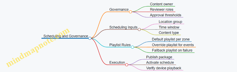
Practical Implementation Checklist
Define templates first, then lock asset rules, then set approval roles, then build scheduling by location groups and time windows, and finally implement device verification. When these pieces are aligned, the workflow becomes boring in the best way: predictable, traceable, and easy to operate when real life interrupts the plan.
10.4 Supporting Retail Operations with Back Office Systems and Connectivity
Back office systems keep retail stores running when the front-of-house is busy. The goal is simple: make data capture reliable, make inventory and pricing consistent, and make staff workflows predictable. Connectivity is the bridge between the store and the rest of the business, so design it like a utility—planned, documented, and tested.
Foundational Concepts for Back Office Connectivity
Start with the store’s operational “loops.” A loop is a repeating workflow that depends on accurate data. Common loops include selling and payment, returns and exchanges, replenishment, and promotions. For each loop, identify what must be captured at the store, what must be validated, and what must be updated.
Example: During a sale, the register needs product identity, price rules, and payment authorization. If the store loses connectivity, the system should either continue with controlled offline rules or fail gracefully with clear instructions. The design decision is not technical trivia; it affects customer experience and end-of-day reconciliation.
System Inventory and Data Ownership
List the systems that touch store operations and define data ownership. Typical categories include:
- Point of Sale and payment processing
- Inventory management and replenishment
- Product information and pricing
- Returns and loyalty or membership
- Back office tools such as scheduling, receiving, and reporting
For each category, specify where the “source of truth” lives. If pricing rules are maintained centrally, the store should receive updates and log what it used. That log matters when a customer disputes a price or when finance audits a promotion.
Network Design for Store Reliability
A store network should be designed around predictable traffic patterns, not around hope. Use a layered approach:
- Core connectivity: internet access and routing to corporate services
- Local segmentation: separate POS, guest Wi-Fi, cameras, and printers
- Edge reliability: switches, access points, and power protection
- Device management: how devices receive updates and configuration
Example: Put POS devices on a dedicated VLAN and restrict access so a misconfigured printer or a guest device cannot interfere with checkout. If you’ve ever watched a store Wi-Fi “mysteriously” slow down during peak hours, you already know why segmentation is worth the effort.
Offline Mode and Reconciliation Rules
Offline mode is not just “it works without internet.” It is a set of rules that define what can be done, what must be queued, and how conflicts are resolved.
Define three behaviors:
- What continues: e.g., basic sales with cached product data
- What queues: e.g., inventory adjustments and loyalty updates
- What blocks: e.g., price changes that require live validation
Example: If a promotion ends while the store is offline, the system should either use the last known promotion window or require manual override. The key is to make the rule explicit so staff aren’t guessing.
Back Office Workflows That Depend on Connectivity
Design connectivity around the moments staff actually work:
- Receiving: scan shipments, update stock, and match purchase orders
- Stock counts: cycle counts and adjustments with audit trails
- Returns: validate original transactions and apply correct refund rules
- Promotions: ensure signage, POS pricing, and inventory eligibility align
Example: For receiving, the back office needs stable connectivity to confirm item identifiers and update inventory. If the store can’t sync, receiving should still capture scans locally but mark the record as “pending sync” so inventory doesn’t silently drift.
Mind Map: Back Office Systems and Connectivity
Example: Store Connectivity Blueprint for a Mid-Size Retailer
A practical blueprint ties decisions to devices and workflows.
- POS: wired connections for registers; dedicated VLAN; local receipt printing
- Back office: wired workstation(s) for receiving and reporting; scheduled sync windows
- Printers and scanners: restricted network access; consistent naming for device pairing
- Wi-Fi: guest network separated; staff devices on a controlled SSID
- Cameras and security: isolated network segment with independent bandwidth planning
Operationally, the store should have a documented “sync checklist” for opening and closing. The checklist confirms that POS services, inventory sync, and pricing updates are healthy before peak hours. It’s not glamorous, but it prevents the most expensive kind of problem: the one discovered after the store is already busy.
Advanced Detailing for Implementation
When you move from concept to drawings and specifications, include:
- Network topology: where switches, access points, and routers connect
- Port and cabling plans: device-to-switch mapping and labeling
- Power strategy: UPS coverage for critical services
- Monitoring points: what gets logged and who reviews it
- Acceptance testing: offline behavior tests and reconciliation verification
Example: During commissioning, test a simulated internet outage. Confirm that sales can proceed under the defined offline rules, that inventory adjustments are queued, and that end-of-day reconciliation produces a clear report with no silent gaps.
10.5 Documenting Technology Requirements for Contractors and Vendors
Technology requirements documentation is where good intentions meet reality. Contractors and vendors can’t price, schedule, or install what they can’t clearly see in writing. This section turns technology needs into a coordinated set of requirements, assumptions, and deliverables that reduce change orders and rework.
Start with Technology Scope Boundaries
Define what is in scope before you specify anything. State whether the project includes only interior fit-out cabling and devices, or also includes network switching, licensing, managed services, and ongoing support. Include a simple “responsibility split” so everyone knows who touches what.
Example: If the client owns the core network, your document should say that vendor work begins at the demarcation point and ends at labeled patch panels and device terminations.
Translate Use Cases into Measurable Requirements
List each space type and its technology purpose, then convert that purpose into measurable requirements.
For offices and meeting rooms, capture:
- Number of rooms and typical occupancy
- Display size or minimum resolution
- Microphone type and coverage expectations
- Whether content is shared by HDMI, wireless casting, or both
- Control method for lights and AV
For retail customer areas, capture:
- Number of kiosks or screens
- Touch requirements and mounting height
- Power and network needs
- Queue display behavior and update method
Keep requirements testable. “Good audio” becomes “speech intelligibility for a seated group of 8 with ceiling noise sources present.”
Define Infrastructure First Then Devices
Document the path from power and data to the final device. A common failure is specifying a device without specifying the cabling, pathways, and termination details.
Include:
- Cable types and categories (for example, Cat 6A for Ethernet runs)
- Conduit and pathway routing expectations
- Rack locations, patch panel counts, and labeling rules
- Power circuits, outlets, and whether devices require dedicated breakers
Example: A meeting room that needs two displays and a camera should have a documented minimum of two HDMI runs (or one HDMI plus an approved switching approach), plus a defined number of network drops for control and conferencing.
Specify Standards, Labeling, and Acceptance Criteria
Make installation and handover consistent across vendors.
Include:
- Labeling scheme for outlets, patch panels, and device IDs
- Test requirements for cabling (pass/fail thresholds)
- Commissioning steps for AV and signage
- Documentation deliverables at closeout
Acceptance criteria should be written as “what success looks like.”
Example: “Cabling test results must be provided for each permanent link with attenuation and NEXT values recorded, and all labels must match the as-built schedule.”
Provide a Clear Deliverables Matrix
A deliverables matrix prevents the classic mismatch where one party assumes another will supply drawings, firmware, or training.
| Deliverable | Who Provides | When | What It Must Include |
|---|---|---|---|
| Device schedule | AV/IT vendor | Submittal | Model, quantity, power, mounting |
| Cabling schedule | Low-voltage contractor | Submittal | Run IDs, termination types |
| Rack elevation | Low-voltage contractor | Submittal | Patch panel layout and labeling |
| Test reports | Low-voltage contractor | Closeout | Results per link and device |
| Commissioning checklist | AV integrator | Pre-handover | Step-by-step verification |
| As-built drawings | Contractor | Closeout | Updated routes, IDs, and locations |
Document Interfaces and Dependencies
Technology rarely lives alone. Document interfaces between systems so vendors don’t guess.
Include dependencies such as:
- Network requirements for conferencing and signage (VLANs, DHCP/static needs)
- Control integration with room management systems
- How retail screens receive content updates
- Any required approvals from the client’s IT team
Example: If kiosks require a specific network configuration, the document should state that the client IT team provides VLAN assignments before commissioning.
Mind Map of Technology Documentation Content
Mind Map: Technology Requirements Documentation
Example Requirement Snippet for Contractors
Use consistent formatting so contractors can quote and schedule.
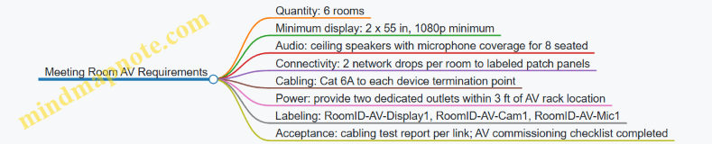
Closeout Package Checklist
Closeout documentation should be a checklist, not a scavenger hunt. Include:
- As-built drawings with updated device locations and cable routes
- Device schedules with serial numbers
- Cabling test results and labeling photos
- Commissioning checklists signed by integrator
- Training attendance records and quick-start guides for basic operation
A good rule: if a facility manager can’t maintain it using your package, the documentation is incomplete—even if the installation works.
11. Sustainability and Lifecycle Considerations for Interior Design
11.1 Establishing Sustainability Criteria for Materials and Assemblies
Sustainability criteria work best when they are written like a checklist that a designer, spec writer, and contractor can all use without guessing. The goal is not to “be green” in general, but to make specific, measurable decisions about materials and assemblies that affect health, durability, energy use, and waste.
Start with What You Can Control
Begin by listing the project’s controllable scope: interior finishes, partitions, ceilings, flooring, wall systems, doors, millwork, and the assemblies that connect them. Then define what “good” means for this project. For example, a workplace may prioritize low odor and acoustic performance, while a retail environment may prioritize cleanability and impact resistance. Both can be sustainable, but the criteria must reflect the actual use.
Define Sustainability Categories and Decision Rules
Use a small set of categories so the criteria stay usable. Each category should include decision rules and an example.
- Health and Indoor Air Quality: Require low-emitting products for adhesives, sealants, paints, and finishes. Example: specify a flooring adhesive with documented low VOC content and pair it with a ventilation flush plan after installation.
- Durability and Maintenance: Set minimum performance expectations so materials don’t get replaced early. Example: choose a commercial-grade sheet vinyl or resilient flooring with a clear wear layer specification, then define a maintenance routine that matches the manufacturer’s cleaning method.
- Resource Efficiency and Waste: Prefer systems that reduce offcuts and enable reuse. Example: use modular ceiling tiles with standardized grid sizes and plan for salvage of tiles during demolition.
- Embodied Carbon and Material Intensity: Require transparency for major assemblies and set thresholds where feasible. Example: request Environmental Product Declarations for ceiling systems and large millwork components, then compare options using the same functional unit.
- Circularity and End-of-Life: Favor assemblies that can be disassembled. Example: specify mechanical fasteners for certain wall panels instead of permanent adhesives, so panels can be removed without destroying the substrate.
Translate Categories into a Practical Criteria Matrix
A criteria matrix turns principles into procurement-ready requirements. Include the product type, required documentation, minimum thresholds, and acceptance method.
Example criteria matrix (condensed):
- Flooring: low-emitting requirements; documented maintenance guidance; wear layer minimum; EPD required for alternatives.
- Paint and coatings: low VOC; documentation for cure and recoat times; finish schedule tied to washability needs.
- Ceiling systems: recyclable components where available; tile replacement strategy; EPD for major components.
- Adhesives and sealants: low-emitting; compatibility with substrates; installation method that avoids rework.
Acceptance should be explicit. If a contractor cannot provide documentation, the spec should state what happens next: substitution review, alternate product approval, or value engineering with documented tradeoffs.
Mind Map: Sustainability Criteria Workflow
Build Criteria from Assemblies, Not Just Products
Assemblies often determine performance more than individual items. A low-emitting paint is only part of the story if the wall system traps moisture or creates frequent repairs. Treat assemblies as the unit of decision.
Example: For a wall assembly, criteria should cover the paint, the wallboard, the joint treatment, and the air-sealing approach. If the project requires frequent cleaning, the criteria should also specify the finish sheen and scrub rating, not just “low VOC.”
Specify Documentation Requirements That Contractors Can Actually Submit
Make documentation requirements specific and limited. Ask for what you will use: VOC content documentation, EPDs for key assemblies, and maintenance instructions. Avoid requesting every possible report for every item; that creates paperwork without improving decisions.
A good rule: require EPDs for the largest-impact assemblies and low-emitting documentation for anything that releases during and shortly after installation.
Use Clear Examples to Prevent Common Failure Modes
- Failure Mode: “Green” substitutes that fail in use. Example: a low-VOC coating that cannot handle scrubbing in a high-traffic retail zone. Fix: tie coating selection to washability and expected cleaning frequency.
- Failure Mode: Documentation gaps. Example: a product with good claims but no submittal-ready proof. Fix: define acceptance and substitution steps in the criteria matrix.
- Failure Mode: Assemblies that require rework. Example: flooring installed over an incompatible substrate leading to premature replacement. Fix: include installation compatibility requirements and substrate preparation criteria.
Lock the Criteria into the Spec and Submittal Process
Finally, sustainability criteria must live where decisions happen: in the specification section and the submittal review checklist. When the criteria are written as thresholds and acceptance methods, the project team can evaluate options consistently, and the contractor can price the work without guessing what “sustainable” means.
11.2 Selecting Low Emission Finishes and Managing Indoor Air Impacts
Low-emission finishes are not just about choosing products labeled “low VOC.” The real goal is to reduce pollutants that can irritate eyes and airways, worsen headaches, and create lingering odors—especially in spaces that are occupied daily. The strategy works best when you treat finishes as part of an indoor air system: materials, installation methods, ventilation conditions, and how quickly the space is brought into use.
Foundations for Low Emission Decisions
Start with the pollutant types that matter most in commercial interiors:
- Volatile organic compounds (VOCs) from paints, adhesives, sealants, coatings, and some flooring.
- Formaldehyde and related emissions from certain composite wood products, panel adhesives, and some textile-backed systems.
- Particulates and fibers released during installation and maintenance, especially with dry cutting, sanding, and abrasive cleaning.
- Odor-causing compounds that may be present even when total VOC numbers look acceptable.
A practical way to keep decisions grounded is to define “where emissions come from” in your project. In most office and retail fit-outs, the biggest sources are coatings, flooring systems, and bonding materials. That means your finish schedule should be paired with an installation plan, not treated as a standalone list.
A Systematic Selection Workflow
-
Set emission targets by space and sensitivity. Conference rooms and customer waiting areas often need stricter odor and irritation control than back-of-house storage. If your project includes sensitive users (for example, frequent visitors with asthma triggers), prioritize low-emission choices there.
-
Request documentation that matches the product’s real use. Ask for emission test data relevant to the intended installation scenario, including curing time and whether the product is used with specific adhesives or primers. A flooring system can be “low emission” but still become problematic if paired with a high-emission adhesive.
-
Control the finish-to-adhesive-to-sealant chain. Many indoor air complaints trace back to the weakest link: a single adhesive, sealant, or primer used to solve a construction problem. Require compatibility so that the low-emission finish is not undermined by the bonding system.
-
Plan for curing and pre-occupancy flushing. Emissions often peak during and shortly after installation. If the space must open quickly, coordinate with the contractor to extend curing periods where feasible and verify ventilation readiness before occupancy.
-
Specify installation practices that reduce exposure. Low-emission products still require correct handling. Use wet methods or dust control for cutting, minimize open containers, and protect finished surfaces from contamination that can increase odor.
Managing Indoor Air Impacts During Construction
Construction is when occupants are most at risk from both chemical emissions and particulates. The goal is to keep pollutants from spreading through the building.
- Separate work zones using physical barriers and pressure control where possible.
- Protect HVAC pathways so that dust and fumes do not travel to occupied areas.
- Sequence finishes so that the highest-emission activities happen early, with time for curing before sensitive areas are completed.
- Use ventilation during curing according to the project’s mechanical readiness plan, not just “turning on the system.”
A simple example: if you install a new carpet tile system with a bonding adhesive, schedule it earlier in the fit-out. Keep the area closed until the adhesive has cured under the specified ventilation conditions, then complete the remaining low-emission finishes afterward.
Advanced Details That Prevent Common Failures
- Composite wood and panel systems: Require emission data for the specific panel type and adhesive system used. If you can’t get clear documentation, treat those areas as higher risk and limit the use of those products in sensitive zones.
- Sealants and caulks: These are often overlooked. Specify low-emission sealants for joints, penetrations, and wet-area transitions, and confirm they are compatible with adjacent materials.
- Flooring underlayments and backing: Some systems emit more from the backing layer than the top surface. Evaluate the full assembly.
- Cleaning products after installation: “Low-emission” finishes can still be affected by high-odor cleaners used during turnover. Specify acceptable cleaning methods and products for closeout.
Mind Map: Low Emission Finishes and Indoor Air Impacts
Example Scenarios with Clear Outcomes
Example: Office suite with painted walls and modular workstations
- Use low-emission wall coatings and specify low-emission primers where required.
- Require the same low-emission approach for any touch-up paints and sealants around penetrations.
- Schedule painting early, keep the suite closed during curing, and confirm ventilation is operating before occupancy.
Example: Retail store with carpet tile and customer-facing waiting area
- Select a carpet tile system with documented low emissions for the full assembly, including backing.
- Use a compatible low-emission adhesive and require dust control during installation.
- Complete the waiting area finishes first only if curing time is guaranteed; otherwise, install earlier and finish last to avoid odor carryover into the opening window.
Practical Specification Checklist
- Emission documentation requested for the full system, not just the top layer.
- Adhesives, primers, sealants, and coatings specified as a compatible set.
- Installation method requirements for dust control and exposure reduction.
- Curing and ventilation conditions defined for pre-occupancy readiness.
- Closeout cleaning products and methods limited to acceptable low-odor options.
When these pieces work together, low-emission finishes stop being a checkbox and become a controllable part of indoor air quality—quietly doing their job while people do theirs.
11.3 Planning for Reuse, Refurbishment, and Modular Design Approaches
Reuse, refurbishment, and modular design are three ways to keep interiors useful when needs change. Reuse focuses on keeping existing components in place or with minimal modification. Refurbishment updates finishes, systems, and layouts while preserving the underlying structure. Modular design builds spaces from repeatable parts so reconfiguration is planned, not improvised.
Foundations for Reuse and Refurbishment
Start by separating what must stay from what can move. Structural elements, core plumbing and major duct routes, and fixed life-safety components are usually “stay.” Everything else—partitions, ceilings, lighting trims, furniture, and many finishes—can be “move.” A practical first step is an inventory that tags each element by condition and flexibility. For example, a ceiling grid in good condition can often be reused even if the lighting layout changes; a damaged ceiling tile should be replaced, but the grid may remain.
Next, define the “change triggers” that will drive future work. Common triggers include headcount shifts, new service models, brand refreshes, and accessibility upgrades. If you know the triggers, you can choose assemblies that tolerate change. A simple example: if teams frequently reconfigure, specify demountable partitions and keep power/data access points reachable without chasing new conduits through finished surfaces.
Modular Design That Actually Helps
Modular design is most effective when modules align with how people use space. Think in terms of repeatable zones: a meeting module, a focus module, a service module, and a circulation module. Each module should have clear boundaries for finishes and services so swapping one module does not force rework everywhere.
A good rule is to design “service continuity” at module edges. Place power and data drops at predictable locations and use standardized connection methods. For instance, a workstation module can share a common underfloor or overhead raceway strategy, so relocating desks does not require new electrical rough-in.
Planning the Building Blocks
Use a component-first approach:
- Partitions and Walls: Prefer demountable systems where possible. If a wall must be fixed, plan for removable infill panels so you can update openings or add acoustic upgrades without demolishing the entire assembly.
- Ceilings: Keep ceiling grids and access panels consistent. When ceiling access is predictable, maintenance and future lighting changes become routine rather than disruptive.
- Lighting and Controls: Select fixtures that can be re-aimed or swapped without replacing the entire mounting system. Controls should support zoning so you can adjust lighting patterns when layouts change.
- Flooring: Choose flooring that can be patched or replaced in sections. For example, modular carpet tiles allow targeted replacement after spills or localized wear.
- Casework and Built-Ins: Design built-ins with replaceable fronts, tops, and hardware. A reception desk can keep its base while swapping the countertop and paneling during a refurbishment.
Mind Map: Reuse, Refurbishment, and Modular Planning
Integrated Example: Office-to-Client-Service Conversion
Imagine an office suite converting part of its area into a client service zone. The existing ceiling grid is intact, so it becomes the reuse backbone. The lighting layout changes to support reception and waiting areas, but the mounting points remain compatible, so only fixtures and trims are replaced.
Partitions are reconfigured using demountable panels for the new service boundary. Where acoustic performance is required, add removable acoustic infill rather than rebuilding the wall. Flooring is patched in the service area using modular tiles to match the existing pattern and reduce demolition.
Finally, power and data are planned at module edges. Instead of running new cables through finished surfaces, the design uses standardized connection points so the new service desks plug into the planned infrastructure.
Execution Details That Prevent Costly Surprises
Reuse and modularity fail when documentation is missing. Require a component schedule that records what is reusable, what is replaceable, and what must be verified on site. Include installation notes such as ceiling access locations, partition connection types, and flooring replacement logic.
During construction, use mockups to confirm fit and tolerances, especially at module boundaries. Track salvage and waste separately so the team can prove what was reused and what was replaced for valid reasons like damage or code compliance.
A final practical step is to plan handover information for future work. Provide a “maintenance and reconfiguration” set that includes ceiling access maps, fixture types, and the locations of service connection points. That way, the next refurbishment is a planned operation, not a scavenger hunt with a ladder.
11.4 Managing Waste Through Construction and Fit Out Practices
Waste management starts before the first demolition line is drawn. In a fit out, most waste comes from three places: material that never gets installed, material that gets installed and then replaced, and packaging or offcuts that get treated as “just trash.” The goal is to reduce all three without slowing the job.
Foundations for Waste Reduction on Site
Begin with a waste baseline and a simple target. A baseline can be as basic as “last project’s dumpster count” or “typical skip volume per square meter.” Then set a target that teams can act on, such as “reduce landfill by separating drywall, metal, and timber” or “cut offcuts by standardizing panel sizes.”
Next, define roles. The site supervisor owns execution, the procurement lead owns ordering accuracy, and the trade foreman owns installation discipline. If nobody owns waste, it becomes everybody’s problem and nobody’s task.
Finally, align waste handling with the schedule. If skips are placed too late, sorting becomes optional. If storage is cramped, materials get damaged and replaced. Waste reduction works best when logistics are planned like any other critical path item.
Waste Prevention Through Procurement and Layout
Most “construction waste” begins as a planning issue. Order quantities should include a controlled allowance for breakage, not a blank check. For example, when installing ceiling tiles, specify the tile size and layout pattern so the supplier can cut or package to match the plan. If you know a corridor uses a repeating module, avoid mixing random tile sizes that force extra trims.
Use staging to prevent damage. Store flooring flat, keep plasterboard dry, and protect finishes from dust. A scuffed wall finish often leads to rework, which creates waste twice: first from the damaged material, then from the replacement.
A practical trick is to create a “material map” that shows where each major material will land on arrival. When deliveries arrive at the wrong location, they get moved multiple times, increasing breakage and packaging waste.
Sorting That Actually Works
On-site sorting should be simple enough to survive real conditions. A workable set of streams for interiors typically includes:
- Clean metal scrap
- Timber and cardboard
- Drywall and plasterboard
- Concrete and masonry
- Packaging film and mixed plastics
- General waste
Set up labeled stations before work starts. Place them where trades naturally finish their tasks, not where it is convenient for the waste contractor. For instance, put drywall offcuts near the cutting area, not at the far end of the site.
Train trades with one rule: “If it’s not clean, it goes to general waste.” This prevents contamination that ruins recycling loads. For example, a bucket of plasterboard offcuts mixed with plastic wrap can force the entire load to landfill.
Handling Offcuts, Returns, and Reuse
Not every offcut is waste. Keep a “reuse shelf” for items that can be returned to inventory: intact fasteners, unused trim pieces, and undamaged panels. For retail-style fit outs, where branding elements may be modular, reuse can be significant if the design allows it.
Returns should be scheduled, not improvised. When a supplier takes back unused materials, the paperwork needs to match delivery notes and packaging condition. A common failure is returning items without documentation, which turns “returnable” into “landfill.”
For larger components, plan for salvage. If a ceiling grid is being replaced, check whether the grid can be reused or sold as scrap. If it cannot, ensure it is separated from mixed debris so it doesn’t contaminate other streams.
Packaging and Temporary Works
Packaging waste often looks small per delivery, but it adds up quickly. Require suppliers to minimize mixed packaging, and insist on removal at the point of use. For example, when installing furniture, have the delivery team remove the pallet wrap immediately rather than leaving it for later. Later removal usually means it gets mixed into general waste.
Temporary works also generate waste: protective film, disposable covers, and broken spacers. Use reusable protection where feasible, and specify how long protection must remain in place before removal. Removing too early creates damage and rework; removing too late increases contamination and disposal volume.
Measurement, Documentation, and Feedback Loops
Waste management becomes real when it is measured. Track waste by stream and by trade area. A simple log can record: material type, estimated weight or volume, destination stream, and date. Then compare actuals to the target.
Feedback should be immediate. If drywall offcuts are high in one zone, check whether the layout is causing excessive cuts or whether deliveries are arriving with the wrong panel sizes. Fixing the cause is more effective than celebrating a good recycling rate.
Mind Map: Waste Management Practices for Construction and Fit Out
Example: Drywall and Ceiling Fit Out
A team planned a ceiling grid with a repeating module but ordered mixed tile sizes “to be safe.” During installation, they created many short trims, and offcuts were contaminated with protective film because the film was removed later. The fix was straightforward: reorder to a single tile size aligned to the module, place a drywall offcut bin next to the cutting area, and remove protective film immediately after the ceiling is complete in each zone. The next week’s waste log showed fewer offcuts and cleaner recycling loads.
Example: Retail Back of House Staging
In a retail fit out, deliveries arrived to a central staging area. Trades then moved materials through the store, damaging corners and generating extra packaging waste. The site implemented a material map with zone-based drop-off points and required delivery teams to remove pallet wrap on arrival. Waste tracking then showed a drop in general waste from damaged packaging and fewer replacement orders for scuffed finishes.
11.5 Preparing Sustainability Documentation for Submittals and Closeout
Sustainability documentation is easiest when you treat it like a chain of evidence: every claim in the design brief should be backed by a specific product document, a specific specification section, and a specific submittal package. The goal is not to collect papers for their own sake; it’s to make it possible to verify what was installed, how it performs, and how it should be maintained.
Foundational Requirements That Drive the Paper Trail
Start by aligning three items before you touch submittals: (1) the sustainability criteria in the project brief, (2) the measurable targets in the design intent, and (3) the compliance path in the contract documents. For example, if the brief requires low-VOC finishes, the criteria must specify what “low” means (test standard and threshold), and the contract must state where the evidence is submitted (finish submittals, indoor air quality section, or both).
Next, create a simple mapping from criteria to deliverables. If a criterion is “recycled content for carpet,” the deliverable is a product data sheet plus a recycled-content statement, not a general sustainability brochure. If a criterion is “durable, cleanable surfaces for high-traffic areas,” the deliverable is a finish schedule with wear rating and cleaning guidance.
Submittal Package Structure That Reviewers Can Follow
Organize sustainability submittals in the same order as the finish and systems schedule. A practical approach is to use a “one product, one folder” method:
- Product identification: manufacturer, model, and where it goes in the building.
- Performance evidence: test reports, certifications, or compliance statements tied to the stated criteria.
- Installation and maintenance: cleaning instructions, recommended maintenance intervals, and any restrictions.
- Compliance summary: a short checklist that states which criteria the product meets.
Example: For ceiling tiles, include (a) a fire classification document, (b) an indoor air quality document showing emissions testing results, and (c) a maintenance note that explains how to handle damaged tiles without contaminating adjacent areas. This prevents a common closeout problem: the building is “compliant on paper,” but maintenance staff can’t follow the guidance.
Closeout Documentation That Proves What Was Installed
Closeout should confirm three things: materials, quantities, and conditions. Materials means the installed products match the approved submittals. Quantities means the schedule totals align with procurement and installation records. Conditions means the building is handed over with the information needed to keep performance stable.
Include the following in the closeout package:
- Final finish schedule with installed product names and locations.
- Copies of approved product submittals and any approved substitutions.
- Indoor air quality documentation relevant to finishes, adhesives, and coatings.
- Waste management closeout: disposal and diversion records tied to the project’s waste plan.
- Commissioning or verification records that relate to sustainability-related systems, such as ventilation control sequences and filter change requirements.
A useful trick is to require contractors to submit a “submittal-to-installed reconciliation” table. It’s not glamorous, but it catches mismatches early.
Mind Map: Sustainability Documentation Workflow
Example: Finish Submittal Checklist for Low-VOC Requirements
Use a checklist that forces evidence to be specific:
- Finish type: paint, primer, adhesive, sealant, or coating
- Product model and intended location
- Emissions test standard and result
- Threshold comparison to the project requirement
- Any mixing or application constraints that affect emissions
- Cleaning and maintenance instructions
If the project requirement is “low-VOC per a specified standard,” the submittal should state the standard and the measured value. If it only says “low VOC,” the reviewer has to guess, and guessing is how closeout becomes a scavenger hunt.
Example: Waste Management Closeout That Doesn’t Contradict the Plan
A waste plan often lists categories like drywall, metal, cardboard, and mixed debris. Closeout should show totals by category and disposal method. If the plan expects diversion for cardboard and the closeout shows only “landfill,” the documentation contradicts the plan. Fixing that mismatch after the fact is harder than aligning it during the last site walk.
Document Control That Keeps Everything Findable
Finally, treat the documentation set like a system, not a pile. Use consistent naming, version control, and an index that links each installed item to its approved evidence. When maintenance later asks, “What adhesive is under this flooring?” the answer should be a document reference, not a memory.
A good closeout package ends with clarity: what was installed, why it meets the sustainability criteria, and how to maintain it so the building keeps behaving the way the design intended.
12. Project Delivery, Documentation, and Quality Control
12.1 Developing Design Deliverables Including Plans, Elevations, and Details
Design deliverables are the bridge between intent and construction. Plans show how spaces work; elevations show what the building looks like when you stand still; details show how it’s actually built when you zoom in. A complete set prevents “interpretation gaps,” where different people assume different things and the project pays for the mismatch.
Core Deliverables and Their Roles
Plans communicate layout, dimensions, and relationships. They typically include floor plans for each level, reflected ceiling plans when needed, and furniture or equipment plans for workplace and retail operations.
Elevations communicate vertical composition and alignment. They help coordinate storefront elements, interior wall finishes, millwork heights, and ceiling transitions.
Details communicate construction logic. They cover junctions like wall-to-ceiling, floor-to-wall transitions, counter edges, handrails, and any area where materials meet and the real world shows up.
A practical rule: if a contractor can’t build it from the drawings without guessing, it needs a detail or a clearer note.
Mind Map: Deliverables Workflow
Plans That Contractors Can Actually Use
Start with a clean base: architectural floor plan underlay, then add interior scope in layers. Include key dimensions that affect construction and operations: door swings, corridor widths, clearances around seating or fixtures, and turning paths where relevant.
For workplace and retail, add a furniture or equipment plan that matches the architectural plan’s coordinate system. If a workstation layout changes, the plan should update without forcing a redraw of everything else. Use consistent naming for rooms and zones so finish schedules and lighting plans reference the same labels.
Reflected ceiling plans should show ceiling types, lighting locations, diffusers, sprinklers where applicable, and any ceiling soffits. Even if the ceiling is “simple,” show the transitions. A ceiling that changes height is never simple during installation.
Elevations That Keep Finishes Aligned
Elevations should be tied to the plan with clear cut lines and consistent numbering. Show the height of major elements: baseboards, wall panels, glazing heads, counter tops, and any feature walls.
Include finish callouts directly on elevations. If a wall has three finishes, the elevation should show where each begins and ends. If the finish boundary depends on a ceiling height, reference that ceiling level rather than guessing a height.
For retail, elevations also help coordinate storefront sightlines and customer-facing service counters. A counter that looks centered in plan can be off by a few inches in elevation if the wall thickness or reveal isn’t coordinated.
Details That Eliminate Costly Guesswork
Details are where the set becomes buildable. Focus on junctions and interfaces:
- Floor-to-wall transitions: show base height, base material, and how flooring meets it. If the floor is resilient, specify the edge condition and whether it’s capped or tucked.
- Wall-to-ceiling transitions: show trim or shadow gaps, especially where acoustical ceilings meet drywall.
- Millwork and counter edges: show thickness, edge profiles, and how the surface is supported. A countertop edge detail should include the substrate and the finish layer.
- Accessibility elements: show handrail mounting heights, clearances, and any required blocking.
Example: A reception counter with a stone top and a painted face needs a detail that shows the stone thickness, the substrate, and the joint treatment at the edge. Without it, the installer may leave a visible gap or create a weak joint that fails at the first busy day.
Documentation Quality Checks
Before issuing drawings, run a consistency pass:
- Scales and line weights: ensure plans and elevations are readable at the intended plot size.
- Finish schedule alignment: every finish referenced on plans and elevations must exist in the schedule with the same identifier.
- Hardware and openings coordination: door types, clearances, and hardware locations must match the door schedule and elevations.
- MEP coordination notes: where ceilings or soffits depend on ductwork or sprinklers, show the intended ceiling envelope and any required clearances.
Mind Map: Detail Selection Priorities
Example Detail Set for a Small Office Reception Wall
A minimal but complete detail package for a reception wall might include:
- Wall-to-ceiling transition for the feature wall with a different ceiling height.
- Floor-to-base transition showing base material and how the resilient flooring terminates.
- Counter edge detail showing stone top support, edge profile, and joint treatment.
- Service opening jamb detail showing trim reveals and how the opening aligns with the wall finish.
This set covers the most common failure points: height mismatches, finish boundaries, and weak joints. The result is a drawing set that reduces questions on site and keeps the built outcome consistent with the design intent.
12.2 Creating Construction Documentation Packages and Coordination Sets
Construction documentation is where good ideas become buildable instructions. A strong package reduces guesswork, speeds bidding, and prevents the classic “we thought you meant the other thing” problem. The goal is not to produce more drawings; it’s to produce the right drawings, in the right order, with consistent naming, clear responsibility, and coordination-ready information.
Foundational Concepts for Package Structure
Start by defining what each document is for. Drawings show geometry and locations. Specifications explain materials, workmanship, and quality requirements. Schedules list quantities and options. Coordination sets connect disciplines so the field team can install without playing detective.
A practical baseline package includes:
- Cover sheet and project identifiers
- Architectural drawings (plans, elevations, details)
- Structural drawings where applicable
- MEP drawings (mechanical, electrical, plumbing)
- Reflected ceiling plans and ceiling details
- Finish schedules and room finish plans
- Door and hardware schedules
- Lighting and power plans
- Fire/life safety drawings and notes
- General notes, code references, and accessibility requirements
Then define the coordination set rules: which sheets are “coordination-critical,” which are “reference-only,” and what revision logic applies. If you don’t set this early, coordination becomes a blame game with extra steps.
Documentation Workflow That Stays Coherent
- Freeze the base set: lock architectural and reflected ceiling plan geometry before heavy MEP detailing. If the ceiling grid moves later, every duct and cable tray suddenly becomes a new project.
- Issue discipline packages: each discipline produces a complete set with consistent sheet numbering and scale conventions.
- Run coordination checks: compare MEP routes against architectural openings, structural beams, and ceiling elements.
- Resolve conflicts with traceable decisions: each change should have a reason and a responsible party.
- Compile the coordination set: produce a single, cross-discipline bundle for field use.
- Quality check for buildability: verify dimensions, clearances, and callouts match the schedules.
Coordination Set Contents and Naming Logic
A coordination set is not just “everything in one folder.” It is a curated set of sheets with clear hierarchy.
Include:
- A coordination index listing sheet numbers and discipline owners
- A reflected ceiling plan coordination sheet with ceiling grid, lighting, diffusers, sprinklers, and major routes
- A penetrations and sleeves sheet showing where trades pass through assemblies
- A routing and clearance sheet for congested zones (e.g., corridors, mechanical rooms, ceiling plenum transitions)
- A room-by-room finish and equipment coordination sheet when multiple trades affect the same surfaces
Naming logic should be consistent across disciplines. Use the same room numbers, grid references, and elevation datum. If one discipline uses “Room 210” and another uses “Rm 210,” the field will eventually find the mismatch and charge you for it.
Mind Map: Package Components and Coordination Flow
Example: What “Good” Looks Like in a Congested Ceiling Zone
Imagine a corridor ceiling with sprinklers, supply diffusers, return grilles, lighting, and a cable tray crossing near a soffit. A coordination-critical approach would:
- Show the ceiling grid and soffit geometry on the RCP.
- Place sprinklers and lighting with clear offsets from soffit edges.
- Indicate duct and tray routes with elevation callouts where they pass under beams.
- Include a penetrations sheet that lists sleeve sizes and firestopping responsibility.
- Add a note on the coordination sheet stating that any ceiling tile removal requires re-verification of clearance around the tray.
This avoids the common failure mode: the drawings show “close enough,” but the field needs “installable.”
Example: How Specifications Support Coordination
When coordination-critical items overlap, specifications should remove ambiguity. For instance:
- If a ceiling system supports lighting and diffusers, the spec should state load limits and fastening requirements.
- If penetrations require firestopping, the spec should define the required system type and documentation at closeout.
- If finishes are affected by MEP access panels, the spec should require matching finish and clear access requirements.
The drawings locate; the specifications ensure the installation matches the intent.
Quality Checks Before Issuing
Perform a final buildability pass:
- Confirm every schedule item has a corresponding drawing callout.
- Verify dimensions are not contradicted by scale-dependent measurements.
- Check that clearances around doors, equipment, and access panels are maintained.
- Ensure revision marks are consistent and that the coordination set reflects the latest resolved conflicts.
A package that passes these checks reads like a set of instructions, not a collection of guesses. That’s the difference between “issued” and “usable.”
12.3 Managing Contractor Bid Reviews and Scope Alignment
A bid review is where “sounds good” meets “can we build it without surprises.” The goal is not to find reasons to reject bids; it’s to confirm that the contractor’s price matches the scope, the scope matches the design intent, and the team can execute the work with clear responsibilities.
Establishing the Review Baseline
Start by locking the baseline documents: the latest drawings, specifications, addenda, and the project schedule requirements. Then create a bid review checklist that mirrors the scope structure used in the contract documents. If the bid form is organized by divisions, align your review to those divisions; if it’s organized by work packages, align to those.
Example: If the drawings show a ceiling grid change in Corridor A and the spec requires specific acoustical tiles, your checklist should include both the ceiling system and the tile product requirements under the same line item. Otherwise, you’ll end up comparing apples to “probably similar oranges.”
Reading Bids Like a Scope Translator
Contractors often price what they think you asked for, not what you meant. During review, translate each bid line item into three questions:
- What exactly is included (materials, labor, temporary work)?
- What is excluded or assumed elsewhere?
- What conditions could change the cost (site access, lead times, unknown field conditions)?
Use a scope alignment matrix with columns for: bid line item, contract requirement, evidence in the bid (unit rates, allowances, alternates), and risk notes. When a bid line item is vague, require clarification before you compare totals.
Comparing Apples to Apples with Allowances and Alternates
Allowances and alternates are where bid totals can look tidy while the real work shifts. Review allowances for three things: basis of estimate, included scope boundaries, and whether the allowance is tied to a specific product category or a generic placeholder.
Example: A bid includes a $10,000 allowance for “millwork.” If the spec requires custom casework with specific hardware and finish durability, the allowance may only cover basic boxes. Your review should flag the mismatch and request a breakdown or a revised allowance.
Verifying Scope Boundaries Across Trades
Scope alignment fails most often at interfaces: ceiling-to-lighting, flooring-to-wall base, MEP rough-in-to-finish clearances, and back-of-house support spaces. During review, identify interface points and confirm who owns each portion.
Example: If lighting fixtures require a specific ceiling cutout tolerance and the ceiling contractor assumes the electrical contractor will provide exact locations, you need a responsibility statement. Otherwise, you get misaligned trims and a change order that nobody enjoys.
Running a Clarification Loop That Produces Decisions
Clarifications should be structured and time-bound. Send a consolidated list of questions, grouped by topic, and require written responses. Track each question to a decision: accept as clarification, require revised pricing, or treat as a scope gap.
Use a “question-to-impact” log:
- Question summary
- Bid line item(s) affected
- Potential cost/time impact type
- Required action
Example: “Does the bid include firestopping at all penetrations?” If the answer is “only where shown,” you may need to require full compliance with the spec and request a revised allowance or unit rate.
Confirming Unit Rates, Quantities, and Measurement Rules
Even when totals look close, unit rates and measurement rules can diverge. Check how the contractor measured quantities against your takeoff method. Confirm whether they will re-measure in the field, and what triggers re-measurement.
Example: If your drawings indicate a specific number of wall panels but the contractor proposes “allowance based on field verification,” ask for the verification method and how discrepancies will be handled.
Aligning the Schedule with Real Work Sequencing
Scope alignment includes sequencing. Review the proposed schedule for dependencies: lead times for specialty finishes, inspection windows, and how the contractor plans to protect finished surfaces while other trades work.
Example: If the contractor schedules flooring installation before ceiling and lighting rough-in is complete, you should flag the sequencing risk and request a revised plan.
Documenting the Outcome So Execution Stays Calm
At the end of bid review, produce a scope alignment summary that states:
- Confirmed inclusions by major work package
- Clarified exclusions and assumptions
- Required revisions to pricing or allowances
- Interface responsibilities
- Items requiring contract language updates or addenda
This document becomes the reference point for kickoff and change management.
Mind Map: Contractor Bid Review and Scope Alignment
Example: Scope Alignment Matrix Entry
| Bid Line Item | Contract Requirement | Evidence in Bid | Risk Note | Action |
|---|---|---|---|---|
| Acoustical ceiling tiles in Corridor A | Specific tile type and NRC rating | “Ceiling tiles per spec” with no NRC listed | Product substitution risk | Request NRC and product cut sheet |
| Firestopping | All penetrations | “As required by code” | May miss spec-driven locations | Require full compliance statement |
| Lighting trims | Trim finish and cutout tolerance | Included as “standard trims” | Tolerance mismatch at ceiling grid | Require trim model and tolerance approach |
Example: Clarification Loop Decision
Question: “Does the bid include full firestopping at all MEP penetrations, including those not explicitly shown on drawings?”
Decision: If the response limits firestopping to “shown locations,” require a revised scope statement and pricing adjustment, because the spec typically governs over drawing callouts.
Example: Interface Responsibility Fix
If the ceiling contractor assumes the electrical contractor provides exact fixture locations, add a responsibility line: fixture layout verification occurs after ceiling grid installation, with a defined review step and correction method before tile installation.
12.4 Conducting Site Reviews, Mockups, and Punch List Verification
Site reviews, mockups, and punch list verification are where drawings become real objects with real tolerances. The goal is simple: confirm that what was designed can be built, used, and maintained—without surprises at closeout.
Prepare for the Review with Clear Acceptance Criteria
Start by aligning on what “done” means before anyone walks the site. Build a short acceptance checklist tied to the contract documents: dimensions, finish appearance, hardware function, clearances, lighting levels, acoustic targets, and accessibility routes. For example, if a workplace plan shows 36 in. clear path width, the acceptance criterion should specify where the measurement is taken and what counts as an obstruction (door swing, base cabinets, temporary protection).
Create a review packet that includes the latest drawings, finish schedules, fixture cut sheets, and a marked-up plan showing review locations. If a mockup is required, list the exact scope: one representative wall section, one ceiling grid bay, one restroom module, or one retail service counter assembly. This prevents the classic situation where everyone agrees the mockup looks good, but it doesn’t represent the area that will actually be installed.
Conduct Site Walks That Follow a Logical Route
Use a repeatable route so observations are comparable across visits. A practical sequence is: exterior approach and entry, circulation paths, key rooms or zones, then back-of-house and service areas. In an office, that might mean verifying the accessible route from lobby to elevators before checking workstation layouts. In a retail environment, verify customer sightlines and queue space before evaluating back-of-house storage.
During the walk, record findings in three categories: compliant, nonconforming, and “needs clarification.” “Needs clarification” is useful when the issue is real but the cause is unclear, such as a ceiling height mismatch that could be due to duct routing or a coordination error.
Use Mockups to Test Fit, Finish, and Function
Mockups should test more than appearance. A good mockup includes:
- Fit: alignment of trim, reveals, and transitions.
- Finish: color consistency, sheen control, and stain resistance.
- Function: door operation, latch engagement, hardware clearance, and lighting behavior.
Example: For a conference room, mock up a wall with the intended paint and acoustic panel system, then test a mounted display. Verify that the panel edges align with the frame, that the display doesn’t interfere with the panel seams, and that the lighting doesn’t create glare on the screen.
Example: For a retail fitting area, mock up the mirror, lighting, and flooring transition. Check that the mirror height matches the intended viewing angle and that the flooring edge doesn’t create a trip hazard when customers step in and out.
Verify Punch List Items with Evidence, Not Opinions
Punch lists should be specific enough that a contractor can fix them without guessing. Each item should include location, reference drawing/detail, observed condition, required condition, and a verification method.
Use a “measure, photograph, confirm” workflow:
- Measure the dimension or clearance.
- Photograph the condition with a visible reference (door number, room name, or a scale marker).
- Confirm the fix after completion using the same measurement points.
Example: If a baseboard gap is listed as “needs caulking,” add the target: “gap shall be ≤ 1/16 in. at wall-floor junction, measured at three points per 10 ft run.” Then verify after caulking by re-measuring and checking for continuous coverage.
Close the Loop with Documentation and Sign-Off
Punch list verification is complete only when records show what changed. Maintain a punch log with status transitions: open, in progress, corrected, verified, and accepted. For each verified item, attach the before/after photo set and the measurement result.
If a mockup was used to establish finish acceptance, reference it in the punch list so the team doesn’t re-litigate color or texture later. For example, “Ceiling tile finish matches mockup bay M-2; verified for sheen and pattern alignment.”
Mind Map: Site Reviews, Mockups, and Punch List Verification
Practical Example Workflow for One Visit
On a single visit dated 2026-02-07, the team can run a tight sequence: verify accessible route and door clearances first, then check ceiling grid alignment in the main open office, then inspect the retail service counter mockup area for reveal consistency and hardware operation. Finally, compile a punch list that includes measurement targets and photo references, so the next visit focuses on verification rather than debate.
12.5 Closing Out Projects With As Built Records and Maintenance Handover
Closing out a commercial interior project is where the design intent either survives reality or quietly gets replaced by “good enough.” The goal is simple: produce accurate as-built documentation and hand over a maintenance-ready package that helps the owner operate the space without guesswork.
Foundations of as Built Accuracy
Start by defining what “as built” means for this project. At minimum, it should include what changed from the issued documents: actual dimensions, equipment locations, routing paths, and any substitutions. A practical approach is to run a two-pass verification. First, collect contractor redlines and submittal markups. Second, confirm critical items on site—especially concealed work like ceiling-mounted devices, fire/smoke components, and concealed power/data drops.
A quick example: if a meeting room has a ceiling speaker, the as-built should show the speaker’s exact grid location relative to room reference lines, not just “centered.” Maintenance teams often replace devices later and need a reliable map.
Organizing the Closeout Package
Assemble the closeout package in a consistent order so it can be used under time pressure. A common structure is:
- Architectural record set
- MEP record set
- Life safety record set
- Finish and hardware schedules
- Commissioning and test documentation
- O&M manuals and warranties
- Training records and handover sign-offs
Keep file naming predictable. For example, use a pattern like “Floor_RoomSystem_Subsystem_Version.” This prevents the classic problem of multiple “final” PDFs that all claim to be final.
Capturing Critical Systems and Hidden Work
Not all documentation has equal impact. Prioritize systems that affect safety, comfort, and operational uptime.
- HVAC: diffuser locations, thermostat locations, control sequences summary, and balancing reports.
- Electrical: panel schedules, circuit directory updates, lighting control zoning, and device labeling.
- Fire and life safety: device types and locations, panel programming notes, and inspection results.
- AV and data: rack locations, cable labeling scheme, and endpoint mapping.
Example: if lighting controls were adjusted during commissioning, the as-built should reflect the final zoning and any occupancy sensor settings that affect after-hours operation.
Maintenance Handover That Actually Helps
Maintenance handover should answer three questions: What is installed? How do we service it? What happens when something fails?
Include:
- A maintenance index listing each asset category and where its O&M instructions live.
- Service intervals where provided by manufacturers, plus any contractor-recommended checks.
- Access notes for items that are difficult to reach, such as filters behind ceiling access panels.
- Spare parts list with part numbers and quantities, limited to what the owner can realistically store.
A slightly playful but useful rule: if a technician can’t find the right manual within five minutes, the package needs reorganization.
Training and Handover Sessions
Training should be role-based. Provide a short walkthrough for operations staff focused on daily and monthly tasks, and a separate session for maintenance staff focused on service procedures and access points.
Use a checklist during the session. Confirm that:
- Labels match the as-built drawings.
- Access panels and shutoffs are identified.
- Emergency procedures are understood at a practical level.
Example: for a retail customer service counter with integrated power and data, show where the disconnects are and how to safely remove the counter panel without damaging finishes.
Mind Map of Closeout Workflow
Example Closeout Checklist
- Confirm drawings match field conditions for:
- Lighting control zones
- HVAC diffuser and thermostat locations
- Fire device types and mounting positions
- AV and data rack locations
- Update labeling:
- Circuit directory and panel schedules
- Device tags and cable labels
- Compile documentation:
- O&M manuals grouped by system
- Warranty certificates and start dates
- Test and inspection reports
- Conduct handover:
- Walkthrough with owner representatives
- Training sign-off for operations and maintenance
Final Quality Gate
Before submission, run a quality gate that is less about paperwork and more about usability. Spot-check three rooms and three systems end-to-end: can someone locate the asset, identify its controls, and find the correct maintenance instructions? If the answer is “not quickly,” fix the organization and labeling before the package leaves your hands.
When the owner receives the final set, the space should be understandable without relying on memory. That is what “closeout” really means: the building keeps its instructions after the project team is gone.