Game Art For Non Artists
Chapter 1: Introduction to Game Art for Non-Artists
1.1 Understanding Game Art and Its Role in Game Development
Game art is the collection of visual elements that make up the look and feel of a video game. It includes everything from characters and environments to user interfaces and icons. While it might seem like just decoration, game art plays a crucial role in how players experience and understand a game.
At its core, game art serves several key purposes:
- Communication: Art conveys information quickly. For example, a red glowing button might signal danger or urgency, while a green checkmark indicates success.
- Immersion: Visuals help players feel part of the game world. Consistent art styles and believable environments support this.
- Aesthetics: Good art makes a game enjoyable to look at, which can increase player engagement.
- Functionality: Art supports gameplay by making controls, objectives, and feedback clear.
Even simple visuals can achieve these goals if designed thoughtfully. You don’t need to be a skilled drawer to create effective game art; understanding the role of each element is more important.
Mind Map: Components of Game Art
Each component contributes differently but works together to create a cohesive experience. For example, UI elements guide player actions, while characters and environments build the world.
Example: Simple Visual Asset in a Puzzle Game
Imagine a puzzle game where players match colored blocks. The blocks themselves are game art assets. They need to be visually distinct so players can quickly identify colors and shapes. Even if these blocks are just colored squares with simple shading, they fulfill the communication and functionality roles.
Mind Map: Roles of Game Art
Understanding these roles helps non-artists focus on what matters when creating assets. For instance, a button doesn’t need to be a masterpiece; it just needs to clearly look clickable.
Example: UI Button Design
A simple rectangular button with a contrasting color and a clear label can be more effective than a complex, detailed graphic. The goal is clarity and usability, not artistic complexity.
In summary, game art is more than just pretty pictures. It is a tool for communication, immersion, and gameplay support. Recognizing this helps non-artists create assets that serve the game’s needs without requiring advanced drawing skills.
1.2 Common Misconceptions About Art and Drawing Skills
When people think about creating game art, the first image that often comes to mind is someone sketching detailed characters or landscapes with a pencil or digital pen. This association creates several misconceptions that can discourage non-artists from trying their hand at visual asset creation. Here, we clarify some of these misunderstandings.
Misconception 1: You Must Be Good at Drawing to Make Game Art
Many believe that the ability to draw realistically or with great detail is a prerequisite for making game art. In reality, game art comes in many styles, many of which rely on simple shapes, colors, and patterns rather than complex drawings. For example, minimalist icons or geometric shapes can communicate game elements effectively without requiring traditional drawing skills.
Mind Map:
Misconception 2: Art Must Be Original to Be Useful
While originality is valuable, many game developers use existing assets or modify templates to fit their needs. Using pre-made assets or combining existing elements is a valid approach, especially for beginners. The key is to adapt and customize assets so they fit the game’s style and requirements.
Example: A developer might take a free icon set and recolor or resize icons to match their game’s theme rather than creating each icon from scratch.
Misconception 3: Art Creation Requires Expensive or Complex Software
Another common belief is that creating game art demands professional-grade software like Photoshop or Illustrator. However, many free or low-cost tools offer sufficient features for making simple assets. Programs like vector editors, pixel art generators, or photo editors with basic functions can be enough to create effective game visuals.
Mind Map:
Misconception 4: Art Skills Develop Only Through Drawing Practice
Drawing practice is one way to improve art skills, but understanding design principles, color theory, and composition can also significantly enhance visual asset quality. Non-artists can focus on these areas, which often have a more direct impact on the clarity and appeal of game art.
Example: Knowing how to choose contrasting colors or arrange UI elements clearly can make a game interface look professional without any drawing involved.
Misconception 5: Game Art Must Be Complex to Be Effective
Simple art can be just as effective as complex art, especially in games where clarity and readability are priorities. Many successful games use minimalistic or stylized visuals that rely on clean shapes and limited color palettes.
Example: Puzzle games often use basic shapes and colors to avoid distracting the player from gameplay.
Misconception 6: Non-Artists Cannot Contribute Meaningfully to Game Art
Non-artists can create valuable assets by leveraging tools, templates, and design principles. Their contributions can include assembling modular assets, selecting color schemes, or designing layouts. Collaboration with artists is helpful but not mandatory for producing decent game visuals.
Mind Map:
In summary, the idea that drawing skill alone defines the ability to create game art is limiting. Game art is a broad field that welcomes various approaches, many of which do not require traditional drawing. Understanding this opens the door for anyone interested in making games to participate in the visual creation process.
1.3 Overview of Simple Visual Asset Types in Games
In game development, visual assets are the building blocks that create the game’s look and feel. For non-artists, understanding the types of simple visual assets helps clarify what you can create without needing advanced drawing skills. These assets generally fall into a few broad categories: sprites, tilesets, UI elements, icons, and textures. Each serves a distinct purpose and can be approached with straightforward techniques.
Mind Map: Simple Visual Asset Types
Sprites
Sprites are 2D images representing characters, objects, or effects. They are often the most recognizable assets in a game. For non-artists, sprites can be created using simple shapes or by modifying existing images. For example, a character sprite might be a combination of circles and rectangles with basic colors to suggest a figure. Effects like explosions or magic can be simple animated shapes or color changes.
Example: A simple coin sprite can be a yellow circle with a slight gradient or highlight to suggest shine. No detailed drawing needed.
Tilesets
Tilesets are collections of small images, usually square, that fit together to form game environments. They are especially common in 2D games with grid-based maps. Tilesets include terrain (grass, water, dirt), buildings, and props like trees or rocks. Since tiles repeat, creating a few simple, modular tiles can build complex scenes.
Example: A grass tile can be a green square with a few darker green dots or lines to simulate texture. By repeating this tile, you create a field without drawing a large landscape.
UI Elements
User Interface (UI) elements include buttons, panels, sliders, and health bars. These assets help players interact with the game. UI elements often rely on clean, simple shapes and clear typography rather than detailed art. Non-artists can design effective UI components using basic rectangles, circles, and color blocks.
Example: A button can be a rounded rectangle with a contrasting color and a simple label. Adding a slight shadow or border can improve visibility without complex art.
Icons
Icons represent items, abilities, or statuses in a compact form. They need to be clear at small sizes. Creating icons without drawing skills involves using simple symbols or combining basic shapes to convey meaning.
Example: An inventory icon for a potion might be a simple bottle shape made from circles and rectangles, filled with a bright color to stand out.
Textures
Textures are images applied to surfaces to give them detail and realism. For non-artists, textures can be created by editing photos, using patterns, or generating simple designs. Textures often serve as backgrounds or surface details.
Example: A wood texture might be a photo of wood grain cropped and adjusted for color and contrast, then tiled to cover a surface.
Mind Map: Examples of Simple Asset Creation Approaches
Understanding these asset types and approaches helps non-artists focus on manageable tasks. Instead of worrying about drawing complex images, you can build game visuals by assembling simple components, editing photos, or customizing existing assets. This approach keeps the process accessible and productive.
1.4 Setting Realistic Goals for Non-Artists
Setting realistic goals is a crucial step for anyone creating game art without formal drawing skills. It helps keep projects manageable, reduces frustration, and ensures steady progress. When you’re new to visual asset creation, it’s easy to aim too high—wanting detailed characters or complex scenes right away. Instead, focus on achievable outcomes that build your confidence and skills over time.
Understanding What Realistic Means
Realistic goals are those that match your current skill set, available time, and tools. They don’t mean settling for low quality but rather choosing projects that are doable and useful. For example, creating simple icons or basic environment tiles is more realistic than trying to draw a fully rendered character from scratch.
Mind Map: Factors Influencing Realistic Goals
Breaking Down Goals by Asset Type
Different asset types require different effort levels. Here’s a rough guide:
- Icons and UI elements: Simple shapes and colors; good starting point.
- Tiles and backgrounds: Can be made modular and reused; moderate complexity.
- Characters and creatures: Usually more complex; better tackled with vector shapes or photo manipulation.
- Animations: Add complexity; start with simple loops or hover effects.
Example: Goal Setting for a Simple Puzzle Game
Suppose you want to create art for a puzzle game. A realistic goal might be:
- Design 5 unique tile types using geometric shapes.
- Create 3 button styles for the UI.
- Make a simple logo using typography and basic shapes.
This goal avoids detailed character art or animations, focusing on assets you can create without drawing.
Mind Map: Example Goal Breakdown for Puzzle Game
Managing Time and Effort
Estimate how long each asset will take. If a tile takes 30 minutes, 5 tiles mean about 2.5 hours. Add time for UI buttons and logo, and you get a clear picture of your workload. This helps avoid overcommitting.
Example: Weekly Schedule for Asset Creation
- Monday: Create 2 tile types (1 hour)
- Wednesday: Design 3 button styles (1.5 hours)
- Friday: Develop logo (1 hour)
Adjusting Goals Based on Progress
If you find some tasks harder than expected, adjust your goals. Maybe reduce the number of tile types or simplify button designs. Flexibility keeps the process enjoyable and productive.
Mind Map: Adjusting Goals
Avoiding Perfectionism
Perfectionism can stall progress. Aim for “good enough” assets that serve your game’s needs. You can always improve or replace them later. Early iterations are about functionality and clarity, not artistic mastery.
Summary
Setting realistic goals means understanding your skills, time, tools, and project needs. Break down your work into manageable chunks, estimate effort, and be ready to adjust. This approach keeps your game art creation practical and satisfying, even without drawing skills.
1.5 Tools and Software Accessible to Beginners
Creating game art without drawing skills depends heavily on choosing the right tools. The goal is to find software that is approachable, intuitive, and capable of producing useful assets without requiring advanced artistic knowledge. This section outlines a variety of tools, organized by their primary function, along with examples and simple mind maps to clarify their roles.
Categories of Tools
Image Editors
Raster-based editors work with pixels, making them suitable for photo editing, pixel art, and texture creation. They allow you to manipulate images at the pixel level or apply filters and effects.
- Example: Paint.NET is a free, lightweight editor with an easy interface. It supports layers and basic effects, making it good for simple edits and creating textures from photos.
- Example: GIMP is a more advanced free editor. While it has a steeper learning curve, it offers powerful tools for photo manipulation and pixel editing.
Vector-based editors use mathematical shapes instead of pixels. This makes them ideal for creating scalable assets like icons, logos, and simple characters built from shapes.
- Example: Inkscape is a free vector editor that allows you to combine basic shapes into complex assets. Its interface is straightforward once you get used to it.
- Example: Boxy SVG offers a simpler, web-based vector editor with a focus on ease of use.
Asset Generators
These tools automate asset creation by generating pixel art, icons, or shapes based on parameters you set. They reduce the need for manual drawing.
- Pixel Art Generators: Tools like Piskel allow you to create pixel art with a simple interface, including animation support.
- Icon Generators: Some web-based tools let you build icons by selecting shapes, colors, and styles.
Texture and Pattern Creators
Creating textures can be challenging without drawing skills. Tools that generate patterns or allow photo-based textures are helpful.
- Example: Filter Forge offers filters to create seamless textures from photos or procedural effects.
- Example: Material Maker is a node-based tool to create textures procedurally.
These tools often include options to tile textures seamlessly, which is important for game environments.
UI and Typography Tools
Typography and UI elements can be created without drawing by using shape tools and font libraries.
- Example: Canva provides drag-and-drop design with access to fonts and simple shapes.
- Example: Figma is a free UI design tool that supports vector shapes and text, useful for assembling UI components.
Animation Tools
Simple animations can be created using shape transformations or frame-by-frame editing without drawing.
- Example: Krita supports frame-by-frame animation with a simple interface.
- Example: Piskel also supports pixel art animation.
- Example: Spine offers skeletal animation but may be more complex for beginners.
Asset Management and Export Tools
Organizing and exporting assets in the correct formats is crucial.
- Most image editors and design tools include export options to PNG, JPEG, SVG, or GIF.
- Simple file management tools like Windows Explorer or Finder help keep assets organized.
Practical Example: Choosing Tools for a Simple Game Icon
Suppose you want to create a simple game icon made of geometric shapes and flat colors without drawing.
- Use a vector editor like Inkscape.
- Combine circles, rectangles, and triangles to form the icon’s shape.
- Apply flat colors using the fill tool.
- Export the icon as a PNG file.
This process avoids freehand drawing and relies on tools designed for shape manipulation.
Summary
Selecting the right tools depends on your specific needs and comfort level. Raster editors are good for photo-based edits and pixel art, vector editors excel at shape-based assets, and asset generators automate repetitive tasks. UI and typography tools help build interface elements without drawing, while animation tools add motion to simple shapes. Organizing and exporting assets correctly ensures smooth integration into your game project.
Using these tools thoughtfully allows non-artists to create functional and visually coherent game assets without needing traditional drawing skills.
Chapter 2: Fundamentals of Visual Design Without Drawing
2.1 Basic Principles of Design: Color, Shape, and Composition
Design in game art is about arranging visual elements so they communicate clearly and look good. Even without drawing skills, understanding how color, shape, and composition work together helps you create assets that fit your game’s style and purpose.
Color
Color influences mood, readability, and focus. It’s not just about picking favorite hues but about how colors interact.
- Hue: The color itself (red, blue, green).
- Saturation: Intensity or purity of the color. High saturation means bright, low means dull.
- Value (Brightness): How light or dark a color is.
Using contrasting colors can make important elements stand out. For example, a bright yellow button on a dark background draws attention immediately. Meanwhile, analogous colors (colors next to each other on the color wheel, like blue and green) create harmony but less contrast.
Mind map for Color:
Example: Imagine designing a health bar. Using a red hue with high saturation signals danger or low health, while green suggests safety or full health. Adjusting saturation and brightness can indicate different health levels without changing shapes.
Shape
Shapes are the building blocks of your visual assets. They carry meaning and help players recognize objects quickly.
- Geometric shapes (circles, squares, triangles) feel structured and clean.
- Organic shapes (irregular, freeform) feel natural and relaxed.
Simple shapes can represent complex ideas. For example, a triangle pointing upward can suggest direction or movement. Circles often feel friendly or soft, while squares feel stable.
Mind map for Shape:
Example: A game icon for a shield might be a simple rounded rectangle with a triangle at the bottom to suggest protection. No detailed drawing needed, just combining basic shapes.
Composition
Composition is how you arrange colors and shapes within your asset or scene. Good composition guides the viewer’s eye and balances elements.
Key concepts:
- Balance: Distributing visual weight evenly. Symmetrical balance feels formal; asymmetrical can feel dynamic.
- Alignment: Placing elements along common edges or centers to create order.
- Proximity: Grouping related elements close together.
- Whitespace: Empty space that prevents clutter and improves readability.
Mind map for Composition:
Example: Designing a simple game button: center the text inside a rectangle, leave enough padding (whitespace) around the text, and use contrasting colors for text and background. This makes the button clear and easy to use.
Integrated Example
Suppose you want to create a simple collectible coin asset without drawing.
- Use a circle shape (geometric, simple).
- Choose a golden yellow hue with medium saturation and high brightness.
- Add a smaller, lighter circle inside to suggest shine (using value contrast).
- Place the coin slightly off-center in your frame for asymmetrical balance.
- Leave whitespace around the coin so it doesn’t feel cramped.
This approach uses color, shape, and composition principles together to create a recognizable asset without any drawing.
Understanding these basics lets you build assets that communicate clearly and fit your game’s style, even if you don’t draw. Start simple, experiment with shapes and colors, and pay attention to how you arrange elements.
2.2 Using Geometric Shapes to Build Visual Assets
Using geometric shapes to build visual assets is a practical approach for anyone without drawing skills. Geometric shapes—circles, squares, triangles, rectangles, and polygons—are the building blocks of many visual elements in games. By combining and modifying these shapes, you can create recognizable and functional assets without needing to sketch freehand.
Why Geometric Shapes?
- They are simple and easy to manipulate.
- They provide clear structure and form.
- They help maintain consistency across assets.
- They reduce complexity, making assets easier to create and edit.
Basic Shapes and Their Uses
- Circle: Good for buttons, wheels, eyes, coins, or any rounded object.
- Square/Rectangle: Useful for platforms, walls, crates, and UI panels.
- Triangle: Often used for arrows, roofs, or directional indicators.
- Polygon: Can represent more complex shapes like shields or gems.
Mind Map: Geometric Shapes and Their Common Game Uses
Combining Shapes
Most game assets are combinations of basic shapes. For example, a simple character might be a circle for the head, rectangles for the body and limbs, and triangles for feet or hats. By layering and aligning these shapes, you can create a coherent figure.
Mind Map: Combining Shapes for a Simple Character
Practical Example 1: Creating a Simple Tree
- Start with a brown rectangle for the trunk.
- Add overlapping green circles or ovals for foliage.
- Optionally, use smaller circles to represent fruits.
Practical Example 2: Designing a Coin
- Use a circle as the base.
- Add a smaller concentric circle inside for a border.
- Place a simple symbol or letter in the center using a polygon or smaller shapes.
Adjusting Shapes
You can modify shapes by scaling, rotating, or combining them with transparency effects. For instance, overlapping circles with varying opacity can create a sense of depth or texture.
Mind Map: Shape Modifications
Best Practices
- Keep it simple: Avoid adding too many shapes that clutter the asset.
- Use symmetry where possible to create balanced designs.
- Align shapes carefully to maintain cohesion.
- Use color and shading to differentiate parts without adding complexity.
Summary
Using geometric shapes is a straightforward way to create game assets without drawing. By understanding the basic shapes and how they can be combined and modified, you can build a wide variety of visual elements. This approach emphasizes clarity and simplicity, which often leads to cleaner and more effective game art.
2.3 Understanding Contrast and Visual Hierarchy
Understanding contrast and visual hierarchy is essential when creating game art, especially if you’re not relying on drawing skills. These concepts help guide the player’s eye and make your assets clear and effective.
What is Contrast?
Contrast refers to the difference between elements that makes them distinguishable. It can be about color, brightness, size, shape, or texture. Without sufficient contrast, elements blend together and become confusing.
Types of Contrast:
- Color Contrast: Using colors that stand apart, like dark text on a light background.
- Value Contrast: Difference in lightness and darkness.
- Size Contrast: Larger elements attract more attention.
- Shape Contrast: Unique shapes stand out against repetitive ones.
- Texture Contrast: Rough vs. smooth surfaces.
Why Contrast Matters
Contrast helps players quickly identify important objects or UI elements. For example, a bright red button on a muted background signals “click me.” Without contrast, players might miss key interactive parts or get visually overwhelmed.
What is Visual Hierarchy?
Visual hierarchy is the arrangement of elements to show their order of importance. It’s how you guide the viewer’s eye from one part of the screen to another in a logical way.
Good visual hierarchy ensures the player knows what to look at first, second, and so on. It reduces confusion and improves usability.
How Contrast Creates Visual Hierarchy
Contrast is one of the main tools to establish hierarchy. By varying contrast levels, you can make some elements pop while others recede.
For example, a large, bright icon will draw attention before smaller, dull icons.
Mind Map: Contrast and Visual Hierarchy
Practical Examples
Example 1: Button Design
- A call-to-action button uses a bright color (high color contrast) against a muted background.
- The button is larger than surrounding text (size contrast).
- The shape is a rounded rectangle, distinct from square icons nearby (shape contrast).
This combination makes the button the first thing the player notices.
Example 2: Game Icon Set
- Important icons are larger and use more saturated colors.
- Less important icons are smaller and use muted colors.
- Icons with similar functions share shape styles to group them visually.
This helps players quickly find what they need.
Tips for Applying Contrast and Visual Hierarchy Without Drawing
- Use simple shapes and vary their size to create emphasis.
- Choose colors with clear differences in brightness and saturation.
- Group related items close together and separate unrelated ones.
- Keep the layout clean to avoid clutter that reduces contrast effectiveness.
Mind Map: Applying Contrast in Non-Drawn Assets
By focusing on these principles, you can create clear, attractive game assets that communicate their purpose without needing advanced drawing skills.
2.4 Creating Effective Silhouettes for Game Objects
Silhouettes are the basic outlines or shapes of objects, stripped of all detail and color. They serve as the first impression of a game asset and play a crucial role in readability and recognition, especially in fast-paced gameplay or small screen sizes. For non-artists, focusing on silhouettes is a practical way to create clear, understandable visuals without needing advanced drawing skills.
Why Silhouettes Matter
- Instant Recognition: Players identify objects quickly by their overall shape.
- Visual Clarity: Simplified shapes reduce confusion in busy scenes.
- Style Consistency: Strong silhouettes help maintain a cohesive look.
Key Principles for Effective Silhouettes
- Distinctive Shape: Avoid generic or overly similar outlines.
- Clear Edges: Use simple, readable contours without unnecessary complexity.
- Balanced Proportions: Shapes should feel stable and intentional.
- Avoid Clutter: Too many small protrusions or details can confuse the silhouette.
Mind Map: Elements of an Effective Silhouette
How to Create Silhouettes Without Drawing Skills
-
Use Basic Shapes: Start with circles, squares, triangles, and rectangles. Combine and modify these to form the general shape of your object.
-
Cut and Combine: Use digital tools to subtract or add shapes, creating unique outlines.
-
Test Readability: Fill the shape with solid black and view it at different sizes. If the object is hard to identify, simplify or exaggerate parts of the silhouette.
-
Iterate: Try multiple versions, focusing on the overall shape rather than details.
Practical Example: Designing a Simple Silhouette for a Tree
- Start with a large circle for the foliage.
- Add a rectangle for the trunk.
- Modify the circle by subtracting smaller circles to create a jagged outline.
- Combine shapes and fill them solid black.
- Check if the shape reads as a tree at small sizes.
If the silhouette looks like a blob, try elongating the trunk or adding a branch shape to break the monotony.
Mind Map: Steps to Create a Silhouette
Examples of Effective Silhouettes
- Character: A humanoid with a distinct hat or weapon silhouette stands out more than a plain figure.
- Item: A potion bottle with a unique stopper shape is easier to recognize than a generic bottle.
- Environment Object: A rock with a jagged top silhouette reads better than a smooth oval.
Tips for Non-Artists
- Use vector or shape-based software to manipulate silhouettes easily.
- Avoid adding detail inside the silhouette; focus on the outer shape.
- When stuck, look at everyday objects and break them down into simple shapes.
- Remember that exaggeration can help; bigger or more unusual shapes catch the eye.
Summary
Creating effective silhouettes is about simplifying and clarifying shapes. By focusing on the outline, you can make game assets that communicate their purpose quickly and clearly. This approach suits non-artists because it relies on combining and adjusting basic shapes rather than freehand drawing. Testing silhouettes at small sizes ensures your assets remain readable in-game.
2.5 Practical Example: Designing a Simple Game Icon Using Shapes
Creating a game icon without drawing skills is about combining basic shapes thoughtfully and applying design principles to communicate the intended idea clearly. Let’s walk through designing a simple game icon representing a treasure chest.
Step 1: Define the Concept
The icon should clearly represent a treasure chest, a common game asset. Since drawing detailed chests is complex, we simplify the concept into basic shapes that suggest the form.
Mind Map: Concept Breakdown
Step 2: Choose Your Shapes
- Body: Start with a rectangle to represent the main chest body.
- Lid: Use a slightly smaller rounded rectangle or trapezoid placed on top to suggest the lid.
- Lock: Add a small circle or rectangle centered on the body’s front to indicate a lock.
- Bands: Use thin rectangles or lines horizontally across the chest to mimic metal bands.
Each shape should be simple and clearly distinguishable.
Step 3: Arrange and Layer Shapes
Arrange the shapes so they overlap logically:
- Place the lid shape slightly overlapping the top edge of the body.
- Position the lock shape centered horizontally on the body, near the top.
- Overlay the bands across the body, ensuring they don’t obscure the lock.
Mindful layering helps create depth without drawing.
Step 4: Apply Colors
Assign colors to differentiate parts:
- Use a warm brown for the chest body to suggest wood.
- A darker brown or gray for the lid to create contrast.
- Metallic gray or gold for the lock and bands.
Keep the palette limited to 3-4 colors to maintain clarity.
Step 5: Add Simple Highlights and Shadows
Without drawing, highlights can be simulated by adding small white or lighter shapes:
- Place a small white ellipse or polygon on the lid’s top-left corner to suggest light reflection.
- Add a darker shape or shadow under the lid to imply depth.
These subtle touches improve visual interest.
Step 6: Final Adjustments and Scaling
Check the icon at typical game sizes (e.g., 64x64 pixels). Simplify or enlarge shapes if details become unclear. Ensure the icon reads well even when small.
Example Breakdown
| Element | Shape Type | Color | Positioning Notes |
|---|---|---|---|
| Chest Body | Rectangle | Warm Brown | Base layer, center |
| Lid | Rounded Rectangle | Dark Brown | Overlaps top of body, slightly wider |
| Lock | Circle | Gold | Centered on chest front |
| Metal Bands | Thin Rectangles | Gray | Horizontally across chest body |
| Highlight | Small Ellipse | White | Top-left corner of lid |
Mind Map: Shape and Color Relationship
Summary
By breaking down the treasure chest into simple geometric shapes and layering them with distinct colors, you create a recognizable icon without drawing. Highlights and shadows are suggested with additional shapes rather than freehand shading. This method works for many game icons: identify the core shapes, arrange them logically, and use color and layering to communicate form and function.
Chapter 3: Working with Photographs and Textures
3.1 Sourcing Free and Legal Photos for Game Assets
When creating game art without drawing skills, photographs can be a valuable resource. Using photos as textures, backgrounds, or even as parts of composite assets can save time and add realism. However, it’s crucial to ensure that the photos you use are free and legal to avoid copyright issues.
Understanding Licensing
Before downloading or using any photo, check its license. The license tells you what you can and cannot do with the image. Common licenses include:
- Public Domain (CC0): These photos can be used without restrictions, including commercial use, modification, and distribution.
- Creative Commons (CC) Licenses: Some require attribution, some restrict commercial use, and others forbid modifications. Always read the specific terms.
- Royalty-Free: You pay once or get free access, then use the photo multiple times without additional fees. Terms vary, so verify usage rights.
Using photos without proper rights can lead to legal trouble, so always confirm the license before incorporating images into your game.
Mind Map: Photo Licensing Basics
Where to Find Free and Legal Photos
There are many sources for free photos, but the key is to verify their licensing and quality. Some photos are contributed by photographers who explicitly release them under permissive licenses. When selecting photos, consider resolution, subject matter, and style to match your game’s needs.
Mind Map: Criteria for Selecting Photos
Examples of Using Photos in Game Assets
- Texture Creation: A photo of a wooden surface can be edited to create a tileable texture for floors or walls.
- Backgrounds: Landscape photos can serve as backgrounds for 2D games, adding depth without drawing.
- Photo Manipulation: Combining photos of leaves and rocks to create natural environment assets.
Practical Tips
- Always download the highest resolution available to maintain quality during editing.
- Use image editing software to crop, resize, and adjust photos to fit your game’s style.
- Convert photos to grayscale or apply filters to unify the look across different assets.
- When modifying photos, keep track of the original license to ensure compliance.
Mind Map: Photo Usage Workflow
By carefully sourcing and using photos with proper licenses, you can build a library of visual assets that enhance your game without needing to draw. This approach opens up many possibilities for non-artists to create appealing and functional game visuals.
3.2 Basic Photo Editing Techniques for Game Art
Photo editing is a practical way to create or enhance game assets without drawing. It involves adjusting and manipulating photos to fit your game’s style and needs. The goal is to transform raw images into usable visual elements like textures, backgrounds, or props.
Key Photo Editing Techniques
- Cropping and Resizing: Focus on the important part of an image and adjust its size to fit your game’s resolution or asset requirements.
- Color Adjustment: Modify brightness, contrast, saturation, and hue to match your game’s mood or palette.
- Removing Backgrounds: Isolate objects by removing or replacing backgrounds, making assets easier to place in game scenes.
- Applying Filters and Effects: Use simple filters to change the look of a photo, such as turning a photo into a sketch-like image or softening details.
- Cloning and Healing: Fix imperfections or remove unwanted elements by copying nearby pixels.
- Layering and Masking: Combine multiple images or parts of images, controlling visibility to create composite assets.
Mind Map: Basic Photo Editing Techniques
Practical Examples
Example 1: Creating a Ground Texture
- Start with a photo of dirt or grass.
- Crop to a square section that looks uniform.
- Resize to the desired tile size (e.g., 256x256 pixels).
- Adjust brightness and contrast to reduce shadows and highlights, making the texture more even.
- Use the clone tool to remove any distracting objects like sticks or leaves.
- Apply a subtle blur filter to soften harsh edges.
- Save as a seamless tile by carefully cloning edges or using offset tools.
Example 2: Isolating a Prop for a Game Scene
- Take a photo of a simple object, such as a rock.
- Use a selection tool to outline the rock.
- Remove the background, leaving a transparent area around the object.
- Adjust hue and saturation to better fit the game’s color scheme.
- Add a slight drop shadow effect to give depth when placed in the scene.
Mind Map: Example Workflow for Prop Isolation
Tips for Effective Photo Editing
- Work with high-resolution photos to maintain quality after editing.
- Keep edits subtle to avoid unnatural looks unless stylization is the goal.
- Use non-destructive editing methods like adjustment layers and masks when possible.
- Regularly zoom out to see how the asset looks at game scale.
- Save versions at different stages to revert if needed.
Photo editing is a flexible skill that lets you repurpose real-world visuals into game-ready assets. With practice, you can quickly produce consistent and appealing visuals without needing to draw anything by hand.
3.3 Creating Textures from Photos Without Drawing
Creating textures from photos without drawing skills is a practical way to produce game assets that look natural and detailed. The process involves selecting suitable photos, editing them to fit your needs, and preparing them for use in your game. This section breaks down the steps and techniques with examples and mind maps to clarify the workflow.
Understanding the Basics
Textures are images applied to 3D models or 2D surfaces to give them detail and realism. When you use photos as textures, you bypass the need to draw or paint, relying instead on real-world detail captured by a camera.
Step 1: Choosing the Right Photo
Not every photo works well as a texture. Look for images with:
- Consistent lighting: Avoid harsh shadows or bright spots.
- Even surfaces: Flat or gently curved surfaces work best.
- Minimal perspective distortion: Photos taken straight on are easier to edit.
- Repetitive patterns: For example, bricks, grass, or fabric.
Example: A close-up photo of a wooden floor taken from directly above with even lighting is a good candidate.
Step 2: Preparing the Photo
Once you have a photo, the goal is to make it tileable and clean. This means the edges should match when repeated, and any distracting elements should be removed.
Mind Map: Preparing a Photo for Texture
Example: Using an image editor, crop the wooden floor photo to a 512x512 square. Use the clone stamp tool to remove scratches or dirt spots that might look odd when repeated.
Step 3: Making the Texture Tileable
Tileable textures repeat seamlessly. To achieve this:
- Use an offset filter to shift the image horizontally and vertically by half its width and height.
- Fix visible seams by cloning or healing over the edges.
- Repeat the offset and fix process until seams disappear.
Example: After offsetting the wooden floor photo, you notice a visible line in the middle. Use the healing brush to blend this line with surrounding wood grain.
Step 4: Enhancing the Texture
Adjust the photo to better suit your game’s style:
- Desaturate or adjust colors to match your palette.
- Add noise or blur to reduce photographic sharpness if needed.
- Apply filters like posterize or threshold for stylized effects.
Example: Slightly desaturate the wooden floor texture to fit a muted game environment.
Step 5: Exporting the Texture
Save the texture in a format compatible with your game engine, typically PNG or JPEG. Keep file size in mind; compress without losing too much quality.
Practical Example: Creating a Tileable Grass Texture
- Take a photo of grass from above on a cloudy day for even lighting.
- Crop to a 256x256 square.
- Use the offset filter to shift the image 128 pixels horizontally and vertically.
- Clone out any visible seams.
- Adjust brightness and contrast to make the grass look lively but not oversaturated.
- Export as PNG.
This texture can now be repeated across a game terrain without obvious seams.
Summary Mind Map: Workflow for Creating Textures from Photos
Using photos as textures is a straightforward way to add visual detail without drawing. The key is in careful selection and editing to ensure the texture fits your game’s needs and looks seamless when repeated.
3.4 Best Practices for Seamless Textures and Patterns
Creating seamless textures and patterns is a valuable skill for game art, especially when you want to cover large surfaces without obvious repetition or visible edges. Seamless textures tile smoothly, meaning when placed side by side, the edges match perfectly, avoiding distracting lines or breaks. This section covers best practices to achieve seamlessness, with examples and mind maps to clarify the process.
Understanding Seamless Textures
A seamless texture is an image designed so its left edge matches its right edge, and its top edge matches its bottom edge. When tiled, the pattern appears continuous.
Key Principles for Seamless Textures
- Edge Matching: The pixels on one edge must correspond exactly to those on the opposite edge.
- Consistent Patterns: Avoid abrupt changes in color or shape at the edges.
- Balanced Detail: Too much detail can make seams obvious; too little can look flat.
Mind Map: Seamless Texture Creation
Step-by-Step Best Practices
-
Start with a Square Canvas: A square image (e.g., 256x256 pixels) is standard for textures.
-
Create Your Base Pattern: Use simple shapes, colors, or photo elements. Keep in mind the overall look you want.
-
Apply the Offset Filter: Shift the image horizontally and vertically by half its size. This moves the edges to the center, revealing seams.
-
Fix the Seams: Use tools like the clone stamp or healing brush to blend the seams in the center. Avoid adding new elements that break the pattern.
-
Check Tiling: Repeat the texture in a grid to see if seams are visible. Adjust as needed.
Mind Map: Seamless Texture Editing Workflow
Example 1: Creating a Seamless Stone Texture
- Start with a photo of a stone surface.
- Crop to a square.
- Apply offset filter to move edges to center.
- Use clone stamp to blend the visible seam lines.
- Add subtle noise to unify texture.
- Test by tiling; adjust if any lines remain.
Example 2: Designing a Simple Geometric Pattern
- Create a pattern using circles and squares.
- Ensure shapes that cross edges are duplicated on the opposite side.
- Use offset filter to verify alignment.
- Adjust shapes to avoid abrupt cutoffs.
- Tile to confirm smooth repetition.
Tips for Avoiding Common Pitfalls
- Avoid High-Contrast Edges: Sharp color changes at edges make seams obvious.
- Use Noise or Grain: Adding subtle noise can mask minor imperfections.
- Duplicate Edge Elements: If a shape crosses an edge, place its counterpart exactly on the opposite edge.
- Work Non-Destructively: Use layers or duplicates to preserve original work.
Mind Map: Troubleshooting Seamless Textures
By following these practices, you can create textures that tile without obvious seams, making your game environments look more polished without requiring advanced drawing skills.
3.5 Practical Example: Making a Tileable Ground Texture from a Photo
Creating a tileable ground texture from a photo is a practical skill that lets you build game environments without drawing. You start with a photo of a surface—like grass, dirt, or stone—and transform it into a seamless pattern that can repeat infinitely without visible edges. This section walks through the process step-by-step, with explanations and examples.
Step 1: Choose the Right Photo
Not every photo works well for tileable textures. Look for images with:
- Even lighting: Avoid harsh shadows or bright highlights.
- Minimal distinct features: Large rocks or leaves can create obvious seams.
- Consistent texture: Grass, dirt, or gravel with uniform appearance works best.
Example: A photo of a patch of grass with uniform blades and no big flowers.
Step 2: Crop to a Square
Most tileable textures are square for easier repetition.
- Open your photo in an image editor.
- Crop to a square area that captures the texture well.
Example: Crop a 512x512 pixel square focusing on a uniform patch of dirt.
Step 3: Offset the Image
Offsetting moves the edges of the image to the center, revealing seams.
- Use the Offset filter (usually under Filter > Other > Offset).
- Offset by half the image width and height (e.g., 256 pixels for 512x512).
- This places the edges in the center, making seams visible.
Mind Map:
Example: After offsetting, you see a vertical and horizontal seam crossing the center.
Step 4: Fix the Seams
Use cloning or healing tools to blend the seams.
- Clone Stamp Tool: Sample nearby pixels and paint over seams.
- Healing Brush: Automatically blends texture.
- Work carefully to avoid creating new patterns.
Mind Map:
Example: Clone patches of grass over seam lines, blending edges so the transition is smooth.
Step 5: Check for Repeatability
Test if the texture tiles without visible seams.
- Duplicate the image multiple times in a grid.
- Look for lines or mismatched areas.
- If visible, return to Step 4 and refine.
Mind Map:
Example: A 3x3 grid shows no visible seams, confirming success.
Step 6: Adjust Color and Contrast (Optional)
Sometimes the texture looks flat or dull.
- Use Levels or Curves to improve contrast.
- Adjust Hue/Saturation for color consistency.
Mind Map:
Example: Slightly increase contrast to make the dirt texture more defined.
Step 7: Export the Texture
Save the texture in a format suitable for your game engine.
- PNG is common for lossless quality.
- Ensure dimensions remain power of two (e.g., 256x256, 512x512).
Summary Mind Map
Additional Tips
- Avoid photos with strong directional lighting; it creates unnatural shading when tiled.
- Use smaller brush sizes when cloning near seams for subtle blending.
- Save incremental versions to avoid losing progress.
- Keep the texture simple; complexity can make seamless tiling harder.
This method lets you create convincing ground textures without drawing. It’s a practical way to build game environments using photos and basic editing tools. The key is patience in blending seams and testing repeatability until the texture looks natural when tiled.
Chapter 4: Using Vector Graphics and Shape-Based Tools
4.1 Introduction to Vector Graphics for Game Art
Vector graphics are images created using mathematical formulas rather than pixels. Unlike raster images, which are made up of tiny dots (pixels), vector graphics use points, lines, curves, and shapes based on coordinates. This difference means vector images can be scaled up or down without losing quality, making them ideal for game art assets that need to appear crisp on various screen sizes.
Why Use Vector Graphics in Game Art?
- Scalability: Vector graphics maintain sharp edges at any size, so an icon or character can be resized without becoming blurry.
- Editability: Since vectors are made of individual shapes and paths, you can easily adjust colors, shapes, or sizes without starting over.
- Smaller File Sizes: Vector files often take up less space than high-resolution raster images, which helps with game performance.
- Simplicity: Vector art often relies on clean shapes and colors, which suits many game styles, especially 2D and minimalist designs.
Basic Components of Vector Graphics
- Points (Nodes): The fundamental units that define positions in space.
- Paths: Lines connecting points, which can be straight or curved.
- Shapes: Closed paths forming objects like circles, rectangles, or custom polygons.
- Fills and Strokes: Fills color the inside of shapes, while strokes define the outline.
Mind Map: Core Concepts of Vector Graphics
Common Vector File Formats
- SVG (Scalable Vector Graphics): Widely supported and editable, often used for web and game UI.
- AI (Adobe Illustrator): Proprietary format, popular in professional design.
- EPS (Encapsulated PostScript): Compatible with many design programs.
Example: Creating a Simple Vector Game Icon
Imagine you want to create a simple heart icon for a health indicator. Using vector tools, you start with two circles overlapping side by side and a downward-pointing triangle beneath them. By combining these shapes and adjusting their positions, you form a heart shape. You then fill it with red and add a subtle darker red stroke to give it definition. Because it’s vector-based, you can resize this heart to fit a small UI element or a large screen overlay without losing clarity.
Mind Map: Steps to Create a Vector Icon
Practical Considerations
- Vector graphics are not always the best choice for highly detailed or textured art, but they excel at clean, stylized visuals.
- Many game engines support importing vector files directly or require exporting them as raster images (like PNG) at specific resolutions.
- Learning to manipulate vector shapes is often easier for beginners than freehand drawing because it involves moving and resizing simple objects.
Summary
Vector graphics offer a flexible and accessible way for non-artists to create game visuals. By focusing on shapes and colors rather than freehand drawing, you can build clear, scalable assets suitable for various game elements. Understanding the components and workflow of vector art is a solid step toward producing effective game art without traditional drawing skills.
4.2 Tools for Creating Vector Art Without Drawing Skills
Creating vector art without drawing skills is entirely possible thanks to a variety of tools designed to simplify the process. These tools focus on manipulating shapes, lines, and colors rather than freehand drawing, allowing you to build clean, scalable graphics suitable for game assets. Below, we explore some of the main types of vector art tools and how they help non-artists create game visuals.
Mind Map: Tools for Creating Vector Art Without Drawing Skills
Shape-Based Editors
These editors emphasize working with basic geometric shapes—circles, rectangles, polygons—that you can combine, resize, and recolor. They often include snapping guides and alignment tools to help position elements precisely.
Example: In Gravit Designer, you can start by placing a circle and a rectangle, then use Boolean operations like “Union” or “Subtract” to create a simple game icon, such as a shield or button. This method avoids freehand drawing and relies on combining shapes.
Template & Asset-Based Editors
Some tools provide libraries of pre-made shapes, icons, and templates that you can customize. This approach lets you assemble assets by modifying existing components rather than creating from scratch.
Example: Canva offers a range of vector-style icons and shapes. You can select a base icon, change its colors, resize parts, and layer additional shapes to create a unique game UI element like a health bar or inventory slot.
Path and Node Editors
These tools allow more detailed control by manipulating paths and nodes, but you don’t need to draw freehand. Instead, you adjust curves and lines on existing shapes or use simple pen tools to create straight or curved segments.
Example: In Inkscape, you can start with a basic shape and edit its nodes to refine the form. For instance, creating a stylized tree by adjusting a polygon’s points or smoothing curves on a leaf shape. This method requires some patience but no drawing skill.
Auto-Trace Tools
If you have a raster image or photo, auto-trace tools convert it into vector shapes. This can be useful for turning simple sketches or icons into scalable vector assets.
Example: Using Inkscape’s trace bitmap feature, you can import a black-and-white logo and generate vector paths. Then, you can edit colors and shapes to fit your game’s style without redrawing.
Practical Example: Designing a Simple Vector Game Icon Without Drawing
- Open a shape-based editor like Vectr.
- Add a circle to represent a coin.
- Place a smaller rectangle over the circle to create a shine effect.
- Use the “Subtract” Boolean operation to cut the shine shape out.
- Adjust colors: gold for the coin, white for the shine.
- Export as SVG for use in your game.
This process uses only basic shapes and built-in operations, no drawing needed.
Summary
Vector art tools for non-artists focus on shape manipulation, templates, and simple path editing rather than freehand drawing. By combining basic shapes, customizing templates, or using auto-trace features, you can create clean, scalable game assets. Experimenting with these tools helps build confidence and skill without requiring traditional drawing ability.
4.3 Combining Basic Shapes to Form Complex Assets
Combining basic shapes to form complex assets is a practical approach for non-artists to create game visuals without needing to draw freehand. The idea is to use simple geometric forms—circles, squares, triangles, rectangles—and arrange or layer them to represent more intricate objects. This method relies on breaking down the target asset into its fundamental parts and reconstructing it with shapes you can easily manipulate.
Why Use Basic Shapes?
- Simplicity: Shapes are easy to create and edit.
- Consistency: Using the same shapes helps maintain a uniform style.
- Scalability: Shapes can be resized or duplicated without losing clarity.
Step-by-Step Approach
- Identify the Core Components: Look at the object and ask, “What simple shapes make up this?” For example, a tree trunk is a rectangle, leaves can be circles or ovals.
- Sketch a Rough Layout: Even if it’s just a mental note, decide where each shape will go.
- Create and Arrange Shapes: Use your software’s shape tools to build each part.
- Adjust and Refine: Change sizes, colors, and positions to improve the look.
- Add Details with Smaller Shapes: Use smaller shapes to suggest texture or features.
Mind Map: Combining Shapes for a Simple Tree Asset
Example 1: Creating a Simple Tree
- Start with a vertical brown rectangle for the trunk.
- Add overlapping green circles on top to represent leaves.
- Use varying shades of green to add depth.
- Place a translucent oval beneath to simulate shadow.
This approach avoids drawing complex leaf shapes and still produces a recognizable tree.
Mind Map: Constructing a Basic Sword Icon
Example 2: Designing a Sword
- Use a long, narrow rectangle for the blade.
- Add a smaller rectangle perpendicular near the base for the guard.
- Attach a circle at the bottom for the pommel.
- Color variations distinguish parts.
This method creates a clear, simple sword icon without sketching curves.
Mind Map: Building a Basic Character Head
Example 3: Crafting a Character Face
- Start with a circle for the head.
- Place two white circles for eyes, with smaller black circles inside.
- Use a small triangle or simple shape for the nose.
- Add a thin rectangle or curved shape for the mouth.
This creates a friendly, cartoon-like face with minimal shapes.
Tips for Combining Shapes
- Overlap Shapes: Overlapping can create new forms and suggest volume.
- Use Color and Opacity: Different colors or transparency levels help separate parts.
- Group Shapes: Grouping makes moving and scaling easier.
- Experiment with Rotation: Rotating shapes can add dynamism.
- Keep It Simple: Avoid too many shapes; simplicity aids clarity.
Practical Exercise
Try building a simple house asset:
- Base: Large square or rectangle.
- Roof: Triangle on top.
- Door: Smaller rectangle.
- Windows: Small squares or circles.
Adjust colors to differentiate materials (e.g., brown for door, red for roof).
By focusing on basic shapes and their arrangement, you can create a wide range of game assets without needing to draw complex lines or curves. This approach is accessible, flexible, and effective for non-artists aiming to produce clean, functional visuals.
4.4 Coloring and Styling Vector Assets for Games
When working with vector assets, coloring and styling are crucial steps that bring your shapes to life and make them fit the look and feel of your game. Since vectors are built from shapes and paths, you have precise control over colors, gradients, strokes, and effects. This section covers practical approaches to coloring and styling that anyone can apply without advanced art skills.
Understanding Basic Color Application
Coloring vector assets starts with filling shapes. Most vector tools let you apply solid colors easily. The key is to choose colors that work well together and suit your game’s mood.
- Fill Color: The main color inside a shape.
- Stroke (Outline): The border around the shape, which can be colored, thick, thin, or even dashed.
Example: A simple tree shape can have a green fill for leaves and a brown stroke for the trunk outline.
Mind Map: Color and Style Components
Using Solid Colors Effectively
Solid colors are the easiest to apply and often the cleanest look for simple game assets. When choosing solid colors:
- Pick a limited palette (3-5 colors) to keep assets cohesive.
- Use contrasting colors to separate elements clearly.
- Consider the background color of your game scene to ensure visibility.
Example: For a button asset, a blue fill with a white stroke can stand out well on a dark background.
Adding Gradients for Depth
Gradients blend two or more colors smoothly and can add a sense of volume or light source without drawing complex shading.
Types of gradients:
- Linear Gradient: Color changes along a straight line.
- Radial Gradient: Color radiates outward from a center point.
Example: A coin asset can use a radial gradient from gold to a darker yellow to suggest roundness.
Mind Map: Gradient Usage
Styling Strokes
Strokes define the edges of shapes and can dramatically change the asset’s look.
- Stroke Width: Thicker strokes can make assets bolder; thinner strokes are subtle.
- Stroke Color: Often darker or complementary to the fill color.
- Stroke Style: Solid lines are standard; dashed or dotted lines can indicate special states or effects.
Example: A shield icon with a thick dark gray stroke and a light blue fill looks sturdy and clear.
Using Opacity and Transparency
Adjusting opacity lets you create layering effects or soften parts of an asset.
- Lower opacity can simulate glass, water, or shadows.
- Combining opacity with gradients can produce subtle highlights.
Example: A magic orb asset might have a semi-transparent glow around it to suggest energy.
Adding Simple Effects: Shadows and Highlights
Even without drawing skills, you can add depth by layering shapes with different colors and opacities.
- Drop Shadows: Create a duplicate shape offset slightly with a darker color and lower opacity.
- Highlights: Add a smaller shape with a lighter color or white at the light source side.
Example: A button can have a dark shadow shape offset below and to the right, plus a small white highlight shape on the top-left.
Mind Map: Effects for Vector Assets
Maintaining Consistency Across Assets
Using a consistent color palette and stroke style helps your game look unified.
- Define a palette before styling assets.
- Use the same stroke width and color for similar asset categories.
- Reuse gradients and effects to maintain visual harmony.
Example: All UI buttons share the same blue fill, white stroke, and subtle shadow.
Practical Example: Styling a Simple Vector Character
- Base Shapes: Use circles and rectangles for the head, body, and limbs.
- Fill Colors: Choose a skin tone for the head and hands, a shirt color, and pants color.
- Strokes: Apply a thin dark stroke around all shapes for definition.
- Gradients: Add a subtle linear gradient on the shirt to suggest folds.
- Highlights: Place a small white ellipse on the head to simulate light reflection.
- Shadow: Add a dark oval beneath the character to ground it.
This approach creates a clean, readable character without any freehand drawing.
Coloring and styling vector assets is about making deliberate choices that enhance clarity and fit your game’s style. By combining fills, strokes, gradients, and simple effects, you can create assets that look polished and purposeful without needing advanced art skills.
4.5 Practical Example: Designing a Simple Character Using Vector Shapes
Designing a simple character using vector shapes is a practical way to create game art without needing drawing skills. Vector graphics rely on basic geometric shapes—circles, rectangles, triangles, and lines—that you can combine and modify to form recognizable characters. This approach emphasizes structure and simplicity, making it accessible and efficient.
Step 1: Conceptualize the Character
Before opening your vector software, think about the character’s role and personality. Is it a hero, a villain, or a neutral NPC? What kind of shapes might represent its traits? For example, circles often suggest friendliness and softness, while sharp triangles can imply danger or aggression.
Mind Map: Character Concept
Step 2: Choose Basic Shapes
Start by selecting a few simple shapes to represent the main parts of the character: head, body, arms, and legs. For instance, a circle for the head, an oval or rectangle for the torso, and elongated rectangles or triangles for limbs.
Mind Map: Shape Selection
Step 3: Assemble the Character
Using your vector tool, place the shapes roughly where they belong. Don’t worry about perfection at this stage. Focus on proportion and balance. For example, a larger head relative to the body can create a cute or cartoonish effect.
Step 4: Refine and Adjust
Adjust the size, rotation, and position of each shape to improve the silhouette and clarity. Group related shapes to move them together. Use layering to place some parts in front or behind others, such as arms over the torso.
Step 5: Add Details Using Simple Shapes
Details like eyes, mouth, or clothing can be added with smaller shapes. For example, small circles for eyes, a curved line for a smile, or rectangles for a belt. Keep details minimal to maintain simplicity.
Mind Map: Detail Elements
Step 6: Apply Color
Choose a limited color palette to keep the design clean. Use flat colors or simple gradients. Assign colors consistently: for example, one color for the body, another for clothing, and a third for accessories.
Example Walkthrough
Imagine creating a simple robot character:
- Head: Large circle
- Body: Rectangle slightly wider than the head
- Arms: Thin rectangles attached to the sides
- Legs: Two small rectangles at the bottom
- Eyes: Two small circles inside the head
- Mouth: A thin rectangle or line
Start by drawing the head circle. Place the rectangle body below, aligning the center. Add arms as thin rectangles on each side, rotated slightly to suggest a relaxed pose. Legs are small rectangles spaced evenly. Add two small white circles for eyes and a thin horizontal rectangle for the mouth.
Adjust sizes to ensure the head is the most prominent feature, giving the robot a friendly appearance. Use a gray color for the body and head, blue for the eyes, and black for the mouth.
Tips for Success
- Keep it simple: Avoid adding too many shapes or details.
- Use symmetry: It helps maintain balance and makes the character easier to create.
- Experiment with proportions: Changing the size relationships between shapes can alter the character’s personality.
- Group and name layers: This keeps your workspace organized.
By following these steps, you can create a clear, simple character that fits your game’s style without needing to draw freehand. Vector shapes provide a flexible and forgiving way to build visual assets that are easy to edit and scale.
Chapter 5: Leveraging Asset Libraries and Templates
5.1 Overview of Free and Paid Asset Libraries
When creating game art without drawing skills, asset libraries are a practical resource. They provide ready-made visual elements such as sprites, textures, backgrounds, icons, and 3D models. Using these libraries can save time and help maintain visual consistency across your game.
What Are Asset Libraries?
Asset libraries are collections of digital art assets organized for easy browsing and use. They come in various formats and styles, often categorized by theme, genre, or asset type. Libraries can be free or paid, each with advantages and limitations.
Free Asset Libraries
Free libraries offer a cost-effective way to access game assets. They are especially useful for prototyping or small projects. However, free assets may have restrictions such as limited customization, lower resolution, or common usage by other developers.
Examples of Free Assets
- Sprites: Simple 2D characters or objects, often pixel art or flat design.
- Textures: Surface images like wood, metal, or grass for backgrounds and 3D models.
- Icons: UI elements such as buttons, health bars, or inventory slots.
Considerations When Using Free Assets
- Check the license carefully; some require attribution.
- Verify the asset resolution fits your game’s target platform.
- Be prepared to modify assets to fit your game’s style.
Paid Asset Libraries
Paid libraries generally offer higher quality, more variety, and better support. They often include commercial licenses that allow broader use without attribution. Paid assets may also come with source files, enabling easier customization.
Examples of Paid Assets
- Character Packs: Fully rigged 3D models or detailed 2D sprites with animations.
- Environment Sets: Modular tilesets or 3D environments with consistent art style.
- UI Kits: Complete user interface elements designed for specific game genres.
Considerations When Using Paid Assets
- Budget constraints: paid assets require investment.
- License terms: ensure the license covers your intended use.
- Style matching: paid assets can be more cohesive but still may need tweaking.
Mind Map: Asset Library Types
Mind Map: Key Factors When Choosing Assets
Practical Example
Imagine you’re making a 2D platformer and need character sprites and background tiles. You find a free pixel art sprite pack that fits your style but lacks some animations. You also purchase a paid tileset that offers a complete environment with multiple variations. You combine these assets, modifying the free sprites slightly to match the color palette of the tileset. This mix-and-match approach leverages both free and paid resources effectively.
Summary
Asset libraries are essential tools for non-artists creating game visuals. Free libraries provide accessible options but often require compromises. Paid libraries offer quality and flexibility at a cost. Understanding the differences and how to evaluate assets helps you build a cohesive visual experience without drawing skills.
5.2 How to Customize Pre-Made Assets to Fit Your Game
Using pre-made assets is a practical way to save time and effort, especially if you don’t have drawing skills. However, simply dropping these assets into your game rarely works perfectly. Customization is key to making them feel like part of your unique project. This section covers straightforward methods to adjust and personalize pre-made assets so they fit your game’s style and needs.
Understanding the Asset’s Original Style and Purpose
Before customization, identify the asset’s style, color palette, and intended use. Ask yourself:
- What mood or theme does this asset convey?
- Is it realistic, cartoonish, minimalist, or detailed?
- What role does it play in the game (background, character, UI element)?
Knowing this helps you decide how much and what kind of modification is needed.
Mind Map: Customizing Pre-Made Assets
Color Adjustments
Changing colors is often the easiest way to make an asset feel unique. Use image editing software to:
- Shift hues to match your game’s palette.
- Adjust saturation to make colors more muted or vivid.
- Modify brightness and contrast to fit lighting conditions.
Example: If you have a tree asset with bright green leaves but your game uses autumn colors, shift the hue toward orange and reduce saturation slightly to create a fall look.
Shape Modifications
Altering the asset’s shape can help it better fit your game’s proportions or style.
- Scale parts of the asset non-uniformly to exaggerate or tone down features.
- Crop unnecessary parts to simplify the asset.
- Use basic shape tools to add simple elements like spikes on a rock or leaves on a bush.
Example: A rock asset might be too rounded for a stylized game. Cropping the edges or adding angular shapes can give it a sharper look.
Texture and Pattern Changes
Textures add detail and realism. You can:
- Overlay a texture to change the surface feel (e.g., adding a grainy texture to a smooth surface).
- Replace patterns, such as changing a brick wall pattern to a stone wall pattern.
Example: Applying a subtle noise texture over a flat color asset can break monotony and add visual interest.
Layering and Compositing
Combine multiple assets or layers to create new visuals.
- Stack assets to form composite objects (e.g., placing a flower asset on a grass patch).
- Add shadows or highlights on separate layers to enhance depth.
Example: Combine a basic character silhouette with a hat and backpack assets to create a unique character without drawing.
Style Matching
To maintain consistency, apply filters or simplify details.
- Use blur or pixelate filters to match the resolution or style.
- Remove intricate details to fit a minimalist aesthetic.
Example: If your game uses flat colors, desaturate and remove gradients from a pre-made asset.
Naming and Organizing
Rename assets clearly to avoid confusion. Group similar assets into folders or collections based on type or usage.
Example: Rename “tree_01.png” to “forest_tree_autumn.png” to clarify its purpose.
Practical Example: Customizing a Pre-Made Character Asset
- Original Asset: A cartoon-style character with blue clothes and a neutral expression.
- Goal: Adapt it for a medieval-themed game with a red outfit and a happy expression.
- Steps:
- Use color adjustment tools to shift the blue clothes to red.
- Crop and reshape the hat to look like a medieval cap.
- Overlay a smile by compositing a simple curved line on the face.
- Add a subtle texture overlay to the clothes for fabric feel.
- Rename the file to “medieval_character_red_happy.png”.
This process personalizes the asset without requiring drawing skills.
Customizing pre-made assets is about small, deliberate changes that align the asset with your game’s look and feel. By focusing on color, shape, texture, layering, and organization, you can make these assets your own with minimal effort and no drawing required.
5.3 Best Practices for Mixing and Matching Assets
When you use assets from different sources, the goal is to make them feel like they belong together in the same game world. This requires attention to style, scale, color, and context. Here are some practical guidelines and examples to help you combine assets smoothly.
Understand the Core Style
Before mixing assets, identify the dominant style you want for your game. Is it flat and minimalistic, pixelated, or more detailed and realistic? Assets with wildly different styles will clash and break immersion.
- Example: Combining a low-poly tree model with a highly detailed photorealistic rock will look off. Instead, use low-poly rocks or simplify the rock texture.
Mind Map: Style Compatibility
Match Scale and Proportions
Assets from different packs often have different scales. A character might be twice as tall as a building if you don’t adjust. Always check relative sizes and resize assets accordingly.
- Example: If you import a character and a vehicle, compare their sizes side-by-side. Use your game’s grid or reference objects to maintain consistency.
Mind Map: Scale and Proportion
Harmonize Color and Lighting
Colors can make or break cohesion. Even if styles differ, adjusting colors can help assets blend. Use color overlays, tinting, or adjust brightness and contrast to unify assets.
- Example: If one asset is bright and saturated but another is dull, apply a color filter to the bright asset or desaturate the dull one to bring them closer.
Mind Map: Color and Lighting
Maintain Consistent Perspective and Angle
Assets created with different camera angles or perspectives will look odd when placed together. Check if assets are isometric, top-down, side-view, or 3D perspective and keep them consistent.
- Example: Don’t mix side-view character sprites with top-down environment tiles unless you plan to adjust one to match the other.
Mind Map: Perspective Consistency
Use Repetition and Variation Thoughtfully
Repetition of similar assets creates visual rhythm and unity. Variation prevents monotony. When mixing assets, repeat some elements and vary others to balance cohesion and interest.
- Example: Use the same tree model multiple times but vary its scale or rotation slightly to avoid a copy-paste look.
Practical Example: Assembling a Simple Game Scene
Imagine you have a free asset pack with buildings, another with characters, and a third with props. Here’s how you might mix them:
- Check styles: All assets are low-poly but buildings are more detailed. Simplify building textures or add detail to props.
- Adjust scale: Resize characters to match door heights on buildings.
- Color match: Apply a subtle color overlay to props to match building hues.
- Align perspective: Ensure all assets use the same isometric angle.
- Arrange thoughtfully: Place repeated props (like barrels) with slight variations in rotation.
Following these steps helps the scene look intentional rather than a random collection.
Summary Checklist
- Identify and stick to a core art style.
- Adjust scale and proportions to maintain believable size relationships.
- Harmonize colors and lighting for visual unity.
- Keep perspective and angles consistent.
- Use repetition and variation to create rhythm and interest.
Mixing and matching assets is part technical, part artistic judgment. With practice, you’ll develop an eye for what fits and what doesn’t, even without drawing skills.
5.4 Avoiding Common Pitfalls When Using Asset Packs
When using asset packs to create game visuals, it’s easy to run into a few common issues that can undermine the quality and coherence of your project. Avoiding these pitfalls will save time and frustration, and help your game look more polished—even if you didn’t draw a single pixel yourself.
Inconsistent Art Styles
Asset packs often come from different creators or cover various themes. Mixing them without care can make your game look disjointed.
- Mind Map: Inconsistent Art Styles
Example: You might have a cartoonish character pack combined with realistic environment tiles. The character will look out of place, distracting players. To fix this, pick either cartoon or realistic assets, or adjust colors and textures to bring them closer visually.
Overusing Assets Without Customization
Using assets straight out of the box can make your game feel generic or like a demo.
- Mind Map: Overuse Without Customization
Example: If you use the same tree asset repeatedly without variation, the environment looks artificial. Rotating some trees, changing their scale, or recoloring leaves can add variety without drawing.
Ignoring Licensing and Usage Terms
Not all asset packs are free for commercial use or modification. Overlooking licenses can cause legal issues.
- Mind Map: Licensing Issues
Example: Using a free asset in your commercial game without permission might force you to remove it later, causing delays.
Poor Asset Resolution and Scaling
Assets that don’t match your game’s resolution or scale can look blurry or pixelated.
- Mind Map: Resolution and Scaling Problems
Example: Importing a 64x64 pixel icon into a 1920x1080 game and scaling it up 10x will make it look blocky. Instead, find higher-resolution assets or recreate the icon using vector shapes.
Neglecting Color Palette Harmony
Assets with conflicting colors can clash and confuse players.
- Mind Map: Color Palette Harmony
Example: A bright neon asset placed next to muted earth tones will stand out awkwardly. Applying a subtle color overlay to the neon asset can help it blend.
Overlooking Asset Optimization
Large or unoptimized assets can hurt game performance.
- Mind Map: Asset Optimization
Example: A 4K texture used for a small UI button wastes memory and slows loading. Scaling it down to the button size reduces file size and improves performance.
Summary
Avoiding these pitfalls involves careful selection, thoughtful customization, and attention to technical details. Asset packs are valuable tools, but they require mindful use to keep your game visually consistent, legally safe, and performant.
5.5 Practical Example: Assembling a Game Scene Using Asset Templates
Assembling a game scene using asset templates is a practical way for non-artists to create visually coherent environments without needing to draw from scratch. Asset templates are pre-made visual components that you can customize, combine, and arrange to build a scene. This example walks through the process step-by-step, illustrating how to think about composition, layering, and consistency.
Step 1: Define the Scene Purpose and Style
Before assembling assets, clarify what kind of scene you want. Is it a forest, a city street, or an interior room? The purpose guides your choice of templates and how you arrange them.
- Scene Type: Forest
- Mood: Calm, daytime
- Style: Simple, low-detail
Step 2: Collect Asset Templates
Gather templates that fit your scene. For a forest, you might have:
- Trees (various shapes and sizes)
- Ground textures (grass, dirt)
- Rocks and bushes
- Sky background
Step 3: Plan the Layout
Sketch a rough layout or list the elements you want to include and their relative positions. This helps avoid clutter and ensures balance.
Mind Map: Forest Scene Layout
Step 4: Assemble the Scene
Use your chosen software to place the assets according to your plan. Start with the background and work forward.
- Place the sky background as the base layer.
- Add distant trees scaled smaller and with less detail.
- Position midground trees and bushes with moderate size.
- Overlay foreground elements like rocks and grass patches to add depth.
Step 5: Customize and Adjust
Modify colors, sizes, and positions to create harmony. For example, slightly vary tree sizes to avoid repetition. Adjust brightness or saturation to unify the palette.
Step 6: Add Details
Use simple overlays like shadows or light gradients to add dimension without drawing.
Practical Example: Putting It All Together
Imagine you have the following templates:
- Tree Template A: Tall pine
- Tree Template B: Short bushy
- Ground Texture: Grass tile
- Rock Template
- Sky Gradient
You start by placing the sky gradient as the background. Next, tile the grass texture to cover the ground area. Then, scatter Tree Template A at varying scales across the midground. Add Tree Template B near the foreground edges for framing. Place rock templates sporadically in the foreground to break monotony.
Mind Map: Asset Placement
Tips for Success
- Use layering to create depth; assets closer to the viewer should be larger and more detailed.
- Repeat assets with variation to avoid a pattern-like look.
- Keep color adjustments subtle to maintain consistency.
- Group assets logically for easier editing.
By following these steps, you can assemble a game scene that looks intentional and cohesive, even without drawing skills. The key is to think about how assets relate spatially and visually, then use templates as building blocks rather than finished products.
Chapter 6: Creating Pixel Art Without Drawing Skills
6.1 Understanding Pixel Art Basics and Limitations
Pixel art is a form of digital art where images are created and edited at the pixel level. Each pixel acts like a tiny building block, and the overall image is constructed by arranging these blocks in a grid. This style is often associated with early video games but remains popular due to its simplicity and charm.
What Makes Pixel Art Different?
- Grid-Based Structure: Pixel art is inherently tied to a grid, where each pixel is a discrete unit. Unlike vector or raster art that can be smoothly scaled, pixel art relies on careful placement of individual pixels.
- Limited Resolution: Pixel art typically works within small canvases, often ranging from 16x16 to 64x64 pixels for characters or objects. This limitation forces artists to focus on essential details.
- Color Constraints: Many pixel art styles use limited color palettes. This restriction helps maintain clarity and style consistency.
Mind Map: Core Concepts of Pixel Art
Why Pixel Art Works for Non-Artists
Pixel art’s reliance on small, manageable grids means you can create recognizable images without complex drawing skills. Instead of drawing smooth lines or shading, you focus on placing pixels thoughtfully. This makes it accessible for beginners.
Limitations to Keep in Mind
- Detail is Minimal: Because of the low resolution, you can’t include fine details. Instead, you suggest shapes and features with minimal pixels.
- Scaling Issues: Enlarging pixel art without proper scaling methods can cause blurriness or distortion. Pixel art usually requires nearest-neighbor scaling to keep edges sharp.
- Color Bleeding: Using too many colors or gradients can make pixel art look muddy. Clear, distinct colors work best.
- Animation Complexity: Animating pixel art can be time-consuming since each frame requires pixel-level adjustments.
Mind Map: Limitations of Pixel Art
Practical Example: Creating a Simple Pixel Art Heart
- Start with a 16x16 pixel grid.
- Use a limited palette: red, dark red, and black.
- Place pixels to form a symmetrical heart shape.
- Use darker red pixels to suggest shading on one side.
- Avoid adding too many colors or details.
This simple approach results in a recognizable heart icon without requiring drawing skills.
Summary
Pixel art is about working within constraints: a fixed grid, limited colors, and minimal detail. These constraints guide you to focus on clarity and suggestion rather than realism. For non-artists, pixel art offers a clear framework to create game visuals by placing pixels deliberately. Understanding these basics and limitations helps set expectations and encourages practical experimentation.
6.2 Using Pixel Art Generators and Tools
Pixel art generators and tools offer a practical way for non-artists to create pixel art without needing to draw each pixel manually. These tools simplify the process by providing ready-made shapes, patterns, or automatic conversions that can be customized. This section explains how to use these tools effectively, what features to look for, and includes examples to clarify their application.
What Are Pixel Art Generators?
Pixel art generators are software or web-based tools that automate part of the pixel art creation process. They can generate sprites, tiles, or textures based on user input, templates, or algorithms. Some tools let you start with a rough shape or photo and convert it into pixel art, while others offer shape libraries and color palettes to build assets piece by piece.
Key Features to Look For in Pixel Art Tools
- Grid-based editing: Allows precise control over individual pixels.
- Palette management: Lets you select or limit colors to maintain style consistency.
- Shape libraries: Provides basic shapes or patterns to assemble assets.
- Auto pixelation: Converts images or sketches into pixel art automatically.
- Animation support: Enables frame-by-frame editing or simple tweening.
- Export options: Supports common formats like PNG with transparency.
Mind Map: Using Pixel Art Generators
Example 1: Creating a Simple Character Sprite
- Open a pixel art tool with shape libraries.
- Select a basic shape like a circle for the head.
- Use rectangles and lines to form the body and limbs.
- Apply a limited color palette to keep the style consistent.
- Adjust pixels manually to refine the silhouette.
- Export the sprite as a PNG.
This approach avoids freehand drawing and relies on assembling shapes, which is easier for non-artists.
Example 2: Auto Pixelation of an Image
- Choose a simple, high-contrast image (e.g., a leaf or a coin).
- Import the image into a pixel art generator with auto pixelation.
- Set pixel size and color reduction parameters.
- Let the tool convert the image into pixel art.
- Tweak the result by editing individual pixels to improve clarity.
- Save the pixelated asset for use in the game.
This method is useful for creating textures or items without drawing from scratch.
Mind Map: Workflow for Pixel Art Creation Using Generators
Tips for Effective Use
- Start with simple shapes and build complexity gradually.
- Limit your color palette to maintain visual coherence.
- Use grid snapping to keep pixels aligned.
- Save versions frequently to track progress.
- Experiment with auto pixelation settings to find the best balance.
- Combine generated assets with manual edits for a polished look.
Using pixel art generators and tools can significantly lower the barrier to creating pixel art. By focusing on assembling shapes, managing palettes, and using automation where possible, non-artists can produce clear, functional pixel assets suitable for many game styles.
6.3 Modifying Existing Pixel Art to Create Variations
Modifying existing pixel art is a practical way to generate new assets without starting from scratch. This approach saves time and helps maintain a consistent style across your game. The key is to make thoughtful changes that keep the original recognizable while introducing enough difference to feel fresh.
Why Modify Instead of Create?
- Efficiency: Tweaking existing art is faster than creating new pieces.
- Consistency: Variations share the same style, palette, and proportions.
- Learning: It helps you understand pixel art structure and design decisions.
Common Modification Techniques
Mind Map: Modifying Pixel Art Variations
Color Adjustments
Changing colors is the simplest way to create variations. For example, swapping the color palette of a character’s outfit can represent different teams or power-ups. Use hue shifts to keep the same brightness and contrast but alter the color tone.
Example:
- Original sprite has a blue shirt.
- Variation uses a green shirt by shifting the hue.
Keep in mind that drastic color changes can affect readability. Test your changes at the game’s display size.
Shape Alterations
Adjusting the silhouette or small details can make a sprite feel new. For instance, changing the shape of a hat or the length of a sword adds variety.
Example:
- Original character holds a sword.
- Variation replaces the sword with a staff by reshaping pixels in the hand and weapon area.
Avoid altering the core proportions too much, or the sprite may lose its identity.
Texture and Pattern Changes
Adding or removing pixel clusters can simulate different materials or wear. For example, adding a few scattered pixels can create a rough texture on armor.
Example:
- Original shield is smooth.
- Variation adds a dotted pattern to suggest metal studs.
Simplifying textures can also help create a cleaner look for smaller or UI sprites.
Animation Frame Tweaks
If your sprite is animated, small changes in frames can create new motions or expressions.
Example:
- Original idle animation has arms at rest.
- Variation raises one arm to wave.
This requires careful pixel placement to maintain smooth animation.
Combining Elements
Mixing parts from different sprites can produce hybrid designs.
Example:
- Take the body from one character and the helmet from another.
- Adjust pixels to blend seams.
This method works well if the original sprites share a similar style and scale.
Scaling and Orientation
Flipping a sprite horizontally or vertically can create mirrored versions.
Example:
- A left-facing character flipped to face right.
Be cautious with asymmetrical details like weapons or badges; they may need manual correction.
Practical Example: Creating Variations of a Simple Enemy
Start with a 32x32 pixel goblin sprite:
- Color: Change skin tone from green to gray.
- Shape: Modify ears to be pointier.
- Texture: Add pixel clusters to armor for a rough look.
- Animation: Adjust walking frame to raise a weapon.
- Combine: Add a helmet from another goblin sprite.
- Flip: Create left and right facing versions.
Each step introduces a new variation while keeping the core design recognizable.
Tips for Effective Modifications
- Work at the original pixel size to avoid distortion.
- Use layers or copies to compare before and after.
- Limit changes per variation to keep assets manageable.
- Maintain the original sprite’s contrast and readability.
- Test variations in the game context to ensure clarity.
Modifying pixel art is a skill that improves with practice. By focusing on color, shape, texture, and animation tweaks, you can build a diverse asset library without needing to draw every pixel from scratch.
6.4 Color Palettes and Pixel Art Style Consistency
Maintaining color palette consistency is a key factor in creating pixel art that looks coherent and intentional. Unlike traditional art, pixel art relies on a limited number of pixels, which means every color choice carries more weight. Using a consistent palette helps unify your assets and prevents them from looking like a random collection of colors.
Why Color Palettes Matter in Pixel Art
Pixel art often uses fewer colors than other art styles. This limitation is partly technical and partly stylistic. A well-chosen palette ensures that your art communicates clearly and fits the game’s mood or theme. It also simplifies the process of creating multiple assets that look like they belong together.
Choosing a Color Palette
Start with a small set of colors—usually between 8 and 32 colors depending on your project’s complexity. This range keeps your art manageable and visually consistent. Consider the following when selecting colors:
- Hue variety: Include a range of hues to cover different elements (e.g., skin, clothing, environment).
- Value range: Have light, mid, and dark tones to create depth and contrast.
- Saturation: Decide if your palette will be muted or saturated based on the game’s mood.
Here’s a simple mind map to organize your palette choices:
Applying the Palette Consistently
Once you have your palette, apply it consistently across all assets. This means:
- Using the same colors for similar materials (e.g., all wooden objects share the same browns).
- Keeping shading and highlights within the palette’s value range.
- Avoiding introducing new colors unless absolutely necessary.
This consistency helps players recognize materials and objects quickly, even at small sizes.
Managing Color Limitations
Pixel art often requires creative solutions to represent detail with few colors. Here are some techniques:
- Dithering: Mixing two colors in a checkerboard pattern to simulate a third color or texture.
- Selective outlining: Using darker or lighter colors from your palette to define edges without adding new colors.
- Palette swapping: Reusing the same colors in different contexts to save palette space.
Example: Simple Character Palette
Imagine you’re creating a small pixel character. Your palette might look like this:
Using this palette, every pixel on the character fits into one of these colors. The skin tones provide depth, hair colors add texture, and clothing colors define the outfit. Highlights and shadows give volume without introducing new hues.
Mind Map: Palette Application Workflow
Maintaining Style Consistency
Color palette consistency supports style consistency but does not guarantee it alone. Other factors include pixel size, line thickness, and shading style. However, a mismatched palette can break immersion even if other elements are consistent.
Practical Tips
- Limit your palette early and stick to it.
- Test your palette on different assets to ensure flexibility.
- Use palette references from games or art styles you like as a starting point.
- Avoid adding colors on the fly; instead, adjust existing colors if needed.
- Keep track of your palette in a swatch file or document.
By focusing on a consistent color palette, you make your pixel art look polished and unified, even if you’re not drawing every pixel freehand. This approach simplifies asset creation and helps establish a recognizable visual identity for your game.
6.5 Practical Example: Making a Simple Pixel Art Item Using a Generator
Creating pixel art without drawing skills can be straightforward by using pixel art generators. These tools automate much of the process, allowing you to produce clean, consistent assets quickly. This example walks through making a simple pixel art item—a potion bottle—using a generator, explaining choices and adjustments along the way.
Step 1: Define the Item Concept
Before opening the generator, clarify what you want to create. In this case, a potion bottle is a common game item, recognizable and simple in shape.
Mind Map: Defining the Potion Bottle Concept
This helps keep focus on essential features and prevents unnecessary complexity.
Step 2: Choose a Pixel Art Generator
Select a generator that allows shape customization and color control. Many generators let you pick base shapes and apply colors, which is enough for simple items.
Step 3: Create the Base Shape
Start with a basic bottle shape. Generators often provide geometric shapes like circles, rectangles, or polygons. For a potion bottle:
- Use an oval or circle for the body.
- Add a smaller rectangle or trapezoid on top for the neck.
Mind Map: Base Shape Construction
This modular approach helps maintain clarity and ease of editing.
Step 4: Apply Colors
Choose colors that convey the item’s purpose. For a red potion:
- Body fill: Bright red or crimson.
- Neck and stopper: Brown or beige to simulate cork.
- Highlights: Light pink or white for glass reflection.
Mind Map: Color Application
Use the generator’s palette tools to apply these colors to the respective shapes.
Step 5: Add Details and Highlights
Details give the item character without requiring drawing skills.
- Add a white pixel or two on the bottle body to simulate shine.
- Use a darker red pixel near the bottom for depth.
- Place a few brown pixels on the stopper for texture.
Mind Map: Detailing
These small touches improve visual interest and readability.
Step 6: Adjust Size and Export
Pixel art items should be clear at small sizes. Check how the potion looks at typical game sizes (e.g., 32x32 pixels).
- Ensure the shape remains recognizable.
- Avoid overcrowding details.
Export the image in PNG format with transparency to use in your game.
Summary Mind Map: Potion Bottle Creation Process
This method shows how a non-artist can produce a simple, effective pixel art asset by combining basic shapes, color choices, and minimal detailing in a pixel art generator. The key is breaking down the item into manageable parts and using the generator’s tools to assemble them logically.
Chapter 7: Typography and Text-Based Visual Assets
7.1 Importance of Typography in Game UI and Art
Typography plays a key role in game UI and art by shaping how players receive information and experience the game world. It is not just about choosing a font; it’s about communication clarity, mood setting, and usability.
At its core, typography in games helps players understand menus, instructions, scores, dialogue, and other text elements quickly and without confusion. Poor typography can slow down comprehension or cause frustration, which affects gameplay.
Mind Map: Key Functions of Typography in Game UI and Art
Communication: Readability and Hierarchy
The primary goal is to make text easy to read. This means selecting fonts that are clear at different sizes and on various backgrounds. For example, a pixelated font might suit a retro game but could be hard to read if used for long paragraphs. Hierarchy is about organizing text so players know what to focus on first—like making the score larger than the timer or using bold text for important alerts.
Example: In a puzzle game, the level number is usually prominent, while hints are smaller and less intrusive. Using a clean sans-serif font for instructions and a stylized font for titles can separate functional text from decorative elements.
Mood and Style: Matching Typography to Game Theme
Typography contributes to the game’s atmosphere. A horror game might use sharp, jagged fonts to create unease, while a casual farming game might use rounded, friendly fonts. This choice reinforces the visual style and emotional tone without needing additional artwork.
Example: A fantasy RPG might use a serif font with subtle flourishes for menus and dialogue boxes to evoke a medieval feel, whereas a sci-fi game might lean on sleek, geometric fonts.
Usability: Navigation and Feedback
Good typography guides players through the interface. Clear labels, buttons, and tooltips reduce confusion. Typography also provides feedback—like changing the font color or weight when a button is hovered over or pressed.
Example: In a strategy game, selected units might have their names highlighted in bold or a different color to indicate active status.
Branding: Consistency and Recognition
Consistent use of typography across menus, logos, and in-game text helps build a recognizable identity. This consistency supports player memory and makes the game feel polished.
Example: Using the same font family for the game title, menus, and HUD elements ties the visual experience together.
Mind Map: Typography Considerations for Non-Artists
Practical Tips for Non-Artists
- Choose fonts designed for screen use: These fonts maintain clarity at small sizes and low resolutions.
- Limit font families: Using one or two fonts helps maintain consistency and reduces visual clutter.
- Pay attention to spacing: Adequate line height and letter spacing improve readability.
- Use contrast wisely: Text should stand out from backgrounds; avoid low contrast combinations.
- Test on different devices: What looks good on a desktop may not be clear on a phone.
Example: Simple UI Text Setup
Imagine a mobile puzzle game with three text elements on the main screen: the game title, the current level, and a start button.
- Game Title: Large, decorative font to set the mood.
- Current Level: Medium size, clean sans-serif font for clarity.
- Start Button: Bold sans-serif font with high contrast color for easy tapping.
This setup ensures players immediately recognize the game, understand their progress, and know how to start playing without confusion.
In summary, typography in game UI and art is a practical tool for communication, mood setting, usability, and branding. Non-artists can effectively use typography by focusing on readability, consistency, and appropriate style choices, all of which contribute to a smoother player experience.
7.2 Choosing Fonts That Match Your Game’s Style
Choosing fonts that match your game’s style is a crucial step in creating a cohesive visual experience. Fonts communicate tone, mood, and even gameplay style without a single drawn line. Here’s a clear approach to selecting fonts, supported by examples and mind maps to organize your thinking.
Understanding Font Categories
Fonts generally fall into a few broad categories, each carrying distinct impressions:
- Serif: Fonts with small lines or strokes attached to the ends of letters. They often feel traditional, formal, or literary.
- Sans-serif: Clean fonts without extra strokes, conveying modernity, simplicity, and clarity.
- Script: Fonts that mimic handwriting or calligraphy, often elegant or playful.
- Display/Decorative: Unique or stylized fonts designed for headlines or specific moods.
- Monospace: Fonts where each character takes up the same horizontal space, often technical or retro.
Mind Map: Font Categories and Their Impressions
Matching Fonts to Game Genres and Styles
Each game genre tends to benefit from font choices that reinforce its atmosphere. Here’s a practical breakdown:
-
Fantasy: Often pairs well with serif or decorative fonts that suggest history or magic. For example, a serif font with slight flourishes can evoke a medieval feel.
-
Sci-Fi: Sans-serif or monospace fonts work best, emphasizing technology and futurism. A clean, geometric sans-serif font can suggest sleek interfaces.
-
Casual/Puzzle: Rounded sans-serif fonts or playful scripts create a friendly, approachable vibe.
-
Horror: Distorted display fonts or sharp serif fonts can add unease or tension.
-
Retro/Pixel Art: Monospace fonts or pixelated display fonts emphasize nostalgia and simplicity.
Mind Map: Genre to Font Style
Practical Examples
-
Fantasy RPG Title: Using a serif font like “Garamond” with subtle embellishments can suggest an ancient or magical world. Avoid overly modern or minimal fonts here, as they clash with the theme.
-
Sci-Fi Shooter UI: A geometric sans-serif font such as “Futura” or “Roboto” keeps the interface clean and readable, fitting the technological setting.
-
Casual Mobile Puzzle Game: A rounded sans-serif font like “Comic Sans” (used carefully) or “Nunito” can make the game feel inviting and lighthearted.
-
Horror Game Menu: A display font with jagged edges or irregular shapes can create tension, but legibility must be maintained to avoid frustrating players.
-
Retro Platformer: A monospace font or pixel-style font reinforces the nostalgic feel, matching the pixel art visuals.
Mind Map: Font Selection Process
Readability and Practical Considerations
Choosing a font is not just about style. It must be readable at different sizes and on various screen types. Avoid overly ornate fonts for body text or UI elements that require quick comprehension. Reserve decorative fonts for titles or special effects.
Combining Fonts
Using two fonts can add visual interest but requires balance:
- Pair a serif font with a sans-serif for contrast.
- Use one font for headings and another for body text.
- Avoid using more than two or three fonts to keep the design clean.
Example: Font Pairing for a Puzzle Game
- Heading: Rounded sans-serif font (friendly, clear)
- Body: Simple sans-serif font (easy reading)
Summary
Choosing fonts that match your game’s style involves understanding font categories, linking them to your game’s genre and mood, and testing for readability and consistency. Use mind maps to organize your choices and experiment with font pairings to create a polished look without needing drawing skills.
7.3 Creating Text-Based Logos and Titles Without Drawing
Creating text-based logos and titles without drawing skills is a practical and accessible way to give your game a professional look. Text-based logos rely on typography, layout, and simple effects rather than hand-drawn elements. This section explains how to approach this task step-by-step, with mind maps and examples to clarify the process.
Understanding the Components of Text-Based Logos
A text-based logo or title usually consists of these core components:
- Font choice: The style of the letters.
- Layout: How the text is arranged.
- Color: The palette used for the text.
- Effects: Simple enhancements like shadows or outlines.
Each component influences how the logo communicates the game’s tone and genre.
Mind Map: Components of a Text-Based Logo
Step 1: Choosing the Right Font
Fonts set the tone. For example, a serif font can feel classic or formal, while a sans-serif font often feels modern and clean. Display fonts are decorative and can add personality but should be used sparingly to maintain readability.
Example: For a puzzle game, a clean sans-serif font like “Montserrat” or “Open Sans” works well. For a fantasy game, a decorative display font with subtle flourishes might be more fitting.
Step 2: Arranging the Text
Decide how the title will be laid out. A horizontal layout is straightforward and fits most UI spaces. Stacked or centered layouts can create emphasis or fit better in square spaces.
Example:
- Horizontal: “Puzzle Quest”
- Stacked:
Puzzle
Quest
This choice affects readability and how much space the logo occupies.
Mind Map: Layout Options
Step 3: Selecting Colors
Colors influence mood and visibility. High contrast between text and background improves readability. Limit your palette to two or three colors to avoid clutter.
Example: For a sci-fi game, cool blues and grays can work. For a casual game, bright and warm colors like orange and yellow might be better.
Step 4: Adding Simple Effects
Effects should enhance, not overpower. Common effects include:
- Shadow: Adds depth.
- Outline: Makes text stand out against backgrounds.
- Glow: Creates a soft highlight.
- Texture overlay: Adds subtle detail without drawing.
Keep effects subtle to maintain clarity.
Example: Adding a thin dark outline to white text can improve readability on varied backgrounds.
Practical Example: Creating a Text-Based Logo for a Casual Game
- Font: Choose a rounded sans-serif font for a friendly feel.
- Layout: Use a horizontal layout for simplicity.
- Color: Pick a bright orange for the text with a dark gray background.
- Effect: Add a slight drop shadow to lift the text.
Result: A clean, approachable logo that fits casual game aesthetics.
Mind Map: Workflow for Creating Text-Based Logos
Tips for Non-Artists
- Use built-in font libraries in design tools to experiment quickly.
- Avoid overly complex fonts that reduce readability.
- Test your logo at small sizes to ensure it remains clear.
- Keep effects minimal to prevent clutter.
- Align text elements carefully for a balanced look.
By focusing on these elements, you can create effective text-based logos and titles without needing to draw. The key is to combine typography, layout, color, and simple effects thoughtfully.
7.4 Using Text Effects to Enhance Visual Appeal
Using text effects in game art can significantly improve the visual appeal of your typography, even if you have no drawing skills. Text effects help your words stand out, convey mood, and integrate better with the overall game design. This section covers common text effects, how to apply them thoughtfully, and examples to illustrate their use.
Common Text Effects and Their Uses
- Shadow: Adds depth by creating a duplicate of the text offset behind it. Shadows can be soft or hard, colored or grayscale.
- Outline (Stroke): Draws a border around each letter, improving readability against complex backgrounds.
- Gradient Fill: Applies a smooth color transition inside the text, adding subtle interest.
- Glow: Creates a light halo around the text, useful for highlighting or sci-fi themes.
- Texture Fill: Uses an image or pattern to fill the text, adding complexity without drawing.
- 3D/Bevel Effects: Simulates volume by adding highlights and shadows to edges.
Mind Map: Text Effects Overview
Applying Text Effects: Best Practices
- Keep it readable: Effects should enhance clarity, not obscure letters. For example, a thick shadow with low contrast can make text harder to read.
- Match your game’s style: A glowing neon effect fits a cyberpunk game but looks out of place in a medieval fantasy.
- Use subtlety for UI elements: Overly flashy effects on buttons or menus can distract players.
- Combine effects carefully: Layering a shadow and outline can improve legibility, but too many effects can clutter.
- Test on different backgrounds: Text effects that look good on a plain background might fail on varied in-game scenes.
Mind Map: Applying Text Effects
Examples
Example 1: Shadow for Button Text
- Effect: Soft black shadow offset by 2 pixels down and right.
- Purpose: Makes white button text pop against a colorful background.
- Result: Text appears slightly lifted, improving clickability.
Example 2: Outline for Game Title
- Effect: Thick dark outline around bright yellow letters.
- Purpose: Ensures title is readable over a busy background image.
- Result: Letters stand out clearly without needing a background box.
Example 3: Gradient Fill for Menu Headers
- Effect: Vertical gradient from light blue to dark blue.
- Purpose: Adds subtle depth and interest to otherwise flat text.
- Result: Headers look polished but remain easy to read.
Example 4: Glow for Sci-Fi HUD Text
- Effect: Blue glow with medium intensity.
- Purpose: Matches futuristic theme and draws attention to critical info.
- Result: Text feels integrated into the sci-fi environment.
Example 5: Texture Fill for In-Game Labels
- Effect: Metallic texture filling the text.
- Purpose: Conveys a mechanical or industrial feel without drawing.
- Result: Labels appear thematic and textured, enhancing immersion.
Mind Map: Examples of Text Effects
Summary
Text effects are accessible tools that non-artists can use to improve game typography. By focusing on readability, style consistency, and appropriate subtlety, you can make your text assets more engaging without needing to draw. Experiment with shadows, outlines, gradients, glows, and textures to find combinations that fit your game’s look and feel.
7.5 Practical Example: Designing a Game Title Screen Using Typography
Designing a game title screen using typography involves more than just picking a font and typing the game’s name. It’s about creating a visual hierarchy, setting the tone, and ensuring readability. This practical example will guide you through the process step-by-step, using simple tools and concepts accessible to non-artists.
Step 1: Define the Purpose and Mood
Before selecting fonts or arranging text, consider what the title screen needs to communicate. Is the game playful, serious, mysterious, or futuristic? The typography should reflect this mood.
- Purpose: Introduce the game title clearly and attractively.
- Mood: Choose a style that matches the game’s theme.
Step 2: Choose Fonts
Limit yourself to two fonts maximum to keep the design clean. One font for the main title and one for any subtitle or tagline.
- Main Title Font: Should be bold and distinctive.
- Subtitle/Tagline Font: Should be simpler and smaller to support the main title.
Step 3: Create a Visual Hierarchy
Use size, weight, and spacing to guide the viewer’s eye.
- Main title: Largest size, bold weight.
- Subtitle/tagline: Smaller size, regular or light weight.
Step 4: Arrange Text Elements
Center alignment is common for title screens, but left or right alignment can work depending on style.
- Leave enough space between lines (line height) for clarity.
- Avoid crowding the edges of the screen.
Step 5: Add Simple Effects
Without drawing skills, you can still add effects like shadows, outlines, or color contrasts to make text pop.
- Drop shadows can improve readability on complex backgrounds.
- Outlines help separate text from the background.
Step 6: Choose Colors
Pick colors that contrast well with the background.
- Use one or two colors for text.
- Consider the emotional impact of colors (e.g., red for urgency, blue for calm).
Step 7: Final Touches
Add simple shapes or lines to frame or separate text if desired.
Mind Map: Typography Design for Game Title Screen
Example Walkthrough
Imagine you are designing a title screen for a casual puzzle game called “Block Quest” with a subtitle “Solve the mystery”.
- Purpose & Mood: Friendly and approachable.
- Fonts: Use a rounded sans-serif font for the main title and a clean sans-serif for the subtitle.
- Hierarchy: “Block Quest” in 72pt bold, subtitle in 24pt regular.
- Arrangement: Center aligned, with 1.5 line spacing.
- Effects: Add a subtle drop shadow to the main title.
- Colors: Main title in dark blue, subtitle in medium gray.
- Extras: Add a thin horizontal line between title and subtitle for separation.
This simple setup creates a clear, readable title screen without any drawing.
Additional Example: Sci-Fi Game Title
Game: “Star Drift”
- Mood: Futuristic, sleek.
- Fonts: Use a geometric sans-serif for the main title, and a condensed font for the tagline “Explore the cosmos”.
- Hierarchy: Main title at 80pt, tagline at 28pt.
- Arrangement: Right-aligned to suggest motion.
- Effects: Neon glow effect on main title (achieved via software text effects).
- Colors: Bright cyan for main title, light gray for tagline.
This approach uses typography and simple effects to convey a sci-fi theme without any hand-drawn elements.
Summary
Designing a game title screen with typography involves clear decisions about font choice, hierarchy, arrangement, and color. By focusing on these elements and using simple effects, non-artists can create effective and attractive title screens. The key is to keep it simple, consistent, and aligned with the game’s mood.
Chapter 8: Color Theory and Palettes for Non-Artists
8.1 Basics of Color Theory Relevant to Game Art
Color theory is the study of how colors interact and how they can be combined to create pleasing or effective visuals. For game art, understanding color theory helps you choose colors that communicate mood, improve readability, and maintain consistency across your assets.
Primary, Secondary, and Tertiary Colors
At the foundation are primary colors: red, blue, and yellow. These colors cannot be created by mixing others. Mixing two primaries produces secondary colors: green, orange, and purple. Mixing a primary with a secondary creates tertiary colors, such as red-orange or blue-green.
Mind Map: Basic Color Categories
Example: If you want a simple palette for a forest-themed game, you might start with green (secondary) and add yellow-green (tertiary) for highlights and blue-green for shadows.
Color Wheel and Relationships
The color wheel arranges colors in a circle, showing relationships between them. Key relationships include:
- Complementary colors: Opposite on the wheel (e.g., red and green). Using them together creates contrast.
- Analogous colors: Next to each other (e.g., blue, blue-green, green). They blend well and create harmony.
- Triadic colors: Three colors evenly spaced (e.g., red, yellow, blue). They balance contrast and harmony.
Mind Map: Color Relationships
Example: For a sci-fi game UI, you might use a triadic scheme with blue, red, and yellow to keep the interface lively but balanced.
Hue, Saturation, and Value (HSV)
- Hue: The color itself (red, blue, etc.).
- Saturation: Intensity or purity of the color. High saturation means vivid colors; low saturation means muted or grayish.
- Value (Brightness): How light or dark the color is.
Adjusting saturation and value can create depth and focus. For example, a bright, saturated color draws attention, while desaturated, darker colors recede.
Mind Map: HSV Components
Example: In a platformer game, the main character might be a bright, saturated red to stand out, while background elements use desaturated greens and browns.
Warm and Cool Colors
Warm colors (reds, oranges, yellows) tend to feel energetic or aggressive. Cool colors (blues, greens, purples) feel calm or distant. Mixing warm and cool colors can create visual interest or indicate depth.
Mind Map: Warm vs Cool Colors
Example: To make a character appear friendly and approachable, use warm colors. For enemies or background elements, cool colors can create contrast and mood.
Color Context and Perception
Colors can look different depending on surrounding colors. A gray square on a white background looks darker than the same gray on black. This is important when designing UI elements or icons to ensure visibility.
Example: A health bar might use bright red on a dark background for clear visibility, but on a light background, a darker red or outline might be necessary.
Practical Summary
- Use complementary colors for contrast but avoid overwhelming the player.
- Analogous colors create smooth transitions and harmony.
- Adjust saturation and value to guide player focus.
- Warm colors attract attention; cool colors recede.
- Always test colors in context to ensure clarity.
Understanding these basics lets you create palettes that support your game’s style and usability without needing advanced art skills.
8.2 Tools for Generating and Selecting Color Palettes
Selecting and generating color palettes is a crucial step in creating game art, especially when you’re not relying on drawing skills. The right palette can set the mood, improve readability, and unify your visual assets. Fortunately, there are several tools designed to help you pick and create palettes without needing to understand color theory deeply.
Understanding Color Palette Tools
Color palette tools generally fall into two categories: generators and selectors. Generators create palettes based on algorithms or input parameters, while selectors allow you to choose colors manually or from existing palettes.
Mind Map: Tools for Color Palettes
Generators
Algorithmic Generators produce palettes based on color relationships. For example, you might select a base color, and the tool generates complementary or triadic colors automatically. This helps maintain harmony without needing to know why certain colors work together.
Example: Suppose you pick a blue tone as your base. An analogous generator will suggest colors close to blue on the color wheel, like teal and purple, creating a smooth transition.
Input-Based Generators extract palettes from images or themes. You upload a photo or enter a keyword like “forest,” and the tool provides a palette inspired by that input.
Example: Uploading a photo of autumn leaves might yield warm oranges, reds, and browns, which you can use for a game level set in fall.
Selectors
Manual selectors let you pick colors directly, often with visual aids like color wheels or sliders. This is useful if you want precise control or to tweak palettes generated automatically.
Pre-made palettes offer ready-to-use color sets, often categorized by style or mood. These can be a good starting point, especially if you want to maintain consistency across assets.
Mind Map: Practical Workflow Using Tools
Examples
Example 1: Creating a Palette for a Calm Puzzle Game
- Start with a soft green as the base color.
- Use an analogous generator to add nearby colors like light blue and soft yellow.
- Adjust brightness to keep colors muted.
- Test by coloring UI buttons and backgrounds.
- Notice that the palette feels soothing and consistent.
Example 2: Extracting a Palette from a Photo
- Upload a photo of a desert landscape.
- Extracted colors include sandy beige, burnt orange, and sky blue.
- Use these colors for environment tiles and character outfits.
- Adjust saturation to ensure colors don’t clash on screen.
Tips for Using Palette Tools
- Start simple: pick one or two base colors before expanding.
- Check contrast: ensure text or important elements stand out.
- Save palettes with clear names for easy reuse.
- Experiment with brightness and saturation to fit your game’s mood.
Using these tools, you can create cohesive and appealing color schemes without needing to draw or paint. The key is to combine automated suggestions with your own adjustments until the palette feels right for your game.
8.3 Applying Color Palettes to Non-Drawn Assets
Applying color palettes to non-drawn assets is about using color intentionally to bring cohesion and clarity to your visuals, even when the shapes and forms are simple or geometric. Since these assets often rely on basic shapes, textures, or photos, color becomes a key tool to unify the style and communicate meaning.
Why Color Palettes Matter for Non-Drawn Assets
Color palettes help create a consistent look across your game assets. When you use a limited set of colors thoughtfully, your assets feel like they belong together, even if they come from different sources or were created with different methods. This consistency supports player immersion and makes your game easier to understand.
Steps to Apply Color Palettes Effectively
-
Choose a Palette First: Start with a palette that fits your game’s mood or theme. This might be a few complementary colors or a monochromatic scheme with accent colors.
-
Assign Roles to Colors: Decide which colors are for backgrounds, which are for interactive elements, and which highlight important features.
-
Apply Colors to Shapes or Textures: Use your palette to fill shapes, overlay textures, or tint photos. Avoid random colors that clash or distract.
-
Adjust Saturation and Brightness: Even within a palette, tweaking saturation or brightness can add depth without breaking harmony.
-
Test in Context: Place your colored assets in the game environment to check how they look together and adjust as needed.
Mind Map: Applying Color Palettes to Non-Drawn Assets
Practical Examples
Example 1: Coloring Geometric UI Buttons
Imagine you have a set of square buttons made from simple rectangles. Your palette includes a soft blue, a medium gray, and a bright orange.
- Use the soft blue as the main button fill color.
- Apply medium gray for borders or shadows to create separation.
- Use bright orange for hover states or active buttons to draw attention.
This approach keeps the UI clean and functional without any drawing.
Example 2: Tinting Photo-Based Textures
Suppose you use a photo of wood grain as a texture for a game environment. The original photo has many colors and might not fit your palette.
- Apply a color overlay using a warm brown from your palette.
- Adjust the overlay’s opacity to keep texture details visible.
- Use a slightly darker shade of the same brown for shadows.
This method harmonizes the photo texture with other assets and maintains visual consistency.
Example 3: Coloring Vector Shape Characters
You have a character made from circles and rectangles. Your palette includes pastel green, cream, and dark brown.
- Fill the body shapes with pastel green.
- Use cream for face and hands.
- Apply dark brown for eyes and accessories.
By sticking to the palette, the character looks unified and intentional despite the simple shapes.
Tips for Avoiding Common Pitfalls
- Don’t use too many colors; it can make assets look chaotic.
- Avoid colors that blend into each other; maintain enough contrast.
- Remember that colors may look different on various screens; test accordingly.
Mind Map: Common Pitfalls and Solutions
Applying color palettes to non-drawn assets is a practical way to elevate simple visuals. By planning your colors and applying them consistently, you can create assets that feel polished and purposeful without needing advanced drawing skills.
8.4 Creating Mood and Atmosphere Through Color
Creating mood and atmosphere through color is a practical way to influence how players feel and perceive your game world, even if you don’t have drawing skills. Color choices can set the tone, suggest time of day, or highlight important elements without needing complex visuals.
Understanding Mood and Atmosphere in Color
Mood refers to the emotional feeling a scene or asset evokes. Atmosphere is the overall sense of environment or setting. Both can be shaped by color in straightforward ways.
Key Concepts
- Hue: The basic color (red, blue, green, etc.)
- Saturation: Intensity or purity of the color
- Value (Brightness): How light or dark the color is
Adjusting these properties changes the mood. For example, a dark, desaturated blue can feel cold and somber, while a bright, saturated yellow feels cheerful and energetic.
Mind Map: Color Properties and Their Emotional Effects
Practical Example: Setting a Nighttime Scene
Suppose you want to create a nighttime environment using simple colored shapes or backgrounds. Instead of drawing detailed stars or moon, you can use a dark blue (low value, medium saturation) as the base color. Adding small, pale yellow dots (low saturation, high value) can suggest distant lights or stars. This combination creates a quiet, calm atmosphere.
Mind Map: Color Combinations for Common Moods
Using Color Gradients to Enhance Atmosphere
Gradients can simulate lighting or depth without detailed art. For example, a gradient from dark blue at the top to lighter blue at the bottom can imply a sky fading into horizon. A warm gradient from orange to brown can suggest sunset or warmth.
Practical Example: UI Button States
You can use color to communicate states without icons or text changes. A button might be gray (low saturation) when inactive, bright green (high saturation) when active, and red (high saturation) when disabled or in error. These color shifts create an intuitive atmosphere of interaction.
Mind Map: Color Roles in Game Elements
Tips for Non-Artists
- Use color palettes designed for specific moods rather than random colors.
- Limit your palette to 3-5 colors to keep assets cohesive.
- Test colors in context; colors can look different depending on surrounding colors.
- Adjust brightness and saturation to avoid harsh contrasts that strain the eyes.
By focusing on these color principles, you can create clear moods and atmospheres that support your game’s narrative and gameplay without needing to draw complex images.
8.5 Practical Example: Applying a Cohesive Color Scheme to Game UI Elements
Applying a cohesive color scheme to game UI elements is about creating visual harmony and clarity. It helps players understand the interface quickly and makes the game feel polished. This example walks through selecting and applying a color palette to a simple game menu screen, focusing on buttons, backgrounds, text, and icons.
Step 1: Choose a Base Color Palette
Start with a limited palette of 3 to 5 colors. For this example, we’ll use:
- Primary color: Medium blue (#3A7BD5)
- Secondary color: Soft orange (#F2A365)
- Neutral dark: Charcoal gray (#2E2E2E)
- Neutral light: Light gray (#EAEAEA)
- Accent color: Pale yellow (#F7E9A0)
These colors provide contrast and balance. The blue serves as the main interactive color, orange highlights important elements, and neutrals handle backgrounds and text.
Step 2: Assign Colors to UI Elements
Map each color to specific UI components:
- Background: Light gray (#EAEAEA)
- Header bar: Charcoal gray (#2E2E2E)
- Primary buttons: Medium blue (#3A7BD5)
- Secondary buttons or highlights: Soft orange (#F2A365)
- Text: Mostly charcoal gray (#2E2E2E) for readability
- Icons or notifications: Pale yellow (#F7E9A0) for subtle attention
Step 3: Apply and Test Contrast
Check that text on buttons and backgrounds is readable. For example, white text on medium blue buttons works well because of sufficient contrast. Avoid low-contrast combinations like orange text on light gray.
Step 4: Maintain Consistency
Use the same colors for similar elements across different screens. If the primary button is blue, it should remain blue everywhere. This consistency helps players recognize interactive elements.
Mind Map: Color Assignment for UI Elements
Step 5: Example Application
Imagine a main menu with a header bar, a title, and three buttons: “Start Game,” “Options,” and “Exit.”
- The header bar uses charcoal gray to anchor the top.
- The title text is white on charcoal gray for clarity.
- Buttons use medium blue backgrounds with white text.
- When hovered or selected, buttons change to soft orange for feedback.
- Background behind buttons is light gray to keep focus on interactive elements.
- Small notification icons next to “Options” use pale yellow to catch attention without overwhelming.
Step 6: Adjust for Accessibility
Ensure color choices work for colorblind users. For instance, test that blue and orange are distinguishable. If not, add patterns or shapes to differentiate states.
Mind Map: Accessibility Considerations
Step 7: Final Touches
Add subtle shadows or borders using neutral dark or light colors to separate elements without clutter. Keep the palette consistent to avoid visual noise.
Summary
By selecting a small, balanced palette and assigning colors thoughtfully, you create a cohesive UI that guides players naturally. Testing contrast and consistency ensures the interface is both attractive and functional.
Chapter 9: Simple Animation Techniques Without Drawing
9.1 Basics of Animation Principles for Game Assets
Animation in games is about creating the illusion of movement by displaying a sequence of images or frames. Even simple animations can add life and clarity to game assets, making interactions feel more responsive and engaging. For non-artists, understanding core animation principles helps in crafting effective animations without needing to draw complex frames.
Key Principles of Animation Relevant to Game Assets
- Timing and Spacing: Determines how fast or slow an animation plays and how frames are distributed over time. Faster timing creates urgency, while slower timing feels relaxed.
- Squash and Stretch: Adds a sense of weight and flexibility by slightly deforming objects during motion, making them feel more natural.
- Anticipation: A small preparatory movement before the main action, signaling what will happen next.
- Follow Through and Overlapping Action: Parts of an object continue moving after the main action stops, adding realism.
- Ease In and Ease Out: Movements start slowly, accelerate, then decelerate, avoiding mechanical, linear motion.
- Looping: Repeating animations seamlessly, useful for idle states or continuous effects.
These principles apply even when working with simple shapes or pre-made assets.
Mind Map: Core Animation Principles
Applying Principles Without Drawing Skills
-
Timing and Spacing: Use your animation software’s timeline to adjust frame durations. For example, a button press can be quick (few frames), while a door opening might be slower (more frames).
-
Squash and Stretch: Even simple shapes like circles or rectangles can be scaled vertically or horizontally during motion to simulate this effect. For instance, a bouncing ball can be squashed when it hits the ground and stretched when moving upward.
-
Anticipation: Before a character jumps, a slight crouch can be created by scaling down a shape or moving it slightly downwards.
-
Follow Through and Overlapping: If a character has a tail or a flag, animate these parts to continue moving after the main body stops. For simple assets, this could be a secondary shape moving with a delay.
-
Ease In and Ease Out: Adjust the interpolation curves in your animation tool to avoid linear motion. This makes movements feel more natural.
-
Looping: Design animations so the last frame connects smoothly to the first. For example, a rotating gear or blinking light.
Mind Map: Applying Animation Principles Without Drawing
Concrete Examples
-
Bouncing Ball Animation:
- Start with a circle shape.
- Frame 1: Ball at top, normal shape.
- Frame 2: Ball moves down, stretches vertically.
- Frame 3: Ball hits ground, squashes horizontally.
- Frame 4: Ball rebounds, stretches again.
- Use ease in/out for smooth movement.
- Loop frames 1-4 for continuous bounce.
-
Button Press Effect:
- Use a rectangle for the button.
- Frame 1: Normal size.
- Frame 2: Slightly scaled down vertically (squash).
- Frame 3: Return to normal size.
- Quick timing to simulate press.
-
Simple Character Jump:
- Use a basic humanoid made of circles and rectangles.
- Frame 1: Standing pose.
- Frame 2: Slight crouch (scale down shapes).
- Frame 3: Lift off (move shapes upward).
- Frame 4: Mid-air pose (stretch vertically).
- Frame 5: Landing (squash).
- Frame 6: Return to standing.
These examples show how basic shapes and simple transformations can create convincing animations.
Summary
Understanding animation principles helps non-artists create engaging game assets by focusing on movement and timing rather than detailed drawing. Simple shape transformations, timing adjustments, and thoughtful sequencing can produce animations that communicate clearly and enhance gameplay experience.
9.2 Using Frame-by-Frame Animation with Simple Shapes
Using frame-by-frame animation with simple shapes is a straightforward way to create movement without needing drawing skills. This method involves creating a sequence of images, each slightly different from the last, which when played in order, produce the illusion of motion. Since the shapes are basic—circles, squares, triangles—there’s no need for complex drawing, just careful adjustments between frames.
Why Frame-by-Frame Animation Works for Simple Shapes
Simple shapes are easy to manipulate. You can change their position, size, color, or rotation across frames to simulate movement or transformation. This approach is especially useful for beginners because it focuses on the core principle of animation: change over time.
Basic Steps for Frame-by-Frame Animation with Simple Shapes
-
Step 1: Plan the Motion
- Decide what you want to animate (e.g., a bouncing ball, a rotating square).
- Break the motion into key positions.
-
Step 2: Create Key Frames
- Draw the first and last positions of the shape.
- These frames define the start and end of the motion.
-
Step 3: Fill In-Between Frames
- Add frames between the key frames to smooth the motion.
- Adjust the shape’s position or properties incrementally.
-
Step 4: Test the Animation
- Play the frames in sequence.
- Adjust timing or frames as needed.
Mind Map: Frame-by-Frame Animation Workflow
Example 1: Bouncing Ball Animation
Imagine animating a simple circle to bounce up and down.
-
Key Frames:
- Frame 1: Ball at the top.
- Frame 5: Ball at the bottom.
-
In-Between Frames:
- Frames 2-4: Ball moves progressively downward.
-
Additional Details:
- Squash the circle slightly at the bottom frame to simulate impact.
- Stretch it vertically as it moves down to add a sense of speed.
This small change in shape adds personality without drawing skills.
Mind Map: Bouncing Ball Animation Details
Example 2: Rotating Square
Animating a square rotating 90 degrees in 6 frames.
-
Key Frames:
- Frame 1: Square at 0° rotation.
- Frame 6: Square at 90° rotation.
-
In-Between Frames:
- Frames 2-5: Square rotated incrementally by 15° each frame.
-
Tips:
- Keep the square’s center fixed to avoid jitter.
- Use consistent rotation increments for smoothness.
Mind Map: Rotating Square Animation
Tips for Effective Frame-by-Frame Animation with Simple Shapes
- Keep It Simple: Focus on one property changing at a time (position, size, rotation).
- Use Onion Skinning: If your software supports it, onion skinning helps see previous frames while drawing the next.
- Maintain Consistency: Keep shapes consistent in size and style to avoid distracting flicker.
- Adjust Timing: Not all frames need equal display time; speed changes can add realism.
- Reuse Frames: For looping animations, create frames that cycle smoothly.
Practical Exercise
Try animating a simple shape like a triangle that moves left to right while changing color from red to blue over 8 frames. This exercise combines position and color changes without drawing.
- Frame 1: Triangle on left, red.
- Frame 8: Triangle on right, blue.
- Frames 2-7: Gradual horizontal movement and color interpolation.
This demonstrates how frame-by-frame animation can handle multiple simple transformations.
In summary, frame-by-frame animation with simple shapes is accessible and effective. It teaches the core ideas of animation without requiring drawing skills, making it a valuable technique for non-artists creating game visuals.
9.3 Leveraging Software for Automated or Template-Based Animations
Creating animations can seem intimidating if you lack drawing skills or experience with frame-by-frame animation. Fortunately, several software tools offer automated or template-based animation features that simplify the process. These tools let you produce smooth, appealing animations by manipulating shapes, layers, or pre-built elements rather than drawing each frame by hand.
Understanding Automated and Template-Based Animation
Automated animation involves software handling the in-between frames or transitions based on key inputs you provide. Template-based animation uses pre-designed animation sequences or assets that you customize with your own colors, shapes, or text.
Both approaches reduce manual work and skill requirements, making them ideal for non-artists aiming to create simple game animations.
Mind Map: Automated and Template-Based Animation Overview
Common Features in Animation Software for Non-Artists
- Keyframe Animation: You set start and end points for an object’s position, scale, rotation, or opacity. The software calculates the frames between.
- Shape Tweening: Automatically morphs one shape into another over time.
- Preset Effects: Built-in animations like fades, bounces, or slides that you apply to objects.
- Looping Controls: Easily create repeating animations for continuous effects.
- Layer-Based Editing: Organize elements on layers to animate them independently.
Practical Examples
Example 1: Animating a Button Hover Effect
- Start with a simple rectangular button shape.
- Use keyframe animation to scale the button up slightly on hover.
- Add a color change using preset fade or color transition effects.
- Loop the animation so it smoothly returns to the original state when the cursor leaves.
This requires no drawing beyond the initial button shape and uses software interpolation to handle smooth transitions.
Example 2: Creating a Simple Character Idle Animation Using Shape Morphing
- Design a character using basic vector shapes.
- Duplicate the character layer and adjust shapes slightly (e.g., move arms or legs).
- Use shape tweening to morph between the two states.
- Loop the animation to simulate breathing or subtle movement.
This approach avoids frame-by-frame drawing and relies on the software’s morphing capabilities.
Mind Map: Steps for Creating Template-Based Animations
Tips for Using Automated and Template-Based Animation Tools
- Start simple: Use basic shapes and minimal effects to avoid clutter.
- Experiment with timing: Adjust easing curves or duration to make animations feel natural.
- Reuse templates: Modify existing animations slightly to create variety without extra work.
- Keep file sizes in mind: Optimize exports for performance in your game.
In summary, automated and template-based animation software offers a practical path for non-artists to add motion to game assets. By focusing on keyframes, shape morphing, and preset effects, you can produce engaging animations without drawing each frame. These tools help maintain consistency and save time, making animation accessible even if you don’t have traditional art skills.
9.4 Creating Looping Animations with Minimal Effort
Creating looping animations with minimal effort is a practical skill for non-artists aiming to bring simple game assets to life. Looping animations repeat seamlessly, giving the impression of continuous motion without requiring a large number of frames. This section explains how to design such animations efficiently, using basic tools and straightforward techniques.
Understanding Looping Animations
A looping animation cycles through a set of frames and returns to the start without a noticeable jump or break. The key is to ensure the first and last frames connect smoothly.
Basic Principles for Minimal-Effort Loops
- Keep it short: Use as few frames as possible to reduce workload.
- Use simple transformations: Move, scale, or rotate basic shapes instead of redrawing.
- Repeat patterns: Leverage repeating elements to create rhythm.
- Symmetry helps: Animations that mirror halfway are easier to loop.
Mind Map: Core Concepts for Looping Animations
Example 1: Bouncing Ball Using Shape Scaling and Position
Imagine a simple circle representing a ball. To create a bounce loop:
- Start with the ball at its highest point (normal size).
- Move it down while slightly squashing the circle vertically (scale Y < 1) to simulate impact.
- Return to the original position and shape.
This loop can be done in 4-6 frames. The key is that the first and last frames are identical, making the animation seamless.
Mind Map: Bouncing Ball Animation Steps
Example 2: Simple Rotating Gear
A gear made from a circle and rectangles can be animated by rotating the entire shape incrementally. Since rotation is continuous, you only need a few frames showing the gear at different angles.
Steps:
- Create the gear shape.
- Rotate it by equal degrees per frame (e.g., 30°).
- Loop back to the starting angle.
This approach requires no redrawing, just rotating the asset.
Mind Map: Rotating Gear Animation
Example 3: Pulsing Button Using Scale
For UI elements, a pulsing effect draws attention. Use simple scaling:
- Start at normal size.
- Scale up slightly (e.g., 110%).
- Scale back to normal.
Loop these frames smoothly. This can be done with just 3-4 frames.
Mind Map: Pulsing Button Animation
Tips for Creating Looping Animations
- Test the loop early: Play the animation repeatedly to spot jumps.
- Use onion skinning: Many editors show previous and next frames to align transitions.
- Keep transformations consistent: Avoid sudden changes in size or position.
- Leverage symmetry: For example, a waving flag can be animated by moving points back and forth symmetrically.
Mind Map: Tips for Smooth Loops
Summary
Looping animations can be created with minimal effort by focusing on simple transformations, limiting frame counts, and ensuring smooth transitions between the first and last frames. Using shape scaling, rotation, and position shifts, even non-artists can produce effective animations that add polish and life to game assets.
9.5 Practical Example: Animating a Simple Button Hover Effect
Animating a simple button hover effect is a practical way to add interactivity to your game interface without needing advanced drawing skills. The goal is to create a visual change when the user moves the cursor over a button, signaling that the button is active and clickable. This example uses basic shapes and color changes, which anyone can do with common graphic or game design tools.
Step 1: Define the Button’s Base Appearance
Start with a simple rectangular button. Use a solid color fill and a border to make it distinct. For example:
- Rectangle shape
- Fill color: medium blue (#4A90E2)
- Border: 2px solid darker blue (#357ABD)
- Text label: “Play” in white, centered
Step 2: Identify the Hover State Changes
When the cursor hovers over the button, you want to signal interactivity. Common changes include:
- Color shift (lighter or darker)
- Border thickness or color change
- Slight scaling (button grows a bit)
- Shadow or glow effect
For simplicity, this example will use a color lightening and a subtle scale increase.
Step 3: Plan the Animation
The animation should be smooth and quick, typically around 150–250 milliseconds. It needs to feel responsive but not jarring.
Mind Map: Button Hover Animation Components
Step 4: Create the Hover Effect
Depending on your tool, you can create this effect in different ways:
Option A: Using a Graphic Editor with States
- Duplicate the button layer.
- Change the duplicated button’s fill color and border thickness.
- Slightly enlarge the duplicated button.
- Use the editor’s animation timeline to transition between the base and hover states.
Option B: Using Game Engine UI Animation
- Set the button’s default properties.
- Create an animation clip for the hover state that changes color and scale.
- Trigger the animation on mouse-over and reverse on mouse-out.
Step 5: Example Code Snippet (Pseudocode)
button.onHover = () => {
  animate(button, {
    fillColor: '#6BB3FF',
    borderWidth: 3,
    scale: 1.05
  }, duration=200ms, easing='ease-in-out')
}

button.onHoverExit = () => {
  animate(button, {
    fillColor: '#4A90E2',
    borderWidth: 2,
    scale: 1.0
  }, duration=200ms, easing='ease-in-out')
}
Step 6: Testing and Refinement
Test the hover effect in your game or prototype:
- Does the button respond quickly?
- Is the color change noticeable but not harsh?
- Is the scaling subtle enough to avoid layout shifts?
- Does the animation feel smooth?
Adjust timing, colors, or scale as needed.
Additional Tips
- Avoid too large a scale increase; it can cause layout issues.
- Keep color changes within a range that maintains readability.
- Use easing functions to make animations feel natural.
- If your tool supports it, add a slight shadow or glow for extra feedback.
Summary Mind Map: Workflow for Button Hover Animation
This approach to animating a button hover effect keeps things simple and accessible. By focusing on shape, color, and scale—elements anyone can manipulate—you create a clear interactive signal without drawing. The effect enhances user experience and adds polish to your game interface with minimal effort.
Chapter 10: Building Game Environments Using Modular Assets
10.1 Concept of Modular Design in Game Art
Modular design in game art is a method of creating visual assets by breaking down complex environments or objects into smaller, reusable pieces called modules. Instead of designing an entire scene or object as one large image, you build it from multiple parts that fit together like building blocks. This approach simplifies the creation process, especially for non-artists, by focusing on manageable chunks rather than overwhelming details.
The key advantage of modular design is efficiency. By reusing modules, you save time and maintain visual consistency across your game. It also allows for flexibility; you can rearrange or combine modules in different ways to create varied environments without starting from scratch each time.
Core Principles of Modular Design
- Reusability: Modules are designed to be used multiple times in different contexts.
- Consistency: Modules share a common style, color scheme, and scale to ensure they look like part of the same world.
- Simplicity: Each module is simple enough to create without advanced drawing skills, often using basic shapes or textures.
- Compatibility: Modules fit together seamlessly, usually on a grid or with matching edges.
Mind Map: Modular Design Basics
Types of Modules
Modules can vary depending on what you’re creating. Common types include:
- Tiles: Square or rectangular pieces used to build floors, walls, or terrain.
- Props: Smaller objects like crates, barrels, or furniture.
- Environment Pieces: Larger sections such as building facades or tree clusters.
Each type follows the modular principle but differs in scale and complexity.
Mind Map: Types of Modules
Example: Building a Simple Forest Scene
Imagine you want to create a forest environment for a game. Instead of drawing an entire forest, you create a few modules:
- A tree module (simple shape with a trunk and leaves)
- A bush module
- A rock module
- A grass tile module
By arranging these modules in different patterns, you can quickly build a variety of forest scenes. The tree module can be rotated or scaled slightly to add variety without needing new drawings. The grass tile can be repeated to cover the ground.
This modular approach means you only need to create a handful of assets but can produce a large, diverse environment.
Mind Map: Forest Scene Modules
Practical Tips for Creating Modules Without Drawing Skills
- Use basic geometric shapes (rectangles, circles, triangles) to form modules.
- Keep color palettes simple and consistent.
- Design modules on a grid to ensure they align perfectly.
- Use photo textures or simple patterns to add detail without drawing.
- Test modules by assembling them early to check how well they fit together.
Example: Creating a Wall Tile Module
Start with a square base. Add simple brick patterns using rectangles or lines. Use a limited color palette to keep it clean. Make sure the edges line up so when you place multiple tiles side by side, the bricks align or create a seamless pattern. This tile can then be repeated to build walls of any length.
Mind Map: Wall Tile Module Creation
In summary, modular design breaks down complex visuals into simple, reusable parts. This method fits well with non-artists’ strengths by focusing on arrangement and combination rather than detailed drawing. It encourages creativity through assembly and variation, making game art creation more accessible and manageable.
10.2 Creating and Combining Simple Modules Without Drawing
Creating and combining simple modules without drawing means building game environments or objects from basic, reusable parts that you assemble like building blocks. This approach lets you produce consistent visuals without needing to sketch or paint anything freehand.
What Are Modules?
Modules are small, self-contained visual elements designed to fit together seamlessly. Think of them as puzzle pieces that can be rearranged to create larger scenes or objects. For example, a wall module might be a square tile with a brick pattern, and a corner module might be a tile that fits neatly at the edge.
Why Use Modules?
- Consistency: Modules ensure your game assets share the same style and scale.
- Efficiency: Reusing modules saves time compared to creating each asset from scratch.
- Flexibility: You can mix and match modules to create varied environments.
How to Create Simple Modules Without Drawing
You don’t need to draw to make modules. Instead, use basic shapes, textures, and simple editing techniques.
Step 1: Choose Your Base Shapes
Start with geometric shapes like squares, rectangles, circles, or triangles. These can be created easily in vector or raster software using shape tools.
Step 2: Add Texture or Pattern
Apply textures or patterns to these shapes. For example, a square can become a stone tile by overlaying a stone texture photo and adjusting colors.
Step 3: Define Edges and Details
Use simple lines or color variations to suggest edges or depth. For example, a darker line on one side of a square can imply a shadow or border.
Step 4: Save as Individual Modules
Export each shape with its texture and details as a separate file. Keep the size consistent (e.g., 64x64 pixels) so they tile well.
Combining Modules
Once you have modules, you can combine them in different ways to build scenes.
- Grid Layout: Arrange square or rectangular modules in rows and columns to form floors, walls, or platforms.
- Layering: Stack modules with transparency to add complexity, like placing foliage over ground tiles.
- Rotation and Mirroring: Flip or rotate modules to create variation without new assets.
Mind Map: Creating and Combining Modules
Example 1: Building a Stone Wall
- Create a square module with a stone texture.
- Add a thin dark line on the bottom and right edges to simulate depth.
- Create a corner module by adding a slightly different texture or shading.
- Arrange these modules in a grid to form a wall.
- Rotate corner modules to fit different corners.
Example 2: Designing a Forest Floor
- Use a square base shape filled with a dirt texture.
- Create a circular module with a leaf pattern.
- Overlay leaf modules on top of dirt tiles in varying positions.
- Rotate and mirror leaf modules to avoid repetition.
Tips for Success
- Keep module sizes consistent to avoid alignment issues.
- Use transparency to allow layering without visual artifacts.
- Limit the number of unique modules to maintain style coherence.
- Test combinations early to spot awkward joins or mismatches.
By focusing on simple shapes, textures, and smart combinations, you can create visually appealing game environments without drawing skills. Modules act like visual Lego blocks, letting you build complex scenes from straightforward parts.
10.3 Best Practices for Consistency and Reusability
Consistency and reusability are cornerstones of efficient game art creation, especially when working without traditional drawing skills. Keeping your assets uniform and modular saves time, reduces confusion, and helps your game look polished even with simple visuals.
Why Consistency Matters
Consistency means that your assets share common visual traits—colors, shapes, styles, and proportions—that make them feel like they belong together. Without it, your game can look like a patchwork quilt of unrelated pieces. For example, if one tree is a bright green circle and another is a dull green polygon, players might subconsciously notice the mismatch.
Why Reusability Matters
Reusability means designing assets so they can be used in multiple places or combined in different ways. This approach reduces the workload and helps maintain consistency. For instance, creating a set of modular wall pieces that snap together allows you to build many different rooms without creating each from scratch.
Best Practices for Consistency and Reusability
Define a Visual Language Early
Decide on a limited set of colors, shapes, and styles before creating assets. This acts as your visual vocabulary.
- Choose a color palette with 3-5 main colors.
- Pick a shape style: rounded, angular, or geometric.
- Decide on line thickness or absence of outlines.
Example: If your game uses flat colors with no outlines, avoid adding shadows or gradients later.
Use Templates and Base Shapes
Start with a few base shapes or templates that can be modified slightly to create different assets.
- Create a square tile template for floors.
- Use a circle base for collectibles.
This keeps proportions and style uniform.
Modular Design
Break complex assets into smaller parts that can be reused and combined.
- Walls, doors, windows as separate pieces.
- Trees made from a trunk shape plus leaf clusters.
This allows mixing and matching without redrawing.
Consistent Scale and Proportions
Keep all assets at the same scale relative to each other.
- If a character is 64 pixels tall, trees and buildings should be sized accordingly.
This avoids awkward size mismatches.
Naming and Organizing Assets
Use clear, descriptive names and organize files logically.
- Example: “tile_floor_01”, “tile_floor_02”, “wall_brick_01”
Good organization helps reuse and prevents duplication.
Limit Variations
Too many variations can break consistency. Stick to a manageable number of asset variants.
- Example: 3 types of trees instead of 10.
This keeps your game visually coherent.
Mind Map: Consistency and Reusability
Example: Building a Modular Forest Scene
-
Define Visual Language: Use simple geometric shapes with flat colors—circles for leaves, rectangles for trunks. Palette: three greens, one brown.
-
Create Base Shapes: Make a trunk template (brown rectangle) and a leaf cluster (green circle).
-
Modular Design: Combine one trunk with one or more leaf clusters to create different tree types.
-
Scale: Keep trunks and leaves proportionate to the player character size.
-
Naming: Name assets “tree_trunk_01”, “leaf_cluster_01”.
-
Reuse: Use the same leaf clusters for bushes by resizing and recoloring slightly.
This method produces a cohesive forest that feels varied but consistent.
Example: Simple Dungeon Tileset
- Define a square tile size (e.g., 32x32 pixels).
- Create base floor tile with flat color.
- Design wall segments as separate tiles: corner, edge, middle.
- Use the same color palette and line style for all tiles.
- Name tiles clearly: “floor_basic”, “wall_corner”, “wall_edge”.
- Assemble levels by snapping tiles together.
This approach allows building many dungeon layouts quickly without redrawing each room.
In summary, focusing on consistency and reusability means planning your assets with a clear style, modular components, and organized workflow. This reduces effort and helps your game look intentional, even when your art is simple and created without drawing skills.
10.4 Using Tilesets and Grids for Environment Creation
Using tilesets and grids is a practical way to create game environments, especially if you don’t have drawing skills. This method relies on repeating small, simple pieces (tiles) arranged on a grid to build larger scenes. It’s like assembling a puzzle where each piece fits neatly next to others, allowing you to create complex maps without needing to draw every detail.
What Are Tilesets and Grids?
- Tileset: A collection of small images (tiles), usually square or rectangular, that represent parts of the environment such as ground, walls, water, or objects.
- Grid: An invisible or visible layout of rows and columns where tiles are placed. Each grid cell holds one tile.
The grid ensures that tiles align perfectly, preventing gaps or overlaps. This structure simplifies level design and helps maintain consistency.
Why Use Tilesets and Grids?
- Efficiency: Reuse tiles to build large areas without creating new art for each section.
- Consistency: Tiles share the same style and size, so the environment looks cohesive.
- Flexibility: Easily swap or rearrange tiles to change the environment.
Basic Concepts Mind Map
Designing Tilesets Without Drawing
You can create tiles using simple shapes, colors, and patterns. For example, a grass tile might be a green square with a subtle texture or pattern. A water tile could be a blue square with wave-like shapes made from simple curves or gradients.
Example: Simple 3x3 Tileset for a Forest Scene
| Tile Name | Description | Visual Idea |
|---|---|---|
| Grass | Basic ground tile | Solid green square with dots |
| Dirt | Path or bare ground | Brown square with rough edges |
| Tree Base | Bottom part of a tree | Brown rectangle with green top |
| Tree Top | Top foliage of a tree | Green circle or blob shape |
| Rock | Small obstacle | Gray irregular shape |
| Water | Pond or river tile | Blue square with wave pattern |
Grid Layout Mind Map
Practical Example: Building a Simple Forest Map
- Base Layer: Fill the grid with grass tiles.
- Path: Replace some grass tiles with dirt tiles to create a path.
- Objects: Place tree base and tree top tiles on top of grass or dirt.
- Obstacles: Add rock tiles sparingly.
- Water: Insert water tiles at the edges or in a pond shape.
This layering ensures that trees appear above the ground and that the path stands out.
Tips for Using Tilesets and Grids
- Keep Tile Size Consistent: All tiles should be the same size to fit the grid properly.
- Use Tile Variations: Slightly different versions of the same tile prevent repetition from looking boring.
- Plan Your Map Layout: Sketch your environment on graph paper or a digital grid before placing tiles.
- Mind Tile Edges: Design tiles so edges match seamlessly when placed side by side.
- Layering Matters: Use multiple layers to add depth, such as shadows or highlights.
Example Mind Map: Tile Placement Rules
Software and Tools
Many simple tools support tile-based design with grids, allowing you to drag and drop tiles onto a grid and preview the environment. You can create your tiles in basic graphic editors using simple shapes and colors.
Summary
Using tilesets and grids lets you create game environments without drawing complex images. By focusing on small, reusable pieces and placing them on a grid, you can build detailed scenes efficiently. Planning tile design, maintaining consistency, and layering tiles thoughtfully are key to making your environment look good and function well.
10.5 Practical Example: Constructing a Simple Game Level Using Modular Assets
Constructing a simple game level using modular assets is a practical way to create a cohesive environment without needing to draw complex art from scratch. Modular design means breaking down your environment into smaller, reusable pieces—modules—that fit together like building blocks. This approach saves time, ensures consistency, and makes it easier to tweak or expand your level later.
Step 1: Define Your Level Concept
Before assembling modules, decide what kind of level you want. Is it an outdoor forest, a dungeon, or a sci-fi corridor? This choice influences the types of modules you’ll need.
Step 2: Identify Core Modules
List the basic building blocks your level requires. For example, in a dungeon level, you might need:
- Floor tiles
- Wall segments (straight, corner, T-junction)
- Doors or gates
- Decorative elements (torches, crates)
Step 3: Create or Source Your Modules
Using simple shapes or photo textures, create these modules. Keep them consistent in style and scale. For instance, floor tiles could be square shapes with a stone texture, while walls might be rectangular blocks with a matching texture.
Step 4: Assemble the Level
Using a grid system helps align modules neatly. Place floor tiles first to form the base, then add walls around the edges or to create rooms. Insert doors where passages connect.
Step 5: Add Details
Sprinkle decorative modules to break monotony and add interest. Place torches near doors or crates in corners.
Mind Map: Modular Level Construction
Example: Building a Simple Dungeon Room
- Floor Tiles: Use a 64x64 pixel square with a stone texture. Duplicate to cover the room area.
- Walls: Create straight wall modules as 64x16 pixel rectangles with a matching stone texture. Corners are 16x16 pixel squares.
- Doors: A simple rectangle with a different color or texture to indicate an opening.
- Decoration: Place small torch icons (simple yellow-orange circles with a flame shape) beside doors.
Arrange floor tiles in a 5x5 grid. Surround with wall modules, placing corners at each corner and straight walls along edges. Insert doors on one or two walls to create entry points. Add torches next to doors.
Mind Map: Example Dungeon Room Layout
Tips for Success
- Keep module sizes consistent to avoid gaps or overlaps.
- Use simple color variations or textures to differentiate modules without complicating the design.
- Test your assembled level in your game engine or editor to check alignment and visual flow.
- Modular assets can be reused in multiple levels, so invest time in making them versatile.
By focusing on modular assets, you create a flexible, manageable way to build game levels that look coherent and polished without requiring advanced drawing skills.
Chapter 11: User Interface (UI) Design for Non-Artists
11.1 Fundamentals of Game UI Design
Game User Interface (UI) design is about creating the visual and interactive elements that players use to navigate and control a game. It’s the bridge between the player and the game’s mechanics, delivering information and options clearly and efficiently. For non-artists, understanding the basics of UI design helps create functional, attractive interfaces without needing advanced drawing skills.
What Makes a Good Game UI?
A good UI should be:
- Clear: Players should immediately understand what each element does.
- Consistent: Similar elements behave and look alike.
- Responsive: Feedback is given when players interact with UI elements.
- Non-intrusive: UI should support gameplay without distracting from it.
Core Components of Game UI
- Buttons: Trigger actions like starting a game or opening menus.
- Panels: Containers that group related information or controls.
- Icons: Visual symbols representing items, actions, or statuses.
- Text: Labels, instructions, or feedback.
- Progress Bars: Show progress like health, loading, or experience.
Mind Map: Key Elements of Game UI Design
Layout and Hierarchy
Organizing UI elements logically helps players find what they need quickly. Use size, color, and position to indicate importance. For example, a large “Start” button in the center draws attention, while smaller options can be placed in corners.
Example: Simple Main Menu Layout
- Large central button: “Play”
- Smaller buttons below: “Settings”, “Credits”
- Top corner: Game logo
This layout guides the player’s eye naturally and prioritizes the main action.
Visual Consistency
Use a limited color palette and repeat shapes or styles for buttons and panels. This creates a cohesive look and reduces confusion.
Example: Button Styles
- All buttons use rounded rectangles
- Primary buttons have a solid color fill
- Secondary buttons use outlines
This simple system can be created using basic shapes and fills in any graphic tool.
Feedback and Interactivity
Players need to know when their input is registered. Simple effects like changing a button’s color on hover or click provide this feedback.
Example: Button Interaction States
- Normal: Blue fill
- Hover: Lighter blue fill
- Clicked: Dark blue fill
These states can be made by duplicating a shape and changing its color.
Text and Typography
Text must be legible and concise. Use clear fonts and avoid overcrowding. Labels should describe the function clearly.
Example: Labeling a Button
Instead of “Go”, use “Start Game” for clarity.
Mind Map: UI Design Process for Non-Artists
Summary
Game UI design focuses on clarity, consistency, and usability. Non-artists can create effective UI by using simple shapes, consistent colors, clear text, and basic interaction feedback. Planning layouts and applying a small set of design rules helps build interfaces that support gameplay without requiring advanced drawing skills.
11.2 Creating Buttons, Panels, and Icons Using Basic Shapes
Creating buttons, panels, and icons using basic shapes is a practical approach for anyone without drawing skills. These UI elements rely on simple geometry, color, and layout rather than detailed illustration. The goal is clarity and usability, not artistic complexity.
Buttons
Buttons are interactive elements that users click or tap. Their design should make them easily identifiable and visually consistent.
Basic shapes used: rectangles, rounded rectangles, circles, and ellipses.
- Rectangles and rounded rectangles are the most common button shapes. Rounded corners soften the look and improve perceived clickability.
- Circles and ellipses work well for icon-only buttons or floating action buttons.
Design tips:
- Use a clear border or shadow to separate buttons from the background.
- Keep text or icons centered.
- Use contrasting colors for the button background and text.
Example: A rectangular button with a light blue fill, slightly rounded corners (radius 6px), white centered text, and a subtle drop shadow. When hovered, the fill darkens slightly.
Panels
Panels are containers that group related UI elements. They provide structure and help users focus.
Basic shapes used: rectangles and rounded rectangles.
- Panels are usually rectangular blocks with a background color or subtle texture.
- Rounded corners can make panels feel less rigid.
- Borders or shadows can help panels stand out from the background.
Design tips:
- Maintain consistent padding inside panels.
- Use a slightly different background color than the main screen to separate the panel visually.
- Avoid heavy decoration; simplicity aids readability.
Example: A panel with a light gray background, 10px padding, rounded corners (8px radius), and a thin darker gray border.
Icons
Icons communicate actions or concepts in a small space. Without drawing skills, you can build icons by combining simple shapes.
Basic shapes used: circles, rectangles, triangles, lines.
- Combine shapes to represent common objects (e.g., a magnifying glass can be a circle plus a rectangle for the handle).
- Use symmetry and repetition to keep icons balanced.
- Keep icons simple; avoid unnecessary detail.
Design tips:
- Use consistent stroke width and corner radius across all icons.
- Limit the number of shapes per icon to maintain clarity at small sizes.
- Use negative space effectively to define shapes.
Example: A ‘play’ icon made from a right-pointing triangle centered inside a circle.
Mind Map: Creating Buttons
Mind Map: Panels
Mind Map: Icons
Practical Example: Building a Button
- Start with a rounded rectangle (width 150px, height 50px, corner radius 8px).
- Fill it with a medium blue color (#4A90E2).
- Add a subtle drop shadow (offset 2px, blur 4px, color rgba(0,0,0,0.2)).
- Center white text reading “Play” using a clean sans-serif font.
- For hover state, change fill to a darker blue (#357ABD).
Practical Example: Constructing a Panel
- Draw a rectangle (width 300px, height 200px) with rounded corners (10px radius).
- Fill with light gray (#F0F0F0).
- Add a thin border (1px, color #CCCCCC).
- Apply 15px padding inside for content spacing.
Practical Example: Creating a Simple Icon
- Draw a circle with a 40px diameter.
- Inside the circle, place a right-pointing triangle with base 20px and height 25px, centered.
- Use a dark gray fill (#333333) for the circle and white for the triangle.
By focusing on these basic shapes and straightforward styling, you can create clean, functional UI elements without needing to draw freehand. Consistency in shape, color, and spacing will make your interface look polished and intentional.
11.3 Organizing UI Elements for Clarity and Usability
Organizing UI elements for clarity and usability means arranging components so players can quickly understand and interact with the interface without confusion. Good organization reduces cognitive load and helps users focus on the game rather than figuring out how to use the UI.
Key Principles for Organizing UI Elements
- Grouping Related Elements: Place buttons, icons, and information that serve similar purposes close together. This helps users recognize patterns and predict where to find things.
- Visual Hierarchy: Use size, color, and spacing to indicate the importance of elements. Primary actions should stand out, while secondary information can be smaller or more subdued.
- Consistent Alignment: Align elements along common edges or centers to create a clean, orderly look. Misaligned items can feel chaotic and distract users.
- Spacing and Padding: Adequate spacing prevents the interface from feeling cramped and reduces accidental clicks. It also helps separate groups visually.
- Logical Flow: Arrange elements in the order users expect to interact with them, often following reading patterns (left to right, top to bottom).
Mind Map: Organizing UI Elements
Example 1: Inventory Screen
Imagine an inventory screen with item icons, a description panel, and action buttons (equip, drop, use).
- Group all item icons in a grid on the left.
- Place the description panel to the right of the grid, clearly separated by whitespace.
- Position action buttons below the description panel, aligned horizontally.
- Use larger, bold fonts for item names in the description panel to emphasize importance.
- Ensure consistent spacing between icons and between buttons.
This layout groups related elements, creates a clear visual hierarchy, and follows a logical flow: select item → read details → take action.
Mind Map: Inventory Screen Layout
Example 2: Pause Menu
A pause menu might include resume, settings, and quit options.
- Stack buttons vertically in the center of the screen.
- Use consistent button sizes and spacing.
- Highlight the default or recommended option (e.g., resume) by using a slightly larger size or a different color.
- Keep the background dimmed but visible to maintain context.
This arrangement is simple and intuitive, allowing users to quickly choose an option without distraction.
Mind Map: Pause Menu Layout
Practical Tips
- Use grids or guides in your design tool to maintain alignment.
- Test your layout by imagining the user’s eye movement and interaction flow.
- Avoid overcrowding; if the screen feels busy, consider splitting content across multiple panels or tabs.
- Use color sparingly to draw attention only where needed.
Organizing UI elements well doesn’t require artistic skill, just attention to how users think and interact. Clear grouping, consistent alignment, and logical flow make interfaces easier to use and more pleasant to navigate.
11.4 Integrating Text and Visual Elements Seamlessly
Integrating text and visual elements in game UI or art requires a balance between clarity and cohesion. Text is often the primary way players receive information, so it must be readable and well-placed. Visual elements, such as icons, shapes, or backgrounds, support the text by guiding attention and reinforcing meaning. When these two components work together smoothly, the interface feels intuitive and polished.
Key Considerations for Integration
- Hierarchy: Establish a clear visual hierarchy so players know what to read first. Use size, weight, and color contrasts to differentiate headings, subheadings, and body text.
- Alignment: Align text with visual elements to create a clean, organized layout. Misaligned text can feel chaotic and distract players.
- Spacing: Maintain consistent spacing between text and visuals. Crowded elements reduce readability; too much space can disconnect related items.
- Color Coordination: Use colors that complement each other and maintain sufficient contrast between text and backgrounds.
- Consistency: Repeat styles and placements across screens or menus to build familiarity.
Mind Map: Integrating Text and Visual Elements
Practical Example 1: Button Design
Imagine a simple “Start” button for a game menu. The button consists of a rounded rectangle background and the text “Start” centered inside.
- Hierarchy: The text should be large enough to read easily but not so large that it overwhelms the button shape.
- Alignment: Center the text horizontally and vertically within the button shape.
- Spacing: Leave enough padding between the text and button edges to avoid crowding.
- Color Coordination: Use a background color that contrasts well with the text color. For example, a dark blue button with white text.
- Consistency: Use the same button style for all interactive buttons in the game.
Mind Map: Button Text Integration
Practical Example 2: Inventory Screen Labels
In an inventory screen, you might have icons representing items with text labels below or beside them.
- Hierarchy: Icons should be the focal point; labels are secondary but clear.
- Alignment: Align text labels consistently below each icon, centered horizontally.
- Spacing: Leave a small gap between icon and label to visually connect but avoid overlap.
- Color Coordination: Use neutral or slightly muted colors for labels so they don’t compete with colorful icons.
- Consistency: Keep label font and size uniform across all items.
Mind Map: Inventory Label Integration
Tips for Non-Artists
- Use grid or guide tools in your design software to keep text and visuals aligned.
- Stick to one or two fonts to avoid visual clutter.
- Test readability by viewing your design at different sizes.
- When in doubt, prioritize readability over decoration.
- Use simple shapes or backgrounds behind text to improve contrast if needed.
By focusing on these practical points, you can create interfaces and game art where text and visuals support each other naturally, even without advanced drawing skills.
11.5 Practical Example: Designing a Simple Inventory Screen UI
Designing a simple inventory screen UI involves organizing visual elements so players can easily see and interact with their items. Since this book focuses on non-artists, we’ll use basic shapes, clear typography, and straightforward layout principles to create a functional and visually coherent interface.
Step 1: Define the Inventory Components
An inventory screen typically includes:
- Inventory Grid: A grid where items are displayed.
- Item Slots: Individual boxes within the grid.
- Item Icons: Visual representations of items.
- Item Descriptions: Text showing item details.
- Navigation Buttons: For closing the inventory or switching tabs.
Step 2: Plan the Layout
A clean layout helps users find items quickly. We’ll use a simple grid for item slots, a description panel to the side, and buttons at the bottom or top.
Mind Map: Inventory Screen Structure
Step 3: Create the Inventory Grid Using Basic Shapes
Use squares or rectangles to represent item slots. Keep them evenly spaced and aligned.
- Shape: Use a square with a light border.
- Size: Consistent size for all slots (e.g., 64x64 pixels).
- Spacing: Equal padding between slots (e.g., 8 pixels).
Example: Inventory Grid Layout
Step 4: Representing Item Icons
Since drawing skills are limited, use simple vector shapes or icons from asset libraries. For example, a sword can be a simple rectangle with a triangle tip.
- Use consistent style (flat colors, minimal detail).
- Use color coding if possible (e.g., green for consumables, gray for weapons).
Step 5: Adding Item Descriptions
Place a rectangular panel next to the grid. Use clear, readable fonts for item names and descriptions.
- Use a sans-serif font for clarity.
- Keep text left-aligned.
- Limit description length to a few lines.
Mind Map: Item Description Panel
Step 6: Navigation Buttons
Create simple rounded rectangles with text labels like “Close” or “Sort”.
- Use contrasting colors for buttons to stand out.
- Keep button size large enough for easy clicking.
Step 7: Assemble the UI
Arrange the grid on the left, description panel on the right, and buttons below or above.
Mind Map: Final Inventory Screen Layout
Step 8: Practical Example Walkthrough
Imagine a 4x5 grid of empty slots. Each slot is a 64x64 pixel square with a thin gray border on a white background. When an item is selected, its icon appears in the slot—a simple shape like a green circle for a potion or a gray rectangle with a triangle for a sword.
To the right, a rectangular panel (256x320 pixels) displays the item name in bold, a short description below, and stats like “Damage: 10” or “Heals 20 HP.” The text uses a clean sans-serif font at 14px size.
Below the grid and description panel, two buttons labeled “Close” and “Sort” appear as rounded rectangles with a light blue fill and white text.
Tips for Non-Artists
- Use consistent spacing and alignment to create order.
- Stick to a limited color palette to avoid visual noise.
- Use simple geometric shapes to represent items.
- Keep text legible and concise.
This approach results in an inventory UI that is easy to create, clear to use, and visually balanced without requiring drawing skills.
Chapter 12: Exporting and Optimizing Assets for Games
12.1 Understanding File Formats and Their Uses
When creating game assets, choosing the right file format is crucial. The format affects image quality, file size, compatibility with game engines, and how easily you can edit or animate the asset later. Here’s a clear breakdown of common file formats you’ll encounter, what they’re good for, and when to use them.
Raster vs Vector: The Basics
Before jumping into specific formats, it helps to understand the difference between raster and vector images.
- Raster images are made of pixels. Each pixel has a color value, and together they form the image. Common raster formats include PNG, JPEG, and BMP.
- Vector images are made of paths defined by mathematical equations. They scale without losing quality. Common vector formats include SVG and AI.
Mind Map: File Format Categories
Raster Formats Explained
PNG (Portable Network Graphics)
- Supports lossless compression, meaning no quality loss when saving.
- Supports transparency (alpha channel), which is essential for game assets like sprites and UI elements.
- Best for images with sharp edges, text, or transparency.
- Example: A game button with transparent background should be saved as PNG to preserve crisp edges and transparency.
JPEG (Joint Photographic Experts Group)
- Uses lossy compression, which reduces file size by sacrificing some quality.
- Does not support transparency.
- Best for photographic images or backgrounds where subtle color gradients matter more than sharp edges.
- Example: A background photo in a game scene can be JPEG to keep file size manageable.
BMP (Bitmap)
- Uncompressed raster format.
- Large file sizes.
- Rarely used in games due to inefficiency.
GIF (Graphics Interchange Format)
- Limited to 256 colors.
- Supports simple animations.
- Not ideal for detailed game art but can be used for simple animated icons.
TIFF (Tagged Image File Format)
- Supports lossless compression.
- Large file sizes.
- Mostly used in professional workflows, not common in game asset pipelines.
Vector Formats Explained
SVG (Scalable Vector Graphics)
- XML-based vector format.
- Scales infinitely without quality loss.
- Supports transparency and animation.
- Supported by some game engines and UI frameworks.
- Example: A scalable game logo or UI icon can be created as SVG.
AI (Adobe Illustrator)
- Proprietary vector format.
- Used for creating and editing vector art.
- Often exported to SVG or PNG for game use.
EPS (Encapsulated PostScript)
- Vector format used for print and design.
- Less common in game development.
Specialized Game Asset Formats
PSD (Photoshop Document)
- Supports layers, masks, and effects.
- Useful for complex editing and animation frames.
- Not used directly in games but as a master file for exporting assets.
TGA (Targa)
- Supports alpha channels.
- Common in game development for textures.
- Can store uncompressed or compressed data.
EXR (OpenEXR)
- High dynamic range image format.
- Used for advanced lighting and effects.
- Less common for simple assets.
Mind Map: When to Use Which Format
Examples
Example 1: Creating a Character Sprite
- Start with a PSD file to keep layers separate (body, clothes, accessories).
- Export the final sprite as PNG to preserve transparency and sharp edges.
- Use TGA if the game engine prefers it for textures.
Example 2: Designing a Game Background
- Use JPEG for photographic or painted backgrounds to keep file size down.
- Avoid PNG here unless transparency or sharp details are needed.
Example 3: UI Icon
- Design in vector format (SVG or AI) for easy scaling.
- Export as PNG for use in the game.
Summary
Choosing the right file format depends on the asset type, need for transparency, file size constraints, and game engine compatibility. PNG is the go-to for most sprite and UI assets due to its lossless compression and transparency support. JPEG fits photographic backgrounds where file size matters more than sharp edges. Vector formats like SVG are excellent for scalable UI elements but may require raster export for game use. Keep master files in editable formats like PSD or AI to allow easy updates.
Understanding these formats helps you avoid common pitfalls like blurry images, large file sizes, or missing transparency. It also makes your workflow smoother and your game assets more professional.
12.2 Optimizing Asset Size Without Losing Quality
Optimizing asset size without losing quality is a balancing act between visual fidelity and performance. In games, large files can slow loading times, increase memory usage, and cause lag. But shrinking assets too much can make them look pixelated, blurry, or just plain ugly. Here’s how to keep assets lean while maintaining their clarity.
Understanding Asset Size
Asset size depends on dimensions (width and height in pixels), color depth, file format, and compression. Larger dimensions mean more pixels, which usually means bigger files. Color depth affects how many colors the image can display; more colors usually mean larger files. File formats and compression methods determine how efficiently data is stored.
Mind Map: Factors Affecting Asset Size
Choose the Right Dimensions
Use the smallest dimensions that still look good on target devices. For example, if your game runs at 1920x1080, you don’t need a 4000x4000 texture for a small UI button. Resize images to the exact size they’ll be displayed at or slightly larger for scaling flexibility.
Example: A 512x512 icon scaled down to 64x64 in-game wastes memory and processing power. Instead, create or resize the asset directly to 64x64.
Mind Map: Dimension Optimization
Use Appropriate File Formats
- PNG: Great for images needing transparency and lossless quality. Files can be large.
- JPEG: Good for photos without transparency. Uses lossy compression, so some quality is lost but files are smaller.
- GIF: Limited color palette, suitable for simple animations.
- WebP: Supports both lossy and lossless compression with transparency, often smaller files.
Example: A character portrait with transparency should be PNG or WebP. A background photo without transparency can be JPEG.
Compression: Lossless vs Lossy
- Lossless compression keeps all original data (e.g., PNG). Files are bigger but quality is perfect.
- Lossy compression removes some data to reduce size (e.g., JPEG). Quality loss can be visible if overdone.
Adjust compression levels to find a balance. For JPEGs, 70-85% quality often looks good with much smaller files.
Mind Map: Compression Strategies
Reduce Color Depth When Possible
Lowering color depth reduces file size. For example, an 8-bit PNG with 256 colors is smaller than a 24-bit PNG with millions of colors. This works well for pixel art or simple graphics.
Example: A flat-colored icon can be saved as an 8-bit PNG without noticeable quality loss.
Mind Map: Color Depth Optimization
Use Mipmaps for Textures
Mipmaps are smaller versions of textures used when objects are far away. They reduce aliasing and improve performance. Most game engines generate mipmaps automatically, but starting with optimized base textures helps.
Practical Example: Optimizing a UI Button Asset
- Original button: 1024x1024 PNG with alpha, 32-bit color, 3 MB.
- Resize to 128x128, matching in-game size.
- Save as PNG with 8-bit indexed colors if the design allows.
- Resulting file: ~50 KB with no visible quality loss.
Mind Map: Step-by-Step Asset Optimization
Tips to Keep Quality While Reducing Size
- Preview assets at actual game size before finalizing.
- Avoid excessive compression; artifacts are distracting.
- Use transparency only when necessary.
- Simplify designs to reduce color complexity.
- Batch process similar assets to maintain consistency.
Optimizing asset size is about making smart choices based on how and where the asset will be used. By carefully adjusting dimensions, file formats, color depth, and compression, you can keep your game running smoothly without sacrificing the look of your visuals.
12.3 Naming Conventions and Asset Organization
Organizing your game assets and naming them consistently might not be the most exciting part of game art creation, but it’s essential. A clear system saves time, reduces confusion, and makes collaboration easier—even if you’re working solo. When you don’t have to hunt for files or guess what something is, you spend more time creating and less time managing.
Why Naming Conventions Matter
Imagine opening a folder full of files named “image1.png,” “image2.png,” and “final_asset.png.” Without context, it’s hard to know what each file contains or how it fits into your game. A good naming convention tells you what the asset is, where it belongs, and sometimes even its version or size.
Basic Principles for Naming Assets
- Be descriptive but concise. Include key information without making names too long.
- Use consistent separators. Underscores (_) or hyphens (-) are common; pick one and stick to it.
- Avoid spaces and special characters. These can cause issues in some game engines or software.
- Include asset type or category. This helps group similar files.
- Add version numbers if needed. Useful when iterating on assets.
Common Naming Elements
| Element | Description | Example |
|---|---|---|
| Category | Type or group of asset | character, ui, bg (background) |
| Specific Name | What the asset represents | hero, button_play, tree |
| State or Variant | Different versions or states | idle, hover, damaged |
| Size or Resolution | Dimensions or scale if relevant | 64x64, hd, low |
| Version | Iteration number | v1, v2 |
Example Naming Patterns
category_specificname_state_size_version.extui_button_play_hover_64x64_v1.pngcharacter_hero_idle_hd_v2.pngbg_forest_day_1920x1080.png
Mind Map: Naming Convention Components
Organizing Assets in Folders
Good folder structure complements naming conventions. It helps you find assets quickly and keeps your project tidy.
Folder Structure Tips
- Group by asset type or category. For example, separate folders for characters, UI, backgrounds, and sounds.
- Use subfolders for states or variations. For example, inside
characters/hero/, haveidle/,run/,attack/. - Keep folder names simple and consistent. Use lowercase and underscores or hyphens.
- Avoid deep nesting. Too many layers make navigation cumbersome.
Example Folder Structure
assets/
  characters/
    hero/
      idle/
      run/
      attack/
    enemy/
  ui/
    buttons/
    icons/
  backgrounds/
    forest/
    city/
  props/
Mind Map: Folder Organization
Combining Naming and Organization
Folder structure and file names work best together. For example, if you have a file named hero_idle_64x64_v1.png inside assets/characters/hero/idle/, the folder path already tells you much about the asset, so the file name can be slightly simpler, like hero_64x64_v1.png.
Practical Examples
-
Example 1: UI Button
- Folder:
assets/ui/buttons/ - File name:
button_play_hover_64x64.png
- Folder:
-
Example 2: Character Sprite
- Folder:
assets/characters/hero/run/ - File name:
hero_run_128x128_v2.png
- Folder:
-
Example 3: Background Image
- Folder:
assets/backgrounds/forest/ - File name:
forest_day_1920x1080.png
- Folder:
Tips for Maintaining Consistency
- Decide on your naming and folder system before starting asset creation.
- Keep a simple document or spreadsheet listing your conventions.
- Regularly review your folders to ensure files are correctly named and placed.
- Rename or reorganize early if you notice inconsistencies.
Summary
Clear naming conventions and organized folders reduce frustration and speed up your workflow. They make it easier to locate, update, and share assets. Even if you’re not an artist, managing your files well is a key part of producing game art that fits together smoothly.
12.4 Preparing Assets for Different Game Engines
When you create visual assets for games, the final step before seeing them in action is preparing them to fit the requirements of your chosen game engine. Different engines have their own preferred formats, import settings, and optimization needs. Understanding these differences helps avoid common pitfalls like blurry textures, incorrect colors, or performance issues.
Key Considerations When Preparing Assets
- File Formats: Each engine supports certain image formats better than others.
- Resolution and Size: Engines may have limits or recommendations for texture sizes.
- Color Profiles: Some engines expect sRGB textures, others linear.
- Transparency Handling: How alpha channels are interpreted can vary.
- Compression: Engines often compress textures differently, affecting quality.
- Naming Conventions: Proper naming helps with automatic import and organization.
Mind Map: Preparing Assets for Game Engines
Common Game Engines and Their Asset Requirements
Unity
- Preferred Formats: PNG, JPEG, TGA, PSD
- Texture Size: Works best with power-of-two dimensions (e.g., 256x256). Non-power-of-two textures are supported but may be less efficient.
- Color Space: Supports sRGB and linear color spaces; sRGB is default for textures.
- Transparency: Alpha channel supported in PNG and TGA.
- Compression: Unity applies its own compression; you can select compression settings in the editor.
- Import Tips: Use consistent naming; Unity auto-imports assets placed in the ‘Assets’ folder.
Unreal Engine
- Preferred Formats: PNG, TGA, PSD
- Texture Size: Power-of-two recommended; non-power-of-two textures are supported but may impact performance.
- Color Space: Linear color space is standard; textures can be marked as sRGB or not.
- Transparency: Alpha channel supported, especially in TGA.
- Compression: Unreal applies compression with different settings for textures, masks, etc.
- Import Tips: Naming conventions help with material setups; avoid spaces and special characters.
Godot
- Preferred Formats: PNG, JPEG
- Texture Size: Power-of-two sizes recommended but not strictly required.
- Color Space: Uses sRGB by default.
- Transparency: Supports alpha channel in PNG.
- Compression: Godot compresses textures on export.
- Import Tips: Keep file names simple; Godot auto-imports assets in the project folder.
Practical Examples
Example 1: Preparing a Character Sprite for Unity
- Export the sprite as a PNG with a transparent background.
- Use a power-of-two size, for example, 512x512 pixels.
- Ensure the color profile is sRGB.
- Name the file “hero_idle.png” to keep it clear and consistent.
- Place the file in the Unity project’s ‘Assets/Sprites’ folder.
- In Unity, check the import settings: set Texture Type to ‘Sprite (2D and UI)’, enable alpha transparency, and choose appropriate compression.
Example 2: Preparing a Texture for Unreal Engine
- Export the texture as a TGA file with alpha channel if transparency is needed.
- Use 1024x1024 pixels (power-of-two).
- Confirm the texture is in linear color space if it’s a mask or normal map; otherwise, sRGB for color textures.
- Name the file “wood_plank_diffuse.tga”.
- Import into Unreal and verify compression settings match the texture type (e.g., default for diffuse, normal map compression for normals).
Example 3: Preparing UI Elements for Godot
- Export buttons and icons as PNG files with transparent backgrounds.
- Use sizes like 256x256 or 128x128 pixels.
- Use sRGB color profile.
- Name files clearly, e.g., “button_play.png”.
- Place assets in the Godot project folder; Godot will auto-import.
Mind Map: Asset Preparation Workflow
Tips to Avoid Common Issues
- Always check if your engine prefers power-of-two textures; using non-standard sizes can cause unexpected scaling or performance hits.
- Verify transparency by testing assets on different backgrounds within the engine.
- Avoid spaces and special characters in file names to prevent import errors.
- Use lossless formats like PNG or TGA for assets requiring transparency.
- Remember that compression can degrade quality; test different settings to find a balance.
Preparing assets with these points in mind will make the transition from creation to implementation smoother. It reduces surprises and lets you focus on building your game rather than fixing import problems.
12.5 Practical Example: Exporting and Importing Assets into a Game Engine
When you finish creating your game assets, the next step is to get them into your game engine. This process involves exporting the assets in the right format and importing them correctly so they work as expected. Let’s walk through this with clear steps, examples, and mind maps to keep things organized.
Step 1: Preparing Your Asset for Export
Before exporting, ensure your asset is properly named and organized. Consistent naming helps avoid confusion later.
- Use lowercase letters and underscores (e.g.,
player_idle.png) - Avoid spaces or special characters
- Group related assets in folders (e.g.,
characters/,ui/,backgrounds/)
Example: You created a simple button icon as a PNG file named button_play.png inside a folder called ui.
Step 2: Choosing the Right File Format
Different asset types require different formats:
- Sprites and UI elements: PNG (supports transparency)
- Textures: PNG or JPEG (PNG preferred for transparency)
- Animations: PNG sequences or GIFs (though GIFs are less common in engines)
- 3D models: FBX or OBJ (not covered here as this book focuses on 2D)
For our button icon, PNG is the right choice because it supports transparency.
Step 3: Export Settings
When exporting, keep these in mind:
- Resolution: Match your game’s target resolution or scale assets accordingly.
- Transparency: Export with alpha channel if needed.
- Compression: Avoid heavy compression that degrades quality.
Example: Export button_play.png at 256x256 pixels with transparency enabled.
Step 4: Importing into the Game Engine
We’ll use Unity and Godot as examples since they are popular and beginner-friendly.
Unity
- Open your Unity project.
- In the Project window, right-click the
Assetsfolder and selectImport New Asset.... - Navigate to your exported
button_play.pngand import it. - Unity will automatically create a texture asset.
- Select the imported asset and check the Inspector panel:
- Set Texture Type to
Sprite (2D and UI). - Adjust Pixels Per Unit if needed (default is 100).
- Apply changes.
- Set Texture Type to
Godot
- Open your Godot project.
- Copy your
button_play.pnginto the project’sres://folder (using your file explorer). - Godot will detect the new file automatically.
- In the Godot editor, select the image and check import settings:
- Ensure
Filteris enabled for smooth scaling or disabled for pixel art. - Set
Repeatif you want the texture to tile. - Click
Reimportif you make changes.
- Ensure
Step 5: Using the Asset in Your Game
Once imported, you can drag the asset into your scene or UI canvas.
- In Unity, drag the sprite into the Scene or UI Canvas.
- In Godot, create a
SpriteorTextureRectnode and assign the texture.
Mind Map: Exporting and Importing Workflow
Additional Tips
- Keep asset resolution consistent: Mixing very large and very small assets can cause scaling issues.
- Check transparency: If your asset background looks black or white in the engine, transparency might not have exported correctly.
- Test in the game scene: Always preview your asset in the actual game environment to check for visual issues.
Summary Example
You created a simple play button icon in a graphic editor. You named it button_play.png, exported it at 256x256 pixels with transparency. You then imported it into Unity by selecting Import New Asset, set the texture type to Sprite, and dragged it into your UI canvas. In Godot, you copied the file into the project folder, adjusted the import settings, and assigned it to a TextureRect node. The button appeared crisp and ready to use.
This straightforward process applies to most simple visual assets you create without drawing skills. Following these steps ensures your assets look right and function correctly in your game.
Chapter 13: Troubleshooting Common Challenges
13.1 Fixing Visual Inconsistencies Without Redrawing
Fixing visual inconsistencies without redrawing is a practical skill for anyone creating game art without traditional drawing skills. Visual inconsistencies can include mismatched colors, uneven shapes, awkward alignments, or conflicting styles. Addressing these issues improves the overall polish and coherence of your assets without requiring you to start from scratch.
Understanding Common Visual Inconsistencies
Visual inconsistencies often fall into a few categories:
- Color mismatches: Colors that clash or don’t fit the intended palette.
- Shape irregularities: Uneven edges, asymmetrical parts where symmetry is expected.
- Alignment problems: Elements not lining up properly, causing a disjointed look.
- Style conflicts: Mixing different visual styles unintentionally, like combining pixel art with smooth vector shapes.
Mind Map: Fixing Visual Inconsistencies
Color Adjustments
If colors don’t match, use your software’s eyedropper tool to sample colors from a consistent palette or other assets. Applying a color overlay or adjusting hue/saturation can unify colors across different elements. For example, if a button’s background is slightly off from the rest of the UI, applying a subtle color overlay can bring it in line without redrawing.
Example: You have a tree asset with a green leaf color that looks too bright compared to the rest of the environment. Instead of redrawing leaves, select the leaf area and reduce saturation or brightness until it fits the scene better.
Shape Corrections
Uneven or awkward shapes can often be fixed by using shape tools rather than freehand edits. For instance, if a platform edge looks jagged, replace the edge with a rectangle or rounded rectangle shape. Mirroring or duplicating halves of an asset can create symmetry.
Example: A simple house icon has an uneven roof. Instead of redrawing, delete the roof shape and replace it with a triangle shape tool, then duplicate and flip it to ensure symmetry.
Alignment Fixes
Misaligned elements disrupt visual flow. Use grid snapping or guides in your software to align objects precisely. Group related elements so they move together, maintaining their relative positions.
Example: An inventory UI has icons slightly off-center inside their slots. Enable snapping and nudge icons until they are perfectly centered. Group the icons and slots to keep alignment consistent when moving.
Style Harmonization
Mixing styles can be jarring. To harmonize, apply consistent effects such as uniform line thickness or shadows. If one asset has a drop shadow and others don’t, add or remove shadows for consistency.
Example: You have a set of buttons where some have thick outlines and others have none. Select all buttons and apply the same outline thickness or remove outlines entirely.
Practical Steps Summary
- Identify the inconsistency type (color, shape, alignment, style).
- Use software tools like color pickers, shape tools, grids, and alignment guides.
- Apply adjustments incrementally and compare with other assets.
- Group and organize elements to maintain consistency.
Mind Map: Practical Example - Fixing a Button Asset
By focusing on these manageable adjustments, you can improve your game assets’ appearance without needing to draw or redraw. This approach saves time and leverages the tools available to non-artists effectively.
13.2 Adjusting Colors and Contrast for Accessibility
When creating game art, especially if you are not an artist, it’s easy to overlook how color choices affect players with different visual abilities. Accessibility in color and contrast means making sure your visuals are clear and distinguishable for as many people as possible, including those with color vision deficiencies or low vision.
Why Color and Contrast Matter
Color is a powerful tool for conveying information quickly. However, relying solely on color differences can exclude players who have difficulty distinguishing certain hues. Contrast helps separate elements visually, making interfaces and game assets easier to understand.
Key Concepts
- Color Contrast: The difference in luminance or brightness between two colors.
- Color Blindness: A condition where people have difficulty distinguishing certain colors, commonly red-green or blue-yellow.
- Luminance: The perceived brightness of a color.
Mind Map: Factors Affecting Color Accessibility
Practical Steps to Adjust Colors and Contrast
-
Check Contrast Ratios: Use simple tools or built-in software features to measure contrast between foreground and background colors. Aim for a contrast ratio of at least 4.5:1 for text and important UI elements.
-
Avoid Relying on Color Alone: Use shapes, patterns, or labels alongside color to communicate information. For example, instead of just a red highlight for errors, add an icon or underline.
-
Test with Colorblind Simulators: These simulate how your art looks to people with common types of color blindness. Adjust colors if key elements blend together.
-
Use Grayscale Preview: Viewing your art in grayscale helps identify if contrast is sufficient without color cues.
-
Choose High-Contrast Palettes: Select colors with clear differences in brightness and saturation.
Mind Map: Adjusting Colors for Accessibility
Examples
Example 1: Button States
- Original: A green button for “Confirm” and a red button for “Cancel”. Both use similar brightness levels.
- Problem: Red-green colorblind players may not distinguish the buttons easily.
- Solution: Increase brightness contrast (make green lighter, red darker), add icons (checkmark and cross), and use different shapes (rounded vs. square).
Example 2: Health Bar
- Original: Health bar changes from green to red as health decreases.
- Problem: Red-green colorblind players might not perceive the change clearly.
- Solution: Add a numeric percentage, use a pattern overlay (stripes or dots) when health is low, and adjust colors to blue and orange which are easier to differentiate.
Example 3: Map Markers
- Original: Different objectives marked only by color (red, green, blue).
- Problem: Some colors appear similar to colorblind users.
- Solution: Use distinct shapes for each marker (circle, square, triangle) combined with color.
Summary
Adjusting colors and contrast is not about making your art look dull; it’s about making sure it communicates clearly to everyone. Simple shape additions, brightness adjustments, and testing with simulators can make a big difference. These steps help your game be more inclusive without requiring advanced artistic skills.
13.3 Handling Asset Scaling and Resolution Issues
When working with game assets, especially as a non-artist, scaling and resolution problems are common hurdles. These issues can make your carefully crafted visuals look blurry, pixelated, or oddly stretched. Understanding how to manage these problems ensures your assets look sharp and consistent across different screen sizes and devices.
Why Scaling and Resolution Matter
- Resolution refers to the number of pixels in an image. Higher resolution means more detail but larger file size.
- Scaling is resizing an asset, either up or down, which can affect clarity.
If you scale a low-resolution image up, it becomes pixelated or blurry. Scaling down a high-resolution image usually works better but can lose detail if not done carefully.
Common Scaling Issues
- Pixelation: Occurs when a small image is enlarged beyond its pixel capacity.
- Blurriness: Happens when images are scaled non-proportionally or when smoothing filters are applied.
- Aspect Ratio Distortion: When width and height are scaled unevenly, causing stretching.
Mind Map: Causes and Effects of Scaling Issues
Best Practices for Handling Scaling and Resolution
-
Start with the Right Resolution
- Create or source assets at the highest resolution you expect to use.
- For pixel art, use native resolution and scale by whole numbers (e.g., 2x, 3x) to avoid distortion.
-
Maintain Aspect Ratio
- Always scale width and height proportionally.
- Use software tools that lock aspect ratio during resizing.
-
Use Vector Graphics When Possible
- Vectors scale infinitely without quality loss.
- Ideal for UI elements and simple shapes.
-
Apply Proper Export Settings
- Export assets at multiple resolutions if your game supports different screen sizes.
- Use appropriate file formats (PNG for pixel art, SVG for vectors).
-
Test on Target Devices
- Check how assets look on different screen sizes and resolutions.
- Adjust scaling or resolution accordingly.
Mind Map: Best Practices for Scaling
Practical Examples
Example 1: Scaling a Simple Icon
You have a 64x64 pixel icon created in a vector tool. Your game requires a 128x128 version.
- Since the original is vector-based, export at 128x128 directly without quality loss.
- If only a raster 64x64 version exists, scaling it up to 128x128 will cause pixelation.
- Solution: recreate or convert the icon to vector or source a higher resolution version.
Example 2: Pixel Art Character Scaling
A 16x16 pixel character sprite needs to appear larger on screen.
- Scale by whole multiples (e.g., 2x to 32x32 or 3x to 48x48).
- Avoid fractional scaling like 2.5x, which blurs pixels.
- Use nearest-neighbor scaling to preserve sharp edges.
Example 3: UI Button Resizing
A button asset is 200x50 pixels but must fit a smaller UI panel.
- Scale down proportionally to maintain shape.
- If scaling causes blurriness, consider recreating the button at the smaller size.
- Alternatively, use vector shapes for buttons to avoid quality loss.
Mind Map: Example Workflows
Tools and Settings to Help
- Image Editors: Photoshop, GIMP, or Krita allow you to choose scaling algorithms (nearest neighbor, bilinear, bicubic).
- Vector Editors: Inkscape or Adobe Illustrator for scalable assets.
- Game Engines: Unity and Godot support importing multiple asset resolutions and automatic scaling.
Summary
Handling scaling and resolution is about starting with the right asset type and resolution, scaling proportionally, and choosing the right tools and settings. For non-artists, relying on vectors for UI and simple shapes, and following pixel art scaling rules, can prevent common visual issues. Testing assets on actual devices or game screens is the final step to ensure your visuals hold up in real use.
13.4 Managing Limited Time and Resources Effectively
Managing limited time and resources effectively is a practical skill that can make a significant difference when creating game art without drawing skills. The key is to focus on what matters most and use simple, repeatable methods to produce consistent results. Here are some clear strategies and examples to help you stay productive and efficient.
Prioritize Tasks Based on Impact and Effort
Not all art tasks carry the same weight. Some assets will be seen frequently by players, while others might be minor background elements. Prioritize creating assets that have the biggest visual impact or are essential for gameplay.
Mind Map: Prioritizing Tasks
Example: If you’re making a simple platformer, focus first on the player character and platforms. Background trees or decorative elements can be simplified or added later if time permits.
Use Templates and Reusable Components
Creating reusable assets or templates saves time in the long run. For example, design a modular tile set or a basic button style that can be adapted for different UI elements.
Mind Map: Reusable Components
Example: Design one button style with simple shapes and colors. Then duplicate and recolor it for different states like hover, pressed, and disabled, rather than designing each from scratch.
Limit the Scope of Each Asset
Avoid overcomplicating assets. Simple shapes, limited color palettes, and minimal detail can still communicate clearly and look polished.
Mind Map: Limiting Asset Scope
Example: Instead of trying to create a detailed tree, use a simple green circle or oval shape with a brown rectangle for the trunk. This conveys the idea without extra effort.
Batch Similar Tasks Together
Group similar tasks to maintain focus and reduce context switching. For instance, create all icons in one session, then move on to backgrounds.
Mind Map: Task Batching
Example: Spend an hour creating all your game’s icons using vector shapes, then switch to editing photos for textures. This keeps your workflow efficient.
Use Time Boxes and Set Limits
Set fixed time limits for tasks to avoid perfectionism and keep the project moving.
Mind Map: Time Management
Example: Allocate 45 minutes to create a character sprite. If it’s not perfect, move on and come back later if time allows.
Leverage Automation and Tools
Use software features like shape libraries, color palettes, and asset generators to speed up creation.
Mind Map: Automation Tools
Example: Use a pixel art generator to create variations of simple items instead of drawing each one manually.
Accept Imperfection and Iterate
With limited time, aim for “good enough” assets that can be improved later. Early playable versions benefit more from functional visuals than polished but incomplete art.
Mind Map: Iterative Approach
Example: Use simple colored blocks as placeholders for enemies during prototyping, then refine them after gameplay testing.
Summary Example: Managing a Small Game Art Project
- Day 1: Prioritize main assets (player, platforms)
- Day 2: Create modular tileset and UI buttons using templates
- Day 3: Batch-create icons and simple background textures
- Day 4: Animate key UI elements with basic shape animations
- Day 5: Review all assets, make quick fixes within time limits
By breaking down work into focused, manageable chunks and using simple methods, you can produce effective game art without drawing skills, even with tight time and resource constraints.
13.5 Practical Example: Improving a Blurry Asset Using Simple Techniques
Blurry assets can make a game look unprofessional and distract players. Fixing blur doesn’t always require redrawing or advanced software skills. Here, we’ll explore straightforward steps to sharpen and clarify a blurry image using accessible tools and simple methods.
Understanding Why Assets Become Blurry
- Scaling Issues: Enlarging a small image without proper resampling leads to blur.
- Compression Artifacts: Saving images in low-quality formats can cause loss of detail.
- Incorrect Export Settings: Exporting at wrong resolutions or with anti-aliasing can soften edges.
Mind Map: Causes and Fixes for Blurry Assets
Step 1: Assess the Asset
Open the asset in an image editor. Zoom in to see if edges are soft or if the entire image lacks detail. Determine if the blur is uniform or localized.
Example: A 64x64 pixel icon scaled up to 256x256 without smoothing will appear blurry.
Step 2: Resize with Nearest Neighbor or Crisp Algorithms
When scaling pixel art or simple assets, use “Nearest Neighbor” interpolation to avoid smoothing.
- In Photoshop or GIMP: Choose Image > Scale Image, then select Nearest Neighbor.
- In vector-based tools, export at the target size rather than scaling afterward.
Example: Resizing a 32x32 asset to 128x128 with Nearest Neighbor keeps hard edges crisp.
Step 3: Apply Sharpening Filters
Most image editors have sharpening filters that enhance edge contrast.
- Use “Unsharp Mask” or “Sharpen” filters sparingly.
- Adjust radius and amount to avoid introducing noise.
Example: Applying Unsharp Mask with a radius of 1.0 and amount of 150% can clarify a soft icon.
Step 4: Increase Contrast and Adjust Levels
Sometimes blur appears due to low contrast.
- Use Levels or Curves adjustments to deepen shadows and brighten highlights.
- This can make edges stand out more clearly.
Example: Raising the black point slightly and increasing midtone brightness can improve clarity.
Step 5: Rebuild Using Simple Shapes
If the asset is very simple, consider recreating it using basic shapes.
- Use vector tools or shape layers to replicate the design.
- This avoids blur caused by raster scaling.
Example: A blurry button icon can be rebuilt with rectangles, circles, and color fills.
Step 6: Overlay Textures or Patterns
Adding a subtle texture or pattern can mask blur and add visual interest.
- Use noise or grain overlays at low opacity.
- This breaks up smooth, blurry areas.
Example: A slight grain overlay on a blurry background tile can reduce the perception of softness.
Mind Map: Workflow for Fixing a Blurry Asset
Example Walkthrough
Imagine you have a blurry 128x128 pixel game icon originally created at 64x64 and scaled up.
- Open the image in your editor.
- Resize it back down to 64x64 using Nearest Neighbor to restore pixel clarity.
- Apply Unsharp Mask with moderate settings to enhance edges.
- Adjust Levels to deepen blacks and brighten whites.
- If the icon is simple, rebuild it using vector shapes matching the original design.
- Add a subtle noise overlay at 5-10% opacity to reduce flatness.
The result is a sharper, clearer icon that fits your game’s style without needing to redraw from scratch.
This approach balances technical fixes with creative solutions. It keeps the process manageable for non-artists while improving asset quality effectively.
Chapter 14: Case Studies and Real-World Examples
14.1 Case Study: Creating a Casual Mobile Game Art Style Without Drawing
Creating art for a casual mobile game without traditional drawing skills is entirely feasible by focusing on simple shapes, color harmony, and clever use of existing tools. This case study walks through the process of developing a cohesive art style using accessible methods.
Step 1: Define the Visual Theme and Constraints
Before creating assets, it’s important to decide the overall look and feel. For a casual mobile game, the art should be clear, readable on small screens, and friendly.
- Use flat colors or minimal gradients to keep things simple.
- Avoid complex textures or detailed shading.
- Focus on geometric shapes and icons.
Mind Map: Visual Theme Definition
Step 2: Select a Color Palette
Choose a palette that supports clarity and mood. For casual games, pastel or muted colors work well. Use tools or simple color theory to pick harmonious colors.
Example palette:
- Primary: Soft blue (#6CA0DC)
- Secondary: Light coral (#F28C8C)
- Accent: Pale yellow (#F2E394)
- Neutral: Light gray (#D9D9D9)
Step 3: Build Assets Using Basic Shapes
Without drawing, assets can be constructed by combining and modifying basic shapes in vector or graphic software.
Example: Creating a Coin Asset
- Start with a circle for the base.
- Add a smaller circle inside for the coin’s center.
- Use a simple line or rectangle to indicate shine.
- Apply the yellow accent color.
Mind Map: Coin Asset Construction
Step 4: Use Photographs and Textures Sparingly
For backgrounds or certain elements, use edited photos or textures. For example, a blurred grass photo can serve as a background without drawing.
Example:
- Take a photo of grass.
- Apply a blur filter.
- Adjust brightness and saturation to match palette.
Step 5: Create UI Elements with Shapes and Typography
Buttons, panels, and icons can be made from rectangles and circles with rounded corners. Text should be clear and legible.
Example: Button
- Rounded rectangle with primary color fill.
- White text label using a clean sans-serif font.
- Drop shadow or subtle border for depth.
Step 6: Assemble a Simple Character Using Vector Shapes
Characters can be abstract or symbolic, using circles and rectangles.
Example: Friendly Robot
- Head: Rounded rectangle
- Eyes: Two circles
- Body: Larger rectangle
- Antenna: Thin line with small circle
Color with primary and secondary palette colors.
Mind Map: Simple Character Design
Step 7: Maintain Consistency
Consistency in shape style, color usage, and line weight helps unify the art. Keep edges smooth and avoid mixing too many styles.
Step 8: Export and Test on Device
Export assets in appropriate formats (PNG, SVG) and test visibility on actual mobile screens. Adjust sizes and colors as needed for clarity.
This approach shows that by focusing on simple geometric shapes, a limited color palette, and minimal detail, a non-artist can create a cohesive and functional casual mobile game art style. The key is to think modularly, use available tools effectively, and keep the design clean and readable.
14.2 Case Study: Building a Retro Pixel Art Game Using Asset Generators
Creating pixel art can seem intimidating if you don’t have traditional drawing skills. However, asset generators offer a practical way to produce retro-style pixel art that fits many game projects. This case study walks through the process of using such tools to build a consistent set of assets for a simple pixel art game.
Step 1: Define the Visual Scope and Style
Before generating assets, it’s important to decide on the visual parameters. Retro pixel art often adheres to a limited color palette, low resolution, and simple shapes. Here’s a mind map outlining key style decisions:
For this example, a 16x16 resolution with a 12-color palette was chosen to keep assets simple and manageable.
Step 2: Select Asset Generators and Tools
Several pixel art generators allow you to create sprites by combining preset shapes, colors, and patterns. These tools often have options to customize character features, tile textures, or item designs without manual pixel editing.
Key features to look for in generators:
- Ability to export PNG files with transparency
- Customizable color palettes
- Modular design for easy variation
Step 3: Generate Character Sprites
Using the generator, start by creating a base character. Adjust parameters such as body shape, clothing colors, and accessories. The goal is to produce a sprite that fits the chosen palette and resolution.
Example process:
- Select a humanoid base shape
- Choose a limited set of colors for clothing
- Add simple accessories (hat, backpack) using preset shapes
- Export the sprite as a PNG
Repeat to create variations for player characters, NPCs, and enemies. Keep proportions consistent to maintain visual coherence.
Step 4: Create Tiles and Environment Assets
Tiles form the game world’s building blocks. Use the generator’s tile creation mode or manually combine simple shapes to produce ground, wall, and decorative tiles.
Mind map for tile types:
Example: Generate a grass tile by selecting a green base and overlaying a subtle texture pattern. Export multiple tiles for variety.
Step 5: Design Items and Collectibles
Items such as coins, keys, or health pickups can be created by combining simple geometric shapes with the palette.
Example:
- Coin: yellow circle with a simple shine effect
- Key: gray rectangle with a rounded handle
These assets are generated quickly by adjusting shape parameters and colors.
Step 6: Assemble and Test Assets in Context
After generating individual assets, import them into your game engine or prototype environment. Check for:
- Consistency in style and scale
- Readability at game resolution
- Color harmony
Adjust generator settings as needed to fix mismatches or improve clarity.
Practical Example Mind Map: Asset Creation Workflow
Tips for Using Asset Generators Effectively
- Start with a small, consistent palette to avoid visual clutter.
- Use modular parts to create variations without extra effort.
- Export assets with transparent backgrounds for easy layering.
- Keep animations minimal to reduce complexity.
- Regularly test assets in the game environment to ensure they work together.
This approach allows non-artists to produce a cohesive set of pixel art assets that suit retro-style games. Asset generators reduce the need for manual pixel editing while still offering customization. The key is to plan the visual style clearly and use the tools to maintain consistency across all assets.
14.3 Case Study: Designing a Puzzle Game UI with Simple Shapes and Typography
Designing a user interface (UI) for a puzzle game can seem daunting without drawing skills, but it is entirely achievable by focusing on simple shapes and typography. This case study walks through the process of creating a clean, functional UI that supports gameplay without relying on complex illustrations.
Step 1: Identify Core UI Elements
Before creating any visuals, list the essential UI components needed for a puzzle game. Typical elements include:
- Title/Header
- Game Board/Grid
- Puzzle Pieces or Slots
- Score Display
- Timer or Moves Counter
- Buttons (Start, Pause, Reset)
- Feedback Messages (Success, Error)
This list helps focus the design on what is necessary and avoids clutter.
Step 2: Define the Visual Style Using Simple Shapes
Since drawing is off the table, use basic geometric shapes to represent UI elements. Circles, squares, rectangles, and lines can form the building blocks.
- Game Board: Use a grid of squares or rounded rectangles to represent slots.
- Puzzle Pieces: Different colored squares or circles can represent pieces.
- Buttons: Rectangles with rounded corners, filled with solid colors.
- Score and Timer: Rectangular panels or simple bars.
This approach keeps the UI clean and easy to understand.
Step 3: Choose Typography
Typography carries much of the UI’s personality and clarity. Select a readable, clean font. Sans-serif fonts often work well for digital interfaces.
- Use different font weights (bold for headers, regular for body text).
- Limit font sizes to a small range to maintain hierarchy.
- Use uppercase sparingly for emphasis.
Step 4: Layout Planning
Organize UI elements logically. The game board should be central and prominent. Controls and information displays should be placed around it without crowding.
- Header at the top center.
- Score and timer at the top corners.
- Buttons below or beside the board.
Mind Map: Puzzle Game UI Components and Layout
Step 5: Color and Contrast
Use a limited color palette to keep the UI visually coherent. Assign colors to different elements to create clear distinctions.
- Background: Light neutral color
- Game Board: Slightly darker neutral or pastel shade
- Puzzle Pieces: Bright, distinct colors
- Buttons: Contrasting color with white text
- Text: Dark color for readability
Ensure sufficient contrast between text and backgrounds for accessibility.
Step 6: Creating the UI Elements
Using a vector or graphic design tool, create each element:
- Game Board: Draw a grid of equally sized squares with subtle borders.
- Puzzle Pieces: Fill squares or circles with solid colors, no shading needed.
- Buttons: Rounded rectangles with centered text labels.
- Score and Timer Panels: Simple rectangles with text inside.
Practical Example: Button Design
- Shape: Rounded rectangle, 120x40 pixels
- Fill Color: #4A90E2 (blue)
- Text: “Start” in white, centered, font size 18px, bold
This simple design is clear and easy to replicate.
Step 7: Feedback Messages
Use text boxes with a background color to display messages.
- Success: Green background (#4CAF50), white text
- Error: Red background (#F44336), white text
Keep messages short and place them near the game board.
Mind Map: Typography and Color Usage
Step 8: Putting It All Together
Arrange all elements on the canvas:
- Place the title centered at the top.
- Position score and timer panels at top left and right.
- Center the game board below the header.
- Align control buttons horizontally beneath the board.
- Reserve space below buttons for feedback messages.
This layout balances functionality and simplicity.
Final Notes
This case study shows that effective puzzle game UI design does not require drawing skills. By relying on simple shapes, clear typography, and thoughtful layout, you can create an interface that is both functional and visually appealing. The key is to focus on clarity, consistency, and ease of use.
The examples and mind maps provided serve as a practical guide to structuring your design process and translating ideas into visual assets without complex drawing.
14.4 Lessons Learned from Non-Artist Game Developers
Lessons Learned from Non-Artist Game Developers
Non-artist game developers often face a unique set of challenges when creating visual assets. Their experiences provide practical insights into what works and what doesn’t when you lack traditional drawing skills. Below are key lessons distilled from their journeys, supported by examples and mind maps to clarify the concepts.
Embrace Constraints as Creative Tools
Many non-artists find that working within clear limits—such as using only geometric shapes or a fixed color palette—actually helps focus their creativity. Constraints reduce decision fatigue and prevent overcomplicating assets.
Example: A developer creating a top-down RPG used only circles and rectangles for characters and objects. This limitation led to a consistent and recognizable style that fit the game’s minimalist theme.
Mind Map: Embracing Constraints
Reuse and Modify Existing Assets
Rather than building everything from scratch, non-artists often find success by repurposing free or purchased assets. Modifying colors, sizes, or combining parts can create new visuals without drawing.
Example: A puzzle game developer combined several free icon packs, recolored them to match the game’s palette, and layered simple shapes to create unique power-up icons.
Mind Map: Asset Reuse and Modification
Prioritize Readability Over Detail
Non-artists learn that clear, readable visuals matter more than intricate detail. Simple shapes with strong contrast communicate game elements effectively, especially on small screens.
Example: A mobile game used bold, flat colors and large shapes for characters and items, ensuring players could quickly identify objects during fast gameplay.
Mind Map: Readability in Game Art
Use Software Features to Compensate for Drawing Skills
Tools with built-in shape libraries, snapping grids, and simple animation presets help non-artists produce polished assets. Learning to leverage these features reduces the need for freehand drawing.
Example: A developer used vector graphic software’s shape builder and snapping tools to assemble characters from basic shapes, then applied simple animations using timeline presets.
Mind Map: Leveraging Software Features
Consistency is Key
Maintaining a consistent style across assets, even if simple, creates a professional feel. Non-artists often develop style guides to keep colors, shapes, and proportions uniform.
Example: A developer created a style guide specifying a 3-color palette and fixed shape proportions for all UI elements and characters, which helped maintain visual harmony.
Mind Map: Consistency in Game Art
Iteration and Feedback Improve Results
Non-artists benefit from iterative design and seeking feedback early. Simple assets can be refined quickly, and outside perspectives often highlight readability or style issues.
Example: A developer shared early UI mockups with players, adjusted button sizes and colors based on feedback, resulting in a more user-friendly interface.
Mind Map: Iteration and Feedback
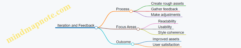
Focus on Function Over Form
Non-artists often find success by prioritizing how assets serve gameplay rather than artistic perfection. Clear communication of game mechanics through visuals matters more than detailed art.
Example: In a strategy game, icons clearly indicated unit types and statuses using simple shapes and colors, which helped players make quick decisions.
Mind Map: Function Over Form
Summary
Non-artist game developers succeed by working smart with limitations, reusing assets, focusing on clarity, leveraging software tools, maintaining consistency, iterating based on feedback, and emphasizing function. These lessons show that drawing skills are not a barrier to creating effective game art when approached thoughtfully.
14.5 Summary of Best Practices Illustrated Through Examples
This section wraps up key practices from throughout the book, using clear examples and mind maps to organize ideas. The goal is to provide a quick reference that highlights how simple, practical approaches can produce effective game art without drawing skills.
Mind Map: Core Principles for Non-Artist Game Art
Example 1: Designing a Simple Game Icon Using Shapes
Instead of drawing a detailed sword, start with a rectangle for the blade and a smaller rectangle for the handle. Add a triangle at the tip for the point. Use a limited color palette: gray for the blade, brown for the handle. This approach uses basic shapes to create a recognizable icon without sketching skills.
Mind Map: Asset Creation Workflow for Non-Artists
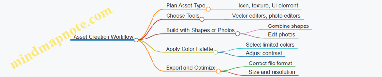
Example 2: Making a Tileable Ground Texture from a Photo
Select a simple photo of grass or dirt. Use photo editing software to crop a square section. Apply the offset filter to check seams. Clone or heal any visible edges to make the texture tile seamlessly. This method avoids drawing by transforming real-world images into game-ready textures.
Mind Map: Animation Techniques for Non-Artists
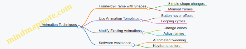
Example 3: Animating a Button Hover Effect
Create a circular button using a vector tool. Duplicate the shape and slightly increase its size and brightness for the hover state. Use simple fade or scale animations between these states. This requires no drawing, just manipulating shapes and colors.
Mind Map: UI Design Essentials for Non-Artists
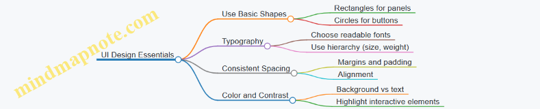
Example 4: Designing a Simple Inventory Screen UI
Arrange rectangular panels for item slots. Use a consistent grid layout. Label slots with clear, readable fonts. Highlight selected items with a contrasting border color. This setup avoids drawing by relying on shape arrangement and typography.
Summary Points
- Start with simple shapes and combine them rather than attempting to draw complex forms.
- Use limited and consistent color palettes to maintain visual coherence.
- Modify existing assets or photos instead of creating from scratch.
- Focus on clear silhouettes and readable typography to improve recognition.
- Employ software tools that automate or simplify tasks like animation and texture creation.
- Organize assets and UI elements with grids and modular layouts for consistency.
- Export assets in appropriate formats and optimize size for game performance.
These practices, illustrated through concrete examples, show that creating effective game art is achievable without traditional drawing skills. The key is to work smart, use available resources, and keep designs simple and clear.
Chapter 15: Resources and Next Steps
15.1 Recommended Free and Paid Tools for Non-Artists
When you’re not an artist but want to create game art, choosing the right tools can make a big difference. This section lists free and paid software options tailored for non-artists, focusing on ease of use, features, and suitability for creating simple visual assets.
Recommended Tools for Non-Artists
Raster Graphics Editors
Free Options
- Krita: Although often used by artists, Krita has a user-friendly interface and supports working with layers, shapes, and basic brushes. It also includes vector tools, which can help create clean shapes without drawing freehand.
- GIMP: A classic free image editor. It’s a bit less intuitive but powerful for photo editing and compositing, which is useful if you want to work with textures or modify photos for your game.
Paid Options
- Affinity Photo: A one-time purchase alternative to Photoshop. It offers robust photo editing and design tools with a simpler interface than some professional software.
Vector Graphics Editors
Free Options
- Inkscape: A solid free vector editor. It lets you build assets from basic shapes and combine them. It’s great for creating icons, UI elements, and simple characters without drawing.
Paid Options
- Affinity Designer: Paid but affordable vector tool with a clean interface. It supports both vector and raster work, making it versatile for non-artists.
Pixel Art Tools
Free Options
- Piskel: A browser-based pixel art editor with a simple interface. It supports animation and layering, perfect for beginners.
- Aseprite (trial version): While the full version is paid, the trial lets you explore pixel art basics.
Paid Options
- Aseprite: A popular pixel art tool with animation support, onion skinning, and palette management.
Photo and Texture Editing
- Photoscape X (Free & Paid versions): Easy for quick photo edits and creating textures.
- Canva (Free & Paid): While not a traditional game art tool, Canva’s drag-and-drop interface and templates can help create UI elements and simple graphics.
Animation Tools
- DragonBones (Free): A 2D skeletal animation tool that lets you animate simple shapes and imported assets without frame-by-frame drawing.
- Spine (Paid): More advanced skeletal animation software with a user-friendly interface.
Asset Assembly and Scene Building
- Tiled (Free): A map editor that lets you arrange tilesets to build game levels without drawing.
- Construct 3 (Paid): A game engine with built-in tools for creating and animating assets.
Mind Map: Tool Categories and Examples
Examples of Use
Example 1: Creating a Simple Icon Using Inkscape
Start by opening Inkscape and using the shape tools (rectangles, circles, polygons) to build a basic icon. Combine shapes by grouping and use the fill and stroke options to add color and outlines. This approach avoids freehand drawing but still results in a clean, professional-looking asset.
Example 2: Making a Tileable Texture with GIMP
Import a photo of a surface (like concrete or wood). Use the offset filter to shift the image and clone stamp or heal tool to fix seams. Export as a tileable texture for game backgrounds or floors.
Example 3: Animating a Button Hover Effect in DragonBones
Import your button asset (created in Inkscape or another editor). Use DragonBones to create a simple scale or color change animation triggered on hover. This adds polish without needing frame-by-frame drawing.
Choosing the right tool depends on your project needs and comfort level. Starting with free options lets you experiment without commitment. As you grow more confident, paid tools can offer additional features and smoother workflows. Remember, the goal is to create clear, functional assets without needing advanced drawing skills.
15.2 Online Communities and Tutorials for Support
When you’re creating game art without traditional drawing skills, having a supportive community and clear tutorials can make a big difference. Online communities offer a place to ask questions, share your work, and learn from others who are on a similar path. Tutorials provide step-by-step guidance, often breaking down complex tasks into manageable chunks. Here’s a practical overview of how to navigate these resources effectively.
Understanding Online Communities
Online communities for game art and asset creation vary in size, focus, and style. Some are forums, others are chat groups or social media pages. What they share is a collective knowledge base and a willingness to help newcomers.
- Forums and Discussion Boards: These are structured spaces where you can post questions and browse previous discussions. They often have categories for different tools, styles, or game engines.
- Chat Groups (Discord, Slack): Real-time conversations happen here. They’re great for quick feedback or casual advice.
- Social Media Groups: Platforms like Facebook or Reddit host groups focused on game art. These are useful for inspiration and community challenges.
How to Get the Most from Communities
- Be Specific in Your Questions: Instead of “How do I make game art?”, try “How can I create a simple tileable texture using photos?” Specific questions get better answers.
- Share Your Progress: Posting your work, even if it’s rough, invites constructive feedback.
- Respect Community Guidelines: Each group has its own rules. Following them keeps the space welcoming.
Tutorials: What to Look For
Good tutorials for non-artists focus on practical steps and use accessible tools. They often include screenshots or videos showing exactly what to do.
- Step-by-Step Instructions: Clear, numbered steps help you follow along without getting lost.
- Examples Included: Tutorials that show finished examples alongside the process help you understand the goal.
- Tool-Specific Guides: Since many non-artists use particular software, tutorials tailored to those tools are more useful.
Mind Map: Navigating Online Communities and Tutorials
Example: Using a Discord Community
Imagine you want to create a simple animated button for your game UI but aren’t sure how to start. You join a Discord server focused on beginner game art. You post a question describing your goal and the software you’re using. Within minutes, someone shares a tutorial link and offers to review your first attempt. You upload your work, get feedback on timing and color choices, and improve your animation. This interaction saves you hours of trial and error.
Example: Following a Tutorial for Texture Creation
You find a tutorial that explains how to create tileable textures from photos using free software. The tutorial breaks down the process into these steps:
- Selecting a suitable photo with repeating patterns.
- Cropping and adjusting the image.
- Using software tools to remove seams.
- Testing the texture in a simple game engine.
Each step includes screenshots and tips, such as how to avoid visible edges. By following it, you create a texture that fits your game environment without needing to draw anything.
Summary
Online communities and tutorials are essential tools for non-artists working on game art. Communities provide feedback, motivation, and shared knowledge. Tutorials offer structured learning tailored to your needs. Approaching both with clear questions and a willingness to share your work will help you progress steadily. Use the mind map above as a guide to find and engage with these resources effectively.
15.3 Continuing Skill Development Without Drawing
Continuing skill development without drawing involves expanding your understanding of visual design, mastering software tools, and practicing creative problem-solving. You don’t need to sketch to improve your game art skills; instead, focus on areas that complement your strengths and build your visual vocabulary.
Mind Map: Paths to Skill Development Without Drawing
Visual Design Principles
Understanding design basics helps you make better decisions about your assets. For example, knowing how color affects mood or how shapes communicate meaning can guide your choices when assembling or modifying assets.
Example: When creating a button, you might use contrasting colors to make it stand out and rounded rectangles to suggest friendliness. This doesn’t require drawing but improves the asset’s effectiveness.
Software Proficiency
Learning to use tools like vector editors (e.g., Inkscape), photo editors (e.g., GIMP), or animation programs (e.g., Spine or simple GIF makers) lets you create and tweak assets efficiently.
Example: Using vector shapes, you can build a character by combining circles, rectangles, and triangles, adjusting colors and layering without drawing freehand.
Creative Problem Solving
Often, you’ll need to adapt existing assets or combine multiple elements to create something new. This skill involves thinking about how parts fit together and how to modify them to suit your game’s style.
Example: Taking a free icon and changing its color scheme or overlaying simple shapes can produce a unique-looking item without original drawing.
Practice and Feedback
Regular practice helps internalize design principles and software skills. Sharing your work with others and seeking feedback sharpens your eye and helps identify areas for improvement.
Example: After designing a UI panel, ask peers to test its readability and usability. Use their input to adjust spacing, colors, or fonts.
Mind Map: Practice Strategies
Examples of Practice Exercises
- Recreate a Simple Icon: Use vector shapes to replicate a common game icon, focusing on shape arrangement and color.
- Modify a Texture: Take a photo-based texture and adjust its colors or patterns to fit a new environment.
- Build a UI Element: Combine shapes and typography to make a menu button, experimenting with different layouts.
Summary
Continuing skill development without drawing is about deepening your understanding of design, mastering accessible tools, and practicing thoughtful asset creation and adaptation. By focusing on these areas, you can steadily improve your game art capabilities without needing to pick up a pencil.
15.4 How to Collaborate with Artists When Needed
Collaborating with artists can be a practical way to enhance your game’s visual quality without needing to master drawing yourself. The key is to communicate clearly and understand how to work together efficiently. Here’s a structured approach to make collaboration smooth and productive.
Understanding Roles and Expectations
Before starting, clarify what you need from the artist and what they expect from you. This prevents misunderstandings and keeps the project on track.
- Define the scope: What assets do you need? Characters, backgrounds, UI elements?
- Set deadlines and milestones.
- Agree on the style and level of detail.
Communication Essentials
Clear communication is the backbone of collaboration. Use simple language and visual references whenever possible.
- Share mood boards or example images to illustrate your vision.
- Provide written descriptions that are specific but concise.
- Ask questions to confirm understanding.
Mind Map: Collaboration Workflow
Providing Useful Feedback
Feedback should be actionable and focused on the work, not the artist. Avoid vague comments like “make it better.” Instead, say what exactly needs adjustment.
- Point out specific areas (e.g., “The character’s colors feel too dark for the game’s mood.”)
- Suggest alternatives (e.g., “Could we try a lighter blue for the background?”)
- Balance positives and negatives to keep morale.
Example: Requesting a Character Redesign
Instead of: “I don’t like this character.”
Try: “The character looks a bit too serious for our casual game. Could you make the expression friendlier and use brighter colors?”
Managing File Formats and Versions
Agree on file formats early to avoid technical issues. Common formats include PNG for sprites and PSD or SVG for editable files.
- Use version numbers or dates in file names (e.g., character_v2.png).
- Keep a shared folder organized by asset type.
Mind Map: File Management
Respecting the Artist’s Expertise
Artists bring skills you might not have. Trust their judgment on technical and stylistic matters but don’t hesitate to ask for explanations if something isn’t clear.
Example: Discussing Style Choices
You might say, “I’m not sure why this shading style works better. Could you explain how it improves readability?” This opens dialogue and helps you learn.
Handling Revisions
Revisions are normal. Keep track of requested changes and avoid piling too many at once.
- Prioritize fixes.
- Be clear about which changes are essential.
- Acknowledge when the artist has addressed your points.
Mind Map: Revision Process
Final Integration and Testing
Once assets are delivered, test them in your game environment. Sometimes an asset looks good alone but needs tweaks in context.
- Check for size, color, and alignment issues.
- Communicate any final adjustments promptly.
Summary
Collaborating with artists is about clear communication, mutual respect, and organized workflows. By setting expectations, providing precise feedback, and managing files properly, you can get the visual assets you need without drawing skills. This teamwork lets you focus on your strengths while benefiting from professional art.
15.5 Final Practical Exercise: Creating a Complete Simple Game Asset Pack
This exercise guides you through assembling a basic but functional game asset pack using the techniques covered in this book. The goal is to create a consistent set of visual elements that can be used in a simple 2D game. You will work with shapes, colors, textures, typography, and simple animations—all without drawing skills.
Step 1: Define Your Asset Pack Scope
Before creating assets, decide what your game needs. For this exercise, let’s build assets for a simple top-down adventure game. The pack will include:
- Player character
- Enemy character
- Environment tiles (ground, water, obstacles)
- Collectible item
- UI elements (button, health bar)
Mind Map: Asset Pack Scope
Step 2: Create the Player Character Using Basic Shapes
Use vector or shape tools to build the player. For example, combine a circle for the head, a rectangle for the body, and smaller rectangles for arms and legs. Keep the palette limited to two or three colors for clarity.
Example:
- Head: Circle, light blue
- Body: Rounded rectangle, dark blue
- Arms/Legs: Thin rectangles, dark blue
This approach avoids drawing and uses simple shapes to suggest a humanoid figure.
Step 3: Design the Enemy Character with Contrast
Create an enemy using different shapes and colors to distinguish it from the player. For instance, use a triangle for the head and a square for the body, with red and black colors to signal danger.
Example:
- Head: Triangle, red
- Body: Square, black
- Eyes: Small white circles
This simple design communicates the enemy role clearly.
Step 4: Build Environment Tiles
Use photo textures or create tileable patterns from simple shapes.
- Ground Tile: Use a green square with a subtle noise texture overlay to simulate grass.
- Water Tile: Blue square with wavy lines created from curved shapes.
- Obstacle Tile: Gray rounded rectangle with a rock-like texture created by layering circles and irregular shapes.
Ensure tiles are the same size (e.g., 64x64 pixels) for easy tiling.
Step 5: Create a Collectible Item Icon
Design a simple coin or gem using circles or polygons with bright colors.
Example:
- Coin: Yellow circle with a smaller orange circle inside to suggest depth.
- Gem: Diamond shape using two triangles, colored purple and pink.
Keep it simple and recognizable at small sizes.
Step 6: Design UI Elements
- Button: Rounded rectangle with a gradient fill from light gray to dark gray. Add a simple label using a clear font.
- Health Bar: A horizontal rectangle with a red fill indicating health level. Use a darker border for contrast.
These elements should be clean and functional.
Step 7: Add Simple Animations
Create subtle animations to bring assets to life without drawing frames.
- Player: Slight up-and-down movement by shifting the entire shape group.
- Collectible: Slow rotation using vector tools.
- Button: Color change on hover simulated by swapping fills.
Use software features like keyframe animation or tweening to keep it simple.
Step 8: Organize and Export Assets
Name files clearly (e.g., player_idle.png, enemy_idle.png, tile_grass.png). Export assets in appropriate formats (PNG for transparency, SVG for vectors).
Group related assets in folders:
- Characters
- Environment
- UI
Summary Mind Map
Mind Map: Complete Asset Pack Workflow
This exercise demonstrates how to combine simple design principles and accessible tools to produce a usable game asset pack without drawing skills. Each asset relies on shapes, colors, and textures rather than freehand art, making the process approachable and repeatable.