The Emotional Commerce Economy
1. Emotional Value as the Core Unit of Commerce
1.1 Defining Emotional Value and How It Differs From Functional Value
Emotional value is what a purchase does for a person’s inner experience: how safe, capable, seen, connected, or regulated they feel after the transaction. Functional value is what the product does in the world: performance, reliability, speed, durability, and measurable utility. People often talk as if these are the same thing, but customers usually decide based on the emotional job first, then justify it with functional reasons.
A simple way to separate them is to ask two questions about the same moment:
- Functional question: “What outcome do I get?”
- Emotional question: “What feeling or risk does that outcome remove or create?”
Emotional Value as an Outcome, Not a Slogan
Emotional value shows up in three places: before purchase (confidence and reduced anxiety), during use (ease and reassurance), and after purchase (pride, belonging, or relief). For example, a meal kit can be “fast to cook” (functional) and also “a break from decision fatigue” (emotional). The emotional part is not a decoration; it’s the reason the person chooses that option over a cheaper or more feature-rich alternative.
Functional Value as a Set of Capabilities
Functional value is constrained by physics and process. If a vacuum is weak, no amount of friendly copy fixes the suction. Functional value is still important, but it’s not sufficient for loyalty. Many products meet the baseline; emotional value is what differentiates the experience when the baseline is already good.
The Difference in Decision Logic
Customers rarely say, “I bought this because it improved my self-efficacy.” They say things like “This makes me feel like I’ve got it handled,” or “I don’t have to think about it.” Those statements are emotional value translated into everyday language.
Here’s the core distinction:
- Functional value answers whether the product works.
- Emotional value answers whether the customer feels okay using it and okay being the kind of person who uses it.
Mind Map: Emotional Value vs Functional Value
Concrete Examples That Keep the Two Separate
Example 1: A skincare cleanser
- Functional value: removes oil without stripping; gentle on skin.
- Emotional value: reduces worry about irritation; makes the customer feel “I’m taking care of myself” even on low-energy days.
Example 2: A budgeting app
- Functional value: categorizes transactions; shows balances.
- Emotional value: lowers the stress of not knowing where money went; creates a sense of control and competence.
Example 3: A coworking space
- Functional value: desks, Wi‑Fi, meeting rooms.
- Emotional value: signals professionalism and belonging; reduces the awkwardness of being “the new person.”
In each case, functional value can be measured. Emotional value is measured by what customers report and what they do: do they hesitate less, return more often, recommend it, or ask fewer questions?
A Practical Test: The “If This Were True” Method
Take any product claim and run it through two versions:
- “If this were true, I would get X.” (functional)
- “If this were true, I would feel Y.” (emotional)
If you can’t name Y, you may be describing features without the reason people care. If you can name Y but it doesn’t connect to X, you may be describing feelings without the mechanism that produces them.
How Teams Use the Distinction Without Getting Stuck
When teams align on emotional value, they stop treating customer experience as a vague “brand thing.” They translate emotional goals into concrete design and service choices:
- Comfort becomes fewer steps, clearer instructions, and predictable outcomes.
- Identity becomes language and visuals that match how customers describe themselves.
- Belonging becomes community cues and consistent norms.
- Mood relief becomes timing, pacing, and friction removal.
Functional value remains the foundation. Emotional value is the reason the foundation matters to a specific person at a specific moment.
1.2 Mapping the Emotional Jobs Consumers Hire Products to Do
Mapping Emotional Jobs Consumers Hire Products To Do
Consumers rarely buy “a product.” They hire it to handle a specific emotional job in a specific situation. An emotional job is the feeling they want to reach, the feeling they want to avoid, and the social or personal meaning they want the purchase to carry. Functional needs matter, but they are usually the supporting cast.
Start with a simple rule: if a customer could describe the purchase without mentioning features, you’re looking at an emotional job. For example, “I need something that makes mornings easier” points to comfort and reduced friction, not to a particular wattage or material.
The Emotional Job Framework
An emotional job has three parts that work together:
- Target feeling: the state the customer wants. Examples include calm, confidence, relief, pride, or feeling “taken care of.”
- Threat being managed: what the customer fears will happen without the product. Examples include embarrassment, wasted time, feeling judged, or losing control.
- Meaning and proof: what the purchase signals to the customer and others. Examples include “I’m competent,” “I belong here,” or “I can handle this.”
When you map these parts, you can explain why two products with similar features can sell to different people. The difference is often the threat being managed and the meaning being signaled.
From Situations to Jobs
Emotional jobs are triggered by situations. A situation is a moment with constraints: time pressure, uncertainty, social visibility, or emotional strain. The same person can hire different emotional jobs on different days.
Consider a customer buying a skincare product. On a stressful workday, the job might be “reduce irritation and feel presentable.” On a weekend event, the job might be “look consistent and feel confident in photos.” The product category stays the same; the emotional job changes.
Mind Map: Emotional Jobs
Examples That Show the Mapping
Example: Comfort job in a meal kit
- Situation: “I’m tired after work and I don’t want to think.”
- Target feeling: relief and low mental load.
- Threat being managed: decision fatigue and the risk of a disappointing dinner.
- Meaning and proof: “I can still take care of myself.”
- Product as tool: clear steps, predictable results, and minimal cleanup.
Example: Identity job in a wardrobe update
- Situation: “I want to dress like I mean it, not like I’m borrowing someone else’s style.”
- Target feeling: pride and self-consistency.
- Threat being managed: feeling out of place or looking inconsistent.
- Meaning and proof: “This fits my story.”
- Product as tool: sizing confidence, styling guidance, and materials that match the customer’s self-image.
Example: Belonging job in a fitness class
- Situation: “I’m new and I’m worried I’ll be the awkward one.”
- Target feeling: acceptance and psychological safety.
- Threat being managed: embarrassment and social exclusion.
- Meaning and proof: “People like me are here.”
- Product as tool: welcoming onboarding, visible norms, and community cues.
Example: Mood relief job in a subscription service
- Situation: “I need a reset after a rough week.”
- Target feeling: calm and a sense of control.
- Threat being managed: spiraling thoughts and feeling stuck.
- Meaning and proof: “I’m taking care of my mood.”
- Product as tool: predictable delivery, gentle pacing, and messages that acknowledge stress without overpromising.
Turning Jobs into Clear Statements
To map emotional jobs for real customers, convert raw observations into structured job statements:
- “When [situation] happens, I want [target feeling] because I’m worried about [threat], and I need [meaning/proof].”
If your statement still reads like a feature list, you’re not done. Keep rewriting until it sounds like something a customer would say in plain language.
Common Failure Points
- Mixing jobs: customers may want comfort and identity in one purchase, but you should still separate the primary job from the secondary one.
- Ignoring proof: reassurance often comes from signals like reviews, guarantees, or visible process, not from claims.
- Forgetting the situation: the same product can fail when the customer’s emotional job changes.
A good emotional job map makes your next decisions easier: it tells you what to emphasize, what to reduce, and what to make reliably true for the customer in that moment.
1.3 Comfort Identity Belonging and Mood Relief as Distinct Motivators
Consumers often say they want “a product,” but they usually mean they want a feeling to stabilize their day. Comfort, identity, belonging, and mood relief are related, yet they are not interchangeable. Each one has a different trigger, a different promise, and a different way to measure whether the purchase actually helped.
Comfort as Predictable Ease
Comfort is the motivation to reduce friction and uncertainty. It shows up when people feel time pressure, overwhelm, or low energy. A comfort purchase answers: “Will this make the next step easier and less annoying?”
Best-practice example: A meal kit that includes pre-measured ingredients and a “two-minute start” video. The emotional promise is not “tastes great,” it is “you won’t get stuck.” If customers mention “I didn’t have to think,” that’s comfort working.
Operational detail: Comfort improves when the experience removes decision points. If a checkout page asks for five choices before the user can see the total, you’ve added cognitive load, not comfort.
Identity as Self-Consistency
Identity is the motivation to express who someone is and to stay consistent with their self-story. It shows up when people care about how they look, sound, or behave in front of others—or in front of themselves.
Best-practice example: A skincare brand that offers a simple routine labeled by skin goals (“calm,” “balance,” “clear”) rather than by ingredient jargon. The emotional promise is “this fits the person I’m trying to be.” Customers who say “this matches my routine” are buying identity alignment.
Operational detail: Identity needs coherence across touchpoints. If the product packaging says “minimal,” but the website is cluttered and the emails are loud, the mismatch creates doubt.
Belonging as Social Safety
Belonging is the motivation to feel accepted and to reduce the risk of being judged. It shows up when people want to participate without standing out for the wrong reasons.
Best-practice example: A fitness studio that offers a “first class plan” with clear expectations, instructor introductions, and a quiet option for newcomers. The emotional promise is “you’ll know what to do, and people won’t treat you like an outsider.”
Operational detail: Belonging is strengthened by predictable social cues. If reviews are full of “everyone is friendly,” but the front desk scripts are awkward or the class schedule is confusing, the promise breaks.
Mood Relief as Feeling Regulation
Mood relief is the motivation to change how someone feels right now. It shows up when people want to calm down, feel in control, or reduce irritation. Unlike comfort, which often reduces effort, mood relief targets emotional state.
Best-practice example: A stress-reduction app that offers short sessions labeled by outcome (“calm,” “focus,” “sleep”) and uses gentle language during setup. The emotional promise is “this helps me settle.”
Operational detail: Mood relief depends on timing and pacing. If the onboarding asks for a long questionnaire before any relief is offered, the user’s mood is still the same when they need help.
How the Four Motivators Interact Without Blending
People rarely buy for only one reason. The key is to identify the primary driver and support the others without diluting the message.
- Comfort
- Trigger: overwhelm, low energy, uncertainty
- Promise: fewer steps, less thinking
- Signals: “easy,” “no hassle,” “didn’t get stuck”
- Design levers: reduce choices, clear instructions, fast start
- Identity
- Trigger: self-expression, consistency, social presentation
- Promise: “this fits who I am”
- Signals: “matches my style,” “my routine,” “how I want to be seen”
- Design levers: coherent tone, consistent visuals, goal-based naming
- Belonging
- Trigger: fear of judgment, desire for acceptance
- Promise: “you’re welcome and understood”
- Signals: “friendly,” “welcoming,” “they explained everything”
- Design levers: onboarding expectations, community cues, supportive scripts
- Mood Relief
- Trigger: stress, irritation, restlessness
- Promise: “I feel better now”
- Signals: “calmed down,” “helped me focus,” “slept easier”
- Design levers: short sessions, gentle pacing, outcome-based guidance
- Integration Rule
- Choose one primary driver per moment
- Support secondary drivers with evidence, not extra claims
- Measure with language tied to the primary driver
Example: One Offer, Four Correct Interpretations
Consider a “starter bundle” for a new hobby class.
- Comfort interpretation: “Everything you need to begin in one box.” The first win is setup speed.
- Identity interpretation: “A kit that looks and feels like your style.” The first win is self-consistency.
- Belonging interpretation: “A guided first session with a friendly introduction.” The first win is social safety.
- Mood relief interpretation: “A short pre-class routine that helps you feel ready.” The first win is emotional regulation.
If you try to claim all four as the main benefit, customers may like the bundle but still hesitate, because the “first win” becomes unclear.
Practical Diagnostic Questions
Use these questions to keep the motivator distinct:
- What is the customer trying to reduce: effort, doubt, judgment, or emotional discomfort?
- What is the earliest moment of relief or confidence they should feel after purchase?
- Which customer words show up most in reviews or support tickets: easy, me, welcome, or calm?
When you can answer those three, you can write messaging and design experiences that match the real reason people buy.
1.4 Translating Emotional Value into Clear Customer Outcomes
Emotional value is real only when it changes what the customer can do next. The goal of this section is to convert “comfort, identity, belonging, and mood relief” into outcomes customers can recognize in their day-to-day experience. A useful test is simple: if you removed your product name and kept only the outcome, would the customer still understand why it matters?
Start with the Emotional Job, Not the Feature
Begin by writing the emotional job as a sentence the customer would say. For example: “I want to feel settled after a long day” is an emotional job. The next step is to list the functional behaviors that make that feeling more likely: faster setup, fewer decisions, predictable results, and easy recovery when something goes wrong. This prevents a common mismatch where teams describe emotions but measure only clicks.
Example: A meal kit brand might think it sells “fresh ingredients.” Customers may actually hire it to reduce decision fatigue and create a calm routine. The emotional job becomes: reduce mental load and restore a sense of control.
Convert Emotional Jobs into Outcome Statements
Use outcome statements that include three parts: what changes, for whom, and under what conditions.
- What changes: the customer’s state or experience (calm, confidence, social ease).
- For whom: a specific customer type (new parent, first-time buyer, returning customer).
- Under what conditions: the trigger moment (after work, during onboarding, when comparing options).
Example outcome statements:
- “After work, a busy customer can start dinner within 10 minutes without re-checking instructions.”
- “A first-time buyer feels confident choosing the right size because the fit guidance matches their body type.”
Map Outcomes to Observable Proof
Emotions are internal, so you need external signals that indicate the emotion is landing. Proof can be behavioral, operational, or social.
- Behavioral proof: fewer steps to completion, higher repeat usage, lower abandonment.
- Operational proof: faster time-to-first-value, fewer support contacts for the same issue.
- Social proof: reviews that mention relief, confidence, or feeling “like me,” not only product specs.
Example: If your identity promise is “I look like I belong in this space,” proof might include customer photos, style-match guidance, and reduced returns due to fit and expectation alignment.
Build a Measurement Ladder from Outcomes to Metrics
A measurement ladder keeps teams from jumping straight to revenue. Start at the outcome, then define leading indicators, then define metrics.
Comfort ladder example:
- Outcome: “Customers feel settled during setup.”
- Leading indicators: fewer help requests, fewer retries, higher completion rate.
- Metrics: time-to-first-step, onboarding completion, support ticket rate for setup.
Belonging ladder example:
- Outcome: “Customers feel socially safe to participate.”
- Leading indicators: more community posts from new members, higher response rates, lower churn after first interaction.
- Metrics: participation rate, first-week retention, moderation outcomes.
Use Constraints to Keep Outcomes Honest
Outcomes should be constrained by what you can actually deliver. Write a “boundary line” for each emotional promise: what it does not cover.
Example: “Mood relief” can mean reducing friction and stress, not treating medical conditions. A boundary line prevents teams from writing claims that customers interpret as promises you cannot keep.
Mind Map: The Translation System
Emotional Value to Customer Outcomes Mind Map
Integrated Example from Start to Finish
Imagine a subscription service that customers describe as “stressful to manage.” The team identifies the emotional job as comfort through predictability. They translate it into outcomes: “Customers can pause, skip, or change delivery without re-learning the process each month.” They then choose proof signals: fewer account-related support tickets, higher self-serve success, and reviews mentioning “easy to manage.” Finally, they set metrics: time to complete a change, percentage of changes done without support, and retention after the first attempted modification.
This approach keeps the emotional promise grounded. You are not chasing feelings directly; you are designing the conditions that make the feeling more likely, then verifying it with observable outcomes.
2. The Psychology Behind Comfort Purchases
2.1 Comfort as a Response to Uncertainty Stress and Cognitive Load
Comfort buying often starts before a person can explain it. When the world feels unpredictable, the brain spends extra effort simply to keep track of what might happen next. That extra effort is cognitive load, and it competes with everything else: planning, remembering, comparing options, and making decisions. Comfort products and services reduce that load by making the next step feel safer, simpler, and more controllable.
The Foundational Mechanism
Uncertainty triggers a “monitoring” mode. People scan for signals that confirm safety and predictability. If those signals are missing, they compensate by thinking harder, checking more, and hesitating longer. That’s why the same purchase can feel easy in one context and exhausting in another.
Comfort works as a counterweight in three ways:
- It lowers decision effort. Clear defaults, familiar formats, and predictable routines reduce the number of choices the customer must actively manage.
- It reduces perceived risk. Guarantees, easy returns, and consistent quality act like guardrails, so the customer doesn’t have to mentally rehearse worst cases.
- It restores a sense of control. When the product or service fits the customer’s routine, they can stop “planning” and start “doing.”
Stress and the Body’s Shortcut to “Make It Stop”
Stress narrows attention. Under stress, people prioritize immediate relief over long-term optimization. That doesn’t mean they’re irrational; it means their mental bandwidth is being used for threat management. Comfort purchases therefore tend to emphasize immediate soothing cues: warmth, softness, quiet, reduced friction, and fewer steps.
A practical example: someone who had a chaotic day may choose a meal kit with straightforward instructions and minimal prep rather than a more “interesting” recipe. The interesting recipe might be better on paper, but it requires more sequencing, more timing, and more tolerance for mistakes.
Cognitive Load and the Cost of “Too Many Steps”
Cognitive load increases when tasks require memory, coordination, or repeated evaluation. Comfort reduces load by compressing steps and externalizing thinking.
Consider three ways a brand can accidentally increase load:
- Ambiguous instructions. If users must interpret what to do next, they spend mental effort that they don’t want to spend.
- Hidden constraints. If the fine print changes how the product works, customers must mentally simulate exceptions.
- Choice overload. If every option requires a separate comparison, the customer’s decision system gets crowded.
Comfort design counters these with visible next actions, consistent terminology, and fewer branching paths.
Mind Map: Comfort Under Uncertainty
Examples That Show the Mechanism in Action
Example: A grocery delivery order. A customer under time pressure picks a “ready to eat” option with a short list of steps. The comfort isn’t the food alone; it’s the reduced mental work of planning, portioning, and timing.
Example: A skincare routine. When a person feels uncertain about irritation, they choose a smaller routine with fewer products and clear usage frequency. The comfort comes from fewer variables and a predictable cadence.
Example: A customer support flow. A help page that asks users to describe the issue in detail increases cognitive load. A comfort-oriented flow asks a single question first—“What are you trying to do today?”—and then routes to the next step.
Best Practices That Translate into Clear Customer Outcomes
- Use defaults that match the most common “safe” choice. If customers are unsure, they want a starting point that won’t punish them.
- Make the next action obvious. Reduce the number of screens or steps between “I have a problem” and “I know what to do.”
- State constraints plainly. If something won’t work in certain conditions, say so early to prevent mental rework.
- Offer recovery paths. Easy returns and straightforward troubleshooting reduce the need for customers to mentally hedge.
- Write instructions as sequences, not essays. Short steps with clear order reduce working memory demands.
A Simple Diagnostic for Comfort Opportunities
When customers complain about “confusing” or “too much work,” treat it as a cognitive load signal. When they hesitate because they “don’t know if it will work,” treat it as uncertainty. Then ask: what can we remove, simplify, or make predictable so the customer can stop monitoring and start moving?
2.2 Sensory Cues and Rituals That Reduce Perceived Effort
Perceived effort is the mental cost of “getting to done.” Even when the task is objectively small, people hesitate if the path feels uncertain, physically demanding, or socially awkward. Sensory cues and rituals reduce that cost by making the next step obvious and the experience feel safe and repeatable.
Foundational Principle: Make the Next Step Feel Obvious
Start with a simple rule: if customers can’t predict what happens next, their brain spends effort on guessing. Sensory cues reduce guessing by signaling timing, location, and action.
Example: A meal kit box that includes color-coded ingredient bags and a printed “Step 1” card on top reduces searching. The cue isn’t the card alone; it’s the immediate visual order that tells the customer the process is already handled.
Sensory Cues That Lower Friction
Sensory cues work best when they map to a specific job: find, start, continue, and finish.
-
Visual hierarchy for orientation
- Use consistent placement for key elements: primary action button, “what to do next,” and progress indicators.
- Keep the first screen from asking for decisions. Let it confirm the chosen path.
Example: A checkout page that shows “Delivery today” or “Delivery tomorrow” near the top reduces the effort of re-checking assumptions.
-
Tactile and physical cues for momentum
- In packaging and devices, design for “one-handed progress.” Handles, tabs, and guided openings prevent micro-frustrations.
Example: A detergent bottle with a flip-top that clicks into place signals readiness. Customers don’t have to test whether it’s open.
-
Auditory cues for confirmation
- Use subtle sounds to confirm actions: a click for a completed step, a tone for successful pairing.
- Avoid sounds that require interpretation.
Example: A smart speaker that plays a short confirmation tone after a command reduces the effort of wondering if it heard correctly.
-
Olfactory and temperature cues for comfort
- Use scent or warmth sparingly and only when it supports the emotional job. The goal is to make the environment feel “already set up.”
Example: A hotel lobby that offers a consistent, mild scent and a warm welcome drink makes arriving feel less like starting from zero.
Rituals That Convert Effort into Familiarity
Rituals are repeatable sequences that tell customers, “I can do this again.” They reduce effort by lowering cognitive load and making outcomes feel reliable.
A strong ritual has three parts: entry, sequence, and closure.
- Entry: a small, low-stakes start that confirms you’re in the right place.
- Sequence: a guided path with minimal branching.
- Closure: a clear finish that signals completion and next actions.
Example: A subscription coffee service can create a ritual by including a “brew in 3 steps” card, a pre-measured filter pack, and a post-brew message that tells customers how to store grounds. The customer isn’t just buying coffee; they’re buying a repeatable routine.
Mind Map: Sensory Cues and Rituals
Practical Integration: Build a Cue-Ritual Pair
Sensory cues work best when they reinforce the ritual sequence. Treat them like a choreography: cue tells you where you are, ritual tells you what to do.
Example: A home fitness app can pair cues and rituals by:
- Visual cue: a large “Start workout” tile on the home screen.
- Entry ritual: a 10-second warm-up prompt that begins immediately.
- Sequence ritual: one instruction at a time with a timer that advances automatically.
- Auditory cue: a short tone when a set ends.
- Closure ritual: a “cool down completed” screen with a single next choice.
This reduces effort because the user doesn’t have to manage transitions, interpret states, or search for the next instruction.
Measurement Without Guessing
To verify that cues and rituals reduce effort, look for signals that customers are spending less time deciding and recovering.
- Fewer backtracks: reduced returns to previous steps.
- Faster completion: shorter time from start to first meaningful outcome.
- Lower support friction: fewer “I can’t find…” or “Did it work?” messages.
- Higher confidence language: more “it worked” and fewer “I wasn’t sure.”
Example: If a product tutorial currently leads to many “Where do I click?” tickets, the fix is often not better instructions but clearer cues: move the primary action, add a visible progress indicator, and ensure the first step is physically or visually guided.
When you combine sensory cues that clarify the present with rituals that standardize the sequence, customers experience the process as manageable. The result is less mental work and fewer small failures that drain attention.
2.3 Safety Signals in Packaging Pricing and Service Design
Safety signals are the small, concrete cues that reduce perceived risk before a customer commits. In emotional commerce, “safe” rarely means sterile. It means predictable: the product will arrive as expected, the price won’t surprise people later, and help will be available if something goes wrong.
What Safety Signals Do
Safety signals reduce three kinds of uncertainty. First is outcome uncertainty: “Will this work for me?” Second is cost uncertainty: “Will I pay more than I think?” Third is process uncertainty: “Will I be able to fix it if it doesn’t?” Packaging, pricing, and service design each target one or more of these uncertainties.
A practical rule: every safety cue should answer a specific question a customer is likely asking at that moment. If the cue doesn’t map to a question, it becomes decoration.
Packaging Safety Signals
Packaging communicates safety through clarity, protection, and frictionless verification.
Clarity means the customer can tell what they’re getting without guessing. Include visible product identifiers, straightforward usage cues, and honest condition statements. For example, if an item is “pre-washed,” say so. If it’s “for indoor use,” don’t bury that in a tiny insert.
Protection means the product arrives intact. Use packaging that matches the product’s failure modes. If a bottle leaks, a simple seal plus secondary containment beats a thicker box. If a device is sensitive to static, add appropriate safeguards.
Verification means the customer can confirm the purchase is correct. A packing slip that lists what’s inside, plus a quick “how to check” line, prevents the common support spiral: “I opened it and it’s not what I ordered.”
Example
A skincare brand ships a set with a clear outer label showing the exact bundle name, a checklist on the packing slip, and a tamper-evident seal. If a customer receives the wrong item, the checklist makes it easy to report the mismatch with fewer back-and-forth questions.
Pricing Safety Signals
Pricing safety signals reduce cost uncertainty by preventing hidden fees and by making tradeoffs legible.
Make the total cost obvious. Show shipping and taxes at checkout when possible, or at least provide a clear estimate before the final step. Customers interpret delays in cost disclosure as risk.
Avoid “gotcha” pricing structures. If a subscription requires a commitment, state it plainly. If there are restocking fees, disclose them up front. The goal is not to be generous; it’s to be predictable.
Use pricing that matches the emotional job. When customers buy comfort, they often want “one-and-done.” A bundle that includes the most common add-ons can reduce decision fatigue. When customers buy identity, they may accept a premium if the value is clear and consistent across sizes or variants.
Example
An online retailer sells a home cleaning kit. The product page lists what’s included, the checkout shows shipping cost before payment, and the returns policy is summarized in one sentence near the price. Customers feel safer because the financial rules are visible.
Service Design Safety Signals
Service safety signals reduce process uncertainty by making help easy to access and easy to use.
Reduce steps. A support flow that asks for only the necessary information prevents customers from feeling blamed or stalled. If the customer needs an order number, request it once.
Use recovery paths. When something goes wrong, offer a small set of clear options: replacement, refund, or repair. Each option should include what happens next and the expected timeline.
Set expectations in plain language. “We respond within one business day” is more useful than “we aim to help quickly.” If timelines vary, explain what affects them.
Example
A consumer electronics seller includes a QR code on the packing slip that opens a “start here” page. The page offers three paths based on the issue type, and each path includes what the customer will need to provide. The customer doesn’t have to guess how to describe the problem.
Mind Map: Safety Signals Across Touchpoints
Putting It Together Without Contradictions
Safety signals work best when they agree across touchpoints. If packaging promises “sealed for freshness,” pricing and service should support that promise with clear return handling for seal issues. If pricing is transparent, service should not require extra steps to resolve a billing mistake.
A quick audit method: pick one common failure scenario, such as “wrong item received” or “damaged on arrival.” Then trace what the customer sees in packaging, what the customer pays, and what the customer can do next. If any step forces the customer to guess, that’s where the risk signal leaks.
2.4 Practical Examples of Comfort Led Product and Service Bundles
Comfort bundles work when they reduce small frictions that customers feel in the moment: uncertainty, effort, and the fear of doing it wrong. The goal is not to add more stuff; it is to package the right sequence of help so the customer can move from “I’m not sure” to “I’m done and it feels fine.”
Comfort Bundle Example 1: Home Coffee That Doesn’t Require a Personality
A common comfort job is “make mornings predictable.” A bundle can combine product plus service so the customer avoids the learning curve.
Bundle components
- Starter machine with a simple interface and clear maintenance prompts.
- Pre-measured pods or curated grounds for the first two weeks.
- Setup service delivered as a short remote session: water calibration, first brew, and cleaning routine.
- Care kit with a single-page checklist and a reminder cadence.
How it delivers comfort
- The customer doesn’t have to research grind sizes or machine settings on day one.
- The setup session turns “What if I break it?” into “I’ve done it once correctly.”
- The care kit prevents the slow slide into “It tastes off, so I guess I’m doing something wrong.”
Best practice Write the bundle as a sequence: Day 1 brew, Week 1 taste adjustment, Week 2 maintenance. Customers feel comfort when the next step is obvious.
Comfort Bundle Example 2: Meal Kits with a Built-In Exit Ramp
Another comfort job is “feed people without turning dinner into a project.” A bundle should include a path for when energy is low.
Bundle components
- Meal kit with ingredients portioned to reduce measuring.
- Two difficulty lanes inside the same box: one “standard” recipe and one “low-effort” alternative.
- Substitution rules printed on the card so swaps are safe and still taste right.
- Cleanup promise: recipes designed around fewer dishes, plus a short “clean as you go” card.
How it delivers comfort
- The low-effort lane gives permission to choose less work without feeling like they failed.
- Substitution rules reduce anxiety when an ingredient is missing or a preference changes.
- Cleanup design addresses the end-of-day dread that often kills repeat purchases.
Best practice Include a “rescue option” in the bundle instructions, such as a quick alternative sauce or a simplified cooking method, so the customer can recover mid-cook.
Comfort Bundle Example 3: Skincare Routine That Doesn’t Punish Mistakes
Comfort also shows up as “reduce the risk of irritation and regret.” A bundle can treat uncertainty as part of the product.
Bundle components
- Gentle cleanser and moisturizer as the foundation.
- One targeted treatment sized for a short trial period.
- Patch-test guidance with a clear schedule.
- Service check-in: a short form after the first week and a support reply that recommends either continue, adjust frequency, or pause.
How it delivers comfort
- The trial period limits the cost of being wrong.
- The patch-test schedule turns “I hope this is safe” into a measurable process.
- The check-in prevents customers from guessing when something feels off.
Best practice Use decision rules in support responses. For example: if redness lasts more than a specified number of days, pause and switch to foundation-only. Customers trust clarity.
Mind Map: Comfort Led Product and Service Bundle Design
Putting It Together a Simple Bundle Blueprint
Use this structure to design your own comfort bundles without overcomplicating them.
- Name the comfort job in one sentence the customer would say.
- Identify the first friction that blocks action (setup, learning, cleanup, risk).
- Choose one service layer that removes that friction (setup call, check-in, substitution rules, rescue steps).
- Sequence the experience so the next step is always clear.
- Add a small recovery mechanism for when the customer deviates from the plan.
A comfort bundle is successful when customers can explain it in plain language: “They helped me start, and they helped me when I got stuck.”
2.5 Measuring Comfort Through Customer Language and Behavior
Comfort is measurable when you treat it like a behavior system, not a vibe. Customers show comfort in what they say, what they do, and what they avoid. The trick is to measure signals that are close to the moment of choice, not only outcomes like revenue.
Comfort Signals in Customer Language
Start with the words customers use when they describe relief, ease, and safety. Comfort language often includes:
- Low-effort phrasing: “easy,” “simple,” “doesn’t take long,” “I can figure it out.”
- Reduced anxiety phrasing: “no surprises,” “clear,” “I trust it,” “I know what to expect.”
- Sensory and routine phrasing: “cozy,” “warm,” “calm,” “settles me,” “feels like my usual.”
- Recovery phrasing: “fixed,” “helped,” “made it right,” “got me back on track.”
To measure this, build a small dictionary of comfort terms and then expand it using real customer text. Don’t stop at synonyms; look for patterns in how terms are used. For example, “clear” can mean clarity of instructions (comfort) or clarity of pricing (comfort). Both matter, but they point to different fixes.
Comfort Signals in Customer Behavior
Language is useful, but behavior is harder to fake. Comfort shows up in:
- Friction avoidance: fewer clicks to purchase, fewer abandoned steps, fewer support contacts per order.
- Preference for familiar paths: repeat purchases, returning to the same product page, using saved addresses or prior payment methods.
- Tolerance for guidance: customers who follow setup prompts, watch short how-to videos, or complete onboarding steps.
- Recovery behavior: customers who resolve issues quickly through self-serve, or who accept replacements instead of escalating.
A practical approach is to define “comfort moments” in your journey. For an e-commerce checkout, comfort moments include: understanding shipping timing, completing payment without confusion, and knowing what happens after purchase.
Mind Map: Comfort Measurement System
A Systematic Measurement Workflow
- Collect raw comfort language from reviews, support transcripts, and survey comments. Keep it unedited so you can see the exact phrasing.
- Code a small sample manually into comfort themes (for example: clarity, ease, safety, recovery). Use two coders if possible; disagreements reveal where your definitions are fuzzy.
- Quantify with guardrails. If you use keyword matching, treat it as a first pass. Confirm with theme coding so you don’t count “easy” in a context that actually means “cheap.”
- Map themes to journey stages. “No surprises” belongs near shipping and pricing. “Cozy” belongs near product experience and post-purchase usage.
- Connect themes to behavior metrics. If customers mention “clear instructions” and you see higher onboarding completion, you have a coherent signal. If language improves but behavior doesn’t, the issue may be elsewhere.
Example: Comfort Measurement for Checkout
Imagine a store where customers complain about uncertainty at checkout. You might see language like “I don’t know when it ships” and “the total changed.” Behavior might show higher abandonment on the shipping step and more pre-purchase questions in chat.
A targeted fix could be to show delivery windows earlier and keep the total stable after shipping selection. After the change, you’d expect:
- More “no surprises” language in reviews and support.
- Lower abandonment at the shipping step.
- Fewer “when will it arrive” tickets.
Example: Comfort Measurement for Onboarding
For a subscription product, comfort often comes from setup that feels safe and repeatable. Customers may say “it was straightforward” or “I didn’t have to figure it out.” Behavior might show higher completion of setup steps and fewer early cancellations.
If you introduce a guided setup flow, measure whether customers who complete it use comfort language in later support interactions. The goal is not just completion; it’s reduced confusion afterward.
Mind Map: Turning Signals into Actions
What to Report Internally
Report comfort measurement as a small set of stage-based indicators: one language theme score, one friction metric, and one recovery metric. Keep it tight so teams can act. If you can’t explain why a metric changed in plain language, it’s not yet a comfort measure—it’s just a number with a costume.
3. Identity Purchases and the Need to Be Seen
3.1 Identity Work and Self Narrative in Everyday Buying
Identity work is the quiet process of deciding who you are, who you are not, and what kind of person you want to be today. Everyday buying is one of the most practical places this happens. You rarely purchase only a thing; you purchase a story that fits your self narrative—often without noticing you’re doing it.
Start with a simple distinction: a self narrative is the ongoing explanation you give yourself about your preferences, standards, and role in the world. Identity work is the effort you spend to keep that narrative consistent when life changes. Shopping creates friction because it introduces options that could shift your narrative. The result is that many purchases are really “identity maintenance” in a new outfit.
The Building Blocks of Self Narrative
A self narrative usually has three parts. First is a “type,” such as practical, creative, health-conscious, or low-drama. Second is a “boundary,” such as “I don’t buy things that feel flimsy” or “I don’t want to manage complicated routines.” Third is a “proof,” the evidence you rely on—past purchases, habits, or other people’s recognition.
When you buy, you test whether an option supports your type, respects your boundary, and provides proof. If it does, the purchase feels easy. If it doesn’t, you may still buy, but you’ll feel a lingering sense of mismatch.
How Buying Becomes Identity Maintenance
Consider a person who sees themselves as “someone who plans ahead.” They might choose a calendar app, meal planning tools, or a grocery delivery slot. The functional benefit is convenience, but the identity benefit is consistency: the purchase signals that planning is part of who they are.
Now consider the same person on a week when planning fails. They might buy takeout. The identity work doesn’t stop; it changes. They may choose a brand that feels “responsible” or “clean,” or they may buy a small item that restores order, like a salad kit. The purchase is not about food alone; it’s about re-aligning the narrative after a deviation.
The Decision Signals That Reveal Identity Work
Identity-driven choices often show up in specific signals:
- Language choices: You gravitate toward product descriptions that match your self story. “Simple routine” lands better than “advanced formula.”
- Risk tolerance: If your boundary is strong, you’ll pay more to avoid regret. “No surprises” becomes a purchase criterion.
- Ownership rituals: You care about how the item fits into your routine—setup, storage, and maintenance. Rituals are proof.
- Audience awareness: You consider who might notice. Even private purchases can be identity-facing if you expect to talk about them later.
These signals help explain why two people can evaluate the same feature set and reach different conclusions.
Mind Map: Identity Work in Everyday Buying
Example: Identity Work in a Grocery Run
A shopper who identifies as “organized” buys a pantry organizer, then labels containers. The organizer is the functional item, but the labeling is the identity proof. Later, when they buy snacks, they choose ones that fit the system—portion sizes, resealable packaging, and clear expiration dates. The purchase criteria are identity criteria.
If they skip labeling one day, they may feel minor discomfort and compensate by buying a better labeling kit or a different storage system. The “repair purchase” is a narrative fix, not a random impulse.
Example: Identity Work in a Wardrobe Choice
Someone who sees themselves as “professional but not stiff” avoids clothes that look overly formal. They might choose a blazer with softer fabric, neutral colors, and comfortable tailoring. The identity work is in the boundary: they want to look competent without signaling distance. Even if the blazer is expensive, the price can be justified as “worth it for the right fit to my story.”
When they later buy shoes, they choose styles that match the same boundary. The shoe purchase is evaluated for how it completes the narrative, not just for comfort.
Practical Takeaways for Interpreting Identity Work
When you observe customer behavior, look for narrative consistency across time. If the same person buys multiple items that share a theme—simplicity, cleanliness, competence, calm—that theme is likely their type. If they repeatedly avoid certain categories, that avoidance is often a boundary. If they choose items that make their routine visible to themselves, that’s proof.
Identity work is not a mystery. It’s a set of repeatable checks: does this option fit my type, respect my boundaries, and give me evidence that I’m still the person I think I am?
3.2 Status Taste and Competence as Identity Dimensions
Status, taste, and competence are three identity dimensions that often travel together. People use them to answer different questions: “Do I belong here?” (status), “Does this fit me?” (taste), and “Can I handle this?” (competence). In emotional commerce, the product is rarely the whole story; it’s the evidence the customer can carry.
Status as Social Position
Status is the perceived rank of a person in a group. It can be explicit (premium pricing, exclusive access) or implicit (how quickly support responds, how polished the experience feels). The key is that status signals reduce social uncertainty. If someone can predict how they’ll be treated, they spend with less anxiety.
A practical example: a coworking space that offers quiet rooms, fast Wi‑Fi, and a simple “member welcome” desk script. The customer isn’t buying furniture; they’re buying the expectation that they won’t feel out of place. Best practice is to make status signals legible without requiring the customer to decode them. Clear signage, consistent service standards, and predictable check-in do that.
Taste as Personal Fit
Taste is the sense that something matches one’s aesthetic and values. It’s not only visual style; it includes tone, materials, and even how instructions are written. Taste reduces the risk of choosing something that will feel embarrassing later.
Example: a skincare brand that offers two “skin routines” with different textures and language. One is straightforward and minimal; the other is more sensory and descriptive. Customers who care about taste can pick the routine that matches their self-image, not just their skin type. Best practice is to offer taste options that are meaningfully different in experience, not just in color.
Competence as Capability Proof
Competence is the belief that a person can manage a task successfully. In buying, competence shows up as clarity, reliability, and the feeling that the product won’t require heroics. Customers often interpret competence signals through details: setup time, error-proofing, documentation quality, and the way issues are handled.
Example: a home coffee machine with a guided first brew, clear water measurements, and a “what to do if it tastes off” troubleshooting flow. The customer isn’t just buying coffee; they’re buying the confidence that they can produce a good result without wasting ingredients. Best practice is to design competence signals into the process, not only the marketing copy.
How the Three Dimensions Interlock
Status, taste, and competence form a triangle. If one corner is weak, customers compensate by doubting the others.
- Weak status, strong competence: “I can do this, but will people respect it?”
- Strong status, weak taste: “This looks right, but it doesn’t feel like me.”
- Strong taste, weak competence: “It fits my style, but will it work without hassle?”
Integrated design means each dimension gets at least one concrete proof point. For instance, a premium kitchen tool set can signal status through craftsmanship, taste through cohesive design language, and competence through intuitive controls and reliable maintenance.
Mind Map: Identity Dimensions in Buying
Example: One Offer, Three Identity Proofs
Consider a subscription meal kit.
- Status proof: delivery packaging that looks organized and consistent, plus a predictable schedule that signals “this is handled.”
- Taste proof: recipe cards that match different cooking styles, such as “quick and minimal” versus “spice-forward and exploratory,” with ingredient choices that reflect those styles.
- Competence proof: a first-week “starter plan” with clear prep steps, substitutions that actually work, and a support flow that resolves mistakes quickly.
The customer experiences the offer as “I’m the kind of person who can manage this,” “this fits how I like to live,” and “I won’t feel awkward doing it.” That’s the identity job, delivered through practical details.
Practical Checklist for Teams
- Status: Can a new customer tell what kind of place this is within the first interaction?
- Taste: Are the options different in lived experience, not just in appearance?
- Competence: Does the customer know what to do next, especially on the first attempt?
- Integration: Do you have at least one concrete proof point for each dimension in the same journey?
When these questions are answered with specifics, identity stops being a vague promise and becomes a measurable experience.
3.3 Consistency Across Channels From Ads to Unboxing
Consistency across channels means the customer receives the same emotional promise at every step, even though the format changes. Ads are fast and incomplete; unboxing is slow and detailed. The job is to make those two realities agree, so the customer doesn’t feel tricked, confused, or “sold to” at the last minute.
The Foundational Rule of Emotional Continuity
Start with one sentence that states the identity promise in plain language. For example: “You’re the kind of person who keeps things neat and ready.” Then translate that sentence into three layers:
- Tone: how it sounds (confident, calm, practical).
- Proof: what evidence it uses (materials, reviews, demonstrations).
- Experience: what the customer actually does (setup steps, packaging cues, support flow).
If any layer changes without explanation, the customer’s self-story wobbles. They may still buy, but the identity purchase becomes less satisfying.
Channel Map: What Each Touchpoint Must Carry
Different channels have different constraints, so consistency is about carrying the same meaning, not the same copy.
- Ads carry the identity cue and the “why you” feeling. Keep the claim narrow.
- Landing pages carry the proof and the exact experience outline. They should answer “What will I notice first?”
- Email and retargeting carry continuity and reduce friction. They should remind the customer of the promise while guiding the next step.
- Checkout carries reassurance and clarity. It should confirm what’s included and what happens next.
- Unboxing carries the final confirmation through visuals, instructions, and small interactions.
A practical test: if you remove the product name from each channel, could a customer still identify the identity promise and the first concrete experience they’ll get?
Mind Map: Emotional Consistency System
Example: A Neat-and-Ready Identity Purchase
Imagine a subscription kit for desk organization. The identity promise is: “You’re the kind of person who keeps things ready.”
- Ad: shows a tidy desk corner and says the kit helps you “reset in five minutes.”
- Landing page: includes a short demo video and lists what arrives: trays, labels, and a quick-start card.
- Email after purchase: repeats the five-minute reset and tells the customer to start with the label sheet.
- Checkout: clearly states the kit includes labels and the reset timer card.
- Unboxing: the first item is the label sheet, with a card that visually matches the email’s “start here” instruction.
Notice what stays consistent: the customer’s identity (“neat and ready”) and the first concrete action (“start with the label sheet”). What changes is the format, not the meaning.
Advanced Details That Prevent Identity Drift
- Match the “first notice”: Ads often show the final result; unboxing must show the first step that leads there. If the ad highlights a feature that isn’t immediately visible, the customer may feel the product is different.
- Use the same vocabulary for the same objects: If the landing page calls it a “quick-start card,” the unboxing insert should use that phrase. Customers don’t need poetic language; they need stable labels.
- Keep proof consistent with packaging reality: If reviews emphasize durability, the packaging should include a durability cue (material sample, clear construction notes, or a simple test instruction). Don’t rely on reviews alone to do the emotional work.
- Align support language with the promise: If the brand promise is “no stress setup,” the instructions should be short, and customer support should mirror that tone in the first response.
A Simple Consistency Checklist
- One identity promise sentence exists and is used across channels.
- Each channel answers a different question, but all answers point to the same experience.
- The first unboxing step matches the first step implied by the ad and email.
- Included items match what checkout and landing pages say.
- Instructions use the same names and ordering as the pre-purchase materials.
Consistency isn’t about repeating the same message everywhere. It’s about making the customer’s self-story and the physical experience agree, from the first glance to the last insert in the box.
3.4 Designing for Self Expression Without Overpromising
Self expression is the reason people choose a style, a tone, or a ritual. Overpromising happens when the brand treats that expression as a guaranteed outcome instead of a personal process. The goal is simple: make it easy for customers to project themselves, while being precise about what you actually do.
Start with What You Can Control
Customers can control their identity; you control the inputs you provide. Begin by listing what your product or service reliably changes: appearance, usability, comfort, time saved, or the quality of a moment. Then list what you cannot control: how someone feels after using it, how others interpret it, or whether it solves every social situation.
Example: A skincare brand can control texture and scent, but it cannot control confidence. If the packaging says “look instantly confident,” you’re promising an internal state you can’t measure. A safer promise is “designed to feel gentle and easy to apply,” which supports self expression without claiming emotional results.
Translate Identity into Behaviors, Not Outcomes
Identity is expressed through actions: choosing, pairing, customizing, posting, gifting, and repeating. Design for those behaviors by making the “how” visible.
A practical method is to write two lines for each claim:
- What the customer does: “Select a finish, mix a color, adjust the fit.”
- What the system provides: “You get three finish options, a shade guide, and a sizing tool.”
If you can’t write the “customer does” line, the claim is probably too outcome-heavy.
Build Customization with Guardrails
Customization invites creativity, but guardrails prevent disappointment. Guardrails are not restrictions for their own sake; they are clarity mechanisms.
Use three guardrails:
- Range guardrail: show the full set of options and what each one looks like.
- Compatibility guardrail: explain what works together (and what doesn’t).
- Effort guardrail: state the time and steps required.
Example: A shoe brand offers color swaps. If customers can’t see how the swap affects the overall look, they’ll feel misled. A better approach is a “before and after” gallery plus a short checklist: “Swap takes 10 minutes; requires the included tool; best results on clean soles.”
Use Language That Describes Experience, Not Guaranteed Identity
Self expression is personal, so your language should be descriptive and conditional.
Prefer:
- “Designed to match your style preferences.”
- “Choose a look that fits your day.”
- “Helps you create a consistent routine.”
Avoid:
- “Be the person you want to be.”
- “Instantly signals your status.”
- “Guaranteed to make people notice you.”
Example: A watch retailer can say “two strap textures for different moods,” but it should not say “people will treat you with respect.” The first is about product choice; the second is about other people’s behavior.
Make Proof Specific and Local
Proof should be about what customers can verify. “Trust us” is vague; “here’s what you’ll see” is concrete.
Use proof types that map to self expression:
- Visual proof: photos in consistent lighting, multiple skin tones, multiple body types.
- Process proof: short videos showing customization steps.
- Context proof: examples of use cases (“office day,” “weekend casual,” “gift-ready”).
Example: A bag brand shows three styling examples using the same bag with different outfits. It also states the exact strap length range and how it changes the carry position. Customers can judge fit and style without being told what they should feel.
Mind Map: Self Expression Design Without Overpromising
A Simple Claim Review Workflow
Before launch, run each identity-related claim through a three-step check:
- Action mapping: What does the customer do that expresses identity?
- Capability mapping: What does your product or service provide to support that action?
- Boundary mapping: What can’t you guarantee, and how do you phrase the boundary?
Example: Claim: “Your home will feel like you.”
- Action mapping: customer selects decor pieces.
- Capability mapping: you provide color palettes and installation instructions.
- Boundary mapping: rephrase to “designed to help you create a home look that matches your taste.”
When you design this way, self expression stays in the customer’s hands, and your promises stay inside your control. That’s not less creative—it’s more usable.
3.5 Practical Examples of Identity Led Merchandising and Copy
Identity-led merchandising treats the customer’s self-story as the product’s job. The goal is not to flatter; it’s to make the fit obvious so the buyer can act with less uncertainty. Below are practical examples that move from basics to more advanced execution.
Identity Led Merchandising Foundations
Start with three inputs: (1) the identity dimension you’re serving (competent, caring, adventurous, minimalist, etc.), (2) the “proof” you can show (materials, process, community, outcomes), and (3) the friction you remove (confusion, risk, social mismatch).
A simple rule for merchandising: every shelf, collection, or recommendation should answer “Who is this for?” in plain language, then back it up with a reason to believe.
Example: skincare for a “calm and consistent” identity
- Collection name: “For People Who Want Their Routine To Feel Settled”
- Product cards: show step count, texture notes, and how it fits morning vs night
- Proof block: include dermatologist-reviewed ingredient rationale and a short “what to expect” panel
- Copy micro-line: “If your skin gets reactive when routines change, this keeps the steps stable.”
This works because the buyer is buying a stable self-image: “I’m the kind of person who handles my health calmly.”
From Identity Claims to Proof
Identity claims fail when they’re vague. Replace “premium” or “for you” with observable signals.
Example: apparel for “craft and competence” identity
- Merchandising layout: “Build Your Workwear Set” with three roles—Organizer, Builder, Traveler
- Each role includes: fabric weight, care instructions, and a “why it holds up” note
- Copy on the category page: “Designed for repeated wear, not one-time outfits.”
The proof is doing the heavy lifting. The identity label is just the map.
Advanced Merchandising Patterns
Pattern 1: Role-based bundles Instead of bundling by product type, bundle by the customer’s role in their own story.
- Bundle title: “The Host Who Likes Everything Ready”
- Included items: prep tools, serving pieces, and a storage solution
- Copy: “You’ll spend less time searching and more time being present.”
Pattern 2: Identity laddering Offer a progression from “easy entry” to “full commitment.” This reduces the risk of choosing the wrong level of identity.
- Level 1: “Try the Look” starter set
- Level 2: “Make It Yours” customization add-ons
- Level 3: “Own the Routine” subscription or replenishment
Pattern 3: Social fit cues Identity is partly social. Use cues that help the buyer predict how they’ll be perceived.
- Product page section: “Where it fits” with scenarios like “office casual,” “weekend errands,” “gallery night”
- Visuals: show the same item in multiple contexts so the buyer can self-select the social environment
Copy That Matches Identity Without Overpromising
Identity copy should be specific about behavior and constraints, not just values.
Example: home organization for “low-stress control” identity
- Instead of: “Bring calm to your home.”
- Use: “Keep daily clutter from spreading. The system is designed for quick resets, not deep clean marathons.”
Add “constraint language” to reduce mismatch:
- “Works best if you prefer 5-minute routines.”
- “Designed for small spaces and shared drawers.”
These lines help the buyer self-check.
Mind Map: Identity Led Merchandising and Copy
Identity Led Merchandising and Copy Mind Map
Putting It Together with One Integrated Example
Example: coffee subscription for “steady, thoughtful routine” identity
- Landing page sections: “For People Who Like Their Mornings Predictable” and “For People Who Want Small Choices Without Overthinking”
- Merchandising: three subscription tiers aligned to routine intensity
- “Daily Steady” (one profile)
- “Weekday Choice” (two profiles)
- “Curious Consistency” (rotations with notes)
- Copy on each tier: include brew method fit, roast profile explanation, and a “what you’ll taste” expectation
- Proof: show sourcing region and tasting notes written in customer-friendly language
- Risk reduction: “If you only have a drip machine, start with Daily Steady.”
The buyer doesn’t just learn what the coffee is. They learn how it supports the kind of person they’re trying to be—then they can choose without guessing.
4. Belonging Purchases and the Social Proof Loop
4.1 Belonging as a Social Need and a Risk Reduction Strategy
Belonging is not just a nice-to-have feeling; it’s a practical way people reduce uncertainty. When you’re part of a group, you can borrow the group’s expectations: what’s normal, what’s safe, and what to do next. In commerce, that means customers often choose brands, communities, and services that make them feel “I won’t be judged for this” and “I won’t be stuck figuring it out alone.”
The Social Need Behind Buying
Humans use social signals to decide whether an environment is worth their attention. A product can be technically good, but if it signals “people like you don’t use this,” the purchase feels risky. Belonging shows up in three common ways.
First, customers look for recognition. They want to feel seen through language, visuals, and customer support that matches their lived context. For example, a skincare brand that uses only clinical jargon may fit a lab, but it can alienate someone who wants plain explanations and reassurance.
Second, customers seek predictability. Belonging reduces the mental effort of learning. A clothing brand that offers clear sizing guidance, fit photos from multiple body types, and easy exchange steps helps customers feel they won’t waste money.
Third, customers want permission. They want to believe their preferences won’t be criticized. A fitness studio that welcomes beginners with nonjudgmental class descriptions reduces the fear of being “the only one who doesn’t know what they’re doing.”
Risk Reduction Through Belonging
Belonging works as a risk reduction strategy because it lowers three specific risks.
Performance risk: “Will this actually work for me?” Social proof and peer experiences help customers infer fit. If reviews consistently mention similar skin tones, budgets, or skill levels, the customer can estimate outcomes more confidently.
Social risk: “Will I look foolish or be treated poorly?” Community norms, moderation, and respectful customer service reduce the fear of embarrassment. A brand with a clear code of conduct in its community forum signals that questions won’t be punished.
Process risk: “Will I get stuck?” Onboarding, templates, and responsive support reduce the chance that the customer will fail silently. Belonging here is operational: the customer feels guided rather than abandoned.
Mind Map: Belonging Drivers and Commerce Signals
Integrated Practices with Easy Examples
Practice 1: Use “people like me” evidence, not generic praise. On a product page, include review snippets that mention relevant context: skin type, experience level, or use case. Example: a meal kit service highlights that a customer with limited cooking time found the steps manageable, not just that it “tasted great.”
Practice 2: Make norms visible before customers join. If you run a community, show what questions are welcome and how moderation works. Example: a forum banner states that beginner questions are encouraged and that posts are answered within a stated timeframe. The customer doesn’t have to guess whether they’ll be mocked.
Practice 3: Reduce process risk with guided first steps. After purchase, send a short onboarding sequence that mirrors how a helpful friend would explain the first session. Example: a language learning app emails a “Day 1 plan” with a 10-minute activity and a reminder that it’s okay to repeat the same lesson.
Practice 4: Align customer support scripts with the belonging promise. Support should confirm the customer’s identity and reduce shame. Example: when someone returns a shoe due to fit, the agent asks about foot width and recommends a specific size adjustment rather than treating the return as a failure.
Practice 5: Design policies that feel like care, not punishment. Clear exchange windows, simple steps, and fast confirmation reduce anxiety. Example: a subscription service includes a one-page “pause or skip” guide in the confirmation email so customers feel in control.
A Simple Example Journey
A customer considering a new hobby class worries about wasting money and looking inexperienced. The class’s landing page includes beginner outcomes (“what you can do after the first session”), instructor bios that mention teaching novices, and a short FAQ about equipment. After booking, the customer receives a checklist and a message that encourages questions before the first class. When the customer asks about gear, support replies with a friendly recommendation and an option to borrow items. The purchase becomes less about the class itself and more about the customer feeling safe to participate.
Belonging, in this sense, is a system: signals that recognition is real, expectations are clear, and help is available. When those signals are consistent across the journey, customers experience less risk and more confidence—without needing to be persuaded into anything.
4.2 Community Signals Reviews Referrals and Membership Cues
Community signals are the shortcuts people use to estimate risk and effort. When a buyer can’t fully verify quality, they borrow confidence from other people’s experiences. The trick is to make those signals specific, legible, and consistent with the emotional job the customer is hiring the brand to do—belonging, not just information.
Foundational Idea: Signals Answer Three Questions
- Is this for people like me? Membership cues and community norms reduce the “wrong crowd” fear.
- Will it work without hassle? Reviews and Q&A reduce uncertainty about setup, durability, and support.
- Can I trust the source? Referrals and verified participation reduce the suspicion that everything is staged.
A practical best practice is to map each signal to one question, then ensure the page or flow shows that answer quickly. If a review section also tries to educate from scratch, it stops being a shortcut.
Reviews That Do More Than Rate
Start with review structure. A star rating alone is a weak signal because it hides context. Better reviews include at least one of these: the buyer’s use case, the time since purchase, and what they expected versus what happened.
Example: A skincare brand shows reviews with fields like “Skin concern,” “Routine stage,” and “Time to see change.” A customer who is new to routines can filter to “routine stage: beginner,” which directly answers “Is this for people like me?”
Best practices that keep reviews credible:
- Show both strengths and friction. If every review is perfect, people assume selection bias.
- Highlight review recency. A product that changed in the last 60 days should have reviews from that period surfaced first.
- Use moderation rules that are visible. For instance, remove reviews that include personal attacks but keep those that mention shipping delays.
Referrals That Feel Like Social Proof, Not a Coupon
Referrals work when the referrer’s relationship to the buyer is clear. The signal is not “someone saved money,” it’s “someone I trust chose this.”
Example: A meal kit service offers “Invite a friend” with a message template that includes the referrer’s reason: “I liked that it’s quick on weeknights.” The friend sees the referrer’s stated reason before any discount.
Best practices:
- Let the referrer add one sentence. One line of context beats a generic referral.
- Reward the referrer after the friend’s first successful outcome. “First box delivered and recipe completed” is more meaningful than “friend signed up.”
- Avoid hiding the referral mechanism. If the buyer can’t tell why they’re receiving a message, trust drops.
Membership Cues That Reduce Identity Risk
Membership cues are the “who belongs here” signals. They can be explicit (membership tiers, community access) or implicit (tone of support, norms in forums, the kind of questions people ask).
A membership cue should answer: “If I join, will I feel out of place?”
Example: A fitness app community shows that beginners ask form questions and get patient replies. The onboarding screen includes a short “what to expect” list: “You’ll get feedback on technique, not just encouragement.” That’s a belonging cue because it sets expectations.
Best practices:
- Use onboarding to show norms. Pin a “how we help” post and link it in the first three touchpoints.
- Make participation easy. If joining requires complex steps, the cue becomes a barrier.
- Keep moderation consistent. Inconsistent enforcement makes the community cue feel performative.
Putting It Together in a Single Flow
When these signals appear together, they should reinforce each other rather than compete.
Example flow for a subscription purchase:
- Above the fold: “People like you” membership cue (e.g., beginner-friendly community badge).
- Mid-page: reviews filtered by the same use case as the cue.
- Near checkout: referral card showing the referrer’s reason and a short “what happens next” timeline.
This sequencing works because it answers the three questions in order: fit, reliability, trust.
Mind Map: Community Signals That Build Belonging
Example: One Page Audit Checklist
Use this checklist to verify the signals are doing their jobs:
- The first visible element answers “Is this for people like me?”
- Reviews include at least one contextual detail per review.
- The review section shows both positives and friction.
- Referrals show a reason from the referrer, not only a discount.
- Membership cues match the actual experience in support and community.
- The page sequence follows fit → reliability → trust.
When these conditions hold, community signals stop being decoration. They become a structured way to reduce uncertainty while reinforcing belonging.
4.3 How Brands Earn Trust Through Shared Values and Practices
Trust is rarely built by what a brand says once. It’s built by what it does repeatedly in ways customers can verify in daily life. Shared values matter because they explain why decisions are made; shared practices matter because they prove those values show up when it counts.
Start with Values That Can Be Observed
A value becomes useful when it predicts behavior. “Respect” is too vague unless it shows up as specific choices: clear pricing, plain-language policies, and timely responses. A practical way to test a value is to ask, “What would a customer notice if we were consistent for six months?” If the answer is only slogans, the value won’t guide decisions.
Example: A brand that claims “honesty” can operationalize it by showing shipping timelines at checkout, listing known limitations on product pages, and using the same wording in ads and support replies.
Translate Values into Practices with Guardrails
Practices are the repeatable actions that carry values across teams. To keep practices from drifting, define guardrails—rules that constrain behavior even when pressure hits.
Common guardrails include:
- Consistency rules: the same promise across website, packaging, and customer emails.
- Exception rules: what happens when inventory, timelines, or availability change.
- Escalation rules: when support can offer relief and when it must route to a manager.
Example: If a brand values “fairness,” a practice might be a standardized credit policy for delayed orders. The guardrail is that support agents can apply it without negotiating case-by-case, which prevents uneven outcomes.
Make Trust Visible at the Moment of Friction
Customers don’t evaluate trust only at purchase. They evaluate it when something goes wrong: a return, a missing item, a billing question, or a confusing instruction. Shared practices should reduce friction in those moments.
A simple trust practice is “explain the next step.” Instead of vague updates, provide a sequence: what happened, what you’re doing now, what the customer should do (if anything), and when to expect the next update.
Example: For a return, the brand can include a one-page checklist: label creation time, drop-off options, refund timing, and how to track status. The customer feels respected because the process is legible.
Use Language That Matches the Customer’s Reality
Values show up in wording. If a brand uses optimistic phrasing while policies are strict, customers feel misled. Trust grows when language is accurate and specific.
Practice: Replace “we’ll do our best” with measurable commitments where possible, and otherwise with clear boundaries. If a promise depends on carrier performance, say so plainly.
Example: In a shipping delay email, the brand can state the carrier’s estimated window and the brand’s action plan: proactive status checks, a replacement option if the delay exceeds a threshold, and a refund path if the window is missed.
Build Shared Practices into the Operating System
Trust is easier to maintain when it’s embedded in workflows.
- Design: ensure product pages, packaging, and instructions reflect the same reality.
- Support: create scripts that mirror policies and values.
- Measurement: track outcomes tied to trust, not just sales.
- Training: teach teams how to apply guardrails, including edge cases.
Example: If “clarity” is a value, the brand can standardize how it handles sizing questions: consistent measurement guidance, a response template that includes the same conversion logic, and a rule for when to recommend a different size.
Mind Map: Shared Values into Shared Practices
Example: A Values-to-Practices Chain in Action
Suppose a brand’s stated value is “respect for time.” A corresponding practice could be a two-part system:
- Before purchase: show delivery estimates and confirm them again after fulfillment.
- After purchase: send updates only when something changes, and include a direct action link (track order, reschedule delivery, or request a refund).
The trust outcome is not just fewer complaints. It’s fewer “Where is it?” messages because customers can see status without guessing.
Example: When Values and Practices Don’t Match
If a brand says “we stand behind our products” but requires customers to jump through multiple steps, upload documents repeatedly, or wait weeks for a decision, the practice contradicts the value. Even if the final outcome is favorable, the customer experiences the process as disrespect. Trust erodes because the customer can’t rely on the brand when it matters.
Practical Checklist for This Section
- Can each value be described as behavior a customer can observe?
- Do practices include guardrails for exceptions?
- Are the hardest moments designed for clarity and next steps?
- Does support language match policies and promises?
- Are workflows and training aligned so practices don’t depend on individual effort?
When values and practices line up, trust becomes less of a feeling and more of a pattern customers can count on.
4.4 Practical Examples of Belonging Led Experiences and Programs
Belonging programs work best when they reduce social risk and make participation feel normal. The goal is not to “market community,” but to create repeatable moments where people feel recognized, safe to contribute, and confident they won’t be judged for being new.
Foundational Belonging Mechanics
Start with three mechanics, then build examples on top of them.
- Identity-safe entry: New members can participate without performing competence. A simple example is a first-week activity that has clear steps and low stakes, like choosing preferences rather than posting a personal story.
- Visible reciprocity: People see that others contribute and that contributions are acknowledged. A practical example is a weekly “thank-you” routine that tags participants by role, not by popularity.
- Shared norms that are easy to follow: Norms should be short, concrete, and repeated. For instance, “Ask one question before giving advice” is easier to remember than “Be respectful.”
Mind Map: Belonging Program Design
Example 1: The “First Week Wins” Cohort
A cohort program for a new audience can be designed as a five-touch sequence over 10 days.
- Day 1: A short preference form that determines which discussion prompts they see. Example prompt: “What would make this week easier?”
- Day 3: A guided post template with three sentence starters. Example: “I’m new here, and I’m hoping for…”, “One thing I’ve tried is…”, “A question I have is…”.
- Day 5: A small-group round where members answer only one question. This prevents the “everyone talks at once” problem.
- Day 8: A recognition message that thanks them for a specific action, like “You asked a clear question on Tuesday.”
- Day 10: A choice between two next steps: join a weekly session or receive a curated digest.
Why it works: it turns belonging into a sequence of safe, repeatable actions. People don’t have to guess what “good participation” looks like.
Example 2: Role-Based Community Contributions
Some members want to belong without speaking. A role system makes participation feel fair.
- Roles: “Question asker,” “Resource sharer,” “Welcome buddy,” and “Summary writer.”
- Weekly routine: Each role has one task with a time limit. Example: “Welcome buddy replies to three new members with one question and one helpful link.”
- Recognition: The program highlights role completion, not follower counts.
Why it works: belonging becomes a set of contributions that match different comfort levels. The community stops rewarding only the loudest behavior.
Example 3: The Welcome Buddy with Guardrails
A welcome buddy program can fail if it becomes awkward or overly personal. Guardrails keep it useful.
- Buddy training: Buddies learn two response patterns: ask a clarifying question and offer one concrete next step.
- Message templates: Example first message: “Hi—what are you working on right now? If you want, I can point you to the prompt that matches your goal.”
- Time expectations: Buddies aim to respond within 48 hours, but the system also provides an “auto-acknowledge” message so no one feels ignored.
Why it works: it reduces uncertainty for newcomers and prevents buddies from improvising in ways that could feel intrusive.
Example 4: Belonging Through Shared Norms in a Live Session
A live session can create belonging when norms are practiced, not just posted.
- Opening ritual: The host repeats the norm: “Ask one question before offering advice.”
- Participation method: Use a “two-lane” approach: chat questions and spoken answers. People can choose their lane.
- Closing ritual: Each attendee leaves with one action they will try before the next session.
Why it works: people leave with evidence that they can participate without being put on the spot.
Example 5: Recovery from Missteps Without Social Punishment
Belonging includes how a community handles mistakes.
- Moderation rule: Corrective feedback focuses on the behavior, not the person.
- Recovery path: If someone posts something off-topic, the system offers a “reframe prompt” rather than a public reprimand.
- Example reframe prompt: “Try rewriting your post as a question about what you tried and what you want to learn next.”
Why it works: people stay because they believe the community can handle human errors without turning them into identity threats.
Practical Implementation Checklist
- Onboarding includes a low-stakes first action.
- Participation options exist for different comfort levels.
- Recognition is specific and tied to actions.
- Norms are short and practiced in real moments.
- Safety processes exist for conflict and missteps.
Mind Map: Belonging Program Touchpoints
4.5 Avoiding Manipulation by Using Authentic Community Proof
Community proof works when it reduces uncertainty. It fails when it tries to replace the customer’s judgment with yours. The difference is whether the proof is verifiable, specific, and earned through real participation.
Start with a simple rule: community proof should answer the question “Will this work for me?” not “Will I feel something right now?” Reviews, photos, and stories should be tied to observable context like use case, timeframe, and constraints. If a post says “This fixed my problem,” require enough detail that a reader can check whether their situation matches.
What Counts as Authentic Proof
Authentic proof has three traits.
- Attribution: the source is identifiable enough to be meaningful. A username is fine; “verified customer” is better when it’s backed by a real verification process.
- Context: the proof includes conditions. “Used for a week in a humid climate” is more useful than “Works great.”
- Specificity: the claim includes a measurable or concrete outcome. “Reduced breakage” beats “improved quality.”
A practical example: if you sell meal kits, a review that mentions dietary restrictions, cooking time, and what the customer actually cooked is authentic. A review that only says “So good!” is not.
How Manipulation Shows Up
Manipulation usually looks like one of these patterns.
- Selective sampling: only the most flattering posts are shown, with no indication of overall sentiment.
- Timing tricks: prompts appear right after a purchase or right after a customer hits an error, steering responses toward a particular mood.
- Incentivized reviews without transparency: discounts or gifts are offered, but the customer isn’t told.
- Engineered “community”: testimonials are written by staff or contractors and presented as peer experiences.
Even when the intent is good, these patterns erode trust because customers can sense when the evidence is curated to persuade rather than inform.
Mind Map: Authentic Community Proof System
Building Proof Without Steering
The best practice is to design collection and display so customers can reach their own conclusion.
1. Use neutral prompts. Instead of “How amazing was your experience?” ask “What did you use it for?” and “What was the biggest difference you noticed?” If you ask about the outcome first, you’ll get outcome stories; if you ask about the context first, you’ll get better self-matching.
2. Tag proof by scenario. When you show reviews, include tags like “first-time user,” “sensitive skin,” or “small apartment.” This lets a reader filter mentally. It also reduces the temptation to cherry-pick because the system can show a range within each scenario.
3. Show both strengths and tradeoffs. You don’t need to publish every negative review, but you should avoid hiding them in a way that makes the overall picture misleading. A simple approach is to display a balanced set from each scenario, then highlight the most helpful comments that explain tradeoffs.
4. Be transparent about incentives. If you offer a discount for participation, state it clearly in the review request and in the review display. Transparency is not a legal shield; it’s a trust signal.
Example: Review Display That Respects the Reader
Imagine an online skincare brand. A manipulated display might show only “5-star glow” posts and remove comments about irritation. An authentic display would:
- show reviews tagged by skin type and routine stage,
- include a short excerpt that mentions whether the customer experienced dryness or breakouts,
- link the review to the product variant used,
- and keep the full text accessible.
A customer with oily skin can then decide whether the “drying but effective” tradeoff matches their needs.
Example: Community Proof for Service Recovery
For a subscription service, community proof often includes “support stories.” Authentic recovery proof includes what went wrong, what the customer tried, what support did, and how long it took. Avoid posting only the happy ending. If you include the timeline, readers can judge whether your fix is fast enough for them.
Operational Checklist for Authenticity
- Collect context fields during submission.
- Moderate for accuracy and safety, not for positivity.
- Display proof with scenario tags and clear source attribution.
- Use neutral prompts and transparent incentive language.
- Audit for selective sampling by scenario, not just overall rating.
Authentic community proof is less about persuasion and more about making evidence usable. When customers can see themselves in the story, they stop needing you to sell the conclusion.
5. Mood Relief Purchases and the Regulation of Feelings
5.1 Mood Relief as a Short Term Outcome with Long Term Effects
Mood relief is what customers feel right after the purchase or service interaction: tension drops, uncertainty clears, and the next step feels manageable. The long term effects are what those short relief moments change over time: habits form, confidence accumulates, and the customer’s relationship with the brand becomes easier to maintain.
The Short Term Outcome
Start with the immediate emotional job. People buy mood relief when their current state makes normal decision-making harder. A customer might be overwhelmed by choices, irritated by friction, or simply tired of feeling “not quite right.” The product or service doesn’t need to be life-changing; it needs to reduce the emotional cost of the next hour.
Practical examples:
- A meal kit that arrives with clear steps and pre-portioned ingredients reduces the anxiety of “I’ll mess this up,” even before the first bite.
- A customer support chat that resolves the issue in one session reduces the dread of follow-ups and the mental load of tracking the problem.
- A skincare routine with simple instructions and consistent results reduces the frustration of trial-and-error.
Best practice: design for a fast emotional win. Identify the moment when the customer’s uncertainty peaks—often right before use, setup, or the first decision—and remove the biggest source of friction there.
The Long Term Effects
Short term relief becomes long term change through three mechanisms: learning, reinforcement, and identity alignment.
- Learning When the customer experiences relief repeatedly, they update their internal model: “This brand makes things easier.” That learning reduces future anxiety because the customer expects fewer surprises.
Example: If a budgeting app consistently imports transactions correctly and explains what it did in plain language, the customer stops fearing that “the numbers will be wrong.”
- Reinforcement Relief is memorable. When the brand reliably produces it, the customer’s brain tags the experience as safe and predictable. That predictability reduces decision fatigue.
Example: A subscription that sends reminders at the right time and makes rescheduling effortless turns a recurring chore into a routine.
- Identity Alignment Mood relief often supports a self-story: “I’m the kind of person who handles things.” When the experience matches that story, the customer feels competent, not just soothed.
Example: A fitness program that offers achievable plans and celebrates consistency (not extremes) helps the customer feel like they can keep going.
Best practice: connect the emotional win to a repeatable process. If relief depends on rare heroics, it won’t compound. If relief is built into the workflow—setup, guidance, recovery, and follow-through—it can.
A Systematic Way to Design the Transition
Use a simple chain: Trigger → Relief → Confidence → Habit.
- Trigger: what emotional pressure exists before the purchase?
- Relief: what changes immediately after the first interaction?
- Confidence: what evidence accumulates that the change will hold?
- Habit: what behavior becomes easier because confidence exists?
Example chain in a retail context:
- Trigger: “I’m not sure this will fit my needs.”
- Relief: a quick quiz plus a clear recommendation reduces the effort of comparing options.
- Confidence: the product page shows what to expect and how to adjust if it’s not right.
- Habit: the customer returns sooner because choosing feels routine.
Mind Map: Mood Relief with Compounding Effects
Example: Turning One Relief Moment into a Durable Pattern
Consider a home delivery service that customers choose when they’re busy and stressed. The first relief moment is accurate delivery and a simple “what happens next” message. To create long term effects, the service also reduces future anxiety: it provides easy rescheduling, explains substitutions clearly, and makes refunds straightforward when something goes wrong.
The key is that the customer doesn’t just feel better once; they learn that the brand handles the messy parts. That learning lowers the emotional cost of the next order, which is how mood relief becomes a stable advantage rather than a one-time perk.
5.2 Triggering Calm Excitement or Control Through Design Choices
Calm, excitement, and control are not moods you “add” to a page. They are outcomes you design for by shaping uncertainty, effort, and predictability. The same product can feel calming or chaotic depending on how the interface, packaging, and service steps handle three questions: What is happening? What happens next? What will it cost me in time, attention, or risk?
Foundational Design Levers
Start with the basics that reliably change perceived emotional temperature.
-
Reduce uncertainty with clear state changes When customers click, they want confirmation that the system is alive and progressing. A checkout button that changes label from “Continue” to “Placing order” within a second, plus a visible progress indicator, lowers anxiety. If the system is slow, show a realistic status message instead of leaving a blank spinner.
-
Reduce effort with sensible defaults Calm comes from fewer decisions. Default selections should match the most common intent. For example, a meal kit subscription can preselect a weekly plan size and dietary preference “none specified,” then offer a simple edit path. The customer still controls the outcome, but the interface does not force them to start from zero.
-
Increase control with reversible actions Control is easier to feel when mistakes are cheap. A cart that allows quantity changes without reloading the page, and a “save for later” option that does not punish exploration, turns browsing into a low-stakes activity.
-
Use pacing to manage attention Excitement often needs momentum, while calm needs breathing room. Break long forms into steps, but keep each step short. In an onboarding flow, show one question at a time and summarize what you already know. The customer experiences progress without cognitive overload.
Calm Design Patterns
Calm is typically built through predictability and gentle friction.
- Consistent layout and stable navigation: If the menu moves between pages, the customer spends mental energy re-orienting. Keep navigation placement consistent, and use the same terminology across screens.
- Readable hierarchy: Use fewer font sizes and a clear primary action. If every element looks equally important, the customer cannot decide where to start.
- Risk-reducing microcopy: Instead of “Submit,” use “Submit and receive confirmation email.” Instead of “Processing,” use “Confirming your payment.” These small statements reduce the unknown.
- Support availability cues: A calm experience signals help before the customer needs it. A visible “Chat with us” button on the checkout page, plus a short expected response time, prevents escalation.
Example: A skincare brand’s product page can feel calming by showing a simple routine card: “Cleanse → Treat → Moisturize,” with a “Why this step” tooltip. The customer is not guessing how to use the product, so the purchase feels safer.
Excitement Design Patterns
Excitement is not chaos; it’s positive energy from clarity and novelty.
- Progressive disclosure: Show the essentials first, then reveal details when the customer asks. A fitness app can display today’s workout summary immediately, with optional “view form tips” only if tapped.
- Meaningful feedback: When a customer selects a size or color, update the page with a realistic preview. The excitement comes from seeing the choice become real.
- Lightweight personalization: Use inputs that are easy to provide and easy to change. A coffee subscription can ask “How do you like it?” with three options, then allow switching in one tap later.
Example: An online bookstore can trigger excitement by highlighting “New in your favorite genres” based on past browsing, but still show the full catalog so the customer does not feel boxed in.
Control Design Patterns
Control is the feeling that the customer can steer outcomes.
- Transparent pricing and timing: Show totals early and explain shipping timing in plain language. If taxes or delivery fees appear late, customers feel tricked even when the math is correct.
- Editable commitments: Let customers change delivery dates, skip weeks, or adjust quantities without contacting support. Control reduces the need for reassurance.
- Clear boundaries: If a promotion has constraints, state them up front. “Free returns within 30 days” is better than burying the policy in a link.
Example: A subscription box can increase control by offering a “Choose your next box” step before billing. The customer sees the next charge date, reviews contents, and can swap items without starting over.
Mind Map: Design Choices That Shape Calm Excitement and Control
Practical Integration Checklist
Use this sequence when designing a flow: confirm the customer’s current state, show the next step, make the primary action obvious, ensure the customer can undo or edit, and then add reassurance only where it prevents a specific worry. If you do those five things, calm, excitement, and control tend to appear as side effects—because the customer’s attention has somewhere useful to go.
5.3 Timing and Context How Consumers Choose When to Buy
Consumers rarely decide to buy in a vacuum. They choose a moment when the purchase feels easiest to justify, least risky to execute, and most likely to deliver the emotional outcome they want. Timing is not just “when they’re ready”; it’s when their attention, mood, environment, and social signals line up.
The Foundational Timing Model
Start with three layers that interact:
- Attention timing: When the product is top-of-mind.
- Decision timing: When the perceived effort and risk drop below a personal threshold.
- Emotional timing: When the purchase can regulate feelings—comfort, identity reinforcement, belonging reassurance, or mood relief.
A customer might be interested for weeks but buy only after a specific trigger reduces uncertainty. For example, someone may browse a meal kit service for “someday,” then subscribe after a busy week makes cooking feel like a chore they can’t manage.
Context Triggers That Move the Purchase Moment
Context triggers are the practical reasons the “when” changes. They usually fall into four buckets.
1. Life friction When routines break, people seek relief. A broken schedule, a missed delivery, or a sudden need for a gift creates a time window where convenience and emotional safety matter more than price.
Example: A parent doesn’t buy a stroller during calm weekends. They buy after a doctor’s appointment requires long walks and the current setup feels stressful.
2. Uncertainty spikes Uncertainty increases the cost of being wrong. Consumers delay until they find enough reassurance—reviews, clear guarantees, or a familiar brand pattern.
Example: A first-time buyer of a skincare product waits until they see consistent “no irritation” comments and a simple return policy.
3. Social timing Belonging signals often arrive through other people’s schedules: events, group chats, team deadlines, and seasonal gatherings.
Example: Someone buys a matching outfit not when they “need clothes,” but when a friend group plans photos and the social moment becomes imminent.
4. Mood timing Mood relief purchases cluster around moments when regulation is most needed: after a tough day, before a stressful meeting, or during low-energy evenings.
Example: A person orders a warm meal delivery after work because the decision is easier than cooking and the comfort is immediate.
How Consumers Choose the Moment: A Step-by-Step Sequence
Most purchases follow a sequence like this:
- Trigger: Something changes—time pressure, emotion, environment.
- Search posture: The customer shifts into a mode that matches the need. Comfort mode favors speed and simplicity; identity mode favors fit and presentation; belonging mode favors proof.
- Shortlist formation: They compare only a few options because time and attention are limited.
- Risk check: They look for “safe enough” signals: delivery reliability, return ease, compatibility, and social validation.
- Action timing: They buy when the next step feels frictionless—payment is ready, shipping is acceptable, and the message matches their current state.
Example: A customer wants a new laptop for a school project. They buy after receiving a syllabus (trigger), then choose a model with clear specs and easy returns (risk check), and finally complete checkout when a discount appears during a focused browsing session (action timing).
Practical Best Practices for Timing and Context
Make triggers visible in the journey. If you know the common trigger is “busy week,” your landing page should acknowledge it directly and reduce the steps to the first win.
Example: A grocery delivery service can highlight “ready-to-cook meals in 20 minutes” and show a sample week plan, so the customer doesn’t have to translate the offer into their own life.
Use context-matched messaging, not one-size copy. The same product can be framed differently depending on whether the customer is seeking comfort, identity, belonging, or mood relief.
Example: A subscription coffee brand can emphasize “consistent taste and easy reorder” for comfort mode, and “signature blend that matches your style” for identity mode.
Reduce the risk check with concrete reassurance. Timing improves when customers can complete the risk check quickly.
Example: If returns are a key barrier, show return steps and timelines near the decision button, not buried in a footer.
Design for the “next step” moment. Customers buy when the next action is obvious. If they must hunt for delivery dates, compatibility details, or setup instructions, the moment passes.
Example: For a home fitness app, show the first-session plan and equipment requirements before checkout so the customer can decide while motivation is present.
Mind Map: Timing and Context Decision Drivers
Integrated Example: One Offer, Four Timing Contexts
Consider a “home meal kit” offer. In comfort mode, the trigger is a tired week, so the customer buys when the plan promises short prep and predictable results. In uncertainty mode, the trigger is “will this work for my preferences,” so the customer buys when ingredient options and substitutions are clear and returns are easy. In belonging mode, the trigger is a family gathering, so the customer buys when portion sizes and dietary accommodations are visible. In mood relief mode, the trigger is an evening low point, so the customer buys when the first meal is ready quickly and the experience feels calming rather than complicated.
Timing is the bridge between emotional need and operational execution. When the journey matches the customer’s moment, the decision feels less like a gamble and more like a sensible next step.
5.4 Practical Examples of Mood Relief Led Offers and Journeys
Mood relief is easiest to design when you treat it as a sequence: notice the emotional problem, reduce friction to relief, and confirm the customer feels better in a measurable way. The examples below move from simple offers to more complete journeys, each with a clear “what the customer wants to feel” and “what the brand must do.”
Mood Relief Offer Building Blocks
Start with four inputs:
- Trigger: what state the customer is in (tired, overwhelmed, anxious, socially exposed).
- Relief Mechanism: what changes in the experience (less effort, more control, immediate comfort, reduced embarrassment).
- Proof: what signals confirm relief is happening (time-to-first-win, clear next steps, reassurance, social validation).
- Boundary: what you will not claim (no medical promises; no “fix your life” language).
A good rule: if the offer can’t be explained in one sentence, it probably can’t be delivered reliably.
Mind Map: Mood Relief Offer to Journey
Example 1: Comfort-First Subscription for Overwhelm
Customer state: “I’m behind and I don’t want to think.”
Offer: a monthly kit with a single recommended routine and pre-set preferences.
- Relief mechanism: reduce decision load.
- What you do: include a one-page “Start Here” card, plus a short setup video that shows the exact first action.
- Proof: email confirms the routine in the customer’s own words from onboarding (“You said you want fewer steps and predictable results”).
- Boundary: you promise “a simpler routine,” not “instant transformation.”
Journey:
- Entry: checkout asks two questions only: schedule and tolerance for effort.
- Onboarding: day-of delivery message includes the first step and a 3-minute estimate.
- Use moment: the kit includes a checklist that ends with “Done for today.”
- Support: if the customer pauses, a single-question help prompt appears in the account.
Example 2: Mood Relief Checkout for Anxiety and Uncertainty
Customer state: “I’m worried I’ll choose wrong.”
Offer: a “try with confidence” purchase flow with a guided selection and a clear recovery option.
- Relief mechanism: increase control and reduce fear of regret.
- What you do: show three options labeled by emotional outcome, not only product specs (for example, “Calm start,” “Steady support,” “Extra confidence”).
- Proof: show a simple comparison table that includes what to do if it doesn’t fit.
- Boundary: you frame the guarantee as a service policy, not a guarantee of feelings.
Journey:
- Entry: a short quiz ends with a recommendation and a “why this fits” explanation.
- Onboarding: confirmation email includes a “first 10 minutes” plan.
- Recovery: returns or exchanges are explained before purchase, with the exact steps.
Example 3: Belonging-Adjacent Mood Relief for Social Stress
Even when the driver is mood relief, social stress often sits underneath. This example keeps the focus on comfort while using social proof carefully.
Customer state: “I don’t want to look foolish.”
Offer: a guided experience with scripts and low-visibility participation.
- Relief mechanism: reduce embarrassment risk.
- What you do: provide message templates, a “what to expect” walkthrough, and a way to opt into anonymous participation.
- Proof: show aggregated feedback about clarity and ease, not just satisfaction scores.
- Boundary: you avoid implying the community will “fix” the customer.
Journey:
- Entry: the landing page answers “How does this start?” in plain steps.
- Onboarding: first session begins with a checklist and a suggested script.
- Support: a help channel uses the same script language so customers don’t have to translate their anxiety.
Example 4: Mood Relief Timing for Low Energy
Customer state: “I can’t handle a long process.”
Offer: a “short session” mode that delivers a meaningful win quickly.
- Relief mechanism: restore energy by shortening the path.
- What you do: offer a 7-minute setup with a single goal for the first day.
- Proof: the product experience includes a visible progress marker that ends at “Ready.”
- Boundary: you describe duration and steps, not emotional outcomes.
Journey:
- Entry: choose “7-minute start” at checkout.
- Onboarding: the app or site hides advanced settings until the customer completes the first step.
- Follow-up: after completion, you ask one question about what felt easiest.
Practical Checklist for Mood Relief Journeys
- The first action takes under 5 minutes.
- The customer always knows what happens next.
- Recovery is explained before it’s needed.
- Messaging matches the customer’s emotional state without claiming medical or guaranteed results.
- Support language mirrors the offer’s promise of reduced effort and clearer control.
Mini Case Study: A Calm Start Bundle
A small retailer bundles a “calm start” kit with a guided routine and a 30-day exchange policy. The customer receives it on 2026-02-26, opens the “Start Here” card, completes a single step, and gets a confirmation message that includes the exact next action. Support tickets drop because customers stop asking “What do I do first?” and start asking “How do I repeat this tomorrow?”—a shift from confusion to routine.
5.5 Capturing Mood Relief in Messaging Without Medical Claims
Mood relief messaging works when it describes an experience people can recognize, not a treatment people need to prove. The goal is to help customers predict how they’ll feel after using your product or service, while staying away from medical language like “treat,” “cure,” “relieve symptoms,” or “diagnose.”
Start with What You Can Safely Promise
Begin by separating three layers:
- What the product does: concrete actions like “warms,” “organizes,” “reduces noise,” “simplifies setup.”
- What the experience feels like: observable outcomes such as “feels calmer,” “feels easier,” “feels less stressful.”
- What the customer is trying to do emotionally: comfort, control, reassurance, or a pause from friction.
A safe message ties the second layer to the first. For example, “Designed to reduce distractions” is safer than “Reduces anxiety.” If you want to mention feelings, keep them tied to the usage context: “After a 10-minute wind-down, many people report feeling more settled.”
Use Plain Language for Emotional Outcomes
Replace vague emotional claims with specific, customer-facing descriptions.
- Instead of “stress relief,” use “a calmer moment after a long day.”
- Instead of “mood improvement,” use “helps you reset your routine.”
- Instead of “comfort therapy,” use “a softer, warmer experience during evenings.”
These phrases describe a lived moment rather than a clinical effect. They also give customers a mental picture, which reduces the chance they’ll interpret your message as a medical promise.
Build a Claim Ladder from Mechanism to Feeling
A practical structure is a three-step ladder:
- Mechanism: the feature or process.
- Experience: what that mechanism tends to create.
- Boundary: what you are not claiming.
Example progression:
- Mechanism: “Insulated to keep drinks at a steady temperature.”
- Experience: “Helps you stay comfortable during long meetings.”
- Boundary: “Not intended to treat any medical condition.”
You don’t need to add the boundary in every sentence, but you should ensure your overall messaging stays within non-medical territory.
Anchor Claims in Context and Timing
Mood relief is often time-bound. Customers expect a “before and after” feel, not an instant miracle.
Use timing cues that match real usage:
- “During setup, you’ll notice fewer steps.”
- “After your first session, the routine feels simpler.”
- “In the evening, the experience is designed to slow you down.”
Avoid language that implies immediate therapeutic results. If your product is used over days, don’t describe it as a one-time fix.
Create Messaging That Survives Skeptical Questions
When people doubt a claim, they ask: “How do you know?” Your messaging should pre-empt that by pointing to evidence types you can support without medical framing.
Use these evidence-friendly anchors:
- Customer language: “Customers often say it feels easier to start.”
- Observed behavior: “Fewer steps to complete checkout.”
- Experience design: “Guided prompts reduce decision fatigue.”
Avoid implying that you measured clinical outcomes unless you truly did and can substantiate it. Even then, keep the wording experiential.
Mind Map: Mood Relief Messaging Without Medical Claims
Example: Rewrite a Risky Claim into a Safe One
Risky: “Relieves anxiety in minutes.”
Safer: “Helps you settle into a calmer routine. Many people find the guided steps make it easier to start when the day feels heavy.”
Notice what changed: the claim no longer targets a condition, it describes a routine and a process, and it uses “many people find” to keep expectations realistic.
Example: Product Page Microcopy That Stays Experiential
- Headline: “A calmer evening routine, made simpler.”
- Supporting line: “Fewer decisions and a guided start help you feel more settled as you unwind.”
- Feature tie-in: “Designed for quick setup so you can begin without friction.”
- Boundary line: “Not intended to diagnose, treat, cure, or prevent any disease.”
This pattern keeps the emotional promise connected to what the customer actually does.
Example: Customer Support Script That Reinforces Mood Relief
When a customer asks, “Will this help with stress?” respond with experience framing:
“People use it to make their routine feel easier to begin and less mentally crowded. If you share what part of your day feels hardest, we can suggest the setup that matches that moment.”
You’re not denying emotions; you’re guiding the customer toward a non-medical, practical fit.
Final Checklist Before You Publish
- Every emotional word is tied to a mechanism or experience.
- No symptom, diagnosis, or treatment verbs appear.
- Timing matches how the product is actually used.
- Proof signals are experiential or behavioral, not clinical.
- Your message reads like a description of a moment, not a promise of medical outcome.
6. From Product Features to Emotional Benefits
6.1 Converting Feature Lists into Benefit Statements That Feel True
Feature lists answer “What is it?” Benefit statements answer “What changes for me?” The trick is to convert each feature into a specific customer outcome, then sanity-check that the outcome is actually caused by the feature.
Step 1: Start with Feature Truth, Not Vague Claims
Write each feature as a verifiable capability. Example: “Includes a guided setup wizard.” Avoid turning it into “Easy setup” immediately. “Easy” is a feeling; “guided setup wizard” is a mechanism.
Quick test: If a skeptical customer asked, “How do you know it’s easy?” you should be able to point to the wizard steps, prompts, and defaults.
Step 2: Translate Mechanism into Customer Job
For each feature, identify the customer job it supports. A job is the task the customer is trying to complete under constraints.
Example mapping:
- Feature: “Guided setup wizard”
- Customer job: “Get started without wasting time or making mistakes”
- Benefit: “You’re up and running quickly with fewer errors”
Notice the benefit is still measurable in spirit: time saved, errors reduced.
Step 3: Choose the Benefit Type That Matches the Feature
Benefits usually fall into four buckets. Pick one per feature so the statement doesn’t become a mushy sentence.
- Time: reduces steps, speeds completion
- Effort: lowers cognitive load, simplifies decisions
- Risk: prevents mistakes, improves reliability
- Confidence: provides clarity, reassurance, predictable results
Example:
- Feature: “Auto-saves drafts every 30 seconds”
- Benefit type: Risk + Confidence
- Benefit: “Your work is protected from accidental loss, so you can write without constantly worrying.”
Step 4: Add the “So What” Constraint
A benefit feels true when it includes the constraint the customer actually has. Constraints are common: limited time, low patience, unfamiliar setup, shared devices, strict deadlines.
Example:
- Feature: “Default templates for common workflows”
- Benefit without constraint: “You can start faster.”
- Benefit with constraint: “When you’re setting up a workflow for the first time, templates help you start faster without guessing.”
Step 5: Use Proof-Style Language Without Overpromising
You don’t need numbers for every benefit, but you do need language that matches evidence.
Good patterns:
- “Helps you…” when the feature supports the outcome
- “Reduces…” when you can point to fewer steps or fewer failure points
- “Prevents…” only when the feature blocks the failure mode
Example:
- Feature: “Error messages explain what to fix”
- Benefit: “You know what to change instead of restarting from scratch.”
Step 6: Convert a Feature List into a Benefit Matrix
Create a matrix to ensure coverage and avoid duplicates.
| Feature | Mechanism | Customer Job | Benefit Bucket | Benefit Statement | Evidence Hook |
|---|---|---|---|---|---|
| Guided setup wizard | Prompts, defaults, steps | Start without mistakes | Effort + Time | “You get set up step-by-step without hunting for the right option.” | Wizard screens + defaults |
| Auto-save drafts | Periodic saving | Avoid losing work | Risk | “Accidental refresh won’t erase your progress.” | Save interval + recovery |
Step 7: Mind Map the Conversion Logic
Mind Map: Feature to Benefit Conversion
Step 8: Example Transformations You Can Reuse
Example 1
- Feature: “One-click export to PDF”
- Mechanism: Single action, consistent formatting
- Benefit: “You can share a clean document in one step, without formatting surprises.”
- Evidence hook: Export button + template formatting.
Example 2
- Feature: “Search filters by date, status, and owner”
- Mechanism: Indexed fields and filter controls
- Benefit: “When you need a specific item quickly, filters help you find it without scanning pages.”
- Evidence hook: Filter UI + results update.
Example 3
- Feature: “Role-based access controls”
- Mechanism: Permissions and restrictions
- Benefit: “You can limit who can view or edit sensitive files, reducing accidental exposure.”
- Evidence hook: Permission settings + blocked actions.
Step 9: Final Quality Checks
Before publishing, run three checks:
- Causality: Does the feature plausibly cause the benefit?
- Specificity: Can a customer picture the change in their day?
- Non-duplication: Are two benefits describing the same bucket outcome?
If a benefit fails one check, revise the mechanism, the job, or the bucket—not the customer’s reality.
6.2 Building Emotional Benefit Hierarchies From Top Needs to Details
Emotional benefit hierarchies turn “what the customer feels” into a structure you can design, write, and measure. The key is to start with the top need—the emotional job the purchase is meant to complete—then work downward into specific, observable benefits.
Step 1: Name the Top Need in Plain Customer Language
A top need is the feeling-state the customer is trying to reach or protect. It should be phrased as a customer outcome, not a brand promise.
- Comfort: “I want things to feel easy and safe right now.”
- Identity: “I want to feel like I belong to the kind of person who buys this.”
- Belonging: “I want to feel included and not judged.”
- Mood relief: “I want the day to feel calmer and more manageable.”
Best practice: pull the exact phrasing from reviews, support chats, and return reasons. If customers say “I just wanted it to work without thinking,” that sentence is a top-need candidate.
Step 2: Convert the Top Need into Emotional Benefits
Emotional benefits are the intermediate outcomes that bridge the top need to product reality. Each top need typically supports multiple emotional benefits, but keep the set small so you can test it.
Example hierarchy for Comfort:
- Top need: easy and safe right now
- Emotional benefits:
- Less mental effort
- More confidence it will work
- Faster relief from friction
Best practice: write each emotional benefit as something the customer can recognize in their own experience. “Less mental effort” is easier to validate than “reduced stress.”
Step 3: Add Proofable Micro-Benefits That Tie to Details
Micro-benefits are specific claims you can support with features, service steps, or design choices. They should be testable in the customer journey.
For “Less mental effort,” micro-benefits might include:
- Clear setup steps that match the customer’s starting point
- Fewer decisions during checkout
- Predictable delivery updates
For “More confidence it will work,” micro-benefits might include:
- Transparent compatibility info
- A visible progress indicator during setup
- A straightforward guarantee with simple conditions
Best practice: every micro-benefit should answer “What will I notice, do, or feel within the first 10 minutes?”
Step 4: Build the Hierarchy as a Map, Not a List
A hierarchy works best when it shows relationships: one top need supports multiple emotional benefits, each with multiple micro-benefits.
Mind Map: Emotional Benefit Hierarchy from Top Needs to Details
Step 5: Ensure Each Level Has a Customer Touchpoint
If a micro-benefit exists only in copy, it won’t hold up. Tie each micro-benefit to a moment in the journey where the customer can experience it.
Comfort example mapped to touchpoints:
- Landing page: “Setup in minutes” plus a short “what you need” checklist
- Checkout: fewer required fields and a delivery estimate that doesn’t wobble
- Onboarding: a step-by-step flow that starts with the customer’s most common scenario
- Support: quick answers that mirror the exact setup steps shown earlier
Step 6: Use a Simple Scoring Method to Keep the Hierarchy Honest
Create a one-page evaluation table for each emotional benefit.
- Clarity: Can a new team member restate the benefit in one sentence?
- Proof: Is there a concrete detail that supports it?
- Visibility: Will the customer notice it without hunting?
- Consistency: Does the same promise appear across channels and support?
If a micro-benefit fails proof or visibility, either revise the detail or remove the claim.
Integrated Example: One Offer, Multiple Emotional Benefits
Suppose you sell a home organization kit.
- Top need: easy and safe right now
- Emotional benefits:
- Less mental effort
- More confidence it will fit my space
- Faster relief from clutter
- Micro-benefits:
- “Measure once” guide with a simple template
- Size charts that show real room examples
- Pre-labeled components to reduce sorting decisions
- A first-step routine that takes 15 minutes
The hierarchy keeps the offer coherent: the customer’s emotional job drives the details, and the details reinforce the emotional benefits at each touchpoint.
Step 7: Write Benefits as if You’re Explaining Them to a Skeptical Friend
When you draft benefit statements, test them against a practical question: “Would this still make sense if the customer is tired, busy, and slightly annoyed?” If yes, the hierarchy is likely grounded in real experience rather than wishful phrasing.
6.3 Writing Copy That Matches The Customer Emotional State
Customers don’t read copy in a vacuum. They read it while feeling something: uncertain, rushed, proud, left out, or mentally tired. Copy that matches that emotional state does three jobs at once: it names the feeling without sounding like a therapist, it reduces the specific friction that feeling creates, and it gives the next step a low-risk shape.
Start with the Emotional State, Not the Product
Begin by writing a one-sentence “emotional snapshot” for the target moment. Keep it concrete and observable.
- Comfort snapshot: “I’m overwhelmed and I need this to feel easy and safe.”
- Identity snapshot: “I want to look and feel like the kind of person who chooses well.”
- Belonging snapshot: “I don’t want to be the only one who doesn’t get it.”
- Mood relief snapshot: “I need a quick reset that doesn’t create more work.”
Then write copy that answers the questions your snapshot implies. If you can’t state the question, you’re probably describing features instead of emotions.
Use Emotional Language That Stays Grounded
Emotional language should be specific enough to be believed. Replace vague claims with sensory or procedural details.
- Instead of “relaxing,” say “a 3-minute routine with no setup.”
- Instead of “premium,” say “stitched seams and a weight that doesn’t feel flimsy.”
- Instead of “community,” say “members share weekly templates and you can ask questions in one thread.”
This keeps the copy honest. It also prevents the common mismatch where the customer feels something real, but the copy responds with a generic promise.
Match Copy Structure to the Feeling’s Friction
Different emotions create different friction. Your structure should follow that friction.
Comfort Copy Structure
- Acknowledge the overwhelm: “When you’re short on time, you still want it to work.”
- Remove uncertainty: “No complicated setup; it’s ready in minutes.”
- Offer a safety net: “If it doesn’t fit your routine, return it.”
- Close with an easy action: “Start with the option that matches your schedule.”
Identity Copy Structure
- Reflect the self-image: “For people who care about how things look and feel.”
- Prove taste: “Designed for clean lines and consistent color.”
- Reduce social risk: “No loud branding; it fits your style.”
- Invite commitment: “Choose the version that matches your everyday look.”
Belonging Copy Structure
- Normalize the concern: “If you’re new, you won’t be the only beginner.”
- Show shared signals: “Members post progress, not perfection.”
- Provide a low-effort entry: “Start with the first prompt; it takes 10 minutes.”
- Reinforce trust: “Moderators respond within one business day.”
Mood Relief Copy Structure
- Name the moment: “When your day is loud, you need a quick reset.”
- Specify the mechanism: “A guided flow that reduces decision fatigue.”
- Set expectations: “You’ll feel calmer after the first session.”
- Keep it simple: “Pick the length that fits right now.”
Mind Map: Emotional State to Copy Components
Example: Rewrite One Offer Four Ways
Assume the product is a “starter kit” for a home routine.
Comfort version “Short on time? This starter kit is designed to work with minimal setup. You’ll be ready in about 5 minutes, and if it doesn’t fit your routine, you can return it.”
Identity version “Made for people who care about how their home routine looks and feels. The kit uses a consistent color palette and simple tools that match a clean, uncluttered style.”
Belonging version “New to this routine? You’re not the only one. Members share what they tried this week, and you can start with the first prompt that takes about 10 minutes.”
Mood relief version “When your day is heavy, you need a quick reset. This kit gives you a guided flow that reduces decisions, with a session length you can choose based on how you feel right now.”
Advanced Detail: Keep the Emotion Consistent Across Touchpoints
Emotional matching fails when the landing page promises one feeling and the checkout or support experience delivers another. Use the same emotional snapshot sentence as a “north star” across:
- Headline and first paragraph
- Product bullets and how-to steps
- Guarantee or support language
- Confirmation email and onboarding instructions
If the customer’s emotional state changes during the journey, update the snapshot rather than adding unrelated claims. For example, comfort-driven shoppers often become identity-curious after they see how the product fits their routine; the copy can shift from “easy setup” to “how it fits your style” without changing the overall tone.
Quick Checklist for Emotional-State Copy
- Does the first 2 lines name the moment’s friction?
- Are the claims specific enough to be believed?
- Does the structure match the emotion’s job?
- Is the next step low-risk and easy to take?
- Does support language reinforce the same emotional promise?
6.4 Visual Design Principles for Emotional Clarity and Ease
Emotional clarity starts with visual clarity. If a customer can’t quickly tell what the product is, what it does, and what happens next, the brain spends energy on uncertainty. That energy shows up as hesitation, not as “taste.” The goal of this section is to design interfaces and packaging that reduce mental work while signaling the emotional job: comfort, identity, belonging, or mood relief.
Emotional Clarity Through Information Hierarchy
Begin with a simple rule: the first screen should answer three questions in under five seconds—what this is, who it’s for, and what you get. Use a single primary message, one supporting line, and one clear action. For example, a comfort-focused meal kit page might show “Warm dinner in 20 minutes” as the headline, “No prep, low-stress recipes” as support, and “Choose your plan” as the only button.
Then structure the rest of the page as a descending stack of decisions. Put the most emotionally relevant proof near the top: delivery reliability for comfort, creator credibility for identity, community participation for belonging, and “how it feels” outcomes for mood relief. Details can come later, but they must not compete with the main promise.
Ease Through Friction Mapping
Ease is not “less content.” It’s fewer avoidable steps. Do a quick friction map of the customer journey: where they hesitate, what they search for, and what they fear getting wrong. Visually, you can reduce friction by making states obvious.
- Use consistent button styles for primary actions.
- Show progress for multi-step flows.
- Confirm actions immediately with clear feedback.
- Keep forms short and label fields with plain language.
Example: if a checkout form asks for “Address Line 2,” many users pause. A small visual cue like “Optional” and a placeholder example reduces uncertainty without changing the underlying data.
Comfort Design Signals
Comfort is often communicated through softness of interaction and predictability of outcomes.
- Use generous spacing and readable typography to lower perceived effort.
- Prefer calm color palettes and avoid high-contrast flashing elements.
- Make loading states informative, not blank.
Packaging example: a “sleep tea” box can include a simple three-step brewing diagram and a “what to expect” section that describes sensory outcomes (warm, calming, gentle) rather than medical claims.
Identity Design Signals
Identity design works when visuals support self-expression without forcing a single identity.
- Offer choice through visible variants: color, style, scent, or fit.
- Use imagery that shows real usage contexts, not only studio perfection.
- Keep the naming system consistent so customers can recognize their “type.”
Example: a skincare brand can label product variants by skin goals (“Barrier Support,” “Glow After Wash”) and show matching routines in small cards. The customer feels seen because the system mirrors how they describe themselves.
Belonging Design Signals
Belonging needs social proof that feels specific and earned.
- Show community signals near the decision point: member counts, review excerpts, and photos.
- Use moderation cues: “Verified purchase” or “Reviewed by members” reduces skepticism.
- Present values through actions, not slogans.
Example: a fitness app can display “Most common wins this week” with short quotes and a filter for beginner-friendly progress. The visuals communicate that newcomers are expected, not tolerated.
Mood Relief Design Signals
Mood relief is about timing and control, not just aesthetics.
- Use microcopy and visuals that guide the customer to the right moment.
- Offer “choose your pace” options: quick start vs. guided flow.
- Make the outcome legible: show what changes after the action.
Example: a journaling app can offer a “2-minute reset” tile with a clear preview of the first prompt and a visible timer. The user doesn’t wonder whether they’ll get stuck.
Mind Map: Visual Design for Emotional Clarity and Ease
Practical Example: One Layout, Four Emotional Versions
Use the same page structure, but swap the top proof and the first interaction.
- Comfort version: headline emphasizes ease, proof shows delivery reliability, button leads to “Choose your plan.”
- Identity version: headline emphasizes style fit, proof shows variant photos, button leads to “Pick your look.”
- Belonging version: headline emphasizes community, proof shows member quotes, button leads to “Join the group.”
- Mood relief version: headline emphasizes a quick reset, proof shows “what happens next,” button leads to “Start now.”
The structure stays stable so customers don’t relearn the interface. The emotional meaning changes through the first visible proof and the first action.
Advanced Detail Without Complexity
When you need more nuance, add it through progressive disclosure. Keep the initial view calm, then reveal specifics with clear triggers: “See ingredients,” “View sizes,” “Read how it works,” or “Show routine steps.” Each reveal should answer a single question. If a panel contains multiple unrelated topics, it becomes another place to get lost.
Finally, test the visuals with a simple method: ask someone to point to the next step and explain what they expect to happen. If they can’t do it quickly, the issue is not their personality. It’s the design’s hierarchy, states, or emotional proof placement.
6.5 Practical Templates for Turning Specs into Emotional Outcomes
Specs describe what a product does. Emotional outcomes describe what it makes the customer feel safer, more capable, more connected, or more in control. The templates below help you move from one to the other without inventing feelings that the customer never asked for.
Template 1: The Spec-to-Feeling Ladder
Use this when you have a list of features and you need emotional translations.
- Spec: Write the feature in plain language.
- Mechanism: Explain how it works in one sentence.
- Emotional Job: Name the customer’s emotional need (comfort, identity, belonging, mood relief).
- Outcome: Describe the feeling the customer gets, in customer language.
- Proof: Add a concrete detail that makes the claim believable.
Example: “Breathable fabric” → Mechanism: “Air moves through the weave.” → Emotional job: Comfort under heat → Outcome: “I stay comfortable without thinking about it.” → Proof: “Ventilation zones under the arms.”
Template 2: Benefit Statements with Boundaries
Emotional claims fail when they sound unlimited. Add boundaries so the statement stays true.
Formula: “So you can [emotional outcome] when [context], without [common annoyance].”
Example: “So you can feel calm during long commutes when the weather changes, without your bag getting soaked.”
This keeps the message specific enough to match real usage.
Template 3: The “If-Then” Copy Pair
Use this for landing pages, product pages, and email.
- If: The customer’s situation or worry.
- Then: The emotional outcome delivered by the spec.
Example: “If you hate wrestling with complicated setups, then you’ll feel in control from the first minute because the setup takes five steps.”
Template 4: The Proof Stack
Emotional outcomes need multiple small proofs, not one big promise.
Create a stack with four layers:
- Layer 1: Visual or sensory cue (what they see or touch).
- Layer 2: Process cue (what happens next).
- Layer 3: Performance cue (measurable behavior).
- Layer 4: Social cue (how others confirm it).
Example for comfort: “Soft lining” (Layer 1), “no-fuss zipper access” (Layer 2), “holds warmth for X hours” (Layer 3), “reviewers mention staying comfortable at night” (Layer 4).
Mind Map: Spec-to-Emotion Mapping
Template 5: Section Builder for Product Pages
Turn one spec into a complete page block.
Block structure
- Headline: Emotional outcome in one line.
- Subhead: Context and boundary.
- Bullets: 3 bullets, each mapping spec → mechanism → proof.
- Mini story: One short scenario that uses customer language.
- FAQ: Two questions that address likely emotional objections.
Example block for identity: “Look like you belong in your own style.” Subhead: “Designed to match everyday outfits without feeling flashy.” Bullets: “Matte finish hides fingerprints” (spec) → “less wiping” (mechanism) → “reviewers mention it stays clean” (proof). Mini story: “You grab it before work and it still looks intentional.” FAQ: “Does it show smudges?” “Is it too loud for casual settings?”
Template 6: Support Script Translation
Support teams often hear the real emotional story. Convert that into consistent language.
Script formula: “I hear you [emotion]. Here’s what the spec does for you [mechanism]. Here’s what to do next [action].”
Example: “I hear you—setup feels like a hassle. The quick-start guide is built around the exact steps you’ll need, so you can be using it in minutes. Let’s do step one together.”
Template 7: Spec Clustering into One Emotional Theme
When multiple specs serve the same emotional job, cluster them so the customer doesn’t have to connect dots.
Clustering method
- Group specs by mechanism similarity.
- Assign each group to one emotional job.
- Write one theme statement that covers the group.
Example theme for mood relief: “Less friction, more control.” Cluster: “clear labeling” + “guided setup” + “error messages that explain what to do.” Outcome: “You feel steady instead of stuck.”
Quality Checklist Before You Publish
- Every emotional outcome has a mechanism behind it.
- Every claim has at least one proof layer.
- Boundaries are stated through context or “without” clauses.
- Copy uses customer language from reviews, tickets, or interviews.
When you follow these templates, specs stop being a list and start behaving like answers to the customer’s actual emotional questions.
7. Customer Research for Emotional Commerce
7.1 Choosing Research Methods That Reveal Emotional Drivers
Emotional drivers hide in plain sight: customers rarely say, “I’m buying mood regulation.” They say things like, “This makes me feel normal again,” or “I don’t want to think about it.” The job of research is to capture that language, then connect it to decisions, not just opinions.
Start with the Emotional Driver Model
Before choosing methods, define what you’re trying to prove. Comfort, identity, belonging, and mood relief each show up differently in behavior.
- Comfort shows up as reduced effort, fewer worries, and smoother routines.
- Identity shows up as self-description, status cues, and consistency with “who I am.”
- Belonging shows up as social safety, shared norms, and trust through others.
- Mood Relief shows up as timing, emotional triggers, and “after” states customers want.
A practical way to avoid method mismatch is to write one sentence per driver: “We believe customers choose X because it reliably produces Y emotional outcome in Z situation.” Each method should test one part of that sentence.
Match Methods to What You Need to Learn
Different methods reveal different layers of emotional drivers.
1) Discovery Methods for Language and Context
Use these to find the words customers actually use.
- Customer interviews reveal the “why” behind choices. Ask for specific moments: the last time they almost bought, the moment they decided, and what they felt right after.
- Diary or experience sampling captures emotional states across time. Give participants a short prompt at key moments: before browsing, after receiving, and after using.
- Open-ended surveys work when you need breadth. Keep the questions concrete: “What were you hoping would be different after you used it?”
Example: If you sell a home cleaning service, interviews might surface “I can finally stop worrying about guests,” which points to comfort plus mood relief. A diary might show the worry spikes right before social events.
2) Behavioral Methods for What People Do
Emotions influence choices through constraints and friction.
- Usability testing shows where emotional discomfort appears. Watch for hesitation, repeated backtracking, and “I’m not sure” moments.
- Session recordings and clickstream analysis reveal patterns like abandoning when uncertainty rises. Pair this with a short follow-up question: “What were you thinking right then?”
- Customer support ticket analysis finds emotional language at scale. Tag tickets by emotional theme, then compare to product pages and offer pages that correlate with those tickets.
Example: If users abandon a checkout step, the emotional driver might be anxiety about hidden costs. That’s comfort research, not just conversion optimization.
3) Comparative Methods for Emotional Tradeoffs
People rarely choose based on one emotion.
- Concept tests compare messaging or offer structures. Show two versions that differ in emotional promise, not just features.
- Choice experiments quantify tradeoffs. For instance: “Which would you pick if you valued feeling calm more than saving $10?”
Example: Two subscription plans can differ in “predictable delivery” versus “flexible scheduling.” If “predictable delivery” wins among a segment that describes stress, you’ve learned a comfort driver.
Mind Map: Method Selection Logic
Build a Research Plan with a Simple Sequence
A systematic plan reduces wasted effort.
- Collect language first using interviews and open-ended survey prompts. Capture exact phrases for each driver.
- Observe behavior next with usability tests or session recordings tied to the same customer journey moments.
- Test tradeoffs last with concept tests or choice experiments using the language you already heard.
This sequence prevents a common failure mode: designing a “feel-good” message that sounds right to the team but doesn’t match how customers describe their actual emotional problem.
Use Screening to Keep the Sample Emotionally Relevant
Emotional drivers vary by situation, not just demographics. Screen for recent triggers.
- Comfort: “When was the last time you felt overwhelmed by upkeep or decision fatigue?”
- Identity: “What do you want people to assume about you when they see you use this?”
- Belonging: “Who do you want to feel included by, and what would make you trust them?”
- Mood Relief: “What emotion were you trying to change right before you bought?”
Turn Findings into Testable Emotional Hypotheses
End each method with a driver statement and a measurable implication.
- Driver statement: “Customers choose X to reduce worry about Y during Z moment.”
- Implication: “If we remove uncertainty at step A, abandonment should drop for the worry-prone segment.”
When research methods are chosen this way, emotional drivers stop being a vague theme and become something you can observe, quote, and test.
7.2 Interviewing for Language That Surfaces Comfort Identity Belonging and Mood Relief
Interviews work best when you collect the customer’s own words for what they’re trying to feel, not just what they’re trying to buy. Your goal is to surface language that points to comfort, identity, belonging, and mood relief—then translate that language into testable product and messaging decisions.
Start with Emotional Jobs and Plain Prompts
Begin by framing the interview around moments of need. Instead of asking “What do you like about the product?” ask for a specific situation: “Tell me about the last time you decided you needed this.” Follow with: “What were you hoping would be different after you used it?”
Use a consistent prompt set so you can compare answers across participants:
- “What were you feeling right before you chose it?”
- “What did you want to avoid?”
- “What would ‘good enough’ look like?”
- “Who else would notice if it went well?”
- “How did it change your day, not just your outcome?”
Build a Coding Frame Before You Talk
Create a simple coding frame so you can recognize emotional language as it appears. You’re not forcing answers into categories; you’re catching patterns.
Comfort language often includes words like “easy,” “settled,” “reassured,” “not a hassle,” “I could breathe,” and “finally.”
Identity language often includes “me,” “my style,” “the kind of person who…,” “I don’t want to look like…,” and “it fits how I see myself.”
Belonging language often includes “people like me,” “community,” “no judgment,” “they get it,” and “I felt included.”
Mood Relief language often includes “calm,” “less stressed,” “out of my head,” “a reset,” “I felt better fast,” and “when I needed it most.”
Ask for Language, Not Opinions
Opinions are useful, but emotional commerce language usually shows up in explanations. Encourage storytelling and sensory specificity.
Try these follow-ups:
- “What did you notice first?” (comfort and mood relief)
- “What did you tell yourself in that moment?” (identity and mood relief)
- “What would have made you feel safer choosing it?” (comfort and belonging)
- “What did you hope others would think?” (identity and belonging)
A practical example: if someone says, “It’s comfortable,” ask, “Comfort how—time, effort, physical feel, or confidence?” Their answer will likely split into concrete dimensions you can design for.
Mind Map: Emotional Language Signals to Capture
Use a Ladder of Detail to Avoid Vague Answers
When participants stay general, climb down to specifics. When they get too detailed, climb up to the emotional point.
A simple ladder:
- Situation: “What happened right before?”
- Feeling: “What were you feeling?”
- Need: “What did you need to be true?”
- Proof: “What convinced you?”
- After: “What changed in your day?”
Example flow for mood relief:
- “I was overwhelmed.”
- “I needed something that would calm me down.”
- “I wanted it to work without thinking.”
- “The instructions were simple, and it didn’t fight me.”
- “After, I felt like I could handle the rest.”
That sequence yields language you can reuse: “work without thinking,” “didn’t fight me,” and “handle the rest.”
Capture Contrasts to Reveal What They Reject
Ask what they didn’t want. Rejection language is often more actionable than preference.
Prompts:
- “What made you hesitate?”
- “What would have felt wrong?”
- “What did you refuse to compromise on?”
Comfort examples might include “too complicated,” “too many steps,” or “I didn’t trust it.” Identity examples might include “doesn’t look like me,” “too flashy,” or “trying too hard.” Belonging examples might include “felt judged,” “talked down,” or “not for people like me.” Mood relief examples might include “made me more anxious,” “took too long,” or “didn’t change how I felt.”
Turn Interview Notes into Emotional Statements
After each interview, write 3–6 emotional statements in the participant’s language. Keep them short and testable.
Example emotional statements:
- “I wanted something that felt easy so I could stop worrying.” (comfort + mood relief)
- “I chose it because it looks like me, not like a costume.” (identity)
- “I felt included because people spoke in my language.” (belonging)
Then check coverage: if you only have comfort statements, you may be missing identity or belonging cues. Adjust your next interview prompts accordingly.
A Concrete Interview Example with Integrated Best Practices
Participant: “I bought it when I was stressed.”
- You ask for the moment: “What was happening that day?”
- You ask for the feeling: “What were you trying to get away from?”
- You ask for proof: “What made you trust it?”
- You ask for after: “What changed once you used it?”
- You ask for rejection: “What would have made it feel worse?”
If they answer, “It was simple and didn’t make me think,” you now have comfort language (“simple,” “didn’t make me think”) and mood relief language (“stressed,” “get away from”). If they add, “It also looks like what I’d wear,” you’ve captured identity as a secondary driver without forcing it.
Close the Interview with a Language Harvest
End with one final prompt that invites quotable phrasing:
- “If you had to describe this to a friend in one sentence, what would you say?”
Collect the exact sentence. That line is often the cleanest expression of comfort, identity, belonging, or mood relief, and it becomes your anchor for later copy and experience design.
7.3 Analyzing Reviews Surveys and Support Tickets for Emotional Themes
Emotional themes show up in customer language long before they show up in your product roadmap. Reviews, surveys, and support tickets are three different “recorders” of the same underlying reality: what people felt, what they feared, and what they needed to feel safe enough to continue.
Start with What Each Source Can Actually Tell You
Reviews capture emotions after the purchase. They often include comparisons (“I expected X, but got Y”), which is useful for identifying where comfort, identity, belonging, or mood relief broke or improved.
Surveys capture emotions on demand. They’re best for clarifying intent and prioritizing which emotional driver matters most in a specific segment.
Support tickets capture emotions under friction. They reveal the exact moment customers feel stuck, embarrassed, or uncertain—usually with more detail than reviews.
A practical rule: treat each source as evidence for a different stage of the emotional journey. Then combine them so you don’t overfit to one moment.
Build a Simple Emotional Coding Framework
Before reading everything, define a small set of emotional theme codes and keep them stable across sources. Use four primary codes aligned to the book’s model, plus a few “mechanism” codes that explain how the emotion is triggered.
- Comfort: reduced effort, relief from uncertainty, ease of use, “this just works.”
- Identity: self-expression, competence, taste, “this fits who I am.”
- Belonging: social proof, community acceptance, shared values, “people like me.”
- Mood Relief: calming, excitement, control, distraction from stress.
- Mechanisms: safety signals, friction points, trust breaks, ritual cues, recognition.
Keep the codebook short enough that a teammate can apply it consistently after one training pass.
Extract Meaning from Language, Not Sentiment Scores
A star rating is a blunt instrument. The emotional theme is in the sentences that explain why the rating changed.
Look for three patterns:
- Cause phrases: “because,” “so,” “since,” “when.” These connect an event to an emotion.
- Effort language: “easy,” “confusing,” “took forever,” “I had to.” These often map to comfort.
- Self-reference: “I,” “my,” “as someone who,” “for my routine.” These often map to identity and belonging.
Example: “The setup took five minutes and I didn’t have to watch a tutorial” signals comfort through reduced effort and confidence.
Analyze Reviews with a Structured Pass
Do a first pass that tags only the emotional theme and the mechanism. Do not try to interpret everything on the first read.
Then do a second pass that answers two questions per theme:
- What emotional promise did the customer believe?
- What evidence confirmed or contradicted it?
Example review fragments you might tag:
- “I was worried it wouldn’t fit, but the sizing guide was spot on.” Comfort + safety signal.
- “It looks like the kind of thing my friends would recommend.” Belonging + recognition.
- “I feel calmer after using it at night.” Mood relief + ritual cue.
Analyze Surveys with Theme Prioritization
Surveys are where you turn themes into priorities. Start by grouping open-text responses by the same emotional codes used for reviews.
For closed questions, don’t just compute averages. Compare how different segments describe the same theme.
Example survey insight:
- Segment A rates “ease” high and writes about “not thinking.” That’s comfort via cognitive load reduction.
- Segment B rates “ease” high but writes about “feeling confident.” That’s comfort via safety and competence.
Same surface score, different mechanism.
Analyze Support Tickets for Friction Moments
Support tickets are often the richest emotional data because they include the customer’s immediate problem and their coping attempts.
Use a three-step extraction:
- Trigger: what event started the ticket.
- Emotional spike: what the customer says they feel or fear.
- Recovery attempt: what they tried and whether it worked.
Example ticket fragment:
- Trigger: “The code didn’t work.”
- Emotional spike: “I thought I was scammed.”
- Recovery attempt: “I tried again and still nothing.”
Tag this as Comfort + trust break, with a mechanism of safety signal failure.
Combine Sources into a Single Theme Map
After tagging, merge evidence into a theme matrix. Each theme should have:
- Top mechanisms (what causes the emotion)
- Top contradictions (what breaks the promise)
- Most common customer language (phrases you can reuse internally)
- Touchpoints where it appears (purchase, onboarding, usage, support)
This prevents the common mistake of treating emotional themes as abstract values instead of operational realities.
Mind Map: Emotional Theme Analysis Workflow
Example: One Theme, End to End
Theme: Comfort.
- Reviews: “Setup was painless” (mechanism: reduced effort).
- Survey: Segment A says “I didn’t have to think,” Segment B says “I felt confident it would work” (mechanism split: cognitive load vs safety).
- Support tickets: “I thought something was wrong with my order” (mechanism: trust break).
Synthesis: Comfort is not just “easy.” It’s ease plus confidence plus reliable recovery when something goes wrong.
Quality Checks That Keep Analysis Honest
Do a consistency check by sampling 20 tagged items and verifying that the same theme is applied to similar language. Then check for “theme drift,” where a code gets used for everything. If a theme has no distinct mechanisms, it’s probably too broad.
Finally, write one sentence per theme that starts with the customer’s implied promise and ends with the evidence they cite. That sentence becomes the anchor for later messaging and offer design decisions.
7.4 Segmenting by Emotional Motivators Not Only Demographics
Demographics tell you who someone is. Emotional motivators tell you what they’re trying to feel or avoid right now. Segmenting by emotions is useful because the same person can buy for different reasons depending on context: a parent may choose a meal kit for comfort on a busy weeknight, then choose a different brand for identity when hosting friends.
Foundational Concept: Emotional Jobs and Decision Triggers
Start with two building blocks.
-
Emotional job: the feeling the customer is hiring the purchase to produce or protect. Examples include calm, pride, relief, safety, or social ease.
-
Decision trigger: the moment that makes the emotional job urgent. Triggers are often observable: a support ticket spike, a checkout abandonment pattern, a seasonal schedule change, or a change in browsing behavior.
A practical rule: if you can’t name the trigger, you’ll end up with segments that look neat in a spreadsheet and fail in real life.
Step 1: Build an Emotional Motivator Inventory
Create a list of motivators based on customer language, not internal assumptions. Use recurring phrases from reviews, chat logs, and survey comments. Then group them into a manageable set.
Example motivator inventory for a home-care brand:
- Comfort: “easy,” “gentle,” “doesn’t irritate,” “no hassle”
- Safety: “non-toxic,” “safe for kids/pets,” “won’t stain”
- Control: “works the first time,” “no trial and error”
- Belonging: “like what my community uses,” “recommended by neighbors”
Keep each motivator distinct enough that a customer could plausibly choose between two products for different emotional reasons.
Step 2: Translate Motivators into Measurable Signals
Emotions are abstract, so you need signals that correlate with them.
- Comfort signals: preference for bundles that reduce steps; higher click-through on “how it feels” descriptions; lower tolerance for complicated instructions.
- Safety signals: repeated searches for ingredients; higher engagement with certifications; more questions about compatibility.
- Control signals: faster conversion when results are quantified; higher usage of “before/after” content.
- Belonging signals: stronger response to peer reviews; higher conversion after seeing community stories.
Step 3: Create Segments as “Motivator + Trigger” Pairs
Instead of “Parents” or “Students,” define segments like:
- Comfort seekers during time pressure
- Safety seekers after a negative incident
- Control seekers when prior attempts failed
- Belonging seekers when they want social reassurance
This format prevents the common mistake of treating emotion as a permanent trait.
Mind Map: Emotional Segmentation Structure
Example: Turning Data into Two Real Segments
Assume an online skincare store.
Segment A: Comfort seekers during irritation flare-ups
- Motivator: comfort and reduced sting
- Trigger: recent browsing for “redness” and increased returns
- Signals: higher engagement with “soothing” claims; more add-to-cart hesitation when routines look long
- Best practice: simplify the routine to a two-step option and show a short “what to expect” section.
Segment B: Control seekers after product mismatch
- Motivator: control and predictable results
- Trigger: support tickets about “didn’t work for my skin type”
- Signals: higher conversion when skin-type guidance is prominent; lower conversion on vague descriptions
- Best practice: add a decision guide that maps skin concerns to product behavior, then confirm it at checkout with a quick compatibility check.
Notice how both segments might include the same demographic group, yet the offer structure changes because the emotional job and trigger differ.
Step 4: Validate Segments with Behavior, Not Just Surveys
Run small tests that change one emotional lever at a time.
- If you adjust copy to emphasize comfort, comfort-seeking segments should respond with higher add-to-cart and fewer support questions about irritation.
- If you adjust copy to emphasize control, control-seeking segments should show improved conversion and lower return rates.
Validation is successful when the segment’s behavior shifts in the direction that matches the emotional job, not merely when overall conversion rises.
Step 5: Keep Segments Actionable and Limited
A good target is a small set of motivator segments that your team can operationalize in messaging, merchandising, and support scripts. If you end up with ten motivators and no clear triggers, you’ll struggle to decide what to change first.
A simple closure test: for each segment, write one sentence describing the customer’s emotional job, one sentence describing the trigger, and one sentence describing the offer change that would help. If you can’t write those three sentences, the segment isn’t ready for execution.
7.5 Turning Findings Into Testable Emotional Value Hypotheses
Research often produces a pile of useful observations: customer quotes, review themes, support patterns, and behavioral signals. The next step is to convert those findings into hypotheses that are specific enough to test and simple enough to explain to a teammate who wasn’t in the interview.
Step 1: Consolidate Findings into Emotional Claims
Start by grouping raw findings into a small set of emotional claims. Each claim should name the emotional job and the situation where it shows up.
Example consolidation:
- Finding: Customers say checkout feels “risky” and “I don’t know if I’ll like it.”
- Emotional claim: “When customers face uncertainty, they buy comfort through confidence signals that reduce perceived regret.”
- Evidence: Quote snippets, high support volume on “will this fit?” and “how do I return?”
Keep claims grounded in evidence. If you can’t point to at least two sources (e.g., interviews plus reviews), treat the claim as a candidate, not a hypothesis.
Step 2: Translate Emotional Claims into Testable Mechanisms
A hypothesis needs a mechanism: what you will change, and why it should change behavior.
Use this structure:
- Given: the customer situation
- When: they encounter a specific experience element
- They will: feel a specific emotional shift
- Which leads to: a measurable outcome
Example mechanism:
- Given: first-time buyers comparing options
- When: they see a clear fit-and-return promise plus a short “what to expect” setup guide
- They will: feel less anxiety about regret
- Which leads to: higher conversion and fewer pre-purchase questions
Step 3: Define Outcomes That Match the Emotional Job
Pick outcomes that are close enough to the emotional shift to be believable, but not so narrow that you can’t measure them.
Comfort outcomes:
- Reduced hesitation: higher add-to-cart rate, lower checkout drop-off
- Reduced friction: fewer “how do I” support tickets
Identity outcomes:
- Increased self-consistency: higher engagement with personalization options, higher repeat purchase
Belonging outcomes:
- Increased trust: higher review click-through, higher referral rate
Mood relief outcomes:
- Faster relief: improved time-to-first-value, lower churn after onboarding
Step 4: Write Hypotheses with Clear Variables
A testable hypothesis includes:
- Independent variable: the change you control
- Dependent variable: the metric you expect to move
- Guardrail metrics: what must not get worse
Example hypothesis set:
- Hypothesis A (Comfort): Adding a “fit and return in plain language” block on product pages increases checkout completion.
- Guardrails: no increase in refund rate beyond baseline.
Step 5: Choose the Smallest Viable Test
Start with the smallest change that directly targets the mechanism. If the mechanism is “reduce uncertainty,” don’t test a full redesign first.
Good first tests:
- A/B test a promise block
- Change onboarding copy and measure time-to-first-success
- Add a community proof element to landing pages
Mind Map: From Findings to Hypotheses
Example: Comfort Hypothesis from Mixed Findings
Findings:
- Interviews: “I’m worried it won’t work for me.”
- Reviews: “Great product, but the instructions were confusing.”
- Support: spike in questions during week one.
Emotional claim:
- “Customers seek comfort by reducing uncertainty and effort during the first use.”
Mechanism:
- Add a short setup guide that answers the top three “first week” questions and place it before purchase.
Test:
- Independent variable: new pre-purchase “first week” guide section.
- Dependent metric: week-one support ticket rate per order.
- Guardrails: refund rate and average order value.
Interpretation rule:
- If support drops but conversion doesn’t move, the emotional shift may be happening after purchase, so the next test should move the guide earlier in the journey.
Example: Identity Hypothesis from Language Patterns
Findings:
- Reviews repeatedly mention “this feels like me” and “matches my style.”
- Survey: customers want “proof it will look right.”
Emotional claim:
- “Customers buy identity confirmation through visual evidence that aligns with their self-image.”
Mechanism:
- Replace generic product photos with scenario-based images that match the top two identity cues found in reviews.
Test:
- Independent variable: scenario image set.
- Dependent metric: product page engagement and add-to-cart rate.
- Guardrails: return rate.
Step 6: Document Hypotheses So They Survive Contact with Reality
Write each hypothesis on one page with:
- The emotional claim in one sentence
- The evidence sources
- The mechanism and the exact change
- Metrics and guardrails
- The decision rule for success
A good decision rule is specific: “Proceed if conversion lifts by X% with no increase in refunds, and support tickets drop in the first week.”
Step 7: Segment the Test by Emotional Trigger
If your research shows multiple triggers, don’t average them away. Segment by the situation where the emotional job appears.
Example segmentation:
- First-time buyers vs repeat buyers
- Customers who read reviews vs those who skip them
- High-uncertainty category shoppers vs low-uncertainty shoppers
When results differ by segment, treat it as information, not noise. It tells you which emotional job your experience element actually serves.
8. Offer Design That Matches Emotional Jobs
8.1 Bundles Subscriptions and Service Layers as Emotional Scaffolding
Bundling, subscriptions, and service layers are not just pricing mechanics. They are emotional scaffolding: structures that reduce uncertainty, lower effort, and make the next step feel safe. When done well, customers feel “taken care of” rather than “sold to.”
Foundational Idea Comfort Through Predictable Next Steps
Start with a simple promise: the customer should always know what happens after purchase. A bundle clarifies the minimum set of items needed to get the outcome. A subscription clarifies cadence. A service layer clarifies support when something goes wrong.
Easy example: A meal kit bundle includes ingredients plus a recipe card. The subscription adds weekly delivery. The service layer adds “help in 60 seconds” chat for substitutions. The emotional payoff is not the food; it’s the reduced worry that the week will derail.
Bundle Design That Prevents Emotional Friction
A good bundle removes “decision tax,” the mental cost of figuring out what to buy and how to use it.
- Bundle by job, not by catalog. If the job is “sleep better,” include essentials that support that job (sleep mask, earplugs, calming tea) rather than unrelated bestsellers.
- Name the bundle outcome in plain language. “Travel reset kit” is clearer than “assorted wellness set.”
- Include a starter path. Add a first-use guide that tells customers what to do today, not what to do someday.
Easy example: A skincare brand bundles cleanser, moisturizer, and sunscreen with a one-page “morning routine” card. Customers don’t have to guess order or timing, so the purchase feels low-risk.
Subscription Design That Converts Anxiety into Routine
Subscriptions work when they feel like a steady rhythm, not an ongoing obligation.
- Choose a cadence customers can live with. Monthly is often easier than weekly for non-perishables.
- Offer control without punishment. Let customers pause or skip with minimal friction.
- Make the next delivery legible. Show what arrives, when, and why it matches their usage.
Easy example: A pet supply subscription asks two questions at checkout: weight and activity level. The system schedules refills based on estimated consumption and sends a “next box preview” email. The emotional benefit is confidence: the customer won’t run out at the worst time.
Service Layers That Turn Support into Relief
Service layers are the difference between “I bought it” and “I’m okay.” They should be triggered by real moments, not generic promises.
- Add a recovery path. Returns are good; recovery is better. Provide a fast replacement option or guided troubleshooting.
- Use proactive help for common failure points. If customers often struggle with setup, provide setup assistance as part of the offer.
- Reduce cognitive load in support. Pre-fill steps, ask one question at a time, and reference the customer’s exact plan.
Easy example: A home fitness subscription includes a service layer: after the first workout, customers receive a short check-in with two options—“I need form help” or “I’m good.” Support then routes them to the right guidance.
Mind Map: Emotional Scaffolding from Bundle to Service
Integrated Example: One Offer, Three Layers
Consider a “new parent night routine” product line.
- Bundle: A night kit includes a white-noise device, dimmable lamp, and a simple sleep checklist.
- Subscription: Monthly replenishment of consumables (batteries, wipes) arrives on a predictable schedule.
- Service layer: A guided setup call is offered after purchase, plus a short troubleshooting flow if the device isn’t working as expected.
The customer’s emotional journey is coherent: they get everything needed to start, they don’t have to remember replenishment, and they have immediate help if the first attempt fails.
Practical Build Steps Without Guesswork
- Write the customer’s “first 30 minutes” after purchase as a sequence of actions.
- Identify where uncertainty spikes: choosing items, starting use, maintaining supply, or fixing issues.
- Assign each spike to a component: bundle for choice, subscription for cadence, service layer for recovery.
- Test with a small group and watch for concrete signals like setup completion time and support resolution speed.
When these pieces align, the offer feels like a system that supports the customer’s day, not a set of separate transactions.
8.2 Pricing and Guarantees That Reduce Anxiety and Increase Confidence
Anxiety shows up when customers can’t predict what will happen next. Pricing and guarantees are the two levers that most directly reduce that uncertainty. The goal is not to “make people feel good.” It’s to make the next step feel calculable: what it costs, what you get, and what happens if it doesn’t work.
Foundational Principle
Start with a simple promise structure: price states the commitment, guarantee states the recovery path. If either part is vague, customers fill the gap with worst-case assumptions.
Example: A meal kit costs $49. If the page also says “free substitutions” but doesn’t explain limits, customers worry they’ll pay the same and receive less. A better approach is to pair the price with a clear substitution rule and a guarantee that covers delivery failures.
Pricing Design That Lowers Uncertainty
-
Make the total price easy to compute. Show the final amount before checkout, including shipping and required add-ons.
- Example: Instead of “from $29,” show “$29 + $6 shipping” on the product tile.
-
Separate must-haves from nice-to-haves. Customers fear hidden requirements more than they fear paying.
- Example: For a software plan, show “Core features included” and list optional modules under “Add-ons.”
-
Use price framing that matches the emotional job. Comfort buyers want predictability, identity buyers want consistency, belonging buyers want fairness, and mood relief buyers want quick resolution.
- Example: For a subscription, offer a monthly price with a clear annual option and explain what changes (or doesn’t) between them.
-
Avoid “gotcha” pricing mechanics. If a discount depends on conditions, state them plainly.
- Example: “Save 15% when you bundle two items” is fine; “Save more when you qualify” is not.
Guarantees That Build Confidence
A guarantee works when it answers three questions: What counts as a problem? What do I do? What do I get back?
-
Define the trigger. Use observable criteria.
- Example: “If the item arrives damaged” is clearer than “if you’re not satisfied.”
-
Define the process. Reduce steps and time.
- Example: “Start a return in 2 minutes” paired with a single form and prepaid label.
-
Define the outcome. Specify refund vs replacement vs credit.
- Example: “Refund to original payment method” is more confidence-building than “we’ll make it right.”
-
Set a reasonable window. Too short feels punitive; too long feels like a loophole.
- Example: A 30-day window for apparel returns is common because it aligns with typical decision cycles.
-
Keep exceptions narrow and explained. If you must exclude items, list them.
- Example: “Final sale items are not eligible” plus a clear badge on the product page.
Mind Map: Anxiety to Confidence
Integrated Example: One Offer, Two Layers
Scenario: A home fitness app sells a 12-week program.
- Pricing: $19/month billed monthly, with a visible total for the first month and a note that the program continues until canceled.
- Guarantee: “If you complete the first week and don’t feel you can follow the plan, you can request a refund within 14 days.”
Why it works: the price reduces budgeting uncertainty, and the guarantee targets a specific early failure mode (can’t follow). The process is short, and the outcome is explicit.
Advanced Details That Prevent Policy Drift
-
Align every touchpoint. The policy must match product pages, checkout, confirmation emails, and support responses.
- Example: If checkout says “14 days,” support shouldn’t say “up to 30.” Customers notice inconsistency faster than they notice benefits.
-
Use consistent language for eligibility. “Damaged on arrival” should mean the same thing in photos, forms, and agent decisions.
- Example: Require a photo of the shipping label and the damage area, then apply the same rule every time.
-
Measure resolution time as part of the guarantee. A guarantee with a clear outcome still fails if it takes weeks.
- Example: Track median time to first response and median time to refund initiation.
Practical Checklist for Implementation
- Total price shown before checkout
- Add-ons labeled as optional
- Discount conditions stated in plain language
- Guarantee trigger defined with observable criteria
- Steps to claim are fewer than three
- Outcome specified as refund, replacement, or credit
- Window length stated and consistent everywhere
- Exceptions listed and visibly marked
- Support scripts mirror the policy text
Mini Template for Clear Guarantees
Use this structure in your policy page and checkout:
Trigger: If [observable problem].
Time Window: Request within [X days].
Steps: Do [one action] and provide [one item].
Outcome: Receive [refund/replacement/credit] to [method].
Example: “If your order arrives damaged, request within 14 days, upload a photo of the damage and packaging, and receive a replacement or refund to the original payment method.”
8.3 Onboarding and Setup as the First Emotional Win
Onboarding is the first moment customers feel whether your product will make their day easier or add work. In an emotional commerce economy, “setup” is not a technical step; it is the customer’s first test of comfort, identity fit, belonging signals, and mood relief. The goal is simple: reduce uncertainty fast, create a small win early, and make the next action obvious.
The Emotional Job of Setup
Setup usually fails for one of four reasons: the customer can’t tell what to do next, the product doesn’t match their context, the experience feels risky, or the effort is higher than expected. Each failure maps to an emotional cost.
- Comfort cost: “This will take too long.”
- Identity cost: “This isn’t for people like me.”
- Belonging cost: “No one will help if I get stuck.”
- Mood relief cost: “I’m still stressed, not calmer.”
A strong onboarding plan prevents those costs by designing for clarity, relevance, and recovery.
Foundations That Make Setup Feel Safe
Start with three basics that quietly carry most of the emotional weight.
- A single primary path: One setup goal per session. If you need multiple steps, group them into phases and show progress.
- A fast confirmation: The customer should see a meaningful result within minutes, not after “configuration later.” For example, a fitness app can show the first workout plan immediately after profile setup.
- Recovery built in: Every step should include “If this doesn’t work” guidance. Recovery reduces anxiety because the customer knows they are not trapped.
A practical example: an order-tracking page that shows “Estimated delivery window” and “What to do if it slips” during setup turns uncertainty into manageable expectations.
Systematic Onboarding Flow
Use a flow that moves from context to action to reassurance.
-
Context capture without interrogation
- Ask only what you need for the first win.
- Example: a meal kit service asks dietary preferences and allergies, not a full medical history.
-
Guided first action
- Provide a step-by-step checklist with one-click actions where possible.
- Example: a budgeting tool offers “Connect bank” as the first step, then shows a preview of categories before asking for deeper settings.
-
Immediate payoff
- Show the output of the setup step, not just the completion status.
- Example: after connecting a store, an analytics dashboard can display “Your top product this week” right away.
-
Reassurance and boundaries
- Explain what will happen next and what the customer can ignore for now.
- Example: “You can add team members later. For now, your workspace is ready.”
-
Support that feels like a teammate
- Offer help at the moment of friction, not as a separate page.
- Example: if a user fails a verification step, show a short troubleshooting card and a direct contact option.
Mind Map: Emotional Setup Design
Concrete Examples That Work
Example: A subscription box checkout
- Setup step: confirm delivery address and preferences.
- First win: show the first box preview immediately.
- Recovery: if an address is invalid, suggest alternatives and explain what changes will be applied.
- Emotional effect: comfort rises because the customer sees the outcome and knows the process won’t derail them.
Example: A B2B dashboard for new admins
- Setup step: invite one teammate and connect one data source.
- First win: display a ready-made report template with sample data replaced after connection.
- Recovery: if permissions fail, show the exact missing permission and a one-sentence fix.
- Emotional effect: belonging improves because the admin sees that common setups are supported, not left to guesswork.
Advanced Details Without Complexity
Once the basics are solid, refine with targeted improvements.
- Default choices that match intent: If a user selects “beginner,” preselect simpler templates and hide advanced controls until later.
- Error messages that explain the next action: Replace “Something went wrong” with “We couldn’t verify your email. Try resending, then check spam.”
- Progress that reflects reality: If setup takes five minutes, don’t show a ten-step bar that implies a longer ordeal.
A good onboarding experience ends with a customer who can describe what they did and what happens next, without needing to think about it. That is the first emotional win: relief through clarity, not through persuasion.
8.4 Returns Support and Recovery as Part of Emotional Value
Returns are rarely just logistics. They are a moment when customers test whether you respect their time, their judgment, and their feelings about having made a choice. Emotional value here means the customer leaves the situation with less stress than they arrived with, even if the product didn’t work out.
Foundational Principle
Treat returns as a service recovery loop. The loop has three jobs: confirm what went wrong, reduce the effort to fix it, and restore confidence in the brand. If any job is missing, the customer’s emotional “ledger” stays negative.
A simple way to think about it: the customer is not only returning an item; they are returning uncertainty. Your process should replace uncertainty with clarity.
Design the Recovery Path
Start with the most common emotional failure points.
- Ambiguity: “Do I qualify?” “How long will it take?” “Will it be painful?”
- Friction: too many steps, unclear labels, slow refunds.
- Loss of dignity: forms that feel accusatory, support scripts that sound like blame.
- Unfinished closure: no confirmation, no status updates, no clear next step.
Best practice is to map these failure points to specific process elements.
- Eligibility clarity: show return windows and conditions at the moment the customer decides to return, not only in a help center.
- Effort reduction: provide a single, predictable flow for label creation and drop-off or pickup.
- Respectful language: acknowledge the reason without implying the customer did something wrong.
- Closure signals: send confirmation at each stage and include the next expected action.
Make the First Response Do Real Work
The first support interaction sets the tone. A good response does three things quickly: it validates the situation, it offers a concrete option, and it sets a realistic timeline.
Example: If a customer says, “It doesn’t fit,” the response should not only apologize. It should immediately route them to the right resolution: exchange for size, store credit, or refund. Each option should include what happens next and when.
A practical guideline: every message should answer at least one of these questions—what I do now, what you do next, and when I’ll know.
Offer Structures That Reduce Anxiety
Emotional value increases when the customer can choose a path that matches their urgency.
- Fast refund for low-risk items: when the product is easy to verify as unused, a quicker refund reduces the “stuck” feeling.
- Exchange-first for fit and compatibility: for sizing or configuration issues, exchanges preserve the customer’s original intent.
- Store credit for repeat shoppers: credit can feel less like a loss and more like a reset, especially when the customer is still interested.
- Pickup options for bulky items: removing the physical burden is often the biggest emotional win.
The key is to avoid forcing one resolution type on everyone. Different customers have different emotional clocks.
Recovery Through Root-Cause Handling
Returns data becomes emotionally useful when it changes the next experience.
Collect return reasons in a way that supports action, not just reporting. For instance, “defective” should be split into categories that help operations: shipping damage, missing parts, performance failure, or wrong item.
Then close the loop internally:
- If a specific defect category spikes, update packaging checks.
- If a sizing confusion category spikes, adjust product descriptions and size charts.
- If a compatibility category spikes, improve selection guidance.
Customers don’t need a long explanation. They need fewer repeat problems.
Mind Map: Returns Support and Recovery
Example: A Complete Recovery Flow
A customer orders a home fitness accessory. It arrives damaged.
- Support message: “We’re sorry it arrived this way. You can choose a replacement or a refund. If you choose replacement, we’ll ship the next one as soon as the return is initiated. Refunds are processed within 3 business days after the item is scanned.”
- Return instructions: a pre-filled label link, a clear drop-off option, and a one-screen checklist.
- Updates: confirmation that the label was created, then confirmation when the carrier scans it, then confirmation when the refund or replacement is completed.
The emotional effect is straightforward: the customer stops worrying about whether they will be blamed, whether the process is slow, and whether the brand will disappear after the complaint.
Practical Checklist for Teams
- Return eligibility is visible at the decision moment.
- Every support response includes next step and timeline.
- The return flow has fewer than five required actions.
- Status updates happen at each stage.
- Refund and exchange rules are consistent and easy to explain.
- Return reasons are categorized for operational fixes.
- Language avoids implying customer error.
When returns are handled this way, the customer’s experience becomes less about the product failing and more about the brand repairing the situation. That repair is emotional value, delivered through process rather than promises.
8.5 Practical Examples of Offer Structures for Each Emotional Driver
Comfort, identity, belonging, and mood relief each require a different kind of “offer scaffolding.” The goal is not to decorate a product with feelings; it’s to design the purchase so the customer can predict what will happen next and feel safer doing it.
Comfort Offer Structures
Comfort customers want reduced effort and fewer unpleasant surprises. A strong comfort offer usually includes three elements: low-friction choice, guided setup, and recovery support.
Example: Meal kit for busy evenings
- Low-friction choice: “Pick your time and dietary comfort level” instead of long menus.
- Guided setup: A first-meal “no-stress” mode with shorter steps and pre-measured ingredients.
- Recovery support: If a step goes wrong, include a quick “rescue” card with two alternatives (e.g., swap ingredient A for B).
Mind Map: Comfort Offer Structure
Identity Offer Structures
Identity customers want to feel consistent with who they believe they are. The offer should make self-expression easy while keeping claims grounded in observable details.
Example: Skincare routine starter
- Identity framing: “Build a routine that matches your skin story” with three paths (calm, clear, glow) tied to specific ingredient categories.
- Consistency across touchpoints: The quiz results match the packaging labels and the first shipment contents.
- No overpromising: Include a “what to expect in week one” card with realistic timelines and usage guidance.
Mind Map: Identity Offer Structure
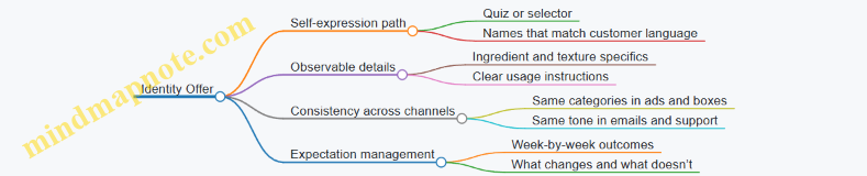
Belonging Offer Structures
Belonging customers want social safety: they want to join something without risking embarrassment. The offer should reduce uncertainty about norms and make participation feel supported.
Example: Fitness membership for beginners
- Norm clarity: A “first session plan” that explains what happens, what to wear, and how to ask for help.
- Community cues: Member stories that show different bodies and schedules, plus a visible “how we coach” standard.
- Participation scaffolding: A buddy option or small-group onboarding so the customer isn’t dropped into a crowd.
Mind Map: Belonging Offer Structure

Mood Relief Offer Structures
Mood relief customers want emotional regulation: calm, focus, or a sense of control. The offer should match timing, context, and the “moment of use,” not just the product.
Example: Subscription for evening wind-down
- Timing match: Choose a delivery window aligned to the customer’s routine (e.g., “after dinner” vs “late night”).
- Moment design: Include a short “two-minute reset” guide that pairs the product with a specific action (dim lights, stretch, breathing cue).
- Control signals: Provide adjustable intensity levels so customers can choose how much change they want.
Mind Map: Mood Relief Offer Structure

Integrated Offer Structures for Multiple Emotional Drivers
Many purchases blend drivers. The practical approach is to pick a primary emotional job and let the other drivers support it.
Example: Home office chair upgrade
- Primary comfort: Trial period plus guided fit instructions.
- Identity support: Color and style options that match the customer’s aesthetic categories.
- Belonging support: A community page with “how others solved back pain at work” stories and Q&A.
- Mood relief support: A “focus setup” checklist that pairs chair height with lighting and desk posture.
Offer blueprint rule:
- One driver owns the headline promise.
- Every other driver appears as a supporting feature with clear instructions or proof.
- The customer can explain the offer in one sentence after reading it.
Mini checklist for each driver
- Comfort: Can the customer predict effort and recovery?
- Identity: Can the customer see themselves in the choice and details?
- Belonging: Can the customer understand norms and entry steps?
- Mood relief: Can the customer match the product to a specific moment and control intensity?
9. Channel Strategy for Emotional Consistency
9.1 Aligning Messaging Across Search Social Email and Retail
Customers rarely experience your brand in a single channel. They see a search result, skim a social post, receive an email, and finally touch the product in-store. If each touchpoint promises a different emotional outcome, the customer has to do extra mental work—compare, translate, and doubt. Alignment means every channel communicates the same core promise, while adapting the proof and the level of detail to the channel’s job.
The Foundation: One Promise, Different Proof
Start with a single “emotional job statement” that all channels share. Example: “Help me feel calm and in control when I’m getting ready.” Then define three proof types that can be shown in different ways: (1) sensory or experiential cues, (2) social proof, and (3) risk reduction. Search can lead with the most relevant proof, while retail can let customers experience it.
A practical rule: the promise stays constant; the evidence changes. If your promise is “calm,” don’t let one channel focus only on “fast shipping.” Shipping can be helpful, but it’s not the emotional job.
Mind Map: Messaging Alignment System
Search: Match Intent to the Right Proof
Search messaging should behave like a helpful assistant: it answers the question implied by the query. If someone searches “unscented laundry detergent for sensitive skin,” your ad and landing page should emphasize the risk-reduction proof first, not the brand’s origin story.
Best practice: build a “keyword to proof” map. For each top query theme, assign a primary proof type and a secondary proof type.
Example mapping:
- Query theme: “sensitive skin” → Primary proof: risk reduction (dermatologist-tested claim if true, clear ingredient list)
- Query theme: “smells fresh” → Primary proof: sensory cues (notes, intensity scale)
- Query theme: “best for families” → Primary proof: social proof (review excerpts about multiple users)
Keep the emotional job statement consistent in the landing page headline, but let the first paragraph carry the proof that matches the query.
Social: Context Without Contradiction
Social posts should show the product in a situation that supports the emotional promise. The goal is not to repeat the same sentence everywhere; it’s to avoid contradicting the promise.
Best practice: use a three-part post structure.
- Frame the moment (what the customer is trying to feel)
- Show the product doing the job (sensory cue or workflow)
- Add one proof element (a review line, a guarantee, or a clear spec)
Example: A skincare brand with a calm promise can post a short routine video. The caption can mention “designed for sensitive skin” (risk reduction) and include a single review quote about irritation. Don’t add a separate claim in comments that conflicts with the landing page.
Email: Turn Curiosity into Confidence
Email is where you handle the “yes, but…” questions that other channels only hint at. Alignment here means the emotional job statement remains visible, while the body provides the proof ladder.
Best practice: write emails using a proof ladder with three steps.
- Restate the emotional job in one line
- Provide the most relevant proof for the segment
- Reduce the final friction with a concrete next action
Example sequence:
- Line: “Feel steady during your morning routine.”
- Proof: “No harsh fragrance; ingredient list is clearly labeled.”
- Action: “Try the 14-day starter size; returns are free.”
If the retail experience offers a sample, the email should mention it. If retail doesn’t, don’t promise it.
Retail: Make the Promise Verifiable
In-store, customers can’t rely on a caption. They need cues that confirm the emotional promise. Alignment means the same proof types appear in physical form.
Best practice: create shelf and associate scripts that mirror the message hierarchy.
- Promise line: “This is made to help you feel calm and in control while you get ready.”
- Sensory cue: “Notice the texture and how it absorbs.”
- Social proof: “Customers often mention it doesn’t irritate after repeated use.”
- Risk reduction: “You can return it within X days if it’s not right.”
Even small details matter. If your online page emphasizes “unscented,” the shelf signage should say “unscented,” not “low scent.” That mismatch forces the customer to correct you.
Governance: Keep Channels from Drifting
Alignment fails when teams update one channel without updating the others. Use a single message hierarchy document as the source of truth.
Minimum governance checklist:
- One emotional job statement approved for the campaign
- Proof library with what’s allowed and what’s not
- Objection responses assigned to proof types
- A launch checklist that requires search, social, email, and retail review
Example launch checklist item: “If we change the guarantee terms on the landing page, update the email footer and the retail signage before the first day of the campaign.”
Integrated Example: One Campaign, Four Touchpoints
- Search headline: emotional job statement + risk reduction proof
- Social caption: moment frame + sensory cue + one proof element
- Email subject and first line: emotional job statement + segment-specific proof ladder
- Retail signage and script: promise line + sensory verification cue + risk reduction
When each channel carries the same promise and the same proof types—just in the format that channel customers expect—the customer experiences continuity instead of translation.
9.2 Landing Pages That Deliver the Right Emotional Promise
A landing page is an emotional contract written in plain language. The job is not to “say more,” but to make the customer’s current feeling feel understood and handled. Start with the emotional promise, then prove it with specific evidence, then remove friction so the customer can act without second-guessing.
Foundations of Emotional Landing Pages
-
Name the emotional job in one sentence. If the page is for comfort, the sentence should describe relief from effort or uncertainty. If it’s for identity, it should describe how the product helps the customer show up as themselves. If it’s for belonging, it should describe social safety and shared values. If it’s for mood relief, it should describe a feeling the customer wants to regulate.
-
Match the page to the customer’s decision mode. Some visitors are comparing options; others are trying to calm anxiety. A comparison-minded visitor needs crisp differences and proof. An anxiety-minded visitor needs reassurance, clarity, and a low-risk path.
-
Use one primary promise per page. Mixing comfort and identity in the hero can work, but only if the page structure supports both. Otherwise, the page reads like it’s trying to please everyone, which usually pleases no one.
Page Structure That Converts Without Confusing
Hero section:
- Promise line: One sentence that states the emotional outcome.
- Proof cue: A short, concrete reason it’s true (e.g., “built for sensitive skin,” “ships in 24 hours,” “used by teams of 50+”).
- Action button: The next step that reduces effort (e.g., “See the fit,” “Start with the basics,” “Check delivery”).
Problem-to-solution bridge:
- Describe the emotional friction the visitor already feels.
- Then show how the offer addresses it with a simple mechanism.
Evidence blocks:
- Use three types of proof: customer language, operational facts, and risk reducers.
- Keep each block tied to the emotional promise. Proof that doesn’t serve the promise is just decoration.
Offer clarity:
- Explain what’s included, what happens next, and what it costs in time.
- If there’s a subscription, say so plainly and show how to pause or cancel.
Objection handling:
- Address the top three reasons people hesitate for this emotional job.
- Use short sections with direct answers, not long essays.
Close with a low-friction path:
- Offer a second action if the first is too committed (e.g., “View sizes” alongside “Buy now”).
Mind Map: Emotional Landing Page Design
Systematic Example: Comfort Promise for a Subscription
Scenario: A meal kit service targets customers who feel overwhelmed by planning.
- Hero promise line: “Feel confident about dinner without planning.”
- Proof cue: “Recipes include a 10-minute prep option and a weekly shopping list.”
- Bridge: “When planning takes over your evening, dinner becomes a chore. This removes the decisions.”
- Evidence blocks:
- Customer language: “I stopped stressing on Sundays.”
- Operational facts: “Ships every Tuesday; recipes update weekly.”
- Risk reducer: “Skip a week anytime; cancel in one step.”
- Objection handling:
- “Is it hard to cook?” Answer with time ranges and skill level.
- “What if I don’t like a recipe?” Answer with swap options.
- “Will it fit my schedule?” Answer with delivery windows and prep guidance.
- Close: “Choose your first week” plus “See prep times” as the secondary action.
Advanced Details That Keep the Promise Honest
- Use customer language in the evidence blocks, not just in testimonials. If customers say “I don’t have to think,” mirror that phrasing in the section that explains how the product reduces decisions.
- Make the emotional promise testable. “Comfort” is vague; “setup in under 5 minutes” is testable.
- Keep the page scannable. If the visitor has to work to find the mechanism, the emotional promise loses credibility.
- Align CTA wording with the emotional job. “Buy now” can work, but “Start with the basics” often matches comfort and reduces perceived commitment.
A landing page earns trust by doing three things in order: it names the feeling, it shows how the offer handles it, and it removes the reasons to hesitate.
9.3 Customer Support Scripts That Reinforce Comfort and Belonging
Customer support is where emotional value becomes real. A script should do two jobs at once: reduce the customer’s immediate uncertainty and signal that they belong with you. Comfort comes from clarity and low friction; belonging comes from tone, consistency, and visible respect for the customer’s context.
Foundations for Comfort and Belonging
Start every interaction with a short orientation: what you understand, what you will do next, and what the customer can expect. Comfort improves when customers can predict the next step. Belonging improves when customers feel seen as a person, not a ticket number.
A practical rule: write scripts in three layers.
- Acknowledgment layer: confirm the emotion and the situation without guessing motives.
- Action layer: state the next step in plain language, including timing when you can.
- Ownership layer: explain what you need from the customer and what you will handle.
Mind Map: Emotional Support Script Components
Core Script Patterns You Can Reuse
Pattern 1: Acknowledge and orient Use when the customer is frustrated or confused.
Example:
“Hi {name}, I see you’re dealing with {issue}. Thanks for explaining what happened. Here’s what we’ll do next: I’ll check {system/process}, and then I’ll confirm the fix and timing.”
Why it works: it validates the situation, reduces uncertainty, and sets a predictable sequence.
Pattern 2: Ask once, then proceed Use when you need missing details.
Example:
“To make sure I handle this correctly, I only need one thing: {single required detail}. Once you send it, I’ll {next action}.”
Why it works: fewer back-and-forth messages lowers cognitive load, which is comfort.
Pattern 3: Explain the policy as a customer benefit Use when you must set boundaries.
Example:
“I can’t change {policy constraint}, but I can offer {allowed option}. This keeps your request on track and avoids delays.”
Why it works: it prevents the customer from feeling blocked without explanation.
Pattern 4: Repair the experience after a mistake Use when you caused the problem or the customer was misrouted.
Example:
“Sorry about the runaround. You shouldn’t have had to repeat {detail}. I’m taking ownership now: I’ll {fix action} and confirm the outcome by {time window}.”
Why it works: ownership and specific next steps restore trust and reinforce belonging.
Advanced Details That Make Scripts Feel Consistent
1) Tone calibration by emotional intensity If the customer uses urgent language, shorten sentences and increase specificity. If they are calm, you can be slightly more conversational while still staying precise.
2) Micro-choices that signal respect
- Mirror key terms: if they say “login loop,” use that phrase.
- Avoid blame words like “user error.”
- Confirm what you will not do: “I won’t ask for the same screenshot twice.”
3) Timing statements that don’t overpromise Use ranges you can meet. Example: “You’ll hear back within 24 hours on business days.” If timing varies, say what determines it: “Once the verification step completes.”
Example Support Scripts by Common Scenarios
Scenario A: Refund request with missing order info “Hi {name}, I can help with the refund. I’m missing {order identifier} to locate the purchase. Please send {single detail}. After that, I’ll confirm eligibility and the next steps.”
Scenario B: Delivery delay and repeated status checks “Hi {name}, I understand you’ve been checking updates. I’m looking at the shipment now. Next step: I’ll verify the carrier scan and tell you whether it’s in transit or needs a replacement request.”
Scenario C: Account access issue after password reset “Hi {name}, thanks for trying the reset steps. If you’re seeing {error message}, it usually means {brief cause}. I’ll guide you through {one step} and then we’ll confirm access.”
Quality Checklist for Every Script
- Does the customer see the next step within two sentences?
- Is there exactly one request for information at a time?
- Are we using the customer’s language instead of internal jargon?
- Do we avoid surprises by stating constraints early?
- Does the message include ownership, not just instructions?
When these elements are consistent, customers experience support as a place they can land—comfort from clarity, belonging from being treated as a person with a real situation.
9.4 Influencer And Creator Partnerships That Match Identity And Mood
Influencer and creator partnerships work best when you treat them like a fit problem, not a reach problem. Identity and mood are felt in tone, pacing, and the kind of problems the creator chooses to show. If your product is bought for comfort, belonging, or mood relief, the creator must naturally speak in those emotional registers.
Start with the Emotional Fit, Not the Audience Size
Begin by writing two short “emotional briefs” for the partnership.
- Identity brief: What kind of person is the buyer trying to be? Example: “Someone who looks put-together without trying hard.”
- Mood brief: What feeling does the buyer want right now? Example: “Less friction after a long day.”
Then screen creators using three practical checks:
- Language check: Do they describe outcomes as feelings or as tasks? Identity creators often use self-referential framing (“I’m the kind of person who…”). Mood creators often describe relief, ease, or recovery.
- Scene check: Do their videos show the buyer’s environment and constraints? Mood content usually includes context like time pressure, fatigue, or small rituals.
- Taste check: Do they match your visual and behavioral norms? If your brand is calm and minimal, a creator who constantly performs chaos will create friction.
Build a Creator Shortlist with a Simple Scoring Sheet
Use a 1–5 score for each creator. Keep it boring and consistent.
- Identity alignment: self-story and values
- Mood alignment: relief, ease, calm, confidence
- Proof style: how they show results (before/after, routine, explanation)
- Product realism: do they handle constraints honestly
- Audience match: not demographics, but buyer intent
Example: A skincare creator who posts “morning routine for busy mornings” scores higher on mood alignment than a creator who posts only transformation photos with no routine context.
Co-Create the Script Around Emotional Jobs
Creators should not simply read your talking points. Instead, co-create around the emotional job.
- Identity job example: “Help me look like I belong in my workplace.”
- Creator angle: outfit choices, confidence cues, small details.
- Product integration: show how the item supports the self-story.
- Mood job example: “Help me feel less stressed after work.”
- Creator angle: decompression routine, sensory comfort, low-effort steps.
- Product integration: show the moment of relief, not just the feature.
A useful constraint: the creator must include one “friction moment” they would normally mention anyway. If they never mention tradeoffs, the content can feel rehearsed.
Mind Map: Partnership Design for Identity and Mood
Example: A Creator Campaign That Feels Like a Routine
A home fragrance brand wants mood relief through comfort. The creator posts a three-part sequence:
- Setup: “I’m wiped after cooking and errands.”
- Action: “I do this one step before I sit down.”
- After-feel: “My shoulders drop; the room feels calmer.”
Best practice: the creator shows the same step twice—once on a busy day and once on a slower day—so viewers learn when the product helps, not just what it looks like.
Example: Identity Through Consistency, Not Costume
A fashion accessory brand wants identity alignment: “I’m the kind of person who keeps things tidy.” The creator doesn’t frame it as a makeover. Instead, they show a weekly pattern:
- Monday: quick styling for meetings
- Wednesday: repair or reset moment
- Friday: “still works” check
Best practice: the creator uses the accessory in multiple contexts so it reads as part of identity maintenance, not a one-time event.
Measurement That Matches Emotional Outcomes
Track signals that reflect identity and mood rather than just clicks.
- Comment themes: look for self-story (“this matches my style”) and relief language (“this makes evenings easier”).
- Retention: repeat views on the routine segments usually indicate mood relevance.
- Support tickets: if customers ask fewer “how do I use this for my routine?” questions, the content is doing its job.
Operational Guardrails That Keep the Partnership Honest
- Require clear disclosures.
- Provide a short “do not imply” list for claims.
- Approve only for emotional clarity and factual accuracy, not for rewriting the creator’s voice.
When identity and mood are treated as design constraints—language, scenes, and proof style—creator partnerships stop feeling like sponsorships and start feeling like the buyer’s own routine, just with better guidance.
9.5 Practical Examples of Channel Playbooks for Emotional Commerce
A channel playbook is a set of rules for how the same emotional promise shows up in different places. The goal is consistency without copy-pasting. Comfort, identity, belonging, and mood relief each have different “proof types,” so the playbook should specify what evidence to use per channel and what customer question it answers.
Channel Playbook Foundations
Start with three building blocks:
- Emotional job: what the customer is trying to feel or avoid.
- Channel job: what the channel is best at doing (discover, compare, reassure, or convert).
- Proof type: the evidence that makes the emotional promise feel believable.
Mind map of the playbook logic:
Mind Map: Emotional Commerce Channel Playbook
Search Playbook Example
Emotional job: comfort after a stressful day. Customer question: “Will this actually be easy and reliable for me?”
What to do
- Use ad and landing page copy that mirrors the search intent with one emotional benefit stated plainly: “Set up in 5 minutes” or “No-fuss returns.”
- Add a short “first win” section above the fold: what happens immediately after purchase.
- Include a reassurance block that matches the comfort proof type: warranty length, return window, and support hours.
Easy example
- Search query: “easy meal prep subscription for beginners.”
- Landing page: “Your first box includes a 10-minute starter plan” plus a visible “If it’s not right, return within 30 days.”
Social Playbook Example
Emotional job: identity and belonging through taste and community. Customer question: “Do people like me actually use this, and does it fit my style?”
What to do
- Post formats should show context, not just product shots. A creator using the product in a real routine is better than a studio angle.
- Use captions that include the customer’s language for identity: “I wanted something that looks good on my shelf and doesn’t feel fussy.”
- Pin one post that answers the “belonging” proof type: community norms, how members share, and what newcomers can expect.
Easy example
- A skincare brand runs a weekly “morning routine swap.” Each post includes one routine step and one reason it feels easier for the creator.
Email Playbook Example
Emotional job: mood relief through reduced uncertainty. Customer question: “What should I do next, and will I regret it?”
What to do
- Sequence emails by emotional friction, not by marketing funnel stages.
- Email 1: confirm the choice with a “what happens next” timeline.
- Email 2: address the top anxiety with one practical promise (shipping, setup, or support).
- Email 3: reinforce mood relief with a routine cue: “Use it tonight” or “Start with the first step only.”
- Keep subject lines specific to the emotional job: “Your setup guide is inside” beats “Welcome.”
Easy example
- After signup for a budgeting app: Email 1 shows a three-step onboarding. Email 2 highlights “No spreadsheets required.” Email 3 suggests a 7-minute first session.
Retail or App Playbook Example
Emotional job: comfort through experience and control. Customer question: “Can I try it and feel confident before committing?”
What to do
- Design the in-store or in-app flow to create a “confidence moment.” That can be a sample, a guided setup, or a quick comparison tool.
- Train staff to ask one emotional question, then respond with the matching proof type.
Easy example
- A furniture store offers a “comfort check” where shoppers test seat firmness and then receive a personalized care and return explanation at the same time.
Integrated Channel Example with One Offer
Offer: a home organization service. Emotional promise: comfort plus mood relief—“Your space will feel calmer quickly.”
- Search: “First session in 48 hours” and “30-day satisfaction support.”
- Social: before/after stories with the client’s words about stress reduction.
- Email: timeline for the first session and a checklist of what to prepare.
- App or retail: a guided intake that ends with a clear plan and a reassurance screen about rescheduling.
Practical Consistency Checklist
- Same emotional promise in every channel headline or first screen.
- Proof type matches the emotional promise (comfort gets risk reducers; identity gets context; belonging gets community evidence; mood relief gets routine and timing).
- Every channel includes one “next step” that reduces effort or uncertainty.
- Customer language appears at least once per channel (a quote, a paraphrase, or a phrase from reviews).
10. Metrics and Evaluation for Emotional Performance
10.1 Defining Success Metrics That Reflect Emotional Outcomes
Success metrics for emotional commerce should answer one question: did the customer’s emotional job get done? If you only track conversion, you’ll miss whether the purchase reduced anxiety, increased confidence, or restored belonging. The trick is to measure emotional outcomes indirectly through observable signals, then connect those signals back to the emotional driver.
Start with Emotional Outcomes, Not Channels
Begin by listing the emotional outcomes your offer is meant to produce. For comfort, the outcome might be “reduced uncertainty and effort.” For identity, it might be “feeling consistent with self-image.” For belonging, it might be “feeling socially safe and recognized.” For mood relief, it might be “feeling calmer or more in control after use.”
Then translate each outcome into measurable proxies. Proxies are not perfect, but they are consistent. Examples include:
- Language: customer mentions of calm, relief, confidence, “feels like me,” or “finally found my people.”
- Behavior: fewer support contacts after setup, higher repeat purchase, faster time-to-first-success.
- Experience: lower return rates for “fit” or “expectation mismatch,” higher satisfaction with onboarding.
Build a Metric Stack That Covers the Journey
Use a stack so you don’t confuse early excitement with lasting emotional resolution.
-
Pre-purchase clarity (reduces anxiety)
- Metric: percentage of sessions where key questions are answered before checkout (measured via FAQ click-through and reduced “how does it work” tickets).
- Example: a skincare brand adds a “what to expect in week one” section; support tickets for “is this normal” drop.
-
Purchase confidence (reduces risk)
- Metric: checkout completion rate by segment and device, plus payment failures.
- Example: adding a transparent delivery timeline and a simple guarantee increases completion for first-time buyers.
-
First emotional win (creates relief)
- Metric: time from delivery to first meaningful action, such as first login, first use, or first setup completion.
- Example: a meal kit sends a “start here” card; customers who complete setup within 30 minutes have higher satisfaction.
-
Ongoing emotional stability (keeps the promise)
- Metric: repeat purchase rate and churn, but segmented by emotional proxy signals.
- Example: customers whose reviews mention “easy” and “no surprises” repeat more.
-
Recovery quality (turns disappointment into trust)
- Metric: resolution time, refund/replace approval rate, and sentiment shift in follow-up messages.
- Example: if a size issue occurs, fast replacement plus a “how to get the right fit” note reduces negative sentiment.
Mind Map: Emotional Success Metrics
Emotional Success Metrics Mind Map
Choose Metrics That Can Actually Move
A metric must be actionable and attributable enough to guide decisions. If you can’t influence it, you can’t manage it.
- Leading indicators (earlier, faster feedback): FAQ engagement, setup completion rate, early sentiment in support chats.
- Lagging indicators (later, harder to change): repeat purchase, long-term satisfaction, return rate after a full usage cycle.
Example: if you improve onboarding to reduce confusion, you should expect a drop in “can’t find X” tickets within days, followed by improved satisfaction and lower returns over weeks.
Define Targets and Guardrails
Set targets for emotional proxies, but also guardrails to prevent gaming.
- Comfort guardrail: lower support volume should not come from customers giving up; check for increased silent churn.
- Identity guardrail: higher “looks good” reviews should not increase returns for “doesn’t match expectations.”
- Belonging guardrail: community participation should not correlate with higher complaint rates about moderation or tone.
- Mood relief guardrail: sentiment improvements should align with product usage, not just one-time promotional effects.
Example Metric Set for One Offer
Suppose an app sells guided routines aimed at mood relief.
- Pre-purchase clarity: percentage of users who complete “what you’ll feel” onboarding before starting.
- Purchase confidence: checkout completion rate for first-time buyers.
- First emotional win: completion of the first routine within 24 hours.
- Ongoing stability: week-4 retention for users whose first routine feedback includes “calm” or “less stress.”
- Recovery quality: support resolution time and sentiment shift in follow-up messages for users who report discomfort.
This set works because each metric ties to a specific emotional outcome and a specific moment in the journey. When the numbers change, you can usually explain why—without guessing which part of the experience caused the emotional result.
10.2 Using Conversion Retention and Support Signals Together
Conversion, retention, and support signals are three different lenses on the same customer promise. Conversion tells you what people chose. Retention tells you whether the choice held up. Support tells you what broke, what was confusing, and what customers had to work around. Used together, they prevent the classic trap: optimizing for sign-ups that churn, or fixing support tickets that never convert.
Foundational Definitions That Stay Consistent
Start by defining each signal in a way your team can measure the same way every time.
- Conversion: the moment a customer completes the key action (purchase, subscription start, activation event). Example: “Customer buys plan within 7 days of landing.”
- Retention: continued use or repeat behavior after conversion. Example: “Customer still uses the product 30 days later.”
- Support signals: contact volume, ticket categories, resolution time, and repeat contacts. Example: “How many tickets mention ‘can’t find feature’ after day 7?”
A practical rule: conversion and retention should be defined on the same customer unit (account, order, or user), and support should be mapped to that unit too.
A Systematic Way to Combine Signals
- Segment first, then compare. Don’t average across everyone. Compare segments that differ in intent or onboarding path. Example: “New visitors who watched a demo vs. those who didn’t.”
- Align time windows. Conversion happens fast; support and retention show up later. Example: measure conversion within 7 days, retention at day 30, and support within days 8–30.
- Create a three-column scorecard per segment. For each segment, record conversion rate, retention rate, and top support categories per 1,000 active users.
- Interpret mismatches as hypotheses. A mismatch is information, not failure.
Mind Map: The Three-Signal Diagnostic Loop
Pattern 1: High Conversion, Low Retention
If conversion is strong but retention is weak, the experience likely fails to deliver the implied outcome. Support usually reveals the specific gap.
Example: A meal-kit subscription shows a 12% conversion rate from a “ready in 20 minutes” landing page, but 30-day retention is only 35%. Support tickets in days 8–30 are dominated by “missing ingredient” and “recipe timing differs from what was promised.”
Best practice: treat this as an expectation-and-operations mismatch. Fix the fulfillment accuracy first, then adjust the recipe timing language to match reality. If you change messaging before fixing the root cause, you may reduce conversion without improving retention.
Pattern 2: High Conversion, High Retention, High Support
This pattern means customers get value, but they still hit friction. Support categories help you decide whether to improve UX, documentation, or self-serve flows.
Example: A project management tool has 70% day-30 retention and strong activation, yet support volume is high for “how to invite teammates” and “permissions confusion.” Tickets are resolved quickly, but customers contact support multiple times for the same theme.
Best practice: reduce repeat contacts by improving the in-product path. Add a guided invite step after the first project is created, and ensure permission explanations are visible at the moment of selection. Retention is already good, so the goal is lower effort, not a new promise.
Pattern 3: Low Conversion, High Retention
Here the product works once customers arrive, but fewer people choose it. Support may be quiet because customers who convert are the right fit.
Example: An online course has 60% day-30 retention among enrolled students, but conversion from the pricing page is only 1.2%. Support tickets mention “unclear what’s included” and “who it’s for.”
Best practice: improve offer clarity and reduce decision friction. Use a tighter breakdown of what’s included, what the first week looks like, and who benefits most. Don’t change the product; change the path to the product.
Pattern 4: Low Conversion, Low Retention
This is the most expensive mismatch. Support often shows activation failure, confusion, or a missing first win.
Example: A fitness app converts 0.6% from ads and retains 25% at day 30. Support categories include “can’t set up profile,” “subscription confusion,” and “workouts don’t match goals.”
Best practice: prioritize the earliest failure in the journey. Fix onboarding steps that block the first meaningful use, then verify that support categories shift downward in the same time window where retention improves.
A Simple Scorecard Example
For one segment, you might see:
- Conversion: 9%
- Day-30 Retention: 40%
- Support: 18 tickets per 1,000 active users, top category “setup help”
If you reduce setup-related tickets by 30% and retention rises to 52% while conversion stays stable, you’ve likely improved the value delivery rather than just the marketing story.
Guardrails So You Don’t Optimize the Wrong Thing
- Don’t change messaging based only on conversion. Confirm with retention and support that the promise matches reality.
- Don’t treat support volume as the only success metric. A small number of high-impact tickets can matter more than many low-impact ones.
- Track repeat contacts. Repeat issues are the clearest signal that friction is structural, not random.
Used together, these signals let you move from “something is wrong” to “here is where the promise breaks, and here is what to fix first.”
10.3 Measuring Emotional Benefit Clarity in Copy and Creative
Emotional benefit clarity means customers can quickly name what they’ll feel and why it will happen after they engage with your copy or creative. If they can’t, you’ll see it as low click-through, high bounce, slow add-to-cart, and support questions that start with “I’m not sure…”
Start with Definitions That You Can Measure
Begin by separating three layers:
- Emotional benefit: the feeling outcome (comfort, confidence, belonging, relief).
- Mechanism: the reason the feeling should occur (reduced effort, social proof, predictable results).
- Proof: evidence that the mechanism is real (what you do, what’s included, what customers report).
A piece of copy is clear when it states the emotional benefit, ties it to a mechanism, and supports it with proof. For example, “Comfortable all day” is a benefit claim; “soft lining that stays breathable” is the mechanism; “4.7-star reviews mentioning ‘stays cool’” is proof.
Build a Clarity Scorecard
Use a simple rubric so teams don’t argue about taste. Score each landing page section, ad, or email on a 0–2 scale.
- Benefit specificity: Is the feeling named in plain language?
- Mechanism presence: Is there a concrete “because” statement?
- Proof type match: Does the proof support the mechanism (not just the brand)?
- Cognitive load: Can a reader understand it in one pass?
- Consistency: Does the creative promise match the page experience?
Example rubric interpretation:
- 0: Missing or vague.
- 1: Present but incomplete or hard to find.
- 2: Clear, direct, and easy to locate.
Mind Map: Clarity Inputs to Measurement Outputs
Use Comprehension Tests Before You Trust Metrics
Behavioral metrics are useful, but they’re noisy. A short comprehension test isolates whether the copy is understood.
Run a 5-question test with 5–8 participants per variant. Keep it practical:
- “What feeling do you expect after using this?”
- “What makes that feeling likely?”
- “What evidence did you notice?”
- “Where did you look to find that evidence?”
- “What part felt confusing or missing?”
Score answers against your scorecard. If people can’t name the feeling, you likely have benefit vagueness. If they name the feeling but not the mechanism, you have a “feels good” claim without a reason.
Tie Clarity to Behavioral Signals Without Overreaching
Once comprehension is validated, connect it to measurable outcomes. Use a small set of signals that map to the customer journey.
- Early attention: impressions to clicks. If clarity is low, people hesitate because they can’t predict the payoff.
- Engagement quality: scroll depth and time to key sections. If mechanism and proof are hard to find, readers stall.
- Conversion: add-to-cart or signup. If proof is mismatched, customers hesitate at the decision point.
- Post-click friction: return visits to FAQ, chat volume, and “how does this work” tickets.
A useful pattern: when clarity improves, support questions shift from “What is this?” to “How do I use it?” That’s a sign you’ve moved from uncertainty to execution.
Audit Creative with Alignment Checks
Clarity fails when the promise changes mid-journey. Do a structured alignment check between:
- ad or email subject line
- hero headline and first supporting block
- product or service page section order
- checkout or next-step screen
Write down the emotional benefit you think the customer should feel at each step. If step 2 promises a different feeling than step 1, you’ve created a mental mismatch. Fix it by either updating the later copy or narrowing the initial promise.
Example: Comfort Copy That Scores Higher
Variant A (unclear): “Experience comfort like never before.”
- Benefit: implied, not named.
- Mechanism: missing.
- Proof: missing.
Variant B (clear): “Stay comfortable without constant adjustments. Our breathable lining reduces heat buildup, and customers mention ‘no fuss’ in their reviews.”
- Benefit: named.
- Mechanism: breathable lining.
- Proof: review language.
In a rubric, Variant B typically earns 2s across benefit specificity, mechanism presence, and proof relevance.
Mind Map: Common Failure Modes
Convert Findings into Concrete Edits
After scoring and testing, choose one edit per iteration:
- If benefit is vague, rewrite the headline to name the feeling.
- If mechanism is missing, add a single concrete “because” tied to the product or service.
- If proof is weak, replace generic claims with evidence that directly supports the mechanism.
- If cognitive load is high, remove one competing claim and move proof closer to the benefit.
Track the clarity score alongside conversion. When both move in the same direction, you’ve improved understanding, not just aesthetics.
10.4 Attribution Challenges and How to Evaluate Without Guesswork
Attribution is hard because emotional commerce rarely follows a straight line. A customer may see a comfort message on a Tuesday, compare options on Wednesday, and buy on Friday after a stressful day. If you only credit the last click, you’ll systematically undercount the earlier emotional work.
The Foundational Problem with Last-Click Attribution
Last-click attribution assumes the final touch is the cause. In emotional commerce, the final touch often acts like a permission slip: it reduces friction, confirms fit, or makes the offer feel safe. The earlier touches may have created the emotional readiness that made the permission slip matter.
A practical example: a skincare brand runs a series of posts about “calming routines.” The customer doesn’t buy from the post. They later search for “sensitive skin moisturizer,” land on a product page, and purchase. Last-click credits the search page, but the emotional readiness likely came from the earlier comfort framing.
What You Can Measure Instead of Guessing
You can evaluate without pretending you know the exact causal chain by separating three questions:
- Exposure: Did the customer encounter the message?
- Influence: Did that exposure change behavior compared with a similar group?
- Outcome: Did the purchase or retention happen, and did it match the emotional promise?
When you treat attribution as a measurement problem rather than a story problem, you can use multiple signals that don’t require perfect causality.
Mind Map: Attribution Signals and Evaluation Steps
Common Attribution Failure Modes
Cross-device and cross-channel drift: a person sees a video on mobile, researches on desktop, and buys later. Cookie loss breaks the chain. Algorithmic attribution can hide assumptions by producing a neat number.
Emotional mismatch is another failure mode. Even if a channel drives conversions, it may do so by attracting the wrong emotional need. For instance, a “confidence” message might increase clicks but lead to higher returns because the product doesn’t actually deliver comfort.
A Systematic Evaluation Workflow
Start with a clear unit of evaluation. For emotional commerce, pick one emotional driver per test, even if your brand uses multiple. Then:
- Choose a measurable proxy for the emotional job. Comfort can map to lower hesitation signals like fewer support contacts about setup, or higher satisfaction with “ease to use.” Identity can map to reduced “not what I expected” returns. Belonging can map to higher referral rates among purchasers.
- Run a controlled exposure test. Use a geo holdout or audience split so one group sees the emotional message and the other doesn’t.
- Measure lift at multiple funnel stages. Look at search volume for branded terms, product page engagement, add-to-cart rate, and purchase conversion. If only the last stage moves, the message may be acting as a discount substitute rather than emotional readiness.
- Check downstream quality. Compare return rates, support contact reasons, and review themes between groups. This is where emotional attribution becomes real: the right message should reduce confusion, not just increase orders.
Example: Testing Comfort Messaging Without Over-Crediting
A subscription meal kit brand wants to test comfort framing in email. They run a two-week campaign where Group A receives an email series emphasizing “easy weeknight calm” and “no decision fatigue,” while Group B receives a neutral feature-focused email.
They track:
- Exposure: delivered and opened rates.
- Influence: add-to-cart rate and checkout completion.
- Outcome quality: support tickets about substitutions and “how to start,” plus refund/return rate.
If Group A shows higher checkout completion but also higher “confusing instructions” tickets, the comfort framing may be attracting customers who expected a different level of guidance. The evaluation then concludes that the message needs operational support, not that attribution is “wrong.”
Mind Map: Decision Rules for Interpreting Results
Reporting That Prevents Self-Deception
Use ranges and confidence language internally. In dashboards, separate conversion credit from emotional promise fulfillment. A channel can be “effective” at driving purchases while still failing the emotional job. The evaluation should therefore include both behavioral lift and quality outcomes, so the team learns what actually changed in the customer’s experience.
10.5 Practical Dashboards for Comfort Identity Belonging and Mood Relief
A useful dashboard does two things at once: it shows whether the business is winning, and it explains why customers feel better about the purchase. For emotional commerce, “why” matters because the same conversion rate can come from very different emotional drivers.
1) Start with Emotional Outcomes, Not Just Funnel Steps
Define one primary metric per emotional driver, plus a supporting metric that indicates friction.
- Comfort: Primary metric is “ease-to-reorder” rate (customers who repurchase within a set window after a first win). Supporting metric is “effort score” from support tickets tagged as confusion, setup, or delivery uncertainty.
- Identity: Primary metric is “self-consistency engagement” (views or clicks on identity cues like style guides, creator stories, or fit/values selectors). Supporting metric is “mismatch returns” (returns where the reason is “not as expected” or “doesn’t match my style/needs”).
- Belonging: Primary metric is “community participation rate” (opt-ins to membership, referrals, or participation in Q&A). Supporting metric is “trust friction” (refund requests or negative sentiment in community threads).
- Mood Relief: Primary metric is “calm-to-complete” journey completion (checkout completion after a high-intent visit that includes reassurance content). Supporting metric is “abandonment after uncertainty” (drop-off after shipping, guarantee, or usage questions).
2) Build a Dashboard Layout That Mirrors Customer Decisions
Use four panels that map to the emotional drivers, then add one cross-driver panel for operational health.
3) Instrumentation Rules That Keep Metrics Honest
Emotional dashboards fail when teams measure feelings with the wrong signals. Use these rules.
- Tag touchpoints by emotional promise: every landing section, email module, and support macro should be labeled as comfort, identity, belonging, or mood relief.
- Measure before and after: for each driver, track a baseline period and a post-change period. A dashboard should show movement, not just numbers.
- Separate intent from emotion: if a page gets traffic from a discount search, conversion might rise even when emotional clarity is weak. Track “promise match” engagement, not only clicks.
4) Example Dashboard Metrics and Definitions
Below is a practical set of fields you can implement quickly.
| Driver | Primary Metric | Supporting Metric | Data Source |
|---|---|---|---|
| Comfort | Ease-to-reorder rate | Effort score from tickets | CRM + Support |
| Identity | Selector completion rate | Mismatch returns rate | Web analytics + Returns |
| Belonging | Community participation rate | Trust friction rate | Community + Support |
| Mood Relief | Calm-to-complete completion | Abandonment after uncertainty | Web + Checkout |
Example: If a comfort-focused onboarding email is added, you should see fewer “setup confusion” tickets and a higher ease-to-reorder rate, not just a temporary spike in first purchases.
5) Advanced Detail Without Making It Complicated
Once the basics work, add two layers.
- Segment by emotional trigger: segment by what customers searched for or asked about. Example segments: “delivery uncertainty,” “fit and style,” “need reassurance,” “want community.”
- Attribution by touchpoint sequence: instead of crediting the last click, credit the first emotional promise touchpoint that occurred before the key conversion step.
6) A Simple Weekly Operating Rhythm
Run the dashboard weekly and tie it to one decision.
- If comfort effort score rises, prioritize clarity fixes in setup and delivery reassurance.
- If identity mismatch returns rise, tighten selectors and update product imagery to match the emotional promise.
- If belonging trust friction rises, audit community moderation and the accuracy of shared claims.
- If mood relief abandonment after uncertainty rises, improve guarantee and shipping answers earlier in the journey.
Example: In a week starting 2026-02-26, a team notices mood relief completion drops specifically on mobile checkout after the shipping question step. They update the shipping FAQ module and the next week shows reduced abandonment and higher completion, while first-purchase conversion stays flat. That pattern tells you the emotional friction was localized, not the whole funnel.
7) The One Chart That Prevents Misreads
Add a single “Emotional Clarity Score” chart that combines four driver-specific promise-match engagement rates into one view. Keep it simple: if the score rises but the primary outcome metric doesn’t, the dashboard is detecting attention without emotional resolution. If the outcome rises but the score doesn’t, the team may be succeeding through product quality alone, which is still useful information.
11. Implementation Playbooks for Teams and Operations
11.1 Building Cross Functional Alignment Between Marketing Product and Support
Cross-functional alignment is not a meeting schedule; it’s a shared operating system. Marketing, Product, and Support all touch the same customer reality, but they describe it differently. Marketing translates it into promises, Product turns it into behavior, and Support observes it when reality doesn’t match the promise. Alignment means those three perspectives agree on what “good” looks like, where it can break, and how to fix it.
Shared Definitions That Prevent Misfires
Start with a small set of definitions everyone uses.
- Emotional value: the customer outcome that reduces discomfort or increases confidence, expressed in customer language.
- Customer journey stage: the moment the customer is trying to solve something, not the moment your team wants to measure.
- Failure mode: a specific mismatch, such as “setup takes longer than expected” or “returns feel risky.”
Example: If Marketing says “setup in minutes,” Product must know what “minutes” means under real conditions, and Support must know what to do when it doesn’t.
A Single Source of Truth for Promises and Capabilities
Create one document that maps promises to capabilities and support reality. Keep it short enough to maintain.
- Promise: the exact customer-facing statement.
- Capability: the feature or process that makes it true.
- Boundary: where it may not hold, stated plainly.
- Support guidance: the first three actions Support should take.
Example: “Cancel anytime” is a promise. The capability is the cancellation flow. The boundary is “processing may take up to 2 business days.” Support guidance includes the script for what the customer will see and when.
Mind Map: Alignment Inputs and Outputs
Operating Rhythm That Keeps Everyone Honest
Alignment needs a cadence that matches how work actually moves.
- Pre-launch alignment (short and specific): Marketing proposes the exact copy and visuals. Product confirms feasibility and boundaries. Support reviews likely confusion points.
- Launch readiness check: Support validates that macros cover the top five “why isn’t this working” questions.
- Post-launch review (based on evidence): Use ticket categories and conversion drop-off points tied to the same journey stage.
Example: If Support sees a spike in “I can’t find the discount” tickets, Product checks whether the discount appears after a specific step, and Marketing updates the onboarding message to match the actual sequence.
Shared Journey Stage Playbooks
Instead of aligning by department, align by stage. Each stage playbook should include:
- Customer intent: what the customer is trying to feel or accomplish.
- Expected experience: what “smooth” looks like.
- Common confusion: the top three reasons customers hesitate.
- Support resolution path: what Support does in the first 5 minutes.
- Product instrumentation: what signals confirm the experience is working.
Example: For onboarding, “smooth” might mean the customer reaches the first meaningful action without repeated prompts. Support should know the fastest recovery path when the customer gets stuck.
Practical Example: The “Comfort Setup” Scenario
Imagine a subscription service where customers buy comfort through low effort and predictable outcomes.
- Marketing promise: “Get started in under 10 minutes.”
- Product capability: guided setup with a progress indicator.
- Boundary: “If you need to import data, it may take longer.”
- Support guidance: if setup exceeds 10 minutes, Support offers a checklist and a one-click “skip import” option.
Alignment happens when all three teams agree on the boundary and the recovery path, so Support doesn’t improvise and Marketing doesn’t overpromise.
Guardrails That Stop Drift
Finally, add rules that prevent slow misalignment.
- Claim change rule: any new customer-facing claim requires a capability check.
- Behavior change rule: Product notifies Support before changing flows that affect comprehension.
- Evidence rule: post-launch updates must reference the same journey stage definitions.
When these guardrails exist, the teams stop arguing about opinions and start fixing mismatches. That’s the real alignment: fewer surprises for customers, and fewer firefights for everyone else.
11.2 Creating Emotional Value Guidelines for Brand Voice and Design
Emotional value guidelines are the rules that keep your brand from saying one thing and showing another. They translate customer emotional jobs into repeatable choices for voice, visuals, UX, and service. The goal is consistency that customers can feel, not a style guide that only designers can love.
Start with Emotional Outcomes, Not Aesthetic Preferences
Begin by writing a short list of emotional outcomes your customers are trying to achieve. Each outcome should be phrased as what the customer wants to feel or avoid, not what you want to sell.
Example outcomes:
- Comfort: “I can relax because this will be easy and predictable.”
- Identity: “This fits who I am, so I don’t have to explain myself.”
- Belonging: “People like me are here, and I’m not the odd one out.”
- Mood relief: “This helps me shift my day without extra effort.”
Then define what “good” looks like in behavior. For comfort, good might be fewer steps, clearer status updates, and fewer surprises. For identity, good might be language that matches the customer’s self-description and visuals that avoid generic stock vibes.
Build a Voice System That Matches Emotional States
Your brand voice guidelines should include four layers: tone, vocabulary, sentence patterns, and refusal rules.
- Tone by emotional state
- Comfort state: calm, steady, low-friction. Use short confirmations and practical next steps.
- Identity state: specific, respectful, permission-giving. Avoid talking down or using “everyone” language.
- Belonging state: inclusive, grounded, community-aware. Use “we” carefully and only when you can back it up.
- Mood relief state: timely, light, and action-oriented. Keep the path short.
- Vocabulary rules Create a list of words to prefer and words to avoid.
- Prefer: “simple,” “clear,” “ready,” “you’re set,” “here’s what happens next.”
- Avoid: vague intensity words that don’t map to customer experience.
-
Sentence patterns
Comfort copy often works best as: claim → what happens → what you need to do.
Identity copy often works best as: observation → alignment → choice. -
Refusal rules
Write explicit “do not” rules. For example: do not use guilt to drive urgency; do not imply medical or psychological outcomes when you’re selling a product or service.
Translate Voice into Design Decisions
Design guidelines should mirror voice rules. If your voice is calm and clear, your interface should reduce cognitive load.
- Layout: prioritize the next action. If customers are anxious, burying the button is like hiding the exit sign.
- Typography: ensure readability at the sizes you actually use. Emotional clarity collapses when text becomes a scavenger hunt.
- Color and motion: use them to communicate status, not to decorate. Motion should explain change, not distract from it.
- Imagery: choose visuals that match the customer’s self-image. If your identity promise is “for people like you,” your images must look like the people you’re addressing.
Create a Touchpoint Checklist for Emotional Consistency
Use a checklist for every major touchpoint: homepage, product page, checkout, onboarding, support, and post-purchase.
Checklist items:
- Does the page state the emotional outcome in plain language?
- Does the interface reduce uncertainty at the moment the customer feels it?
- Are the “what happens next” steps visible before the customer commits?
- Do error messages explain recovery, not blame?
- Do confirmations and receipts reinforce the same emotional promise as the ad or email?
Mind Map: Emotional Value Guidelines for Voice and Design
Governance: Make It Usable, Not Just Written
Guidelines fail when they live only in a document. Add governance that forces decisions to be consistent.
- Example library: store “before and after” snippets for each emotional outcome. Include one comfort example, one identity example, one belonging example, and one mood relief example.
- Approval criteria: each release should pass a short review: voice alignment, design clarity, and recovery behavior.
- Review cadence: revisit guidelines when customer language shifts or when you change core flows.
Example: Comfort and Identity in the Same Checkout
A checkout page can support both comfort and identity without mixing messages.
- Comfort element: “You’ll see a confirmation email within 2 minutes. If it doesn’t arrive, use the ‘Resend receipt’ link.”
- Identity element: “Choose the style that matches your setup: minimal, warm, or bold.”
- Design alignment: show order status progress, keep the payment button prominent, and use imagery that matches the style choices.
The key is that each element serves a specific emotional job. When everything is trying to be everything, customers feel the effort—even if the product is good.
11.3 Training Teams to Recognize Emotional Triggers in Customer Behavior
Teams don’t need to “read minds.” They need a shared way to notice patterns in what customers do, what they say, and what they avoid. Emotional triggers show up as repeated behaviors: hesitations, return requests, repeated questions, sudden silence, and specific phrasing in support tickets. Training should turn those signals into consistent actions.
Foundations: Emotional Triggers as Observable Signals
Start with a simple definition: an emotional trigger is a moment when a customer’s internal state changes, and that change affects behavior. Comfort triggers often look like requests for reassurance or simpler steps. Identity triggers show up as preference for certain aesthetics, language, or social proof. Belonging triggers appear as questions about community norms and trust. Mood relief triggers show up as urgency tied to stress, timing, or “I just need this to work.”
A practical training rule: every trigger must map to (1) a customer action, (2) an underlying need, and (3) a team response that reduces friction. If any of the three is missing, the team will guess.
The Trigger Map Workshop
Run a workshop where teams build a “trigger map” from real artifacts: chat logs, email threads, call transcripts, review excerpts, and support tickets. Use a consistent template so people don’t drift into opinions.
Template for each observed trigger
- Observed behavior: What the customer did or wrote
- Emotional need: Comfort, identity, belonging, mood relief, or a mix
- Risk the customer feels: Waste time, look foolish, feel unsafe, lose control
- Best next response: What the team should say or do
- Proof to include: Policy clarity, examples, visuals, or step-by-step guidance
Example: A customer asks, “Will this fit my exact model?” after previously browsing accessories.
- Observed behavior: repeated fit questions
- Emotional need: comfort and mood relief
- Risk: wasted money and effort
- Best next response: confirm compatibility with a clear checklist and one-click guidance
- Proof to include: a short fit table and a photo of the exact model
Mind Map: Emotional Triggers to Team Actions
Training Scenarios That Build Muscle Memory
Use role-play with scoring so the team practices the same moves under pressure.
Scenario 1: Comfort Trigger in Support Customer: “I don’t understand the sizing. I’m afraid it won’t fit.”
- Good response: ask one clarifying question, then provide a sizing checklist and a clear exchange path.
- Common mistake: sending a generic size chart without next steps.
Scenario 2: Identity Trigger in Sales Customer: “I want it to look like the photos, not like a cheap version.”
- Good response: confirm what the customer will see, show a real example, and explain materials in concrete terms.
- Common mistake: focusing only on specs while ignoring the “look” concern.
Scenario 3: Belonging Trigger in Community Questions Customer: “Do people like me usually join this?”
- Good response: share norms and examples of members with similar backgrounds, then explain how onboarding works.
- Common mistake: replying with mission statements but no practical details.
Scenario 4: Mood Relief Trigger in Checkout Customer: “I need this by Friday. If it won’t arrive, I can’t use it.”
- Good response: confirm delivery windows, offer alternatives if needed, and remove unnecessary steps.
- Common mistake: repeating shipping policy text without checking the specific order.
Advanced Details: Consistency and Escalation Rules
After practice, standardize two things.
-
Trigger-to-response mapping: each trigger should point to a small set of approved response patterns (clarify, reassure, validate, guide). This prevents “creative” answers that miss the emotional need.
-
Escalation thresholds: define when to escalate for accuracy or recovery. For example, sizing uncertainty, compatibility questions, or delivery promises should trigger a verification step rather than a guess.
Finally, run a short calibration session weekly. Pick three recent interactions, label the trigger, and compare the team’s response to the trigger map. The goal is not to judge; it’s to tighten the mapping so the next customer gets the right help faster.
11.4 Workflow Examples for Launching Emotional Value Improvements
Emotional value improvements fail most often for one boring reason: teams treat them like a one-time campaign instead of a repeatable workflow. The goal here is to make emotional value changes behave like product changes—measurable, reviewable, and safe to ship.
Step 1: Pick One Emotional Job and One Touchpoint
Start with a single emotional job (Comfort, Identity, Belonging, or Mood Relief) and a single touchpoint where customers feel friction. Example: customers abandon checkout because they feel uncertain about delivery timing (Comfort). The touchpoint is the shipping and returns section.
Quick rule: if you can’t name the exact page, email, or interaction, you can’t improve it.
Step 2: Define the Emotional Outcome in Plain Language
Write an outcome statement that a support agent could recognize. Example:
- “After reading shipping details, customers feel confident enough to complete checkout without searching elsewhere.”
Then list observable proxies:
- fewer “Where is my order?” tickets
- higher checkout completion rate
- fewer session exits on the shipping step
Step 3: Build a Small Change Set That Can Be Tested
Emotional value is usually delivered by multiple small signals. Choose 2–4 changes that are tightly connected.
Example change set for Comfort at checkout:
- Show delivery windows by region, not just “ships in 2–3 days.”
- Add a one-sentence returns promise near shipping info.
- Replace generic icons with a short “What happens next” sequence.
- Add a reassurance line that matches the customer’s likely worry: “If timing changes, we’ll email you.”
Step 4: Create a Review Loop with Marketing, Product, and Support
Run a short review where each function checks a different risk.
- Marketing checks clarity of the emotional promise.
- Product checks operational feasibility.
- Support checks whether the wording reduces confusion or creates new questions.
A practical artifact is a “Promise vs. Reality” checklist.
Step 5: Pilot with Guardrails and a Clear Stop Condition
Use a limited rollout so you can learn without breaking trust.
- Guardrails: do not change policies, only how they are communicated.
- Stop condition: if checkout completion drops or ticket volume rises for shipping-related issues, revert.
Step 6: Measure Emotional Value Using Both Behavior and Language
Behavior tells you what happened; language tells you why.
- Behavior: checkout completion, time on shipping section, support deflection.
- Language: ticket categories, top phrases in customer messages.
If behavior improves but language doesn’t, you may have reduced friction without addressing the underlying emotional job.
Mind Map: Emotional Value Improvement Workflow
Example: Comfort Improvement Launch in Three Days
Day 1: Diagnose and draft. Review shipping-related tickets from the last 30–45 days. Identify the top two worries: timing and what happens if timing changes.
Day 2: Implement and review. Update the shipping/returns module with delivery windows by region and a “what happens next” sequence. Run a Promise vs. Reality checklist with Product and Support.
Day 3: Pilot and monitor. Roll out to a small percentage of traffic. Monitor checkout completion and shipping-related ticket volume for the pilot window. If the stop condition triggers, revert and adjust wording before expanding.
Example: Identity Improvement Launch Without Changing the Product
Identity often fails when the messaging sounds like it’s trying too hard. Improve the signals instead.
Change set for an apparel product page:
- Add a “Who this is for” section using customer language from reviews.
- Show styling outcomes with simple scenarios: “office-ready,” “weekend casual,” “travel light.”
- Ensure the size guide uses the same tone as the rest of the page so customers feel the brand “gets it.”
Measurement:
- product page to cart rate
- reduced returns for fit-related reasons
- fewer questions about sizing in pre-purchase support
Example: Belonging Improvement Launch Through Proof and Participation
Belonging improves when customers can see themselves in the community.
Change set for a membership signup flow:
- Add a short “What members do here” section with concrete examples.
- Include review snippets that mention shared values and helpful behavior, not just star ratings.
- Add a first-step action after signup that feels like an invitation, not homework.
Measurement:
- signup completion rate
- first-week participation metric
- reduction in “Is this for people like me?” questions
Example: Mood Relief Improvement Launch with Timing and Sequencing
Mood relief is often about reducing the mental load at the right moment.
Change set for a post-purchase email:
- Send a “next steps” email that answers the top three questions in order.
- Use a calm, consistent structure: what you’ll do, what we’ll do, when you’ll hear from us.
- Avoid new decisions in the first email; keep it informational.
Measurement:
- fewer support tickets in the first 72 hours
- higher email engagement on the “next steps” section
Step 7: Turn Each Launch into a Reusable Pattern
After each pilot, document what changed and why it worked. Capture:
- the emotional job statement
- the specific signals added or reordered
- the metrics that moved
- the failure modes you avoided
This is how emotional value improvements stop being one-off projects and start behaving like a dependable system.
11.5 Practical Checklists for Auditing Emotional Consistency
Emotional consistency means customers feel the same emotional promise across every touchpoint, even when the format changes. If your product page says “calm,” but checkout feels risky and support feels dismissive, the emotional story breaks. Use these checklists to audit comfort, identity, belonging, and mood relief as a connected system.
Mind Map: Emotional Consistency Audit
Step 1: Lock the Emotional Promise Before You Audit
Start with a one-page “emotional brief” so the audit has something concrete to compare against.
Checklist
- Name the primary emotional driver for the offer (choose one first).
- Write the emotional outcome in plain language customers would use. Example: “I feel calmer after setup” instead of “reduces anxiety.”
- List the emotional proof you will rely on. Example for comfort: “clear instructions, predictable delivery, easy returns.”
- Define what you will not claim. Example: “We do not treat medical conditions.”
Mini example A meal kit brand targets comfort: “I can cook without stress.” The emotional brief includes “step-by-step cards, substitutions that don’t break the recipe, and a support team that answers quickly.”
Step 2: Audit Touchpoints with a Consistency Matrix
Create a matrix with touchpoints as rows and emotional dimensions as columns.
Checklist
- For each touchpoint, mark whether it supports the emotional promise, contradicts it, or is emotionally neutral.
- Note the specific reason for each mark, not just the verdict.
- Confirm that the implied stakes match. Comfort promises should reduce perceived effort and risk, not increase them.
Example matrix snippet
- Product page: Supports comfort via “simple steps” and “what’s included.”
- Checkout: Contradicts comfort if it introduces surprise fees or unclear delivery windows.
- Support: Supports comfort if agents use “let’s fix it together” and provide direct next steps.
Step 3: Message Integrity Checks
Emotional consistency fails when language and tone drift.
Checklist
- Emotional language: Are the same emotional words and metaphors used across channels? Example: if you say “easy setup,” don’t switch to “advanced configuration” on the onboarding email.
- Tone and pacing: Does the reading level and sentence length match the promise? Comfort pages should not feel like legal documents.
- Proof type: Are you using the proof you said you would? If you promised “real customer experiences,” don’t replace them with only brand statements.
Quick test Ask: “If a customer only reads the first screen, do they still understand the emotional outcome and why it’s credible?”
Step 4: Experience Integrity Checks
Now audit the actual experience, because customers judge emotions by friction.
Checklist
- Friction: Does the number of steps, required fields, or waiting times increase stress beyond the promise?
- Clarity: Are instructions structured so customers can succeed on the first attempt?
- Recovery: If something goes wrong, does the recovery process match the emotional promise?
Example Identity-driven apparel promises “you’ll look like yourself, just sharper.” If sizing guidance is vague and returns require multiple steps, the experience undermines identity confidence.
Step 5: Operational Integrity Checks
Operations are where emotional promises either survive or die.
Checklist
- Support scripts: Do agents reinforce the emotional outcome? Example for belonging: “You’re not the only one—here’s what others did.”
- Policies: Are refunds, replacements, and escalations aligned with the emotional promise’s risk reduction?
- Ownership: Who is responsible for emotional consistency when a process changes? Assign it.
Example Mood relief promises “quick help when you’re stuck.” If the help center routes urgent issues into a slow queue, the promise becomes a joke.
Step 6: Evidence Collection and Scoring
Use customer language and outcomes to validate the audit.
Checklist
- Collect top support ticket themes and tag them by emotional driver.
- Extract recurring phrases customers use. Example: “I was worried,” “I felt confident,” “I felt left alone.”
- Score each touchpoint: 0 (contradicts), 1 (neutral), 2 (supports).
- Prioritize fixes by impact on the emotional promise, not by how easy the change is.
Simple scoring rule If a touchpoint scores 0 while the offer promises emotional relief, treat it as a priority even if conversions look “fine.”
Step 7: Fix Plan and Verification
Make changes testable and verify emotional consistency after updates.
Checklist
- Write the change as an emotional repair. Example: “Remove surprise fees from checkout copy and show delivery window earlier.”
- Update the related scripts and policies, not just the page text.
- Re-audit the touchpoints that connect to the change.
- Confirm the customer journey still reads as one story.
Example verification After improving checkout clarity, check onboarding emails and support macros to ensure they don’t reintroduce uncertainty with conflicting delivery language.
12. Case Based Patterns for Emotional Commerce Execution
12.1 Pattern Library for Comfort Led Journeys and Touchpoints
Comfort-led journeys treat “ease” as a measurable outcome: fewer decisions, less uncertainty, and a faster path to feeling settled. The pattern library below is organized from foundations to execution details so teams can build consistent touchpoints without guessing.
Comfort Led Journey Mind Map
Foundational Comfort Triggers and Customer States
Comfort usually starts when a customer expects hassle. That expectation can come from unclear fit, complicated setup, or fear of wasting money. A practical way to segment is by customer state rather than demographics.
- Overloaded: they want the simplest next step. Example: a shopper compares three similar items and abandons when the differences feel technical.
- Hesitant: they need reassurance. Example: they pause at checkout because the return policy feels hard to use.
- Insecure: they worry about looking foolish or choosing wrong. Example: they avoid a gift purchase because they cannot confirm the recipient’s taste.
- Rushed: they need speed and certainty. Example: they buy late at night and expect the process to be predictable.
Comfort-led journeys respond to these states with specific touchpoint moves.
Phase Pattern 1: Discover with Low Effort Clarity
Goal: help customers feel “this is for me” without reading a manual.
Move: Reduce options early. Show a small set of curated choices based on a single question. Example: “Which problem are you solving today?” with three buttons: “Calm my routine,” “Make mornings easier,” “Stay comfortable on the go.”
Move: Use plain-language proof. Instead of only star ratings, include one-line summaries that match the comfort state. Example: “Easy setup in under 5 minutes” or “No-fuss returns, no questions asked.”
Phase Pattern 2: Choose with Guidance and Fit Confidence
Goal: remove the fear of choosing wrong.
Move: Recommendation logic that explains itself. When showing a recommendation, include a short reason tied to comfort. Example: “Recommended because it’s designed for sensitive skin and quick rinsing.”
Move: Make trade-offs visible. Comfort is not “no downsides.” It’s “I understand the downsides and they’re acceptable.” Example: “Softer feel, slightly less structured support.”
Phase Pattern 3: Buy with Predictable Checkout
Goal: prevent last-minute anxiety.
Move: Fewer fields, clearer totals. Example: show shipping and delivery timing before the final step. If delivery is uncertain, offer a default option with a clear cutoff time.
Move: Comfort guarantees that are operational. A guarantee must be easy to execute. Example: “Return label included in the box” or “Start a return in two steps from your order page.”
Phase Pattern 4: Receive with Rituals and Immediate Wins
Goal: create the first “ah, that’s nice” moment quickly.
Move: Unboxing as a guided sequence. Use a simple card: “Do this first, then this.” Example: Step 1 “Remove the protective layer,” Step 2 “Run the quick rinse,” Step 3 “Save the receipt for returns.”
Move: Setup that matches the customer’s tempo. Offer two onboarding paths: “Fast start” and “Comfort setup.” Example: Fast start uses pre-set defaults; Comfort setup lets them adjust feel and fit.
Phase Pattern 5: Use with Frictionless Support
Goal: keep comfort intact after purchase.
Move: Contextual help. When a customer hesitates during use, show a single next action. Example: if they pause at a “first wash” screen, display “Use cold water and skip fabric softener” with a one-tap confirmation.
Move: Support scripts that mirror the comfort state. For overloaded customers, scripts should shorten the path: “Tell me what you’re trying to fix and I’ll send the exact steps.” For hesitant customers, scripts should include a reassurance plus a concrete action.
Phase Pattern 6: Recover with Calm Resolution
Goal: turn a mistake into a settled outcome.
Move: Returns and recovery as a single journey. Example: order page → “Start return” → label → refund timeline. Avoid making customers hunt for instructions.
Move: Close the loop with a “what we learned” note. Example: “We noticed you returned due to sizing. Here’s how to pick the next size using two measurements.”
Integrated Touchpoint Example
A comfort-led subscription for home essentials can follow one consistent logic across touchpoints:
- Discover: “Choose your comfort level: light, standard, extra.”
- Choose: show one recommended bundle with a reason tied to effort.
- Buy: confirm delivery window and include a one-line return promise.
- Receive: include a three-step setup card.
- Use: provide a single “next best action” help prompt.
- Recover: return flow takes under two minutes and includes sizing guidance.
Comfort Evidence Checklist
Use this to validate whether the journey truly reduces discomfort:
- Customers can explain the choice in one sentence.
- Checkout drop-offs decrease after clarity improvements.
- Support tickets cluster around fewer, simpler issues.
- Recovery time for returns is predictable and communicated.
- Repeat purchases increase for customers who had a smooth first setup.
12.2 Pattern Library for Identity Led Merchandising and Messaging
Identity-led merchandising starts with a simple premise: people buy to align their public and private story. The product is the prop; the emotional job is “make me feel like myself, in a way that others can recognize.” This section gives a practical pattern library you can apply to shelves, search results, landing pages, and email.
Core Identity Concepts That Drive Merchandising
Identity work has three layers. First is self narrative: the story someone tells about who they are. Second is social signaling: what they want others to infer. Third is consistency: the desire that the purchase fits the rest of their choices.
A useful way to avoid vague messaging is to translate identity into observable buying criteria. For example, “I’m the kind of person who plans ahead” becomes criteria like early access, clear timelines, and predictable delivery. “I’m creative” becomes criteria like customization, visible craft, and options that look good in photos.
Pattern 1: Identity Segments with Concrete Proof
Instead of segmenting by demographics, segment by identity claims customers already use. Collect phrases from reviews, support chats, and returns notes. Then map each phrase to proof you can show.
Example: A skincare brand sees customers say “I want to look rested without trying.” Proof can be: under-eye coverage photos, application time under 60 seconds, and before/after lighting consistency.
Merchandising best practice: each identity segment gets its own “proof stack” on the page.
- Claim: “Looks rested fast.”
- Proof: time, texture description, photo set.
- Constraint: “No heavy fragrance” if that’s part of the identity.
- Risk reducer: satisfaction guarantee and easy shade matching.
Pattern 2: The “Role-Based” Product Grid
Identity purchases often come from roles, not categories. Roles are how people want to be seen in a moment: “the competent host,” “the calm parent,” “the serious runner,” “the thoughtful gift giver.”
Build a product grid where each tile is a role, not a SKU family.
Example: A meal kit store organizes by roles:
- “Weeknight Host” (quick cleanup, serving-ready portions)
- “Meal Planner” (recipe cards with prep schedules)
- “Comfort Cook” (warm flavors, simple steps)
Best practice: each role tile includes one sentence that states the identity outcome and one bullet that states the operational mechanism.
Pattern 3: Messaging That Uses “I” Without Sounding Like a Diary
Identity copy should feel like it belongs to the customer’s language, not the brand’s. Use first-person framing sparingly and pair it with specific behaviors.
Example:
- Weak: “Be your best self.”
- Strong: “I’m the kind of person who has a plan—so I can prep in 15 minutes and still serve something that looks intentional.”
Best practice: write one “identity line” and one “how it works line.” The first earns attention; the second earns trust.
Pattern 4: Consistency Across Touchpoints
Identity is fragile. If the ad promises “minimal, clean, calm” but the checkout page feels cluttered and urgent, customers feel misread.
Best practice checklist:
- Same identity claim in ad, landing page hero, and email subject.
- Same tone in product descriptions and support macros.
- Same visual cues for the same identity segment.
Example: If “quiet confidence” is a segment, use calm typography, fewer competing offers, and product pages that highlight finish and fit rather than discounts.
Pattern 5: Merchandising with “Choice Architecture”
Identity buyers want control that still feels guided. Present options in a way that reduces decision fatigue while preserving self-expression.
Example: A fashion brand offers “3 fits” and “2 styling directions,” then shows curated pairings.
- Fit choices map to comfort identity (e.g., “structured,” “relaxed”).
- Styling direction maps to social signaling (e.g., “office-ready,” “weekend polished”).
Best practice: limit the number of top-level choices, then let customers customize within that frame.
Mind Map: Identity Led Merchandising and Messaging
Pattern 6: Risk Reducers That Protect Identity
People don’t just fear product failure; they fear identity mismatch. If the purchase makes them look wrong, they feel embarrassed.
Best practice: attach risk reducers to the identity claim.
Example: For a “professional competence” segment, offer:
- Fit guarantee or easy exchanges
- Clear sizing guidance with real measurements
- Styling examples that match workplace norms
This turns “I hope it works” into “I can make it work without losing face.”
Pattern 7: Advanced Integration Using a Single Page Blueprint
Use one blueprint for every identity segment page.
- Hero: identity line + outcome.
- Proof stack: three items that demonstrate the claim.
- Product grid: role-based tiles.
- Choice architecture: limited top-level options.
- Risk reducer: exchange, guarantee, or matching help.
- Microcopy: “how it works” bullets that mirror customer behavior.
Example: A home fragrance brand builds a “focus at work” identity page with:
- Hero: “I’m the kind of person who keeps my space working for me.”
- Proof: burn time, scent notes, and low-overpower guidance.
- Grid: “Desk reset,” “Meeting prep,” “Deep work.”
- Risk reducer: scent strength exchange.
This structure keeps identity messaging grounded in decisions customers actually make.
12.3 Pattern Library for Belonging Led Community and Proof Systems
Belonging Led Community and Proof Systems
Belonging purchases happen when people feel safe enough to be seen. Your job is to make that safety visible, repeatable, and easy to verify. A belonging system has two halves: community mechanisms that create real connection, and proof mechanisms that reduce the fear of joining the wrong group.
Foundations of Belonging
Start with three basics you can observe in customer behavior.
- Low social risk: people can participate without being judged for asking basic questions.
- Recognizable norms: members know what “good participation” looks like.
- Reciprocity: newcomers receive help quickly, and later learn how to help others.
A practical way to design for these is to treat every touchpoint as either a “welcome” moment or a “verification” moment. Welcome moments reduce uncertainty. Verification moments confirm that the community is the right fit.
Community Mechanisms That Create Connection
Use a small set of repeatable formats so members know what to expect.
1) Guided first steps When someone joins, they should complete one simple action within five minutes: introduce themselves using a prompt, answer a short question, or pick a preference. Example: a skincare community asks, “What’s your skin goal this month?” with three options and one free-text field. The prompt does the social work.
2) Lightweight roles Give members roles that are earned through behavior, not status. Example: “Helpful Starter” for answering two newcomer questions with specific details. This keeps belonging grounded in contribution.
3) Norms that are stated and demonstrated Post a short “how we talk here” guideline and enforce it with examples. Example: “We answer with steps, not judgments.” Then show two sample replies: one that includes a checklist, one that includes empathy plus a next action.
4) Moderation that protects newcomers Moderation should focus on tone and clarity. Example: if a member says, “Just buy the expensive one,” moderators reframe: “If budget matters, here are three options by price range.”
Proof Mechanisms That Reduce Fear
Belonging fails when people can’t tell whether the community is welcoming. Proof systems answer that question before the first post.
1) Member language as evidence Collect quotes from members that describe feelings and outcomes, not just features. Example: “I asked a basic question and got a calm answer.” Use these quotes on join pages and in onboarding emails.
2) Participation signals Show activity in a way that doesn’t require the viewer to interpret everything. Example: “New questions answered today: 18” and “Average first reply time: 2 hours.”
3) Review-style community stories Replace vague testimonials with structured stories: “Problem → What I asked → What I received → What changed.” Example: a fitness group includes a story where the member wanted accountability but was nervous about being judged.
4) Fit checks that prevent mismatch Offer a quick “community match” quiz and show what kind of questions are typical. Example: “Do you prefer short routines or deep dives?” Then display two example threads that match the selection.
Mind Map: Belonging Led Community and Proof Systems
Integrated Touchpoint Flow
Treat the journey as a sequence of welcome then verification.
- Entry: show member language and participation signals.
- First action: guided prompt that leads to an easy introduction.
- Early response: ensure the first replies follow the norms and include a next step.
- Ongoing verification: display example threads and structured stories in the areas where people hesitate.
Example: a parent support community. The join page shows “New member stories” with the exact fear they had, like “I didn’t want to sound clueless.” After joining, the first prompt asks for the child’s age range and one concern. Moderators and experienced members respond with a short plan: “Try this tonight, then come back with what happened.”
Operational Guardrails That Keep It Working
Belonging systems break when operations drift.
- Tone rules: define a small set of phrases that moderators use to de-escalate and clarify.
- Response targets: set a target for first replies and track it by newcomer cohorts.
- Escalation paths: if a question signals harm or conflict, route it to a trained moderator quickly.
- Role criteria: publish the behaviors required for lightweight roles so members trust the process.
Example: Proof-First Onboarding with Community Norms
A community for home cooks uses a two-step onboarding.
- Step 1: “Pick your comfort level” with three options. The UI shows example threads for each level.
- Step 2: “Ask your first question” using a template: “I’m cooking for __. I want __. I’m stuck on __.”
The join confirmation includes a quote from a member who previously felt embarrassed asking basic questions, plus a participation signal showing that newcomers typically receive a first reply the same day.
This structure works because it reduces social risk before the first post, then makes the first post easy, then ensures the first replies match the norms. Belonging becomes something people can predict, not something they hope for.
12.4 Pattern Library for Mood Relief Led Timing and Experience Design
Mood relief is not just “make it feel good.” It is a sequence: notice the emotional trigger, reduce friction at the moment of need, and leave the customer with a clear sense of recovery. The timing pattern matters because customers buy comfort when their attention is narrow and their patience is thin.
Foundational Timing Logic for Mood Relief
Mood relief typically follows a short loop: trigger → attempt → stall → relief. Your job is to shorten the stall and make relief feel earned, not forced.
- Trigger recognition: Customers often arrive when they are already stressed, tired, or overwhelmed. Your first screen should acknowledge the state without requiring them to explain it.
- Friction removal: The fastest path to relief is usually fewer decisions. Reduce choices early, then offer customization after trust is established.
- Recovery pacing: Relief should arrive in stages. The first stage is “I can handle this,” the second is “this is working,” and the third is “I feel better than before.”
Experience Design Pattern for Immediate Relief
Start with a “low-effort win” that can be completed in under two minutes.
- Example: A meal kit checkout that defaults to a simple plan for the next two dinners, with one-tap substitutions. The customer doesn’t need to compare recipes while hungry.
- Best practice: Use progressive disclosure. Show the final outcome first (what they will eat), then the details (diet preferences, allergens) only if they ask.
Timing Pattern for Contextual Offers
Mood relief depends on context, not just demographics.
- Example: A skincare brand sends a “reset routine” offer at the time of day when customers typically reorder. The email subject references the moment: “After-work reset routine,” not “New product drop.”
- Best practice: Tie offers to customer intent signals you already have, like browsing a “sleep” category, abandoning a cart, or searching for “sensitive.”
The Three-Stage Relief Journey
Design the journey so each stage has a distinct emotional job.
-
Stage One: Permission to slow down
- Reduce cognitive load. Offer a single recommended option and a clear next step.
- Example: A budgeting app that starts with “Choose your comfort level: calm, steady, or focused,” then asks one question.
-
Stage Two: Proof that it’s working
- Provide quick feedback. Show progress that matches the customer’s expectation of relief.
- Example: A laundry service that confirms pickup within minutes and shows a simple status bar: “Collected → Cleaned → Ready.”
-
Stage Three: Closure and reassurance
- Make the end state explicit. Summarize what changed and what to do next.
- Example: A subscription box that includes a “two-minute unwind” card and a reminder for the next delivery window.
Mind Map: Mood Relief Timing and Experience Design
Advanced Pattern: Decision Architecture for Calm
When customers seek mood relief, they interpret complexity as risk.
- Example: A travel booking page that offers “quiet weekend” and “family reset” packages with included times and cancellation terms shown upfront.
- Best practice: Put the “risk reducer” information near the primary action button: delivery window, cancellation policy, and what happens if something goes wrong.
Advanced Pattern: Recovery Messaging Without Overpromising
Mood relief messaging should describe the experience you can actually deliver.
- Example: Instead of “guaranteed calm,” use “designed for a 10-minute wind-down.”
- Best practice: Use concrete time, steps, and boundaries. Customers relax when they know what to expect.
Example: A Full Timing Sequence for a Mood Relief Purchase
A customer buys a “night reset” bundle after late-evening browsing.
- Landing moment: The page shows one recommended routine with a two-minute setup.
- Checkout: Defaults to the customer’s prior preferences and shows delivery timing clearly.
- Confirmation: The email includes a simple “start now” checklist and a status note for shipping.
- Post-purchase: The next message arrives the following evening with the same routine steps, not a new pitch.
- Support: If they contact support, the first response references the routine steps and offers a quick adjustment.
This sequence works because each touchpoint reduces a different kind of stress: decision stress at the start, uncertainty stress during fulfillment, and follow-through stress after purchase.
12.5 Pattern Library for Integrating Multiple Emotional Drivers in One Offer
When one offer tries to satisfy comfort, identity, belonging, and mood relief at the same time, the risk is muddled messaging and inconsistent experiences. The fix is to design the offer as a sequence of emotional “wins,” where each driver earns its place at a specific moment in the customer journey.
Core Principle: One Primary Driver per Moment
Pick one emotional driver as the primary job for each step, then let the other drivers support it with smaller, consistent signals.
- Comfort leads the first win: reduce friction, uncertainty, and effort.
- Identity leads the self-expression win: help customers feel “this fits me.”
- Belonging leads the trust win: show that others like them are safe here.
- Mood relief leads the emotional regulation win: help customers feel better right now.
Mind Map: Emotional Driver Integration
Pattern 1: Comfort On-Ramp with Identity Confirmation
Use comfort to lower the “will this work for me?” question, then confirm identity once the customer is ready to choose.
- Comfort signal: a short quiz or guided selection that ends with a simple promise like “You’ll get the setup that matches your routine.”
- Identity signal: after selection, show a preview that reflects the customer’s stated preferences (tone, style, or use case).
Example: A meal kit service offers a 60-second preference flow. The first screen emphasizes ease and low effort. The confirmation screen then shows a “your week, your style” plan with dietary preferences and cooking pace, so the customer feels recognized without being asked to “perform” identity.
Pattern 2: Belonging Proof That Does Not Replace Product Clarity
Belonging should reduce social risk, not substitute for practical details.
- Comfort and clarity first: show what arrives, how long it takes, and what to do on day one.
- Belonging second: add community proof that matches the same decision point.
Example: A skincare brand includes a “first-week routine” card. Only after that does it show reviews from customers with similar skin concerns, using language that echoes the routine steps rather than generic praise.
Pattern 3: Mood Relief Through Micro-Wins During Setup
Mood relief works best when it happens during an action, not only after purchase.
- Build a setup moment that feels calming or empowering.
- Keep the emotional language tied to observable outcomes: fewer steps, clearer guidance, faster results.
Example: A home organization subscription sends a “start in 20 minutes” kit. The onboarding email uses calm, direct instructions. The customer experiences immediate relief when the first zone is completed quickly, while identity is supported by optional labeling styles.
Pattern 4: Recovery as Belonging Reinforcement
Returns and support can either feel like punishment or like membership. Make recovery match the emotional job of belonging.
- Comfort in recovery: fast resolution, clear policies, and helpful troubleshooting.
- Belonging in recovery: show that support is consistent with the brand’s values and community norms.
Example: A fitness app offers a “pause without penalty” option and a human response that references the customer’s goals. The customer learns they are not being judged, which strengthens belonging while comfort prevents churn.
Pattern 5: One Offer, Four Layers, Same Story
Structure the offer so each driver appears as a layer, not a competing claim.
- Layer A Comfort: reduce effort and uncertainty.
- Layer B Identity: personalize the experience.
- Layer C Belonging: add proof and shared norms.
- Layer D Mood Relief: create an immediate emotional payoff.
Example: A coworking membership package.
- Comfort: simple pricing, clear access rules, and a “first day checklist.”
- Identity: desk preferences and room vibe options.
- Belonging: member introductions and shared events aligned to the customer’s interests.
- Mood relief: a quiet-start option with guided “settle in” instructions for the first session.
Practical Checklist for Integration
- Each journey step has one primary emotional job.
- Proof appears at the same step as the emotional promise.
- Personalization supports identity without changing the core comfort path.
- Recovery reinforces belonging using the same tone and values as the onboarding.
- Measurement is step-level, not only overall conversion.
Mind Map: Step-Level Emotional Jobs
Example: Putting It Together in One Offer Flow
A subscription box for hobby learning can follow this order: first, a guided selection that promises low effort and clear materials (comfort). Next, a preview that matches the customer’s chosen skill style and pace (identity). Then, a first-session guide that makes the first attempt feel manageable and satisfying (mood relief). Finally, a community forum invite and a supportive “help me troubleshoot” channel that treats questions as normal (belonging).