Modern Hypermedia Systems with HTMX Swap Strategy and HTML over the Wire
1. Foundations of Hypermedia Driven User Interfaces
1.1 Understanding Hypermedia as the Application State
Hypermedia means the server describes what the client can do next using links, forms, and other actionable markup. In this model, “application state” is not only stored in memory; it is also represented by the current page fragment’s available actions and their destinations. When the UI changes, the server sends new markup that updates both what the user sees and what the user is allowed to do.
A practical way to think about it: the browser is a renderer and request sender, while the server is the authority for valid transitions. If a button should disappear after an action, the server should decide that and return markup without that action. If an action should target a different endpoint based on permissions or workflow stage, the server should provide the correct target in the response.
Mind Map: Hypermedia as Application State
From “State” to “Actions”
Traditional UI state often lives in client variables: selected tab, current filter, whether a modal is open. Hypermedia shifts emphasis to server-provided actions. For example, a “Cancel Order” action is only meaningful when an order is in a cancellable status. Instead of encoding that rule in JavaScript, the server returns a fragment where the cancel form is present only when cancellation is allowed.
This does not mean the client has no state. The client still tracks focus, scroll position, and which element the user clicked. The key difference is that the server defines the state that affects correctness: what actions exist, where they go, and what inputs are required.
Example: Link-Driven Workflow
Imagine a small workflow: viewing an order, then confirming it. The server renders the order page with a “Confirm” link only when the order is pending.
<!-- Order fragment rendered by the server -->
<section id="order">
  <h1>Order #1042</h1>
  <p>Status: pending</p>
  <a href="/orders/1042/confirm" data-method="post">Confirm</a>
</section>
After confirmation, the server returns updated markup where the “Confirm” action is gone and a “Ship” action appears. The client does not need to know the workflow rules; it just displays what it was given.
Example: Form Constraints as State
Forms are another way hypermedia carries state. Consider a “Change Email” form. If the user must re-verify their email, the server can render a form that includes a verification code field and a different submission target.
<form action="/account/email" method="post">
  <label>New email
    <input name="email" type="email" required />
  </label>
  <label>Verification code
    <input name="code" inputmode="numeric" required />
  </label>
  <button type="submit">Update email</button>
</form>
If verification is not required, the server omits the code field entirely. The form’s structure becomes part of the application state, because it encodes what the server expects next.
Advanced Detail: Representations and Transitions
A hypermedia system typically exposes resources and transitions. A resource representation includes both data and actions. Transitions are the “next steps” that the server authorizes. When a request fails validation, the server can return the same representation shape with error messages and corrected constraints, rather than forcing the client to guess what went wrong.
This approach also clarifies error handling. If a user submits an action that is no longer valid, the server can respond with markup that reflects the new state, such as showing “Status changed” and offering the correct next action. The client’s job is to render the response, not to reconcile conflicting rules.
Practical Takeaway
When you design hypermedia-driven UI, treat the server response as the source of truth for the current state of the workflow. The “state” is the combination of what the user can see and what the user can do next, expressed through links and forms in the returned markup.
1.2 Mapping UI Interactions to Server Responses
A good hypermedia UI treats every user action as a question the server can answer with markup. The mapping is the bridge between what the user does (clicks, types, submits, navigates) and what the server returns (a fragment, a redirect, an error block, or a corrected form). When the mapping is explicit, you can reason about behavior without guessing.
Interaction Types and What They Ask the Server
Start by classifying interactions by intent. This prevents the common mistake of treating all requests as “just fetch HTML.”
- Navigation intent asks for a new resource representation. The server returns a page or a main-content fragment.
- Collection intent asks for a list view filtered or sorted. The server returns a fragment for the list region plus any summary widgets.
- Mutation intent changes state, such as creating or updating an item. The server returns either the updated fragment or a form with validation errors.
- Exploration intent reveals details without leaving the current context, like expanding a row or opening a modal. The server returns a detail fragment targeted to a container.
Each intent implies a response shape. If you keep that shape consistent, the UI stays predictable.
Response Shapes and Swapable Regions
In a server-rendered hypermedia system, the server response is usually a fragment that targets a specific DOM region. The mapping should specify:
- Target region: which element gets replaced or updated.
- Swap strategy: replace, append, prepend, or other behaviors.
- Out-of-band updates: optional updates to page metadata or layout regions.
- Focus and accessibility behavior: where the user’s attention should go after the update.
A practical rule: if the user’s mental model is “the same page, different content,” map the response to a stable container. If the user’s mental model is “a new page,” map to a full navigation or a main-content replacement.
A Mind Map of the Mapping Workflow
Mind Map: Mapping UI Interactions to Server Responses
Concrete Example: Search That Updates Only the List
User action: the user changes the search term.
Mapping:
- Interaction type: Collection intent.
- Server request: GET
/orders?query=...&page=.... - Response shape: an HTML fragment containing only the list rows and a small summary like “Showing 10 of 42.”
- Target region: the table body container.
- Swap strategy: replace the rows container, not the entire table.
Why this works: the table header and column labels remain stable, so the user doesn’t lose context. The server can still enforce filtering rules and return consistent markup.
Concrete Example: Form Submission with Validation Errors
User action: the user submits a create form.
Mapping:
- Interaction type: Mutation intent.
- Server request: POST
/projects. - Success response: a fragment that shows the created project in a list region, plus a cleared form region.
- Error response: re-render the form fragment with:
- field-specific error messages
- the user’s original input values
- a global error summary block
- Target region: the form container.
- Swap strategy: replace the form container so errors appear in the right place.
Why this works: the server remains the source of truth for validation, and the UI gets a complete, self-consistent fragment. The user sees errors without a full page reload.
Concrete Example: Row Expansion for Details
User action: the user clicks “Details” on a row.
Mapping:
- Interaction type: Exploration intent.
- Server request: GET
/orders/{id}. - Response shape: a detail fragment that includes a heading, key fields, and actions.
- Target region: the row’s expandable container.
- Swap strategy: replace the expandable container content.
- Accessibility behavior: ensure the fragment includes a focusable element or a heading so keyboard users can orient themselves.
This mapping avoids mixing concerns. The server returns the detail representation; the client only places it where the user expects it.
The Mapping Contract Checklist
Before implementing, verify these points for every interaction:
- The server endpoint returns markup that matches the intended region.
- The response includes all required elements for the fragment to stand alone.
- Error handling uses the same target region and swap strategy as success, so the UI doesn’t jump.
- Out-of-band updates are limited to elements that truly need global changes.
- Accessibility is considered as part of the response, not an afterthought.
When these are true, mapping becomes a reliable design tool rather than a collection of one-off tricks.
1.3 Designing Resource Oriented Endpoints for UI Workflows
Resource oriented endpoints treat UI actions as requests for resources or resource transitions, not as “do this thing” commands. The payoff is simple: the server can return HTML fragments that match the exact part of the page that needs updating, while the URL and HTTP method remain meaningful.
Start by separating three ideas: what the user is trying to accomplish, which resource is involved, and what representation the UI needs. For example, “add a comment” involves the Comment resource and the Post it belongs to. The UI usually needs two representations: the updated comment list fragment and a small status message.
A practical endpoint design process:
- Name the resource in the path. Use nouns:
/posts/{postId},/comments/{commentId},/projects/{projectId}/tasks. - Use HTTP methods to express intent.
GETreturns representations,POSTcreates,PUT/PATCHupdates,DELETEremoves. - Keep UI workflow steps as resource transitions. “Publish” is often a state change on the same resource:
/posts/{postId}/publishcan be modeled asPATCH /posts/{postId}with astatus=publishedpayload, or as a dedicated transition endpoint if your domain benefits from it. - Return fragments that match the swap target. If the UI swaps
#comments, the endpoint should render only the comments list fragment, not a full page. - Make error responses renderable. Validation failures should return the same fragment shape the UI expects, with field-level messages.
Mind Map: Resource Oriented Endpoint Design
Endpoint Shapes That Fit UI Swaps
A good rule: the endpoint should know which part of the page it is responsible for. That doesn’t mean hardcoding DOM selectors into the server; it means the server returns the fragment that corresponds to the UI region.
Consider a post page with a comments section and a comment form.
GET /posts/42returns the full page.GET /posts/42/commentsreturns the comments list fragment.POST /posts/42/commentscreates a comment and returns the updated comments list fragment.DELETE /posts/42/comments/9removes a comment and returns the updated comments list fragment.
Notice what’s missing: there’s no endpoint called /doSomethingWithComments. The UI action maps to a resource operation, and the response maps to the region that needs updating.
Example: Comment Creation with Fragment Response
<form hx-post="/posts/42/comments"
      hx-target="#comments"
      hx-swap="outerHTML">
  <input name="author" placeholder="Name" />
  <textarea name="body" placeholder="Comment"></textarea>
  <button type="submit">Add</button>
</form>
<div id="comments">
  <!-- server renders list here -->
</div>
On success, the server returns HTML for the entire #comments region. On failure, it returns the same region with inline validation messages and the user’s input preserved. This consistency keeps the client logic boring, which is the correct direction.
Example: Modeling State Changes Without Action Verbs
If you have a “publish” button, avoid inventing a new resource for every button. Prefer a state transition on the existing resource.
PATCH /posts/42with{ "status": "published" }- Response returns the updated post header fragment showing status.
This approach keeps the URL stable and makes caching and authorization easier to reason about.
Advanced Details That Prevent Subtle Bugs
Fragment contract consistency. If the comments region sometimes renders a list and sometimes renders an empty paragraph, your swap target will still update, but the UI will behave inconsistently. Use a predictable wrapper element and render empty states inside it.
Authorization at the resource boundary. Every endpoint should verify the user’s permission for the specific resource instance. For example, DELETE /posts/42/comments/9 must confirm the comment belongs to post 42 and that the user can delete it.
Idempotent deletes and safe retries. If a request fails after the server performs the action, the client might retry. Designing deletes to be safe to repeat avoids “already deleted” errors turning into confusing UI.
Error status codes that still render. Use appropriate HTTP codes for validation and authorization, but ensure the response body contains the fragment the UI expects. The UI can then show errors without needing a separate error page flow.
When you design endpoints this way, the UI workflow becomes a sequence of resource requests, and the page updates become a sequence of predictable fragment swaps. The result is an application that stays understandable even when the interactions get more than a little busy.
1.4 Establishing Consistent Markup Contracts Between Client and Server
A markup contract is the shared agreement between what the server renders and what the client expects to swap, target, and preserve. With server-rendered HTML and HTMX-style partial updates, the contract is less about “matching templates” and more about guaranteeing stable DOM anchors, predictable fragment boundaries, and consistent semantics for both success and failure paths.
What the Contract Covers
A good contract answers four practical questions:
- Where does the update land? The server must return HTML that fits the client’s target element, and the client must point to an element that already exists.
- What part of the page changes? The server should render fragments that are scoped to a specific region, not a whole page disguised as a fragment.
- What stays stable? Containers, headings, and form wrappers should remain consistent so focus, screen reader context, and layout don’t jump.
- What does each response mean? Success, validation errors, and “nothing to update” should follow the same structural rules so the client can behave deterministically.
DOM Anchors and Fragment Boundaries
Pick a small set of stable anchors and treat them like public API. For example, a list region might always be wrapped in a container with an id such as orders-list. When the server returns a fragment, it should update only the inside of that container (or replace the container entirely, but then the id must remain the same).
A reliable pattern is:
- The full page includes the anchor container.
- The server fragment includes markup that matches the container’s expected structure.
- The fragment never assumes it is the whole document.
Example: Stable Container with Predictable Inner Markup
<!-- Full page -->
<section id="orders-list" aria-live="polite">
  <!-- server renders initial list here -->
</section>

<!-- HTMX request swaps the section contents -->
<button
  hx-get="/orders?status=open"
  hx-target="#orders-list"
  hx-swap="innerHTML">
  Show open orders
</button>
On the server, the fragment should render only the list items and any list-level wrapper that belongs inside the section. If the server sometimes returns a full <section> and sometimes returns only <li> elements, the client contract breaks and debugging becomes a guessing game.
Consistent Naming for Targets and Data Attributes
Use consistent identifiers across endpoints. If hx-target="#orders-list" is used for filtering, the server should not introduce a different wrapper id like orders-results in some responses. When you need multiple regions, name them by purpose rather than by page layout.
A practical rule: target ids describe the region, not the view. “Orders list” stays “Orders list” whether the user is on the dashboard or a dedicated page.
Data attributes can also form part of the contract. If client-side behavior relies on data-order-id, the server must include it in every fragment that renders order rows.
Response Shape for Success and Validation Errors
Contracts get real when forms fail. The server should return fragments that preserve the form wrapper and replace only the inner parts that changed.
A common approach:
- Keep the
<form>element stable. - Replace the field error blocks and the submit button state area.
- Preserve user input values so the user doesn’t retype.
Example: Field Errors Rendered in the Same Places
<form hx-post="/orders" hx-target="#order-form" hx-swap="outerHTML">
  <div id="order-form">
    <label>
      Customer
      <input name="customer" value="{{customer}}" />
    </label>

    <div class="field-error" data-field="customer">
      {{customer_error}}
    </div>

    <button type="submit">Create</button>
  </div>
</form>
When validation fails, the server should render the same id="order-form" wrapper and the same data-field locations. That way, the client swap is mechanical, and the user sees errors exactly where they expect them.
Semantic Consistency and Accessibility
Markup contracts also include semantics. If a list region uses aria-live="polite", it should remain on the same element across updates. If error messages use role="alert" or are associated with fields via aria-describedby, those relationships must be present in every fragment that can show errors.
A simple checklist:
- Headings remain in the same order and are not replaced inconsistently.
- Error containers keep stable ids so
aria-describedbyreferences remain valid. - Tables keep the same column structure even when rows change.
Mind Map: Markup Contract Essentials
A Practical Contract Checklist
Before wiring an endpoint to an HTMX target, verify:
- The target element exists on the initial page.
- Every response for that endpoint returns markup compatible with the swap mode.
- The fragment keeps required ids, classes, and data attributes.
- Error responses render the same structural locations as success responses.
- Accessibility attributes that reference ids remain valid after the swap.
A consistent markup contract turns partial updates from “it usually works” into “it always lands correctly,” which is exactly what you want when the UI is doing more than just reloading the page.
1.5 Handling Navigation, Forms, and Errors as First Class Responses
In a server-rendered hypermedia UI, navigation, forms, and errors are not special cases. They are just different shapes of responses that the client can place into the page. The trick is to make every response predictable: it should declare what changed, where it should appear, and how the user should continue.
Navigation as Response, Not a Side Effect
Treat navigation like a resource transition. A link click should request a server resource, and the server should return markup that represents the new state. For partial navigation, return only the region that changes, such as a main content container, while keeping layout stable.
A practical rule: keep the URL meaningful even when you update only part of the page. That way, the browser back button and copy-paste behavior remain sane. When you update the main region, also update page metadata regions like breadcrumbs or headings using out-of-band swaps.
Forms as Stateful Interactions
Forms are where users expect correctness. The server should handle submission, validation, and persistence of user intent. That means the response must be able to represent at least three states: initial form, validation failure, and success.
On validation failure, re-render the form with field-level error messages and the user’s previously entered values. On success, return either a redirect-style navigation or an updated region showing the created/updated resource.
A simple mental model: the form is a mini resource with a lifecycle. The server returns the lifecycle stage as HTML fragments.
Errors as Structured UI Outcomes
Errors come in layers. Field errors are local and should appear next to inputs. Business rule errors might be global to the form. System errors should degrade gracefully without breaking the page.
Make error rendering consistent across full-page and partial requests. If a request targets a specific container, the error response should target the same container so the UI doesn’t end up half-updated.
Mind Map: Navigation, Forms, and Errors
Example: Link Navigation with Stable Layout
Imagine a page with a main content region and a breadcrumb region. Clicking a link should update only the main region while also updating breadcrumbs.
- The link triggers a request.
- The server returns markup for the main region.
- The server also returns breadcrumb markup as an out-of-band fragment.
Result: the user sees the new content without losing the surrounding layout, and the browser URL still changes.
Example: Form Validation Failure Without Losing Input
Consider a “Create Project” form with fields like name and owner email.
On submit:
- The server validates.
- If invalid, it returns the form fragment.
- Each invalid field gets an error message and the input value is re-populated.
Key detail: the response should target the form container, not the whole page. That keeps the user’s scroll position and avoids reloading unrelated UI.
Example: Global Error Banner with Recovery
Suppose the server rejects a submission due to a business rule, like “Owner email must belong to an active account.”
- Render a global error banner at the top of the form.
- Include a clear recovery action, such as “Try a different email.”
- Keep the rest of the form intact so the user can correct only what’s needed.
This approach prevents the common failure mode where the user sees an error but has no idea what to do next.
Example: System Error That Still Targets the Right Region
If something unexpected happens, return a fragment that fits the same target container.
- Replace the main region with a minimal error message.
- Keep navigation and layout intact.
- Provide a retry action that re-requests the same resource.
The goal is not to hide problems; it’s to keep the UI coherent.
Response Contract Checklist
Before wiring anything, confirm these invariants:
- Every interactive request declares a target region.
- Every response renders into that region, even on errors.
- Validation failure re-renders the form with preserved values.
- Success returns either updated content or navigation markup.
- Out-of-band updates keep headings and breadcrumbs consistent.
When these hold, navigation, forms, and errors stop being separate concerns and become reliable outcomes of server responses.
2. Server Rendered Interaction Design with HTML over the Wire
2.1 Choosing Server Rendered Rendering Boundaries
Server rendered rendering boundaries define which parts of the UI are produced on the server for each interaction, and which parts stay stable on the client. With HTMX, the boundary is usually “what gets swapped.” The trick is to make that swap small enough to be predictable, large enough to be useful, and consistent enough that your templates don’t become a patchwork.
Start with User Tasks, Not Components
Begin by listing the user’s tasks: browse, search, filter, view details, edit, confirm, and recover from errors. For each task, decide what the user needs immediately after the request returns. If the user expects the main content to change, the boundary should include that main region. If the user expects only a button state to change, keep the boundary narrow.
A practical rule: render on the server anything that must be correct with respect to permissions, validation, and business rules. Render on the client only what is purely presentational and can tolerate being slightly wrong until the next request.
Define Stable Containers and Moving Regions
A boundary is easiest to manage when the DOM has stable containers. Stable containers don’t get replaced; moving regions do. For example, a page layout wrapper can remain untouched while a list region swaps in new rows.
Think in terms of three layers:
- Layout shell: header, navigation, sidebars.
- Interaction region: the part that changes in response to a request.
- Micro feedback: inline error messages, field hints, and status text.
Your rendering boundary should usually cover the interaction region and the micro feedback, not the layout shell.
Choose Boundaries by Swap Granularity
Swap granularity is the size of the HTML fragment you return. Too small fragments force many requests and create coordination problems. Too large fragments cause unnecessary re-rendering and make focus management harder.
A good default boundary for list interactions is “the list plus its immediate controls.” For example, when filtering a table, return the table body and the pagination controls together so the UI doesn’t briefly show mismatched pages.
Keep Markup Contracts Tight
Templates should agree on what they output. If your server returns a fragment for a specific target, that fragment should always include the same structural hooks: wrapper elements, predictable IDs or classes, and consistent ARIA attributes.
When boundaries are loose, you end up with conditional markup that breaks swaps. When boundaries are tight, you can reason about the DOM after each request.
Handle Errors at the Boundary
Error rendering belongs inside the boundary that the user is currently looking at. If a form submission fails, the boundary should include the form fields and their error messages, not the entire page.
This keeps the user’s context intact. It also prevents “error islands,” where the server reports problems somewhere the user didn’t ask to update.
Mind Map: Rendering Boundary Decisions
Example: Filtering a List Without Rebuilding the Page
Suppose you have a page with a search box, a table, and pagination. The boundary for the filter request should return the table rows and pagination, because both depend on the filter.
- Stable shell: page header and surrounding layout.
- Boundary fragment:
tbodyplus pagination controls. - Micro feedback: an inline “no results” row inside the table.
<div id="results">
  <form hx-get="/items" hx-target="#results" hx-swap="outerHTML">
    <input name="q" value="{{q}}" />
    <button type="submit">Search</button>
  </form>

  <table>
    <tbody>
      {{#each items}}
        <tr><td>{{name}}</td></tr>
      {{/each}}
      {{#if itemsEmpty}}
        <tr><td>No results</td></tr>
      {{/if}}
    </tbody>
  </table>

  <nav id="pagination">{{paginationHtml}}</nav>
</div>
The server returns the same #results wrapper on both success and empty results, so the swap outcome is consistent. The user sees the table and pagination update together, with no brief mismatch.
Example: Editing a Single Item with Inline Errors
For an edit form, the boundary should include the form itself and the error messages for its fields. The layout shell stays stable so the user doesn’t lose navigation context.
- Stable shell: header and sidebar.
- Boundary fragment: the form container.
- Micro feedback: field-level error text.
<div id="edit-form">
  <form hx-post="/items/{{id}}" hx-target="#edit-form" hx-swap="outerHTML">
    <label>Name</label>
    <input name="name" value="{{name}}" />
    {{#if nameError}}<div class="error">{{nameError}}</div>{{/if}}

    <button type="submit">Save</button>
  </form>
</div>
On validation failure, the server re-renders #edit-form with the same structure and updated error messages. The user can correct fields without reloading the page or losing focus.
A Simple Boundary Checklist
- Does the boundary contain everything the user expects to change after the request?
- Does it exclude layout shell elements that should remain stable?
- Is the fragment structure consistent across success and error?
- Are errors rendered inside the boundary the user is currently viewing?
- Can you predict the DOM state after the swap without reading the entire page template?
If you can answer these questions confidently, your rendering boundaries will stay manageable as the application grows.
2.2 Structuring Templates for Partial Updates
Partial updates work best when templates are written as small, predictable “response fragments” rather than mini pages. The goal is simple: when a request comes in, the server returns markup that can be swapped into a specific region without breaking layout, accessibility, or user input.
Template Boundaries That Match UI Regions
Start by drawing a boundary between what the user sees as a whole page and what changes frequently. For example, a product list page might have:
- A stable shell: header, navigation, and page-level layout.
- A changing region: the list results area.
- Smaller changing regions: pagination controls, summary counts, and inline validation messages.
Write templates so each fragment corresponds to one region. If a fragment sometimes includes the shell and sometimes doesn’t, your swap behavior becomes a guessing game.
A Practical Rule
If a fragment is swapped into a container, it should assume that container already exists. That means the fragment should not repeat the container’s outer wrapper unless you intentionally want nested structure.
Designing Fragment Markup for Stable Swaps
A partial template should be “swap-ready.” That means:
- The fragment’s root element matches the swap target’s expectations.
- IDs are unique within the page, even after multiple swaps.
- Focus and screen reader context remain coherent.
Consider a results region container like #results. The fragment returned for that region should render the list items and any supporting UI inside the container, not replace the container itself.
Example: Results Fragment Template
<!-- server renders this fragment for the results region -->
<section id="results" aria-live="polite">
  <ul>
    <li>
      <a href="/products/42">Sprocket 42</a>
      <span class="price">$19.99</span>
    </li>
  </ul>
  <nav aria-label="Pagination">
    <a href="/products?page=2" data-hx-get="/products?page=2" data-hx-target="#results">Next</a>
  </nav>
</section>
In this approach, the fragment root is consistent, so the swap is deterministic. The aria-live region helps announce changes without forcing focus jumps.
Template Inputs and Output Contracts
Partial templates need clear inputs. Treat them like functions:
- Inputs: the data needed to render the region, plus any UI state (current query, page number, selected filters).
- Output: markup that fits the region contract.
A common contract is “render a list plus pagination for the current query.” If the server returns pagination for the wrong query, the UI will look correct at first glance and then quietly drift.
Mind Map: Template Contracts
Handling Lists, Empty States, and Errors Without Surprises
A partial update should cover the full range of outcomes. If you only render the “happy path,” you’ll eventually return markup that doesn’t match the region contract.
Empty State
When there are no results, render a message inside the same region root. Keep the structure stable so the swap doesn’t change the container type.
Error State
For errors, return markup that fits the same region. If the region is a list, show an error message where the list would be, and include an action link to retry.
Example: Error Fragment for the Same Region
<section id="results" aria-live="polite">
  <div role="alert" class="error">
    We couldn’t load results. Try again.
  </div>
  <a href="/products" data-hx-get="/products" data-hx-target="#results">
    Retry
  </a>
</section>
This keeps the swap target stable and avoids special-case containers that complicate CSS and accessibility.
Coordinating Multiple Fragments in One Interaction
Sometimes one user action updates several regions: results, a summary count, and a flash message. You can keep templates modular by returning multiple fragments that each match their own target.
A clean pattern is:
- One template per region.
- One request handler that selects which templates to render.
- A consistent naming scheme for fragment templates, such as
results_fragment,summary_fragment, andflash_fragment.
Mind Map: Multi-Region Rendering
Template Structure That Keeps CSS and Layout Predictable
Layout stability is not a styling problem; it’s a template problem. If your results fragment sometimes includes a wrapper and sometimes doesn’t, the page will reflow awkwardly.
To prevent that:
- Keep the same outer structure for a region across success, empty, and error states.
- Use placeholder elements when needed so the region’s height changes less abruptly.
- Avoid swapping in fragments that introduce new top-level wrappers that your CSS doesn’t expect.
A Simple Checklist Before You Ship
- Does each fragment correspond to exactly one swap target region?
- Does every outcome render the same root element shape?
- Are IDs unique and stable across repeated swaps?
- Are error and empty states included in the same contract?
- Does the fragment avoid duplicating page-level wrappers?
When these are true, partial updates become boring in the best way: predictable, readable, and easy to reason about.
2.3 Preserving Accessibility and Semantic HTML in Dynamic Flows
Dynamic flows are where accessibility either holds steady or quietly slips. With server-rendered HTML over the wire, you can keep semantics intact by treating each swap as a controlled replacement of meaningful regions, not as a random DOM makeover.
Start with Semantic Landmarks That Survive Swaps
Use native elements and landmarks so assistive technologies can orient users even after partial updates. Prefer:
header,main,nav,section,article,footerfor structure.h1once per page, then a consistent heading order for subsections.form,label,button,fieldset,legendfor interaction.
When you swap content, ensure the swapped fragment includes the correct internal structure. If the fragment replaces a list of results, the fragment should still contain the heading and list semantics, not just a pile of divs.
Define Stable Update Regions and Focus Targets
Accessibility depends on predictable locations. Choose one or more stable containers that will be replaced by HTMX swaps, and keep their identity consistent.
- Give the container a clear role in the page, such as a results region.
- Ensure the container has an accessible name, typically via a heading.
- When an update changes what the user should read next, move focus to the new content.
A practical pattern is to wrap the region in a container with tabindex="-1" so it can receive focus without adding it to the tab order.
Mind Map: Accessibility in Dynamic Swaps
Use Focus Rules Instead of Guesswork
Not every swap should move focus. A good rule set:
- Move focus when the user’s action expects a new view: submitting a form that returns validation errors, or navigating to a different panel.
- Do not move focus for background updates: updating a counter or refreshing a list that the user did not request.
- When you do move focus, focus something meaningful: a heading, the first error summary, or the updated form field.
For example, if a search form updates results, focus the results heading. If a form submission fails, focus the error summary and keep the user’s cursor near the first invalid field.
Example: Accessible Results Region with Focus Target
<main>
  <h1>Search</h1>
  <form hx-post="/search" hx-target="#results" hx-swap="innerHTML">
    <label for="q">Query</label>
    <input id="q" name="q" type="search" />
    <button type="submit">Search</button>
  </form>

  <section id="results" aria-labelledby="results-title" tabindex="-1">
    <h2 id="results-title">Results</h2>
    <!-- swapped content goes here -->
  </section>
</main>
When the server returns the fragment, keep the h2 and list semantics inside the swapped region. If you replace only the list, keep the heading outside the swap so the accessible name stays stable.
Example: Error Summary That Works for Keyboard and Screen Readers
Validation errors should be both visible and programmatically connected.
- Render an error summary at the top of the form.
- Link each invalid field to its error message using
aria-describedby. - Mark invalid fields with
aria-invalid="true". - Focus the error summary after a failed submission.
<form hx-post="/profile" hx-target="#form" hx-swap="innerHTML">
  <div id="form" tabindex="-1">
    <h2 id="err-title">Please fix the highlighted fields</h2>

    <div role="alert" aria-labelledby="err-title">
      <ul>
        <li><a href="#email">Email is required</a></li>
      </ul>
    </div>

    <label for="email">Email</label>
    <input id="email" name="email" aria-invalid="true" aria-describedby="email-err" />
    <div id="email-err">Email is required</div>

    <button type="submit">Save</button>
  </div>
</form>
The role="alert" region helps announce errors without forcing focus changes for every minor update. Focus can still be moved to #form or #err-title after the swap.
Announce Changes Without Creating Noise
Use aria-live sparingly. If you already move focus to the updated region, a live region often becomes redundant. Reserve live regions for status messages that do not receive focus, such as “Saving…” or “Upload complete,” and ensure they are short and specific.
Keep Keyboard Flow Predictable After Swaps
After a swap, verify:
- Tab order continues logically from where the user expects to go.
- Links and buttons remain reachable and have visible focus styles.
- Heading navigation still makes sense, especially when results lists change.
A common mistake is swapping away the element that currently has focus. If that happens, focus can jump to the document body, which is confusing. Prefer focusing a stable target that remains after the swap.
Summary Mindset for Semantic Dynamic UX
Treat each partial update like a small page transition: preserve landmarks, keep headings meaningful, connect errors to fields, and move focus only when the user’s next step depends on it. When semantics are stable, accessibility becomes boring—in the best possible way.
2.4 Managing State Without Client Side Frameworks
When you avoid a client-side framework, you still need state. The trick is to treat state as something the server can render and the browser can carry forward through URLs, forms, and small DOM updates. HTMX helps by sending requests that include the current form values and by swapping server-rendered fragments into predictable targets.
State Types You Must Decide On
- Navigation state: what page the user is on, represented by the URL.
- Form state: what the user typed, represented by form fields and validation messages.
- Selection state: which item is selected in a list, represented by IDs in the DOM and query parameters.
- Transient UI state: expanded/collapsed panels, open modals, or current filters, represented by hidden inputs, query params, or small swap-driven markers.
A practical rule: if the state affects what the server should render, make it part of the request. If it only affects presentation, keep it in the DOM and update it with swaps.
URL State and Shareable Screens
For list filters and pagination, encode state in query parameters. That gives you refresh behavior “for free” and makes back/forward work naturally.
Example: a filtered list endpoint reads ?q=...&page=... and renders the list plus the filter controls.
<form hx-get="/orders" hx-target="#orders" hx-push-url="true">
  <input name="q" value="{{ q }}" placeholder="Search orders" />
  <button type="submit">Search</button>
</form>
<div id="orders">{{ orders_fragment }}</div>
When the user submits, HTMX issues a GET with the form values, swaps #orders, and updates the URL. The server can then re-render the same state on refresh.
Form State and Validation Without Client Logic
For create and update flows, let the server be the source of truth. On validation failure, return the same form fragment with field-level errors and the user’s submitted values.
Example: the form posts with HTMX, and the server responds with a fragment that includes value attributes and error text.
<form hx-post="/orders/{{ id }}/items" hx-target="#items-form" hx-swap="outerHTML">
  <label>SKU
    <input name="sku" value="{{ sku }}" />
  </label>
  <div class="error">{{ sku_error }}</div>

  <label>Qty
    <input name="qty" value="{{ qty }}" />
  </label>
  <div class="error">{{ qty_error }}</div>

  <button type="submit">Add</button>
</form>
Using outerHTML replaces the entire form container, which prevents mismatched error states lingering after a successful submission.
Selection State with Stable Markup
Selection state is easiest when each list item has a stable identifier and the server can mark the selected item on render. Avoid relying on client-side toggles that the server can’t reproduce.
Example: clicking an item requests /orders/{{ order_id }}/details?selected={{ item_id }} and the server renders the list with a selected class.
<ul>
  {% for item in items %}
    <li>
      <a hx-get="/orders/{{ order_id }}/details"
         hx-include="#filters"
         hx-target="#details"
         hx-vals='{"selected":"{{ item.id }}"}'>
        {{ item.name }}
      </a>
    </li>
  {% endfor %}
</ul>
<div id="details">{{ details_fragment }}</div>
The server receives selected and renders both the details and any list highlighting that depends on it.
Transient UI State with Hidden Inputs
For UI toggles that should survive a request, store the state in hidden inputs so it is included in the next HTMX request.
Example: a “show only open” toggle.
<form id="filters" hx-get="/tickets" hx-target="#tickets" hx-push-url="true">
  <input type="hidden" name="open_only" value="{{ open_only }}" />
  <button type="button" onclick="this.closest('form').open_only.value = this.dataset.v">
    Toggle
  </button>
</form>
The toggle updates the hidden value, and the next request includes it. Keep the toggle logic minimal and deterministic.
Mind Map: State Management Without Client Frameworks
Practical Checklist for Each Interaction
- What does the user expect to remain the same after the request? Put that into the request (URL, form fields, hidden inputs).
- What should be replaced to avoid stale UI? Prefer swapping the smallest container that fully owns the state.
- Can the server render the same result from the request alone? If yes, you have state management without client frameworks.
This approach keeps state coherent: the browser carries inputs and URLs, and the server renders the truth. HTMX then becomes the glue that moves that truth into the right part of the page.
2.5 Implementing Progressive Enhancement with Graceful Degradation
Progressive enhancement starts with a working baseline that doesn’t depend on HTMX. Then you add HTMX behaviors that improve the experience when the browser can handle them. Graceful degradation is the safety net: if HTMX features fail, the user still gets a usable page rather than a broken interface.
Baseline First: What Must Work Without HTMX
Your baseline is the full page request/response cycle. Every interactive feature should have a non-HTMX equivalent: navigation links, form submissions, and server-rendered validation. For example, a “Create Comment” action should work as a normal POST that returns either a redirect to the comment list or a re-render of the form with errors.
A practical rule: if a user can’t complete a task with plain HTML, you don’t yet have a baseline.
Layering HTMX Enhancements
Once the baseline works, you add HTMX attributes to reduce friction. The server still renders HTML fragments; the client just swaps them into the existing page.
A good enhancement plan is to keep the same endpoints and semantics. The HTMX request should hit the same route as the non-HTMX form submission, but return a fragment when the request is partial.
Example: Same Endpoint, Two Rendering Modes
Use a request header to decide whether to return a full page or a fragment. The client doesn’t need to know the difference; it just swaps what it receives.
<form method="post" action="/comments">
  <label>Comment</label>
  <textarea name="body"></textarea>
  <button type="submit">Post</button>
</form>

<!-- Enhanced version -->
<form method="post" action="/comments"
      hx-post="/comments"
      hx-target="#comments"
      hx-swap="beforeend">
  <label>Comment</label>
  <textarea name="body"></textarea>
  <button type="submit">Post</button>
</form>
In the enhanced version, the server can return only the new comment fragment. If HTMX is unavailable, the baseline form still posts normally.
Mind Map: Progressive Enhancement and Graceful Degradation
Designing Fragment Responses That Still Make Sense
A fragment response should be valid HTML for the target region. If your fragment depends on surrounding layout, the swap target becomes fragile. Instead, render fragments that are self-contained enough to display correctly.
For lists, return a single item or a list chunk. For forms, return the form region with errors and the same field names so the user can resubmit.
Handling Errors Without Breaking the Baseline
Graceful degradation is mostly about error paths. If a partial request fails validation, the server should return the same form markup region with field-level messages.
A common pattern is:
- For full requests: return the full page with the form and errors.
- For partial requests: return only the form region with errors.
That way, the user always sees actionable feedback.
Choosing Swap Strategies That Don’t Create Dead Ends
Enhancements should never require perfect DOM surgery to function. Prefer swaps that append or replace a clearly defined container.
For example, inline search results can replace a results container. If HTMX fails, the user can still submit the search form and get a full results page.
Accessibility and Usability Under Both Modes
When HTMX swaps content, focus and context matter. Ensure the baseline page has correct labels, headings, and error associations. Then, for enhanced mode, keep the same semantic structure in fragments.
A simple tactic: when updating a form region with errors, render the error summary and keep the first invalid field focusable. Even if focus management isn’t perfect, the baseline remains correct.
Example: Search with Baseline Submit and Enhanced Results
<form method="get" action="/search"
      hx-get="/search"
      hx-target="#results"
      hx-swap="innerHTML">
  <label for="q">Query</label>
  <input id="q" name="q" value="{{q}}" />
  <button type="submit">Search</button>
</form>

<div id="results">
  <!-- Baseline renders results here -->
  {{> results}}
</div>
If HTMX is ignored, the GET request still returns a full page with results. If HTMX works, the server can return only the results fragment, keeping the rest of the page stable.
Practical Checklist for This Section
- Every HTMX-enhanced action has a non-HTMX equivalent.
- Forms keep
methodandactionso baseline submission works. - Server endpoints can return full pages and fragments based on request type.
- Fragments render valid HTML for their swap targets.
- Validation and error rendering are consistent across both modes.
- Swap targets are stable containers that won’t disappear after updates.
Progressive enhancement isn’t about making the page “fancier.” It’s about making the page dependable first, then making it smoother where it counts.
3. HTMX Core Concepts and Request Lifecycle
3.1 Understanding HTMX Attributes and Their Execution Model
HTMX turns HTML attributes into a small set of predictable behaviors: it watches for events, builds a request, sends it to the server, and then swaps returned HTML into the page. The key to using HTMX well is knowing what each attribute contributes to that pipeline.
The Execution Model in Plain Terms
- A trigger happens: a user clicks a link, submits a form, changes a field, or an HTMX event fires.
- HTMX decides what to send: it reads attributes like
hx-get/hx-post, collects parameters from the element and optionally from other parts of the page, and includes headers such as the CSRF token when configured. - A request is made: the browser performs an HTTP request, but HTMX manages the lifecycle and events.
- A response arrives: HTMX expects HTML by default, but it can also handle other content types depending on configuration.
- A swap updates the DOM: attributes like
hx-targetandhx-swapdetermine where the returned fragment goes and how it replaces existing nodes.
A useful mental model is: trigger + request + target + swap. If you can identify those four pieces in your markup, you can usually predict what will happen.
Core Attributes That Define the Request
hx-get and hx-post define the HTTP method and URL. If you use hx-get, HTMX will issue a GET request to that URL when the trigger fires. If you use hx-post, it will issue a POST request.
hx-trigger controls when the request fires. The default differs by element type, but you can make it explicit. Common triggers include click, change, and submit. You can also use event names like revealed when you want a request to happen after an element becomes visible.
hx-include and hx-params control which values are sent. hx-include pulls in values from other elements, which is handy when the clicked button needs context from a nearby filter form. hx-params lets you control which form fields are included, which is useful when you want to avoid sending unrelated inputs.
Targeting and Swapping Returned HTML
hx-target tells HTMX where to place the response. If you omit it, HTMX uses a default target based on the element type. hx-swap tells HTMX how to merge the response into the target.
Common swap modes include:
innerHTML: replace the target’s contents.outerHTML: replace the target element itself.beforebeginandafterend: insert the fragment relative to the target.
Swap behavior matters for event handlers and focus. Replacing an entire element can remove nested state and listeners; replacing only inner content tends to preserve surrounding structure.
Mind Map: HTMX Attribute Roles
Example: Click to Load a Fragment
<button
  hx-get="/messages/preview"
  hx-target="#preview"
  hx-swap="innerHTML"
  hx-trigger="click">
  Load preview
</button>
<div id="preview">No preview yet.</div>
When the button is clicked, HTMX requests /messages/preview. The server returns an HTML fragment. HTMX places that fragment inside #preview, replacing the existing text.
Example: Include Filter Context in the Request
<form id="filters">
  <input name="q" value="inbox" />
  <select name="tag">
    <option value="all">All</option>
    <option value="work">Work</option>
  </select>
</form>

<button
  hx-get="/messages"
  hx-target="#list"
  hx-swap="innerHTML"
  hx-include="#filters">
  Search
</button>

<div id="list"></div>
Here, clicking the button sends the filter values from #filters along with the request. Without hx-include, the button would not automatically send those inputs.
Example: Swap Mode Choice Changes the DOM
<div id="card">
  <h2>Current</h2>
  <p>Details</p>
</div>

<button
  hx-get="/card/update"
  hx-target="#card"
  hx-swap="outerHTML">
  Replace card
</button>
With outerHTML, the returned fragment replaces #card entirely. If the server returns a wrapper element, it becomes the new #card (or whatever ID the fragment includes). With innerHTML, only the contents would change.
Execution Events That Help You Reason About Behavior
HTMX emits events during the lifecycle, which you can use to debug or coordinate UI behavior. For example, you can listen for events around request start and completion to show or hide a loading indicator, or to focus an element after a swap. The important part is that these events align with the execution model: they occur when HTMX is about to send, has sent, or has updated the DOM.
Mind Map: A Predictable Debugging Flow

Once you treat HTMX attributes as a set of inputs to a single pipeline, the markup stops feeling like magic and starts behaving like a contract: triggers create requests, requests produce fragments, and swaps apply those fragments in a controlled way.
3.2 Configuring Endpoints for Targeted Requests
Targeted requests are the difference between “the whole page changed” and “only the part that needs attention changed.” With HTMX, you configure endpoints so each request returns exactly the fragment the UI expects, using predictable URLs, methods, and response shapes.
Endpoint Shape and Contract
Start by treating each endpoint as a small server-rendered function:
- Input: request method, path, query params, and form fields.
- Output: an HTML fragment that matches the target region’s markup contract.
- Side effects: updates to data, plus optional metadata updates (like counts or breadcrumbs).
A practical rule: if the UI target is a list, the endpoint should return the list fragment, not a full page wrapper. That keeps swap behavior simple and prevents accidental layout duplication.
Choosing URL Patterns for UI Workflows
Use URL patterns that mirror the UI workflow, not internal data models. For example:
GET /inboxreturns the initial inbox page or shell.GET /inbox/messages?query=...returns only the message list fragment.POST /inbox/messages/{id}/archivereturns the updated row or list fragment.
When you keep these responsibilities separate, you avoid endpoints that sometimes return full pages and sometimes return fragments. That inconsistency is where “it works on my machine” bugs breed.
Mapping HTMX Triggers to Endpoint Methods
HTMX can send requests based on user actions. Your endpoint method should match the action’s intent:
- GET for idempotent reads like searching, sorting, and pagination.
- POST for state changes like creating, archiving, or updating.
Example: a search box should call a GET endpoint that returns the filtered list. A “Save” button should call a POST endpoint that validates input and returns either the updated fragment or an error fragment.
Designing Response Fragments That Swap Cleanly
A fragment should be self-contained for the target region. If your target is a <tbody>, return only <tbody>...</tbody> or only <tr>...</tr> depending on your swap target. Pick one approach and stick to it.
Also decide what happens to surrounding UI:
- If the target includes the container, return the container.
- If the target is a stable wrapper, return only the inner content.
This choice affects flicker and layout stability. Stable wrappers reduce DOM churn and keep focus behavior more predictable.
Handling Errors Without Breaking the UI
For targeted requests, errors should still return HTML fragments that can be swapped into the same region. A common pattern is:
- On success: return the updated fragment.
- On validation failure: return a fragment that includes field-level messages and preserves user input.
To preserve input, render the form fields with the submitted values. For example, if title failed validation, the returned fragment should render value="..." using the submitted title.
Mind Map: Endpoint Configuration for Targeted Requests
Example: Search Endpoint Returning Only the List Fragment
<div id="message-list" hx-get="/inbox/messages" hx-trigger="keyup changed delay:300ms" hx-target="#message-list" hx-swap="innerHTML">
  <!-- initial list rendered on page load -->
</div>
The endpoint should accept the query string (for example ?query=...) and return only the HTML that belongs inside #message-list. If #message-list is a wrapper that expects inner HTML, return only the inner markup.
Example: Archive Endpoint Returning Updated Row
<tr id="msg-42">
  <td>Quarterly report</td>
  <td>
    <button hx-post="/inbox/messages/42/archive" hx-target="#msg-42" hx-swap="outerHTML">
      Archive
    </button>
  </td>
</tr>
Here the target is the entire row, so the endpoint should return a full <tr id="msg-42">...</tr> fragment. If you return only a <td>...</td>, the swap will produce broken table structure.
Example: Validation Failure Returning an Error Fragment
When a POST fails validation, return HTML that fits the same target region. For a form area, the fragment might include:
- The form fields with submitted values.
- Inline error messages near each field.
- A global error summary if needed.
The key is that the fragment is still valid HTML for the target, so the UI remains usable after the swap.
Endpoint Checklist for Targeted Requests
- Each endpoint returns a fragment that matches the swap target’s expectations.
- GET endpoints do not change server state.
- POST endpoints validate input and return either success fragments or error fragments.
- Markup boundaries are consistent: wrapper vs inner content is intentional.
- Status codes and response bodies align with the UI’s swap behavior.
3.3 Controlling Triggers and Event Driven Interactions
HTMX actions start with a trigger. A trigger decides when HTMX should send a request, and what event should cause it. Once you control triggers precisely, the rest of the system becomes predictable: the server returns the right fragment, and the swap updates only the intended region.
Triggers as Event Sources
Think of a trigger as a rule: “When this event happens on this element, send this request.” The event can be a user action (click, change, submit) or a browser event (load, keyup). The element that owns the rule is the event target, and HTMX uses it to determine request parameters like values and form fields.
A common beginner mistake is binding a request to a broad event like keyup without narrowing it. That can flood the server and cause out-of-order updates. The fix is to choose an event that matches the user’s intent, or to add constraints so the request fires only when it should.
Choosing the Right Trigger
Start with the simplest event that matches the workflow.
- Click for explicit actions: “Add item”, “Save”, “Cancel”. Users expect these to happen only when they press the control.
- Change for committed input: A select box or checkbox usually represents a committed choice when it changes.
- Submit for forms: Submitting a form is already a clear boundary for validation and error rendering.
- Load for initial hydration: If you need to fetch a fragment when a page section appears,
loadcan request it once.
When you need “typeahead” behavior, prefer keyup only with a throttle-like approach (for example, only firing on Enter) or by using a more specific event like input with careful constraints.
Event Driven Interactions with HTMX Attributes
HTMX lets you attach trigger behavior to elements using attributes. The key idea is that the trigger attribute controls when the request happens, while other attributes control where the response goes.
Here is a compact example: a search box that requests results only when the user presses Enter.
<input
  name="q"
  hx-get="/search"
  hx-trigger="keydown[enter]"
  hx-target="#results"
  hx-swap="innerHTML"
/>
<div id="results">Type a query and press Enter.</div>
The selector [enter] narrows the event to the Enter key. That single constraint prevents a request on every keystroke.
Preventing Duplicate Requests
Duplicate requests usually come from two sources: multiple triggers on the same element, or events bubbling from nested elements.
If you have a button inside a clickable container, a click on the button might also trigger the container’s click handler. Use event modifiers to stop the container rule from firing, or restructure the markup so only one element owns the trigger.
A practical pattern is to attach triggers to the smallest element that represents the user’s intent. That reduces accidental overlap.
Using Trigger Modifiers for Precision
Trigger modifiers let you filter events and control timing. Common modifiers include:
- Key filters:
keydown[enter]orkeyup[escape]. - Delay: Useful for input-driven requests, but only when you can tolerate short latency.
- Once: For actions that should happen a single time, like loading a default fragment.
- Changed: For inputs where you only want to react when the value actually changes.
Example: load a fragment once when the page is ready.
<div
  id="stats"
  hx-get="/stats"
  hx-trigger="load once"
  hx-swap="innerHTML"
></div>
This avoids repeated requests if the element is re-rendered or swapped.
Coordinating Multiple Events in One Workflow
Sometimes one user action should cause multiple updates: a list changes, and a status message updates too. You can coordinate this by returning fragments that include out-of-band targets, but the trigger still matters.
A clean approach is to keep the trigger singular and let the server decide what to update. For example, a “Create” button triggers one request; the server returns both the new row fragment and an updated flash message fragment.
Debugging Trigger Behavior
When triggers misfire, the fastest path to correctness is to verify three things in order:
- Event: Does the browser event actually occur on the element you think it does?
- Filter: If you used key filters or conditions, do they match the real event payload?
- Target and Swap: Even if the request fires, the UI might not change if the target selector is wrong or the swap mode doesn’t match the fragment structure.
A good test is to temporarily point hx-target to a small debug element so you can see the response arrive.
Mind Map: Controlling Triggers and Event Driven Interactions
Example: Enter to Search, Escape to Clear
This example shows two different triggers on the same input: Enter performs the search, and Escape clears results.
<input
  name="q"
  hx-get="/search"
  hx-trigger="keydown[enter]"
  hx-target="#results"
  hx-swap="innerHTML"
/>
<button
  type="button"
  hx-get="/search/empty"
  hx-trigger="click"
  hx-target="#results"
  hx-swap="innerHTML"
>Clear</button>
<div id="results">Ready.</div>
The key point is that each trigger maps to a single, understandable outcome. Users get immediate feedback, and the server receives only the requests that correspond to actual intent.
3.4 Handling Response Content Types and Swap Targets
HTMX can only do useful work when two things line up: the server returns the right kind of content, and the client knows exactly where to place it. “Right kind” is about the response body and headers; “where” is about swap targets and swap modes. Treat them as a pair, not separate settings.
Response Content Types That Matter
Start with the simplest rule: for HTML fragments, return HTML and let HTMX insert it. In practice, that means your endpoint should respond with an HTML body that matches the target’s expectations.
Common cases:
- HTML fragment for a target: Return a partial template (for example, a table row list) and swap it into a container.
- Full page navigation: Return a complete document when the request is meant to replace the whole page or when you intentionally target the root container.
- No content: For actions that only trigger side effects (like logging or sending an email), return an empty body and use events to update UI elsewhere.
- Non-HTML payloads: If you return JSON, HTMX won’t magically render it into the DOM. You must handle it via client-side logic, or you must convert it into HTML server-side before swapping.
Headers help keep behavior predictable. If you return HTML, set a content type like text/html; charset=utf-8. If you return something else, make sure you’re not accidentally asking HTMX to treat it like HTML.
Swap Targets That Stay Predictable
A swap target is the DOM element that receives the response. HTMX chooses it using hx-target (explicit) or defaults based on the triggering element. The default can be convenient, but it also makes templates harder to reason about when you reuse components.
A reliable approach is to always specify hx-target for fragment updates. Then your server can focus on returning the correct fragment without worrying about where it lands.
Swap modes control how the target is updated:
- Replace: The target’s contents are replaced.
- Inner: Only the inside of the target is replaced.
- Before/After: Insert adjacent to the target.
- Append/Prepend: Add to the end or start of the target.
Use the mode that matches the fragment shape. If your server returns a list of <tr> elements, appending them into a <tbody> target makes sense. If your server returns a single <div> panel, replacing a panel container is cleaner.
Mind Map: Content Types and Swap Targets
Example: Fragment Update for a List
You want to add a comment and update only the comment list.
- Server returns HTML for the new comment item.
- Client appends it into the
<ul>.
<ul id="commentList">
  <!-- existing items -->
</ul>

<form
  hx-post="/comments"
  hx-target="#commentList"
  hx-swap="beforeend">
  <input name="body" />
  <button type="submit">Add</button>
</form>
The response body should be a single <li>...</li> (or multiple <li> elements if you support batch inserts). If you accidentally return a full page layout, the list will end up with nested <html> tags inside the <ul>, which is a fast way to get broken markup.
Example: Replace a Panel with Validation Errors
When a form submission fails, return the same fragment region you normally show on success.
- Server returns an HTML fragment containing the form fields plus inline error messages.
- Client replaces the form container so the user sees errors immediately.
<div id="profileFormWrap">
  <!-- server renders the form here -->
</div>

<form
  hx-post="/profile"
  hx-target="#profileFormWrap"
  hx-swap="innerHTML">
  <!-- fields -->
</form>
On success, the server can return the updated form (or a confirmation panel). On failure, return the same wrapper structure so the swap doesn’t change the surrounding layout unexpectedly.
Example: Out of Band Updates with Clear Targeting
Sometimes you update two regions: the main content and a small status badge. Keep the main swap target focused, and let the badge update be separate and explicit.
- Main response swaps into
#main. - Badge response updates via out-of-band markup.
<div id="main" hx-target="this" hx-swap="innerHTML">
  <!-- main content -->
</div>

<span id="statusBadge">
  <!-- updated out of band -->
</span>
In this pattern, the server returns HTML that includes both the main fragment and a badge fragment marked for out-of-band replacement. The key is consistency: the badge’s element id must match what the client already has.
Practical Checklist for This Section
- Return HTML when you expect DOM insertion.
- Set
hx-targetexplicitly for fragment updates. - Choose
hx-swapbased on the fragment’s shape. - Keep server fragments wrapper-compatible with the target.
- Use out-of-band updates only when you can name the exact element to change.
When content type and swap target agree, the UI becomes boring in the best way: predictable, testable, and easy to debug with a quick look at the response body.
3.5 Debugging Request Payloads and Response Rendering
When an HTMX interaction misbehaves, the fastest path to a fix is to treat it like a contract problem: what the browser sent, what the server returned, and how the swap rules interpreted that return. Debugging becomes systematic when you verify each contract layer in order, from request payload to DOM update.
Mind Map: Debugging Flow
Step 1: Confirm the Request Was Sent
Open your browser’s network panel and locate the request triggered by the user action. Confirm the URL matches the endpoint you intended, and the HTTP method matches the form or button semantics. A common “it did nothing” case is that the request never fired because the trigger selector didn’t match the actual element, or because another attribute prevented submission.
Also check the request headers. HTMX typically sends identifying headers that let the server distinguish full page loads from fragment requests. If your server routes fragment requests differently, a missing or unexpected header can cause it to return a full layout instead of a partial.
Step 2: Inspect the Payload
For form submissions, verify that the payload includes the fields you expect. If the UI uses name attributes, missing name means the server never receives the value. If you rely on hx-include, confirm it points to elements that actually exist at the moment of the request.
For example, a filter form might include a hidden field that tracks the current page size. If that hidden input is outside the form element, it won’t be sent unless you explicitly include it.
Here’s a minimal pattern that makes payload intent obvious:
<form hx-post="/search" hx-target="#results" hx-swap="innerHTML">
  <input name="q" value="htmx" />
  <input type="hidden" name="pageSize" value="20" />
  <button type="submit">Search</button>
</form>
If the server logs show q but not pageSize, the issue is structural: the hidden input isn’t being submitted or is being overwritten by client-side behavior.
Step 3: Validate the Server Response
Next, inspect the response body. For fragment updates, the response should be HTML that matches the target region’s expectations. If your server returns a full HTML document, the swap will insert it as-is, often producing nested <html> or <body> content that looks broken.
Check the status code too. A 302 redirect can be valid, but it may not behave like a full navigation when swapped into a fragment target. If you see a redirect, decide whether you want to handle it as a navigation (link style) or as a fragment replacement (error or login fragment).
Finally, verify Content-Type. If your server sets it incorrectly, some middleware or clients may treat the response as plain text, and the browser will display raw markup instead of parsing it.
Step 4: Verify Swap Interpretation
Now confirm how HTMX applies the response. Ensure hx-target points to the element you expect to change. If the target selector is too broad, you may replace a container that also holds other interactive widgets, causing them to disappear.
Swap mode matters. innerHTML replaces contents; outerHTML replaces the element itself. If you replace the element that owns the trigger, subsequent interactions may stop working because the trigger node was removed.
Out-of-band swaps are another frequent source of confusion. If your response includes elements marked for out-of-band updates, they will update elsewhere in the DOM. That’s useful, but it can look like “random” changes unless you intentionally design those regions.
Step 5: Check DOM and Accessibility Outcomes
After the swap, verify the DOM contains the expected structure. Watch for duplicate id attributes, because they can cause label associations and query selectors to hit the wrong element. Also confirm focus behavior: if the update replaces an input, focus may jump to the body, which makes keyboard workflows feel unreliable.
A practical debugging trick is to temporarily add a distinctive wrapper around the target region so you can visually confirm exactly what got replaced.
Example: Diagnosing a Missing Field
Suppose a form submits but the server receives an empty q. The network payload shows q=. That means the input exists but its name is wrong or the value is not what you think.
<form hx-post="/search" hx-target="#results" hx-swap="innerHTML">
  <input id="query" value="htmx" />
  <button type="submit">Search</button>
</form>
This fails because the input lacks name. Fix it by adding name="q":
<form hx-post="/search" hx-target="#results" hx-swap="innerHTML">
  <input id="query" name="q" value="htmx" />
  <button type="submit">Search</button>
</form>
Example: Diagnosing a Full Layout Swap
If the results area shows a whole page, the server likely returned a full layout for a fragment request. Confirm the server distinguishes fragment requests and returns only the partial markup for hx-target.
A clean server response for a fragment should start with the fragment’s root element, not a document wrapper. When that’s true, the swap becomes predictable and debugging stops being guesswork.
4. HTMX Swap Strategy for Precise DOM Updates
4.1 Selecting Swap Targets and Defining Update Regions
A swap target is the exact DOM element HTMX will replace, append to, or otherwise update. Defining update regions means choosing boundaries that are stable, predictable, and aligned with what the user is trying to do. If you pick a target that changes too often, you’ll fight flicker, lost focus, and confusing partial layouts.
Start with the User’s Mental Model
Before touching HTMX attributes, describe the interaction in plain terms: “When I submit this form, only the error area should change,” or “When I click this page number, the list should update but the filters should stay.” That statement becomes your update region.
A good rule: the update region should contain the smallest set of UI elements whose meaning changes as a result of the request.
Choose Stable Containers
Stable containers are elements that remain in the DOM across multiple interactions. They give you consistent anchors for swaps and reduce layout jumps.
Example: a page layout with a persistent header, filters sidebar, and a main content region.
- Persistent: header, navigation, filter controls
- Swappable: results list, inline details panel, form error block
When you render partials, ensure the target element exists before the request. If the target is created only after the request, you’ll need careful event wiring and you’ll lose the simplicity of “target exists, swap happens.”
Map Requests to Targets
Each HTMX request should have a clear target strategy:
- Replace when the entire region’s content is determined by the response.
- Append when the response adds items to an existing list.
- Prepend for “new items at the top” patterns.
- Before/After when you want to insert without replacing the whole container.
A practical approach is to name your regions in the markup. For instance, use IDs like results, details, and form-errors. Names help you keep server templates and client targets aligned.
Define Update Regions with Markup Contracts
Your server partial should return markup that fits the target’s expectations. The contract is simple: the response fragment must be valid inside the target element’s role.
- If the target is a
<div id="results">, return a<div>or a set of children that makes sense inside it. - If the target is a
<tbody id="results-body">, return only<tr>rows.
This prevents “works on my machine” swaps where the DOM ends up nested incorrectly.
Mind Map: Target Selection Workflow
Example: Inline Error Region Replacement
When a form submission fails, replace only the error block. Keep the rest of the form intact so the user doesn’t lose what they typed.
<form hx-post="/tasks/42/update" hx-target="#task-form" hx-swap="outerHTML">
  <div id="task-form">
    <div id="task-errors" class="errors"></div>
    <!-- form fields here -->
    <button type="submit">Save</button>
  </div>
</form>
A more precise variant targets only #task-errors for failures. That requires the server to return a fragment that contains just the error markup.
<form hx-post="/tasks/42/update" hx-target="#task-errors" hx-swap="innerHTML">
  <!-- fields -->
  <button type="submit">Save</button>
</form>
Use the second approach when the success response is handled elsewhere (for example, the server returns a redirect or triggers a separate update). The first approach is simpler when the server always returns the full form wrapper.
Example: Pagination with a Results Body Target
For tables, target the <tbody> so headers and filters stay put.
<table>
  <thead>...</thead>
  <tbody id="results-body">
    <!-- rows -->
  </tbody>
</table>

<nav>
  <a href="/reports?page=2" hx-get="/reports?page=2" hx-target="#results-body" hx-swap="innerHTML">2</a>
</nav>
The server should return only <tr> elements for the tbody. This keeps the DOM structure correct and avoids re-rendering the table frame.
Advanced Detail: Multiple Targets Without Chaos
Sometimes one request changes more than one region: the list changes, and a summary count changes too. In that case, keep each target’s responsibility narrow.
A common pattern is to return fragments that update different regions using out-of-band swaps, while still keeping the primary swap target focused on the main region. The key is to avoid returning a giant fragment that tries to replace everything at once.
Quick Checklist for Good Targets
- The target element exists before the request.
- The target contains only UI whose meaning changes for that request.
- The swap mode matches the intent (replace vs append).
- The server fragment fits the target’s role and nesting.
- Focus and layout stability are preserved by keeping stable containers outside the swap region.
4.2 Using Swap Modes for Replace Append Prepend and More
Swap modes decide what HTMX does with the response fragment once it arrives. The goal is simple: update only the part of the page that needs changing, and do it in a way that keeps the user’s mental model intact. If you pick the wrong mode, you get duplicated rows, missing controls, or a UI that “jumps” because the DOM structure changes unexpectedly.
Core Idea: Target, Response, Swap
HTMX uses three ingredients:
- Target: the element identified by
hx-target(or the default target). - Response: the HTML fragment returned by the server.
- Swap mode: how the response is inserted relative to the target.
A good practice is to make the server return markup that matches the swap mode. For example, if you use outerHTML, the server should return a complete replacement for the target element, not just a child fragment.
Replace: When You Want One Element to Become Another
Use Replace when the target element should be fully substituted.
hx-swap="outerHTML"replaces the target element itself.hx-swap="innerHTML"replaces only the target’s children.
Example: Replacing a status banner
When a user submits a form, you might want to replace the entire banner so its structure and classes match the new state.
<div id="status" hx-swap-oob="true">Old status</div>

<form hx-post="/orders/123/confirm" hx-target="#status" hx-swap="outerHTML">
  <button type="submit">Confirm</button>
</form>
Server returns:
<div id="status" class="ok">Order confirmed</div>
Because outerHTML is used, the returned element includes the id="status", so the DOM remains consistent.
Append: When New Content Should Grow the End
Use Append when the response represents additional items that should appear after existing ones.
hx-swap="beforeend"appends to the end of the target.
Example: Adding a comment to the bottom
<ul id="comment-list" hx-target="#comment-list" hx-swap="beforeend">
  <li>Existing comment</li>
</ul>

<form hx-post="/comments" hx-target="#comment-list" hx-swap="beforeend">
  <input name="body" />
  <button type="submit">Post</button>
</form>
Server returns a single <li>...</li>. The list grows without disturbing earlier items.
Prepend: When New Content Should Appear at the Top
Use Prepend when the response is “new first,” such as newest activity.
hx-swap="afterbegin"inserts at the beginning of the target.
Example: Showing newest notifications first
<div id="notifications" hx-target="#notifications" hx-swap="afterbegin">
  <div class="note">Earlier</div>
</div>

<button hx-post="/notifications/poll" hx-target="#notifications" hx-swap="afterbegin">
  Check updates
</button>
Server returns a <div class="note">New</div>. The container stays stable; only the top changes.
Before and After: When Position Matters More Than Container Choice
Sometimes you want the response to be inserted relative to the target element itself.
hx-swap="beforebegin"inserts before the target.hx-swap="afterend"inserts after the target.
Example: Inserting an inline error block
If a form fails, you may want an error message to appear immediately above the form without replacing the form.
<form id="profile-form" hx-post="/profile" hx-target="#profile-form" hx-swap="beforebegin">
  <input name="email" />
  <button type="submit">Save</button>
</form>
Server returns:
<div class="error">Email is invalid</div>
Because the swap is beforebegin, the error becomes a sibling before the form.
More Swap Modes: Practical Rules of Thumb
A few rules keep swap behavior predictable:
- Match fragment shape to swap mode:
outerHTMLexpects a full element;beforeendexpects children. - Keep IDs unique: if you replace an element, ensure the replacement keeps the same
idonly when it truly replaces that element. - Avoid accidental duplication: if you append a list item, return only one item per request.
- Stabilize layout when possible: replacing a large container can cause more reflow than replacing a small banner.
Mind Map: Swap Modes and When to Use Them
Mini Checklist for Choosing a Swap Mode
Before writing the markup, decide what the user should see change:
- “The whole widget becomes a new widget” →
outerHTML. - “Only the contents change” →
innerHTML. - “New items appear after existing ones” →
beforeend. - “New items appear before existing ones” →
afterbegin. - “A message appears next to the form without replacing it” →
beforebeginorafterend.
When the swap mode matches the intent, the UI updates feel deliberate rather than accidental. That’s the entire trick: DOM surgery with a steady hand.
4.3 Managing Out of Band Updates for Layout and Metadata
Out of band (OOB) updates let one HTMX response update more than one place in the DOM. The main swap still targets the element you configured, but OOB elements in the response can update other regions without requiring a second request. This is especially useful for layout chrome like page titles, breadcrumbs, counters, and flash messages.
Why OOB Updates Matter
A typical page has “content” and “chrome.” Content changes frequently (lists, details, forms). Chrome changes too, but often in smaller, targeted ways (title text, active navigation state, summary counts). Without OOB, you either re-render the whole page or accept stale chrome until the next full navigation.
OOB updates keep the chrome synchronized with the interaction that caused the change. The key idea is simple: the server returns HTML fragments that include explicit instructions for where each fragment should land.
Foundational Mechanics
In HTMX, OOB updates are expressed by marking elements in the response with an attribute that identifies their target. Conceptually:
- The response contains normal HTML for the primary target.
- Additional elements are annotated so HTMX knows to swap them into other existing elements.
- Those OOB swaps happen as part of processing the same response.
This means you should design your server templates so that the response can carry both the main content fragment and the chrome fragments.
Designing Stable Targets
OOB updates work best when the target elements are stable and uniquely identifiable. Use predictable IDs for chrome regions, such as:
#page-title#breadcrumb#notification-area#results-count
Avoid generating random IDs per request. If the target doesn’t exist in the current DOM, the OOB fragment has nowhere to go, and the user sees no change.
Example: Updating Title and Breadcrumb After Navigation
Suppose a user clicks a link to view a specific project. The main content swaps into #main, while the title and breadcrumb update out of band.
<!-- Response fragment returned by GET /projects/42 -->
<div id="main">
  <h2>Project 42</h2>
  <p>Details render here.</p>
</div>

<h1 id="page-title" hx-swap-oob="true">Project 42</h1>
<nav id="breadcrumb" hx-swap-oob="true">
  <a href="/projects">Projects</a> / <span>Project 42</span>
</nav>
The main swap updates #main as configured by the triggering element. The OOB elements update #page-title and #breadcrumb immediately, so the page feels coherent without a full reload.
Example: Updating Summary Counters After Filtering
Filtering often changes both the list and a small summary widget. You can return the updated list plus an OOB counter.
<!-- Response fragment returned by POST /projects/filter -->
<section id="project-list">
  <ul>
    <li>Project A</li>
    <li>Project B</li>
  </ul>
</section>

<div id="results-count" hx-swap-oob="true">
  Showing 2 of 18 projects
</div>
This keeps the counter aligned with the list even if the user continues interacting quickly.
Swap Strategy for OOB Elements
OOB updates still need swap behavior. For most metadata and layout regions, replace is the safest default because it avoids mixing old and new markup. If you need to preserve existing child nodes, you can choose a different swap mode, but only when you’re sure the server fragment matches the intended structure.
A practical rule: if the OOB region is a single logical widget, replace it. If it’s a container that accumulates items, append or prepend it deliberately.
Accessibility and Focus Considerations
Chrome updates can affect screen reader context. When updating titles or headings, ensure the new content is semantically correct (use the right heading level, keep landmarks intact). For notifications, prefer a region with role="status" or aria-live so updates are announced when appropriate.
Also consider focus. OOB updates should not steal focus from the user’s current interaction. Keep OOB fragments free of autofocus behavior and avoid re-rendering interactive controls unless the user expects it.
Mind Map: Out of Band Updates
Common Pitfalls
- Missing targets: the OOB element’s target ID isn’t present on the page.
- Unstable IDs: IDs change between renders, so OOB updates land nowhere.
- Overlapping responsibilities: returning multiple competing fragments for the same target causes confusing results.
- Semantic drift: swapping a heading with a different level or landmark can harm accessibility.
Case Study: One Response, Many Regions
A “create comment” interaction typically updates three areas: the comment list, a “comment count” badge, and a small success message. Returning all three in one response reduces latency and prevents the badge from lagging behind the list.
The main comment list swaps into its container. The badge updates via OOB. The success message appears in a dedicated notification region via OOB, using a replacement swap so old messages don’t linger.
When you treat chrome as a set of stable, named regions, OOB updates become a disciplined way to keep the interface consistent—without turning every interaction into a full page redraw.
4.4 Preventing UI Flicker with Stable Containers and Keys
UI flicker in HTMX usually comes from two causes: the DOM being replaced in a way that briefly removes visible structure, and the browser losing track of elements so it has to rebuild focus, scroll position, and layout. The fix is to keep the “shape” of the page stable and make updates land in the right place.
Foundational Idea: Stable Regions Beat Full Replacements
A stable container is a DOM element that remains in place across requests. When you swap inside it, the browser can keep layout calculations and preserve user context. In practice, that means:
- Choose a container that already exists on first render.
- Swap only the inner content of that container.
- Avoid swapping the container itself unless you also control focus and scroll.
A stable key is a value that lets you ensure the server returns markup that corresponds to the same logical item. When keys are consistent, you reduce “wrong element, wrong moment” problems like a list item briefly showing the previous record.
Mind Map: Flicker Sources and Fixes
Stable Containers in Markup
Start with a wrapper that never disappears. For example, a list page can render a wrapper once, then update only the list body.
<div id="orders-panel" class="panel">
  <div class="panel-header">Orders</div>
  <div id="orders-list" aria-live="polite">
    <!-- initial list rows here -->
  </div>
</div>
When you trigger an HTMX request, target #orders-list and swap its contents, not #orders-panel. If you accidentally target the outer panel, the browser may briefly remove the header and cause a noticeable jump.
Swap Strategy: Prefer Inner Updates
If your server returns a fragment that includes the wrapper element, you can end up with nested wrappers after multiple swaps. That’s a common flicker trigger because the DOM structure changes.
Rule of thumb: return only what you intend to replace. If the target is #orders-list, return rows (or a fragment that starts with the first row), not a new div id="orders-list".
A typical pattern is:
- Target:
#orders-list - Swap: replace the target’s inner content
- Response: rows only
Stable Keys for Lists and Reordering
Consider an orders table where rows can change order after sorting or filtering. If the server returns rows without stable identity, the browser may treat them as new elements and reset focus.
Use a key-like attribute that stays consistent for the same record. Even if you don’t use a client framework, you can still make identity explicit.
<tr data-key="{{order.id}}" id="order-{{order.id}}">
  <td>{{order.number}}</td>
  <td>{{order.status}}</td>
  <td>
    <button
      hx-get="/orders/{{order.id}}"
      hx-target="#order-details"
      hx-swap="innerHTML">
      View
    </button>
  </td>
</tr>
On the server, ensure the same data-key and id are used every time that row is rendered. When the list changes, the browser can update without “forgetting” which row is which.
Preventing Flicker During Loading
Even with stable containers, you can get a brief empty state if the response takes time. A simple approach is to keep the container filled with a placeholder that is replaced when the real fragment arrives.
- Render a placeholder row set initially.
- Swap it out with real rows on success.
Example placeholder:
<div id="orders-list" aria-live="polite">
  <div class="skeleton-row">Loading orders…</div>
</div>
Then your response for the same target should start with real rows, not a new wrapper.
Focus and Scroll: Don’t Accidentally Reset the Page
Flicker isn’t only visual; it’s also “the page jumped.” If you swap a region that contains the focused element, focus can move to the body. Keep interactive controls inside the stable container when possible, and when you must replace content, ensure the next fragment includes the element that should receive focus.
A practical pattern is to separate:
- A stable list container.
- A separate details container.
So clicking “View” updates details without replacing the list and stealing focus.
Implementation Checklist
- The outer wrapper exists on first load and is never targeted for swapping.
- The HTMX target points to an element that already exists.
- The server fragment matches the target’s expected inner structure.
- List rows include stable identity attributes like
data-key. - Loading placeholders occupy the same target until the real fragment arrives.
When these pieces line up, the UI updates feel like edits, not redraws. The browser still does work, but it doesn’t have to pretend the page is brand new.
4.5 Designing Partial Templates for Predictable DOM Outcomes
Predictable DOM outcomes mean the same user action produces the same structural result every time. With HTMX swaps, unpredictability usually comes from partial templates that change their outer wrapper shape, reuse IDs, or rely on client-side state that the server fragment doesn’t know about. The goal is simple: make each fragment’s “DOM contract” explicit.
DOM Contracts for Partial Templates
A partial template should declare three things in its markup: (1) what element becomes the swap target, (2) what elements it may add or remove, and (3) which IDs or data attributes must remain stable.
Start by choosing a stable container in the full page. For example, wrap the list area in a single element that never changes identity:
- The full page owns the container:
<div id="items">…</div>. - Partial responses update only the inside of that container.
- The fragment never introduces a second
id="items".
This prevents “double containers” where swaps succeed but the page now has two competing targets.
Stable Wrappers and Swap-Friendly Structure
When you use hx-target="#items" with hx-swap="innerHTML", the server fragment should return only the children you want inside #items. If you accidentally return a full <div id="items">…</div>, the browser will nest a new #items inside the old one. That breaks CSS selectors, event delegation, and accessibility landmarks.
A practical rule: if the swap strategy is innerHTML, the fragment’s root should be a list of nodes, not a wrapper that repeats the target.
Predictable Keys for List Updates
For list-like UI, predictable outcomes depend on stable keys. Even without a client framework, you can still make the DOM deterministic by ensuring each row has a stable identifier and that the server renders rows in a consistent order.
Use a row wrapper with a stable id or data-key derived from the resource identity:
id="item-{{id}}"for row-level targeting.- Consistent ordering by server-side sort rules.
Then, when you replace the list, the browser sees the same structure each time. When you append, the new rows don’t collide with existing IDs.
Error Fragments That Preserve Layout
Errors are where DOM contracts often fail. If a successful fragment returns a list, but an error fragment returns a completely different structure, the page layout jumps and screen readers lose context.
Instead, keep the same container shape and swap only the content region. For example, always render a list container with either rows or an error row:
- Success:
<ul>…rows…</ul> - Error:
<ul><li role="alert">…</li></ul>
This keeps the same landmarks and reduces surprise.
Mind Map: Partial Template Design
Example: InnerHTML List Update
Assume the full page contains:
hx-target="#items"hx-swap="innerHTML"
The server fragment should return only the list children. For a success response, return rows; for an empty result, return an empty-state row. The swap replaces the container’s inside, not the container itself.
<!-- Fragment returned by the server for innerHTML -->
<ul class="items">
  <li id="item-101" data-key="101">Apples</li>
  <li id="item-102" data-key="102">Oranges</li>
</ul>
Example: Error Without Structural Drift
If the server fails to load results, return the same list wrapper so the DOM shape stays consistent:
<!-- Error fragment for the same innerHTML target -->
<ul class="items">
  <li role="alert" class="error">Could not load items.</li>
</ul>
Example: Avoiding Duplicate IDs
If #items is the target, the fragment must not include id="items". This is the most common “it works once” bug.
<!-- Wrong: repeats the target id inside the target -->
<div id="items">
  <ul class="items">
    <li id="item-101">Apples</li>
  </ul>
</div>
Verification Checklist
Before shipping a partial template, verify these points:
- The fragment root matches the swap mode (
innerHTMLreturns children). - The fragment does not introduce duplicate IDs, especially the swap target.
- List rows have stable identifiers and consistent ordering.
- Error fragments keep the same container shape as success.
- Repeating the same HTMX action yields the same DOM structure, not a progressively “deeper” one.
When these rules are followed, the UI becomes boring in the best way: the DOM changes are predictable, and users don’t have to relearn the page after every interaction.
5. Forms, Validation, and Error Rendering with HTMX
5.1 Building Server Rendered Forms with HTMX Submissions
Server rendered forms with HTMX submissions work best when you treat the server as the source of truth for both data and UI feedback. The browser sends intent; the server returns HTML fragments that replace a predictable region of the page. This keeps validation, error messages, and field defaults consistent across full page loads and partial updates.
Core Idea: One Form, Two Outcomes
A form submission should produce either:
- A success fragment that updates the relevant UI region (for example, a list row, a detail panel, or a flash message area).
- A validation fragment that re-renders the same form region with field-level errors and preserved user input.
To make this reliable, design your markup so the form and its error display live inside a single container that can be swapped.
Mind Map: Form Submission Flow
Markup Strategy: Stable Containers and Predictable Swaps
Wrap the form in a container with a stable identifier. Point hx-target at that container and use hx-swap="outerHTML" so the server can fully control the form markup on both success and failure.
Example: Server Rendered Form with HTMX
<div id="profile-form-wrapper">
  <form
    hx-post="/profile/update"
    hx-target="#profile-form-wrapper"
    hx-swap="outerHTML"
    method="post">

    <label for="displayName">Display name</label>
    <input id="displayName" name="displayName" value="{{displayName}}" />

    {{#if displayNameError}}
      <div class="field-error" role="alert">{{displayNameError}}</div>
    {{/if}}

    <button type="submit">Save</button>
  </form>
</div>
This pattern avoids partial, inconsistent updates where the server updates inputs but the client keeps stale error text. When the server returns HTML, the wrapper becomes the single source of truth.
Server Contract: Return HTML for Both Paths
On the server, implement the endpoint so it always returns an HTML fragment suitable for the wrapper.
- If validation passes, return the wrapper containing the updated form state (for example, disabled inputs, a success summary, or the same form with updated values).
- If validation fails, return the wrapper containing the form with:
- The submitted values re-filled.
- Field-specific error messages rendered next to the relevant inputs.
- Any global error message rendered in a consistent place.
A practical rule: the template that renders the wrapper should accept a single view model that includes both values and errors.
Validation Feedback: Keep Errors Close and Specific
Field errors should be rendered near the input they describe. Use role="alert" for immediate announcement when the fragment is swapped. Also ensure each error message is tied to the input visually and semantically.
Example: Error Aware Rendering
<label for="email">Email</label>
<input
  id="email"
  name="email"
  value="{{email}}"
  aria-invalid="{{emailError ? 'true' : 'false'}}" />

{{#if emailError}}
  <div class="field-error" role="alert">{{emailError}}</div>
{{/if}}
This keeps the UI understandable even when the swap happens quickly.
Preserving User Input Without Guesswork
When validation fails, do not rely on the browser to keep values if the wrapper is replaced. Instead, re-render the form with the submitted values from the request. That means your view model should be built from request data first, then enriched with validation errors.
A common mistake is to re-render the form with default values on failure. Users then have to retype everything, which is the opposite of “server rendered UX design.”
Focus and Keyboard Usability After Swap
After a validation failure, focus should move to the first invalid field. You can do this server-side by including an element with autofocus on the first invalid input, or client-side by listening for HTMX events. If you choose server-side, keep it deterministic: always mark the first invalid field.
Handling Success Without Confusing the User
On success, decide what the wrapper should show. Options include:
- The same form with updated values and no errors.
- A confirmation message plus a reset button.
- A form that transitions to a read-only state.
Whichever you choose, keep the wrapper consistent so the user knows where to look next.
Minimal Testing Checklist
- Submitting valid data replaces the wrapper with the success state.
- Submitting invalid data replaces the wrapper with the same input values and visible field errors.
- Errors appear next to the correct fields and use accessible markup.
- Focus lands on the first invalid input after the swap.
When these pieces line up, the form feels responsive without sacrificing the clarity of server-rendered HTML.
5.2 Implementing Field Level Validation Feedback
Field level validation feedback is where server rendered UX becomes feelable. The goal is simple: when a user submits a form, each invalid field should immediately show what went wrong, why it matters, and what to do next—without losing the rest of their input.
Foundational Principles for Field Feedback
Start by deciding what “field level” means in your markup contract. A field is field level when the error message is tied to a specific input element and can be announced by assistive technologies.
Use three rules:
- Tie errors to inputs using
idandaria-describedby. - Render errors on the server so the HTML fragment already contains the correct messages.
- Preserve user input so the user fixes issues, not retypes everything.
A practical pattern is to render each field inside a small block that contains the label, the input, and an error container. When validation fails, only the error container changes.
Server Side Validation Flow
On submit, validate the incoming values and build a structured error map keyed by field name. Then re-render the form fragment with:
- The submitted values repopulated into inputs.
- Per-field error messages inserted into the correct error containers.
aria-invalid="true"on invalid inputs.aria-describedbypointing to the error element id.
This keeps the client logic minimal. HTMX just swaps HTML; the server decides what the HTML should say.
Markup Contract for Accessible Errors
For each field, use a stable error element id. Example: email-error for the email input. When there is no error, you can omit the message text but keep the element present, or omit the element and remove aria-describedby. Keeping the element present is often simpler.
Here is a compact template pattern:
<div class="field">
  <label for="email">Email</label>
  <input id="email" name="email" type="email"
         value="{{email}}"
         aria-invalid="{{hasEmailError}}"
         aria-describedby="email-error">
  <div id="email-error" class="error" role="alert">
    {{emailError}}
  </div>
</div>
When emailError is empty, the container should be visually hidden via CSS (for example, :empty { display:none; }). That prevents blank error space while preserving the accessibility wiring.
HTMX Targeting for Field Level Updates
Field level feedback works best when the swap target is the entire form or the specific field block. If you swap only the field block, the rest of the form stays untouched, which reduces the chance of losing focus.
A common approach is to submit the form via HTMX and swap the form content back into a stable container. Inside that container, each field block includes its own error markup.
Example HTMX attributes:
<form hx-post="/signup" hx-target="#form" hx-swap="outerHTML">
  <!-- fields render here -->
  <button type="submit">Create account</button>
</form>
This is reliable because the server returns a complete form fragment with correct errors and preserved values.
Example: Validation Errors That Don’t Fight the User
Suppose the user submits:
email = "not-an-email"password = "123"
The server responds with HTML where:
- The email input shows
aria-invalid="true"and the error text explains the format issue. - The password input shows
aria-invalid="true"and the error text explains the minimum length. - The user’s original values remain in the inputs.
A field block for password might look like:
<div class="field">
  <label for="password">Password</label>
  <input id="password" name="password" type="password"
         value="{{password}}"
         aria-invalid="true"
         aria-describedby="password-error">
  <div id="password-error" class="error" role="alert">
    Password must be at least 8 characters.
  </div>
</div>
Note that you should not echo sensitive values in real systems. For passwords, preserve intent by re-rendering the input empty while still showing the error message.
Mind Map: Field Level Validation Feedback
Advanced Details That Prevent Common Bugs
- Stable ids and names: If you change input ids between renders,
aria-describedbybreaks and errors stop being announced. - Consistent error container behavior: Empty containers should not create layout jumps. Hide them when empty.
- First invalid field focus: After a failed submit, focus the first invalid input. This can be done server-side by including a small script in the fragment or by ordering the HTML so the browser naturally lands on the first invalid control after swap.
- Avoid duplicate error messages: If you render both a global error summary and field errors, ensure they don’t repeat the same text in conflicting ways.
Field level validation feedback is successful when the HTML fragment returned by the server already contains the correct semantics and the user can fix the form with minimal friction.
5.3 Preserving User Input After Failed Submissions
When a submission fails, the user should not have to retype everything. In HTMX-driven server rendered flows, preserving input is mostly about two things: returning the same form markup with the user’s values, and rendering errors in a way that points to what needs fixing.
Core Principle: Echo Values Back Into the Re-rendered Form
On a failed POST, the server should re-render the form fragment (the same fragment the page uses for the initial display). The fragment must be built from the submitted data, not from empty defaults.
A practical pattern is:
- Parse the request into a “form model” (fields plus validation results).
- Validate.
- If invalid, return the form fragment with:
valueattributes set from the submitted model.selectedoptions set from submitted values.- Error messages placed near the relevant fields.
This keeps the client simple: HTMX swaps the returned HTML into the target, and the user sees their previous input immediately.
Mind Map: Failed Submission Data Flow
Field-Level Echoing with Predictable Markup
To make echoing reliable, keep your form fragment markup consistent across initial render and error render. For example, if your email input uses name="email", your error render must also include an input with the same name and the same id.
A simple rule: every field that can fail validation must be fully represented in the error fragment, including its current value.
Example: Re-rendering Values in Inputs
<form hx-post="/profile/update" hx-target="#profile-form" hx-swap="outerHTML">
  <label for="displayName">Display name</label>
  <input id="displayName" name="displayName" value="{{displayName}}" />

  {{#if displayNameError}}
    <p class="field-error" role="alert">{{displayNameError}}</p>
  {{/if}}

  <label for="email">Email</label>
  <input id="email" name="email" value="{{email}}" />

  {{#if emailError}}
    <p class="field-error" role="alert">{{emailError}}</p>
  {{/if}}

  <button type="submit">Save</button>
</form>
In the invalid case, {{displayName}} and {{email}} come from the submitted request, not from a fresh model.
Checkboxes and Selects Without Surprises
Text fields are easy; boolean and enumerated inputs need careful echoing.
- Checkbox: set
checkedwhen the submitted value indicates it was selected. - Select: mark the matching option as
selected.
If you skip this, the server will return a form that looks “reset,” and the user will lose context.
Example: Checkbox and Select Echoing
<label>
  <input type="checkbox" name="newsletter" {{#if newsletter}}checked{{/if}} />
  Subscribe to newsletter
</label>

<select name="timezone">
  <option value="UTC" {{#if (eq timezone "UTC")}}selected{{/if}}>UTC</option>
  <option value="America/New_York" {{#if (eq timezone "America/New_York")}}selected{{/if}}>
    New York
  </option>
</select>
Error Rendering That Helps the User Fix the Right Thing
Preserving input is not only about values; it’s also about clarity. Render errors close to the field and keep the message specific.
A good error fragment includes:
- A global error summary at the top when multiple fields fail.
- Field errors adjacent to each input.
- Consistent
ariahooks so screen readers announce updates.
A small but effective detail: ensure the first invalid field is focusable and move focus to it after the swap. This prevents the user from hunting for the problem.
Focus Management After HTMX Swap
HTMX swaps HTML into the target; focus does not automatically land where you want. Add a lightweight focus strategy that runs after the swap.
<script>
  document.body.addEventListener('htmx:afterSwap', (evt) => {
    const target = evt.detail.target;
    if (!target || target.id !== 'profile-form') return;
    const firstError = target.querySelector('[data-first-invalid="true"]');
    if (firstError) firstError.focus();
  });
</script>
In your error fragment, set data-first-invalid="true" on the first invalid input.
Mind Map: What the Error Fragment Must Contain
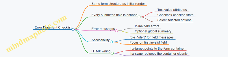
Practical Example: Minimal HTMX Wiring for Preservation
Use hx-target to replace the form container with the server-rendered fragment. Use outerHTML so the entire form is replaced, ensuring the echoed values and error messages are consistent.
When the server returns the invalid form fragment, the user sees their previous input and a clear list of what to correct. The client does not need to reconstruct state; the server already has it, and the fragment is the source of truth.
5.4 Handling Redirects and Post Submit Navigation
After a successful HTMX form submission, you have two jobs: (1) decide where the user should land next, and (2) make sure the navigation feels consistent with what the server actually did. Redirects are the server’s way of saying “the canonical result is at this URL.” HTMX is the client’s way of saying “render this response into the page.” When you combine them, you need a clear rule for which one wins.
Core Navigation Options
- Return a fragment directly: The server responds with HTML for the target region. This is best when the next state is still “the same page,” just updated.
- Return a redirect: The server responds with a redirect status and a
Locationheader. This is best when the next state is a different canonical resource URL. - Return a fragment plus out of band updates: The server updates multiple regions in one response, and you keep the URL stable. This is best when you want the page to reflect the new state without changing the route.
A practical rule: if the user should bookmark or share the result, prefer a redirect. If the user should keep their current context (filters, scroll position, open panels), prefer a fragment.
Redirects with HTMX
When a form submission succeeds, the server can redirect to a “show” page or to a “list with the new item included.” For example, after creating a comment, you might redirect to /posts/42 so the user sees the updated post.
To keep the experience smooth, ensure the redirect target renders the same semantic structure as the page the user expects. If the redirect lands on a full page, the browser navigation will replace the current DOM. If you instead want to stay on the same page, return a fragment and update the relevant container.
Post Submit Navigation Mind Map
Example: Redirect After Create
Use a redirect when the user should land on the canonical “detail” page.
<form
  hx-post="/posts/42/comments"
  hx-target="#main"
  hx-swap="innerHTML">
  <input name="body" />
  <button type="submit">Add comment</button>
</form>
In this setup, you typically choose one of two behaviors:
- If the server returns a fragment,
#mainupdates. - If the server returns a redirect, the browser navigates to the
LocationURL, and the full page is rendered.
On the server, the successful POST handler should redirect to the page that represents the new state. For instance, redirect to /posts/42 after inserting the comment.
Example: Stay on Page with Fragment Updates
Use a fragment response when the user should remain in the same workflow, such as adding an item to a list while keeping the current filters.
<form
  hx-post="/inbox/messages"
  hx-target="#message-list"
  hx-swap="beforeend">
  <input name="subject" />
  <button type="submit">Send</button>
</form>
Here, the server returns a single rendered message row. The list grows without changing the URL. If validation fails, return the form fragment with field errors so the user can correct input without losing what they typed.
Handling Validation Versus Success
Redirects should be reserved for success paths. On validation failure, return a fragment that re-renders the form region with error messages and the user’s submitted values. This keeps the mental model simple: “success moves; failure stays and explains.”
A clean pattern is:
- POST invalid:
200 OKwith the form fragment and errors. - POST valid:
303 See Other(or302) to the canonical GET URL.
Practical Checklist
- Redirect targets must be correct GET endpoints that render the updated state.
- Success messages should appear in the region that will actually be shown after navigation.
- Error rendering must target the form region so users don’t hunt for feedback.
- Choose fragment updates when preserving UI context matters more than changing the route.
- Choose redirects when the result should have a stable, shareable URL.
When these rules are consistent, navigation stops being a side effect and becomes a deliberate part of the user experience design.
5.5 Rendering Global Errors and Recovery Actions
Global errors are messages that apply to the whole form or request, not a single field. In server-rendered HTMX flows, they should be rendered in a predictable region so the user can recover without hunting for what went wrong.
Establishing a Global Error Region
Create a dedicated container near the top of the form. Give it a stable id so HTMX can target it reliably. Keep the markup semantic: use an aria-live region for updates and ensure the message is readable even when styling fails.
Example: a global error block that can be swapped on failure.
<form hx-post="/orders" hx-target="#form" hx-swap="outerHTML">
  <div id="global-errors" aria-live="polite">
    <!-- server may replace this -->
  </div>

  <div id="form">
    <!-- form fields here -->
  </div>

  <button type="submit">Place order</button>
</form>
On success, the server can return the normal form or a confirmation fragment. On failure, it should return the same overall structure so the swap does not leave the page in an odd half-state.
Designing Error Payloads That Support Recovery
A global error should include:
- A short summary the user can act on.
- Optional details that explain what to check.
- Recovery actions that are safe and obvious.
Recovery actions should be implemented as links or buttons that trigger new requests, not as client-side guessing. For example, “Try again” should resubmit the same form, while “Review details” should navigate back to the form with the user’s current inputs.
Rendering Global Errors with HTMX Targets
Use HTMX to swap only the error region when possible. This avoids re-rendering the entire form and keeps focus behavior simpler.
<form hx-post="/orders" hx-target="#global-errors" hx-swap="innerHTML">
  <div id="global-errors" aria-live="polite"></div>

  <div>
    <label>Customer email</label>
    <input name="email" type="email" required />
  </div>

  <button type="submit">Place order</button>
</form>
When the server detects a global failure (for example, payment provider unavailable), it returns only the error fragment. When field-level validation fails, you can return a fragment that updates both the global region and the relevant fields.
Mind Map: Global Errors and Recovery Actions
Example: Server Fragment for a Global Failure
A global error fragment should be self-contained and not assume surrounding layout. Include a reference id so the user can quote it if needed.
<div class="alert" role="alert">
  <strong>We couldn’t place the order.</strong>
  <p>Please try again in a moment, or review your details.</p>
  <p>Reference: <code>REQ-7f3a2c</code></p>

  <div class="actions">
    <button type="button" onclick="this.form.requestSubmit()">Try again</button>
    <a href="/orders/new">Review details</a>
  </div>
</div>
The “Try again” action can be implemented without custom JavaScript by using a normal submit button in the form, but the key idea is that the action must trigger a real request that the server understands.
Recovery Actions That Avoid Confusing Loops
Two common pitfalls are:
- Infinite retry loops: if the server always returns the same global error for a given input, “Try again” becomes a trap. In that case, prefer “Review details” or a safe navigation link.
- Loss of user input: if the server re-renders the form on global failure, it should preserve the user’s submitted values. Otherwise, the user has to retype everything, which turns recovery into punishment.
A practical rule: if the user’s input is still valid but the request failed due to external conditions, keep the form state and only update the global error region.
Example: Coordinating Global Errors with Field Validation
When field validation fails, render both global and field errors in one response so the user sees the full picture at once.
<div id="global-errors" aria-live="polite">
  <div role="alert">
    <strong>Check the form before submitting.</strong>
  </div>
</div>

<div id="form">
  <!-- re-render fields with inline errors -->
</div>
This approach keeps the recovery path consistent: the user corrects what’s wrong, then submits again.
Systematic Checklist for Global Errors
- The error region has a stable target.
- The message is short, specific, and actionable.
- Recovery actions are server-backed and safe.
- User input is preserved when re-rendering.
- The UI remains usable with keyboard and without color.
Global errors should help the user recover in one or two steps. If recovery requires guesswork, the error rendering is doing more work than it should.
6. Navigation Patterns with Hypermedia Links and History
6.1 Designing Link Driven Workflows for UI Navigation
Link driven workflows treat navigation as a normal resource transition: the user clicks a link, the server returns the next representation, and the page updates in a predictable region. With HTMX, you can keep that model while still getting partial updates and smooth interactions.
Core Idea: Links Describe Transitions
A link should answer two questions: “Where does this action go?” and “What should the user see next?” When you design workflows around URLs, you get shareable states and consistent back/forward behavior. When you design around buttons that fire arbitrary requests, you often end up with UI state that only exists in the browser.
A practical rule: if the user can reasonably bookmark or share the result, it should be reachable via a link. If it’s purely an in-place tweak, it can still be a link, but the target should be a fragment update.
Markup Contract: Stable Targets and Predictable Fragments
For link driven navigation, you need a stable DOM “landing zone.” For example, wrap the main content in a container with an id, and make every navigation link update that container.
<main id="content">
  <!-- server renders initial page here -->
</main>
Now every link can target #content and swap in the next server rendered fragment. The key is that the server returns HTML that matches the container’s expectations, so the swap never leaves half a layout behind.
Workflow Patterns That Fit Links
- List to Details: A link from a row to a detail view updates the same content container.
- Details to Related Actions: Links inside the detail view update subregions, such as an “activity” panel.
- Wizard Steps: Each step is a link that loads the step representation; form submissions can still be HTMX requests.
- Error Recovery: Links from error fragments return the user to a known good representation.
Each pattern works best when the server owns the representation. The client only decides where to place it.
Mind Map: Link Driven Navigation
Example: List to Details with Content Swaps
Assume a page shows a list of projects. Each project name is a link that loads the project detail fragment.
<ul>
  <li>
    <a href="/projects/42"
       hx-get="/projects/42"
       hx-target="#content"
       hx-swap="innerHTML">
      Project Atlas
    </a>
  </li>
</ul>
When the user clicks, the browser still knows the destination URL (href), and HTMX fetches the fragment (hx-get). The server can return a full page for normal navigation and a fragment for HTMX requests, but the user experience stays consistent because the landing zone is always #content.
Example: Breadcrumb and Title Updates Out of Band
Navigation often changes page metadata. Instead of forcing the main fragment to include everything, let the server return small “out of band” elements.
<!-- inside the fragment returned for /projects/42 -->
<title>Project Atlas</title>
<nav aria-label="Breadcrumb">
  <ol>
    <li><a href="/projects">Projects</a></li>
    <li aria-current="page">Project Atlas</li>
  </ol>
</nav>
<section>
  <h1>Project Atlas</h1>
  <!-- rest of content -->
</section>
With out of band swaps enabled, these pieces update without disturbing the main container. The result is less DOM churn and fewer “why did my scroll jump?” moments.
Advanced Detail: Making Back/Forward Behave
Back/forward works best when navigation is URL driven. Ensure links use real href values and that the server returns representations that match the URL. If you update only a fragment, the browser still records the URL transition, so the user can return to the previous representation.
A small UX improvement is to focus the updated region after swaps. You can do this by ensuring the fragment includes a heading and then using a lightweight focus strategy in the page template.
Example: Focus the Updated Region
<main id="content" tabindex="-1">
  <!-- fragment includes <h1> or similar -->
</main>
After a swap, focusing #content makes keyboard users land in the right place without re-scanning the page.
Summary of Best Practices
Design each link as a transition to a URL-backed representation, keep a stable target container for swaps, and let the server render fragments that match that contract. Use out of band updates for metadata, and ensure the updated region is focusable so navigation feels intentional rather than accidental.
6.2 Updating Breadcrumbs and Page Titles with Out of Band Swaps
Breadcrumbs and page titles are small, but they carry a lot of meaning: they tell users where they are, and they help assistive technologies and browser UI stay consistent. With HTMX, you can update these elements without re-rendering the whole page by using out of band swaps. The key idea is simple: your server can return extra markup that targets elements elsewhere in the DOM, even if the primary swap target is different.
Foundational Model for Out of Band Updates
Think of a page as two layers of UI work:
- Primary content update: the section the user asked for, like a list, a detail panel, or a form result.
- Global context update: metadata and navigation cues, like breadcrumbs and the document title.
Out of band swaps let the server respond with both layers at once. The client applies the primary swap to the requested target, then applies the out of band fragments to their own targets.
Mind Map: Where Breadcrumbs and Titles Live
Server Render Strategy for Consistent Context
A practical pattern is to render breadcrumbs and titles from the same server-side “view model” you use for the main content. That prevents mismatches like a detail panel showing item 42 while breadcrumbs still say item 41.
For example, when a user clicks a link to /projects/7/tasks/3, your server can compute:
- Breadcrumb items:
Projects → Project 7 → Tasks → Task 3 - Page title:
Task 3 in Project 7
Then your main fragment returns the task content, while two out of band fragments update:
- The breadcrumb container in the layout
- The
<title>element in the document head
Example: HTMX Request with Out of Band Fragments
In your layout, ensure you have stable targets for the out of band swaps.
<!-- Layout snippet -->
<nav aria-label="Breadcrumb">
  <ol id="breadcrumbs">
    <!-- initial server render -->
  </ol>
</nav>

<head>
  <title id="page-title">Loading…</title>
</head>

<main id="content">
  <!-- primary content swaps here -->
</main>
Now, the link that triggers the update can target only the main content.
<a href="/projects/7/tasks/3"
   hx-get="/projects/7/tasks/3"
   hx-target="#content"
   hx-swap="innerHTML">
  View task
</a>
Your server response includes the main fragment plus out of band fragments. The out of band fragments declare their own swap targets.
<!-- Main fragment swapped into #content -->
<section>
  <h1>Task 3</h1>
  <p>Status: In progress</p>
</section>

<!-- Out of band breadcrumb update -->
<ol id="breadcrumbs" hx-swap-oob="true">
  <li><a href="/projects">Projects</a></li>
  <li><a href="/projects/7">Project 7</a></li>
  <li><a href="/projects/7/tasks">Tasks</a></li>
  <li aria-current="page">Task 3</li>
</ol>

<!-- Out of band title update -->
<title hx-swap-oob="true">Task 3 in Project 7</title>
Practical Details That Prevent Common Bugs
- Use stable IDs:
#breadcrumbsand the<title>element must exist in the DOM before swaps happen. If the IDs change between pages, out of band updates will silently fail. - Keep breadcrumb structure consistent: render the same list element type (
<ol>with<li>) every time. Assistive tech relies on predictable structure. - Avoid duplicate titles: only one
<title>should be updated. If you wrap titles in extra elements, you may end up with confusing browser behavior. - Mark the current crumb: set
aria-current="page"on the last breadcrumb item so screen readers announce it as the current location.
Case Example: Breadcrumbs for Nested Navigation
Suppose you have nested routes: /projects/:projectId/tasks and /projects/:projectId/tasks/:taskId. When the user navigates from the list to a task, the primary content changes, but the breadcrumb should also move forward.
A clean rule is: the server response for the task view always includes the full breadcrumb trail, not just the last segment. That way, you never depend on what the client previously rendered.
Summary of the Integrated Workflow
When a user triggers an HTMX navigation:
- The server returns the main content fragment for
hx-target. - The server also returns out of band fragments for
#breadcrumbsand<title>. - The client applies both updates in the same response cycle, keeping navigation cues and browser context aligned with the content the user just requested.
6.3 Managing Browser History and Back Forward Behavior
Browser history is where server-rendered UX either feels seamless or feels like it’s fighting the user. With HTMX, you can keep the back and forward buttons working predictably by aligning three things: what URL the browser thinks it visited, what DOM you replace, and whether you let the browser cache and restore prior states.
Foundational Mental Model
When a user clicks a link, the browser creates a history entry for the target URL. With HTMX, you often intercept that navigation and fetch HTML instead. If you don’t update the URL and history entry intentionally, the back button may jump to an earlier page that no longer matches what the user sees.
A practical rule: if the user expects back to undo the visible change, the visible change should correspond to a distinct URL state. If the visible change is purely in-place (like expanding a row), you can keep it off the history stack.
Choosing Which Interactions Become History Entries
Start by classifying interactions:
- Navigation-like changes: switching between views, opening a detail page, changing filters that should be shareable. These should update the URL and create history entries.
- In-place changes: toggling a checkbox, expanding a panel, revealing inline help. These should not create new history entries.
For navigation-like changes, prefer link-driven requests or form submissions that target a URL you can represent. For in-place changes, keep the URL stable.
URL Updates and History Entries with HTMX
HTMX can push or replace history entries when it swaps content. The key idea is to ensure the browser URL matches the content you render.
Use a pattern like this for navigation-like swaps:
- The request returns HTML for the main content region.
- The swap updates that region.
- The URL is updated so back returns to the prior URL and content.
A simple example uses a link that targets the main container and updates history:
<a href="/orders/42"
   hx-get="/orders/42"
   hx-target="#main"
   hx-swap="innerHTML"
   hx-push-url="true">
  View order 42
</a>
Now the browser history reflects the order URL. When the user presses back, the browser navigates to the previous URL, and HTMX can re-render the correct content for that URL.
Handling Back Forward Cache and Restored DOM
Some browsers may restore pages from cache when navigating back and forward. If your page relies on client-side initialization, you must ensure the restored DOM is still consistent. For server-rendered fragments, consistency usually comes from rendering the full region needed for the view.
To reduce surprises:
- Keep the swap target narrow and deterministic, such as
#main. - Avoid partial updates that depend on transient client state unless you can recompute it on restore.
- Ensure any form controls in the swapped region reflect server truth, not stale local edits.
Preventing Double Navigation and Mismatched URLs
A common failure mode is when the URL changes but the content swap doesn’t match, or vice versa. That happens when:
- The request is made to one URL but the browser URL is updated to another.
- Multiple swaps occur and only one is tied to history.
- The swap target is too broad, replacing elements that should remain stable across history states.
A robust approach is to tie history updates to a single, well-defined region. If you need additional updates like breadcrumbs, do them as out-of-band swaps that are derived from the same server response.
Mind Map: History Strategy for HTMX Swaps
Example: Filters That Behave Like Real Navigation
Suppose you have a list page with server-rendered filtering. Users expect back to return to the previous filter state.
Use links or form submissions that update the URL and swap #main:
<form hx-get="/orders"
      hx-target="#main"
      hx-swap="innerHTML"
      hx-push-url="true">
  <input type="hidden" name="status" value="paid">
  <button type="submit">Paid</button>
</form>
Each submission produces a new URL with query parameters. The browser history now tracks filter states, and back returns to the prior list.
Example: Row Expansion Without History Noise
For expanding a row, keep the URL unchanged. The user can still use back to leave the page, but back won’t step through every expansion.
<button hx-get="/orders/42/notes"
        hx-target="#order-42-notes"
        hx-swap="innerHTML">
  Show notes
</button>
The swap updates a small region and doesn’t create a new history entry.
Practical Checklist
- Decide whether the interaction should be a history entry.
- For history entries, ensure the server response corresponds to the URL you push.
- Swap a deterministic container like
#main. - Use out-of-band swaps for dependent UI that must change with the same response.
- Keep in-place interactions off the history stack.
When these rules are followed, back and forward behave like the user expects: they move between meaningful states, not between every tiny DOM tweak.
6.4 Implementing Modal Navigation and Focus Management
Modals are a special kind of navigation: they temporarily replace the user’s attention without leaving the current page context. With HTMX and server-rendered HTML, the key is to treat the modal as a predictable DOM region that can be opened, updated, and closed while keeping focus behavior consistent.
Foundational Model for Modal UX
A modal interaction has four states: closed, opening, open, and closing. “Opening” is not just a visual change; it’s when focus moves and keyboard behavior becomes constrained. “Closing” is when focus returns to the element that initiated the modal.
Define these invariants early:
- The modal has a single focus entry point (usually the first meaningful control).
- Focus stays inside the modal while it’s open.
- Pressing Escape closes the modal.
- Clicking the backdrop closes the modal only when that’s intended.
- When the modal closes, focus returns to the opener.
Server-Rendered Structure That Supports Focus
Render the modal markup so it can be swapped without breaking focus rules. Use stable IDs for the modal container and its content region.
A practical pattern is:
- A button or link triggers the modal request.
- The server returns the modal HTML fragment.
- HTMX swaps the fragment into a dedicated container.
- The modal fragment includes a focusable element that can receive focus immediately.
Example: the trigger includes a target container and a swap strategy that replaces the modal region.
<button
  hx-get="/projects/42/details"
  hx-target="#modal-root"
  hx-swap="innerHTML"
  hx-on="htmx:afterSwap:openModal(this)"
>
  View details
</button>

<div id="modal-root" aria-live="polite"></div>
The modal fragment should include an element like a close button or the first input. Give the modal container role and labeling so screen readers understand it.
<div class="modal" id="project-modal" role="dialog" aria-modal="true" aria-labelledby="project-modal-title">
  <h2 id="project-modal-title">Project details</h2>
  <button type="button" class="close" onclick="closeModal()">Close</button>
  <div class="modal-body">…</div>
</div>
Mind Map: Modal Navigation and Focus Management
Focus Trap and Restoration Logic
You need two small behaviors: trapping focus while the modal is open, and restoring focus when it closes. Store the opener element so restoration is accurate even if multiple triggers exist.
<script>
  let lastOpener = null;

  function openModal(openerEl) {
    lastOpener = openerEl;
    const modal = document.getElementById('project-modal');
    modal.style.display = 'block';
    const focusable = modal.querySelector('button, [href], input, select, textarea, [tabindex]:not([tabindex="-1"])');
    (focusable || modal).focus();
    document.addEventListener('keydown', trapTab);
    document.addEventListener('keydown', onEscape);
  }

  function closeModal() {
    const modal = document.getElementById('project-modal');
    if (modal) modal.remove();
    document.removeEventListener('keydown', trapTab);
    document.removeEventListener('keydown', onEscape);
    if (lastOpener) lastOpener.focus();
  }

  function onEscape(e) {
    if (e.key === 'Escape') closeModal();
  }

  function trapTab(e) {
    if (e.key !== 'Tab') return;
    const modal = document.getElementById('project-modal');
    if (!modal) return;
    const focusables = [...modal.querySelectorAll('button, [href], input, select, textarea, [tabindex]:not([tabindex="-1"])')];
    const first = focusables[0];
    const last = focusables[focusables.length - 1];
    if (e.shiftKey && document.activeElement === first) { e.preventDefault(); last.focus(); }
    else if (!e.shiftKey && document.activeElement === last) { e.preventDefault(); first.focus(); }
  }
</script>
This code assumes the modal is present after the swap. If your server sometimes returns an empty fragment (for example, an error), guard the openModal call by checking for the modal element.
Backdrop Click and Click Targeting
Backdrop behavior should be explicit. If you render a backdrop element, attach the close handler to the backdrop, not to the dialog itself. Otherwise, clicks inside the modal can accidentally close it.
Example modal fragment pattern:
<div class="backdrop" onclick="closeModal()"></div>
<div class="modal" id="project-modal" role="dialog" aria-modal="true" aria-labelledby="project-modal-title">
  <h2 id="project-modal-title">Project details</h2>
  <button type="button" class="close" onclick="closeModal()">Close</button>
  <div class="modal-body">…</div>
</div>
Updating Modal Content Without Breaking Focus
When the modal content changes (for example, switching tabs inside the modal), avoid replacing the entire modal container if you can. If you must replace it, re-run openModal logic after the swap so focus lands on a sensible control. Keep the close button stable so users don’t lose their way.
A reliable approach is to target only the modal body region:
- Modal container stays in place.
- HTMX swaps
.modal-body. - Focus remains where it was unless the update removes the focused element.
Integrated Example Flow
- User clicks “View details”.
- HTMX fetches
/projects/42/detailsand swaps into#modal-root. htmx:afterSwapcallsopenModal(this).- Focus moves to the close button.
- Tab cycles within the modal.
- Escape or backdrop click closes the modal.
- Focus returns to the original “View details” button.
That sequence keeps modal navigation predictable across mouse, keyboard, and assistive technologies, while still letting the server own the HTML that appears on screen.
6.5 Ensuring Consistent URL Semantics for Shareable States
Shareable state means a user can copy a URL, send it to a teammate, and both land on the same view with the same filters, pagination, and selected item. With HTMX, the temptation is to treat every interaction as “just a fragment update.” That works until the URL stops matching what the user sees. The fix is to make URL semantics a deliberate part of your UI contract.
Foundational Rule: The URL Describes the Whole View
A page URL should represent the complete screen state, not merely the last action. For example, a list page might include query parameters for search and filters, while a detail page might include a path segment for the resource id. When HTMX updates only part of the DOM, the server still needs to know which state the user is in, and the client needs to keep the address bar aligned.
A practical pattern is:
- Full page GET renders the entire view for a given URL.
- HTMX requests are POST or GET that return fragments.
- After an HTMX interaction changes the view state, the client updates the URL to the new canonical URL.
Defining Canonical URLs for Each View
Start by writing down the canonical shape for each major view.
- List view:
/orders?query=...&status=...&page=... - Detail view:
/orders/{id} - Nested selection:
/orders/{id}?tab=...
Keep these stable. If you later change parameter names, you’ll break old links and confuse users who bookmarked the old URL.
Mapping UI Actions to URL Changes
Not every interaction should change the URL. Decide based on whether the state is meaningful to share.
- Changes URL: search submit, filter toggle, pagination, tab selection, selecting a specific item.
- Might not change URL: typing into a search box without submitting, expanding a collapsed panel, hovering.
For example, if a user filters orders to “Paid” and then clicks page 2, the URL should reflect both the filter and the page. If they merely expand “Order details” inline, you can keep the URL unchanged.
Using History Updates with HTMX
HTMX can update the browser history so the address bar matches the new state. The key idea is: when the server returns a fragment that corresponds to a new canonical URL, instruct HTMX to push or replace that URL.
Example: filter submission that updates both content and URL.
<form hx-post="/orders/filter"
      hx-target="#orders-list"
      hx-swap="innerHTML"
      hx-push-url="true">
  <input type="hidden" name="status" value="paid">
  <button type="submit">Paid</button>
</form>
In this setup, the server should respond with the fragment for #orders-list, and the request should be associated with the canonical URL that includes status=paid. If you use hx-push-url="true", ensure the response is tied to the correct URL so the history entry is accurate.
Handling Redirects Without Losing Semantics
When a POST results in a new canonical GET URL, prefer a redirect to the GET form of the state. That keeps the canonical URL consistent and reduces special cases.
A common approach:
- POST endpoint validates input and returns either a fragment with the correct canonical URL metadata or a redirect to the canonical GET.
- GET endpoint renders the full page for that URL.
If you skip this and return fragments from many different endpoints with inconsistent URL shapes, you’ll end up with “almost shareable” links that look right but don’t reproduce the exact view.
Mind Map: URL Semantics for Shareable States
URL Semantics Mind Map
Example: Back Button That Actually Works
Imagine a user filters to “Paid,” then goes to page 3, then selects order 42. With consistent semantics:
- Each step updates the URL to the canonical state.
- The back button walks through those states because history entries match the view.
- Reloading the page reconstructs the same list and selection because the GET endpoint uses the URL parameters.
If instead you only swap fragments and never update the URL, the back button may jump to an earlier unrelated page, and a copied link may show the default filter rather than what the user currently sees.
Practical Checklist
- Every shareable UI state has a canonical URL.
- Every URL-changing interaction updates history to that canonical URL.
- GET endpoints render the full view from the URL.
- POST endpoints map to the canonical outcome via redirect or correct history association.
- Non-shareable UI changes do not clutter the URL.
When these rules are followed, the URL becomes a reliable description of what the user is looking at, even though the page is being updated in smaller pieces.
7. Composable UI Components with Partial Templates
7.1 Defining Component Boundaries for Reuse
Component reuse in server-rendered HTMX apps works best when you draw boundaries around what changes and what stays stable. A reusable component is not “any chunk of HTML”; it’s a fragment with a clear contract: inputs it expects, outputs it produces, and the DOM region it owns.
Start with Ownership, Not Aesthetic Similarity
A component boundary is the set of DOM nodes a fragment is responsible for. If a fragment sometimes updates its own header but sometimes relies on the page template to redraw it, you’ll get inconsistent UI after swaps.
A practical rule: choose a single “root” element for the component and ensure every swap target points to that root or a descendant that the component can fully render. For example, a product-card component should render the card container, its title, its price, and its action area. If you only render the title and leave the rest to other fragments, you’ve created a coordination problem.
Define Inputs as Data Contracts
On the server, treat component inputs like function parameters. Keep them small and explicit.
- Identity inputs:
productId,userId. - Display inputs:
name,price,statusLabel. - Behavior inputs:
canEdit,canDelete.
Avoid passing raw objects that force templates to know too much about the caller’s domain model. Instead, pass pre-shaped values that the component can render without guessing.
Define Outputs as Markup Guarantees
A component output should guarantee:
- Stable structure: the same root element and key subregions exist across renders.
- Predictable swap behavior: the fragment can be swapped into the same target every time.
- Self-contained accessibility: labels, headings, and ARIA attributes are present where needed.
If a component sometimes omits an error message region, your swap target might keep stale content. Include the region and render it empty when there’s nothing to show.
Mind Map: Boundary Decisions
Example: Product Card with Clear Boundaries
Imagine a product list where each card can be updated after an “Add to cart” action. The card component should own its action area so the server can return a fragment that replaces only that area.
Component contract
- Inputs:
productId,name,price,inCartCount,canEdit. - Output: a
div.product-cardroot with adiv.product-actionssubregion.
HTMX wiring idea
- The “Add to cart” button targets
#product-actions-{{productId}}. - The server returns the
product-actionsfragment, not the whole card.
This boundary keeps the list stable while still allowing precise updates.
Example: Inline Edit Form Without Leaking Page Context
Inline editing often fails reuse because the form template depends on page-level variables like breadcrumbs or global layout state. Keep the edit component self-sufficient.
- The edit component receives
productId,currentName, andvalidationErrors. - It renders the form fields, error messages, and submit button.
- It does not assume where it sits in the page; it only assumes it will be swapped into a known container.
If validation fails, the server returns the same form fragment with errors populated. The caller doesn’t need to merge error markup; the component owns that output.
Composition Rules That Prevent Template Coupling
Reusable components stay reusable when parents pass data and children render markup.
- Parent passes values:
statusLabel,canEdit. - Child renders subregions: badges, buttons, and helper text.
- Avoid parent-driven partial assembly: don’t have the parent stitch together badge HTML and button HTML from separate fragments unless each fragment has a clear ownership boundary.
Advanced Detail: Boundary Granularity for Swap Strategy
Granularity is a trade-off between reuse and update precision.
- Use coarser components when the UI region changes together (e.g., a card header plus its actions).
- Use finer components when only one subregion changes (e.g., a counter next to an icon).
A good test: if you can describe the component update in one sentence—“Replace the actions area after cart changes”—then your boundary is probably the right size.
Quick Checklist for Reusable Boundaries
- One root element per component fragment.
- Swap targets align with component-owned nodes.
- Inputs are explicit and pre-shaped for rendering.
- Output includes stable structure and accessibility.
- Errors and empty states render consistently.
- Parents pass data, not markup fragments.
When these hold, reuse becomes mechanical: you can drop the component into a new page, wire the same targets, and trust the server to return fragments that fit without surprise.
7.2 Passing Parameters to Partial Templates Safely
Partial templates become reliable when the data you pass is explicit, validated, and predictable. “Safely” here means two things: the template receives the right shape of data, and the rendered HTML can’t be tricked into producing unintended markup.
Foundational Data Contracts
Start by treating each partial as a small contract.
- Inputs are named and minimal. Pass only what the partial needs:
user,items,errors,pagination. - Inputs have stable types. If
itemsis a list, always pass a list, even if it’s empty. - Inputs are sanitized at the boundary. Escape user-provided strings before they reach the template, or rely on your template engine’s auto-escaping.
A practical rule: if a partial can render without optional fields, make those fields optional only in the data layer, not by sprinkling if checks everywhere.
Parameter Shaping and Validation
In server-rendered systems, you typically build the parameters in the route handler (or view model builder) rather than inside the template.
- Normalize before render. Convert database rows into view-friendly structures: dates formatted, booleans coerced, IDs typed.
- Validate for partial context. A “Delete button” partial should receive a boolean like
canDelete, not raw permission objects. - Keep derived values derived. If the partial needs
displayPrice, compute it once and pass it in.
This prevents the partial from becoming a mini application with its own logic, which is where subtle inconsistencies creep in.
Escaping and Attribute Safety
Even with auto-escaping, you must be careful with where values land.
- Text nodes: safe with auto-escaping.
- HTML attributes: safe if the engine escapes quotes and special characters.
- URLs and query strings: ensure values are URL-encoded and restricted to expected patterns.
If you pass a value into an attribute like hx-get="...", treat it as data, not markup. Never pass prebuilt HTML into a partial unless you have a deliberate, audited process for it.
Mind Map: Parameter Flow and Safety
Example: List Row Partial with Predictable Inputs
Assume a partial renders each row in a table. The route handler constructs a list of row view models.
<!-- _item_row.html -->
<tr id="item-{{item.id}}">
  <td>{{item.name}}</td>
  <td>{{item.statusLabel}}</td>
  <td>
    <button
      hx-post="/items/{{item.id}}/toggle"
      hx-target="#item-{{item.id}}"
      hx-swap="outerHTML"
      {{#unless item.canToggle}}disabled{{/unless}}>
      Toggle
    </button>
  </td>
</tr>
Key safety choices:
item.idis numeric or a UUID string that you control.item.nameis treated as text, not HTML.hx-postuses an ID that has already been validated.disabledis driven by a boolean, not by raw permission text.
Example: Error Partial with Field-Level Messages
For form errors, pass a structured map so the partial doesn’t guess.
<!-- _field_errors.html -->
{{#each errors as |err|}}
  <div class="field-error" role="alert">{{err.message}}</div>
{{/each}}
The handler should pass errors as an array of objects with a message string already escaped by the template engine. If you also need a field name, pass it as a separate string rather than embedding it into the message.
Advanced Detail: Out of Band Updates and Parameter Scope
When a partial is used for out-of-band swaps (like updating a page title or a summary widget), keep parameters scoped to that fragment.
- The title partial should receive
titleTextonly. - The summary partial should receive
countsonly. - Avoid passing the entire page model to every partial; it increases the chance that one fragment accidentally depends on fields that aren’t present in other contexts.
A good litmus test: if you can render the partial in isolation with a small sample payload, it’s likely safe and maintainable.
Practical Checklist
- Pass named, minimal parameters.
- Normalize and validate in the handler.
- Rely on auto-escaping for text and ensure attribute values are escaped.
- Restrict IDs used in URLs to validated formats.
- Keep partial logic focused on presentation, not data shaping.
When these rules are consistent, partials become predictable building blocks: they render the same way for the same inputs, and they don’t surprise you when the request is a partial update rather than a full page load.
7.3 Rendering Lists and Detail Views with Consistent Markup
A list and a detail view should feel like two windows into the same resource, not two unrelated pages. Consistent markup means the server returns fragments that share the same structural vocabulary: the same headings hierarchy, the same “card” layout rules, the same action button placement, and stable wrapper elements so HTMX swaps don’t reshuffle the page like a deck of cards.
Foundational Markup Contracts
Start by defining a small set of reusable regions. For example:
- List Region: a wrapper with an identifiable container for results.
- Item Card: a repeatable block with predictable sub-elements.
- Detail Region: a wrapper that can be swapped independently.
- Action Bar: a consistent place for primary and secondary actions.
When the list item is clicked, the server should return detail markup that uses the same card conventions as the list item. That way, users can scan quickly because the visual grammar stays the same.
Mind Map: Markup Consistency Strategy
Designing the List Markup
A list fragment should render each item with the same internal structure every time. Use a card-like pattern with a heading for the title, a short summary, and a status badge. The wrapper around the whole list should be stable so sorting, filtering, and pagination can replace only the inner results.
Example list item structure (conceptual):
articleordivwithclass="item-card"h3for the item titlepfor the summaryspanfor status- an action link that triggers a detail request
The action link should carry enough information for the server to fetch the correct resource. In practice, that’s usually the resource ID in the URL.
Designing the Detail Markup
The detail fragment should reuse the same “card” conventions as the list item. If the list shows a status badge, the detail should show it in the same relative position. If the list uses an h3 for the title, the detail should use an h2 or h3 depending on the page’s overall heading structure, but keep the same meaning.
Also, include an action bar that mirrors the list’s action placement. For example, if the list card has a primary “View” action, the detail panel can have “Edit” and “Delete” while keeping the same button ordering and visual grouping.
Coordinating List and Detail with HTMX
Use two targets: one for list updates and one for detail updates. A common pattern is a two-column layout where the list column swaps results, and the detail column swaps the selected resource.
<div class="layout">
  <section id="list-panel">
    <div id="results-wrapper">
      <!-- list items rendered here -->
    </div>
  </section>

  <aside id="detail-panel">
    <div id="detail-wrapper">
      <!-- detail fragment swapped here -->
    </div>
  </aside>
</div>
When a user clicks an item, the server returns only the inner detail markup for #detail-wrapper. This keeps the outer layout stable and avoids layout jumps.
Example: Consistent Card Markup Across Both Views
Below is a minimal illustration of shared structure. The list card and the detail card both use the same classes and sub-elements.
<!-- List card fragment -->
<article class="item-card">
  <h3 class="item-title">Acme Report</h3>
  <p class="item-summary">Monthly overview for Q2.</p>
  <span class="status-badge">Published</span>
  <a class="btn" hx-get="/items/42" hx-target="#detail-wrapper" hx-swap="innerHTML">
    View
  </a>
</article>
<!-- Detail card fragment -->
<article class="item-card">
  <h2 class="item-title">Acme Report</h2>
  <p class="item-summary">Monthly overview for Q2.</p>
  <span class="status-badge">Published</span>
  <div class="action-bar">
    <a class="btn" href="/items/42/edit">Edit</a>
    <form method="post" action="/items/42/delete">
      <button class="btn btn-danger" type="submit">Delete</button>
    </form>
  </div>
</article>
Notice what stays consistent: the card container, the title meaning, the status badge placement, and the action grouping. The detail view adds more fields, but it doesn’t change the basic vocabulary.
Handling Empty and Missing States Without Breaking Consistency
If the list is empty, render the same list wrapper and show a message in the same “card” style so the page doesn’t feel broken. If a detail resource is missing, swap the detail wrapper with a card that includes a clear heading like “Not Found” and a single recovery action such as “Back to list.” The key is that the detail wrapper always contains a card-like structure, even when the data isn’t there.
Practical Checklist for Consistent Markup
- The list and detail fragments share the same container classes and sub-elements.
- Outer layout wrappers remain stable; only inner regions swap.
- Heading levels are appropriate for context, but the meaning of each heading stays consistent.
- Status badges and action bars use the same placement rules.
- Empty list and missing detail render cards that match the same structural pattern.
7.4 Coordinating Multiple Targets in One Interaction
When one user action should update several parts of the page, you need a clear plan for what changes, where it lands, and how the updates stay consistent. With HTMX, that plan usually comes down to two mechanisms: multiple hx-target values via multiple elements and coordinated swaps using out-of-band updates. The goal is not “more magic,” but predictable DOM outcomes.
Foundational Mental Model
Think of the interaction as producing a set of HTML fragments, each with a destination. The destination can be:
- A primary target for the request response body.
- One or more secondary targets updated via out-of-band markers.
- A stable container that receives a swap mode that preserves layout.
A practical rule: keep the primary target focused on the main content region, and use out-of-band updates for small, related UI pieces like counters, breadcrumbs, or form summaries.
Coordinating Targets with Out of Band Updates
Out-of-band updates let the server return additional fragments in the same response. Each fragment declares where it should be applied, so you can update multiple regions without forcing the client to make multiple requests.
Example: a “Create Comment” action updates the comment list and also refreshes a comment count badge.
<div id="comment-count">12</div>
<ul id="comment-list"></ul>

<form
  hx-post="/posts/42/comments"
  hx-target="#comment-list"
  hx-swap="beforeend">
  <input name="body" placeholder="Write a comment" />
  <button type="submit">Post</button>
</form>
Server response includes the new list item plus an out-of-band fragment for the badge.
<li id="comment-99">Nice point.</li>
<div id="comment-count" hx-swap-oob="true">13</div>
Here, the primary response body appends to #comment-list, while the badge is replaced in place. The user sees both changes immediately, and the badge never depends on client-side counting logic.
Designing Response Fragments That Don’t Step on Each Other
Multiple targets can conflict if they overlap or if swap modes fight. Avoid these pitfalls:
- Don’t reuse the same
idfor different fragments in the same response unless you intend to replace that exact element. - Keep swap modes consistent with the element’s role. For example, use
beforeendfor list growth andinnerHTML-style replacement for single-value widgets. - Ensure each out-of-band fragment targets a unique element id.
A good pattern is to return:
- One main fragment for the primary target.
- Several out-of-band fragments for independent widgets.
Coordinating Multiple Targets with Event Boundaries
Sometimes you need coordination not only in the DOM, but also in timing. If a secondary update depends on the result of the primary swap, keep it in the same response so it happens in the same lifecycle. If you must separate timing, use HTMX events to trigger follow-up actions, but only when the dependency truly requires it.
For most “update list plus update summary” cases, same-response out-of-band updates are simpler and more robust.
Mind Map: Coordinating Multiple Targets
Example: Inline Edit with Three Regions
Suppose an inline edit updates the row content, refreshes a “last updated” timestamp, and toggles an “editing” indicator.
<table>
  <tbody id="rows">
    <tr id="row-7">
      <td>Original</td>
      <td>
        <button hx-get="/items/7/edit" hx-target="#edit-panel">Edit</button>
      </td>
    </tr>
  </tbody>
</table>

<div id="edit-panel"></div>
<div id="last-updated">—</div>
<div id="editing-indicator">Idle</div>
The “save” form posts and targets the row, while the server returns out-of-band updates for the other two regions.
<form
  hx-post="/items/7"
  hx-target="#row-7"
  hx-swap="outerHTML">
  <input name="value" />
  <button type="submit">Save</button>
</form>
Server response:
<tr id="row-7"><td>Updated</td><td>Done</td></tr>
<div id="last-updated" hx-swap-oob="true">2026-04-01 10:30</div>
<div id="editing-indicator" hx-swap-oob="true">Idle</div>
The row swap replaces the entire row element, while the timestamp and indicator update independently. The user gets a coherent result without waiting for separate requests.
Practical Checklist
Before wiring multiple targets, confirm:
- The primary target is the main content region for the action.
- Every out-of-band fragment has an
idthat exists in the page. - Swap modes match the element’s structure and expected behavior.
- The response contains exactly one fragment per destination element.
When these conditions hold, coordinating multiple targets becomes a straightforward contract between server-rendered fragments and stable DOM anchors.
7.5 Avoiding Template Coupling with Clear Data Contracts
Template coupling happens when a partial template quietly assumes too much about how its caller structures data, names variables, or orders fields. The result is “works until it doesn’t”: a harmless refactor in one place breaks another. The fix is to treat each partial as a small contract: it declares what it needs, what it returns, and how it behaves when data is missing.
What a Data Contract Means in Server Rendered UI
A clear data contract has three parts.
- Inputs: the exact fields the partial expects, including types and optionality.
- Invariants: rules that must hold for correct rendering, such as “id is always present” or “status is one of these values.”
- Outputs: what markup regions the partial produces, so callers can target swaps reliably.
When these are explicit, templates become composable. Callers can change their internal logic without rewriting every partial.
Contract Boundaries for Partial Templates
Start by drawing a boundary around each partial.
- List partial: renders a collection and a predictable container for swapping.
- Row partial: renders one item and exposes stable attributes for identification.
- Detail partial: renders a single item view and includes its own error and empty states.
A practical rule: if a partial needs to know how the caller paginates, sorts, or filters, the contract is already leaking.
Mind Map: Template Coupling and Contract Design
Example: From Leaky Templates to Contracted Partials
Consider a “task list” UI.
Coupled approach: the list partial expects tasks to be a list of objects with title, due_at, and priorityLabel, where priorityLabel is precomputed by the caller.
Contracted approach: the list partial expects a view model that already normalizes fields, and it owns the mapping from priority to label.
A simple contract for the list partial:
tasks: array of{ id, title, dueAt, priority }emptyText: stringcanCreate: boolean- Output: a container with
id="task-list"and rows that includedata-task-id.
This keeps the caller focused on fetching data, while the partial focuses on rendering.
Example: Stable Markup Regions for Swap Targets
When callers use HTMX swap targets, they should not depend on internal markup details.
- The list partial always renders a wrapper with
id="task-list". - The row partial always renders a row with
data-task-id. - The detail partial always renders a wrapper with
id="task-detail".
That way, the caller can swap the whole region without knowing how many inner elements exist.
Contracted View Models in Practice
Even if your stack is server-rendered, you can still structure data like a contract.
- Create a dedicated view model per partial.
- Populate it in the route handler.
- Keep the partial logic limited to formatting and conditional rendering.
Here is a compact example of a view model shape and how it prevents coupling.
TaskRowVM
- id: string
- title: string
- dueAt: ISO-8601 string or null
- priority: "low" | "medium" | "high"

TaskListVM
- tasks: TaskRowVM[]
- emptyText: string
- canCreate: boolean
The partial can format dueAt and map priority to a label, but it should not guess how priority was derived.
Mind Map: Invariants That Prevent Breakage
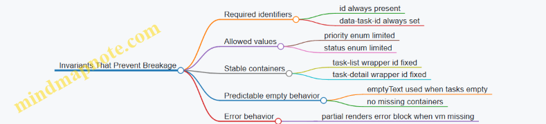
Example: Handling Missing Data Without Coupling
If a detail request fails or returns no task, the detail partial should still render id="task-detail" with an error or empty message. The caller should not need to decide which template to use.
A clean contract here is: the detail partial always receives a TaskDetailVM that includes either task or errorMessage.
- Caller: fetches and builds the VM.
- Partial: renders one region consistently.
This removes the need for the caller to branch on template selection, which is a common source of coupling.
Practical Checklist for Clear Contracts
- Every partial has a named input shape.
- Every partial has a stable outer wrapper for swaps.
- Every partial owns formatting and enum-to-label mapping.
- Every partial renders empty and error states inside its own wrapper.
- Callers pass view models, not raw domain objects with implicit expectations.
When these rules are followed, partials stop being fragile building blocks and become predictable components. Your UI still changes quickly, but the templates stop breaking for reasons that have nothing to do with the UI.
8. Data Fetching Patterns for Interactive Tables and Dashboards
8.1 Implementing Search and Filter Interactions with HTMX
Search And Filter Interactions With HTMX
Search and filtering feel simple until you try to make them consistent: the UI should update the same way every time, the server should receive predictable parameters, and the results should render without losing the user’s place. With HTMX, you can keep the interaction server-driven while still making the page feel responsive.
Core Interaction Model
Start by deciding what “state” means for your page. For a typical listing, state is usually:
- Query text (e.g.,
q) - Filter selections (e.g.,
status,category) - Sorting (e.g.,
sort) - Pagination (e.g.,
page)
Then decide what changes in the DOM. A common pattern is to swap only the results container while leaving the search form intact. That way, the user can refine filters without the form resetting.
Mind Map: Parameters to Markup
Markup Strategy for Predictable Swaps
Use a dedicated results wrapper so HTMX has a stable target. The wrapper should contain everything that must change together: the list, the empty state, and pagination.
A practical approach is to render the search form once, then swap only the results wrapper. The form should include hidden fields for any state you want to keep consistent across requests.
Example: Search Form with HTMX GET
<form
  hx-get="/items"
  hx-target="#results"
  hx-swap="innerHTML"
  hx-trigger="keyup changed delay:300ms, submit">
  <label>
    Search
    <input name="q" value="{{q}}" />
  </label>

  <label>
    Status
    <select name="status">
      <option value="" {{if eq status ""}}selected{{end}}></option>
      <option value="active" {{if eq status "active"}}selected{{end}}>Active</option>
      <option value="archived" {{if eq status "archived"}}selected{{end}}>Archived</option>
    </select>
  </label>

  <button type="submit">Search</button>
</form>

<div id="results">{{> items_results_partial}}</div>
This setup triggers on typing (with a short delay), on select changes, and on submit. Using GET keeps URLs shareable and makes back/forward behavior more intuitive.
Server Contract for Results Rendering
Your server endpoint should accept query parameters and return an HTML fragment that matches the results wrapper expectations. Keep the fragment self-contained: it should render the list, the empty state, and pagination links that also use HTMX.
A clean contract looks like this:
- Input:
q,status,sort,page - Output: HTML for
#results
When the user changes filters, reset pagination to page 1. You can do this by omitting page from the form submission or by having the server treat missing page as 1.
Pagination That Doesn’t Break the Flow
Pagination links should also be HTMX-enabled so the results wrapper swaps again. Keep the pagination markup inside the results fragment so it always matches the current filters.
Example: HTMX Pagination Links
<nav aria-label="Pagination">
  <a
    href="?q={{q}}&status={{status}}&page={{prev}}"
    hx-get="?q={{q}}&status={{status}}&page={{prev}}"
    hx-target="#results"
    hx-swap="innerHTML">
    Previous
  </a>

  <a
    href="?q={{q}}&status={{status}}&page={{next}}"
    hx-get="?q={{q}}&status={{status}}&page={{next}}"
    hx-target="#results"
    hx-swap="innerHTML">
    Next
  </a>
</nav>
Even if the user clicks a pagination link, the form stays put and the results update in place.
Handling Empty States and Feedback
Empty states should be rendered by the server fragment, not guessed by the client. That avoids mismatches like “no results” when the server later applies additional constraints.
Include a small summary in the results fragment, such as “Showing 0–10 of 0 items” or “No matches for ‘abc’”. This summary helps users understand why the list changed.
Advanced Detail: Avoiding Confusing UI Updates
Two issues show up quickly in real pages:
- Out-of-order responses: rapid typing can produce requests that return in a different order. A short delay on
keyupreduces this, and keeping the swap target narrow limits visible disruption. - Form state drift: if the server normalizes parameters (e.g., trims whitespace), ensure the next fragment reflects the normalized values. You can do this by re-rendering the form values from server state, or by keeping the form inputs controlled by the user while the results fragment reflects server truth.
Example: Results Fragment Responsibilities
Your items_results_partial should include:
- Results list or empty state
- Pagination controls with HTMX links
- Optional summary widget
This keeps the interaction coherent: every search or filter change produces a complete, consistent results view.
8.2 Building Sortable Table Headers with Server Driven Updates
Sortable tables look simple until you try to keep them consistent with server rendered UX. The goal is: clicking a header should request a new fragment from the server, swap only the table body (or a narrow region), and keep the rest of the page stable. That stability matters for focus, scroll position, and avoiding “why did my page jump?” moments.
Core Model for Sorting
Start with a small, explicit contract between UI and server:
- The client sends
sortandorderparameters. - The server validates them against an allowlist.
- The server returns HTML for the table body (and optionally a small header fragment for sort indicators).
A practical allowlist prevents “sort by anything” bugs and keeps SQL building straightforward.
Designing Sortable Header Markup
Each header cell needs two things: a link (or button) that carries the sorting intent, and a visual indicator that reflects the current state. With HTMX, the link can trigger a request and target the table body.
Use a stable container for the body so the swap doesn’t replace the entire table structure.
Example: Header Link with HTMX Target
<table class="table">
  <thead>
    <tr>
      <th>
        <a href="/orders?sort=customer&order=asc"
           hx-get="/orders?sort=customer&order=asc"
           hx-target="#orders-tbody"
           hx-swap="outerHTML">
          Customer
        </a>
      </th>
      <th>
        <a href="/orders?sort=total&order=desc"
           hx-get="/orders?sort=total&order=desc"
           hx-target="#orders-tbody"
           hx-swap="outerHTML">
          Total
        </a>
      </th>
    </tr>
  </thead>
  <tbody id="orders-tbody">
    <!-- server renders rows -->
  </tbody>
</table>
The outerHTML swap replaces the <tbody> element itself, which is convenient when the server needs to adjust row markup or include empty state rows.
Server Side Sorting Rules
On the server, treat sorting as a deterministic transformation:
- Parse
sortandorder. - Normalize
ordertoascordesc. - Validate
sortagainst an allowlist likecustomer,total,created_at. - Apply ordering and render the same row template.
This approach keeps the UI predictable: the same query parameters always produce the same HTML.
Example: Sorting Parameter Validation Logic
allowedSorts = {
  "customer": "customer_name",
  "total": "order_total",
  "created_at": "created_at"
}

sortKey = request.query.sort
order = request.query.order

if sortKey not in allowedSorts:
  sortKey = "created_at"

if order != "asc" and order != "desc":
  order = "desc"

dbOrderBy = allowedSorts[sortKey] + " " + order
rows = db.orders.orderBy(dbOrderBy).limit(25)
render("orders_rows.html", rows)
Keeping Sort Indicators Accurate
If you only swap the body, the header indicators won’t update. Two common solutions:
- Swap both header and body as one fragment.
- Keep header indicators in a separate small element and update it with an out-of-band swap.
Out-of-band swaps are useful when you want to avoid re-rendering the whole table.
Example: Out of Band Header Update
<table>
  <thead>
    <tr>
      <th>
        <span id="sort-indicator-customer">Customer</span>
      </th>
      <th>
        <span id="sort-indicator-total">Total</span>
      </th>
    </tr>
  </thead>
  <tbody id="orders-tbody">...</tbody>
</table>
On the server, include header indicator markup with hx-swap-oob attributes so it updates without replacing the table.
Swap Strategy Choices That Avoid UI Surprises
For sortable tables, the most reliable swap is replacing only the <tbody>. That keeps column headers, column widths, and any surrounding layout stable.
Use these rules of thumb:
- Swap only the region that changes: rows and empty state.
- Keep the
<thead>outside the swap. - Prefer
outerHTMLfor<tbody>when the server may add or remove rows.
Handling Empty Results and Consistent Row Structure
When sorting yields no rows, render a single empty state row inside the <tbody>. Keep the table structure consistent so the browser doesn’t reflow columns in unexpected ways.
A simple empty row might look like: one <tr> with a single <td colspan="N">No orders match your sort.</td>.
Accessibility and Keyboard Behavior
Make header controls actual links or buttons so keyboard users can activate them. Also ensure the updated region is reachable after the swap. A small improvement is to move focus to the table body container after the request, but only if it doesn’t interrupt users who are already interacting with inputs.
Mind Map: Sortable Table Headers with Server Driven Updates
Case Flow Example: Click, Request, Swap, Confirm
- User clicks “Total”.
- Browser requests
/orders?sort=total&order=descvia HTMX. - Server validates
total, applies ordering, renders<tbody id="orders-tbody">...</tbody>. - HTMX swaps the
<tbody>without touching the<thead>. - If indicators are separate, the server also sends out-of-band updates so the active sort arrow appears in the correct header.
This flow keeps the interaction tight: one click, one request, one predictable DOM change.
8.3 Handling Pagination With Partial Results and Stable Layout
Pagination is where “it works” often turns into “it feels wrong.” With HTMX, the goal is simple: request only the next slice of data, swap only the right DOM region, and keep the surrounding layout stable so the page doesn’t jump around like it’s trying to escape.
Core Idea: Separate Layout from Results
Treat the page as two layers:
- Stable layout layer: header, filters, table frame, pagination controls container, and any widgets that should not move.
- Results layer: the table rows (or cards), plus any per-page summary that should update together.
When you swap, target only the results layer. The pagination controls can be updated too, but keep them inside a dedicated container so their swap doesn’t shift the table.
Mind Map: Pagination Responsibilities
Designing the Markup Contract
Use a consistent container for the results. For example, wrap rows in a <tbody id="items-body"> or a <div id="items"> depending on your markup style. The key is that the container you swap should always exist, even when it’s empty.
A practical pattern is:
- The full page renders the table frame and pagination controls.
- The pagination endpoint returns only the rows (and optionally a small summary fragment).
This keeps the client-side job small: fetch, swap, and move on.
Example: Pagination Links That Swap Only Rows
In the full page, render pagination links with HTMX attributes. Each link requests the next page and swaps the results container.
<div id="items-container">
  <table>
    <thead>
      <tr><th>Name</th><th>Status</th></tr>
    </thead>
    <tbody id="items-body">
      <!-- rows render here -->
    </tbody>
  </table>
</div>

<nav id="pagination-controls">
  <a href="/items?page=1" hx-get="/items?page=1" hx-target="#items-body" hx-swap="innerHTML">1</a>
  <a href="/items?page=2" hx-get="/items?page=2" hx-target="#items-body" hx-swap="innerHTML">2</a>
</nav>
The swap mode innerHTML replaces only the contents of items-body. The table header stays put, so the layout remains stable.
Example: Server Response That Returns Only Rows
Your pagination endpoint should return markup that matches the target container’s expectations. If the target is a <tbody>, return <tr> elements only.
<tr>
  <td>Atlas</td>
  <td>Active</td>
</tr>
<tr>
  <td>Beacon</td>
  <td>Paused</td>
</tr>
If there are no results, return a single row with a colspan that matches your header count. This prevents the table from collapsing.
<tr>
  <td colspan="2">No items match your filters.</td>
</tr>
Stable Layout Tactics That Actually Matter
- Keep the table frame outside the swap: swapping the entire table often causes column width recalculation and visible jumps.
- Use consistent row structure: changing the number of columns or wrapping cells differently between pages can shift widths.
- Reserve space for summary and errors: if you update a summary widget, keep it in a fixed container and swap only its contents.
- Avoid swapping pagination controls unless needed: if the controls don’t change, don’t touch them. If they do, update them in a dedicated container.
Handling Loading and Errors Without Layout Jitter
Loading feedback should live inside the results container so it doesn’t push other elements. Render a placeholder row like “Loading…” before the swap completes.
For errors, return an inline error row with the same colspan strategy as the empty state. The pagination controls remain visible, so users can try another page.
Mind Map: Swap Targets and Outcomes
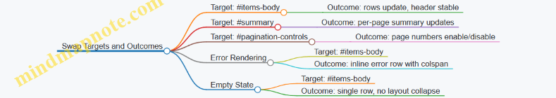
Putting It Together: A Pagination Flow
When a user clicks page 2, the browser requests /items?page=2. The server returns <tr> markup only. HTMX swaps #items-body contents. The table header, filters, and surrounding frame never move, so the user perceives the update as a content change, not a layout reset.
That’s the whole trick: stable containers, targeted swaps, and server responses that speak the same markup language every time.
8.4 Updating Summary Widgets Alongside Main Content
Summary widgets are the small, high-signal parts of a page: counts, totals, active filters, and “what changed” indicators. When you update them alongside the main content, you keep the user’s mental model aligned with what the server just rendered. The trick is to treat the widgets as first-class targets with their own markup contracts, not as decorative extras.
Foundational Principle: One Interaction, Multiple Synchronized Fragments
Start by deciding what “main content” means for your page—typically the list, table body, or detail panel. Then decide what summary widgets must reflect after every interaction: for example, result count, current filter chips, pagination totals, or aggregate metrics.
A practical rule: if the main content changes because of a request, the summary widgets should change for the same request. Otherwise, users will see a table that says “12 results” while the list shows 9. That mismatch is confusing even when it’s temporary.
Mind Map: Widget Update Responsibilities
Designing Markup Contracts for Widgets
Give each widget a stable wrapper element with a deterministic ID. Inside, render only what should change. For example, a results summary might have:
- A numeric count
- A short sentence that includes the current filter context
- A hidden “sr-only” region for screen readers if the update is meaningful
Keep widget markup consistent across responses. If the widget sometimes renders a paragraph and sometimes renders a div, you’ll fight swap behavior and accessibility.
Example: Search Updates Main Table and Result Summary
Assume a page with:
#results-tablefor the table body#results-summaryfor the count and context
When the user submits a search form, the server returns fragments for both targets. The simplest approach is to include both fragments in the response and use out-of-band swaps for the widgets.
<form hx-post="/search" hx-target="#results-table" hx-swap="innerHTML">
  <input name="q" value="{{q}}" />
  <button type="submit">Search</button>
</form>

<div id="results-summary">
  <!-- server renders summary here -->
</div>
On the server response, render the table fragment as the main response body, and render the summary fragment with an out-of-band marker so it updates in the same request.
<!-- Response body: main content -->
<tbody id="results-table">
  <!-- rows -->
</tbody>

<!-- Out-of-band widget update -->
<div id="results-summary" hx-swap-oob="innerHTML">
  <p><strong>9</strong> results for “{{q}}”.</p>
</div>
This pattern keeps the request lifecycle simple: one user action, one server computation, and multiple synchronized DOM updates.
Swap Strategy: Choose Stability over Surprise
Use swap modes that match the widget’s structure.
- For widgets that should fully reflect the new state,
innerHTMLis usually fine. - For widgets that contain interactive elements (like a “clear filters” button), replace only the region that must change.
- Avoid replacing the entire widget wrapper if it would reset focus or break keyboard navigation.
A good default is: stable outer container, replace inner content.
Handling Pagination and Aggregates Without Drift
Pagination is a common source of drift. If the main content shows page 3, the summary must also show page 3 metadata: “Showing 21–30 of 87.” Render that sentence from the same server-side calculation that builds the table.
For aggregates (like totals), compute them from the filtered dataset, not from the current page slice. Otherwise, the widget will look plausible but be wrong.
Accessibility Details That Matter
When the summary changes, users relying on assistive tech should get the update without re-reading the whole page. A simple approach is to include an aria-live="polite" region inside the summary widget so screen readers announce the new count.
Also ensure the summary text is not only numeric. “9 results” is better than “9” because it remains meaningful when announced out of context.
Testing Checklist for Widget Synchronization
- Trigger one interaction and confirm widget values match the main content.
- Verify empty states: the table shows “no results,” and the summary says “0 results” with the same filter context.
- Rapidly submit the same action and confirm swaps don’t interleave into mismatched states.
- Confirm keyboard focus remains where expected when only widget inner content changes.
Practical Server Rendering Approach
Render widgets from the same request handler that prepares the main fragment. Pass the computed totals and metadata into both the table template and widget templates. This keeps the page consistent because there’s one source of truth, not two separate computations that might disagree by rounding, filtering, or pagination boundaries.
8.5 Designing Empty States and Loading Feedback Without Spinners
Empty states and loading feedback are the two moments when users are most likely to wonder, “Did it work?” and “What happens next?” With HTMX and server-rendered fragments, you can answer both questions using markup that is already part of your page structure.
Foundational Principles for Empty States
An empty state is not an error screen. It is a truthful description of the current dataset plus a next action. For example, a “No results” table should still show the table headers so the layout doesn’t jump.
Start by defining three server-rendered outcomes for list endpoints:
- Has data: render rows and pagination controls.
- No data: render headers, an empty body region, and a clear action.
- Not yet requested: render a placeholder only on initial page load, not after the user triggers a request.
In HTMX terms, you typically want the list container to be the swap target, so the server can replace the container with the correct outcome.
Loading Feedback Without Spinners
Spinners are common, but they often fail at the job of explaining what’s happening. A better approach is to provide stable layout and action-level feedback.
Use these patterns:
- Disable the triggering control while the request runs.
- Swap in a lightweight skeleton or “Loading…” text inside the same container that will later receive the final fragment.
- Keep the page layout stable by reserving space for the container.
HTMX supports this cleanly with event hooks. The idea is: when a request starts, update the UI in the smallest possible region; when it ends, let the server fragment replace that region.
Mind Map: Empty States and Loading Feedback
Example: Table with Empty Results and Stable Headers
Assume a search endpoint returns a fragment for the table body region. The swap target is the <tbody> or a wrapper around it.
- When results exist, render rows.
- When results are empty, render a single row that spans columns and includes a “Clear filters” button.
This keeps the table header visible and avoids the “blank page” feeling.
Example: Loading Feedback Scoped to the Results Container
Use a placeholder inside the same container that will later be swapped. The placeholder should be short and specific.
<div id="results">
  <p class="muted">Type a query to see results.</p>
</div>

<button
  hx-get="/search?q=books"
  hx-target="#results"
  hx-swap="innerHTML"
  hx-indicator="#results-indicator">
  Search
</button>

<div id="results-indicator" class="muted" hidden>
  Loading results…
</div>
Here, the “Loading results…” text is not a spinner; it’s a statement tied to the results region. The hidden attribute ensures it doesn’t appear before the request.
Example: Server Fragments for Data and Empty States
Your server should return different HTML fragments for the same target.
- Data fragment: rows plus pagination.
- Empty fragment: a single message row plus an action.
- Error fragment: a message row with a retry action.
The key is that the client doesn’t need to guess which state it is in; it just swaps whatever the server returns.
Advanced Details That Prevent Common UX Bugs
- Don’t show “empty” during initial load unless the user already asked for data. Initial pages often need a neutral prompt like “Choose a filter.”
- Avoid double messaging: if the client shows “Loading…” and the server returns an empty fragment quickly, ensure the loading placeholder is removed or replaced by the swap.
- Keep actions consistent: the “Clear filters” button should trigger the same endpoint and swap the same container, so the user sees a predictable transition.
- Handle pagination emptiness: if a user navigates to page 5 and it becomes empty due to changed filters, render the empty state inside the list container, not a full-page reset.
Case-Ready Checklist for Implementation
- The swap target is a container that can represent data, empty, and error.
- Empty fragments preserve the surrounding structure.
- Loading feedback is scoped to the request’s target region.
- Trigger controls provide immediate feedback by disabling or reflecting state.
- The server is the source of truth for which fragment to render.
9. Authentication, Authorization, and Session Aware UI Responses
9.1 Rendering Authenticated Views and Shared Layouts
Authenticated UI is mostly about consistency: the same navigation, the same page chrome, and the same rules for what actions are allowed. The trick is to render the shared layout on the server while keeping the interactive parts small and predictable, so HTMX swaps don’t accidentally “forget” who the user is.
Core Principle: Layout First, Permissions Second
Start by deciding what is always visible for an authenticated user. For example, a top navigation bar, a sidebar, and a user menu are layout concerns. Then decide what varies by permission: “Admin” links, destructive actions, or certain form fields.
A practical pattern is:
- Render the full page shell only when you need a full navigation.
- Render partial fragments for the main content area, but always include permission-aware markup inside those fragments.
That means every endpoint that returns HTML fragments must know the current session user and apply the same authorization rules as the full page.
Mind Map: Authenticated Layout Responsibilities
Shared Layout Structure That Survives Swaps
When HTMX replaces content, it targets specific DOM regions. If your layout changes shape between authenticated and unauthenticated states, you’ll get broken focus, missing buttons, or confusing partial UI.
Use stable wrappers. For instance, keep a consistent main container and render only the inner content. In templates, this often looks like a base layout with a main region and a nav region.
Example: shared layout behavior
- The layout always includes the
navregion. - The
navregion is rendered with authenticated links only when the session user exists. - The
mainregion is swapped by HTMX fragments, but each fragment assumes the layout already exists.
Example: Authenticated Navigation with Permission Checks
<nav>
  <a href="/dashboard">Dashboard</a>
  <a href="/projects">Projects</a>

  <!-- Only show if user can manage users -->
  {{#if canManageUsers}}
    <a href="/admin/users">User Admin</a>
  {{/if}}

  <div class="user-menu">
    <span>{{user.displayName}}</span>
    <a href="/logout">Sign out</a>
  </div>
</nav>
The key is that canManageUsers is computed on the server for both full pages and fragments. If a fragment renders an “Invite user” button, it must use the same permission logic.
Handling Unauthenticated and Forbidden Requests
Treat unauthenticated and forbidden differently.
- Unauthenticated: redirect to sign-in for full page requests, or return a fragment that triggers a sign-in flow for HTMX requests.
- Forbidden: return a fragment that explains the action is not allowed, while keeping the rest of the page intact.
A simple rule: never return a fragment that includes privileged UI if the user is not allowed to see it. Even if the server will reject the action later, the UI should match the rules.
Example: Permission Aware Fragment for Inline Actions
<div id="project-actions">
  <button
    hx-post="/projects/{{id}}/archive"
    hx-target="#project-actions"
    hx-swap="outerHTML"
    {{#unless canArchiveProjects}}disabled{{/unless}}
  >Archive</button>

  {{#if canArchiveProjects}}
    <p class="hint">Archiving removes the project from active lists.</p>
  {{/if}}
</div>
If the user lacks permission, the fragment renders a disabled button and omits the hint. That keeps the UI honest and reduces confusion.
CSRF and Session Integrity in Shared Layouts
Shared layouts are a good place to ensure every form and HTMX request has the CSRF token. The layout can expose the token once, and fragments can rely on it.
For example, include a hidden CSRF input in forms and ensure HTMX requests send the token header or parameter. The important part is consistency: the token must be available for both full page forms and fragment-triggered submissions.
Advanced Detail: Keep Targets Auth Stable
Authenticated layouts often include user-specific counts, notifications, or badges. If those badges live in the layout, update them with out-of-band swaps so they stay correct after actions.
When you do this, ensure the badge fragment is also permission-aware. A user without access to a section should not see its badge at all, even if the badge container exists in the layout.
Practical Checklist
- Every HTML fragment endpoint applies the same authorization rules as the full page.
- Shared layout regions are stable so HTMX swaps don’t break structure.
- Navigation and action buttons are rendered conditionally on the server.
- Unauthenticated and forbidden cases return appropriate HTML for the request type.
- CSRF token availability is handled consistently via the shared layout.
When these pieces line up, authenticated UX feels coherent: the page chrome stays consistent, interactive fragments remain correct, and the user never sees actions they can’t perform.
9.2 Handling Unauthorized Actions with Targeted Responses
Unauthorized actions should fail in a way that matches the user’s current context. With HTMX and server-rendered HTML, that means returning a fragment that can replace only what’s relevant, while keeping the rest of the page stable. The goal is simple: the user sees an explanation they can act on, and the UI doesn’t jump around like it’s trying to escape.
Foundational Model for Unauthorized Requests
Start by treating authorization as a server decision that produces a UI outcome. For any action endpoint, decide three things:
- What status code represents the failure (typically 401 for unauthenticated, 403 for authenticated but forbidden).
- What fragment should be returned for HTMX requests.
- Where that fragment should go using
hx-targetandhx-swap.
A practical rule: full-page requests get a full layout; HTMX requests get a fragment that fits the existing layout. This keeps markup contracts consistent and prevents “half-updated” pages.
Mind Map: Unauthorized UX Flow
Targeted Fragment Design
Use a dedicated fragment for each failure type so the UI stays predictable. For example, an “action cell” in a table can be replaced with a small message and a single button.
Example: Forbidden Delete Button
- The user clicks “Delete” for item
#42. - The server checks permission.
- If forbidden, it returns a fragment to replace the button area.
<button
  hx-delete="/items/42"
  hx-target="#item-42-actions"
  hx-swap="outerHTML"
  class="danger"
>
  Delete
</button>
<div id="item-42-actions">
  <!-- button lives here -->
</div>
On the server, detect HTMX via the request header and return a fragment like:
<div class="notice notice--denied" role="alert">
  <p>You can’t delete this item.</p>
  <a href="/items/42" class="btn">View item</a>
</div>
This fragment replaces only #item-42-actions, so the rest of the page remains stable.
Differentiating Unauthenticated from Forbidden
Mixing 401 and 403 responses into the same fragment is a common mistake. Users need different next steps.
- 401 Unauthorized: show a login prompt and preserve the user’s intent.
- 403 Forbidden: show a permission denied message and route them to a safe page.
If you include a “Continue” link, keep it deterministic. For instance, the login fragment can include a link back to the original item page rather than trying to replay the exact action.
Example: Unauthenticated Save Form
When a user submits a form via HTMX and the session is missing, return a fragment that replaces the form’s error region.
<form
  hx-post="/projects/7/notes"
  hx-target="#notes-form"
  hx-swap="outerHTML"
>
  <div id="notes-form">
    <!-- form markup -->
  </div>
</form>
Server fragment for 401:
<div class="notice notice--login" role="alert">
  <p>Please sign in to add notes.</p>
  <a href="/login" class="btn">Sign in</a>
</div>
Client Behavior and Swap Strategy
Targeted responses work best when the swap region is narrow and semantically meaningful. Prefer swapping the action container (outerHTML) over swapping the entire page container. That reduces layout churn and avoids losing user context.
Also decide how you want focus to behave. If the fragment includes a button or link, it should be reachable by keyboard immediately after the swap. A simple approach is to keep the fragment short and avoid inserting large blocks that push the user’s current focus off-screen.
Handling Multiple Targets and Partial Failures
If one interaction updates multiple regions, unauthorized responses should still be coherent. Either:
- Return fragments for each target, or
- Ensure the primary target contains enough information to explain what happened.
For example, if a “like” button updates both the count and the button state, a 403 should update the button state and include a short explanation, while the count can remain unchanged.
Systematic Checklist for 9.2
- Use 401 for missing identity and 403 for insufficient permission.
- Return fragments for HTMX requests and full pages for normal requests.
- Swap only the relevant container using
hx-targetandhx-swap. - Keep fragments short, with one clear next action.
- Ensure fragments include accessible structure like
role="alert"for immediate feedback.
A good unauthorized response feels like the server is paying attention to where the user is, not just that the request failed.
9.3 Preserving CSRF and Session Integrity in HTMX Requests
CSRF protection is about making sure the browser is allowed to perform the action it’s trying to perform. With HTMX, the main twist is that requests are often triggered by small UI events (button clicks, link taps, form submissions) and they may target partial HTML fragments. That means your CSRF strategy must work for both full page loads and fragment requests, and it must stay consistent across redirects and error responses.
Core Principles for Server Rendered Safety
Start with two invariants.
- Every state changing request must carry a valid CSRF token. “State changing” includes POST, PUT, PATCH, DELETE, and sometimes GET endpoints that have side effects (try hard to avoid those).
- The server must validate the token against the user’s session. The token should not be a standalone secret that can be replayed across users.
In HTMX, you typically send the token in a header or in a form field. Either approach works as long as your server validates it uniformly for both full and partial requests.
Token Delivery Strategies That Don’t Break Fragment Requests
Option A: Token in Form Fields
When you use HTMX with standard form submissions, include a hidden input in the form template.
Example: a server rendered form includes:
<input type="hidden" name="csrf" value="...">- HTMX submits the form normally.
This is the most boring approach, which is exactly why it’s reliable. It also keeps the token close to the action that needs it.
Option B: Token in Request Headers
For non-form interactions like hx-post on a button, you’ll want a header-based token.
A common pattern is:
- Render the CSRF token into the page (for example, in a meta tag).
- Configure HTMX to copy it into outgoing requests.
<meta name="csrf-token" content="{{ csrf_token }}">
<script>
  document.body.addEventListener('htmx:configRequest', (e) => {
    const token = document.querySelector('meta[name="csrf-token"]').content;
    e.detail.headers['X-CSRF-Token'] = token;
  });
</script>
This keeps fragment requests safe even when they are not tied to a form.
Ensuring Session Integrity Across Redirects
Many CSRF failures happen during redirects. The browser follows redirects automatically, but the token you sent on the original request might not match the session state after a login, logout, or session rotation.
To avoid surprises:
- Rotate CSRF tokens only when you also update what the client uses. If your app rotates tokens after authentication, ensure the updated token is present in the next rendered HTML fragment.
- On authentication changes, return HTML that includes the new token. If the user logs in via an HTMX request, the response should update the token source (meta tag or hidden inputs).
A practical approach is to make your base layout include the token source and ensure any fragment that can change auth state also re-renders that token source.
Handling Error Responses Without Losing the Token
If a request fails CSRF validation, you still need to respond in a way HTMX can render.
Recommended behavior:
- Return a fragment that includes the CSRF token source (meta tag or hidden inputs) along with the error message.
- Use consistent target containers so the UI updates without leaving stale tokens behind.
Example flow:
- User submits a form via HTMX.
- Server returns the same form fragment with field errors and a fresh token.
- HTMX swaps the form region; the next attempt uses the new token.
Mind Map: CSRF and Session Integrity in HTMX
Example: Safe HTMX Button Action
Suppose you have a “Delete” button that triggers a POST without a form. The server expects CSRF validation.
- The page includes a meta tag with the token.
- HTMX configRequest copies it into
X-CSRF-Token. - The server validates it for the delete endpoint.
If the token is missing or invalid, the server returns an error fragment that still includes the updated token source so the user can retry.
Example: Safe HTMX Form Submission
For a “Change Email” form:
- The form template includes a hidden CSRF field.
- HTMX submits the form and swaps the form region.
- On validation failure, the server re-renders the form with the same target and a fresh token.
This keeps the token aligned with the session and prevents the classic “first attempt fails, second attempt uses the old token” problem.
Practical Checklist for Implementation
- Confirm every state changing HTMX endpoint validates CSRF.
- Use one token delivery method consistently across the app.
- Ensure any fragment response that can change authentication also refreshes the token source.
- On CSRF failure, return an error fragment that includes a valid token for the next attempt.
9.4 Designing Login and Logout Flows for Server Rendered UX
A server-rendered login flow should feel like a normal page workflow, even when it uses HTMX for targeted updates. The key is to treat authentication as a state change that the server owns, then render the right fragment for the right moment.
Foundational Principles for Server Rendered Auth
- Use the server as the source of truth. The server decides whether a session is valid, whether a user can access an action, and what the UI should show.
- Keep URLs meaningful. A login page should have a stable URL (e.g.,
/login). A logout action should also have a stable endpoint (e.g.,/logout). - Render fragments that match the swap target. If you update only the login panel, return only that panel markup. If you update the whole navigation bar, return only the nav fragment.
- Preserve user intent. When login is triggered from a protected action, redirect back to the intended destination after successful authentication.
Login Flow with HTMX Submissions
A common pattern is a login form that submits via HTMX and swaps only the form region. On success, you can either redirect to the originally requested page or swap the navigation and show a success state.
Example: Login form behavior
- User opens
/login. - They submit credentials.
- Server validates input.
- If invalid, server re-renders the form with field-level errors.
- If valid, server clears the error state and either redirects or swaps the authenticated UI.
<form hx-post="/login" hx-target="#auth-panel" hx-swap="outerHTML">
  <label>Email <input name="email" type="email" autocomplete="email"></label>
  <label>Password <input name="password" type="password" autocomplete="current-password"></label>
  <input type="hidden" name="next" value="/dashboard">
  <button type="submit">Sign in</button>
</form>
<div id="auth-panel"></div>
In the invalid case, the server returns the same auth-panel markup containing the form plus errors. In the valid case, the server returns either a fragment that shows “Signed in” and navigation, or a response that triggers a redirect.
Logout Flow That Updates the UI Reliably
Logout should be simple and deterministic. Use a POST request to avoid accidental logouts from link prefetching or crawlers. After logout, update the navigation and any user-specific widgets.
Example: Logout button
- Button submits POST to
/logout. - Server invalidates the session.
- Server returns a nav fragment with “Sign in” links.
<button
  hx-post="/logout"
  hx-target="#site-nav"
  hx-swap="outerHTML"
>
  Sign out
</button>
If your app has multiple user-specific regions, you can either target one “shell” container that includes them all, or return out-of-band updates for the rest.
Mind Map: Login and Logout UX Responsibilities
Error Rendering That Stays Usable
A login form often fails for reasons that should be handled without making the user guess. Render errors in a way that is both visible and tied to the form.
- Global error: “Sign in failed. Check your email and password.”
- Field errors: Mark the email input if it fails format, and mark the password input only when appropriate.
- Preserve input: Keep the email value after a failed attempt so the user doesn’t retype it.
Handling Next Destinations Without Confusion
When a user is sent to /login, store the intended destination in a hidden next field or in the server session. After successful login, redirect to that destination only if it is safe.
- Accept only relative paths for
next. - If
nextis missing or invalid, fall back to a default like/dashboard.
Logout Edge Cases That Matter
- User clicks logout while a request is in flight. The server should still invalidate the session; the UI update should reflect the new state.
- User returns to a protected page with the back button. The protected endpoint should require authentication again; the server-rendered response should show the login UI.
- Multiple tabs. One tab logging out should make other tabs behave correctly on the next protected request.
Integrated Example: Putting It Together
A practical setup is: login swaps #auth-panel, logout swaps #site-nav, and protected pages always render server-side. That means the user sees consistent UI after each state change, without relying on client-side guesses.
If you need a date for an audit log entry, use something like 2026-03-31 when demonstrating how you record login and logout events in server logs.
9.5 Communicating Permission Errors with Actionable UI Messages
Permission errors are where user experience goes from “works on my machine” to “why can’t I do anything.” The goal is simple: explain what happened, tell the user what they can do instead, and keep the UI consistent with the server’s decision.
Foundational Principles for Permission Messaging
Start by distinguishing three cases that often get lumped together:
- Not authenticated: the user is not logged in.
- Authenticated but unauthorized: the user is logged in but lacks permission.
- Authenticated with partial access: the user can view the resource but cannot perform a specific action.
Each case should map to a different UI message and a different next step. A generic “Forbidden” message wastes the user’s time and your support budget.
Actionable messages include:
- A clear reason in plain language (not internal policy names).
- A next action that is possible (log in, request access, choose a different action).
- A UI correction so the user doesn’t keep clicking the same disabled-looking button.
Mind Map: Permission Error Communication
Server and UI Contract for Permission Errors
When using HTMX, treat permission errors like any other server-rendered fragment: the server decides, the client swaps. That means your error fragment should be predictable and targetable.
A practical contract:
- Return HTTP 401 for not authenticated.
- Return HTTP 403 for authenticated but unauthorized.
- Render an error banner fragment into a known container (for example,
#flash), and optionally update the action area (for example, replace the disabled button state).
Example: Inline Permission Error for a Restricted Action
Suppose a user clicks “Delete” on a record they can view but not delete. The server returns a fragment that replaces the action panel.
Server behavior
- Status:
403 - Fragment: updates
#action-paneland#flash - Message: explains the missing permission and offers a next step.
Client markup
<div id="flash" aria-live="polite"></div>

<div id="action-panel">
  <button
    hx-delete="/records/42"
    hx-target="#action-panel"
    hx-swap="outerHTML"
    class="btn btn-danger">
    Delete
  </button>
</div>
Permission error fragment
<div class="alert alert-warning" role="alert">
  You can view this record, but you don’t have permission to delete it.
  <div class="mt-2">
    <a href="/records/42">Go back to the record</a>
  </div>
</div>

<div class="action-disabled">
  Delete is not available for your account.
</div>
Notice what’s missing: no policy jargon, no blame, no “try again later.” The user gets a usable alternative immediately.
Example: Not Authenticated with a Login Action
For 401, the message should point to logging in, and the UI should avoid showing action controls that will fail again.
Error fragment
<div class="alert alert-info" role="alert">
  Please sign in to continue.
  <div class="mt-2">
    <a href="/login?next=/records/42">Sign in</a>
  </div>
</div>
If the action panel is still visible, replace it with a “Sign in to enable actions” state so the interface matches the server’s reality.
Example: Partial Access with Action Replacement
Partial access is common: users can edit some fields but not others, or they can submit a form but not approve it.
A good pattern is to replace the specific action control with a safer alternative:
- Replace “Approve” with “Request approval”
- Replace “Export” with “View report”
- Replace “Change role” with “Contact an administrator”
This keeps the user moving without pretending they can do the forbidden thing.
Accessibility and Interaction Details
After an HTMX swap, ensure the user can find the message:
- Put the error banner in a region with
role="alert"oraria-live="polite". - Move focus to the banner when the action fails, especially for keyboard users.
- Keep the message short enough to scan, but include one concrete next step.
Practical Checklist for Actionable Permission Messages
- The message matches the case:
401vs403vs partial access. - The reason is plain language and tied to the action the user attempted.
- The next step is possible in the current UI.
- The action control is updated so the user doesn’t repeat the same failing click.
- The error fragment is targeted and consistent across endpoints.
When these pieces line up, permission errors stop being dead ends and become guided detours—still strict, but not frustrating.
10. Security and Robustness for HTML over the Wire
10.1 Preventing Cross Site Scripting in Server Rendered Fragments
Cross Site Scripting (XSS) happens when untrusted data becomes executable code in the browser. In server rendered fragments, the risk is amplified because you often return small HTML snippets that get swapped into an existing page. That means a single unsafe fragment can compromise the whole session, even if the initial page load was clean.
Mind Map: XSS Threat Model for HTML over the Wire
Foundational Rule: Escape by Context, Not by Habit
Escaping “everything” as plain text is safe but can break intended markup. The correct approach is to escape based on the HTML context where the data lands.
- Text nodes: escape characters like
<,>,&, and quotes where relevant. - Attribute values: escape quotes and other characters that can terminate the attribute.
- HTML attributes that represent URLs: validate and encode the URL, and reject dangerous schemes.
- Script blocks and inline event handlers: avoid them for untrusted data; if you must render scripts, treat them as a separate, high-risk context.
A practical example: if a user’s display name is rendered inside a <span>, you want < instead of <. If the same name is rendered into a title attribute, you also need to escape quotes so the attribute cannot be broken.
Example: Safe Rendering of User Text in Fragments
<!-- Fragment template output -->
<span class="user-name">{{ user.displayName }}</span>
<!-- If displayName is: <img src=x onerror=alert(1)> -->
<!-- Rendered result should be: -->
<span class="user-name"><img src=x onerror=alert(1)></span>
The key is that the template engine must perform HTML escaping by default for {{ ... }}-style variables. If your engine has an “unescaped” variant, keep it locked behind explicit, reviewed use.
Example: Preventing Attribute Injection in HTMX Targets
Fragments often include attributes like hx-target, hx-swap, id, or data-*. Untrusted values should never be inserted into these attributes unless you strictly control the allowed format.
<!-- Unsafe if userId is untrusted and inserted without validation -->
<div id="user-{{ userId }}" hx-target="#panel-{{ userId }}"></div>

<!-- Safer approach: validate userId server side -->
<div id="user-{{ safeUserId }}" hx-target="#panel-{{ safeUserId }}"></div>
Validation here is not about escaping; it’s about ensuring the value matches a safe pattern (for example, digits only). That prevents someone from smuggling characters that break selectors or attributes.
URL Context Rule: Only Allow Safe Schemes
When rendering href or src, escaping alone is not enough. Attackers can use javascript: or malformed URLs to execute code.
- Allow only
http,https, and relative paths for links. - For images, allow only safe paths or known hosts.
- Reject or neutralize anything else.
A simple server-side rule: build URLs from trusted components, then escape the final string for the attribute context.
Avoid Inline Scripts and Event Handlers in Fragments
Inline onclick, onerror, and inline <script> blocks are common XSS accelerators. Even if you escape text, event handler attributes interpret content as code.
Instead of:
onclick="doSomething('{{ userInput }}')"
Prefer:
- Render data as
data-*attributes (escaped), then attach behavior using a stable script loaded once for the page.
This keeps fragments focused on markup and lets JavaScript read data without turning it into executable code.
Defense in Depth: Content Security Policy and Template Discipline
A Content Security Policy (CSP) reduces the impact of mistakes by restricting where scripts can come from and whether inline scripts are allowed. CSP is not a substitute for escaping, but it helps when an unsafe fragment slips through.
Template discipline matters too:
- Keep “raw/unescaped” rendering off by default.
- Centralize fragment rendering helpers so escaping rules are consistent.
- Ensure partial templates use the same escaping defaults as full pages.
Testing Strategy for Fragment Safety
Test the fragment endpoints directly. For each fragment that accepts input, verify that:
- Dangerous characters are escaped in text and attributes.
- URL fields reject
javascript:and similar schemes. - No fragment returns inline scripts or event handler attributes derived from user data.
A good test input is a string that would be harmless when escaped but dangerous when not, such as "><img src=x onerror=alert(1)>. If that string appears in the rendered HTML without escaping, you have a real issue.
Practical Checklist for Fragment Authors
- Escape by context: text nodes, attributes, and URLs are different.
- Validate any value used in IDs, selectors, and HTMX attributes.
- Never render untrusted data into inline scripts or event handlers.
- Treat URL fields as allowlist problems, not just escaping problems.
- Add CSP to limit blast radius.
- Test fragment endpoints with malicious inputs and confirm safe output.
10.2 Validating Inputs for Both Full Page and Partial Requests
Validation should behave the same whether the user submits a full page form or triggers a partial update via HTMX. The trick is to treat validation as a server responsibility with consistent rules, consistent error shapes, and consistent rendering targets.
Core Idea: One Validation Pipeline, Two Rendering Paths
Start by defining a single validation pipeline that accepts the same input data regardless of request type. Then branch only at the response layer: full page returns a full template, partial returns a fragment that targets the right DOM region.
A practical rule: if the server can’t validate the input, it should not care whether the request came from a full page submit or an HTMX request. It should return the same field-level errors and the same non-field errors.
Step 1: Normalize Input Before Validation
Before running validators, normalize the incoming payload so both request types validate identically.
- Trim whitespace for text fields.
- Convert empty strings to null for optional fields.
- Parse numbers and dates into typed values.
- Enforce consistent casing where it matters (for example, email normalization).
Example: if a user types " [email protected] ", normalization ensures the validator sees [email protected] in both full and partial submissions.
Step 2: Validate with Field Level and Non-Field Errors
Use two categories of errors.
- Field errors map to specific inputs, enabling inline messages.
- Non-field errors explain problems that don’t belong to one field, such as “You can’t submit because the record is locked.”
Keep error messages stable across request types so the UI doesn’t surprise users by changing wording depending on how they clicked.
Step 3: Detect Request Intent Without Changing Validation
HTMX requests usually include headers that let the server know it should return a fragment. Detection should only affect the response format, not the validation rules.
A simple pattern is:
- Run normalization and validation.
- If valid, perform the action and return success rendering.
- If invalid, return the same error data, but render it either as a full page or as a fragment.
Step 4: Render Errors Into the Correct Target
For partial requests, the server must return markup that matches the client’s swap target. For full page requests, the same errors should appear in the full template.
A consistent approach is to render a shared “error summary” fragment and a shared “field error” fragment, then include them in both full and partial templates.
Example UI behavior:
- Inline field message appears next to the input.
- Error summary appears at the top of the form.
- The submit button remains visible so the user can correct and resubmit.
Step 5: Preserve User Input on Failure
When validation fails, the server should re-render the form with the user’s submitted values. This prevents the classic annoyance where the form resets and the user has to retype everything.
For partial updates, preservation matters even more because the user expects the form to remain in place while only the relevant region updates.
Step 6: Keep CSRF and Method Semantics Consistent
Validation is only useful if the request is trustworthy.
- Ensure CSRF protection applies to both full and HTMX submissions.
- Ensure the server uses the correct HTTP method semantics so validation runs on the same logical action.
If the server rejects a request for security reasons, treat it as a non-field error for the form when possible, or return an appropriate full error page when the request can’t be safely recovered.
Step 7: Make Idempotent Validation Outcomes
Validation should be deterministic: the same input should produce the same error set. This reduces confusing differences between full and partial submissions.
For example, if you validate uniqueness against the database, ensure the query logic is identical in both flows and uses the same transaction boundaries.
Mind Map: Validation Across Full and Partial Requests
Example: Same Validation, Different Response
Scenario: A user submits a “Create Comment” form with an empty body.
- Full page submit: server returns the full page template with the comment form re-rendered, showing “Body is required.”
- HTMX submit: server returns only the form fragment targeted by the swap, showing the same “Body is required.” message and preserving the other fields.
The key is that both responses use the same validation result object, then render it into different templates.
Example: Field Error Mapping That Works Everywhere
If the form field is named body, the server should return an error keyed by body. The template can then render:
- Inline message next to the textarea.
- Error summary entry listing “Body: Body is required.”
Because the key is consistent, the same rendering logic works for full page and partial fragments.
Example: Non-Field Error for Concurrency
If the server detects a concurrency conflict, return a non-field error like “This item changed since you opened the form.”
- Full page: show it in the error summary.
- Partial: show it in the same error summary region inside the swapped fragment.
This keeps the user’s mental model intact: the form didn’t break; the server reported a problem that isn’t tied to one field.
10.3 Protecting Against Request Forgery and Unintended Submissions
Request forgery and unintended submissions share a theme: the server receives a request that the user didn’t explicitly intend for that moment. In HTMX-style flows, the risk grows because small interactions can trigger network calls without a full page reload. The goal is simple: ensure every state-changing request is both authentic and intentional, and that the UI makes accidental repeats less likely.
Core Concepts: Authenticity and Intent
Start with two checks on the server.
-
Authenticity answers: “Did this request come from a browser that has a valid session for this user?”
-
Intent answers: “Did the user submit this specific form or click this specific action at the right time?”
For authenticity, use a CSRF token tied to the user session. For intent, combine token validation with request semantics (method, endpoint rules) and UI patterns that reduce accidental resubmits.
CSRF Tokens for HTMX Requests
A practical pattern is: include a CSRF token in the page, then ensure HTMX sends it on every request that can change state.
- Render a hidden input inside forms that perform state changes.
- For non-form triggers (like buttons that fetch or post), include the token in a meta tag and configure HTMX to send it as a header.
Example: a form that updates a profile field.
<form hx-post="/profile/email" hx-target="#profile" hx-swap="outerHTML">
  <input type="hidden" name="csrf" value="{{csrf_token}}" />
  <label>
    Email
    <input name="email" type="email" value="{{email}}" />
  </label>
  <button type="submit">Save</button>
</form>
If you also have actions that don’t use forms, use a meta tag.
<meta name="csrf-token" content="{{csrf_token}}" />
<script>
  document.body.addEventListener('htmx:configRequest', (e) => {
    const token = document.querySelector('meta[name="csrf-token"]').content;
    e.detail.headers['X-CSRF-Token'] = token;
  });
</script>
On the server, validate the token for any endpoint that performs writes (create, update, delete, approve, publish). Read-only endpoints can skip CSRF checks, but still validate inputs.
Preventing Unintended Submissions
Unintended submissions usually come from three sources: duplicate clicks, stale UI, and browser retry behavior.
-
Duplicate clicks: users click twice, or a slow network causes a second submission.
-
Stale UI: the user sees an old form state, then submits after the underlying resource changed.
-
Browser retry: network hiccups can cause resubmission attempts.
A reliable mitigation is to make state-changing requests idempotent where possible, and to use server-side checks that reject duplicates.
Use Idempotency Keys for High-Risk Actions
For actions like “confirm purchase” or “send money,” accept an idempotency key and store the result for a short window. If the same key arrives again, return the stored outcome.
Example: include a key in the form.
<form hx-post="/orders/confirm" hx-target="#order" hx-swap="outerHTML">
  <input type="hidden" name="csrf" value="{{csrf_token}}" />
  <input type="hidden" name="idempotency_key" value="{{request_id}}" />
  <button type="submit">Confirm</button>
</form>
The server ties the key to the user session and the specific action, then returns the same fragment if repeated.
Disable Buttons During Requests
On the client, reduce accidental repeats by disabling the triggering control until the response arrives.
- Add a small script that listens for HTMX request events.
- Disable the clicked element and re-enable it after
htmx:afterRequest.
This doesn’t replace server checks, but it makes the common case behave.
Request Method and Endpoint Rules
Make it hard to call the wrong thing.
- Use POST for writes.
- Reject state changes on GET, even if the UI accidentally triggers them.
- Require CSRF tokens only for write endpoints.
- Validate that the resource being modified belongs to the authenticated user.
This turns “forgery” into “rejected request,” which is exactly what you want.
Mind Map: Forgery and Unintended Submission Controls
Practical Example: Delete with Safety
A delete action is a good test case because it’s both state-changing and easy to trigger accidentally.
- Use POST for deletion.
- Require CSRF.
- Use an idempotency key.
- Return a fragment that removes the item from the list.
If the user clicks twice, the second request should either return the same updated fragment or a clear error fragment explaining that the item is already gone. Either way, the UI ends in a consistent state.
Summary: A Systematic Checklist
For every write endpoint: validate CSRF, enforce POST, verify ownership, and apply idempotency for actions where duplicates are costly. For the UI: disable submit controls during requests and ensure tokens are always included in HTMX-triggered calls. When both layers agree, forged requests fail and accidental repeats become harmless.
10.4 Controlling Caching and Response Headers for Fragments
Fragment caching is where “fast” meets “correct.” With HTMX, the browser may reuse previously fetched HTML snippets, so you must decide which fragments are safe to cache, how long they can live, and which headers prevent stale UI from sticking around.
What Caching Means for HTML over the Wire
A fragment response is still an HTTP response. That means standard caching rules apply: the browser and any intermediary caches may store the response body and reuse it for later requests. If the fragment includes user-specific data (like permissions, cart counts, or “liked” state), caching must be constrained or disabled.
A practical rule: cache fragments only when the response is determined entirely by request inputs that won’t change for the same user within the cache window.
Cache Control Headers You Actually Use
Start with Cache-Control, because it’s explicit and widely respected.
Cache-Control: no-storeprevents storage entirely. Use it for highly sensitive or frequently changing fragments.Cache-Control: no-cacheallows storage but forces revalidation before reuse. Use it when you want the browser to keep a copy but never trust it blindly.Cache-Control: max-age=60allows reuse for 60 seconds without revalidation. Use it for fragments that change slowly.Cache-Control: privateallows caching only in the browser, not shared proxies. Use it for user-specific fragments.Cache-Control: publicallows shared caching. Avoid for user-specific HTML.
Also consider Vary. If the fragment differs by headers like Accept-Language or Cookie, you must reflect that in Vary so caches don’t mix responses.
ETag and Last-Modified for Revalidation
If you choose no-cache, you still need a way to revalidate efficiently. That’s where conditional requests help.
ETaglets the client ask “is this still the same?” usingIf-None-Match.Last-Modifiedworks withIf-Modified-Since.
When revalidation succeeds, the server can return 304 Not Modified with no body, saving bandwidth while keeping the UI consistent.
A Mind Map of Fragment Caching Decisions
Mind Map: Fragment Caching and Headers
Example: User-Specific Fragment with No-Store
This fragment renders a user’s “favorite” state. It should never be reused.
Cache-Control: no-store
Content-Type: text/html; charset=utf-8
Vary: Cookie
In practice, you can still keep the response fast by making the fragment small and rendering only the part that changes.
Example: Short-Lived Shared Fragment with Max-Age
This fragment renders a public category list that updates occasionally.
Cache-Control: public, max-age=30
Content-Type: text/html; charset=utf-8
Vary: Accept-Language
If the list changes more often, reduce max-age or switch to no-cache with ETag.
Example: Revalidation with No-Cache and ETag
This fragment renders a dashboard widget that changes, but not every second.
Cache-Control: private, no-cache
ETag: "w-9f3a2"
Vary: Cookie
Content-Type: text/html; charset=utf-8
On the next request, the browser sends If-None-Match: "w-9f3a2". If nothing changed, the server returns 304 and HTMX swaps nothing new.
Avoiding Common Header Mistakes
- Caching user-specific HTML as public. Shared caches can leak content across users.
- Forgetting
Varywhen responses depend on headers. Without it, caches may serve the wrong language or the wrong personalization. - Using
max-agefor fragments that reflect recent actions. If a user just submitted a form, the fragment should reflect that immediately, so either disable caching or revalidate.
A Simple Server Strategy for Fragment Endpoints
Use a consistent policy per endpoint category:
- “Action results” fragments:
no-storeorprivate, no-cache. - “Slow-changing shared” fragments:
public, max-agewithVary. - “Moderately changing personalized” fragments:
private, no-cacheplusETag.
This keeps behavior predictable: the browser may cache, but it won’t confidently reuse stale HTML for the wrong user or the wrong state.
10.5 Designing Idempotent Endpoints for Safe Replays
Idempotent endpoints behave the same way when the same request is repeated. In HTML over the wire, “repeated” often happens for practical reasons: a user double-clicks, a network retries, a browser replays after a timeout, or HTMX sends the same request again due to an event firing twice. The goal is simple: repeating a request should not create duplicate records, double-charge actions, or drift the UI into a confusing state.
Start with a clear rule: GET is safe and idempotent by definition, while POST is not unless you design it to be. For HTMX, you’ll frequently use POST for form submissions and actions. That means you should treat POST handlers as “idempotent if designed,” not “idempotent by default.”
Idempotency Keys and Action Deduplication
The most reliable pattern is an idempotency key. The client sends a unique key per logical user action. The server stores the outcome for that key and returns the same result on repeats.
A practical approach for server-rendered apps:
- Generate a key when rendering the form (or when the user triggers the action).
- Include it in the form as a hidden field.
- On the server, enforce uniqueness on
(user_id, idempotency_key). - Store the response-relevant data needed to render the fragment consistently.
Example: a “Create Comment” form posts to /comments. If the user clicks “Post” twice, the server should create exactly one comment and re-render the same updated list.
<form hx-post="/comments" hx-target="#comments" hx-swap="outerHTML">
  <input type="hidden" name="idempotency_key" value="c8f3c2a1-9b2f-4d1a-8f0a-2d6c3c2a1f77">
  <label>
    Comment
    <textarea name="body" required></textarea>
  </label>
  <button type="submit">Post</button>
</form>
On the server, the handler checks whether the key was already processed. If yes, it returns the same fragment HTML that the first request produced.
Idempotent Semantics for Updates
Not every action needs an idempotency key. If the endpoint updates a resource in a way that naturally converges, it can be idempotent without extra storage.
Examples:
- Set a value:
PUT /profile/displayNamesets the display name to the submitted string. Repeating yields the same final state. - Toggle with care: toggles are usually not idempotent because repeating flips the state again. Prefer “set enabled/disabled” endpoints.
- Add to a list: appending is not idempotent unless you dedupe by a stable identifier (like a client-generated comment draft id).
For HTMX actions that feel like “create,” assume they are not idempotent unless you enforce deduplication.
Designing Fragment Responses for Repeat Safety
Idempotency isn’t only about database writes. It also includes what fragment you return.
When a repeat request occurs, the server should:
- Return a fragment that matches the already-applied state.
- Avoid transient “success then error” outcomes caused by race conditions.
- Keep swap targets stable so the UI doesn’t jump between inconsistent partial renders.
A good pattern is to render fragments from the canonical state after the write (or after deduplication). That way, the fragment reflects reality, not the path taken.
Handling Concurrency and Race Conditions
Two identical requests can arrive nearly simultaneously. If you only check “does the key exist” without enforcing uniqueness, both requests may pass the check and both may write.
Use a uniqueness constraint and transaction boundaries:
- Unique index on
(user_id, idempotency_key). - Insert-or-select logic that guarantees only one “first” write.
- For the second request, read the stored outcome and render the same fragment.
-- Example schema intent
-- Unique constraint prevents double processing
CREATE UNIQUE INDEX ux_idempotency
ON processed_actions(user_id, idempotency_key);
Mind Map: Idempotency for Safe Replays
Example: Idempotent Comment Creation with Consistent UI
Imagine a comment list fragment at #comments. The first POST creates the comment and returns the updated list. If the same idempotency key is posted again, the server detects it and returns the same updated list fragment. The user sees no duplicate comment and no confusing “already posted” message unless you choose to render one consistently.
A subtle but useful detail: if you include the idempotency key in the form, you can also include it in the fragment rendering logic. For example, you can highlight the newly created comment only when the server indicates it was the first processing for that key.
Example: Non-Idempotent Toggle Replaced by Idempotent Set
A “like” toggle endpoint that flips state on each call is not idempotent. Replace it with an endpoint that sets the desired state.
- Instead of:
POST /likes/togglewith no target state - Use:
POST /likes/setwithliked=true|false
Repeating the same request sets the same final state, so replays are safe.
Practical Checklist for Idempotent HTMX Endpoints
- Every “create” or “charge-like” POST includes an idempotency key.
- The server enforces uniqueness and returns canonical-state fragments.
- Update endpoints are modeled as “set/replace,” not “toggle/append,” unless deduped.
- Fragment rendering is deterministic for a given final state.
- Swap targets are stable so repeats don’t cause layout churn.
When these pieces line up, safe replays become boring in the best way: the system behaves predictably even when the same request shows up more than once.
11. Observability, Testing, and Debugging of Hypermedia Interactions
11.1 Instrumenting Requests and Rendering Outcomes
Instrumenting HTMX interactions is mostly about answering two questions quickly: what request happened, and what changed in the DOM as a result. If you can trace those two facts end to end, debugging becomes a matter of reading logs, not guessing.
What to Measure First
Start with a minimal set of signals that cover the whole lifecycle.
- Request identity: a correlation id that ties the browser event to the server log line.
- Request intent: method, URL, and which element triggered the request.
- Response outcome: HTTP status, response content type, and whether the response was a fragment meant for swapping.
- Swap result: which target was updated, which swap mode was used, and whether the target existed at the moment of processing.
A practical rule: if you can’t explain a UI change using those signals, you’re missing instrumentation, not effort.
Correlation Ids That Survive Partial Updates
For HTMX, the easiest correlation strategy is to generate an id on the server per request and echo it back in a response header. Then you can log it on the server and also surface it in the fragment for quick inspection.
Example: server adds a correlation header and fragment marker
Request received: POST /orders/123/cancel
HTMX trigger: button#cancel-123
Correlation: req_7f3a2c
Status: 200
Swap: innerHTML into #order-123-actions

Fragment contains:
<div data-correlation="req_7f3a2c">...</div>
This gives you a stable breadcrumb even when multiple partial updates happen in one user action.
Mind Map: Instrumentation Coverage
Capturing Rendering Outcomes Without Guessing
Server logs should record what you rendered, not just that you rendered something. For fragment endpoints, log the template name (or view function), the model version or key fields used, and whether the response is intended for a swap.
A common failure mode is returning a full page layout to a fragment target. Instrumentation should make that obvious by logging the response shape.
Example: log rendering shape and swap intent
Correlation req_7f3a2c
Endpoint: POST /orders/:id/cancel
Render: partial order_actions
Fragment: true
Swap hint: target=#order-123-actions swap=innerHTML
Status: 200
If you also log the swap hint from the request headers (or from server-side parsing of HTMX metadata), you can compare intent to outcome.
Swap Verification That Catches Silent Failures
Sometimes the server returns 200, but nothing appears to change. That usually means the target selector didn’t match, or the response didn’t contain the expected fragment structure.
Instrument swap verification by adding lightweight checks:
- Target existence: log when the target selector is missing.
- Out-of-band updates: log how many out-of-band elements were applied.
- Fragment marker presence: ensure the correlation marker exists in the response body.
Example: response marker used to confirm swap readiness
Correlation req_7f3a2c
Response body marker: present
Target #order-123-actions: found
Swap mode: innerHTML
Out-of-band elements: 0
Testing Instrumentation with Realistic Flows
Instrumentation should be testable. Write tests that assert the correlation marker is present in the fragment and that the target update occurs.
Example: test asserts fragment marker and target update
Given order 123 is cancellable
When user clicks cancel button
Then response contains data-correlation="req_*"
And #order-123-actions innerHTML changes
And server log includes same correlation id
This turns observability into a contract: if the UI changes, the logs and markers must agree.
Putting It Together in One Request Trace
A complete trace should read like a short story with no missing pages.
- User clicks a specific element.
- Browser sends a request with a correlation id.
- Server logs endpoint, validation, and which partial template rendered.
- Server returns a fragment with a marker.
- Client swaps into a specific target using a specific mode.
- Logs confirm the target existed and the marker was present.
When that chain is consistent, debugging becomes straightforward: you can pinpoint whether the problem is in intent, rendering, response shape, or DOM application.
11.2 Capturing Correlation Identifiers Across Partial Updates
When HTMX swaps only a fragment, the browser still makes a full HTTP request behind the scenes. The tricky part is tying that request to the exact DOM change you see, especially when multiple interactions happen close together (search typing, rapid pagination, or a form submit that triggers validation and then a follow-up fetch). A correlation identifier gives you a single thread across server logs, response headers, and client-side events.
The Correlation Identifier Contract
Start with a simple contract: every request that can produce a partial update gets a correlation id, and every response fragment echoes it back in a predictable place. The client then includes that id in its own event trail, so you can match “request X” to “swap Y”.
Use one of these sources for the id:
- Incoming header: if the client already has one, reuse it.
- Server generated: otherwise create a new id per request.
A practical choice is a short, URL-safe token like req_01J.... Keep it opaque; don’t encode user ids or business meaning into it.
Server Side Generation and Echoing
Generate the id at the start of request handling, store it in request context, and include it in:
- Response header for easy inspection.
- Rendered fragment markup so the client can read it after the swap.
A common pattern is to add a data-correlation-id attribute to the root element of each fragment. That attribute becomes your “receipt” for what the server actually rendered.
Example request flow:
- Client triggers
hx-get. - Server generates correlation id
C. - Server renders fragment with
data-correlation-id="C". - Server sets
HX-Correlation-Id: Cheader. - Client logs
Cwhen the swap completes.
Client Side Capture Using HTMX Events
HTMX emits lifecycle events you can hook into. The goal is to record correlation id at the moment you know the swap happened, not when the request started.
Use these steps:
- Read the correlation id from the response header or from the swapped fragment’s
data-correlation-id. - Log it alongside the target element id and the triggering element.
- Include the HTTP status so you can spot partial failures.
Here’s a compact approach that prefers the fragment attribute (it’s the most direct proof of what was rendered):
document.body.addEventListener('htmx:afterSwap', (evt) => {
  const swapped = evt.detail?.target;
  const corr = swapped?.querySelector?.('[data-correlation-id]')
    ?.getAttribute('data-correlation-id') ||
    swapped?.getAttribute?.('data-correlation-id');

  const trigger = evt.detail?.requestConfig?.triggeringElement;
  const triggerName = trigger?.getAttribute?.('name') || trigger?.id || trigger?.tagName;

  console.log('htmx swap', {
    correlationId: corr,
    status: evt.detail?.xhr?.status,
    targetId: swapped?.id,
    trigger: triggerName
  });
});
If you also want the header value, capture it in htmx:beforeRequest by reading evt.detail.xhr.getResponseHeader is not reliable there; instead, read it in htmx:afterRequest or from the swapped markup as shown.
Mind Map: Correlation Across Partial Updates
Example: Search with Rapid Typing
Scenario: a user types c, ca, cat quickly. Without correlation ids, you might see results that don’t match the latest input, because responses can arrive out of order.
With correlation ids:
- Each
hx-getresponse fragment includesdata-correlation-id. - The client logs swaps with correlation ids.
- In server logs, you can confirm which query produced which fragment.
A simple debugging check: compare the correlation id of the fragment currently in the results container with the correlation ids of the last two requests in the server logs. If the older request swapped last, you know where to focus.
Example: Validation Errors in a Form
When a form submit fails validation, the server typically returns the same fragment region with error messages. Ensure the error fragment also carries the correlation id. That way, when a user reports “the error message didn’t match my input,” you can trace the exact validation run that produced the fragment.
A good rule: every partial response, including error responses rendered as fragments, must follow the same correlation contract. Consistency beats cleverness here; your future self will thank you.
Operational Checklist
- Every partial endpoint sets
HX-Correlation-Id. - Every fragment root includes
data-correlation-id. - Server logs include correlation id on entry and on completion.
- Client logs correlation id on
htmx:afterSwap. - Error fragments follow the same rules as success fragments.
With that in place, correlation ids stop being a nice-to-have and become a practical debugging tool that connects server truth to browser reality.
11.3 Testing Fragment Rendering and Swap Behavior
Testing HTMX fragment rendering is mostly about proving two things: the server returns the right HTML for the right request, and the client swaps it into the right place without breaking the page’s structure, focus, or form state. The trick is to test at the right layer so you don’t end up asserting implementation details that change every time you refactor a template.
Testing Goals That Stay Stable
Start by writing tests around observable outcomes:
- Correct fragment selection: the endpoint returns the expected partial template for the request.
- Correct swap target: the response lands in the intended container.
- Correct swap mode: replace vs append vs prepend changes the DOM shape.
- Correct event behavior: HTMX lifecycle events fire in the expected order for the interaction.
- Correct accessibility impact: headings, labels, and focusable elements remain usable after the swap.
A practical mindset: treat the fragment as a contract. If the contract holds, the UI holds.
Mind Map: What to Test and Where
Server Side Tests for Fragment Contracts
Server tests should verify that the fragment HTML contains the elements your swap logic expects. For example, if your page swaps into #results, the fragment should include a wrapper element that matches your DOM strategy.
Example: fragment contract assertions
- The fragment includes a container with
id="results"only when you useswap: "outerHTML". - The fragment includes a child list with
data-role="items"when you useswap: "innerHTML". - Error fragments render the same wrapper so the swap never replaces the wrong region.
In practice, keep selectors stable and avoid asserting full HTML strings. Assert structure and key attributes instead.
Client Side Tests for Swap Modes
Client tests should confirm that the swap mode produces the expected DOM shape.
Example: replace vs append
- With
hx-swap="innerHTML", the container’s children change but the container remains. - With
hx-swap="outerHTML", the container itself is replaced, which can reset focus or event bindings if you rely on them.
Write DOM assertions that reflect the mode:
- For
innerHTML, check that the container element identity stays the same. - For
outerHTML, check that the container element is replaced and has the new content.
Lifecycle Event Testing Without Overfitting
HTMX emits lifecycle events that are useful for testing sequencing. Instead of asserting every event, assert the ones that correspond to your UX guarantees.
Example: event order for a search interaction
htmx:beforeRequestfires before the network call.htmx:afterSwapfires after the DOM update.htmx:responseErrorfires when the server returns an error status.
If you use focus management after swaps, assert that focus moves after afterSwap, not before.
Mind Map: A Systematic Test Flow
Example Test Scenarios That Cover Real Bugs
- Wrong target selector: the request succeeds, but the swap lands nowhere. Assert that the target container exists and changes.
- Duplicate IDs from fragments: two swaps create repeated
idvalues. Assert uniqueness of critical IDs after multiple interactions. - Error path mismatch: validation fails and the server returns an error fragment with a different wrapper. Assert that the same swap target updates in both success and error cases.
- Out of band updates: fragments update metadata elsewhere on the page. Assert that the OOB element updates and that the main target still swaps correctly.
Minimal Example: DOM Assertions After Swap
// Pseudocode style example for a browser test
// Trigger: click a button with hx-get to update #results
await page.click('[data-test="search-button"]');
await page.waitForSelector('#results [data-role="items"]');

const count = await page.$$eval('#results [data-role="item"]', els => els.length);
expect(count).toBeGreaterThan(0);

// Ensure swap mode did what you intended
const container = await page.$('#results');
expect(container).not.toBeNull();
Practical Rules That Keep Tests Maintainable
- Test outcomes, not template internals: assert structure and required attributes.
- Use stable selectors: prefer
data-testor semantic wrappers over brittle class names. - Run the same assertions for success and error: the swap contract should hold.
- Limit string comparisons: HTML formatting changes shouldn’t break tests.
When these tests pass together, you get confidence that fragment rendering and swap behavior work as a single system, not as two separate halves that only cooperate by luck.
11.4 Verifying Accessibility and Keyboard Navigation After Updates
When HTMX swaps HTML fragments, the browser’s focus, reading order, and interactive semantics can change in ways that aren’t obvious from the UI alone. The goal of this section is to verify accessibility after each swap: keyboard users should keep their place, screen readers should announce the right content, and controls should remain reachable and correctly labeled.
Establishing Baseline Accessibility Before You Swap
Start by confirming the full page works without HTMX. Use a keyboard-only pass to check:
- Tab order follows the visual order.
- Every interactive element has an accessible name (label, aria-label, or associated text).
- Headings form a logical structure.
- Error messages are announced and tied to the relevant fields.
Then verify that your partial templates preserve the same rules. A common failure is a fragment that introduces a new form control without a label, or a list update that replaces headings with plain text.
Example: A search results fragment replaces only the <ul> but keeps the page heading and the search form. Keyboard users tab from the search input into the first result link without landing on hidden or duplicated controls.
Understanding Focus Behavior During HTMX Swaps
A swap can replace the focused element, move it into a different container, or remove it entirely. Decide what should happen for each interaction:
- If the focused element remains in the DOM, focus should stay.
- If the focused element is replaced, move focus to a predictable target inside the new fragment.
- If the interaction opens a modal-like region, move focus into it and trap it.
Use a consistent strategy: focus the first meaningful control in the updated region, or focus the heading of the updated region if there are no immediate controls.
Example: Submitting a form that returns validation errors should keep focus on the first invalid field. Submitting a form that succeeds should move focus to the next step, such as the updated list heading or the first action button.
Verifying Keyboard Navigation After Each Swap
Perform a repeatable checklist for every HTMX interaction:
- Navigate to the control that triggers the request.
- Activate it with Enter or Space.
- Confirm focus after the swap.
- Continue tabbing and ensure you don’t hit removed elements.
- Confirm Shift+Tab moves backward correctly.
Pay special attention to swap modes. If you append results, tab order should extend naturally. If you replace a container, tab order should not jump to unrelated controls.
Example: For pagination, replace the results container but keep the pagination controls in place. Keyboard users should tab from the pagination to the first result link without encountering stale links.
Ensuring Screen Reader Announcements Are Meaningful
After a swap, screen readers may not announce changes unless you provide cues. Use two practical mechanisms:
- A live region for status updates like “3 results found.”
- Proper headings and landmarks inside the swapped content so users can navigate by structure.
Avoid relying on visual-only cues. If you show “Loading…” or “Saved,” ensure the same message is available to assistive technology.
Example: When filters update a dashboard, swap the results region and also update a small live region with the new count.
Mind Map: Accessibility Checks for HTMX Swaps
Practical Example: Validation Error Swap
A server-rendered form returns a fragment containing field errors. The fragment should:
- Render error text near the field.
- Associate errors with the field using
aria-describedbyor server-side error markup patterns. - Include a heading like “Please fix the highlighted fields.”
Then your verification steps are straightforward:
- Trigger submit with invalid data.
- Confirm focus lands on the first invalid input.
- Tab through invalid fields and confirm each error is read.
- Confirm that after a successful submit, focus moves to the next logical region.
Practical Example: Results Update with Stable Navigation
For a search results swap, keep the search form and its label outside the swapped region. Inside the swapped region:
- Use a heading for the results section.
- Ensure each result link has a clear accessible name.
- If results can be empty, render an empty-state message as real text.
Verification:
- Tab into the results region after the swap.
- Confirm you can reach the first result link.
- Confirm that empty-state text is reachable by heading navigation.
Common Failure Modes to Check Systematically
- Duplicate
idattributes across full page and fragments. - Missing labels in partial templates.
- Focus landing on a removed element.
- Live region updates that are visually present but not announced.
- Error messages that appear but aren’t associated with inputs.
A good accessibility pass is not a one-time event. Treat each HTMX interaction like a small page transition: verify focus, verify structure, verify announcements, then move on.
11.5 Using Browser Dev Tools to Trace HTMX Lifecycles
Tracing HTMX behavior is mostly about correlating three things: what request you triggered, what response you received, and what DOM change you applied. When those line up, debugging becomes mechanical instead of mysterious.
Start with the Event Timeline
Open DevTools and use the Network tab plus the Console. In the Network tab, filter by htmx or by your endpoint path. Then trigger the interaction you want to inspect, such as a button that loads a fragment into a target.
In the Console, watch for HTMX lifecycle events. HTMX emits events like htmx:beforeRequest, htmx:afterRequest, htmx:beforeSwap, and htmx:afterSwap. Logging these events gives you a readable trace without guessing.
Example:
<script>
  document.body.addEventListener('htmx:beforeRequest', e => {
    console.log('[htmx beforeRequest]', e.detail.verb, e.detail.path);
  });
  document.body.addEventListener('htmx:afterRequest', e => {
    console.log('[htmx afterRequest]', e.detail.xhr.status, e.detail.xhr.responseURL);
  });
  document.body.addEventListener('htmx:beforeSwap', e => {
    console.log('[htmx beforeSwap]', e.detail.target, e.detail.xhr.status);
  });
  document.body.addEventListener('htmx:afterSwap', e => {
    console.log('[htmx afterSwap]', e.detail.target);
  });
</script>
This trace tells you whether the request happened, whether the server returned what you expected, and whether the swap targeted the correct element.
Verify the Request Payload and Headers
In Network, click the request and inspect:
- Request Payload: Confirm form fields and query parameters match the UI state.
- Headers: HTMX typically sends identifying headers that help the server decide whether to return a full page or a fragment.
- Response Headers: Look for content type and any caching directives that might affect fragment freshness.
A common mistake is a mismatch between the element that triggers the request and the element that provides values. For example, a button may submit a form, but the inputs you care about are outside the form tag. The Network payload makes that obvious.
Confirm the Response Body Matches the Swap Contract
HTMX swaps HTML into a target. That means your response body must be valid HTML for the intended insertion point.
In the Network response preview, check:
- The fragment root element matches what your swap expects.
- IDs inside the fragment do not collide with existing IDs unless you intentionally replace them.
- Error responses still return HTML that your UI can render into the target.
If you use out-of-band swaps, verify that the response includes elements with the expected hx-swap-oob attributes. Those updates won’t appear in the main target, so you need to scan the response body carefully.
Map Swap Behavior to DOM Changes
The most useful mental model is: target selection happens before swap, insertion happens during swap, and event hooks wrap both.
To validate swap behavior:
- In Elements, locate the target container.
- Trigger the interaction.
- Watch the DOM update.
If the DOM changes in an unexpected way, compare your hx-target and hx-swap settings with the actual insertion result.
Use Breakpoints to Stop Before the Swap
When you need precision, set a breakpoint on DOM mutation or on the HTMX event handler.
A practical approach is to temporarily pause inside htmx:beforeSwap and inspect e.detail.target and e.detail.xhr.responseText. That lets you confirm the fragment content before it touches the DOM.
Example:
document.body.addEventListener('htmx:beforeSwap', e => {
  debugger;
  console.log('target', e.detail.target);
  console.log('status', e.detail.xhr.status);
  console.log('first 200 chars', e.detail.xhr.responseText.slice(0, 200));
});
When the debugger stops, you can inspect the response text and the target element without relying on guesswork.
Check Accessibility and Focus After Swaps
A swap can be correct and still break keyboard flow. After the swap, confirm:
- Focus moves to the right control for modal-like fragments.
aria-liveregions announce meaningful updates when appropriate.- No focusable elements are removed without moving focus.
In Elements, verify that the swapped fragment includes the expected landmark structure and that the target container remains present if you rely on it for focus management.
Case Study: A Fragment That Replaces the Wrong Region
Suppose clicking “Save” updates the page, but the list doesn’t refresh. Your trace shows htmx:afterRequest returns 200, yet htmx:beforeSwap logs a target you didn’t intend.
The fix is usually one of these:
- The trigger element has
hx-targetpointing to the wrong container. - The target container ID changed due to a previous swap.
- The swap mode is replacing a parent wrapper, removing the list you expected to update.
Use Elements to confirm the target exists at the moment of swap. Then re-check the response body for the fragment root element that should be inserted.
A Minimal Checklist That Stays Useful
- Network shows the request and the correct payload.
- Response body contains the fragment HTML you expect.
- Console event logs show the correct target and swap sequence.
- Elements confirms the DOM insertion matches
hx-swapintent. - Focus and accessibility remain coherent after the update.
Once you follow that order, HTMX debugging becomes a sequence of confirmations rather than a hunt through logs.
12. End-to-End Application Build with HTMX Swap Strategy
12.1 Defining Resources and Endpoints for a Complete Workflow
A complete HTMX workflow starts with two decisions: what your resources are, and what each endpoint returns. If those are clear, the rest of the system becomes mostly wiring—targets, swaps, and small template fragments.
Resource Modeling That Matches User Tasks
Treat a resource as something the UI can ask for and update independently. For a typical app workflow, you’ll usually have:
- Primary resources: the things users create and manage (e.g.,
orders,projects,tickets). - Secondary resources: supporting data used to render screens (e.g.,
users,labels,status options). - UI state fragments: small server-rendered pieces that represent a specific view region (e.g., a table body, an error list, a pagination bar).
A practical rule: if a fragment can be replaced without breaking the page layout, it deserves its own endpoint.
Endpoint Design That Supports Partial Rendering
Each endpoint should answer one question. For example, a page might need both a list and a summary widget; those should not be forced into a single “do everything” response.
Use endpoint naming that mirrors intent:
- Read endpoints return HTML fragments for a specific region.
- Write endpoints accept form submissions and return either an updated fragment or an error fragment.
- Action endpoints handle non-CRUD operations like “approve” or “archive” and return the updated representation.
When HTMX triggers a request, it typically targets a DOM element. That means the endpoint’s response should be shaped for that target.
A Concrete Workflow Example
Imagine an app where users manage “tasks.” The UI has:
- A task list with search and pagination.
- A task detail panel.
- A form to create tasks.
- Inline actions to mark tasks complete.
Define resources:
Taskas the primary resource.TaskListViewandTaskDetailViewas UI fragments.
Define endpoints:
GET /tasksreturns the full page.GET /tasks/listreturns the list fragment.GET /tasks/{id}returns the detail fragment.POST /taskscreates a task and returns either the list fragment or the form error fragment.POST /tasks/{id}/completetoggles completion and returns the updated row fragment.
This keeps each response predictable. The list endpoint always returns HTML for the list region; the complete endpoint always returns HTML for the row region.
Mind Map: Resources and Endpoints
Request/Response Contracts That Prevent Surprises
A reliable workflow depends on consistent contracts:
- Stable target selectors: the element you replace should exist on the page before the request.
- Consistent fragment shape: the endpoint should return the same kind of markup each time.
- Error responses render into the same region: if a form submission fails, return the form region with errors, not a full page.
- Redirects are optional: if you want to keep the user on the same page region, return fragments directly. If you do redirect, ensure the client behavior still lands on the right UI state.
Example: Endpoint Responsibilities in Practice
List fragment
- Input: query params like
qandpage. - Output:
<tbody>plus pagination markup.
Create task
- Input: form fields.
- Output:
- Success: updated list fragment.
- Failure: form fragment with field-level errors.
Complete task
- Input: task id.
- Output: updated row fragment so the list stays coherent.
Example: Minimal HTMX Wiring for Targets
<!-- List region -->
<div id="task-list" hx-get="/tasks/list" hx-trigger="load, search" hx-target="#task-list" hx-swap="outerHTML">
  <!-- server renders initial list here -->
</div>

<!-- Detail region -->
<div id="task-detail" hx-get="/tasks/1" hx-trigger="click" hx-target="#task-detail" hx-swap="outerHTML"></div>

<!-- Create form -->
<form hx-post="/tasks" hx-target="#task-list" hx-swap="outerHTML">
  <input name="title" />
  <button type="submit">Create</button>
</form>
The key is that the endpoints and targets agree: /tasks/list returns markup meant for #task-list, /tasks returns markup meant for the same target, and /tasks/{id} returns markup meant for #task-detail.
A Simple Checklist for “Complete Workflow” Readiness
- Every user action has an endpoint that returns HTML for exactly one UI region.
- Every fragment endpoint has a clear input shape and a consistent output shape.
- Error handling returns fragments into the same target region as the success path.
- URLs remain shareable for full pages, while fragments remain focused for partial updates.
Once these are in place, the rest of the chapter can concentrate on swap strategy, validation rendering, and composing fragments without fighting the data model.
12.2 Implementing Core Pages with Partial Templates and Targets
Core pages are the ones users hit first and return to often: the dashboard, list pages, detail pages, and the “create/edit” surfaces. With HTMX, you keep the full page render for the initial load, then use partial templates to update only the parts that changed. The trick is to make those parts predictable: each partial has a clear purpose, a stable wrapper element, and a swap target that matches the wrapper.
Core Page Layout Strategy
Start by defining a page shell that rarely changes: header, navigation, and a main content region. Inside the main region, place stable containers for the fragments you plan to update. For example, a dashboard page might have a summary strip and a content list.
When you design the shell, decide what stays stable across interactions. If the header never changes, don’t make it part of fragment swaps. If the list changes frequently, wrap it in a dedicated container so swaps don’t accidentally replace unrelated UI.
Partial Template Boundaries
Use partial templates for UI regions that have their own lifecycle. A good boundary is where the server can answer the request with only that region’s HTML.
Common partials for core pages:
- List region partial: renders rows and pagination controls.
- Detail region partial: renders a single item view and its action buttons.
- Form partial: renders the form body and field-level error messages.
- Status partial: renders counts, alerts, or “no results” messages.
Each partial should assume it will be inserted into a known wrapper. That wrapper should exist in the page shell and in any other partial that replaces it.
Targets and Swap Rules That Don’t Surprise Users
A target is the DOM element that receives the server response. Keep targets narrow and specific. If you swap a large container for a small change, you risk losing focus, scroll position, and user context.
A practical rule: swap the smallest wrapper that fully contains the changed content. For example, when adding an item from a modal, swap only the list container, not the entire page.
Use swap modes deliberately. For list updates, outerHTML replacement of the list wrapper is often clean because it removes stale rows. For inline updates like toggling a status badge, innerHTML can be enough.
Example: Dashboard Page Shell with Fragment Targets
Below is a minimal shell that sets up two targets: one for the summary and one for the list.
<div id="dashboard-summary" hx-get="/dashboard/summary" hx-trigger="load" hx-swap="innerHTML">
  Loading summary...
</div>

<div id="dashboard-list" hx-get="/dashboard/items" hx-trigger="load" hx-swap="innerHTML">
  Loading items...
</div>
On first load, you can render the shell with placeholders. Then HTMX fills each region with server-rendered HTML.
Example: List Partial with Predictable Wrapper
Your list partial should render only the inside of #dashboard-list so the wrapper stays stable.
<div class="list-header">
  <h2>Items</h2>
</div>

<ul class="items">
  {{#each items}}
    <li>
      <a href="/items/{{id}}">{{name}}</a>
    </li>
  {{/each}}
</ul>

<div class="pagination">
  {{pagination}}
</div>
This keeps the DOM shape consistent: the list wrapper remains the same element, and only its contents change.
Mind Map: Core Pages with Partial Templates and Targets
Systematic Implementation Flow
- Define the page shell with stable wrappers and unique IDs for each update region.
- Create partial templates that render only the region contents, not the entire page.
- Wire HTMX requests so each request targets exactly one wrapper.
- Choose swap modes based on whether you want to replace the wrapper or only its contents.
- Verify user context by checking focus, scroll, and keyboard navigation after swaps.
Example: Detail Page with Targeted Actions
On a detail page, action buttons should update only the detail region or a related list region. If the user edits an item, return the updated detail partial and swap it into the detail wrapper.
<div id="item-detail" hx-get="/items/42" hx-trigger="load" hx-swap="innerHTML"></div>

<button hx-post="/items/42/toggle" hx-target="#item-detail" hx-swap="innerHTML">
  Toggle status
</button>
This keeps the URL and page structure stable while the server updates the relevant HTML region.
12.3 Applying Swap Strategies for Lists Details and Inline Actions
A list-detail UI is a classic “same page, different content” problem. With HTMX, you solve it by making each interaction return a fragment that lands in a predictable DOM region. The trick is choosing swap strategies that match the user’s mental model: lists should update without losing context, details should replace cleanly, and inline actions should feel immediate without breaking focus.
Core Idea for Swap Strategy Selection
Start by naming three regions in your layout:
- List region: where items are added removed or re-ordered.
- Detail region: where the selected item’s information appears.
- Inline region: where small controls live, like toggles, status pills, or action buttons.
Then map each endpoint to one region and one swap behavior. If an endpoint updates multiple regions, use out-of-band swaps so each region changes independently.
Mind Map: Swap Strategy Decision Flow
Lists That Update Without Losing Context
For list changes, prefer swapping only the list container contents. Use a stable wrapper so HTMX always targets the same element.
Example: a search results list.
<div id="results">
  <!-- list items rendered here -->
</div>

<input name="q" hx-get="/items" hx-target="#results" hx-trigger="keyup changed delay:300ms" />
On the server, return only the <div id="results"> inner markup, not the entire page. If you need to append more items, switch to an append strategy so the existing items remain in place.
Details That Replace Cleanly
When the user selects an item, the detail region should replace, not merge. That prevents stale fields from lingering when the next item has fewer attributes.
Example: clicking a list item.
<ul id="items">
  <li>
    <a href="/items/42"
       hx-get="/items/42"
       hx-target="#detail"
       hx-swap="innerHTML">
      View
    </a>
  </li>
</ul>

<section id="detail">
  <!-- detail fragment -->
</section>
Use innerHTML for the detail container so the surrounding section stays stable. If you include a header inside the detail fragment, it will update with the item, while the page layout remains untouched.
Inline Actions That Feel Instant
Inline actions should update the smallest possible region. Wrap each action area in a dedicated container with its own ID so you can swap just that piece.
Example: toggling an item’s active state.
<div id="item-42-actions">
  <button hx-post="/items/42/toggle"
          hx-target="#item-42-actions"
          hx-swap="outerHTML">
    Deactivate
  </button>
</div>
Return a full replacement for item-42-actions so the button label and any disabled state are correct after the toggle. outerHTML is useful here because the container owns the button; replacing the whole container avoids edge cases where nested elements change.
Coordinating Multiple Regions with Out of Band Swaps
Sometimes an inline action affects both the list and the detail. For example, toggling status changes the list badge and the detail summary. In that case, return one response that includes:
- the inline region fragment for the targeted swap
- additional fragments marked for out-of-band replacement
Example response structure:
<!-- targeted swap for hx-target -->
<div id="item-42-actions">...</div>

<!-- out-of-band updates -->
<div id="item-42-row" hx-swap-oob="outerHTML">...</div>
<div id="detail" hx-swap-oob="innerHTML">...</div>
This keeps the interaction simple on the client side: one request, multiple consistent updates.
Markup Contracts That Prevent “DOM Drift”
To keep swaps predictable, enforce these rules:
- Stable IDs: the target element must exist before the request.
- Single responsibility per endpoint: an endpoint should either update list content, detail content, or inline controls, unless you intentionally use out-of-band swaps.
- Consistent fragment boundaries: list items should render with the same root structure every time.
A practical pattern is to render list rows and detail views from the same underlying data model, but with different templates. That way, the list row can update without accidentally changing the detail schema.
Putting It Together in One Interaction
A complete flow for “select item, then toggle inline status” looks like this:
- Clicking a list link replaces
#detail. - Toggling status replaces
#item-42-actions. - The server also updates the corresponding list row and the detail summary via out-of-band swaps.
The result is a UI that updates in place, keeps the user’s focus where it belongs, and avoids the common failure mode where old fields remain after a detail change.
12.4 Integrating Forms Validation and Error Recovery in Context
Forms are where server-rendered UX either feels solid or feels like a prank. With HTMX, the trick is to treat validation as a normal response type, not an exceptional event. That means your server returns the same kind of fragment the UI expects, and your templates render errors in the exact region the user is looking at.
Validation as a Response Contract
Start by deciding what a “valid submission” looks like in your markup. For example, a successful update might swap the form into a confirmation panel, while an invalid submission swaps only the form region.
A practical contract:
- The form fragment always renders the form container.
- On success, the server returns a fragment that replaces the form container with a success view.
- On failure, the server returns the same form container, but with error messages and field styling.
This keeps focus and layout predictable. Users don’t have to re-learn the page after each submit.
Mind Map: Validation and Error Recovery Flow
Field Errors That Stay Put
When a submission fails, render errors next to the fields and also in a summary at the top of the form. The summary helps keyboard and screen reader users jump directly to the failing fields.
Use a consistent pattern:
- Each input has an
id. - Each error message has a matching
id. - The input includes
aria-invalid="true"andaria-describedbypointing to the error message.
Example fragment structure (server renders it):
<form hx-post="/projects/42/update" hx-target="#form" hx-swap="outerHTML">
  <div id="form-errors" class="error-summary" role="alert">
    <p>Please fix the highlighted fields.</p>
    <ul>
      <li><a href="#name">Name is required</a></li>
    </ul>
  </div>

  <label for="name">Name</label>
  <input id="name" name="name" value="{{name}}"
         aria-invalid="true" aria-describedby="name-error" />
  <div id="name-error" class="field-error">Name is required.</div>

  <button type="submit">Save</button>
</form>
The key detail is that the fragment swap replaces the entire form container. That guarantees the error summary and field-level messages always match the current validation result.
Preserving User Input Without Guesswork
If you simply re-render the form using the database values, users lose what they typed. Instead, repopulate the form with the submitted values when validation fails.
A clean approach is to pass a “form state” object to the template:
values: the submitted valueserrors: a map of field name to error message(s)nonFieldErrors: errors not tied to a single field
Then your template uses values for value="..." and uses errors to decide which fields get aria-invalid and which error blocks render.
Focus Management After Swap
After HTMX swaps the form fragment, focus should move to the first invalid field. You can do this with a small inline script that runs on the HTMX lifecycle event.
<script>
  document.body.addEventListener('htmx:afterSwap', (e) => {
    const form = e.detail.target.querySelector('form');
    if (!form) return;
    const firstInvalid = form.querySelector('[aria-invalid="true"]');
    if (firstInvalid) firstInvalid.focus();
  });
</script>
This is intentionally conservative: it only focuses when the swapped content actually marks invalid fields.
Error Recovery That Doesn’t Break the Flow
Recovery is more than showing messages. It also means:
- Keep the swap target stable (
#formstays the same). - Keep the form action and HTMX attributes consistent.
- Ensure the server returns the same fragment shape for both success and failure.
A common pattern is to have two server-rendered templates for the same container:
project_form.htmlfor both states, driven byerrors.- Or a shared template with conditional blocks.
Example: Update Form with Success and Failure
On success, the server returns a fragment that replaces #form with a confirmation panel and a “Back to list” link. On failure, it returns the form fragment with errors and preserved values.
The HTMX attributes stay the same:
hx-postpoints to the update endpoint.hx-targetpoints to#form.hx-swap="outerHTML"ensures the container is fully replaced.
That consistency is what makes error recovery feel like part of the normal interaction, not a detour.
12.5 Completing The Application With Consistent UX And Maintainable Markup
A complete HTMX application feels consistent when three things line up: the server returns predictable fragments, the client swaps them into stable regions, and the markup stays readable enough that you can change it without fear. This section ties those threads together using a systematic checklist, then shows concrete patterns for layout, forms, and error handling.
Mind Map: Consistent UX and Maintainable Markup
Establish a Stable Page Shell Before You Add Features
Start with a layout that never changes structure during partial updates. Put your main content inside a single container with a stable id, and keep secondary regions (like a flash message area) in their own containers. When swaps happen, you replace only what needs replacing.
Example: a shell that supports multiple targets.
<body>
  <header>...</header>
  <main>
    <div id="flash" hx-swap-oob="true"></div>
    <section id="content" hx-target="this">
      <!-- initial page render -->
    </section>
  </main>
</body>
The key idea is that every fragment you return should “know” where it will land. If you keep targets stable, you can reason about the UI without running it in your head.
Define Partial Templates with Explicit Inputs and Output Shapes
Maintainability improves when each partial has a clear contract: what data it expects and what DOM it produces. Use consistent wrapper elements so swap results are deterministic.
A practical rule: list fragments always render a list wrapper, and detail fragments always render a detail wrapper.
<!-- _item_list.html -->
<ul class="items" id="items-list">
  {{#each items}}
    <li id="item-{{id}}">{{name}}</li>
  {{/each}}
</ul>

<!-- _item_detail.html -->
<article id="item-detail">
  <h2>{{name}}</h2>
  <div class="meta">{{status}}</div>
</article>
When you swap, you replace the wrapper, not random inner nodes. That prevents “half-updated” states.
Make Error Rendering Follow the Same Shape Rules
Errors should reuse the same containers as success. If your form normally renders a field block, your error fragment should render the same field block with messages included.
Example: field block markup that can represent both states.
<div class="field" id="field-{{name}}">
  <label for="{{name}}">{{label}}</label>
  <input id="{{name}}" name="{{name}}" value="{{value}}" />
  {{#if error}}
    <p class="error" role="alert">{{error}}</p>
  {{/if}}
</div>
Then, on validation failure, return the same form fragment with errors populated. Users shouldn’t have to relearn the layout after a mistake.
Keep Swap Strategy Consistent Across the App
Use one swap mode per region and stick to it. For example, replace the main content region on navigation, and replace the items list wrapper on filtering. Avoid mixing append and replace for the same container unless the UX explicitly calls for it.
A simple convention:
- Main navigation:
hx-swap="innerHTML"on#content - List updates: replace the list wrapper
- Flash messages: out-of-band swap into
#flash
Ensure Forms Submit Predictably with Server Rendered UX
For forms, consistency means three behaviors:
- The server returns the form fragment again on failure.
- The server returns the next fragment on success.
- The fragment includes enough context to keep the user oriented.
If you submit a “create item” form, success should return the updated list and a short flash message. Failure should return the same form with field-level messages.
Mind Focus and Keyboard Flow After Updates
After a swap, focus should land somewhere sensible. If the user submits a form, focus the first invalid field. If the user navigates to a detail view, focus the detail heading.
You can do this by including a small focus target in the fragment, such as a heading with tabindex="-1", and then focusing it via a lightweight event handler.
Use Naming Conventions That Match Your Mental Model
Maintainability improves when ids and partial names reflect purpose. Prefer #content, #flash, #items-list, and #item-detail over generic names like #main or #panel. When you read a fragment later, you should immediately know what region it updates.
Verify Consistency with a Small Set of Fragment Tests
You do not need a huge test suite to catch most regressions. Test that:
- The list fragment always includes
#items-list. - The form fragment always includes
#field-<name>blocks. - The error fragment includes
role="alert"messages. - The flash fragment can be swapped out-of-band into
#flash.
Consistency is less about cleverness and more about repeatable structure. When your fragments follow the same rules, the UI stays understandable even as the application grows.