Accessible Design for Digital Products
1. Introduction to Accessible Design
1.1 Understanding Accessibility: Definition and Importance
Accessibility in digital design means creating products that everyone can use, including people with disabilities. It ensures that websites, apps, and digital tools are perceivable, operable, understandable, and robust for all users regardless of their abilities or disabilities.
What is Accessibility?
Accessibility is about removing barriers that might prevent people with disabilities from interacting with digital content effectively. Disabilities can be visual, auditory, motor, cognitive, or neurological, and accessible design addresses these diverse needs.
Mind Map: Core Concepts of Accessibility
Why is Accessibility Important?
-
Ethical Responsibility: Everyone deserves equal access to information and digital services.
-
Legal Compliance: Laws like the ADA (Americans with Disabilities Act) and WCAG (Web Content Accessibility Guidelines) set standards to protect users’ rights.
-
Business Benefits: Accessible products reach a wider audience, improve SEO, and enhance overall user experience.
-
Improved Usability: Accessibility improvements often benefit all users, such as captions helping in noisy environments.
Example: Accessibility in Action
-
Scenario: A product designer creates a form for signing up to a newsletter.
-
Accessible Practice: Each input field has a clear label linked via the
forattribute, error messages are descriptive, and the form is fully navigable by keyboard. -
Result: Users with screen readers or motor impairments can complete the form without barriers.
Mind Map: Benefits of Accessibility
Additional Example: Color Contrast
-
Problem: A button uses light gray text on a white background.
-
Accessible Solution: Adjust the color contrast ratio to meet WCAG minimums (4.5:1 for normal text).
-
Impact: Users with low vision or color blindness can easily read the button label.
Summary
Understanding accessibility is the foundation for designing digital products that serve everyone. It is not just a checklist but a mindset that values inclusivity, legal adherence, and improved user experience. By embracing accessibility, product designers, frontend engineers, and accessibility leads can create meaningful, usable, and equitable digital experiences.
1.2 The Business and Ethical Case for Accessibility
Accessible design is not just a legal or technical requirement—it’s a strategic business advantage and a moral imperative. This section explores why investing in accessibility benefits organizations financially, enhances brand reputation, and fosters inclusivity.
Business Case for Accessibility
Expanding Market Reach
- Over 1 billion people worldwide live with some form of disability.
- Accessible products open doors to a large, often underserved customer base.
Legal Compliance and Risk Mitigation
- Lawsuits related to inaccessible websites and apps are increasing globally.
- Compliance with standards like WCAG 2.1 reduces legal risks.
Example: In 2019, a major retailer faced a lawsuit because their website was not accessible to screen reader users, resulting in costly settlements and reputational damage.
Enhanced User Experience for Everyone
- Accessibility improvements often improve overall usability.
- Features like clear navigation, readable fonts, and keyboard support benefit all users.
Example: Captions on videos help not only deaf users but also people watching in noisy environments or non-native speakers.
SEO Benefits
- Search engines favor well-structured, semantic, and accessible content.
- Proper use of headings, alt text, and ARIA roles can boost search rankings.
Innovation and Market Differentiation
- Accessibility challenges inspire creative solutions.
- Companies that lead in accessibility often pioneer new features that benefit all users.
Example: Apple’s VoiceOver screen reader was a breakthrough that set industry standards.
Ethical Case for Accessibility
Digital Inclusion as a Human Right
- Access to digital information and services is essential in modern society.
- Denying access to people with disabilities perpetuates inequality.
Promoting Diversity and Inclusion
- Accessible design respects diverse abilities and needs.
- It fosters an inclusive culture within organizations and communities.
Corporate Social Responsibility (CSR)
- Demonstrating commitment to accessibility aligns with CSR goals.
- Builds trust and loyalty among customers and employees.
Moral Leadership
- Organizations that prioritize accessibility set positive examples.
- They influence industry standards and inspire others.
Integrated Example: Accessible E-Commerce Platform
Scenario: An online retailer redesigns their website to be accessible.
- Business Impact: Sales increase by 15% due to new customers with disabilities.
- Legal Impact: Compliance with accessibility standards avoids potential lawsuits.
- User Experience: All users benefit from improved navigation and clearer product descriptions.
- Ethical Impact: The company gains recognition for inclusivity, enhancing brand loyalty.
Summary
Accessible design is a win-win: it drives business growth, reduces legal risks, and fulfills ethical responsibilities. By embracing accessibility, organizations create better products and a more equitable digital world.
1.3 Overview of Accessibility Laws and Standards (WCAG, ADA, Section 508)
Accessibility laws and standards are essential frameworks that guide the design and development of digital products to ensure they are usable by people with disabilities. Understanding these regulations helps Product Designers, Frontend Engineers, and Accessibility Leads create compliant and inclusive experiences.
Key Accessibility Laws and Standards
- WCAG (Web Content Accessibility Guidelines)
- ADA (Americans with Disabilities Act)
- Section 508 of the Rehabilitation Act
Mind Map: Accessibility Laws and Standards Overview
Web Content Accessibility Guidelines (WCAG)
WCAG is the most widely adopted standard for web accessibility. It is developed by the World Wide Web Consortium (W3C) and provides detailed guidelines to make web content more accessible.
-
Principles (POUR):
- Perceivable: Information must be presented in ways users can perceive (e.g., text alternatives for images).
- Operable: Interface components must be operable (e.g., keyboard navigation).
- Understandable: Information and operation must be understandable (e.g., clear instructions).
- Robust: Content must be robust enough to work with current and future technologies.
-
Conformance Levels:
- Level A: Minimum accessibility requirements.
- Level AA: Addresses biggest and most common barriers.
- Level AAA: Highest and most complex level.
Example:
- A button with insufficient color contrast (e.g., light gray text on white background) fails WCAG Level AA.
- Adding a visible focus indicator ensures keyboard users can identify the active element.
Americans with Disabilities Act (ADA)
The ADA is a civil rights law that prohibits discrimination against individuals with disabilities in all areas of public life, including websites and digital services.
- Title III requires places of public accommodation to provide equal access.
- Although ADA does not specify technical standards, courts often reference WCAG as the benchmark.
Example:
- An online retail store must ensure its checkout process is accessible to screen reader users and keyboard-only users.
- Failure to do so can lead to legal challenges.
Section 508 of the Rehabilitation Act
Section 508 requires federal agencies to make their electronic and information technology accessible to people with disabilities.
- Applies to websites, software, hardware, and multimedia.
- Updated to align with WCAG 2.0 Level AA standards.
Example:
- A government agency website must provide text alternatives for images and ensure all interactive elements are keyboard accessible.
Mind Map: WCAG Principles with Examples
Practical Example: Applying Accessibility Laws in a Login Form
| Aspect | Requirement | Example Implementation |
|---|---|---|
| Text Labels | Must be programmatically associated | Use <label for=“username”>Username</label> |
| Keyboard Navigation | All inputs and buttons accessible | Tab order: Username → Password → Submit button |
| Error Identification | Clear and descriptive error messages | “Password must be at least 8 characters” |
| Color Contrast | Minimum 4.5:1 for text | Dark text on light background |
| Screen Reader Support | Proper ARIA roles and states | aria-live for error messages |
Summary
Understanding and implementing accessibility laws and standards such as WCAG, ADA, and Section 508 is critical for creating digital products that are inclusive and legally compliant. By integrating these standards into design and development workflows, teams can ensure their products serve all users effectively.
1.4 Common Disabilities and How They Affect Digital Interaction
Understanding the variety of disabilities that users may have is crucial for designing accessible digital products. Disabilities can affect how users perceive, interact with, and navigate digital interfaces. Below, we explore common disability categories, their impact on digital interaction, and practical examples to illustrate these effects.
Visual Disabilities
Visual disabilities range from partial to complete vision loss and include color blindness and low vision.
-
Types:
- Blindness
- Low vision
- Color blindness
-
Impact on Digital Interaction:
- Difficulty reading text or distinguishing colors
- Inability to perceive visual cues like icons or images
- Challenges in navigating interfaces without screen reader support
-
Example:
- A user with color blindness might not distinguish between red and green buttons if color is the only differentiator.
- Screen readers enable blind users to hear descriptions of content.
-
Mind Map:
Auditory Disabilities
These include partial or complete hearing loss.
-
Impact on Digital Interaction:
- Difficulty accessing audio content
- Challenges in understanding multimedia without captions or transcripts
-
Example:
- A deaf user cannot hear video audio; captions or transcripts are essential.
- Audio notifications without visual cues are inaccessible.
-
Mind Map:
Motor Disabilities
Motor disabilities affect a user’s physical ability to interact with devices.
-
Impact on Digital Interaction:
- Difficulty using mouse or touchscreens
- Challenges with precise gestures or rapid inputs
-
Example:
- A user with limited hand mobility benefits from keyboard navigation and voice commands.
- Large clickable areas help users with tremors.
-
Mind Map:
Cognitive Disabilities
Cognitive disabilities affect memory, attention, problem-solving, and comprehension.
-
Impact on Digital Interaction:
- Difficulty understanding complex instructions or layouts
- Challenges with time-limited tasks or distractions
-
Example:
- Simplified language and clear instructions help users with cognitive impairments.
- Consistent navigation reduces confusion.
-
Mind Map:
Seizure Disorders
Certain visual patterns or flashing lights can trigger seizures.
-
Impact on Digital Interaction:
- Exposure to flashing or blinking content can cause seizures
-
Example:
- Avoiding content that flashes more than three times per second.
- Providing warnings before potentially triggering content.
-
Mind Map:
Summary Table of Disabilities and Design Considerations
| Disability Type | Impact on Interaction | Design Considerations | Example Practice |
|---|---|---|---|
| Visual | Difficulty seeing or distinguishing content | Use alt text, high contrast, scalable fonts | Text alternatives for images |
| Auditory | Difficulty hearing audio content | Provide captions, transcripts, visual alerts | Captions on videos |
| Motor | Difficulty with precise or rapid inputs | Keyboard navigation, large clickable areas | Keyboard-accessible dropdowns |
| Cognitive | Difficulty understanding complex info | Simplify language, consistent layout | Clear error messages |
| Seizure Disorders | Sensitivity to flashing or blinking content | Avoid flashing > 3/sec, provide warnings | No rapid blinking animations |
By understanding these disabilities and their effects on digital interaction, product designers, frontend engineers, and accessibility leads can create more inclusive experiences that accommodate a wider range of users.
1.5 Key Roles in Accessibility: Product Designers, Frontend Engineers, and Accessibility Leads
Accessible design is a collaborative effort that requires clear roles and responsibilities across the product team. Understanding how Product Designers, Frontend Engineers, and Accessibility Leads contribute to accessibility ensures a cohesive and effective approach.
Product Designers
Product Designers are responsible for creating user experiences that are inclusive from the start. Their work sets the foundation for accessibility by considering diverse user needs during the design phase.
-
Responsibilities:
- Researching accessibility needs and user personas with disabilities.
- Applying accessibility principles (like POUR) in wireframes and prototypes.
- Designing with sufficient color contrast, clear typography, and intuitive navigation.
- Creating accessible forms, buttons, and interactive elements.
- Collaborating with engineers to ensure designs are feasible and accessible.
-
Example:
- Designing a login form with clear labels, error messages, and keyboard-friendly tab order.
-
Mind Map:
Frontend Engineers
Frontend Engineers bring accessible designs to life by implementing code that supports assistive technologies and meets accessibility standards.
-
Responsibilities:
- Writing semantic HTML and using ARIA roles appropriately.
- Ensuring keyboard navigability and focus management.
- Implementing responsive and mobile-friendly accessible interfaces.
- Testing with screen readers and other assistive tools.
- Fixing accessibility bugs and optimizing performance.
-
Example:
- Coding a modal dialog that traps keyboard focus and announces itself to screen readers.
-
Mind Map:
Accessibility Leads
Accessibility Leads coordinate and champion accessibility efforts across teams, ensuring compliance and fostering an accessibility-first culture.
-
Responsibilities:
- Defining accessibility standards and best practices.
- Conducting accessibility audits and user testing.
- Training and mentoring team members on accessibility.
- Advocating for accessibility in product roadmaps.
- Monitoring legal compliance and industry trends.
-
Example:
- Leading a workshop on keyboard accessibility and ARIA usage for designers and engineers.
-
Mind Map:
Collaboration Example: Building an Accessible Dropdown Menu
- Product Designer: Creates a dropdown design with clear labels, visible focus states, and keyboard navigation cues.
- Frontend Engineer: Implements the dropdown using semantic HTML
<button>and<ul>elements, manages keyboard interactions (arrow keys, escape), and applies ARIA roles likearia-haspopupandaria-expanded. - Accessibility Lead: Reviews the implementation, tests with screen readers, and provides feedback to improve focus management and announcements.
Summary
| Role | Primary Focus | Key Contribution Example |
|---|---|---|
| Product Designer | Inclusive design and UX | Designing accessible forms and navigation |
| Frontend Engineer | Accessible implementation and testing | Coding keyboard-trappable modals with ARIA |
| Accessibility Lead | Strategy, compliance, and advocacy | Leading accessibility audits and team training |
By clearly defining and understanding these roles, teams can work synergistically to create digital products that are truly accessible to all users.
2. Foundations of Accessible Design
2.1 Principles of Accessible Design: Perceivable, Operable, Understandable, Robust (POUR)
Accessible design is grounded in four fundamental principles known by the acronym POUR. These principles ensure that digital products can be used by people with a wide range of abilities and disabilities. Let’s explore each principle in detail, supported by mind maps and practical examples.
Perceivable
Definition: Information and user interface components must be presented to users in ways they can perceive. Users cannot interact with what they cannot perceive.
Key Aspects:
- Text alternatives for non-text content
- Adaptable content that can be presented in different ways
- Distinguishable content with sufficient contrast and clarity
Mind Map:
Example:
- Providing descriptive alt text for images, e.g., an image of a “red apple on a wooden table” instead of “image1.jpg”.
- Offering captions for videos so users who are deaf or hard of hearing can follow along.
- Ensuring text has at least a 4.5:1 contrast ratio against the background for readability.
Operable
Definition: User interface components and navigation must be operable. Users must be able to interact with all controls and interactive elements.
Key Aspects:
- Keyboard accessibility
- Enough time for users to read and use content
- Avoiding content that causes seizures
- Navigable interfaces
Mind Map:
Example:
- Ensuring all buttons and links can be reached and activated using only the keyboard.
- Providing a “Skip to main content” link to help keyboard users bypass repetitive navigation.
- Avoiding flashing animations that exceed 3 flashes per second to prevent seizures.
Understandable
Definition: Information and the operation of the user interface must be understandable.
Key Aspects:
- Readable text
- Predictable navigation and interface behavior
- Input assistance
Mind Map:
Example:
- Using simple, clear language for instructions and error messages.
- Maintaining consistent button styles and placement throughout the app.
- Providing inline validation with helpful error messages, e.g., “Password must be at least 8 characters.”
Robust
Definition: Content must be robust enough to be interpreted reliably by a wide variety of user agents, including assistive technologies.
Key Aspects:
- Use of valid, semantic HTML
- Proper ARIA roles and attributes
- Compatibility with current and future technologies
Mind Map:
Example:
- Using
<button>elements for clickable actions instead of generic<div>or<span>. - Applying ARIA roles like
aria-expandedon collapsible sections to communicate state to screen readers. - Testing with multiple screen readers and browsers to ensure consistent behavior.
Summary Table of POUR Principles with Examples
| Principle | Description | Example |
|---|---|---|
| Perceivable | Users can perceive the information presented | Alt text for images, captions for videos, high contrast text |
| Operable | Users can operate interface components | Keyboard navigation, skip links, avoiding flashing content |
| Understandable | Users understand the information and UI | Clear language, consistent UI, helpful error messages |
| Robust | Content works across technologies | Semantic HTML, correct ARIA usage, compatibility with assistive tech |
By embedding these principles into your design and development process, you ensure your digital products are accessible to the broadest possible audience, including users with disabilities. Each principle is interconnected, and together they form the foundation of inclusive digital experiences.
2.2 Designing for Diverse User Needs: Visual, Auditory, Motor, Cognitive
Designing digital products that are truly accessible requires a deep understanding of the diverse needs users bring to the table. Disabilities and impairments can affect how users perceive, interact with, and understand digital content. This section explores the four primary categories of user needs — visual, auditory, motor, and cognitive — and provides practical design strategies and examples to accommodate each.
Visual Accessibility
Users with visual impairments may experience blindness, low vision, color blindness, or light sensitivity. Designing for visual accessibility means ensuring content is perceivable and distinguishable.
Key Practices:
- Use sufficient color contrast (minimum 4.5:1 for normal text).
- Avoid conveying information by color alone.
- Provide scalable text and support zoom.
- Use clear, legible fonts.
- Support screen readers with semantic HTML.
Example: A product dashboard uses red and green to indicate status. To improve accessibility, it adds icons (exclamation mark for error, checkmark for success) and text labels alongside colors.
Mind Map: Visual Accessibility
Auditory Accessibility
Users with hearing impairments or deafness rely on visual or textual alternatives to audio content.
Key Practices:
- Provide captions and transcripts for audio and video.
- Use visual alerts instead of or alongside sound alerts.
- Avoid auto-playing audio.
Example: A video tutorial includes synchronized captions and a downloadable transcript. When a notification sound plays, a visual banner also appears.
Mind Map: Auditory Accessibility
Motor Accessibility
Users with limited motor control may have difficulty using precise mouse movements, clicking small targets, or performing complex gestures.
Key Practices:
- Ensure all functionality is keyboard accessible.
- Provide large clickable/tappable targets (minimum 44x44 pixels).
- Avoid time-limited interactions or provide options to extend time.
- Support alternative input devices.
Example: A form includes large buttons and allows users to navigate fields using the keyboard tab key. Timeouts on form submissions are disabled or adjustable.
Mind Map: Motor Accessibility
Cognitive Accessibility
Users with cognitive disabilities may experience difficulties with memory, attention, problem-solving, or understanding complex language.
Key Practices:
- Use clear, simple language.
- Break content into manageable chunks.
- Provide consistent navigation and layout.
- Use icons and visuals to support understanding.
- Offer help and error recovery guidance.
Example: An onboarding flow uses step-by-step instructions with progress indicators and simple language. Error messages clearly explain how to fix issues.
Mind Map: Cognitive Accessibility
Integrating Diverse Needs: Holistic Example
Consider a login page:
- Visual: High contrast text, labels for inputs.
- Auditory: No reliance on sound; visual error messages.
- Motor: Large input fields and buttons, full keyboard navigation.
- Cognitive: Simple instructions, clear error messages.
By addressing all these needs simultaneously, the product becomes usable by a wider audience.
Summary
Designing for diverse user needs is not about creating separate versions but about embedding accessibility into the core design. Using the mind maps as checklists and incorporating real-world examples helps teams create inclusive digital experiences that serve everyone effectively.
2.3 Color Contrast and Use of Color: Best Practices with Real Examples
Introduction
Color contrast and the use of color are fundamental aspects of accessible design. Proper color contrast ensures that text and important UI elements are distinguishable by users with visual impairments, including color blindness and low vision. This section covers best practices, practical examples, and mind maps to help product designers, frontend engineers, and accessibility leads create visually accessible digital products.
Why Color Contrast Matters
- Enhances readability for users with low vision.
- Supports users with color blindness by not relying solely on color to convey information.
- Meets WCAG guidelines for accessibility compliance.
WCAG Color Contrast Guidelines
- Minimum Contrast Ratio: 4.5:1 for normal text.
- Large Text (18pt or 14pt bold): Minimum 3:1 contrast ratio.
- UI Components and Graphical Objects: Minimum 3:1 contrast ratio.
Mind Map: Key Concepts in Color Contrast
Best Practices for Color Contrast and Use of Color
Use Sufficient Contrast
- Always check text and background color combinations with contrast ratio tools.
- Example: Black text (#000000) on white (#FFFFFF) has a contrast ratio of 21:1, which is excellent.
Avoid Using Color as the Sole Means of Conveying Information
- Use icons, patterns, or text labels alongside color.
- Example: Instead of just a red border to indicate an error, add an error icon and descriptive text.
Consider Color Blindness
- Use color palettes that are distinguishable for common types of color blindness.
- Example: Use blue and orange instead of red and green for charts.
Test with Real Users and Simulators
- Use tools like Color Oracle or Chrome DevTools to simulate color blindness.
- Conduct user testing with people who have visual impairments.
Use Semantic Colors and Variables
- Define accessible color variables in your design system for consistency.
- Example:
$color-text-primary: #212121;with verified contrast.
Mind Map: Best Practices Workflow
Real Examples
Example 1: Accessible Button Design
- Problem: A button with light gray text (#CCCCCC) on a white background (#FFFFFF) has a contrast ratio of 1.9:1, which is too low.
- Solution: Change text color to dark gray (#333333) to achieve a contrast ratio of 15.8:1.
<button style="background-color:#FFFFFF; color:#333333;">Submit</button>
Example 2: Error Message with Color and Icon
- Problem: Using only red text to indicate an error excludes colorblind users.
- Solution: Add an error icon and clear text.
<div style="color:#B00020; display:flex; align-items:center;">
  <svg aria-hidden="true" width="16" height="16" fill="#B00020" viewBox="0 0 24 24">
    <path d="M12 2L1 21h22L12 2z" />
  </svg>
  <span style="margin-left:8px;">Please enter a valid email address.</span>
</div>
Example 3: Color-Blind Friendly Chart
- Use blue (#0072B2) and orange (#E69F00) instead of red and green.
<div>
  <svg width="200" height="100">
    <rect x="10" y="10" width="80" height="80" fill="#0072B2" />
    <rect x="110" y="10" width="80" height="80" fill="#E69F00" />
  </svg>
  <p><span style="color:#0072B2;">■</span> Sales Q1</p>
  <p><span style="color:#E69F00;">■</span> Sales Q2</p>
</div>
Tools to Check Color Contrast
- WebAIM Contrast Checker: https://webaim.org/resources/contrastchecker/
- Color Oracle: https://colororacle.org/
- Accessible Colors: https://accessible-colors.com/
- Stark (Figma/Sketch Plugin): Helps check contrast and simulate color blindness.
Summary
- Always ensure text and UI elements meet or exceed WCAG contrast ratios.
- Never rely on color alone to convey meaning.
- Use color-blind friendly palettes.
- Test early and often with automated tools and real users.
- Incorporate accessible color choices into your design system for consistency and scalability.
By integrating these best practices and examples into your workflow, you can create digital products that are visually accessible and inclusive to all users.
2.4 Typography and Readability: Choosing Accessible Fonts and Sizes
Typography plays a crucial role in making digital products accessible. Good typography ensures that content is readable, understandable, and usable by a wide range of users, including those with visual impairments or cognitive disabilities. This section explores best practices for selecting fonts, sizes, and typographic styles to maximize accessibility.
Why Typography Matters for Accessibility
- Readability: Clear, legible text reduces eye strain and cognitive load.
- Comprehension: Proper typography helps users understand content faster.
- Inclusivity: Supports users with low vision, dyslexia, or other reading difficulties.
Key Principles for Accessible Typography
- Use sans-serif fonts for better screen readability.
- Maintain sufficient font size and allow for user scaling.
- Ensure high contrast between text and background.
- Avoid overly decorative or complex fonts.
- Use consistent line height and letter spacing.
Mind Map: Accessible Typography Considerations
Choosing Fonts: Examples and Recommendations
| Font Type | Example Fonts | Accessibility Notes |
|---|---|---|
| Sans-serif | Arial, Helvetica, Verdana | Highly legible on screens, preferred for body text |
| Dyslexia-friendly | OpenDyslexic, Lexend | Designed to reduce letter confusion |
| Serif (use sparingly) | Georgia, Times New Roman | Can be used for headings, but less legible on screens |
| Decorative/Script | Brush Script, Comic Sans | Avoid for body text; may reduce readability |
Example:
- Body text in Verdana, 16px, 1.5 line height ensures clarity.
- Headings in Georgia, 24px, bold provide hierarchy without sacrificing readability.
Font Size and Scaling
- Base font size: 16px is widely accepted as a minimum for body text.
- Use relative units like
emorreminstead of fixedpxto allow user scaling. - Ensure your layout supports zooming up to 200% without breaking or clipping content.
Example:
body {
  font-size: 1rem; /* 16px base */
  line-height: 1.5;
}
h1 {
  font-size: 2rem; /* 32px */
}
Line Height and Spacing
Proper spacing improves readability by preventing text from appearing cramped.
- Line height: 1.5 to 1.75 times the font size.
- Letter spacing: Slightly increased spacing can help users with dyslexia.
- Avoid overly tight or overly loose spacing.
Example:
p {
  line-height: 1.6;
  letter-spacing: 0.02em;
}
Color Contrast and Typography
Text must have sufficient contrast against its background to be readable by users with low vision.
- WCAG recommends a contrast ratio of at least 4.5:1 for normal text.
- For large text (18pt or 14pt bold), a minimum of 3:1 contrast ratio is acceptable.
Example:
- Black text (#000000) on white background (#FFFFFF) has a contrast ratio of 21:1.
- Light gray text (#777777) on white background (#FFFFFF) has a contrast ratio of about 4.5:1, which is borderline.
Use tools like WebAIM Contrast Checker to verify.
Practical Examples
Example 1: Accessible Body Text
<p style="font-family: Verdana, sans-serif; font-size: 16px; line-height: 1.6; color: #222222; background-color: #FFFFFF;">
  This is an example of accessible body text that is easy to read for most users.
</p>
Example 2: Dyslexia-Friendly Font
<p style="font-family: 'OpenDyslexic', Arial, sans-serif; font-size: 18px; line-height: 1.7; color: #000000;">
  This paragraph uses a dyslexia-friendly font to improve readability for users with dyslexia.
</p>
Example 3: Responsive Typography
html {
  font-size: 100%; /* 16px base */
}
@media (max-width: 600px) {
  html {
    font-size: 90%; /* 14.4px on small screens */
  }
}
Summary
- Choose simple, sans-serif fonts for body text.
- Maintain a minimum font size of 16px and use relative units.
- Ensure high contrast between text and background.
- Use appropriate line height and letter spacing.
- Support user scaling and zoom.
- Test typography with real users, including those with disabilities.
By carefully considering typography and readability, product designers and frontend engineers can create digital experiences that are inclusive, comfortable, and effective for all users.
2.5 Use of Icons and Visual Cues with Text Alternatives
Introduction
Icons and visual cues play a crucial role in enhancing user interfaces by providing quick, intuitive understanding of actions, statuses, or information. However, for users relying on assistive technologies such as screen readers, icons without proper text alternatives can create barriers. This section explores best practices for using icons and visual cues accessibly, supported by practical examples and mind maps to clarify concepts.
Why Text Alternatives Matter for Icons
- Icons convey meaning visually but are often meaningless to screen readers if not properly labeled.
- Text alternatives ensure that all users, including those with visual impairments, understand the icon’s purpose.
- Proper labeling improves overall usability and accessibility compliance (WCAG 2.1 Guideline 1.1.1 - Non-text Content).
Best Practices for Accessible Icons and Visual Cues
Use Semantic HTML or ARIA Labels
- Whenever possible, use native HTML elements with descriptive text.
- For purely decorative icons, use
aria-hidden="true"to hide them from screen readers. - For informative icons, provide an accessible name via
altattributes (for<img>),aria-label, oraria-labelledby.
Combine Icons with Visible Text
- Pair icons with visible text labels to reinforce meaning.
- This benefits users with cognitive disabilities and those unfamiliar with iconography.
Avoid Relying on Color Alone
- Do not use color as the sole means of conveying information.
- Combine color with icons and text alternatives.
Ensure Sufficient Contrast
- Icons should have sufficient contrast against backgrounds to be distinguishable by users with low vision.
Use Consistent and Recognizable Icons
- Use widely recognized icons to reduce cognitive load.
- Maintain consistency throughout the product.
Mind Map: Accessible Icon Usage
Example 1: Icon as a Button with Accessible Name
<button aria-label="Search">
  <svg role="img" aria-hidden="true" width="24" height="24" viewBox="0 0 24 24">
    <path d="M21 21l-4.35-4.35" stroke="black" stroke-width="2"/>
    <circle cx="10" cy="10" r="6" stroke="black" stroke-width="2" fill="none"/>
  </svg>
</button>
- Here, the button has an
aria-label“Search” that screen readers announce. - The SVG icon is marked
aria-hidden="true"because the label provides the accessible name.
Example 2: Decorative Icon Hidden from Assistive Technologies
<span aria-hidden="true" class="icon-star"></span>
- The star icon is purely decorative and hidden from screen readers.
Example 3: Inline SVG with Title and Description
<svg role="img" width="32" height="32" viewBox="0 0 32 32" aria-labelledby="iconTitle iconDesc">
  <title id="iconTitle">Warning Icon</title>
  <desc id="iconDesc">Yellow triangle with exclamation mark</desc>
  <path d="M16 2 L30 28 H2 Z" fill="yellow" stroke="black"/>
  <text x="16" y="22" font-size="16" text-anchor="middle" fill="black">!</text>
</svg>
- The
titleanddescelements provide descriptive text for screen readers.
Mind Map: Integrating Visual Cues with Text Alternatives
Example 4: Icon with Visible Text and Tooltip
<button>
  <svg aria-hidden="true" width="20" height="20" viewBox="0 0 20 20">
    <circle cx="10" cy="10" r="8" stroke="black" stroke-width="2" fill="none"/>
    <line x1="10" y1="5" x2="10" y2="10" stroke="black" stroke-width="2"/>
    <circle cx="10" cy="14" r="1" fill="black"/>
  </svg>
  <span>Info</span>
</button>
- The icon is decorative (
aria-hidden="true"), and the visible text “Info” provides the accessible label. - Optionally, add a
titleattribute on the button for tooltip support.
Testing Tips
- Use screen readers (NVDA, VoiceOver, JAWS) to verify icon labels.
- Check that decorative icons are ignored by assistive tech.
- Validate color contrast using tools like Axe or Contrast Checker.
- Test keyboard focus to ensure icons inside interactive elements are reachable.
Summary
- Always provide meaningful text alternatives for icons that convey information or function.
- Hide purely decorative icons from assistive technologies.
- Combine icons with visible text for clarity.
- Avoid relying on color alone.
- Use semantic markup and ARIA attributes correctly.
By following these practices, product designers, frontend engineers, and accessibility leads can ensure that icons and visual cues enhance the user experience for everyone, including people with disabilities.
3. Accessible User Interface Components
3.1 Designing Accessible Buttons and Controls: Focus States and Keyboard Navigation
Accessible buttons and controls are fundamental to creating inclusive digital products. They must be perceivable, operable, and understandable by all users, including those relying on keyboard navigation and assistive technologies.
Why Focus States Matter
Focus states provide a visible indicator showing which element is currently active or ready to receive input. Without clear focus states, keyboard and screen reader users can easily lose track of their position on the page.
Best Practices:
- Use a distinct, high-contrast outline or underline.
- Avoid removing default focus styles without replacing them.
- Ensure focus styles are visible across all themes (light/dark).
Example:
button:focus {
  outline: 3px solid #005fcc; /* High contrast blue outline */
  outline-offset: 2px;
}
Keyboard Navigation Essentials
Users who cannot use a mouse rely on keyboard navigation, primarily using the Tab key to move forward and Shift + Tab to move backward through interactive elements.
Key points:
- All buttons and controls must be reachable via keyboard.
- The tab order should follow a logical and intuitive sequence.
- Avoid keyboard traps where users cannot move focus away.
Example:
<button>Submit</button>
<a href="#">Learn More</a>
<input type="text" aria-label="Name" />
All these elements are naturally focusable and accessible via keyboard.
Mind Map: Designing Accessible Buttons and Controls
Semantic HTML for Buttons
Always use the native <button> element for buttons rather than generic elements like <div> or <span>. Native buttons come with built-in keyboard accessibility and focus management.
Example:
<!-- Accessible -->
<button type="button">Click Me</button>

<!-- Less Accessible -->
<div role="button" tabindex="0">Click Me</div>
While the second example can be made accessible with ARIA and tabindex, it requires extra work and is prone to errors.
Managing Disabled and Toggle States
- Use the
disabledattribute on native buttons to prevent interaction. - For custom toggle buttons, use
aria-pressedto indicate state.
Example:
<button disabled>Submit</button>

<button aria-pressed="false" role="button">Toggle</button>
Ensure that keyboard users can still focus on toggle buttons and that screen readers announce their state changes.
Example: Accessible Button with Focus and Keyboard Support
<button id="saveBtn">Save</button>

<style>
  button {
    padding: 10px 20px;
    font-size: 16px;
    border: 2px solid #333;
    background-color: #f0f0f0;
    cursor: pointer;
  }
  button:focus {
    outline: 3px solid #007acc;
    outline-offset: 2px;
  }
  button:active {
    background-color: #007acc;
    color: white;
  }
</style>
Users can tab to the button, see the focus outline, and activate it with Enter or Space keys.
Testing Keyboard Accessibility
- Use the Tab key to navigate through all interactive elements.
- Ensure focus is visible and moves in a logical order.
- Use Shift + Tab to navigate backwards.
- Confirm no keyboard traps exist.
Tools:
- Chrome DevTools Accessibility pane
- Keyboard only navigation
- Screen readers (NVDA, VoiceOver)
Summary
Designing accessible buttons and controls involves:
- Providing clear, visible focus states
- Ensuring all controls are keyboard operable
- Using semantic HTML elements
- Managing states with ARIA when necessary
- Testing thoroughly with keyboard and assistive technologies
By following these practices, product designers, frontend engineers, and accessibility leads can create digital products that everyone can use effectively.
3.2 Forms and Input Fields: Labels, Instructions, and Error Handling
Creating accessible forms is critical for ensuring all users, including those with disabilities, can successfully complete and submit information. This section covers best practices for labels, instructions, and error handling, with clear examples and mind maps to illustrate key concepts.
Importance of Accessible Forms
Forms are often the gateway to user interaction—signing up, purchasing, or providing feedback. Poorly designed forms can block users with disabilities, especially those relying on screen readers or keyboard navigation.
Mind Map: Key Elements of Accessible Forms
Labels
Best Practices:
- Always provide a visible label for each input field. Labels clarify the purpose of the field.
- Use the
<label>element and associate it with the input using theforattribute (matching the input’sid). - If a visible label is not possible, use
aria-labeloraria-labelledbyattributes.
Example: Proper Label Usage
<label for="email">Email Address</label>
<input type="email" id="email" name="email" />
Example: Using aria-label for Icon-Only Inputs
<input type="search" aria-label="Search site" />
Instructions
Best Practices:
- Provide clear, concise instructions on how to fill out fields.
- Place instructions close to the relevant input.
- Use examples where helpful.
- Avoid ambiguous language.
Example: Instructions with Input
<label for="username">Username</label>
<input type="text" id="username" name="username" />
<p class="instructions">Choose a username between 6 and 12 characters.</p>
Error Handling
Proper error handling helps users identify and fix mistakes efficiently.
Best Practices:
- Identify errors clearly: Use text and visual cues.
- Describe the error: Explain what went wrong.
- Suggest corrections: Provide actionable advice.
- Use ARIA live regions to announce errors dynamically for screen reader users.
Mind Map: Error Handling Workflow
Example: Inline Error Message with ARIA
<label for="phone">Phone Number</label>
<input type="tel" id="phone" name="phone" aria-describedby="phone-error" aria-invalid="true" />
<span id="phone-error" class="error-message" role="alert">Please enter a valid phone number (e.g., 123-456-7890).</span>
Explanation:
aria-describedbylinks the input to the error message.aria-invalid="true"indicates the field has an error.role="alert"ensures screen readers announce the error immediately.
Additional Tips
- Keyboard focus: Ensure error messages and instructions are reachable via keyboard.
- Consistent styling: Use consistent colors and icons for errors and instructions.
- Avoid relying on color alone: Combine color with icons or text for error indication.
Comprehensive Example: Accessible Form Snippet
<form>
  <div>
    <label for="email">Email Address</label>
    <input type="email" id="email" name="email" aria-describedby="email-instructions email-error" aria-invalid="false" />
    <p id="email-instructions" class="instructions">We'll never share your email.</p>
    <!-- Error message hidden by default -->
    <span id="email-error" class="error-message" role="alert" style="display:none;">Please enter a valid email address.</span>
  </div>

  <div>
    <label for="password">Password</label>
    <input type="password" id="password" name="password" aria-describedby="password-instructions password-error" aria-invalid="false" />
    <p id="password-instructions" class="instructions">Must be at least 8 characters.</p>
    <span id="password-error" class="error-message" role="alert" style="display:none;">Password is too short.</span>
  </div>

  <button type="submit">Submit</button>
</form>
Summary
- Always associate labels programmatically with inputs.
- Provide clear instructions near inputs.
- Use ARIA attributes to communicate errors dynamically.
- Combine visual and textual cues for error handling.
- Test forms with keyboard and screen readers to ensure accessibility.
By following these practices, product designers and frontend engineers can create forms that are inclusive, usable, and compliant with accessibility standards.
3.3 Navigation and Menus: Creating Logical and Keyboard-Friendly Structures
Effective navigation is a cornerstone of accessible digital products. Users with disabilities rely heavily on well-structured, logical navigation and menus that are fully operable via keyboard and assistive technologies. This section explores best practices, practical examples, and mind maps to help you design navigation systems that everyone can use.
Why Accessible Navigation Matters
- Users with motor impairments may only use a keyboard or alternative input devices.
- Screen reader users depend on semantic landmarks and clear menu structures.
- Cognitive disabilities benefit from predictable and consistent navigation.
Key Principles for Accessible Navigation and Menus
- Logical Structure: Navigation should follow a clear hierarchy and predictable order.
- Keyboard Operability: All menu items and controls must be accessible via keyboard (Tab, Shift+Tab, Enter, Arrow keys).
- Focus Management: Visible focus indicators and logical focus order help users orient themselves.
- ARIA Roles and Properties: Use appropriate ARIA roles (e.g.,
menu,menuitem,navigation) to enhance screen reader experience.
Mind Map: Logical Navigation Structure
This mind map illustrates a clear hierarchy, grouping related items under parent categories for intuitive navigation.
Mind Map: Keyboard-Friendly Menu Interaction
Example 1: Semantic HTML Navigation
<nav aria-label="Primary">
  <ul>
    <li><a href="/home">Home</a></li>
    <li><a href="/about">About Us</a></li>
    <li>
      <button aria-haspopup="true" aria-expanded="false" aria-controls="services-menu">Services</button>
      <ul id="services-menu" hidden>
        <li><a href="/services/consulting">Consulting</a></li>
        <li><a href="/services/development">Development</a></li>
        <li><a href="/services/design">Design</a></li>
      </ul>
    </li>
    <li><a href="/blog">Blog</a></li>
    <li><a href="/contact">Contact</a></li>
  </ul>
</nav>
- The
aria-haspopupandaria-expandedattributes indicate submenu presence and state. - The submenu is hidden by default and toggled via JavaScript.
- Keyboard users can tab to the Services button and open the submenu with Enter or Space.
Example 2: JavaScript for Keyboard Navigation in Menus
const servicesButton = document.querySelector('button[aria-haspopup]');
const servicesMenu = document.getElementById('services-menu');

servicesButton.addEventListener('click', () => {
  const expanded = servicesButton.getAttribute('aria-expanded') === 'true';
  servicesButton.setAttribute('aria-expanded', String(!expanded));
  servicesMenu.hidden = expanded;
  if (!expanded) {
    servicesMenu.querySelector('a').focus();
  }
});

servicesButton.addEventListener('keydown', (e) => {
  if (e.key === 'ArrowDown' || e.key === 'Enter' || e.key === ' ') {
    e.preventDefault();
    servicesButton.click();
  }
});

servicesMenu.addEventListener('keydown', (e) => {
  const items = Array.from(servicesMenu.querySelectorAll('a'));
  let index = items.indexOf(document.activeElement);

  switch(e.key) {
    case 'ArrowDown':
      e.preventDefault();
      index = (index + 1) % items.length;
      items[index].focus();
      break;
    case 'ArrowUp':
      e.preventDefault();
      index = (index - 1 + items.length) % items.length;
      items[index].focus();
      break;
    case 'Escape':
      e.preventDefault();
      servicesButton.setAttribute('aria-expanded', 'false');
      servicesMenu.hidden = true;
      servicesButton.focus();
      break;
  }
});
This script enables:
- Opening submenu with keyboard.
- Navigating submenu items with arrow keys.
- Closing submenu with Escape.
Example 3: Visible Focus Indicators
CSS to ensure keyboard users can see where focus is:
a:focus, button:focus {
  outline: 3px solid #005fcc;
  outline-offset: 2px;
}
Tips for Designers and Developers
- Use semantic HTML5 elements like
<nav>,<ul>,<li>, and<a>for natural accessibility. - Avoid using only hover states to reveal menus; always provide keyboard triggers.
- Test navigation with keyboard only and popular screen readers (NVDA, VoiceOver).
- Keep navigation consistent across pages.
- Provide skip links to allow users to bypass repetitive navigation.
Bonus Mind Map: Skip Link Implementation
By following these guidelines and examples, you can create navigation and menus that are intuitive, logical, and fully accessible to all users, including those relying on keyboards and assistive technologies.
3.4 Modals, Dialogs, and Popups: Managing Focus and Screen Reader Announcements
Modals, dialogs, and popups are common UI patterns used to display important information or require user interaction without navigating away from the current page. However, if not implemented accessibly, they can create confusion and barriers for users relying on keyboard navigation or screen readers. This section covers best practices for managing keyboard focus and ensuring screen reader users receive clear announcements.
Why Focus Management Matters
When a modal or dialog opens, keyboard focus should move into the modal so users can interact with its content immediately. When it closes, focus should return to the element that triggered it. Without this, keyboard users may get lost or trapped, and screen reader users may not understand the context change.
Best Practices for Focus Management
- Trap focus inside the modal: Prevent keyboard navigation from moving outside the modal while it is open.
- Set initial focus: Move focus to the first interactive element or a meaningful heading inside the modal.
- Return focus on close: Restore focus to the element that opened the modal.
- Use visible focus indicators: Ensure users can visually track where focus is.
Screen Reader Announcements
To ensure screen reader users are aware that a modal/dialog has opened:
- Use appropriate ARIA roles such as
role="dialog"orrole="alertdialog". - Provide a clear accessible name via
aria-labelledbyoraria-label. - Use
aria-modal="true"to indicate the rest of the page is inert.
Mind Map: Focus Management in Modals
Mind Map: Screen Reader Accessibility for Modals
Practical Example: Accessible Modal Implementation (HTML + ARIA + JS)
<!-- Trigger Button -->
<button id="openModalBtn">Open Modal</button>

<!-- Modal Structure -->
<div id="modal" role="dialog" aria-modal="true" aria-labelledby="modalTitle" aria-describedby="modalDesc" hidden>
  <h2 id="modalTitle">Subscribe to Newsletter</h2>
  <p id="modalDesc">Enter your email address to subscribe.</p>
  <input type="email" id="emailInput" aria-required="true" placeholder="Email address" />
  <button id="submitBtn">Subscribe</button>
  <button id="closeModalBtn">Close</button>
</div>

<script>
  const openBtn = document.getElementById('openModalBtn');
  const modal = document.getElementById('modal');
  const closeBtn = document.getElementById('closeModalBtn');
  const emailInput = document.getElementById('emailInput');

  // Store last focused element
  let lastFocusedElement;

  openBtn.addEventListener('click', () => {
    lastFocusedElement = document.activeElement;
    modal.hidden = false;
    emailInput.focus(); // Set initial focus
    trapFocus(modal);
  });

  closeBtn.addEventListener('click', () => {
    modal.hidden = true;
    removeTrapFocus();
    lastFocusedElement.focus(); // Return focus
  });

  // Focus trap implementation
  let focusableElementsString = 'a[href], area[href], input:not([disabled]), select:not([disabled]), textarea:not([disabled]), button:not([disabled]), iframe, object, embed, [tabindex="0"], [contenteditable]';
  let focusableElements;
  let firstTabStop;
  let lastTabStop;

  function trapFocus(element) {
    focusableElements = element.querySelectorAll(focusableElementsString);
    firstTabStop = focusableElements[0];
    lastTabStop = focusableElements[focusableElements.length - 1];

    element.addEventListener('keydown', handleKeyDown);
  }

  function removeTrapFocus() {
    modal.removeEventListener('keydown', handleKeyDown);
  }

  function handleKeyDown(e) {
    if (e.key === 'Tab') {
      if (e.shiftKey) { // Shift + Tab
        if (document.activeElement === firstTabStop) {
          e.preventDefault();
          lastTabStop.focus();
        }
      } else { // Tab
        if (document.activeElement === lastTabStop) {
          e.preventDefault();
          firstTabStop.focus();
        }
      }
    }
    if (e.key === 'Escape') {
      closeBtn.click();
    }
  }
</script>
Explanation of the Example
- The modal is hidden by default using the
hiddenattribute. - When the “Open Modal” button is clicked, the modal becomes visible, and focus moves to the email input field.
- Keyboard focus is trapped inside the modal by cycling tab navigation between the first and last focusable elements.
- Pressing
Escapecloses the modal and returns focus to the button that opened it. - ARIA attributes
role="dialog",aria-modal="true",aria-labelledby, andaria-describedbyprovide semantic meaning and context to screen readers.
Additional Tips
- Avoid using
display:noneor removing modals from the DOM when open; instead, usehiddenoraria-hiddento manage visibility for screen readers. - Ensure background content is inert or not focusable when modal is open to prevent confusion.
- Provide clear instructions or labels inside the modal for screen reader users.
- Test modals with multiple screen readers (NVDA, VoiceOver, JAWS) and keyboard-only navigation.
By carefully managing focus and screen reader announcements, modals, dialogs, and popups can be made accessible, providing a seamless experience for all users.
3.5 Tables and Data Grids: Semantic Markup and Accessibility Considerations
Tables and data grids are essential components for presenting structured data in digital products. However, without proper semantic markup and accessibility considerations, they can become barriers for users relying on assistive technologies such as screen readers. This section covers best practices for creating accessible tables and data grids, with clear examples and mind maps to help you visualize the concepts.
Why Accessibility Matters for Tables and Data Grids
- Screen readers rely on semantic HTML to interpret tables correctly.
- Proper markup helps users understand relationships between headers and data cells.
- Keyboard navigation must be intuitive, especially for complex data grids.
Mind Map: Key Accessibility Considerations for Tables and Data Grids
Semantic HTML for Tables: Best Practices
- Use the
<table>element to define the table. - Group headers and body content with
<thead>,<tbody>, and optionally<tfoot>. - Define headers with
<th>elements rather than styling<td>s. - Use the
scopeattribute on<th>elements to specify if they are row or column headers.
Example:
<table>
  <caption>Monthly Sales Report</caption>
  <thead>
    <tr>
      <th scope="col">Month</th>
      <th scope="col">Product A</th>
      <th scope="col">Product B</th>
      <th scope="col">Product C</th>
    </tr>
  </thead>
  <tbody>
    <tr>
      <th scope="row">January</th>
      <td>$10,000</td>
      <td>$12,000</td>
      <td>$8,000</td>
    </tr>
    <tr>
      <th scope="row">February</th>
      <td>$11,000</td>
      <td>$9,000</td>
      <td>$7,500</td>
    </tr>
  </tbody>
</table>
This markup ensures screen readers announce headers correctly when reading data cells.
Complex Tables: Using headers Attribute
For tables where headers are not simply in the first row or column, use the headers attribute on <td> elements to explicitly associate them with multiple headers.
Example:
<table>
  <caption>Employee Work Hours</caption>
  <thead>
    <tr>
      <th id="emp">Employee</th>
      <th id="mon">Monday</th>
      <th id="tue">Tuesday</th>
      <th id="wed">Wednesday</th>
    </tr>
  </thead>
  <tbody>
    <tr>
      <th id="john">John</th>
      <td headers="emp mon">8</td>
      <td headers="emp tue">7</td>
      <td headers="emp wed">8</td>
    </tr>
    <tr>
      <th id="jane">Jane</th>
      <td headers="emp mon">9</td>
      <td headers="emp tue">8</td>
      <td headers="emp wed">7</td>
    </tr>
  </tbody>
</table>
This explicit association helps assistive technologies provide context when navigating complex tables.
Data Grids: ARIA Roles and Keyboard Interaction
When tables become interactive (e.g., editable grids, sortable columns), use ARIA roles and properties:
- Use
role="grid"on the container. - Use
role="row"on rows. - Use
role="gridcell"on cells. - Use
aria-selected="true|false"to indicate selection. - Use
aria-rowindexandaria-colindexto describe position.
Example:
<div role="grid" aria-rowcount="3" aria-colcount="4">
  <div role="row">
    <div role="gridcell" aria-colindex="1">Header 1</div>
    <div role="gridcell" aria-colindex="2">Header 2</div>
    <div role="gridcell" aria-colindex="3">Header 3</div>
    <div role="gridcell" aria-colindex="4">Header 4</div>
  </div>
  <div role="row">
    <div role="gridcell" aria-colindex="1">Row 1, Cell 1</div>
    <div role="gridcell" aria-colindex="2" aria-selected="true">Row 1, Cell 2</div>
    <div role="gridcell" aria-colindex="3">Row 1, Cell 3</div>
    <div role="gridcell" aria-colindex="4">Row 1, Cell 4</div>
  </div>
  <!-- More rows -->
</div>
Keyboard interaction patterns for grids often include:
- Arrow keys to move between cells.
- Enter or F2 to activate cell editing.
- Space or Enter to select cells.
Mind Map: Keyboard Navigation in Data Grids
Caption and Summary
- Always provide a
<caption>element to describe the table’s purpose. - The
summaryattribute was used historically to provide detailed descriptions but is now deprecated in HTML5; instead, use ARIA descriptions or visible text.
Example:
<table>
  <caption>Quarterly Revenue by Region</caption>
  <!-- Table content -->
</table>
For complex descriptions, consider:
<div aria-describedby="tableDesc">
  <table>
    <caption>Quarterly Revenue by Region</caption>
    <!-- Table content -->
  </table>
  <div id="tableDesc" hidden>
    This table shows revenue data for North America, Europe, and Asia for Q1 to Q4.
  </div>
</div>
Responsive Tables
Tables can be challenging on small screens. Best practices include:
- Avoid horizontal scrolling where possible.
- Use stacked or card views for small devices.
- Provide alternative views or summaries.
Example:
@media (max-width: 600px) {
  table, thead, tbody, th, td, tr {
    display: block;
  }
  thead tr {
    position: absolute;
    top: -9999px;
    left: -9999px;
  }
  tr {
    margin-bottom: 1rem;
  }
  td {
    position: relative;
    padding-left: 50%;
  }
  td:before {
    position: absolute;
    top: 0;
    left: 0;
    width: 45%;
    padding-left: 0.5rem;
    white-space: nowrap;
    font-weight: bold;
  }
  /* Use data-label attribute to provide header info */
  td:nth-of-type(1):before { content: "Month"; }
  td:nth-of-type(2):before { content: "Product A"; }
  td:nth-of-type(3):before { content: "Product B"; }
  td:nth-of-type(4):before { content: "Product C"; }
}
This CSS stacks table rows and uses pseudo-elements to label data cells on small screens.
Testing Tables and Data Grids for Accessibility
- Use screen readers (NVDA, VoiceOver, JAWS) to verify header announcements.
- Test keyboard navigation: can users navigate cells logically?
- Validate semantic markup with tools like WAVE or axe.
- Test responsive behavior on various screen sizes.
Summary
Creating accessible tables and data grids requires:
- Proper semantic HTML markup with
<table>,<thead>,<tbody>,<th>, andscopeattributes. - Explicit header associations for complex tables using
headersattribute. - ARIA roles and properties for interactive grids.
- Thoughtful keyboard navigation support.
- Clear captions and descriptions.
- Responsive design adaptations.
By following these best practices, product designers, frontend engineers, and accessibility leads can ensure that tabular data is usable and understandable for all users, including those relying on assistive technologies.
4. Semantic HTML and ARIA for Accessibility
4.1 Importance of Semantic HTML in Accessibility
Semantic HTML is the foundation of accessible web design. It involves using HTML elements according to their intended purpose, which provides meaningful structure and context to both browsers and assistive technologies like screen readers. Proper use of semantic tags ensures that users with disabilities can navigate, understand, and interact with digital content effectively.
Why Semantic HTML Matters for Accessibility
- Improves Screen Reader Experience: Semantic tags convey the role and meaning of content, allowing screen readers to interpret and announce information correctly.
- Enhances Keyboard Navigation: Elements like
<nav>,<main>, and<header>help users quickly jump to relevant sections. - Supports SEO and Future-proofing: Search engines and assistive technologies rely on semantic markup for better indexing and compatibility.
- Reduces Need for ARIA: When semantic HTML is used correctly, reliance on ARIA attributes decreases, minimizing complexity and potential errors.
Mind Map: Semantic HTML and Accessibility
Examples of Semantic HTML Improving Accessibility
Example 1: Using <nav> for Navigation
<!-- Non-semantic -->
<div class="navigation">
  <ul>
    <li><a href="#home">Home</a></li>
    <li><a href="#about">About</a></li>
    <li><a href="#contact">Contact</a></li>
  </ul>
</div>

<!-- Semantic -->
<nav aria-label="Primary">
  <ul>
    <li><a href="#home">Home</a></li>
    <li><a href="#about">About</a></li>
    <li><a href="#contact">Contact</a></li>
  </ul>
</nav>
Why it matters: Screen readers recognize <nav> as a landmark region, allowing users to skip directly to navigation. The aria-label further clarifies the purpose.
Example 2: Proper Heading Structure
<!-- Poor structure -->
<h3>Welcome to Our Site</h3>
<p>Introductory text...</p>
<h2>Features</h2>
<p>Details about features...</p>

<!-- Proper structure -->
<h1>Welcome to Our Site</h1>
<p>Introductory text...</p>
<h2>Features</h2>
<p>Details about features...</p>
Why it matters: Screen readers use heading levels to build a document outline. Skipping or misordering headings can confuse users.
Example 3: Using <button> Instead of Clickable <div>
<!-- Non-semantic -->
<div role="button" tabindex="0" onclick="submitForm()">Submit</div>

<!-- Semantic -->
<button type="submit">Submit</button>
Why it matters: Native <button> elements come with built-in keyboard accessibility and proper roles, reducing the need for extra ARIA attributes and scripting.
Summary
Using semantic HTML is a critical step toward building accessible digital products. It ensures that assistive technologies can correctly interpret content, improves keyboard navigation, and reduces the complexity of accessibility implementations. Product designers and frontend engineers should prioritize semantic markup as a best practice to create inclusive and user-friendly experiences.
Additional Resources
- MDN Web Docs: Semantic HTML
- W3C: Using ARIA in HTML
- WebAIM: Semantic Structure
4.2 Using ARIA Roles, States, and Properties Correctly
Accessible Rich Internet Applications (ARIA) is a powerful set of attributes that enhance the accessibility of web content, especially for dynamic and complex UI components that are not natively accessible. Proper use of ARIA roles, states, and properties ensures that assistive technologies can accurately interpret and interact with your digital product.
What Are ARIA Roles, States, and Properties?
- Roles define what an element is or does (e.g., button, navigation, alert).
- States describe the current condition of an element that can change (e.g., expanded, checked).
- Properties provide additional information about an element that does not change (e.g., label, describedby).
Mind Map: ARIA Roles, States, and Properties Overview
Best Practices for Using ARIA Roles
- Use native HTML elements first: For example, use
<button>instead of a<div role="button">because native elements have built-in accessibility. - Assign the most specific role: For example, use
role="checkbox"rather than a genericrole="widget". - Use landmark roles to improve navigation: For example, use
role="navigation"for menus orrole="main"for the main content area.
Example: Using Landmark Roles
<header role="banner">
  <h1>My Website</h1>
</header>
<nav role="navigation" aria-label="Primary">
  <ul>
    <li><a href="#home">Home</a></li>
    <li><a href="#about">About</a></li>
  </ul>
</nav>
<main role="main">
  <article role="article">
    <h2>Welcome</h2>
    <p>Content goes here.</p>
  </article>
</main>
<footer role="contentinfo">
  <p>© 2024 Company</p>
</footer>
Correct Use of ARIA States
- Reflect dynamic changes: For example, update
aria-expandedwhen a collapsible section opens or closes. - Keep states in sync with UI: Screen readers rely on these to inform users about the current state.
Example: Toggle Button with aria-expanded
<button aria-expanded="false" aria-controls="faq1" id="toggle-faq1">
  Show FAQ
</button>
<div id="faq1" hidden>
  <p>Answer to FAQ 1.</p>
</div>
<script>
  const btn = document.getElementById('toggle-faq1');
  const content = document.getElementById('faq1');
  btn.addEventListener('click', () => {
    const expanded = btn.getAttribute('aria-expanded') === 'true';
    btn.setAttribute('aria-expanded', String(!expanded));
    content.hidden = expanded;
  });
</script>
Using ARIA Properties for Descriptions and Labels
- aria-label: Provides an accessible name when visible text is not available.
- aria-labelledby: References another element that labels the current element.
- aria-describedby: References an element that provides additional descriptive information.
Example: aria-label vs aria-labelledby
<!-- Using aria-label -->
<button aria-label="Close dialog">×</button>

<!-- Using aria-labelledby -->
<h2 id="dialogTitle">Settings</h2>
<div role="dialog" aria-labelledby="dialogTitle">
  <!-- Dialog content -->
</div>
Mind Map: ARIA Attributes in Action
Common Pitfalls and How to Avoid Them
| Pitfall | Description | How to Fix |
|---|---|---|
| Using ARIA on native elements | Adding role="button" on <button> | Remove redundant ARIA roles |
| Missing state updates | Not updating aria-expanded on toggle | Sync ARIA states with UI changes |
| Incorrect role assignment | Using generic roles instead of specific | Use the most appropriate ARIA role |
| Overusing ARIA | Using ARIA where native semantics exist | Prefer native HTML elements |
Practical Example: Custom Checkbox Component
<label>
  <input type="checkbox" id="subscribe" style="display:none;" />
  <span role="checkbox" tabindex="0" aria-checked="false" id="customCheckbox">Subscribe to newsletter</span>
</label>

<script>
  const checkbox = document.getElementById('customCheckbox');
  checkbox.addEventListener('click', () => {
    const checked = checkbox.getAttribute('aria-checked') === 'true';
    checkbox.setAttribute('aria-checked', String(!checked));
  });
  checkbox.addEventListener('keydown', (e) => {
    if (e.key === ' ' || e.key === 'Enter') {
      e.preventDefault();
      checkbox.click();
    }
  });
</script>
This example demonstrates how to create an accessible custom checkbox using ARIA roles and states, keyboard interaction, and proper labeling.
Testing ARIA Implementations
- Use screen readers (NVDA, VoiceOver, JAWS) to verify that roles, states, and properties are announced correctly.
- Use browser accessibility inspectors (Chrome DevTools Accessibility pane, Firefox Accessibility Inspector) to audit ARIA attributes.
- Validate with automated tools but always complement with manual testing.
Summary
Correct use of ARIA roles, states, and properties bridges the gap between complex UI components and assistive technologies. Always prioritize native HTML semantics, keep ARIA states in sync with UI changes, and test thoroughly with real users and assistive tools to ensure your digital products are truly accessible.
4.3 Avoiding ARIA Misuse: Common Pitfalls and How to Fix Them
ARIA (Accessible Rich Internet Applications) roles, states, and properties are powerful tools to enhance accessibility, especially when native HTML elements fall short. However, misuse of ARIA can cause more harm than good, confusing assistive technologies and users. This section explores common ARIA pitfalls and provides practical fixes with examples.
Common Pitfalls in ARIA Usage
Pitfall 1: Using ARIA Roles that Conflict with Native Elements
Problem: Applying an ARIA role that duplicates or conflicts with the native semantics of an element can confuse screen readers.
Example:
<button role="button">Click me</button>
Why it’s wrong: The <button> element already has an implicit button role. Adding role="button" is redundant and can cause unexpected behavior.
Fix: Remove the redundant role.
<button>Click me</button>
Pitfall 2: Redundant ARIA Attributes
Problem: Adding ARIA attributes that duplicate native behavior can cause conflicts.
Example:
<input type="checkbox" aria-checked="false" />
Why it’s wrong: The native checkbox already manages its checked state. Using aria-checked manually can cause inconsistencies.
Fix: Use native controls without redundant ARIA attributes.
<input type="checkbox" />
Pitfall 3: Overusing ARIA When Native HTML Suffices
Problem: Using ARIA roles on elements that already provide semantic meaning.
Example:
<nav role="navigation">
  <!-- navigation links -->
</nav>
Why it’s wrong: The <nav> element is already a landmark region with the navigation role.
Fix: Avoid adding ARIA roles that duplicate native semantics.
<nav>
  <!-- navigation links -->
</nav>
Pitfall 4: Missing Keyboard Support for ARIA Widgets
Problem: Adding ARIA roles to custom interactive elements without implementing keyboard interactions.
Example:
<div role="button" tabindex="0">Custom Button</div>
Issue: If keyboard event handlers (e.g., Enter or Space key) are missing, keyboard users cannot activate the button.
Fix: Implement keyboard event handlers to mimic native behavior.
const customButton = document.querySelector('div[role="button"]');
customButton.addEventListener('keydown', (e) => {
  if (e.key === 'Enter' || e.key === ' ') {
    e.preventDefault();
    customButton.click();
  }
});
Pitfall 5: Incorrect State Management
Problem: Not updating ARIA states dynamically to reflect UI changes.
Example:
<button aria-expanded="false" aria-controls="menu">Menu</button>
<div id="menu" hidden>
  <!-- menu items -->
</div>
If the menu is toggled open but aria-expanded remains false, screen readers get incorrect information.
Fix: Update aria-expanded when toggling the menu.
const menuButton = document.querySelector('button[aria-controls="menu"]');
const menu = document.getElementById('menu');

menuButton.addEventListener('click', () => {
  const expanded = menuButton.getAttribute('aria-expanded') === 'true';
  menuButton.setAttribute('aria-expanded', String(!expanded));
  menu.hidden = expanded;
});
Pitfall 6: Improper Landmark Usage
Problem: Using multiple role="main" landmarks or misplacing landmark roles.
Example:
<div role="main">
  <!-- content -->
</div>
<div role="main">
  <!-- more content -->
</div>
Why it’s wrong: There should be only one main landmark per page to help screen reader users orient themselves.
Fix: Use a single role="main" or native <main> element.
Pitfall 7: Using role="presentation" Incorrectly
Problem: Applying role="presentation" or aria-hidden="true" on interactive or meaningful elements removes semantics.
Example:
<button role="presentation">Submit</button>
Why it’s wrong: This removes the button’s semantic meaning, making it invisible to assistive technologies.
Fix: Avoid removing semantics from interactive elements.
Summary Mindmap of Fixes
Additional Tips
- Always start with semantic HTML before adding ARIA.
- Use ARIA only to fill gaps where native HTML cannot provide the required accessibility.
- Test your ARIA implementations with multiple screen readers (NVDA, VoiceOver, JAWS).
- Use linting tools like eslint-plugin-jsx-a11y to catch common ARIA misuse.
By carefully avoiding these common pitfalls and following the fixes above, you ensure your digital products provide a smooth, understandable, and accessible experience for all users.
4.4 Practical Examples: Enhancing Custom Components with ARIA
When building custom UI components, native HTML elements sometimes fall short in providing the necessary semantic meaning or accessibility features out-of-the-box. ARIA (Accessible Rich Internet Applications) roles, states, and properties help bridge this gap by enhancing these components for assistive technologies.
Why Use ARIA?
- To communicate the role and state of custom widgets to screen readers.
- To enable keyboard navigation and interaction.
- To provide meaningful feedback and context to users with disabilities.
Mind Map: ARIA Enhancement Workflow for Custom Components
Example 1: Custom Dropdown
Problem: A custom dropdown built with divs and spans lacks semantic meaning and keyboard support.
Solution: Use role="combobox" or role="listbox" with appropriate ARIA attributes.
<div class="custom-dropdown" role="combobox" aria-haspopup="listbox" aria-expanded="false" aria-labelledby="dropdown-label" tabindex="0">
  <span id="dropdown-label">Select an option</span>
  <ul role="listbox" tabindex="-1" aria-activedescendant="option-1">
    <li id="option-1" role="option" aria-selected="true">Option 1</li>
    <li id="option-2" role="option" aria-selected="false">Option 2</li>
    <li id="option-3" role="option" aria-selected="false">Option 3</li>
  </ul>
</div>
Key ARIA attributes:
role="combobox"indicates an input that controls a list of options.aria-haspopup="listbox"signals the presence of a popup list.aria-expandedreflects whether the list is open.aria-activedescendantpoints to the currently focused option.role="option"andaria-selectedmark selectable items.
Keyboard support:
- Use arrow keys to navigate options.
- Enter or space to select.
- Escape to close.
Example 2: Custom Tabs
Problem: Tabs built with buttons or divs lack semantic grouping and state information.
Solution: Use role="tablist" for the container, role="tab" for each tab, and role="tabpanel" for content panels.
<div role="tablist" aria-label="Sample Tabs">
  <button role="tab" id="tab1" aria-selected="true" aria-controls="panel1" tabindex="0">Tab 1</button>
  <button role="tab" id="tab2" aria-selected="false" aria-controls="panel2" tabindex="-1">Tab 2</button>
  <button role="tab" id="tab3" aria-selected="false" aria-controls="panel3" tabindex="-1">Tab 3</button>
</div>

<div id="panel1" role="tabpanel" aria-labelledby="tab1">Content for Tab 1</div>
<div id="panel2" role="tabpanel" aria-labelledby="tab2" hidden>Content for Tab 2</div>
<div id="panel3" role="tabpanel" aria-labelledby="tab3" hidden>Content for Tab 3</div>
Key ARIA attributes:
role="tablist"groups tabs.role="tab"identifies each tab.aria-selectedindicates the active tab.aria-controlslinks tabs to their panels.role="tabpanel"defines the content area.
Keyboard support:
- Left/right arrow keys to move between tabs.
- Tab key to move into panel content.
Example 3: Custom Accordion
Problem: Accordions built with generic elements lack clear expand/collapse state.
Solution: Use role="button" on headers with aria-expanded and link to content with aria-controls.
<div class="accordion">
  <h3>
    <button aria-expanded="false" aria-controls="sect1_content" id="sect1_header">Section 1</button>
  </h3>
  <div id="sect1_content" role="region" aria-labelledby="sect1_header" hidden>
    <p>Content for section 1.</p>
  </div>
  <h3>
    <button aria-expanded="true" aria-controls="sect2_content" id="sect2_header">Section 2</button>
  </h3>
  <div id="sect2_content" role="region" aria-labelledby="sect2_header">
    <p>Content for section 2.</p>
  </div>
</div>
Key ARIA attributes:
aria-expandedindicates whether the section is open.aria-controlslinks the button to the content region.role="region"identifies the content area.
Keyboard support:
- Space or Enter toggles expansion.
- Tab moves through headers and content.
Mind Map: ARIA Roles and States for Common Custom Components
Example 4: Custom Checkbox
Problem: A custom checkbox built with divs lacks state information.
Solution: Use role="checkbox" and aria-checked to communicate state.
<div role="checkbox" tabindex="0" aria-checked="false" aria-label="Subscribe to newsletter" id="subscribeCheckbox">
  <!-- Custom styled box -->
</div>
Keyboard support:
- Space toggles checked state.
JavaScript snippet:
const checkbox = document.getElementById('subscribeCheckbox');
checkbox.addEventListener('keydown', (e) => {
  if (e.key === ' ' || e.key === 'Enter') {
    e.preventDefault();
    const isChecked = checkbox.getAttribute('aria-checked') === 'true';
    checkbox.setAttribute('aria-checked', String(!isChecked));
  }
});
Testing and Validation Tips
- Use screen readers (NVDA, VoiceOver, JAWS) to verify announcements.
- Test keyboard-only navigation to ensure focus moves logically.
- Validate ARIA roles and attributes with tools like WAVE or axe.
- Avoid redundant ARIA if native HTML elements suffice.
Summary
Enhancing custom components with ARIA roles, states, and properties is crucial for making them accessible. By carefully selecting roles, managing states, and supporting keyboard interactions, you ensure that all users, including those relying on assistive technologies, can effectively interact with your digital products.
4.5 Testing Semantic and ARIA Implementations with Screen Readers
Ensuring that your semantic HTML and ARIA (Accessible Rich Internet Applications) attributes are correctly implemented is crucial for delivering an accessible digital product. Screen readers rely heavily on these to convey meaningful information to users with visual impairments. This section will guide you through effective testing methods using screen readers, enriched with practical examples and mind maps to clarify concepts.
Why Test Semantic and ARIA Implementations?
- Semantic HTML provides the foundational structure that screen readers interpret.
- ARIA roles, states, and properties enhance accessibility when native HTML elements are insufficient.
- Incorrect or missing ARIA can confuse screen readers, leading to poor user experience.
Mind Map: Testing Semantic and ARIA with Screen Readers
Step-by-Step Testing Guide
Choose and Set Up Your Screen Reader
- NVDA (NonVisual Desktop Access): Free and popular on Windows.
- VoiceOver: Built-in on macOS and iOS.
- JAWS: Commercial, widely used on Windows.
- TalkBack: Android’s native screen reader.
Example: On Windows, install NVDA and open your web product in Firefox or Chrome.
Navigate Using Keyboard Only
- Use
Tab,Shift + Tabto move forward and backward through interactive elements. - Use screen reader commands to navigate landmarks, headings, and form controls.
Example: Press H in NVDA to cycle through headings and verify heading hierarchy is logical and semantic.
Verify Semantic HTML Elements
- Ensure elements like
<nav>,<main>,<header>,<footer>,<button>,<form>, and<table>are used appropriately.
Example: A <nav> element should be announced as “Navigation region” by the screen reader.
Test ARIA Roles and Properties
- Confirm ARIA roles such as
role="dialog",role="alert", orrole="menu"are recognized. - Check ARIA states like
aria-expanded="true"update correctly when toggling menus.
Example: When a collapsible panel expands, NVDA should announce “expanded”.
Check Dynamic Content Updates
- Use ARIA live regions (
aria-live="polite"oraria-live="assertive") to notify users of changes.
Example: When a chat message arrives, the screen reader should announce the new message without requiring focus change.
Identify and Fix Common Issues
- Missing or incorrect roles can cause elements to be ignored or misrepresented.
- Overuse or misuse of ARIA can conflict with native semantics.
Example: Using role="button" on a <div> without keyboard event handlers will make it inaccessible.
Practical Examples
Example 1: Accessible Modal Dialog
<div role="dialog" aria-modal="true" aria-labelledby="dialogTitle" tabindex="-1">
  <h2 id="dialogTitle">Subscribe to Newsletter</h2>
  <button aria-label="Close dialog">×</button>
  <form>
    <label for="email">Email:</label>
    <input type="email" id="email" name="email" required />
    <button type="submit">Subscribe</button>
  </form>
</div>
Testing:
- Screen reader announces “Dialog, Subscribe to Newsletter” upon opening.
- Focus is trapped inside the dialog.
- Close button is accessible via keyboard and announced as “Close dialog button”.
Example 2: ARIA-expanded on Accordion
<button aria-expanded="false" aria-controls="section1" id="accordion1">
  Section 1
</button>
<div id="section1" hidden>
  <p>Content for section 1.</p>
</div>
Testing:
- When button is activated,
aria-expandedchanges totrue. - Screen reader announces “Section 1, expanded”.
Tips for Effective Screen Reader Testing
- Learn basic shortcuts for your chosen screen reader.
- Test with multiple screen readers and browsers to catch inconsistencies.
- Combine automated testing with manual screen reader testing.
- Involve users with disabilities to get authentic feedback.
Summary
Testing semantic HTML and ARIA implementations with screen readers is an essential step in the accessibility workflow. It ensures that your digital product communicates effectively with assistive technologies, providing a seamless experience for users with disabilities. By following structured testing processes, using real examples, and leveraging mind maps to organize your approach, you can confidently deliver accessible and inclusive digital products.
5. Keyboard Accessibility and Focus Management
5.1 Ensuring Full Keyboard Navigation Across the Product
Keyboard accessibility is a cornerstone of inclusive digital design. Many users rely exclusively on keyboards or keyboard-like devices to navigate digital products, including people with motor disabilities, screen reader users, and power users who prefer keyboard shortcuts. Ensuring full keyboard navigation means that every interactive element and functionality in your product can be accessed and operated using only the keyboard.
Why Full Keyboard Navigation Matters
- Inclusivity: Enables users with disabilities to interact with your product.
- Usability: Improves efficiency for power users.
- Compliance: Meets WCAG 2.1 guidelines (Success Criterion 2.1.1 Keyboard).
Key Principles for Keyboard Navigation
Make All Interactive Elements Keyboard-Accessible
- Buttons, links, form fields, menus, and custom controls must be reachable and operable via keyboard.
- Use semantic HTML elements (
<button>,<a>,<input>) whenever possible because they are inherently keyboard accessible. - For custom components, ensure
tabindex="0"is set and keyboard event handlers are implemented.
Example:
<!-- Accessible button -->
<button type="button">Submit</button>

<!-- Custom div acting as button with keyboard support -->
<div role="button" tabindex="0" onkeydown="if(event.key === 'Enter' || event.key === ' ') { /* trigger action */ }">Custom Button</div>
Logical and Intuitive Tab Order
- The order in which elements receive focus when pressing
Tabshould follow the visual and reading order. - Avoid using positive
tabindexvalues as they can disrupt natural tab order.
Example:
<!-- Correct tab order -->
<form>
  <label for="name">Name</label>
  <input id="name" type="text" />
  <label for="email">Email</label>
  <input id="email" type="email" />
  <button type="submit">Send</button>
</form>
Visible Focus Indicators
- Always ensure focused elements have a clear, visible outline or style.
- Avoid removing browser default focus styles without replacing them.
Example:
button:focus, a:focus {
  outline: 3px solid #005fcc;
  outline-offset: 2px;
}
Avoid Keyboard Traps
- Users should never get stuck on an element or inside a component.
- If using modals or dialogs, trap focus inside but provide a way to exit via keyboard (e.g.,
Esckey).
Example Mind Map:
Provide Skip Links
- Skip links allow users to bypass repetitive navigation and jump directly to main content.
- Typically hidden off-screen and become visible on keyboard focus.
Example:
<a href="#main-content" class="skip-link">Skip to main content</a>

<style>
.skip-link {
  position: absolute;
  top: -40px;
  left: 0;
  background: #000;
  color: #fff;
  padding: 8px;
  z-index: 100;
  transition: top 0.3s;
}
.skip-link:focus {
  top: 0;
}
</style>

<main id="main-content">
  <!-- Main content here -->
</main>
Keyboard Shortcuts and Accessibility
- Offer keyboard shortcuts for frequent actions but ensure they do not conflict with assistive technology or browser shortcuts.
- Provide a way to discover and customize shortcuts.
Testing Keyboard Navigation
- Manual Testing: Navigate your product using only the keyboard (Tab, Shift+Tab, Enter, Space, Arrow keys).
- Screen Reader Testing: Combine keyboard navigation with screen readers to verify announcements and focus.
- Automated Tools: Use tools like axe, Lighthouse, or WAVE to identify keyboard accessibility issues.
Summary Mind Map
By implementing these practices, product designers and frontend engineers can ensure that their digital products are fully navigable and usable via keyboard, creating a more inclusive experience for all users.
5.2 Managing Focus Order and Visible Focus Indicators
Managing focus order and visible focus indicators is a cornerstone of accessible digital product design. It ensures that users who rely on keyboard navigation, such as people with motor disabilities or screen reader users, can navigate interfaces efficiently and understand where they are within the UI.
Understanding Focus Order
Focus order defines the sequence in which interactive elements receive keyboard focus when a user presses the Tab key (or Shift + Tab to move backward). A logical and intuitive focus order aligns with the visual layout and expected user flow.
Why Focus Order Matters:
- Prevents confusion and frustration for keyboard users.
- Supports screen reader users by providing a predictable navigation path.
- Enhances overall usability and accessibility.
Common Pitfalls:
- Non-linear focus order that jumps around the page.
- Hidden or off-screen elements receiving focus unexpectedly.
- Skipping important interactive elements.
Best Practices for Managing Focus Order
- Follow the Visual Layout: The tab order should follow the visual reading order (usually left to right, top to bottom).
- Use Semantic HTML: Native HTML elements (like
<button>,<a>,<input>) have built-in focus behavior. - Avoid Using
tabindex> 0: Positive tabindex values create a custom tab order that can confuse users; prefer natural tab order ortabindex="0"to include custom elements. - Manage Focus in Dynamic Content: When modals or dialogs open, move focus to the first interactive element inside and trap focus within.
Visible Focus Indicators
Focus indicators visually show which element currently has keyboard focus. They are essential for users who cannot use a mouse and rely on keyboard navigation.
Key Points:
- The default browser focus outline is often sufficient and should not be removed without replacement.
- Custom focus styles should be highly visible and meet contrast requirements.
- Avoid removing focus outlines on click or focus.
Example: Managing Focus Order and Visible Focus Indicators
Scenario: A Login Form
<form>
  <label for="username">Username</label>
  <input id="username" type="text" />

  <label for="password">Password</label>
  <input id="password" type="password" />

  <button type="submit">Login</button>
</form>
Focus Order:
- The natural tab order follows the DOM: Username input → Password input → Login button.
Focus Indicator:
- The browser’s default outline appears on each focused element.
Custom Focus Styling Example:
input:focus, button:focus {
  outline: 3px solid #005fcc; /* High contrast blue outline */
  outline-offset: 2px;
}
Mind Map: Managing Focus Order
Mind Map: Visible Focus Indicators
Advanced Example: Custom Component with Focus Management
Imagine a custom dropdown menu built with divs and spans (non-semantic elements). To make it accessible:
<div role="combobox" aria-haspopup="listbox" aria-expanded="false" tabindex="0" id="dropdown">
  Select an option
</div>
<ul role="listbox" id="dropdown-list" tabindex="-1" hidden>
  <li role="option" tabindex="-1">Option 1</li>
  <li role="option" tabindex="-1">Option 2</li>
  <li role="option" tabindex="-1">Option 3</li>
</ul>
Focus Management:
- The combobox is focusable (
tabindex="0"). - When opened, focus moves to the first option.
- Arrow keys navigate options.
- Focus is trapped inside the dropdown until closed.
Visible Focus Indicators:
- Custom CSS to highlight focused option:
[role="option"]:focus {
  background-color: #005fcc;
  color: white;
  outline: none;
}

[role="combobox"]:focus {
  outline: 3px solid #005fcc;
  outline-offset: 2px;
}
Testing Focus Order and Indicators
- Use keyboard only (Tab, Shift+Tab, Enter, Space, Arrow keys) to navigate.
- Confirm focus moves in logical order.
- Ensure focus is always visible.
- Use screen readers (NVDA, VoiceOver) to verify focus announcements.
- Use browser dev tools and accessibility auditing tools (axe, Lighthouse).
Summary
Managing focus order and visible focus indicators is vital for creating accessible digital products. By following best practices, leveraging semantic HTML, and providing clear visual cues, designers and developers can ensure that keyboard and assistive technology users have a seamless and intuitive experience.
5.3 Handling Keyboard Traps and Modal Focus
Keyboard accessibility is a cornerstone of inclusive digital design. One common challenge is managing keyboard traps and ensuring proper focus behavior within modals and dialogs. This section explores how to identify, prevent, and fix keyboard traps, and how to manage focus effectively in modal interfaces.
What is a Keyboard Trap?
A keyboard trap occurs when keyboard users (often those relying on Tab navigation) get stuck within a component or section of a UI, unable to navigate away using the keyboard alone. This breaks the operable principle of accessibility and can cause frustration or block task completion.
Common scenarios causing keyboard traps:
- Modal dialogs that don’t allow focus to move outside
- Custom widgets without proper focus management
- Components that capture keyboard events but don’t provide a way to exit
Mind Map: Understanding Keyboard Traps
Managing Focus in Modals
Modals are overlays that demand user attention and interaction before returning to the main content. Proper focus management ensures users can navigate within the modal and exit it easily.
Best Practices:
- Focus Trap: When a modal opens, focus should move to the first interactive element inside the modal.
- Focus Loop: Tabbing should cycle through the modal’s interactive elements only, not allowing focus to escape.
- Return Focus: When the modal closes, focus should return to the element that triggered it.
Mind Map: Modal Focus Management
Example 1: Simple Modal Focus Trap Implementation (HTML + JavaScript)
<button id="openModal">Open Modal</button>

<div id="modal" role="dialog" aria-modal="true" aria-labelledby="modalTitle" tabindex="-1" style="display:none;">
  <h2 id="modalTitle">Modal Title</h2>
  <input type="text" placeholder="Name" />
  <button id="closeModal">Close</button>
</div>

<script>
  const openBtn = document.getElementById('openModal');
  const modal = document.getElementById('modal');
  const closeBtn = document.getElementById('closeModal');
  let lastFocusedElement;

  openBtn.addEventListener('click', () => {
    lastFocusedElement = document.activeElement;
    modal.style.display = 'block';
    modal.focus();
    trapFocus(modal);
  });

  closeBtn.addEventListener('click', () => {
    modal.style.display = 'none';
    lastFocusedElement.focus();
  });

  function trapFocus(element) {
    const focusableElements = element.querySelectorAll('a[href], button, textarea, input, select, [tabindex]:not([tabindex="-1"])');
    const firstElement = focusableElements[0];
    const lastElement = focusableElements[focusableElements.length - 1];

    element.addEventListener('keydown', function(e) {
      if (e.key === 'Tab') {
        if (e.shiftKey) { // Shift + Tab
          if (document.activeElement === firstElement) {
            e.preventDefault();
            lastElement.focus();
          }
        } else { // Tab
          if (document.activeElement === lastElement) {
            e.preventDefault();
            firstElement.focus();
          }
        }
      }
      if (e.key === 'Escape') {
        closeBtn.click();
      }
    });

    firstElement.focus();
  }
</script>
Explanation:
- When the modal opens, focus moves to the first focusable element.
- Keyboard navigation (Tab and Shift+Tab) loops inside the modal.
- Escape key closes the modal and returns focus to the trigger.
Example 2: Avoiding Keyboard Traps in Custom Widgets
Imagine a custom dropdown that traps focus unintentionally:
<div class="custom-dropdown" tabindex="0">
  <button aria-haspopup="listbox" aria-expanded="false">Select Option</button>
  <ul role="listbox" hidden>
    <li role="option" tabindex="-1">Option 1</li>
    <li role="option" tabindex="-1">Option 2</li>
  </ul>
</div>
Problem: If keyboard navigation inside the dropdown is not managed, users might get stuck.
Solution:
- Manage focus movement with keyboard events.
- Allow Escape key to close dropdown and return focus.
- Ensure Tab moves focus out when dropdown is closed.
Mind Map: Preventing Keyboard Traps in Custom Components
Testing Tips
- Always test your modals and custom components using keyboard only (Tab, Shift+Tab, Enter, Space, Escape).
- Use screen readers (NVDA, VoiceOver, JAWS) to verify focus announcements.
- Employ accessibility testing tools (axe, Lighthouse) to detect focus-related issues.
Summary
- Keyboard traps block users from navigating away using keyboard alone.
- Modals require focus trapping and returning focus on close.
- Custom components must handle keyboard events and focus properly.
- Testing with keyboard and assistive technologies is essential.
By carefully managing focus and keyboard interactions, you ensure your digital products are operable and enjoyable for everyone, including users relying on keyboard navigation.
5.4 Practical Examples: Keyboard-Accessible Dropdowns and Carousels
Ensuring keyboard accessibility in interactive components like dropdowns and carousels is crucial for users who rely on keyboard navigation, including many with motor disabilities or screen reader users. This section explores practical examples and mind maps to help you design and implement keyboard-accessible dropdown menus and carousels.
Keyboard-Accessible Dropdowns
Dropdown menus are common UI elements that often pose accessibility challenges. The goal is to allow users to open, navigate, and select options using only the keyboard.
Key Accessibility Considerations:
- Focus Management: Focus should move logically into the dropdown when opened and return when closed.
- Keyboard Controls: Use standard keys for interaction (e.g., Enter/Space to open/select, Arrow keys to navigate, Esc to close).
- ARIA Roles and Properties: Use appropriate roles like
menu,menuitem, and states likearia-expanded.
Mind Map: Keyboard-Accessible Dropdown
Example: Simple Keyboard-Accessible Dropdown (HTML + ARIA)
<button id="dropdownButton" aria-haspopup="true" aria-expanded="false">Options</button>
<ul id="dropdownMenu" role="menu" hidden>
  <li role="menuitem" tabindex="-1">Profile</li>
  <li role="menuitem" tabindex="-1">Settings</li>
  <li role="menuitem" tabindex="-1">Logout</li>
</ul>

<script>
const button = document.getElementById('dropdownButton');
const menu = document.getElementById('dropdownMenu');
const items = menu.querySelectorAll('[role="menuitem"]');
let menuOpen = false;
let currentIndex = -1;

function openMenu() {
  menu.hidden = false;
  button.setAttribute('aria-expanded', 'true');
  menuOpen = true;
  currentIndex = 0;
  items[currentIndex].focus();
}

function closeMenu() {
  menu.hidden = true;
  button.setAttribute('aria-expanded', 'false');
  menuOpen = false;
  currentIndex = -1;
  button.focus();
}

button.addEventListener('keydown', e => {
  if (e.key === 'ArrowDown' || e.key === 'Enter' || e.key === ' ') {
    e.preventDefault();
    if (!menuOpen) openMenu();
  }
});

items.forEach((item, index) => {
  item.addEventListener('keydown', e => {
    switch (e.key) {
      case 'ArrowDown':
        e.preventDefault();
        currentIndex = (index + 1) % items.length;
        items[currentIndex].focus();
        break;
      case 'ArrowUp':
        e.preventDefault();
        currentIndex = (index - 1 + items.length) % items.length;
        items[currentIndex].focus();
        break;
      case 'Home':
        e.preventDefault();
        currentIndex = 0;
        items[currentIndex].focus();
        break;
      case 'End':
        e.preventDefault();
        currentIndex = items.length - 1;
        items[currentIndex].focus();
        break;
      case 'Escape':
        e.preventDefault();
        closeMenu();
        break;
      case 'Enter':
      case ' ': // Space
        e.preventDefault();
        alert(`Selected: ${item.textContent}`);
        closeMenu();
        break;
    }
  });

  item.addEventListener('click', () => {
    alert(`Selected: ${item.textContent}`);
    closeMenu();
  });
});

// Close menu if clicking outside
window.addEventListener('click', e => {
  if (menuOpen && !menu.contains(e.target) && e.target !== button) {
    closeMenu();
  }
});
</script>
Keyboard-Accessible Carousels
Carousels (or sliders) display a sequence of content panels or images. Accessibility challenges include keyboard navigation, focus management, and screen reader announcements.
Key Accessibility Considerations:
- Keyboard Controls: Allow users to navigate slides with arrow keys and tab to controls.
- Focus Management: Focus should be on the carousel container or controls; avoid trapping focus.
- ARIA Roles and Properties: Use roles like
regionorgroupwith appropriate labels; announce slide changes. - Pause/Play Controls: Provide controls to pause automatic sliding for users who need more time.
Mind Map: Keyboard-Accessible Carousel
Example: Keyboard-Accessible Carousel (Simplified)
<div id="carousel" role="region" aria-label="Featured Articles Carousel">
  <div class="slides">
    <div class="slide" aria-hidden="false" tabindex="0">Slide 1 Content</div>
    <div class="slide" aria-hidden="true" tabindex="-1">Slide 2 Content</div>
    <div class="slide" aria-hidden="true" tabindex="-1">Slide 3 Content</div>
  </div>
  <button id="prevBtn" aria-label="Previous Slide">Previous</button>
  <button id="nextBtn" aria-label="Next Slide">Next</button>
  <div aria-live="polite" aria-atomic="true" class="sr-only" id="carouselStatus"></div>
</div>

<script>
const carousel = document.getElementById('carousel');
const slides = carousel.querySelectorAll('.slide');
const prevBtn = document.getElementById('prevBtn');
const nextBtn = document.getElementById('nextBtn');
const status = document.getElementById('carouselStatus');
let currentSlide = 0;

function updateSlides(newIndex) {
  slides.forEach((slide, i) => {
    if (i === newIndex) {
      slide.setAttribute('aria-hidden', 'false');
      slide.setAttribute('tabindex', '0');
      slide.focus();
    } else {
      slide.setAttribute('aria-hidden', 'true');
      slide.setAttribute('tabindex', '-1');
    }
  });
  status.textContent = `Slide ${newIndex + 1} of ${slides.length}`;
  currentSlide = newIndex;
}

prevBtn.addEventListener('click', () => {
  const newIndex = (currentSlide - 1 + slides.length) % slides.length;
  updateSlides(newIndex);
});

nextBtn.addEventListener('click', () => {
  const newIndex = (currentSlide + 1) % slides.length;
  updateSlides(newIndex);
});

carousel.addEventListener('keydown', e => {
  switch(e.key) {
    case 'ArrowLeft':
      e.preventDefault();
      prevBtn.click();
      break;
    case 'ArrowRight':
      e.preventDefault();
      nextBtn.click();
      break;
  }
});

// Initialize
updateSlides(0);
</script>

<style>
.sr-only {
  position: absolute;
  width: 1px;
  height: 1px;
  padding: 0;
  margin: -1px;
  overflow: hidden;
  clip: rect(0,0,0,0);
  border: 0;
}
</style>
Summary
Designing keyboard-accessible dropdowns and carousels involves:
- Clear focus management and logical tab order
- Using ARIA roles and properties correctly
- Supporting standard keyboard interactions
- Providing live announcements for dynamic content
By following these practices and using the examples above, you can create digital products that are inclusive and usable by everyone, regardless of their input method.
Additional Resources
- WAI-ARIA Authoring Practices: Menu Button
- WAI-ARIA Authoring Practices: Carousel
- MDN Web Docs: Keyboard Accessibility
5.5 Tools and Techniques for Testing Keyboard Accessibility
Ensuring keyboard accessibility is a critical step in making digital products usable for people who rely on keyboard navigation, including users with motor disabilities and screen reader users. This section explores essential tools and techniques to effectively test keyboard accessibility, supported by practical examples and mind maps to guide your process.
Why Test Keyboard Accessibility?
- Keyboard is the primary input method for many users.
- Ensures operability without a mouse.
- Helps identify keyboard traps and focus issues.
Key Techniques for Testing Keyboard Accessibility
Manual Keyboard Navigation Testing
- Tab Order: Use the Tab key to navigate through interactive elements in a logical sequence.
- Shift + Tab: Navigate backwards to ensure reverse order is also logical.
- Focus Visibility: Confirm that focused elements have visible focus indicators.
- Keyboard Traps: Ensure no element traps keyboard focus, preventing users from moving forward or backward.
- Activation: Test that all interactive elements (buttons, links, form controls) can be activated using Enter or Space keys.
Example:
- Open a form and use Tab to move through inputs, buttons, and links.
- Check if the focus outline is visible and if pressing Enter submits the form.
Using Browser Developer Tools
- Inspect elements to verify tabindex values.
- Check for ARIA attributes that affect keyboard interaction (e.g.,
aria-disabled,aria-expanded).
Example:
- In Chrome DevTools, inspect a dropdown menu and verify that the menu items have appropriate roles and tabindex=“-1” or “0”.
Automated Accessibility Testing Tools
- axe DevTools: Browser extension that highlights keyboard accessibility issues.
- Lighthouse: Provides accessibility audits including keyboard navigation checks.
- WAVE: Visualizes accessibility errors and warnings.
Example:
- Run axe DevTools on a page and review flagged keyboard focus issues.
Screen Reader Testing with Keyboard
- Combine keyboard navigation with screen readers like NVDA (Windows), VoiceOver (macOS), or TalkBack (Android).
- Verify that keyboard focus and screen reader focus are synchronized.
Example:
- Navigate a modal dialog using Tab and Shift+Tab while listening to screen reader announcements.
Mind Map: Keyboard Accessibility Testing Workflow
Mind Map: Common Keyboard Accessibility Issues
Practical Examples
Example 1: Fixing a Keyboard Trap in a Modal
- Issue: User cannot tab out of a modal dialog.
- Solution: Implement focus trapping logic that cycles focus within the modal.
- Testing: Use Tab and Shift+Tab to ensure focus loops inside modal without escaping.
Example 2: Ensuring Focus Visibility
- Issue: Custom buttons styled without visible focus.
- Solution: Add CSS styles for
:focusstate (e.g., outline or box-shadow). - Testing: Tab through buttons and confirm visible focus ring.
Example 3: Logical Tab Order in Navigation
- Issue: Tab order jumps unpredictably due to incorrect tabindex usage.
- Solution: Use natural DOM order or tabindex=“0” for focusable elements; avoid positive tabindex values.
- Testing: Navigate with Tab and verify logical progression.
Summary
Testing keyboard accessibility requires a combination of manual exploration, developer inspection, automated tools, and assistive technology testing. By following structured workflows and using the right tools, teams can identify and fix keyboard accessibility issues effectively, ensuring a more inclusive digital experience.
Additional Resources
- W3C Keyboard Accessibility Guide
- Deque University Keyboard Accessibility
- MDN Keyboard Accessibility
6. Accessible Multimedia Content
6.1 Providing Captions and Transcripts for Videos
Accessible multimedia is a cornerstone of inclusive digital products. Captions and transcripts ensure that video content is accessible to users who are deaf or hard of hearing, as well as those who prefer or need to consume content in text form. This section explores best practices, practical examples, and mind maps to help product designers, frontend engineers, and accessibility leads implement effective captions and transcripts.
Why Captions and Transcripts Matter
- Captions provide synchronized text of spoken dialogue and important audio cues within the video.
- Transcripts offer a full textual representation of the video content, including dialogue, descriptions of sounds, and other relevant information.
Benefits:
- Accessibility for deaf or hard-of-hearing users.
- Improved comprehension for non-native speakers.
- Useful in noisy or quiet environments where audio cannot be played.
- Better SEO and content discoverability.
Mind Map: Key Elements of Captions and Transcripts
Best Practices for Captions
- Accuracy: Captions should be verbatim, including all spoken words and relevant sounds (e.g., [door creaks], [music playing]).
- Synchronization: Captions must sync precisely with the audio to avoid confusion.
- Speaker Identification: Clearly indicate who is speaking, especially in multi-speaker videos.
- Readability: Use legible fonts, sufficient size, and high contrast backgrounds.
- Positioning: Place captions where they don’t obscure important visual content.
- Toggle Option: Allow users to turn captions on or off easily.
Example: Caption Implementation on a Video Player
<video controls crossorigin>
  <source src="example-video.mp4" type="video/mp4">
  <track kind="captions" src="example-captions.vtt" srclang="en" label="English" default>
  Your browser does not support the video tag.
</video>
- The
<track>element links to a WebVTT file containing captions. - Users can toggle captions via the video player’s built-in controls.
Best Practices for Transcripts
- Complete Content: Include all spoken dialogue and relevant audio descriptions.
- Clear Formatting: Use headings, speaker labels, and timestamps for easy navigation.
- Accessible Format: Provide transcripts in HTML or other accessible formats, not just PDFs.
- Easy Access: Link transcripts near the video player or embed them on the same page.
Example: Transcript Section on a Webpage
<section aria-labelledby="transcript-heading">
  <h2 id="transcript-heading">Video Transcript</h2>
  <p><strong>Host:</strong> Welcome to our tutorial on accessible design.</p>
  <p><strong>Guest:</strong> Thank you for having me. Let's dive in!</p>
  <!-- More transcript content -->
</section>
- Using semantic HTML and ARIA landmarks improves screen reader navigation.
Mind Map: Workflow for Creating Captions and Transcripts
Tools and Resources
- Captioning Tools: Amara, YouTube Studio, Kapwing
- Transcription Services: Otter.ai, Rev, Descript
- Standards: WCAG 2.1 Guideline 1.2 (Time-based Media)
- Video Platforms: YouTube auto-captioning (requires review), Vimeo caption support
Real-World Example
YouTube’s Captioning System:
- Automatically generates captions using speech recognition.
- Allows creators to edit captions for accuracy.
- Supports multiple languages.
Accessibility Lead Tip: Always review and edit auto-generated captions to ensure accuracy and completeness.
Summary
Providing captions and transcripts is essential for making video content accessible. By following best practices around accuracy, synchronization, readability, and user control, teams can create inclusive multimedia experiences. Leveraging semantic HTML, ARIA roles, and accessible formats ensures that captions and transcripts serve all users effectively.
This comprehensive approach empowers product designers, frontend engineers, and accessibility leads to embed accessibility organically into multimedia content, enhancing usability and compliance simultaneously.
6.2 Audio Descriptions and Their Implementation
What Are Audio Descriptions?
Audio descriptions (AD) are narrated explanations of key visual elements in a video or multimedia content, designed to make visual information accessible to people who are blind or have low vision. They provide context that is not conveyed through dialogue or sound effects alone.
Why Are Audio Descriptions Important?
- They enable visually impaired users to fully understand and enjoy video content.
- They enhance comprehension of visual storytelling, actions, settings, and on-screen text.
- They ensure compliance with accessibility standards such as WCAG 2.1 (Guideline 1.2.3).
When to Use Audio Descriptions?
- In movies, TV shows, and online videos.
- In educational and training videos.
- For user interface walkthroughs or tutorials.
- In multimedia presentations or digital products with rich visual content.
How Audio Descriptions Work
Audio descriptions are inserted during natural pauses in dialogue or sound. They narrate:
- Actions (e.g., “John picks up the red book.”)
- Scene changes (e.g., “The camera pans to a bustling city street.”)
- Facial expressions and emotions (e.g., “She smiles warmly.”)
- On-screen text or graphics (e.g., “Text appears: ‘Welcome to our app.’”)
Mind Map: Audio Descriptions Overview
Best Practices for Implementing Audio Descriptions
- Plan Early: Integrate audio descriptions during the production phase, not as an afterthought.
- Keep Descriptions Concise: Use brief, clear narration to avoid overwhelming the listener.
- Use Natural Language: Narrate in a conversational tone that fits the content style.
- Insert During Pauses: Place descriptions in natural breaks in dialogue or sound.
- Describe Only What’s Necessary: Focus on essential visual information that adds to understanding.
- Test with Users: Validate the effectiveness with people who rely on audio descriptions.
Mind Map: Best Practices for Audio Description Implementation
Methods to Implement Audio Descriptions
| Method | Description | Example Use Case |
|---|---|---|
| Separate Audio Track | Provide a dedicated audio description track that users can toggle on/off. | Streaming platforms like Netflix, YouTube |
| Integrated Narration | Embed descriptions directly into the main audio track. | Educational videos with narration |
| Text-Based Descriptions | Provide a text transcript or description synchronized with video. | Websites offering alternative content |
Example: Audio Description Script for a Product Demo Video
Visual: The screen shows a user clicking the “Submit” button.
Audio Description: “The user clicks the blue ‘Submit’ button located at the bottom right of the form.”
Visual: A success message appears: “Your request has been submitted successfully.”
Audio Description: “A green success message appears, reading ‘Your request has been submitted successfully.’”
Tools and Resources for Creating Audio Descriptions
- YouDescribe: A free tool to add audio descriptions to YouTube videos.
- Amara: Collaborative subtitling and description platform.
- Adobe Audition / Audacity: Audio editing software for recording and mixing descriptions.
- Described and Captioned Media Program (DCMP): Resources and guidelines.
Testing Audio Descriptions
- Use screen readers alongside video players.
- Conduct user testing sessions with visually impaired participants.
- Check timing to ensure descriptions do not overlap dialogue.
Mind Map: Audio Description Workflow
Summary
Audio descriptions are a vital accessibility feature that enrich digital products by making visual content understandable to users with visual impairments. By following best practices, leveraging appropriate tools, and involving users in testing, product designers and engineers can create inclusive multimedia experiences that comply with standards and delight all users.
6.3 Designing Accessible Audio Players and Controls
Designing accessible audio players is essential to ensure that all users, including those with disabilities, can interact with audio content effectively. This section covers best practices, practical examples, and mind maps to guide product designers, frontend engineers, and accessibility leads in creating audio players that are usable, understandable, and operable by everyone.
Key Accessibility Considerations for Audio Players
- Keyboard Accessibility: All controls (play, pause, volume, seek, etc.) must be operable via keyboard.
- Screen Reader Compatibility: Use semantic HTML and ARIA roles to ensure screen readers announce controls and status updates.
- Visible Focus Indicators: Users navigating via keyboard should see clear focus outlines on controls.
- Labels and Instructions: Controls should have descriptive labels, either visible or via ARIA attributes.
- Volume and Playback Rate Control: Allow users to adjust volume and playback speed easily.
- Error Handling: Provide feedback if audio fails to load or play.
- Time Indicators: Display current time and duration in accessible formats.
- Captions and Transcripts: While primarily for video, transcripts benefit audio-only content users.
Mind Map: Designing Accessible Audio Players
Practical Examples
Example 1: Semantic HTML5 Audio Element with Native Controls
<audio controls>
  <source src="audiofile.mp3" type="audio/mpeg">
  Your browser does not support the audio element.
</audio>
- Accessibility Benefits: Native controls are keyboard accessible and screen reader friendly by default.
- Limitations: Limited styling and customization options.
Example 2: Custom Audio Player with ARIA and Keyboard Support
<div role="region" aria-label="Audio player" tabindex="0">
  <button id="playPause" aria-pressed="false" aria-label="Play audio">Play</button>
  <input type="range" id="seekBar" min="0" max="100" value="0" aria-valuemin="0" aria-valuemax="100" aria-valuenow="0" aria-label="Seek slider">
  <button id="mute" aria-pressed="false" aria-label="Mute audio">Mute</button>
  <span id="time" aria-live="polite">0:00 / 3:45</span>
</div>
- Keyboard: All controls reachable via Tab; space/enter activates buttons; arrow keys adjust seek bar.
- Screen Reader: ARIA labels describe controls; live region updates time.
Example JavaScript for Keyboard Interaction
const playPauseBtn = document.getElementById('playPause');
const seekBar = document.getElementById('seekBar');
const muteBtn = document.getElementById('mute');

playPauseBtn.addEventListener('click', () => {
  const isPlaying = playPauseBtn.getAttribute('aria-pressed') === 'true';
  playPauseBtn.setAttribute('aria-pressed', String(!isPlaying));
  playPauseBtn.textContent = isPlaying ? 'Play' : 'Pause';
  // Add audio play/pause logic here
});

seekBar.addEventListener('keydown', (e) => {
  let value = parseInt(seekBar.value, 10);
  if (e.key === 'ArrowRight' || e.key === 'ArrowUp') {
    seekBar.value = Math.min(value + 1, 100);
  } else if (e.key === 'ArrowLeft' || e.key === 'ArrowDown') {
    seekBar.value = Math.max(value - 1, 0);
  }
  seekBar.setAttribute('aria-valuenow', seekBar.value);
  // Update audio current time accordingly
});

muteBtn.addEventListener('click', () => {
  const isMuted = muteBtn.getAttribute('aria-pressed') === 'true';
  muteBtn.setAttribute('aria-pressed', String(!isMuted));
  muteBtn.textContent = isMuted ? 'Mute' : 'Unmute';
  // Add audio mute/unmute logic here
});
Additional Tips
- Focus Management: When opening an audio player modal or popup, trap focus inside and return focus to the triggering element on close.
- Live Region Updates: Use
aria-live="polite"oraria-live="assertive"to announce changes like play state or time updates. - Avoid Auto-Play: If audio auto-plays, provide a clear way to pause or stop it immediately.
- Provide Transcripts: Link to or embed transcripts for users who prefer reading or have hearing impairments.
Summary
Designing accessible audio players requires a combination of semantic markup, ARIA attributes, keyboard support, and clear visual cues. By following these best practices and leveraging examples like native controls or custom players enhanced with ARIA, teams can create inclusive audio experiences that work for all users.
6.4 Best Practices for Animations and Motion Sensitivity
Animations can greatly enhance user experience by providing visual feedback, guiding attention, and making interfaces feel more dynamic. However, for users with motion sensitivity or vestibular disorders, excessive or inappropriate motion can cause discomfort, dizziness, or nausea. Designing animations with accessibility in mind ensures your digital product is inclusive and comfortable for all users.
Understanding Motion Sensitivity
- Vestibular Disorders: Conditions affecting the inner ear that impact balance and spatial orientation.
- Symptoms Triggered by Motion: Dizziness, nausea, headaches, disorientation.
- User Preferences: Many users prefer reduced motion or no motion at all.
Key Principles for Accessible Animations
- Respect User Preferences: Detect and honor the user’s system-level “prefers-reduced-motion” setting.
- Use Subtle Animations: Avoid rapid, flashing, or large-scale motion.
- Provide Controls: Allow users to pause, stop, or disable animations.
- Avoid Animations That Trigger Seizures: No flashing lights or rapid color changes.
Mind Map: Best Practices for Accessible Animations
Detecting User Preferences: prefers-reduced-motion
Use CSS media queries to detect if a user has requested reduced motion:
@media (prefers-reduced-motion: reduce) {
  /* Disable or simplify animations */
  .animated-element {
    animation: none !important;
    transition: none !important;
  }
}
Example:
A carousel that normally auto-rotates can be paused or switched to a static display when this media query matches.
Example: Subtle Animation vs. Motion Intense Animation
| Animation Type | Description | Accessibility Impact |
|---|---|---|
| Subtle Fade-In | Element gently fades into view | Generally safe and comfortable |
| Rapid Zoom or Shake | Quick zoom or shaking effect | Can cause dizziness or nausea |
Best Practice: Prefer fade or slide animations over shaking or bouncing effects.
Providing User Controls
- Toggle Buttons: Let users enable or disable animations manually.
- Pause/Stop Buttons: Especially for auto-playing carousels or background animations.
Example:
A news ticker with a “Pause” button allowing users to stop the scrolling text.
Avoiding Seizure-Inducing Animations
- Do not use flashing or strobing lights.
- Avoid rapid color changes or blinking.
Example:
Instead of flashing alerts, use static color changes combined with text labels.
Mind Map: Implementation Techniques
JavaScript Example: Dynamically Disabling Animations
const prefersReducedMotion = window.matchMedia('(prefers-reduced-motion: reduce)');

function handleMotionPreferenceChange() {
  if (prefersReducedMotion.matches) {
    document.body.classList.add('reduce-motion');
  } else {
    document.body.classList.remove('reduce-motion');
  }
}

prefersReducedMotion.addEventListener('change', handleMotionPreferenceChange);
handleMotionPreferenceChange();
In CSS:
.reduce-motion .animated-element {
  animation: none !important;
  transition: none !important;
}
Testing Animations for Motion Sensitivity
- Manual Testing: Enable “Reduce Motion” in OS settings and verify animations are disabled or simplified.
- User Testing: Engage users with motion sensitivity to gather feedback.
- Automated Tools: Use accessibility linters that flag excessive motion.
Summary
| Best Practice | Example Implementation |
|---|---|
| Detect and respect prefers-reduced-motion | CSS media query to disable animations |
| Use subtle, slow animations | Fade-ins instead of shakes |
| Provide user controls | Pause button on carousels |
| Avoid flashing/strobing | Static color alerts instead of blinking lights |
| Test with real users | User testing sessions with motion-sensitive users |
By integrating these best practices, product designers and frontend engineers can create digital products that delight all users while minimizing discomfort for those with motion sensitivity.
6.5 Case Studies: Accessible Multimedia in Popular Digital Products
Accessible multimedia is a critical component of inclusive digital product design. In this section, we explore real-world examples from popular digital products that excel in making multimedia content accessible to all users, including those with disabilities. These case studies highlight best practices and practical implementations.
Case Study 1: YouTube – Captions and Transcripts
Overview: YouTube is one of the largest video platforms globally and has invested heavily in accessibility features.
- Captions: YouTube offers auto-generated captions using speech recognition technology, which creators can edit for accuracy.
- Manual Caption Upload: Creators can upload their own captions and subtitles in multiple languages.
- Transcripts: Users can view full video transcripts, allowing for easier navigation and content comprehension.
Best Practices Demonstrated:
- Providing both auto-generated and manual captions ensures broader accessibility.
- Transcripts support users who prefer reading or need assistive technologies.
- Caption customization options (font size, color) enhance readability.
Example:
- A user with hearing impairment can enable captions to follow along with a tutorial video.
Case Study 2: Netflix – Audio Descriptions
Overview: Netflix offers audio descriptions (AD) for many of its shows and movies, narrating visual elements for users with visual impairments.
- Implementation: AD tracks are integrated alongside standard audio tracks and can be toggled on/off.
- Quality: Professional narrators provide clear, concise descriptions without interrupting dialogue.
Best Practices Demonstrated:
- Seamless integration of AD within the media player.
- Clear labeling and easy access to AD settings.
- Consistent availability across a wide range of content.
Example:
- A visually impaired user watches a drama series with AD enabled, receiving descriptions of scenes, actions, and settings.
Case Study 3: Khan Academy – Accessible Video Player and Transcripts
Overview: Khan Academy, an educational platform, prioritizes accessibility in its multimedia content.
- Video Player: Keyboard accessible controls, including play, pause, volume, and captions toggle.
- Captions: High-quality captions synchronized with video content.
- Transcripts: Full transcripts available below videos for reference and search.
Best Practices Demonstrated:
- Keyboard operability for all video controls.
- Providing multiple ways to access content (video, captions, transcript).
- Clear visual focus indicators on controls.
Example:
- A student with motor impairments uses keyboard shortcuts to navigate video lessons and reads transcripts to reinforce learning.
Case Study 4: TED Talks – Multilingual Captions and Interactive Transcript
Overview: TED Talks provides captions in multiple languages and an interactive transcript that highlights text as the speaker talks.
- Multilingual Captions: Users can select captions in over 100 languages.
- Interactive Transcript: Clicking on any part of the transcript jumps to that video segment.
Best Practices Demonstrated:
- Supporting global audiences with multilingual captions.
- Interactive transcripts improve navigation and comprehension.
- User control over caption appearance.
Example:
- A non-native English speaker selects captions in their language and uses the transcript to review specific sections.
Case Study 5: Instagram – Automatic Caption Stickers in Stories
Overview: Instagram introduced automatic caption stickers for Stories, enabling users to add captions to videos easily.
- Auto Captioning: Speech-to-text technology generates captions automatically.
- Customization: Users can edit captions for accuracy and style.
- Accessibility Impact: Makes ephemeral content accessible to users with hearing impairments.
Best Practices Demonstrated:
- Empowering content creators to produce accessible content effortlessly.
- Real-time caption generation with user editing.
- Visual design that maintains Story aesthetics while ensuring readability.
Example:
- An influencer creates a Story with automatic captions, allowing deaf followers to engage with the content.
Mind Map: Key Elements of Accessible Multimedia in Digital Products
Mind Map: Benefits of Accessible Multimedia
Summary
These case studies demonstrate that accessible multimedia is achievable and beneficial across various platforms and content types. By integrating captions, audio descriptions, accessible players, and transcripts, digital products can provide richer, more inclusive experiences. Product designers, frontend engineers, and accessibility leads should collaborate to embed these practices early in the design and development process, ensuring multimedia content is accessible to all users.
7. Responsive and Mobile Accessibility
7.1 Designing for Touch and Gesture Accessibility
Designing for touch and gesture accessibility is essential to ensure that digital products are usable by people with a wide range of abilities, including those with motor impairments, limited dexterity, or cognitive challenges. Touch interfaces are dominant on mobile and tablet devices, and gestures add powerful interaction possibilities—but they must be implemented thoughtfully to be inclusive.
Key Principles for Touch and Gesture Accessibility
- Target Size and Spacing: Ensure touch targets are large enough and spaced adequately to avoid accidental taps.
- Alternative Interaction Methods: Provide alternatives to complex gestures.
- Consistent and Predictable Gestures: Use standard gestures and avoid custom gestures that might confuse users.
- Feedback and Confirmation: Provide clear visual, auditory, or haptic feedback for touch interactions.
- Avoid Time-Dependent Gestures: Avoid requiring users to perform gestures within strict time limits.
Mind Map: Designing for Touch and Gesture Accessibility
Touch Target Size and Spacing
Best Practice: Touch targets should be at least 44x44 pixels (about 7-10mm) to accommodate users with limited dexterity or tremors.
Example:
- A navigation bar with icons spaced too closely can cause accidental taps. Increasing padding and spacing reduces errors.
<button style="width:48px; height:48px; margin:8px;">Menu</button>
<button style="width:48px; height:48px; margin:8px;">Search</button>
This ensures users can easily tap without hitting adjacent buttons.
Providing Alternatives to Complex Gestures
Some gestures like multi-finger swipes or device shaking can be difficult or impossible for some users.
Example:
- Instead of relying on a shake gesture to undo an action, provide an on-screen “Undo” button.
<button aria-label="Undo last action">Undo</button>
This ensures all users can access the functionality regardless of physical ability.
Consistent and Predictable Gestures
Using standard gestures that users are familiar with improves usability.
Example:
- Swipe left/right to navigate between carousel items.
- Tap to select.
Avoid custom gestures like drawing shapes or multi-finger taps unless absolutely necessary and always provide alternatives.
Feedback and Confirmation
Providing immediate feedback helps users understand their interactions.
Example:
- When a button is tapped, change its color or add a subtle animation.
- Use ARIA live regions to announce changes for screen reader users.
<button onmousedown="this.style.backgroundColor='#ccc'" onmouseup="this.style.backgroundColor=''" aria-pressed="false" aria-live="polite">Toggle</button>
Avoid Time-Dependent Gestures
Gestures that require quick execution can exclude users with slower motor responses.
Example:
- Instead of requiring a double-tap within 300ms, allow a longer interval or provide a single-tap alternative.
Real-World Example: Accessible Swipeable List
An accessible swipeable list might allow users to swipe left to delete an item but also provide a visible “Delete” button for those who cannot perform the gesture.
<ul>
  <li>
    Item 1
    <button aria-label="Delete Item 1">Delete</button>
  </li>
  <li>
    Item 2
    <button aria-label="Delete Item 2">Delete</button>
  </li>
</ul>
The swipe gesture enhances efficiency but the button ensures accessibility.
Testing Touch and Gesture Accessibility
- Use assistive technologies like Switch Control or Voice Control on iOS to simulate alternative input.
- Test with users who have limited dexterity or use assistive devices.
- Use tools like Accessibility Insights or Axe to check touch target sizes.
Summary
Designing for touch and gesture accessibility means creating interfaces that are easy to interact with for everyone. By ensuring adequate target sizes, providing alternatives to gestures, maintaining consistency, giving feedback, and avoiding time constraints, designers and engineers can build inclusive digital products that empower all users.
7.2 Ensuring Accessible Zoom and Text Scaling
Accessible zoom and text scaling are critical components of digital product design that ensure users with low vision or other visual impairments can comfortably read and interact with content. This section explores best practices, common pitfalls, and practical examples to help product designers, frontend engineers, and accessibility leads implement effective zoom and scaling features.
Why Zoom and Text Scaling Matter
- Users with visual impairments often rely on browser zoom or system-level text scaling to enlarge content.
- Poorly implemented zoom can break layouts, hide content, or cause horizontal scrolling.
- Text scaling must maintain readability without disrupting the overall design or functionality.
Best Practices for Accessible Zoom and Text Scaling
Use Relative Units for Text and Layout
- Avoid fixed units like pixels (px) for font sizes and layout dimensions.
- Use relative units such as
em,rem,%,vw, andvhto allow flexible scaling.
Example:
body {
  font-size: 1rem; /* relative to root font size */
}
h1 {
  font-size: 2.5rem; /* scales with root font size */
}
.container {
  width: 80%; /* relative width for flexible layout */
}
Support Browser Zoom Without Layout Breakage
- Test your product at 200% zoom and ensure no horizontal scrollbars appear unless content is intentionally scrollable.
- Avoid fixed-width containers that cause overflow.
Example:
/* Instead of fixed width */
.container {
  max-width: 1200px;
  width: 100%;
  padding: 1rem;
}
Avoid Absolute Positioning That Breaks on Zoom
- Absolute positioning can cause elements to overlap or move off-screen when zoomed.
- Use flexible layout techniques like CSS Grid or Flexbox.
Use CSS Media Queries for Text Scaling
- Detect user preferences or viewport changes to adjust font sizes dynamically.
Example:
@media (min-width: 768px) {
  body {
    font-size: 1.125rem;
  }
}
Respect User’s System Font Size Preferences
- Use
remunits tied to the root font size so when users change system settings, your app respects those changes.
Mind Map: Key Considerations for Accessible Zoom and Text Scaling
Example: Responsive Text Scaling in a Product Card Component
<div class="product-card">
  <h2 class="product-title">Wireless Headphones</h2>
  <p class="product-description">Experience high-quality sound with noise cancellation.</p>
  <button class="buy-btn">Buy Now</button>
</div>
.product-card {
  width: 90%;
  max-width: 400px;
  margin: 1rem auto;
  padding: 1rem;
  border: 1px solid #ccc;
  border-radius: 8px;
  font-size: 1rem; /* base font size */
}
.product-title {
  font-size: 1.5rem; /* scales with base font size */
  margin-bottom: 0.5rem;
}
.product-description {
  font-size: 1rem;
  margin-bottom: 1rem;
}
.buy-btn {
  font-size: 1rem;
  padding: 0.75em 1.5em; /* em units scale with font size */
  cursor: pointer;
}

/* Responsive scaling with media query */
@media (min-width: 768px) {
  .product-card {
    font-size: 1.125rem;
  }
}
Result: When users zoom in or increase system font size, the entire product card scales proportionally without breaking layout or overflowing.
Common Pitfalls and How to Avoid Them
| Pitfall | Description | Solution |
|---|---|---|
| Fixed pixel font sizes | Text does not scale with user preferences or zoom | Use relative units like rem or em |
| Fixed-width containers | Causes horizontal scroll or content clipping on zoom | Use max-width and percentage widths |
| Absolute positioning for key elements | Elements overlap or move off-screen when zoomed | Use flexible layouts like Flexbox or Grid |
| Ignoring system font size preferences | Text remains small despite user settings | Use rem units tied to root font size |
| Not testing zoom at multiple levels | Accessibility issues go unnoticed | Test at 100%, 150%, 200% zoom and with screen magnifiers |
Tools and Techniques for Testing Zoom and Text Scaling
- Browser Zoom: Manually test zoom levels (100%, 150%, 200%) in Chrome, Firefox, Safari.
- Screen Magnifiers: Use OS-level magnifiers (Windows Magnifier, macOS Zoom) to simulate low vision scenarios.
- Accessibility Testing Tools: Lighthouse, Axe, WAVE can flag fixed pixel sizes and layout issues.
- Responsive Design Mode: Use browser dev tools to test different viewport sizes and text scaling.
Summary
Ensuring accessible zoom and text scaling requires thoughtful use of relative units, flexible layouts, and respect for user preferences. By avoiding fixed dimensions and absolute positioning, and by thoroughly testing across zoom levels and devices, digital products can provide an inclusive experience for users with visual impairments.
Additional Resources
- WCAG 2.1 Guideline 1.4.4: Resize Text
- MDN Web Docs: Using relative units in CSS
- Inclusive Components: Text Sizing
- WebAIM: Visual Disabilities and Accessibility
7.3 Mobile Screen Reader Compatibility and Testing
Mobile screen readers are essential tools that enable users with visual impairments to interact with digital products on smartphones and tablets. Ensuring compatibility with these screen readers is a critical aspect of accessible design for mobile platforms.
Understanding Mobile Screen Readers
- iOS VoiceOver: The built-in screen reader on iPhones and iPads.
- Android TalkBack: The default screen reader on Android devices.
Both screen readers provide auditory feedback and support gestures for navigation.
Key Considerations for Mobile Screen Reader Compatibility
- Semantic Markup: Use native UI components and semantic HTML to ensure screen readers interpret content correctly.
- Focus Management: Properly manage focus especially during dynamic content changes.
- Labeling: Ensure all interactive elements have meaningful labels.
- Gesture Support: Design UI elements that respond well to screen reader gestures.
- Live Regions: Use ARIA live regions to announce updates dynamically.
Mind Map: Mobile Screen Reader Compatibility Essentials
Practical Examples
Example 1: Proper Labeling of a Button on Mobile
<button aria-label="Submit form">Submit</button>
- The
aria-labelensures screen readers announce the button’s purpose clearly.
Example 2: Managing Focus After Modal Opens
// When modal opens, set focus to the first focusable element
modalElement.querySelector('input, button, [tabindex]:not([tabindex="-1"])').focus();
- This ensures VoiceOver or TalkBack users are immediately placed in the modal context.
Example 3: Using ARIA Live Regions for Dynamic Content
<div aria-live="polite" id="statusMessage"></div>
// Update status message dynamically
const status = document.getElementById('statusMessage');
status.textContent = 'Form submitted successfully';
- Screen readers announce the update without interrupting the user.
Testing Mobile Screen Reader Compatibility
-
Manual Testing with VoiceOver (iOS):
- Enable VoiceOver in Settings > Accessibility.
- Navigate your app using gestures:
- Swipe left/right to move between elements.
- Double tap to activate.
- Explore by touch to hear element descriptions.
-
Manual Testing with TalkBack (Android):
- Enable TalkBack in Settings > Accessibility.
- Use similar gestures as VoiceOver.
-
Automated Tools:
- Use tools like Axe for Android and iOS to catch common issues.
-
User Testing:
- Involve users who rely on mobile screen readers to provide feedback.
Mind Map: Mobile Screen Reader Testing Workflow
Tips for Effective Mobile Screen Reader Compatibility
- Avoid custom controls that do not mimic native behaviors.
- Test with real devices, not just simulators.
- Keep UI simple and predictable.
- Provide alternative text for images and icons.
- Use consistent and descriptive labels.
By integrating these practices and testing methods, product designers, frontend engineers, and accessibility leads can ensure their mobile digital products are truly accessible to users relying on screen readers.
7.4 Handling Orientation Changes and Responsive Layouts
Handling orientation changes and responsive layouts is a critical aspect of accessible design, especially for mobile and tablet users who frequently switch between portrait and landscape modes. Ensuring your digital product adapts seamlessly to these changes not only improves usability but also enhances accessibility for users with diverse needs.
Why Orientation Changes Matter for Accessibility
- Users with motor impairments may find one orientation easier to interact with.
- Screen readers and assistive technologies rely on consistent layout structures.
- Orientation changes can affect focus order and visibility of interactive elements.
Best Practices for Handling Orientation Changes
-
Design Fluid Layouts That Adapt Gracefully
- Use flexible grid systems (e.g., CSS Grid, Flexbox) to rearrange content dynamically.
- Avoid fixed-width elements that break or cause horizontal scrolling.
-
Maintain Logical Content Order
- Ensure that the reading and tab order remains intuitive after orientation changes.
- Use semantic HTML to preserve content hierarchy.
-
Preserve User Context and State
- Avoid resetting forms or losing user input when orientation changes.
- Keep modal dialogs and focus states intact.
-
Test Focus Visibility and Keyboard Navigation
- Confirm that focus outlines remain visible and navigation order is logical in both orientations.
-
Use Media Queries for Orientation
- CSS media queries like
@media (orientation: portrait)and@media (orientation: landscape)help tailor styles.
- CSS media queries like
-
Avoid Orientation Locking
- Do not force users into a single orientation; support both whenever possible.
Mind Map: Handling Orientation Changes and Responsive Layouts
Example 1: Responsive Form Layout
Scenario: A sign-up form that rearranges fields from a single column in portrait to two columns in landscape.
Implementation:
.form-container {
  display: flex;
  flex-direction: column;
}

@media (orientation: landscape) {
  .form-container {
    flex-direction: row;
    flex-wrap: wrap;
  }
  .form-field {
    flex: 1 1 45%;
    margin-right: 5%;
  }
}
Accessibility Considerations:
- Use
<label>elements linked to inputs for screen reader clarity. - Ensure tab order follows the visual order.
- Maintain focus styles so users can see which field is active.
Example 2: Navigation Menu Adaptation
Scenario: A horizontal navigation bar in landscape switches to a vertical stacked menu in portrait.
Implementation:
.nav-menu {
  display: flex;
  flex-direction: row;
  list-style: none;
  padding: 0;
}

@media (orientation: portrait) {
  .nav-menu {
    flex-direction: column;
  }
  .nav-menu li {
    margin-bottom: 1rem;
  }
}
Accessibility Considerations:
- Ensure keyboard users can tab through menu items in both orientations.
- Maintain ARIA roles like
role="navigation"andaria-labelfor clarity. - Provide visible focus outlines.
Example 3: Preserving State on Orientation Change
Scenario: A user fills out a multi-step form and rotates the device mid-process.
Implementation Tips:
- Use JavaScript to save form state to local storage or in-memory variables.
- On orientation change event (
window.onorientationchangeorresize), reload the layout but restore form values.
Sample JavaScript snippet:
window.addEventListener('resize', () => {
  const formData = {};
  document.querySelectorAll('input, select, textarea').forEach(el => {
    formData[el.id] = el.value;
  });
  // Save formData to sessionStorage
  sessionStorage.setItem('formData', JSON.stringify(formData));
});

window.addEventListener('load', () => {
  const savedData = JSON.parse(sessionStorage.getItem('formData') || '{}');
  Object.keys(savedData).forEach(id => {
    const el = document.getElementById(id);
    if (el) el.value = savedData[id];
  });
});
Accessibility Considerations:
- Prevent loss of user input to reduce frustration.
- Maintain focus on the current input field after orientation change.
Tools and Testing
- Use browser developer tools to simulate orientation changes.
- Test with screen readers (VoiceOver, TalkBack) to verify content order and focus.
- Use keyboard-only navigation to ensure operability in both orientations.
Summary
Handling orientation changes and responsive layouts thoughtfully ensures that digital products remain accessible and user-friendly regardless of device or user preference. By combining fluid design techniques, semantic markup, state preservation, and rigorous testing, designers and engineers can create inclusive experiences that adapt gracefully to every context.
7.5 Examples of Mobile Accessibility Best Practices
Mobile accessibility is crucial as more users rely on smartphones and tablets to interact with digital products. Here, we explore practical examples and mind maps illustrating best practices to ensure mobile experiences are inclusive and usable for everyone.
Mind Map: Mobile Accessibility Best Practices
Example 1: Touch Target Size and Spacing
Best Practice: Ensure all tappable elements meet the minimum recommended size of 44x44 pixels with sufficient spacing to prevent accidental taps.
Example:
- A mobile banking app increased button sizes on their transfer screen from 30x30 pixels to 48x48 pixels.
- Added 8px padding around buttons to avoid overlap.
- Resulted in fewer user errors and improved accessibility for users with motor impairments.
Example 2: Gesture Alternatives
Best Practice: Provide alternative controls for gestures such as swipe or pinch, which some users may find difficult.
Example:
- A photo gallery app added “Next” and “Previous” buttons alongside swipe gestures.
- Users who cannot perform swipe gestures can navigate using buttons accessible via keyboard and screen readers.
Example 3: Screen Reader Compatibility
Best Practice: Use semantic HTML and ARIA attributes to ensure screen readers correctly interpret mobile UI components.
Example:
- A news app used proper heading tags (
<h1>,<h2>) and landmarks (<nav>,<main>) to structure content. - Added ARIA labels to custom toggle switches.
- Screen reader users could easily navigate articles and controls.
Example 4: Zoom and Text Scaling
Best Practice: Support pinch-to-zoom and respect device text scaling settings.
Example:
- An e-commerce app allowed users to zoom product images and text without breaking layout.
- The app respected system font size preferences, increasing text size accordingly.
- This helped users with low vision read product details comfortably.
Example 5: Color Contrast and Indicators
Best Practice: Use sufficient contrast ratios (at least 4.5:1 for normal text) and avoid relying solely on color to convey information.
Example:
- A fitness tracking app redesigned its progress bars with high contrast colors.
- Added text labels and patterns to indicate status alongside colors.
- Users with color blindness could easily understand progress.
Example 6: Orientation and Responsive Layout
Best Practice: Ensure content adapts seamlessly to both portrait and landscape orientations.
Example:
- A messaging app dynamically adjusted chat bubbles and input fields when switching orientation.
- Prevented content clipping and maintained readability.
Example 7: Focus Management and Visible Indicators
Best Practice: Provide visible focus outlines and logical tab order for keyboard and assistive technology users.
Example:
- A calendar app implemented clear focus rings around interactive elements.
- Keyboard users could navigate dates and controls in a predictable sequence.
Example 8: Error Prevention and Recovery
Best Practice: Offer clear, accessible error messages and easy ways to correct mistakes.
Example:
- A mobile form app highlighted input errors with text and icons.
- Provided inline suggestions and allowed users to correct inputs without losing data.
Example 9: Performance and Motion Sensitivity
Best Practice: Optimize load times and provide options to reduce motion for users sensitive to animations.
Example:
- A news app minimized heavy animations on mobile.
- Included a setting to disable parallax and auto-scrolling effects.
- Improved usability for users prone to motion sickness.
Summary
Mobile accessibility requires thoughtful design and development to accommodate diverse user needs. By implementing these best practices—ranging from touch target sizing to screen reader compatibility and performance optimization—digital products become more inclusive and enjoyable for all users.
8. Accessibility Testing and Validation
8.1 Automated Accessibility Testing Tools: Strengths and Limitations
Automated accessibility testing tools are essential in the workflow of Product Designers, Frontend Engineers, and Accessibility Leads. They help quickly identify common accessibility issues, enforce standards, and maintain consistent quality across digital products. However, understanding their strengths and limitations is crucial to effectively integrate them into your accessibility strategy.
What Are Automated Accessibility Testing Tools?
These are software tools that scan your digital product’s code or rendered pages to detect accessibility issues based on predefined rules and standards such as WCAG (Web Content Accessibility Guidelines).
Strengths of Automated Accessibility Testing Tools
- Speed and Efficiency: Quickly scan large codebases or multiple pages.
- Consistency: Apply the same rules uniformly across the product.
- Early Detection: Identify issues early in development, reducing costly fixes later.
- Integration: Can be integrated into CI/CD pipelines for continuous monitoring.
- Reporting: Generate detailed, actionable reports.
Limitations of Automated Accessibility Testing Tools
- Coverage Gaps: Can only detect about 20-50% of accessibility issues.
- Context Understanding: Lack the ability to understand context, semantics, or user experience nuances.
- False Positives/Negatives: May report issues that are not actual problems or miss real ones.
- Dynamic Content Challenges: Struggle with complex interactive elements or custom components.
- No User Perspective: Cannot replace testing with real users, especially those with disabilities.
Popular Automated Accessibility Testing Tools and Examples
| Tool Name | Strengths | Limitations | Example Use Case |
|---|---|---|---|
| Axe by Deque | Open-source, integrates with browsers and CI | Limited to detectable code issues | Detects missing alt text on images in a React app |
| Lighthouse | Built into Chrome DevTools, performance metrics | Limited ARIA attribute checks | Reports low color contrast on buttons |
| WAVE | Visual feedback overlay on pages | Limited automation for dynamic content | Highlights unlabeled form fields |
| Tenon | API-based, customizable rules | Paid service, requires setup | Automated testing in CI pipeline |
| Pa11y | Command-line tool, customizable | Requires technical knowledge | Batch testing multiple URLs |
Mind Map: Automated Accessibility Testing Tools Overview
Example: Using Axe to Detect Missing Image Alt Text
<img src="logo.png" /> <!-- Missing alt attribute -->
Running Axe on this page will flag the missing alt attribute as an accessibility violation, recommending adding descriptive alt text like:
<img src="logo.png" alt="Company Logo" />
This fix improves screen reader experience by providing meaningful image descriptions.
Example: Lighthouse Color Contrast Issue
Lighthouse may report that a button’s text color (#777777) on a white background (#FFFFFF) has insufficient contrast.
Fix: Adjust the text color to a darker shade (e.g., #222222) to meet WCAG AA contrast ratio.
Best Practices When Using Automated Tools
- Use automated tools as a first step in accessibility testing.
- Combine automated testing with manual testing and user testing.
- Regularly update tools to leverage new rules and improvements.
- Customize rules where possible to fit your product’s context.
- Integrate tools into development workflows for continuous feedback.
Summary
Automated accessibility testing tools are invaluable for quickly identifying many common issues and maintaining accessibility standards. However, they are not a silver bullet. Combining them with manual reviews and real user feedback ensures a truly accessible and inclusive digital product.
8.2 Manual Testing Techniques: Keyboard, Screen Readers, and More
Manual accessibility testing is a crucial step to ensure your digital product is truly usable by people with disabilities. Automated tools can catch many issues, but manual testing reveals real-world usability challenges. This section covers essential manual testing techniques including keyboard navigation, screen reader testing, and additional methods.
Keyboard Testing
Keyboard accessibility ensures users who cannot use a mouse can fully interact with your product using only the keyboard.
Key Practices:
- Tab Order: Verify that pressing
Tabmoves focus through interactive elements in a logical and intuitive order. - Focus Visibility: Ensure the focused element has a visible outline or highlight.
- Keyboard Operability: All interactive elements (buttons, links, form fields, menus, modals) must be operable with keyboard alone.
- No Keyboard Traps: Users should never get stuck on an element;
Shift + Tabshould move focus backward.
Example:
Imagine a login form:
- Press
Tabto move from username input → password input → “Remember Me” checkbox → “Login” button. - Press
SpaceorEnterto toggle the checkbox and submit the form. - Press
Shift + Tabto move focus backward.
Mind Map: Keyboard Testing
Screen Reader Testing
Screen readers convert text and UI elements into speech or braille output for users with visual impairments.
Key Practices:
- Use Popular Screen Readers: NVDA (Windows), VoiceOver (macOS/iOS), TalkBack (Android).
- Test Semantic HTML: Headings, landmarks, buttons, links should be announced correctly.
- Check ARIA Roles and Labels: Confirm that ARIA attributes improve clarity and do not conflict.
- Verify Dynamic Content Updates: Ensure live regions announce changes (e.g., error messages).
Example:
Using NVDA on a product page:
- Navigate through headings to understand page structure.
- Listen to button labels and ensure they describe the action (e.g., “Add to cart button”).
- Trigger form validation errors and verify error messages are read aloud.
Mind Map: Screen Reader Testing
Additional Manual Testing Techniques
Zoom and Text Scaling
- Test zooming up to 200% without loss of content or functionality.
- Use browser zoom or OS-level text scaling.
Color Contrast Testing
- Manually inspect color combinations.
- Use high contrast mode in OS settings.
Speech Recognition and Voice Control
- Test voice commands if supported.
Cognitive Accessibility Checks
- Evaluate clarity of instructions and error messages.
- Test simple language and consistent UI patterns.
Example:
On a dashboard, zoom in to 200% and verify no horizontal scrolling or clipped text. Then enable high contrast mode and check UI elements remain distinguishable.
Mind Map: Additional Manual Testing
Tips for Effective Manual Testing
- Test early and often during design and development.
- Combine multiple assistive technologies for comprehensive coverage.
- Involve users with disabilities in testing for authentic feedback.
- Document findings clearly with screenshots, descriptions, and reproduction steps.
Summary
Manual testing techniques such as keyboard navigation, screen reader usage, and additional checks for zoom, contrast, and cognitive accessibility are essential to validate your product’s accessibility. These hands-on methods complement automated tools and help create inclusive digital experiences.
References & Tools
- NVDA Screen Reader: https://www.nvaccess.org/
- VoiceOver Guide: https://www.apple.com/accessibility/mac/vision/
- WebAIM Keyboard Accessibility: https://webaim.org/techniques/keyboard/
- Color Contrast Analyzer: https://developer.paciellogroup.com/resources/contrastanalyser/
- W3C ARIA Authoring Practices: https://www.w3.org/TR/wai-aria-practices/
8.3 User Testing with People with Disabilities: Planning and Execution
User testing with people with disabilities is a crucial step in validating the accessibility and usability of digital products. It goes beyond automated and manual testing by providing real-world insights into how users with diverse abilities interact with your product.
Why User Testing with People with Disabilities?
- Reveals real usage challenges that tools cannot detect.
- Validates assumptions made during design and development.
- Builds empathy and understanding within the product team.
- Ensures compliance with accessibility standards in practical contexts.
Planning User Testing Sessions
Mind Map: Planning User Testing with People with Disabilities
Example: A product team designing a banking app wants to test the accessibility of their new mobile onboarding flow. They define objectives to test screen reader compatibility and keyboard navigation. They recruit participants with visual impairments, motor disabilities, and cognitive challenges. The team prepares devices with popular screen readers (VoiceOver, TalkBack) and ensures the testing space is quiet and distraction-free.
Executing User Testing Sessions
Mind Map: Executing User Testing Sessions
Example: During the session, a participant using a screen reader struggles to locate the “Submit” button because it lacks a descriptive label. The moderator notes this and asks the participant for suggestions. The participant recommends adding an ARIA label describing the button’s function. This feedback directly informs the next development sprint.
Best Practices for User Testing with People with Disabilities
- Use a diverse participant pool to cover a range of disabilities.
- Avoid leading questions; let users express their genuine experience.
- Be patient and flexible; some users may need more time.
- Provide accessible test materials (e.g., large print, braille, digital formats).
- Ensure confidentiality and respect participant privacy.
- Combine qualitative feedback with quantitative data for a holistic view.
Tools and Resources
- Recruitment Platforms: Local disability organizations, accessibility forums, user research agencies specializing in accessibility.
- Assistive Technologies: Screen readers (NVDA, JAWS, VoiceOver), alternative input devices, speech recognition software.
- Recording Tools: Screen capture software with captioning, note-taking apps.
Summary
User testing with people with disabilities is an indispensable part of accessible design. Proper planning, respectful execution, and thoughtful incorporation of feedback lead to digital products that are truly inclusive and usable by everyone.
8.4 Integrating Accessibility Testing into CI/CD Pipelines
Integrating accessibility testing into Continuous Integration and Continuous Deployment (CI/CD) pipelines is a powerful way to ensure that accessibility remains a core part of your development workflow rather than an afterthought. This approach helps catch accessibility issues early, reduces technical debt, and fosters a culture of inclusivity.
Why Integrate Accessibility Testing into CI/CD?
- Early Detection: Identify accessibility regressions immediately after code changes.
- Automated Enforcement: Enforce accessibility standards consistently across all builds.
- Faster Feedback Loop: Developers receive quick feedback, enabling faster fixes.
- Scalability: Handle large projects and multiple teams efficiently.
Key Components of Accessibility Testing in CI/CD
Step-by-Step Guide to Integration
-
Select Automated Accessibility Testing Tools
- Examples: axe-core, Pa11y, Lighthouse, Cypress-axe
- Choose tools that fit your tech stack and testing needs.
-
Incorporate Tests into Build Process
- Add accessibility test scripts to run during build or test stages.
- Example (package.json script):
"scripts": {
  "test:a11y": "pa11y-ci"
}
-
Run Accessibility Tests on Pull Requests (PRs)
- Configure your CI server (GitHub Actions, Jenkins, GitLab CI) to run accessibility tests on each PR.
- Example GitHub Actions snippet:
name: Accessibility Check
on: [pull_request]
jobs:
  a11y:
    runs-on: ubuntu-latest
    steps:
      - uses: actions/checkout@v2
      - name: Install dependencies
        run: npm install
      - name: Run accessibility tests
        run: npm run test:a11y
-
Fail Builds on Accessibility Violations
- Configure tests to return non-zero exit codes on failures to block merges.
-
Generate and Share Reports
- Use tools that output detailed reports (HTML, JSON).
- Publish reports as build artifacts or comment on PRs.
-
Integrate with Issue Trackers
- Automatically create tickets for accessibility issues.
Example: Integrating axe-core with GitHub Actions
name: Accessibility Test

on:
  pull_request:

jobs:
  axe:
    runs-on: ubuntu-latest
    steps:
      - uses: actions/checkout@v2
      - name: Set up Node.js
        uses: actions/setup-node@v2
        with:
          node-version: '16'
      - name: Install dependencies
        run: npm ci
      - name: Run axe accessibility tests
        run: |
          npx cypress run --spec "cypress/integration/a11y.spec.js"
In this example, Cypress with axe-core runs accessibility tests on the app during every PR, blocking merges if violations are found.
Mind Map: Accessibility Testing Workflow in CI/CD
Best Practices
- Combine Automated and Manual Testing: Automated tools catch many issues but not all. Complement with manual testing.
- Customize Rules: Tailor accessibility rules to your product’s context to reduce false positives.
- Educate Developers: Provide training so developers understand accessibility failures and how to fix them.
- Use Incremental Testing: Run quick tests on code diffs for faster feedback.
- Maintain Accessibility Baselines: Track accessibility metrics over time to identify trends.
Challenges and Solutions
| Challenge | Solution |
|---|---|
| False Positives | Customize rules and review reports carefully |
| Test Flakiness | Stabilize test environments and selectors |
| Performance Impact on CI | Run heavy tests in nightly builds |
| Keeping Tests Updated | Regularly update tools and test scripts |
Summary
Integrating accessibility testing into your CI/CD pipeline ensures continuous enforcement of accessibility standards, empowers your team with immediate feedback, and helps deliver inclusive digital products. By combining automated tools, thoughtful workflows, and developer education, accessibility becomes an integral and manageable part of your product lifecycle.
8.5 Real-World Examples: Fixing Accessibility Issues Based on Testing Feedback
In this section, we explore practical, real-world scenarios where accessibility testing uncovered issues and how teams effectively addressed them. These examples highlight the importance of iterative testing and collaboration between designers, frontend engineers, and accessibility leads.
Example 1: Improving Keyboard Navigation in a Complex Form
Issue: During manual keyboard testing, users reported that the tab order in a multi-step checkout form was confusing and inconsistent, causing keyboard users to lose context.
Testing Feedback:
- Keyboard focus jumped unpredictably.
- Some interactive elements were skipped.
- No visible focus indicator on several buttons.
Fixes Implemented:
- Reordered the DOM elements to follow a logical tab sequence.
- Added
tabindex="0"to custom interactive elements. - Enhanced focus styles with a clear, high-contrast outline.
- Added ARIA landmarks to separate form sections.
Outcome: Keyboard users could now navigate the form smoothly and understand their position within the process.
Mind Map: Fixing Keyboard Navigation Issues
Example 2: Enhancing Color Contrast on a Marketing Website
Issue: Automated testing flagged multiple text elements with insufficient color contrast, making content difficult to read for users with low vision.
Testing Feedback:
- Headings and buttons had contrast ratios below WCAG 2.1 AA standards (4.5:1).
- Background images reduced text legibility.
Fixes Implemented:
- Adjusted text and background colors to meet or exceed 4.5:1 contrast ratio.
- Added semi-transparent overlays on background images behind text.
- Used tools like the Contrast Checker during design and development.
Outcome: Improved readability and compliance with accessibility standards, verified by re-running automated tests and manual visual checks.
Mind Map: Addressing Color Contrast Issues
Example 3: Fixing Screen Reader Announcements in Modal Dialogs
Issue: Screen reader users reported that when a modal dialog opened, focus was not moved into the dialog, and the dialog’s purpose was not announced.
Testing Feedback:
- Screen reader focus remained on the background page.
- No ARIA roles or labels on the modal.
Fixes Implemented:
- Added
role="dialog"andaria-modal="true"to the modal container. - Programmatically shifted keyboard focus to the first focusable element inside the modal when it opened.
- Added
aria-labelledbyreferencing the modal title. - Implemented focus trap to keep keyboard navigation inside the modal.
Outcome: Screen reader users were immediately informed of the modal’s presence and could interact with it without confusion.
Mind Map: Improving Modal Accessibility
Example 4: Making Data Tables Accessible
Issue: A data-heavy dashboard had tables without proper headers and no way for screen readers to associate data cells with their headers.
Testing Feedback:
- Screen readers read table content as a flat list.
- Users struggled to understand cell context.
Fixes Implemented:
- Added
<th>elements for row and column headers. - Used
scope="col"andscope="row"attributes appropriately. - For complex tables, implemented
aria-describedbyand summary descriptions.
Outcome: Screen reader users could navigate tables efficiently and understand the relationships between data points.
Mind Map: Accessible Data Tables
Summary
These real-world examples demonstrate that accessibility issues often arise from overlooked details in design and development. By incorporating comprehensive testing — automated, manual, and user-based — teams can identify and fix these problems effectively. Collaboration across roles ensures that fixes are practical, maintainable, and truly improve the user experience for everyone.
Remember, accessibility is an ongoing process, and continuous feedback loops are key to delivering inclusive digital products.
9. Inclusive Design Beyond Compliance
9.1 Designing for Cognitive Accessibility and Neurodiversity
Cognitive accessibility focuses on making digital products usable and understandable for people with a wide range of cognitive abilities and neurodiverse conditions, such as dyslexia, ADHD, autism spectrum disorder, and memory impairments. Designing for cognitive accessibility means creating experiences that reduce cognitive load, enhance comprehension, and provide flexible ways to interact.
Key Principles for Cognitive Accessibility
- Simplicity: Use clear, straightforward language and interface elements.
- Consistency: Maintain predictable layouts and interaction patterns.
- Flexibility: Allow users to customize or adjust the interface to their needs.
- Support: Provide helpful guidance, error prevention, and recovery.
Mind Map: Core Strategies for Cognitive Accessibility
Examples of Cognitive Accessibility Best Practices
Plain Language and Clear Instructions
Example: Instead of “Submit your application for consideration,” use “Send your application.”
Why it helps: Plain language reduces confusion and helps users with reading difficulties or limited language proficiency.
Chunking Information
Example: Break long forms into smaller, manageable sections with progress indicators.
Why it helps: Reduces cognitive overload by allowing users to focus on one task at a time.
Consistent Navigation and Layout
Example: Use the same menu structure and button placement across all pages.
Why it helps: Predictability helps users with memory or attention challenges navigate more easily.
Avoiding Time Limits or Providing Extensions
Example: Allow users to complete tasks without strict time constraints or offer a clear option to extend time.
Why it helps: Users with processing speed differences or anxiety can work at their own pace.
Customizable Display Options
Example: Enable toggling between simplified and detailed views or adjusting font size and color contrast.
Why it helps: Supports diverse preferences and needs, improving comfort and comprehension.
Mind Map: Example User Flow with Cognitive Accessibility Considerations
Practical Tips for Designers and Developers
- Use readability tools like Hemingway or Readable to ensure text is accessible.
- Test with neurodiverse users to gather real feedback.
- Provide multiple ways to complete tasks (e.g., voice input, keyboard shortcuts).
- Avoid flashing or rapidly moving content to prevent sensory overload.
- Use clear, descriptive labels and avoid ambiguous icons.
Real-World Example: Microsoft’s Inclusive Design Toolkit
Microsoft’s Inclusive Design Toolkit emphasizes recognizing exclusion, solving for one, and extending to many. Their guidelines include designing for cognitive accessibility by simplifying content, providing clear feedback, and enabling personalization.
Designing for cognitive accessibility and neurodiversity is about empathy and flexibility. By integrating these practices, product designers, frontend engineers, and accessibility leads can create digital products that welcome and empower all users.
9.2 Language and Content Accessibility: Plain Language and Readability
Creating accessible digital products goes beyond visual and technical considerations—it deeply involves how content is communicated. Language and content accessibility ensure that users of all cognitive abilities, literacy levels, and language backgrounds can understand and engage with your product effectively.
Why Plain Language Matters
Plain language means writing in a way that is clear, straightforward, and easy to understand. It reduces cognitive load, making content accessible to people with learning disabilities, cognitive impairments, or limited proficiency in the language.
Benefits of Plain Language:
- Increases comprehension and retention
- Reduces errors and misunderstandings
- Improves user satisfaction and trust
Key Principles of Plain Language
- Use common, everyday words instead of jargon or technical terms.
- Keep sentences short and focused on one idea.
- Use the active voice instead of passive voice.
- Break complex information into smaller chunks.
- Use lists and headings to organize content.
- Avoid double negatives and ambiguous phrases.
Mind Map: Plain Language Principles
Readability: Making Content Easy to Scan and Understand
Readability refers to how easy it is for users to read and understand text. It involves typography, layout, and writing style.
Best Practices for Readability:
- Use legible fonts and adequate font sizes (minimum 16px for body text).
- Maintain sufficient line height (1.5x font size) and paragraph spacing.
- Use high contrast between text and background.
- Limit line length to 50-75 characters.
- Use headings and subheadings to break up text.
- Incorporate white space to reduce clutter.
Mind Map: Readability Factors
Examples of Plain Language and Readability in Action
Example 1: Complex vs Plain Language
- Complex: “Utilize the dropdown menu to facilitate navigation to the desired section.”
- Plain: “Use the dropdown menu to go to the section you want.”
Example 2: Long Sentence vs Short Sentences
- Long: “If you experience any issues while using the application, please do not hesitate to contact our support team who will assist you promptly.”
- Short: “If you have any problems using the app, contact our support team. They will help you quickly.”
Example 3: Using Lists for Clarity
-
Before:
“To reset your password, you need to go to the settings page, find the security section, and then click on ‘Change Password’.” -
After:
"To reset your password:- Go to the settings page.
- Find the security section.
- Click on ‘Change Password’."
Tools to Assess and Improve Language Accessibility
- Hemingway Editor: Highlights complex sentences and suggests simpler alternatives.
- Readable: Provides readability scores and suggestions.
- Grammarly: Helps with clarity and conciseness.
- Microsoft Editor: Includes clarity and conciseness checks.
Integrating Language Accessibility into Your Workflow
- Collaborate with content strategists and UX writers focused on accessibility.
- Include plain language checks in content reviews.
- Conduct user testing with people of varying literacy and cognitive abilities.
- Train teams on the importance of clear communication.
Mind Map: Workflow for Language Accessibility
Summary
Language and content accessibility are foundational to inclusive digital products. By applying plain language principles and optimizing readability, you ensure your product communicates effectively with all users, regardless of their abilities or backgrounds. This fosters better engagement, reduces frustration, and ultimately creates a more welcoming user experience.
9.3 Personalization and User Preferences for Accessibility
Personalization and user preferences are critical components in creating truly accessible digital products. Accessibility is not a one-size-fits-all solution; users have diverse needs and preferences that can vary widely depending on their disabilities, contexts, and personal comfort. By enabling personalization, designers and developers empower users to tailor their experience, improving usability, satisfaction, and inclusivity.
Why Personalization Matters in Accessibility
- Diverse Needs: Users with visual, auditory, cognitive, or motor impairments may require different adjustments.
- Contextual Flexibility: Lighting conditions, device types, and environments can affect accessibility needs.
- User Empowerment: Giving control to users fosters independence and better engagement.
Key Areas for Accessibility Personalization
Examples of Personalization Features
-
Color and Contrast Adjustments
- Users can switch to high contrast mode or select custom color themes.
- Example: Microsoft Windows offers a high contrast theme that changes UI colors for better visibility.
-
Text Customization
- Adjustable font sizes, font types (e.g., dyslexia-friendly fonts), and line spacing.
- Example: The Kindle app allows users to change font size, style, and background color.
-
Keyboard and Interaction Preferences
- Customizable keyboard shortcuts and alternative input methods.
- Example: Adobe Photoshop lets users remap keyboard shortcuts to suit their needs.
-
Content Simplification and Language Preferences
- Options to switch to simplified language or filter complex content.
- Example: News websites offering “Easy Read” versions of articles.
-
Audio Controls
- Enabling captions, adjusting audio description volume, or turning off background sounds.
- Example: YouTube provides customizable captions and audio description settings.
-
Layout and Zoom Controls
- Allow users to zoom in/out or adjust spacing between UI elements.
- Example: Mobile OS accessibility settings that enable zoom magnification.
Implementing Personalization: Best Practices
- Save Preferences: Persist user settings across sessions using cookies, local storage, or user profiles.
- Easy Access: Provide a dedicated and easily discoverable accessibility settings panel.
- Preview Changes: Allow users to preview personalization changes in real-time.
- Respect Defaults: Start with accessible defaults but allow customization.
- Compatibility: Ensure personalization works across devices and assistive technologies.
Mind Map: Workflow for Implementing Personalization
Real-World Example: GOV.UK Accessibility Preferences
The UK Government website offers a dedicated accessibility preferences menu allowing users to:
- Increase or decrease text size
- Change color contrast (normal, dark, yellow, or high contrast)
- Enable or disable animations
- Adjust spacing between lines and paragraphs
This personalization is saved in cookies so the preferences persist across visits, improving usability for users with different needs.
Summary
Personalization and user preferences are essential for making digital products truly accessible. By offering customizable options for visual, auditory, interaction, and content preferences, products can accommodate a wide range of user needs. Thoughtful implementation, coupled with user research and testing, ensures these features deliver meaningful benefits and empower users to control their experience.
9.4 Cultural Sensitivity and Accessibility
Cultural sensitivity in accessible design ensures that digital products are not only usable by people with disabilities but also respectful and inclusive of diverse cultural backgrounds. This intersection is crucial because culture shapes how users perceive, interpret, and interact with digital content. Ignoring cultural nuances can lead to misunderstandings, exclusion, or even offense, undermining the goal of accessibility.
Why Cultural Sensitivity Matters in Accessibility
- Language Variations: Different dialects, idioms, and reading directions (e.g., left-to-right vs. right-to-left) affect comprehension.
- Symbolism and Color Meaning: Colors and icons can have different meanings across cultures.
- Content Relevance: Examples, metaphors, or references may not resonate universally.
- Interaction Patterns: Cultural norms influence how users expect to navigate or interact with interfaces.
Mind Map: Key Aspects of Cultural Sensitivity in Accessibility
Best Practices with Examples
Language and Localization
- Practice: Provide translations and adapt content to local dialects and reading directions.
- Example: A news app offers Arabic and Hebrew versions with right-to-left text flow, ensuring screen readers announce content correctly in those languages.
Color and Iconography
- Practice: Research cultural color meanings and choose neutral or culturally appropriate palettes.
- Example: In Western cultures, red often signals error or danger, but in some Asian cultures, red symbolizes luck and prosperity. A form validation error uses a red border but also includes an error icon and text to avoid misinterpretation.
Content and Imagery
- Practice: Use culturally diverse images and avoid idioms or metaphors that may confuse non-native speakers.
- Example: An educational platform replaces the idiom “hit the ground running” with a straightforward phrase like “start immediately” to improve clarity.
Interaction and Navigation
- Practice: Adapt navigation patterns to cultural expectations, such as placement of menus or reading order.
- Example: An e-commerce site places the main navigation on the right side for Arabic users, aligning with their reading habits.
Accessibility Features with Cultural Context
- Practice: Ensure screen readers and assistive technologies respect language settings and cultural nuances.
- Example: ARIA labels dynamically update to reflect the user’s selected language, providing meaningful descriptions in context.
Mind Map: Cultural Sensitivity in Visual Design
Example Scenario: Designing a Multicultural Accessible Website
Context: A global health information platform aims to serve users from multiple countries with varying languages and cultural backgrounds.
- Step 1: Implement language selection with automatic screen reader language switching.
- Step 2: Use culturally neutral color schemes with sufficient contrast.
- Step 3: Replace culturally specific idioms with plain language.
- Step 4: Provide culturally diverse images representing users from different ethnicities and ages.
- Step 5: Adjust navigation placement based on language direction.
- Step 6: Test with users from different cultures and disabilities to gather feedback.
Summary
Cultural sensitivity enhances accessibility by ensuring digital products are meaningful, respectful, and usable across cultural boundaries. Integrating cultural considerations with accessibility best practices fosters truly inclusive experiences.
Additional Resources
- W3C Internationalization (i18n) Accessibility
- Inclusive Design Principles
- Global Accessibility Awareness Day
9.5 Case Examples: Inclusive Design in Leading Digital Products
Inclusive design goes beyond mere compliance with accessibility standards; it embraces the diversity of all users, including those with disabilities, neurodiverse conditions, and varying cultural backgrounds. Leading digital products have set inspiring examples by embedding inclusive design principles deeply into their user experience. Below, we explore several case studies and mind maps illustrating how these products achieve inclusivity.
Case Study 1: Microsoft Office Suite – Empowering Diverse Users
Microsoft Office has integrated inclusive design to support users with a wide range of abilities. Key features include:
- Immersive Reader: Enhances readability with text spacing, syllable highlighting, and read-aloud functionality.
- Dictate: Speech-to-text support for users with motor impairments.
- Accessibility Checker: Built-in tool that guides users to fix accessibility issues in documents.
Mind Map: Inclusive Features in Microsoft Office
Example: A user with dyslexia can use Immersive Reader to adjust text spacing and have the document read aloud, improving comprehension and reducing fatigue.
Case Study 2: Apple iOS – Accessibility as a Core Experience
Apple’s iOS platform is renowned for its comprehensive accessibility features that are integrated system-wide:
- VoiceOver: A screen reader that describes what’s on the screen.
- Switch Control: Allows users with limited mobility to control the device using adaptive switches.
- Magnifier: Turns the device camera into a digital magnifying glass.
- Customizable Display & Text: Includes color filters, bold text, and increased contrast.
Mind Map: Apple iOS Accessibility Features
Example: A user with limited hand mobility uses Switch Control to navigate apps and send messages, enabling independence.
Case Study 3: Google Maps – Accessibility in Navigation
Google Maps incorporates inclusive design to assist users with disabilities in navigation and exploration:
- Accessible Routes: Provides walking routes optimized for wheelchair users.
- Voice Guidance: Turn-by-turn navigation with clear voice instructions.
- Detailed Place Information: Includes accessibility attributes like wheelchair accessibility, braille menus, and service animal policies.
Mind Map: Google Maps Inclusive Design
Example: A user who uses a wheelchair can select an accessible route that avoids stairs and steep inclines, improving travel confidence.
Case Study 4: Duolingo – Inclusive Language Learning
Duolingo’s language learning app embraces inclusivity by considering cognitive accessibility and diverse learning styles:
- Multiple Learning Modes: Visual, auditory, and kinesthetic exercises.
- Clear, Simple Language: Instructions and feedback use plain language.
- Adjustable Pace: Users can repeat lessons and control speed.
- Gamification with Accessibility: Visual cues combined with sound and haptic feedback.
Mind Map: Duolingo Inclusive Design
Example: A user with auditory processing difficulties benefits from visual and kinesthetic exercises, allowing effective language acquisition.
Case Study 5: Slack – Accessibility in Team Communication
Slack integrates accessibility features to ensure all team members can participate effectively:
- Keyboard Navigation: Full app control via keyboard shortcuts.
- Screen Reader Support: Proper ARIA roles and announcements.
- Customizable Notifications: Visual and auditory alerts.
- Contrast and Font Size Options: User-adjustable settings for readability.
Mind Map: Slack Accessibility Features
Example: A team member with low vision uses high contrast mode and keyboard shortcuts to stay fully engaged in conversations.
Summary Mind Map: Inclusive Design Elements Across Products
These examples demonstrate that inclusive design is a multifaceted effort requiring collaboration between designers, engineers, and accessibility leads. By learning from these leading products, teams can create digital experiences that truly welcome and empower every user.
10. Collaboration and Workflow for Accessibility
10.1 Building Cross-Functional Accessibility Teams
Creating accessible digital products is a multifaceted challenge that requires collaboration across various roles and expertise. Building a cross-functional accessibility team ensures that accessibility is integrated throughout the product lifecycle — from ideation and design to development and testing.
Why Cross-Functional Teams Matter for Accessibility
Accessibility is not just a checklist item for developers or designers; it’s a shared responsibility. When teams work in silos, accessibility can be overlooked or inconsistently applied. Cross-functional teams bring diverse perspectives and skills, enabling holistic solutions that truly serve all users.
Key Roles in an Accessibility Team
- Product Designers: Craft accessible user interfaces and experiences considering diverse user needs.
- Frontend Engineers: Implement accessible code, semantic markup, and ensure keyboard and screen reader compatibility.
- Accessibility Leads: Guide accessibility strategy, advocate for best practices, and coordinate testing.
- Content Strategists: Ensure content is clear, concise, and accessible.
- QA/Testers: Conduct accessibility testing using automated and manual methods.
- User Researchers: Include people with disabilities in usability testing to gather real-world feedback.
Mind Map: Core Components of a Cross-Functional Accessibility Team
Best Practices for Building and Managing the Team
Define Clear Roles and Responsibilities
Each team member should understand their role in accessibility. For example, designers focus on visual and interaction accessibility, while engineers ensure technical implementation aligns with standards.
Foster Open Communication
Regular meetings and shared documentation help keep everyone aligned. Use collaboration tools like Slack channels dedicated to accessibility or shared Confluence pages.
Provide Accessibility Training
Invest in ongoing education to keep the team updated on accessibility standards and tools. Workshops, webinars, and hands-on sessions are effective.
Integrate Accessibility Early and Often
Involve the accessibility team from the earliest stages of product development to catch issues early and reduce costly fixes later.
Encourage Empathy Through User Involvement
Include people with disabilities in user research and testing to ground decisions in real user needs.
Example: Cross-Functional Accessibility Workflow
- Discovery Phase: User researchers identify accessibility needs through interviews and testing with diverse users.
- Design Phase: Product designers create wireframes with accessible color palettes and clear navigation.
- Development Phase: Frontend engineers implement semantic HTML and ARIA roles; accessibility leads review code.
- Testing Phase: QA testers run automated and manual accessibility tests; user researchers conduct usability testing with assistive technologies.
- Launch & Monitoring: Accessibility leads track compliance and gather user feedback for continuous improvement.
Mind Map: Accessibility Team Workflow
Real-World Example: How a SaaS Company Built Their Accessibility Team
Context: A SaaS company wanted to improve accessibility across their platform.
Approach:
- Formed a dedicated accessibility task force including designers, engineers, QA, and product managers.
- Held weekly accessibility sync meetings to discuss progress and blockers.
- Created a shared accessibility checklist integrated into their design and development workflows.
- Conducted quarterly training sessions on WCAG guidelines and assistive technologies.
- Invited users with disabilities to participate in beta testing.
Outcome: The company saw a 40% reduction in accessibility-related bugs post-launch and received positive feedback from users relying on assistive technologies.
Summary
Building a cross-functional accessibility team is essential for embedding accessibility into digital products effectively. By clearly defining roles, fostering communication, providing education, and involving users with disabilities, teams can create inclusive experiences that benefit everyone.
Additional Resources
- W3C Accessibility Guidelines Overview
- Inclusive Design Principles
- Deque University Accessibility Training
- The A11Y Project
10.2 Accessibility in Agile and Lean Product Development
Incorporating accessibility into Agile and Lean product development processes ensures that digital products are inclusive from the earliest stages, without compromising speed or flexibility. This section explores practical strategies, mind maps, and examples to seamlessly embed accessibility into iterative workflows.
Why Accessibility in Agile and Lean?
- Agile emphasizes iterative development, continuous feedback, and collaboration.
- Lean focuses on minimizing waste and maximizing value.
- Accessibility is not a one-time checklist but an ongoing commitment.
Integrating accessibility early prevents costly rework and expands your user base.
Mind Map: Accessibility Integration in Agile Workflow
Embedding Accessibility in User Stories
Best Practice: Write user stories that explicitly include accessibility considerations.
Example:
As a user with low vision,
I want to adjust text size easily,
So that I can read content comfortably.
Tip: Use personas representing users with disabilities to guide story creation.
Definition of Done (DoD) with Accessibility
Integrate accessibility checkpoints into your DoD to ensure consistent quality.
Example DoD Checklist Items:
- All interactive elements are keyboard accessible.
- Color contrast meets WCAG AA standards.
- ARIA roles and labels are correctly implemented.
- Automated accessibility tests pass.
- Manual screen reader testing completed.
Mind Map: Accessibility Testing in Agile
Lean Approach: Minimizing Waste with Accessibility
- Prioritize accessibility fixes that impact the most users.
- Use reusable accessible components to reduce duplicated effort.
- Conduct lightweight accessibility reviews during design sprints.
Example: A team creates an accessible button component with proper focus states and ARIA labels. This component is reused across multiple features, reducing redundant accessibility work.
Collaboration and Communication
- Accessibility Leads act as accessibility champions in Agile teams.
- Regularly share accessibility knowledge during stand-ups and retrospectives.
- Use shared documentation and checklists to keep accessibility visible.
Example: During sprint planning, the Accessibility Lead highlights upcoming accessibility tasks and helps estimate effort.
Real-World Example: Accessibility in an Agile Sprint
Scenario: Developing a new signup form.
- User Story: “As a user with motor impairments, I want to navigate the signup form using only my keyboard.”
- Sprint Planning: Accessibility tasks added, including keyboard navigation and error message screen reader announcements.
- Development: Frontend engineers use semantic HTML and ARIA attributes.
- Testing: Automated tests run in CI; manual keyboard and screen reader testing performed.
- Review: Accessibility Lead verifies compliance; feedback incorporated.
Result: The signup form is accessible without delaying the sprint delivery.
Tips for Success
- Start small: Integrate accessibility in one feature per sprint.
- Automate what you can, but never skip manual testing.
- Educate the team continuously; accessibility is a shared responsibility.
- Use retrospectives to identify and remove accessibility blockers.
By embedding accessibility into Agile and Lean workflows, teams can deliver inclusive digital products efficiently and sustainably, ensuring no user is left behind.
10.3 Documentation and Communication of Accessibility Requirements
Effective documentation and communication of accessibility requirements are critical to ensuring that accessibility is integrated seamlessly throughout the product development lifecycle. Clear, well-structured documentation empowers designers, developers, testers, and stakeholders to understand, implement, and maintain accessibility standards consistently.
Why Documentation and Communication Matter
- Alignment: Ensures all team members share a common understanding of accessibility goals.
- Consistency: Helps maintain accessibility standards across features and releases.
- Accountability: Provides a reference point for audits, testing, and compliance.
- Efficiency: Reduces rework by clarifying requirements early.
Key Components of Accessibility Documentation
Mind Map: Accessibility Documentation Components
Best Practices for Documenting Accessibility Requirements
-
Integrate Accessibility into Existing Documentation:
- Embed accessibility notes in design specs, user stories, and acceptance criteria.
- Example: In a user story for a login form, include “Must meet WCAG 2.1 AA color contrast and keyboard operability requirements.”
-
Use Clear, Non-Technical Language for Cross-Functional Teams:
- Explain accessibility concepts in plain language.
- Example: Instead of “Use ARIA roles for landmarks,” say “Label page sections so screen readers can easily navigate.”
-
Provide Concrete Examples and Code Snippets:
- Show how to implement accessible components.
- Example:
<button aria-label="Close dialog" tabindex="0">×</button>
-
Maintain a Centralized Accessibility Wiki or Repository:
- Keep all guidelines, checklists, and resources in one accessible place.
-
Version Control and Updates:
- Regularly update documentation to reflect new standards or lessons learned.
Communication Strategies for Accessibility Requirements
Mind Map: Accessibility Communication Strategies
Example: Accessibility Requirements in a User Story
User Story: As a user with low vision, I want the website’s navigation menu to have sufficient color contrast and keyboard accessibility so that I can easily find and access different sections.
Acceptance Criteria:
- Navigation links must have a minimum contrast ratio of 4.5:1.
- All menu items must be reachable and operable using keyboard only.
- Focus indicators must be visible and distinct.
- Screen reader announces menu state (expanded/collapsed) correctly.
Notes:
- Refer to WCAG 2.1 AA guidelines for color contrast.
- Use semantic HTML
<nav>and ARIA attributes for menu state.
Example: Accessibility Checklist for Frontend Engineers
- Use semantic HTML elements (e.g.,
<button>,<header>,<main>). - Ensure all interactive elements are keyboard accessible.
- Provide visible focus indicators on all focusable elements.
- Use ARIA roles and properties only when necessary.
- Verify color contrast meets WCAG 2.1 AA standards.
- Include descriptive alt text for images.
- Test with screen readers (NVDA, VoiceOver).
- Avoid keyboard traps in modals and dialogs.
Tools to Facilitate Documentation and Communication
- Documentation Platforms: Confluence, Notion, Google Docs
- Issue Trackers: Jira, GitHub Issues with accessibility labels
- Design Tools: Figma with accessibility plugins (e.g., Stark)
- Communication Channels: Slack channels dedicated to accessibility
- Testing Tools: Axe, Lighthouse, WAVE integrated into CI/CD
Summary
Documenting and communicating accessibility requirements is a collaborative, ongoing process that involves clear guidelines, practical examples, and consistent dialogue across teams. By embedding accessibility into documentation and workflows, teams can build more inclusive digital products efficiently and effectively.
10.4 Educating and Empowering Teams on Accessibility Best Practices
Creating accessible digital products is a team effort that requires knowledge, empathy, and continuous learning. Educating and empowering your teams—whether they are product designers, frontend engineers, or accessibility leads—is essential to embed accessibility into your product development lifecycle effectively. This section explores practical strategies, training approaches, and real-world examples to help you build accessibility expertise across your teams.
Why Education and Empowerment Matter
- Accessibility is not a one-time checklist; it’s an ongoing commitment.
- Teams equipped with accessibility knowledge can proactively identify and fix issues early.
- Empowered teams foster an inclusive culture that benefits all users.
Key Strategies for Educating Teams
Accessibility Workshops and Training Sessions
- Hands-on Workshops: Interactive sessions where teams practice building accessible components.
- Role-Specific Training: Tailor content for designers (color contrast, typography), engineers (ARIA, keyboard navigation), and leads (policy, testing).
- Example: A workshop where frontend engineers refactor a form to include proper labels, error messages, and keyboard focus management.
Accessibility Champions Program
- Identify passionate team members to become accessibility advocates.
- Champions serve as go-to resources and help spread best practices.
- Example: A designer champion creates a shared style guide with accessible color palettes and typography rules.
Documentation and Knowledge Sharing
- Maintain an internal wiki or handbook with accessibility guidelines, tutorials, and FAQs.
- Use real examples from your product to illustrate best practices.
- Example: Documenting how to implement accessible modals with focus trapping and screen reader announcements.
Regular Accessibility Reviews and Pairing
- Schedule periodic accessibility audits with cross-functional teams.
- Pair less experienced members with accessibility leads for mentorship.
- Example: A frontend engineer pairs with an accessibility lead to review keyboard navigation on a new feature.
Gamification and Incentives
- Use quizzes, challenges, or badges to motivate learning.
- Recognize and reward accessibility improvements in sprint demos.
- Example: A monthly “Accessibility Hero” award for the team member who fixed the most accessibility issues.
Mind Maps for Educating and Empowering Teams
Mind Map 1: Accessibility Training Program
Mind Map 2: Accessibility Champions Responsibilities
Mind Map 3: Continuous Learning Cycle
Practical Examples
Example 1: Running a Design Accessibility Workshop
Scenario: Your design team struggles with color contrast and typography choices.
Approach:
- Conduct a 2-hour workshop focused on WCAG color contrast guidelines.
- Use tools like the Contrast Checker to test existing designs.
- Redesign a sample screen with improved contrast and font sizes.
- Share before-and-after screenshots to illustrate impact.
Outcome: Designers gain hands-on experience and confidence to apply accessible color palettes and typography in their daily work.
Example 2: Frontend Engineer Pairing Session
Scenario: A new engineer is unfamiliar with ARIA roles and keyboard navigation.
Approach:
- Pair the engineer with an accessibility lead for a code review session.
- Walk through a custom dropdown component, identifying missing ARIA attributes.
- Refactor the component to include proper roles, keyboard support, and focus management.
- Test with a screen reader to validate improvements.
Outcome: The engineer learns practical ARIA usage and keyboard accessibility techniques, improving future development quality.
Example 3: Creating an Internal Accessibility Wiki
Scenario: Teams lack centralized resources for accessibility best practices.
Approach:
- Develop a wiki with sections for design guidelines, frontend coding tips, testing checklists, and common pitfalls.
- Include code snippets, screenshots, and links to external resources.
- Encourage team members to contribute and update content regularly.
Outcome: The wiki becomes a living resource that supports onboarding and continuous learning.
Tools and Resources to Support Team Education
- Deque University: Online accessibility training courses.
- WAVE Tool: Visual accessibility evaluation.
- axe DevTools: Automated accessibility testing integrated into browsers.
- Inclusive Design Principles: Microsoft’s guidelines for inclusive design.
- The A11Y Project: Community-driven accessibility resources.
Summary
Educating and empowering your teams on accessibility best practices is a foundational step toward building truly inclusive digital products. By combining structured training, mentorship, documentation, and motivation, you create a culture where accessibility is everyone’s responsibility. Use the mind maps and examples provided as a blueprint to design your own team education initiatives that drive meaningful change.
10.5 Tools and Resources for Ongoing Accessibility Collaboration
Effective accessibility collaboration requires the right set of tools and resources that enable teams—product designers, frontend engineers, and accessibility leads—to communicate, test, document, and iterate efficiently. This section explores essential tools and resources, accompanied by mind maps to visualize how these tools fit into the collaboration workflow.
Accessibility Collaboration Tool Categories Mind Map
Communication & Documentation
Clear communication and thorough documentation are foundational for accessibility collaboration.
-
Slack / Microsoft Teams: Create dedicated accessibility channels to share updates, questions, and resources in real-time.
- Example: A #a11y-help channel where engineers post accessibility bugs and designers share design considerations.
-
Confluence / Notion: Maintain living accessibility guidelines, checklists, and meeting notes.
- Example: A Notion page documenting the company’s accessibility standards, updated after each sprint.
Design & Prototyping Tools
Integrating accessibility checks early in the design phase reduces costly fixes later.
-
Figma: Use plugins like Able or Stark to check color contrast, simulate color blindness, and verify text legibility.
- Example: Designers run contrast checks on button states directly in Figma before handing off to developers.
-
Adobe XD: Built-in accessibility features and plugins help designers test keyboard navigation and color contrast.
Development & Testing Tools
Automated and manual testing tools help engineers identify and fix accessibility issues.
-
Axe DevTools: Browser extension that scans pages for WCAG violations with detailed issue explanations.
- Example: Frontend engineers run Axe on new components during development to catch issues early.
-
Lighthouse: Integrated in Chrome DevTools, provides accessibility audits alongside performance and SEO.
-
WAVE: Visualizes accessibility errors and alerts directly on the webpage.
-
pa11y: Command-line tool for automated accessibility testing in CI pipelines.
-
Accessibility Insights: Microsoft’s tool for fast, guided testing and issue reporting.
User Testing & Feedback Platforms
Real user feedback is invaluable for uncovering accessibility gaps.
-
UserZoom / Optimal Workshop: Platforms for remote usability testing with participants who have disabilities.
-
Lookback: Records user sessions with screen capture and audio to analyze accessibility challenges.
Example: Accessibility leads coordinate remote testing sessions with screen reader users through UserZoom, collecting qualitative feedback to prioritize fixes.
Continuous Integration & Automation
Embedding accessibility checks into CI/CD pipelines ensures ongoing compliance.
-
GitHub Actions: Automate Axe or pa11y scans on pull requests to prevent regressions.
-
Jenkins / CircleCI: Integrate accessibility linters and testing scripts to enforce standards before deployment.
Example: A pull request fails if Axe detects new accessibility violations, prompting developers to fix issues before merging.
Learning & Community Resources
Continuous education keeps teams updated on evolving accessibility standards and techniques.
-
W3C Web Accessibility Initiative (WAI): Authoritative guidelines and resources.
-
a11y Project: Community-driven accessibility checklist and tutorials.
-
Deque University: Comprehensive training and certification.
-
WebAIM: Articles, tools, and resources for practical accessibility knowledge.
Integrated Mind Map: Accessibility Collaboration Workflow
Summary
By leveraging these tools and resources, teams can foster a culture of accessibility that is collaborative, efficient, and proactive. Integrating accessibility checks into every stage—from design to deployment—ensures digital products are inclusive and compliant. Regular user testing and continuous learning empower teams to stay ahead of accessibility challenges.
Additional Example: Using Figma + Axe DevTools in Workflow
- Designers create wireframes in Figma and run contrast checks with Stark plugin.
- Design handoff includes accessibility annotations in Notion.
- Frontend engineers build components, running Axe DevTools during development.
- Automated tests run Axe scans on every pull request via GitHub Actions.
- Accessibility leads organize monthly user testing sessions using Lookback.
- Feedback and issues are documented in Slack channels and Notion for transparency.
This example illustrates seamless collaboration supported by the right tools at each stage.
11. Future Trends in Accessible Digital Design
11.1 Emerging Technologies: AI and Accessibility Enhancements
Artificial Intelligence (AI) is rapidly transforming the landscape of accessible digital design by offering innovative solutions that enhance user experiences for people with disabilities. Leveraging AI can help product designers, frontend engineers, and accessibility leads create more inclusive products that adapt intelligently to diverse user needs.
How AI Enhances Accessibility
- Personalized User Experiences: AI can analyze user behavior and preferences to tailor interfaces, content, and interactions.
- Automated Content Adaptation: AI-powered tools can automatically generate alt text, captions, and transcripts.
- Improved Assistive Technologies: AI boosts the capabilities of screen readers, voice assistants, and other aids.
- Real-time Interaction Support: AI enables live transcription, translation, and context-aware assistance.
Mind Map: AI Accessibility Enhancements
Examples of AI-Driven Accessibility Features
Automated Image Description Generation
AI models like Microsoft Azure’s Computer Vision or Google’s Cloud Vision can analyze images and generate descriptive alt text automatically. This helps users with visual impairments understand image content without manual input from designers.
Example:
- A news website uses AI to generate alt text for thousands of images, ensuring consistent and meaningful descriptions.
Real-Time Captioning and Transcription
Services like Google’s Live Transcribe or Otter.ai use AI to convert spoken language into text instantly. This benefits users who are deaf or hard of hearing by providing accessible audio content.
Example:
- Video conferencing platforms integrate AI-powered live captions, making meetings accessible to all participants.
Voice Assistants with Context Awareness
AI-powered voice assistants (e.g., Siri, Alexa, Google Assistant) understand natural language and context, allowing users with motor or visual impairments to control devices and access information hands-free.
Example:
- A smart home app uses AI voice commands to adjust lighting and temperature, improving accessibility for users with mobility challenges.
Language Simplification and Cognitive Support
AI tools can simplify complex text into plain language, aiding users with cognitive disabilities or limited language proficiency.
Example:
- An educational platform uses AI to rewrite dense academic content into easier-to-understand language, improving comprehension.
Mind Map: AI Use Cases in Accessibility with Examples
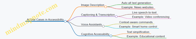
Best Practices for Integrating AI in Accessibility
- Validate AI Outputs: Always review AI-generated content for accuracy and appropriateness; automated alt text or captions can sometimes be incorrect or incomplete.
- Maintain User Control: Allow users to customize or override AI-driven features to suit their preferences.
- Ensure Privacy and Security: AI systems often process sensitive data; ensure compliance with privacy standards.
- Combine AI with Human Expertise: Use AI as a tool to augment, not replace, human accessibility efforts.
Conclusion
AI offers exciting opportunities to enhance accessibility in digital products by automating labor-intensive tasks, personalizing experiences, and improving assistive technologies. However, thoughtful implementation and continuous evaluation are essential to ensure these technologies truly serve all users effectively and respectfully.
11.2 Voice Interfaces and Accessibility Considerations
Voice interfaces are rapidly becoming a mainstream way for users to interact with digital products. For accessibility leads, product designers, and frontend engineers, understanding how to design and implement voice interfaces that are inclusive is critical. This section explores key accessibility considerations for voice interfaces, practical examples, and mind maps to help visualize the concepts.
Why Voice Interfaces Matter for Accessibility
Voice interfaces provide an alternative interaction mode that can empower users with motor impairments, visual impairments, or cognitive disabilities. They allow hands-free and eyes-free control, making digital products more accessible in various contexts.
Key Accessibility Considerations for Voice Interfaces
Voice Interface Accessibility Mind Map
Use Clear and Simple Language
Voice interfaces should use concise, jargon-free language to accommodate users with cognitive disabilities or those unfamiliar with the product.
Example: Instead of “Would you like to proceed with the transaction?”, say “Do you want to pay now?”
Provide Feedback and Confirmation
Users rely on auditory feedback to understand the system’s state. Confirmations reduce errors and increase confidence.
Example: After a user says “Turn on the lights,” the system responds, “Turning on the living room lights.”
Design for Error Tolerance and Recovery
Voice recognition can misinterpret commands. Design interfaces that gracefully handle errors and offer easy ways to correct them.
Example: If the system mishears “Set alarm for 7 AM” as “Set alarm for 9 AM,” it should confirm: “Did you mean 7 AM or 9 AM?”
Support Multiple Languages, Dialects, and Accents
To be truly accessible, voice interfaces must recognize diverse speech patterns.
Example: Amazon Alexa and Google Assistant support multiple languages and regional accents, improving accessibility for global users.
Privacy and Security Considerations
Voice interfaces often process sensitive information. Ensure users can control when the microphone is active and understand how their data is used.
Example: Provide clear voice prompts about data usage and allow users to mute or disable voice input easily.
Integration with Screen Readers and Assistive Technologies
Voice interfaces should complement, not replace, other assistive technologies.
Example: Voice commands can be used alongside screen readers like NVDA or VoiceOver to enhance navigation.
Practical Example: Accessible Voice Command Flow for a Music App
Mind Map: Designing Voice Interfaces for Accessibility
Tools and Resources
- Web Speech API: Enables speech recognition and synthesis in web apps.
- VoiceOver (iOS) and TalkBack (Android): Screen readers that can be tested alongside voice commands.
- Speech Recognition Testing Tools: Such as Google’s Speech-to-Text API for accuracy testing.
Summary
Designing accessible voice interfaces requires a deep understanding of user needs, clear communication, robust error handling, and integration with existing assistive technologies. By following best practices and continuously testing with real users, teams can create voice experiences that are inclusive and empowering.
For more detailed examples and case studies, refer to the next sections and appendices in this blog.
11.3 Virtual and Augmented Reality Accessibility Challenges
Virtual Reality (VR) and Augmented Reality (AR) represent cutting-edge frontiers in digital product design, offering immersive experiences that blend or replace the physical world. However, these technologies also introduce unique accessibility challenges that require thoughtful design and engineering to ensure inclusivity for all users.
Key Accessibility Challenges in VR and AR
VR & AR Accessibility Challenges Mind Map
Sensory Accessibility
-
Visual Impairments: VR and AR experiences are predominantly visual, which can exclude users with low vision or blindness. For example, a VR game relying heavily on color-coded cues without alternative indicators can be inaccessible.
- Best Practice: Use high-contrast visuals, scalable UI elements, and provide audio descriptions or haptic feedback as alternatives.
- Example: An AR navigation app that uses both visual arrows and spatialized audio cues to guide users.
-
Auditory Impairments: Audio cues are common in VR/AR for alerts or environmental sounds.
- Best Practice: Provide captions or visual indicators for all audio content.
- Example: A VR training simulation that displays text captions synchronized with spoken instructions.
Motor Accessibility
- Many VR/AR interactions require precise hand movements or gestures, which can be challenging for users with limited mobility.
- Best Practice: Support alternative input methods such as voice commands, simplified gestures, or controller remapping.
- Example: A VR painting app that allows users to select colors and brushes via voice commands instead of complex hand gestures.
Cognitive Accessibility
- VR and AR environments can be overwhelming due to their complexity and sensory richness.
- Best Practice: Simplify UI, provide clear instructions, and allow customization of sensory input intensity.
- Example: An AR educational app that lets users toggle between simplified and detailed modes to reduce cognitive load.
Environmental Factors
- Spatial orientation is critical in VR/AR, but users with vestibular disorders may experience motion sickness.
- Best Practice: Implement comfort settings like reduced motion, teleportation navigation, and stable horizon lines.
- Example: A VR exploration app offering a “comfort mode” that limits rapid movements and provides stationary viewpoints.
Hardware Limitations
- Controllers and headsets may not accommodate all users comfortably.
- Best Practice: Design adjustable hardware and support a variety of input devices.
- Example: VR systems compatible with adaptive controllers designed for users with limited hand function.
Software Design
- Complex UIs and lack of feedback can hinder accessibility.
- Best Practice: Use consistent UI patterns, multimodal feedback (visual, audio, haptic), and provide tutorials.
- Example: An AR app that uses vibration feedback when users interact with virtual objects, supplemented by visual highlights.
Mind Map: Strategies for Improving VR & AR Accessibility
Example Use Case: Accessible VR Museum Tour
- Scenario: A VR museum tour designed to be accessible to users with various disabilities.
- Features:
- Audio narration with captions and sign language avatar.
- Voice commands to navigate exhibits.
- Adjustable text size and contrast.
- Haptic feedback when interacting with virtual artifacts.
- Teleportation navigation to reduce motion sickness.
This example demonstrates how integrating multiple accessibility practices can create an inclusive VR experience.
Conclusion
Designing accessible VR and AR experiences requires a holistic approach that considers sensory, motor, cognitive, environmental, hardware, and software factors. By applying best practices and continuously involving users with disabilities in testing, product teams can create immersive digital products that everyone can enjoy.
11.4 Accessibility in IoT and Smart Devices
The Internet of Things (IoT) and smart devices are rapidly transforming how users interact with technology in their homes, workplaces, and public spaces. Ensuring accessibility in these devices is crucial to provide equitable experiences for users with disabilities. This section explores the unique challenges and best practices for accessible design in IoT and smart devices, supported by mind maps and practical examples.
Understanding Accessibility Challenges in IoT and Smart Devices
- Diverse interaction modes: voice, touch, gestures, physical buttons
- Limited or no traditional screen interfaces
- Context-aware and ambient computing environments
- Integration with mobile apps and cloud services
- Privacy and security considerations impacting accessibility
Mind Map: Key Accessibility Considerations for IoT and Smart Devices
Best Practices and Examples
Voice Control Accessibility
Practice: Design voice interfaces that accommodate speech impairments, alternative phrasing, and provide clear feedback.
Example: Amazon Alexa allows users to customize wake words and supports alternative commands. It also provides visual feedback through Echo Show devices to confirm actions.
Physical Button Design
Practice: Include tactile, well-spaced physical buttons with distinguishable shapes and textures for users with motor impairments.
Example: The Nest Thermostat features a rotating physical ring with tactile feedback, enabling precise control without relying solely on touchscreens.
Multi-Modal Feedback
Practice: Combine audio, visual, and haptic feedback to ensure users receive notifications regardless of sensory limitations.
Example: Smart doorbells like Ring provide chimes (audio), LED lights (visual), and vibration alerts via connected mobile devices.
Mobile App Accessibility
Practice: Ensure companion apps for IoT devices follow WCAG guidelines, support screen readers, and allow customization of controls.
Example: Philips Hue app supports VoiceOver on iOS and TalkBack on Android, enabling users with visual impairments to control lighting.
Personalization and Adaptability
Practice: Allow users to adjust sensitivity, disable motion gestures, or switch to alternative input methods.
Example: Smart TVs often let users customize remote control button mappings and enable closed captions and audio descriptions.
Mind Map: Designing Accessible Voice Interfaces for IoT
Case Study: Accessible Smart Home Setup
Scenario: A user with limited hand mobility wants to control home lighting and temperature.
- Uses voice commands via a smart speaker with customizable wake words.
- Physical smart switches with large, tactile buttons are installed for essential controls.
- Companion mobile app supports screen readers and allows remote control.
- Notifications use combined audio and vibration alerts.
This multi-modal approach ensures the user can interact with the smart home environment effectively and independently.
Testing Accessibility in IoT and Smart Devices
- Include users with disabilities in beta testing phases.
- Test voice recognition accuracy with diverse speech patterns.
- Evaluate physical controls for ease of use and tactile differentiation.
- Assess mobile app accessibility with screen readers and keyboard navigation.
- Simulate environmental conditions like background noise and low lighting.
Summary
Accessibility in IoT and smart devices requires thoughtful design across multiple interaction modes and contexts. By combining voice, tactile, visual, and app-based controls, designers and engineers can create inclusive experiences that empower all users. Continuous user testing and adherence to accessibility principles are essential to keep pace with evolving technologies.
11.5 Preparing for the Future: Continuous Learning and Adaptation
As digital accessibility continues to evolve alongside technology, preparing for the future means embracing continuous learning and adapting your design and development practices accordingly. This section explores strategies, mind maps, and practical examples to help Product Designers, Frontend Engineers, and Accessibility Leads stay ahead in accessible design.
Why Continuous Learning Matters
- Accessibility standards and user needs evolve.
- New assistive technologies emerge frequently.
- Inclusive design benefits from diverse perspectives and feedback.
- Staying updated reduces costly retrofits and legal risks.
Mind Map: Continuous Learning Framework for Accessibility
Practical Examples
Example 1: Following WCAG Updates
Scenario: A frontend engineer subscribes to the W3C Accessibility mailing list and notices a draft update to WCAG 3.0.
Action: They review the draft, share a summary with their team, and begin experimenting with new guidelines in a sandbox environment.
Result: The team is prepared to adopt changes early, ensuring their product remains compliant and user-friendly.
Example 2: Experimenting with Assistive Technologies
Scenario: A product designer tests their interface using the latest screen reader versions and voice control software.
Action: They identify navigation issues with voice commands and redesign components to improve operability.
Result: The product becomes more accessible to users relying on voice interfaces.
Mind Map: Adapting to Emerging Technologies in Accessibility
Example 3: Integrating AI for Personalized Accessibility
Scenario: An accessibility lead explores AI tools that adjust font size and contrast based on user preferences and ambient light.
Action: They collaborate with engineers to integrate AI-driven personalization features.
Result: Users receive a tailored experience that improves readability and comfort.
Tips for Building a Culture of Continuous Accessibility Learning
- Schedule regular training and knowledge-sharing sessions.
- Encourage team members to present accessibility findings.
- Allocate time for experimentation with new tools.
- Foster partnerships with disability advocacy groups.
- Celebrate accessibility wins and improvements.
Summary
Preparing for the future in accessible digital design is a dynamic process. By committing to continuous learning, engaging with communities, and embracing emerging technologies, teams can create inclusive products that stand the test of time and evolving user needs.
Remember: Accessibility is not a one-time checklist but an ongoing journey of adaptation and empathy.
12. Conclusion and Resources
12.1 Recap of Key Accessible Design Practices
Accessible design is a holistic approach that ensures digital products are usable by everyone, including people with disabilities. Below is a comprehensive recap of the essential practices covered throughout this guide, organized into key focus areas with illustrative mind maps and concrete examples.
Perceivable Content
- Use sufficient color contrast to aid users with visual impairments.
- Provide text alternatives (alt text) for images and non-text content.
- Ensure multimedia content includes captions, transcripts, and audio descriptions.
- Avoid relying solely on color to convey information.
Example:
- Buttons with text labels and icons use a contrast ratio of at least 4.5:1.
- Videos include synchronized captions and a downloadable transcript.
Operable Interface
- Ensure all interactive elements are keyboard accessible.
- Provide visible focus indicators for keyboard navigation.
- Avoid keyboard traps, especially in modals and popups.
- Design clear and consistent navigation structures.
Example:
- Dropdown menus can be opened and navigated using keyboard arrows and tab keys.
- Modal dialogs trap focus within but allow easy exit with the Escape key.
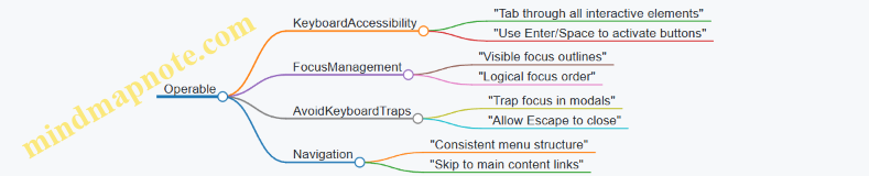
Understandable Content
- Use clear, simple language and avoid jargon.
- Provide instructions and error messages that are easy to understand.
- Maintain consistent UI patterns and predictable behavior.
Example:
- Form validation messages clearly explain what went wrong and how to fix it.
- Use placeholder text and labels to guide input.

Robust Content
- Use semantic HTML elements to ensure compatibility with assistive technologies.
- Apply ARIA roles and properties appropriately to enhance accessibility.
- Test across multiple browsers and screen readers.
Example:
- Use
<button>elements instead of clickable<div>s. - Apply
aria-expandedon collapsible sections.
Inclusive Multimedia
- Provide captions and transcripts for videos.
- Include audio descriptions for key visual information.
- Avoid flashing content that can trigger seizures.
Example:
- An explainer video includes captions and a separate audio-described version.
Mobile and Responsive Accessibility
- Ensure touch targets are large enough (minimum 44x44 pixels).
- Support zooming and text scaling without breaking layouts.
- Make gestures accessible or provide alternatives.
Example:
- Buttons have ample spacing to avoid accidental taps.
- Text scales properly when user zooms in on mobile.
Testing and Validation
- Combine automated tools with manual testing (keyboard, screen readers).
- Include users with disabilities in usability testing.
- Integrate accessibility checks into development workflows.
Example:
- Use Axe or Lighthouse for automated scans.
- Conduct user testing sessions with screen reader users.
Summary Mind Map
By consistently applying these practices, product designers, frontend engineers, and accessibility leads can create digital products that are not only compliant with standards but truly usable and enjoyable for all users.
12.2 Building an Accessibility-First Mindset
Creating an accessibility-first mindset is essential for product designers, frontend engineers, and accessibility leads to ensure that accessibility is not an afterthought but a foundational aspect of every digital product. This mindset helps teams proactively design, develop, and test products that are usable by everyone, including people with disabilities.
Why an Accessibility-First Mindset Matters
- Inclusive by Default: Embedding accessibility from the start avoids costly retrofits and ensures inclusivity.
- Improved User Experience: Accessibility improvements often enhance usability for all users.
- Legal and Ethical Responsibility: Helps comply with regulations and promotes social responsibility.
Key Components of an Accessibility-First Mindset
Awareness: Cultivating Empathy and Understanding
- Education: Regular training sessions on accessibility standards (WCAG) and assistive technologies.
- Empathy: Engage with real user stories and personas representing diverse disabilities.
- Example: Conducting empathy exercises where designers use screen readers or keyboard-only navigation to experience challenges firsthand.
Integration: Embedding Accessibility into Every Stage
- Design Process: Use accessible color palettes, typography, and component libraries from the start.
- Development Workflow: Write semantic HTML, use ARIA attributes correctly, and ensure keyboard navigability.
- Testing & QA: Incorporate automated and manual accessibility testing into CI/CD pipelines.
Example: A design team adopts an accessible UI kit and mandates accessibility checks during design reviews and code commits, preventing inaccessible components from being merged.
Collaboration: Building Cross-Functional Accessibility Champions
- Cross-functional Teams: Include accessibility leads in product planning, design, and development meetings.
- Accessibility Champions: Empower team members to advocate for accessibility and share knowledge.
- Feedback Loops: Establish channels for users and team members to report accessibility issues.
Example: A frontend engineer partners with an accessibility lead to create a checklist used during sprint demos, ensuring accessibility criteria are met before release.
Continuous Improvement: Learning and Adapting
- User Feedback: Collect feedback from users with disabilities through usability testing and surveys.
- Analytics & Metrics: Track accessibility-related bugs and resolution times.
- Training & Resources: Provide ongoing learning opportunities and access to up-to-date accessibility tools.
Example: After launching a feature, the team reviews screen reader user feedback and iterates on the design to improve clarity and navigation.
Mind Map: Practical Steps to Build an Accessibility-First Mindset
Real-World Example: Accessibility-First Mindset in Action
Company: ExampleApp
- Challenge: Legacy product with accessibility issues causing user complaints.
- Approach: Leadership mandated accessibility-first mindset by:
- Hosting monthly accessibility training for all teams.
- Integrating accessibility criteria into the Definition of Done for every feature.
- Creating an internal accessibility champions group to mentor peers.
- Incorporating automated accessibility tests in the deployment pipeline.
- Outcome: Significant reduction in accessibility bugs, improved user satisfaction scores, and compliance with WCAG 2.1 AA standards.
Summary
Building an accessibility-first mindset is a cultural shift that requires commitment, education, and collaboration. By embedding accessibility into awareness, integration, collaboration, and continuous improvement, teams can create digital products that serve all users effectively and ethically.
12.3 Recommended Tools, Libraries, and Frameworks
Creating accessible digital products is greatly facilitated by leveraging the right tools, libraries, and frameworks. These resources help product designers, frontend engineers, and accessibility leads to implement, test, and maintain accessibility best practices efficiently. Below is a comprehensive guide with examples and mind maps to help you navigate these resources.
Accessibility Testing Tools
These tools help identify accessibility issues automatically or assist manual testing.
-
Automated Testing Tools:
- axe by Deque: A popular browser extension and API for automated accessibility testing.
- Lighthouse: Google’s open-source tool integrated into Chrome DevTools for auditing accessibility.
- WAVE: Web Accessibility Evaluation Tool that provides visual feedback on accessibility.
- Pa11y: Command-line tool for automated accessibility testing.
-
Screen Reader Testing:
- NVDA (Windows)
- VoiceOver (macOS, iOS)
- TalkBack (Android)
-
Keyboard Testing:
- Manual tab navigation and focus testing.
Mind Map: Accessibility Testing Tools
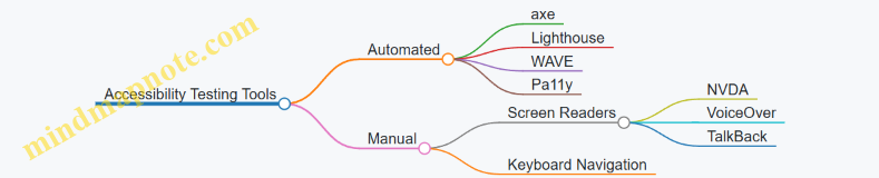
Accessibility-Focused Libraries and Frameworks
These libraries provide pre-built accessible components or utilities to help build accessible UI.
-
React Aria (by Adobe): Provides accessible UI primitives for React apps.
- Example: Using
useButtonhook to create accessible buttons with keyboard and screen reader support.
- Example: Using
-
Reach UI: A set of accessible React components.
- Example: Accessible modal dialogs, dropdowns, and tabs.
-
Vue A11y: Accessibility plugins and components for Vue.js.
-
Angular CDK (Component Dev Kit): Includes accessibility utilities and components.
-
Headless UI: Unstyled, fully accessible UI components for React and Vue.
Example: Accessible Button with React Aria
import {useButton} from '@react-aria/button';
import {useRef} from 'react';

function AccessibleButton(props) {
  let ref = useRef();
  let {buttonProps} = useButton(props, ref);

  return (
    <button {...buttonProps} ref={ref}>
      {props.children}
    </button>
  );
}
Mind Map: Accessibility Libraries and Frameworks
Color Contrast and Design Tools
Tools to ensure your color choices meet accessibility contrast standards.
- Contrast Checker by WebAIM: Check color contrast ratios.
- Stark: Plugin for Sketch, Figma, and Adobe XD to check contrast and simulate color blindness.
- Color Oracle: Simulates color blindness on your screen.
Example: Using Stark in Figma
- Select your design elements.
- Run Stark plugin to check contrast ratios.
- Adjust colors until they meet WCAG AA or AAA standards.
Mind Map: Color and Design Tools
ARIA and Semantic HTML Validators
Tools to validate proper use of ARIA roles and semantic markup.
- ARIA Validator: Browser extensions and online tools to check ARIA usage.
- HTML Validator: Tools like the W3C Markup Validation Service.
Mind Map: ARIA & Semantic Validators
Workflow and Collaboration Tools
Tools that integrate accessibility into your development and design workflows.
- Storybook: UI component explorer with accessibility add-ons.
- Figma: Design tool with accessibility plugins (e.g., Stark).
- Jira / GitHub: Track accessibility issues alongside development.
- CI/CD Integration: Tools like axe-core can be integrated into pipelines.
Example: Integrating axe-core in CI Pipeline
- Run axe-core automated tests on pull requests.
- Fail builds if accessibility violations exceed thresholds.
Mind Map: Workflow & Collaboration
Summary Table of Recommended Tools
| Category | Tool / Library | Description | Example Use Case |
|---|---|---|---|
| Automated Testing | axe | Automated accessibility testing | Run audits in Chrome DevTools |
| Automated Testing | Lighthouse | Accessibility audits with performance metrics | CI pipeline integration |
| Screen Reader Testing | NVDA, VoiceOver | Manual screen reader testing | Testing navigation and announcements |
| React Accessibility | React Aria | Accessible UI primitives | Accessible buttons, menus |
| Vue Accessibility | Vue A11y | Accessibility plugins for Vue | Accessible form controls |
| Angular Accessibility | Angular CDK | Accessibility utilities and components | Keyboard focus management |
| Color Contrast | WebAIM Contrast Checker | Check color contrast ratios | Validate color palettes |
| Design Plugins | Stark | Contrast and color blindness simulation | Figma and Sketch plugin |
| ARIA Validation | ARIA Validator | Validate ARIA roles and attributes | Ensure correct ARIA usage |
| Workflow Integration | Storybook + Add-ons | Component explorer with accessibility checks | Develop accessible UI components |
By integrating these tools, libraries, and frameworks into your design and development process, you can build digital products that are not only compliant but truly accessible and inclusive for all users.
12.4 Communities and Organizations for Accessibility Support
Engaging with communities and organizations dedicated to accessibility is crucial for staying updated on best practices, gaining support, and contributing to the ongoing evolution of accessible design. These groups offer valuable resources, networking opportunities, mentorship, and advocacy platforms.
Key Accessibility Communities and Organizations
-
W3C Web Accessibility Initiative (WAI)
- Develops guidelines like WCAG
- Provides educational resources and tools
- WAI Website
-
International Association of Accessibility Professionals (IAAP)
- Certification programs
- Professional networking
- Accessibility conferences
- IAAP Website
-
a11y Project
- Community-driven accessibility resources
- Checklists, articles, and tools
- a11y Project Website
-
Deque Systems
- Accessibility software and training
- Open source tools like axe-core
- Deque Website
-
Inclusive Design 24
- Annual 24-hour online accessibility conference
- Talks from global experts
- Inclusive Design 24
-
AccessibilityOz
- Consulting and testing services
- Community webinars and resources
- AccessibilityOz Website
-
Global Initiative for Inclusive ICTs (G3ict)
- Advocacy and policy guidance
- Promotes ICT accessibility worldwide
- G3ict Website
-
Local Meetups and Slack Groups
- Regional accessibility meetups
- Slack channels like #a11y on various tech communities
Mind Map: Accessibility Communities and Organizations
How to Engage and Benefit
-
Join Mailing Lists and Forums
- Subscribe to newsletters from W3C WAI and IAAP
- Participate in discussions on GitHub repos like the a11y Project
-
Attend Conferences and Webinars
- Inclusive Design 24 for global accessibility talks
- IAAP annual conferences for professional growth
-
Contribute to Open Source Projects
- Help improve accessibility tools like axe-core
- Share your own accessibility code snippets or guides
-
Participate in Local Meetups and Online Groups
- Network with peers and experts
- Share challenges and solutions
-
Leverage Training and Certification
- IAAP certifications to validate skills
- Deque and AccessibilityOz training programs
Example: Using the a11y Project Community
- Scenario: A frontend engineer wants to implement accessible form validation.
- Approach:
- Visit the a11y Project website and explore their form accessibility checklist.
- Join their GitHub discussions to ask questions and see community solutions.
- Use shared code examples to implement ARIA live regions for error announcements.
- Share improvements or issues back with the community.
Example: IAAP Membership Benefits for Accessibility Leads
- Access to exclusive webinars on emerging accessibility trends.
- Networking with global accessibility professionals.
- Discounts on conferences and training.
- Ability to influence accessibility standards through working groups.
Summary
Connecting with accessibility communities and organizations empowers product designers, frontend engineers, and accessibility leads to:
- Stay informed about evolving standards and technologies.
- Access practical resources and real-world examples.
- Collaborate and share knowledge with peers.
- Advocate for accessibility within their organizations and beyond.
By actively participating in these communities, teams can build more inclusive digital products and foster a culture of accessibility excellence.
12.5 Final Thoughts: Making Digital Products Truly Accessible
Creating truly accessible digital products is not just about ticking boxes or meeting compliance standards—it’s about embracing an inclusive mindset that puts every user at the center of your design and development process. Accessibility is a continuous journey that requires empathy, collaboration, and a commitment to learning and improvement.
Key Takeaways for Truly Accessible Design
- User-Centered Approach: Always design with real users in mind, especially those with disabilities. Engage users early and often.
- Accessibility as a Foundation: Integrate accessibility from the very start of product development rather than as an afterthought.
- Cross-Disciplinary Collaboration: Designers, engineers, content creators, and accessibility leads must work hand-in-hand.
- Continuous Testing & Feedback: Use a combination of automated tools, manual testing, and user feedback to identify and fix issues.
- Education & Advocacy: Foster an accessibility-first culture within your organization to sustain long-term commitment.
Mind Map: Core Principles for Making Digital Products Truly Accessible
Mind Map: Practical Steps to Embed Accessibility
Real-World Example: Airbnb’s Commitment to Accessibility
Airbnb has embedded accessibility deeply into their product development:
- Design: They use clear labels, consistent focus indicators, and high contrast UI elements.
- Development: Semantic HTML and ARIA roles are used to ensure screen reader compatibility.
- Testing: They conduct user testing sessions with people with disabilities to gather real feedback.
- Culture: Accessibility is part of their engineering and design team’s core values, with dedicated accessibility champions.
This holistic approach ensures their platform is usable by a broad audience, improving overall user satisfaction.
Example: Accessible Button Implementation
<button aria-label="Close dialog" class="btn-close" tabindex="0">
  <svg aria-hidden="true" focusable="false"><!-- icon --></svg>
</button>
- Why it’s accessible:
- Uses a clear, descriptive
aria-labelfor screen readers. - Focusable via keyboard (
tabindex="0"). - Icon marked as decorative (
aria-hidden="true") to avoid redundancy.
- Uses a clear, descriptive
Final Encouragement
Accessibility is a shared responsibility and an ongoing commitment. By embedding accessibility into every stage of your product lifecycle, continuously learning from users, and fostering a culture that values inclusivity, you can create digital experiences that are not only compliant but truly welcoming and usable for everyone.
Remember, accessible design benefits all users — it improves usability, broadens your audience, and reflects the values of empathy and respect in technology.
Keep accessibility at the heart of your work, and your digital products will shine brighter for all users.