Structured Thinking Data Analysis and Business Communication Basics
1. Introduction to Structured Thinking
1.1 What is Structured Thinking? Definition and Importance
Structured Thinking is a disciplined approach to problem-solving and decision-making that involves breaking down complex issues into clear, manageable components. It helps individuals organize their thoughts logically, ensuring clarity, focus, and efficiency in understanding and addressing challenges.
At its core, structured thinking enables you to:
- Identify the key elements of a problem.
- Analyze relationships between these elements.
- Prioritize actions based on logical reasoning.
- Communicate findings and solutions clearly.
Why is Structured Thinking Important?
-
Clarity in Complexity: Business problems are often multifaceted. Structured thinking helps simplify complexity by categorizing and segmenting information.
-
Improved Decision-Making: By organizing data and insights logically, decisions are based on evidence rather than assumptions.
-
Enhanced Communication: Structured thinking naturally leads to clearer communication, making it easier to explain ideas and persuade stakeholders.
-
Efficiency: Saves time by focusing on what truly matters and avoiding unnecessary details.
-
Consistency: Provides a repeatable framework for approaching diverse problems.
Mind Map: Components of Structured Thinking
Example 1: Structured Thinking in Action – Planning a Marketing Campaign
Imagine you are tasked with launching a new product. Instead of jumping straight into tactics, structured thinking guides you to:
- Define the Problem: Increase product awareness among target customers.
- Breakdown: Segment the target audience, identify channels, set budget constraints.
- Analyze: Evaluate which channels have the highest ROI, understand customer preferences.
- Prioritize: Focus on channels with the best reach and engagement.
- Communicate: Prepare a clear campaign plan with timelines and expected outcomes.
This approach ensures no important aspect is overlooked and resources are used efficiently.
Mind Map: Structured Thinking Applied to Marketing Campaign
Example 2: Structured Thinking for Graduate Students – Writing a Research Paper
A graduate student faces the challenge of organizing a large amount of research material:
- Define the Problem: Write a coherent paper addressing the research question.
- Breakdown: Divide the paper into Introduction, Literature Review, Methodology, Results, Discussion.
- Analyze: Identify key themes and gaps in literature.
- Prioritize: Focus on the most relevant studies and data.
- Communicate: Draft each section clearly, linking ideas logically.
This structured approach reduces overwhelm and improves the quality of the paper.
Mind Map: Structured Thinking for Research Paper Writing
Summary
Structured thinking is a foundational skill that empowers professionals and students alike to tackle complex problems methodically. By breaking down issues, analyzing components, prioritizing effectively, and communicating clearly, structured thinking drives better outcomes in business and academic contexts.
1.2 Benefits of Structured Thinking in Business and Data Analysis
Structured thinking is a disciplined approach to problem-solving and decision-making that breaks down complex issues into clear, manageable components. In business and data analysis, this approach offers numerous benefits that enhance clarity, efficiency, and effectiveness.
Key Benefits of Structured Thinking
- Improved Problem Clarity: By decomposing problems into smaller parts, structured thinking helps identify root causes and relevant factors.
- Enhanced Decision-Making: Clear frameworks reduce ambiguity, enabling more informed and confident decisions.
- Efficient Communication: Structured thoughts translate into clearer, more persuasive communication with stakeholders.
- Better Prioritization: Helps focus on high-impact areas by organizing information logically.
- Reduced Cognitive Overload: Breaking down information prevents overwhelm and supports systematic analysis.
- Facilitates Collaboration: Common frameworks and language improve team alignment.
Mind Map: Benefits of Structured Thinking
Example 1: Improving Problem Clarity
Scenario: A sales team notices declining revenue but is unsure why.
Without Structured Thinking: The team discusses various vague reasons — market conditions, product issues, or sales tactics — but lacks focus.
With Structured Thinking: The team breaks down the problem:
- Analyze sales by region
- Analyze sales by product line
- Analyze sales by customer segment
This decomposition reveals that a specific product line underperforms in one region, focusing efforts precisely.
Mind Map: Problem Clarity Example
Example 2: Enhanced Decision-Making
Scenario: A company must decide whether to invest in new software.
Structured Thinking Approach: Using a pros and cons framework, the team evaluates:
- Cost
- Implementation time
- Expected efficiency gains
- User adoption risks
This structured evaluation clarifies trade-offs and supports a data-driven decision.
Mind Map: Decision-Making Framework
Example 3: Efficient Communication
Scenario: Presenting quarterly results to executives.
Without Structure: Data is presented as raw numbers, overwhelming the audience.
With Structured Thinking: The presenter organizes insights into key themes:
- Revenue Growth
- Cost Management
- Customer Acquisition
Each theme is supported by clear data points and visuals, making the message compelling and easy to follow.
Mind Map: Communication Structure
Summary
Structured thinking empowers business professionals and data analysts to tackle complex challenges with clarity and confidence. By breaking problems down, prioritizing effectively, and communicating clearly, teams can drive better outcomes and foster collaboration.
Practice Exercise
Take a current challenge you face in your work or studies. Create a mind map breaking down the problem into smaller parts and identify at least three benefits you could gain by applying structured thinking to it.
1.3 Common Pitfalls Without Structured Thinking: Real-World Examples
Structured thinking is essential for clear problem-solving and decision-making. Without it, professionals often fall into common pitfalls that can lead to confusion, inefficiency, and poor outcomes. Below, we explore some of these pitfalls with real-world examples and mind maps to illustrate how structured thinking can prevent them.
Pitfall 1: Jumping to Conclusions Without Analyzing the Problem
Example: A marketing team noticed a sudden drop in sales and immediately blamed the product quality without investigating other factors. They launched a costly product redesign, but sales continued to decline because the real issue was a competitor’s aggressive pricing strategy.
Mind Map:
Without structured thinking, the team focused on one cause and missed the bigger picture.
Pitfall 2: Overwhelmed by Complexity and Missing Key Details
Example: A project manager received a large dataset about customer behavior but tried to analyze everything at once. The lack of a structured approach led to confusion, missed trends, and delayed decision-making.
Mind Map:
Breaking down the problem into smaller parts helps focus on what matters most.
Pitfall 3: Poor Communication Due to Unorganized Thoughts
Example: An analyst presented quarterly results to executives but jumped between unrelated topics without a clear structure. The audience was confused and unable to grasp the key insights.
Mind Map:
A structured outline ensures the message is clear and persuasive.
Pitfall 4: Ignoring Root Causes and Treating Symptoms
Example: Customer support noticed an increase in complaints and responded by adding more staff. However, complaints continued because the underlying issue was a confusing product interface.
Mind Map:
Structured thinking helps identify root causes rather than just addressing symptoms.
Pitfall 5: Lack of Prioritization Leading to Inefficient Resource Use
Example: A startup tried to tackle all customer requests simultaneously without prioritizing. This scattered approach delayed critical feature development and frustrated key clients.
Mind Map:
Prioritization frameworks within structured thinking optimize resource allocation.
Summary
Without structured thinking, professionals risk making decisions based on incomplete or disorganized information, leading to wasted time, resources, and missed opportunities. Using tools like mind maps to break down problems, analyze root causes, and organize communication can significantly improve outcomes.
Try this: Next time you face a complex problem, create a simple mind map to visualize the components before jumping to conclusions. This habit builds your structured thinking muscle and leads to better business decisions.
1.4 Best Practices for Developing a Structured Thinking Mindset
Structured thinking is a skill that can be cultivated through deliberate practice and adopting certain habits. Below are some best practices to help you develop a structured thinking mindset, accompanied by easy-to-understand examples and mind maps.
Start with Clear Problem Definition
Before diving into analysis or decision-making, clearly define the problem you want to solve. This helps focus your thinking and avoid unnecessary complexity.
Example: Imagine your company’s sales have dropped. Instead of asking “Why are sales down?”, define the problem more precisely: “Why did sales in the Northeast region drop by 15% in Q1 compared to Q4 last year?”
Break Down Problems into Smaller Parts (Decomposition)
Divide complex problems into smaller, manageable components. This makes it easier to analyze and address each part systematically.
Example: If the problem is “Declining customer satisfaction,” break it down into factors such as product quality, customer service, delivery time, and pricing.
Mind Map:
Use Frameworks to Organize Your Thinking
Frameworks like MECE (Mutually Exclusive, Collectively Exhaustive) ensure your analysis covers all relevant areas without overlap.
Example: Analyzing causes of employee turnover:
This ensures you consider all distinct categories.
Prioritize Issues Based on Impact and Effort
Not all problems are equally important. Use prioritization to focus on high-impact, feasible solutions first.
Example: If you identify five issues causing delays in project delivery, prioritize them by impact and effort:
Visualize Your Thought Process
Use diagrams, flowcharts, and mind maps to externalize your thinking. Visualization helps clarify relationships and spot gaps.
Example Mind Map: Structured Thinking Approach
Ask Clarifying Questions
Challenge assumptions and gather more information by asking targeted questions.
Example: Instead of accepting “Sales are down because of the economy,” ask:
- Which products are most affected?
- Are competitors experiencing the same decline?
- Has customer behavior changed?
Practice Reflective Thinking
After completing an analysis or decision, reflect on what worked, what didn’t, and how you can improve.
Example: After presenting a business report, ask yourself:
- Was my problem definition clear?
- Did I cover all relevant factors?
- Was my communication effective?
Develop a Habit of Structured Note-Taking
Organize your notes logically during meetings or research to maintain clarity.
Example: Use bullet points, headings, and subheadings:
Collaborate and Seek Feedback
Engage colleagues to get different perspectives and validate your structured approach.
Example: Share your problem breakdown with a peer and ask if they see any missing components or overlaps.
Continuous Learning and Practice
Structured thinking improves with practice. Regularly challenge yourself with new problems and frameworks.
Example Exercise: Pick a daily challenge (e.g., planning a trip) and practice breaking it down, prioritizing tasks, and visualizing the plan.
Summary Mind Map: Best Practices for Developing Structured Thinking
By integrating these best practices into your daily work and study habits, you will steadily develop a structured thinking mindset that enhances your data analysis and business communication skills.
1.5 Exercise: Breaking Down a Complex Problem into Manageable Parts
Structured thinking often begins with the ability to decompose a complex problem into smaller, more manageable components. This exercise will guide you through this process using practical examples and mind maps to visually organize your thoughts.
Why Break Down Problems?
- Simplifies complexity
- Helps identify root causes
- Makes problem-solving more systematic
- Enables focused action on specific parts
Step-by-Step Approach
- Identify the main problem clearly and write it down.
- Ask yourself: What are the key components or factors contributing to this problem?
- Group related components into categories.
- Break down each category further into sub-components if necessary.
- Visualize the structure using a mind map to see relationships and hierarchy.
Example Problem:
“Our company’s quarterly sales have dropped by 15%, and we need to understand why.”
Step 1: Define the Main Problem
- Main Problem: Quarterly sales dropped by 15%.
Step 2 & 3: Identify and Group Key Components
- Market Factors
- Internal Sales Process
- Product Issues
- Customer Behavior
Step 4: Break Down Each Category
Market Factors:
- Economic downturn
- Increased competition
- Seasonal trends
Internal Sales Process:
- Sales team performance
- Lead generation
- Sales training
Product Issues:
- Product quality
- Pricing
- Availability
Customer Behavior:
- Changing preferences
- Customer satisfaction
- Customer retention
Step 5: Mind Map Visualization
Additional Mind Map Example: Planning a Product Launch Delay
Problem: Product launch delayed by 3 months.
Practice Exercise for You:
Choose a complex problem you are currently facing or a hypothetical business challenge. Follow these steps:
- Write down the main problem.
- Identify 3-5 major categories contributing to the problem.
- Break down each category into smaller parts.
- Create a mind map in format to visualize the breakdown.
Tips for Effective Problem Breakdown:
- Use the MECE principle (Mutually Exclusive, Collectively Exhaustive) to avoid overlap and gaps.
- Start broad, then narrow down.
- Collaborate with others to get diverse perspectives.
- Use visual tools like mind maps or flowcharts to clarify thinking.
By practicing this exercise regularly, you will enhance your ability to approach complex problems with clarity and structure, making your analysis and communication far more effective.
2. Fundamentals of Data Analysis
2.1 Understanding Data Types and Sources
In data analysis, the foundation of any insightful conclusion lies in understanding the types of data you are working with and where that data comes from. This section will guide you through the common data types and typical data sources encountered in business contexts, supported by clear examples and mind maps to help visualize the concepts.
What Are Data Types?
Data types categorize the kind of information collected and analyzed. Knowing the data type helps determine the appropriate analysis techniques and tools.
Common Data Types:
-
Quantitative Data (Numerical): Data that represents measurable quantities.
- Discrete: Countable values (e.g., number of sales, number of employees).
- Continuous: Values that can take any number within a range (e.g., revenue, temperature).
-
Qualitative Data (Categorical): Data that describes qualities or characteristics.
- Nominal: Categories without order (e.g., product types, customer gender).
- Ordinal: Categories with a meaningful order (e.g., customer satisfaction ratings: low, medium, high).
-
Binary Data: A special case of categorical data with two categories (e.g., yes/no, pass/fail).
Mind Map: Data Types Overview
Examples of Data Types in Business Context
- Quantitative Example: A retail company tracks daily sales revenue (continuous) and the number of transactions (discrete).
- Qualitative Example: A survey collects customer feedback on product preference (nominal) and ranks service quality as poor, average, or excellent (ordinal).
- Binary Example: A marketing campaign tracks whether a customer responded to an email (yes/no).
What Are Data Sources?
Data sources refer to where data originates. Identifying reliable and relevant sources is crucial for accurate analysis.
Common Data Sources:
-
Internal Sources: Data generated within the organization.
- Sales records
- Customer databases
- Financial reports
- Employee performance data
-
External Sources: Data obtained from outside the organization.
- Market research reports
- Social media analytics
- Government statistics
- Industry benchmarks
-
Primary Data: Data collected firsthand for a specific purpose (e.g., surveys, interviews).
-
Secondary Data: Data collected by others, reused for analysis (e.g., published reports, databases).
Mind Map: Data Sources Overview
Examples of Data Sources in Practice
- Internal Data Example: A company uses its CRM system to analyze customer purchase history.
- External Data Example: A business consults government census data to understand demographic trends.
- Primary Data Example: A startup conducts customer interviews to validate a new product idea.
- Secondary Data Example: Analysts use industry reports from consulting firms to benchmark performance.
Integrating Data Types and Sources
Understanding the relationship between data types and sources helps in planning data collection and analysis strategies.
Mind Map: Integrating Data Types and Sources
Practical Example: Analyzing Customer Churn
Scenario: A telecom company wants to analyze why customers are leaving.
-
Data Types Needed:
- Quantitative: Number of months subscribed (continuous), number of support calls (discrete)
- Qualitative: Reason for leaving (nominal), customer satisfaction rating (ordinal)
- Binary: Churn status (yes/no)
-
Data Sources:
- Internal: Customer subscription records, support call logs, satisfaction surveys
- External: Industry churn benchmarks
By clearly identifying these data types and sources, analysts can structure their approach to gather relevant data, clean it appropriately, and apply suitable analysis techniques.
Summary
- Data types include quantitative (discrete and continuous), qualitative (nominal and ordinal), and binary.
- Data sources can be internal or external, and primary or secondary.
- Understanding these concepts is essential for accurate data collection, analysis, and communication.
- Mind maps help visualize the relationships and guide structured thinking.
Exercise
Create your own mind map listing the data types and sources relevant to a project or business problem you are currently working on or interested in. Identify at least one example for each category.
2.2 Collecting Reliable Data: Best Practices and Examples
Collecting reliable data is the foundation of any meaningful data analysis. Without trustworthy data, your insights and decisions may be flawed, leading to costly mistakes. This section will guide you through best practices for collecting reliable data, supported by clear examples and mind maps to visualize the process.
Why is Reliable Data Important?
- Ensures accuracy in analysis
- Builds confidence in decision-making
- Reduces risk of errors and misinterpretations
Best Practices for Collecting Reliable Data
Define Clear Objectives
Before collecting data, clearly define what you want to learn or solve.
- Example: A retail company wants to understand customer satisfaction to improve service.
Choose the Right Data Sources
Select sources that are relevant, credible, and up-to-date.
- Internal data: sales records, customer feedback
- External data: market reports, social media analytics
Use Standardized Data Collection Methods
Consistency is key. Use standardized surveys, forms, or automated tools to minimize bias.
- Example: Using the same customer satisfaction survey across all stores.
Ensure Data Accuracy and Completeness
Check for missing values, duplicates, or errors.
- Example: Validating email addresses in a customer database.
Maintain Data Integrity and Security
Protect data from unauthorized access or tampering.
- Example: Encrypting sensitive customer information.
Document the Data Collection Process
Keep detailed records of how, when, and where data was collected.
- Example: Logging survey dates and respondent demographics.
Mind Map: Best Practices for Collecting Reliable Data
Example 1: Collecting Customer Feedback for a New Product
Scenario: A software company launches a new app feature and wants to collect user feedback.
Steps Taken:
- Objective: Understand user satisfaction and identify bugs.
- Data Sources: In-app surveys, app store reviews.
- Method: Standardized 5-question survey sent via app notification.
- Accuracy: Automated checks to prevent multiple responses from the same user.
- Integrity: Data encrypted and stored securely.
- Documentation: Survey launch date and response rate logged.
Outcome: Reliable feedback helped prioritize bug fixes and feature improvements.
Mind Map: Example 1 - Customer Feedback Collection
Example 2: Gathering Sales Data Across Multiple Regions
Scenario: A multinational company wants to analyze sales performance region-wise.
Steps Taken:
- Objective: Identify high and low performing regions.
- Data Sources: Regional sales databases.
- Method: Standardized reporting templates submitted monthly.
- Accuracy: Cross-checked totals with inventory data.
- Integrity: Role-based access to sensitive financial data.
- Documentation: Version control on reports.
Outcome: Reliable data enabled targeted marketing campaigns and resource allocation.
Mind Map: Example 2 - Sales Data Collection
Tips for Ensuring Data Reliability
- Pilot test your data collection tools before full deployment.
- Train data collectors thoroughly to reduce human error.
- Regularly audit data for inconsistencies.
- Use automation where possible to minimize manual errors.
Summary
Reliable data collection is a deliberate process involving clear objectives, appropriate sources, standardized methods, accuracy checks, security measures, and thorough documentation. By following these best practices, you ensure that your data analysis is built on a solid foundation, leading to trustworthy insights and better business decisions.
2.3 Data Cleaning and Preparation Techniques
Data cleaning and preparation are critical steps in the data analysis process. Clean data ensures accurate insights and reliable decision-making. In this section, we’ll explore common techniques for cleaning and preparing data, supported by easy-to-understand examples and mind maps to visualize the process.
Why Data Cleaning and Preparation Matter
Raw data often contains errors, inconsistencies, missing values, or irrelevant information. Without cleaning, these issues can lead to misleading conclusions. Preparation also involves structuring data so it can be analyzed efficiently.
Common Data Cleaning Techniques
Handling Missing Data
- Identify missing values: Detect blanks, nulls, or placeholders.
- Decide on treatment: Options include removing rows, imputing values (mean, median, mode), or flagging missing data.
Example: In a customer dataset, if the ‘Age’ field is missing for some entries, you might fill those with the median age of the dataset.
Removing Duplicates
- Detect duplicates: Check for repeated rows or records.
- Remove or merge: Eliminate exact duplicates or consolidate partial duplicates.
Example: Two entries for the same client with identical contact info should be merged to avoid double counting.
Correcting Data Types
- Ensure numerical fields are numbers, dates are in date format, and categorical data is consistent.
Example: A ‘Date of Purchase’ column stored as text should be converted to a date format to enable time-based analysis.
Standardizing Data
- Normalize text fields (e.g., capitalization, spelling).
- Standardize units (e.g., converting all weights to kilograms).
Example: Converting all country names to their official ISO codes for consistency.
Handling Outliers
- Identify extreme values that may skew analysis.
- Decide whether to remove, transform, or investigate further.
Example: A sales record showing a transaction of $1,000,000 when typical sales are under $10,000 might be an error or a special case.
Data Preparation Techniques
Data Transformation
- Creating new variables (e.g., calculating age from birthdate).
- Normalization or scaling for machine learning.
Data Integration
- Combining data from multiple sources.
Data Reduction
- Removing irrelevant features or aggregating data.
Mind Map: Data Cleaning Process
Mind Map: Data Preparation Process
Example Walkthrough: Cleaning a Sales Dataset
Raw Data Sample:
| OrderID | Customer | Date | Amount | Country |
|---|---|---|---|---|
| 1001 | John Doe | 2023-01-15 | 250 | USA |
| 1002 | Jane Doe | 300 | United States | |
| 1003 | John Doe | 2023-01-17 | -50 | USA |
| 1003 | John Doe | 2023-01-17 | 50 | USA |
| 1004 | 2023-01-18 | 400 | US |
Issues Identified:
- Missing Date for OrderID 1002
- Negative Amount for OrderID 1003
- Duplicate OrderID 1003 with conflicting Amount
- Missing Customer for OrderID 1004
- Inconsistent Country names (USA, United States, US)
Cleaning Steps:
- Handle missing Date: Impute missing date for 1002 from similar orders or flag for follow-up.
- Resolve duplicates: For OrderID 1003, verify correct amount (likely 50), remove negative entry.
- Fill missing Customer: Investigate or mark as unknown.
- Standardize Country: Convert all to ‘USA’.
Cleaned Data Sample:
| OrderID | Customer | Date | Amount | Country |
|---|---|---|---|---|
| 1001 | John Doe | 2023-01-15 | 250 | USA |
| 1002 | Jane Doe | 2023-01-16 | 300 | USA |
| 1003 | John Doe | 2023-01-17 | 50 | USA |
| 1004 | Unknown | 2023-01-18 | 400 | USA |
Summary
Data cleaning and preparation are foundational to trustworthy analysis. By systematically identifying and addressing issues like missing data, duplicates, and inconsistencies, you ensure your dataset is accurate and ready for analysis. Using mind maps helps visualize these processes, making it easier to apply best practices consistently.
Practice Tip: Try applying these cleaning steps on a sample dataset you have access to. Document each step and the rationale behind your decisions to build a disciplined approach to data preparation.
2.4 Exploratory Data Analysis: Identifying Patterns and Trends
Exploratory Data Analysis (EDA) is a crucial step in the data analysis process that involves summarizing the main characteristics of a dataset, often using visual methods. The goal is to uncover patterns, spot anomalies, test hypotheses, and check assumptions with the help of summary statistics and graphical representations.
Why is EDA Important?
- Helps understand the data’s structure and quality
- Detects outliers and anomalies
- Identifies relationships between variables
- Guides further analysis and modeling
Key Steps in EDA
- Data Summary: Calculate mean, median, mode, standard deviation, and other descriptive statistics.
- Data Visualization: Use charts and graphs to visualize distributions and relationships.
- Pattern Recognition: Look for trends, clusters, or correlations.
- Anomaly Detection: Identify outliers or unexpected data points.
Mind Map: Exploratory Data Analysis Overview
Example 1: Identifying Sales Trends Over Time
Imagine you have monthly sales data for a retail company over two years. Your goal is to identify seasonal trends and growth patterns.
Step 1: Data Summary
- Calculate average monthly sales.
- Identify months with highest and lowest sales.
Step 2: Visualization
- Plot a line chart of sales over time.
Interpretation: The line chart reveals a clear seasonal pattern with sales peaking during the holiday season and dipping in early months.
Mind Map: Sales Data EDA
Example 2: Detecting Customer Segments Using Clustering
You have customer data including age, income, and spending score. You want to identify distinct customer groups.
Step 1: Data Summary
- Calculate mean and range for each variable.
Step 2: Visualization
- Use scatter plots to visualize relationships.
- Apply clustering algorithms (e.g., K-Means) to find groups.
Interpretation: Clustering reveals three distinct customer segments, helping tailor marketing strategies.
Mind Map: Customer Segmentation EDA
Best Practices for EDA
- Always start with data cleaning to handle missing or inconsistent data.
- Use multiple visualization types to get different perspectives.
- Combine quantitative summaries with visual insights.
- Document findings and hypotheses for further analysis.
Summary
Exploratory Data Analysis is your first deep dive into the data. By summarizing, visualizing, and interpreting data, you can identify meaningful patterns and trends that inform business decisions and further analysis.
Exercise: Take a dataset relevant to your field (e.g., academic grades, sales, or survey responses). Perform EDA by:
- Calculating descriptive statistics
- Creating at least two types of visualizations
- Writing down three key insights you discover
This hands-on practice will solidify your understanding of EDA and its importance in structured data analysis.
2.5 Case Study: Analyzing Sales Data to Identify Growth Opportunities
In this case study, we will walk through a practical example of how to analyze sales data to uncover growth opportunities. This will demonstrate structured thinking applied to data analysis, combined with clear communication of insights.
Step 1: Define the Objective
Our goal is to identify areas where the company can increase sales revenue. We want to answer questions like:
- Which products are underperforming?
- Are there particular regions or customer segments with growth potential?
- What seasonal trends affect sales?
Step 2: Collect and Prepare Data
We gather sales data for the past 12 months, including:
- Product categories
- Sales volume and revenue
- Customer segments
- Geographic regions
- Time periods (monthly data)
We clean the data by removing duplicates, correcting errors, and filling missing values.
Step 3: Exploratory Data Analysis (EDA)
We start by summarizing the data:
- Total sales by product category
- Sales trends over time
- Regional sales distribution
- Customer segment performance
Mind Map: Exploratory Data Analysis Focus Areas
Example:
| Product Category | Total Sales ($) | Growth Rate (%) |
|---|---|---|
| Electronics | 1,200,000 | 5 |
| Home Appliances | 800,000 | -2 |
| Clothing | 600,000 | 10 |
Observation: Clothing shows the highest growth rate, while Home Appliances is declining.
Step 4: Identify Patterns and Insights
- Seasonality: Sales peak in November and December, likely due to holiday shopping.
- Regional Performance: Region A has 40% of total sales but shows only 2% growth, while Region B has 20% of sales but a 15% growth rate.
- Customer Segments: Premium customers contribute 50% of revenue but represent only 20% of customers.
Mind Map: Insights Summary
Step 5: Hypothesize Growth Opportunities
Based on the insights, possible growth opportunities include:
- Expanding marketing efforts in Region B to capitalize on high growth.
- Developing promotions targeting premium customers to increase their purchase frequency.
- Introducing new products or bundles in the Clothing category to leverage its growth momentum.
Example Hypothesis:
“Increasing targeted advertising in Region B by 20% during peak months will increase sales by 10%.”
Step 6: Visualize Data to Support Recommendations
Visual aids help communicate findings effectively.
Example: Sales Growth by Region (Bar Chart)
Region A | ██████████████████ 2%
Region B | ████████████████████████████ 15%
Region C | ███████████ 5%
Example: Monthly Sales Trend (Line Chart)
Jan - ▄
Feb - ▄▄
Mar - ▄▄▄
...
Nov - ████████████
Dec - ██████████████
Step 7: Communicate Findings
When presenting to stakeholders, structure the communication as follows:
- Summary: Key findings and growth opportunities.
- Data Evidence: Visualizations and data points.
- Recommendations: Actionable steps with expected impact.
Example Executive Summary:
“Our analysis of the past year’s sales data reveals that the Clothing category and Region B are key growth drivers. We recommend increasing marketing investments in Region B and launching targeted promotions for premium customers during peak months to maximize revenue growth.”
Practice Exercise:
Try applying this structured approach to your own sales data or a sample dataset. Use the mind maps above to guide your analysis and prepare a short presentation summarizing your findings.
This case study illustrates how structured thinking and data analysis combine to identify actionable business opportunities, supported by clear communication and visual storytelling.
3. Applying Structured Thinking to Data Analysis
3.1 Defining the Problem Clearly Before Analysis
Defining the problem clearly is the foundational step in any structured thinking and data analysis process. Without a well-articulated problem statement, your analysis can become unfocused, inefficient, or even misleading. This section will guide you through best practices for defining problems clearly, supported by mind maps and practical examples.
Why Defining the Problem Matters
- Sets the direction for your analysis
- Helps identify relevant data and methods
- Prevents scope creep and wasted effort
- Facilitates clearer communication with stakeholders
Best Practices for Defining the Problem
- Be Specific and Concise: Avoid vague or broad statements.
- Focus on the Root Issue: Distinguish symptoms from causes.
- Use the 5 Ws and 1 H (Who, What, When, Where, Why, How)
- Frame the Problem from the Stakeholder’s Perspective
- Ensure the Problem is Measurable and Actionable
Mind Map: Components of a Well-Defined Problem
Example 1: Vague vs. Clear Problem Statement
- Vague: “Sales are down.”
- Clear: “Our North American retail sales declined by 15% in Q1 2024 compared to Q1 2023, primarily in the electronics category, impacting revenue targets.”
This clear statement defines the scope (North American retail, electronics category), timeframe (Q1 2024 vs Q1 2023), and impact (revenue targets), enabling focused analysis.
Step-by-Step Approach to Define the Problem
- Gather Preliminary Information
- Collect initial data and stakeholder input.
- Ask Clarifying Questions
- Use the 5 Ws and 1 H.
- Write a Draft Problem Statement
- Keep it concise and focused.
- Validate with Stakeholders
- Ensure alignment and relevance.
- Refine and Finalize
Mind Map: Applying 5 Ws and 1 H to Define a Problem
Example 2: Defining a Problem Using 5 Ws and 1 H
Scenario: A company notices a drop in customer satisfaction scores.
- Who? Customers using the online support service.
- What? Customer satisfaction scores dropped by 20% in the last quarter.
- When? Scores began declining in January 2024.
- Where? Online support channel.
- Why? Possible delays in response times.
- How? Measured via post-interaction surveys.
Problem Statement: “Since January 2024, customer satisfaction scores for the online support service have decreased by 20%, likely due to increased response times, negatively affecting customer retention.”
Practical Exercise: Define Your Problem
Think about a challenge you face at work or in your studies. Use the following template to draft a clear problem statement:
- Who is affected?
- What is the issue?
- When and where does it occur?
- Why is it important to solve?
- How can success be measured?
Summary
Defining the problem clearly is a critical first step that guides your entire analysis and communication process. Using structured approaches like the 5 Ws and 1 H, supported by mind maps, helps break down complex issues into manageable, actionable statements.
For more insights, continue to the next section: 3.2 Hypothesis Formulation and Testing with Data.
3.2 Hypothesis Formulation and Testing with Data
What is a Hypothesis?
A hypothesis is a clear, testable statement that predicts a relationship between variables. In data analysis, it guides the investigation by providing a focused question or assumption to validate or refute using data.
Why Formulate a Hypothesis?
- Provides direction and focus for data analysis.
- Helps avoid aimless data exploration.
- Enables structured thinking by breaking down complex problems.
Steps to Formulate a Hypothesis
- Identify the Problem or Question
- Example: “Why has our customer churn increased this quarter?”
- Research and Gather Background Information
- Understand possible factors affecting churn.
- Formulate a Clear, Testable Hypothesis
- Example Hypothesis: “Customers who experience delayed deliveries are more likely to churn.”
- Define Variables
- Independent Variable: Delivery Timeliness (On-time vs. Delayed)
- Dependent Variable: Customer Churn (Yes/No)
Mind Map: Hypothesis Formulation Process
Hypothesis Testing with Data
Once a hypothesis is formulated, the next step is to test it using relevant data.
Key Steps:
- Collect Relevant Data
- Example: Collect delivery records and customer churn data.
- Choose the Right Analysis Method
- For categorical data: Chi-square test
- For numerical data: t-test, regression analysis
- Perform the Analysis
- Interpret Results
- Determine if data supports or rejects the hypothesis.
- Draw Conclusions and Take Action
Example: Testing the Delivery Delay Hypothesis
- Hypothesis: Customers with delayed deliveries have a higher churn rate.
- Data: 500 customers, delivery status (on-time/delayed), churn status.
| Delivery Status | Churned | Not Churned | Total |
|---|---|---|---|
| On-time | 50 | 300 | 350 |
| Delayed | 80 | 70 | 150 |
- Analysis: Chi-square test to check if churn is independent of delivery status.
- Result: p-value < 0.05 indicates a significant relationship.
- Conclusion: Delayed deliveries are associated with higher churn.
Mind Map: Hypothesis Testing Workflow
Best Practices for Hypothesis Formulation and Testing
- Keep hypotheses specific and measurable.
- Use prior knowledge or data to inform hypotheses.
- Avoid bias by not cherry-picking data.
- Document assumptions and methods clearly.
- Validate findings with additional data or experiments.
Additional Example: Marketing Campaign Effectiveness
- Question: Does sending personalized emails increase click-through rates?
- Hypothesis: Personalized emails have a higher click-through rate than generic emails.
- Variables: Email type (personalized/generic), click-through (yes/no).
- Testing: A/B test with 1000 recipients.
- Outcome: Personalized emails show 25% CTR vs. 15% for generic.
- Conclusion: Hypothesis supported; personalized emails are more effective.
Summary
Formulating and testing hypotheses is a cornerstone of structured data analysis. It transforms vague questions into focused investigations, enabling data-driven decisions with clarity and confidence.
3.3 Using Frameworks like MECE (Mutually Exclusive, Collectively Exhaustive)
Structured thinking frameworks help organize complex information into clear, manageable parts. One of the most powerful frameworks used in data analysis and business problem-solving is the MECE principle, which stands for Mutually Exclusive, Collectively Exhaustive.
What is MECE?
- Mutually Exclusive (ME): Each category or group should be distinct with no overlaps. This ensures clarity and prevents double counting or confusion.
- Collectively Exhaustive (CE): All possible options or categories should be covered, leaving no gaps.
Applying MECE helps break down problems logically and ensures comprehensive analysis.
Why Use MECE?
- Prevents redundancy and overlap in analysis.
- Ensures all possibilities are considered.
- Simplifies complex problems into clear, actionable parts.
- Enhances communication clarity when presenting findings.
Example Scenario: Analyzing Reasons for Declining Sales
Suppose a company notices a decline in sales and wants to analyze the causes using the MECE framework.
Step 1: Define categories that are mutually exclusive and collectively exhaustive.
- Market Factors
- Product Factors
- Sales & Distribution Factors
- Customer Factors
Each category is distinct (no overlaps) and together they cover all possible reasons.
Mind Map: MECE Breakdown for Declining Sales
This mind map clearly separates causes into distinct buckets with no overlap, covering all potential areas.
Example of Non-MECE Breakdown (What to Avoid)
- Price issues
- Quality issues
- Marketing problems
- Customer complaints
- Competitor pricing
Here, “Price issues” and “Competitor pricing” may overlap, and “Marketing problems” and “Customer complaints” could overlap with other categories. Also, it may miss some factors like distribution or economic environment.
Applying MECE in Data Analysis
When analyzing data, MECE helps structure hypotheses and segment data without overlap.
Example: Segmenting customers to analyze churn.
- By Age Group
- By Geography
- By Product Usage
- By Contract Type
Each segment is mutually exclusive (a customer belongs to one age group, one geography, etc.) and collectively exhaustive (all customers are covered by these segments).
Mind Map: MECE Customer Segmentation
This structure allows precise, non-overlapping analysis of churn drivers.
Tips for Creating MECE Frameworks
- Start Broad, Then Drill Down: Begin with high-level categories, then break them down further.
- Check for Overlaps: Review categories to ensure no overlaps exist.
- Ensure Completeness: Brainstorm to cover all possibilities.
- Use Visual Tools: Mind maps, flowcharts, or tables help visualize MECE structures.
- Iterate: Refine categories as you gain more insight.
Practice Exercise
Try applying MECE to analyze reasons for employee turnover in a company. Create mutually exclusive categories such as:
- Compensation
- Work Environment
- Career Growth
- Management
- Personal Reasons
Use a mind map to organize sub-factors under each category.
Summary
The MECE framework is a foundational tool in structured thinking that helps organize data and ideas clearly and comprehensively. Using MECE ensures that your analysis is logically sound, easy to communicate, and actionable.
3.4 Visualizing Data to Support Structured Conclusions
Visualizing data is a crucial step in structured thinking and data analysis. It transforms raw numbers into clear, understandable insights that support decision-making and communication. Effective data visualization helps highlight patterns, trends, and outliers, making complex information accessible and actionable.
Why Visualize Data?
- Clarify complex data: Visuals simplify large datasets.
- Identify trends and patterns: Spot growth, decline, or cyclical behavior.
- Support arguments: Provide evidence for conclusions.
- Engage your audience: Visuals are more memorable than text or tables.
Best Practices for Data Visualization
- Choose the right chart type: Match your data and message.
- Keep it simple: Avoid clutter and unnecessary decoration.
- Use labels and legends clearly: Ensure the audience understands what they see.
- Highlight key insights: Use color or annotations to draw attention.
- Maintain consistency: Use consistent scales and colors across visuals.
Common Visualization Types and When to Use Them
| Visualization Type | Use Case | Example |
|---|---|---|
| Bar Chart | Comparing categories | Sales by region |
| Line Chart | Showing trends over time | Monthly revenue growth |
| Pie Chart | Showing proportions | Market share distribution |
| Scatter Plot | Showing relationships | Customer age vs. purchase amount |
| Heatmap | Showing intensity or frequency | Website click activity |
Example: Visualizing Customer Feedback Data
Imagine you have collected customer ratings (1 to 5 stars) for your product over the last quarter. You want to understand the distribution and identify areas for improvement.
Step 1: Structured Thinking Approach
- Define the question: “What is the distribution of customer satisfaction ratings?”
- Identify key data: Ratings frequency per star level.
- Choose visualization: Bar chart to compare counts.
Step 2: Create a Bar Chart
| Rating | Number of Responses |
|---|---|
| 5 | 120 |
| 4 | 80 |
| 3 | 40 |
| 2 | 20 |
| 1 | 10 |
Bar Chart Mind Map:
This simple visualization immediately shows that most customers are satisfied (4-5 stars), but there is a small segment with low ratings that may need attention.
Mind Map Example: Visualizing Data to Support Conclusions
Additional Example: Sales Trend Over Six Months
Suppose you want to analyze sales data to identify growth trends.
| Month | Sales (in $1000) |
|---|---|
| January | 50 |
| February | 55 |
| March | 60 |
| April | 70 |
| May | 65 |
| June | 80 |
Step 1: Structured Thinking
- Define question: “How have sales changed over the last six months?”
- Data: Monthly sales figures.
- Visualization: Line chart to show trend.
Line Chart Mind Map:
This visualization helps identify that sales are generally increasing, with a minor dip in May, which could be investigated further.
Tips for Creating Effective Visualizations
- Use color purposefully: For example, red for negative trends, green for positive.
- Avoid 3D charts: They often distort data perception.
- Label axes and units: So the audience can interpret values correctly.
- Use annotations: To explain key points or anomalies.
Summary
Visualizing data is an essential tool in structured thinking and data analysis. By selecting appropriate charts and following best practices, you can turn raw data into compelling stories that support your conclusions and drive informed business decisions.
Use mind maps to organize your visualization approach and ensure your communication is clear and structured.
3.5 Example Walkthrough: Structured Analysis of Customer Feedback
In this section, we will walk through a structured approach to analyzing customer feedback using structured thinking principles. This example will demonstrate how to break down the feedback, identify key themes, prioritize issues, and derive actionable insights.
Step 1: Collect and Organize Customer Feedback
Imagine you have collected feedback from a recent product launch via surveys, social media comments, and customer support tickets. The raw feedback includes comments like:
- “The app crashes frequently when I try to upload photos.”
- “Customer support was slow to respond.”
- “I love the new design, very intuitive and clean.”
- “The pricing seems a bit high compared to competitors.”
- “It takes too long to load the dashboard.”
To analyze this effectively, start by categorizing the feedback into broad themes.
Step 2: Create a Mind Map to Categorize Feedback
Using a mind map helps visually organize the feedback into categories and subcategories.
Customer Feedback Analysis Mind Map
This mind map breaks down the feedback into four main categories: Product Performance, Customer Service, User Experience, and Pricing.
Step 3: Drill Down into Each Category
Next, analyze each category to understand the specific issues or praises.
Detailed Mind Map with Examples
Step 4: Prioritize Issues Using Structured Thinking
Apply a simple prioritization framework based on impact and frequency:
| Issue | Frequency (High/Medium/Low) | Impact (High/Medium/Low) | Priority (H/M/L) |
|---|---|---|---|
| App Crashes | High | High | High |
| Dashboard Loading Speed | Medium | Medium | Medium |
| Slow Customer Support | Medium | High | High |
| Pricing Concerns | Low | Medium | Medium |
| Positive Design Feedback | N/A | Positive | N/A |
Step 5: Visualize Prioritization with a Mind Map
Step 6: Derive Actionable Insights
Based on the prioritized issues, the business can focus on:
- Fixing the app crashes urgently to improve user retention.
- Improving customer support response times to enhance satisfaction.
- Optimizing dashboard performance as a medium-term goal.
- Reviewing pricing strategy considering competitor analysis.
Step 7: Communicating Findings
When presenting this analysis to stakeholders, use clear visuals and concise language. For example:
“Our analysis of customer feedback reveals that the most critical issues are frequent app crashes during photo uploads and slow customer support response times. Addressing these will likely have the greatest impact on customer satisfaction and retention. Positive feedback on the new design indicates that our UX improvements are well received. Medium priority areas include dashboard loading speed and pricing concerns, which we recommend monitoring and addressing in upcoming product cycles.”
Summary
This example demonstrates how structured thinking helps break down complex, unstructured customer feedback into manageable categories, prioritize issues based on impact and frequency, and derive clear, actionable insights. Using mind maps at each step aids visualization and communication, making the analysis accessible and effective.
4. Basics of Business Communication
4.1 Key Principles of Effective Business Communication
Effective business communication is essential for success in any professional environment. It ensures that messages are conveyed clearly, understood correctly, and lead to productive outcomes. Below are the key principles that form the foundation of effective business communication, accompanied by mind maps and practical examples.
Clarity
- Definition: Communicating your message in a straightforward and unambiguous manner.
- Why it matters: Avoids misunderstandings and ensures the receiver knows exactly what is expected.
Example: Instead of saying, “Please get the report done soon,” say, “Please complete the quarterly sales report by Friday, 5 PM.”
Conciseness
- Definition: Delivering your message in as few words as necessary without losing meaning.
- Why it matters: Respects the recipient’s time and keeps attention focused.
Example: Replace “Due to the fact that the meeting was postponed, we will reschedule it to next week” with “The meeting is rescheduled to next week.”
Courtesy
- Definition: Being polite, respectful, and considerate in communication.
- Why it matters: Builds positive relationships and fosters collaboration.
Example: Instead of “Send me the files now,” say “Could you please send me the files at your earliest convenience?”
Correctness
- Definition: Ensuring your communication is free from errors in grammar, facts, and figures.
- Why it matters: Builds credibility and avoids confusion.
Example: Double-check numbers in a financial report before sending it to stakeholders.
Completeness
- Definition: Providing all necessary information the recipient needs to understand and act.
- Why it matters: Prevents back-and-forth clarifications and delays.
Example: When assigning a task, include what needs to be done, deadline, and resources available.
Consideration
- Definition: Tailoring your message to the audience’s perspective and needs.
- Why it matters: Increases engagement and effectiveness.
Example: When communicating with technical teams, use industry terms; with clients, simplify jargon.
Concreteness
- Definition: Using specific facts and figures rather than vague statements.
- Why it matters: Makes communication more believable and actionable.
Example: Instead of “We had a good quarter,” say “Our sales increased by 15% in Q1 compared to last year.”
Integrated Example: Applying the Principles
Scenario: Writing an email to request project updates from a team member.
Ineffective Email: “Hey, I need the project update soon. Make sure it’s good and complete. Thanks.”
Effective Email Applying Principles: "Hi Sarah,
Could you please send me the latest project update report by Wednesday, March 15th, 3 PM? Please include the current progress, any challenges faced, and next steps planned.
Let me know if you need any assistance.
Thanks in advance!
Best,
John"
- Clarity: Clear deadline and expectations.
- Conciseness: Straight to the point.
- Courtesy: Polite request and offer to help.
- Correctness: Proper grammar and format.
- Completeness: Specifies what to include.
- Consideration: Friendly tone suited for colleague.
- Concreteness: Specific date and information requested.
Summary Mind Map of Key Principles
By consistently applying these principles, office professionals and graduate students can enhance their communication effectiveness, leading to better collaboration, fewer misunderstandings, and stronger professional relationships.
4.2 Understanding Your Audience: Tailoring the Message
Effective business communication hinges on understanding who your audience is and tailoring your message accordingly. This ensures your communication is clear, relevant, and impactful. In this section, we’ll explore how to analyze your audience, adapt your tone and content, and use examples and mind maps to illustrate these concepts.
Why Understanding Your Audience Matters
- Relevance: Tailoring content ensures the message addresses the audience’s needs and interests.
- Engagement: A message that resonates keeps the audience attentive and responsive.
- Clarity: Using language and examples familiar to the audience reduces misunderstandings.
- Persuasion: Customized communication increases the likelihood of influencing decisions.
Step 1: Identify Your Audience
Ask yourself:
- Who are they? (e.g., executives, colleagues, clients, technical experts, non-experts)
- What is their level of knowledge about the topic?
- What are their interests, goals, and pain points?
- What is their preferred communication style?
Mind Map: Audience Identification
Step 2: Tailor Your Message Content
- Language: Use jargon or technical terms only if the audience is familiar.
- Depth: Provide detailed data for experts; high-level summaries for executives.
- Focus: Highlight aspects that matter most to the audience (e.g., ROI for finance teams).
- Tone: Formal for senior leadership, conversational for peers.
Example 1: Communicating a Data Analysis Result
- To Executives: “Our sales increased by 15% last quarter, contributing to a $2M revenue growth, exceeding targets by 5%.”
- To Technical Team: “The sales increase is primarily driven by a 20% uplift in the Northeast region, supported by the new CRM implementation that improved lead conversion rates from 12% to 18%.”
Step 3: Choose the Right Communication Medium
- Email for formal updates
- Presentations for detailed discussions
- Informal chats or instant messaging for quick clarifications
Mind Map: Communication Medium Selection
Step 4: Use Examples and Stories Relevant to Your Audience
Stories and examples help make abstract data relatable.
Example 2: Tailoring an Example
- For Marketing Team: “By targeting social media ads to millennials, we saw a 30% increase in engagement, similar to the campaign we ran last year that boosted brand awareness.”
- For Finance Team: “The campaign’s cost per acquisition decreased from $50 to $35, improving overall marketing ROI by 12%.”
Summary Mind Map: Tailoring Your Message
Practice Exercise
Think of a recent business communication you had. Identify the audience and rewrite your message tailored to two different audience types (e.g., technical team vs. executives). Consider tone, detail, and examples.
By mastering audience analysis and message tailoring, you increase the effectiveness of your business communication, ensuring your insights are understood and acted upon.
4.3 Verbal vs. Written Communication: When and How to Use Each
Effective business communication hinges on choosing the right medium for your message. Verbal and written communication each have unique strengths and ideal use cases. Understanding when and how to use each can significantly improve clarity, engagement, and outcomes.
Understanding Verbal Communication
Verbal communication involves spoken words, either face-to-face, over the phone, or via video conferencing. It allows for immediate feedback, tone variation, and emotional nuance.
Best Uses of Verbal Communication:
- Quick decision-making discussions
- Brainstorming sessions
- Delivering sensitive or complex messages
- Building rapport and trust
- Handling misunderstandings promptly
Example: Imagine a project manager needs to clarify a sudden change in deadlines with the team. A quick verbal meeting or call helps address questions immediately and adjust plans collaboratively.
Understanding Written Communication
Written communication includes emails, reports, memos, and instant messaging. It provides a permanent record, allows for careful crafting of messages, and suits detailed or complex information.
Best Uses of Written Communication:
- Sharing detailed instructions or documentation
- Communicating with large or dispersed audiences
- Providing formal updates or proposals
- Ensuring clarity and consistency over time
- When a permanent record is needed
Example: A business analyst sends a detailed report summarizing quarterly sales data with charts and insights. This allows stakeholders to review the information at their own pace and refer back as needed.
Mind Map: Choosing Between Verbal and Written Communication
When to Use Verbal Communication
- Urgency: When decisions or clarifications are needed quickly.
- Complexity: When the topic benefits from tone, inflection, or immediate Q&A.
- Relationship Building: To foster trust and personal connection.
- Conflict Resolution: To address misunderstandings or sensitive issues.
Example: A team lead calls a quick meeting to resolve confusion about task responsibilities after receiving conflicting emails.
When to Use Written Communication
- Documentation: When a record of communication is necessary.
- Detail: When conveying complex data, instructions, or policies.
- Asynchronous Communication: When recipients are in different time zones or schedules.
- Formal Communication: For official announcements or proposals.
Example: HR sends an email outlining updated company policies to ensure everyone has the same information in writing.
How to Use Verbal Communication Effectively
- Prepare key points to stay focused.
- Use clear and concise language.
- Listen actively and encourage questions.
- Be mindful of tone and body language.
- Summarize decisions and next steps at the end.
Example: During a video call, a manager clearly outlines project goals, pauses for questions, and confirms understanding before ending the meeting.
How to Use Written Communication Effectively
- Start with a clear subject or headline.
- Use bullet points or numbered lists for clarity.
- Keep sentences concise and jargon-free.
- Include visuals (charts, tables) when helpful.
- Proofread for grammar and tone.
- End with a clear call to action or summary.
Example: An analyst emails a summary report with bullet points highlighting key findings, includes a chart for visual impact, and closes with recommended next steps.
Mind Map: Tips for Effective Verbal vs. Written Communication
Integrated Example: Choosing the Right Medium
Scenario: A marketing team discovers a sudden drop in campaign performance.
- Step 1: The team lead calls a verbal meeting to quickly discuss possible causes and gather initial ideas.
- Step 2: The data analyst prepares a detailed written report with data visualizations to share with stakeholders.
- Step 3: The team lead follows up with a written email summarizing decisions made and next steps.
This integrated approach leverages the strengths of both verbal and written communication for maximum effectiveness.
By mastering when and how to use verbal and written communication, office professionals and graduate students can enhance collaboration, reduce misunderstandings, and drive better business outcomes.
4.4 Common Communication Barriers and How to Overcome Them
Effective business communication is essential for success, but various barriers can hinder the clarity and impact of your message. Understanding these barriers and learning strategies to overcome them can significantly improve your communication skills.
Common Communication Barriers
Below is a mind map illustrating the main types of communication barriers encountered in business settings:
Physical Barriers
Description: Physical barriers include environmental factors that obstruct communication, such as noise, distance, or faulty communication tools.
Example: During a virtual meeting, poor internet connectivity causes audio dropouts, making it difficult to follow the conversation.
How to Overcome:
- Use reliable communication technology.
- Choose quiet, distraction-free environments.
- Use written follow-ups to reinforce verbal communication.
Psychological Barriers
Description: Internal states such as stress, anxiety, or preconceived notions can cloud understanding.
Example: An employee under stress may misinterpret constructive feedback as criticism.
How to Overcome:
- Practice active listening and empathy.
- Encourage open dialogue to clarify misunderstandings.
- Manage stress through breaks and mindfulness.
Language Barriers
Description: Differences in language, use of jargon, or ambiguous terms can confuse the message.
Example: Using technical jargon in a presentation to non-technical stakeholders leads to confusion.
How to Overcome:
- Simplify language and avoid jargon when possible.
- Provide glossaries or explanations for technical terms.
- Confirm understanding by asking questions.
Cultural Barriers
Description: Differences in cultural norms, values, and communication styles can lead to misunderstandings.
Example: In some cultures, direct criticism is considered rude, while in others it is expected.
How to Overcome:
- Educate yourself on cultural differences.
- Adapt communication style to the audience.
- Use inclusive language and be respectful.
Organizational Barriers
Description: Structural issues within an organization, such as rigid hierarchies or information silos, can impede communication flow.
Example: Important information gets stuck at middle management and never reaches frontline employees.
How to Overcome:
- Promote open communication channels.
- Encourage feedback loops.
- Use collaborative tools to share information transparently.
Perceptual Barriers
Description: Different perspectives or biases can cause misinterpretation of messages.
Example: Two team members interpret the same project update differently due to their roles and priorities.
How to Overcome:
- Clarify intent and context.
- Encourage questions and paraphrasing to confirm understanding.
- Foster a culture of openness and trust.
Integrated Example: Overcoming Multiple Barriers
Imagine a multinational company launching a new product. The project manager needs to communicate the launch plan to a diverse team.
- Barrier: Language and cultural differences cause confusion about deadlines.
- Solution: The manager uses simple language, avoids jargon, and provides a written summary.
- Barrier: Organizational silos delay feedback.
- Solution: The manager sets up a shared digital workspace for real-time updates.
- Barrier: Stress among team members leads to misinterpretation.
- Solution: The manager holds a Q&A session to address concerns and clarify points.
This approach ensures clear, inclusive, and effective communication.
Mind Map: Strategies to Overcome Communication Barriers
Summary
By recognizing and addressing common communication barriers, office professionals and graduate students can enhance their ability to convey ideas clearly and build stronger professional relationships. Practice empathy, clarity, and adaptability to ensure your message is understood as intended.
4.5 Practical Example: Writing a Clear and Concise Business Email
Effective business communication often hinges on the ability to write clear and concise emails. This section will guide you through best practices, supported by mind maps and examples, to craft emails that get your message across efficiently and professionally.
Key Elements of a Clear and Concise Business Email
Step 1: Crafting an Effective Subject Line
The subject line is the first thing your recipient sees. It should summarize the email’s purpose in a few words.
Example:
- Instead of “Update,” write “Project X: Status Update and Next Steps”
Step 2: Professional Greeting
Use a greeting appropriate to your relationship with the recipient.
Examples:
- Formal: “Dear Ms. Johnson,”
- Semi-formal: “Hi John,”
Step 3: Writing the Body with Structured Thinking
Organize your email body logically. Start with the purpose, provide necessary details, and end with clear requests or next steps.
Example:
Hi Sarah,
I am writing to provide you with the latest update on the Q2 marketing campaign. We have completed the initial design phase and are on track for the launch scheduled on July 15.
Please review the attached campaign plan and share your feedback by Friday, June 30. Let me know if you have any questions or need further information.
Thank you for your support.
Best regards,
Mark
Step 4: Closing and Signature
End with a polite closing and your professional signature.
Examples:
- “Best regards,”
- “Sincerely,”
Include your full name, position, and contact information if appropriate.
Full Email Example
Email:
Subject: Project Update and Feedback Request
Hi Sarah,
I am writing to provide you with the latest update on the Q2 marketing campaign. We have completed the initial design phase and are on track for the launch scheduled on July 15.
Please review the attached campaign plan and share your feedback by Friday, June 30. Let me know if you have any questions or need further information.
Thank you for your support.
Best regards,
Mark
Tips for Writing Clear and Concise Emails
- Use short paragraphs and bullet points where possible.
- Avoid jargon unless you are sure the recipient understands it.
- Be specific about deadlines and expectations.
- Proofread for grammar and clarity before sending.
By following these structured steps and using the mind maps as a guide, you can write business emails that are clear, concise, and effective in communicating your message.
5. Integrating Data Analysis with Business Communication
5.1 Translating Data Insights into Clear Business Messages
Translating data insights into clear business messages is a critical skill for office professionals and graduate students aiming to influence decision-making and drive organizational success. Data alone is not enough; the real value lies in how effectively you communicate what the data means and what actions should be taken.
Why is Translating Data Insights Important?
- Bridges the gap between technical analysis and business strategy.
- Enables informed decision-making by stakeholders who may not be data experts.
- Builds credibility for your analysis and recommendations.
- Drives action by clearly outlining implications and next steps.
Best Practices for Translating Data Insights
- Start with the Key Message: Identify the main insight or takeaway before diving into details.
- Use Simple Language: Avoid jargon; explain technical terms if necessary.
- Contextualize the Data: Explain why the insight matters to the business.
- Highlight Impact: Quantify benefits, risks, or changes implied by the data.
- Suggest Clear Actions: Provide recommendations or options based on the insight.
- Use Visuals Wisely: Support messages with charts or infographics that reinforce the point.
Mind Map: Translating Data Insights into Business Messages
Example 1: Sales Data Insight
Raw Insight: “Sales in Region A increased by 15% last quarter compared to the previous quarter.”
Translated Business Message:
“Our sales in Region A grew by 15% last quarter, outperforming the company-wide average growth of 8%. This suggests that recent marketing campaigns targeting this region are effective. To capitalize on this momentum, we recommend increasing the marketing budget for Region A by 20% next quarter to further boost sales.”
Mind Map for Example 1:
Example 2: Customer Feedback Analysis
Raw Insight: “Customer satisfaction scores dropped by 10% after the new software update.”
Translated Business Message:
“Following the recent software update, customer satisfaction scores have declined by 10%, indicating potential usability issues. Immediate attention is needed to identify and resolve these problems to prevent churn. We suggest conducting user testing sessions and prioritizing bug fixes in the next development cycle.”
Mind Map for Example 2:
Step-by-Step Approach to Crafting Your Message
- Analyze the Data: Understand what the numbers mean.
- Identify the Audience: Tailor the message to their level of expertise and interests.
- Extract the Core Insight: What is the one thing they need to know?
- Explain the Why: Why does this insight matter?
- Quantify the Impact: Use metrics or KPIs.
- Recommend Actions: What should be done next?
- Support with Visuals: Choose clear and relevant charts.
Additional Mind Map: Step-by-Step Message Crafting
Summary
Translating data insights into clear business messages requires a structured approach that focuses on clarity, relevance, and actionable recommendations. Using simple language, contextualizing data, and supporting your message with visuals can significantly enhance understanding and impact.
By practicing these techniques and using mind maps to organize your thoughts, you can become more effective at communicating data-driven insights that drive business success.
5.2 Storytelling with Data: Techniques and Best Practices
Storytelling with data is the art of turning raw numbers and statistics into a compelling narrative that resonates with your audience. It bridges the gap between complex data analysis and clear business communication, enabling decision-makers to understand insights quickly and act confidently.
Why Storytelling with Data Matters
- Engages your audience: Stories are easier to remember than isolated facts.
- Clarifies insights: A narrative provides context and meaning to data.
- Drives action: Well-told stories motivate stakeholders to make informed decisions.
Core Techniques for Storytelling with Data
Start with a Clear Message (The “So What?”)
Every data story needs a central message or insight. Ask yourself: What is the key takeaway? What do you want your audience to remember or do?
Example:
- Instead of presenting raw sales numbers, say: “Sales in the Northeast region grew by 15% last quarter, indicating a successful marketing campaign.”
Structure Your Story: The Classic Narrative Arc
Use a simple structure to guide your audience:
- Context: Set the scene with background information.
- Conflict/Challenge: Present the problem or question.
- Resolution: Show how data provides the answer or insight.
Mind Map:
Example:
- Context: “Our customer churn rate has increased over the past 6 months.”
- Challenge: “Why are customers leaving?”
- Resolution: “Data shows dissatisfaction peaks after the first product use, suggesting onboarding issues.”
Use Visuals to Amplify the Story
Visualizations help translate numbers into intuitive understanding. Choose the right chart type for your message.
- Bar charts: Compare categories
- Line charts: Show trends over time
- Pie charts: Display proportions (use sparingly)
- Scatter plots: Reveal correlations
Mind Map:
Example:
- Instead of a table of monthly sales, use a line chart highlighting the upward trend with annotations for key events.
Simplify and Focus
Avoid overwhelming your audience with too much data. Highlight the most relevant insights and remove distractions.
Example:
- Show only the top 3 factors affecting customer satisfaction instead of all surveyed variables.
Use Contextual Annotations
Add labels, callouts, or brief explanations directly on visuals to guide interpretation.
Example:
- On a sales decline chart, annotate “New competitor entered market” at the corresponding time point.
Connect Data to Real-World Impact
Translate numbers into business implications.
Example:
- “A 10% drop in website traffic led to an estimated $50,000 revenue loss last quarter.”
Example: Storytelling with Customer Feedback Data
Scenario: You analyzed customer survey data to understand satisfaction drivers.
Step 1: Define the message “Product usability is the key driver of customer satisfaction and retention.”
Step 2: Structure the story
Step 3: Visualize
- Bar chart showing satisfaction scores by feature usability
- Scatter plot correlating usability and retention rates
Step 4: Annotate
- Highlight the highest impact usability issues
Step 5: Connect to impact “Improving usability could increase retention by 12%, potentially adding $1M in annual revenue.”
Mind Map Summary of Storytelling with Data
Best Practices Checklist
- Define your core message before creating visuals
- Use a clear narrative structure
- Choose visuals that support your story
- Simplify data presentation
- Annotate charts for clarity
- Relate data insights to business outcomes
By mastering storytelling with data, you transform raw numbers into persuasive, memorable narratives that drive better business decisions and professional communication.
5.3 Using Visual Aids Effectively in Presentations
Visual aids are powerful tools that help convey complex information clearly and engage your audience. When used effectively, they enhance understanding, retention, and persuasion. This section covers best practices for using visual aids in business presentations, supported by examples and mind maps to illustrate key concepts.
Why Use Visual Aids?
- Simplify complex data
- Highlight key points
- Maintain audience interest
- Support storytelling with data
Best Practices for Visual Aids
-
Keep it Simple and Focused
- Avoid cluttered slides.
- Use one main idea per visual.
- Example: Instead of showing a full spreadsheet, display a summarized chart highlighting the key trend.
-
Choose the Right Type of Visual
- Bar charts for comparisons
- Line charts for trends over time
- Pie charts for proportions
- Infographics for processes or hierarchies
-
Use Consistent Design Elements
- Consistent colors, fonts, and styles improve readability.
- Use company branding colors where appropriate.
-
Label Clearly and Accurately
- Titles, axis labels, and legends should be clear.
- Avoid jargon unless the audience is familiar.
-
Use Animation Sparingly
- Use animations to guide attention but avoid distractions.
-
Practice with Your Visuals
- Ensure smooth transitions and familiarity with your visuals.
Example: Presenting Quarterly Sales Performance
Imagine you need to present quarterly sales data to stakeholders. Here’s how to use visual aids effectively:
- Start with a summary slide showing total sales growth with a simple bar chart.
- Use a line chart to show sales trends over the quarters.
- Include a pie chart to display sales distribution by product category.
- Add a callout box highlighting the top-performing region.
Mind Maps to Organize Visual Aid Strategies
Additional Examples
Example 1: Process Explanation Using Infographics
- When explaining a business process, use a flowchart or infographic.
- Example: Visualize the customer onboarding process step-by-step.
Example 2: Comparing Options with a Table
- Use a table to compare features, costs, or benefits side-by-side.
- Example: Comparing software tools for project management.
Summary
Using visual aids effectively means selecting the right type of visual, keeping it simple and focused, and designing it to support your message clearly. Practice integrating visuals seamlessly into your presentation to enhance communication and impact.
5.4 Example: Presenting Quarterly Performance Results to Stakeholders
Presenting quarterly performance results to stakeholders is a critical business communication task that requires clarity, structure, and the ability to translate complex data into actionable insights. This section will guide you through best practices and provide examples, including mind maps, to help you deliver an effective presentation.
Step 1: Understand Your Audience
Before preparing your presentation, identify who your stakeholders are (executives, investors, department heads, etc.) and what they care about most (revenue growth, cost control, customer satisfaction, etc.). Tailor your message accordingly.
Step 2: Structure Your Presentation
Use a clear, logical structure to help stakeholders follow your narrative. A common structure includes:
- Introduction: Brief overview of the quarter and objectives
- Key Metrics: Highlight critical performance indicators
- Analysis: Explain trends, successes, and challenges
- Action Items: Recommendations and next steps
- Q&A: Address stakeholder questions
Mind Map: Quarterly Performance Presentation Structure
Step 3: Select and Present Key Metrics
Choose metrics that align with stakeholder priorities. Use visuals like charts and graphs to make data digestible.
Example:
| Metric | Q1 2024 | Q4 2023 | % Change |
|---|---|---|---|
| Revenue | $5M | $4.5M | +11.1% |
| Customer Growth | 12,000 | 11,000 | +9.1% |
| Operating Costs | $2M | $1.8M | +11.1% |
Visuals can include bar charts for revenue growth or line graphs showing customer growth over time.
Step 4: Analyze and Explain the Data
Provide context for the numbers. Explain why revenue increased, what drove customer growth, or why costs rose.
Example:
- Revenue increased by 11.1% due to the launch of the new product line in February.
- Customer growth was fueled by expanded marketing campaigns targeting new demographics.
- Operating costs rose due to increased investment in R&D.
Mind Map: Analysis of Quarterly Results
Step 5: Recommend Action Items
Based on the analysis, suggest clear next steps.
Example:
- Increase marketing budget to sustain customer growth.
- Optimize supply chain to reduce delays.
- Monitor R&D spending to ensure ROI.
Step 6: Prepare for Q&A
Anticipate questions stakeholders might ask and prepare concise, data-backed answers.
Full Example Presentation Outline with Mind Map
Tips for Effective Presentation:
- Use simple, clear language avoiding jargon.
- Incorporate visuals (charts, graphs, mind maps) to support points.
- Keep slides uncluttered; focus on key messages.
- Practice delivering the presentation to maintain confident pacing.
- Engage stakeholders by inviting questions and feedback.
By following this structured approach, you ensure your quarterly performance presentation is clear, data-driven, and aligned with stakeholder interests, enhancing decision-making and fostering trust.
5.5 Handling Questions and Feedback Based on Data Presentations
Effectively managing questions and feedback after presenting data is crucial to ensuring your message is understood, building credibility, and fostering productive discussions. This section will guide you through best practices, provide examples, and use mind maps to help you navigate this important phase.
Why Handling Questions and Feedback Matters
- Clarifies any doubts or misunderstandings
- Demonstrates your expertise and preparedness
- Builds trust and engagement with your audience
- Provides insights that may improve your analysis or presentation
Best Practices for Handling Questions and Feedback
-
Listen Actively
- Pay full attention to the question or feedback.
- Avoid interrupting.
- Show you value the input.
-
Clarify When Needed
- Paraphrase the question to confirm understanding.
- Ask follow-up questions if the query is vague.
-
Respond Honestly and Clearly
- If you know the answer, provide it concisely.
- If you don’t know, acknowledge it and offer to follow up.
-
Stay Calm and Professional
- Manage emotions, especially with critical feedback.
- Keep responses respectful and constructive.
-
Use Data to Support Your Answers
- Refer back to your visuals or data points.
- Provide additional context if necessary.
-
Engage the Group
- Sometimes invite others’ perspectives.
- Encourage collaborative problem-solving.
-
Summarize and Transition
- Briefly summarize your response.
- Transition back to the presentation or next question.
Mind Map: Handling Questions and Feedback
Example Scenario 1: Handling a Challenging Question
Presentation Context: You presented quarterly sales data showing a decline in one region.
Question: “Why did sales drop so sharply in the Northeast region? Could it be due to seasonal factors or competitor activity?”
Response:
- Listen & Clarify: “Great question. To confirm, you’re asking whether the sales decline in the Northeast is linked to seasonal trends or competitor actions, correct?”
- Answer: “Based on our data, the decline coincides with a new competitor launching a promotion in that region last quarter, which likely impacted sales. Seasonal trends typically show a slight dip in Q2, but this drop was steeper than usual. We can explore this further with additional competitor data.”
- Engage: “Does anyone else have insights or data on competitor activities in that region?”
- Summarize: “So, the preliminary analysis points to competitor impact combined with seasonal factors. We’ll investigate further and update the team.”
Example Scenario 2: Receiving Critical Feedback
Feedback: “The data visualization is too complex and hard to interpret quickly.”
Response:
- Listen & Acknowledge: “Thank you for that feedback; I appreciate your perspective.”
- Clarify: “Could you specify which part felt complex? Was it the chart type, the number of data points, or something else?”
- Answer: “I understand that the multi-line chart with several categories might be overwhelming. For future presentations, I’ll simplify the visuals or break them into smaller segments to improve clarity.”
- Engage: “Would you prefer a summary dashboard or individual charts for each category?”
- Summarize: “Your input helps me tailor the presentation better. I’ll incorporate these changes moving forward.”
Mind Map: Responding to Challenging Questions and Feedback
Tips for Difficult Situations
-
Handling Off-Topic Questions: Politely steer back by saying, “That’s an interesting point; let’s discuss it after the presentation to stay on track.”
-
Dealing with Hostile Feedback: Maintain composure and respond with facts, e.g., “I understand your concerns; here’s the data that supports our findings.”
-
When You Don’t Know the Answer: “I don’t have that information right now, but I’ll research it and get back to you promptly.”
Practice Exercise
After your next data presentation, prepare for Q&A by:
- Listing potential questions based on your data.
- Drafting clear, data-supported answers.
- Practicing paraphrasing and clarifying questions.
Mastering the art of handling questions and feedback not only strengthens your credibility but also enhances the impact of your data presentations, fostering a culture of open communication and continuous improvement.
6. Tools and Techniques for Structured Thinking and Communication
6.1 Mind Mapping and Flowcharts for Problem Structuring
Structured thinking begins with organizing your thoughts clearly and visually. Two powerful tools to achieve this are mind maps and flowcharts. These tools help break down complex problems into manageable parts, reveal relationships, and guide decision-making.
What is a Mind Map?
A mind map is a diagram used to visually organize information. It starts with a central idea and branches out into related subtopics, allowing you to see the big picture and details simultaneously.
Best Practices for Mind Mapping:
- Start with a clear central problem or topic.
- Use keywords or short phrases.
- Branch out logically with related ideas.
- Use colors, icons, or images to enhance memory and clarity.
- Keep the structure radial and avoid crossing lines.
Example 1: Mind Map for “Improving Customer Satisfaction”
This mind map breaks down the broad goal of improving customer satisfaction into four key areas, each with sub-factors to analyze.
Example 2: Mind Map for “Launching a New Product”
This mind map helps structure the entire launch process, ensuring no critical area is overlooked.
What is a Flowchart?
A flowchart is a graphical representation of a process or workflow. It uses standardized symbols to depict steps, decisions, inputs, and outputs, guiding you through a sequence logically.
Best Practices for Flowcharts:
- Define the start and end points clearly.
- Use consistent symbols (e.g., ovals for start/end, rectangles for steps, diamonds for decisions).
- Keep the flow from top to bottom or left to right.
- Avoid crossing lines and keep it simple.
- Label decision branches clearly.
Example 3: Flowchart for “Customer Support Ticket Resolution”
(Start)
   |
[Receive Ticket]
   |
[Categorize Issue]
   |
<Is it Technical?>
  /       \
Yes       No
 |         |
[Assign to Tech Team]  [Assign to Customer Service]
 |         |
[Resolve Issue]       [Provide Information]
   \       /
    [Close Ticket]
       |
     (End)
This flowchart visually guides the support team through the ticket resolution process, clarifying decision points and actions.
Example 4: Flowchart for “Hiring Process”
(Start)
   |
[Job Posting]
   |
[Receive Applications]
   |
[Screen Resumes]
   |
<Qualified Candidate?>
  /       \
Yes       No
 |         |
[Schedule Interview]  [Send Rejection]
 |         |
[Conduct Interview]
   |
<Pass Interview?>
  /       \
Yes       No
 |         |
[Offer Job]    [Send Rejection]
   |
(End)
This flowchart helps HR visualize the hiring steps and decision points, ensuring a consistent process.
Integrating Mind Maps and Flowcharts
Often, mind maps are used in the early stages of problem structuring to brainstorm and organize ideas, while flowcharts are used to map out processes or workflows derived from those ideas.
Example:
- Use a mind map to explore all factors affecting project delays.
- Then create a flowchart to map the current project workflow and identify bottlenecks.
Summary
Mind maps and flowcharts are essential tools for office professionals and graduate students aiming to enhance their structured thinking skills. They simplify complex problems, improve clarity, and facilitate communication.
Try this:
- Pick a current challenge.
- Create a mind map to explore all related factors.
- Develop a flowchart to visualize the process or decision flow.
- Share with colleagues or peers for feedback.
This practice will build your confidence in structuring problems effectively and communicating solutions clearly.
6.2 Introduction to Data Analysis Tools (Excel, Tableau, Power BI)
Data analysis tools are essential for transforming raw data into meaningful insights that drive business decisions. In this section, we will explore three widely used tools: Microsoft Excel, Tableau, and Power BI. Each tool has unique strengths and is suited for different types of analysis and communication needs.
Microsoft Excel
Excel is one of the most accessible and versatile tools for data analysis, widely used by office professionals and graduate students alike. It offers a range of functionalities from basic calculations to advanced data modeling.
Key Features:
- Data organization using tables and ranges
- Formulas and functions (SUM, AVERAGE, VLOOKUP, IF statements)
- PivotTables for summarizing data
- Charts and conditional formatting for visualization
- Data filtering and sorting
Best Practices:
- Use named ranges to make formulas easier to understand
- Keep raw data separate from analysis and reports
- Use PivotTables to quickly summarize large datasets
Example: Sales Data Analysis in Excel
Suppose you have monthly sales data for different regions. Using a PivotTable, you can easily summarize total sales by region and month.
- Select your dataset.
- Insert a PivotTable.
- Drag “Region” to Rows and “Month” to Columns.
- Drag “Sales” to Values to get the sum.
- Use conditional formatting to highlight top-performing regions.
Mind Map: Excel Data Analysis Workflow
Tableau
Tableau is a powerful data visualization tool designed to help users create interactive and shareable dashboards. It is especially useful for exploring large datasets and uncovering trends through visual storytelling.
Key Features:
- Drag-and-drop interface for building visualizations
- Connects to multiple data sources (Excel, SQL databases, cloud services)
- Interactive dashboards with filters and drill-downs
- Real-time data updates
Best Practices:
- Start with a clear question or hypothesis
- Use consistent color schemes and labels
- Avoid clutter: focus on key metrics
- Use filters and parameters to allow user-driven exploration
Example: Customer Segmentation Dashboard
Imagine you want to segment customers by purchase behavior. In Tableau:
- Connect to your customer dataset.
- Create calculated fields for metrics like “Average Purchase Value”.
- Build visualizations such as bar charts for segments and scatter plots for behavior patterns.
- Combine them into a dashboard with filters for demographics.
Mind Map: Tableau Dashboard Creation
Power BI
Power BI is a Microsoft business analytics tool that provides interactive visualizations and business intelligence capabilities with an interface simple enough for end users to create their own reports and dashboards.
Key Features:
- Seamless integration with Microsoft products (Excel, Azure, SharePoint)
- Power Query for data transformation
- DAX (Data Analysis Expressions) for advanced calculations
- Custom visuals marketplace
- Real-time dashboard updates and mobile access
Best Practices:
- Use Power Query to clean and transform data before analysis
- Write reusable DAX measures for consistent calculations
- Design reports with user experience in mind (navigation, clarity)
- Schedule data refreshes to keep reports up to date
Example: Financial Performance Report
To analyze quarterly financial data:
- Import data into Power BI Desktop.
- Use Power Query to remove errors and format columns.
- Create DAX measures for “Profit Margin” and “Year-over-Year Growth”.
- Build visuals like cards, line charts, and tables.
- Publish the report to Power BI Service for sharing.
Mind Map: Power BI Report Development
Summary Comparison Table
| Feature | Excel | Tableau | Power BI |
|---|---|---|---|
| Ease of Use | Moderate (familiar interface) | Intuitive drag-and-drop | Moderate (requires learning DAX) |
| Data Visualization | Basic to Intermediate | Advanced and interactive | Advanced and interactive |
| Data Sources | Mostly flat files and databases | Multiple including cloud | Extensive Microsoft ecosystem |
| Collaboration | Shared files, limited real-time | Tableau Server/Public | Power BI Service and apps |
| Best For | Quick analysis, small datasets | Visual storytelling, dashboards | Enterprise BI, integrated reporting |
Final Example: Choosing the Right Tool
Imagine you are an office professional tasked with analyzing monthly sales and presenting insights to your manager:
- If you need quick calculations and simple charts, Excel is your best bet.
- For interactive dashboards that let your manager explore data, Tableau offers powerful visuals.
- If your organization uses Microsoft products extensively and you want integrated reporting, Power BI is ideal.
By understanding the strengths and use cases of each tool, you can select the right one to enhance your structured thinking and data communication skills.
6.3 Templates for Business Reports and Presentations
Creating structured, clear, and professional business reports and presentations is essential for effective communication. Templates serve as valuable guides that help maintain consistency, ensure all critical elements are covered, and save time.
Why Use Templates?
- Consistency: Ensures uniformity across reports and presentations within a team or organization.
- Efficiency: Saves time by providing a ready-made structure.
- Clarity: Helps organize thoughts logically, making it easier for the audience to follow.
- Professionalism: Enhances the credibility of your communication.
Business Report Template
A typical business report includes the following sections:
Example: Sales Performance Report Excerpt
Sales Performance Report - Q1 2024
Executive Summary
Sales increased by 12% compared to Q4 2023, driven primarily by the launch of the new product line. Key markets contributing to growth were North America and Europe.
Findings
- Total sales: $5M (12% increase)
- North America sales up 15%
- Europe sales up 10%
- Asia sales remained flat
Recommendations
- Increase marketing budget in Asia to stimulate growth
- Expand product availability in Europe
Presentation Template
A well-structured presentation typically follows this flow:
Example: Quarterly Marketing Review Presentation Outline
Mind Maps for Structuring Reports and Presentations
Mind maps help visualize the structure before writing or designing your report or presentation. Below are two examples in format.
Mind Map 1: Business Report Structure
Mind Map 2: Presentation Flow
Tips for Using Templates Effectively
- Customize: Adapt templates to fit your specific project or audience.
- Keep it Simple: Avoid clutter; focus on clarity.
- Use Visuals: Incorporate charts, graphs, and images to support your points.
- Review and Edit: Always proofread and refine content for accuracy and professionalism.
By leveraging these templates and mind maps, office professionals and graduate students can enhance their structured thinking and communication skills, producing reports and presentations that are clear, persuasive, and impactful.
6.4 Collaborative Tools for Team Communication and Data Sharing
In today’s fast-paced business environment, effective collaboration is essential for success. Teams often work remotely or across departments, making seamless communication and data sharing critical. This section explores the best collaborative tools that enhance team communication and facilitate efficient data sharing, along with practical examples and mind maps to illustrate their use.
Why Collaborative Tools Matter
- Centralized Communication: Avoids fragmented conversations across emails, chats, and calls.
- Real-Time Collaboration: Enables simultaneous editing and instant feedback.
- Transparency: Keeps everyone updated on project progress and data changes.
- Version Control: Prevents data loss and confusion over document versions.
Popular Collaborative Tools Overview
| Tool | Primary Use | Key Features | Example Use Case |
|---|---|---|---|
| Microsoft Teams | Team chat and meetings | Channels, video calls, file sharing | Cross-department project coordination |
| Slack | Instant messaging | Channels, integrations, file sharing | Daily stand-ups and quick Q&A |
| Google Workspace | Document creation & sharing | Docs, Sheets, Slides, Drive | Collaborative report writing |
| Trello | Project management | Boards, cards, checklists | Tracking task progress |
| Asana | Task and project tracking | Timelines, dependencies, comments | Managing marketing campaign workflows |
| SharePoint | Document management | Version control, permissions | Company-wide document repository |
Mind Map: Choosing the Right Collaborative Tool
Best Practices for Using Collaborative Tools
- Define Clear Communication Channels: Assign specific channels or groups for different topics or projects to avoid clutter.
- Set Permissions Thoughtfully: Control who can view or edit sensitive data.
- Encourage Regular Updates: Team members should update tasks and documents frequently.
- Integrate Tools: Use integrations (e.g., Slack with Google Drive) to streamline workflows.
- Train Team Members: Ensure everyone understands how to use the tools effectively.
Example 1: Using Microsoft Teams for a Product Launch
- Scenario: A cross-functional team is preparing for a new product launch.
- Setup: Create a dedicated Team with channels for Marketing, Development, and Customer Support.
- Collaboration: Share product specs in the Files tab, schedule weekly video meetings, and use chat for quick questions.
- Outcome: Centralized communication reduces email overload and speeds decision-making.
Example 2: Collaborative Report Writing with Google Docs
- Scenario: A team needs to prepare a quarterly business review report.
- Process: Team members simultaneously edit the Google Doc, leave comments for feedback, and track changes.
- Benefit: Real-time collaboration shortens the report preparation time and improves accuracy.
Mind Map: Workflow for Collaborative Report Writing
Example 3: Task Tracking with Trello
- Scenario: Marketing team managing a campaign launch.
- Setup: Create a Trello board with lists: To Do, In Progress, Review, Done.
- Usage: Assign cards to team members, add checklists, and attach relevant files.
- Result: Visual task tracking improves accountability and deadline adherence.
Mind Map: Trello Board Structure for Campaign Management
Integrating Communication and Data Sharing Tools
Many organizations combine tools for maximum efficiency. For example:
- Use Slack for quick messaging and integrate it with Google Drive to share documents instantly.
- Schedule meetings in Microsoft Teams and collaborate on presentations using PowerPoint Online.
- Manage project tasks in Asana while sharing status updates in Teams channels.
Summary
Collaborative tools are indispensable for modern teams to communicate effectively and share data seamlessly. Selecting the right tools based on team needs, establishing clear processes, and leveraging integrations can significantly enhance productivity and decision-making.
By adopting these tools and best practices, teams can ensure that structured thinking and data analysis efforts are communicated clearly and acted upon efficiently.
6.5 Example: Creating a Structured Project Update Using Templates
Providing regular project updates is essential for keeping stakeholders informed, aligned, and engaged. Using a structured template ensures clarity, consistency, and completeness. In this section, we’ll walk through creating a project update using a simple, effective template and illustrate how mind maps can help organize your thoughts before drafting the update.
Step 1: Define the Core Sections of Your Project Update
A typical project update template includes the following key sections:
- Project Overview: Brief summary of the project and its objectives.
- Progress Summary: What has been accomplished since the last update.
- Current Status: Status of key deliverables, milestones, and timelines.
- Risks and Issues: Any challenges or blockers encountered.
- Next Steps: Planned activities and upcoming milestones.
- Support Needed: Any assistance or decisions required from stakeholders.
Step 2: Use a Mind Map to Organize Content
Before writing, create a mind map to visually organize the information you want to include. Here’s an example mind map in format:
Project Update Mind Map
This mind map helps you ensure that you cover all critical areas and maintain a logical flow.
Step 3: Populate the Template with an Example
Below is a filled-in example of a structured project update using the template:
Project Update: Website Redesign Initiative
Project Overview: The Website Redesign Initiative aims to improve user experience and increase conversion rates by revamping the company website’s design and functionality.
Progress Summary:
- Completed wireframes and design mockups for the homepage and product pages.
- Finalized requirements with the marketing and sales teams.
- Developed the initial front-end prototype.
Current Status:
- Milestone 1 (Design Approval): Completed on schedule.
- Milestone 2 (Prototype Development): 75% complete; on track for next week.
- Timeline remains aligned with the original project plan.
Risks and Issues:
- Potential delay in content delivery from the content team, which may impact the next phase.
- Identified a compatibility issue with older browsers during prototype testing.
Next Steps:
- Complete front-end prototype development.
- Begin user testing sessions scheduled for next month.
- Coordinate with content team to expedite content delivery.
Support Needed:
- Approval to allocate an additional developer to address browser compatibility issues.
- Decision on prioritizing mobile responsiveness enhancements.
Step 4: Visual Mind Map of the Example Update
To further clarify the structure of this update, here is a mind map representing the example content:
Step 5: Tips for Effective Project Updates
- Be concise but informative: Stakeholders appreciate brevity with enough detail to understand progress and challenges.
- Use bullet points: They improve readability and highlight key information.
- Maintain consistency: Use the same template for every update to build familiarity.
- Include visuals when possible: Charts, timelines, or mind maps can enhance understanding.
- Highlight action items: Clearly state what decisions or support you need.
By combining structured templates with mind maps, office professionals and graduate students can create clear, comprehensive, and impactful project updates that foster transparency and collaboration.
7. Advanced Structured Thinking Strategies
7.1 Root Cause Analysis Using the ‘5 Whys’ Technique
Root Cause Analysis (RCA) is a critical problem-solving method used to identify the underlying causes of an issue rather than just addressing its symptoms. One of the simplest yet most effective RCA tools is the ‘5 Whys’ technique, which involves asking “Why?” repeatedly—typically five times—to drill down to the root cause.
What is the ‘5 Whys’ Technique?
The ‘5 Whys’ technique was originally developed by Sakichi Toyoda and is widely used in Lean manufacturing and Six Sigma methodologies. The core idea is that by continuously questioning the cause of a problem, you peel back layers of symptoms until you reach the fundamental issue.
Key Principles:
- Ask “Why?” at least five times or until the root cause is identified.
- Each answer forms the basis of the next “Why?” question.
- Keep questions focused and specific.
- Avoid jumping to conclusions or assigning blame.
Why Use the ‘5 Whys’?
- Simple and quick to apply without requiring complex tools.
- Encourages deep thinking and collaboration.
- Helps prevent recurring problems by addressing root causes.
Step-by-Step Example
Problem: A company’s monthly sales dropped by 20%.
| Step | Question (Why?) | Answer |
|---|---|---|
| 1 | Why did monthly sales drop by 20%? | Because fewer customers placed orders this month. |
| 2 | Why did fewer customers place orders? | Because the website was frequently down. |
| 3 | Why was the website frequently down? | Because the server was overloaded. |
| 4 | Why was the server overloaded? | Because the server capacity was not upgraded despite increased traffic. |
| 5 | Why was the server capacity not upgraded? | Because the IT budget was cut last quarter. |
Root Cause: IT budget cuts led to inadequate server capacity, causing website downtime and resulting in fewer customer orders.
Mind Map: ‘5 Whys’ Applied to Sales Drop
- Sales Drop (20%)
- Why? Fewer customer orders
- Why? Website downtime
- Why? Server overload
- Why? No server upgrade
- Why? IT budget cut
- Why? No server upgrade
- Why? Server overload
- Why? Website downtime
- Why? Fewer customer orders
Best Practices When Using ‘5 Whys’
- Be Specific: Frame each “Why?” question clearly to avoid vague answers.
- Collaborate: Involve team members from different functions to get diverse perspectives.
- Document Answers: Record each step to maintain clarity and traceability.
- Stop When Root Cause is Found: Sometimes fewer or more than five “Whys” are needed.
- Avoid Blame: Focus on processes and systems, not individuals.
Additional Example: Manufacturing Defect
Problem: A batch of products failed quality inspection.
| Step | Question (Why?) | Answer |
|---|---|---|
| 1 | Why did the batch fail inspection? | Because some products had incorrect dimensions. |
| 2 | Why did products have incorrect dimensions? | Because the measuring equipment was not calibrated. |
| 3 | Why was the equipment not calibrated? | Because the calibration schedule was missed. |
| 4 | Why was the schedule missed? | Because the maintenance team was understaffed. |
| 5 | Why was the team understaffed? | Because of recent budget cuts and hiring freeze. |
Root Cause: Budget cuts led to understaffing, causing missed equipment calibration and resulting in defective products.
Mind Map: Manufacturing Defect Root Cause
- Batch Failure
- Why? Incorrect product dimensions
- Why? Uncalibrated equipment
- Why? Missed calibration schedule
- Why? Understaffed maintenance team
- Why? Budget cuts and hiring freeze
- Why? Understaffed maintenance team
- Why? Missed calibration schedule
- Why? Uncalibrated equipment
- Why? Incorrect product dimensions
Exercise: Try It Yourself
Scenario: Your team missed a project deadline.
- Write down the problem.
- Ask “Why?” five times to uncover the root cause.
- Use a mind map to visualize your answers.
Example mind map structure:
- Missed Project Deadline
- Why? …
- Why? …
- Why? …
- Why? …
- Why? …
- Why? …
- Why? …
- Why? …
- Why? …
Summary
The ‘5 Whys’ technique is a powerful, easy-to-use tool for uncovering root causes of problems in business and data analysis. By persistently asking “Why?” and documenting answers, teams can move beyond surface-level symptoms to implement effective, lasting solutions.
Remember, the goal is not just to find a quick fix but to understand and address the underlying issues that cause problems to recur.
For further reading, consider exploring how ‘5 Whys’ integrates with other root cause analysis tools like Fishbone Diagrams or Fault Tree Analysis for more complex problems.
7.2 Prioritization Frameworks: Eisenhower Matrix and RICE Scoring
Prioritization is a critical skill in structured thinking and effective business decision-making. When faced with multiple tasks, projects, or ideas, knowing which to tackle first can significantly impact productivity and outcomes. Two widely used prioritization frameworks are the Eisenhower Matrix and RICE Scoring. This section will explain both frameworks, provide easy-to-understand examples, and include mind maps to help visualize the concepts.
Eisenhower Matrix
The Eisenhower Matrix, also known as the Urgent-Important Matrix, helps you categorize tasks based on their urgency and importance. It divides tasks into four quadrants:
- Quadrant 1: Urgent and Important (Do First)
- Quadrant 2: Not Urgent but Important (Schedule)
- Quadrant 3: Urgent but Not Important (Delegate)
- Quadrant 4: Not Urgent and Not Important (Eliminate)
Mind Map: Eisenhower Matrix
Example: Prioritizing Daily Tasks for an Office Professional
Imagine you have the following tasks:
- Prepare a presentation due tomorrow (Urgent & Important)
- Plan next quarter’s team training (Not Urgent & Important)
- Respond to non-critical emails (Urgent & Not Important)
- Browse social media during breaks (Not Urgent & Not Important)
Using the Eisenhower Matrix:
- Quadrant 1: Prepare presentation (Do immediately)
- Quadrant 2: Plan team training (Schedule time later this week)
- Quadrant 3: Respond to non-critical emails (Delegate or batch later)
- Quadrant 4: Browsing social media (Minimize or eliminate)
This framework helps focus on what truly drives value and prevents getting overwhelmed by less important tasks.
RICE Scoring
RICE is a quantitative prioritization framework used mainly for project or feature prioritization. It evaluates items based on four factors:
- Reach: How many people or customers will this impact?
- Impact: How much will it improve the experience or outcome? (Usually scored as a multiplier)
- Confidence: How confident are you in your estimates? (Percentage)
- Effort: How much time/resources will it take? (Usually in person-months or hours)
The RICE score is calculated as:
\[ \text{RICE Score} = \frac{Reach \times Impact \times Confidence}{Effort} \]
Higher scores indicate higher priority.
Mind Map: RICE Scoring Framework
Example: Prioritizing Product Features for a Graduate Student Startup
You have three feature ideas:
| Feature | Reach (users) | Impact (1-3) | Confidence (%) | Effort (person-months) |
|---|---|---|---|---|
| Feature A: Chatbot | 10,000 | 2 | 80 | 4 |
| Feature B: Analytics | 5,000 | 3 | 70 | 6 |
| Feature C: UI Revamp | 15,000 | 1.5 | 90 | 5 |
Calculate RICE scores:
- Feature A: (10,000 * 2 * 0.8) / 4 = 4,000
- Feature B: (5,000 * 3 * 0.7) / 6 = 1,750
- Feature C: (15,000 * 1.5 * 0.9) / 5 = 4,050
Prioritization order: Feature C > Feature A > Feature B
This method helps make data-driven decisions, balancing impact with effort and confidence.
Combining Both Frameworks
In practice, you can use the Eisenhower Matrix for daily task prioritization and RICE for larger project or feature prioritization. For example, a product manager might use RICE to decide which features to develop next quarter and use the Eisenhower Matrix daily to manage meetings, emails, and urgent issues.
Mind Map: Prioritization Frameworks Overview
Summary of Best Practices
- Use Eisenhower Matrix to quickly categorize and manage daily tasks.
- Apply RICE Scoring for objective, data-driven prioritization of projects or features.
- Always validate your Confidence scores with data or expert input.
- Regularly revisit and update your prioritization as new information arises.
- Combine qualitative and quantitative methods for balanced decision-making.
Practice Exercise
- List your current tasks or projects.
- Categorize them using the Eisenhower Matrix.
- Select 2-3 projects and score them using the RICE framework.
- Compare your prioritization results and reflect on how this changes your focus.
By mastering these frameworks, office professionals and graduate students can enhance their structured thinking and make better, more impactful decisions.
7.3 Scenario Planning and Decision Trees
Introduction to Scenario Planning
Scenario planning is a strategic method used to make flexible long-term plans. It involves envisioning different plausible futures based on varying assumptions and external factors. This helps businesses anticipate risks, identify opportunities, and prepare for uncertainties.
Best Practice: When conducting scenario planning, always start by defining the key drivers of change that could impact your business or project. These drivers could be economic, technological, regulatory, or social.
Example: A retail company might consider scenarios based on changes in consumer behavior, supply chain disruptions, or new competitors entering the market.
Mind Map: Key Components of Scenario Planning
Step-by-Step Scenario Planning Example
Context: A software company is planning its product roadmap for the next 5 years.
- Define Objective: Understand how market and technology changes could affect product demand.
- Identify Key Drivers:
- Adoption rate of AI technologies
- Competitor innovation speed
- Regulatory environment on data privacy
- Develop Scenarios:
- Best Case: Rapid AI adoption, slow competitor innovation, favorable regulations.
- Worst Case: Slow AI adoption, fast competitor innovation, strict regulations.
- Most Likely: Moderate AI adoption, moderate competitor innovation, evolving regulations.
- Analyze Implications: How each scenario impacts product features, marketing, and investment.
- Develop Response Strategies: Flexible product design, contingency marketing plans, compliance readiness.
Introduction to Decision Trees
Decision trees are graphical representations of decisions and their possible consequences, including chance event outcomes, resource costs, and utility. They help in making structured, data-driven decisions by mapping out options and outcomes.
Best Practice: Use decision trees to evaluate complex decisions with multiple possible outcomes and uncertainties. Assign probabilities and values to outcomes to calculate expected values.
Example: Choosing between launching a new product now or delaying until more market research is done.
Mind Map: Components of a Decision Tree
Decision Tree Example
Scenario: A company must decide whether to launch a new product immediately or conduct market research first.
-
Option 1: Launch Now
- Success (60% chance): Profit $500K
- Failure (40% chance): Loss $200K
-
Option 2: Conduct Market Research (Cost $50K)
- Research indicates high demand (70% chance)
- Launch product: Success 80%, Failure 20%
- Research indicates low demand (30% chance)
- Do not launch, avoid loss
- Research indicates high demand (70% chance)
Decision Tree :
Expected Value Calculation:
-
Launch Now:
- EV = (0.6 * 500,000) + (0.4 * -200,000) = 300,000 - 80,000 = $220,000
-
Conduct Research:
- EV = -50,000 (research cost) + (0.7 * ((0.8 * 500,000) + (0.2 * -200,000))) + (0.3 * 0)
- EV = -50,000 + 0.7 * (400,000 - 40,000) + 0
- EV = -50,000 + 0.7 * 360,000
- EV = -50,000 + 252,000 = $202,000
Conclusion: Launching now has a slightly higher expected value, but conducting research reduces risk.
Combined Mind Map: Scenario Planning and Decision Trees
Practical Tips for Using Scenario Planning and Decision Trees
- Always validate assumptions with data or expert input.
- Keep scenarios plausible and distinct to avoid overlap.
- Use software tools (e.g., Lucidchart, Excel) to create clear decision trees.
- Communicate findings visually to stakeholders for better understanding.
Summary
Scenario planning helps anticipate possible futures and prepare strategic responses, while decision trees provide a structured way to evaluate choices under uncertainty. Together, they empower business professionals to make informed, data-driven decisions.
Exercise
Choose a current business challenge you face. Identify 2-3 key drivers and create at least two scenarios. Then, build a simple decision tree to evaluate a critical decision within one scenario. Share your insights with your team or mentor.
7.4 Example: Applying Root Cause Analysis to a Customer Service Issue
Root Cause Analysis (RCA) is a structured thinking technique used to identify the fundamental cause of a problem rather than just addressing its symptoms. One of the most popular RCA methods is the “5 Whys” technique, which involves asking “Why?” repeatedly until the root cause is uncovered.
Scenario:
A company has been receiving an increasing number of customer complaints about delayed responses from the customer service team. The goal is to apply root cause analysis to identify the underlying cause and propose solutions.
Step 1: Define the Problem
Problem: Customers are experiencing delayed responses from the customer service team.
Step 2: Apply the 5 Whys Technique
| Why # | Question | Answer |
|---|---|---|
| 1 | Why are customers experiencing delayed responses? | Because the customer service team is taking too long to reply to inquiries. |
| 2 | Why is the customer service team taking too long? | Because there is a backlog of unresolved tickets. |
| 3 | Why is there a backlog of unresolved tickets? | Because the team is understaffed and overwhelmed with the volume of requests. |
| 4 | Why is the team understaffed? | Because recent budget cuts delayed hiring new staff. |
| 5 | Why were budget cuts made that delayed hiring? | Because the company did not forecast increased customer inquiries during product launch. |
Root Cause: Lack of forecasting and planning for increased customer inquiries during the product launch led to understaffing, causing delayed responses.
Step 3: Visualize the Root Cause Analysis with a Mind Map
Root Cause Analysis: Delayed Customer Service Responses
- Delayed Responses
- Backlog of Tickets
- Understaffed Team
- Budget Cuts
- Poor Forecasting
- Product Launch Increase Not Anticipated
- Poor Forecasting
- Budget Cuts
- Understaffed Team
- Backlog of Tickets
Step 4: Explore Additional Contributing Factors (Fishbone Diagram / Ishikawa)
This expanded view helps identify other areas for improvement beyond the root cause.
Step 5: Best Practices and Recommendations
- Improve Forecasting: Use historical data and market analysis to predict customer inquiry volumes before product launches.
- Staffing Flexibility: Implement temporary staffing or cross-training to handle peak periods.
- Process Optimization: Introduce ticket prioritization and escalation procedures.
- Technology Upgrade: Invest in CRM tools with automation to reduce manual workload.
- Continuous Monitoring: Track response times and backlog regularly to catch issues early.
Step 6: Example Implementation Plan
| Action Item | Responsible | Timeline | Notes |
|---|---|---|---|
| Analyze past inquiry volumes | Data Team | 1 week | Use data from previous launches |
| Hire temporary support staff | HR | 2 weeks | Contract workers for launch period |
| Implement ticket prioritization | Customer Service Manager | 3 weeks | Define priority levels and escalation paths |
| Upgrade CRM system | IT | 1 month | Evaluate tools with automation features |
| Monitor KPIs weekly | Team Leads | Ongoing | Response time, backlog size |
Summary
By applying Root Cause Analysis using the 5 Whys and visualizing with mind maps, the company identified that poor forecasting and understaffing were the fundamental reasons for delayed customer service responses. Addressing these root causes with a combination of staffing, process, and technology improvements will lead to better customer satisfaction and operational efficiency.
7.5 Integrating Multiple Frameworks for Complex Problem Solving
When faced with complex business problems, relying on a single framework often limits your ability to see the full picture. Integrating multiple structured thinking frameworks allows you to analyze problems from different angles, leading to more comprehensive and effective solutions. This section explores how to combine frameworks such as Root Cause Analysis (5 Whys), MECE (Mutually Exclusive, Collectively Exhaustive), Eisenhower Matrix, and Decision Trees to tackle complex challenges.
Why Integrate Multiple Frameworks?
- Holistic Analysis: Different frameworks focus on various aspects—causes, prioritization, categorization, or decision paths.
- Reduced Bias: Combining methods minimizes blind spots.
- Improved Clarity: Layered frameworks help break down complexity step-by-step.
Step 1: Define and Break Down the Problem Using MECE
Start by structuring the problem into mutually exclusive and collectively exhaustive categories to ensure no overlap or gaps.
Example: A company faces declining customer satisfaction.
This MECE breakdown ensures each category is distinct and covers all possible areas.
Step 2: Apply Root Cause Analysis (5 Whys) to Each Category
For each category, use the 5 Whys technique to drill down to the root cause.
Example: For “Service Issues”:
Step 3: Prioritize Issues Using the Eisenhower Matrix
Once root causes are identified across categories, prioritize them based on urgency and impact.
- Urgent & Important:
- Implement customer traffic tracking system.
- Adjust staff scheduling accordingly.
- Important but Not Urgent:
- Review product quality feedback.
- Urgent but Not Important:
- Improve communication templates.
- Neither Urgent nor Important:
- Reassess pricing strategy later.
Step 4: Use Decision Trees to Evaluate Possible Solutions
For high-priority issues, map out decision trees to visualize potential actions and outcomes.
Example: Implementing a customer traffic tracking system.
Integrated Mind Map Example
Practical Example: Solving a Declining Sales Problem
Scenario: Sales have dropped in a retail chain.
-
MECE Breakdown:
- Market Factors
- Product Factors
- Sales Team Factors
- Customer Experience
-
Root Cause Analysis:
- Market Factors: Increased competition
- Product Factors: Outdated product line
- Sales Team Factors: Low motivation
- Customer Experience: Poor in-store service
-
Prioritization:
- Urgent & Important: Update product line, improve customer service
- Important but Not Urgent: Sales team training
-
Decision Trees:
- Product Update Options: New product development vs. sourcing new suppliers
- Customer Service Options: Hire more staff vs. train existing staff
This integrated approach ensures the problem is thoroughly understood, prioritized, and actionable solutions are evaluated systematically.
Best Practices for Integration
- Start Broad, Then Drill Down: Use MECE to structure, then root cause analysis to dig deeper.
- Prioritize Before Acting: Use Eisenhower Matrix to focus efforts.
- Visualize Decisions: Decision trees clarify choices and consequences.
- Iterate and Reassess: Complex problems evolve; revisit frameworks as needed.
By mastering the integration of multiple frameworks, you enhance your ability to solve complex business problems with clarity, structure, and confidence.
8. Enhancing Data Literacy for Better Business Decisions
8.1 Understanding Key Metrics and KPIs
In the world of business and data analysis, Key Metrics and Key Performance Indicators (KPIs) are essential tools that help organizations measure progress toward their goals. Understanding these concepts is fundamental for making informed decisions and communicating effectively with stakeholders.
What are Key Metrics?
Key Metrics are quantifiable measures used to track the performance of specific business processes or activities. They provide insight into how well a particular area is functioning.
Example:
- Website traffic
- Customer acquisition cost
- Average order value
What are KPIs?
KPIs are a subset of key metrics that are most critical to the success of an organization. They are aligned directly with strategic objectives and help evaluate the effectiveness of actions taken.
Example:
- Monthly recurring revenue (for a SaaS company)
- Customer retention rate
- Employee productivity rate
Mind Map: Key Metrics vs KPIs
How to Identify Effective KPIs
- Align with Business Goals: KPIs must directly reflect the objectives of the organization.
- Be Measurable: Quantitative data should be available and reliable.
- Be Actionable: The KPI should inform decisions or actions.
- Be Time-Sensitive: Track progress over a specific period.
- Be Understandable: Clear and easy to interpret by all stakeholders.
Example: A retail company aiming to increase customer loyalty might choose Customer Retention Rate as a KPI because it directly measures repeat business.
Mind Map: Characteristics of Good KPIs
Examples of Common Business KPIs by Department
| Department | KPI Example | Description |
|---|---|---|
| Sales | Conversion Rate | % of leads turning into customers |
| Marketing | Cost Per Lead | Average cost to acquire a lead |
| Customer Service | First Response Time | Average time to respond to customer inquiries |
| Finance | Gross Profit Margin | Revenue minus cost of goods sold as a % |
| HR | Employee Turnover Rate | % of employees leaving over a period |
Mind Map: KPIs by Business Function
Practical Example: Choosing KPIs for a Startup
Imagine a startup focused on launching a mobile app. Their strategic goal is to grow their user base and increase engagement.
- Potential KPIs:
- Number of Active Users (measures growth)
- Daily Session Length (measures engagement)
- Customer Acquisition Cost (measures efficiency of marketing spend)
- User Retention Rate (measures loyalty)
By tracking these KPIs, the startup can make data-driven decisions such as optimizing marketing channels or improving app features.
Exercise: Define KPIs for Your Role
- Identify your organization’s top 3 strategic goals.
- List 5 metrics you currently track.
- Select 2-3 KPIs that best align with these goals.
- Explain why these KPIs are important and how they can influence your work.
Summary
- Key Metrics track various aspects of business performance.
- KPIs are the most important metrics tied directly to strategic goals.
- Effective KPIs are measurable, actionable, timely, aligned, and clear.
- Different departments have unique KPIs tailored to their functions.
- Selecting the right KPIs enables focused decision-making and clearer communication.
Understanding and leveraging KPIs empowers office professionals and graduate students alike to analyze data meaningfully and communicate business insights effectively.
8.2 Interpreting Statistical Results with Confidence
Interpreting statistical results confidently is a crucial skill for office professionals and graduate students working with data. It ensures that decisions are based on sound evidence rather than guesswork or misinterpretation. This section will guide you through the key concepts, common pitfalls, and practical examples to help you interpret statistics accurately and with assurance.
Key Concepts in Statistical Interpretation
- Statistical Significance: Understanding p-values and confidence intervals.
- Effect Size: Measuring the magnitude of an observed effect.
- Correlation vs. Causation: Distinguishing relationships from cause-effect.
- Confidence Intervals: Range within which the true value likely falls.
- Type I and Type II Errors: Risks of false positives and false negatives.
Mind Map: Core Concepts for Interpreting Statistical Results
Understanding p-values and Confidence Intervals
p-value tells you the probability of obtaining the observed data (or something more extreme) assuming the null hypothesis is true. A p-value less than the alpha level (usually 0.05) indicates statistical significance.
Example:
- A marketing team tests if a new campaign increases sales.
- Null hypothesis: No increase in sales.
- p-value = 0.03 (< 0.05) means there’s strong evidence to reject the null hypothesis.
Confidence Interval (CI) provides a range of values within which the true population parameter lies with a certain level of confidence (usually 95%).
Example:
- A survey estimates average customer satisfaction as 7.8 with a 95% CI of [7.2, 8.4].
- This means we are 95% confident the true average satisfaction is between 7.2 and 8.4.
Mind Map: Interpreting p-values and Confidence Intervals
Effect Size: Beyond Statistical Significance
Statistical significance does not imply practical importance. Effect size quantifies the magnitude of the difference or relationship.
Example:
- Two training programs improve employee productivity.
- Program A increases productivity by 2%, Program B by 10%.
- Both may be statistically significant, but Program B has a larger effect size and more practical value.
Correlation vs. Causation
A significant correlation does not mean one variable causes the other.
Example:
- Ice cream sales and drowning incidents are correlated (both increase in summer).
- But ice cream sales do not cause drowning; the lurking variable is temperature.
Always consider study design and confounding factors before concluding causation.
Mind Map: Common Pitfalls in Statistical Interpretation
Practical Example: Interpreting a Statistical Report
Scenario: A company tests if a new software tool improves team efficiency.
| Metric | Value |
|---|---|
| Mean efficiency (old) | 75% |
| Mean efficiency (new) | 80% |
| p-value | 0.04 |
| 95% Confidence Interval | [1%, 9%] |
Interpretation:
- The p-value (0.04) is less than 0.05, so the increase in efficiency is statistically significant.
- The 95% CI [1%, 9%] means the true increase is likely between 1% and 9%.
- The effect size (5% increase) suggests a meaningful improvement.
Conclusion: The new software tool likely improves efficiency.
Tips for Interpreting Statistical Results with Confidence
- Always check the context and study design.
- Look beyond p-values: consider effect sizes and confidence intervals.
- Be cautious about claiming causation.
- Understand the limitations of the data.
- Use visualizations to support interpretation.
Summary
Interpreting statistical results confidently requires understanding key concepts like p-values, confidence intervals, effect sizes, and the difference between correlation and causation. Using mind maps to organize these ideas and practicing with real examples will enhance your ability to make data-driven decisions with clarity and confidence.
8.3 Avoiding Common Data Misinterpretations
Interpreting data correctly is crucial for making sound business decisions. Misinterpretations can lead to misguided strategies, wasted resources, and lost opportunities. In this section, we explore common pitfalls in data interpretation and how to avoid them, supported by clear examples and mind maps.
Common Data Misinterpretations
Common Data Misinterpretations Mind Map
Correlation vs Causation
Explanation: Just because two variables move together does not mean one causes the other.
Example: A company notices that ice cream sales and drowning incidents both increase in summer. Concluding that ice cream sales cause drownings is incorrect; the lurking variable is the season (summer).
Best Practice: Always question whether a third factor might explain the relationship.
Correlation vs Causation Mind Map
Sampling Bias
Explanation: When the data sample is not representative of the population, conclusions may be skewed.
Example: Surveying only office employees to understand overall customer satisfaction excludes other customer segments, leading to biased results.
Best Practice: Ensure samples are randomized and representative.
Sampling Bias Mind Map
Overgeneralization
Explanation: Drawing broad conclusions from limited or specific data.
Example: A product performs well in one region, and the company assumes it will succeed everywhere without considering cultural differences.
Best Practice: Analyze data within context and validate with additional data sets.
Overgeneralization Mind Map
Ignoring Context
Explanation: Data points lose meaning without understanding the environment or conditions under which they were collected.
Example: A sudden spike in customer complaints might look alarming but could be due to a recent product launch with known issues.
Best Practice: Always consider timing, external events, and business conditions.
Ignoring Context Mind Map
Misleading Visualizations
Explanation: Poorly designed charts or graphs can distort data interpretation.
Example: A bar chart with a truncated y-axis exaggerates differences between sales figures.
Best Practice: Use appropriate scales, labels, and chart types.
Misleading Visualizations Mind Map
Confirmation Bias
Explanation: Interpreting data in a way that confirms pre-existing beliefs.
Example: Ignoring data that shows a decline in product performance because it conflicts with management optimism.
Best Practice: Approach data with an open mind and seek disconfirming evidence.
Confirmation Bias Mind Map
Data Dredging (P-Hacking)
Explanation: Searching through data to find any statistically significant pattern without a prior hypothesis.
Example: Testing multiple variables until finding one that appears significant by chance.
Best Practice: Define hypotheses before analysis and adjust for multiple comparisons.
Data Dredging Mind Map
Summary Table of Misinterpretations and Solutions
| Misinterpretation | Description | Example | How to Avoid |
|---|---|---|---|
| Correlation vs Causation | Mistaking correlation for causation | Ice cream sales & drownings | Question causality, consider confounders |
| Sampling Bias | Non-representative samples skew results | Surveying only office employees | Use randomized, representative samples |
| Overgeneralization | Drawing broad conclusions from limited data | Assuming regional success is universal | Analyze context, validate with more data |
| Ignoring Context | Missing background leads to wrong conclusions | Spike in complaints post-launch | Include timing and external factors |
| Misleading Visualizations | Distorted charts mislead interpretation | Truncated y-axis exaggeration | Use clear, honest visuals |
| Confirmation Bias | Favoring data that supports beliefs | Ignoring declining performance | Seek disconfirming evidence |
| Data Dredging (P-Hacking) | Fishing for significance without hypothesis | Multiple variable testing | Predefine hypotheses, adjust tests |
Practical Example: Avoiding Misinterpretation in Marketing Data
A marketing team notices a sudden increase in website traffic and assumes their latest campaign is the cause. However, by applying structured thinking and avoiding common misinterpretations, they:
- Check for correlation vs causation: Discover that a viral news article unrelated to their campaign drove traffic.
- Examine sampling bias: Ensure data includes all traffic sources, not just paid ads.
- Consider context: Note that a competitor’s site was down, possibly redirecting visitors.
- Review visualizations: Use clear, properly scaled graphs to track traffic trends.
By avoiding these pitfalls, the team correctly attributes the traffic spike and adjusts their strategy accordingly.
Key Takeaways
- Always question if correlation implies causation.
- Use representative samples to avoid bias.
- Avoid overgeneralizing from limited data.
- Consider the context behind data points.
- Design honest and clear visualizations.
- Guard against confirmation bias.
- Define hypotheses before analyzing data to prevent p-hacking.
By integrating these best practices into your data analysis routine, you will make more accurate, reliable, and impactful business decisions.
8.4 Example: Spotting Misleading Trends in Marketing Data
In marketing, data is a powerful tool to guide decisions, but it can also be misleading if not analyzed carefully. This section will walk you through how to identify misleading trends in marketing data using structured thinking and data literacy.
Understanding the Context
Before jumping to conclusions about any trend, it’s crucial to understand the context:
- What is the time frame of the data?
- Are there external factors influencing the data (seasonality, campaigns, market changes)?
- What metrics are being used, and do they align with business goals?
Common Types of Misleading Trends
| Misleading Trend Type | Description | Example Scenario |
|---|---|---|
| Seasonal Effects | Data fluctuates due to predictable seasonal patterns. | Sales spike every December due to holidays. |
| Sampling Bias | Data collected is not representative of the whole group. | Survey only includes loyal customers, ignoring new ones. |
| Correlation vs. Causation | Mistaking correlation for causation. | Ice cream sales and drowning incidents both rise in summer but are unrelated. |
| Data Aggregation Issues | Aggregated data hides important sub-group trends. | Overall sales look flat, but a segment is growing rapidly. |
Example Scenario: Misleading Increase in Website Traffic
A marketing team observes a 30% increase in website traffic over the last month and assumes their new campaign is highly successful. However, upon deeper analysis, the trend is misleading.
Step 1: Break Down the Data
Step 2: Analyze Traffic Sources
- Paid Traffic: Increased by 50% due to a new ad campaign.
- Organic Traffic: Dropped by 10%.
- Referral Traffic: Spiked due to a popular blog mentioning the site.
Step 3: Identify the Real Driver
The spike is largely due to referral traffic from a one-time viral blog post, not the new ad campaign.
Step 4: Check Engagement Metrics
- Bounce rate increased from 40% to 60%.
- Average session duration dropped from 3 minutes to 1.5 minutes.
This indicates that while more visitors came, they were less engaged.
Step 5: Conclusion
The increase in traffic is misleading as it does not reflect improved marketing campaign effectiveness or user engagement.
Mind Map: Structured Approach to Spotting Misleading Trends
Additional Example: Sales Growth Misinterpretation
A company reports 15% sales growth year-over-year. However, the growth is concentrated in one product line, while others declined.
- Aggregated data hides the decline.
- Without segmenting sales by product, the trend is misleading.
Mind Map: Sales Data Segmentation
Key Takeaways
- Always segment marketing data to uncover hidden trends.
- Beware of external factors and seasonality.
- Correlation does not imply causation.
- Use engagement metrics to validate the quality of traffic or leads.
- Communicate findings with transparency about limitations.
By applying structured thinking and critical analysis, you can avoid being misled by superficial trends and make better-informed marketing decisions.
8.5 Continuous Learning: Resources for Improving Data Literacy
Improving data literacy is an ongoing journey that empowers you to make better business decisions, communicate insights effectively, and solve problems with confidence. Below, we explore various resources and strategies to help you continuously enhance your data skills.
Online Courses and Platforms
- Coursera: Offers courses like “Data Science Specialization” by Johns Hopkins University and “Data Analysis and Presentation Skills” by PwC.
- edX: Provides courses such as “Data Science Essentials” by Microsoft and “Analyzing and Visualizing Data with Excel”.
- LinkedIn Learning: Features short courses on Excel, Tableau, Power BI, and data storytelling.
Example: Sarah, a marketing analyst, took the “Data Visualization with Tableau” course on Coursera. She applied her new skills to create dashboards that improved her team’s reporting efficiency by 30%.
Books
- “Data Literacy: A User’s Guide” by David Herzog – A practical guide to understanding and using data effectively.
- “Storytelling with Data” by Cole Nussbaumer Knaflic – Focuses on communicating data insights clearly.
- “Naked Statistics” by Charles Wheelan – Makes statistics approachable and relevant.
Example: Tom read “Storytelling with Data” and revamped his quarterly reports to include clearer charts and narratives, resulting in better stakeholder engagement.
Interactive Tools and Tutorials
- Khan Academy: Free tutorials on statistics and probability.
- DataCamp: Hands-on coding exercises in R, Python, and SQL.
- Google Data Studio: Free tool for creating interactive dashboards.
Example: Emily used DataCamp’s Python courses to automate data cleaning tasks, saving her team hours each week.
Communities and Forums
- Reddit (r/datascience, r/analytics): Discussions, advice, and resources.
- Stack Overflow: Technical Q&A for data analysis programming.
- Meetup Groups: Local or virtual data science and analytics meetups.
Example: John joined a local data analytics Meetup group, where he collaborated on projects and learned new visualization techniques.
Certifications
- Microsoft Certified: Data Analyst Associate
- Tableau Desktop Specialist
- Google Data Analytics Professional Certificate
These certifications validate your skills and can boost your professional credibility.
Mind Map: Continuous Learning Path for Data Literacy
Mind Map: Applying Data Literacy in Business
Tips for Sustained Growth
- Set Learning Goals: Define what skills you want to acquire or improve.
- Practice Regularly: Apply what you learn to real projects or datasets.
- Stay Updated: Follow industry blogs, podcasts, and newsletters.
- Teach Others: Sharing knowledge reinforces your understanding.
Example: Lisa set a goal to master Power BI within 3 months. She practiced weekly by analyzing company data and shared her dashboards with colleagues, receiving valuable feedback.
By leveraging these resources and strategies, you can steadily build your data literacy, making you a more effective professional in today’s data-driven business environment.
9. Writing and Presenting Data-Driven Business Communications
9.1 Structuring Reports for Maximum Impact
A well-structured report is essential for communicating data-driven insights clearly and persuasively. The goal is to guide your reader through your analysis logically, making it easy for them to understand the key points and take action.
Key Components of an Effective Report
-
Title Page
- Clear, concise title reflecting the report’s purpose
- Author(s), date, and any relevant affiliations
-
Executive Summary
- A brief overview of the report’s objectives, findings, and recommendations
- Should be understandable even without reading the full report
-
Table of Contents
- Helps readers navigate the document easily
-
Introduction
- Context and background information
- Purpose and scope of the report
- Key questions or problems addressed
-
Methodology
- Description of data sources and analysis methods
- Ensures transparency and credibility
-
Findings / Results
- Presentation of data and analysis
- Use of visuals (charts, tables) to support points
-
Discussion
- Interpretation of findings
- Implications and significance
-
Recommendations
- Clear, actionable suggestions based on findings
-
Conclusion
- Summary of key takeaways
-
Appendices and References
- Additional data, technical details, or sources
Mind Map: Report Structure Overview
Best Practices for Structuring Each Section
-
Executive Summary:
- Keep it under one page.
- Highlight only the most critical insights.
- Example: “Sales increased by 15% in Q1 due to new marketing strategies, recommending expansion into digital channels.”
-
Introduction:
- Set the scene with relevant context.
- Clearly state the problem or question.
- Example: “This report analyzes customer churn rates to identify retention opportunities.”
-
Methodology:
- Be concise but thorough.
- Example: “Data was collected from CRM records between Jan-Mar 2024 and analyzed using Excel pivot tables.”
-
Findings:
- Use headings and subheadings for clarity.
- Incorporate visuals with descriptive captions.
- Example: “Figure 1 shows a 20% drop in churn after implementing loyalty programs.”
-
Discussion:
- Connect data to business implications.
- Avoid jargon; keep language accessible.
- Example: “The decrease in churn suggests loyalty programs improve customer satisfaction and retention.”
-
Recommendations:
- Prioritize actions.
- Use bullet points for readability.
- Example:
- “Expand loyalty program to all regions by Q3.”
- “Invest in customer feedback tools to monitor satisfaction.”
-
Conclusion:
- Reinforce main messages.
- Avoid introducing new information.
Mind Map: Detailed Section Breakdown
Example: Structuring a Report on Employee Productivity Analysis
Title: Employee Productivity Analysis Q1 2024
Executive Summary: This report examines employee productivity trends in Q1 2024. Key findings indicate a 10% increase in output following the introduction of flexible work hours. Recommendations include extending flexible schedules and investing in remote collaboration tools.
Introduction: With evolving work environments, understanding productivity drivers is critical. This report analyzes productivity metrics to inform HR policies.
Methodology: Data was gathered from internal performance tracking software and employee surveys conducted in March 2024.
Findings:
- Productivity increased by 10% post-policy change.
- Departments with flexible hours saw higher engagement scores.
Discussion: Flexible work hours appear to positively influence productivity and morale, suggesting a shift in work culture benefits.
Recommendations:
- Expand flexible scheduling company-wide.
- Provide training on remote collaboration tools.
Conclusion: Adopting flexible work policies supports productivity and employee satisfaction.
Tips for Maximizing Report Impact
- Use clear headings and consistent formatting to improve readability.
- Incorporate visual aids like charts, graphs, and tables to illustrate data points.
- Write in a concise, objective tone.
- Anticipate reader questions and address them proactively.
- Include a call-to-action in recommendations.
Mind Map: Tips for Impactful Reports
By following this structured approach, your reports will not only convey data effectively but also drive informed business decisions with clarity and confidence.
9.2 Crafting Executive Summaries That Highlight Key Insights
An executive summary is a concise, clear, and compelling overview of a larger report or proposal, designed to provide busy executives with the essential information they need to make informed decisions quickly. Crafting an effective executive summary requires structured thinking, clarity, and the ability to highlight key insights without overwhelming the reader.
Why Executive Summaries Matter
- They save time by distilling complex data into actionable insights.
- They set the tone and context for the full report.
- They help decision-makers grasp the significance of findings and recommendations.
Key Components of an Executive Summary
- Purpose: Why was the analysis or project conducted?
- Background: Brief context or problem statement.
- Key Findings: Highlight the most important data insights.
- Recommendations: Clear, actionable suggestions based on findings.
- Conclusion: Summarize the impact or next steps.
Best Practices for Crafting Executive Summaries
- Be concise: Keep it to 1-2 pages or about 10% of the full report.
- Use simple language: Avoid jargon and technical terms.
- Focus on outcomes: Emphasize what matters most to the audience.
- Use bullet points and headings: Enhance readability.
- Incorporate visuals: Simple charts or mind maps can clarify complex points.
Mind Map: Structure of an Executive Summary
Example Mind Map: Executive Summary for Quarterly Sales Report
Step-by-Step Example: Crafting an Executive Summary
Scenario: You have analyzed customer satisfaction survey data and want to present key insights to senior management.
-
Purpose: To evaluate customer satisfaction levels and identify improvement areas.
-
Background: Survey conducted among 1,000 customers over the last quarter.
-
Key Findings:
- 85% overall satisfaction rate.
- Long wait times cited as main dissatisfaction cause.
- Customers value product quality highly.
-
Recommendations:
- Implement faster customer support response times.
- Maintain product quality standards.
-
Conclusion: Improving support responsiveness will likely increase customer loyalty.
Executive Summary Example (Text):
Executive Summary
This report evaluates the recent customer satisfaction survey conducted with 1,000 participants during Q1 2024. Overall satisfaction stands at 85%, indicating a generally positive customer experience. However, long wait times for customer support emerged as the primary source of dissatisfaction. Product quality remains a strong asset, highly valued by customers.
To enhance customer loyalty and satisfaction, it is recommended to focus on reducing support response times while maintaining current product quality standards. Implementing these changes is expected to improve overall customer retention and brand reputation.
Visual Mind Map for the Above Executive Summary
Tips for Highlighting Key Insights
- Use bold or italic to emphasize critical points.
- Quantify insights with numbers or percentages.
- Link findings directly to recommendations.
- Avoid including raw data; summarize instead.
Common Mistakes to Avoid
- Overloading with details or technical data.
- Being vague or too general.
- Ignoring the audience’s priorities.
- Writing the summary before completing the full analysis.
Practice Exercise
Take a recent report or dataset you have worked on. Draft an executive summary using the structure and best practices above. Create a mind map in to outline your summary before writing it.
By mastering the art of crafting executive summaries, you empower decision-makers with clarity and confidence, ensuring your data-driven insights lead to impactful business actions.
9.3 Using Visual Storytelling to Enhance Written Communication
Visual storytelling is a powerful technique that combines visuals with narrative to make complex information more understandable, memorable, and engaging. In written business communication, integrating visual elements such as charts, diagrams, and mind maps can help clarify key points, highlight relationships, and guide readers through your message.
Why Use Visual Storytelling?
- Improves comprehension: Visuals help break down complex data or ideas into digestible parts.
- Enhances retention: People remember visual information better than text alone.
- Engages readers: Visuals capture attention and maintain interest.
- Supports persuasion: Well-designed visuals can reinforce arguments and influence decisions.
Best Practices for Visual Storytelling in Written Communication
- Align visuals with your message: Every visual should support or clarify a key point.
- Keep it simple: Avoid clutter; use clean, clear visuals.
- Use consistent style and colors: This creates a professional and cohesive look.
- Label clearly: Titles, captions, and legends help readers understand visuals quickly.
- Integrate visuals organically: Place visuals near relevant text and reference them explicitly.
Example: Enhancing a Business Report with Mind Maps
Imagine you are writing a report on improving customer satisfaction. Instead of a long list of ideas, you can use a mind map to visually organize your recommendations.
Customer Satisfaction Improvement Mind Map
This mind map helps readers quickly see the main areas of focus and sub-initiatives. It also serves as a visual summary that complements the detailed text.
Mind Map Example: Structuring a Data-Driven Proposal
Using this mind map in your written proposal can guide readers through your logic flow and make the document easier to navigate.
Example: Visual Storytelling with a Flowchart in a Written Email
Suppose you want to explain a new process for handling customer complaints in an email. Instead of a dense paragraph, include a simple flowchart:
Customer Complaint Handling Flowchart
Start -> Receive Complaint -> Categorize Issue ->
This visual breaks down the process clearly, helping recipients understand their roles and the workflow.
Tips for Creating Effective Mind Maps and Visuals
- Use tools like MindMeister, XMind, or even simple drawing tools.
- Start with a central idea and branch out logically.
- Use keywords rather than long sentences.
- Incorporate icons or colors to differentiate categories.
- Review visuals for clarity and relevance before including them.
Summary
Incorporating visual storytelling into your written business communication transforms dry data and complex ideas into engaging, easy-to-understand narratives. Mind maps, flowcharts, and other visuals not only clarify your message but also help your audience retain and act on the information more effectively. Always ensure visuals are purposeful, clear, and seamlessly integrated with your text to maximize impact.
9.4 Example: Drafting a Data-Driven Proposal for a New Initiative
Drafting a data-driven proposal is a critical skill for office professionals and graduate students aiming to influence decision-making and secure support for new initiatives. This section walks you through a structured approach to creating a compelling proposal, integrating data analysis and clear communication.
Step 1: Define the Objective Clearly
Start by stating the purpose of the proposal. What problem are you addressing or what opportunity are you pursuing?
Example:
“This proposal aims to introduce a customer loyalty program to increase repeat purchases by 15% over the next 12 months.”
Step 2: Gather and Analyze Relevant Data
Collect data that supports the need for the initiative. This might include sales trends, customer feedback, market research, or competitor analysis.
Example Data Points:
- Current repeat purchase rate: 25%
- Industry average repeat purchase rate: 40%
- Customer survey indicating 70% interest in rewards programs
Step 3: Structure Your Proposal Using a Mind Map
A mind map helps organize your ideas and data logically before writing.
Mind Map: Data-Driven Proposal for Customer Loyalty Program
Step 4: Write the Proposal Sections
Use the mind map as your guide to draft each section. Below is an example outline with sample content.
1. Executive Summary
This proposal recommends launching a customer loyalty program to boost repeat purchases by 15% within a year. Data shows our repeat purchase rate lags behind industry standards, and customer surveys reveal strong interest in rewards. Implementing this program will enhance customer retention and increase revenue.
2. Problem Statement
Our current repeat purchase rate is 25%, significantly below the 40% industry average. Analysis of customer feedback indicates that 70% of our customers would be more likely to return if rewarded for their loyalty.
3. Proposed Solution
We propose a tiered loyalty program offering discounts and exclusive offers. The program will be rolled out in phases over six months, with marketing campaigns to drive awareness.
4. Data Analysis Supporting the Proposal
- Sales data shows a plateau in repeat purchases over the past two years.
- Customer survey results highlight demand for rewards.
- Competitor analysis reveals successful loyalty programs contributing to their growth.
5. Expected Benefits
- Increase in repeat purchase rate by 15%.
- Higher average order value through tier incentives.
- Strengthened competitive position.
6. Resources and Budget
Estimated budget: $50,000 for technology and marketing.
Team involvement: Marketing, IT, Customer Service.
7. Risks and Mitigation
Risk: Low adoption rate.
Mitigation: Pilot program with select customers and feedback loops.
8. Conclusion and Call to Action
Approving this proposal will position us to better engage customers and drive revenue growth. We recommend initiating the program development immediately.
Step 5: Visualize Key Data in the Proposal
Including charts or tables can make your data more persuasive.
Example Table: Repeat Purchase Rates
| Metric | Current | Industry Average |
|---|---|---|
| Repeat Purchase Rate (%) | 25 | 40 |
Example Chart (Table for Visualization):
| Month | Repeat Purchases | Target (15% Increase) |
|---|---|---|
| Jan | 100 | 115 |
| Feb | 102 | 117 |
| Mar | 98 | 113 |
Step 6: Review and Refine
Ensure your proposal is clear, concise, and free of jargon. Use bullet points, headings, and visuals to enhance readability.
Summary
Drafting a data-driven proposal involves:
- Clearly defining the objective
- Collecting and analyzing relevant data
- Structuring your ideas with mind maps
- Writing clear, persuasive sections supported by data
- Using visuals to enhance understanding
- Reviewing for clarity and impact
By following this structured approach, your proposals will be more compelling and actionable, increasing your chances of gaining stakeholder buy-in.
9.5 Best Practices for Delivering Persuasive Data Presentations
Delivering persuasive data presentations is a critical skill for office professionals and graduate students alike. It enables you to influence decisions, communicate insights clearly, and drive action. Below are best practices, supported by mind maps and examples, to help you master this art.
Know Your Audience
Understanding who you are presenting to shapes your message, tone, and level of detail.
- Identify their background: Are they technical experts or business stakeholders?
- Determine their priorities: What decisions do they need to make?
- Anticipate questions and concerns.
Example: Presenting sales data to the marketing team will focus on customer segments and campaign effectiveness, while presenting to finance will emphasize revenue and cost implications.
Mind Map: Know Your Audience
Craft a Clear and Compelling Narrative
Data alone rarely persuades; storytelling connects data points into a meaningful message.
- Start with the key insight or conclusion.
- Provide context and background.
- Use data to support your points logically.
- End with a call to action or recommendation.
Example: Instead of saying “Sales increased by 10%,” say “Our targeted campaign led to a 10% sales increase in Q1, indicating strong customer engagement that we should capitalize on in Q2.”
Mind Map: Crafting a Narrative
Use Visuals Effectively
Visual aids help audiences grasp complex data quickly.
- Choose the right chart type: bar charts for comparisons, line charts for trends, pie charts for proportions.
- Keep visuals simple and uncluttered.
- Highlight key data points with colors or annotations.
- Avoid overwhelming slides with too much information.
Example: To show quarterly revenue growth, use a line chart with a highlighted upward trend rather than a table of numbers.
Mind Map: Effective Visuals
Practice Clear and Confident Delivery
How you present affects how your message is received.
- Maintain eye contact and engage with your audience.
- Use a steady, clear voice with appropriate pacing.
- Pause to emphasize important points.
- Be prepared to explain data sources and methodology.
Example: When presenting a forecast, confidently explain assumptions behind the model to build trust.
Mind Map: Delivery Techniques
Engage Your Audience
Interaction keeps attention and uncovers insights.
- Ask rhetorical questions to provoke thought.
- Invite questions at logical breaks.
- Use polls or quick surveys if possible.
- Respond respectfully and thoughtfully to feedback.
Example: After presenting customer satisfaction scores, ask “What factors do you think contributed most to this result?” to encourage discussion.
Mind Map: Audience Engagement
Prepare for Technical Issues and Questions
Being ready for challenges enhances credibility.
- Test your equipment and software beforehand.
- Have backup copies of your presentation.
- Prepare answers for anticipated tough questions.
Example: If asked about data anomalies, explain how you handled outliers during analysis.
Mind Map: Preparation
Summary Table of Best Practices
| Practice | Description | Example |
|---|---|---|
| Know Your Audience | Tailor message and detail to audience needs | Marketing vs. Finance focus |
| Craft a Clear Narrative | Connect data points into a compelling story | Sales increase linked to campaign success |
| Use Visuals Effectively | Select appropriate charts and simplify visuals | Line chart showing revenue growth |
| Practice Clear Delivery | Engage with confident, clear speech | Explaining forecast assumptions |
| Engage Your Audience | Encourage interaction and feedback | Asking about factors influencing satisfaction |
| Prepare for Issues and Questions | Test tech and anticipate questions | Handling questions on data anomalies |
Mastering these best practices will enable you to deliver data presentations that not only inform but also persuade and inspire action. Practice regularly, solicit feedback, and refine your approach to become an effective data communicator.
10. Real-World Applications and Case Studies
10.1 Case Study: Structured Thinking in Market Entry Strategy
Entering a new market is a complex business decision that requires careful analysis and structured thinking to minimize risks and maximize success. In this case study, we will explore how a mid-sized technology company used structured thinking to develop a successful market entry strategy for launching their software product in a new geographic region.
Step 1: Define the Problem Clearly
The company’s leadership team framed the problem as:
“How can we successfully enter the Southeast Asian market with our project management software, ensuring product-market fit, competitive positioning, and sustainable growth?”
By defining the problem precisely, the team set a clear direction for their analysis.
Step 2: Break Down the Problem Using a Mind Map
The team created a mind map to visualize the key components of the market entry strategy:
Market Entry Strategy Mind Map
This mind map helped the team ensure they covered all critical aspects systematically.
Step 3: Apply the MECE Framework to Market Analysis
To avoid overlap and gaps, the team used the MECE (Mutually Exclusive, Collectively Exhaustive) principle to segment the market:
- Customer Segments:
- Small and Medium Enterprises (SMEs)
- Large Enterprises
- Government Agencies
- Competitor Types:
- Local Software Providers
- International Competitors
- Open Source Alternatives
This clear segmentation allowed targeted strategies for each group.
Step 4: Data Collection and Analysis
The team gathered data from multiple sources:
- Market reports on software adoption rates in Southeast Asia
- Customer surveys to understand pain points
- Competitor pricing and feature comparison
Example: They discovered SMEs preferred affordable, easy-to-use solutions with local language support, while large enterprises valued integration capabilities.
Step 5: Hypothesis Formulation
Based on initial data, the team hypothesized:
“If we localize the software interface and offer tiered pricing tailored for SMEs, then we will capture at least 30% of the SME market within 12 months.”
Step 6: Visualizing the Strategy Roadmap
To communicate the plan effectively, the team created a flowchart outlining key milestones:
This visualization aligned all departments on timelines and responsibilities.
Step 7: Example of Structured Communication
When presenting to stakeholders, the team used the Pyramid Principle to structure their message:
- Main Point: We recommend entering the Southeast Asian SME market with a localized, tiered pricing software offering.
- Supporting Arguments:
- Market data shows high demand for localized solutions.
- Competitor gaps in SME-focused offerings.
- Financial projections indicate positive ROI within 18 months.
This clear, structured communication helped secure executive buy-in.
Summary
This case study illustrates how structured thinking tools—mind maps, MECE framework, hypothesis testing, and visual roadmaps—combined with clear communication, can guide complex business decisions like market entry strategies. By breaking down the problem, analyzing data systematically, and communicating insights effectively, the company was able to reduce uncertainty and increase the likelihood of success.
Practice Exercise
Try creating a mind map for a market entry strategy in your own industry or region. Identify at least three major branches and sub-branches, then formulate a clear problem statement and one hypothesis to test.
10.2 Case Study: Data Analysis Driving Operational Efficiency
Operational efficiency is critical for businesses aiming to reduce costs, improve productivity, and enhance customer satisfaction. In this case study, we explore how a mid-sized manufacturing company leveraged data analysis to identify bottlenecks, optimize workflows, and ultimately drive operational efficiency.
Background
The company was experiencing delays in its production line, leading to missed deadlines and increased operational costs. Management suspected inefficiencies but lacked clear insights into the root causes.
Step 1: Defining the Problem Using Structured Thinking
The team applied structured thinking to break down the problem:
This helped focus the data analysis on specific areas rather than a broad, unfocused approach.
Step 2: Data Collection and Preparation
Data was collected from various sources:
- Production logs
- Machine operation times
- Employee shift schedules
- Maintenance records
The team cleaned the data by removing duplicates, handling missing values, and standardizing timestamps.
Step 3: Exploratory Data Analysis (EDA)
Using EDA, the team visualized and summarized the data to identify patterns.
Mind Map: Exploratory Data Analysis Focus Areas
Example: Visualizing Machine Downtime
A bar chart revealed that Machine 3 had significantly higher downtime during the afternoon shift compared to others.
Step 4: Hypothesis Formulation and Testing
Based on EDA, the team hypothesized:
- Hypothesis: Machine 3’s frequent breakdowns during the afternoon shift cause production delays.
They tested this by correlating downtime data with production output.
Example: Correlation Analysis
- Downtime of Machine 3 vs. units produced per hour showed a strong negative correlation (-0.85), confirming the hypothesis.
Step 5: Root Cause Analysis Using ‘5 Whys’
To uncover why Machine 3 was problematic, the team applied the ‘5 Whys’ technique:
- Why is Machine 3 frequently down in the afternoon?
- Because it overheats during that time.
- Why does it overheat?
- Because the cooling system is less effective in the afternoon.
- Why is the cooling system less effective?
- Because maintenance was last performed 6 months ago.
- Why was maintenance delayed?
- Because of scheduling conflicts and lack of alerts.
- Why are there no alerts?
- Because the maintenance tracking system is manual and outdated.
Step 6: Implementing Solutions
Based on insights, the company:
- Scheduled preventive maintenance for Machine 3 every 3 months.
- Installed temperature sensors to monitor overheating in real-time.
- Automated maintenance alerts.
- Adjusted shift schedules to allow maintenance during low production periods.
Step 7: Measuring Impact
Post-implementation data showed:
- 40% reduction in Machine 3 downtime.
- 15% increase in overall production output.
- Improved on-time delivery rates.
Mind Map: Summary of Data-Driven Operational Efficiency Process
Key Takeaways
- Structured thinking helped focus the analysis on critical issues.
- Combining multiple data sources provided a comprehensive view.
- Visualizations and correlation analysis were essential for validating hypotheses.
- Root cause analysis ensured solutions addressed underlying problems.
- Continuous monitoring and automation sustain improvements.
This case study illustrates how integrating structured thinking with data analysis and business communication can drive meaningful operational improvements. By clearly defining problems, analyzing data systematically, and communicating findings effectively, businesses can unlock efficiency gains and competitive advantages.
10.3 Case Study: Effective Communication in Change Management
Change management is a critical process in any organization undergoing transformation, whether it’s adopting new technology, restructuring teams, or shifting strategic direction. Effective communication plays a pivotal role in ensuring that change initiatives are understood, accepted, and successfully implemented.
Overview of the Case
A mid-sized software company, TechNova, decided to transition from traditional waterfall project management to an agile methodology. This shift required changes in team roles, workflows, and reporting structures. Initial resistance and confusion among employees threatened the success of the initiative.
The leadership team recognized that clear, structured communication was essential to manage the change effectively.
Step 1: Understanding the Change and Stakeholders
Before communicating, TechNova mapped out the change and identified key stakeholders.
Mind Map: Understanding Change and Stakeholders
This mind map helped clarify who needed what information and how the change would affect them.
Step 2: Crafting the Communication Strategy
TechNova used structured thinking to develop a communication plan that addressed the needs of different groups.
Mind Map: Communication Strategy
Example:
- Town Hall Meeting: Leadership presented the vision and benefits of agile.
- Email Newsletter: Weekly updates with FAQs and success stories.
- Workshops: Hands-on training for new roles and tools.
Step 3: Executing Clear and Consistent Messaging
Key to success was using simple, jargon-free language and repeating core messages.
Example of an Email Excerpt:
Subject: Embracing Agile at TechNova – What You Need to Know
Dear Team,
As we move towards agile project management, we want to ensure everyone understands what this means and how it benefits our work. Agile will help us deliver faster, improve collaboration, and respond better to client needs. Over the next few weeks, you’ll receive invitations to workshops and resources to support you through this transition.
Please reach out with any questions.
Best,
Leadership Team
Step 4: Encouraging Two-Way Communication
TechNova established feedback loops to listen and respond to employee concerns.
Mind Map: Feedback and Engagement
Example: After a survey revealed confusion about new reporting lines, leadership hosted a Q&A session clarifying roles.
Step 5: Measuring Communication Effectiveness
TechNova tracked engagement metrics and sentiment.
- Attendance at workshops and town halls
- Open and click rates of emails
- Survey feedback scores
Adjustments were made accordingly, such as simplifying materials and increasing face-to-face interactions.
Summary of Best Practices Demonstrated
- Structured Planning: Mapping stakeholders and communication needs before acting.
- Clear Messaging: Using simple language and consistent themes.
- Multi-Channel Approach: Combining meetings, emails, and workshops.
- Two-Way Communication: Providing feedback channels and responding promptly.
- Measurement and Adaptation: Tracking effectiveness and iterating.
Final Mind Map: Effective Communication in Change Management
Mind Map: Effective Communication in Change Management
This case study illustrates how structured thinking and deliberate communication strategies can significantly improve the success rate of change management initiatives by fostering understanding, reducing resistance, and building trust among employees.
10.4 Lessons Learned from Failed Business Communications
Effective business communication is critical for organizational success, yet failures happen frequently, often leading to misunderstandings, lost opportunities, and damaged relationships. In this section, we explore common reasons behind failed business communications, analyze real-world examples, and extract actionable lessons to improve your communication skills.
Common Causes of Failed Business Communications
- Lack of Clarity: Messages that are vague or ambiguous confuse the audience.
- Ignoring the Audience: Failing to tailor communication to the audience’s needs and knowledge level.
- Poor Timing: Delivering messages at inappropriate times reduces impact.
- Overloading Information: Providing too much information at once overwhelms the receiver.
- Ineffective Medium: Using the wrong communication channel for the message.
- Emotional Tone Mismanagement: Messages perceived as aggressive, defensive, or insincere.
Mind Map: Causes and Effects of Failed Business Communication
Real-World Example 1: The Misinterpreted Email
Scenario: A project manager sent an email to the team stating, “Please complete the report ASAP.” Without specifying a deadline or priority, team members interpreted “ASAP” differently. Some delayed the report, assuming it was not urgent, while others rushed, causing errors.
Lessons Learned:
- Always specify clear deadlines and expectations.
- Avoid ambiguous terms like “ASAP” without context.
- Consider adding a priority level or follow-up mechanism.
Improved Communication Example:
Subject: Report Submission Deadline - Friday, 5 PM
Dear Team,
Please submit the project report by Friday, 5 PM to ensure timely review before the client meeting next week. Let me know if you foresee any challenges meeting this deadline.
Best,
Project Manager
Mind Map: Improving Email Clarity
Real-World Example 2: The Ineffective Presentation
Scenario: A sales director presented quarterly results using dense spreadsheets and jargon-heavy slides to a non-technical executive team. The audience struggled to grasp key insights, leading to disengagement and poor decision-making.
Lessons Learned:
- Tailor content to the audience’s background.
- Use visuals and storytelling to simplify complex data.
- Highlight actionable insights rather than raw data.
Improved Communication Example:
- Replace spreadsheets with clear charts showing trends.
- Use bullet points to summarize key takeaways.
- Begin with a brief story illustrating the impact of sales performance.
Mind Map: Effective Presentation Strategies
Real-World Example 3: The Unaddressed Feedback Loop
Scenario: A company introduced a new internal policy via a one-way announcement email without inviting feedback or questions. Employees felt unheard, leading to resistance and rumors.
Lessons Learned:
- Encourage two-way communication.
- Provide channels for feedback and clarification.
- Follow up to address concerns promptly.
Improved Communication Example:
Subject: New Policy Announcement & Feedback Session
Dear Team,
We are implementing a new remote work policy starting next month. Please review the attached document. We will hold a Q&A session on Friday at 3 PM to address any questions or concerns.
Your feedback is valuable to us.
Best,
HR Team
Mind Map: Building Effective Feedback Loops
Summary of Key Lessons
| Lesson | Description | Example |
|---|---|---|
| Be Clear and Specific | Avoid vague language; specify deadlines and expectations | “Submit report by Friday, 5 PM” instead of “ASAP” |
| Know Your Audience | Tailor content complexity and style to audience needs | Use visuals and simple language for non-technical stakeholders |
| Choose the Right Medium | Use appropriate channels for message type | Use meetings or Q&A for complex policy changes instead of just email |
| Encourage Two-Way Communication | Allow feedback to build trust and clarity | Schedule feedback sessions and respond to concerns |
| Manage Emotional Tone | Use respectful and positive language to avoid misunderstandings | Avoid aggressive or ambiguous wording |
By learning from these common communication failures and applying the best practices illustrated, office professionals and graduate students can significantly improve their business communication effectiveness, leading to better collaboration, decision-making, and professional growth.
10.5 Workshop: Applying Structured Thinking and Communication to Your Own Project
Welcome to this hands-on workshop designed to help you apply structured thinking and effective business communication techniques directly to a project you are currently working on or planning. This session will guide you step-by-step, using mind maps and practical examples to organize your thoughts, analyze data, and communicate your findings clearly.
Step 1: Define Your Project and Objective
Start by clearly defining the project scope and your primary objective. This ensures your thinking remains focused and your communication targeted.
Example: Suppose you are tasked with improving employee engagement in your department.
Project Definition Mind Map
Step 2: Break Down the Problem Using Structured Thinking
Use the MECE principle (Mutually Exclusive, Collectively Exhaustive) to break down the problem into manageable parts.
Problem Breakdown Mind Map
Tip: Each branch should be distinct and cover all possible causes without overlap.
Step 3: Collect and Analyze Data
Identify what data you need to validate your hypotheses and how to collect it.
Example:
- Employee survey results
- Exit interview feedback
- Participation rates in company events
Data Collection & Analysis Mind Map
Example Analysis: After reviewing survey data, you find that “Recognition & Rewards” scores are lowest, indicating a key area to address.
Step 4: Develop Actionable Recommendations
Based on your analysis, structure your recommendations clearly.
Recommendations Mind Map
Step 5: Plan Your Communication Strategy
Decide how to present your findings and recommendations effectively to stakeholders.
Communication Strategy Mind Map
Step 6: Create a Sample Executive Summary
Use structured thinking to draft a concise summary.
Example:
Executive Summary:
Our recent analysis of employee engagement identified “Recognition & Rewards” as the primary area needing improvement. Survey scores in this category were 25% below the company average. To address this, we recommend launching monthly recognition awards and implementing a peer-to-peer platform to foster appreciation. These initiatives, combined with improved communication and career development opportunities, aim to increase engagement scores by 15% within six months.
Step 7: Practice Presenting Your Findings
Prepare to answer questions and handle feedback by anticipating concerns.
Q&A Preparation Mind Map
Final Exercise: Apply to Your Project
- Define your project and objective.
- Break down the problem using MECE.
- Identify data needed and analyze it.
- Develop clear recommendations.
- Plan your communication approach.
- Draft an executive summary.
- Prepare for Q&A.
Use the mind map templates above as guides. Feel free to sketch your own mind maps on paper or use digital tools like MindMeister, XMind, or even editors.
Summary
This workshop demonstrated how structured thinking and communication can transform a complex project into clear, actionable steps. By breaking down problems, analyzing data systematically, and communicating insights effectively, you increase your chances of project success and stakeholder buy-in.
Remember: Structured thinking is a skill honed over time. Practice regularly by applying these steps to your daily work and projects.
11. Developing Your Personal Structured Thinking and Communication Skills
11.1 Self-Assessment: Identifying Your Strengths and Gaps
Self-assessment is a crucial first step in improving your structured thinking and business communication skills. By honestly evaluating your current abilities, you can identify areas where you excel and pinpoint gaps that need development. This section guides you through a structured self-assessment process using mind maps and practical examples.
Why Self-Assessment Matters
- Helps you understand your baseline skills.
- Enables targeted learning and growth.
- Builds self-awareness, which is key to professional development.
Step 1: Reflect on Your Structured Thinking Skills
Ask yourself questions like:
- How do I approach complex problems?
- Can I break down issues into smaller, manageable parts?
- Do I use frameworks or tools to organize my thoughts?
Mind Map: Structured Thinking Self-Assessment
Step 2: Reflect on Your Data Analysis Skills
Consider:
- How comfortable am I with data collection and cleaning?
- Can I identify trends and patterns effectively?
- Do I know how to visualize data to support conclusions?
Mind Map: Data Analysis Self-Assessment
Step 3: Reflect on Your Business Communication Skills
Ask:
- How effectively do I tailor messages to my audience?
- Am I clear and concise in writing and speaking?
- How well do I handle feedback and questions?
Mind Map: Business Communication Self-Assessment
Step 4: Create Your Personal Strengths and Gaps Map
Combine insights from the above reflections into a personalized mind map.
Example: Applying Self-Assessment
Scenario: Jane is a graduate student preparing for a business internship.
- She realizes she is good at breaking down problems but struggles with prioritizing tasks.
- She is comfortable creating charts but sometimes misreads data trends.
- Her emails are clear but occasionally too formal for her audience.
Action Plan Based on Self-Assessment:
- Practice prioritization frameworks like Eisenhower Matrix.
- Take an online course on basic statistics.
- Adapt email tone based on recipient feedback.
Tips for Effective Self-Assessment
- Be honest but kind to yourself.
- Use examples from recent work or projects.
- Seek feedback from peers or mentors to validate your insights.
- Revisit your self-assessment periodically to track progress.
By systematically identifying your strengths and gaps, you set a solid foundation for focused skill development in structured thinking, data analysis, and business communication.
11.2 Setting SMART Goals for Skill Improvement
Setting SMART goals is a powerful method to ensure your objectives for improving structured thinking and business communication skills are clear, actionable, and achievable. SMART stands for Specific, Measurable, Achievable, Relevant, and Time-bound.
Understanding SMART Goals
| SMART Criteria | Description | Example for Structured Thinking Skill |
|---|---|---|
| Specific | Define the goal clearly and precisely. | “Improve my ability to break down complex business problems into smaller parts.” |
| Measurable | Establish criteria to track progress. | “Complete 3 structured problem-solving exercises per week.” |
| Achievable | Ensure the goal is realistic given your resources and constraints. | “Allocate 30 minutes daily to practice structured thinking techniques.” |
| Relevant | Align the goal with your broader professional development objectives. | “Enhance structured thinking to improve data analysis and decision-making at work.” |
| Time-bound | Set a deadline or timeframe for achieving the goal. | “Achieve noticeable improvement within 8 weeks.” |
Mind Map: Components of a SMART Goal
How to Set a SMART Goal for Skill Improvement
-
Identify the Skill to Improve
- Example: Business Communication – writing clearer emails.
-
Make It Specific
- Instead of “Improve communication,” say “Write concise and clear business emails that get responses within 24 hours.”
-
Define Measurable Outcomes
- Track the number of emails sent and response times.
-
Check Achievability
- Can you realistically practice and apply this skill daily?
-
Ensure Relevance
- Will improving this skill help your current role or career path?
-
Set a Timeframe
- “Achieve this within 6 weeks.”
Example SMART Goals for Structured Thinking and Communication
Example 1: Structured Thinking
- Specific: Break down weekly team challenges into smaller, manageable tasks.
- Measurable: Create a problem breakdown document for at least 2 challenges per week.
- Achievable: Dedicate 1 hour every Monday morning for this task.
- Relevant: Helps improve problem-solving efficiency in team projects.
- Time-bound: Implement this practice consistently for 2 months.
Example 2: Business Communication
- Specific: Improve clarity and conciseness in business emails.
- Measurable: Reduce average email length by 30% while maintaining key information.
- Achievable: Review and edit emails before sending, using a checklist.
- Relevant: Enhances professional image and speeds up communication.
- Time-bound: Achieve this goal in 4 weeks.
Mind Map: Example SMART Goal for Business Communication
Tips for Tracking and Reviewing Your SMART Goals
- Use a journal or digital tool (e.g., Trello, Notion) to log progress.
- Set weekly check-ins to evaluate what’s working and what isn’t.
- Adjust goals if they prove too easy or too difficult, but keep them SMART.
- Celebrate small wins to stay motivated.
Summary
Setting SMART goals transforms vague aspirations into clear action plans. By applying this framework to your structured thinking and business communication skills, you create a roadmap for continuous improvement with measurable milestones and deadlines.
Remember, the key to success is not only setting SMART goals but also consistently reviewing and adapting them as you grow.
11.3 Building a Habit of Reflective Thinking and Feedback
Reflective thinking and feedback are essential habits for continuous professional growth, especially for office professionals and graduate students aiming to sharpen their business skills and structured thinking. Developing these habits helps you learn from experiences, identify areas for improvement, and make informed decisions.
What is Reflective Thinking?
Reflective thinking is the process of thoughtfully considering your actions, decisions, and outcomes to gain insights and improve future performance. It involves asking yourself questions like:
- What went well?
- What could have been done differently?
- What did I learn?
Why Build a Habit of Reflective Thinking?
- Enhances self-awareness
- Improves problem-solving skills
- Encourages continuous learning
- Supports better decision-making
Steps to Build Reflective Thinking Habit
Example: Reflective Thinking in Practice
Scenario: You just completed a presentation to your team.
- Set Aside Time: After the meeting, spend 10 minutes reflecting.
- Ask Guiding Questions:
- What parts of the presentation engaged the team?
- Were there any questions you struggled to answer?
- How was your pacing and clarity?
- Record Your Thoughts: Write down your answers in a journal or note app.
- Seek Feedback: Ask a colleague for constructive feedback.
- Apply Insights: Next time, prepare better for Q&A and practice pacing.
Understanding Feedback
Feedback is information about your performance or behavior that helps you improve. It can be:
- Positive: Reinforces good practices
- Constructive: Offers suggestions for improvement
How to Effectively Seek and Use Feedback
Example: Asking for Feedback
Scenario: You want feedback on a business report you wrote.
- Identify a mentor or colleague who is familiar with the topic.
- Ask: “Could you review my report and let me know which sections are clear and where I can improve?”
- Listen carefully without interrupting.
- Thank them and note key points.
- Reflect on feedback and revise the report accordingly.
Combining Reflective Thinking and Feedback: A Cycle for Growth
Tips to Sustain the Habit
- Schedule regular reflection times (e.g., end of day or week).
- Use prompts or templates to guide reflection.
- Create a safe environment for giving and receiving feedback.
- Celebrate small improvements to stay motivated.
By embedding reflective thinking and feedback into your routine, you cultivate a mindset of continuous improvement that enhances your structured thinking, data analysis, and business communication skills over time.
11.4 Practice Exercises: Daily Structured Thinking Challenges
Structured thinking is a skill that improves with consistent practice. The following exercises are designed to help you develop a habit of breaking down problems, organizing information, and communicating insights clearly every day. Each exercise includes a mind map example in format to guide your thought process.
Exercise 1: Break Down a Daily Task
Objective: Choose a routine task and break it down into smaller, manageable steps.
Example: Organizing a team meeting.
Mind Map:
How to Practice:
- Pick a task you do regularly.
- Create a mind map like above.
- Identify any missing steps or improvements.
Exercise 2: Analyze a Simple Business Problem
Objective: Use structured thinking to analyze a common business challenge.
Example: Declining customer satisfaction.
Mind Map:
How to Practice:
- Identify a problem in your work or studies.
- Map out causes, data needed, solutions, and metrics.
- Reflect on how this structure helps clarify next steps.
Exercise 3: Plan a Presentation
Objective: Structure the content of a short business presentation.
Example: Presenting quarterly sales results.
Mind Map:
How to Practice:
- Choose a topic you need to present.
- Create a mind map outlining the flow.
- Use it to draft your slides or speaking notes.
Exercise 4: Evaluate a Decision Using Pros and Cons
Objective: Apply structured thinking to make a well-informed decision.
Example: Deciding whether to adopt a new software tool.
Mind Map:
How to Practice:
- Identify a decision you face.
- List pros, cons, alternatives, and criteria.
- Use the map to guide your final choice.
Exercise 5: Summarize a Meeting or Lecture
Objective: Capture key points and action items in a structured format.
Example: Team project kickoff meeting.
Mind Map:
How to Practice:
- After your next meeting or lecture, create a mind map summary.
- Share with colleagues or classmates for feedback.
Tips for Effective Practice:
- Use simple tools like pen and paper, or digital apps such as MindMeister, XMind, or even editors.
- Keep your mind maps clear and concise.
- Regularly review and update your maps as situations evolve.
- Challenge yourself with increasingly complex problems.
By integrating these daily structured thinking exercises into your routine, you will sharpen your analytical skills and improve your ability to communicate complex ideas clearly and effectively.
11.5 Resources: Books, Courses, and Communities for Growth
To continue developing your structured thinking, data analysis, and business communication skills, leveraging high-quality resources is essential. Below is a curated list of books, courses, and communities, paired with mind maps and examples to help you navigate your learning journey effectively.
Books
-
“Thinking, Fast and Slow” by Daniel Kahneman
- Explores cognitive biases and decision-making processes.
- Example: Understanding how intuitive (fast) vs. analytical (slow) thinking impacts business decisions.
-
“The McKinsey Mind” by Ethan M. Rasiel
- Provides frameworks and approaches used by consultants for structured problem solving.
- Example: Applying MECE (Mutually Exclusive, Collectively Exhaustive) principle to organize business problems.
-
“Storytelling with Data” by Cole Nussbaumer Knaflic
- Focuses on effective data visualization and communication.
- Example: Transforming raw sales data into compelling charts that tell a story.
-
“Data Science for Business” by Foster Provost and Tom Fawcett
- Bridges data science concepts with business applications.
- Example: Understanding how predictive analytics can improve marketing campaigns.
-
“Crucial Conversations” by Kerry Patterson et al.
- Enhances communication skills for high-stakes business conversations.
- Example: Techniques to handle difficult feedback sessions constructively.
Online Courses
-
Coursera: “Data Analysis and Presentation Skills: the PwC Approach”
- Covers Excel, PowerPoint, and data-driven storytelling.
- Example: Creating a dashboard to present quarterly KPIs.
-
edX: “Business Communications” by University of British Columbia
- Focuses on writing and presentation skills tailored for business.
- Example: Crafting persuasive emails and reports.
-
LinkedIn Learning: “Critical Thinking”
- Develops structured thinking and problem-solving skills.
- Example: Breaking down complex projects into manageable tasks.
-
Udemy: “Data Visualization with Tableau”
- Hands-on course to build interactive dashboards.
- Example: Visualizing customer segmentation data.
-
Harvard Online: “Business Analytics”
- Teaches data-driven decision making with real-world case studies.
- Example: Using regression analysis to forecast sales.
Communities & Forums
-
DataCamp Community
- Engage with data enthusiasts, share projects, and get feedback.
- Example: Participating in weekly challenges to sharpen analysis skills.
-
Reddit r/BusinessAnalysis
- Discussions on business analysis techniques and tools.
- Example: Sharing templates for requirement gathering.
-
LinkedIn Groups: “Business Communication Network”
- Networking and resource sharing focused on communication.
- Example: Posting questions about presentation best practices.
-
Meetup: Data Visualization Groups
- Local or virtual meetups to learn and collaborate.
- Example: Attending workshops on storytelling with data.
-
Stack Exchange: Cross Validated
- Q&A site for statistics, data analysis, and data mining.
- Example: Asking about interpreting p-values in business contexts.
Mind Maps
Below are mind maps in format to help you organize your learning resources and plan your growth path.
Mind Map 1: Resource Categories for Growth
Mind Map 2: Learning Plan Example

Mind Map 3: Skill Integration

Example: Applying Resources in Practice
Scenario: You want to improve your ability to analyze customer data and communicate insights effectively.
- Start by reading “Data Science for Business” to understand foundational concepts.
- Enroll in the Coursera PwC Data Analysis course to gain practical skills.
- Join the DataCamp Community to share your projects and get feedback.
- Use the “Storytelling with Data” book to learn how to present your findings.
- Practice by creating a dashboard in Tableau (Udemy course) and present it to your team.
This integrated approach ensures you build skills in a structured, practical, and communicative manner.
By leveraging these resources and following a structured learning plan, you can steadily enhance your capabilities in structured thinking, data analysis, and business communication—key skills for success in any professional environment.
12. Conclusion and Next Steps
12.1 Recap of Key Concepts and Best Practices
Structured thinking, data analysis, and business communication are interlinked skills essential for effective decision-making and professional success. This section revisits the core ideas and best practices covered throughout the blog, reinforced with mind maps and practical examples.
Structured Thinking: Core Concepts
Structured thinking is a disciplined approach to breaking down complex problems into manageable parts, ensuring clarity and logical flow.
Best Practices:
- Define the problem clearly before diving into solutions.
- Use frameworks like MECE (Mutually Exclusive, Collectively Exhaustive) to organize information.
- Apply root cause analysis techniques such as the ‘5 Whys’.
- Prioritize issues using tools like the Eisenhower Matrix.
Mind Map: Structured Thinking Essentials
Example: Imagine a company facing declining customer satisfaction scores. Instead of jumping to conclusions, structured thinking guides the team to:
- Define the problem: “Why are customer satisfaction scores dropping?”
- Break down potential causes (product quality, customer service, pricing).
- Use the ‘5 Whys’ to identify root causes, e.g., customer service delays due to understaffing.
- Prioritize solutions based on impact and feasibility.
Data Analysis: Core Concepts
Data analysis transforms raw data into actionable insights.
Best Practices:
- Collect reliable and relevant data.
- Clean and prepare data meticulously.
- Conduct exploratory data analysis to spot trends.
- Visualize data to enhance understanding.
Mind Map: Data Analysis Workflow

Example: A sales team analyzes quarterly sales data:
- They clean the dataset to remove duplicates.
- Explore trends showing a dip in one region.
- Visualize sales by region using bar charts.
- Conclude that a competitor’s new product launch affected sales.
Business Communication: Core Concepts
Effective communication ensures insights and decisions are understood and acted upon.
Best Practices:
- Know your audience and tailor your message.
- Use clear, concise language.
- Combine verbal and visual communication.
- Anticipate and address questions.
Mind Map: Business Communication Fundamentals
Example: When presenting quarterly results:
- The presenter uses simple language avoiding jargon.
- Includes charts to illustrate key points.
- Prepares for questions about data sources and implications.
Integrating Structured Thinking, Data Analysis, and Communication
Bringing these skills together maximizes business impact.
Best Practices:
- Start with a structured problem statement.
- Analyze data systematically.
- Craft a compelling narrative supported by visuals.
- Engage stakeholders with clear communication.
Mind Map: Integration of Skills
Example: A marketing manager identifies declining campaign ROI:
- Defines the problem clearly.
- Analyzes campaign data to find underperforming channels.
- Creates a story highlighting key findings.
- Presents with visuals to the leadership team.
- Recommends reallocating budget based on insights.
Summary Table of Best Practices with Examples
| Skill Area | Best Practice | Example Scenario |
|---|---|---|
| Structured Thinking | Use MECE framework | Breaking down customer satisfaction issues |
| Data Analysis | Clean data before analysis | Removing duplicates in sales data |
| Business Communication | Tailor message to audience | Simplifying technical data for executives |
| Integration | Storytelling with data | Presenting marketing ROI with visuals |
By consistently applying these principles and practices, office professionals and graduate students can enhance their analytical capabilities and communication effectiveness, leading to better business outcomes.
12.2 Creating an Action Plan for Applying Learnings
Creating an action plan is a crucial step to ensure that the knowledge and skills you’ve gained about structured thinking, data analysis, and business communication translate into real-world improvements. An effective action plan breaks down your goals into manageable steps, sets clear timelines, and identifies resources and checkpoints for progress.
Step 1: Define Your Objectives Clearly
Start by specifying what you want to achieve. Objectives should be SMART: Specific, Measurable, Achievable, Relevant, and Time-bound.
Example:
- Improve ability to structure business problems by applying MECE framework within 3 months.
- Deliver at least two data-driven presentations to stakeholders in the next quarter.
Step 2: Break Down Objectives into Actionable Tasks
Divide your objectives into smaller, actionable tasks. This helps maintain focus and track progress.
Mind Map: Breaking Down Objectives
Step 3: Set Priorities and Deadlines
Assign priorities to tasks and realistic deadlines to keep momentum.
Example Priority Table:
| Task | Priority | Deadline |
|---|---|---|
| Learn MECE framework | High | Week 1 |
| Practice problem breakdown | Medium | Weekly ongoing |
| Complete Excel tutorials | High | Week 3 |
| Write weekly business emails | Medium | Weekly ongoing |
Step 4: Identify Resources and Support
Determine what tools, materials, or people can help you succeed.
Example:
- Online courses (LinkedIn Learning, Coursera)
- Templates for reports and presentations
- Mentors or peer groups for feedback
Step 5: Monitor Progress and Reflect
Regularly review your progress, adjust your plan as needed, and reflect on lessons learned.
Mind Map: Monitoring and Reflection
Example Action Plan in Practice
Objective: Deliver a data-driven presentation on quarterly sales performance within 6 weeks.
| Task | Priority | Deadline | Resources |
|---|---|---|---|
| Collect and clean sales data | High | Week 1 | Excel, company database |
| Analyze data for key trends | High | Week 2 | Tableau, mentor guidance |
| Create presentation slides | Medium | Week 4 | PowerPoint templates |
| Practice presentation delivery | Medium | Week 5 | Peer feedback sessions |
| Present to stakeholders | High | Week 6 | Meeting room, projector |
Final Tips for Success
- Be flexible: Adjust your plan as you learn what works best.
- Celebrate milestones: Recognize small wins to stay motivated.
- Document your journey: Keep notes on what you learn for continuous improvement.
By following these steps and using the mind maps and examples provided, you can create a clear, actionable roadmap to apply your structured thinking, data analysis, and business communication skills effectively in your professional life.
12.3 Encouraging a Culture of Structured Thinking and Data-Driven Communication
Creating a culture that embraces structured thinking and data-driven communication is essential for organizations aiming to make informed decisions, foster collaboration, and drive continuous improvement. This section explores practical strategies, examples, and visual mind maps to help leaders and professionals embed these principles into everyday work.
Why Cultivate This Culture?
- Improved Decision-Making: Structured thinking reduces ambiguity and bias.
- Enhanced Collaboration: Clear communication aligns teams and stakeholders.
- Increased Accountability: Data-driven insights provide objective bases for actions.
- Continuous Learning: Encourages curiosity and evidence-based improvements.
Key Strategies to Encourage the Culture
-
Lead by Example
- Leaders should consistently apply structured thinking and data-driven communication in meetings, reports, and decision-making.
- Example: A manager starts every project kickoff by outlining the problem using MECE principles and presenting relevant data upfront.
-
Provide Training and Resources
- Organize workshops on structured problem-solving frameworks (e.g., MECE, 5 Whys) and data literacy.
- Share templates and tools for data visualization and communication.
-
Incorporate Structured Thinking in Processes
- Embed structured problem-solving checkpoints in project workflows.
- Example: Before launching a campaign, teams must submit a hypothesis-driven analysis supported by data.
-
Encourage Open Data Sharing and Transparency
- Use collaborative platforms where data and analyses are accessible.
- Promote a safe environment for questioning assumptions and discussing data insights.
-
Recognize and Reward Behavior
- Acknowledge individuals and teams who demonstrate exemplary structured thinking and clear data communication.
Example Mind Map: Building a Culture of Structured Thinking and Data-Driven Communication
Practical Example: Implementing a Data-Driven Meeting Culture
Scenario: A company wants to improve the effectiveness of its weekly team meetings.
Steps Taken:
- Agenda includes a data review section where team members present key metrics.
- Discussions are structured around identifying problems, hypothesizing causes, and proposing data-backed solutions.
- Meeting notes capture decisions linked to data insights.
Outcome:
- Meetings become more focused and actionable.
- Team members develop stronger analytical and communication skills.
Mind Map: Data-Driven Meeting Culture
Example: Encouraging Questions and Critical Thinking
Creating an environment where team members feel comfortable challenging assumptions and asking data-related questions is vital.
Best Practice:
- Start meetings with a “Question of the Day” related to recent data findings.
- Reward insightful questions that lead to deeper analysis or better decisions.
Example:
- In a sales meeting, a team member asks, “Could the recent dip in sales be related to seasonal trends or a change in customer preferences?”
- This question prompts a structured investigation using historical data and customer surveys.
Mind Map: Fostering Critical Thinking and Inquiry
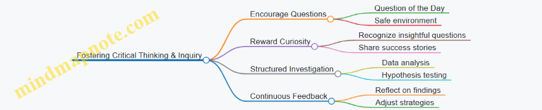
Summary
Encouraging a culture of structured thinking and data-driven communication requires intentional leadership, ongoing education, process integration, and recognition. By embedding these practices into daily routines and fostering an open, inquisitive environment, organizations empower their people to make better decisions and communicate more effectively.
Remember: Culture change is gradual. Start small, celebrate wins, and continuously reinforce the value of structured thinking and data-driven communication.
12.4 Final Example: Integrating Skills in a Real Business Scenario
In this final example, we will walk through a realistic business scenario that requires the integration of structured thinking, data analysis, and effective business communication. This will help you see how these skills come together to solve problems and communicate solutions clearly.
Scenario Overview:
Company: GreenTech Solutions, a mid-sized company specializing in eco-friendly home appliances.
Challenge: Sales of their flagship product, the EcoCool Air Conditioner, have plateaued over the last two quarters. The management suspects market saturation but wants to confirm this with data and develop a strategy to boost sales.
Goal: Analyze sales data, identify root causes, and present a clear, actionable plan to the executive team.
Step 1: Structured Thinking - Defining the Problem
Using structured thinking, break down the problem to understand its components.
Mind Map: Problem Breakdown
Explanation: This mind map helps identify areas to investigate, ensuring no potential cause is overlooked.
Step 2: Data Collection and Analysis
Collect relevant data for each factor:
- Sales figures by region and channel
- Pricing history
- Marketing campaign performance metrics
- Competitor pricing and new product launches
- Market research reports
Example:
| Region | Q1 Sales | Q2 Sales | Q3 Sales | Q4 Sales |
|---|---|---|---|---|
| North | 5000 | 5200 | 5100 | 5050 |
| South | 4500 | 4600 | 4550 | 4500 |
| East | 4800 | 4900 | 4850 | 4800 |
| West | 4700 | 4750 | 4700 | 4650 |
Insight: Sales are slightly declining or flat across all regions.
Step 3: Hypothesis Formulation and Testing
Formulate hypotheses based on structured thinking:
- H1: Market is saturated, limiting growth.
- H2: Marketing campaigns are less effective.
- H3: Competitors have launched better products/pricing.
Test these hypotheses using data:
- Compare marketing ROI over time.
- Analyze competitor product launches and pricing.
- Review customer feedback for product satisfaction.
Step 4: Root Cause Analysis Using the ‘5 Whys’
Focus on the suspected root cause: Market saturation.
Mind Map: Root Cause Analysis - Market Saturation
Conclusion: The product needs innovation to appeal to a broader market.
Step 5: Developing Recommendations
Based on analysis, develop a clear plan:
- Innovate product features to meet emerging customer needs.
- Adjust marketing strategy to target new segments.
- Explore partnerships to expand distribution.
Step 6: Communicating Findings and Recommendations
Structure the communication for maximum impact.
Mind Map: Presentation Structure
Example: Executive Summary Draft
“Over the past two quarters, EcoCool Air Conditioner sales have plateaued due to market saturation. Our analysis indicates that while current customers remain loyal, acquisition of new customers has slowed because the product no longer meets evolving market demands. We recommend investing in product innovation and expanding marketing efforts to target new customer segments, which will help reignite growth.”
Step 7: Visual Aids for Presentation
Use clear visuals to support your message.
Example: Sales Trend Line Chart (Table Representation)
| Quarter | Sales Volume |
|---|---|
| Q1 | 19,000 |
| Q2 | 19,450 |
| Q3 | 18,950 |
| Q4 | 18,500 |
Example: Competitor Product Launch Timeline
| Competitor | Launch Date | Feature Highlights |
|---|---|---|
| CoolAir | Q2 | Smart thermostat, energy saver |
| BreezePro | Q3 | Quiet operation, app control |
Summary
This example demonstrates how structured thinking helps dissect a complex business problem, data analysis validates hypotheses, and effective communication ensures insights and recommendations are clearly conveyed to stakeholders. Using mind maps and structured frameworks throughout the process keeps the analysis organized and the communication impactful.
12.5 Invitation to Share Your Experiences and Continue Learning
As you conclude your journey through structured thinking, data analysis, and business communication, one of the most powerful ways to deepen your skills is by sharing your experiences and engaging with a community of learners and professionals. This collaborative approach not only reinforces your understanding but also exposes you to diverse perspectives and real-world challenges.
Why Share Your Experiences?
- Reinforcement of Learning: Explaining concepts to others helps solidify your knowledge.
- Feedback and Growth: Receiving constructive feedback uncovers blind spots and areas for improvement.
- Networking: Building connections with peers and mentors opens doors to new opportunities.
- Inspiration: Your unique insights can inspire others to adopt structured thinking and data-driven communication.
How to Share Your Experiences Effectively
- Start a Blog or Journal: Document your projects, challenges, and lessons learned.
- Participate in Forums and Groups: Engage in LinkedIn groups, Reddit communities, or professional forums related to business skills.
- Host or Join Webinars and Workshops: Present your case studies or participate in discussions.
- Collaborate on Projects: Work with peers to apply structured thinking in real scenarios.
- Seek Mentorship and Offer Mentorship: Learning is a two-way street.
Mind Map: Sharing Your Experiences and Continuing Learning
Example 1: Sharing a Structured Thinking Case Study in a Blog
Scenario: You recently led a project to improve customer onboarding using structured thinking and data analysis.
Blog Post Outline:
- Introduction: The challenge of onboarding inefficiencies.
- Approach: How you broke down the problem using MECE framework.
- Data Analysis: Metrics collected and insights discovered.
- Communication: How you presented findings to stakeholders.
- Outcome: Improvements achieved and lessons learned.
- Call to Action: Inviting readers to share their onboarding challenges.
This blog not only documents your process but invites dialogue and shared learning.
Mind Map: Structuring a Case Study Blog Post
Example 2: Engaging in a LinkedIn Discussion Group
Scenario: You join a LinkedIn group focused on professional development.
Post Idea: “How structured thinking helped me reduce project delays by 30%. What techniques have you found effective?”
Engagement Tips:
- Share a concise story with data points.
- Ask open-ended questions to invite responses.
- Respond thoughtfully to comments.
- Share resources or tools you found helpful.
This interaction builds your professional presence and fosters mutual learning.
Mind Map: Engaging in Online Professional Communities
Continuing Your Learning Journey
- Curate a Personal Learning Plan: Identify topics and skills to develop.
- Set Regular Reflection Points: Use journals or mind maps to track progress.
- Attend Industry Events: Conferences, seminars, and meetups.
- Leverage Online Platforms: Coursera, edX, LinkedIn Learning, and others.
Remember, the path to mastery is ongoing. By sharing your journey and embracing continuous learning, you become a catalyst for positive change in your organization and beyond.
We encourage you to start today: write a short post about a recent insight, join a discussion group, or create a mind map of your next learning goals. Your experience matters—sharing it enriches the entire community.