Data Literacy for Managers: Read,Question,Decide
1. Introduction to Data Literacy for Managers
1.1 Understanding Data Literacy: Definition and Importance
Data literacy is the ability to read, understand, create, and communicate data as information. For managers, this skill is critical because data-driven decision-making can significantly impact business outcomes, improve operational efficiency, and foster innovation.
What is Data Literacy?
At its core, data literacy involves several key competencies:
- Reading Data: Interpreting charts, graphs, and datasets accurately.
- Understanding Context: Knowing the source, relevance, and limitations of data.
- Questioning Data: Critically evaluating data quality, biases, and assumptions.
- Communicating Insights: Translating data findings into clear, actionable messages.
Why is Data Literacy Important for Managers?
Managers are often the bridge between data teams and business units. Without data literacy, managers risk making decisions based on misinterpreted or incomplete information, which can lead to costly mistakes.
Benefits of data literacy for managers include:
- Improved Decision-Making: Making informed choices backed by evidence.
- Enhanced Collaboration: Better communication with data analysts and stakeholders.
- Increased Agility: Quickly adapting strategies based on data insights.
- Risk Mitigation: Identifying potential pitfalls through data scrutiny.
Mind Map: Core Components of Data Literacy
Mind Map: Importance of Data Literacy for Managers
Practical Example: Sarah, a Product Manager Improving Feature Prioritization
Sarah manages a product team and was initially overwhelmed by the volume of data from user feedback, sales figures, and market research. Without data literacy, she relied on intuition, which sometimes led to misaligned priorities.
After developing her data literacy skills, Sarah learned to:
- Read user engagement dashboards to identify which features users interacted with most.
- Question the data by checking if the sample size was sufficient and if there were seasonal trends affecting usage.
- Decide by combining data insights with customer interviews to prioritize features that would deliver the highest value.
This approach led to a 20% increase in user satisfaction within six months.
Summary
Understanding data literacy is foundational for managers who want to lead effectively in a data-driven world. It empowers them to read data accurately, question its validity, and make informed decisions that drive business success.
1.2 The Role of Managers in Data-Driven Organizations
In today’s fast-evolving business landscape, data-driven organizations leverage data as a strategic asset to gain competitive advantage, optimize operations, and innovate. Managers play a pivotal role in this transformation by bridging the gap between raw data and actionable business insights. Their responsibilities extend beyond traditional management to include fostering a data-centric culture, making informed decisions, and empowering teams with data literacy.
Key Responsibilities of Managers in Data-Driven Organizations
Data Interpretation
Managers must be adept at reading and interpreting various data sources relevant to their domain. This includes understanding key performance indicators (KPIs), recognizing trends, and spotting anomalies.
Example: A Product Manager notices a sudden drop in user engagement on a mobile app dashboard. Instead of reacting impulsively, they analyze the data further and discover the dip coincides with a recent app update. This insight prompts a deeper investigation into the update’s impact.
Decision Making
Data-driven managers use data as a foundation for decisions but balance it with experience and intuition. They apply scenario analysis and risk assessment to evaluate options.
Example: A Sales Manager uses historical sales data and market trends to forecast quarterly targets. When an unexpected competitor enters the market, they adjust projections by combining data insights with market knowledge.
Team Enablement
Managers foster a culture where data literacy is valued. They provide resources and training to upskill team members, encouraging collaboration between data specialists and business units.
Example: A Marketing Manager organizes monthly workshops where analysts explain recent campaign data, helping the team understand metrics like conversion rates and ROI.
Data Governance
Ensuring data quality, compliance with privacy regulations, and ethical use of data is a critical managerial responsibility.
Example: An Operations Manager implements data validation processes to maintain accuracy in inventory data, reducing costly errors.
Communication
Managers translate complex data insights into clear, compelling narratives tailored to different stakeholders, facilitating alignment and informed action.
Example: A Business Manager presents quarterly performance data to executives using storytelling techniques, highlighting successes and areas for improvement with visual aids.
Integrated Example: The Data-Driven Product Launch
Consider a Product Manager leading a new product launch:
- Data Interpretation: Reviews market research data and customer feedback to identify feature priorities.
- Decision Making: Uses A/B testing results to decide which features to include in the MVP.
- Team Enablement: Coordinates with data analysts and developers, ensuring everyone understands the metrics for success.
- Data Governance: Ensures customer data collected during beta testing complies with GDPR.
- Communication: Crafts presentations for stakeholders, using data stories to build support.
This holistic approach exemplifies how managers weave data literacy into every aspect of their role.
Summary
Managers in data-driven organizations are not just consumers of data but active facilitators who interpret, question, and decide based on data. By embracing these roles, they drive better business outcomes and cultivate a culture where data empowers everyone.
Next up: 1.3 Common Challenges Managers Face with Data
1.3 Common Challenges Managers Face with Data
Managers today are expected to make data-driven decisions, but many encounter significant challenges that hinder their ability to leverage data effectively. Understanding these common obstacles is the first step toward overcoming them.
Challenge 1: Data Overload
Managers often face an overwhelming volume of data from multiple sources, making it difficult to identify what is relevant.
- Example: A product manager receives daily reports from sales, marketing, customer support, and web analytics. Without clear prioritization, they struggle to focus on the metrics that truly impact product success.
Challenge 2: Lack of Data Context
Data without context can be misleading. Managers may see numbers but not understand the underlying factors or business environment.
- Example: A manager notices a sudden drop in website traffic. Without understanding recent marketing campaigns or seasonal trends, they might misinterpret the cause.
Challenge 3: Poor Data Quality
Inaccurate, incomplete, or outdated data can erode trust and lead to faulty conclusions.
- Example: A sales report contains duplicate entries and missing customer details, causing confusion about actual revenue figures.
Challenge 4: Limited Analytical Skills
Many managers lack formal training in data analysis, making it hard to interpret complex datasets or statistical outputs.
- Example: A decision maker struggles to understand confidence intervals or correlation coefficients presented by the analytics team.
Challenge 5: Confirmation Bias and Cognitive Traps
Managers may unintentionally favor data that supports their preconceived notions, ignoring contradictory evidence.
- Example: A product manager believes a feature is popular and selectively focuses on positive feedback, overlooking negative usage data.
Challenge 6: Communication Gaps Between Data Teams and Managers
Technical jargon and complex reports can create misunderstandings, reducing the effectiveness of data insights.
- Example: A data scientist presents a complex machine learning model without simplifying the key takeaways, leaving the manager confused about actionable steps.
Challenge 7: Time Constraints
Managers often have limited time to analyze data deeply, leading to rushed or surface-level decisions.
- Example: A marketing manager must decide on campaign budgets quickly and relies on high-level summaries rather than detailed analysis.
Summary
By recognizing these challenges, managers can proactively seek solutions such as improving data literacy, fostering better communication with analytics teams, and implementing tools that simplify data consumption. This awareness sets the foundation for the next steps in the Read, Question, Decide framework.
1.4 Overview of the Read, Question, Decide Framework
In today’s data-driven business environment, managers must develop a structured approach to effectively leverage data for decision-making. The Read, Question, Decide framework provides a clear, actionable process that empowers managers to interpret data accurately, critically evaluate its validity, and make informed decisions that drive business success.
What is the Read, Question, Decide Framework?
This framework breaks down data literacy into three essential steps:
- Read: Understand and interpret the data presented.
- Question: Critically evaluate the data’s source, quality, and context.
- Decide: Use insights from the data to make informed business decisions.
Each step builds upon the previous one, ensuring managers not only consume data but also challenge and apply it effectively.
Mind Map: The Read, Question, Decide Framework
Step 1: Read — Understanding the Data
Reading data effectively means going beyond just looking at numbers or charts. It involves recognizing the type of data, understanding what the metrics represent, and interpreting visualizations correctly.
Example:
A sales manager receives a dashboard showing a 15% drop in monthly sales. Instead of reacting immediately, they first identify:
- What period the data covers (monthly, quarterly?)
- Which products or regions the data includes
- Whether the data is raw or adjusted for returns or promotions
By carefully reading the data, the manager avoids jumping to conclusions based on incomplete information.
Step 2: Question — Developing a Critical Mindset
Questioning data is about probing deeper to validate its reliability and relevance.
Key questions include:
- Where did the data come from?
- Is the data complete and accurate?
- Are there any biases or assumptions influencing the data?
- How does the data align with other known information?
Example:
A product manager notices a spike in customer churn. Instead of accepting the data at face value, they ask:
- Has there been a change in how churn is measured?
- Could recent marketing campaigns have influenced customer behavior?
- Are there external factors like competitor actions or market shifts?
This questioning uncovers that a recent pricing change caused the churn increase, not a product defect.
Step 3: Decide — Making Informed Business Decisions
After reading and questioning, managers use the validated insights to make decisions that align with business goals.
This involves:
- Integrating data insights with business context
- Considering risks and alternative scenarios
- Communicating decisions clearly to stakeholders
- Balancing data-driven insights with managerial experience and intuition
Example:
Using the churn analysis, the product manager decides to adjust pricing tiers and launch targeted retention campaigns. They also prepare a risk assessment outlining potential impacts and communicate the plan to marketing and sales teams.
Mind Map: Practical Example Applying the Framework
Summary
The Read, Question, Decide framework equips managers with a repeatable process to enhance data literacy:
- Read carefully to understand the data in context.
- Question critically to ensure data validity and relevance.
- Decide confidently using data-driven insights balanced with experience.
By embedding this framework into daily workflows, managers can transform raw data into strategic advantage, fostering better decisions and stronger business outcomes.
1.5 Practical Example: How a Product Manager Transformed Decision-Making with Data Literacy
Background
Sarah is a Product Manager at a mid-sized SaaS company. Initially, her team made product decisions based largely on intuition and anecdotal feedback from a few customers. This approach led to missed opportunities and features that didn’t resonate well with the broader user base.
Challenge
Sarah realized that to improve product outcomes, she needed to become more data literate — to read data effectively, question it critically, and make informed decisions.
Step 1: Reading Data Effectively
Sarah started by familiarizing herself with the key data sources available:
- User engagement metrics (e.g., daily active users, session length)
- Customer feedback surveys
- Feature usage statistics
- Support ticket trends
She learned to interpret dashboards and visualizations, focusing on understanding what the data was showing rather than jumping to conclusions.
Mind Map: Reading Data Effectively
Example: Sarah noticed that although a new feature was heavily promoted, its usage was low. The dashboard showed a steep drop-off after initial clicks.
Step 2: Questioning Data
Instead of accepting the low usage at face value, Sarah asked critical questions:
- Why is usage low despite promotion?
- Are users encountering issues?
- Is the feature solving a real problem?
She dug deeper by segmenting the data by user type and reviewing qualitative feedback.
Mind Map: Questioning Data
Example: Sarah discovered that new users were confused by the feature’s interface, while power users found it useful. This insight was not obvious from aggregate data alone.
Step 3: Deciding with Data
Armed with these insights, Sarah collaborated with the UX team to redesign the feature onboarding.
She also prioritized this fix in the product roadmap, balancing data insights with team capacity and business goals.
Mind Map: Deciding with Data
Example: After the redesign and targeted onboarding, feature usage increased by 40% over the next quarter, and customer satisfaction scores improved.
Summary: Sarah’s Data Literacy Journey
This example illustrates how a manager’s data literacy can transform decision-making from guesswork to evidence-based action, driving better business outcomes.
2. Reading Data Effectively: Foundations and Best Practices
2.1 Types of Data Managers Encounter: Structured, Unstructured, and Semi-Structured
Understanding the types of data you encounter as a manager is foundational to becoming data literate. Data comes in various forms, each requiring different approaches to reading, analyzing, and leveraging it for decision-making. In this section, we’ll explore the three primary types of data: structured, unstructured, and semi-structured, with clear examples and mind maps to help you visualize their characteristics.
What is Structured Data?
Structured data is highly organized and formatted so it can be easily entered, stored, and queried in relational databases or spreadsheets. It follows a strict schema with rows and columns.
Characteristics:
- Organized in tables with defined fields
- Easily searchable and analyzable
- Examples include sales records, customer information, inventory data
Example:
A sales database table with columns like Order ID, Customer Name, Date, Product, and Amount.
Mind Map: Structured Data
What is Unstructured Data?
Unstructured data is information that does not have a predefined data model or is not organized in a predefined manner. It is often text-heavy but may contain data such as dates, numbers, and facts as well.
Characteristics:
- No fixed format or schema
- Difficult to search and analyze without specialized tools
- Includes emails, social media posts, videos, images, audio files, documents
Example:
Customer feedback emails or social media comments about a product.
Mind Map: Unstructured Data
What is Semi-Structured Data?
Semi-structured data is a hybrid form that does not reside in a relational database but has some organizational properties that make it easier to analyze than unstructured data.
Characteristics:
- Contains tags or markers to separate data elements
- Flexible schema
- Examples include JSON, XML files, log files, emails with metadata
Example:
A JSON file containing customer information with fields like name, age, and purchase history.
Mind Map: Semi-Structured Data
Practical Examples for Managers
| Data Type | Example Use Case | How Managers Encounter It |
|---|---|---|
| Structured | Monthly sales reports, CRM data | Reviewing dashboards, KPI tracking |
| Unstructured | Customer reviews, call center transcripts | Understanding customer sentiment, qualitative feedback |
| Semi-Structured | Web server logs, JSON API responses | Monitoring system performance, integrating data from multiple sources |
Why This Matters for Managers
- Reading: Knowing the data type helps you understand how to interpret it.
- Questioning: Different data types have different reliability and biases.
- Deciding: The type of data influences the tools and methods you use for decision-making.
Summary Mind Map: Types of Data Managers Encounter
By mastering the distinctions between these data types, managers can better navigate the data landscape, ask the right questions, and make informed decisions that drive business success.
2.2 Interpreting Data Visualizations: Charts, Graphs, and Dashboards
Data visualizations are powerful tools that help managers quickly grasp complex information, identify trends, and make informed decisions. However, interpreting these visuals correctly is essential to avoid misinterpretations that can lead to poor business choices.
Understanding Common Types of Data Visualizations
- Bar Charts: Used to compare quantities across categories.
- Line Graphs: Ideal for showing trends over time.
- Pie Charts: Show proportions within a whole.
- Scatter Plots: Reveal relationships or correlations between two variables.
- Heatmaps: Display data density or intensity using color gradients.
- Dashboards: Combine multiple visualizations to provide a comprehensive view.
Best Practices for Interpreting Visualizations
- Check the Axes and Scales: Ensure you understand what each axis represents and the scale used (linear, logarithmic, etc.).
- Look for Labels and Legends: They provide context about data categories and units.
- Identify the Time Frame: For time series data, know the period covered.
- Beware of Distorted Visuals: For example, truncated axes can exaggerate differences.
- Understand the Data Source: Knowing where data comes from helps assess reliability.
Mind Map: Key Steps to Interpret Data Visualizations
Example 1: Reading a Sales Bar Chart
Imagine a bar chart showing quarterly sales for four regions:
- X-axis: Regions (North, South, East, West)
- Y-axis: Sales in USD (in thousands)
Interpretation:
- The North region shows the highest sales, followed by East.
- South has the lowest sales, indicating potential market challenges.
- The difference between North and South is significant, suggesting a need to investigate factors driving performance.
Example 2: Interpreting a Line Graph for Website Traffic
A line graph displays monthly website visitors over a year.
- X-axis: Months (Jan to Dec)
- Y-axis: Number of Visitors
Interpretation:
- Traffic steadily increases from January to June.
- A sharp drop occurs in July, possibly due to a website outage or seasonal effect.
- Recovery begins in August, with a peak in November, perhaps driven by a marketing campaign.
Mind Map: Interpreting Dashboards
Example 3: Using a Dashboard to Monitor Product Performance
A dashboard includes:
- Sales revenue by product line (bar chart)
- Customer satisfaction score over time (line graph)
- Inventory levels (gauge)
- Return rates by product category (pie chart)
Interpretation:
- Product A has strong sales but a rising return rate, signaling quality issues.
- Customer satisfaction dipped last quarter, aligning with increased returns.
- Inventory levels are adequate, but slow-moving products could be optimized.
Tips for Managers
- Always start by understanding what each visualization represents.
- Use multiple visualizations together to get a fuller picture.
- Question unexpected patterns or anomalies.
- Collaborate with analysts if something is unclear.
- Practice regularly by reviewing dashboards and reports relevant to your role.
By mastering the interpretation of charts, graphs, and dashboards, managers can confidently extract insights, ask the right questions, and make data-driven decisions that propel their teams and organizations forward.
2.3 Understanding Key Metrics and KPIs Relevant to Your Business
As a manager, understanding the key metrics and KPIs (Key Performance Indicators) relevant to your business is essential for making informed decisions. These metrics provide quantifiable measures of performance, helping you track progress towards strategic goals and identify areas for improvement.
What Are Metrics and KPIs?
- Metrics are quantifiable measures used to track and assess the status of a specific business process.
- KPIs are the most critical metrics that directly reflect the success factors of your business objectives.
Think of KPIs as the vital signs of your business — they tell you how well your organization is performing in key areas.
Why Focus on Relevant Metrics and KPIs?
Focusing on relevant KPIs ensures that you are not overwhelmed by data but instead concentrate on what truly impacts your business outcomes. Irrelevant or vanity metrics can mislead decision-making.
Mind Map: Categories of Business Metrics and KPIs
How to Identify the Right KPIs for Your Role
- Align with Business Objectives: Understand your company’s strategic goals.
- Focus on Impact: Choose KPIs that directly influence those goals.
- Ensure Measurability: KPIs should be quantifiable and based on reliable data.
- Keep it Simple: Limit the number of KPIs to maintain focus.
Practical Example: Selecting KPIs for a Product Manager
Suppose you are a Product Manager for a SaaS platform. Your business objective is to increase user engagement and reduce churn.
- Relevant KPIs might include:
- Monthly Active Users (MAU): Measures engagement.
- Churn Rate: Percentage of users leaving the platform.
- Feature Adoption Rate: Tracks how many users use newly released features.
- Customer Satisfaction Score (CSAT): Indicates user happiness.
By monitoring these KPIs, you can decide whether new features are successful or if retention strategies need adjustment.
Mind Map: Example KPIs for a SaaS Product Manager
Best Practice: Visualizing KPIs for Quick Insights
Use dashboards to visualize your KPIs in real-time. For example, a dashboard showing MAU trends alongside churn rate can help you quickly detect if a drop in engagement is causing customer loss.
Practical Example: Sales Manager KPIs
A Sales Manager focused on revenue growth might track:
- Revenue Growth Rate: Measures increase in sales over time.
- Customer Acquisition Cost (CAC): Cost to acquire a new customer.
- Sales Conversion Rate: Percentage of leads converted to customers.
- Average Deal Size: Average revenue per sale.
Tracking these KPIs helps optimize sales strategies and budget allocation.
Mind Map: Sales Manager KPIs
Summary
Understanding and focusing on the right metrics and KPIs enables managers to:
- Track progress toward strategic goals
- Identify opportunities and risks early
- Make data-driven decisions with confidence
Always tailor your KPIs to your specific role and business context, and use clear visualizations to communicate insights effectively.
2.4 Best Practice: Using Context to Avoid Misreading Data
Understanding data in isolation can lead to incorrect conclusions and misguided decisions. Context provides the background and environment in which data exists, enabling managers to interpret numbers and trends accurately. This section explores how to use context effectively to avoid common pitfalls when reading data.
Why Context Matters
- Data without context is just numbers. For example, a 10% drop in sales might seem alarming, but if it occurred during a planned seasonal slowdown, it could be expected.
- Context helps identify anomalies vs. trends. Without knowing external factors, you might mistake a one-time event for a recurring problem.
Key Elements of Context to Consider
Practical Examples
Example 1: Sales Drop Interpretation
- Scenario: Sales dropped by 15% in Q2.
- Without Context: Immediate concern about product performance.
- With Context: Q2 coincides with a major competitor launching a new product and a global supply chain disruption.
- Action: Investigate competitor impact and supply delays before making decisions.
Example 2: Website Traffic Spike
- Scenario: Website traffic increased by 40% in one week.
- Without Context: Assume marketing campaign success.
- With Context: The spike coincided with a viral social media post unrelated to marketing efforts.
- Action: Attribute traffic increase correctly and adjust marketing analysis.
Mind Map: Steps to Use Context When Reading Data
Best Practice Tips
- Always ask: “What else is happening that could affect this data?”
- Cross-reference data with external sources (market reports, news).
- Use historical data to identify normal patterns.
- Collaborate with domain experts to gain deeper insights.
Example Walkthrough: Interpreting Customer Satisfaction Scores
- Data: Customer satisfaction dropped from 85% to 78% in one month.
- Contextual Factors:
- Recent product update rollout with known bugs.
- Customer support team was understaffed due to holidays.
- Industry-wide service outage affecting many competitors.
- Conclusion: The drop is likely temporary and linked to specific events rather than a fundamental problem.
- Decision: Prioritize bug fixes and support staffing before overhauling customer experience strategy.
Summary
Using context transforms raw data into actionable insights. Managers who embed contextual understanding into their data reading practices avoid misinterpretations, make better decisions, and lead their teams more effectively.
2.5 Practical Example: Reading Sales Dashboards to Identify Trends
Sales dashboards are powerful tools that help managers quickly understand business performance and identify trends that can inform strategic decisions. In this section, we’ll walk through how to read a sales dashboard effectively, interpret key metrics, and spot meaningful trends.
Understanding the Components of a Sales Dashboard
A typical sales dashboard includes various visual elements such as:
- Total Sales Revenue: The overall income generated from sales within a specific period.
- Sales by Region: Breakdown of sales performance across different geographic areas.
- Sales by Product: Performance of individual products or product categories.
- Sales Trends Over Time: Line charts showing sales growth or decline over days, weeks, or months.
- Top Customers: List or chart showing customers contributing the most revenue.
- Sales Funnel: Visualization of the stages in the sales process and conversion rates.
Step-by-Step Guide to Reading a Sales Dashboard
- Start with the Big Picture: Look at total sales revenue and compare it to previous periods (month-over-month, year-over-year).
- Identify Regional Performance: Check sales by region to see where the business is thriving or underperforming.
- Analyze Product Performance: Spot which products are driving revenue and which are lagging.
- Examine Sales Trends: Look for upward or downward trends over time to anticipate future performance.
- Review Customer Contributions: Identify key customers and assess if sales are concentrated or diversified.
- Assess the Sales Funnel: Understand conversion rates and where prospects might be dropping off.
Mind Map: Key Areas to Focus When Reading Sales Dashboards
Example Scenario: Identifying a Decline in Product Sales
Imagine you are a product manager reviewing your sales dashboard for the last quarter. You notice:
- Total sales revenue is stable compared to the previous quarter.
- However, sales for Product A have dropped by 15%.
- Sales by region show that the decline is mainly in the Northeast.
- The sales funnel indicates fewer leads converting in that region.
Actionable Insight: This suggests a localized issue affecting Product A’s sales. You might investigate marketing efforts, competitor activity, or customer feedback in the Northeast region.
Mind Map: Investigating Sales Decline
Best Practices When Reading Sales Dashboards
- Contextualize Data: Always consider external factors like seasonality, market changes, or promotions.
- Look for Patterns, Not Just Numbers: Trends over time provide more insight than isolated data points.
- Cross-Reference Metrics: Use multiple dashboard components to validate findings.
- Ask Questions: Why is a metric changing? What could be causing it?
- Collaborate: Discuss findings with sales, marketing, and product teams for deeper insights.
Additional Example: Spotting a Positive Trend
Your dashboard shows a steady increase in sales for Product B over the past 6 months, especially in the West region. The sales funnel shows improved lead conversion rates, and customer feedback is positive.
Insight: This trend indicates successful product-market fit and effective sales strategies in the West. Consider replicating these strategies in other regions.
Mind Map: Leveraging Positive Sales Trends
By systematically reading sales dashboards, questioning the data, and deciding on informed actions, managers can drive better business outcomes and foster a data-literate culture within their teams.
3. Questioning Data: Developing a Critical Mindset
3.1 Why Questioning Data is Crucial for Managers
In today’s data-driven business environment, managers are inundated with vast amounts of data daily. However, simply accepting data at face value can lead to misguided decisions, missed opportunities, and costly mistakes. Questioning data is a critical skill that empowers managers to extract meaningful insights, validate assumptions, and make confident, informed decisions.
The Importance of Questioning Data
- Ensures Data Accuracy: Data can contain errors, inconsistencies, or outdated information. Questioning helps identify these issues before acting on the data.
- Uncovers Hidden Insights: By probing deeper, managers can discover patterns or anomalies that surface-level analysis might miss.
- Prevents Bias and Misinterpretation: Data can be presented in ways that support a particular narrative. Critical questioning helps avoid falling prey to confirmation bias.
- Supports Better Decision-Making: Decisions based on well-questioned data are more robust and defensible.
- Builds Trust in Data: When managers question and understand data thoroughly, they can confidently communicate findings to stakeholders.
Mind Map: Why Managers Must Question Data
Common Scenarios Where Questioning Data Matters
- Sales Performance Reports: A sudden spike in sales might be due to a data entry error or a seasonal promotion. Questioning helps verify the cause.
- Customer Feedback Analysis: Negative feedback trends might be skewed if only a vocal minority is responding. Questioning the representativeness of data is key.
- Financial Forecasts: Forecasts based on outdated assumptions can mislead budgeting decisions.
Practical Example: Questioning Customer Churn Data
Imagine a manager sees that customer churn increased by 15% last quarter. Instead of immediately reacting, the manager asks:
- Is the data complete? Were all customers accounted for?
- Are there external factors? Did a competitor launch a new product?
- Is the churn evenly distributed? Or is it concentrated in a specific segment?
- How was churn defined? Are cancellations, non-renewals, and inactive users all counted?
By questioning the data, the manager discovers that a data integration issue excluded some retention offers, skewing churn numbers. This insight leads to targeted corrective actions rather than misguided broad strategies.
Mind Map: Questions Managers Should Ask When Reviewing Data
Summary
Questioning data is not about skepticism for its own sake but about cultivating a mindset of curiosity and critical thinking. For managers, this skill transforms raw data into actionable knowledge, reduces risks, and fosters a culture of data-driven excellence.
By embedding questioning into their daily workflows, managers ensure that decisions are based on solid ground, ultimately driving better business outcomes.
3.2 Common Data Pitfalls and How to Spot Them
Managers often rely on data to make critical decisions, but data can be misleading if common pitfalls are not recognized. Understanding these pitfalls helps managers ask the right questions and avoid costly mistakes.
Common Data Pitfalls
Incomplete Data
Description: When datasets have missing or partial information, conclusions drawn may be skewed.
How to Spot:
- Check for missing values or nulls in key columns.
- Compare dataset size to expected population.
Example: A sales report missing data from a major region might falsely indicate declining sales.
Biased Data
Description: Data that does not represent the true population or situation, often due to sampling or collection methods.
How to Spot:
- Review data collection methodology.
- Look for overrepresented or underrepresented groups.
Example: Customer feedback collected only from loyal customers may ignore complaints from dissatisfied users.
Misleading Visualizations
Description: Visual representations that distort the data story, intentionally or unintentionally.
How to Spot:
- Check if axes start at zero.
- Look for excessive colors or 3D effects.
- Assess if the chart type fits the data.
Example: A bar chart with a truncated y-axis exaggerates small differences in revenue.
Correlation vs Causation
Description: Assuming that because two variables move together, one causes the other.
How to Spot:
- Question whether there is a plausible mechanism.
- Look for confounding variables.
Example: Ice cream sales and drowning incidents rise together in summer but one does not cause the other.
Outliers and Anomalies
Description: Extreme values that can skew analysis if not properly handled.
How to Spot:
- Use boxplots or scatterplots to identify outliers.
- Analyze if outliers are errors or meaningful data points.
Example: A sudden spike in website traffic due to a bot attack should not be treated as genuine user interest.
Overfitting and Underfitting
Description: Models that are too complex or too simple to accurately represent data patterns.
How to Spot:
- Check model performance on training vs test data.
- Look for overly complex explanations or overly simplistic trends.
Example: A sales forecast model that perfectly fits past data but fails to predict future sales.
Data Timeliness
Description: Using outdated or stale data can lead to irrelevant or incorrect decisions.
How to Spot:
- Verify the date range of data.
- Consider seasonality or recent changes.
Example: Using last year’s customer preferences to design this year’s marketing campaign without adjustment.
Data Quality Issues
Description: Errors in data entry, duplication, or inconsistent formats reduce reliability.
How to Spot:
- Run data validation checks.
- Look for duplicates or inconsistent units.
Example: Duplicate customer records leading to inflated user counts.
Integrated Example: Spotting Pitfalls in Customer Churn Data
Imagine a manager analyzing customer churn data to reduce attrition:
- Incomplete Data: Missing churn records from certain regions could hide problem areas.
- Biased Data: Survey responses only from engaged customers may underestimate churn risk.
- Misleading Visualization: A pie chart showing churn percentages without absolute numbers may mislead.
- Correlation vs Causation: Assuming a spike in churn is caused by price increase without considering competitor actions.
- Outliers: One month with unusually high churn due to a system outage should be flagged.
- Data Timeliness: Using data from two years ago may not reflect current market conditions.
By systematically questioning and checking for these pitfalls, the manager can make more confident, data-driven decisions.
Summary Checklist for Managers
By mastering these common data pitfalls and knowing how to spot them, managers can improve their data literacy and make better-informed decisions that drive business success.
3.3 Formulating Effective Questions: Who, What, When, Where, Why, and How
In the realm of data literacy, asking the right questions is as important as reading the data itself. Effective questioning helps managers uncover deeper insights, identify potential issues, and make informed decisions. The classic interrogative framework — Who, What, When, Where, Why, and How — serves as a powerful guide to dissect data comprehensively.
Mind Map: Formulating Effective Questions
Detailed Breakdown with Examples
Who
- Purpose: Identify the people or entities involved or impacted.
- Example: “Who are the customers contributing to the 20% increase in sales this quarter?”
- Best Practice: Always clarify the source and audience of the data to understand its relevance.
What
- Purpose: Understand the nature and content of the data.
- Example: “What products have the highest return rates, and what are the associated reasons?”
- Best Practice: Define key metrics clearly to avoid misinterpretation.
When
- Purpose: Pinpoint timing to detect trends or anomalies.
- Example: “When did the spike in website traffic occur, and what campaigns were running then?”
- Best Practice: Use time-based filters to segment data for better insights.
Where
- Purpose: Locate the source or distribution of data points.
- Example: “Where are the majority of support tickets originating geographically?”
- Best Practice: Map data to visualize spatial trends.
Why
- Purpose: Explore causes behind data patterns.
- Example: “Why did customer churn increase after the last product update?”
- Best Practice: Combine quantitative data with qualitative feedback to answer why.
How
- Purpose: Understand processes and reliability.
- Example: “How was customer satisfaction measured, and what was the sample size?”
- Best Practice: Evaluate data collection methods to assess accuracy.
Mind Map: Example - Analyzing Customer Churn Data
Practical Example
Imagine a manager reviewing a dashboard showing a sudden drop in monthly active users (MAU) for a mobile app.
- Who: Who are the users dropping off? (e.g., new users, users from a specific region)
- What: What features did these users engage with before dropping off?
- When: When did the drop start? Was it sudden or gradual?
- Where: Where are these users located geographically?
- Why: Why might users be leaving? (e.g., app bugs, poor UX, competitor activity)
- How: How was user engagement tracked? Are there any data collection issues?
By systematically applying these questions, the manager can form hypotheses, guide further analysis, and collaborate with the product and data teams to address the issue effectively.
Summary
Formulating effective questions using the Who, What, When, Where, Why, and How framework empowers managers to interrogate data critically. This approach ensures a holistic understanding of data, uncovers hidden insights, and supports sound decision-making.
Remember: The quality of your questions directly influences the quality of your insights.
3.4 Best Practice: Using the ‘5 Whys’ Technique to Dig Deeper into Data Insights
The ‘5 Whys’ technique is a simple yet powerful tool for managers to uncover the root causes behind data trends, anomalies, or problems. By repeatedly asking “Why?”—typically five times—you can move beyond surface-level observations and identify underlying issues that require attention.
What is the ‘5 Whys’ Technique?
Originally developed by Sakichi Toyoda and used within Toyota’s manufacturing process, the ‘5 Whys’ is a problem-solving method that helps peel away layers of symptoms to reveal the core cause of an issue.
Why Use the ‘5 Whys’ in Data Analysis?
- Avoid Misinterpretation: Data can show what happened but not always why it happened.
- Identify Root Causes: Helps managers avoid quick fixes that address symptoms instead of causes.
- Encourage Critical Thinking: Promotes a culture of inquiry and deeper understanding.
How to Apply the ‘5 Whys’ Technique
- Start with a Clear Problem Statement: Identify the data insight or anomaly you want to investigate.
- Ask Why the Problem Occurred: Write down the answer.
- If the Answer Doesn’t Reveal the Root Cause, Ask Why Again: Repeat this step up to five times or until the root cause is clear.
- Develop Actionable Solutions Based on the Root Cause.
Mind Map: Applying the 5 Whys Technique
- Problem: Declining Monthly Sales
- Why 1: Why did sales decline?
- Because fewer customers purchased product X.
- Why 2: Why did fewer customers purchase product X?
- Because the product was out of stock frequently.
- Why 3: Why was the product out of stock?
- Because inventory levels were not replenished on time.
- Why 4: Why were inventory levels not replenished on time?
- Because the supply chain experienced delays.
- Why 5: Why did the supply chain experience delays?
- Because the supplier changed their delivery schedule without notification.
- Why 5: Why did the supply chain experience delays?
- Because the supply chain experienced delays.
- Why 4: Why were inventory levels not replenished on time?
- Because inventory levels were not replenished on time.
- Why 3: Why was the product out of stock?
- Because the product was out of stock frequently.
- Why 2: Why did fewer customers purchase product X?
- Because fewer customers purchased product X.
- Why 1: Why did sales decline?
Example 1: Investigating Customer Churn Data
Problem: Customer churn rate increased by 15% in Q1.
- Why 1: Why did the churn rate increase?
- Because more customers canceled subscriptions.
- Why 2: Why did customers cancel subscriptions?
- Because they reported dissatisfaction with customer support.
- Why 3: Why was customer support unsatisfactory?
- Because response times were longer than usual.
- Why 4: Why were response times longer?
- Because the support team was understaffed.
- Why 5: Why was the support team understaffed?
- Because of budget cuts in the last quarter.
Root Cause: Budget cuts led to understaffed support, causing longer response times and increased churn.
Action: Propose reallocating budget to support or automating common queries to improve response times.
Example 2: Analyzing Website Traffic Drop
Problem: Website traffic dropped 20% last month.
- Why 1: Why did traffic drop?
- Because fewer visitors came from organic search.
- Why 2: Why fewer visitors from organic search?
- Because the website’s search ranking dropped.
- Why 3: Why did the search ranking drop?
- Because several key pages had broken links.
- Why 4: Why were there broken links?
- Because recent website updates introduced errors.
- Why 5: Why did updates introduce errors?
- Because testing protocols were insufficient before deployment.
Root Cause: Insufficient testing led to broken links, causing a drop in search rankings and traffic.
Action: Implement stricter QA processes before website updates.
Tips for Managers Using the ‘5 Whys’ Technique
- Be Patient and Persistent: Sometimes fewer or more than five whys are needed.
- Avoid Blame: Focus on processes and systems, not individuals.
- Collaborate: Engage cross-functional teams for diverse perspectives.
- Document Each Step: Keep a record of questions and answers for transparency.
Mind Map: Benefits and Challenges of the 5 Whys
By integrating the ‘5 Whys’ technique into your data questioning process, you empower yourself and your team to move beyond surface-level insights and make more informed, effective decisions based on a clear understanding of the underlying issues.
3.5 Practical Example: Questioning Customer Churn Data to Uncover Root Causes
Customer churn — the rate at which customers stop doing business with a company — is a critical metric for managers to understand and reduce. However, raw churn data alone rarely tells the full story. Questioning the data effectively helps uncover underlying causes and informs targeted strategies to improve retention.
Step 1: Start with the Basic Data
Imagine a subscription-based service reports a 12% churn rate last quarter, up from 8% the previous quarter. This jump raises concerns.
Initial Questions:
- Is the increase uniform across all customer segments?
- Are there specific time periods when churn spikes?
- What customer behaviors preceded churn?
Step 2: Segment the Data
Breaking down churn by customer segments can reveal patterns.
Mind Map: Segmenting Customer Churn Data
Example:
- Region A’s churn increased to 18%, while Region B remained stable at 6%.
- New customers churned at 20%, established customers at 5%.
Step 3: Investigate Possible Causes
Use the ‘5 Whys’ technique to dig deeper.
Mind Map: Applying ‘5 Whys’ to High Churn in Region A
- Why is churn high in Region A?
- Because customers report dissatisfaction.
- Why dissatisfaction?
- Because of frequent service outages.
- Why outages?
- Because of infrastructure issues.
- Why infrastructure issues?
- Because of delayed maintenance.
- Why infrastructure issues?
- Because of infrastructure issues.
- Why outages?
- Because of frequent service outages.
- Why dissatisfaction?
- Because customers report dissatisfaction.
Example: Customer support tickets from Region A show a 30% increase in complaints about outages.
Step 4: Analyze Customer Feedback and Behavior
Look beyond numbers to qualitative data.
- Review customer surveys and NPS scores.
- Analyze usage patterns before churn.
Example:
- Customers who churned used the service less frequently in the last month.
- Survey comments mention poor app performance and slow customer support response.
Step 5: Validate Findings with Cross-Functional Teams
Collaborate with product, support, and engineering teams to confirm hypotheses.
Example:
- Engineering confirms a recent software update caused instability in Region A.
- Support team acknowledges increased ticket volume and slower response times.
Step 6: Formulate Actionable Insights
Based on questioning the data, the root causes include:
- Infrastructure and software issues causing outages.
- Poor customer support responsiveness.
- Higher churn among new customers indicating onboarding issues.
Summary Mind Map: Questioning Customer Churn Data
Mind Map: Questioning Customer Churn Data
Key Takeaways for Managers:
- Don’t accept churn numbers at face value. Segment and contextualize the data.
- Ask iterative questions to uncover deeper causes.
- Combine quantitative and qualitative data for a holistic view.
- Engage cross-functional teams to validate insights.
- Translate findings into targeted actions to reduce churn effectively.
By adopting this questioning approach, managers can move beyond surface-level metrics and make informed decisions that improve customer retention and business outcomes.
4. Deciding with Data: Making Informed Business Decisions
4.1 Integrating Data Insights into Decision-Making Processes
In today’s data-driven business environment, integrating data insights into decision-making processes is essential for managers aiming to make informed, effective, and timely decisions. This section explores how managers can seamlessly incorporate data insights into their workflows, ensuring that decisions are not just based on intuition but are supported by solid evidence.
Why Integrate Data Insights?
- Enhances decision accuracy by reducing guesswork.
- Identifies opportunities and risks early.
- Aligns decisions with organizational goals and customer needs.
- Enables measurable outcomes and accountability.
Steps to Integrate Data Insights into Decision-Making
Best Practices for Managers
-
Start with Clear Objectives: Define what decision needs to be made and what data is relevant.
-
Collaborate with Data Teams: Work closely with analysts or data scientists to understand data nuances.
-
Contextualize Data: Always interpret data within the specific business context to avoid misapplication.
-
Use Visualizations: Leverage dashboards and charts to make insights more accessible.
-
Balance Data with Experience: Data should inform, not replace, managerial judgment.
-
Document Decisions: Keep records of data used and rationale for transparency and future learning.
Practical Example: Prioritizing Marketing Campaigns
Imagine a marketing manager deciding which campaign to prioritize for the next quarter. They have data on past campaign performance, customer engagement, and sales impact.
- Data Collection: Gather metrics such as click-through rates, conversion rates, and ROI from previous campaigns.
- Data Analysis: Analyze which campaigns had the highest ROI and engagement among target demographics.
- Insight Generation: Discover that campaigns focusing on personalized emails had 30% higher conversion.
- Decision Formulation: Decide to allocate more budget to personalized email campaigns while reducing spend on less effective channels.
- Implementation: Launch the prioritized campaign with clear KPIs.
- Monitoring & Feedback: Track real-time performance and adjust tactics as needed.
Additional Example: Product Feature Prioritization
A product manager uses customer feedback data and usage analytics to decide which new feature to develop next.
- Data Collection: Collect user feedback, feature requests, and usage statistics.
- Data Analysis: Identify features with the highest demand and potential impact on user retention.
- Insight Generation: Determine that a feature improving onboarding reduces churn by 15%.
- Decision Formulation: Prioritize development of the onboarding feature.
- Implementation: Allocate resources and set timelines.
- Monitoring & Feedback: Measure churn rates post-launch to validate impact.
Summary
Integrating data insights into decision-making is a structured process that involves collecting relevant data, analyzing it thoughtfully, generating actionable insights, and combining these with managerial experience to make informed decisions. By following best practices and leveraging real-world examples, managers can enhance their decision quality, drive business success, and foster a culture of data-driven leadership.
4.2 Balancing Data with Experience and Intuition
In the realm of business decision-making, data provides a powerful foundation for insights and strategy. However, data alone does not always tell the full story. Managers must skillfully balance quantitative data with their own experience and intuition to make well-rounded, effective decisions.
Why Balance is Important
- Data Limitations: Data can be incomplete, outdated, or biased.
- Context Matters: Numbers may not capture nuances such as team dynamics, market sentiment, or emerging trends.
- Speed of Decision: Sometimes decisions must be made quickly, before all data is available.
Mind Map: Balancing Data, Experience, and Intuition
Integrating Experience with Data
Managers bring years of domain expertise that helps interpret data correctly. For example, a sales manager might notice a sudden dip in sales data but, based on experience, recognize it as a seasonal fluctuation rather than a market problem.
Example: Product Launch Decision
- Data: Market research shows moderate interest in a new feature.
- Experience: The product manager recalls similar past launches where early interest was low but grew rapidly post-launch.
- Intuition: The manager senses the feature aligns well with emerging customer needs.
Decision: Proceed with the launch but monitor closely and prepare to iterate.
Mind Map: Decision Inputs in Practice
When to Trust Intuition
- When data is ambiguous or conflicting.
- When rapid decisions are needed.
- When entering new or uncertain markets where historical data is scarce.
Best Practice: Validate Intuition with Data
Even when intuition guides a decision, seek data points that support or challenge your gut feeling. This reduces bias and strengthens confidence.
Example: Marketing Campaign Adjustment
A marketing manager feels a campaign isn’t resonating despite positive engagement metrics. Trusting intuition, they conduct quick customer interviews, revealing a disconnect not captured in the data.
Mind Map: Validating Intuition
Combining All Three for Optimal Decisions
- Use data to inform and ground your decisions.
- Apply experience to interpret data in context.
- Leverage intuition to fill gaps and anticipate future trends.
Final Example: Strategic Pivot
A business unit leader notices declining engagement in app usage data. Experience suggests a feature overload might be causing confusion. Intuition hints that simplifying the interface could improve retention.
Action: The leader initiates a redesign focused on core features, guided by data analytics and user feedback.
Balancing data with experience and intuition is not about choosing one over the other but about integrating all three to make smarter, more agile decisions that drive business success.
4.3 Best Practice: Scenario Analysis and Risk Assessment Using Data
Scenario analysis and risk assessment are critical tools for managers aiming to make informed, data-driven decisions. By systematically exploring possible future events and their impacts, managers can prepare for uncertainties and optimize outcomes.
What is Scenario Analysis?
Scenario analysis involves creating and evaluating multiple plausible future scenarios to understand how different variables and decisions might affect business outcomes.
What is Risk Assessment?
Risk assessment is the process of identifying, quantifying, and prioritizing risks that could negatively impact business objectives.
Why Use Scenario Analysis and Risk Assessment?
- Anticipate uncertainties: Understand how different factors could influence outcomes.
- Improve decision quality: Base decisions on a range of possible futures rather than a single forecast.
- Mitigate risks: Identify potential threats early and develop mitigation strategies.
Step-by-Step Best Practice Guide
Step 1: Define the Objective
Clearly specify the decision or problem you want to analyze.
Step 2: Identify Key Variables and Drivers
Determine the critical factors that influence the outcome. These could be market trends, customer behavior, operational costs, etc.
Step 3: Develop Scenarios
Create diverse, plausible scenarios by varying key variables. Typically, this includes:
- Best-case scenario
- Worst-case scenario
- Most likely scenario
Step 4: Quantify Impact and Probability
Use data to estimate the impact and likelihood of each scenario.
Step 5: Assess Risks
Identify risks associated with each scenario and evaluate their severity.
Step 6: Develop Response Strategies
Plan actions to mitigate risks or capitalize on opportunities.
Step 7: Monitor and Update
Continuously track relevant data and update scenarios as needed.
Mind Map: Scenario Analysis Process
Mind Map: Risk Assessment Components
Practical Example: Prioritizing Product Launch Strategies
Context: A Product Manager must decide between launching a new feature now or delaying it for further testing.
Step 1: Objective - Maximize customer satisfaction while minimizing launch risks.
Step 2: Key Variables - Customer adoption rate, bug occurrence, competitor activity.
Step 3: Scenarios:
- Best-case: High adoption, low bugs, competitor delays launch.
- Worst-case: Low adoption, high bugs, competitor launches early.
- Most likely: Moderate adoption, some bugs, competitor launches on time.
Step 4: Quantify impact using historical data and market research.
Step 5: Risks identified include reputational damage, lost revenue, and increased support costs.
Step 6: Response strategies include phased rollout, enhanced QA, and marketing campaigns.
Step 7: Monitor customer feedback and bug reports post-launch.
Mind Map: Product Launch Scenario Analysis Example
Tips for Managers
- Use data visualization tools like heat maps or risk matrices to communicate risks clearly.
- Collaborate with cross-functional teams to gather diverse perspectives on variables and risks.
- Document assumptions behind scenarios to maintain transparency.
- Leverage historical data and predictive analytics to improve scenario accuracy.
Summary
Scenario analysis and risk assessment empower managers to make better decisions by considering multiple futures and preparing for uncertainties. Integrating these practices into your decision-making process leads to more resilient and strategic business outcomes.
4.4 Practical Example: Using Data to Prioritize Product Features
Prioritizing product features is a critical task for product managers and business leaders. Making the right decisions ensures that development resources are focused on features that deliver the highest value to customers and the business. Leveraging data effectively can transform this process from guesswork into a strategic, evidence-based approach.
Step 1: Collect Relevant Data
Start by gathering diverse data sources to understand customer needs, market trends, and business impact.
- Customer Feedback: Surveys, NPS scores, user interviews, support tickets.
- Usage Analytics: Feature adoption rates, session duration, drop-off points.
- Market Research: Competitor analysis, industry benchmarks.
- Business Metrics: Revenue impact, cost to develop, customer lifetime value.
Step 2: Define Evaluation Criteria
Establish clear criteria to assess each feature. Common criteria include:
- Customer Value: How much will this feature improve user satisfaction or solve pain points?
- Business Impact: Will it increase revenue, reduce churn, or improve efficiency?
- Effort/Cost: How complex or expensive is the development?
- Strategic Alignment: Does it align with company goals or roadmap?
Step 3: Score and Rank Features
Assign scores to each feature against the criteria. This can be done using a weighted scoring model.
Mind Map: Weighted Scoring Model for Feature Prioritization
Example Calculation:
| Feature | Customer Value (40%) | Business Impact (30%) | Effort/Cost (20%) | Strategic Alignment (10%) | Total Score |
|---|---|---|---|---|---|
| Feature A | 8 (3.2) | 7 (2.1) | 5 (1.0) | 9 (0.9) | 7.2 |
| Feature B | 6 (2.4) | 9 (2.7) | 7 (0.6) | 8 (0.8) | 6.5 |
Feature A scores higher and should be prioritized.
Step 4: Validate with Stakeholders
Use the data-driven ranking to facilitate discussions with cross-functional teams (engineering, marketing, sales). This ensures alignment and uncovers any qualitative insights.
Step 5: Make Informed Decisions
Finalize the prioritized list and communicate the rationale clearly to all stakeholders.
Additional Mind Map: Data-Driven Feature Prioritization Workflow
Real-World Example: Prioritizing Features for a SaaS Product
Scenario: A SaaS company wants to decide between developing a new reporting dashboard (Feature A) or enhancing mobile app performance (Feature B).
- Customer Feedback: Surveys show 70% users request better reporting.
- Usage Analytics: Mobile app has a 30% drop-off rate due to slow load times.
- Business Impact: Reporting dashboard expected to increase upsell opportunities; mobile app improvements expected to reduce churn.
- Effort: Reporting dashboard requires 3 months of development; mobile improvements require 2 months.
Using a weighted scoring model, the product manager quantifies these factors and finds the reporting dashboard scores slightly higher. However, after stakeholder discussions, they decide to split the roadmap to address mobile app issues first due to immediate churn risk.
This example highlights how data guides prioritization but also how qualitative factors and business context influence final decisions.
Key Takeaways
- Use multiple data sources for a holistic view.
- Define clear, weighted criteria aligned with business goals.
- Apply quantitative scoring to reduce bias.
- Validate with stakeholders to incorporate qualitative insights.
- Communicate decisions transparently to build trust.
By following this data-driven approach, managers can confidently prioritize product features that maximize value and align with strategic objectives.
4.5 Communicating Data-Driven Decisions to Stakeholders
Effective communication of data-driven decisions is crucial for gaining stakeholder buy-in, ensuring alignment, and driving successful implementation. Managers must translate complex data insights into clear, compelling narratives that resonate with diverse audiences.
Key Principles for Communicating Data-Driven Decisions
- Clarity: Use simple, jargon-free language.
- Relevance: Tailor the message to stakeholders’ interests and concerns.
- Context: Provide background to explain why the data matters.
- Visualization: Use charts and visuals to make data easier to understand.
- Storytelling: Frame data within a narrative to engage and persuade.
- Actionability: Clearly state the recommended decision or next steps.
Mind Map: Components of Effective Communication
Step-by-Step Approach to Communicating Decisions
- Understand Your Audience: Identify who the stakeholders are (executives, product teams, finance, customers) and their priorities.
- Select Key Insights: Focus on the most impactful data points that support your decision.
- Choose the Right Visuals: Use bar charts for comparisons, line charts for trends, pie charts for proportions, and dashboards for overviews.
- Craft a Narrative: Start with the problem, present the data insights, and conclude with your decision and rationale.
- Prepare for Questions: Anticipate concerns or doubts and be ready to explain data sources, methodology, and assumptions.
Practical Example: Communicating a Decision to Prioritize a New Product Feature
Scenario: A product manager uses customer usage data and feedback to decide which feature to develop next.
- Audience: Executive team and development leads.
- Data Insights: 65% of users requested Feature A; usage analytics show Feature B is rarely used.
- Visualization: Bar chart comparing feature requests; heatmap of feature usage.
Narrative:
“Our recent customer feedback survey and usage data reveal a strong demand for Feature A, requested by 65% of our active users, while Feature B is underutilized. Prioritizing Feature A aligns with user needs and is likely to improve customer satisfaction and retention. Therefore, we recommend allocating development resources to Feature A in the next sprint.”
Mind Map: Example Communication Flow for Product Feature Decision
Tips for Different Stakeholder Groups
| Stakeholder | Communication Focus | Example Approach |
|---|---|---|
| Executives | Business impact, ROI, strategic value | “Feature A is expected to increase retention by 10%, boosting revenue.” |
| Product Teams | Technical feasibility, user needs | “Data shows users struggle without Feature A; development can start immediately.” |
| Finance | Cost-benefit analysis | “Investment in Feature A development is justified by projected 15% increase in subscriptions.” |
| Customers | Benefits and improvements | “Feature A will simplify your workflow based on your feedback.” |
Mind Map: Tailoring Communication by Stakeholder
Final Best Practice: Use Data Storytelling Framework
- Hook: Start with a compelling question or problem.
- Data: Present the evidence clearly.
- Insight: Explain what the data means.
- Decision: State the recommended action.
- Impact: Describe expected outcomes.
Summary
Communicating data-driven decisions effectively requires clarity, relevance, and storytelling. By tailoring your message, using appropriate visuals, and anticipating stakeholder concerns, you can build trust and drive alignment. Remember, data is only as powerful as the story you tell around it.
5. Building a Data-Literate Team: Leadership and Culture
5.1 Encouraging a Data-Driven Culture Within Your Team
Creating a data-driven culture is essential for teams to make informed decisions, foster innovation, and stay competitive. As a manager, your role is pivotal in setting the tone, providing the right environment, and empowering your team to embrace data as a core part of their daily work.
What is a Data-Driven Culture?
A data-driven culture means that decisions at every level of the organization are guided by data insights rather than intuition or hierarchy alone. It encourages curiosity, transparency, and accountability through the use of data.
Key Components of a Data-Driven Culture
Best Practices to Encourage a Data-Driven Culture
-
Lead by Example
- Demonstrate your own use of data in decision-making.
- Share stories where data changed your perspective or strategy.
-
Make Data Accessible and Understandable
- Provide dashboards and reports tailored to team needs.
- Avoid jargon; use clear visualizations.
-
Foster Curiosity and Questioning
- Encourage team members to ask “Why?” and “What does this data mean?”
- Create safe spaces where questioning data is welcomed.
-
Provide Continuous Learning Opportunities
- Organize regular training sessions on data tools and concepts.
- Share articles, podcasts, and case studies.
-
Integrate Data into Daily Workflows
- Use data in team meetings, project planning, and retrospectives.
- Set data-driven goals and KPIs.
-
Celebrate Data-Driven Wins
- Recognize individuals or teams who use data effectively.
- Share success stories to inspire others.
Practical Example: Transforming a Marketing Team into a Data-Driven Unit
Scenario: A marketing manager noticed that campaign decisions were mostly based on intuition, leading to inconsistent results. To shift the culture:
- Step 1: The manager started by sharing weekly campaign performance dashboards with the team.
- Step 2: Held a workshop on interpreting key marketing metrics like CTR, conversion rates, and ROI.
- Step 3: Encouraged team members to propose hypotheses before launching campaigns and then validate them with data.
- Step 4: Created a “Data Champion” role within the team to support peers in using analytics tools.
- Outcome: Within 3 months, campaign effectiveness improved by 20%, and the team felt more confident making decisions backed by data.
Mind Map: Steps to Build a Data-Driven Culture
Tips for Overcoming Resistance
- Address Fear of Data: Some team members may feel intimidated by data. Provide patient guidance and emphasize that data literacy is a skill anyone can learn.
- Avoid Information Overload: Start with key metrics and gradually introduce more complex data.
- Encourage Small Wins: Celebrate early successes to build momentum.
By embedding these practices into your leadership approach, you can cultivate a team environment where data is not just available but actively drives smarter, more confident decisions.
5.2 Training and Upskilling Team Members on Data Literacy
Data literacy is no longer a niche skill reserved for data scientists; it is an essential competency for all team members in a data-driven organization. As a manager, fostering data literacy within your team empowers individuals to make informed decisions, collaborate effectively with analytics professionals, and contribute to business success.
Why Training and Upskilling Matter
- Bridging the Gap: Many team members may feel intimidated by data or unsure how to interpret it. Training helps demystify data concepts.
- Improved Decision-Making: Data-literate employees can question assumptions and validate insights.
- Enhanced Collaboration: Upskilled teams communicate better with data specialists, reducing misunderstandings.
Core Components of Data Literacy Training
Step-by-Step Approach to Upskilling Your Team
-
Assess Current Skill Levels
- Conduct surveys or interviews to understand baseline data literacy.
- Example: Use a simple quiz to gauge comfort with interpreting charts.
-
Define Learning Objectives
- Tailor training to roles and business needs.
- Example: Product managers focus on customer analytics; sales teams on pipeline metrics.
-
Select Appropriate Training Formats
- Workshops, e-learning modules, peer learning, or external courses.
- Example: Host a monthly “Data Lunch & Learn” session.
-
Incorporate Hands-On Practice
- Use real company data or simulated datasets.
- Example: Analyze last quarter’s sales data to identify growth opportunities.
-
Encourage Continuous Learning
- Provide access to resources and encourage knowledge sharing.
- Example: Create a Slack channel dedicated to data questions and tips.
Example: Running a Data Literacy Workshop
Scenario: A marketing team struggles to interpret campaign performance metrics.
Workshop Outline:
- Introduction to key marketing KPIs (CTR, Conversion Rate, CAC)
- Hands-on exercise: Analyze recent campaign data using Excel
- Group discussion: Identifying data anomalies and asking critical questions
- Wrap-up with best practices for ongoing data use
Outcome: Team members gain confidence in reading dashboards and can better collaborate with analytics teams.
Mind Map: Upskilling Strategies
Practical Tips for Managers
- Lead by Example: Show your own commitment to learning data skills.
- Celebrate Small Wins: Recognize team members who improve their data literacy.
- Customize Content: Use examples relevant to your industry and team functions.
- Provide Tools: Ensure easy access to data platforms and learning materials.
Example: Personalized Learning Path
Maria, a Product Manager:
- Starts with an online course on data visualization.
- Participates in a workshop on customer behavior analytics.
- Collaborates with the data team on a churn analysis project.
- Shares insights with her product team using storytelling techniques.
This structured approach helps Maria build confidence and apply data skills directly to her role.
By investing in training and upskilling, managers not only enhance individual capabilities but also cultivate a culture where data-driven thinking thrives across the organization.
5.3 Best Practice: Establishing Data Governance and Quality Standards
Effective data governance and quality standards are foundational for building trust in data and ensuring that decisions made by managers are based on reliable, accurate, and consistent information. This section explores best practices for establishing these frameworks within your team or organization, accompanied by practical examples and mind maps to visualize the concepts.
What is Data Governance?
Data governance refers to the overall management of data availability, usability, integrity, and security in an organization. It involves defining policies, procedures, and responsibilities to ensure data is managed as a valuable asset.
Why is Data Governance Important for Managers?
- Ensures data accuracy and consistency across departments.
- Facilitates compliance with legal and regulatory requirements.
- Builds confidence in data-driven decision-making.
- Reduces risks related to data misuse or breaches.
Key Components of Data Governance
Establishing Data Quality Standards
Data quality standards define the criteria that data must meet to be considered fit for use. Common dimensions include:
- Accuracy: Data correctly represents the real-world values.
- Completeness: All required data is present.
- Consistency: Data is uniform across different datasets and systems.
- Timeliness: Data is up-to-date and available when needed.
- Validity: Data conforms to defined formats and rules.
Practical Example: Implementing Data Governance in a Product Team
Scenario: A product manager notices discrepancies in customer usage data reported by different analytics tools, leading to conflicting insights.
Steps Taken:
- Define Data Ownership: Assign a data steward responsible for customer usage data.
- Establish Access Policies: Limit who can modify or input data.
- Create Data Quality Checks: Implement automated validation rules to flag missing or inconsistent data.
- Standardize Metrics: Agree on definitions for key metrics like “active user” to ensure consistency.
- Document Processes: Maintain a data catalog describing data sources, transformations, and owners.
Outcome: Improved trust in data reports, faster issue resolution, and more confident decision-making.
Mind Map: Data Quality Dimensions
Best Practices for Managers to Establish Data Governance and Quality Standards
- Engage Stakeholders Early: Collaborate with IT, data teams, and business units to define governance policies that fit organizational needs.
- Define Clear Roles: Assign data owners and stewards to maintain accountability.
- Develop and Communicate Policies: Create accessible documentation on data standards and governance processes.
- Leverage Technology: Use data catalogs, quality monitoring tools, and metadata management platforms.
- Regular Audits and Reviews: Schedule periodic checks to ensure compliance and identify improvement areas.
- Promote a Data Culture: Encourage team members to value data quality and report issues promptly.
Practical Example: Data Governance Policy Summary for a Marketing Team
| Policy Area | Description | Example Practice |
|---|---|---|
| Data Access | Who can view or edit marketing data | Only marketing analysts and managers have edit rights; others have view-only access |
| Data Retention | How long marketing data is stored | Customer campaign data retained for 3 years, then archived |
| Data Quality | Standards for data accuracy and completeness | Weekly data quality reports generated; errors corrected within 48 hours |
| Compliance | Adherence to GDPR and other privacy laws | Customer consent tracked and documented before email campaigns |
Mind Map: Steps to Implement Data Governance
Summary
Establishing robust data governance and quality standards empowers managers to confidently rely on data for decision-making. By defining clear policies, assigning responsibilities, and embedding quality checks, managers can foster a culture of data trust and accountability. Practical application of these principles, supported by tools and continuous improvement, ensures that data remains a strategic asset rather than a liability.
5.4 Practical Example: Leading a Cross-Functional Data Literacy Workshop
Overview
Leading a cross-functional data literacy workshop is a powerful way for managers to foster a data-driven culture, improve communication across teams, and empower employees to make better data-informed decisions. This example walks through the planning, execution, and follow-up of such a workshop, highlighting best practices and actionable tips.
Workshop Objectives
- Build a common understanding of data literacy across departments
- Equip participants with skills to read, question, and decide using data
- Encourage collaboration and shared ownership of data initiatives
- Identify opportunities to apply data literacy in everyday work
Step 1: Preparation
Identify Participants:
- Representatives from product, marketing, sales, finance, and operations
- Mix of roles: managers, analysts, and key individual contributors
Set Agenda:
- Introduction to Data Literacy and its importance
- Hands-on exercises on reading data visualizations
- Group discussions on questioning data critically
- Decision-making scenarios using real company data
- Action planning for applying learnings
Gather Materials:
- Sample dashboards and reports relevant to the teams
- Case studies or datasets illustrating common challenges
- Tools for collaboration (whiteboards, sticky notes, digital mind mapping tools)
Step 2: Workshop Execution
Part 1: Introduction & Context Setting
- Present the Read, Question, Decide framework
- Share a relatable story of a data-driven decision that impacted the company positively
Part 2: Reading Data Together
- Display a sales dashboard showing monthly revenue, customer segments, and product performance
- Facilitate a group exercise where participants interpret the data and share observations
Mind Map: Reading Data Exercise
Part 3: Questioning Data Critically
- Introduce common pitfalls: bias, incomplete data, misleading visuals
- Use the ‘5 Whys’ technique to analyze a sudden drop in customer retention
Mind Map: Questioning Data with 5 Whys
Part 4: Deciding with Data
- Present a scenario where the team must prioritize product features based on customer feedback and usage data
- Break into small groups to analyze data and recommend priorities
Example Decision Matrix:
| Feature | Customer Demand Score | Development Cost | Business Impact | Priority |
|---|---|---|---|---|
| A | 8 | High | High | Medium |
| B | 5 | Low | Medium | High |
| C | 9 | Medium | High | High |
Groups present their rationale, fostering discussion on balancing data with intuition.
Part 5: Action Planning
- Each participant identifies one way to apply data literacy in their role
- Commit to sharing insights with their teams
Step 3: Follow-Up
- Share workshop materials and recordings
- Schedule regular check-ins to track progress
- Encourage ongoing learning through recommended resources
Additional Tips for Success
- Use real, relevant data to increase engagement
- Encourage questions and create a safe space for learning
- Mix theory with practical exercises
- Leverage visual aids like mind maps to simplify complex concepts
Summary
Leading a cross-functional data literacy workshop helps break down silos and builds a shared language around data. By guiding teams through reading, questioning, and deciding with data, managers can drive better collaboration and more informed business decisions.
5.5 Measuring the Impact of Data Literacy Initiatives
Measuring the impact of data literacy initiatives is essential to understand their effectiveness, justify investments, and continuously improve the program. For managers, this means setting clear goals, tracking relevant metrics, and using both qualitative and quantitative data to assess progress.
Key Dimensions to Measure
- Knowledge Acquisition: How much have team members learned about data concepts?
- Behavioral Change: Are employees applying data literacy skills in their daily work?
- Business Outcomes: Has improved data literacy contributed to better decisions and results?
- Cultural Shift: Is there a growing data-driven mindset within the team or organization?
Mind Map: Measuring Impact of Data Literacy Initiatives
Best Practices for Measurement
-
Define Clear Objectives: Start with what you want to achieve. For example, increase data confidence scores by 20% in six months.
-
Use Mixed Methods: Combine quantitative data (test scores, tool usage) with qualitative feedback (interviews, surveys).
-
Baseline and Benchmark: Measure current data literacy levels before initiatives begin to compare progress.
-
Continuous Monitoring: Track metrics regularly rather than only at the end.
-
Tie to Business Metrics: Link data literacy improvements to business KPIs to show tangible value.
Practical Example: Measuring Data Literacy Impact at a Marketing Team
Scenario: A marketing manager rolled out a data literacy training focused on interpreting campaign analytics and using BI dashboards.
-
Knowledge Acquisition: Conducted pre- and post-training quizzes. Average scores improved from 55% to 85%.
-
Behavioral Change: Monitored dashboard logins and found a 40% increase in active users.
-
Business Outcomes: Campaign ROI improved by 15% over the next quarter.
-
Cultural Shift: Employee surveys showed 70% felt more confident making data-driven decisions, up from 45%.
Insight: The combined metrics showed the training was effective and justified expanding the program.
Mind Map: Example Metrics for Marketing Team
Additional Examples
-
Product Management: Measuring how often product managers use data to prioritize features and the resulting impact on time-to-market.
-
Sales Team: Tracking improvements in forecast accuracy after data literacy workshops.
-
Customer Support: Evaluating reduction in issue resolution time due to better use of customer data analytics.
Summary
Measuring the impact of data literacy initiatives requires a holistic approach that captures learning, behavior, business results, and culture. By using structured frameworks and real examples, managers can demonstrate value, optimize programs, and foster a truly data-driven environment.
6. Tools and Technologies to Support Data Literacy
6.1 Overview of Data Analytics Tools for Managers
In today’s data-driven business environment, managers need to be equipped with the right tools to effectively interpret, analyze, and act on data. This section provides an overview of popular data analytics tools tailored for managers, focusing on ease of use, visualization capabilities, and decision support.
Why Managers Need Data Analytics Tools
Managers often face large volumes of data from various sources—sales figures, customer feedback, operational metrics, and more. Without the right tools, extracting meaningful insights can be overwhelming. Data analytics tools help by:
- Simplifying data visualization
- Enabling self-service analytics
- Supporting real-time decision-making
- Facilitating collaboration across teams
Categories of Data Analytics Tools for Managers
Popular Data Analytics Tools Explained
-
Tableau
- Overview: A leading data visualization platform known for its intuitive drag-and-drop interface.
- Best For: Managers who want to create interactive dashboards without deep technical skills.
- Example: A sales manager uses Tableau to build a dashboard that tracks monthly sales by region, enabling quick identification of underperforming areas.
-
Microsoft Power BI
- Overview: A comprehensive business analytics tool integrated with Microsoft Office 365.
- Best For: Managers familiar with Microsoft products looking for seamless integration.
- Example: A product manager leverages Power BI to combine customer feedback data with product usage metrics, helping prioritize feature development.
-
Google Data Studio
- Overview: A free, cloud-based tool for creating customizable reports and dashboards.
- Best For: Managers seeking cost-effective solutions with easy sharing capabilities.
- Example: A marketing manager creates a real-time campaign performance report shared across the team.
-
Qlik Sense
- Overview: A self-service data analytics platform emphasizing associative data exploration.
- Best For: Managers who want to explore data dynamically and uncover hidden insights.
- Example: An operations manager uses Qlik Sense to analyze supply chain bottlenecks by exploring multiple data dimensions.
-
Alteryx
- Overview: A data preparation and blending tool that automates complex data workflows.
- Best For: Managers working with multiple data sources needing clean, ready-to-analyze data.
- Example: A finance manager automates monthly financial data consolidation from various systems, reducing manual errors.
Mind Map: Manager’s Decision Journey Supported by Analytics Tools
Best Practice: Selecting the Right Tool
- Assess Your Needs: Understand the types of data you work with and the decisions you need to support.
- Ease of Use: Choose tools with intuitive interfaces to reduce dependency on technical teams.
- Integration: Ensure the tool can connect with your existing data sources and business systems.
- Collaboration Features: Look for tools that facilitate sharing insights across teams.
Practical Example: Choosing a Tool for a Product Manager
Emma, a product manager, needs to analyze customer feedback and product usage data to prioritize features. She wants a tool that allows her to visualize trends quickly and share insights with her team.
- After evaluating options, Emma selects Microsoft Power BI because it integrates well with their existing Microsoft ecosystem and offers strong visualization capabilities.
- She creates a dashboard combining survey results and usage metrics, enabling her to identify the most requested features and usage pain points.
- The dashboard is shared with the product and engineering teams, facilitating data-driven prioritization discussions.
By understanding the landscape of data analytics tools and their capabilities, managers can empower themselves and their teams to make informed, timely, and impactful decisions.
6.2 Choosing the Right Tools Based on Business Needs
Selecting the right data analytics and business intelligence tools is a critical step for managers aiming to leverage data effectively. The choice depends on various factors including the size of your organization, the complexity of your data, the technical skills of your team, and your specific business goals.
Key Considerations When Choosing Tools
- Business Objectives: Understand what you want to achieve — whether it’s improving sales forecasting, customer segmentation, or operational efficiency.
- User Skill Level: Tools vary from simple drag-and-drop interfaces to complex coding environments. Choose tools that match your team’s capabilities.
- Data Sources and Integration: Ensure the tool can connect seamlessly with your existing data sources and systems.
- Scalability: Consider if the tool can grow with your business needs.
- Cost and Licensing: Balance features with budget constraints.
- Collaboration Features: Tools that support sharing and collaboration can enhance team productivity.
Mind Map: Factors Influencing Tool Selection
Types of Tools and When to Use Them
| Tool Type | Description | Best For | Example Tools |
|---|---|---|---|
| Self-Service BI Tools | User-friendly, drag-and-drop interfaces for creating reports and dashboards | Managers and business users with limited technical skills | Tableau, Power BI, Qlik Sense |
| Data Visualization Tools | Focused on creating advanced visualizations and storytelling | Teams needing rich, interactive visuals | Tableau, Looker, D3.js |
| Data Preparation Tools | Tools that clean, transform, and prepare data for analysis | Teams needing to handle messy data | Alteryx, Trifacta |
| Advanced Analytics Platforms | Support statistical modeling, machine learning, and predictive analytics | Data scientists and advanced analysts | SAS, RapidMiner, DataRobot |
| Cloud-Based Platforms | Scalable, accessible from anywhere, often with integrated AI | Organizations prioritizing flexibility and scalability | Google BigQuery, AWS QuickSight |
Practical Example: Choosing a Tool for a Mid-Sized Retail Business
Scenario: A retail manager wants to improve sales reporting and customer segmentation but has limited technical resources.
Step 1: Define Needs
- Easy-to-use dashboards
- Integration with existing sales database
- Ability to share reports with marketing and sales teams
Step 2: Evaluate Options
- Power BI: Integrates well with Microsoft products, user-friendly, affordable
- Tableau: Strong visualization, slightly steeper learning curve
- Alteryx: Powerful data prep but requires more technical skill
Decision: Power BI is chosen for its balance of ease of use, integration, and cost.
Mind Map: Tool Selection for Retail Manager
Best Practice: Pilot Before Full Adoption
Before rolling out a tool organization-wide, conduct a pilot project with a small team. This helps validate the tool’s fit for your business needs and uncovers any integration or usability issues early.
Summary
Choosing the right data tool is a strategic decision that should align with your business goals, team skills, and data environment. By carefully evaluating these factors and testing options with real use cases, managers can empower their teams to make data-driven decisions confidently.
6.3 Best Practice: Leveraging Self-Service BI Platforms
Self-Service Business Intelligence (BI) platforms empower managers to access, analyze, and visualize data without heavy reliance on IT or data specialists. This autonomy accelerates decision-making, fosters a data-driven culture, and enhances overall business agility.
Why Self-Service BI Matters for Managers
- Speed: Quickly generate insights without waiting for reports.
- Flexibility: Customize dashboards and reports to fit specific needs.
- Empowerment: Enables managers to explore data and ask new questions.
- Collaboration: Share insights easily across teams.
Key Features of Effective Self-Service BI Platforms
- Intuitive drag-and-drop interfaces
- Pre-built connectors to various data sources
- Interactive dashboards and visualizations
- Data blending and transformation capabilities
- Role-based access and security controls
Mind Map: Leveraging Self-Service BI Platforms
Best Practices for Managers Using Self-Service BI
-
Start with Clear Questions: Before diving into data, define what you want to learn or solve. This focus prevents getting lost in data overload.
-
Invest in Training: Even intuitive tools require some learning. Encourage managers to participate in training sessions or tutorials.
-
Maintain Data Governance: Ensure data sources are reliable and that access permissions are properly managed to maintain data integrity and security.
-
Encourage Experimentation: Allow managers to explore data freely to uncover unexpected insights.
-
Promote Sharing: Use platform features to share dashboards and reports, fostering transparency and collaboration.
Practical Example 1: Sales Trend Analysis Using Tableau
Scenario: A sales manager wants to understand monthly sales trends across regions to identify growth opportunities.
Steps:
- Connect Tableau to the company’s sales database.
- Use drag-and-drop to create a line chart showing sales over time.
- Add filters for regions and product categories.
- Identify regions with declining sales and drill down to investigate.
Outcome: The manager quickly spots a dip in sales in the Northeast region during Q2 and collaborates with the marketing team to launch targeted campaigns.
Mind Map: Sales Trend Analysis Workflow
Practical Example 2: Customer Segmentation with Power BI
Scenario: A product manager wants to segment customers based on purchase behavior to tailor marketing efforts.
Steps:
- Import customer transaction data into Power BI.
- Use clustering algorithms or manual filters to group customers by frequency and purchase amount.
- Visualize segments with bar charts and pie charts.
- Share insights with the marketing team.
Outcome: The team identifies a high-value segment that responds well to premium offers, leading to targeted promotions and increased revenue.
Mind Map: Customer Segmentation Process
Tips to Maximize Self-Service BI Impact
- Integrate Multiple Data Sources: Combine data from CRM, ERP, and external sources for richer insights.
- Automate Data Refreshes: Ensure dashboards reflect the latest data.
- Use Templates: Leverage pre-built templates for common analyses to save time.
- Solicit Feedback: Regularly gather input from users to improve dashboards.
By embracing self-service BI platforms, managers gain the agility and confidence to make data-driven decisions independently, fostering a proactive and informed leadership style.
6.4 Practical Example: Using Tableau to Create Interactive Dashboards
Creating interactive dashboards is one of the most powerful ways managers can engage with data, uncover insights, and communicate findings effectively. Tableau is a leading self-service Business Intelligence (BI) tool that enables users to build visually appealing, interactive dashboards without deep technical expertise.
Why Use Tableau?
- Drag-and-drop interface for ease of use
- Connects to multiple data sources (Excel, SQL, cloud databases, etc.)
- Real-time data updates and filtering
- Powerful visualization options
- Shareable dashboards for collaboration
Step-by-Step Example: Building a Sales Performance Dashboard
Step 1: Connect to Data Source
- Import sales data from an Excel file containing columns like Date, Region, Product, Sales Amount, and Profit.
Step 2: Create Basic Visualizations
- Sales Over Time: Line chart showing monthly sales trends.
- Sales by Region: Map visualization highlighting sales volume by geographic region.
- Top Products: Bar chart showing best-selling products.
Step 3: Add Filters and Interactivity
- Add filters for Date Range, Region, and Product Category.
- Enable dashboard actions so clicking on a region filters the other charts accordingly.
Step 4: Assemble the Dashboard
- Arrange the visualizations logically.
- Add titles, legends, and tooltips for clarity.
Step 5: Publish and Share
- Publish the dashboard to Tableau Server or Tableau Online.
- Share with stakeholders for real-time access.
Mind Map: Building an Interactive Tableau Dashboard
Example Visualizations Explained
-
Sales Over Time (Line Chart): Helps managers identify seasonal trends or growth patterns.
- Example: Seeing a sales dip in Q2 prompts investigation into causes.
-
Sales by Region (Map): Visualizes geographic performance.
- Example: Identifying underperforming regions to target marketing efforts.
-
Top Products (Bar Chart): Highlights best and worst performers.
- Example: Deciding which products to promote or discontinue.
Best Practices for Managers Using Tableau Dashboards
- Keep it Simple: Avoid clutter; focus on key metrics.
- Use Consistent Color Schemes: Helps with quick interpretation.
- Leverage Tooltips: Provide additional context without overcrowding visuals.
- Test Interactivity: Ensure filters and actions work intuitively.
- Iterate Based on Feedback: Engage stakeholders to refine dashboard usefulness.
Additional Mind Map: Best Practices for Interactive Dashboards
Real-World Managerial Use Case
Scenario: A Product Manager wants to monitor product sales performance across regions and time to decide on marketing budget allocation.
- Using Tableau, the manager builds a dashboard with sales trends, regional maps, and product rankings.
- By interacting with filters, the manager identifies a region with declining sales in a key product category.
- This insight leads to targeted marketing campaigns in that region, resulting in a 15% sales uplift over the next quarter.
Summary
Using Tableau to create interactive dashboards empowers managers to:
- Quickly interpret complex data
- Ask meaningful questions through interactivity
- Make informed decisions supported by visual evidence
This practical example illustrates how mastering such tools is a critical step in building data literacy and driving business success.
6.5 Integrating Data Tools with Existing Business Systems
Integrating data tools with your existing business systems is essential for creating a seamless flow of information, improving decision-making speed, and ensuring data consistency across the organization. This section explores best practices, common challenges, and practical examples to help managers navigate integration effectively.
Why Integration Matters
- Unified Data View: Combining data from CRM, ERP, marketing platforms, and analytics tools provides a holistic view.
- Improved Efficiency: Automated data flows reduce manual data entry and errors.
- Faster Insights: Real-time or near-real-time data availability accelerates decision-making.
Key Considerations for Integration
- Compatibility: Ensure the data tools support APIs or connectors compatible with your existing systems.
- Data Quality: Maintain consistent data formats and validation rules across systems.
- Security: Secure data transfer protocols and compliance with privacy policies.
- Scalability: Integration solutions should scale with business growth.
Mind Map: Steps to Integrate Data Tools with Business Systems
Example 1: Integrating Tableau with Salesforce CRM
Scenario: A sales manager wants to combine Salesforce CRM data with Tableau dashboards to visualize sales pipeline and forecast.
Integration Approach:
- Use Tableau’s native Salesforce connector.
- Set up scheduled data refreshes to keep dashboards updated.
- Map Salesforce fields (e.g., Opportunity Stage, Amount) to Tableau data sources.
Outcome:
- Sales team gains real-time insights into pipeline health.
- Reduced manual report generation.
Mind Map: Tableau and Salesforce Integration Workflow
Example 2: Automating Marketing Data Flow with Zapier
Scenario: A marketing manager wants to automatically send leads from a web form (Typeform) to a Google Sheets database and trigger email campaigns in Mailchimp.
Integration Approach:
- Use Zapier to create automated workflows (Zaps).
- When a new Typeform submission occurs, Zapier adds the lead to Google Sheets.
- Zapier then triggers a Mailchimp campaign for the new lead.
Outcome:
- Eliminates manual data entry.
- Accelerates lead nurturing process.
Mind Map: Zapier Integration for Marketing Automation
Best Practices for Successful Integration
- Start Small: Begin with integrating a few critical systems before scaling.
- Involve IT and Data Teams: Collaboration ensures technical feasibility and security.
- Document Data Flows: Clear documentation helps troubleshooting and onboarding.
- Test Thoroughly: Validate data accuracy and system performance before full deployment.
- Plan for Maintenance: Schedule regular reviews and updates to integration setups.
Summary
Integrating data tools with existing business systems empowers managers to leverage comprehensive, timely, and accurate data. By following structured steps, using appropriate technologies, and learning from practical examples like Tableau-Salesforce and Zapier workflows, managers can drive better business outcomes and foster a data-driven culture.
7. Ethical Considerations and Data Privacy for Managers
7.1 Understanding Data Ethics and Its Importance
Data ethics refers to the responsible use, collection, analysis, and sharing of data in a way that respects privacy, fairness, transparency, and accountability. For managers, understanding data ethics is crucial because decisions based on data can significantly impact customers, employees, and the broader community.
Why Data Ethics Matters for Managers
- Trust Building: Ethical data practices foster trust between the organization and its stakeholders.
- Legal Compliance: Avoid costly fines and reputational damage by adhering to data privacy laws (e.g., GDPR, CCPA).
- Fairness and Inclusion: Prevent biased decisions that can harm marginalized groups.
- Sustainable Business: Ethical data use supports long-term business success and social responsibility.
Core Principles of Data Ethics
Practical Example: Ethical Dilemma in Customer Data Usage
A marketing manager wants to use customer purchase data to target ads more effectively. However, some data points reveal sensitive information (e.g., health-related purchases). Ethical questions arise:
- Should the manager use this data without explicit consent?
- How to balance personalization with privacy?
Best Practice: Obtain clear consent and anonymize sensitive data before use.
Mind Map: Ethical Decision-Making Process for Managers
Example: Avoiding Bias in Hiring Analytics
A product manager uses an AI tool to screen job applicants. The tool unintentionally favors candidates from certain demographics due to biased training data.
Ethical Action: The manager works with data scientists to audit the algorithm, identify bias, and retrain the model with more diverse data.
Summary
Understanding data ethics empowers managers to make decisions that respect individuals’ rights and promote fairness. Embedding ethical considerations into daily data practices helps build a trustworthy, compliant, and socially responsible organization.
7.2 Best Practice: Ensuring Compliance with Data Privacy Regulations
In today’s data-driven business environment, ensuring compliance with data privacy regulations is not just a legal obligation but a critical component of maintaining customer trust and safeguarding your organization’s reputation. For managers, understanding and implementing best practices around data privacy compliance is essential.
Why Compliance Matters
- Avoid hefty fines and legal penalties
- Protect customer and employee personal information
- Build and maintain trust with stakeholders
- Enhance brand reputation and competitive advantage
Key Data Privacy Regulations Managers Should Know
- GDPR (General Data Protection Regulation) – Applies to organizations handling data of EU citizens.
- CCPA (California Consumer Privacy Act) – Focuses on California residents’ data rights.
- HIPAA (Health Insurance Portability and Accountability Act) – Governs health-related data in the U.S.
- Other regional/local regulations – Vary by country and industry.
Mind Map: Core Components of Data Privacy Compliance
Best Practices for Ensuring Compliance
Understand What Data You Collect and Why
- Maintain a data inventory cataloging all personal data collected.
- Clearly define the purpose for each data collection activity.
Obtain Explicit and Informed Consent
- Use clear, plain language when requesting consent.
- Allow users to opt-in and opt-out easily.
Implement Strong Data Security Measures
- Encrypt sensitive data both at rest and in transit.
- Use role-based access controls to limit data access.
Respect Data Subject Rights
- Provide mechanisms for data access, correction, and deletion.
- Respond promptly to data subject requests.
Train Your Team Regularly
- Conduct mandatory data privacy training sessions.
- Keep the team updated on regulatory changes.
Work Closely with Legal and IT Teams
- Collaborate to ensure policies meet legal standards.
- Use technology solutions that support compliance.
Monitor and Audit Continuously
- Schedule regular audits to detect compliance gaps.
- Have an incident response plan for data breaches.
Mind Map: Steps to Implement Data Privacy Compliance in Your Team
Practical Example: Ensuring Compliance in a Marketing Campaign
Scenario: A Product Manager is launching a new email marketing campaign targeting customers in the EU.
Steps Taken:
- Data Inventory: Cataloged all customer data fields to be used.
- Consent Verification: Ensured all recipients had opted in explicitly.
- Clear Communication: Updated privacy policy linked in emails.
- Data Minimization: Only used necessary data fields (email, first name).
- Secure Storage: Stored data in encrypted databases with restricted access.
- Right to Unsubscribe: Included easy unsubscribe links in every email.
- Audit Trail: Maintained logs of consent and email sends.
Outcome: The campaign complied fully with GDPR, avoided penalties, and improved customer trust through transparency.
Additional Tips for Managers
- Stay informed about updates in data privacy laws relevant to your industry.
- Encourage a culture where privacy is everyone’s responsibility.
- Use privacy-by-design principles when developing new products or processes.
Summary
Ensuring compliance with data privacy regulations requires a proactive, structured approach that combines legal understanding, technical safeguards, and team awareness. By following these best practices, managers can confidently lead their teams in handling data responsibly and ethically.
For further reading, consider resources like the official GDPR website, CCPA guidelines, and industry-specific compliance frameworks.
7.3 Recognizing Bias in Data and Mitigating Its Impact
Bias in data can significantly distort analysis, leading to flawed conclusions and poor business decisions. For managers, understanding how to recognize and mitigate bias is crucial to maintaining data integrity and making fair, effective decisions.
What is Data Bias?
Data bias occurs when the data collected, processed, or analyzed does not accurately represent the real-world scenario it aims to reflect. This can happen due to various reasons such as sampling errors, measurement errors, or prejudiced assumptions.
Common Types of Data Bias
Mind Map: Types of Data Bias
Recognizing Bias in Your Data
- Check Data Sources: Are all relevant groups represented?
- Analyze Sampling Methods: Was the sample randomly selected or self-selected?
- Look for Missing Data: Are there gaps or exclusions that could skew results?
- Validate Measurement Tools: Are instruments calibrated and reliable?
- Cross-Check with Multiple Data Sets: Does the data align with other sources?
Practical Example: Recognizing Bias in Customer Feedback Data
A product manager notices that customer satisfaction scores are unusually high. Upon investigation, they find that feedback was collected only via an online survey promoted through social media channels. This excluded customers who prefer phone or in-person feedback, many of whom had complaints.
Mitigation: The manager expands feedback channels to include phone surveys and in-store kiosks, resulting in a more balanced and accurate satisfaction score.
Strategies to Mitigate Data Bias
Mind Map: Strategies to Mitigate Data Bias
Practical Example: Mitigating Bias in Hiring Data
A hiring manager uses historical employee performance data to identify traits of successful hires. However, the data reflects a bias toward candidates from certain universities, excluding equally capable candidates from other backgrounds.
Mitigation: The manager works with HR to include a broader range of candidate data and applies blind resume screening techniques to reduce educational background bias.
Summary Checklist for Managers
- Have I reviewed the data collection methods for potential bias?
- Are all relevant groups and variables fairly represented?
- Have I validated the accuracy and reliability of measurement tools?
- Have I cross-checked data against alternative sources?
- Have I involved diverse perspectives in data analysis?
- Is the data analysis process transparent and documented?
By actively recognizing and mitigating bias, managers can ensure their decisions are based on accurate, fair, and representative data, leading to better business outcomes and increased trust across teams and stakeholders.
7.4 Practical Example: Handling Customer Data Responsibly in Marketing Campaigns
In today’s data-driven marketing landscape, responsibly handling customer data is not just a legal obligation but a critical factor in maintaining customer trust and brand reputation. This section explores practical steps and best practices for managers to ensure ethical and compliant use of customer data in marketing campaigns.
Understanding the Importance of Responsible Data Handling
- Customer Trust: Mishandling data can lead to loss of trust and damage to brand reputation.
- Regulatory Compliance: Laws like GDPR, CCPA, and others impose strict rules on data use.
- Data Quality: Responsible handling ensures data accuracy and relevance, improving campaign effectiveness.
Mind Map: Key Components of Responsible Customer Data Handling
Step 1: Collect Data with Clear Consent and Transparency
Best Practice: Always obtain explicit consent from customers before collecting their data.
Example:
- A retail company launching an email campaign includes a clear checkbox for customers to opt-in to marketing communications during checkout.
- The privacy policy is linked and summarized in plain language, explaining what data is collected and how it will be used.
Step 2: Store Data Securely and Limit Access
Best Practice: Use encryption and role-based access controls to protect customer data.
Example:
- Marketing data is stored in a secure CRM system with multi-factor authentication.
- Only marketing and analytics team members with a business need have access.
Step 3: Use Data Only for the Intended Marketing Purpose
Best Practice: Avoid repurposing data without additional consent.
Example:
- Data collected for a loyalty program is not used for third-party advertising without informing customers.
Step 4: Anonymize or Aggregate Data When Possible
Best Practice: Reduce risk by anonymizing data before analysis.
Example:
- Instead of targeting individual customers, segment audiences based on anonymized purchasing behavior patterns.
Step 5: Manage Third-Party Data Sharing Responsibly
Best Practice: Ensure third-party vendors comply with data protection standards.
Example:
- Before sharing customer data with an external email marketing platform, the company signs a Data Processing Agreement (DPA) and reviews the vendor’s compliance certifications.
Step 6: Regularly Review and Update Data Policies
Best Practice: Conduct periodic audits and update privacy policies to reflect changes.
Example:
- Quarterly reviews of marketing data practices ensure alignment with evolving regulations and customer expectations.
Mind Map: Workflow for Responsible Customer Data Handling in Marketing
Real-World Example: Ethical Email Marketing Campaign
Scenario: A subscription-based service wants to launch a promotional email campaign.
- Consent: Customers opt-in via a clear checkbox during sign-up.
- Transparency: Emails include links to privacy policy and unsubscribe options.
- Data Minimization: Only email addresses and subscription preferences are used.
- Security: Email list stored in a secure, access-controlled platform.
- Third-Party: The email service provider complies with GDPR and signs a DPA.
Outcome: The campaign achieves high engagement rates without complaints or regulatory issues, reinforcing customer trust.
Summary
Handling customer data responsibly in marketing campaigns requires a combination of clear consent, secure storage, ethical usage, and compliance with regulations. Managers play a pivotal role in embedding these practices into their teams and processes to ensure marketing efforts are both effective and trustworthy.
7.5 Building Trust Through Transparent Data Practices
Building trust through transparent data practices is essential for managers who want to foster a culture of integrity, accountability, and collaboration within their teams and with external stakeholders. Transparency in how data is collected, processed, and used not only mitigates risks but also enhances credibility and supports ethical decision-making.
Why Transparency Matters
- Trustworthiness: Stakeholders are more likely to trust decisions when they understand the data sources and methodologies.
- Compliance: Transparency helps ensure adherence to regulations like GDPR, CCPA, and industry standards.
- Collaboration: Open data practices encourage cross-functional teamwork and innovation.
- Risk Mitigation: Reduces the chance of data misuse, bias, or misinterpretation.
Key Components of Transparent Data Practices
Best Practices for Managers
-
Communicate Data Sources and Limitations Clearly
- Example: When presenting customer satisfaction scores, explain the survey methodology, sample size, and margin of error.
-
Document Data Processing Steps
- Example: Maintain a data pipeline log that details how raw sales data is cleaned, aggregated, and transformed into performance reports.
-
Implement Access Controls and Data Governance
- Example: Use role-based permissions so only authorized team members can access sensitive employee data.
-
Anonymize Personal Data When Sharing
- Example: Before sharing user behavior data with the marketing team, remove personally identifiable information (PII) to protect privacy.
-
Encourage Open Dialogue About Data Ethics
- Example: Host regular team discussions on potential biases in predictive models and how to address them.
-
Provide Transparent Decision Rationale
- Example: When prioritizing product features based on data, share the criteria and trade-offs considered with the team and stakeholders.
Practical Example: Transparent Data Practices in Action
Scenario: A product manager is tasked with improving the onboarding experience for a SaaS platform. They analyze user engagement data but notice a drop-off after the first tutorial.
- The manager shares the raw data sources, explains how engagement is measured, and highlights potential data quality issues (e.g., missing logs).
- They document the filtering criteria used to exclude inactive users.
- The team anonymizes user IDs before sharing the dataset with UX designers.
- The manager openly discusses assumptions made during analysis and invites feedback.
- Decisions on redesign priorities are communicated with supporting data and rationale.
This transparency builds trust across teams, leading to more effective collaboration and better product outcomes.
Mind Map: Steps to Build Trust Through Transparent Data Practices
Additional Examples
-
Marketing Campaign: Before launching a campaign based on customer segmentation data, the marketing manager shares the segmentation criteria and acknowledges data limitations, ensuring the sales team understands the context.
-
HR Analytics: HR managers publish anonymized reports on employee engagement surveys and explain the statistical methods used, fostering trust among employees.
-
Finance Reporting: Finance leaders provide transparent explanations of forecasting models and assumptions during quarterly reviews, helping executives make informed budget decisions.
Summary
Building trust through transparent data practices is a continuous effort that requires clear communication, ethical handling of data, and openness to scrutiny. Managers who prioritize transparency not only comply with regulations but also empower their teams and stakeholders to make confident, data-driven decisions.
Remember: Transparency is not just about sharing data—it’s about sharing the story behind the data with honesty and clarity.
8. Advanced Data Literacy Skills for Strategic Impact
8.1 Introduction to Statistical Thinking for Managers
Statistical thinking is a fundamental skill for managers who want to make informed, data-driven decisions. It involves understanding how to collect, analyze, interpret, and apply data insights effectively. This section introduces key concepts of statistical thinking tailored for managers, with practical examples and mind maps to help visualize the ideas.
What is Statistical Thinking?
Statistical thinking is the ability to understand variability in data, recognize patterns, and make decisions based on evidence rather than intuition alone. It helps managers:
- Identify meaningful trends
- Understand uncertainty and risk
- Avoid common data misinterpretations
- Communicate insights clearly
Core Concepts of Statistical Thinking
Statistical Thinking Mind Map
Why Managers Need Statistical Thinking
Managers often face decisions involving uncertain outcomes and complex data. Statistical thinking enables them to:
- Evaluate the reliability of reports and analyses
- Ask the right questions about data sources and methods
- Understand the probability of different outcomes
- Make better strategic and operational decisions
Example: Understanding Sales Performance Variability
Imagine a manager reviewing monthly sales data. The average sales for the last six months is $100,000, but some months are much higher or lower.
- Without statistical thinking: The manager might assume sales are steady and plan inventory accordingly.
- With statistical thinking: The manager calculates the standard deviation and realizes sales fluctuate by $20,000 on average, indicating significant variability. This insight prompts a more flexible inventory strategy.
Mind Map: Applying Statistical Thinking in Business Decisions
Practical Example: Evaluating Marketing Campaign Effectiveness
A product manager wants to know if a recent marketing campaign increased customer sign-ups.
- Collect Data: Gather sign-up numbers before and after the campaign.
- Analyze: Calculate average sign-ups and variability.
- Infer: Use hypothesis testing to determine if the increase is statistically significant or just random fluctuation.
- Decide: If significant, allocate more budget; if not, reconsider the strategy.
Tips for Managers to Develop Statistical Thinking
- Focus on understanding variability, not just averages.
- Always question the source and quality of data.
- Use visualizations like box plots and histograms to see data distribution.
- Collaborate with data analysts to deepen understanding.
- Practice interpreting statistical results in real business contexts.
By embracing statistical thinking, managers can transform raw data into actionable insights, leading to smarter decisions and better business outcomes.
8.2 Understanding Predictive Analytics and Machine Learning Basics
Predictive analytics and machine learning (ML) are powerful tools that enable managers to anticipate future outcomes based on historical data. By understanding these concepts, managers can make more informed decisions, optimize resources, and gain a competitive edge.
What is Predictive Analytics?
Predictive analytics uses statistical techniques, machine learning algorithms, and data mining to analyze current and historical data to make predictions about future events.
Key Components:
- Data Collection: Gathering relevant historical data.
- Data Preparation: Cleaning and transforming data.
- Modeling: Applying algorithms to identify patterns.
- Validation: Testing model accuracy.
- Deployment: Using the model to predict future outcomes.
What is Machine Learning?
Machine learning is a subset of artificial intelligence that enables systems to learn and improve from experience without being explicitly programmed.
Types of Machine Learning:
- Supervised Learning: Models learn from labeled data (e.g., predicting sales based on past sales data).
- Unsupervised Learning: Models find hidden patterns in unlabeled data (e.g., customer segmentation).
- Reinforcement Learning: Models learn by trial and error to maximize rewards (used less commonly in business analytics).
Mind Map: Predictive Analytics and Machine Learning Basics
Common Algorithms in Predictive Analytics
| Algorithm | Purpose | Example Use Case |
|---|---|---|
| Linear Regression | Predict continuous values | Forecasting sales revenue |
| Logistic Regression | Predict binary outcomes | Churn prediction (Yes/No) |
| Decision Trees | Classification and regression | Loan approval decisions |
| Random Forest | Ensemble of decision trees | Fraud detection |
| K-Means Clustering | Grouping similar data points | Customer segmentation |
Practical Example 1: Predicting Customer Churn
Scenario: A product manager wants to reduce customer churn by predicting which customers are likely to leave.
Steps:
- Data Collection: Gather historical customer data including usage, support tickets, and demographics.
- Data Preparation: Clean missing values, encode categorical variables.
- Modeling: Use logistic regression to classify customers as likely to churn or not.
- Validation: Test model accuracy with a holdout dataset.
- Deployment: Target high-risk customers with retention campaigns.
Mind Map: Customer Churn Prediction Workflow
Practical Example 2: Forecasting Product Demand Using Machine Learning
Scenario: A business manager wants to forecast product demand to optimize inventory.
Steps:
- Data Collection: Historical sales data, seasonality, promotions.
- Data Preparation: Normalize data, handle missing values.
- Modeling: Apply linear regression or time series forecasting models.
- Validation: Evaluate forecast accuracy using metrics like RMSE.
- Deployment: Adjust inventory levels based on forecast.
Mind Map: Product Demand Forecasting
Best Practices for Managers When Using Predictive Analytics and ML
- Understand the Data: Know the source, quality, and limitations.
- Collaborate with Data Experts: Work closely with data scientists to interpret models.
- Focus on Business Impact: Align models with clear business objectives.
- Validate Models Regularly: Ensure models remain accurate over time.
- Communicate Insights Clearly: Use data storytelling to explain predictions to stakeholders.
Summary
Predictive analytics and machine learning empower managers to anticipate trends and make data-driven decisions. By grasping the basics and applying practical examples like churn prediction and demand forecasting, managers can lead their teams toward smarter, more strategic outcomes.
8.3 Best Practice: Collaborating Effectively with Data Scientists
Effective collaboration between managers and data scientists is crucial to unlock the full potential of data-driven decision-making. Managers bring domain expertise and strategic vision, while data scientists contribute technical skills and analytical rigor. Bridging these perspectives ensures that data projects deliver actionable insights aligned with business goals.
Key Principles for Effective Collaboration
- Clear Communication: Use common language, avoid jargon, and clarify expectations.
- Mutual Respect: Appreciate each other’s expertise and constraints.
- Shared Goals: Align on business objectives and success metrics.
- Iterative Feedback: Maintain ongoing dialogue to refine analyses and solutions.
- Transparency: Share data sources, assumptions, and limitations openly.
Mind Map: Collaboration Foundations
Step-by-Step Collaboration Workflow
-
Define the Problem Together
- Managers explain the business challenge.
- Data scientists clarify technical feasibility.
-
Set Clear Objectives and KPIs
- Agree on measurable outcomes.
-
Data Exploration and Preparation
- Data scientists share data insights.
- Managers provide domain context.
-
Model Development and Validation
- Data scientists build models.
- Managers review results for business relevance.
-
Interpretation and Decision-Making
- Jointly interpret findings.
- Decide on next steps.
-
Implementation and Monitoring
- Managers lead execution.
- Data scientists monitor model performance.
Mind Map: Collaboration Workflow
Practical Example: Launching a New Product Feature
Scenario: A Product Manager wants to prioritize features for the next release using customer usage data.
- Step 1: The manager explains the goal: increase user engagement by 15%.
- Step 2: The data scientist explores usage logs and identifies patterns.
- Step 3: Together, they define KPIs like feature adoption rate and session length.
- Step 4: The data scientist builds a predictive model to estimate feature impact.
- Step 5: The manager reviews the model results, providing feedback on business context.
- Step 6: They decide to prioritize features with highest predicted engagement lift.
- Step 7: After release, the team monitors real-world performance and iterates.
This collaboration ensures the data insights directly inform strategic product decisions.
Tips for Managers to Enhance Collaboration
- Learn Basic Data Concepts: Understand common terms and methods to communicate effectively.
- Ask Questions: Clarify assumptions, data sources, and model limitations.
- Provide Context: Share business insights that data scientists may not have.
- Be Open to Iteration: Data projects evolve; embrace flexibility.
- Celebrate Successes Together: Recognize the joint effort and impact.
Mind Map: Manager’s Collaboration Tips
By following these best practices and fostering a collaborative mindset, managers can effectively partner with data scientists to translate complex data into meaningful business outcomes.
8.4 Practical Example: Using Predictive Models to Forecast Sales
Forecasting sales accurately is critical for managers to make informed decisions about inventory, marketing, staffing, and budgeting. Predictive models leverage historical data and statistical techniques to estimate future sales trends, helping managers anticipate demand and optimize resources.
Step 1: Define the Objective
- Forecast monthly sales for the next 6 months to optimize inventory and marketing spend.
Step 2: Gather and Prepare Data
- Historical sales data (last 3 years, monthly granularity)
- External factors: seasonality, promotions, economic indicators
- Product categories and regions
Step 3: Choose a Predictive Model
- Common models for sales forecasting:
- Time Series Models: ARIMA, Exponential Smoothing
- Regression Models: Linear Regression with external variables
- Machine Learning Models: Random Forest, Gradient Boosting
Step 4: Build and Train the Model
- Example: Using ARIMA for time series forecasting
- Identify seasonality and trends
- Split data into training and testing sets
- Train the model on historical sales
Step 5: Evaluate Model Performance
- Metrics: Mean Absolute Error (MAE), Root Mean Squared Error (RMSE)
- Visualize predicted vs actual sales
Step 6: Use the Model to Forecast Future Sales
- Generate sales forecasts for the next 6 months
- Include confidence intervals to express uncertainty
Step 7: Make Data-Driven Decisions
- Adjust inventory orders based on forecasted demand
- Plan marketing campaigns to boost sales during low seasons
- Allocate budget efficiently
Mind Map: Sales Forecasting Process
Example Scenario
Company: TechGadgets Inc.
Problem: Sales fluctuate significantly due to seasonal promotions and product launches. Managers want to forecast sales to avoid stockouts and overstock.
Approach:
- Collected 36 months of monthly sales data.
- Included promotional calendar and competitor pricing as external variables.
- Built a Random Forest regression model incorporating time features and external variables.
- Evaluated model with RMSE of 5% on test data.
- Forecasted sales for the next 6 months.
Outcome:
- Inventory orders adjusted to predicted demand, reducing overstock by 15%.
- Marketing campaigns timed to boost sales during predicted slow months.
- Improved cash flow management.
Mind Map: Random Forest Sales Forecasting Example
Key Takeaways for Managers
- Predictive models transform raw data into actionable sales forecasts.
- Understanding the model and its assumptions helps managers trust and effectively use forecasts.
- Combining forecasts with business context leads to better decisions.
- Continuous monitoring and model updating improve accuracy over time.
By integrating predictive modeling into their decision-making toolkit, managers can anticipate market demands, reduce risks, and drive business growth with confidence.
8.5 Leveraging Data Storytelling to Influence Strategic Decisions
Data storytelling is the art of combining data, visuals, and narrative to communicate insights in a compelling and actionable way. For managers, mastering data storytelling is crucial to influence strategic decisions, align teams, and drive business outcomes.
Why Data Storytelling Matters for Managers
- Bridges the gap between data and decision-making: Raw data can be overwhelming; storytelling contextualizes it.
- Engages stakeholders: Stories are memorable and persuasive.
- Facilitates alignment: Creates a shared understanding across departments.
Core Components of Data Storytelling
Best Practices for Effective Data Storytelling
- Know Your Audience: Tailor the story to their interests, knowledge level, and concerns.
- Start with a Clear Question or Problem: Frame the narrative around a business challenge.
- Use Simple and Relevant Visuals: Avoid clutter; highlight key insights.
- Create a Narrative Arc: Introduce context, present data as evidence, and conclude with actionable recommendations.
- Incorporate Human Elements: Use customer stories or employee experiences to add emotional weight.
- Be Transparent About Data Limitations: Build trust by acknowledging uncertainties.
Example: Influencing Product Roadmap Decisions Through Data Storytelling
Scenario: A product manager needs to convince executives to prioritize a new feature based on customer usage data.
Step 1: Define the Narrative
- Context: Customer feedback shows demand for a feature.
- Conflict: Current product lacks this feature, causing churn.
- Resolution: Data shows feature adoption could reduce churn by 15%.
Step 2: Present Data Visually
- Use a line chart showing increasing customer requests over time.
- Show a bar chart comparing churn rates between users with and without the feature.
Step 3: Tell the Story “Over the past six months, we’ve seen a 40% increase in customer requests for Feature X (see line chart). Our analysis reveals that customers without Feature X churn at a rate 15% higher than those who have it (see bar chart). Prioritizing this feature in our roadmap could significantly improve retention and revenue.”
Additional Example: Using Data Storytelling to Secure Budget for Marketing Campaigns
Scenario: A marketing manager wants to secure additional budget by showing campaign ROI.
Narrative:
- Context: Recent campaigns have generated leads but budget is limited.
- Conflict: Need to justify increased spend.
- Resolution: Data shows campaigns with higher spend yield disproportionately higher conversions.
Visuals:
- Scatter plot showing correlation between spend and conversions.
- Pie chart breaking down conversion sources.
Story: “Our analysis reveals a strong positive correlation between marketing spend and conversion rates (scatter plot). Campaigns investing more than $50K deliver 30% higher conversions compared to lower spend campaigns. Allocating additional budget strategically can amplify these results and accelerate growth.”
Tips for Creating Mind Maps to Support Data Storytelling
- Use mind maps to outline the story structure before creating visuals.
- Highlight relationships between data points and narrative elements.
- Share mind maps with your team to align on messaging.
Tools to Enhance Data Storytelling
- Tableau / Power BI: For interactive dashboards.
- Canva / Piktochart: For creating infographics.
- Google Slides / PowerPoint: To weave narrative with visuals.
- Mind mapping tools (e.g., MindMeister, XMind): To plan stories.
Summary
Leveraging data storytelling empowers managers to transform complex data into persuasive narratives that drive strategic decisions. By combining clear narratives, relevant visuals, and a deep understanding of the audience, managers can influence stakeholders effectively and foster a data-driven culture.
Quick Reference Mind Map: Data Storytelling Workflow
9. Case Studies: Real-World Applications of Data Literacy
9.1 Case Study 1: Improving Customer Retention through Data-Driven Insights
Introduction
Customer retention is a critical metric for business growth and profitability. This case study explores how a mid-sized e-commerce company leveraged data literacy to improve customer retention by identifying churn drivers and implementing targeted interventions.
Step 1: Reading the Data
The company collected various data points including purchase history, customer service interactions, website behavior, and customer feedback scores.
Mind Map: Reading Customer Data
Example: The product manager noticed that customers with fewer than two purchases in the last six months had a higher churn rate.
Step 2: Questioning the Data
The team applied critical questioning to understand why customers were leaving.
Key Questions:
- Which customer segments have the highest churn?
- Are there common behaviors before churn?
- How does customer service impact retention?
Mind Map: Questioning Customer Churn Data
Example: By analyzing complaint data, the team found that customers experiencing delayed responses were 30% more likely to churn.
Step 3: Deciding and Acting on Insights
Using the insights, the company prioritized actions to improve retention.
Best Practices Applied:
- Targeted communication to at-risk segments
- Improving customer service response times
- Personalized offers based on purchase history
Mind Map: Decision-Making for Retention Improvement
Example: A targeted email campaign offering a 15% discount to customers with declining purchase frequency resulted in a 12% increase in repeat purchases within three months.
Summary of Results
- 18% reduction in churn rate over six months
- 25% increase in customer satisfaction scores
- Enhanced cross-team collaboration between marketing, customer service, and product teams
Key Takeaways for Managers
- Read: Understand multiple data sources holistically.
- Question: Always dig deeper to uncover root causes.
- Decide: Use data-driven insights to prioritize impactful actions.
Final Thought
This case study demonstrates how managers equipped with data literacy can transform raw data into actionable strategies that drive measurable business outcomes.
9.2 Case Study 2: Optimizing Supply Chain Operations with Data Analytics
Introduction
Supply chain operations are complex and involve multiple moving parts, from procurement and inventory management to logistics and delivery. Data analytics can transform these operations by providing actionable insights that help reduce costs, improve efficiency, and enhance customer satisfaction.
The Challenge
A mid-sized manufacturing company faced frequent delays in product delivery, high inventory holding costs, and unpredictable supplier lead times. Managers struggled to pinpoint bottlenecks and make informed decisions due to fragmented data sources and lack of real-time visibility.
Approach: Applying Data Analytics
The company adopted a data-driven approach to optimize its supply chain by focusing on three key areas:
- Demand Forecasting
- Inventory Optimization
- Supplier Performance Monitoring
Mind Map: Key Focus Areas in Supply Chain Optimization
Step 1: Demand Forecasting
Using historical sales data combined with market trend analysis, the company built predictive models to forecast demand more accurately. This helped reduce overstocking and stockouts.
Example:
- Before analytics: The company used a simple average of past sales, leading to frequent overproduction.
- After analytics: Using time-series forecasting (e.g., ARIMA models), the company predicted seasonal spikes and adjusted production accordingly.
Step 2: Inventory Optimization
Data analytics enabled dynamic inventory management by calculating optimal reorder points and safety stock levels based on demand variability and supplier lead times.
Mind Map: Inventory Optimization Components
Example:
- Implemented a dashboard that alerted managers when inventory levels approached critical thresholds.
- Resulted in a 15% reduction in holding costs within 6 months.
Step 3: Supplier Performance Monitoring
The company collected and analyzed data on supplier lead times, quality defects, and delivery reliability to identify underperforming suppliers and negotiate better contracts.
Example:
- Visualized supplier lead times over the past year using control charts.
- Identified suppliers with inconsistent delivery times causing production delays.
- Worked with suppliers to improve processes, reducing average lead time by 10%.
Integrated Mind Map: End-to-End Supply Chain Analytics
Results and Impact
- Reduced Delivery Delays: Improved forecasting and supplier monitoring cut delivery delays by 25%.
- Lower Inventory Costs: Optimized inventory levels saved the company approximately $500,000 annually.
- Enhanced Decision-Making: Managers used real-time dashboards to make proactive decisions rather than reactive fixes.
Best Practices Highlighted
- Data Integration: Consolidate data from sales, suppliers, and inventory systems for a holistic view.
- Visualization: Use intuitive dashboards to make complex data accessible to managers.
- Continuous Monitoring: Regularly update models and metrics to adapt to changing conditions.
Final Thought
This case study demonstrates how managers can leverage data literacy to question existing assumptions, read complex datasets effectively, and decide on strategies that optimize supply chain operations, ultimately driving business value.
9.3 Case Study 3: Enhancing Product Development Cycles Using Data Feedback
In today’s fast-paced market, product development cycles must be agile, data-informed, and customer-centric. This case study explores how a mid-sized software company leveraged data feedback to significantly enhance their product development process, reduce time-to-market, and improve customer satisfaction.
Background
The company, SoftInnovate, was struggling with long product development cycles and frequent misalignment between product features and customer needs. They decided to embed data feedback loops into their development process to make more informed decisions and prioritize features effectively.
Step 1: Establishing Data Feedback Channels
SoftInnovate implemented multiple data feedback channels:
- User Analytics: Tracking feature usage, session duration, and drop-off points within the product.
- Customer Support Tickets: Categorizing and quantifying issues and feature requests.
- Surveys & NPS Scores: Collecting qualitative feedback on user satisfaction.
- Beta Testing Feedback: Early adopter insights on new features.
Step 2: Integrating Data into the Development Cycle
They integrated these data sources into their Agile sprint planning process:
- Prioritized backlog items based on quantitative usage data and qualitative feedback.
- Used analytics to identify underused features for potential redesign or removal.
- Monitored real-time data during beta tests to quickly iterate on features.
Mind Map: Data Feedback Integration in Product Development
Step 3: Best Practices Applied
- Cross-Functional Collaboration: Product managers, data analysts, and developers held weekly data review meetings.
- Data Literacy Empowerment: Training sessions were conducted to help team members interpret analytics dashboards.
- Hypothesis-Driven Development: Each feature was linked to a hypothesis tested through data.
Step 4: Outcomes and Impact
- Reduced Development Cycle Time by 25%: Faster prioritization and iteration based on real user data.
- Increased Feature Adoption by 40%: Features aligned better with user needs.
- Improved Customer Satisfaction Scores by 15%: Reflecting more relevant and reliable product updates.
Example: Prioritizing Features Using Data
SoftInnovate noticed through analytics that a newly launched collaboration feature had a 60% drop-off rate within the first 5 minutes of use. Support tickets highlighted confusion around its interface. Based on this data:
- The team prioritized redesigning the onboarding flow for this feature.
- Beta testers were engaged to validate the new design.
- Post-release data showed a 35% increase in feature retention.
Mind Map: Feature Prioritization Process
Lessons Learned
- Continuous data feedback is essential to align product development with real user needs.
- Combining quantitative and qualitative data provides a holistic view.
- Empowering teams with data literacy accelerates decision-making and innovation.
This case exemplifies how managers can harness data feedback to create more responsive and successful product development cycles, ultimately driving better business outcomes.
9.4 Lessons Learned and Best Practices from Each Case
In this section, we distill the key lessons and best practices derived from the real-world case studies presented earlier. These insights are designed to help managers apply data literacy principles effectively across various business contexts.
Case Study 1: Improving Customer Retention through Data-Driven Insights
Lessons Learned:
- Customer data must be segmented properly to identify at-risk groups.
- Combining quantitative data (churn rates, usage frequency) with qualitative feedback (surveys, interviews) provides a fuller picture.
- Early identification of churn signals enables proactive engagement.
Best Practices:
- Establish regular monitoring of retention KPIs.
- Use cohort analysis to track behavior over time.
- Collaborate with marketing and customer success teams to design targeted interventions.
Example: A subscription service noticed a 15% churn rate in a specific demographic. By analyzing usage patterns and customer feedback, they identified that onboarding experience was a key factor. They revamped onboarding and reduced churn by 8% within three months.
Mind Map:
Case Study 2: Optimizing Supply Chain Operations with Data Analytics
Lessons Learned:
- Real-time data visibility is critical for supply chain agility.
- Data quality issues can severely impact forecasting accuracy.
- Scenario planning helps mitigate risks from external disruptions.
Best Practices:
- Implement automated data collection to reduce errors.
- Regularly audit data sources for accuracy and completeness.
- Use predictive analytics to anticipate demand fluctuations.
Example: A retail company integrated IoT sensors and ERP data to monitor inventory levels in real-time. This reduced stockouts by 20% and improved supplier responsiveness.
Mind Map:
Case Study 3: Enhancing Product Development Cycles Using Data Feedback
Lessons Learned:
- Continuous feedback loops accelerate product improvements.
- Data literacy across teams fosters better collaboration.
- Prioritizing features based on data-driven impact maximizes ROI.
Best Practices:
- Establish clear metrics for product success.
- Use A/B testing to validate hypotheses.
- Encourage transparent communication of data insights among stakeholders.
Example: A software company used user behavior analytics and customer support tickets to prioritize bug fixes and feature enhancements, resulting in a 30% increase in user satisfaction scores.
Mind Map:
Integrated Best Practices Across Cases
Final Thought
By embracing these lessons and best practices, managers can transform raw data into actionable insights, fostering data-driven cultures that enhance decision-making and business outcomes.
9.5 How Managers Can Replicate These Successes
Replicating the successes seen in data-driven case studies requires a strategic approach, a commitment to fostering data literacy, and practical steps tailored to your organization’s context. Below, we break down actionable strategies, supported by mind maps and real-world examples, to help managers embed data-driven success into their teams.
Establish Clear Objectives Aligned with Business Goals
Before diving into data initiatives, clarify what success looks like for your team or project.
Example: A product manager aiming to reduce churn sets a clear KPI: “Reduce monthly churn rate by 5% within 6 months.” This focus guides data collection and analysis efforts.
Foster a Culture of Data Curiosity and Questioning
Encourage your team to not just accept data at face value but to ask questions and seek deeper insights.
Example: In a customer retention project, the team regularly holds “data huddles” where members question trends and hypothesize causes, leading to more nuanced strategies.
Invest in Data Literacy Training and Tools
Equip your team with the skills and tools necessary to read, question, and decide based on data.
Example: A supply chain manager introduces Tableau training sessions and partners with the analytics team to help operational staff interpret dashboards effectively.
Implement Robust Data Governance and Quality Controls
Reliable data is the foundation of success. Ensure data accuracy, consistency, and security.
Example: Marketing managers set up automated data validation scripts to catch anomalies in campaign performance data before making budget decisions.
Use Iterative Experimentation and Scenario Analysis
Adopt an agile mindset by testing hypotheses, analyzing outcomes, and refining strategies.
Example: A product team runs A/B tests on new features, analyzing data to decide which version to roll out broadly.
Communicate Data-Driven Insights Effectively
Translate complex data into compelling narratives that resonate with stakeholders.
Example: A manager presents customer churn insights using a combination of charts and customer testimonials, making the data relatable and actionable.
Lead by Example and Encourage Cross-Functional Collaboration
Demonstrate data-driven decision-making in your own work and foster collaboration across departments.
Example: The manager of a data literacy workshop invites members from sales, marketing, and product teams to share their data challenges and solutions, building a unified approach.
Summary Mind Map: Replicating Data-Driven Success
Final Example: From Insight to Action
Scenario: A manager notices declining engagement in a mobile app.
- Step 1: Sets a clear goal: “Increase daily active users by 10% in 3 months.”
- Step 2: Encourages the team to question data trends, discovering that a recent update caused usability issues.
- Step 3: Provides training on user analytics tools to the product and marketing teams.
- Step 4: Implements data quality checks to ensure accurate tracking.
- Step 5: Runs A/B tests on UI changes.
- Step 6: Communicates findings through dashboards and presentations.
- Step 7: Leads cross-team meetings to align on next steps.
This structured approach, rooted in the Read, Question, Decide framework, helps the manager replicate success and drive measurable improvements.
By following these strategies and leveraging the provided mind maps and examples, managers can confidently replicate data-driven successes in their own organizations, fostering a culture where data literacy leads to smarter, more effective decisions.
10. Future Trends in Data Literacy for Managers
10.1 The Growing Importance of Real-Time Data
In today’s fast-paced business environment, the ability to access and act on real-time data has become a critical competitive advantage for managers. Real-time data refers to information that is collected, processed, and delivered immediately or with minimal delay, enabling timely decision-making and rapid response to changing conditions.
Why Real-Time Data Matters for Managers
- Faster Decision-Making: Managers can make informed decisions instantly rather than waiting for periodic reports.
- Improved Customer Experience: Real-time insights allow businesses to respond to customer needs and issues as they happen.
- Operational Efficiency: Immediate data helps identify bottlenecks or issues in processes, enabling quick corrective actions.
- Competitive Advantage: Organizations leveraging real-time data can outpace competitors by adapting faster to market changes.
Mind Map: Benefits of Real-Time Data for Managers
Practical Example: Retail Manager Using Real-Time Sales Data
Imagine a retail manager overseeing multiple stores. By accessing real-time sales data, the manager notices a sudden spike in demand for a particular product in one location. Acting immediately, they can:
- Increase inventory shipments to that store to avoid stockouts.
- Adjust marketing promotions dynamically to capitalize on the trend.
- Reallocate staff to manage increased customer traffic.
Without real-time data, these opportunities might be missed, leading to lost sales and dissatisfied customers.
Mind Map: Real-Time Data Use Case in Retail
Implementing Real-Time Data: Best Practices
- Identify Key Data Streams: Focus on metrics that impact immediate decisions, such as sales, customer interactions, or operational KPIs.
- Invest in Technology: Use tools and platforms capable of streaming and processing data in real time (e.g., Apache Kafka, cloud-based dashboards).
- Train Teams: Ensure managers and teams understand how to interpret and act on real-time data.
- Establish Alert Systems: Set up automated alerts for critical thresholds to prompt timely action.
Example: Logistics Manager Using Real-Time Fleet Data
A logistics manager monitors vehicle locations and delivery statuses in real time. When a delivery truck encounters unexpected traffic, the system alerts the manager, who can then:
- Reroute other vehicles to maintain delivery schedules.
- Inform customers proactively about delays.
- Adjust warehouse operations accordingly.
This proactive approach minimizes disruption and improves customer satisfaction.
Mind Map: Real-Time Data in Logistics
Summary
Real-time data empowers managers to be agile, responsive, and proactive. By integrating real-time data streams into daily workflows, managers can enhance decision quality, improve customer experiences, and drive operational excellence.
Embracing real-time data is no longer optional but essential for managers aiming to lead in data-driven organizations.
10.2 Emerging Technologies Impacting Data Literacy
As data continues to grow exponentially in volume, variety, and velocity, emerging technologies are reshaping how managers interact with, interpret, and leverage data. Understanding these technologies is essential for managers to stay ahead in data literacy and make informed decisions.
Key Emerging Technologies
Artificial Intelligence (AI) & Machine Learning (ML)
AI and ML are transforming data literacy by automating complex data tasks. For managers, this means less time spent on manual data crunching and more focus on interpreting actionable insights.
Example: A marketing manager uses an AI-powered platform that automatically segments customers based on behavior patterns. Instead of manually analyzing spreadsheets, the manager receives predictive recommendations on which customer segments to target for a new campaign.
Augmented Analytics
Augmented analytics leverages AI to assist with data preparation, insight generation, and explanation. It democratizes data analysis by making it accessible to managers without deep technical expertise.
Example: A product manager uses an augmented analytics tool that highlights unusual sales trends and suggests possible causes, such as seasonality or competitor activity, enabling faster and more informed decisions.
Natural Language Processing (NLP)
NLP allows managers to interact with data systems using natural language queries, removing barriers posed by complex query languages.
Example: A business manager types “Show me last quarter’s revenue growth by region” into a dashboard search bar and instantly receives a clear, visual report without needing SQL knowledge.
Data Visualization Advancements
Modern visualization tools offer interactive and immersive experiences, including AR/VR, enabling managers to explore data in intuitive ways.
Example: A supply chain manager uses an interactive 3D dashboard to visualize inventory levels across warehouses globally, quickly identifying bottlenecks.
Cloud Computing & Data Lakes
Cloud platforms provide scalable, on-demand data storage and processing, enabling managers to access real-time data from anywhere.
Example: A sales manager accesses up-to-the-minute sales data from a cloud dashboard during a client meeting, allowing for dynamic negotiation based on current performance.
Edge Computing
Edge computing processes data near its source, reducing latency and enabling faster decision-making, especially important for IoT and real-time analytics.
Example: A manufacturing manager receives real-time alerts from edge devices about equipment performance, allowing immediate action to prevent downtime.
Blockchain for Data Integrity
Blockchain technology ensures data immutability and provenance, fostering trust in data sources and analytics.
Example: A finance manager relies on blockchain-verified transaction data to ensure audit accuracy and compliance.
Summary Mind Map
Final Thoughts
For managers, embracing these emerging technologies means evolving from traditional data consumers to empowered decision-makers who can read, question, and decide with greater confidence and agility. Staying informed and experimenting with these tools will be key to maintaining a competitive edge in data literacy.
10.3 Preparing for AI-Augmented Decision Making
As AI technologies become increasingly integrated into business processes, managers must prepare to leverage AI-augmented decision making effectively. This means understanding how AI can support, enhance, and sometimes challenge traditional decision-making frameworks.
Understanding AI-Augmented Decision Making
AI-augmented decision making refers to the use of artificial intelligence tools and algorithms to assist managers in analyzing data, generating insights, and making more informed decisions. Rather than replacing human judgment, AI acts as a powerful collaborator.
Key Components to Prepare For:
Mind Map: Preparing for AI-Augmented Decision Making
Best Practices for Managers:
-
Educate Yourself and Your Team on AI Basics
- Understand what AI can and cannot do.
- Example: A product manager attends workshops on AI fundamentals to better evaluate AI-driven feature recommendations.
-
Focus on Data Quality and Governance
- AI models are only as good as the data they are trained on.
- Example: A marketing manager ensures customer data is clean and updated before deploying AI-driven segmentation.
-
Promote Human-AI Collaboration
- Use AI insights as decision support, not decision replacement.
- Example: A business manager reviews AI-generated sales forecasts but applies contextual knowledge before finalizing targets.
-
Address Ethical Concerns and Bias
- Be vigilant about potential biases in AI outputs.
- Example: A hiring manager questions AI-driven candidate screening results to ensure fairness.
-
Develop AI Literacy Across Teams
- Encourage continuous learning about AI tools and their implications.
- Example: Organizing internal seminars on interpreting AI model outputs.
-
Integrate AI Thoughtfully into Existing Workflows
- Avoid disruption by gradually embedding AI tools.
- Example: A supply chain manager pilots AI-powered demand forecasting before full-scale adoption.
Example Scenario: AI-Augmented Decision Making in Product Management
-
Context: A product manager uses an AI tool that analyzes user behavior data to recommend feature prioritization.
-
Step 1: Reading AI Insights
- The AI suggests focusing on a new feature based on predicted user engagement.
-
Step 2: Questioning AI Recommendations
- The manager asks: What data was used? Are there any biases? How recent is the data?
-
Step 3: Deciding with AI Support
- Combining AI insights with customer feedback and business strategy, the manager decides to pilot the feature with a select user group.
Mind Map: AI-Augmented Decision Making Workflow
Tips for Building Trust in AI Systems
- Understand the AI model’s logic where possible.
- Request explanations for AI recommendations (explainable AI).
- Start with low-risk decisions to build confidence.
- Collaborate with data scientists to interpret complex outputs.
Summary
Preparing for AI-augmented decision making requires managers to develop a balanced approach that combines AI’s analytical power with human judgment, ethical considerations, and business context. By educating themselves, fostering collaboration, and integrating AI thoughtfully, managers can harness AI to make smarter, faster, and more reliable decisions.
10.4 Best Practice: Continuous Learning and Adaptation in Data Skills
In today’s fast-evolving data landscape, continuous learning and adaptation are essential for managers to maintain and enhance their data literacy. This practice ensures that managers stay current with new tools, methodologies, and analytical techniques, enabling them to make informed decisions and lead their teams effectively.
Why Continuous Learning Matters
- Rapid Technological Change: Data tools and platforms evolve quickly; staying updated prevents skill obsolescence.
- Evolving Business Needs: As markets and customer behaviors shift, new data insights and approaches become necessary.
- Improved Decision Quality: Updated skills allow managers to interpret data more accurately and confidently.
- Leadership by Example: Managers who learn continuously inspire their teams to do the same, fostering a data-driven culture.
Key Components of Continuous Learning in Data Literacy
Practical Examples of Continuous Learning
-
Monthly Learning Sprints: A product manager dedicates two hours every Friday afternoon to explore a new data visualization technique using Tableau, applying it immediately to current project dashboards.
-
Peer Learning Circles: A business manager organizes bi-weekly meetings where team members share insights from recent data articles or courses, fostering collaborative knowledge growth.
-
Feedback-Driven Improvement: After presenting data-driven recommendations, a manager solicits feedback from data analysts to refine their understanding of statistical concepts used.
-
Experimentation with New Tools: A decision maker pilots a self-service BI tool within their team, learning its capabilities hands-on and adapting workflows accordingly.
Strategies to Embed Continuous Learning
Example Scenario: Adapting to AI-Powered Analytics
A business manager notices AI-powered analytics gaining traction in their industry. To adapt, they:
- Enroll in an introductory AI and machine learning course tailored for managers.
- Collaborate with the data science team to understand AI model outputs.
- Pilot AI-driven forecasting tools on a small product line.
- Share learnings with the team and update decision-making frameworks accordingly.
This continuous learning approach enables the manager to confidently integrate AI insights into strategic planning.
Tips for Managers to Foster Continuous Learning
- Set SMART learning goals related to data skills.
- Leverage microlearning: short, focused learning sessions.
- Use real business problems as learning opportunities.
- Stay connected with industry trends via newsletters and podcasts.
- Encourage a safe environment for experimentation and failure.
By embedding continuous learning and adaptation into their routine, managers not only enhance their own data literacy but also drive their organizations toward more agile, data-informed decision-making.
10.5 Practical Example: Adopting New Data Tools to Stay Competitive
In today’s fast-paced business environment, staying competitive means continuously evolving your data capabilities. Managers who proactively adopt new data tools can unlock deeper insights, streamline decision-making, and respond faster to market changes. This section explores a practical example of how a mid-sized retail company embraced new data tools to gain a competitive edge.
Scenario: RetailCo’s Journey to Data-Driven Agility
RetailCo, a mid-sized retail chain, faced stiff competition from online giants and emerging local players. Their traditional reporting systems were slow, and managers struggled to access real-time data to make informed decisions. To stay competitive, the leadership decided to adopt modern self-service business intelligence (BI) tools and advanced analytics platforms.
Step 1: Identifying Business Needs
RetailCo’s managers outlined key challenges:
- Slow reporting cycles delaying promotional decisions.
- Limited visibility into customer buying patterns.
- Difficulty forecasting inventory needs accurately.
They needed tools that could:
- Provide real-time dashboards.
- Enable ad-hoc data exploration without heavy IT involvement.
- Support predictive analytics for demand forecasting.
Step 2: Evaluating and Selecting Tools
After evaluating multiple options, RetailCo chose:
- Tableau for interactive dashboards and visualization.
- Alteryx for data preparation and blending.
- Python with scikit-learn for predictive modeling.
Step 3: Implementation and Adoption
Managers received training on Tableau to create and customize dashboards tailored to their departments. The IT team automated data pipelines using Alteryx, ensuring clean and timely data feeds.
The data science team developed predictive models in Python to forecast inventory demand based on historical sales, seasonality, and promotions.
Step 4: Outcomes and Competitive Advantages
-
Faster Decision-Making: Managers accessed real-time sales and inventory dashboards, enabling quicker promotional adjustments.
-
Improved Forecast Accuracy: Predictive models reduced stockouts by 15%, improving customer satisfaction.
-
Empowered Teams: Self-service BI reduced dependency on IT, fostering a culture of data curiosity.
Mind Maps
Mind Map 1: Adopting New Data Tools - Key Considerations
Mind Map 2: RetailCo’s Data Tool Adoption Process
Additional Examples
-
Marketing Manager Using Google Data Studio: A marketing manager at a SaaS company adopted Google Data Studio to create real-time campaign performance dashboards. This enabled rapid budget reallocations and improved ROI by 20% within three months.
-
Operations Manager Leveraging Power BI: An operations manager in manufacturing integrated Power BI with IoT sensor data to monitor machine performance. Early detection of anomalies reduced downtime by 25%, saving significant costs.
-
Product Manager Utilizing Looker: A product manager used Looker to analyze user engagement metrics, identifying feature usage trends that informed the product roadmap and increased user retention by 10%.
Best Practices for Managers Adopting New Data Tools
- Engage Stakeholders Early: Involve end-users in tool selection to ensure usability.
- Invest in Training: Provide hands-on workshops and continuous learning resources.
- Start Small, Scale Fast: Pilot tools with a single team before wider rollout.
- Promote Data Culture: Encourage curiosity and experimentation with data.
- Measure Impact: Track KPIs to evaluate tool effectiveness and adoption.
By following RetailCo’s example and these best practices, managers can successfully adopt new data tools that not only enhance their team’s capabilities but also drive sustained competitive advantage.
11. Conclusion and Next Steps
11.1 Recap of the Read, Question, Decide Framework
The Read, Question, Decide framework is a powerful approach designed to enhance data literacy for managers. It empowers you to confidently interpret data, critically evaluate its validity, and make informed decisions that drive business success.
Read: Understanding and Interpreting Data
Reading data effectively is the foundation of data literacy. It involves not just looking at numbers or charts but comprehending what they truly represent in context.
- Key Practices:
- Identify the type of data (structured, unstructured, semi-structured).
- Understand the metrics and KPIs relevant to your business.
- Interpret visualizations correctly (bar charts, line graphs, heatmaps, dashboards).
- Consider the context and source of the data.
Mind Map: Reading Data
Example: A product manager reviews a sales dashboard showing a sudden spike in sales for a particular product. Instead of assuming success, they check the time frame and realize the spike coincides with a limited-time promotion.
Question: Developing a Critical Mindset
Questioning data means not taking it at face value. It’s about probing deeper to uncover biases, errors, or misleading interpretations.
- Key Practices:
- Ask who collected the data and how.
- Identify potential biases or missing information.
- Use the 5 Whys technique to explore root causes.
- Challenge assumptions behind the data.
Mind Map: Questioning Data
Example: A decision maker notices a drop in customer satisfaction scores. Instead of accepting the data as is, they question the survey methodology and discover that the sample size was too small and skewed toward a particular demographic.
Decide: Making Informed Business Decisions
The final step is to integrate your understanding and critical evaluation of data into actionable decisions.
- Key Practices:
- Combine data insights with experience and intuition.
- Use scenario analysis to weigh options.
- Communicate decisions clearly with supporting data.
- Monitor outcomes and iterate as needed.
Mind Map: Deciding with Data
Example: A business manager uses customer feedback data combined with market trends to prioritize new product features. They present a clear plan to stakeholders, showing data-backed rationale and expected impact.
Summary Mind Map: Read, Question, Decide Framework
By consistently applying the Read, Question, Decide framework, managers can transform raw data into meaningful insights and confident decisions. This approach not only improves individual data literacy but also fosters a data-driven culture within teams and organizations.
11.2 Creating a Personal Action Plan to Improve Data Literacy
Improving your data literacy as a manager is a journey that requires intentional steps, continuous learning, and practical application. Creating a personal action plan helps you stay focused, measure progress, and build confidence in using data effectively. This section guides you through building a tailored plan with clear goals, resources, and milestones.
Step 1: Assess Your Current Data Literacy Level
Before setting goals, understand your starting point. Reflect on your comfort with data concepts, tools, and decision-making.
- Can you read and interpret common data visualizations?
- Do you know key metrics relevant to your business?
- How often do you question data sources and assumptions?
- Are you confident making decisions based on data insights?
Example: Sarah, a Product Manager, realized she often relied on intuition rather than data because she felt overwhelmed by analytics dashboards.
Step 2: Define Clear, Measurable Goals
Set specific objectives that are achievable and relevant to your role.
- Improve ability to interpret sales dashboards within 3 months.
- Learn to ask critical questions about data quality in weekly reports.
- Use data to support at least one major decision per quarter.
Example: John, a Business Manager, set a goal to master the basics of Tableau and create his own interactive dashboard by the end of the quarter.
Step 3: Identify Learning Resources and Tools
Gather materials and tools that fit your learning style and business context.
- Online courses (e.g., Coursera’s Data Literacy for Managers)
- Books (e.g., “Data Literacy Fundamentals” by Ben Jones)
- Internal training sessions and workshops
- Self-service BI tools (Tableau, Power BI)
Example: Maria subscribed to a weekly newsletter focused on data storytelling and joined her company’s data literacy community.
Step 4: Schedule Regular Practice and Reflection
Consistent practice solidifies learning. Allocate time weekly to engage with data.
- Review dashboards and reports critically.
- Participate in data discussions with your team.
- Reflect on decisions made with data and outcomes.
Example: Every Friday, David spends 30 minutes reviewing customer analytics and notes questions to discuss with his analytics team.
Step 5: Seek Feedback and Collaborate
Engage with data experts and peers to improve understanding.
- Request feedback on your data interpretations.
- Collaborate on data-driven projects.
- Attend cross-functional meetings involving analytics.
Example: Lisa partnered with a data analyst to co-create a report, learning how to frame questions and interpret results effectively.
Step 6: Track Progress and Adjust Plan
Regularly evaluate your progress and update goals as needed.
- Keep a learning journal or log.
- Celebrate milestones.
- Identify areas needing more focus.
Example: After 6 months, Mark reviewed his action plan, noting improved confidence in reading KPIs but needing more practice in questioning data assumptions.
Mind Map: Personal Action Plan for Data Literacy
Example Personal Action Plan Template
| Step | Action Item | Timeline | Success Indicator |
|---|---|---|---|
| Assess Current Level | Complete a self-assessment questionnaire | Week 1 | Clear understanding of strengths/weaknesses |
| Set Goals | Define 3 measurable data literacy goals | Week 1 | Documented goals with deadlines |
| Learning Resources | Enroll in an online course | Week 2 | Course enrollment confirmation |
| Practice & Reflection | Schedule weekly data review sessions | Ongoing | Consistent weekly sessions logged |
| Feedback & Collaboration | Meet with data analyst monthly | Monthly | Feedback received and applied |
| Track & Adjust | Review progress and update plan | Quarterly | Updated action plan and progress report |
Final Practical Example
Scenario: Emma, a newly promoted Business Manager, created her personal action plan by first assessing her limited experience with data dashboards. She set a goal to confidently interpret her team’s performance metrics within 3 months. Emma enrolled in a beginner’s data visualization course, scheduled weekly sessions to review reports, and partnered with her company’s data analyst for monthly feedback. After 3 months, Emma successfully led a data-driven presentation to senior leadership, demonstrating improved data literacy and decision-making skills.
By following these structured steps and using the mind map as a visual guide, managers can systematically improve their data literacy, enabling smarter, more confident decisions that drive business success.
11.3 Resources for Further Learning and Development
To build and enhance your data literacy as a manager, continuous learning is essential. Below is a curated list of resources spanning books, online courses, communities, tools, and frameworks. Each resource is accompanied by practical examples and mind maps to help you visualize and organize your learning journey.
Books
-
“Data Literacy: A User’s Guide” by David Herzog
- Example: Learn how to interpret common data visualizations and avoid common pitfalls.
-
“Storytelling with Data” by Cole Nussbaumer Knaflic
- Example: Techniques to craft compelling narratives around your data to influence stakeholders.
-
“Naked Statistics” by Charles Wheelan
- Example: Understand statistical concepts without heavy math, helping managers grasp key insights.
Online Courses
-
Coursera: Data-Driven Decision Making
- Example: Apply decision frameworks to real business scenarios.
-
edX: Data Science for Executives
- Example: Learn how to collaborate effectively with data teams.
-
LinkedIn Learning: Data Literacy for Business Professionals
- Example: Interactive exercises to practice reading and questioning data.
Communities & Forums
-
Data Literacy Project (dataliteracyproject.org)
- Example: Access toolkits and case studies to implement data literacy initiatives.
-
Reddit r/dataisbeautiful
- Example: Explore diverse data visualizations and discuss interpretation techniques.
-
LinkedIn Groups: Data Literacy & Analytics for Managers
- Example: Network with peers and share best practices.
Tools and Platforms
-
Tableau Public
- Example: Practice creating interactive dashboards with sample datasets.
-
Google Data Studio
- Example: Build reports integrating multiple data sources.
-
Power BI
- Example: Use drag-and-drop features to explore data insights.
Frameworks and Cheat Sheets
-
The Data Literacy Framework by Qlik
- Example: Assess your current skills and identify areas for growth.
-
Data Visualization Cheat Sheet (from Storytelling with Data)
- Example: Quick reference for choosing the right chart type.
Mind Maps
Below are mind maps in format to help organize your learning path and key concepts.
Mind Map 1: Data Literacy Learning Path
Mind Map 2: Key Concepts in Data Literacy for Managers
Mind Map 3: Tools and Resources
Practical Example: Creating Your Personalized Learning Plan
- Assess Current Skills: Use the Qlik Data Literacy Framework to identify strengths and gaps.
- Select Resources: Choose 1-2 books and an online course that align with your needs.
- Join Communities: Participate in forums like Reddit’s r/dataisbeautiful to stay engaged.
- Practice with Tools: Use Tableau Public or Power BI to apply concepts.
- Reflect and Iterate: Regularly revisit your learning path mind map to track progress and adjust goals.
By leveraging these resources and organizing your learning with mind maps, you can steadily improve your data literacy, empowering you to read, question, and decide with confidence.
11.4 Encouraging a Data-Literate Mindset Across the Organization
Creating a data-literate organization is not just about training individuals; it’s about fostering a culture where data-driven thinking becomes a natural part of everyday work. Managers play a crucial role in encouraging and embedding this mindset across teams and departments.
Why Encourage a Data-Literate Mindset?
- Improved Decision-Making: When everyone understands data, decisions become more evidence-based and less reliant on intuition alone.
- Enhanced Collaboration: Data literacy bridges gaps between technical and non-technical teams, enabling smoother communication.
- Competitive Advantage: Organizations that leverage data effectively can innovate faster and respond to market changes proactively.
Key Strategies to Foster a Data-Literate Culture
Leadership: Lead by Example and Promote Transparency
Managers should demonstrate their own commitment to data literacy by using data openly in meetings and decisions. Transparency about data sources, assumptions, and limitations encourages trust and curiosity.
Example: A sales manager begins weekly team meetings by reviewing key sales metrics and inviting questions, showing that data is central to discussions.
Training & Development: Build Skills Continuously
Offer tailored workshops that focus on practical data skills relevant to each team’s function. Supplement with e-learning modules and create mentorship programs pairing data-savvy employees with others.
Example: A product team attends a hands-on workshop on interpreting user analytics, followed by monthly office hours with a data analyst.
Communication: Share Success Stories and Use Data Storytelling
Highlight examples where data-driven decisions led to positive outcomes. Use storytelling techniques to make data relatable and memorable.
Example: The marketing department shares a case where analyzing campaign data led to a 20% increase in conversion rates, explaining the insights and actions taken.
Tools & Resources: Provide Easy Access to Data
Implement self-service BI tools and create intuitive dashboards so employees can explore data independently without needing technical support.
Example: Customer support reps use a dashboard showing real-time ticket volumes and satisfaction scores, enabling them to identify and address issues proactively.
Recognition & Incentives: Celebrate Data-Driven Wins
Recognize individuals and teams who use data effectively. Reward curiosity and critical thinking to motivate ongoing engagement.
Example: Quarterly awards for “Data Champion” acknowledge employees who uncover valuable insights or improve processes using data.
Collaboration: Foster Cross-Functional Data Communities
Encourage collaboration between departments by forming communities of practice where members share knowledge, challenges, and best practices.
Example: A monthly “Data Roundtable” invites representatives from product, marketing, and finance to discuss data challenges and innovations.
Mind Map: Practical Steps for Managers to Encourage Data Literacy
Final Example: Embedding Data Literacy in a Mid-Sized Company
At TechSolutions, the leadership team launched a “Data Champions” program. Managers nominated team members who demonstrated curiosity and skill in using data. These champions received specialized training and became go-to resources within their teams. Monthly “Data Days” were introduced where teams presented data-driven projects and insights. Over a year, this initiative led to a 30% increase in data tool adoption and noticeably improved decision quality across departments.
Summary
Encouraging a data-literate mindset requires intentional actions from managers—leading by example, providing learning opportunities, facilitating access to tools, recognizing efforts, and fostering collaboration. By embedding these practices into the organizational culture, managers empower their teams to confidently read, question, and decide with data.
11.5 Final Practical Example: A Manager’s Journey to Data-Driven Leadership
In this final practical example, we follow Sarah, a Product Manager at a mid-sized tech company, as she embarks on her journey to becoming a data-driven leader. Her story illustrates how applying the Read, Question, Decide framework transforms her decision-making process, team culture, and ultimately business outcomes.
Step 1: Reading Data Effectively
Sarah begins by familiarizing herself with the key data sources relevant to her product line: user engagement metrics, customer feedback scores, and sales performance dashboards.
Mind Map: Reading Data Effectively
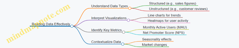
Example: Sarah notices a sudden drop in MAU on the dashboard. Instead of panicking, she checks the timeline and realizes it coincides with a recent app update.
Step 2: Questioning Data Critically
Rather than accepting the drop at face value, Sarah asks critical questions:
- Is the data accurate and complete?
- Could the drop be due to a data collection issue?
- What specific user segments are most affected?
- Are there external factors influencing user behavior?
Mind Map: Questioning Data
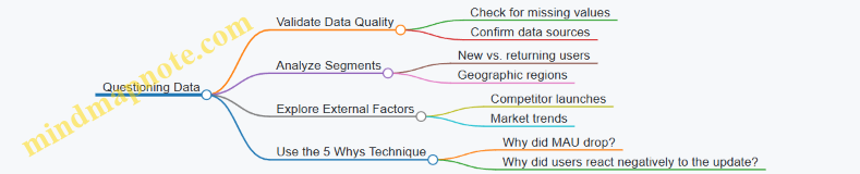
Example: By segmenting the data, Sarah finds that the drop is mainly among new users in a specific region. She also discovers a bug reported in customer feedback related to onboarding.
Step 3: Deciding with Data
Armed with insights, Sarah collaborates with her team to prioritize fixing the onboarding bug and plans a targeted marketing campaign to regain new users in the affected region.
Mind Map: Deciding with Data
Example: Sarah uses scenario analysis to show that fixing the bug could increase MAU by 15% over the next quarter, justifying resource allocation.
Step 4: Leading a Data-Literate Team
Sarah initiates weekly data review meetings, encouraging her team to bring data questions and insights. She also organizes a workshop on interpreting dashboards.
Mind Map: Building a Data-Literate Team

Example: After the workshop, the team identifies additional opportunities for product improvements based on usage patterns.
Step 5: Reflecting on the Journey
Sarah’s journey highlights key lessons:
- Data literacy is a continuous learning process.
- Asking the right questions uncovers deeper insights.
- Data-driven decisions improve business outcomes and team alignment.
- Leadership involves fostering a culture where data is valued and understood.
Mind Map: Manager’s Journey to Data-Driven Leadership
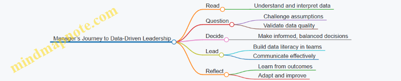
Summary
Sarah’s story exemplifies how managers can evolve into data-driven leaders by systematically applying the Read, Question, Decide framework. Through practical steps, critical thinking, and team engagement, data becomes a powerful tool for strategic leadership and business success.