Night Vision Technology Explained
1. Night Vision Basics and What Each Technology Sees
1.1 Define Night Vision Use Cases and Performance Goals
Night vision is not one job; it’s a set of tasks that happen under low illumination. A “good” device is the one that meets the specific needs of the scenario: what you must detect, how far away it is, how long you need to look, and what else is in the scene (bright lights, fog, moving targets, or clutter).
Start with the Job to Be Done
Write the use case as a simple sentence: “I need to find and confirm ___ at ___ distance under ___ conditions.” Then break it into three measurable goals.
- Detection goal: Can you notice something is there? For example, spotting a person-shaped silhouette near a fence line.
- Identification goal: Can you tell what it is? For example, distinguishing a person from a parked vehicle using shape and edges.
- Operational goal: Can you act on it? For example, reading a license plate at night while walking slowly.
A key nuance: detection and identification often require different settings and sometimes different technologies. If your identification goal is strict, you may need more optical clarity, better contrast handling, or a different modality than you’d use for quick detection.
Translate Goals into Performance Requirements
Performance goals should be expressed in terms that map to real-world behavior.
- Range: The distance to the target category you care about. “Far” is not a number; “150 m for detection, 50 m for identification” is.
- Lighting conditions: New moon darkness, partial moonlight, streetlights, or headlight glare. Intensification and thermal behave differently when there are bright sources.
- Atmospheric conditions: Clear air versus haze or light fog. Fog turns point lights into halos and reduces contrast.
- Target motion: Static targets are easier than moving ones. Motion affects how long you can integrate light or how artifacts appear.
- Field of view and working distance: A wide view helps you find targets; a narrower view helps you see detail once you’ve found them.
Mind Map: Use Cases to Requirements
Examples That Turn Goals into Concrete Targets
Example 1: Perimeter monitoring near streetlights
- Use case: Detect an intruder along a fence line.
- Detection goal: Notice a person-shaped target at 80–120 m.
- Identification goal: Confirm identity at 30–60 m.
- Performance requirements: You need good contrast in the presence of bright lights, because street illumination creates glare and reduces edge clarity.
- Practical implication: If you only optimize for maximum brightness, you may lose detail in the mid-tones where identification happens.
Example 2: Walking a dark path without tripping
- Use case: Navigate safely at night.
- Detection goal: See steps, roots, and low obstacles at 10–25 m.
- Identification goal: Distinguish “safe to step” from “likely uneven” terrain.
- Performance requirements: A wider field of view and stable focus matter more than extreme long-range detail. Motion blur from your own movement also becomes a limiting factor.
- Practical implication: A device that performs well on a distant test target can still feel inadequate if it narrows your view too much.
Example 3: Locating a person in light fog
- Use case: Search a yard or open area.
- Detection goal: Find a moving person at 60–90 m.
- Identification goal: Confirm location and direction at 20–40 m.
- Performance requirements: Fog reduces contrast and increases scattering. Your goal should account for how quickly targets become “hard to separate from background.”
- Practical implication: You may need a workflow that prioritizes repeated scanning and quick re-acquisition rather than staring at one spot.
A Simple Checklist for Setting Performance Goals
- What must you do: detect, identify, or act?
- What distance matters for each step?
- What lighting is present: none, moon, streetlights, or head-on glare?
- What atmosphere is typical: clear, haze, light fog?
- Are targets moving, and how fast?
- Do you need wide-area search or close-detail viewing?
When these answers are clear, the rest of the book becomes easier: each technology choice and each specification can be tied back to a specific job, not a generic “better in the dark” claim.
1.2 Explain Light, Contrast, and Scene Visibility at Night
Light, Contrast, and Scene Visibility at Night
Night vision is mostly a story about how much usable light makes it from the scene to your sensor, and how strongly that light differs between objects. “Seeing” happens when those differences survive the trip through optics, atmosphere, and the device’s own noise.
What “Light” Means in Night Conditions
At night, the limiting factor is rarely total darkness; it’s the amount of light that still carries contrast. Moonlight, starlight, and reflected illumination can be enough for image intensification when the scene has texture and edges. Thermal cameras don’t rely on reflected light at all, but they still depend on how strongly objects differ in emitted infrared energy.
A useful way to think about light is in layers:
- Illumination: how much light exists in the environment.
- Scene reflectance: how much of that light the objects send back.
- Path losses: how much the atmosphere scatters or absorbs.
- System throughput: how much your optics and sensor can convert into signal.
Example: A pale wall under a streetlamp can look “bright” to the eye, yet be low-contrast in a night-vision view if nearby surfaces reflect similarly. The device may produce a noisy image that lacks clear boundaries.
Contrast Is the Real Gatekeeper
Contrast is the difference between what you want to see and what you want to ignore. In low light, contrast often shrinks because:
- The scene’s brightness differences are small.
- Scattered light adds a gray haze that reduces separation.
- Sensor noise becomes comparable to the signal differences.
Contrast can be local (edges and textures) or global (overall brightness gradients). Night vision tends to show local contrast first, because edges create stronger changes in pixel values.
Example: In a foggy parking lot, headlights and streetlights create a bright background veil. Even if a person is warmer or more reflective, the background veil can wash out the person’s edges in an intensified image.
Scene Visibility: The Signal-to-Noise Story
Visibility improves when the device can produce a stable image where object differences stand out from random variation.
For image intensification, the key chain is:
- More usable photons → stronger signal.
- Stronger signal relative to noise → clearer edges.
- Clear edges → easier detection and identification.
For thermal imaging, the chain is:
- More temperature difference (or emissivity difference) → stronger radiance contrast.
- Radiance contrast relative to detector noise → clearer shapes.
- Stable calibration and level settings → consistent interpretation.
Example: Two targets at the same temperature can look different if one has higher emissivity (like fabric vs. shiny metal). In thermal, that changes contrast even when “heat” seems similar.
Atmospheric Effects That Change Contrast
Atmosphere doesn’t just reduce brightness; it changes contrast by adding scattered light.
- Fog and mist scatter light toward the camera, raising the background level.
- Light rain can create shimmering highlights that confuse edge detection.
- Smoke increases haze and reduces separation between objects and the background.
Example: A dark tree line behind a streetlamp can become a uniform gray mass in intensified viewing because scattered light fills in the shadows.
Practical Mind Map
Mind Map: Light, Contrast, and Scene Visibility at Night
Worked Examples You Can Reuse
Example 1: Detecting a Person Near a Bright Background
- If the background is bright (streetlamp, headlights), the intensified image may show a bright halo region that reduces edge contrast.
- Practical adjustment: change viewing angle to reduce direct bright-source scattering into the optics, and focus on the target’s silhouette against the darker portion of the scene.
Example 2: Seeing Texture on Ground Surfaces
- In low light, textured ground (gravel, grass blades) can produce stronger local contrast than a smooth surface.
- Practical adjustment: look for micro-contrast cues like footprints, tire marks, or uneven terrain rather than relying on overall brightness.
Example 3: Thermal Shapes With Similar Temperatures
- A person in a warm environment may not stand out if the background radiance is close.
- Practical adjustment: use the device’s level settings to spread the grayscale or palette across the relevant temperature range, and pay attention to shape edges where emissivity and geometry change.
Quick Self-Check While Observing
Ask three questions: Is there enough usable signal, are object-background differences large enough, and are atmospheric or optical effects adding a veil that blurs edges? If any answer is “no,” visibility will be limited even if the device is functioning correctly.
1.3 Compare Image Intensification Versus Thermal Imaging
Image intensification and thermal imaging both help you see at night, but they start from different physics. Intensification turns existing light into a brighter image. Thermal imaging measures heat-related infrared radiation and converts it into a temperature-like picture. That difference drives what each system does well, what it struggles with, and how you should set expectations.
What Each System Is Actually Measuring
Image intensification begins with photons in the visible or near-visible range. The optics focus those photons onto a photocathode, which releases electrons. The electrons are multiplied and then strike a phosphor screen that emits light you can view. If the scene has very little usable light, the image can become noisy or dim even if the optics are good.
Thermal imaging measures infrared radiation emitted by objects. The camera estimates how hot surfaces appear based on the infrared signal it receives. Because it does not rely on visible illumination, it can often show people and animals in complete darkness, assuming the scene has enough temperature contrast.
Scene Requirements and Typical Strengths
Intensification tends to perform best when there is some ambient illumination: moonlight, starlight, or reflected light from the environment. It also benefits from crisp optics and good alignment because fine detail depends on how well the system preserves spatial information.
Thermal imaging tends to perform best when objects have temperature differences relative to their surroundings. A warm target against a cooler background stands out even without any lighting. However, if the environment is thermally uniform, the thermal image can look flat and low-contrast.
A practical way to remember it: intensification is a “light problem,” while thermal is a “temperature contrast problem.”
How Weather and Atmosphere Change the Outcome
Both systems are affected by the atmosphere, but in different ways.
With intensification, fog, mist, and light rain scatter ambient light toward the lens. That scattering can create haze and reduce contrast, especially when there are bright sources like headlights or streetlights.
With thermal imaging, the atmosphere can absorb and emit infrared radiation. Water vapor and heavy fog can reduce contrast and make distant targets harder to distinguish. The key difference is that intensification is often harmed by scattered visible/near-visible light, while thermal is often harmed by reduced infrared contrast and atmospheric attenuation.
Bright Sources and Contrast Behavior
Intensification systems can be sensitive to bright sources. A nearby headlight, a reflective sign, or even a strong IR illuminator can cause blooming or halo effects that wash out nearby detail. This is not just a comfort issue; it can hide the exact edges you need for identification.
Thermal cameras handle bright “sources” differently because they are not measuring reflected light in the same way. Instead, very hot objects can dominate the scene and compress contrast in cooler regions. Many thermal displays include level and span controls to manage this, but the underlying signal still has limits.
Resolution, Detail, and What You Can Reliably Identify
Intensification can show fine texture and edges when the scene has enough light and the optics are sharp. You may recognize shapes, clothing patterns, or terrain features more easily because the image is tied to spatial detail from the optical path.
Thermal images often excel at detection and general identification of warm bodies, but fine detail depends heavily on thermal contrast and the camera’s effective resolution. Two people at similar temperatures can look like two blobs if the background is also warm or if the distance is large.
A useful rule of thumb: intensification is usually better for crisp detail when illumination exists; thermal is usually better for finding targets when illumination does not.
Examples That Show the Difference
Example: Walking a trail with a bright moon
- Intensification: The path edges and vegetation texture can look clear, and you can often track movement by subtle changes in contrast.
- Thermal: You may see the person clearly, but the ground may also show temperature variation, which can distract from the target unless you adjust level settings.
Example: Searching a yard with no ambient light
- Intensification: Without IR illumination (or enough ambient light), the image may be too dim to be useful.
- Thermal: A person or animal often appears as a distinct warm shape against cooler surfaces, even with no lighting.
Example: Foggy night near streetlights
- Intensification: Scattered light can create a bright veil that reduces contrast and makes it hard to separate the target from the background.
- Thermal: The target may still be visible, but distance and contrast can drop, so you may need to rely on closer observation and careful interpretation.
Mind Map: Key Differences That Drive Real-World Choice
A Simple Decision Checklist
If you expect usable ambient light and you care about crisp detail, intensification is often the better first choice. If you expect darkness or you need detection without relying on lighting, thermal imaging is often the better first choice. In mixed conditions, the deciding factor is usually which problem you can tolerate more: insufficient light for intensification, or insufficient temperature contrast for thermal.
1.4 Identify Common Terms Used in Night Vision and Thermal Systems
Night vision and thermal systems share a goal—seeing in low visibility—but they use different physics, so the vocabulary overlaps only partly. This section maps the most common terms you’ll encounter and explains what each one changes in the real image.
Core Terms You’ll See in Both Systems
Detection, Identification, and Recognition describe how confidently you can answer different questions.
- Detection: “Is there something?” Example: you notice a human-shaped silhouette at the edge of the scene.
- Recognition: “What is it?” Example: you can tell it’s a person rather than a bush.
- Identification: “Who or what exactly?” Example: you can read a uniform patch shape or confirm a vehicle model.
Field of View (FOV) is the width of the scene the device shows. A narrower FOV usually means more magnification, but less context.
- Example: a 40° FOV shows more surroundings than a 10° FOV, which can help you spot movement sooner.
Resolution is about how finely the system can separate details. In practice, it affects whether edges look crisp or smeared.
- Example: a fence line at night becomes either distinct posts or a single gray blur.
Contrast is the difference between target and background. Many “performance” issues are really contrast issues.
- Example: a warm object against a cool sky is easier for thermal than a warm object against warm ground.
Image Intensification Terms
Image Intensifier Tube is the heart of many night vision devices. It converts incoming light into an amplified image.
- Example: when you turn on the device, the tube is what makes the scene appear instead of staying dark.
Photocathode is the part that starts the conversion from light to electrons.
- Example: if the photocathode sensitivity is lower, the same scene looks dimmer.
Gain is how strongly the system amplifies the signal.
- Example: higher gain can make faint stars visible, but it can also make bright sources more distracting.
Signal-to-Noise Ratio (SNR) compares useful image signal to random noise.
- Example: two devices may have similar brightness, but the one with better SNR shows cleaner edges on a person’s outline.
Resolution in Line Pairs is a common way to express how many alternating black/white lines can fit across a distance.
- Example: higher line-pair capability tends to preserve fine detail like wire mesh.
Halo and Blooming are artifacts around bright points.
- Example: a car headlight can create a glowing ring that hides nearby detail.
Auto-Gating controls how the tube responds to very bright light, reducing damage and limiting blooming.
- Example: driving past a streetlight, the image doesn’t wash out as badly.
IR Illuminator is an infrared light source used with intensification when ambient light is insufficient.
- Example: in a dark yard, the illuminator makes the device “see,” but it also affects how far you can detect because it changes the scene’s illumination pattern.
Thermal Vision Terms
Thermal Camera measures emitted infrared energy and converts it into an image.
- Example: a thermal camera can show a person even when the person is invisible to the naked eye.
Radiance is the infrared energy leaving a surface toward the camera.
- Example: a warm wall emits more radiance than a cool road.
Emissivity describes how efficiently a surface emits infrared energy compared to an ideal emitter.
- Example: shiny metal often has lower emissivity, so it may appear cooler than expected.
Apparent Temperature is what the camera reports after processing radiance and assumptions about emissivity.
- Example: a person in front of a reflective surface can look “off” if emissivity settings don’t match reality.
NETD (Noise Equivalent Temperature Difference) is the smallest temperature difference the camera can reliably distinguish.
- Example: if NETD is low, two similarly warm objects separate more clearly.
Palette and Polarity control how temperature values map to colors or brightness.
- Example: “white hot” can make hot targets stand out, while “black hot” can reduce visual clutter for some observers.
Level and Span set the temperature range mapped to the display.
- Example: if you set level too high, a warm target may blend into the background because the camera is compressing the useful range.
Shared Terms That Behave Differently
Focus means different things in each system, but the outcome is the same: sharpness.
- Intensification: focus affects how well the tube and optics form a crisp image.
- Thermal: focus affects how well the lens forms a sharp thermal image on the detector.
Artifacts are unwanted patterns that can be mistaken for targets.
- Intensification: bright-source halos and edge glow.
- Thermal: streaking from motion, fixed-pattern noise, or drift.
Calibration is how the system stabilizes its output.
- Intensification: calibration is often about maintaining consistent tube/optical performance.
- Thermal: calibration commonly includes correcting detector behavior so temperature mapping stays consistent.
Mind Map of Common Terms
Quick Example Scenarios
Scenario: Night Yard Walk
- Intensification: an IR illuminator improves detection, but a nearby reflective surface can create halos that reduce recognition.
- Thermal: the same yard may show the person clearly if the background is cooler, but shiny objects can distort apparent temperature.
Scenario: Bright Headlights Near a Target
- Intensification: auto-gating and blooming control determine whether the target remains visible beside the light.
- Thermal: headlights don’t directly create a thermal image, but they can warm surfaces, changing contrast and level/span needs.
Scenario: Fence Line Detail
- Intensification: resolution and SNR determine whether posts are separable.
- Thermal: lens focus and NETD determine whether thin structures and small temperature differences stand out.
1.5 Choose The Right Technology For Typical Environments
Choosing between image intensification and thermal vision is mostly about what the environment is doing to light and heat. Intensification cares about available illumination and how much contrast the scene has in the visible/near-infrared range. Thermal cares about temperature differences and how much the atmosphere and surfaces hide or reveal those differences.
A quick decision lens
Start with three questions:
- Is there enough light for intensification to form a usable image? If the scene is truly dark with no moonlight and no practical IR illumination, intensification may struggle.
- Are the targets defined by temperature contrast? If you’re looking for people, animals, or warm machinery against a cooler background, thermal often gives a clear starting point.
- Does the environment distort either signal? Fog, smoke, and heavy rain tend to reduce thermal contrast and also scatter light for intensification. Windy dust can create “moving texture” that confuses both, but in different ways.
Mind Map: Environment to Technology Match
Practical examples by environment
Example: Residential yard at night with streetlights
A backyard with a visible streetlamp creates enough ambient light for intensification to produce a recognizable scene. You’ll likely see fences, pathways, and clothing texture more clearly than with thermal. Thermal can still help confirm a warm target, but it may show a softer outline if the background is also warm (for example, a heated shed wall).
Best practice: Use intensification for navigation and initial identification, then use thermal to confirm whether a bright-looking shape is actually warm.
Example: Rural field with no ambient light
In a dark field with no moonlight, intensification usually needs an IR illuminator to avoid a washed-out or noisy image. Thermal can detect a warm person or animal without any added illumination, though it may struggle if the background is also warm (such as sun-warmed ground after dusk).
Best practice: If you cannot or do not want to use IR illumination, thermal is the more straightforward choice for detection.
Example: Light fog near a road
Fog scatters light, which can cause intensification to bloom around headlights and bright objects. Thermal often remains usable because it doesn’t rely on reflected visible light, but fog can still reduce contrast by absorbing and scattering infrared energy.
Best practice: If you must operate in fog, prioritize the modality that gives you the cleaner contrast for your specific scene. Many users end up using thermal to find targets and intensification to interpret them when the fog thins.
Example: Urban alley with mixed lighting and reflections
Alleyways often contain bright signage, windows, and reflective surfaces. Intensification can show strong glare and halos around bright sources, which can hide smaller targets. Thermal may show targets more consistently, but reflective surfaces can confuse emissivity and make some objects appear warmer or cooler than expected.
Best practice: Treat bright lights as “image hazards” for intensification and treat surface materials as “temperature variables” for thermal. Adjust your approach: change viewing angle, reduce exposure to direct bright sources, and use level/contrast settings that stabilize what you’re trying to see.
A simple selection checklist
- If you have usable ambient light and need detail: choose intensification.
- If you have little ambient light and need detection without active illumination: choose thermal.
- If the scene has lots of bright sources: lean toward thermal for initial detection, then use intensification when glare is manageable.
- If the scene has strong temperature contrast and you care about locating warm targets: lean toward thermal.
- If you need both detection and detail: plan to use both modalities in the same workflow, even if one is primary.
The “right” choice is the one that matches your environment’s dominant constraint—light availability for intensification, temperature contrast and atmospheric transmission for thermal—while still fitting the way you actually operate.
2. The Physics of Image Formation for Intensified Systems
2.1 Describe Optical Paths and Image Formation Fundamentals
An optical path is the route light takes from a scene to the sensor or eye. In night vision and thermal systems, the “destination” differs, but the core job is the same: collect light, shape it, and map it into an image with the right focus, brightness, and geometry.
Optical Path from Scene to Image
Start with the scene. Each point in the scene emits or reflects light in many directions. The optics decide which directions are useful and where those rays land.
- Objective lens or lens group gathers light and forms an intermediate image. For a simple lens, rays from a single scene point are bent so they meet at a focal plane.
- Aperture and stop placement control how wide the bundle of rays is. A smaller effective aperture can improve sharpness at the cost of less light.
- Focusing mechanism moves one or more optical elements so the intermediate image lands on the correct plane.
- Image relay optics transfer that intermediate image to the next stage without changing the scene geometry.
- Spectral filters and coatings shape which wavelengths pass. Intensification systems often rely on filters to manage unwanted bands; thermal systems rely on the sensor’s spectral response rather than visible-light filters.
- Sensor or tube screen converts the optical image into an electrical or visual output.
A helpful way to think about it: the optics perform a “spatial mapping.” If the mapping is correct, edges stay edges and points stay points. If it’s wrong, the image blurs, shifts, or shows artifacts.
Image Formation: The Geometry of Focus
A lens forms an image when rays from a point converge at a plane. In practice, nothing is perfect, so we talk about focus quality and blur size.
- Sharp focus means the blur circle for each point is small compared to the smallest detail you care about.
- Defocus means the rays converge too early or too late, so the sensor sees a larger blur circle.
- Depth of field describes how much defocus you can tolerate before blur becomes obvious.
For night vision, focus errors are especially noticeable because the image is often judged by fine edges on dark backgrounds. For thermal, focus errors still matter, but the scene contrast and pixel sampling can dominate what you perceive.
Magnification and Field of View
Magnification determines how much of the scene fits into the display or sensor area. It’s not just “zoom.” It changes the scale of details.
- Higher magnification spreads scene details over more pixels (or more screen area), but it also makes shake and focus errors more obvious.
- Lower magnification gives a wider field of view and can make target acquisition easier, but fine detail may be harder to separate.
A practical example: if you’re scanning a fence line at night, a wider field of view helps you find the likely area. Once you’ve found a specific spot, you can switch to a tighter view or adjust the optics to improve identification.
Where Things Go Wrong: Common Optical Failure Modes
Optical paths are sensitive to alignment and mechanical tolerances.
- Misfocus: the intermediate image plane doesn’t match the sensor/tube plane.
- Tilt or decenter: the image plane is no longer parallel to the sensor, causing edge softness or uneven sharpness.
- Vignetting: the optics block off-axis rays, making corners dimmer.
- Parallax: the viewing axis and the optical axis don’t match, so the apparent position of a target shifts when you move your head.
Example: If you mount a device and then change your viewing position, parallax can make a target appear to “slide” relative to a reticle. That doesn’t mean the sensor moved; it means your eye is sampling a different ray bundle than the one assumed by the aiming reference.
Mind Map: Optical Path and Image Formation
Example: Tracing a Single Point Through the System
Imagine a small reflective point on a distant object. Light from that point enters the objective as a cone of rays. If the lens is set correctly, those rays converge into a small spot at the intermediate image plane. The relay optics then re-image that spot onto the sensor/tube screen.
Now change one variable: rotate the focus slightly so the convergence happens before the sensor plane. The sensor receives a spread of rays, so the point becomes a small disk instead of a spot. The disk size grows with defocus, and the image loses edge crispness.
This is why focus adjustment is not a cosmetic step. It directly controls how well the system performs the point-to-point mapping that makes details readable.
Example: Aperture Choice and the “Too Dim to See” Problem
Suppose you reduce the effective aperture to improve sharpness. The lens still forms an image, but fewer rays reach the sensor. At night, that can push the system into a regime where noise and low signal dominate, making the image look grainy or washed out.
So the optical path is always a balance: sharpness requires controlling ray angles, while visibility requires enough photons (or enough thermal signal) to produce a usable contrast.
Summary of the Fundamentals
An optical path is a sequence of components that shape rays into an image plane. Image formation depends on correct focus, alignment, and ray control. Magnification and field of view determine how details scale, while common failure modes like misfocus, tilt, vignetting, and parallax explain many “why does this look wrong?” moments in real use.
2.2 Explain Photons, Spectral Bands, and Sensitivity
Night vision and thermal systems both start with the same basic idea: the scene produces energy, and the sensor turns that energy into a signal. The difference is what energy they respond to and how efficiently they convert it.
Photons as the “Units” of Light
A photon is a discrete packet of electromagnetic energy. Its energy depends on wavelength: shorter wavelengths carry more energy per photon, while longer wavelengths carry less per photon. Sensors don’t count photons directly in the way a person counts coins, but the physics still matters because it affects how many photons are available and how strongly each one can trigger a response.
A useful mental model is “photon budget.” If a scene is dim, there may simply be too few photons arriving at the sensor to form a clean image. If the scene is bright, the sensor receives more photons per second, raising the signal level and improving visibility—until bright sources start to saturate the system.
Example: Imagine two flashlights shining at the same target. If one flashlight emits mostly near-infrared light and the other emits visible light, an intensifier that is sensitive to near-infrared may produce a clearer image from the first even if both flashlights look equally bright to your eyes.
Spectral Bands and Why “Color” Isn’t the Point
Spectral bands are ranges of wavelengths. Your eyes are sensitive to a narrow band in the visible range, so “color” is a convenient way to describe what you see. Night vision and thermal imaging care about different bands, so the same scene can look very different depending on which wavelengths the system can detect.
Image intensification typically relies on near-infrared and visible photons. Thermal cameras respond to infrared radiation emitted by objects due to their temperature. In both cases, the sensor’s response is not uniform across wavelengths; it follows a sensitivity curve.
Example: A foggy night can look washed out in visible light because scattering spreads visible photons across the image. A system that uses a different band may still be affected by scattering, but the balance between “useful photons” and “haze photons” can change.
Sensitivity as the Conversion Efficiency
Sensitivity describes how effectively the sensor converts incoming photons (or infrared radiation) into an electrical signal. Two sensors can have the same resolution and still produce different images because one is more sensitive in the wavelengths that matter.
For intensification, sensitivity depends on the photocathode’s spectral response and the optical system’s transmission. For thermal, sensitivity depends on how well the detector converts incoming infrared energy into a measurable temperature-related signal.
A practical way to think about sensitivity is: “How much scene energy is needed to produce a visible difference in the output?” That difference is limited by noise.
Noise Sets the Threshold for What Becomes Visible
Even if photons arrive, the sensor output is never perfectly clean. Noise comes from multiple sources, including electronic noise and statistical variation in photon arrival. Sensitivity is therefore tied to the minimum detectable signal.
Example: If a target is only slightly warmer than the background, the thermal camera needs enough sensitivity to distinguish that small difference above noise. If the scene is cold and the temperature contrast is low, the same camera may show a flatter image.
Mind Map: Photons, Spectral Bands, and Sensitivity
Putting It Together with a Concrete Scenario
Consider a person standing in a yard at night.
- The person reflects some near-infrared and visible light from the environment.
- The person also emits infrared radiation based on their temperature.
- An intensifier will mainly benefit from the reflected photons in its sensitive band, so the environment’s illumination and the system’s spectral response matter.
- A thermal camera will mainly benefit from the emitted infrared energy, so temperature contrast and detector sensitivity matter.
If you switch from a visible-light flashlight to an infrared illuminator matched to the intensifier’s sensitivity, the intensifier output improves because more of the emitted photons fall into the band where the photocathode responds. If you keep the same lighting but the person’s temperature is close to the background, the thermal image may show less contrast because the emitted signal difference is smaller relative to noise.
In short: photons provide the raw energy, spectral bands decide which wavelengths count, and sensitivity determines how efficiently those photons or infrared emissions become a usable signal above noise.
2.3 Convert Scene Illumination Into Signal Levels
Night vision and thermal systems both start with the same problem: the world gives you light or heat, but the device needs numbers it can display. “Convert scene illumination into signal levels” is the chain where photons or infrared radiation become measurable electrical or digital values.
The Signal Chain in One Pass
- Scene illumination sets how much energy reaches the optics.
- Optics concentrate that energy onto a sensor area.
- Spectral response decides what fraction is actually useful.
- Conversion turns energy into electrons (intensification) or into a pixel signal (thermal).
- Gain and noise determine how the signal stands out from randomness.
- Display mapping chooses brightness and contrast so you can see it.
A helpful way to think about it: illumination is “how much stuff arrives,” optics is “how tightly you pack it,” and the sensor is “how efficiently you count it.”
From Illumination to Photon Rate
For image intensification, the key quantity is the photon arrival rate at the photocathode. You can estimate it without heavy math:
- If the scene is darker, fewer photons arrive per second.
- If the optics are “faster” (lower f-number), they collect more photons.
- If the photocathode is more sensitive at the scene’s wavelengths, more of those photons become electrons.
Example: A dim path lit by a weak moon gives you a faint scene. If you swap from a narrow field lens to a wider one (same sensor), you may collect more total light from the scene, but you also spread it across more content. The signal per pixel can change in either direction depending on how the optics map the scene onto the sensor.
Spectral Match and Why Filters Matter
Not all light is equally useful. Image intensifiers have a spectral response curve, and thermal sensors respond to specific infrared bands. Filters and coatings shape what reaches the detector.
Example: Streetlights often have strong components in certain visible wavelengths. If your intensifier is most responsive in a different band, the device may look “dimmer than expected” even though the scene seems bright to your eyes.
For thermal, the idea is similar: the camera measures radiation in its designed band. A surface that reflects infrared can appear cooler or warmer than you’d guess from visible appearance because the camera is not measuring “temperature directly,” it’s measuring radiation that depends on emissivity and reflections.
Optics Concentration and Sensor Area
Optics determine how much of the incoming light ends up on the sensor. Two practical factors matter:
- Entrance pupil and f-number affect collection efficiency.
- Magnification affects how scene detail maps to sensor pixels.
Example: If you increase magnification, each pixel covers a smaller patch of the scene. Even if the total light collected by the lens stays similar, the light per pixel drops because the scene patch is smaller. That can reduce brightness and increase the chance that noise dominates.
Conversion to Electrons or Pixel Values
Once light reaches the detector, conversion turns energy into a measurable quantity.
- Image intensification: photons eject electrons at the photocathode, then an electron multiplication stage boosts that count. The output is an amplified electron image that is then converted to a visible pattern.
- Thermal imaging: infrared radiation changes the sensor’s electrical response. The device then applies calibration and processing to map that response into a pixel value.
In both cases, the device is effectively counting or measuring energy packets, then scaling them.
Gain, Noise, and the “Usable Signal” Threshold
A signal level is only meaningful if it rises above noise. Noise comes from multiple sources: random electron generation, readout electronics, and sensor fluctuations.
Example: Suppose two scenes have the same average brightness, but one has lots of texture and edges. The device may show better perceived detail because local contrast is higher, even if the overall signal level is similar. Conversely, a smooth foggy wall can look uniformly gray because there’s little contrast for the system to emphasize.
Mapping Signal Levels to Display Brightness
The raw signal is not what you see. The device must translate it into display intensity.
- If mapping is too aggressive, bright areas clip and lose detail.
- If mapping is too conservative, dark areas become noisy and hard to interpret.
Example: A headlight in the scene can saturate the sensor. The device may reduce gain to keep the rest of the image visible, which can make the surrounding area look darker than before. This is not a “fault,” it’s a practical trade between highlight handling and shadow visibility.
Mind Map: Converting Illumination into Signal Levels
A Concrete Walkthrough Example
Imagine a night scene with three regions: a dark hedge, a reflective road marking, and a distant building.
- Illumination: the road marking reflects more of the available light, so it receives more useful photons.
- Optics: the lens collects light from each region and maps it onto different pixel groups.
- Spectral response: if the reflective marking’s spectrum matches the detector sensitivity, it produces a stronger signal than the hedge.
- Conversion and gain: the intensifier multiplies the electron signal; the thermal sensor produces a pixel response proportional to radiation in its band.
- Noise and mapping: the hedge signal may sit near the noise floor, so it appears grainier. The road marking may approach saturation, so fine detail can compress.
The final image is therefore not just “how bright the scene is,” but how each region’s illumination, spectrum, optics mapping, and detector response interact with noise and display scaling.
2.4 Understand Gain, Noise, and Contrast in the Image Chain
Night vision images are built by a chain of steps: light enters, optics focus it, sensors measure it, and electronics amplify the result. “Gain” boosts signal, “noise” adds unwanted variation, and “contrast” is what your eyes can separate as differences. The tricky part is that gain can improve visibility only when it improves the signal-to-noise ratio (SNR), not when it merely makes everything bigger.
Gain: What It Actually Amplifies
Gain is a multiplier applied to the measured signal. In an intensifier, gain is largely created inside the tube by converting photons to electrons and then multiplying electrons. In a digital sensor, gain is applied electronically after the sensor collects charge.
A useful mental model: imagine a dim scene where the brightest edge produces 100 “signal units” and the darkest useful detail produces 10 units. If the noise floor is 5 units, then:
- Without gain: SNR for the dark detail is 10/5 = 2.
- With gain ×2: signal becomes 20, noise becomes roughly 10 if the noise scales similarly, so SNR stays about 2.
That’s why “more gain” doesn’t automatically mean “more detail.” If the dominant noise source scales with gain, SNR may barely change. If the dominant noise source is mostly fixed before amplification, then gain can help by lifting the signal above that fixed noise.
Noise: The Many Ways Images Get Messy
Noise is not one thing. It includes random fluctuations and systematic effects.
- Shot noise: randomness in photon arrival or electron generation. It grows with the square root of signal, so it’s harder to beat at very low light.
- Read noise: noise introduced when the sensor is read out. It’s often more noticeable at low signal levels.
- Fixed-pattern noise: pixel-to-pixel differences that repeat frame after frame. It can look like faint texture or banding.
- Temporal noise: frame-to-frame variation that makes the image “shimmer.”
A practical example: look at a dark wall at night. If you see a stable grain pattern that doesn’t change much, you’re likely seeing fixed-pattern noise. If the grain dances between frames, temporal noise is dominating.
Contrast: How Differences Survive the Chain
Contrast is the difference between two scene intensities relative to their average. A simple way to think about it is: if two objects differ by only a small amount, noise can blur them together.
Suppose object A is 60 units and object B is 50 units. The raw difference is 10 units. If noise is 8 units, then the difference is only slightly larger than the noise, so the objects may appear similar. If gain increases both A and B by the same factor but noise increases less (or is reduced by processing), the difference becomes easier to see.
Contrast also depends on the display mapping. If the system compresses highlights too aggressively, bright areas can flatten, reducing visible contrast even if the sensor captured it.
The Image Chain Relationship
The key relationship is that SNR and contrast are linked: higher SNR generally preserves contrast. But the chain can break that link through clipping, poor dynamic range handling, or noise sources that scale with gain.
Mind Map: The Image Chain Relationship
Example: Two Settings, One Scene
Consider a path at night with a fence line. The fence posts are slightly brighter than the background.
- Low gain setting: the posts are visible, but the background texture is nearly lost. Edges look soft because the post-background difference is only a bit above the noise.
- Higher gain setting: the posts brighten and the fence line becomes clearer. However, if the higher gain also increases noise proportionally, the image may look grainier without gaining real edge sharpness.
The “win” setting is the one where the post-background difference rises faster than the noise. You can often tell by checking whether edges become more distinct rather than just brighter.
Example: Bright Source and Contrast Collapse
Point a device at oncoming headlights. The bright source can push the system into highlight clipping or blooming.
- Clipping reduces contrast in the brightest region by flattening differences.
- Blooming spreads light into neighboring pixels, raising the local background.
Even if gain is helpful in the dark parts, the bright source can reduce contrast around it by changing the local intensity distribution. This is why good night vision behavior is not only about gain; it’s also about how the system handles extremes.
Quick Checks You Can Do in Practice
- Compare edge visibility, not just brightness. If edges sharpen, SNR improved.
- Watch whether noise pattern changes with gain. If it scales up strongly, SNR may not improve.
- Look for highlight flattening near bright objects. If contrast disappears there, dynamic range mapping is the limiting factor.
When you keep gain, noise, and contrast in the same mental picture, settings become less mysterious: you’re choosing how to trade brightness, noise behavior, and contrast preservation across the scene.
2.5 Map How Lenses and Filters Affect What You See
Night vision and thermal systems both start with the same idea: the scene is turned into an image by optics, then shaped by filters and processing. The difference is what the optics and filters are trying to pass. With image intensification, the goal is to deliver the right photons to the photocathode. With thermal imaging, the goal is to focus infrared radiation onto a detector while controlling what wavelengths are allowed through.
How Lenses Change the Picture
A lens controls three practical things: field of view, image brightness, and how sharply details land on the sensor.
- Field of view (FOV): A shorter focal length lens gives a wider view. That’s why a “wide” objective helps you spot motion sooner, but it also makes distant details smaller in the image.
- Brightness and the f-number: For a given scene and illumination, a lower f-number (larger aperture) gathers more light and produces a brighter image. In intensification, brightness matters because the tube needs enough photons to rise above noise. In thermal, brightness relates to how much infrared power reaches each pixel.
- Sharpness and focus tolerance: Night scenes often include both near and far objects. If the lens is not focused correctly, edges soften and fine targets become harder to distinguish. Even if the image “looks bright,” blur can reduce effective detail.
A useful way to reason about it: optics decide how much of the scene’s information reaches the sensor, and focus decides whether that information lands in the right place.
How Filters Change the Picture
Filters are selective gates. They can reduce unwanted light, protect sensitive components, or match the system to the wavelengths it is designed to detect.
- IR-cut and visible-blocking filters: Many intensification setups use filters to prevent visible light from overwhelming the system when you’re using an infrared illuminator. If the filter is wrong or missing, you can get a washed-out image under streetlights.
- Bandpass filters: These allow a narrow range of wavelengths. For intensification, this can improve contrast by rejecting wavelengths that don’t contribute much to the photocathode response. For thermal, filters can limit the infrared band so the detector sees a more consistent signal.
- Neutral density and attenuation: Some systems include adjustable attenuation to handle bright sources. Without it, bright headlights or reflective surfaces can cause blooming or loss of detail.
Mind Map: Lenses and Filters
Example: Headlights, Streetlights, and a “Too Bright” Image
Imagine you’re using an intensifier on a road at night. You see a bright halo around headlights and the surrounding area looks gray.
- If the lens is properly focused but the image is still washed out, the issue is often filtering and attenuation rather than optics.
- If the filter is not blocking visible light while you’re relying on an IR illuminator, streetlight and vehicle lights can flood the tube.
- If the lens aperture is too wide for the brightness level, highlights can clip, which destroys detail in the brightest parts of the scene.
A practical fix is to adjust the system’s attenuation or filter configuration so the brightest sources don’t dominate the dynamic range.
Example: Wide View for Detection, Narrow View for Identification
Suppose you’re scanning a yard for a person moving near a fence.
- A wider FOV lens helps you detect motion sooner because more of the scene is visible at once.
- Once you’ve found the general location, switching to a narrower FOV (longer focal length) can make the person’s shape and posture easier to interpret.
The key is that optics trade “where to look” for “how much detail you can see.” Filters then help keep the image from being dominated by the wrong wavelengths.
Example: Thermal Lens and Filter Behavior in Fog
In fog, thermal images often look flatter because scattering changes how infrared energy reaches the sensor. A thermal lens focuses what it receives, but it can’t fix the fact that the scene’s infrared contrast is reduced.
- A properly matched lens ensures the detector receives the intended spatial detail.
- A filter that matches the system’s designed infrared band helps keep the signal consistent across the scene.
If the image is soft, you check focus and lens condition first. If the image is contrasty but “wrong-looking,” you check whether the system’s filtering and settings match the scene conditions.
Quick Reasoning Checklist
When the image looks off, ask three questions in order:
- Is the image soft? Focus and lens alignment are the first suspects.
- Is it washed out or overly bright? Filtering and attenuation are usually responsible.
- Is it hard to separate targets from the background? Lens choice (FOV) and filter selection (wavelength control) often explain the difference.
Lenses decide how the scene is mapped onto the sensor. Filters decide which parts of the scene’s radiation are allowed to matter. Together, they determine whether you get usable detail or just a bright picture with no useful contrast.
3. Image Intensification Tube Construction and Operation
3.1 Break Down Tube Components and Their Roles
An image intensifier tube is a chain of jobs done in order: collect photons, convert them to electrons, multiply those electrons, then convert them back into visible light. If any link is weak, the image gets dim, noisy, or oddly shaped.
Photocathode
The photocathode is the tube’s first conversion step. It is a photosensitive layer that releases electrons when it receives light. Its spectral response matters: a photocathode that is more sensitive in the near-infrared will produce a brighter image from the same scene than one that is less sensitive there.
Example: In a parking lot at night, a faint reflective road sign may be barely visible to the naked eye. With a photocathode that responds well to the scene’s dominant wavelengths, the sign’s edges become distinct because more electrons are produced from the same incoming light.
Microchannel Plate
The microchannel plate (MCP) is the gain engine. It contains millions of tiny channels. When electrons enter a channel, they strike the channel walls and trigger secondary electron emission. This repeats along the channel length, creating a large multiplication of electrons.
Example: Imagine one electron as a single raindrop. The MCP turns it into a short shower by multiplying charge through repeated impacts. That multiplication is why intensifiers can work with very low light.
Electrostatic Focusing and Gain Control
Between the photocathode, MCP, and output screen, electric fields guide electrons so they land where they should. Focusing electrodes help keep the electron stream aligned, which improves sharpness. Gain control adjusts the voltage conditions that affect multiplication.
Example: If focusing is off, a point source (like a distant headlight) spreads into a larger blob. That spreading reduces usable detail even if the image is still bright.
Output Phosphor Screen
The output screen converts the multiplied electrons back into visible photons. Different phosphor types produce different colors and persistence behavior. The screen’s efficiency affects brightness, while its structure affects how cleanly electrons become light.
Example: A phosphor with higher light output makes dim scenes easier to see, but if it has longer persistence, moving lights can leave faint trails. That trade-off shows up during quick head turns.
Fiber Optic Coupling and Image Transfer
Many tubes use fiber optic plates to transfer the image from the output screen to the rest of the system. Fiber coupling helps preserve spatial detail and reduces mechanical misalignment sensitivity.
Example: If coupling is poor, you may notice reduced edge sharpness or a slight softness that is consistent across the whole view, not just at the center.
Vacuum Envelope and Mechanical Alignment
The tube is sealed under vacuum so electrons can travel without scattering. Mechanical alignment ensures the electron optics and screen are positioned correctly relative to the input optics.
Example: A tube that has been stressed or improperly mounted can show subtle distortions or uneven brightness, because the internal alignment no longer matches the optical axis.
Common Artifacts Tied to Components
Artifacts often point back to a specific stage.
- Bright-source halos: can relate to electron scattering and screen response.
- Edge distortion: can come from imperfect focusing or coupling.
- Fixed-pattern noise: can be linked to MCP channel behavior.
Example: If a bright streetlamp creates a consistent ring pattern that doesn’t change when you adjust focus, the cause is more likely in the tube’s electron-to-light conversion and screen behavior than in the external lens.
Mind Map: Tube Components and Their Roles
Case Study: Diagnosing a Soft Image
A user reports that the image is bright but lacks crisp edges. The external lens focus is set correctly.
- If the softness is uniform across the view, suspect electron focusing or fiber coupling.
- If only bright highlights look smeared, suspect output screen behavior and scattering around high-intensity regions.
- If the image shows a repeating noise pattern that doesn’t change with scene content, suspect MCP channel-related fixed-pattern effects.
This kind of reasoning keeps troubleshooting grounded: you’re mapping symptoms to the specific job each component performs in the chain.
3.2 Explain Photocathode Operation and Spectral Response
An image intensifier tube starts with a photocathode: a material that turns incoming photons into electrons. Those electrons are then multiplied later in the tube, but the photocathode is where the “which light matters” decision is made. If the photocathode does not respond to a wavelength, the rest of the system can’t fix that—no electrons means no image.
How Photons Become Electrons
Photons arrive through the input window and optics. When a photon hits the photocathode, it may eject an electron if it has enough energy to overcome the material’s work function. The probability of that happening is not constant; it depends on wavelength and the photocathode’s physical chemistry.
A useful way to think about it is as a conversion efficiency curve. At wavelengths where the photocathode is sensitive, more photons produce electrons. At wavelengths where it is not, the same light level produces far fewer electrons, so the image will look dimmer and noisier.
What Spectral Response Means
Spectral response is the photocathode’s sensitivity versus wavelength. It is usually shown as a curve: higher response means more electrons per incident photon. The curve has a peak and then falls off on either side.
For night vision, this matters because real scenes include multiple spectral components. Streetlights, moonlight, and IR illumination do not share the same spectrum. A photocathode that responds well to one band will produce a stronger signal for that illumination and a weaker signal for others.
Why Sensitivity Is Not the Same as Brightness
Two devices can have the same “gain” later in the tube but different photocathodes. The one with better spectral response for the scene’s wavelengths will generate more initial electrons, raising the signal before multiplication. That improves visibility and reduces the relative impact of noise.
A practical example: imagine two intensifiers used under a narrowband IR illuminator. If one photocathode responds strongly to that IR band and the other responds weakly, the first will show clearer edges and less grain, even if both tubes are otherwise similar.
The Role of Input Window and Filters
The input window and any spectral filters also shape what reaches the photocathode. Glass, coatings, and filter materials can absorb or reflect certain wavelengths. So the photocathode’s spectral response is only part of the story; the system’s overall sensitivity is the product of optical transmission and photocathode response.
Example: if a window transmits visible light well but blocks a specific IR band, the photocathode may be capable of responding to that IR, yet the system still won’t. The limiting factor is upstream.
Mind Map: Photocathode Operation and Spectral Response
Example: Matching Photocathode Response to Illumination
Suppose you use an IR illuminator at two wavelengths: one near the photocathode’s response peak and another farther away. With the same illuminator power and the same target distance, the near-peak wavelength produces more initial electrons. After multiplication, that results in a brighter image and better contrast in fine details like fence wire or foliage edges.
Now add a twist: if the input window or filter blocks the farther wavelength, the difference becomes even larger. You might conclude the photocathode is “bad,” when the real issue is that the photons never reach it.
Example: Interpreting a Spectral Response Curve
A spectral response plot is often normalized, so the absolute scale may not be directly intuitive. Still, the shape tells you what to expect. If the curve is high in the visible band but low in a particular IR band, then visible-rich scenes (like moonlit snow) will look stronger than scenes lit primarily by that IR band.
If the curve shows two regions of sensitivity, you can expect the device to perform better under mixed lighting that contains both bands. The image may also show different contrast behavior because the scene’s reflectance varies with wavelength.
Key Takeaways
The photocathode converts photons to electrons with a wavelength-dependent probability. Spectral response determines which parts of the scene’s light spectrum generate the initial electron signal. The final image quality depends not only on later gain, but also on how efficiently the system delivers the right photons to the photocathode.
3.3 Describe Electron Multiplication and Gain Mechanisms
Electron multiplication is what turns a faint trickle of electrons into a bright image. In an image intensifier tube, the process happens after the photocathode releases electrons from incoming light. Those electrons are then accelerated and multiplied in a region designed to make each electron produce many more electrons.
How Gain Is Produced
The tube’s gain comes from a chain reaction: one electron enters the multiplication region, gains enough energy from an electric field, and then knocks loose additional electrons when it collides with the multiplication medium. The key is that the electric field is strong enough to accelerate electrons between collisions, but not so strong that the device becomes unstable or damages itself.
A helpful mental model is a pinball machine with a controlled spring. The spring (electric field) determines how hard the ball hits. Stronger spring energy increases the chance of knocking loose more balls (secondary electrons). But if the spring is too strong, you get chaotic motion and unwanted effects.
The Role of the Multiplication Medium
Most modern intensifiers use a microchannel plate (MCP) or a similar structure. Each microchannel acts like a tiny electron multiplier tunnel. Electrons enter a channel, accelerate along it, and collide with the channel walls. Those collisions release secondary electrons, which are then accelerated deeper into the channel.
Because the channel walls are shaped to guide electrons, the multiplication is more repeatable than in a simple open gap. The geometry also helps reduce stray electrons that would otherwise blur the image.
Secondary Emission and Why It Matters
Secondary emission is the mechanism that converts one energetic electron into multiple lower-energy electrons. The probability of secondary emission depends on the impact energy of the incoming electron and the material properties of the channel walls.
In practice, the tube is designed so that electrons typically arrive at the wall with energies in a range where secondary emission is efficient. If the impact energy is too low, you get weak multiplication. If it’s too high, you can increase unwanted effects like excessive noise and reduced image quality.
Gain as a Product of Many Small Steps
Gain is not a single event; it’s the result of many collisions along the channel length. Each collision has a chance to produce one or more secondary electrons. Over many steps, the number of electrons grows roughly exponentially with the effective multiplication conditions.
This is why gain is sensitive to the applied voltages. Changing the voltage changes the electron impact energy and the number of effective collisions, which changes the multiplication probability at each step.
Voltage Distribution and Control
The multiplication region is powered by a voltage scheme that sets the electric field profile. In an MCP, the field is arranged so electrons accelerate along the channel and strike the walls at useful energies.
A practical example: if you reduce the voltage by a modest amount, the electron impact energy drops. Secondary emission probability falls, and the chain reaction produces fewer electrons. The image becomes dimmer, and the noise can become more noticeable because the signal is weaker.
Noise and Artifacts Tied to Multiplication
Multiplication doesn’t only amplify the desired signal. It also amplifies random processes, including thermionic emission and spurious electrons. Those random electrons can create background glow or fixed-pattern noise.
Another common issue is that bright sources can drive local regions into conditions where multiplication becomes less linear. That can show up as blooming or reduced contrast near bright highlights.
Mind Map: Electron Multiplication and Gain Mechanisms
Example: Predicting What Happens When Gain Changes
Suppose you have an intensifier set to a higher gain setting. The higher voltage increases electron impact energy inside the microchannels. That raises the probability of secondary emission at each collision. The result is more electrons reaching the output screen per input photon.
Now consider the same scenario with a dim scene. With higher gain, the image brightens, and faint details become visible. But the background also becomes more noticeable because random electrons are multiplied too. The “best” gain is therefore a balance: enough multiplication to see the scene, not so much that noise and artifacts dominate.
Example: Bright Light and Local Nonlinearity
Imagine a street scene with a headlight shining into the field of view. The photocathode releases many electrons near the bright region. In that area, the multiplication process can become less linear because the local conditions and available charge dynamics are stressed. The output can show reduced contrast around the bright source, even if the overall image is still bright.
This is why gain mechanisms are designed with both multiplication efficiency and controlled behavior in mind. The goal is strong amplification with predictable image quality across typical nighttime lighting conditions.
3.4 Explain Phosphor Output and Screen Behavior
In an image intensifier, the phosphor screen is where the invisible electron image becomes visible light. The screen’s behavior determines how bright the image feels, how sharp it looks, and how it responds when the scene includes bright sources like headlights or moonlit clouds.
What the Phosphor Screen Does
Electrons accelerated toward the output screen strike phosphor material and produce photons. Those photons form the visible image that you see through the eyepiece. Two practical consequences follow immediately: first, the screen’s brightness depends on how many electrons arrive and how efficiently the phosphor converts them into light; second, the screen’s light does not appear as a perfectly instantaneous flash. It has a decay time, meaning the screen can “linger” briefly after a bright change.
Brightness, Efficiency, and Why “More Gain” Isn’t Always “More Usable”
Phosphor output is often described as brightness per unit input. If the screen is efficient, the same electron arrival produces more visible light. If it’s less efficient, the image can look dim even when the intensifier is otherwise performing well.
However, brightness is not the only goal. A screen that produces more light can also make bright areas more likely to dominate the scene. When the output is too strong for the viewing conditions, you get a washed look where fine contrast in darker regions becomes harder to see. Think of it like turning up volume: louder can help, but if it overwhelms the room, details disappear.
Decay Time and Motion Smear
Because phosphor emits light over a short time window, fast changes in the scene can leave a faint trail. This is most noticeable when you move your head quickly or when the scene includes rapidly changing highlights.
A simple example: imagine walking past a fence at night while looking through the device. If the screen decay is longer, the fence posts may appear to “drag” slightly during head movement. With a shorter decay, the image settles more quickly and the motion looks cleaner.
Bright-Source Effects and Halo Behavior
Bright sources can create artifacts that are not strictly “optical blur.” Part of the effect comes from how electrons spread as they travel and strike the screen, and part comes from how the screen emits light.
Consider a car headlight in the field of view. Even if the headlight is a small point, the screen can produce a surrounding glow. This glow reduces contrast around the bright source, making it harder to see nearby dim details. The size and intensity of the halo depend on electron optics alignment, screen characteristics, and how the system handles high illumination.
Resolution, Scintillation, and Perceived Sharpness
The screen’s light output is tied to where electrons land. If electrons spread slightly before impact, the light spreads too, reducing fine detail. Even when the underlying image is sharp, the screen can introduce a grainy texture due to the discrete nature of photon emission.
A concrete way to notice this: look at a distant sign with small text. If the screen output is strong but the texture is coarse, the letters may look “fuzzy” even though edges are present. If the texture is finer, the text holds together better under low light.
Screen Uniformity and Edge Behavior
Screens are not always perfectly uniform. Variations in phosphor thickness, electron distribution, or optical coupling can cause brightness falloff toward the edges.
Example: if you view a dim tree line, the center may look crisp and evenly lit, while the edges appear slightly dimmer. This can be mistaken for lens vignetting, but the screen itself can contribute. Uniformity matters because the eye uses brightness cues to judge contrast; uneven brightness can make the scene feel less stable.
Mind Map: Phosphor Output and Screen Behavior
Example: Headlight Test and What to Observe
Take a device to a dark road and focus on a distant point light like a headlight. Then observe three things in order: (1) how large the surrounding glow appears, (2) whether nearby dim objects lose contrast, and (3) whether the image trails when you pan slowly past the light. If the halo is large, the screen and electron optics are likely contributing significant light spread. If contrast collapses around the highlight, the screen output is likely too dominant for the scene. If you see trails during panning, the screen decay time is likely long enough to matter.
Practical Takeaways
Phosphor output is not just brightness; it’s brightness plus timing plus how light spreads and settles. When you understand those three behaviors, you can interpret what you see—especially around bright sources and during motion—without blaming everything on optics or “settings.”
3.5 Understand Tube Geometry, Resolution, and Edge Effects
Tube geometry is the set of physical relationships inside an image intensifier: how the photocathode, electron path, and output screen are shaped and aligned. Those shapes determine where the image is sharp, where it softens, and how the edges behave when you look at a wide field.
Start with the idea of a “best focus zone.” Many tubes are designed so that the center of the image is optimized for sharpness. As you move toward the periphery, the optical and electron trajectories become harder to keep perfectly aligned. The result is a gradual change in resolution and contrast across the field.
Resolution is not just a single number. It depends on where you measure it and what you mean by “detail.” A tube can show good center resolution but reduced edge resolution because the electron optics and screen curvature introduce field-dependent blur. A practical way to think about it: the tube is like a camera lens system, but the “lens” includes the electron path, so the blur pattern can be different from ordinary glass optics.
Edge effects are the visible symptoms of geometry limits. Common ones include:
- Vignetting: the edges look dimmer because the system admits less light at larger field angles.
- Coma and astigmatism-like blur: point-like features smear differently depending on their position in the field.
- Curvature of field: the best focus plane is not perfectly flat across the image, so one edge may look sharper than the other unless the system is tuned.
- Distortion: straight lines may bend, which is especially noticeable when you frame a grid, fence, or building facade.
A useful mental model is to separate “brightness falloff” from “sharpness falloff.” Vignetting changes how much light reaches the screen at the edges. Edge blur changes how that light is focused into pixels. You can have one without the other: a tube might be bright at the edges but still soft, or sharp but dim.
Mind Map: Tube Geometry and What It Does to the Image
Example: Center Sharpness Versus Edge Sharpness
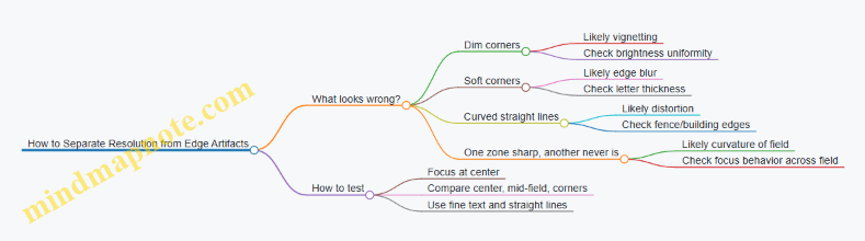
Imagine you’re viewing a distant sign with small letters. If the center looks crisp but the letters near the corners look thicker and less readable, you’re seeing edge blur. Now compare that to a second sign where the letters are equally fuzzy across the field but the corners are simply darker. That second case points more toward vignetting or illumination falloff.
To make this concrete, try a simple test target: a printed grid or a sheet with fine text. Place it so it fills most of the field of view. Focus for the center. Then evaluate three zones: center, mid-field, and corners. If mid-field is noticeably worse than center, the tube’s field-dependent resolution is limiting. If corners are worse than mid-field, edge effects are dominating.
Example: Distortion with Real-World Lines
Distortion is easiest to spot with straight edges. Look at a fence line or the edge of a building. If the fence posts curve outward near the corners, the system is introducing geometric distortion. This doesn’t necessarily mean the image is blurry; it means the mapping from scene angles to screen position is not perfectly linear.
Example: Focus Plane Differences Across the Field
Curvature of field shows up when you focus at the center and then re-check the corners. If the corners never reach the same sharpness level as the center, even after careful focusing, the best focus plane is curved. A practical workaround is not “better focusing,” but choosing the operating framing: for tasks that require corner detail, you may prefer a narrower field of view or a different objective setup.
Mind Map: How to Separate Resolution from Edge Artifacts
Tube geometry also interacts with the rest of the optical chain. The objective lens and any eyepiece or relay optics determine how much of the tube’s usable field you actually use. If you push for a wide field, you are more likely to notice edge effects because you’re sampling the tube where it performs less uniformly.
The takeaway is straightforward: treat the tube as a system with a center that’s usually best, and edges that reveal how geometry and electron optics behave under field angle. When you evaluate a device, don’t just look at the center—check corners for brightness, sharpness, and shape. That’s where the tube tells the truth.
4. Image Intensification Performance Metrics That Matter
4.1 Interpret Resolution, Line Pairs, and Spatial Detail
Resolution tells you how finely a system can separate small features. In night vision, that separation shows up as crisp edges, readable textures, and less “smearing” when something moves. In thermal imaging, resolution affects how well you can distinguish two nearby warm objects instead of seeing one blended blob.
What Line Pairs Mean
“Line pairs” describe spatial frequency: how many alternating dark and light lines fit across a given distance. A common way to state it is in line pairs per millimeter (lp/mm). If a display or sensor can resolve 40 lp/mm, it can distinguish 40 alternating line pairs in the same millimeter span.
A useful mental model: each line pair needs contrast and enough pixels or electron paths to represent both the bright and the dark parts. If the system can’t represent the alternation, the pattern collapses into a gray average.
Resolution Versus Sharpness
Resolution is a limit; sharpness is what you actually see. Two devices can have similar stated resolution, yet one looks sharper because its optics focus better, its processing preserves edges, and its noise level doesn’t wash out fine contrast.
For example, imagine a fence at night. If resolution is high but noise is also high, the fence wires may still look “fuzzy” because the fine contrast is buried. If noise is low but focus is off, the wires blur even though the system could have resolved them.
Spatial Detail as Contrast at Small Scales
Spatial detail depends on three things working together:
- Spatial sampling: how finely the system can represent the scene (pixels, electron paths, or effective sampling).
- Optical transfer: how well the optics deliver contrast at small angles.
- Signal quality: how much noise and artifacts reduce usable contrast.
A line-pair chart is a practical way to test the combined result. You look for the highest frequency where the alternating pattern is still distinguishable. The “still distinguishable” part matters: you’re not just counting theoretical capability; you’re judging usable contrast.
How to Read a Resolution Chart
When you view a line-pair target, start at lower frequencies where lines are clearly separated. Then move upward until the pattern stops looking like alternating lines and starts looking like a uniform gray.
A good rule of thumb: if you can still see the alternation without squinting or guessing, you’re in the resolved region. If you need to “convince yourself,” you’re at the edge of resolution where small changes in focus, distance, or illumination will swing the result.
Example: Two Targets at Different Distances
Suppose you’re checking a device at two distances. At the nearer distance, a small object subtends a larger angle, so it occupies more pixels or sampling elements. At the farther distance, the same object subtends a smaller angle, so it occupies fewer samples.
Even if the device’s resolution limit is unchanged, the farther target may fall below the sampling needed to show distinct edges. You’ll see this as reduced texture and merged shapes.
Example: Intensification Versus Thermal Detail
With image intensification, spatial detail is strongly affected by focus, lens quality, and the tube’s ability to maintain contrast at fine scales. Bright sources can also create artifacts that reduce effective contrast.
With thermal cameras, spatial detail is limited by detector sampling and optics, but also by how the scene’s temperature differences map into contrast. A scene with small temperature differences can look low-detail even when resolution is adequate, because the contrast at fine scales is too weak.
Mind Map: Resolution and Spatial Detail
Quick Checklist for Interpreting What You See
- Look for alternation: resolved line pairs should look like alternating bands, not a single gray smear.
- Check focus first: a slightly off focus can reduce contrast at fine scales more than you’d expect.
- Consider distance and angle: the same physical object can be resolved or not resolved depending on how much of it fits into the system’s sampling.
- Watch for contrast limits: low contrast scenes can hide detail even when resolution is present.
- Judge consistently: compare devices using the same target, distance, and viewing conditions so you’re comparing detail, not just vibes.
4.2 Explain Signal-to-Noise Ratio and Its Visual Impact
Signal-to-noise ratio (SNR) describes how much useful image information you get compared with random variations that don’t belong to the scene. In night vision, “signal” is the light or heat pattern that forms the image. “Noise” is everything that wiggles the pixels without corresponding to real detail. Higher SNR means edges look steadier, small textures survive, and the image is easier to interpret without constantly second-guessing what you’re seeing.
What Counts as Signal and Noise
In an intensified system, the signal is tied to how many photons make it through the optics and how effectively the tube converts them into electrons and then light on the output screen. In a thermal system, the signal is the difference in infrared radiance across the scene that the detector measures. Noise comes from multiple sources: shot noise from the finite number of detected events, electronic noise from the readout chain, and device-specific variations like fixed-pattern noise.
A useful mental model: if you’re trying to read a distant sign, the signal is the actual letter shapes. Noise is the grainy “snow” that makes some strokes look thicker or thinner from moment to moment.
How SNR Shows Up in the Image
SNR affects three visual behaviors that you can observe quickly.
- Stability of brightness: Low SNR makes the image shimmer. A fence line may appear to crawl slightly even when the camera is still.
- Edge clarity: Noise smears contrast at boundaries. A person’s silhouette against a darker background becomes harder to separate from the background.
- Detectability of small details: Fine textures like leaves, grass blades, or vehicle tread patterns require enough SNR to rise above random fluctuations.
Even if two devices have the same nominal “gain” or “sensitivity,” the one with better SNR will usually look more readable because the image is less dominated by random pixel changes.
A Simple Example with Numbers
Imagine a pixel that, on average, receives enough photons to produce a signal level of 100 units. If the standard deviation of the noise is 20 units, then SNR is 100/20 = 5. If another setup yields the same average signal but noise standard deviation is 50, SNR becomes 100/50 = 2.5.
Visually, the second case tends to:
- reduce the contrast of edges,
- make small brightness differences look like random flicker,
- and increase the chance that you “see” a target where there isn’t one because noise happens to form a shape.
Mind Map: Signal-to-Noise Ratio and Visual Impact
Example: Low SNR vs High SNR in the Field
Take a static scene: a dark tree trunk against a lighter sky. With low SNR, the trunk’s boundary may appear to “breathe” as noise causes the edge pixels to alternate between slightly brighter and darker values. With higher SNR, the boundary stays put, and you can more confidently track the trunk’s shape as you move your head or adjust focus.
Now add a moving element: a person walking slowly. If SNR is low, the person’s outline may intermittently blend into the background, especially during pauses when motion cues disappear. With higher SNR, the outline remains consistent, so you can judge posture and direction without relying on guesswork.
How Settings Change SNR Without Changing the Scene
SNR is not only a property of the device; it depends on how you operate it.
- Exposure and illumination: If you increase the effective signal (for example, by using appropriate IR illumination for an intensified system), noise doesn’t disappear, but the signal rises relative to it.
- Gain and processing: Raising gain can make the image brighter, but it can also amplify noise. Some processing reduces noise but may also soften edges, trading one kind of clarity for another.
- Stability: Handheld motion can create apparent noise by smearing detail across frames. A steadier setup often improves practical SNR because edges aren’t constantly being blurred.
Quick Checklist for Reading SNR in Practice
When you look at a night vision or thermal image, ask:
- Does the scene shimmer when nothing moves?
- Do edges stay sharp as you slightly change viewing angle?
- Can you distinguish small textures without squinting or guessing?
- Do bright sources create a halo that overwhelms nearby detail, effectively reducing usable SNR in that region?
If the answers are mostly “yes,” you’re likely seeing a higher SNR situation where the image is dominated by real scene structure rather than random fluctuations.
4.3 Understand Gain, Sensitivity, and Minimum Detectable Light
Night vision systems turn faint light into a visible image. Three terms sit at the center of that conversion: gain (how much the system amplifies), sensitivity (how effectively it converts available light into signal), and minimum detectable light (the lowest light level that still produces a usable image above noise).
Gain
Gain describes how strongly the system boosts the signal after it starts as an electrical representation of light. In an image intensifier, gain is largely tied to the tube’s electron multiplication: a small number of photoelectrons becomes many electrons, which then create a brighter output image.
A useful way to think about gain is to separate two outcomes: brightness and noise. Higher gain generally increases brightness, but it also increases the visibility of noise sources that scale with the signal chain. If you’ve ever turned up a microphone gain and heard hiss, you’ve met the same tradeoff in a different costume.
Example: In a dim yard, a low-gain setting might show only the brightest edges of a fence. Raising gain can make the fence appear more continuous, but you may also notice grainy texture in uniform areas like dark grass.
Sensitivity
Sensitivity is the system’s ability to produce a detectable signal from a given amount of light. It depends on more than amplification. Key contributors include:
- Optics throughput: how much light reaches the sensor or photocathode.
- Spectral response: how well the system responds to the wavelengths present.
- Detector efficiency: how effectively incident photons become usable electrons or pixel values.
- Noise behavior: how much random variation appears for a given signal.
Sensitivity answers: “If the scene light level stays the same, how much image signal do we get?”
Example: Two devices at the same gain can behave differently under an IR illuminator. One may produce a clearer image because its spectral response matches the illuminator wavelength better, even though the amplification stage is similar.
Minimum Detectable Light
Minimum detectable light (MDL) is the light level at which the system can distinguish a target from background noise with a specified confidence. MDL is not a single universal number because “detectable” depends on what you’re trying to see and how you define success.
A practical definition uses signal-to-noise ratio (SNR). The system needs enough signal above noise to form a recognizable pattern. If the target is small, low contrast, or surrounded by clutter, the MDL effectively rises because the required SNR is harder to achieve.
Example: A bright reflective sign might be detectable at a lower light level than a matte object with the same temperature or reflectance. The sign creates stronger contrast against the background, so it crosses the detection threshold earlier.
How Gain and Sensitivity Interact
Gain and sensitivity are related but not identical. Sensitivity determines how much signal you start with; gain determines how strongly you amplify it. If sensitivity is poor, no amount of gain can fully compensate because noise and artifacts still scale through the chain.
Example: If optics are slightly out of focus, the system spreads light over more pixels. That reduces per-pixel signal, making detection harder even if gain is high.
Mind Map: Gain, Sensitivity, and Minimum Detectable Light
Mind Map: What Changes the MDL in Real Scenes
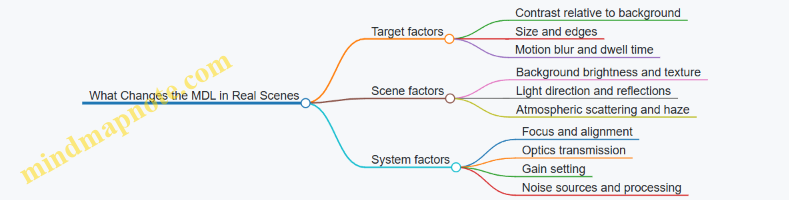
A Simple Calculation Mindset
You can’t always compute MDL precisely without device-specific data, but you can reason about it. Imagine the system produces a signal proportional to light level and a noise term that doesn’t vanish. Detection improves when the signal grows faster than the noise.
If you increase gain, you often increase both signal and some noise components. If you improve sensitivity (better optics throughput or better spectral match), you increase signal without necessarily increasing noise in the same proportion.
Example: Switching from a weak IR illuminator to one that matches the system’s response can improve detection more cleanly than simply increasing gain, because the signal is stronger at the source.
Quick Practical Checks
To understand MDL in your own setup, use repeatable scene cues:
- Compare detection of the same target at different gain settings and note where it becomes recognizable.
- Keep focus and distance constant; MDL shifts dramatically with blur.
- Use both a high-contrast target (like a reflective edge) and a low-contrast one (like a matte surface) to see how “detectable” changes.
When you connect these observations to gain and sensitivity, MDL stops being a mysterious spec and becomes a measurable threshold in your real environment.
4.4 Evaluate Halo, Blooming, and Bright-Source Artifacts
Halo, blooming, and bright-source artifacts are the “bright stuff problems” of night vision. They show up when a scene contains strong highlights—headlights, street lamps, moonlit clouds, or reflective surfaces—and the imaging chain has to squeeze both faint detail and intense light into the same display.
What Halo Looks Like and Why It Happens
Halo is a soft glow around a bright object. In intensified systems, it often comes from light scattering inside the tube and optics, plus how the phosphor spreads energy before it becomes visible. In practice, halo can make a small bright point look larger and less precise, which matters for target edges and identification.
Quick example: Point an intensifier at a distant car headlight. If the headlight appears as a crisp dot with a faint ring, that ring is halo. If the ring grows until it overlaps nearby dark features, your ability to separate the headlight from surrounding detail is reduced.
How to evaluate:
- Compare the same scene with the device at different focus settings. Halo that stays “attached” to the bright source even when focus is correct is likely internal scattering.
- Check whether halo size changes with brightness control or gain. If it scales strongly with gain, the artifact is tied to signal amplification.
What Blooming Looks Like and Why It Happens
Blooming is a flare-like expansion of bright areas that can wash out nearby detail. It happens when the imaging chain reaches a limit and excess signal spreads into neighboring pixels or regions. In intensified systems, blooming is influenced by how the phosphor and display stage handle high light levels.
Quick example: Watch a street sign edge at night. If the sign’s brightest reflective areas turn into a thick, smeared white region that erases nearby lettering, that’s blooming.
How to evaluate:
- Look for “spreading” rather than “glow.” Halo is a ring; blooming is a region that grows and flattens contrast.
- Test with two targets: one bright point (headlight) and one bright area (reflective sign). Blooming often becomes obvious with bright areas because they deliver more total energy.
Bright-Source Artifacts That Aren’t Halo or Blooming
Not every bright-source problem is the same. Some artifacts come from reflections and geometry rather than signal limits.
- Lens flare and internal reflections: You may see ghost images or streaks that shift with head position. This is often caused by reflections between lens surfaces or from a dirty or misaligned optical path.
- Iris and aperture effects: Vignetting or partial illumination can make bright sources look uneven, with bright edges and darker cores.
- Auto-exposure or gain behavior: Some systems adjust brightness dynamically. If the image “pumps” when a bright light enters the field, the artifact is partly control logic rather than pure optics.
Quick example: If you move your head slightly and a ghost dot appears near the bright lamp, that’s likely internal reflection. If the halo/blooming stays fixed relative to the lamp, it’s more likely scattering or saturation.
Mind Map: Bright-Source Artifacts and Their Clues
A Simple Field Test That Separates Causes
Use one location and three targets: a distant headlight (point), a reflective sign (area), and a bare lamp or streetlight (high intensity). Keep the device settings consistent and record what changes.
Step-by-step:
- Start with the brightest target in the center of the view.
- Note the artifact type: ring (halo), smear (blooming), or ghosting (reflections).
- Move the bright target toward the edge of the field. If artifacts worsen near edges, optics alignment and vignetting may be involved.
- Adjust focus slightly. If the artifact shape barely changes, it’s likely internal scattering or saturation rather than focus error.
- Reduce brightness/gain if the device allows it. If blooming shrinks dramatically, you were hitting a limit.
Case Study: Two Devices, One Bright Sign
Device A shows a mild halo around the reflective border, but the letters remain readable. Device B shows a larger bright smear that covers the letter strokes near the border.
Reasoning from observations:
- Device A’s halo suggests scattering without full saturation of the bright region.
- Device B’s blooming suggests the bright area is exceeding the system’s handling capacity, spreading energy into adjacent regions.
Practical takeaway: For tasks that require reading or distinguishing edges near bright highlights, blooming is usually the more damaging artifact because it destroys local contrast, not just adds a glow.
What “Good” Looks Like in Real Terms
A well-behaved system keeps bright highlights from erasing nearby detail. Halo should be small and predictable, blooming should be limited in size, and bright-source reflections should be minimal or at least consistent so you can recognize them as artifacts rather than features.
When you evaluate, focus on what you can still do: separate edges, read shapes, and maintain contrast around highlights. That’s the measurable value behind these artifacts, and it’s the difference between “bright scene visible” and “bright scene usable.”
4.5 Use Practical Benchmarks for Comparing Devices
Benchmarks only help if they match how you actually use the device. A “better” spec on paper can still lose in the field because of optics, processing choices, and how the device behaves under mixed lighting. The goal here is to compare devices using repeatable, scene-based tests that produce numbers you can explain.
What to Benchmark First
Start with three categories: detection, identification, and usability. Detection answers “Can I see it?” Identification answers “Can I tell what it is?” Usability answers “Can I keep the image stable and usable while moving, scanning, or adjusting?”
A practical rule: if two devices tie on detection but one is easier to focus, easier to keep aligned, or less distracting with bright sources, that one often wins for real work.
Mind Map: Benchmark Plan
Benchmarks for Image Intensification
Use a consistent target and a consistent light environment. For example, set up a small reflective marker (like a 1–2 cm high-contrast patch) on a stand at known distances. Add a second marker that is less reflective to test sensitivity to low-contrast detail.
Detection benchmark example:
- Place targets at 25 m, 50 m, 75 m, and 100 m.
- Run 5 trials per distance with the same observer.
- Record the farthest distance where the marker is detected in at least 4 out of 5 trials.
Identification benchmark example:
- Use a human-shaped silhouette with a contrasting panel (for instance, a dark torso with a lighter patch).
- Measure the range where the observer can correctly state “person” versus “not person” and then correctly describe the panel location.
- Record time-to-answer from first sighting.
Bright-source benchmark example:
- Position a streetlight or IR source at a fixed angle relative to the target line.
- Note how long it takes for the image to become usable again after the bright source enters the field of view.
- Compare devices by “recovery time” and by whether the target remains visible through the halo.
Benchmarks for Thermal Vision
Thermal images depend heavily on contrast between the target and the background. Benchmarks should therefore include both “easy contrast” and “hard contrast” scenes.
Detection benchmark example:
- Use a warm target (for instance, a heated container with a stable surface temperature) and a cooler background.
- Place it at 10 m, 20 m, 40 m, and 60 m.
- For each distance, record whether the target is detectable and whether its outline is distinguishable.
Identification benchmark example:
- Use two targets at the same distance: one that looks like a person silhouette and one that looks like a cluttered object.
- Ask the observer to classify which is which.
- Record classification accuracy and time-to-classify.
Level and contrast benchmark example:
- Repeat the same scene with two different level settings: one that preserves mid-tone detail and one that emphasizes hotter highlights.
- Compare devices by how stable the target remains under both settings, not just which setting looks best.
Cross-Device Comparison Method
When comparing intensification and thermal, avoid forcing a single “range” number. Instead, compare the workflow outcome: detection reliability and identification confidence.
Example workflow benchmark:
- Scene: a path with one human-sized target and one vehicle-sized target.
- Task: observer must detect the presence of each target and then identify which is which.
- Score each trial with:
- Detection score (0–2)
- Correct identification score (0–2)
- Time score (seconds)
Then compute an average score per device across trials. This keeps the comparison grounded in what you actually need to do.
Data Recording That Prevents Confusion
Record the device settings that affect the outcome: focus position, gain/brightness level, any automatic processing mode, and whether any illuminator is used. Also record environmental notes like haze or wind, because they change contrast and scattering.
A simple spreadsheet works: one row per trial, columns for distance, target type, settings, and results. If you can’t explain why a trial was “missed,” you can’t trust the comparison.
Quick Benchmark Checklist
- Same target, same distances, same observer.
- Same number of trials per distance.
- Measure detection and identification separately.
- Include a bright-source or glare scenario.
- For thermal, include both high-contrast and low-contrast scenes.
- Score outcomes, not just how the image looks at first glance.
5. Lenses, Optics, and Illumination Control
5.1 Select Objective Lens Focal Length for Field of View
Objective lens focal length is the main knob that sets how wide the scene appears through a night vision or thermal device. In simple terms: shorter focal length gives a wider view; longer focal length gives a narrower view with more magnification. The trick is choosing the focal length that matches how you plan to find targets and how much detail you need once you’re there.
What Field of View Means in Practice
Field of view (FOV) is the angular width of the scene you can see at once. A wider FOV helps with scanning—spotting movement, vehicles, or people across a larger area. A narrower FOV helps with identification—seeing finer features when you’re already close enough or when you can hold the device steady.
A useful mental model: if you’re searching, you want “more sky.” If you’re confirming, you want “more pixels on target.” Objective focal length largely controls that balance.
The Core Relationship Between Focal Length and FOV
For a given sensor size and eyepiece or display setup, changing objective focal length changes magnification and therefore FOV. Many systems follow the same pattern:
- FOV decreases as focal length increases
- FOV increases as focal length decreases
Because sensor size and optical layout also matter, two devices with the same objective focal length can still differ slightly in FOV. Still, objective focal length is the dominant driver.
Choosing Focal Length by Task
Searching Across Distance
If your job is to detect something at unknown locations—like checking a dark parking lot or monitoring a trail—start with a wider FOV. A wider view reduces the chance you miss a target simply because it entered the scene outside your current view.
Example: You’re walking a fence line at night. With a narrow FOV, you must “sweep” more carefully to avoid losing targets between frames. With a wider FOV, you can move at a steady pace and still keep a larger portion of the fence in view.
Identifying Known Targets
Once you have a likely target location, you often want to see more detail. A longer focal length narrows the view but increases effective magnification, making it easier to distinguish shapes, edges, and features.
Example: You spot a warm shape near a doorway on thermal. Switching to a narrower view helps separate a person from a clutter pile because the target occupies more of the display area.
Balancing Stability and Usability
Long focal lengths magnify not only the scene but also your hand motion. If the device is handheld, a very narrow FOV can make the image harder to keep steady, which can reduce practical identification performance.
Example: Two setups both have the same resolution rating, but the longer focal length one is noticeably harder to hold on a moving subject. The wider-FOV setup may produce more usable detail because it stays aligned with the target.
Mind Map: Objective Focal Length and Field of View
Practical Selection Workflow
- List the primary job: detection, identification, or both.
- Estimate your typical target distance: farther targets usually benefit from more magnification, but only if you can hold the view.
- Choose a starting FOV for scanning: if you often don’t know where the target is, bias toward wider.
- Confirm identification needs: if you frequently need to distinguish similar shapes, bias toward narrower.
- Check motion reality: if you expect movement or handheld use, avoid going too narrow for the stability you can maintain.
Worked Example with Two Scenarios
Scenario A: Wide-area search
- You’re monitoring an open yard where targets could appear anywhere.
- You benefit from a wider FOV to keep more area in view.
- Choose a shorter objective focal length so the device “sees” more of the yard per glance.
Scenario B: Narrow-area confirmation
- You’re checking a specific doorway or vehicle position.
- You already have a likely location and want detail.
- Choose a longer objective focal length so the target occupies more of the display.
Common Mistakes to Avoid
- Choosing narrow FOV first for everything: it can make scanning inefficient and increase the chance you miss the target before you can zoom in.
- Ignoring stability: a focal length that looks good on paper can be frustrating in real handling.
- Forgetting that “more magnification” isn’t automatically “better”: if the target doesn’t fill the view consistently, you lose practical clarity.
Objective lens focal length is best treated as a task-setting parameter, not a single “best” number. Pick the FOV that matches how you’ll move, search, and confirm, then let the rest of the system support that workflow.
5.2 Understand Eye Relief, Exit Pupil, and Viewing Comfort
Eye relief is the distance from the eyepiece lens to where your eye must be positioned to see the full image. Exit pupil is the diameter of the “useful” light beam leaving the eyepiece. Together, they determine whether you can keep your eye comfortably placed while still capturing the whole field of view.
Eye Relief: Where Your Eye Has to Live
For night vision, eye relief matters because the image can vignette when your eye is too far forward or too far back. If you wear glasses, eye relief also affects whether you can see the full image without removing them.
A practical way to think about it: eye relief is like the length of a leash. If your eye is outside that range, the image shrinks or darkens at the edges. If it’s inside, you get the intended view.
Example: You set up a monocular and notice that the center looks sharp, but the corners darken as you move your head slightly. That’s a classic sign your eye relief is being exceeded. Bring your eye closer until the vignette disappears, then practice holding that position.
Exit Pupil: How Forgiving the Eyepiece Is
Exit pupil is measured in millimeters and is tied to how much light your eye can accept. A larger exit pupil generally makes the system more forgiving: small head movements still keep you within the usable beam. A smaller exit pupil demands more precise eye placement.
A useful rule of thumb is to compare exit pupil to your own eye’s pupil size in low light. If your eye pupil is smaller than the exit pupil, you’re not using all the available light. If your eye pupil is larger, you may still see the image, but brightness and uniformity can suffer.
Example: Two devices have similar image quality, but one feels “easy” to use because you can move your head a little and the image stays full. That device likely has a larger exit pupil or better optical alignment. The other may require you to “aim” your eye position, which becomes tiring during longer sessions.
Viewing Comfort: The Human Part of the Optics
Comfort is not just about softness of the image. It’s about how stable your head and neck must be to maintain a full view.
Key comfort factors include:
- Eyecup design and eye alignment: A well-shaped eyecup helps you repeat the same eye position, reducing the need to “chase” the sweet spot.
- Diopter adjustment behavior: If the diopter is stiff or has a narrow adjustment range, you may end up with frequent re-focusing, which breaks your rhythm.
- Head posture requirements: Short eye relief can force you into an awkward lean. Even if the image is technically correct, fatigue shows up quickly.
Example: During a walk, you keep getting edge darkening whenever you look down to check footing, then it clears when you raise your head again. That pattern suggests your eye position is drifting outside the eye relief or exit pupil acceptance. Adjust your stance and eyecup contact point so your head movement stays within the usable range.
Mind Map: Eye Relief, Exit Pupil, and Comfort
Quick Field Checks That Actually Help
- Edge vignette test: Slowly move your eye forward and backward while watching the corners. The range where corners stay bright is your practical eye-relief window.
- Lateral movement test: Move your head slightly left and right without changing focus. If the image corners darken quickly, exit pupil tolerance is tight.
- Comfort test: Use the device for a few minutes in the posture you’ll actually use. If you find yourself constantly correcting eye position, the system is demanding more than you want.
Example: If you can keep the full image only by pressing your face firmly into the eyecup, you may be compensating for limited eye relief or a small exit pupil. A small change in stance—bringing your head slightly higher or adjusting how you seat the eyecup—often reduces the need for constant micro-corrections.
Putting It Together
Eye relief tells you where your eye must be. Exit pupil tells you how much movement you can tolerate while staying there. Viewing comfort is the outcome: if you can maintain a full, stable image without awkward posture or constant repositioning, the optics are doing their job and your body is not fighting them.
5.3 Explain Focus, Depth of Field, and Parallax Effects
Focus is the process of making the scene land sharply on the sensor or intensifier screen. Depth of field is the range of distances that still look acceptably sharp. Parallax is the mismatch between where your eye thinks the target is and where the optics actually form the image, especially when the eye, device, and target are not aligned.
Focus and Why “Sharp” Has Rules
Most night-vision and thermal systems have a focus adjustment that moves an internal lens group. When focus is correct, edges in the scene produce edges in the image rather than smears. A useful mental model is that the optics must map a particular distance in the world to a particular plane in the device.
A practical example: imagine focusing on a fence 30 meters away. If you then look at a person 10 meters away, their outline may soften because the device is still mapping 30 meters to the sharp plane. The image doesn’t become “worse” everywhere; it becomes sharp at one distance and progressively less sharp away from it.
Focus also interacts with illumination. With image intensification, very low light can reduce contrast, making it harder to judge focus by eye. With thermal, the scene contrast may be dominated by temperature gradients rather than edges, so you may focus best on a target with clear thermal boundaries, like a warm vehicle edge against a cooler background.
Depth of Field and How It Changes at Night
Depth of field depends on lens focal length, aperture (f-number), and how close you are focusing. In simple terms: a smaller aperture (higher f-number) increases depth of field, while a wider aperture (lower f-number) reduces it. Longer focal lengths also tend to reduce depth of field.
Example: two devices are both focused at 50 meters. Device A uses a relatively “fast” lens (lower f-number), so its depth of field might cover roughly 40–70 meters. Device B uses a more stopped-down lens (higher f-number), so it might cover 35–90 meters. In the field, that difference shows up when you scan: Device B stays usable as targets move closer or farther, while Device A requires more frequent refocusing.
Depth of field is not the same as “everything looks sharp.” It’s the range where blur is small enough to be acceptable for your task. If your task is identifying a vehicle type, you can tolerate more blur than if you’re reading a license plate-sized detail.
Parallax Effects and Where They Come From
Parallax happens when the viewing path and the target’s position don’t share the same geometric reference. In many systems, the image is formed by optics and then viewed through an eyepiece or display. If your eye is not at the intended exit pupil position, the image can shift relative to the real-world target.
A common scenario: you aim at a target while your eye is slightly off to the side of the exit pupil. The target appears to move in the image as you move your head. That’s parallax plus eye-position sensitivity.
Parallax is also affected by how the device is mounted. If the device is mounted on a helmet or weapon, the line of sight from the device to the target may not match the line of sight from your body or aiming reference. The mismatch is small at long distances and more noticeable up close.
Example: you use a mounted night-vision unit to aim at a person at 5 meters. If the device’s optical axis is offset from your aiming reference by a few centimeters, the angular difference can translate into a noticeable lateral shift on the target. At 50 meters, the same offset produces a much smaller shift.
A Simple Mind Map of the Relationships
Field Checks That Make These Effects Practical
-
Focus check at two distances: pick a near target with clear edges (or a strong thermal boundary) and a farther target. Focus on the farther one, then switch attention to the near one. If the near target is noticeably soft, you’ve confirmed limited depth of field and you know you may need a refocus for close work.
-
Parallax check with head movement: keep the device aimed at a stationary target. Move your head slightly left and right while keeping the device steady. If the target “slides” in the image, your eye position is not centered at the exit pupil or the viewing geometry is sensitive. Centering your eye reduces the effect.
-
Close-range accuracy check: at a short distance, compare where the device points versus where your aiming reference indicates. If there’s a consistent offset, treat it as a calibration problem for that setup rather than a random error.
When focus, depth of field, and parallax are understood as separate but interacting constraints, the image becomes less mysterious. You stop blaming the device for every blur and shift, and you start using it with predictable behavior.
5.4 Use IR Illuminators Correctly with Intensified Systems
IR illuminators add usable light when ambient illumination is too low or too uneven for image intensification. The goal is not to “see more,” but to shape the light so the intensifier gets enough photons without creating glare, blooming, or confusing shadows.
Choose the Right Wavelength and Beam Pattern
Most intensified systems respond to near-IR, commonly around 850 nm or 940 nm. A simple way to pick: if you need longer range through haze or dust, 850 nm often performs well; if you need less visible spill and more “invisible to the naked eye” behavior, 940 nm is frequently used. Beam pattern matters too. A narrow beam helps at distance, while a wider beam covers near-field targets and reduces the “spotlight effect” where only one area looks usable.
Example: In a yard search, a wide beam at 850 nm can illuminate fences and ground texture so you can track movement. At the same site, a narrow beam can make the target pop but leave the surroundings too dark to confirm identity.
Match Illuminator Output to Your Scene
IR output should be set based on distance and reflectivity. Bright surfaces like light walls, pale gravel, or wet pavement can reflect IR back into the optics, causing haloing and reduced contrast. Dark scenes need more output, but more output is not always better if it saturates the intensifier.
Practical rule: start low, then increase until you can see target edges and motion clearly, not until the whole scene looks “washed.”
Example: Point an illuminator at a dark path. If you crank output until the path looks uniformly bright, you may lose detail on the target because the background is now too bright relative to the subject.
Control Angle to Prevent Backscatter and Glare
Backscatter happens when IR light reflects off fog, mist, dust, or even nearby surfaces and returns toward the lens. The most common mistake is aiming the illuminator too close to the optical axis in hazy conditions.
Use a simple geometry: keep the illuminator slightly offset from the lens axis so reflected light is less likely to travel straight back. Also avoid pointing at shiny surfaces at steep angles.
Example: In light fog, an offset mount can preserve contrast on a person’s silhouette. If the illuminator is centered, the fog can turn into a bright veil that hides the target.
Understand How Intensifiers React to Bright Sources
Intensified systems can show blooming around strong highlights. IR illuminators can create strong highlights if they hit reflective objects directly—like reflective tape, car windshields, or glossy leaves. Blooming expands the bright area and can mask the details you’re trying to see.
Best practice: scan the scene first with the illuminator at a low setting, then adjust position and angle to avoid direct hits on highly reflective surfaces.
Example: At a parking lot, a low setting may reveal a person near a vehicle. If you increase output and the illuminator starts reflecting off the windshield, the person’s outline can become harder to see due to blooming.
Use Focus and Mounting to Keep the Beam Useful
Many illuminators have adjustable focus or optics that change beam spread. A focused beam can extend effective range, but it also increases intensity and the risk of glare on close objects. A wider beam is more forgiving for near-field work.
Mounting stability matters too. If the illuminator shifts relative to the lens, the “sweet spot” moves and you’ll see inconsistent brightness when you move your head.
Example: For handheld use, a rigid mount keeps the beam aligned so you don’t repeatedly re-tune brightness. For a helmet setup, check alignment after tightening straps.
Mind Map: IR Illuminator Setup Logic
Example Workflow for a Quick, Repeatable Setup
- Start with low output and a beam that matches the expected distance.
- Scan for reflective surfaces and note where the beam might bounce back.
- Adjust angle so the illuminator is slightly offset from the lens axis, especially if there’s haze.
- Increase output gradually until you can see target edges and motion without blooming.
- Confirm consistency by moving your head or body slightly and checking that the brightness stays stable.
Example: In a dim alley, you begin at low output with a medium beam. After you see that the far wall is brightening too much, you reduce output and shift the illuminator angle to keep the wall from dominating the scene. The target becomes easier to track because contrast returns.
Common Mistakes and What They Look Like
- Too much output: background becomes bright and target detail fades.
- Centered illuminator in haze: fog turns into a bright veil.
- Ignoring reflectivity: reflective tape or vehicle glass creates halos.
- Loose mounting: the beam “moves” relative to the view, forcing constant re-adjustment.
Correct use of IR illuminators is mostly about restraint and geometry. When you treat the illuminator as a controlled light source rather than a brightness knob, the intensified image becomes clearer and more predictable.
5.5 Manage Reflections, Glare, and Atmospheric Scattering
Night vision and thermal systems both struggle when light or radiation bounces around the scene before it reaches the sensor. The goal is simple: reduce unwanted paths, keep the sensor from saturating, and preserve contrast where you actually need it.
Reflections and Glare: When Light Takes the Wrong Turn
Reflections usually come from three places: the environment, the device, and the operator’s setup.
- Environmental reflections: Wet pavement, car hoods, window glass, and light-colored walls can throw back IR or visible light. With intensification, bright reflections can create halos and wash out nearby detail. With thermal, shiny surfaces can reflect colder or warmer surroundings, producing confusing “temperature patterns.”
- Device reflections: Internal lens reflections, uncoated edges, and dirty optics can create ghost images and veiling glare. Even a small smudge can scatter light enough to reduce contrast.
- Setup reflections: A common culprit is an IR illuminator aimed too high or too close to the optical axis. If the illuminator’s light enters the lens directly, you get glare and blooming.
Practical example: You’re scanning a parking lot with an IR illuminator. The far side looks “hazy,” and small lights bloom into large circles. Lowering the illuminator angle slightly and increasing standoff distance between illuminator and objective often reduces direct hits on the lens. Cleaning the front element and checking for loose lens caps also helps because stray light paths are usually consistent.
Atmospheric Scattering: Why Fog and Mist Look Like a Contrast Tax
Atmospheric scattering happens when particles in air redirect light toward the sensor. The effect grows with:
- Distance: More air means more opportunities for scattering.
- Particle density: Fog, mist, and light rain increase scattering.
- Wavelength and illumination: Shorter wavelengths scatter more; for IR, the effect still depends on particle size and concentration.
The result is veiling glare: the image gains a background brightness that steals contrast from targets. You can think of it as the scene being “covered” by a faint, distance-dependent fog layer.
Practical example: On a humid night, a tree line that was crisp earlier now looks gray and low-contrast. Switching to a narrower field of view (or stepping closer) often restores target edges because the scattering contribution shrinks with reduced path length. If you’re using an IR illuminator, reducing output to the minimum needed can also help, since brighter illumination increases the scattered light reaching the sensor.
Control Strategies That Actually Work
-
Angle and alignment discipline
- Keep the illuminator’s beam from entering the objective directly.
- Use a quick “paper test”: aim at a matte surface and observe whether the objective sees a bright spot. If it does, you’re feeding glare.
-
Optics cleanliness and mechanical shielding
- Wipe the objective and eyepiece with appropriate lens-safe methods.
- Ensure lens caps and covers are removed only when needed.
- Check for loose mounts or gaps that allow stray light to enter.
-
Exposure management through gain and illumination
- For intensification, avoid settings that push highlights into blooming. If the image is constantly bright, reduce gain or illumination.
- For thermal, adjust level and span so the background doesn’t dominate the palette. If everything looks “mid-gray,” you’ve likely compressed contrast.
-
Scene selection and target framing
- Prefer darker backgrounds behind targets. A bright background increases veiling glare and reduces edge contrast.
- Use tighter framing to reduce the amount of bright sky or reflective ground entering the view.
Mind Map: Reflection, Glare, and Scattering Control
Example Workflow: From “Hazy” to “Readable”
- Identify the source: If bright points bloom into large circles, suspect glare from direct illumination or internal reflections. If the whole scene looks gray with distance, suspect scattering.
- Do one change at a time: Clean the objective first, then adjust illuminator angle, then reduce output or gain. This keeps you from guessing which fix worked.
- Re-check framing: Move the view so the brightest areas occupy less of the field. If contrast improves immediately, you were fighting reflections or veiling glare.
- Confirm with distance: If stepping closer sharply improves clarity, scattering is the dominant problem. If clarity doesn’t change much, reflections or optics are more likely.
The practical takeaway is that glare and scattering are not “mysteries.” They leave consistent visual fingerprints, and small, controlled adjustments usually restore contrast without changing the device.
6. Thermal Vision Fundamentals and How Thermal Images Form
6.1 Explain Heat Transfer and Why Thermal Cameras Work
Thermal cameras don’t “see heat” directly; they measure how much infrared energy different surfaces emit and reflect. To understand why that works, it helps to track how heat moves and how surfaces behave when they’re not all the same temperature.
Heat Transfer Modes You Can Picture
Heat transfers in three main ways: conduction, convection, and radiation. Thermal cameras mainly care about radiation, but the other two explain why the radiation pattern looks the way it does.
Conduction is heat moving through a material. Imagine touching one end of a metal spoon that’s sitting in hot soup. Heat spreads along the spoon, so the handle warms more slowly than the bowl. In a thermal image, you’ll often see gradual temperature gradients across solid objects because conduction smooths temperature differences over distance.
Convection is heat carried by moving fluid, like air. Warm air rises, cool air sinks, and the surface temperature can change as fresh air contacts it. Outdoors, wind can make a surface cool faster, which changes the thermal image even if the object’s internal temperature is steady.
Radiation is energy emitted as electromagnetic waves. Every object above absolute zero emits some infrared radiation. The key point: radiation depends on temperature and surface properties, not on whether there’s air between you and the object.
Why Radiation Shows Up as an Image
A thermal camera has an infrared-sensitive detector array. Each pixel measures incoming infrared energy from a tiny patch of the scene. The camera then converts that energy into a temperature estimate using calibration and assumptions about the surface.
Two ideas matter here:
- Temperature controls emission. Hotter surfaces emit more infrared energy.
- Surface properties control how much of that energy is emitted versus reflected. A shiny surface can reflect infrared from its surroundings, while a matte surface tends to emit more of its own.
That’s why two objects at the same temperature can look different in thermal imaging. The camera is measuring a mix of emitted radiation from the object and reflected radiation from the environment.
Emissivity and the “Same Temperature, Different Brightness” Effect
Emissivity is a number between 0 and 1 describing how effectively a surface emits infrared compared to an ideal radiator. Matte black paint has high emissivity; polished metal often has low emissivity.
Example: A warm engine block and a nearby chrome exhaust pipe might both be hot, but the chrome can appear cooler or uneven because it reflects the cooler surroundings. If you cover the chrome with a high-emissivity tape patch, the thermal image often becomes more consistent with the actual surface temperature.
A Simple Energy Balance for Real Scenes
For many practical situations, a surface pixel value is influenced by:
- Emitted radiation from the surface itself (mostly driven by its temperature)
- Reflected radiation from the environment (driven by what’s around it)
- Atmospheric absorption between camera and target (water vapor and other gases can reduce or alter the signal)
This is why thermal images can look “washed out” over long distances or through mist. The camera is still measuring infrared energy, but the atmosphere changes what reaches the detector.
Mind Map: Heat Transfer and Thermal Imaging
Example: Reading a Warm Object in a Cooler Environment
Place a mug of hot tea on a table and look at it with a thermal camera.
- The tea surface appears warm because it emits strong infrared radiation.
- The mug wall shows a temperature gradient because heat conducts from the tea into the ceramic.
- The rim and handle may cool faster if air currents move around them, due to convection.
- If the mug has a glossy finish, reflections of the room can create bright or dark patches that don’t match the true temperature.
The camera’s image is therefore a map of infrared energy arriving at the lens, shaped by temperature, emissivity, reflections, and the path through the air.
Example: Why “Heat” Can Look Like a Shape, Not a Number
Consider a wall with a warm spot behind it. The wall’s surface temperature changes where heat reaches it, but the pattern depends on how heat conducts through the wall layers. Thermal cameras show the surface radiation pattern, which is an indirect view of internal heat flow. That’s not a flaw; it’s the natural consequence of measuring radiation at the surface.
In short: thermal cameras work because radiation carries temperature information, and the camera measures that radiation pixel by pixel. Heat transfer explains why the surface temperature—and therefore the radiation—varies across the scene.
6.2 Describe Infrared Bands and Typical Thermal Camera Spectra
Infrared Bands and Typical Thermal Camera Spectra
Thermal cameras do not “see heat” directly; they measure infrared radiation and convert it into a temperature-like image. The key to understanding their output is the infrared band they measure, because different bands respond differently to materials, atmospheric absorption, and lens transmission.
Infrared Bands in Plain Terms
Infrared is commonly grouped by wavelength. Shorter wavelengths generally carry more detail for the same optics, while longer wavelengths often tolerate haze and fog differently. Thermal cameras usually operate in two main windows:
- Long-Wave Infrared (LWIR): roughly 8–14 µm. This is the most common thermal band for uncooled cameras.
- Mid-Wave Infrared (MWIR): roughly 3–5 µm. This is common in systems that may use cooled detectors.
There are also near-infrared bands (like 0.7–1.0 µm) used by some night-vision systems, but those are different from thermal imaging because they rely on reflected light rather than emitted thermal radiation.
Why Bands Matter for What You See
A thermal camera’s spectrum is shaped by three things: the detector’s sensitivity, the optics’ transmission, and any filters that restrict the band. If a band is blocked by the atmosphere or by the lens, the camera will measure less signal and the image will look flatter or noisier.
Atmospheric effects are not uniform across wavelengths. Water vapor and carbon dioxide absorb strongly in certain regions, which is why the “windows” around 3–5 µm and 8–14 µm exist. In practice, this means the same scene can appear with different contrast depending on the band and the path length.
Typical Thermal Camera Spectra
A “typical spectrum” for a thermal camera is usually a band-limited response curve: near zero outside the band, rising through the pass region, then rolling off at the edges. The exact shape depends on the detector and filter design.
Here is a simplified mental model for LWIR and MWIR response:
- LWIR (8–14 µm): strong response across the long-wave window, with reduced sensitivity near the band edges.
- MWIR (3–5 µm): strong response across the mid-wave window, often with sharper cutoff behavior due to filtering.
The camera’s output is then influenced by how much of the scene’s emitted radiation falls into that band. Hotter objects emit more total radiation, but the fraction that lands in the camera’s band depends on wavelength.
Mind Map Infrared Bands and Spectra
Mind Map: Infrared Bands and Thermal Camera Spectra
Example: Same Scene, Different Band Response
Imagine a person at night with a background of cooler ground. In both MWIR and LWIR, the person emits more infrared radiation than the ground, so the person appears warmer/brighter in the thermal image. The difference is how the camera weights wavelengths within its band.
If the air path includes moisture, absorption can reduce signal differently across bands. The LWIR image may retain contrast better in some hazy conditions because its band aligns with a more favorable atmospheric window. In clearer air, both bands can produce strong contrast, but the optics and detector resolution still dominate the final sharpness.
Example: Edge Detail and Material Response
Consider a metal object with a shiny surface and a matte surface nearby. Thermal cameras measure emitted radiation, but real surfaces also reflect some infrared from the environment. In a narrower band, the balance between emission and reflected components can shift, changing how edges and surface textures look.
This is why two cameras with the same resolution can still produce different “texture” in the same scene: their spectral bands and spectral response curves differ, and the scene’s materials do not behave identically across wavelengths.
Example: Interpreting a “Band-Limited” Spectrum
Suppose a camera is labeled as LWIR 8–14 µm. That does not mean it measures every wavelength equally. If the response curve peaks around 10–12 µm and drops near 8 µm and 14 µm, then objects whose emission characteristics align more strongly with the peak region will appear with higher contrast. Cooler objects emit less overall, so the band weighting becomes even more noticeable in the image noise and contrast.
Practical Takeaway
When you compare thermal cameras, treat the band as a first-order design choice. It affects atmospheric transmission, lens compatibility, and how the camera converts scene emission into pixel values. Once you know the band, you can reason more reliably about why one camera shows stronger contrast in a given environment than another.
6.3 Convert Radiance Into Pixel Values and Contrast
A thermal camera doesn’t “see temperature” directly. It measures how much infrared energy arrives at each detector element, then converts that energy into a digital number. That number becomes a pixel value, and the way pixel values are mapped to brightness or color determines the contrast you perceive.
Radiance to Signal
Radiance is the energy per unit area per unit solid angle per unit wavelength (or band). In practice, the camera collects radiance through optics, filters it into a band, and focuses it onto a detector.
A useful mental model is an accounting ledger:
- Optics decide how much energy reaches the detector (through aperture, lens transmission, and vignetting).
- The filter decides which wavelengths count.
- The detector turns incoming energy into an electrical signal.
If two parts of a scene have the same radiance at the detector, they produce the same signal (ignoring noise). If they differ, the signal differs, and that difference is what contrast starts with.
From Electrical Signal to Pixel Value
Each detector element outputs a voltage or current related to the incoming energy. The camera then applies several steps:
- Integration: the detector accumulates signal over a time window.
- Analog-to-Digital Conversion: the camera samples the signal and quantizes it into discrete levels.
- Calibration: the camera corrects for offsets and non-uniform detector response.
- Mapping: the camera converts calibrated values into display brightness or a color palette.
The key point: contrast you see is not only about radiance differences. It’s also about how the camera scales and maps the measured values.
Contrast: Two Kinds of “Difference”
Contrast can mean two related but distinct things:
- Radiometric contrast: the ratio or difference in radiance (or equivalent temperature) between two scene regions.
- Displayed contrast: how strongly the pixel values differ after mapping to the screen.
A camera can have good radiometric sensitivity but still show weak displayed contrast if the mapping compresses the range.
Mapping Functions and Why They Matter
Most thermal displays use a mapping from measured value to output intensity. Common patterns include:
- Linear mapping: equal steps in measured value become equal steps in brightness.
- Piecewise or clipped mapping: values outside a chosen range get compressed or clipped.
- Nonlinear mapping: the camera may apply a curve to make certain ranges easier to distinguish.
When you change level and span (or equivalent settings), you’re effectively choosing which measured values get spread out across the available display levels.
Example: Same Scene, Different Contrast
Imagine a scene with two regions:
- Region A produces a detector signal corresponding to a calibrated value of 30 units.
- Region B produces 35 units.
That’s a 5-unit radiometric difference.
Now consider two display mappings:
- Wide span mapping: the camera maps 0–100 units to the full display range. A 5-unit difference becomes a small fraction of the screen brightness range.
- Tight span mapping: the camera maps 25–45 units to the full display range. The same 5-unit difference now occupies most of the screen brightness range.
The radiometric difference didn’t change. The mapping did, so the displayed contrast did.
Noise and Quantization: The “Small Differences” Problem
Even if radiance differs, the measured signal includes noise from the detector, electronics, and calibration residuals. Quantization adds another limitation: pixel values can only change in discrete steps.
If the radiance difference between two regions is smaller than the combined noise and quantization step, the pixel values may end up the same or nearly the same. That’s why contrast can look flat in low-signal situations.
Mind Map: Radiance to Display Contrast
Example: Level and Span as a Stretching Tool
Suppose the camera’s calibrated values in a frame range from 20 to 40 units.
- If you set level to 30 and span to 40, the display range covers 10–50 units. Most of the screen brightness range is unused because your scene occupies only part of it.
- If you set level to 30 and span to 20, the display range covers 20–40 units. The scene fills the screen brightness range, so small differences between 28 and 32 units become easier to see.
This is why “contrast” is partly a measurement problem and partly a display scaling problem.
Practical Takeaway
When you interpret a thermal image, treat each pixel value as the result of: collected radiance → detector signal → calibration → quantization → mapping to brightness. Contrast appears when the scene’s radiance differences survive noise and quantization and then get enough display range to show up as brightness differences.
6.4 Understand Emissivity, Reflections, and Apparent Temperature
Thermal cameras don’t measure “temperature” directly. They measure infrared radiation arriving at the sensor, then convert that radiation into an estimated temperature using assumptions about how surfaces emit and reflect infrared energy. Two surfaces at the same true temperature can look different because their emissivity and reflections differ.
Emissivity and Why It Changes the Picture
Emissivity (ε) describes how efficiently a surface emits infrared radiation compared to an ideal blackbody at the same temperature. It ranges from 0 to 1. A high-emissivity surface (like matte paint) emits strongly, so the camera’s estimate is close to the surface’s true temperature. A low-emissivity surface (like polished metal) emits weakly, so the camera mostly “sees” radiation coming from the surroundings.
A quick way to reason about it: the camera receives a mix of emitted radiation from the object and reflected radiation from the environment. If ε is low, the reflected part becomes a larger share of what the camera detects.
Example: Matte Wall vs. Polished Pipe
Imagine a matte painted wall and a polished steel pipe both at 40°C in a room where the surroundings are effectively 20°C. The matte wall emits a lot of its own infrared energy, so the camera reads near 40°C (with some error from optics and calibration). The polished pipe emits less, so the camera’s reading shifts toward the room’s influence and may appear closer to 20–30°C depending on geometry and what’s in the pipe’s “view.”
Reflections and the Role of the Scene
Reflections matter because many materials reflect infrared radiation like they reflect visible light. In thermal imaging, the “reflected scene” can include walls, the sky, heaters, or even a person standing nearby. The camera can’t separate reflected radiation from emitted radiation unless you provide emissivity and reflected temperature inputs (or use a method like placing a high-emissivity reference target on the surface).
Example: A Hot Object Behind a Low-Emissivity Surface
Place a warm engine block (hotter than the surroundings) behind a shiny cover. The cover’s low emissivity means it doesn’t emit much of its own infrared. Instead, it reflects the engine’s infrared. The camera may show the cover as hotter than it actually is, because the radiation reaching the sensor originates from the engine, not the cover.
Apparent Temperature and the Conversion Assumption
Apparent temperature is the temperature the camera reports after applying its conversion model. That model uses emissivity and an assumed reflected temperature (often tied to ambient conditions). If the emissivity setting is wrong, the reported temperature can be systematically biased.
A practical mental model:
- High emissivity → reported temperature tracks the object’s true temperature.
- Low emissivity → reported temperature tracks a blend of object emission and reflected scene radiation.
Example: Setting Emissivity Incorrectly
Suppose you point a thermal camera at a painted surface that truly behaves like ε ≈ 0.95, but you accidentally set ε = 0.80. The camera will interpret the measured radiation as coming from a less emissive surface, so it compensates by increasing the estimated temperature. The result is a reading that looks too high, even though the surface hasn’t changed.
Mind Map: Emissivity, Reflections, and Apparent Temperature
Practical Checks You Can Do on the Spot
- Look for surface type clues. Matte and rough surfaces usually behave more predictably; shiny surfaces often require careful emissivity handling.
- Change the viewing angle. If the reading changes noticeably when you move, reflections are likely contributing.
- Use a reference patch. Applying a small high-emissivity tape or patch to the measurement area can stabilize the reading for low-emissivity targets.
- Confirm what’s in the background. A bright warm object behind you can reflect into a shiny surface and skew the apparent temperature.
When you treat emissivity and reflections as part of the measurement chain rather than “settings you ignore,” the camera’s behavior becomes consistent and explainable. The numbers still have error, but the direction of error becomes predictable.
6.5 Interpret Thermal Image Color Palettes and Grayscale Modes
Thermal cameras convert measured infrared energy into numbers, then map those numbers to display values. A palette or grayscale mode doesn’t change the underlying temperature data; it changes how your eyes interpret differences. The practical goal is simple: pick a display style that makes the temperature relationships you care about easy to see without hiding important details.
What Palettes Actually Do
Most palettes are monotonic: higher temperature maps to higher display intensity (or a later color). That means the same scene can look different while still preserving the order of temperatures. Some palettes also emphasize mid-range temperatures more strongly than extremes, which can help you spot subtle differences but may make very hot or very cold regions look less distinct.
A good way to reason about palettes is to separate three tasks:
- Find the hottest and coldest regions (global extremes).
- Judge relative differences (how much warmer one area is than another).
- See edges and shapes (where temperature changes abruptly).
Different palettes trade these tasks off. Grayscale tends to be consistent for relative comparisons, while many color palettes improve edge visibility by using stronger contrast between adjacent temperature steps.
Grayscale Modes and When They Help
Grayscale displays temperature as shades from dark to light (or the reverse). Because the mapping is visually uniform, grayscale is often easier for comparing two areas at a glance. It’s also helpful when you need to report observations consistently to someone else.
Example: You’re checking a building wall for insulation gaps. With grayscale, a thin cold spot often appears as a darker patch with a clear boundary. If you switch to a palette that compresses mid-range contrast, that same boundary may look softer even though the temperature difference is unchanged.
Grayscale can still mislead if the display range is set poorly. If the camera’s level and span are too tight, small temperature variations become exaggerated; if too wide, everything looks similar and edges fade.
Color Palettes and How to Read Them
Color palettes typically use multiple hues to represent temperature steps. This can make small changes easier to notice because your visual system is good at detecting color transitions.
However, color palettes can also create “false emphasis.” A palette might allocate more visual steps to a narrow temperature band, making differences there look larger than differences elsewhere.
Example: You’re scanning a vehicle engine bay. The exhaust area is extremely hot, while the surrounding metal is moderately warm. In a palette that strongly emphasizes mid-range temperatures, the exhaust may look like a broad saturated region, while the cooler metal shows sharper internal texture. That’s useful for finding leaks or abnormal heating patterns, but it can make it harder to judge how much hotter the exhaust is compared to the rest.
Level and Span: The Hidden Driver
Before you blame the palette, check the display range controls.
- Level shifts the center of the mapping.
- Span sets how much temperature range is spread across the display.
If the span is too narrow, you’ll see strong contrast everywhere, including noise. If it’s too wide, you’ll lose contrast and may miss small anomalies.
Example: You’re looking for a warm electrical connection. With span set too wide, the warm spot blends into the background. Narrow the span around the expected temperature range, and the connection’s boundary becomes obvious.
Mind Map: Interpreting Palettes and Grayscale
A Simple Field Workflow
- Set level and span first. Aim for a display where both the expected target and the surrounding material show visible contrast.
- Use grayscale for comparisons. When you need to decide which of two areas is warmer, grayscale often reduces confusion.
- Use color for boundary detection. When you need to trace where temperature changes sharply, a palette with strong adjacent-step contrast can help.
- Cross-check with the same range. If you change palette, keep level and span constant so you’re only evaluating display style.
Example: You’re inspecting a refrigerator door seal. With grayscale, you can compare the warmth of the gap versus the intact seal. With a color palette, you can more easily trace the exact line where the seal stops contacting the frame. If you switch palettes but also change span, you’ll lose that clarity.
Common Interpretation Traps
- Trap: assuming color intensity equals temperature difference. It equals temperature difference only within the chosen level/span mapping.
- Trap: trusting edges without checking span. Edges can appear sharper because the palette exaggerates certain bands.
- Trap: mixing modes during decisions. If you’re making a call based on relative warmth, keep the display mapping consistent.
A thermal image is a measurement shown through a display transform. Once you treat palettes and grayscale as tools for visual translation—rather than as new information—you can interpret scenes more reliably and explain what you saw with fewer surprises.
7. Thermal Sensor Technologies and Signal Processing
7.1 Compare Uncooled and Cooled Thermal Sensor Approaches
Thermal cameras measure infrared radiation and convert it into a temperature-like image. The sensor type—uncooled or cooled—mostly determines how sensitive the camera is, how stable it stays, and how much it costs in power and complexity.
What “Uncooled” Means in Practice
Uncooled thermal sensors are typically microbolometer arrays. They absorb infrared energy, causing a tiny temperature change in each pixel. That change is measured electrically, without needing the whole detector to sit at cryogenic temperatures.
Why this matters: because the detector is near room temperature, it also experiences more of its own thermal noise. The camera compensates using calibration and signal processing, but the baseline noise floor is still higher than in cooled systems.
Example: In a parking lot at night, an uncooled camera can show a warm person walking across a cooler background. If the person is far away or the scene is humid and hazy, the image may look “grainier,” and small temperature differences can blend together.
What “Cooled” Means in Practice
Cooled sensors are usually infrared detectors that are cooled to reduce noise. Cooling lowers the detector’s internal thermal activity, so the system can detect smaller changes in incoming infrared energy.
Why this matters: cooled cameras generally achieve better sensitivity and more stable performance, especially when you need to see subtle temperature differences at long distances.
Example: In the same parking lot, a cooled camera is more likely to separate a faintly warm object from a similarly warm background, such as a partially insulated container or a person wearing clothing that reduces heat contrast.
Mind Map: Key Differences That Show Up in Real Use
Sensitivity Versus Stability
Uncooled cameras often trade sensitivity for convenience. Their images can still be very useful, but the camera’s internal calibration and processing play a larger role in how clean the final picture looks.
Cooled cameras trade convenience for stability and sensitivity. With less internal noise, the camera can preserve faint contrast without relying as heavily on aggressive noise reduction.
Example: Look at a wall with a small warm spot. An uncooled camera may show the spot, but the edges can look soft or speckled. A cooled camera more often shows a clearer boundary and a more consistent temperature gradient.
Response to Bright Sources and Scene Contrast
Both types can struggle when the scene has extreme contrast, but the mechanisms differ.
Uncooled systems may show more visible noise when parts of the scene are much warmer than others, because the detector is working near its own noise limits. Cooled systems typically maintain contrast better under demanding conditions, though they still require correct lens choice and proper level/span settings.
Example: Point the camera from a cold outdoor area toward a bright warm doorway. An uncooled camera might require careful level adjustment to avoid washing out the doorway while still seeing details outside it. A cooled camera often keeps more usable detail across the transition.
Power, Size, and Workflow
Uncooled cameras are usually easier to integrate into handheld or vehicle systems because they don’t require a cooling cycle. That affects workflow: you can power on and start imaging without waiting for the detector to reach operating conditions.
Cooled cameras can require warm-up or stabilization, and the cooling hardware adds constraints. In return, you get a sensor that can be more demanding in setup but more forgiving when you need fine discrimination.
Example: For a quick inspection where you need to check multiple areas in sequence, an uncooled camera’s immediate readiness reduces downtime. For a careful measurement task where you want the cleanest possible contrast at distance, a cooled camera’s extra setup can be worth it.
Choosing Between Them Without Guessing
A practical way to decide is to match the sensor type to the hardest part of the job.
- If the main challenge is convenience, rapid start, and general detection in typical night scenes, uncooled is often the straightforward fit.
- If the main challenge is seeing small temperature differences at range or in low-contrast conditions, cooled often performs better.
Example: If you’re scanning for a person in a yard, uncooled may be enough. If you’re trying to distinguish a barely warmer object from a background of similar temperature, cooled can make the difference.
Mind Map: Decision Checklist
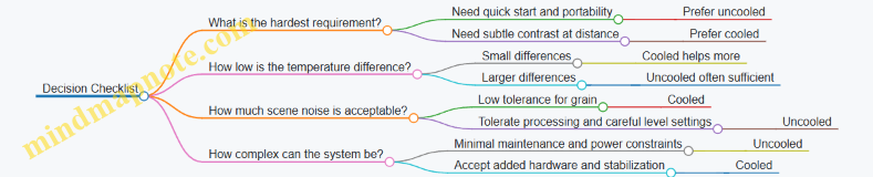
In short: uncooled thermal cameras are usually simpler and quicker to use, while cooled thermal cameras typically provide cleaner low-contrast detail and stronger sensitivity. The best choice depends less on “which is better” and more on which limitation will matter most in your scenes.
7.2 Explain Microbolometer Operation and Output Characteristics
A microbolometer is a tiny heat-sensitive detector array. Each pixel measures how much infrared energy arrives, then converts that energy into an electrical signal. The key trick is that the pixel is built to change resistance when its temperature changes, and the readout electronics translate that resistance change into a number you can display.
How a Microbolometer Pixel Works
Start with a pixel that contains an absorber layer and a temperature-sensitive element. Infrared radiation hits the absorber, which warms up slightly. That temperature rise changes the element’s electrical resistance. A bias circuit drives a small current (or voltage) through the element, so the resistance change produces a measurable change in voltage or current.
Because the temperature changes are small, the electronics must be careful. The readout typically uses a bridge-like measurement or a similar scheme to convert resistance change into a stable signal. The pixel does not “see” temperature directly; it sees energy that causes a temperature change in the detector structure.
What “Output Characteristics” Really Means
The output of a microbolometer system is not a raw temperature reading. It is an image signal shaped by several steps:
- Detector response: how resistance change relates to absorbed energy.
- Time behavior: how quickly the pixel warms and cools.
- Noise and drift: random fluctuations and slow changes in baseline.
- Calibration and correction: mapping the signal to a temperature-like scale.
- Display mapping: converting the corrected values into grayscale or color.
A practical way to think about it: the detector gives you a “brightness” proportional to absorbed infrared energy, and the camera firmware tries to interpret that brightness as temperature under assumptions about the scene and optics.
Time Response and Why It Matters
Microbolometers have a thermal time constant. That means the pixel output lags behind sudden changes in the scene. If a person walks across the field of view, the pixel response follows with a delay and smoothing. This shows up as motion blur or trailing in fast movement, especially when the camera is configured for higher frame rates or when the scene has strong contrast.
Example: Shine a flashlight spot on a wall and then move it quickly. A microbolometer image will show the spot’s edges less sharply than a detector with faster thermal response, because the pixel temperature cannot change instantly.
Noise Sources and Output Stability
Two common noise contributors are detector noise and readout noise. Detector noise includes random resistance fluctuations and thermal noise in the structure. Readout noise comes from amplifiers, analog-to-digital conversion, and clocking.
Drift is the slow part: the baseline response can shift due to temperature changes in the camera body or internal electronics. If drift were left uncorrected, a static scene would gradually brighten or darken over time.
To keep output stable, cameras use calibration routines. One widely used approach is non-uniformity correction, which compensates for pixel-to-pixel differences in responsivity and offset. Another is periodic reference measurements so the system can re-center its baseline.
Example: Point the camera at a steady indoor wall for several minutes. Without correction, you’d expect some pixels to wander relative to others, creating blotchy patterns. With correction, the image remains mostly consistent, though small noise still moves around.
Nonlinearity and Level Mapping
The relationship between absorbed energy and output is not perfectly linear. The absorber and sensing element have temperature-dependent behavior, and the electronics may apply gain and mapping curves.
That’s why “output characteristics” include how the camera maps signal to displayed levels. If you change the level settings (span and level), the same scene can look different even though the detector signal is the same. The camera is choosing how to distribute limited display range across the measured values.
Example: In a cold outdoor scene, the background might cluster near the low end of the detector’s dynamic range. If you set the level too high, the background becomes nearly uniform and small temperature differences disappear.
Mind Map: Microbolometer Operation and Output
A Concrete Walkthrough from Scene to Image
Imagine a camera looking at a warm hand against a cooler background. Infrared energy from the hand increases the absorber temperature in those pixels. The resistance changes, producing a higher electrical signal. The camera then corrects pixel offsets and non-uniformity so the hand appears as a coherent shape rather than a patchwork. Next, it applies a calibration curve to convert the corrected signal into a temperature-like value. Finally, it maps those values into grayscale or color based on the selected level settings.
If the hand moves quickly, the pixel thermal lag causes the edges to trail slightly, and the measured peak may be lower than the true instantaneous temperature. That behavior is part of the detector’s output characteristics, not a user error.
Summary of What You Should Expect
A microbolometer measures infrared energy by sensing tiny temperature changes in each pixel. Its output is shaped by time response, noise, drift, correction, and display mapping. When you understand those steps, you can interpret why a static scene looks stable, why motion can blur, and why changing level settings changes the apparent contrast.
7.3 Describe Detector Noise, Drift, and Calibration Methods
Thermal detectors and image intensifiers both turn incoming energy into electrical signals, but the electronics and the detector itself add their own “background” behavior. Detector noise is the random part; drift is the slow, systematic part. Calibration is the process of measuring those behaviors and compensating for them so the image reflects the scene rather than the sensor mood.
Detector Noise
Detector noise shows up as grain, speckle, or small pixel-to-pixel fluctuations that change from frame to frame. In thermal sensors, two common contributors are detector noise and readout noise. Detector noise comes from the sensing element’s internal randomness; readout noise comes from amplifiers, analog-to-digital conversion, and timing.
A practical way to reason about noise is to separate it into two effects:
- Noise floor: the lowest signal level you can distinguish from randomness.
- Noise structure: whether noise is uniform across the image or varies by pixel.
Example: Imagine a thermal camera pointed at a uniform wall at night. If the wall temperature is steady, the ideal output would be a flat image. Instead, you see small pixel variations. If those variations change every frame, that’s mostly random noise. If certain pixels always look slightly hotter or colder, that’s fixed-pattern noise.
Drift
Drift is the slow change in detector output when the scene stays the same. Drift can be caused by temperature changes in the detector package, aging of components, or changes in bias voltages and offsets. Drift is especially noticeable when you watch a static target for several minutes.
A useful mental model is to treat the detector output as:
- Offset: a baseline value even when the input is “zero.”
- Gain: how strongly the detector converts input energy into output.
- Nonuniformity: pixel-to-pixel differences.
Drift can affect offset and gain. If offset drifts upward, the whole image slowly brightens. If gain drifts, contrast changes over time even if the scene temperature is constant.
Example: Point a thermal camera at a car hood that you keep still. After a few minutes, the hood’s apparent temperature may creep. If the creep is mostly uniform across the image, offset drift is likely. If edges and textures change contrast more than the flat areas, gain drift or nonuniformity drift may be involved.
Calibration Methods
Calibration aims to estimate the detector’s offset, gain, and nonuniformity so the displayed image is corrected. Different methods exist, but they share a common structure: measure reference conditions, compute correction parameters, and apply them to incoming frames.
1) Flat-Field Correction Flat-field correction estimates how each pixel responds relative to others. A typical approach uses a reference view that approximates a uniform scene. The camera records a set of frames, computes per-pixel offsets and scaling factors, and stores them as a correction map.
Example: If one pixel consistently reads 2°C higher than its neighbors under the same conditions, flat-field correction subtracts an estimated offset for that pixel.
2) Offset Calibration Using Reference Views Some systems periodically switch to a reference target or internal shutter. This measures the detector output when the input is known (or at least stable). The measured reference updates the offset estimate.
Example: During a long observation, the system might take brief reference measurements between frames. If the reference output shifts by a small amount, the system adjusts the image so the background doesn’t slowly wander.
3) Gain Calibration and Level Mapping Thermal cameras often map detector output to a temperature scale using calibration curves. Gain calibration ensures that a known input produces the correct output level. Level mapping then converts corrected signals into the displayed temperature range.
Example: If the camera’s temperature scale is set so that a reference blackbody at a known temperature appears correct, then gain calibration helps keep that mapping consistent across time.
4) Temporal Averaging and Filtering Averaging multiple frames can reduce random noise, but it does not remove drift if the scene changes or the detector baseline moves during the averaging window. Filtering is most effective when combined with offset correction.
Example: Averaging 10 frames of a static target reduces grain. If the baseline drifts during those 10 frames, the average still shows a bias. That’s why drift compensation must be handled separately from noise reduction.
Mind Map: Detector Noise, Drift, and Calibration
Case Example: Keeping a Static Target Stable
Suppose you point a thermal camera at a steady scene and notice two issues: the image has grain, and the overall brightness slowly changes. A sensible workflow is:
- Apply flat-field correction so fixed-pattern pixel differences are reduced.
- Use periodic reference measurements to update offset so the baseline doesn’t wander.
- Use temporal averaging only after offset behavior is stabilized, so averaging reduces grain without smearing drift.
The result is an image that stays consistent over time, with less frame-to-frame variation and fewer persistent pixel artifacts.
7.4 Understand Image Stabilization, Flat-Fielding, and Correction
Understand Image Stabilization, Flat-Fielding, and Correction
Night thermal cameras and many image-intensified systems can produce images that look “almost right” but still mislead you. Three tools help: image stabilization to reduce shake, flat-fielding to correct pixel-to-pixel sensitivity differences, and correction to handle optics and sensor artifacts. Together, they make the picture consistent enough to measure and compare.
Image Stabilization: Keeping Motion from Becoming “Information”
Stabilization aims to separate real scene motion from camera motion. If the camera moves, edges smear and small temperature differences blur into each other. That matters because thermal contrast can be subtle.
There are two common stabilization paths:
- Optical or mechanical stabilization: a moving lens group or sensor shift counters camera shake.
- Digital stabilization: the device estimates motion between frames and warps frames to align them.
A practical example: you’re scanning a fence line at night. Without stabilization, the fence posts “jitter” and the gaps between posts appear to change width. With stabilization, the gaps stay consistent, so you can judge whether a warm object is behind a post or simply blurred by movement.
Stabilization has limits. Fast motion can exceed the correction bandwidth, and digital stabilization can introduce slight edge softness because it must resample pixels. The goal is not perfect stillness; it’s reducing the kind of blur that changes what you think you’re seeing.
Flat-Fielding: Fixing Uneven Pixel Sensitivity
Sensors rarely respond uniformly. Some pixels are slightly more sensitive, some less, and some drift over time. Flat-fielding corrects this by mapping the sensor’s “baseline” response.
The idea is simple: if you know how the sensor behaves when it should see a uniform input, you can compensate when it sees real scenes.
A concrete example: imagine a thermal sensor where a vertical stripe of pixels is 5% hotter than average due to manufacturing variation. In a dark scene, that stripe might look like a faint warm band even when nothing is there. Flat-fielding reduces that band by subtracting or scaling the stripe’s response.
Flat-fielding typically uses one of these approaches:
- Factory calibration maps: a stored correction table derived during production.
- In-field calibration: the system periodically measures a reference condition and updates correction parameters.
The correction table is usually applied per pixel using a gain and offset model. Gain correction scales the pixel response; offset correction shifts it. If you only correct one, you can still get residual banding or incorrect temperature levels.
Correction: Handling Optics, Non-Uniformity, and Artifacts
Flat-fielding addresses pixel sensitivity, but other effects still distort the image.
Common correction targets include:
- Non-uniformity across the field: residual banding after flat-fielding.
- Lens and window effects: vignetting or transmission differences across the image.
- Temporal drift: changes in sensor response over time.
- Bad pixels: pixels that behave abnormally and need replacement or masking.
A useful way to think about correction is as a pipeline:
- Stabilize the image so the same scene area lands on the same pixels.
- Normalize pixel responses using flat-field data.
- Compensate for remaining systematic artifacts using additional correction steps.
If you skip stabilization, flat-fielding can’t fully help because the scene moves across pixels between frames. If you skip flat-fielding, correction can’t reliably separate real temperature differences from sensor quirks.
Mind Map: How Stabilization and Correction Work Together
Example: Diagnosing a “Warm Band” Problem
You notice a faint horizontal warm band across the thermal image.
- Step 1: Check motion. If the band shifts position when you move the camera, stabilization or alignment is the issue.
- Step 2: Check fixed pattern. If the band stays in the same place relative to the frame, it’s likely pixel sensitivity or flat-field mismatch.
- Step 3: Check time behavior. If the band strength changes as the device warms up, temporal drift correction may be insufficient.
After applying stabilization and ensuring flat-field correction is active, the band should become weaker or disappear. If it persists, the correction stage may need to address lens vignetting, window transmission, or a small set of bad pixels.
Example: When Stabilization Helps and When It Doesn’t
You pan slowly across a yard. Stabilization keeps edges crisp, so you can track the outline of a warm object. Then you whip the camera quickly. The image still blurs because the motion exceeds what stabilization can compensate. The lesson is practical: stabilization improves measurement reliability for typical hand movement, but it can’t replace steady technique.
Quick Checklist for Consistent Images
- Stabilization is on and functioning before you compare frames.
- Flat-field correction is enabled and not skipped during the measurement window.
- You watch for fixed-pattern artifacts that stay locked to the frame.
- You treat edge softness from digital stabilization as a known limitation, not a scene feature.
7.5 Explain Frame Rate, Integration, and Motion Artifacts
Frame rate and integration time decide how a thermal sensor “collects” energy and how it “freezes” motion. In practice, they also determine which artifacts you’ll notice first: blur, streaks, or flicker.
Frame rate is how many complete images the device produces per second. Higher frame rate reduces motion blur because each frame represents a shorter time window. The tradeoff is that less time is available to gather signal, so the image may look noisier unless the sensor can compensate.
Integration time is the exposure period for each frame. During integration, the sensor accumulates signal. Longer integration improves signal-to-noise ratio in dim scenes, but it increases the chance that moving objects smear across pixels. Think of it like taking a photo with a slow shutter: the scene is “averaged” over the exposure time.
Motion artifacts appear when the scene changes during integration or between frames. The most common ones are:
- Smear and streaking: A moving hot object leaves a trail. This happens when the object moves significantly while the sensor is integrating.
- Frame-to-frame jitter: If the device updates quickly but the scene is unstable (handheld motion, vibration), edges can appear to “crawl” even when the object itself is steady.
- Temporal aliasing: If motion speed and frame rate interact poorly, the object can appear to move in steps or change shape between frames.
Mind Map: Frame Rate, Integration, and Motion Artifacts
Example: Walking Target and Integration Time
Imagine a person walking across the field of view. With a short integration time, the person’s edges stay relatively sharp, but the image may show more grain because each frame collected less signal. With a longer integration time, the person looks smoother and less noisy, yet the legs may appear stretched into a short streak. The streak length roughly corresponds to how far the person moves during the integration window.
A practical check is to compare two settings while keeping everything else constant: aim at the same spot on the ground, then walk at the same speed. If the streak length grows when integration time increases, you’ve confirmed that motion during exposure is the dominant artifact.
Example: Handheld Jitter and Frame Rate
Now consider a stationary wall with a small warm object (like a vent) while you hold the camera. Even if the object isn’t moving, your hand motion shifts the image slightly between frames. At higher frame rates, the device updates more often, so you may notice the object’s edges “shimmer” as the viewpoint changes. At lower frame rates, the shimmer can look slower, but the edges may smear more if integration is long. The key is that handheld motion adds its own motion component, separate from target motion.
A simple mitigation is to rest your elbows, use a stable stance, or mount the device. If the artifact reduces immediately when you stabilize, the artifact is mostly viewpoint jitter rather than sensor integration.
Example: Rotating Motion and Temporal Aliasing
A rotating fan or wheel provides a clear demonstration. If the wheel rotates such that a blade passes the same pixel locations at a repeating rhythm relative to the frame timing, the motion can appear to jump or change spacing between frames. This is not a “fault” so much as a timing mismatch: the sensor samples the motion at discrete moments, so the perceived motion depends on how those moments line up with the rotation.
To test this, rotate the wheel at a slightly different speed and observe whether the apparent stepping changes. If it does, temporal aliasing is likely involved.
Practical Reasoning for Choosing Settings
When you prioritize fast-moving targets, favor shorter integration or higher frame rate to reduce smear. When you prioritize low-contrast scenes with minimal motion, longer integration can improve readability by lowering noise. If you see streaks, reduce integration time or increase frame rate; if you see shimmering without streaks, stabilize the device or reduce viewpoint motion.
The goal isn’t to maximize one number. It’s to match the sensor’s time behavior to the scene’s motion behavior so the image represents the target, not the timing mismatch.
8. Thermal Performance Metrics and How to Read Them
8.1 Understand NETD and What It Means in Practice
NETD stands for Noise Equivalent Temperature Difference. It answers a simple question: how small a temperature difference can a thermal camera detect above its own noise? The unit is usually millikelvin (mK) or sometimes degrees Celsius, but the idea is the same.
A lower NETD number means the camera can see smaller temperature differences. That matters because real scenes rarely present clean, high-contrast heat patterns. A warm object might be only slightly warmer than its surroundings, and the camera’s noise can blur that difference into “maybe” instead of “yes.”
What NETD Measures in the Signal Chain
Thermal cameras convert incoming infrared radiation into an electrical signal, then process it into pixel values. Noise comes from multiple places: sensor noise, readout noise, and processing steps that can add or reveal variation. NETD is a way to roll those effects into one practical figure.
In practice, NETD is measured under controlled conditions using a target with a known temperature difference against a background. The camera is asked to detect that difference, and the smallest reliably visible delta is reported as NETD.
Here’s the key nuance: NETD is not a guarantee that every scene will show the same temperature sensitivity. It’s a baseline under specific test conditions, like a “tire pressure at the factory” number. Useful, but not the whole story.
Mind Map: NETD Meaning and Practical Implications
NETD in Practice with Concrete Examples
Example 1: Spotting a slightly warm object on a cooler surface Imagine a person’s hand resting near a wall. The hand might be only 2–3 °C warmer than the wall. If the camera’s NETD is relatively high, the hand edges may look soft, and the temperature difference may appear patchy. With a lower NETD, the hand shape becomes more consistent, and the boundary between hand and wall becomes easier to interpret.
The reason is straightforward: when the temperature delta is close to the noise floor, the camera’s pixel-to-pixel fluctuations can mask the true difference. NETD tells you where that noise floor sits.
Example 2: Detecting a small warm target Suppose you’re trying to see a warm vent that occupies only a few pixels. Even if the camera has a good NETD, the target’s signal is averaged with surrounding cooler pixels. That “mixing” reduces effective contrast, so the temperature difference you think you’re measuring is not the same as the contrast the sensor actually sees.
NETD helps with the noise part, but it doesn’t replace the need for adequate spatial resolution and proper focus.
Example 3: Comparing two cameras with different NETD values Camera A has NETD 30 mK, Camera B has NETD 50 mK. In a controlled test, A can detect smaller deltas. In the field, if your scene has strong contrast—say a hot engine block against a cold night sky—both cameras may perform similarly because the temperature difference is far above the noise. NETD becomes more decisive when the scene contrast is subtle.
How to Use NETD Without Misreading It
- Treat NETD as a sensitivity baseline, not a scene guarantee. If your target is far away, out of focus, or too small, the limiting factor may shift away from noise.
- Pair NETD with lens and target size. A camera can have excellent NETD but still struggle if the optics can’t concentrate enough signal into the pixels covering the target.
- Look for consistent contrast at the temperatures you care about. NETD is about detectability, but your job is usually to interpret shapes, edges, and boundaries. Those depend on more than one number.
Quick Practical Check You Can Do
Pick a scene with a gentle temperature gradient, like a warm object near a cooler background. View it at the same distance and focus settings. If small differences appear “grainy” and boundaries flicker between frames, you’re likely operating near the noise floor. If boundaries stay stable and the object stands out cleanly, you’re comfortably above it.
That stability is the real-world cousin of NETD: it’s what you notice when the camera’s noise stops being the loudest thing in the image.
8.2 Explain Spatial Resolution, Pixel Pitch, and Effective Detail
Spatial Resolution, Pixel Pitch, and Effective Detail
Spatial resolution tells you how finely a system can separate details in the scene. Pixel pitch describes the physical spacing of sensor elements, and effective detail is what you actually get after optics, processing, and sampling all do their jobs (or don’t).
Spatial Resolution: What It Measures and What It Doesn’t
Spatial resolution is often reported as a number of “pixels” or as a line-pair style metric. The useful way to think about it is: if two thin bright lines are close together, can the system show them as two lines rather than one thick smear?
A key nuance is that spatial resolution is not the same as “how sharp it looks.” Sharpness depends on contrast transfer too. If the system can separate edges but does so with low contrast, the image may still look soft.
Easy example: Imagine a fence at night. If the camera can resolve the spacing between fence slats, you can count them. If it can’t, you’ll see a single dark band with no clear slat spacing.
Pixel Pitch: Why Smaller Pixels Are Not Automatically Better
Pixel pitch is the distance between adjacent sensor elements. Smaller pitch means more pixels fit in the same sensor area, which can help with fine sampling. But smaller pixels also collect fewer photons per pixel for the same exposure.
That trade matters most in low light. If each pixel gets too little signal, noise rises and fine detail becomes harder to distinguish. In other words, you can have high pixel count and still end up with low usable detail.
Easy example: Two people try to read the same tiny text. One has a magnifying glass that makes the letters bigger, but their light is dim. The other has more light but less magnification. The “better” outcome depends on whether the text contrast survives the noise.
Effective Detail: The Result of Optics, Sampling, and Processing
Effective detail is the detail you can actually see and measure. It is limited by multiple bottlenecks:
- Optical resolution: Lenses blur and scatter light, reducing contrast at high spatial frequencies.
- Sampling: If the sensor sampling is too coarse, fine detail aliases into false patterns or becomes smeared.
- Signal-to-noise ratio: Noise masks small contrast differences.
- Processing: Denoising and sharpening can change perceived detail, sometimes helping edges and sometimes creating artifacts.
A practical rule of thumb is that you don’t get to keep the best of every component. The weakest link sets the ceiling.
Mind Map: Spatial Resolution to Effective Detail
How to Judge Effective Detail in Real Scenes
Start with a scene that has repeated structure: fences, building facades, or tree branches against a darker background. Then check three things.
- Edge clarity: Do edges look like edges, or like a gray gradient?
- Spacing visibility: Can you distinguish the spacing between repeated elements?
- Texture stability: If you slightly change focus or viewing angle, does the texture behave like real detail or like noise?
Easy example: Point a thermal camera at a brick wall. If the mortar lines are visible as separate dark gaps, you have good effective detail. If the wall becomes a uniform block with only broad temperature differences, spatial resolution and contrast transfer are not giving you usable separation.
Pixel Pitch Meets Optics: A Concrete Sampling Example
Suppose two systems have similar optics and one has smaller pixel pitch. The smaller pitch can sample finer detail, but only if the lens delivers enough contrast at those fine spatial frequencies. If the lens can’t, extra pixels just record blur more finely.
Easy example: Think of photographing a distant barcode. If the lens can’t render the bars distinctly, more pixels won’t magically create separation. They will just show a more detailed blur.
Quick Checklist for Effective Detail
- Look for separable repeated features, not just “more pixels.”
- Prefer high contrast at fine detail, not only high sampling.
- Remember that low light increases the noise penalty of small pixels.
- Treat processing as a modifier: it can improve edges, but it can also mask or invent detail.
Effective detail is the intersection of what the optics can form, what the sensor can sample, and what the signal-to-noise ratio can support. Pixel pitch is one input, spatial resolution is another measurement, and effective detail is the lived result.
8.3 Evaluate Lens F-number, Field of View, and Detection Range
Lens f-number (f/#), field of view (FOV), and detection range are linked through geometry and signal strength. Changing one often forces tradeoffs in the others, so it helps to treat them as a single system rather than three separate specs.
Lens F-Number and Why It Changes Detection
The f-number is the ratio of focal length to entrance pupil diameter. A smaller f/# means a larger entrance pupil, which gathers more light. For thermal cameras, that extra light typically improves signal-to-noise at the detector. For image intensifiers, it can improve effective visibility when the scene is dim, because more photons reach the photocathode.
A practical way to reason about it: if you stop down the lens (increase f/#), you reduce the light reaching the sensor. The image may still look sharp, but targets become harder to distinguish from noise and background texture.
Example: Two thermal setups use the same sensor and display settings. Setup A uses f/1.0, Setup B uses f/1.4. Setup B admits less light, so small, low-contrast temperature differences blend into the background sooner. You may still detect large hot objects at the same distance, but you lose confidence on smaller ones.
Field of View and How It Affects Target Size
Field of view is the angular width the lens shows. For a fixed sensor resolution, a wider FOV spreads the same pixels across more scene area. That reduces the number of pixels covering a target, which can lower detectability even if the lens is bright.
Think of it as “how many pixels you get to spend per target.” Detection range depends not only on whether the target is bright enough, but also on whether it occupies enough pixels to be distinguished.
Example: A 640×480 thermal sensor is paired with a wide lens and a narrow lens. At 100 m, a person might cover 10×15 pixels with the narrow lens but only 6×9 pixels with the wide lens. If your detection threshold requires a minimum pixel footprint, the wide lens may reduce detection range even if it looks “more informative” because it shows more of the scene.
Detection Range as a Chain of Requirements
Detection range is not a single property of the lens. It’s the distance where a target meets multiple conditions at once:
- The target signal is strong enough relative to noise.
- The target occupies enough pixels (spatial sampling) to be recognized as a distinct object.
- The optics deliver sufficient contrast and sharpness.
- Atmospheric effects and scene clutter don’t erase the target’s contrast.
Example: A small animal at night may be thermally detectable in a clean, cold background, but in a cluttered yard with mixed surfaces, the same animal can become harder to detect because background texture creates competing patterns.
Mind Map: How Lens Settings Drive What You Can See
A Simple Calculation Workflow
Use a repeatable workflow instead of guessing. Start with target size and desired confidence.
- Estimate target angular size at distance: angular size ≈ target size / distance.
- Convert angular size to pixel footprint using FOV and sensor width.
- Check whether the pixel footprint meets your practical threshold for “detect.”
- Adjust f/# to ensure the signal-to-noise supports that detection.
Example: Suppose a 0.5 m tall target. At 200 m, its angular height is about 0.5/200 = 0.0025 rad ≈ 0.143°. If your lens FOV vertically is 10°, then the target spans roughly 0.143/10 = 1.43% of the vertical image. On a 480-pixel tall sensor, that’s about 7 pixels tall. If your detection threshold is around 8–10 pixels tall for reliable spotting, you’re near the edge. A narrower lens (smaller FOV) increases pixel footprint; a brighter lens (lower f/#) improves contrast and noise margin.
Common Tradeoffs You Can Spot Quickly
- Wider FOV helps scanning, not necessarily detection range. It can reduce pixel footprint enough to shrink the range where small targets stand out.
- Lower f/# helps low-light or low-contrast scenes, but doesn’t fix poor sampling. If the target is too small in the image, more light won’t create pixels that weren’t there.
- Sharpness and aberrations matter at the edges. A lens that’s “fast” but soft can reduce contrast where you need it most.
Example Decision: Choosing Between Two Lenses
You’re monitoring a path where targets might be 1 m tall and appear anywhere from 50 m to 150 m.
- Lens A: wider FOV, f/1.2
- Lens B: narrower FOV, f/1.8
Lens B gives more pixels per target, which often improves detection for small objects. Lens A gives more light, which can help when targets are low contrast. If your targets are small and the background is cluttered, Lens B usually wins because sampling limits detection sooner than light does. If targets are large but barely above background noise, Lens A can extend the range.
The key is to decide which bottleneck is most likely: pixel footprint or signal-to-noise. Once you identify that, f/# and FOV stop being abstract numbers and start behaving like levers.
8.4 Interpret Contrast, Temperature Range, and Level Settings
Thermal cameras turn incoming infrared energy into pixel values, then map those values into an image you can interpret. Three settings control that mapping: contrast, temperature range, and level. If you treat them like “brightness knobs,” you’ll get images that look nice but don’t answer the question you actually asked.
Contrast
Contrast controls how strongly differences in temperature show up as differences in brightness (or color). Think of it as the slope of the mapping curve.
- High contrast makes small temperature differences easier to see, but it also exaggerates noise and can make the whole scene look busy.
- Low contrast smooths the image and reduces “texture,” but subtle targets can blend into the background.
Example: You’re scanning a yard where the ground is around 18°C and a person is around 30°C. With high contrast, the grass texture and wind-driven temperature variations become very visible. With moderate contrast, the person’s edges become clearer without turning the background into static.
A practical rule: adjust contrast so that the background has a calm, consistent look while targets still show clear boundaries. If you can’t tell whether a dark patch is a target or just noise, contrast is probably too high.
Temperature Range
Temperature range sets the span of temperatures that the camera maps into the display. It defines the endpoints of the mapping curve.
- Range too wide: everything compresses into a narrow band of display values, so targets look flat.
- Range too narrow: small changes near the endpoints can saturate, causing clipped highlights or clipped shadows.
Example: Suppose the scene includes a warm vehicle at 45°C and a cooler wall at 15°C. If you set the range to 0–80°C, the wall and person might both land in the same mid-display region, reducing separation. If you set the range to 10–50°C, the wall sits near the lower end and the vehicle near the upper end, giving the camera room to show meaningful differences.
When you adjust range, watch for two signs:
- Clipping: very warm areas become featureless “blobs,” and very cool areas become uniform dark patches.
- Loss of separation: targets that should stand out appear to have the same tone as the background.
Level
Level shifts the center of the temperature mapping. If range is the width, level is the midpoint.
- Level too low: most of the scene sits above the midpoint, so cool targets may disappear into the darker half.
- Level too high: warm targets may lose detail because they get pushed toward the upper end.
Example: You’re looking for a hand-sized heat source on a relatively uniform surface. The surface is around 22°C, and the target is around 30°C. If the level is set near 10°C, the surface and target both map into the upper half, shrinking the visible difference. If the level is set near 26°C, the mapping centers on the temperatures you care about, making the target’s contrast more consistent.
How Contrast, Range, and Level Work Together
These settings interact because they shape the same mapping curve. A good workflow is to set range and level first, then fine-tune contrast.
Mind Map:
A Concrete Tuning Sequence
Use this sequence when you start a session or when conditions change.
- Pick a range that brackets the scene. Start with a range that includes both the coldest and warmest major elements you expect.
- Set level near the background temperature. The background should occupy the middle of the display so targets can move up or down from it.
- Adjust contrast for edge clarity. Increase until target boundaries are distinct, then back off slightly if the background becomes noisy.
- Confirm with a quick scan. Move your view across the scene. If new areas suddenly clip or flatten, your range and level aren’t bracketing the full variability.
Case Study:
- Scene: night parking lot with asphalt at ~12°C, a wall at ~14°C, and a person at ~28°C.
- Range set to 0–40°C: person appears, but the wall and asphalt look too similar.
- Range narrowed to 8–32°C: asphalt and wall separate slightly, and the person gains visible structure.
- Level set near 14°C: the person’s temperature difference becomes more consistent across the frame.
- Contrast increased until the person’s outline is clear without turning the asphalt into grain.
The goal isn’t to make the image “look good.” It’s to make the mapping match the temperatures you’re trying to compare, so differences correspond to real thermal differences rather than display settings.
8.5 Validate Performance With Realistic Scene Targets
Validation is where specs meet reality. A device can look great on a chart and still disappoint when the scene has mixed lighting, cluttered backgrounds, and imperfect focus. The goal here is to test detection and identification in conditions that resemble your actual use, using targets you can repeat and measure.
Define What “Good” Means Before You Start
Start by writing two short statements:
- Detection goal: “I can reliably notice a target at X distance under Y conditions.”
- Identification goal: “I can reliably distinguish target features at X distance under Y conditions.”
Example: If you’re checking for people near a trail, detection might mean “see a human-shaped figure,” while identification might mean “tell a person from a bush.” Keep these separate because they often happen at different ranges.
Choose Realistic Targets That Stress the Right Weaknesses
Use a small set of targets that cover common failure modes.
- Low-contrast targets: matte objects that blend into the background.
- Example: a dark backpack placed on dark soil, or a pale object against light sand.
- Bright-source stress: reflective surfaces or direct headlights.
- Example: a small reflective sign angled toward the device, or a car headlamp pointed away from the lens to avoid total washout.
- Partial occlusion: targets behind branches or fence gaps.
- Example: a mannequin torso behind a wire mesh so only the upper body is visible.
- Motion and micro-motion: slight movement that changes edges.
- Example: a target on a string swaying a few centimeters, or a person walking slowly across the field.
- Atmospheric clutter: fog, mist, or light rain.
- Example: test on a damp evening after a light drizzle when visibility is reduced but not zero.
For thermal validation, remember that “same object” can look different depending on surface temperature and wind. For intensification, “same object” can look different depending on illumination and reflections.
Build a Repeatable Test Layout
Consistency matters more than fancy targets.
- Fix the geometry: tripod height, device mounting position, and viewing angle.
- Lock focus: set focus once, then avoid touching the ring during a run.
- Use the same distances: mark positions with measured tape or known landmarks.
- Control exposure conditions: for intensification, keep ambient light stable; for thermal, keep the scene conditions stable long enough to run comparisons.
Example workflow: Place five targets at 25, 50, 75, 100, and 125 meters. Run three passes per target, recording the farthest distance where detection is consistent.
Use a Simple Scoring Method Instead of “Looks About Right”
Create a score sheet with clear criteria.
- Detection score: 0 = not seen, 1 = seen but uncertain, 2 = seen with confidence.
- Identification score: 0 = cannot distinguish, 1 = rough category, 2 = clear category.
Example: A person-shaped figure behind brush might score detection = 2 at 80 m, but identification = 1 at 80 m and identification = 2 only at 60 m.
Mind Map: Validation with Realistic Targets
Example Test Plan for Intensification
Pick one night with stable ambient light.
- Target set: dark backpack (low contrast), reflective sign (bright stress), mannequin behind mesh (occlusion).
- Distances: 30–150 m in 20–30 m steps.
- Procedure: one observer, three runs per distance, no focus changes.
What you’re looking for: if detection drops sharply at a certain distance only for the reflective sign, you’re likely hitting blooming/halo limits rather than true resolution limits.
Example Test Plan for Thermal
Pick a time when the targets have distinct temperatures from the background.
- Target set: insulated container (cooler than ground), warm bottle (warmer than ground), person-shaped target partially covered by a board.
- Distances: 10–120 m depending on lens.
- Procedure: run detection and identification scoring while keeping the device level and focus fixed.
What you’re looking for: if the warm bottle is easy but the person-shaped target is hard, the issue may be edge definition and contrast against clutter, not overall sensitivity.
Interpret Results Without Getting Tricked by Artifacts
Artifacts can masquerade as performance.
- Halo or bloom: bright edges can make a target “appear” larger than it really is.
- Example: a reflective sign may look like a bigger object, inflating identification confidence.
- Noise patterns: thermal can show speckle that resembles small features.
- Example: a low-contrast object might be “seen” briefly during a noisy moment, scoring detection = 1 rather than 2.
When a run fails, note which target type caused the failure. That single detail helps you decide whether the limitation is contrast, optics, focus, or scene conditions.
Record Results in a Way You Can Compare
Use a compact table for each device and each night.
- Rows: target type
- Columns: farthest detection distance, farthest identification distance, and a short note about artifacts (halo, glare, streaking, noise speckle)
Example note: “Low-contrast target: detection consistent to 70 m, identification to 50 m; background clutter caused false edges.”
Validation is successful when your scoring and layout let you explain the results in plain language. If you can’t say why a target failed, the test isn’t specific enough yet.
9. Image Processing Features in Both Technologies
9.1 Explain Automatic Gain Control and Its Side Effects
Automatic Gain Control, or AGC, is the part of an imaging system that tries to keep the picture from looking either too dark or too washed out when lighting changes. It does this by adjusting the amplification applied to the incoming signal. The goal sounds simple: keep the display usable. The side effects are where the real trade-offs live.
How AGC Works in Practice
An intensifier or thermal sensor produces a signal proportional to scene brightness and sensor response. AGC monitors that signal level and changes gain so the output stays within a target range for the display. In a low-light scene, gain rises to make faint details visible. In a bright scene, gain falls to prevent highlights from saturating.
A helpful mental model is a dimmer switch on a lamp. If you walk from a hallway into sunlight, the dimmer turns down automatically. You can still see the room, but the dimmer’s behavior affects how quickly things look “normal.”
The Main Side Effects
Pumping and Breathing
AGC often updates gain over time rather than instantly. When the scene brightness fluctuates—like headlights sweeping across a road—the gain can chase the change. The result is “pumping,” where the image brightness rises and falls even if the scene itself is steady.
Example: You’re scanning a dark field. A distant vehicle passes, and the beam crosses your view. With AGC, the background may brighten after the beam arrives and then dim again after it leaves. The motion of the gain makes the background feel like it’s breathing.
Highlight Clipping and Detail Loss
If AGC reacts too slowly, a sudden bright source can push the signal beyond what the system can represent. Once clipped, the lost highlight detail is gone. Even if AGC later reduces gain, the clipped frames stay clipped.
Example: A bright porch light turns on while you’re observing a doorway. The doorway edges may look fine, but the light itself can bloom or flatten, and the surrounding contrast may temporarily drop.
Noise Amplification in Dark Regions
When AGC increases gain to reveal faint features, it also amplifies noise. Noise is not just “random speckle”; it can become structured in the display due to processing and sensor behavior.
Example: In a moonless alley, AGC boosts gain so you can see a fence line. The fence becomes visible, but the sky area fills with grain. If you then look at a brighter wall, the system reduces gain and the grain decreases.
Flicker and Level Instability
Some systems update gain frequently. If the update rate is noticeable, the image can appear to flicker, especially in scenes with mixed brightness (dark foreground, bright background).
Example: Watching a person move near a lit window. As the person’s silhouette crosses the window’s brightness gradient, the gain changes and the overall image level can shift frame to frame.
Reduced Perceived Contrast
AGC aims for a stable display level, but that can reduce the contrast you would otherwise get from the scene’s natural brightness differences. The system may “compress” the dynamic range.
Example: A trail with a bright path and darker edges. With AGC, the path may not look as bright relative to the edges, making it harder to judge depth and shape.
Choosing Settings and Operating Techniques
Even without changing hardware, you can manage AGC behavior through mode selection and workflow.
- Prefer a mode that matches your expected scene variation. If you’re mostly scanning a stable environment, a less aggressive AGC behavior can reduce pumping.
- When a bright source is likely, position yourself so the bright source is outside the main field of view. That reduces the chance of gain being driven by a single intense area.
- Use brief observation windows for identification. If AGC is actively changing gain, take your “read” after the image settles.
Mind Map: Automatic Gain Control and Side Effects
Quick Example Walkthrough
Imagine you’re monitoring a doorway at night. Early on, the scene is mostly dark, so AGC raises gain and the threshold details—like door edges—become clearer. Then someone turns on a lamp inside. The lamp drives the signal up, AGC reduces gain, and the overall image level drops. During that transition, you may notice the doorway edges look less crisp because the system is rebalancing. If you wait a second after the lamp stabilizes, the image typically becomes steadier, and your identification cues are more reliable.
AGC is useful because real scenes change. Its side effects are the cost of trying to keep one display level across wildly different lighting conditions.
9.2 Understand Noise Reduction, Smoothing, and Edge Preservation
Noise reduction is the art of making the image less “grainy” without erasing the things you actually care about, like edges, text, and small targets. In night vision and thermal systems, noise shows up differently, but the tradeoff is the same: the more you average, the more you risk turning crisp boundaries into soft blobs.
What Noise Looks Like in Practice
In intensified imagery, noise often appears as fine speckle and small brightness fluctuations that vary with illumination and tube behavior. In thermal imagery, noise can look like pixel-to-pixel temperature jitter, sometimes with fixed-pattern components that repeat across frames.
A useful way to think about noise is to separate it into two buckets:
- Random noise: changes from frame to frame, like salt-and-pepper flicker.
- Structured noise: repeats in a pattern, like a faint grid or banding.
Noise reduction methods usually target one bucket more effectively than the other.
Smoothing Without Losing the Plot
Smoothing reduces local variation by averaging nearby pixels. A simple mental model: if you replace each pixel with a weighted average of its neighbors, random noise drops because it cancels out. Edges also get averaged, because edges are also local variation—just the useful kind.
That’s why edge preservation matters: you want smoothing inside regions while avoiding smoothing across boundaries.
Edge Preservation Strategies
Edge-preserving filters decide whether two neighboring pixels belong to the same “region.” If they likely belong together, smoothing is allowed. If they likely cross an edge, smoothing is reduced.
Common cues include:
- Local gradient: if brightness changes sharply, treat it as an edge.
- Local variance: if the neighborhood is already inconsistent, be cautious about averaging.
- Directional behavior: smoothing can be stronger along an edge than across it.
Even without naming the exact algorithm, you can recognize the behavior by how the image responds to a high-contrast target, like a fence line or a person’s silhouette.
How to Tell Whether Processing Helped or Hurt
Use a small set of checks during setup:
- Look at thin features: wires, branches, or the edge of a vehicle. If they widen or fade, smoothing is too aggressive.
- Check for “halos”: if bright objects develop a light ring or dark object develops a shadowy rim, the filter may be overshooting.
- Assess temporal stability: in video, random noise reduction should reduce flicker. If the image “breathes” in brightness, the processing is reacting too strongly to frame changes.
- Compare near and far targets: some systems smooth more in low detail areas, which can make distant targets look flatter.
Mind Map: Noise Reduction and Edge Preservation
Example: Fence Line Under Different Smoothing Levels
Imagine a fence at night with a bright headlight behind it. With minimal noise reduction, the fence wires look sharp but grainy. With moderate smoothing, the grain drops and the fence becomes easier to follow. With heavy smoothing, the wires start to merge into thicker lines, and the spacing between posts becomes harder to see.
A practical rule: if you can no longer count individual elements (posts, links, slats) at the same distance where you could before, the smoothing is too strong for identification tasks.
Example: Thermal Target Edges with Pixel Jitter
Thermal images often show a target’s interior temperature more consistently than its boundary. If smoothing is too aggressive, the boundary can drift inward or outward, especially when the target is only slightly warmer than the background. The result is a “soft edge” that makes range estimation and shape recognition less reliable.
A good test is to focus on the silhouette against a uniform background. If the outline stays stable while the interior noise decreases, edge preservation is doing its job.
Example: When Noise Reduction Creates False Detail
Sometimes processing can make noise look like structure. For instance, if a filter tries to average across a boundary but misclassifies it, it can create faint streaks or repeated textures that weren’t present in the raw signal. The tell is inconsistency: the “detail” changes when you slightly adjust focus or angle, even though the scene hasn’t changed.
Practical Takeaway
Noise reduction should be treated like a dial with a purpose, not a checkbox. Use thin edges and silhouettes as your measuring tools, and tune smoothing so that random variation decreases while boundaries remain trustworthy.
9.3 Interpret Dynamic Range Handling and Highlight Clipping
Dynamic range handling is how a device turns a wide range of scene brightness into a limited set of displayable values. Night vision and thermal systems both face the same practical problem: the real world has highlights that can be much brighter than the dim areas you care about. The device must decide what to preserve—detail in shadows, detail in highlights, or a balanced compromise.
What Dynamic Range Handling Actually Does
Most displays can show only a finite number of brightness steps. The imaging chain produces a signal with its own range, then maps that signal into display values. That mapping is usually adaptive, meaning it changes based on the current scene.
A simple way to think about it: the device sets a “working window” for brightness. Values below the window get compressed toward black; values above the window get compressed toward white. When the window is too narrow for the scene, highlights hit the top of the mapping and lose detail.
Highlight Clipping and Why It Happens
Highlight clipping occurs when the signal exceeds the maximum representable level after processing. On a display, clipped regions look like flat white or flat bright areas with no texture. The key nuance is that clipping can happen even when the scene is not “bright” to your eyes—if the device’s processing chooses a window that is too low for that moment.
For example, imagine a dark path with a distant porch light. Your eyes adapt slowly, but the device may adapt quickly. If it chooses settings optimized for the dark path, the porch light can exceed the top of the mapping. The result is a glowing blob where you expected to see the lamp housing or nearby signage.
How Automatic Mapping Choices Affect What You See
Dynamic range handling often includes automatic gain or level control. When it raises gain to reveal faint details, it also raises the risk that bright sources will clip. When it lowers gain to protect highlights, it can bury subtle contrast in shadows.
A practical example: in a parking lot at night, a thermal camera might show a car’s body clearly but clip the sky area behind it into a uniform bright tone. That clipped sky isn’t “wrong” so much as it’s outside the camera’s chosen temperature-to-display mapping for that frame.
Reading the Signs in Real Scenes
Look for three common visual cues:
- Flat-top highlights: bright areas with no internal structure.
- Loss of edge detail near bright objects: halos may appear because the processing is trying to keep edges while compressing the rest.
- Sudden brightness shifts when you pan: the mapping window changes as the scene content changes.
If you see flat-top highlights, assume the device is saturating the top end. If you see crushed shadows, assume the bottom end is being compressed.
Example Scenarios with Clear Outcomes
Example: Headlights in a Dark Road View
- If dynamic range handling prioritizes shadow visibility, the headlight beams may clip into bright disks.
- If it prioritizes highlight protection, the road surface may look darker, and small tire marks can become harder to distinguish.
- A good workflow is to adjust settings so that you can still see the target area you care about, not just the brightest object.
Example: Thermal View of a Building Facade
- A warm window can clip into a uniform bright patch.
- Meanwhile, cooler wall regions might still show texture if the mapping window spans enough of the scene’s temperature spread.
- If the window is clipped but the wall detail is useful, you’ve effectively chosen a mapping that favors identification over exact temperature nuance.
Mind Map: Dynamic Range Handling and Highlight Clipping
Best Practices for Interpreting Clipping
First, decide what “detail” matters for your task: identifying a target shape, reading a sign, or detecting a faint object. Then interpret clipping as a trade-off signal, not a defect by itself.
Second, use motion to your advantage. If you pan slowly and the highlight behavior changes, you’re seeing adaptive mapping. That means the device is re-centering its working window, and the clipping you observe is tied to the current frame composition.
Finally, treat clipped highlights as information about the mapping window. Flat bright regions tell you the top end is saturated, while crushed shadows tell you the bottom end is compressed. When you can name which end is failing, you can choose settings that protect the part of the scene you actually need.
9.4 Use Polarity, Contrast Modes, and Filters Effectively
Polarity, contrast modes, and filters are the “image language” controls that decide how the same raw sensor data becomes something your eyes can interpret quickly. The goal is not to make the picture prettier; it’s to make the right details easier to separate from the background.
Polarity: Flip the Meaning Without Changing the Scene
Polarity swaps which tones are treated as “bright” versus “dark.” In image intensification, this often changes whether the phosphor output shows dark objects as dark silhouettes or as bright shapes against a darker background. In thermal, polarity typically swaps between black-hot and white-hot (or similar inversions).
How to use it effectively
- Start with the polarity that matches your task. If you’re scanning for movement, choose the polarity that makes edges easiest to see at your typical viewing distance.
- Watch for “background dominance.” If bright sky, headlights, or hot ground fills most of the display, invert polarity and see whether the target contrast improves.
- Keep it consistent during a scan. Switching polarity every few seconds makes your brain re-learn the scene each time, which slows detection.
Example: Thermal black-hot vs white-hot
- In a cold yard at night, a person’s body is warmer than the grass. With white-hot, the person stands out as a bright shape. With black-hot, the person becomes a dark shape. If the grass is also unevenly warmed by nearby structures, one polarity may reduce confusion by making the target stand out more cleanly.
Contrast Modes: Choose the Mapping That Fits the Lighting
Contrast modes change how the device maps sensor values to display brightness. Two common behaviors are:
- Linear or near-linear mapping, which preserves relative differences but can look flat when the scene has low contrast.
- Nonlinear mapping, which boosts mid-tones or compresses highlights to reveal details in specific ranges.
Practical rules
- Low-contrast scenes need contrast boosting. Examples include foggy nights, overcast skies, or snow where everything is similar in brightness.
- High-contrast scenes need highlight control. Examples include strong streetlights, vehicle headlights, or reflective surfaces that can wash out detail.
- Use contrast modes to manage “where the device spends its brightness.” If the display brightness is mostly consumed by highlights, you’ll lose detail in shadows no matter how sharp the optics are.
Example: Intensified image with bright streetlights
- Suppose you’re observing a doorway near a streetlamp. In a high-contrast mode, the lamp’s glare may be compressed so the doorway frame and the area just inside it remain visible. In a low-contrast mode, the lamp can dominate the screen and hide the doorway edges.
Filters: Reduce Unwanted Light and Improve Usability
Filters are not just “extra glass.” They can remove specific wavelengths or reduce certain kinds of glare so the sensor receives a cleaner signal.
Common filter effects
- IR-cut or IR-pass behavior changes what the system emphasizes. For intensified systems, the goal is often to match the illuminator wavelength to what the device is most sensitive to.
- Spectral filters can reduce the impact of ambient light sources that would otherwise raise the noise floor.
- Anti-reflection and glare control help when you’re dealing with wet surfaces, glass, or direct light entering the optics.
Example: Wet pavement and reflections
- On a rainy street, reflections can create bright patches that trigger automatic brightness adjustments. Applying the appropriate filter (or switching to a mode that behaves like one) can reduce those bright patches so the target’s edges remain visible.
Mind Map: How to Choose Polarity, Contrast, and Filters
A Simple Decision Workflow
- Look at the background first. If the background is overwhelming (too bright or too uniform), try polarity inversion before changing contrast.
- Then address the brightness distribution. If highlights are washing out detail, switch to a contrast mode that compresses highlights.
- If the image still looks “busy,” check the light path. Use the relevant filter setting to reduce glare or mismatched illumination.
- Re-check edges, not just brightness. The best setting is the one that makes object boundaries stable and readable as you move your view.
Example: Quick setup for a roadside check
- You see a bright headlight source and a darker vehicle silhouette. First, invert polarity to see which one makes the vehicle edges clearer against the road. Next, choose a contrast mode that prevents the headlight from flattening the rest of the scene. Finally, if reflections on the road keep blooming, apply the filter setting that reduces that glare behavior. The final test is simple: pan slowly and confirm that the vehicle outline stays visible without “breathing” or smearing into the background.
9.5 Avoid Misleading Artifacts From Processing
Night vision and thermal systems both run image processing to make scenes usable. The catch is that processing can also create convincing-looking details that never existed in the original scene. This section focuses on how to spot those artifacts, why they happen, and what to do instead.
What “Misleading” Looks Like
Misleading artifacts usually fall into a few repeatable patterns. You might see edges that look too crisp, textures that appear where there should be smooth surfaces, or bright spots that move when you change gain or level settings. A good rule: if a feature’s behavior changes faster than the scene could physically change, processing is likely involved.
Common Processing Artifacts and Their Causes
-
Edge halos and outline glow
- Cause: Contrast enhancement or sharpening increases local differences, then blends them back with a halo-like transition.
- Example: A fence at night appears with a bright rim, while the interior stays dim. When you slightly defocus, the rim stays more stable than the fence edges, which is a tell.
- Check: Reduce sharpening or switch to a less aggressive contrast mode. If the “rim” shrinks while the fence remains, it was enhancement.
-
Noise reduction that smears small motion
- Cause: Temporal averaging reduces noise by combining frames, but moving objects get averaged into streaks or softened blobs.
- Example: A person walking slowly leaves a short trail that looks like a second body outline. The trail length changes with frame rate or integration settings.
- Check: Compare a short burst of frames with a longer exposure or higher smoothing. If motion trails grow with smoothing, you’re seeing processing.
-
Highlight clipping and “detail popping”
- Cause: Automatic gain or dynamic range compression maps bright areas into a limited output range. Once clipped, subtle structure disappears.
- Example: Headlights or a bright window turn into a flat white disk with no texture, even though the scene should have glare gradients.
- Check: Lower gain/level or use a mode that preserves highlights. If texture returns, the original was clipped.
-
False textures from denoising
- Cause: Some denoisers try to reconstruct plausible patterns. They can invent grain-like texture on smooth surfaces.
- Example: A wall that should be uniform shows “brick-like” micro-contrast that changes when you adjust noise reduction.
- Check: Temporarily disable noise reduction or choose a lower strength setting. Real texture stays consistent; invented texture often shifts.
-
Thermal level and span misinterpretation
- Cause: Thermal images are mapped through level and span. Poor settings can make temperature differences look larger or smaller than they are.
- Example: A warm engine looks like it has sharp borders, but those borders soften when you widen span.
- Check: Adjust level and span until known reference areas (like a neutral ground patch) appear stable in tone.
Mind Map: Processing Artifacts to Watch For
Practical Workflow to Reduce False Confidence
Start with settings that minimize aggressive processing, then add back only what you need.
-
Stabilize the scene first
- Hold the device steady and avoid rapid panning. Processing artifacts often become obvious during motion.
-
Use a reference target
- Pick one stable object: a flat wall, a road patch, or a distant sign. Watch how its tone and edges change when you adjust processing.
-
Change one control at a time
- If you adjust gain, noise reduction, and contrast together, you can’t tell which control created the artifact.
-
Prefer consistency over “pretty”
- A cleaner image isn’t automatically a more truthful one. If a feature appears only under a specific processing mode, treat it as suspect.
Case Study: Fence Line at Night
A user sees a fence with bright outlines and small “sparkles” along the wires.
- Observation: The outline brightness increases when noise reduction is turned up.
- Reasoning: Higher noise reduction can increase edge contrast while smoothing interior noise, producing a rim effect.
- Action: Reduce sharpening and noise reduction strength, then slightly defocus.
- Result: The rim weakens and the sparkles reduce. The fence becomes less dramatic but more believable.
Quick Self-Checks
- If an artifact moves when the scene doesn’t, processing is likely.
- If a feature disappears when you reduce contrast enhancement, it may be an edge artifact.
- If motion trails lengthen with smoothing, temporal averaging is the culprit.
- If thermal borders change with level/span, the “shape” is partly a mapping choice.
The goal isn’t to eliminate processing; it’s to understand how it can reshape what you think you’re seeing, then choose settings that keep the image honest.
10. Practical Setup, Calibration, and Field Workflow
10.1 Perform Pre-Use Checks for Optics, Focus, and Alignment
Before you trust what you see at night, spend a few minutes proving the system is behaving. Pre-use checks are not about perfection; they’re about catching the small, fixable issues that turn “mostly clear” into “why is that blurry?”
Inspect Optics and Surfaces
Start with a visual sweep of the objective lens, eyepiece, and any protective windows. Look for dust, fingerprints, smears, and tiny chips at the edges. Even a thin film can reduce contrast, especially when you’re working with low light or bright point sources.
Example: If you see a soft haze around bright lights, wipe the objective with a proper lens cloth and check again. If the haze disappears, you’ve solved a contrast problem without touching focus.
Also check for loose lens caps, missing covers, and mis-seated filters. A filter installed backward or not fully seated can shift focus and create odd color or brightness behavior.
Verify Mechanical Security
Confirm that the housing is tight and that mounts, rails, and adapters are snug. A slightly loose mount can cause micro-shifts that look like focus drift. For head-mounted or handheld setups, check the strap tension and the stability of the device relative to your head.
Example: If the image sharpness changes when you move your head, the issue is often mechanical play rather than optics.
Set Focus Correctly for the Viewing Mode
Focus depends on whether you’re using an intensifier tube, a thermal display, or a combination. For intensified systems, you typically have a diopter adjustment for your eyes and a focus ring for the objective. For thermal systems, you may have a focus mode, but many units rely on fixed focus and emphasize level/span and lens calibration.
Best practice: Do focus in a controlled order.
- Set the diopter to a neutral starting point.
- Focus on a high-contrast target at a known distance.
- Lock or note the diopter setting so you can return to it.
Example: Use a distant sign, a building edge, or a tree line with branches. Avoid focusing on a single bright light source; it can “look sharp” while the rest of the scene remains soft.
Confirm Alignment and Eye Relief
Alignment checks ensure the optical axis matches your viewing position. If the exit pupil is not aligned with your eye, you can get vignetting, reduced brightness, or a “floating” image.
For binocular systems, check both sides match in brightness and sharpness. If one side is softer, don’t immediately blame the lens; confirm the diopter setting and that the eyecups are positioned consistently.
Example: If the left side shows darker corners while the right side looks normal, adjust eye position and eyecup height before changing any focus.
Use a Simple Target Routine
A repeatable routine prevents you from chasing ghosts. Choose three target types: a bright point, a mid-contrast edge, and a low-contrast texture.
Example routine:
- Bright point: a distant streetlight or vehicle headlamp.
- Mid-contrast edge: a fence line or roof ridge.
- Low-contrast texture: tree bark, grass clumps, or a wall with subtle shading.
If bright points bloom but edges remain crisp, you’re likely seeing expected behavior from the system’s dynamic range rather than a focus failure.
Check for Common Pre-Use Failure Signals
Watch for these practical indicators:
- Persistent blur across the whole image: focus or lens seating.
- Flicker or unstable brightness: power connection, battery contact, or internal settings.
- Uneven brightness between sides: diopter mismatch or misalignment.
- Strange artifacts that move with your eye position: eye relief or vignetting.
Example: If brightness changes when you tilt the device slightly, re-seat the mount and verify the eyepiece alignment.
Mind Map: Pre-Use Checks for Optics, Focus, and Alignment
Case Study: Fixing a “Soft Image” in Minutes
A user reports that the image looks soft at night. The first check finds a fingerprint smear on the objective. After cleaning, the bright points stop looking hazy, but edges are still not crisp. Next, the user redoes focus using a fence line at a consistent distance and sets the diopter back to the recorded value. Finally, the user confirms eyecup height and exit pupil alignment. The image becomes sharp across the scene, and the bright points behave normally.
The key lesson is sequencing: clean first, then mechanical stability, then focus, then alignment. Each step narrows the cause without changing multiple variables at once.
10.2 Calibrate Thermal Level and Span for Consistent Readings
Thermal cameras map measured infrared energy into a temperature scale using two main controls: Level (the center temperature) and Span (the width of temperatures mapped across the display). If Level and Span are set well, the same physical scene produces similar-looking images and comparable temperature readouts. If they’re set poorly, the camera can “spend” its display range on unimportant parts of the scene, making everything else look flat.
What Level and Span Actually Do
Level shifts the temperature center. Think of it like moving the midpoint of a ruler: values above and below Level still show contrast, but the whole mapping shifts.
Span sets how much temperature range fits into the display. A narrow Span stretches small temperature differences into bigger visual contrast, but it also increases the chance of clipping when the scene contains hotter or colder areas.
A practical way to remember it: Level decides where the ruler sits; Span decides how long the ruler is.
A Simple Calibration Workflow
- Start with a stable scene: choose a target area that won’t change quickly, such as a wall, a paved surface, or a stationary vehicle. Avoid moving people and rapidly changing sunlight.
- Set a reasonable initial Level: use the camera’s temperature readout for a representative region (for example, the middle of the scene). If the camera supports a “spot” or “cursor” reading, place it on that region.
- Set Span to avoid clipping: adjust Span so that the hottest and coldest meaningful regions in the scene are both visible without saturating to the top or bottom of the scale.
- Lock in the settings for the task: once Level and Span are chosen, don’t keep adjusting them while comparing frames. Consistency matters more than “pretty contrast.”
Mind Map: Level and Span Calibration Logic
Example: Outdoor Yard with a Warm Vehicle
Imagine you’re scanning an outdoor yard at night. A parked vehicle is warmer than the ground.
- Step 1: Choose a representative region: place the cursor on the ground near the vehicle, not on the brightest reflection or a dark shadow edge.
- Step 2: Set Level: set Level close to the ground’s typical temperature.
- Step 3: Set Span: increase Span until the vehicle’s body is visible without flattening into the maximum color/gray level. If the vehicle saturates, reduce Span or shift Level slightly toward the vehicle temperature.
What you should see: the ground should show gentle gradients rather than a single uniform tone, and the vehicle should show structure (panels, contours) without turning into a solid block.
Example: Indoor Room with Cold Walls and a Warm Door
In an indoor space, walls may be cooler while a door or equipment surface is warmer.
- Set Level near the wall temperature if your goal is to detect subtle temperature differences on the walls.
- Use a wider Span if the warm door is present and you need both areas to remain readable.
If you instead use a very narrow Span centered on the wall, the warm door may clip and lose detail. That might be acceptable if you only care about wall anomalies, but it will break comparisons if you later try to interpret door temperatures.
Verification Checks That Prevent “Good-Looking, Wrong” Readings
- Clipping check: if large areas are stuck at the top or bottom of the scale, Span is too small for the scene. Increase Span or shift Level.
- Uniformity check: if everything looks the same tone, Span is too wide or Level is far from the scene’s useful temperature range.
- Cursor sanity check: confirm that the cursor reading on a known reference region stays stable when you adjust only Level or only Span. Level should shift the mapping; Span should change how quickly tones saturate.
Common Mistakes and How to Avoid Them
- Adjusting Level and Span mid-comparison: it makes two frames look different for reasons unrelated to the scene.
- Centering Level on an outlier: a tiny hot spot (like a lamp reflection) can pull Level away from the rest of the scene.
- Using Span so narrow that everything clips: you get dramatic contrast, but you lose the temperature information you need.
Calibrating Level and Span is less about finding the “best” image and more about choosing a mapping that preserves the temperature relationships you intend to measure.
10.3 Optimize Intensifier Settings for Low Light and Bright Scenes
Image intensifiers are happiest when the scene brightness stays within a comfortable range. When it doesn’t, you’ll see either washed highlights (too much light) or noisy, low-contrast images (too little). The goal is to set controls so the image uses the available dynamic range efficiently—without sacrificing focus and alignment.
Start with a Quick Scene Read
Before touching gain or brightness, identify which problem you’re actually seeing.
- If the image is dim and grainy, you likely need more gain or more illumination.
- If bright areas look like they’re “turning into fog,” you likely need less gain or a different brightness setting.
- If the image looks sharp but contrast is flat, you may be fighting automatic control behavior or an incorrect focus/iris state.
Example: In a parking lot at night, headlights and streetlights create bright patches. If your view shows glowing blobs around those sources, you’re saturating the tube. If instead the whole scene is dark with fine speckle, you’re under-driving the tube.
Use Brightness and Gain as Separate Tools
Many devices expose two related controls: one that sets overall output level (often called brightness) and one that sets amplification (often called gain).
- Increase gain to lift weak signals, but expect more visible noise.
- Reduce brightness to prevent highlights from clipping, but expect darker shadows.
Practical approach:
- Set gain to a moderate value.
- Adjust brightness so the brightest meaningful objects are visible without turning into large uniform glare.
- Re-check shadows; if they’re too dark to interpret, raise gain slightly rather than pushing brightness.
Example: While walking near a wall lit by a porch light, set brightness so the wall texture remains visible. Then raise gain until the path markings become readable. If the porch light blooms again, back off brightness first.
Manage Auto Controls with Intent
Some intensifiers include automatic gain control or automatic brightness behavior. Auto modes can be helpful, but they can also “chase” the scene when brightness changes quickly.
- If you’re scanning across a dark area into a bright doorway, auto may ramp up and then ramp down, causing momentary loss of detail.
- If you’re stationary and the scene brightness is stable, auto can produce consistent images.
Example: At a doorway, step back into darkness and then look toward the lit interior. If the image brightness pumps, switch to manual for steadier interpretation.
Handle Bright Sources Without Losing the Rest of the Scene
Bright sources are the usual reason for clipping. Clipping destroys highlight detail and can reduce perceived contrast everywhere.
Best practices:
- Avoid aiming directly at the brightest source when you’re trying to observe surrounding detail.
- Use a slight angle off the source to keep it in the field but not centered.
- If your device has an iris or focus-dependent brightness behavior, stop down slightly to reduce incoming light.
Example: If you’re trying to read a fence line while a vehicle’s headlights are in view, don’t center the headlights. Instead, keep them near the edge of the view and adjust brightness so the fence wires remain distinct.
Use Illumination Strategy Instead of Only Turning Knobs
If you use an IR illuminator (common with intensifiers), its placement and output matter as much as intensifier settings.
- A higher illuminator output can improve detection, but it also increases the chance of saturating bright surfaces.
- A lower output with better aiming can preserve contrast by avoiding overexposure.
Example: For a trail with reflective signs, aim the illuminator slightly downward and to the side so it lights the ground and reduces glare off vertical reflective surfaces. Then set intensifier brightness to keep sign highlights from blooming.
A Simple Calibration Routine in the Field
Use a repeatable sequence so you don’t “tune by vibes.”
- Find one stable reference scene: a dim area with one moderate highlight.
- Adjust focus first until edges are crisp.
- Set gain to a level where shadows show texture, not just noise.
- Adjust brightness to keep the highlight from turning into a flat glow.
- Walk a few steps to change the angle to bright objects and confirm the image stays interpretable.
Example: At the edge of a street, use a dark hedge as the shadow reference and a nearby street sign as the highlight reference. Tune once, then move slightly and confirm the sign still shows character rather than a white smear.
Mind Map: Intensifier Settings for Low Light and Bright Scenes
Case Example: Mixed Scene at a Yard Gate
You approach a yard gate where the ground is dark but a porch light is bright.
- You notice the porch light becomes a large glow and the gate latch disappears into the glare.
- You lower brightness until the porch light stops expanding into a uniform blob.
- You then raise gain just enough to see latch edges and the ground texture.
- Finally, you angle the view so the porch light sits near the edge of the field, keeping the latch readable without constant re-tuning.
This sequence works because it treats clipping as a brightness problem and noise as a gain problem, while using viewpoint and illumination to reduce the load on the tube.
10.4 Manage Environmental Factors Like Fog, Rain, and Wind
Fog, rain, and wind don’t just “reduce visibility.” They change how light and heat travel, how optics scatter, and how sensors interpret contrast. The goal is to recognize the dominant effect, then adjust settings and technique so the image chain stays honest.
Fog and Low-Contrast Nights
Fog adds suspended droplets that scatter light. With image intensification, that scattering creates a milky haze and bright halos around headlights or streetlights. With thermal, fog mainly reduces contrast by absorbing and scattering infrared energy, so targets blend into the background.
Practical adjustments for fog:
- Reduce bright-source dominance. If you see blooming or a large glow, shift your aim slightly off the brightest source and use the smallest practical gain or brightness setting that still shows edges.
- Use shorter observation distances when possible. Fog’s effect grows quickly with range because scattered light accumulates along the path.
- Prefer motion cues over static detail. In fog, edges are less reliable; a moving person or vehicle often stands out more than a stationary object.
Example: You’re scanning a parking lot at dusk with an intensifier. A distant lamp creates a large halo that washes the center of the view. By angling the view a few degrees away from the lamp and focusing on the ground plane where contrast remains, you can spot a person’s silhouette sooner than trying to “see through” the halo.
Rain, Drizzle, and Wet Surfaces
Rain introduces two problems: optical scatter from droplets and surface changes that alter both reflected light and thermal appearance. Wet asphalt can reflect more visible and near-IR light, which can raise background brightness for intensifiers. For thermal, wet surfaces can appear cooler or warmer depending on how water films redistribute heat.
Practical adjustments for rain:
- Control your illumination strategy. If you use an IR illuminator, keep it aimed and avoid flooding the entire scene. A tight beam reduces backscatter from droplets.
- Watch for “specular highlights.” Intensified images can show bright streaks or glare where droplets catch light. If the glare is overwhelming, reduce illuminator intensity or change angle.
- Use level and span thoughtfully on thermal. If rain makes the background brighter, your thermal level may need adjustment so targets don’t disappear into the mid-tones.
Example: During a light rain, a thermal image shows the road as a uniform mid-gray, making pedestrians hard to distinguish. Lowering the thermal level so the road falls into darker tones brings the human shape back into contrast without changing the camera’s focus.
Wind and Motion Artifacts
Wind affects night vision in two ways: image stability and scene dynamics. For intensifiers, wind can shake the mount, and small vibrations become visible as shimmering edges. For thermal, wind-driven motion of branches, grass, or light rain can create flicker that looks like movement.
Practical adjustments for wind:
- Stabilize the system before chasing detail. Tighten mounts, use a stable stance, and let the image settle before deciding something is a target.
- Use a “two-look” rule. First, confirm the object’s shape. Second, confirm that the motion pattern matches a real target rather than wind-driven sway.
- Expect false motion in vegetation. If the scene has moving foliage, treat it as a separate layer of information and focus on consistent geometry.
Example: In gusty conditions, a thermal view shows repeated streaks near a hedge line. After stabilizing the mount and waiting a few seconds, the streaks align with leaf movement rather than a person crossing, so you shift attention to open ground where motion is less ambiguous.
Mind Map: Environmental Effects and Countermeasures
Integrated Field Workflow
Use a quick sequence so adjustments don’t fight each other:
- Identify the dominant condition by looking at the image: haze and halos suggest fog; streaks and glare suggest rain; shimmering edges and flicker suggest wind.
- Stabilize and aim before changing settings. A shaky view makes every artifact look like a target.
- Adjust one control at a time. For intensifiers, reduce brightness or gain to regain contrast. For thermal, adjust level/span to separate target tones from the background.
- Validate with behavior. Real targets keep a consistent shape; weather-driven effects usually produce repetitive, scene-wide patterns.
Example: You’re moving along a fence line. The view shows both haze and intermittent streaks. You first angle away from a nearby light to reduce halo, then tighten IR illumination to limit droplet backscatter. Finally, you wait for a stable moment to confirm whether any “movement” persists as a consistent shape rather than a flickering pattern.
10.5 Document Results With Repeatable Procedures
Repeatable documentation turns “it looked better” into “here’s why it looked better.” The goal is not to write a novel; it’s to capture enough detail that you can reproduce the same setup, then compare images fairly.
What to Record Every Time
Start with a fixed checklist so you don’t rely on memory.
- Device configuration: model, serial if available, firmware version if relevant, and any toggles (gain mode, polarity, level/span for thermal, recording mode).
- Optics and alignment: lens used, focus setting method (manual ring position or approximate turns), and whether the unit was mounted rigidly.
- Environmental conditions: temperature range, wind, fog/haze presence, and approximate sky brightness (clear moonlight, overcast, streetlights).
- Illumination conditions: for intensification, note IR illuminator status, wavelength if known, and whether it was fixed or variable power.
- Target description: distance estimate, target type (person silhouette, vehicle, reflective tape), and target motion state.
- Camera settings: if you record video or stills, log exposure mode, frame rate, resolution, and whether any post-processing was applied.
- Outcome notes: what you could detect, identify, and read, plus the confidence level and what cues made the difference.
A simple rule: if you can’t reproduce it, you didn’t document it.
A Repeatable Field Workflow
Use the same order each session so variables don’t sneak in.
- Warm up and stabilize: power on and wait long enough for thermal drift to settle and for the display to reach stable brightness.
- Set a baseline scene: choose one location and one target distance that you can return to repeatedly.
- Lock the geometry: mark where you stand and where the target sits. If you can’t mark the target, at least keep the same line-of-sight and distance estimate method.
- Focus once, then don’t “fix” it mid-test: if you must refocus, record the reason and the new focus method.
- Run a controlled sequence: for each device, capture the same set of conditions in the same order.
- Stop and annotate immediately: write notes right after each capture while the cues are fresh.
Mind Map: Documentation Structure
File Naming and Evidence Handling
A good file naming scheme prevents “which one was that?”
- Use a consistent pattern: date_location_device_condition_distance_target.
- Example:
2026-03-12_backyard_INTENSIFIER_IRON_30m_person_walk_stop. - If you record multiple takes, add
take01,take02.
Keep a short written summary at the top of your notes file: what you tested, where, and the single biggest observation.
Example: Intensification Session Notes
Goal: compare two intensifier settings at 30 m on a person-shaped target.
- Device A: gain mode fixed, IR illuminator on at low power.
- Device B: gain mode automatic, IR illuminator on at low power.
- Environment: clear night, light haze, streetlight nearby.
- Target: standing silhouette with a small reflective patch on the shoulder.
Procedure:
- Stand at the marked spot.
- Focus once on the silhouette edge.
- Capture: 10-second clip for each device, same order every run.
Outcome notes template:
- Detection: “silhouette edge visible at start of clip.”
- Identification: “patch location visible after 3 seconds due to specular reflection.”
- Artifacts: “halo around bright streetlight reduced contrast on the ground.”
This is useful because it links what you saw to a specific cue: specular reflection and halo contrast loss.
Example: Thermal Session Notes
Goal: compare thermal level/span choices for a vehicle at 50 m.
- Device: thermal camera with manual level/span.
- Level/span A: level centered on background temperature.
- Level/span B: level lowered to emphasize cooler details.
- Environment: overcast, no direct sun.
- Target: parked vehicle, engine off.
Procedure:
- Warm up until the image stops “breathing.”
- Keep the same framing and distance estimate method.
- Capture one 10-second clip per level/span.
Outcome notes template:
- Detection: “vehicle outline clear in both settings.”
- Identification: “headlight area readable only in level/span B.”
- Reasoning: “level/span B increased contrast between cool body panels and warmer engine bay remnants.”
The key is that the notes explain the contrast mechanism, not just the result.
Quality Checks Before You Call It Done
Before ending a session, verify three things:
- Geometry consistency: distance method stayed the same and you returned to the same stand point.
- Setting consistency: gain mode, level/span, polarity, and illuminator state matched your checklist.
- Evidence completeness: each claim has a corresponding file and a timestamped note.
When documentation is this structured, comparisons become straightforward. You’re not arguing about impressions; you’re comparing recorded conditions and observed cues.
11. Using Night Vision and Thermal Together for Better Decisions
11.1 Build a Complementary Workflow for Detection and Identification
A good night workflow separates two jobs: first, find where something is; second, decide what it is. Image intensification and thermal vision each do one job better under different conditions, so the workflow should use both without forcing them to do the same thing.
Detection First, Identification Second
Start with thermal for detection when the scene has low contrast, fog, or mixed lighting. Thermal highlights temperature differences, so a person or animal often stands out even when the background looks flat to the eye. Then switch to image intensification for identification when you need edges, shapes, and surface details.
A practical rule: if you can’t reliably point to a target location, you can’t reliably identify it. Thermal gives you that pointing step; intensification gives you the “what does it look like” step.
Mind Map: Complementary Detection and Identification Workflow
Workflow Steps with Concrete Examples
Step 1: Thermal scan for candidates. Sweep slowly across likely areas: tree lines, building edges, and ground depressions. If you see a small, warm object against a cooler background, treat it as a candidate rather than a conclusion. Example: in a yard at night, a parked car’s warm engine area may look like a “person-sized” blob for a moment; the workflow keeps it in the candidate bucket until you confirm shape.
Step 2: Mark the target location consistently. Use the same reticle position or the same “center-of-mass” point each time you look. This matters because thermal and intensification may not be perfectly aligned. Example: if you always mark the center of the warmest region, you reduce the chance that you’re comparing different parts of the scene.
Step 3: Move to image intensification for identification. Once you have a candidate location, switch to intensification and look for features that thermal cannot reliably provide: clothing outlines, hand/arm geometry, and whether the object is standing, crouching, or moving. Example: a warm animal lying low may appear as a rounded thermal mass; intensification can reveal legs and head position, turning “blob” into “animal” with fewer guesses.
Step 4: Cross-check location and behavior. Confirm that both systems are pointing at the same physical object. Then use motion and context to resolve ambiguity. Example: a bright headlight glare can cause blooming in intensification, making a nearby object look larger. Thermal may still show the true target as a separate warm region, so you can separate “glare artifact” from “actual target.”
Simple Decision Rules That Keep You Honest
- If thermal shows a target but intensification shows only glare or blur, treat it as unconfirmed. You can still report bearing and approximate range, but avoid identity claims.
- If intensification shows a clear silhouette but thermal shows no corresponding contrast, suspect lighting or emissivity effects. A cool object in a warm environment can be hard for thermal; a bright reflective surface can confuse intensification.
- If both agree on location but disagree on shape, prioritize what you can verify with edges. Intensification is better for crisp boundaries; thermal is better for “something is there.”
Managing Parallax and Alignment
Even small mounting differences can shift where the reticle lands. A simple mitigation is to align devices during setup and then use the same target during routine checks. Example: choose a fixed object at a known distance (a doorway edge or a corner) and verify that both views place the reticle on the same point. During operations, if the reticle alignment drifts, the workflow should slow down and re-mark candidates rather than forcing a match.
Output Format for Clear Reporting
When you finish detection and identification, report in two layers: candidate location and confidence level, then identity cues. Example: “Thermal candidate at marked bearing; intensification shows standing silhouette with distinct limb separation; confidence high.” This keeps the workflow consistent and prevents mixing “found it” with “figured it out.”
11.2 Align Viewpoints and Reduce Parallax Between Devices
Parallax is the mismatch between where two devices “think” a target is located because their cameras sit at different positions. When you use night vision and thermal together, parallax shows up as targets that don’t line up, especially at close range or when you move your head.
Why Parallax Happens
Most night vision setups place the intensifier behind an objective lens with a fixed optical axis. Thermal cameras do the same, but their sensor plane and optical path are usually different. Even if both devices are mounted to the same helmet rail, the optical centers rarely match perfectly. Add to that different fields of view and you get a consistent offset that changes with distance.
A simple way to predict it: if two devices are separated by a horizontal distance and you look at a target at range R, the apparent shift is roughly proportional to separation divided by R. That’s why a person at 10 m can look “almost aligned,” while a person at 3 m looks noticeably offset.
Alignment Goals
You want two things to be true at the same time:
- The optical axes are parallel so the offset stays stable as you move.
- The devices share a common reference point so the offset is minimized at the working distance you care about.
Parallel axes reduce the “it lines up only when I’m standing still” problem. Common reference reduces the “it lines up only at one distance” problem.
Practical Alignment Workflow
Start with a baseline check before you touch screws.
- Pick a target distance that matches your typical use. For patrol-style work, 10–25 m is common; for vehicle work, it might be 3–10 m.
- Use a high-contrast target: a corner, a sign edge, or a small bright object against a darker background. Thermal contrast often comes from edges and temperature differences, so choose something that shows up in both.
- Set both devices to a comparable zoom or field of view if your thermal unit allows it. If not, you can still align, but you’ll rely on edge matching rather than pixel-perfect overlap.
- Adjust mechanical alignment first: level the mounts, confirm the rail is not twisted, and ensure the devices are seated the same way each time.
- Adjust optical alignment second: aim both devices at the same target and tune until the target’s edge sits at the same place in both views.
A good rule: adjust until the edge matches, not just the center of a blob. Edges are easier to track and less sensitive to brightness or palette differences.
Reduce Parallax with Mounting Choices
Parallax is smaller when the optical centers are closer together. You can’t always change hardware, but you can change how you mount and how you use it.
- Minimize lateral separation between the optical axes. If the thermal and intensifier are side-by-side, try to keep the spacing tight.
- Keep the devices at the same height relative to your eye line. Height differences create vertical parallax that’s harder to compensate mentally.
- Avoid excessive tilt. A tilted thermal camera can create a parallax pattern that looks like “alignment drift” when you move.
Mind Map: Parallax Sources and Fixes
Example: Aligning at Two Distances
Suppose your thermal camera and intensifier are mounted with a small horizontal offset. You align them at 15 m using a building corner.
- At 15 m, the corner edge matches well.
- At 5 m, the corner edge appears shifted in one view relative to the other.
That doesn’t mean the alignment failed; it means you aligned for the wrong distance. If your real tasks happen at 5 m, repeat the alignment using a target at 5 m. If you must operate across both ranges, accept that perfect overlap is not realistic and focus on consistent edge alignment at the distance that drives your decisions.
Example: Head Movement and “Parallel Enough”
After alignment, stand in a stable stance and slowly move your head left and right while watching a fixed target. If the offset between devices grows rapidly with head movement, the axes are not parallel. Re-check mount seating and then fine-tune aim until the relative offset stays mostly constant.
Quick Checks That Prevent Rework
- Re-check after tightening: tightening can shift aim. Tighten in small increments and re-verify.
- Confirm focus first: if one device is slightly out of focus, edges look different and you’ll align to the wrong boundary.
- Use the same target feature: align to a corner or edge that both sensors render clearly, not to a center point that may brighten differently.
When you align viewpoints this way, the combined workflow becomes less about “guessing where it is” and more about reading the same geometry from two different sensing methods.
11.3 Cross-Validate Targets Using Both Modalities
Cross-validating means you use one modality to confirm what the other is likely showing, then you resolve mismatches with simple checks. Image intensification (I2) and thermal vision answer different questions: I2 is sensitive to reflected light, while thermal is sensitive to emitted heat. When both agree, you can be confident you’re looking at the same target rather than an artifact, glare, or a temperature illusion.
A Practical Workflow That Keeps You Honest
Start with a shared target selection step. Pick a specific spot in the scene—an edge, a vehicle outline, a person-shaped silhouette—then lock your attention to that same region in both displays.
-
Confirm geometry first. In I2, note where the target sits relative to fixed landmarks like fences, tree trunks, or building corners. In thermal, check whether the same landmarks align with the target’s position. If the target “slides” between views, parallax or mounting misalignment is the likely culprit.
-
Compare contrast logic. In thermal, a target can appear bright because it’s hot, but it can also appear bright because the background is cooler or because the surface reflects infrared. In I2, a target can appear bright because it reflects IR illumination or ambient light. If one modality shows a strong target and the other shows nothing, ask which contrast mechanism is missing.
-
Use edge behavior as a tie-breaker. Thermal edges often stay crisp even when the interior brightness varies with surface temperature. I2 edges can smear when there’s motion, blooming from bright sources, or low signal. If edges match but brightness differs, you’re probably seeing the same object under different physics.
-
Check for “single-modality artifacts.” I2 can produce halo and blooming around bright lights, which may masquerade as a target. Thermal can produce streaking or drift when the scene or sensor conditions change. If the anomaly is consistent across time in one modality but not the other, treat it as suspect.
Mind Map: Cross-Validation Decision Path
Example: Person-Shaped Target in a Dark Yard
You spot a human-shaped silhouette in I2 near a fence line. In thermal, you see a warm region with a similar outline.
- Geometry check: The warm region sits at the same fence-relative position as the I2 silhouette.
- Contrast check: Thermal shows a warmer torso and cooler surroundings, which matches a heat-emitting body. I2 brightness likely comes from reflected IR illumination on clothing.
- Edge check: The thermal outline remains consistent even if the I2 interior brightness fluctuates.
Result: you treat it as a real target, not a blooming artifact, because both modalities agree on position and outline.
Example: Bright Spot in I2 That Isn’t a Target
A bright patch appears in I2 near a streetlight. Thermal shows no corresponding warm object.
- Geometry check: The bright patch is near a light source that can create halo.
- Artifact check: I2 blooming can expand the apparent size of the bright area.
- Contrast logic: Thermal would normally show a warmer object if something is physically present; absence suggests the I2 brightness is mostly from reflected light and glare.
Result: you downgrade confidence and treat the I2 feature as likely illumination-related rather than a separate object.
Example: Thermal Hot Object Without I2 Visibility
A warm engine block or exhaust plume appears in thermal, but I2 shows little detail.
- Contrast mechanism: Thermal detects emitted heat; I2 needs reflected light. If the area is unilluminated or the surface reflects poorly, I2 can look blank.
- Edge behavior: Thermal edges define the object shape even when I2 lacks interior contrast.
- Decision: You accept the target as real but adjust expectations: identification details may require better illumination for I2.
A Simple Confidence Rule You Can Use on the Fly
- High confidence: Same region, same approximate outline, and consistent edge placement across both modalities.
- Medium confidence: Position matches, but brightness differs due to illumination or surface temperature.
- Low confidence: Only one modality shows a target-like feature, especially near known artifact sources like bright lights (I2) or rapidly changing scene conditions (thermal).
Cross-validation is less about “proving” and more about reducing the number of ways you can be wrong. When you systematically check geometry, contrast logic, and edge behavior, the two systems stop being competing opinions and start acting like two different measurement tools that agree when the world is actually the same.
11.4 Understand Common Failure Modes and How to Mitigate Them
Night vision and thermal systems usually fail in predictable ways: the image looks “wrong,” the controls behave oddly, or the device becomes unreliable after a few minutes. The goal is to spot the failure mode quickly and apply a mitigation that restores usable imaging.
Mind Map: Common Failure Modes and Mitigations
Optics and Alignment Problems
Out of focus is the most common “it’s broken” symptom. Mitigation: focus on a high-contrast edge (like a building corner or a fence line) rather than a flat wall. If the device has a diopter or focus ring, confirm it by switching between two distances; the image should sharpen at one distance without becoming equally blurry at both.
Misalignment and parallax show up when the device is mounted and the reticle or field of view doesn’t match the expected target position. Mitigation: do a two-point check. Pick a near target and a far target, then adjust mounting or aim reference so the target stays in the same relative spot across both distances. If you see consistent offset that changes with distance, suspect parallax or mount geometry rather than focus.
Dirty or fogged lenses create haze, reduced contrast, and “milky” blacks. Mitigation: inspect the front element under a light source. If you suspect condensation, let the device acclimate with the lens cap off in a dry area, then re-check focus. For dust, use proper lens cleaning steps; wiping with a dry cloth can turn grit into scratches that permanently reduce contrast.
Illumination and Exposure Failure Modes
Overexposure often comes from headlights, streetlights, or reflective surfaces. The image may bloom or wash out, making small details disappear. Mitigation: reduce exposure by changing settings (gain/auto exposure behavior) and, when possible, reposition the device to avoid direct bright sources in the field of view. A simple test is to look at a bright lamp and then pan away; if the image never recovers, suspect a stuck exposure mode or a control fault.
Underexposure looks like low contrast and “muddy” edges. Mitigation: verify that any IR illuminator is actually on, aimed correctly, and not blocked by the mount. A practical example: if you can see a distant tree trunk in thermal but not in intensification, check whether the intensifier is receiving enough scene illumination rather than assuming the tube is dead.
Incorrect IR illuminator use can cause confusing results. If the illuminator is too close or aimed too high, you may get a bright hotspot with poor overall visibility. Mitigation: aim the illuminator so its brightest region overlaps the viewing area, then confirm by observing the falloff across the scene. If you see a bright circle but no detail outside it, adjust beam alignment or use a wider pattern.
Sensor and Signal Issues
Intensifier noise and artifacts can appear as speckle, streaks, or persistent bright spots. Mitigation: check whether artifacts change with gain and focus. If the artifact remains fixed relative to the tube image while you adjust focus, it may be an internal defect; if it changes with focus, it’s more likely optics or alignment.
Thermal drift and nonuniformity show up as blotchy patches or slowly changing brightness that doesn’t correspond to the scene. Mitigation: perform a calibration step when the device supports it, and avoid starting calibration while the lens is covered by a warm object. Example: if you calibrate with the lens facing a warm wall, the device may treat that wall as “normal,” making cooler targets look wrong afterward.
Level/span mismatch can make the thermal image look “flat” or overly contrasty. Mitigation: set level and span using a scene that includes both a warmer and cooler region. If the entire scene appears either uniformly dark or uniformly bright, adjust level first, then span.
Power and Environmental Failures
Low battery or unstable power can cause flicker, sudden brightness changes, or control resets. Mitigation: confirm battery voltage under load and avoid using partially depleted packs. A quick workflow check is to power on, observe stability for a few minutes, then test again after moving the device to a different temperature.
Condensation from temperature changes is a classic failure mode for both technologies. Mitigation: acclimate the device before use, keep the lens protected when moving between environments, and re-check after the first temperature stabilization period.
Vibration and loose mounts create image jitter or intermittent focus behavior. Mitigation: tighten mounting hardware to spec, verify that cables aren’t pulling on the device, and test on a stable surface before field movement.
User Workflow Errors That Mimic Hardware Failure
Wrong mode or polarity can make the image seem unusable even when the sensor is fine. Mitigation: establish a standard “known-good” startup checklist: confirm mode, confirm polarity, confirm exposure/gain behavior, then verify focus on a known target.
Skipping verification with a known target leads to chasing the wrong problem. Example: if you’re trying to confirm a suspected thermal drift, compare the device output against the same target at the same distance before and after a calibration step. If the target changes only after calibration, the issue is settings discipline, not the sensor.
Case Study: Bright Light Then Nothing Looks Right
A user observes that intensification looks washed out after passing a well-lit area, while thermal remains usable. The likely failure mode is overexposure or an exposure-control state that didn’t return to normal. Mitigation: pan away from bright sources, switch to a manual or fixed exposure/gain mode if available, then re-check focus on a high-contrast edge. If the intensification never recovers after the bright source is removed, inspect controls for a stuck setting rather than assuming tube failure.
11.5 Select Mounting, Power, and Control Layouts for Operations
A good mounting, power, and control layout makes the system predictable under stress. The goal is simple: the operator should know what happens when a switch is pressed, when a battery is swapped, and when the device is moved.
Mounting Layouts That Preserve Alignment
Start with the viewing geometry. Intensified and thermal systems both benefit from stable alignment between optics, but they fail differently: intensifiers can lose sharpness when focus drifts, while thermal systems can show misregistration when the camera shifts relative to the mount.
Use a mounting plan that separates three jobs:
- Rigid support for the device so it does not sag or twist.
- Repeatable positioning so the device returns to the same place after adjustments.
- Operator access so controls are reachable without changing grip.
A practical approach is to mount the device to a rigid rail or bracket, then add a secondary constraint that prevents rotation during recoil or walking. For example, if you mount a thermal camera on a helmet rail, use a two-point clamp pattern rather than a single clamp point. Two-point clamping reduces the “one side lifts” problem that causes the horizon to tilt.
For vehicle or tripod use, plan for three axes of adjustment: yaw, pitch, and optical focus. Keep the adjustment controls distinct. If focus and aim share the same knob, operators tend to “fix” one while accidentally changing the other.
Power Architecture That Avoids Surprise Shutdowns
Power planning should answer two questions: how long you can run, and what happens when power gets low.
Begin by listing power consumers separately: device, illuminator (if used), recording module (if present), and any accessories like mounts with heated elements. Then size the battery for the highest realistic load, not the lowest.
Use a layout that supports safe swapping. If you use a removable battery pack, place it where the operator can replace it without removing the device from its mount. For instance, on a rifle setup, route the cable so it forms a gentle service loop near the battery. That loop prevents cable strain when the operator shoulders the weapon.
Add a power indicator that is visible during operation. A simple battery status LED near the operator’s normal line of sight beats a status screen that requires looking away.
Control Layouts That Match Human Workflow
Controls should follow the operator’s sequence: power on, set mode, adjust level or gain, then confirm focus or calibration. If the device requires multiple steps, group them into a consistent order.
Prefer controls that are tactile and distinct. A rocker switch for power, a rotary control for level, and a separate button for polarity or palette reduces accidental presses. If you use a multi-function button, document the exact press pattern on the device housing so the operator can verify it without guessing.
For dual-technology workflows, decide which system drives which decision. A common layout is: thermal handles detection and range context, while intensification handles fine detail in low light. That division should be reflected in controls. For example, map the “primary” mode changes to the thermal unit’s controls and keep the intensifier controls limited to focus and brightness.
Mind Map: Mounting, Power, and Control Layouts
Example: Helmet Mounted Thermal with Intensifier Overlay
Mount the thermal camera on a helmet bracket with a two-point clamp and a fixed reference mark for pitch. Place the intensifier on a separate mount that shares the same reference mark so both devices can be reinstalled consistently after removal.
Route power from a battery pack on the back of the helmet to the devices using a cable channel along the headband. Leave a service loop near the battery so the cable does not pull when the operator turns their head.
Use a single power switch for both devices if they share the same battery and start sequence. If they do not, use separate switches but keep them side-by-side so the operator can confirm which system is active.
Example: Vehicle Tripod Setup with Recording Module
Mount the thermal camera on a stable tripod head with independent pan and tilt locks. Add a separate focus adjustment for the intensifier if used, and keep the focus knob on the side facing the operator.
Power the devices from one battery with a distribution module that includes individual fuses. That way, a short on an accessory does not take down the primary imaging.
Place the recording control near the operator’s hand position, not near the device. The operator should be able to start and stop recording without reaching across the field of view.
Case Study: Field Adjustment Without Losing Alignment
An operator needs to remove the device for transport and reinstall it quickly. The mount includes a hard stop for yaw and a marked pitch scale. The operator loosens two knobs, aligns the reference marks, and tightens them to a consistent torque.
After reinstalling, the operator performs a short check: verify thermal image framing against a known landmark, then confirm intensifier focus on a high-contrast edge. This sequence catches mount-induced misalignment early, before the operator commits to a longer task.
12. Troubleshooting and Maintenance for Reliable Imaging
12.1 Diagnose Focus, Sharpness, and Resolution Problems
Sharpness issues usually come from one of three places: the optics are not focused, the image is being blurred by motion or processing, or the system is being asked to show more detail than it can. The fastest way to diagnose is to separate “focus wrong” from “resolution limited” before you start changing settings.
What to Check First
Start with a simple rule: if the image is soft everywhere, suspect focus or alignment. If it’s crisp in the center but mushy at the edges, suspect lens quality, focus plane mismatch, or mounting tilt. If only small bright details smear, suspect motion, blooming, or a processing step.
Use a target that has both fine edges and high contrast, such as a printed page with small text, a chain-link fence, or a distant sign with sharp lettering. Avoid targets that are already blurry in daylight; you want the device to be the limiting factor.
Mind Map: Focus, Sharpness, and Resolution
Focus Plane Errors
A focus problem often shows up as “the whole scene looks slightly out of focus,” even when you believe you set it correctly. Many devices have two focus controls: one for the objective (distance) and one for the eyepiece or diopter (your eye). If you adjust only one, you can end up with a sharp image for one distance and softness for others.
Example: You focus on a fence at 20 meters, then switch to a tree at 80 meters. If the tree looks soft but the fence stays sharp, the objective focus is not set for the new distance. If both are soft, the diopter may be off or the focus mechanism may be slipping.
Practical test: Focus on a target at one distance, then move to a second distance. If you can make both targets sharp by turning the correct control, you likely have a normal focus range. If one distance never becomes sharp, suspect focus travel limits, a loose focus ring, or internal alignment.
Optical Misalignment and Mounting Tilt
Misalignment can create a “double-soft” look: the image is not just out of focus, it also lacks crisp edge definition. This is more common after dropping the device, changing mounts, or re-seating accessories.
Example: With a grid target, vertical lines appear sharper than horizontal lines, or one side of the image looks slightly worse. That pattern can indicate tilt or decentering rather than pure focus.
Practical test: Stabilize the device and check sharpness while slowly moving your head slightly left and right. If sharpness changes dramatically with small viewpoint shifts, you may be fighting eye box issues or misalignment.
Motion Blur and Stabilization Limits
Resolution is not just about optics; it’s also about how long the image is effectively “held” before it smears. Motion blur can look like reduced resolution, especially on fine edges.
Example: A person walking across the frame produces smeared edges, but a stationary sign remains crisp. That points to motion rather than focus.
Practical test: Compare a stationary target and a moving one. If only moving targets smear, stabilize the device (tripod or rest) and reduce magnification if possible. If both stationary and moving targets are soft, focus or optics are the bigger issue.
Limited Resolution and Magnification Mismatch
Sometimes the device is doing exactly what it can, and the scene just demands more detail than the system can deliver. Increasing magnification can make this obvious by enlarging blur rather than adding detail.
Example: At low magnification, a distant sign is readable. At higher magnification, the letters become larger but not clearer. That’s a resolution limit, not a focus failure.
Practical test: If you reduce magnification and the image becomes noticeably sharper in terms of edge definition, you were likely over-magnifying relative to the available detail.
Processing Blur and Bright-Source Blooming
Some image processing steps can smooth edges, which looks like “soft focus.” Bright sources can also cause blooming, where highlights spread into nearby dark areas.
Example: A streetlight creates a halo that washes out nearby detail, while the rest of the scene looks fine. That’s blooming, not focus.
Practical test: Cover the bright source or change the viewing angle so it’s not in the field. If edge sharpness returns, manage exposure and avoid placing strong lights near the center of view.
Quick Decision Checklist
- If you can make multiple distances sharp with the correct focus control: focus plane is likely fine.
- If only one distance never sharpens: check focus travel, diopter, or internal alignment.
- If stationary targets are sharp but moving ones smear: motion blur is the culprit.
- If higher magnification enlarges blur without adding edge clarity: you’re hitting resolution limits.
- If highlights create washed-out edges: blooming or processing smoothing is likely.
Case Study: The “Looks Soft Everywhere” Scenario
A user reports that a night image looks soft across the entire field. They focus on a high-contrast edge at 30 meters and then check a second edge at 60 meters. Both are soft, and the focus ring reaches its end without achieving crisp edges.
Diagnosis: This pattern suggests either the diopter is off, the objective focus is not engaging correctly, or the device is not aligned. The next step is to set the diopter using a known sharp daytime target at a similar distance, then re-check objective focus at night. If sharpness improves after diopter correction, the optics were fine and the eye setting was the limiting factor. If sharpness still cannot be achieved, the focus mechanism or alignment needs inspection.
The key is to change only one variable at a time, using targets with fine edges and clear contrast, so you can tell whether the device is failing to focus or simply running out of detail.
12.2 Identify Noise, Flicker, and Bright-Spot Defects
Noise, flicker, and bright-spot defects are the three “image gremlins” that show up when either the sensor is struggling, the electronics are unstable, or a component is physically misbehaving. The trick is to identify which one you’re seeing by looking at where it appears, how it changes with time, and what happens when you change settings.
What Noise Looks Like
Noise is random variation in pixel brightness that makes a scene look grainy, especially in low light or low thermal contrast. It tends to be spatially scattered rather than forming a repeating pattern.
Quick checks
- Stability over time: Noise should look similar from one moment to the next, even if the scene changes.
- Dependence on brightness: If you increase gain or brightness level and the “grain” grows, that’s consistent with noise amplification.
- Uniformity across the frame: Noise usually covers the whole image rather than clustering in one spot.
Example In a dark yard with a faint fence line, a thermal display shows speckled variation across grass. If you point the camera at a flat wall and the speckle remains evenly distributed, it’s likely sensor noise rather than a localized defect.
What Flicker Looks Like
Flicker is temporal instability: brightness or pattern changes from frame to frame in a way that your eyes notice as “shimmer.” It’s often tied to power, synchronization, or automatic processing.
Quick checks
- Frame-to-frame behavior: Flicker changes noticeably when you hold the device still.
- Sensitivity to settings: If flicker increases when you adjust gain, level, or processing modes, it may be tied to control loops.
- Correlation with motion: Some flicker becomes more obvious during panning because your brain compares consecutive frames.
Example An intensified image shows a subtle brightness “breathing” when you keep the device fixed on a dark wall. When you switch to a different gain setting, the shimmer pattern changes immediately. That points to an electronic or control-related cause rather than a permanent physical spot.
What Bright-Spot Defects Look Like
Bright-spot defects are localized high-brightness regions that persist in the same place relative to the display. They can be caused by damaged elements, dust on optical surfaces, sensor pixel defects, or tube/phosphor nonuniformities.
Quick checks
- Location consistency: If the bright spot stays in the same screen position while you move the device, it’s likely internal to the imaging chain.
- Response to focus: If the spot changes size or sharpness when you refocus, it may be related to optics rather than a fixed pixel.
- Response to illumination: In intensified systems, bright sources can trigger blooming or halo effects, which can look like a “defect” but behaves like a highlight artifact.
Example A thermal camera shows a small bright dot that remains fixed near the center even when you aim at different scenes. When you cover the lens, the dot still appears, though it may dim. That strongly suggests a sensor-related defect or internal nonuniformity.
Mind Map: Noise, Flicker, Bright-Spot Identification
Practical Diagnostic Workflow
- Stabilize the device and aim at a uniform target. A blank wall, overcast sky, or smooth ground reduces scene detail so you can see whether the artifact is random (noise), time-varying (flicker), or fixed (bright spot).
- Change one control at a time. Adjust gain/level or processing mode and observe whether the artifact scales, shifts, or remains constant.
- Test screen-relative position. Move the device slightly while keeping the target similar. If the bright spot “sticks” to the display, it’s internal. If it moves with the scene, it’s likely an optical highlight or external reflection.
- Cover the lens briefly. If a bright spot remains when the lens is covered, it’s almost certainly internal to the sensor or display chain.
Common Confusions and How to Separate Them
- Blooming versus a bright-spot defect: Blooming expands around bright sources and often follows the highlight’s position in the scene. A true bright-spot defect stays fixed even when the scene changes.
- Processing noise reduction versus flicker: Some noise reduction can reduce grain but may introduce temporal artifacts. If the shimmer appears only after enabling a specific processing mode, treat it as processing-related.
- Dust specks versus sensor defects: Dust on an optical surface often produces spots that move with focus and can change shape when you refocus. A sensor defect typically stays fixed in screen coordinates.
Case Study: One Artifact, Three Tests
A user reports a “sparkly” image in low light.
- Test A: Holding still shows grain that doesn’t shimmer strongly. This points to noise.
- Test B: Increasing gain makes the grain stronger but doesn’t create a frame-to-frame brightness wave. Still consistent with noise.
- Test C: A small fixed bright dot appears near the same location even when the scene changes. That indicates a second issue: a bright-spot defect layered on top of noise.
The key lesson is that multiple defects can coexist. A clean workflow separates them by behavior: noise is random, flicker is temporal, and bright spots are spatially fixed.
12.3 Troubleshoot Thermal Artifacts Like Streaking and Drift
Thermal artifacts usually come from one of three places: the detector’s raw signal, the camera’s correction pipeline, or the scene itself (motion, reflections, or uneven heating). Streaking and drift are common because they show up as consistent patterns across frames, which makes them easier to diagnose than random noise.
What Streaking Looks Like
Streaking appears as vertical or diagonal lines, bands, or repeated “comet tails” that move with the camera’s orientation. It often becomes more obvious when you pan slowly across a textured scene, because the artifact stays tied to the sensor rather than the objects.
Quick checks
- Pan test: Sweep left to right at a steady speed. If the lines stay fixed relative to the image frame, suspect sensor nonuniformity or calibration.
- Level test: Point at a uniform target (a blank wall or a sheet of matte paper). If streaks remain, it’s likely internal correction or detector behavior rather than scene contrast.
- Warm-up test: Many cameras stabilize after powering on. If streaking changes noticeably over the first few minutes, drift and calibration timing are involved.
What Drift Looks Like
Drift is a gradual change in the image’s baseline temperature mapping. You might see the same object slowly shift from slightly warmer to cooler without any real temperature change, or you may notice the overall contrast “breathing” as the camera updates its internal reference.
Quick checks
- Hold still: Keep the camera on a tripod and aim at the same target for 60–120 seconds. If the target’s apparent temperature changes steadily, drift is present.
- Compare polarities: If the camera supports multiple palettes or polarity modes, drift should still show up as baseline shifts, even if the colors change.
- Check level settings: If level/span are set manually, drift can be masked or exaggerated depending on how the camera maps values.
Mind Map: Streaking and Drift Causes
Mind Map: Diagnostic Workflow
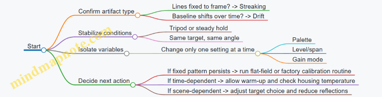
Practical Examples and Reasoning
Example 1: Vertical lines that don’t move with the scene A user points the camera at a dark fence at night and pans slowly. The lines stay in the same pixel columns even as the fence shifts behind them. That behavior points to a sensor-related nonuniformity rather than a problem with the optics or the scene. The most effective next step is to ensure the camera has completed its warm-up and to perform the camera’s flat-field or nonuniformity correction routine (using the camera’s normal procedure). If the camera has a manual correction mode, use it consistently; random switching can make the artifact look worse.
Example 2: Baseline temperature slowly “slides” while the camera is still A camera is mounted on a tripod facing a warm wall. Over two minutes, the wall’s apparent temperature drifts even though nothing changes in the environment. This is classic drift: the detector response or reference mapping is changing with internal temperature. The reasoning is simple: if the camera is motionless and the target is stable, only internal factors remain. Let the camera reach thermal equilibrium, avoid touching the housing, and check whether level/span is set to an automatic mode that updates continuously.
Example 3: Streaking that appears only when looking at bright edges A user notices diagonal streaks mainly near bright, high-contrast boundaries like a car headlight reflection on a wet road. Here, the scene is doing part of the work. Wet surfaces and glossy materials can create strong reflections that stress the camera’s dynamic range and correction. Try a matte target at the same distance, or reframe to reduce specular highlights. If the streaking disappears with a less reflective target, you’ve identified a scene interaction rather than a failing sensor.
What to Record During Troubleshooting
Write down three details each time you test: power-on time, target type (uniform wall, textured surface, reflective surface), and whether the camera is on a tripod. This prevents the common mistake of “fixing” the problem by accident—like waiting for warm-up—while forgetting that the camera’s baseline was still settling.
When to Stop and Escalate
If streaking or drift remains after warm-up, correction routines, and controlled scene tests, the issue is likely persistent hardware behavior. At that point, further guessing wastes time; the most efficient move is to document the conditions and have the camera inspected using the recorded evidence.
12.4 Handle Optics Cleaning, Lens Coatings, and Contamination
Night-vision and thermal systems both depend on optics that stay optically clean and mechanically stable. Cleaning is not just about removing smudges; it’s about preventing micro-scratches, coating damage, and residue that changes how light scatters.
What Contamination Looks Like and Why It Matters
Common issues include fingerprints, oily film, dust haze, water spots, and salt residue. In intensified systems, bright sources can create halos when surface scattering increases. In thermal systems, dust on the window can reduce contrast by adding a “fog layer” that lowers effective transmission.
A quick diagnostic helps you choose the right approach: if the mark is visible only under a flashlight angle, it’s often surface dust or a thin film. If it’s visible straight-on and feels greasy, it’s likely skin oil or lubricant.
Mind Map: Cleaning Decision Flow
Safe Cleaning Workflow That Minimizes Damage
Start with dry removal. Use a blower to lift loose particles rather than dragging them across the glass. If you wipe first, grit becomes sandpaper.
Next, use a lens brush or soft microfiber only after dust is gone. For oily marks, apply cleaning fluid to the cleaning material, not directly to the lens. This reduces the chance of liquid running into lens edges, threads, or any gasketed areas.
Wipe with light pressure using a fresh section of cloth each pass. Use straight strokes or gentle spirals from center outward. Repeated back-and-forth scrubbing increases the chance of micro-scratches, especially on hard-coated surfaces that still hate grit.
Finally, inspect under angled light. Streaks often indicate too much fluid, insufficient drying, or residue left behind by an incompatible cleaner.
Lens Coatings and What They Can Tolerate
Coatings are designed to reduce reflections and improve transmission, but they are not invincible. Anti-reflective coatings can be sensitive to harsh solvents, while some coatings tolerate alcohol better than others. The practical rule is simple: if you don’t know what the coating is rated for, use the mildest approach first.
Avoid household glass cleaners that leave additives. Avoid abrasive pads and “magic eraser” type materials. Even if they remove the visible mark, they can roughen the surface and increase scattering, which is the opposite of what you want.
If you see rainbow-like patches, peeling, or persistent haze that doesn’t wipe away, treat it as coating damage rather than dirt. Continued cleaning will usually make it worse.
Contamination Sources and Prevention That Actually Helps
Fingerprints happen during mounting and focusing. Use gloves when possible, and handle the lens by the housing. Dust enters when caps are off; keep caps on between sessions.
Condensation is a common culprit after moving between temperature zones. If the lens fogs, let it acclimate with caps on. Wiping a fogged lens can trap moisture and leave mineral residue.
Salt residue often comes from coastal environments or sweaty handling. If you suspect salt, remove it with minimal liquid contact and controlled wiping, then dry thoroughly.
Example: Cleaning a Smudged Objective on an Intensifier
A user notices a faint gray patch that grows brighter near streetlights. The patch appears more under angled light than straight-on.
- Blow off loose dust with a blower.
- Lightly wipe with a dry microfiber to remove remaining particles.
- If the mark persists, apply a small amount of lens cleaning solution to lens tissue.
- Wipe once or twice with gentle pressure, using a clean tissue section each time.
- Inspect under angled light; if halos remain, check for internal contamination or coating wear rather than repeating aggressive cleaning.
This approach reduces the chance of turning a fingerprint into a scratch.
Example: Water Spot on a Thermal Window
A thermal window shows circular spots after rain exposure. The spots are visible as dull rings.
- Dry remove loose grit first.
- Use a small amount of cleaning fluid on lens tissue, then wipe lightly.
- Dry with a clean, lint-free wipe to prevent streaking.
- If the ring remains, it may be mineral deposits that require a different technique; repeated wiping with the same method can spread residue.
The goal is to lift deposits without grinding them into the surface.
Practical Checklist Before You Start
- Confirm the lens is cool and dry to the touch.
- Remove dust with a blower before any wiping.
- Apply liquid to the cloth, not the lens.
- Use minimal pressure and fresh material for each pass.
- Inspect under angled light after drying.
- Stop if you suspect coating damage or visible scratches.
Clean optics are less about “more cleaning” and more about “cleaning the right way the first time.”
12.5 Store, Protect, and Verify Performance Over Time
Night vision and thermal devices are optical instruments with electronics attached. Over time, the usual enemies are dust, fingerprints, moisture, battery quirks, mechanical drift, and settings that quietly change between sessions. A good routine keeps the device stable and makes “it looks different today” easier to explain.
Store for Stability and Clean Optics
Start with storage conditions that reduce condensation risk. Use a dry, temperature-stable location and avoid leaving the device in a vehicle or near heaters. If you move between cold and warm environments, let the device reach the new temperature before powering it on; otherwise, moisture can form on internal surfaces and temporarily degrade image quality.
Protect the front lens and any IR window with a proper cap and a clean, lint-free cloth. Fingerprints on an objective lens can create haze and reduce contrast, especially with intensified systems where bright sources already push the image chain. For thermal cameras, keep the lens clean because smudges change how infrared energy is distributed across the detector.
Use a case that prevents the device from rattling. Even small impacts can shift focus or alignment, and the effect may not show up until you compare images side-by-side.
Manage Power Like It’s Part of the Optics
Batteries age even when you do nothing. Store batteries separately when the device will sit for weeks, and remove them if the device is not designed for long-term storage with batteries installed. For lithium-based cells, keep them in a cool, dry place and avoid leaving them fully discharged.
Before storage, check that the device is in a known state: correct polarity, no accidental mode changes, and no active accessories drawing power. A simple habit is to power down, then confirm the device won’t wake from a button press.
Prevent Mechanical Drift and Focus Changes
Focus and alignment can drift from temperature swings and repeated mounting. When you store the device, keep it in the same orientation and avoid compressing straps or mounts that could apply pressure to the housing.
If the device uses a removable mount or adapter, store it with the same hardware installed or label the pairing. Swapping mounts later can introduce small differences in eye relief, optical axis alignment, or thermal camera focus behavior.
Verify Performance with Repeatable Checks
Verification should be quick, repeatable, and based on observable outcomes. Use the same target setup each time you check: a fixed distance, consistent lighting for intensified systems, and a stable scene with known temperature differences for thermal.
For intensified systems, check focus and edge sharpness on a high-contrast target (like a building edge or a sign) and confirm bright-source behavior by viewing a controlled bright point. If you see new blooming or halo changes, inspect the objective lens for contamination and verify the device settings match your last known configuration.
For thermal systems, verify that the image level and span are set consistently. Look for uniformity issues such as fixed-pattern noise changes, drifting brightness, or unexpected streaking. If the device has a calibration routine, run it as part of your checklist so you compare like with like.
Keep a Simple Log That Explains Differences
A log turns “it seems worse” into a measurable statement. Record date, device mode, battery type and charge state, ambient temperature, and the outcome of your checks. Add a short note when you clean optics or change mounts.
Example: “2026-03-12, thermal, level 50, span auto, battery 3/4, ambient 8°C. Edge target sharpness unchanged. Uniformity slightly reduced; lens cleaned with microfiber; repeat check passed.” That kind of note saves time later.
Mind Map for Storage, Protection, and Verification
Case Example for a Practical Routine
A monthly check takes about 10 minutes. You start with the device at room temperature, inspect the objective lens for smudges, and confirm the mount is seated. For an intensified unit, you view a fixed high-contrast target and adjust focus until edges are crisp, then you compare against last month’s notes. For a thermal unit, you view the same scene and confirm the image level and span are set the same way; you then check whether uniformity looks consistent.
If results differ, you don’t guess. You clean the lens if needed, confirm settings, and repeat the check. If the difference persists after cleaning and settings verification, you record it as a potential service issue rather than continuing to use a device you can’t trust.
Quick Checklist for Each Storage Cycle
- Device at stable temperature before powering
- Objective lens protected and clean
- Batteries removed or stored correctly
- Mount pairing consistent
- Storage case prevents movement
- Verification target and settings ready for next check
- Log updated with pass/fail and any changes