Financial Data Visualization for Accountants
1. Introduction to Financial Data Visualization
1.1 Understanding the Importance of Visualization in Accounting
Financial data can often be complex, voluminous, and difficult to interpret in raw numerical form. Visualization transforms this data into graphical formats, making it easier for accountants and stakeholders to understand, analyze, and communicate financial insights effectively.
Why Visualization Matters in Accounting
- Simplifies Complex Data: Visuals condense large datasets into intuitive charts and graphs.
- Enhances Pattern Recognition: Trends, outliers, and relationships become more apparent.
- Improves Decision-Making: Clear visuals support faster and more informed decisions.
- Facilitates Communication: Visuals bridge the gap between technical accounting data and non-expert stakeholders.
- Increases Engagement: Interactive and well-designed visuals maintain attention and improve comprehension.
Mind Map: Importance of Visualization in Accounting
Example 1: Simplifying a Profit & Loss Statement
A traditional Profit & Loss (P&L) statement lists revenues, expenses, and net profit in rows of numbers. By visualizing this data as a stacked bar chart, an accountant can quickly show the proportion of each expense category relative to total revenue, highlighting areas where costs may be disproportionately high.
Before Visualization:
| Category | Amount ($) |
|---|---|
| Revenue | 500,000 |
| Cost of Goods Sold | 200,000 |
| Marketing | 50,000 |
| Salaries | 120,000 |
| Rent | 30,000 |
| Net Profit | 100,000 |
After Visualization:
- A stacked bar chart with segments for each expense category stacked against total revenue, visually emphasizing expense distribution.
Example 2: Detecting Trends in Cash Flow
Raw cash flow data over 12 months can be overwhelming. A simple line chart plotting monthly inflows and outflows allows accountants to spot seasonal trends, cash shortages, or surpluses.
Visualization Insight:
- Identifies months with negative cash flow.
- Helps forecast future cash needs.
Mind Map: Benefits of Visualization for Accountants
Summary
Visualization is a critical skill for accountants, enabling them to transform raw financial data into actionable insights. By leveraging charts, graphs, and interactive dashboards, accountants can not only improve their own analysis but also communicate complex financial information clearly to clients, management, and other stakeholders.
1.2 Key Benefits of Visualizing Financial Data
Visualizing financial data transforms raw numbers into meaningful insights that accountants and data analysts can quickly comprehend and act upon. This section explores the key benefits of financial data visualization, supported by practical examples and mind maps to illustrate concepts clearly.
Benefit 1: Enhanced Data Comprehension
Financial data often involves complex figures and multiple variables. Visualization simplifies this complexity by presenting data in intuitive formats such as charts, graphs, and dashboards.
- Example: Instead of scanning through a lengthy income statement, a bar chart showing revenue and expenses over time allows quick identification of trends and anomalies.
Benefit 2: Faster Decision-Making
Visualizations enable accountants to grasp financial performance at a glance, accelerating the decision-making process.
- Example: A dashboard displaying key performance indicators (KPIs) such as gross margin, net profit, and cash flow can help CFOs make timely strategic decisions.
Benefit 3: Improved Communication with Stakeholders
Visual data presentations are more engaging and easier to understand for non-financial stakeholders, facilitating clearer communication.
- Example: Using pie charts to show expense distribution helps department heads understand budget allocations without needing deep accounting knowledge.
Benefit 4: Identification of Trends and Patterns
Visual tools help uncover trends and patterns that might be missed in tabular data.
- Example: A line chart showing monthly sales over several years can reveal seasonal patterns or growth trends.
Benefit 5: Increased Accuracy and Reduced Errors
Visualizing data can help spot inconsistencies, outliers, or errors early, improving data accuracy.
- Example: A heatmap highlighting unusually high expenses in certain categories can prompt investigation and correction.
Benefit 6: Better Resource Allocation
Visual insights into financial data assist in optimizing resource allocation by highlighting underperforming areas or overspending.
- Example: A waterfall chart illustrating budget variances helps identify where costs exceeded projections.
Summary Mind Map
By integrating these benefits into daily accounting practices, professionals can unlock the full potential of their financial data, leading to more informed decisions and stronger business outcomes.
1.3 Overview of Common Financial Data Types and Metrics
Financial data is the backbone of accounting and financial analysis. Understanding the types of data and key metrics is essential for effective visualization and decision-making. This section provides a comprehensive overview of the most common financial data types and metrics accountants work with, along with practical examples and mind maps to help visualize their relationships.
Common Financial Data Types
- Transactional Data: Records of individual financial transactions such as sales, purchases, payments, and receipts.
- Account Balances: Summarized amounts in ledger accounts, e.g., cash balance, accounts receivable.
- Financial Statements Data: Aggregated data from income statements, balance sheets, and cash flow statements.
- Budget and Forecast Data: Planned or projected financial figures used for comparison against actuals.
- Cost Data: Information related to expenses, cost centers, and cost allocation.
- Tax Data: Data related to tax liabilities, payments, and compliance.
Key Financial Metrics
- Revenue: Total income generated from sales or services.
- Gross Profit: Revenue minus cost of goods sold (COGS).
- Operating Expenses: Costs related to running the business excluding COGS.
- Net Profit (Net Income): Profit after all expenses, taxes, and costs.
- EBITDA: Earnings before interest, taxes, depreciation, and amortization.
- Liquidity Ratios: Metrics like Current Ratio and Quick Ratio indicating short-term financial health.
- Profitability Ratios: Such as Return on Assets (ROA) and Return on Equity (ROE).
- Leverage Ratios: Debt to Equity Ratio, indicating financial leverage.
- Efficiency Ratios: Inventory Turnover, Accounts Receivable Turnover.
Mind Map: Financial Data Types
Mind Map: Key Financial Metrics
Examples of Financial Data and Metrics in Practice
-
Revenue and Gross Profit Visualization
- Example: Visualizing monthly revenue alongside gross profit margin to identify seasonal trends.
- Visualization Tip: Use a combination of bar charts (revenue) and line charts (gross profit margin) for clarity.
-
Liquidity Ratios Dashboard
- Example: Display current ratio and quick ratio over time to monitor short-term financial health.
- Visualization Tip: Use gauges or bullet charts to quickly communicate whether ratios are within healthy ranges.
-
Cost Breakdown Analysis
- Example: Pie chart showing fixed vs variable costs to help identify cost-saving opportunities.
- Visualization Tip: Use color coding to differentiate cost types clearly.
-
Budget vs Actual Comparison
- Example: Side-by-side bar charts comparing budgeted expenses against actual expenses for each department.
- Visualization Tip: Highlight variances with conditional formatting or color indicators.
Summary
Understanding the types of financial data and key metrics is fundamental for accountants aiming to create meaningful visualizations. By categorizing data into transactional, balances, statements, budgets, costs, and tax data, and focusing on core metrics like profitability, liquidity, and efficiency, accountants can tailor their visualizations to provide actionable insights. The mind maps above serve as a guide to organizing and conceptualizing these data elements for better visualization design.
1.4 Tools and Software for Financial Data Visualization
In the realm of accounting and finance, selecting the right tools and software for data visualization is crucial to effectively communicate insights and support decision-making. This section explores popular tools, their features, and practical examples to help accountants and data analysts choose the best fit for their needs.
Popular Financial Data Visualization Tools
Below is a mind map summarizing key categories and examples of tools used for financial data visualization:
Microsoft Excel
Excel remains the most widely used tool among accountants due to its accessibility and versatility.
- Best Practices: Use PivotTables and PivotCharts to summarize and visualize large datasets efficiently.
- Example: Visualizing monthly revenue trends using a line chart with conditional formatting to highlight months exceeding targets.
Power BI
Power BI is a powerful BI tool by Microsoft that integrates seamlessly with Excel and other data sources.
- Best Practices: Use interactive dashboards with slicers and filters to allow dynamic exploration of financial data.
- Example: Creating a dashboard that shows profit margins by region and product category with drill-down capabilities.
Tableau
Tableau is renowned for its intuitive drag-and-drop interface and strong visualization capabilities.
- Best Practices: Utilize calculated fields to create custom financial metrics and use story points to guide stakeholders through insights.
- Example: Visualizing cash flow trends with waterfall charts and embedding annotations to explain fluctuations.
Python Libraries (Matplotlib, Seaborn, Plotly)
For data analysts comfortable with coding, Python offers extensive libraries for customized visualizations.
- Best Practices: Use Seaborn for statistical visualizations and Plotly for interactive charts.
- Example: Plotting a heatmap to identify expense categories with the highest variance month-over-month.
import seaborn as sns
import matplotlib.pyplot as plt

# Sample heatmap of expense variance
sns.heatmap(data=expense_variance_df, annot=True, cmap='coolwarm')
plt.title('Monthly Expense Variance Heatmap')
plt.show()
Google Data Studio
A free, cloud-based tool ideal for collaborative financial reporting.
- Best Practices: Connect live data sources for real-time updates and use filter controls for user-driven analysis.
- Example: Building a real-time dashboard for tracking accounts receivable aging.
Summary Mind Map: Choosing the Right Tool
By understanding the strengths and use cases of these tools, accountants and data analysts can select the most effective software to visualize financial data, enhancing clarity and driving better business decisions.
1.5 Best Practices: Choosing the Right Visualization for Your Data
Choosing the right visualization is critical for accountants to communicate financial insights clearly and effectively. The goal is to select a chart or graph that not only represents the data accurately but also makes it easy for stakeholders to understand trends, comparisons, and key metrics.
Key Considerations When Choosing Visualizations:
- Data Type: Understand whether your data is categorical, numerical, time series, or hierarchical.
- Purpose: Are you comparing values, showing distribution, illustrating trends over time, or explaining composition?
- Audience: Tailor complexity and detail to the knowledge level of your audience.
- Clarity: Avoid clutter and focus on simplicity to enhance comprehension.
Mind Map: Visualization Selection Process
Common Financial Visualization Types and When to Use Them
| Visualization Type | Best Use Case | Example in Accounting |
|---|---|---|
| Bar Chart | Comparing discrete categories | Comparing revenue by product line |
| Line Chart | Showing trends over time | Tracking monthly expenses |
| Pie Chart | Showing parts of a whole (limited categories) | Expense category breakdown |
| Waterfall Chart | Explaining changes between values | Variance analysis in profit margins |
| Heatmap | Highlighting intensity or patterns | Expense heatmap by department and month |
| Scatter Plot | Showing correlation between two variables | Relationship between sales and marketing spend |
| Bullet Graph | Performance against targets | Budget vs actual spending |
Mind Map: Matching Visualization to Financial Scenarios
Practical Examples
- Example: Visualizing Monthly Revenue Trends
- Data: Monthly revenue figures for the past year.
- Best Visualization: Line chart.
- Reason: Line charts clearly show trends and fluctuations over time.
| Month |
|---|
| Jan |
| Feb |
| Mar |
| … |
- Example: Comparing Departmental Expenses
- Data: Expenses by department for the current quarter.
- Best Visualization: Bar chart.
- Reason: Bar charts allow easy comparison across categories.
| Department |
|---|
| HR |
| IT |
| Marketing |
- Example: Explaining Profit Variance
- Data: Starting profit, positive and negative impacts, ending profit.
- Best Visualization: Waterfall chart.
- Reason: Waterfall charts visually break down how different factors contribute to changes.
| Item | Amount ($) |
|---|---|
| Starting Profit | 500,000 |
| Increased Sales | +50,000 |
| Higher Costs | -30,000 |
| Reduced Overheads | +20,000 |
| Ending Profit | 540,000 |
Result: The waterfall chart clearly shows how each factor affects the overall profit.
Additional Tips
- Avoid Pie Charts for Too Many Categories: Pie charts become cluttered and hard to interpret beyond 5-6 slices.
- Use Color Intentionally: Use consistent color coding to represent categories or performance (e.g., red for negative, green for positive).
- Label Clearly: Always label axes, data points, and legends to avoid ambiguity.
- Test with Your Audience: Before finalizing, get feedback to ensure the visualization communicates effectively.
By following these best practices and using the right visualization types for your financial data, accountants can transform raw numbers into compelling stories that drive informed decision-making.
2. Foundations of Effective Financial Visualizations
2.1 Principles of Visual Perception and Data Interpretation
Understanding how humans perceive visual information is fundamental to creating effective financial data visualizations. Accountants and data analysts must leverage these principles to ensure that their visualizations communicate insights clearly and accurately.
Key Principles of Visual Perception
Gestalt Principles
The Gestalt principles explain how people tend to organize visual elements into groups or unified wholes when certain principles are applied.
- Proximity: Objects close to each other are perceived as related.
- Similarity: Items that look similar are grouped together.
- Continuity: The eye follows lines and curves smoothly.
- Closure: The mind fills in missing information to perceive a complete shape.
- Figure-Ground: Differentiating an object (figure) from its background (ground).
Pre-attentive Processing
Certain visual properties are detected almost instantly by the human brain before conscious attention is given. These include:
- Color
- Orientation
- Size
- Shape
- Motion
Using these properties effectively helps highlight important financial data points quickly.
Visual Hierarchy
Visual hierarchy guides the viewer’s eye to the most important information first by manipulating:
- Size (larger elements draw attention)
- Color (bright or contrasting colors stand out)
- Position (top-left or center positions are noticed first)
- White space (isolated elements gain focus)
Cognitive Load
Minimizing cognitive load means reducing the mental effort required to interpret data. Overly complex visuals or cluttered charts can overwhelm users, leading to misinterpretation.
Examples of Applying Visual Perception Principles in Financial Data
Example 1: Using Proximity and Similarity in Expense Categories
When visualizing expense categories, grouping related expenses close together and using similar colors helps users quickly identify patterns.
- Group all marketing expenses in blue shades placed near each other.
- Group operational expenses in green shades.
This reduces the cognitive effort needed to differentiate categories.
Example 2: Highlighting Key Metrics with Pre-attentive Attributes
In a dashboard showing KPIs, use bright red color and larger font size to highlight expenses exceeding budget, while keeping other metrics in muted colors.
This instantly draws attention to problem areas.
Example 3: Creating Visual Hierarchy in a Profit & Loss Chart
Place the total profit figure prominently at the top with a large font and contrasting color. Use smaller, lighter text for supporting details like individual revenue streams.
This guides the viewer to understand the overall financial health before diving into specifics.
Mind Map: Summary of Visual Perception Principles for Financial Visualization
Practical Tip for Accountants
When designing financial reports or dashboards, always ask:
- What is the most important insight I want to convey?
- How can I use size, color, and positioning to emphasize this?
- Are related data points visually grouped to aid understanding?
- Is the visualization free from unnecessary elements that might distract or confuse?
By applying these principles, accountants can transform raw financial data into clear, actionable visual stories that support better decision-making.
2.2 Selecting Appropriate Chart Types for Financial Data
Selecting the right chart type is crucial for effectively communicating financial insights. Different financial data and objectives require different visualization approaches to ensure clarity, accuracy, and impact. This section explores common chart types suitable for various financial data scenarios, supported by mind maps and practical examples.
Understanding Financial Data Types and Their Visualization Needs
Before choosing a chart, consider the nature of your data:
- Time Series Data: Trends over time, such as revenue or expenses monthly.
- Categorical Data: Data grouped by categories, like departments or cost centers.
- Part-to-Whole Relationships: How components contribute to a total, e.g., expense breakdown.
- Comparisons: Comparing values across different entities or periods.
- Distributions: Understanding the spread or frequency of financial values.
Mind Map: Chart Types Based on Financial Data Objectives
Detailed Chart Types with Examples
Line Chart
- Use Case: Tracking financial metrics over time, such as monthly sales or cash flow.
- Best Practice: Use for continuous data; avoid clutter by limiting lines.
- Example: Visualizing a company’s quarterly revenue growth over 3 years.
Bar and Column Charts
- Use Case: Comparing financial figures across categories, like expenses by department.
- Best Practice: Use horizontal bars for long category names; vertical columns for time periods.
- Example: Comparing annual marketing expenses across regions.
Pie and Donut Charts
- Use Case: Showing proportions of a whole, such as expense category breakdown.
- Best Practice: Limit slices to 5-7 for readability; consider alternatives if too many slices.
- Example: Visualizing the percentage of total costs attributed to salaries, rent, utilities, etc.
Waterfall Chart
- Use Case: Demonstrating how individual positive and negative values contribute to a total change.
- Best Practice: Use for variance analysis, profit and loss explanations.
- Example: Explaining the change in net income from one quarter to another.
Bullet Chart
- Use Case: Comparing performance against targets or budgets.
- Best Practice: Use to show actual vs. target with qualitative ranges.
- Example: Visualizing actual expenses against budgeted amounts for each department.
Area Chart
- Use Case: Showing cumulative financial data over time.
- Best Practice: Use stacked area charts to compare multiple categories.
- Example: Displaying cumulative sales by product line over a fiscal year.
Histogram
- Use Case: Analyzing the distribution of financial data, such as invoice amounts.
- Best Practice: Use to identify outliers or common value ranges.
- Example: Distribution of payment amounts received in a month.
Mind Map: Matching Financial Scenarios to Chart Types
Practical Example: Choosing Chart Types for a Monthly Financial Report
| Financial Metric | Recommended Chart Type | Reasoning |
|---|---|---|
| Monthly Revenue | Line Chart | Shows trends and seasonality clearly |
| Expense Breakdown by Type | Donut Chart | Illustrates proportion of each expense type |
| Budget vs Actual Expense | Bullet Chart | Highlights performance against targets |
| Quarterly Profit Changes | Waterfall Chart | Explains positive and negative impacts |
| Invoice Amounts | Histogram | Reveals distribution and outliers |
Summary of Best Practices
- Always align chart type with the story you want to tell.
- Avoid overcomplicating visuals; simplicity aids comprehension.
- Use color and labels strategically to enhance clarity.
- Test charts with your audience to ensure the message is clear.
By thoughtfully selecting chart types tailored to your financial data and audience, accountants can transform raw numbers into compelling visual narratives that drive informed decision-making.
2.3 Color Theory and Its Impact on Financial Reporting
Color is a powerful tool in financial data visualization, influencing how information is perceived, interpreted, and acted upon. Understanding color theory helps accountants create reports that are not only visually appealing but also clear and effective in communicating financial insights.
Why Color Matters in Financial Reporting
- Enhances Comprehension: Colors can highlight key figures, trends, or anomalies, making complex data easier to understand.
- Guides Attention: Strategic use of color directs the viewer’s focus to critical areas.
- Conveys Meaning: Colors often carry cultural and emotional connotations (e.g., red for losses, green for gains).
- Improves Retention: Visual memory is stronger when color is used effectively.
Basic Principles of Color Theory
Mind Map: Basic Color Theory Principles
Applying Color Theory to Financial Data
-
Use Meaningful Colors:
- Red = Negative values (losses, expenses over budget)
- Green = Positive values (profits, savings, revenue growth)
- Blue = Neutral or informational data
-
Maintain Consistency:
- Use the same color scheme across reports to avoid confusion.
-
Limit the Palette:
- Avoid overwhelming users with too many colors; 3-5 colors are usually sufficient.
-
Consider Color Blindness:
- Use colorblind-friendly palettes or combine color with patterns/text.
-
Use Contrast for Readability:
- Ensure text or data points stand out against backgrounds.
Mind Map: Applying Color Theory in Financial Reporting
Examples of Color Use in Financial Visualizations
Example 1: Profit & Loss Bar Chart
- Bars representing expenses are colored in shades of red.
- Revenue bars use shades of green.
- Neutral categories (e.g., fixed costs) use blue or gray.
Example 2: Budget Variance Waterfall Chart
- Positive variances in green.
- Negative variances in red.
- Totals in a neutral color like dark gray.
Example 3: Heatmap for Expense Categories
- Darker reds indicate higher expenses.
- Lighter colors indicate lower expenses.
- Use a gradient scale from light pink to dark red.
Practical Tips for Accountants
- Test your color schemes: Preview reports on different devices and lighting conditions.
- Use tools: Color palette generators like ColorBrewer or Adobe Color can help select harmonious and accessible palettes.
- Annotate when needed: If color meaning might be ambiguous, add legends or labels.
Mind Map: Practical Tips for Color Use
Summary
Color theory is essential for accountants to communicate financial data effectively. By applying meaningful, consistent, and accessible color choices, financial reports become clearer and more actionable. Using examples like P&L charts, variance analyses, and heatmaps demonstrates how color enhances understanding and decision-making.
For further reading, consider exploring resources on color accessibility and advanced visualization techniques to refine your financial reporting skills.
2.4 Designing for Clarity: Avoiding Common Visualization Pitfalls
Effective financial data visualization hinges on clarity. When visuals are cluttered, confusing, or misleading, they fail to communicate insights and can even lead to incorrect conclusions. This section explores common pitfalls accountants should avoid and offers practical guidance to design clear, impactful visualizations.
Common Pitfalls in Financial Data Visualization
Best Practices to Enhance Clarity
-
Simplify Your Visuals
- Focus on key metrics relevant to the message.
- Use minimal colors: 2-3 complementary colors to differentiate data.
- Remove unnecessary elements like heavy gridlines or background images.
-
Use Appropriate Chart Types
- Bar charts for comparisons.
- Line charts for trends over time.
- Waterfall charts for explaining variances.
-
Maintain Consistent and Honest Scales
- Always start axes at zero unless there is a strong reason not to.
- Use uniform intervals to avoid distortion.
-
Label Clearly and Provide Context
- Add descriptive titles and axis labels.
- Include legends and data source notes.
- Use annotations to highlight key insights.
-
Design for Your Audience
- Tailor complexity to the viewer’s expertise.
- Use familiar terminology and formats.
Mind Map: Best Practices for Clarity
Practical Examples
Example 1: Avoiding Overloaded Bar Chart
Poor Visualization: A bar chart showing revenue, expenses, profit margin, and cash flow all in one chart with 7 different colors and no clear labels.
Improved Visualization: Split into two charts—one bar chart for revenue and expenses side-by-side, and a separate line chart for profit margin over the same period. Use two colors consistently (blue for revenue, red for expenses) and clear axis labels.
Example 2: Correct Use of Axis Scale
Poor Visualization: A line chart showing quarterly sales where the y-axis starts at 500,000 instead of zero, exaggerating small fluctuations.
Improved Visualization: Adjust the y-axis to start at zero to provide an honest view of sales trends, avoiding misleading impressions.
Example 3: Adding Context with Annotations
A cash flow chart includes an annotation pointing out a significant dip due to a one-time investment, helping stakeholders understand the cause rather than assuming poor performance.
Summary
Designing for clarity means stripping away distractions, choosing the right visual forms, and always keeping the audience’s understanding front and center. By avoiding common pitfalls and applying these best practices, accountants can transform complex financial data into clear, actionable insights that drive better decision-making.
2.5 Practical Example: Transforming a Profit & Loss Statement into Visual Insights
A Profit & Loss (P&L) statement, also known as an income statement, summarizes revenues, costs, and expenses incurred during a specific period. For accountants, transforming this tabular data into visual insights can greatly enhance understanding, communication, and decision-making.
Step 1: Understanding the Components of a P&L Statement
Before visualizing, it’s essential to break down the P&L into its key components:
- Revenue (Sales)
- Cost of Goods Sold (COGS)
- Gross Profit
- Operating Expenses (e.g., Selling, General & Administrative Expenses)
- Operating Income
- Other Income/Expenses
- Net Income
Mind Map: Components of a P&L Statement
Step 2: Selecting Appropriate Visualizations
Each component can be visualized to highlight trends, proportions, or comparisons.
| P&L Component | Recommended Visualization Type | Purpose/Insight Example |
|---|---|---|
| Revenue | Line Chart, Bar Chart | Show revenue growth over time |
| Cost of Goods Sold | Stacked Bar Chart | Compare COGS against revenue |
| Gross Profit | Area Chart | Visualize profit margin trends |
| Operating Expenses | Pie Chart, Stacked Bar Chart | Breakdown of expense categories |
| Operating Income | Waterfall Chart | Show impact of expenses on income |
| Net Income | Line Chart, KPI Card | Highlight bottom-line profitability |
Step 3: Example Dataset (Simplified Quarterly P&L)
| Quarter | Revenue | COGS | Gross Profit | Operating Expenses | Operating Income | Net Income |
|---|---|---|---|---|---|---|
| Q1 | 100,000 | 60,000 | 40,000 | 20,000 | 20,000 | 15,000 |
| Q2 | 120,000 | 70,000 | 50,000 | 22,000 | 28,000 | 22,000 |
| Q3 | 110,000 | 65,000 | 45,000 | 21,000 | 24,000 | 18,000 |
| Q4 | 130,000 | 75,000 | 55,000 | 23,000 | 32,000 | 25,000 |
Step 4: Visualizing Revenue and Gross Profit Trends
Line Chart Example:
Revenue and Gross Profit Over Quarters
Q1: Revenue=100k, Gross Profit=40k
Q2: Revenue=120k, Gross Profit=50k
Q3: Revenue=110k, Gross Profit=45k
Q4: Revenue=130k, Gross Profit=55k
- X-axis: Quarter
- Y-axis: Amount ($)
- Lines: Revenue (blue), Gross Profit (green)
This visualization quickly shows how revenue and gross profit move together, highlighting profitability trends.
Step 5: Visualizing Expense Breakdown
Pie Chart Example: Operating Expenses Breakdown (Assuming further breakdown)
| Expense Category | Amount |
|---|---|
| Selling Expenses | 12,000 |
| General & Administrative | 8,000 |
Operating Expenses Breakdown
- Selling Expenses: 60%
- General & Administrative: 40%
Visual: Pie chart showing proportion of each expense category
Step 6: Waterfall Chart to Show Operating Income
A waterfall chart is ideal to visualize how revenue is transformed into operating income by subtracting costs and expenses step-by-step.
Waterfall Chart Steps:
- Start: Revenue (100,000)
- Subtract: COGS (-60,000)
- Result: Gross Profit (40,000)
- Subtract: Operating Expenses (-20,000)
- End: Operating Income (20,000)
Visual: Bars showing positive and negative contributions leading to final operating income
Step 7: KPI Cards for Quick Snapshot
Highlight key metrics such as:
- Total Revenue: $460,000 (Sum of all quarters)
- Average Gross Profit Margin: 40%
- Net Income Growth: +66.7% from Q1 to Q4
Mind Map: Visualization Workflow for P&L Insights
Step 8: Best Practices Embedded in This Example
- Clarity: Use simple charts like line and pie charts to avoid overwhelming stakeholders.
- Context: Show trends over time rather than isolated figures.
- Comparison: Use stacked or waterfall charts to illustrate relationships between components.
- Highlight Key Metrics: Use KPI cards to focus attention on critical numbers.
- Consistency: Maintain consistent colors for similar data types (e.g., blue for revenue, green for profit).
By following this structured approach, accountants can convert complex P&L data into compelling visual stories that drive better financial understanding and decision-making.
3. Visualizing Financial Statements
3.1 Visual Techniques for Balance Sheets
Balance sheets provide a snapshot of a company’s financial position at a specific point in time, detailing assets, liabilities, and equity. Visualizing balance sheets effectively helps accountants and stakeholders quickly grasp the financial health and structure of the business. In this section, we explore various visual techniques tailored for balance sheets, integrating best practices and easy-to-understand examples.
Key Visual Techniques for Balance Sheets
-
Stacked Bar Charts
- Useful for comparing the composition of assets, liabilities, and equity side by side.
- Highlights proportions and allows easy comparison across periods.
-
Tree Maps
- Visualize hierarchical data such as asset categories and subcategories.
- Helps in understanding the relative size of each component within the total.
-
Waterfall Charts
- Show how individual components contribute to the total assets or liabilities.
- Useful for illustrating changes between two balance sheet dates.
-
Pie Charts
- Best for showing percentage breakdowns of assets or liabilities at a glance.
- Should be used sparingly and only when the number of categories is limited.
-
Sankey Diagrams
- Visualize flows between asset classes or between liabilities and equity.
- Useful for demonstrating fund sources and uses.
Mind Map: Visual Techniques for Balance Sheets
Example 1: Stacked Bar Chart for Balance Sheet Composition
Scenario: Visualizing the balance sheet composition for Q1 and Q2.
| Category | Q1 Amount (USD) | Q2 Amount (USD) |
|---|---|---|
| Current Assets | 150,000 | 180,000 |
| Fixed Assets | 300,000 | 320,000 |
| Current Liab. | 100,000 | 120,000 |
| Long-term Liab. | 200,000 | 190,000 |
| Equity | 150,000 | 190,000 |
Visualization Insight:
- The stacked bar chart shows growth in current assets and equity from Q1 to Q2.
- Liabilities remain relatively stable, allowing stakeholders to assess improved financial stability.
Example 2: Tree Map for Asset Breakdown
Scenario: Visualizing asset categories for a mid-sized company.
| Asset Category | Amount (USD) |
|---|---|
| Cash & Equivalents | 50,000 |
| Accounts Receivable | 100,000 |
| Inventory | 80,000 |
| Property & Equip. | 270,000 |
Visualization Insight:
- The tree map clearly shows Property & Equipment as the largest asset.
- Cash & Equivalents is the smallest, highlighting liquidity position.
Mind Map: Example Visualization Workflow
Best Practices When Visualizing Balance Sheets
- Keep it Simple: Avoid overcrowding charts with too many categories.
- Use Consistent Color Coding: For example, green for assets, red for liabilities, blue for equity.
- Label Clearly: Include values and category names for quick understanding.
- Show Trends Over Time: Use multiple periods to highlight changes.
- Interactive Dashboards: Allow drill-downs into specific categories for deeper analysis.
By applying these visual techniques and best practices, accountants can transform complex balance sheet data into intuitive and actionable insights, facilitating better financial decision-making and communication with stakeholders.
3.2 Income Statement Visualization: Trends and Comparisons
Visualizing income statements effectively enables accountants and financial analysts to quickly identify trends, compare performance across periods, and communicate financial health clearly to stakeholders. This section explores best practices for visualizing income statements with a focus on trends and comparisons, supported by mind maps and practical examples.
Understanding the Income Statement Components
Before diving into visualization, it’s essential to understand the main components of an income statement:
- Revenue (Sales)
- Cost of Goods Sold (COGS)
- Gross Profit
- Operating Expenses
- Operating Income
- Other Income and Expenses
- Net Income
Mind Map: Key Elements to Visualize in Income Statements
Best Practices for Visualizing Trends
-
Use Line Charts for Time Series Data
- Line charts are ideal for showing revenue, expenses, and net income over multiple periods.
- Example: Plot quarterly revenue over the last 3 years to identify seasonal trends.
-
Highlight Margins and Ratios
- Visualize gross profit margin or net profit margin as a line or area chart alongside absolute values.
- Example: Show net income as bars and net profit margin as a line on a dual-axis chart.
-
Smooth Out Volatility
- Use moving averages to smooth short-term fluctuations and highlight underlying trends.
Mind Map: Visualizing Trends in Income Statements
Best Practices for Comparisons
-
Bar Charts for Period Comparisons
- Use grouped bar charts to compare revenue, expenses, and net income across different periods (e.g., YoY or QoQ).
- Example: Compare Q1 revenue for 2022 vs 2023 side-by-side.
-
Waterfall Charts for Variance Analysis
- Waterfall charts effectively show how different line items contribute to changes in net income between periods.
- Example: Visualize how changes in revenue, COGS, and expenses led to net income variance from last year.
-
Stacked Bar or Area Charts for Component Breakdown
- Show how different expense categories contribute to total operating expenses across periods.
Mind Map: Visualizing Comparisons in Income Statements
Practical Example 1: Line Chart Showing Revenue and Net Income Trends
- Scenario: Visualize monthly revenue and net income for the past 12 months.
- Approach:
- Plot revenue as a blue line.
- Plot net income as a green line.
- Add data labels for peak and low months.
- Annotate months with significant events (e.g., product launch).
Insight: Easily identify growth periods and months with lower profitability.
Practical Example 2: Waterfall Chart Explaining Year-over-Year Net Income Change
- Scenario: Show how different factors contributed to net income change from 2022 to 2023.
- Approach:
- Start with 2022 net income.
- Add bars for revenue increase, COGS increase, operating expense changes, and other income.
- End with 2023 net income.
Insight: Visualizes the impact of each component on overall profitability.
Practical Example 3: Grouped Bar Chart Comparing Quarterly Expenses
- Scenario: Compare operating expenses across four quarters for two consecutive years.
- Approach:
- Group bars by quarter.
- Use different colors for each year.
- Highlight quarters with unusually high expenses.
Insight: Helps identify seasonal expense patterns and anomalies.
Summary
Visualizing income statements with a focus on trends and comparisons empowers accountants to uncover insights quickly and communicate financial performance effectively. Using line charts, bar charts, waterfall charts, and best practices such as annotation and consistent scaling ensures clarity and impact.
Remember to tailor visualizations to your audience’s needs and always validate the data behind the visuals for accuracy.
3.3 Cash Flow Statement: Visualizing Inflows and Outflows
The cash flow statement is a critical financial document that tracks the movement of cash in and out of a business over a specific period. For accountants, visualizing cash inflows and outflows can provide immediate insights into liquidity, operational efficiency, and financial health.
Why Visualize Cash Flow?
- Quick Identification of Trends: Visuals help spot patterns such as seasonal cash shortages or surpluses.
- Enhanced Stakeholder Communication: Simplifies complex data for non-financial stakeholders.
- Improved Decision Making: Enables proactive management of cash resources.
Key Components to Visualize
Cash Flow Statement Visualization Mind Map
Best Practices for Visualizing Cash Flow
-
Use Waterfall Charts to Show Movement:
- Waterfall charts clearly depict how each activity contributes to the net cash change.
- Example: Visualizing how operating cash inflows and outflows, investing, and financing activities cumulatively affect cash balance.
-
Stacked Bar Charts for Activity Breakdown:
- Display inflows and outflows side-by-side or stacked to compare magnitude.
-
Line Charts for Trend Analysis:
- Show cash flow trends over multiple periods to identify seasonality or growth.
-
Color Coding:
- Use green for inflows and red for outflows to intuitively convey cash movement.
-
Annotations and Callouts:
- Highlight significant cash events such as loan repayments or asset purchases.
Example 1: Waterfall Chart of Quarterly Cash Flow
Imagine a company’s quarterly cash flow summarized as:
| Activity | Amount (USD) |
|---|---|
| Opening Cash Balance | 50,000 |
| Operating Activities | +30,000 |
| Investing Activities | -15,000 |
| Financing Activities | +10,000 |
| Closing Cash Balance | 75,000 |
Visualization Insight:
- The waterfall chart starts at $50,000.
- Adds $30,000 from operations.
- Subtracts $15,000 for investments.
- Adds $10,000 from financing.
- Ends at $75,000.
This visual immediately shows which activities are driving cash changes.
Example 2: Stacked Bar Chart for Monthly Cash Inflows and Outflows
| Month | Operating Inflows | Operating Outflows | Investing Outflows | Financing Inflows |
|---|---|---|---|---|
| Jan | 20,000 | 15,000 | 5,000 | 0 |
| Feb | 25,000 | 18,000 | 3,000 | 10,000 |
| Mar | 22,000 | 20,000 | 7,000 | 5,000 |
Visualization Insight:
- Stacked bars show total cash inflows and outflows per month.
- Different colors represent the activity types.
- Helps identify months with cash deficits or surpluses.
Example 3: Line Chart Showing Cash Balance Over Time
Plotting the closing cash balance for each month over a year helps visualize liquidity trends.
Cash Balance Trend Mind Map
Practical Tips for Accountants
- Integrate Visuals into Dashboards: Combine cash flow visuals with other financial metrics for a holistic view.
- Use Interactive Features: Allow drill-downs to see detailed transactions behind summarized cash flows.
- Keep it Simple: Avoid clutter; focus on key cash movements relevant to decision-making.
By applying these visualization techniques, accountants can transform raw cash flow data into compelling, actionable insights that support effective financial management and communication.
3.4 Best Practices: Highlighting Key Financial Ratios Visually
Financial ratios are essential tools for accountants to analyze a company’s financial health, performance, and trends. Visualizing these ratios effectively helps stakeholders quickly grasp complex data and make informed decisions. This section covers best practices for highlighting key financial ratios visually, supported by clear examples and mind maps.
Why Visualize Financial Ratios?
- Simplifies complex numerical data
- Reveals trends and anomalies quickly
- Enhances communication with non-financial stakeholders
- Supports decision-making with intuitive insights
Key Financial Ratios to Visualize
- Liquidity Ratios: Current Ratio, Quick Ratio
- Profitability Ratios: Net Profit Margin, Return on Assets (ROA), Return on Equity (ROE)
- Leverage Ratios: Debt to Equity, Interest Coverage
- Efficiency Ratios: Inventory Turnover, Receivables Turnover
Best Practices for Visualizing Financial Ratios
-
Choose the Right Chart Type
- Use bar charts or column charts for comparing ratios across periods or companies.
- Use line charts to show trends over time.
- Use gauge charts or bullet graphs to indicate performance against benchmarks or targets.
-
Use Color Coding Wisely
- Green for healthy or positive ratios
- Red for warning or negative ratios
- Neutral colors for average or baseline values
-
Add Context and Benchmarks
- Include industry averages or target values as reference lines.
- Annotate charts with explanations for significant changes.
-
Group Related Ratios Together
- Visualize liquidity ratios in one dashboard section.
- Group profitability ratios separately to avoid clutter.
-
Keep Visuals Simple and Clear
- Avoid 3D charts or excessive decoration.
- Use clear labels and legends.
-
Interactive Elements
- Allow filtering by time periods or business units.
- Enable drill-down to underlying financial statements.
Mind Map: Visualizing Financial Ratios
Example 1: Visualizing Liquidity Ratios with Bar Charts
| Period | Current Ratio | Quick Ratio |
|---|---|---|
| Q1 | 1.5 | 1.2 |
| Q2 | 1.7 | 1.3 |
| Q3 | 1.6 | 1.1 |
- Use a grouped bar chart to compare Current Ratio and Quick Ratio across quarters.
- Add a horizontal reference line at 1.0 to indicate the minimum acceptable liquidity.
- Color bars green if above 1.0, red if below.
Example 2: Trend Analysis of Profitability Ratios with Line Charts
- Plot Net Profit Margin, ROA, and ROE over 12 months.
- Use distinct colors for each ratio.
- Add data labels for months where ratios dip below target thresholds.
Example 3: Bullet Graph for Debt to Equity Ratio
- Display current Debt to Equity ratio against a target range.
- Use the bullet graph to show if the ratio is within acceptable limits.
- Color the bar green if within target, orange if borderline, red if exceeding limits.
Example 4: Dashboard Section Grouping
Summary
Visualizing key financial ratios with clarity and context empowers accountants to communicate financial insights effectively. By selecting appropriate chart types, applying meaningful color schemes, grouping related ratios, and incorporating interactivity, accountants can create compelling visuals that enhance understanding and support strategic decisions.
3.5 Case Study: Interactive Dashboards for Financial Statement Analysis
Interactive dashboards have become indispensable tools for accountants aiming to analyze financial statements efficiently and effectively. This case study explores how an accountant can leverage interactive dashboards to transform static financial data into dynamic, insightful visualizations that facilitate deeper understanding and quicker decision-making.
Objective:
To build an interactive dashboard that enables comprehensive analysis of a company’s financial statements — Balance Sheet, Income Statement, and Cash Flow Statement — allowing users to drill down into details, compare periods, and highlight key financial metrics.
Step 1: Identifying Key Components and Metrics
Before designing the dashboard, it’s crucial to outline the key financial components and metrics to visualize.
Mind Map: Key Components for Financial Statement Dashboard
Step 2: Dashboard Layout and Visualization Choices
An effective dashboard balances clarity, interactivity, and information density.
Mind Map: Dashboard Layout Elements
Step 3: Example Visualizations and Interactions
Example 1: Waterfall Chart for Income Statement
- Purpose: To visualize how revenue is transformed into net income by showing incremental additions and subtractions.
- Best Practice: Use contrasting colors for positive (green) and negative (red) values.
Waterfall Chart Example
| Category | Amount (USD) |
|---|---|
| Revenue | 1,000,000 |
| COGS | -400,000 |
| Gross Profit | 600,000 |
| Operating Expenses | -200,000 |
| Operating Income | 400,000 |
| Interest Expense | -50,000 |
| Taxes | -70,000 |
| Net Income | 280,000 |
Interactive feature: Hovering over each bar reveals detailed notes or percentage impact.
Example 2: Drill-Down from Balance Sheet Summary to Details
- Purpose: Allow users to click on ‘Assets’ to see breakdown by current assets, fixed assets, and intangible assets.
- Best Practice: Use collapsible tree maps or expandable tables.
Example 3: Interactive Filters
- Date Range Selector: Users can choose monthly, quarterly, or yearly views.
- Department Filter: View financials by department or cost center.
Step 4: Tools and Implementation
- Tools: Power BI, Tableau, or Excel with Power Query and Power Pivot.
- Data Preparation: Clean and aggregate financial data to ensure accuracy.
- Interactivity: Use slicers, drill-throughs, and dynamic tooltips.
Step 5: Benefits Realized
- Faster identification of financial trends and anomalies.
- Enhanced ability to communicate financial health to non-accounting stakeholders.
- Improved decision-making through real-time data exploration.
Summary Mind Map: Interactive Dashboard Workflow
This case study demonstrates how accountants can harness interactive dashboards to convert complex financial statements into actionable insights, using best practices such as appropriate chart selection, interactivity, and clear layout design. By applying these techniques, accountants not only enhance their analytical capabilities but also improve communication with stakeholders across the organization.
4. Advanced Visualization Techniques for Accountants
4.1 Using Heatmaps to Identify Expense Patterns
Heatmaps are a powerful visualization tool that accountants can use to quickly identify patterns, trends, and anomalies in expense data. By representing data values with varying colors, heatmaps make it easier to spot areas of concern or interest without sifting through rows of numbers.
What is a Heatmap?
A heatmap is a graphical representation of data where individual values contained in a matrix are represented as colors. In financial contexts, heatmaps often display expenses across categories, time periods, departments, or vendors.
Why Use Heatmaps for Expense Analysis?
- Quick Pattern Recognition: Colors help highlight high and low expense areas instantly.
- Anomaly Detection: Outliers or unusual spikes become visually obvious.
- Comparative Analysis: Easily compare expenses across multiple dimensions.
- Efficient Communication: Simplifies complex data for stakeholders.
Best Practices for Creating Effective Heatmaps
- Choose Appropriate Color Scales: Use sequential color schemes (e.g., light to dark) for magnitude-based data.
- Limit Color Range: Avoid too many colors to prevent confusion.
- Use Clear Labels: Ensure rows and columns are well-labeled for context.
- Normalize Data if Needed: Consider percentages or ratios instead of raw values for better comparison.
- Interactive Features: If possible, add tooltips or filters to explore details.
Example 1: Monthly Departmental Expenses Heatmap
Imagine an accountant wants to analyze monthly expenses across different departments to identify which departments have unusually high costs in certain months.
| Department \ Month | Jan | Feb | Mar | Apr | May | Jun |
|---|---|---|---|---|---|---|
| Marketing | 12k | 15k | 14k | 20k | 18k | 22k |
| IT | 10k | 11k | 13k | 12k | 14k | 15k |
| HR | 8k | 7k | 9k | 8k | 7k | 6k |
| Sales | 20k | 22k | 25k | 30k | 28k | 35k |
A heatmap would color the cells from light (low expense) to dark (high expense), instantly showing that Sales and Marketing have higher expenses, especially in April and June.
Mind Map: Creating a Departmental Expense Heatmap
Example 2: Vendor Expense Heatmap Over Quarters
An accountant wants to monitor expenses paid to various vendors over four quarters to detect any unusual increases.
| Vendor | Q1 | Q2 | Q3 | Q4 |
|---|---|---|---|---|
| Vendor A | 50k | 52k | 48k | 70k |
| Vendor B | 30k | 35k | 40k | 38k |
| Vendor C | 20k | 18k | 22k | 19k |
| Vendor D | 15k | 15k | 15k | 15k |
The heatmap would highlight the spike for Vendor A in Q4, prompting further investigation.
Mind Map: Vendor Expense Monitoring
Step-by-Step Guide to Building a Heatmap in Excel (Example)
- Prepare your data in a table format with categories as rows and time periods as columns.
- Select the data range you want to visualize.
- Go to the Home tab > Conditional Formatting > Color Scales.
- Choose a color scale that fits your data (e.g., green-yellow-red).
- Adjust the color scale settings if necessary for better contrast.
- Add data labels or comments to explain key insights.
Integrating Heatmaps into Financial Dashboards
Heatmaps can be embedded in dashboards alongside other visualizations like line charts or bar graphs to provide a comprehensive view of expenses.
Mind Map: Heatmaps in Dashboards
Summary
Heatmaps are an intuitive and effective way for accountants to visualize expense data, enabling quick identification of patterns and anomalies. By following best practices and leveraging examples like departmental and vendor expense heatmaps, accountants can enhance their financial analysis and reporting capabilities.
4.2 Waterfall Charts for Explaining Variance Analysis
Waterfall charts are powerful visualization tools that help accountants and financial analysts break down and explain the components of a variance between two financial figures, such as budget vs actual, or year-over-year changes. They visually depict how an initial value is affected by a series of positive and negative changes, leading to a final value.
Why Use Waterfall Charts in Variance Analysis?
- Clarity: They clearly show incremental impacts on a total, making complex variances easier to understand.
- Transparency: Highlight individual contributors to changes, whether favorable or unfavorable.
- Storytelling: Help narrate the financial story behind the numbers.
Mind Map: Components of a Waterfall Chart for Variance Analysis
How to Build a Waterfall Chart for Variance Analysis
- Identify the initial value: This could be the budgeted amount or prior period figure.
- List all variance components: Break down the differences into positive and negative contributors.
- Calculate incremental changes: Quantify each variance component.
- Plot bars sequentially: Start with the initial value, add positive changes as upward bars, subtract negative changes as downward bars.
- Show the final value: This is the actual or ending figure after all variances.
Example 1: Explaining Budget vs Actual Revenue Variance
| Component | Amount (USD) |
|---|---|
| Budgeted Revenue | 1,000,000 |
| Increase in Product Sales | +150,000 |
| Decrease in Service Sales | -50,000 |
| Marketing Cost Savings | +30,000 |
| Unexpected Expenses | -20,000 |
| Actual Revenue | 1,110,000 |
Interpretation:
- The waterfall chart starts at $1,000,000.
- Positive bars show $150,000 and $30,000 increases.
- Negative bars show $50,000 and $20,000 decreases.
- The final bar shows the actual revenue of $1,110,000.
Mind Map: Step-by-Step Waterfall Chart Creation
Best Practices for Using Waterfall Charts in Variance Analysis
- Keep it simple: Limit the number of variance components to avoid clutter.
- Use consistent colors: Positive changes in green or blue, negative changes in red.
- Label bars clearly: Include amounts and descriptions.
- Add totals: Show initial and final values prominently.
- Use interactive tools: Allow drill-downs for detailed variance exploration.
Example 2: Visualizing Expense Variance Using a Waterfall Chart
Imagine an accountant analyzing why total expenses exceeded the budget.
| Component | Amount (USD) |
|---|---|
| Budgeted Expenses | 500,000 |
| Increased Labor Costs | +40,000 |
| Higher Material Costs | +25,000 |
| Utility Savings | -10,000 |
| Reduced Travel Expenses | -5,000 |
| Actual Expenses | 550,000 |
The waterfall chart would:
- Start at $500,000 (budgeted expenses).
- Show positive bars for labor and material cost increases.
- Show negative bars for utility and travel savings.
- End at $550,000 actual expenses.
Interactive Example (Representation)
Initial Budgeted Expenses: $500,000

+-----------------------------+
| +$40,000 (Labor Costs)      |
+-----------------------------+

+-----------------------------+
| +$25,000 (Material Costs)   |
+-----------------------------+

---------------------------
| -$10,000 (Utility Savings)  |
---------------------------

---------------------------
| -$5,000 (Travel Savings)    |
---------------------------

= $550,000 Actual Expenses
Tools to Create Waterfall Charts
- Excel: Built-in Waterfall chart type (Excel 2016+).
- Power BI: Customizable waterfall visuals with interactivity.
- Tableau: Supports waterfall chart creation via calculated fields.
- Google Sheets: Manual construction using stacked bar charts.
Summary
Waterfall charts are an essential tool for accountants conducting variance analysis. They provide a clear, visual breakdown of how individual factors contribute to changes in financial figures. By following best practices and using real-world examples, accountants can transform complex data into intuitive visual stories that support better financial decision-making.
4.3 Bullet Graphs for Performance Against Budgets
Bullet graphs are a powerful visualization tool designed to display performance data against a target or benchmark, making them ideal for accountants tracking financial performance against budgets. Developed by Stephen Few, bullet graphs provide a compact, information-rich alternative to gauges and meters.
What is a Bullet Graph?
A bullet graph consists of several components:
- Primary Measure (Bar): Represents the actual value, such as actual expenses or revenue.
- Comparative Measure (Marker): Indicates the target or budget value.
- Qualitative Ranges (Background Bands): Show performance zones like poor, satisfactory, and good.
This combination allows quick assessment of how actual performance compares to expectations.
Why Use Bullet Graphs for Budget Performance?
- Compact and Informative: Fits multiple data points in a small space.
- Clear Comparison: Directly compares actuals to budgets.
- Contextual Performance: Background bands provide qualitative context.
- Easy to Interpret: Intuitive visual cues for quick decision-making.
Mind Map: Components of a Bullet Graph
Mind Map: Steps to Create a Bullet Graph for Budget Performance
Example 1: Visualizing Departmental Expense vs Budget
Imagine an accountant wants to visualize the monthly expenses of the Marketing department against its budget.
- Actual Expense: $85,000
- Budget: $100,000
- Qualitative Ranges:
- Poor: $0 - $70,000
- Satisfactory: $70,001 - $90,000
- Good: $90,001 - $110,000
Interpretation: The actual expense bar reaches $85,000, which falls into the satisfactory range but below the budget marker at $100,000, indicating controlled spending but room for optimization.
Example 2: Revenue Performance Against Forecast
- Actual Revenue: $1.2M
- Forecast Revenue: $1.5M
- Qualitative Ranges:
- Poor: $0 - $1.0M
- Satisfactory: $1.0M - $1.4M
- Good: $1.4M - $1.6M
The bullet graph shows the actual revenue bar at $1.2M, within the satisfactory range but below the forecast marker, signaling the need for strategic review.
Best Practices When Using Bullet Graphs
- Define Clear Ranges: Use meaningful thresholds based on business context.
- Keep It Simple: Avoid clutter; focus on key measures.
- Use Consistent Scales: Ensure comparability across multiple bullet graphs.
- Label Clearly: Include actual values, targets, and range descriptions.
- Integrate with Dashboards: Combine bullet graphs with other visuals for comprehensive insights.
Mind Map: Best Practices for Bullet Graphs
Tools to Create Bullet Graphs
- Excel: Use bar charts with added markers and colored bands.
- Power BI: Built-in bullet chart visual or custom visuals from marketplace.
- Tableau: Create using bar charts combined with reference lines and colored bands.
- Google Data Studio: Use combo charts and layering techniques.
Summary
Bullet graphs offer accountants a concise and effective way to visualize performance against budgets. By combining actual values, targets, and qualitative ranges in one compact visual, they facilitate quick insights and informed decision-making.
For practical application, accountants can start by identifying key budget metrics, defining performance thresholds, and experimenting with bullet graphs in their preferred BI tool to enhance financial reporting clarity and impact.
4.4 Time Series Analysis with Line and Area Charts
Time series analysis is a fundamental technique in financial data visualization that allows accountants to track changes in financial metrics over time. This section explores how line and area charts can be effectively used to analyze trends, seasonality, and fluctuations in financial data, providing clear insights for decision-making.
Understanding Time Series Data in Finance
Time series data consists of observations collected sequentially over time, such as daily sales, monthly expenses, quarterly revenues, or yearly profits. Visualizing this data helps accountants identify patterns, detect anomalies, and forecast future performance.
Why Use Line and Area Charts?
- Line Charts: Ideal for showing continuous data points connected over time, highlighting trends and changes.
- Area Charts: Similar to line charts but with the area below the line filled, useful for emphasizing volume or magnitude over time.
Both chart types are intuitive and widely understood, making them perfect for communicating financial trends to stakeholders.
Best Practices for Time Series Visualization
- Consistent Time Intervals: Ensure data points are evenly spaced (daily, monthly, quarterly).
- Clear Axis Labels: Time should be on the x-axis with appropriate formatting (e.g., Q1 2023, Jan 2024).
- Use of Colors: Differentiate multiple series with distinct, colorblind-friendly colors.
- Avoid Clutter: Limit the number of lines or areas to maintain readability.
- Highlight Key Events: Use annotations to mark significant dates like fiscal year-end or policy changes.
Mind Map: Key Elements of Time Series Visualization
Example 1: Visualizing Monthly Revenue Trends with a Line Chart
Scenario: An accountant wants to analyze monthly revenue over the past year to identify growth patterns and seasonal fluctuations.
Implementation:
- X-axis: Months (Jan to Dec)
- Y-axis: Revenue in USD
- Single line representing total revenue
- Annotations on months with major promotions or market events
Insights:
- Identify peak revenue months
- Detect seasonal dips
- Correlate revenue spikes with marketing campaigns
Example 2: Using Area Charts to Show Expense Composition Over Time
Scenario: Tracking how different expense categories contribute to total monthly expenses.
Implementation:
- X-axis: Months
- Y-axis: Total expenses
- Stacked area chart with categories such as Salaries, Rent, Utilities, Marketing
- Different colors for each category
Insights:
- Visualize which expense categories dominate
- Observe how expense composition shifts over time
- Identify months with unusually high expenses in specific categories
Mind Map: Step-by-Step Process to Create a Time Series Line Chart
Practical Tips for Accountants
- Use rolling averages in line charts to smooth out short-term fluctuations and highlight longer-term trends.
- When comparing multiple time series, consider using small multiples (multiple small charts) instead of overcrowding one chart.
- For forecasting, overlay historical data with predicted values using dashed lines or different colors.
Summary
Line and area charts are powerful tools for accountants to analyze and communicate financial time series data. By following best practices and leveraging clear examples, accountants can transform raw financial data into actionable insights that support strategic decisions.
4.5 Practical Example: Visualizing Quarterly Financial Performance with Multiple Techniques
In this section, we will explore how to visualize quarterly financial performance by combining various visualization techniques to provide a comprehensive and insightful view. This approach helps accountants and data analysts identify trends, variances, and key performance indicators (KPIs) effectively.
Step 1: Define the Data and Metrics
Typical quarterly financial data includes:
- Revenue
- Cost of Goods Sold (COGS)
- Gross Profit
- Operating Expenses
- Net Income
- Key Ratios (e.g., Gross Margin, Operating Margin)
Step 2: Choose Visualization Techniques
To visualize this data effectively, we will use:
- Line Charts for trend analysis over quarters
- Bar Charts for comparing individual metrics across quarters
- Waterfall Charts to explain profit and loss movements
- Bullet Graphs to compare actual performance against targets
- Heatmaps to highlight performance intensity
Mind Map: Visualization Techniques for Quarterly Financial Performance
Step 3: Example Visualizations
Line Chart: Revenue and Net Income Trends
- Plot quarterly revenue and net income over the last four quarters.
- This helps identify growth patterns or seasonal fluctuations.
Example:
| Quarter | Revenue ($M) | Net Income ($M) |
|---|---|---|
| Q1 | 15 | 3 |
| Q2 | 18 | 4 |
| Q3 | 20 | 5 |
| Q4 | 22 | 6 |
Interpretation: The steady upward trend indicates improving profitability.
Bar Chart: Operating Expenses and Gross Profit Comparison
- Compare operating expenses and gross profit side-by-side for each quarter.
Example:
| Quarter | Operating Expenses ($M) | Gross Profit ($M) |
|---|---|---|
| Q1 | 6 | 9 |
| Q2 | 7 | 11 |
| Q3 | 7.5 | 12.5 |
| Q4 | 8 | 14 |
Interpretation: Observe how expenses grow relative to gross profit.
Waterfall Chart: Explaining Net Income Variance from Q3 to Q4
- Start with Q3 net income.
- Add revenue increase, subtract expense increase.
- Result is Q4 net income.
Example:
| Step | Amount ($M) |
|---|---|
| Q3 Net Income | 5 |
| Revenue Increase | +2 |
| Expense Increase | -1 |
| Q4 Net Income | 6 |
Interpretation: Waterfall charts clarify how different factors contribute to net income changes.
Bullet Graph: Revenue vs Target
- Visualize actual revenue against quarterly targets.
Example:
| Quarter | Target ($M) | Actual Revenue ($M) |
|---|---|---|
| Q1 | 14 | 15 |
| Q2 | 17 | 18 |
| Q3 | 19 | 20 |
| Q4 | 21 | 22 |
Interpretation: Bullet graphs quickly show if targets were met or exceeded.
Heatmap: Quarterly Margin Ratios
- Use color intensity to highlight gross margin and operating margin across quarters.
Example:
| Quarter | Gross Margin (%) | Operating Margin (%) |
|---|---|---|
| Q1 | 60 | 20 |
| Q2 | 61 | 22 |
| Q3 | 62.5 | 23 |
| Q4 | 63.6 | 24 |
Interpretation: Darker colors indicate higher margins, making it easy to spot improvements.
Step 4: Integrating Visuals into a Dashboard
Combine these visualizations into an interactive dashboard allowing users to:
- Filter by quarter or fiscal year
- Drill down into specific metrics
- View annotations explaining significant changes
Summary
By using multiple visualization techniques, accountants can present quarterly financial performance in a clear, engaging, and insightful manner. This multi-faceted approach supports better decision-making and communication with stakeholders.
Additional Mind Map: Benefits of Multi-Technique Visualization
This practical example demonstrates how combining line charts, bar charts, waterfall charts, bullet graphs, and heatmaps can transform raw quarterly financial data into actionable insights for accountants and financial analysts.
5. Data Preparation and Cleaning for Accurate Visualizations
5.1 Importance of Data Quality in Visualization
Data quality is the foundation of any meaningful financial data visualization. Without accurate, complete, and reliable data, visualizations can mislead stakeholders, resulting in poor decision-making and potential financial risks. For accountants and data analysts, ensuring high data quality is not just a best practice—it’s a critical responsibility.
Why Data Quality Matters in Financial Visualization
- Accuracy: Visualizations built on incorrect data can distort financial realities, leading to flawed conclusions.
- Completeness: Missing data points can create gaps, making trends or patterns invisible or misleading.
- Consistency: Uniform data formatting and definitions ensure comparability across reports and time periods.
- Timeliness: Up-to-date data reflects the current financial state, essential for responsive decision-making.
- Reliability: Trustworthy data fosters confidence among stakeholders viewing the visualizations.
Mind Map: Key Dimensions of Data Quality in Financial Visualization
Common Data Quality Issues in Financial Data
- Duplicate records: Multiple entries for the same transaction can inflate totals.
- Incorrect data entry: Typos or misplaced decimal points can skew results.
- Inconsistent categorization: Expenses or revenues classified differently across periods.
- Missing data: Unreported transactions or incomplete datasets.
- Outdated information: Using stale data that no longer reflects the current financial status.
Example: Impact of Poor Data Quality on Visualization
Imagine an accountant preparing a visualization of monthly expenses to identify cost-saving opportunities. If some expense entries are duplicated or misclassified, the resulting bar chart may show inflated costs in certain categories. This could lead management to cut budgets unnecessarily or overlook actual problem areas.
Mind Map: Consequences of Poor Data Quality
Best Practices to Ensure Data Quality Before Visualization
- Data Validation: Implement checks for data accuracy during entry and import.
- Standardization: Use consistent formats for dates, currencies, and categories.
- Data Cleaning: Regularly identify and correct duplicates, errors, and missing values.
- Documentation: Maintain clear records of data sources, transformations, and assumptions.
- Automation: Use tools to automate data quality checks and reduce human error.
Example: Data Cleaning Workflow for Financial Data
- Step 1: Import raw accounting data from ERP or spreadsheets.
- Step 2: Run automated scripts to detect duplicates and flag anomalies.
- Step 3: Standardize date formats (e.g., YYYY-MM-DD) and currency symbols.
- Step 4: Fill missing values where appropriate or mark them clearly.
- Step 5: Validate totals against source documents.
- Step 6: Prepare the cleaned dataset for visualization tools like Power BI or Tableau.
Summary
High-quality data is essential for creating trustworthy and insightful financial visualizations. Accountants and data analysts must prioritize data accuracy, completeness, consistency, timeliness, and reliability to ensure their visualizations truly reflect the financial realities and support sound decision-making.
5.2 Techniques for Cleaning Financial Data
Cleaning financial data is a critical step to ensure accuracy, reliability, and meaningful insights in your visualizations. Financial datasets often come with inconsistencies, errors, missing values, or formatting issues that can mislead analysis if not addressed properly. Below, we explore key techniques for cleaning financial data with practical examples and mind maps to guide you.
Key Techniques for Cleaning Financial Data
Mind Map: Financial Data Cleaning Process
Detailed Techniques with Examples
Data Validation
Example: You receive a dataset with a “Transaction Date” column. Some entries are in MM/DD/YYYY format, others in DD-MM-YYYY, and some are text like “N/A”.
Action:
- Use data validation rules to flag invalid dates.
- Convert all dates to a standard format (e.g., ISO 8601: YYYY-MM-DD).
- Remove or correct non-date entries.
# Python example using pandas
import pandas as pd

df['Transaction Date'] = pd.to_datetime(df['Transaction Date'], errors='coerce')
df = df.dropna(subset=['Transaction Date'])
Handling Missing Data
Example: An expense report has missing values in the “Amount” column.
Action:
- If missing values are few, remove those rows.
- If many, impute using the median expense amount.
median_amount = df['Amount'].median()
df['Amount'].fillna(median_amount, inplace=True)
Removing Duplicates
Example: Duplicate invoice entries appear due to system errors.
Action:
- Identify duplicates based on invoice number and date.
- Remove duplicates to avoid double counting.
df = df.drop_duplicates(subset=['Invoice Number', 'Transaction Date'])
Standardizing Data Formats
Example: Currency values are mixed with symbols ($, €, £) and inconsistent decimal places.
Action:
- Strip currency symbols.
- Convert all amounts to a single currency if needed.
- Round to two decimal places.
df['Amount'] = df['Amount'].replace('[$,€£]', '', regex=True).astype(float)
df['Amount'] = df['Amount'].round(2)
Correcting Errors and Outliers
Example: A revenue figure is recorded as 10,000,000 instead of 100,000.
Action:
- Use boxplots or z-scores to detect outliers.
- Verify suspicious values with source documents.
- Correct or remove erroneous data.
import numpy as np

z_scores = np.abs((df['Revenue'] - df['Revenue'].mean()) / df['Revenue'].std())
df = df[z_scores < 3]
Normalization and Scaling
Example: Comparing sales data across years with inflation.
Action:
- Adjust historical data for inflation.
- Normalize values to a base year.
# Example: Adjust sales by CPI index
cpi_base = 100
cpi_year = {2019: 102, 2020: 105, 2021: 110}
df['Adjusted Sales'] = df.apply(lambda row: row['Sales'] * (cpi_base / cpi_year[row['Year']]), axis=1)
Summary
Cleaning financial data is foundational for trustworthy visualizations. By validating data, handling missing values, removing duplicates, standardizing formats, correcting errors, and normalizing figures, accountants and data analysts can ensure their visual insights reflect reality accurately. Incorporating these techniques into your data preparation workflow will save time and improve decision-making quality.
5.3 Handling Missing or Inconsistent Data
Handling missing or inconsistent data is a critical step in preparing financial data for visualization. Inaccurate or incomplete data can lead to misleading visuals, poor decision-making, and loss of stakeholder trust. This section will guide accountants and data analysts through best practices to identify, manage, and correct missing or inconsistent data with clear examples and mind maps.
Understanding Missing and Inconsistent Data
- Missing Data: Occurs when no value is recorded for a data point.
- Inconsistent Data: Occurs when data values conflict or do not follow expected formats or ranges.
Common causes include:
- Data entry errors
- System integration issues
- Timing mismatches
- Human oversight
Mind Map: Types and Causes of Missing/Inconsistent Data
Step 1: Identifying Missing or Inconsistent Data
- Use data profiling tools or Excel functions like
ISBLANK(),COUNTBLANK(), or conditional formatting. - Check for:
- Blank cells in critical columns (e.g., transaction amounts, dates)
- Unexpected zeros or negative values where not applicable
- Duplicate entries
- Format inconsistencies (e.g., dates in different formats)
Example:
In an accounts payable dataset, if invoice dates are missing or incorrectly formatted, the aging analysis visualization will be inaccurate.
Step 2: Handling Missing Data
Techniques:
-
Deletion
- Remove rows or columns with missing data.
- Use cautiously; may lead to loss of valuable information.
-
Imputation
- Fill missing values using:
- Mean, median, or mode (for numerical data)
- Forward fill or backward fill (for time series data)
- Domain-specific constants (e.g., zero for no expense)
- Fill missing values using:
-
Flagging
- Create an indicator variable to mark missing values for transparency.
-
Data Collection
- If possible, revisit the source to obtain missing data.
Example: Imputing Missing Expense Amounts
| Date | Expense Category | Amount |
|---|---|---|
| 2024-01-01 | Travel | 500 |
| 2024-01-02 | Office Supplies | |
| 2024-01-03 | Travel | 450 |
- Missing amount on 2024-01-02 could be imputed with the median expense amount for Office Supplies or zero if no expense was incurred.
Step 3: Handling Inconsistent Data
Techniques:
-
Standardization
- Convert data into consistent formats (e.g., dates as YYYY-MM-DD).
-
Validation Rules
- Apply business rules to flag anomalies (e.g., negative revenue).
-
Deduplication
- Identify and remove duplicate records.
-
Outlier Detection
- Use statistical methods or visualization (box plots) to detect outliers.
Example: Standardizing Date Formats
| Invoice ID | Invoice Date |
|---|---|
| 1001 | 01/15/2024 |
| 1002 | 2024-01-16 |
| 1003 | 15-Jan-2024 |
- Convert all dates to a single format (e.g., 2024-01-15) before visualization.
Mind Map: Handling Missing and Inconsistent Data Workflow
Practical Example: Cleaning a Financial Dataset in Excel
- Identify missing values: Use
COUNTBLANK()to find missing cells in the ‘Amount’ column. - Impute missing amounts: Use the median of the ‘Amount’ column with
MEDIAN()and fill missing cells. - Standardize dates: Use
TEXT()function to convert all dates toYYYY-MM-DD. - Remove duplicates: Use Excel’s ‘Remove Duplicates’ feature on Invoice ID.
- Flag anomalies: Use conditional formatting to highlight negative or zero amounts where inappropriate.
Summary
Handling missing and inconsistent data is essential to ensure the accuracy and reliability of financial visualizations. By systematically identifying issues, applying appropriate correction techniques, and validating the cleaned data, accountants can create trustworthy visual reports that support informed decision-making.
Additional Resources
- Data Cleaning Techniques in Excel
- Best Practices for Data Imputation
- Financial Data Validation Rules
5.4 Aggregating and Summarizing Data for Visualization
Aggregating and summarizing financial data is a critical step in preparing datasets for effective visualization. This process transforms raw transactional data into meaningful summaries that highlight trends, patterns, and key insights, making it easier for accountants and data analysts to communicate financial information clearly.
Why Aggregate and Summarize?
- Simplify complex data: Raw financial data can be overwhelming; aggregation condenses this data into digestible chunks.
- Highlight trends: Summaries reveal patterns over time, across departments, or by categories.
- Improve performance: Visualizations based on aggregated data load faster and are easier to interpret.
Common Aggregation Techniques in Financial Data
- Sum: Total revenue, total expenses, total assets.
- Average: Average monthly sales, average cost per transaction.
- Count: Number of transactions, number of invoices.
- Min/Max: Lowest and highest sales figures.
- Median: Middle value in a dataset, useful for skewed data.
Mind Map: Aggregation Methods
Summarization Techniques
- Grouping: Organizing data by categories such as department, region, or account type.
- Time Periods: Summarizing data by day, month, quarter, or year.
- Pivot Tables: Interactive tables that allow dynamic summarization.
Mind Map: Summarization Strategies
Practical Example 1: Summarizing Expense Data by Department and Month
Suppose you have a dataset containing daily expense transactions across multiple departments. To visualize monthly expenses by department:
- Aggregate: Sum expenses grouped by department and month.
- Summarize: Create a table showing total expenses per department for each month.
- Visualize: Use a stacked bar chart to compare departmental expenses over months.
Sample Data:
| Date | Department | Expense Amount |
|---|---|---|
| 2024-01-05 | Marketing | 1,200 |
| 2024-01-15 | Sales | 950 |
| 2024-02-10 | Marketing | 1,500 |
| 2024-02-20 | Sales | 1,100 |
Aggregation Result:
| Month | Marketing | Sales |
|---|---|---|
| Jan-24 | 1,200 | 950 |
| Feb-24 | 1,500 | 1,100 |
Practical Example 2: Using Pivot Tables in Excel to Summarize Revenue
- Load raw sales data with columns: Date, Region, Product, Revenue.
- Insert a pivot table.
- Drag ‘Region’ to Rows, ‘Product’ to Columns, and ‘Revenue’ to Values (summed).
- Add ‘Date’ to Filters to select specific periods.
This allows quick summarization of total revenue by region and product, facilitating targeted visualizations such as heatmaps or bar charts.
Tips for Effective Aggregation and Summarization
- Define your goal: Know what insights you want before aggregating.
- Avoid over-aggregation: Too much summarization can hide important details.
- Use consistent time periods: Align data to standard intervals (e.g., fiscal quarters).
- Validate aggregated data: Cross-check sums and averages against raw data.
Summary
Aggregating and summarizing data are foundational steps that enable accountants to create clear, insightful financial visualizations. By applying appropriate aggregation methods and summarization strategies, you can transform complex datasets into compelling visual stories that drive informed decision-making.
5.5 Example: Preparing Raw Accounting Data for Visualization in Excel and BI Tools
Preparing raw accounting data effectively is a critical step to ensure accurate, insightful, and visually compelling financial reports. This section walks you through the process of cleaning, structuring, and transforming raw accounting data using Excel and Business Intelligence (BI) tools like Power BI or Tableau.
Step 1: Understanding Your Raw Data
Raw accounting data often comes from multiple sources such as ERP systems, general ledger exports, or transactional databases. Typical raw data features:
- Multiple columns with dates, accounts, amounts, and descriptions
- Missing or inconsistent data entries
- Unstructured or semi-structured formats
Mind Map: Understanding Raw Accounting Data
Step 2: Data Cleaning in Excel
Excel is a powerful tool for initial data cleaning before importing into BI tools.
Key Cleaning Practices:
- Remove duplicates: Use
Remove Duplicatesfeature to avoid double counting. - Handle missing data: Identify blanks and decide whether to fill, ignore, or remove.
- Standardize date formats: Use
TEXT()orDATEVALUE()functions. - Split combined columns: Use
Text to Columnsfor separating concatenated data. - Correct inconsistent entries: Use
Find & Replaceor formulas likeIF()to standardize.
Example:
Suppose you have a raw ledger export:
| Date | Account Code | Description | Debit | Credit |
|---|---|---|---|---|
| 01/02/2024 | 4001 | Sales Revenue | 1500.00 | |
| 01-02-2024 | 4001 | Sales Revenue | 1500.00 | |
| 02/02/2024 | 5002 | Office Supplies | 200.00 | |
| 5002 | Office Supplies | 200.00 |
Cleaning steps:
- Standardize dates to
dd/mm/yyyy. - Remove duplicate rows.
- Fill missing dates if possible or flag for review.
Mind Map: Data Cleaning in Excel
Step 3: Structuring Data for Visualization
Visualization tools require well-structured data, often in a tabular, normalized format.
Best Practices:
- Use a flat table structure (rows = transactions, columns = attributes).
- Create calculated columns if needed (e.g., Net Amount = Debit - Credit).
- Categorize accounts into groups (e.g., Revenue, Expenses) for easier filtering.
- Add date hierarchy columns (Year, Quarter, Month) for time-based analysis.
Example:
| Date | Account Code | Account Group | Description | Debit | Credit | Net Amount | Year | Quarter | Month |
|---|---|---|---|---|---|---|---|---|---|
| 01/02/2024 | 4001 | Revenue | Sales Revenue | 0.00 | 1500.00 | -1500.00 | 2024 | Q1 | Feb |
| 02/02/2024 | 5002 | Expenses | Office Supplies | 200.00 | 0.00 | 200.00 | 2024 | Q1 | Feb |
Mind Map: Structuring Data for Visualization
Step 4: Importing Data into BI Tools
Once cleaned and structured, import the data into BI tools like Power BI or Tableau.
Power BI Example:
- Use
Get Datato import Excel or CSV files. - Use Power Query Editor to perform additional transformations (filter rows, change data types).
- Define relationships if multiple tables exist (e.g., linking accounts to categories).
Tableau Example:
- Connect to Excel or database.
- Use Tableau Prep for data cleaning if necessary.
- Create calculated fields for metrics.
Mind Map: Importing Data into BI Tools
Step 5: Validating and Testing Data
Before building visualizations, validate the data:
- Cross-check totals with original reports.
- Verify calculated columns.
- Test filters and slicers.
Example:
Compare total revenue in BI tool visualization with the official financial statement to ensure accuracy.
Summary Mind Map: Preparing Raw Accounting Data for Visualization
By following these steps and best practices, accountants and data analysts can transform messy raw accounting data into clean, structured datasets ready for insightful and accurate visualizations that drive better financial decision-making.
6. Interactive Financial Dashboards for Accountants
6.1 Designing User-Friendly Dashboard Layouts
Designing a user-friendly financial dashboard is crucial for accountants and data analysts to quickly interpret key financial metrics and make informed decisions. A well-structured dashboard balances clarity, accessibility, and interactivity, enabling users to focus on what matters most without feeling overwhelmed.
Key Principles of User-Friendly Dashboard Design
- Simplicity: Avoid clutter by displaying only essential information.
- Consistency: Use uniform colors, fonts, and chart styles.
- Hierarchy: Prioritize the most important metrics at the top or in prominent positions.
- Responsiveness: Ensure the dashboard adapts well to different screen sizes.
- Interactivity: Incorporate filters and drill-down options to explore data.
Mind Map: Core Elements of Dashboard Layout Design
Example: Structuring a Financial Expense Dashboard
-
Header Section:
- Company logo
- Dashboard title: “Monthly Expense Overview”
- Date selector filter (month/year)
-
Top Row (Primary KPIs):
- Total Expenses (large number with trend arrow)
- Expense vs Budget (bullet graph)
- Expense Growth % (sparkline chart)
-
Middle Section (Detailed Visuals):
- Bar chart showing expenses by category (e.g., Travel, Supplies, Payroll)
- Pie chart for expense distribution
-
Bottom Section (Supporting Data):
- Table listing top 10 expense transactions
- Heatmap showing expense intensity by department
-
Interactive Filters:
- Dropdowns for department, expense category
- Date range slider
Mind Map: Example Dashboard Layout for Expense Monitoring
Best Practices with Examples
-
Use whitespace effectively: Avoid crowding visuals. For example, separate KPIs with ample padding to improve readability.
-
Group related information: Place expense categories and their corresponding charts close together to help users draw connections.
-
Limit color palette: Use 3-5 colors consistently. For instance, use green for favorable metrics (under budget) and red for unfavorable (over budget).
-
Label clearly: Every chart and table should have descriptive titles and axis labels. Example: “Expenses by Category (USD) - Q1 2024”.
-
Provide context: Use tooltips or annotations to explain spikes or anomalies, e.g., “Travel expenses increased due to annual conference attendance.”
Practical Example: Building a User-Friendly Dashboard in Power BI
- Step 1: Import financial data (expense transactions, budgets).
- Step 2: Create calculated measures for Total Expenses, Budget Variance.
- Step 3: Design the layout starting with KPIs at the top.
- Step 4: Add bar and pie charts with filters for category and department.
- Step 5: Incorporate slicers for date selection.
- Step 6: Test dashboard responsiveness and clarity with sample users.
By following these design principles and examples, accountants can create dashboards that not only present financial data effectively but also empower stakeholders to make faster, data-driven decisions.
6.2 Incorporating Filters and Drill-Down Features
Incorporating filters and drill-down features into financial dashboards empowers accountants and data analysts to explore data dynamically, uncover insights, and tailor views to specific questions or audiences. These interactive elements transform static reports into engaging tools that facilitate deeper understanding and faster decision-making.
Why Use Filters and Drill-Downs?
- Filters allow users to narrow down data by specific criteria (e.g., date ranges, departments, account types).
- Drill-downs enable users to click on summarized data points to explore underlying details (e.g., from total expenses to individual transactions).
Both features enhance usability by reducing information overload and focusing attention where it matters most.
Best Practices for Filters and Drill-Downs
- Keep filters intuitive and relevant: Use familiar financial categories such as fiscal periods, cost centers, or account types.
- Limit the number of filters: Too many filters can overwhelm users; prioritize the most impactful ones.
- Provide clear labels and default selections: Help users understand what each filter controls.
- Enable multi-select where appropriate: For example, viewing multiple departments simultaneously.
- Design drill-down paths logically: Ensure that drilling down reveals progressively detailed and meaningful data.
- Maintain performance: Optimize data queries to keep interactions smooth.
Mind Map: Filters in Financial Dashboards
Mind Map: Drill-Down Feature Flow
Example 1: Filtering by Fiscal Quarter and Department
Imagine a dashboard showing overall expenses. By applying filters, the accountant can select “Q2 2024” and “Marketing Department” to view expenses specific to that period and department.
How to implement:
- Add dropdown filters for Fiscal Quarter and Department.
- When selections change, update charts and tables dynamically.
Result:
- Expense charts update to reflect only Marketing expenses in Q2 2024.
Example 2: Drill-Down from Profit Summary to Transaction Details
A line chart displays quarterly profits. Clicking on Q1 2024 drills down to show profit by product category for that quarter. Clicking further on a product category reveals individual sales transactions contributing to profit.
How to implement:
- Configure the chart with drill-down hierarchy: Quarter → Product Category → Transactions.
- Use interactive elements (clickable points or bars).
Result:
- Users explore profit drivers from high-level summary to granular data without leaving the dashboard.
Combining Filters and Drill-Downs
Filters and drill-downs work best when combined:
- Filters narrow the scope (e.g., select “Europe” region).
- Drill-downs explore details within that filtered scope (e.g., drill into expenses by vendor in Europe).
This layered interactivity supports comprehensive analysis.
Practical Tips for Accountants
- Start with the most common questions your stakeholders ask and design filters accordingly.
- Test drill-down paths to ensure they reveal meaningful insights without confusion.
- Document how filters and drill-downs interact to avoid unexpected results.
- Use tooltips and instructions to guide users on how to interact with the dashboard.
Summary
Incorporating filters and drill-down features transforms financial dashboards from static reports into powerful analytical tools. By enabling users to customize views and explore data at multiple levels, accountants can deliver clearer insights and support more informed financial decisions.
For further reading, explore tools like Microsoft Power BI, Tableau, and Excel Power Query, which offer robust capabilities for implementing these features.
6.3 Real-Time Data Integration and Visualization
In today’s fast-paced financial environment, real-time data integration and visualization have become essential tools for accountants. They enable timely decision-making, immediate identification of anomalies, and more dynamic financial reporting. This section explores how accountants can leverage real-time data streams, integrate them into visualization tools, and apply best practices to maximize their impact.
What is Real-Time Data Integration?
Real-time data integration refers to the continuous, immediate processing and updating of data from various sources into a centralized system or dashboard. For accountants, this means financial data such as transactions, cash flows, expenses, and revenues are updated instantly or with minimal delay.
Benefits of Real-Time Financial Visualization
- Immediate Insights: Detect cash flow issues or budget overruns as they happen.
- Enhanced Accuracy: Reduce errors caused by outdated data.
- Faster Decision-Making: Support dynamic forecasting and scenario analysis.
- Improved Collaboration: Share up-to-date financial status with stakeholders.
Key Components of Real-Time Data Integration
Mind Map: Components of Real-Time Data Integration
Example: Integrating Bank Transaction Data in Real-Time
Imagine an accountant monitoring company cash flow. By integrating the bank’s API into a BI tool like Power BI, every transaction is streamed and updated in the dashboard within seconds.
- Step 1: Connect Power BI to the bank’s API using a secure connector.
- Step 2: Set up data refresh intervals or streaming datasets.
- Step 3: Create visualizations such as a real-time cash balance gauge and transaction heatmaps.
- Step 4: Configure alerts for unusual transactions or low balances.
This setup allows the accountant to react immediately to cash flow changes, improving liquidity management.
Best Practices for Real-Time Financial Visualization
Mind Map: Best Practices for Real-Time Visualization
Example: Real-Time Expense Monitoring Dashboard
An accounting team uses a real-time dashboard to track expenses across departments.
- Visuals include:
- Live Expense Totals: Updated every minute.
- Departmental Breakdown: Bar charts showing current spend vs budget.
- Trend Lines: Hourly expense trends to spot spikes.
- Alerts: Notifications for expenses exceeding thresholds.
This empowers accountants to quickly identify overspending and collaborate with department heads to control costs.
Challenges and Solutions
| Challenge | Solution |
|---|---|
| Data Latency | Use streaming data platforms and optimize refresh rates |
| Data Quality Issues | Implement automated validation and error handling |
| Overwhelming Data Volume | Aggregate data and focus on key metrics |
| Security Concerns | Use secure APIs, encryption, and role-based access |
Summary
Real-time data integration and visualization transform financial accounting from static, periodic reports into dynamic, actionable insights. By connecting live data sources, applying best practices, and designing intuitive dashboards, accountants can enhance accuracy, responsiveness, and stakeholder communication.
For further reading, explore tools like Microsoft Power BI’s streaming datasets, Tableau’s real-time connectors, and Apache Kafka for data streaming architectures.
6.4 Best Practices: Balancing Detail and Overview in Dashboards
Creating effective financial dashboards for accountants requires a careful balance between providing a high-level overview and offering detailed insights. This balance ensures that users can quickly grasp the overall financial health while having the option to drill down into specifics when necessary.
Why Balance Matters
- Avoid Information Overload: Too much detail can overwhelm users, making it difficult to identify key insights.
- Maintain Context: Overly summarized data might omit critical nuances needed for decision-making.
- Enhance Usability: A balanced dashboard caters to diverse users, from executives seeking summaries to analysts requiring granular data.
Key Principles for Balancing Detail and Overview
- Layered Information Architecture: Present summary data upfront with the ability to drill down.
- Progressive Disclosure: Reveal details progressively as users interact with the dashboard.
- Consistent Visual Hierarchy: Use size, color, and positioning to prioritize information.
- Interactive Elements: Filters, tooltips, and drill-downs empower users to explore data at their preferred level.
Mind Map: Balancing Detail and Overview in Dashboards
Practical Examples
Example 1: Expense Monitoring Dashboard
- Overview: Displays total expenses by category with a bar chart and a headline KPI showing total spend vs. budget.
- Detail: Users can click on any category bar to drill down into monthly expenses, vendor breakdowns, and individual transactions.
- Best Practice: Use color coding to highlight categories over budget in red, and those under budget in green, providing immediate visual cues.
Example 2: Profit & Loss Summary
- Overview: A line chart shows quarterly revenue, expenses, and net profit trends.
- Detail: Clicking on any quarter reveals detailed income statement components and variance explanations.
- Best Practice: Incorporate tooltips that explain spikes or drops when hovering over data points, helping users understand context without cluttering the view.
Tips for Implementation
- Start with User Needs: Identify who will use the dashboard and tailor the balance accordingly.
- Use Filters Wisely: Allow users to filter by time periods, departments, or projects to customize the level of detail.
- Limit Number of Visuals on Overview: Keep the overview clean with 3-5 key visuals to avoid distraction.
- Consistent Navigation: Ensure drill-down paths are intuitive and easy to reverse.
- Test and Iterate: Gather user feedback to refine the balance between detail and overview.
Additional Mind Map: Interaction Design for Balanced Dashboards
By thoughtfully combining overview and detail layers, accountants and data analysts can create dashboards that are both insightful and user-friendly, enabling better financial decision-making and reporting.
6.5 Example: Building an Interactive Dashboard for Expense Monitoring
Creating an interactive dashboard for expense monitoring is a powerful way for accountants and financial analysts to track spending, identify trends, and make informed decisions quickly. This section walks through the process of building such a dashboard, integrating best practices and practical examples.
Step 1: Define Objectives and Key Metrics
Before building the dashboard, clarify what you want to monitor. Common objectives for expense monitoring include:
- Tracking total expenses over time
- Comparing actual expenses against budgets
- Identifying high-cost categories
- Detecting unusual or unexpected spending
Key Metrics to Include:
- Total expenses (monthly, quarterly, yearly)
- Expense categories (e.g., travel, office supplies, salaries)
- Budget vs. actual expenses
- Expense trends and growth rates
- Top vendors or departments by expense
Step 2: Data Preparation
Ensure your data is clean, consistent, and structured for visualization. Typical data fields might include:
- Date of expense
- Expense category
- Amount
- Department or cost center
- Vendor
- Budget allocation
Example of a cleaned data table:
| Date | Category | Amount | Department | Vendor | Budget |
|---|---|---|---|---|---|
| 2024-01-05 | Travel | 1200.00 | Sales | Airline Co. | 1500 |
| 2024-01-10 | Office Supplies | 300.00 | HR | OfficeMart | 400 |
Step 3: Choose Visualization Components
To build an effective interactive dashboard, use a combination of charts and controls:
- Line Chart: Shows expense trends over time.
- Bar Chart: Compares expenses by category or department.
- Pie Chart or Donut Chart: Displays expense distribution by category.
- Table: Detailed transaction-level data.
- Filters: Date range, category, department, vendor.
- KPI Cards: Highlight total expenses, budget variance, and top categories.
Step 4: Dashboard Layout Mind Map
Step 5: Building the Dashboard (Example Using Power BI / Tableau / Excel)
Example: Power BI
- Load Data: Import your cleaned expense data.
- Create Filters: Add slicers for date, category, department, and vendor.
- Add Visuals:
- Insert a line chart plotting
Dateon the x-axis andAmounton the y-axis. - Add a bar chart showing sum of
AmountbyCategory. - Use a pie chart to visualize expense distribution by category.
- Include a table visual with detailed transactions.
- Insert a line chart plotting
- Add KPI Cards: Use DAX measures to calculate total expenses, budget variance, and highlight top categories.
- Interactivity: Configure filters so selections update all visuals dynamically.
Step 6: Best Practices Embedded in the Example
- Clarity: Use clear labels and legends for all charts.
- Consistency: Maintain consistent color coding for categories across charts.
- Simplicity: Avoid clutter by limiting the number of visuals.
- Interactivity: Enable users to drill down into specific categories or time periods.
- Context: Show budget comparisons to provide financial context.
Step 7: Sample Mind Map for User Interaction Flow
Step 8: Example Scenario
Imagine the Sales department wants to monitor travel expenses for Q1 2024.
- The user selects the date range: Jan 1, 2024 - Mar 31, 2024.
- Filters category to “Travel” and department to “Sales.”
- The line chart shows a spike in February due to a sales conference.
- The bar chart highlights that Airline Co. is the top vendor.
- The KPI card shows expenses are 10% over budget.
This interactive dashboard enables quick insights and supports timely decision-making.
Summary
Building an interactive expense monitoring dashboard involves:
- Defining clear objectives and metrics
- Preparing clean and structured data
- Selecting appropriate visual components
- Designing an intuitive layout with interactive filters
- Embedding best practices for clarity and usability
By following these steps and leveraging tools like Power BI, Tableau, or Excel, accountants can transform raw expense data into actionable insights that drive better financial management.
7. Storytelling with Financial Data
7.1 The Role of Narrative in Financial Reporting
Financial reporting is not just about presenting numbers; it’s about telling a story that provides context, clarity, and insight to stakeholders. The narrative in financial reporting bridges the gap between raw data and meaningful understanding, enabling accountants and analysts to communicate complex financial information effectively.
Why Narrative Matters in Financial Reporting
- Contextualizes Data: Numbers alone can be ambiguous. Narratives explain the “why” behind the numbers, such as reasons for revenue growth or expense spikes.
- Enhances Decision-Making: Clear storytelling helps stakeholders grasp key insights quickly, supporting better strategic decisions.
- Builds Trust: Transparent narratives demonstrate accountability and integrity, fostering stakeholder confidence.
- Highlights Trends and Risks: Narratives can emphasize emerging trends, potential risks, or opportunities that numbers might not immediately reveal.
Mind Map: Components of an Effective Financial Narrative
Integrating Narrative with Visualizations: Best Practices
- Use Annotations: Add brief text explanations directly on charts to highlight important points.
- Combine Text and Visuals: Place narrative paragraphs alongside relevant graphs or tables to reinforce understanding.
- Tell a Logical Story: Structure the narrative to follow the flow of the visuals, guiding the reader step-by-step.
- Keep Language Clear and Concise: Avoid jargon; use straightforward language that non-experts can understand.
Example: Narrative Accompanying a Revenue Trend Line Chart
Visualization: A line chart showing monthly revenue over the past 12 months.
Narrative:
“The revenue trend over the last year shows a steady increase from January to June, driven primarily by the launch of our new product line in Q1. A slight dip in July corresponds with seasonal market fluctuations, but revenue rebounded strongly in August and September due to expanded marketing efforts. The consistent upward trend indicates successful market penetration and customer adoption.”
Mind Map: Narrative Techniques for Financial Reporting
Example: Explaining a Budget Variance with Narrative
Visualization: Bar chart comparing budgeted vs actual expenses.
Narrative:
“The actual expenses for Q2 exceeded the budget by 12%, primarily due to unforeseen IT infrastructure upgrades required to support remote work. While this variance impacted short-term profitability, these investments are expected to enhance operational efficiency and reduce costs in the long run.”
Summary
The narrative in financial reporting transforms numbers into a compelling story that informs, persuades, and builds trust. By combining clear explanations with effective visualizations, accountants can ensure their reports are not only accurate but also engaging and actionable.
7.2 Structuring Visual Stories for Stakeholders
Effective financial communication goes beyond just presenting numbers; it involves crafting a compelling visual story that resonates with stakeholders. Structuring visual stories helps accountants translate complex financial data into clear, actionable insights tailored to the audience’s needs.
Key Components of a Visual Financial Story
- Context: Set the stage by explaining the background and purpose of the data.
- Key Message: Identify the main insight or conclusion you want stakeholders to take away.
- Supporting Data: Use charts and visuals to back up the key message.
- Implications: Discuss what the data means for the business or decision-making.
- Call to Action: Suggest next steps or decisions based on the insights.
Mind Map: Structuring a Visual Financial Story
Step-by-Step Example: Visual Story for Budget Variance Analysis
Context:
- The company’s Q1 budget vs actual expenses are being reviewed to identify overspending areas.
Key Message:
- Marketing expenses exceeded the budget by 15%, impacting overall profitability.
Supporting Data:
- Bar chart comparing budgeted vs actual expenses by department.
- Waterfall chart showing how variances contribute to net profit changes.
Implications:
- Overspending in marketing may require revisiting campaign strategies.
- Other departments stayed within budget, indicating controlled spending.
Call to Action:
- Recommend a detailed review of marketing campaigns and reallocation of funds.
Mind Map: Example Visual Story for Budget Variance
Tips for Structuring Visual Stories for Different Stakeholders
| Stakeholder | Focus Area | Visualization Style | Storytelling Approach |
|---|---|---|---|
| Executives | High-level insights | Dashboards, summary charts | Emphasize key messages and strategic impact |
| Financial Managers | Detailed financial metrics | Tables, variance charts | Highlight operational details and trends |
| Investors | Performance and forecasts | Trend lines, projections | Focus on growth, risks, and opportunities |
| Auditors | Compliance and accuracy | Audit trails, detailed logs | Stress transparency and data integrity |
Example: Visual Storytelling for Executives
- Start with a headline slide summarizing overall financial health.
- Use a dashboard showing revenue growth, profit margins, and cash flow trends.
- Incorporate callouts highlighting significant changes or risks.
- End with a recommendation slide outlining strategic decisions.
Summary
Structuring visual stories for stakeholders involves organizing financial data into a coherent narrative that highlights key insights, supports them with clear visuals, explains their implications, and guides decision-making. Using mind maps helps plan the story flow, while examples ensure the approach is practical and relatable.
7.3 Using Annotations and Highlights Effectively
Annotations and highlights are powerful tools in financial data visualization that help accountants guide viewers’ attention, clarify complex data points, and tell a compelling story. When used effectively, they transform static charts into dynamic narratives that enhance understanding and decision-making.
Why Use Annotations and Highlights?
- Clarify Key Insights: Draw attention to important trends, anomalies, or thresholds.
- Provide Context: Explain the reasons behind data spikes or drops.
- Enhance Storytelling: Support the narrative flow with visual cues.
- Improve Accessibility: Help non-expert stakeholders grasp complex financial data.
Best Practices for Using Annotations and Highlights
- Be Concise: Use brief, clear text to avoid clutter.
- Use Consistent Styles: Maintain uniform colors, fonts, and shapes for annotations.
- Position Thoughtfully: Place annotations close to relevant data points without overlapping.
- Leverage Color Wisely: Use contrasting colors for highlights but avoid overwhelming the viewer.
- Limit Quantity: Too many annotations can confuse rather than clarify.
Mind Map: Effective Use of Annotations and Highlights
Types of Annotations and When to Use Them
| Annotation Type | Description | Example Use Case |
|---|---|---|
| Text Labels | Short notes directly on or near data points | Labeling a sudden drop in expenses due to cost-cutting |
| Callouts | Boxes or bubbles with explanatory text connected by lines or arrows | Explaining a one-time revenue boost from asset sale |
| Arrows and Lines | Visual pointers to emphasize direction or highlight trends | Pointing to a peak in quarterly profits |
| Shapes (Circles, Boxes) | Highlighting specific areas or clusters in charts | Encircling months with unusually high expenses |
Example 1: Highlighting Budget Overruns in a Bar Chart
Scenario: An accountant wants to show which departments exceeded their budgets in Q2.
- Use red-colored boxes around bars exceeding budget.
- Add text labels with the amount over budget.
- Include a callout explaining the cause (e.g., unexpected project costs).
| Department | Budget ($) | Actual Spend ($) | Overrun ($) |
|---|---|---|---|
| Marketing | 50,000 | 58,000 | 8,000 |
| IT | 40,000 | 38,000 | 0 |
| Sales | 60,000 | 65,000 | 5,000 |
Visualization: Bars for Marketing and Sales are highlighted in red with annotations:
- “$8K over budget due to campaign launch”
- “$5K over budget due to travel expenses”
Example 2: Explaining Revenue Spikes with Callouts in a Line Chart
Scenario: A revenue line chart shows a sharp increase in December.
- Add a callout box near the spike: “Holiday season sales surge”
- Use an arrow pointing to the spike for emphasis.
Month: Jan - Dec
Revenue: Steady growth with spike in Dec
Visualization: The spike is circled and annotated with a brief explanation, helping stakeholders understand seasonality.
Example 3: Marking Important Dates on a Timeline
Scenario: Visualizing cash flow with annotations for key events.
- Use vertical lines and labels to mark dates like “Loan Received” or “Major Payment Made”.
- Highlight these events with different colors.
Timeline: Jan - Dec
Cash Flow: Fluctuations with annotations at March (Loan Received) and September (Payment)
Visualization: Annotations help explain sudden changes in cash flow, improving transparency.
Tools and Features for Adding Annotations
| Tool | Annotation Features | Notes |
|---|---|---|
| Excel | Text boxes, shapes, comments | Good for simple static charts |
| Power BI | Custom tooltips, shapes, text boxes | Supports interactive dashboards |
| Tableau | Tooltip customization, annotations, reference lines | Ideal for dynamic visual storytelling |
Summary
Annotations and highlights are essential for making financial visualizations more insightful and accessible. By carefully choosing annotation types, maintaining clarity, and using examples such as budget overruns or revenue spikes, accountants can create visuals that not only present data but also tell a meaningful story.
7.4 Best Practices: Combining Text and Visuals for Maximum Impact
Effectively combining text and visuals in financial data visualization is essential for clear communication and ensuring your audience grasps the insights quickly. For accountants, who often deal with complex numbers and detailed reports, integrating explanatory text with visuals can transform raw data into compelling stories.
Key Principles for Combining Text and Visuals
- Contextualize the Visuals: Always provide concise titles, labels, and annotations that explain what the visual represents.
- Use Clear and Concise Language: Avoid jargon and keep text simple to complement the visuals.
- Highlight Key Insights: Use callouts or bold text to draw attention to important trends or anomalies.
- Maintain Visual Hierarchy: Ensure text and visuals are balanced so neither overwhelms the other.
- Use Consistent Formatting: Consistency in fonts, colors, and styles helps readability.
Mind Map: Combining Text and Visuals for Maximum Impact
Practical Examples
Example 1: Annotated Line Chart for Revenue Trends
- Visual: A line chart showing monthly revenue over a year.
- Text Integration:
- Title: “Monthly Revenue Trends for FY2023”
- Annotations: Highlight peak months with notes like “Holiday season boost”.
- Callout Box: “Q3 saw a 15% increase due to new product launch.”
Example 2: Bar Chart with Labels and Summary Text
- Visual: Bar chart comparing department expenses.
- Text Integration:
- Labels on each bar showing exact values.
- Summary below chart: “Marketing expenses increased by 10%, while R&D remained stable.”
Example 3: Waterfall Chart with Step Descriptions
- Visual: Waterfall chart explaining variance from budget to actual.
- Text Integration:
- Step labels describing each variance (e.g., “Higher material costs”, “Labor savings”).
- Highlighted text box: “Overall variance reduced by 5% compared to last quarter.”
Mind Map: Text Elements to Enhance Visuals
Tips for Accountants
- Use bullet points alongside visuals to summarize key findings.
- Incorporate footnotes for detailed explanations without cluttering the main visual.
- Use consistent terminology to avoid confusion.
- When presenting to non-financial stakeholders, include glossaries or simple definitions.
By thoughtfully combining text and visuals, accountants can create impactful reports that not only present data but also tell a clear, actionable story to stakeholders.
7.5 Example: Crafting a Visual Story to Explain Budget Variances
In this section, we will walk through a practical example of how accountants can craft a compelling visual story to explain budget variances effectively. Budget variance analysis is a critical task that helps stakeholders understand where actual spending deviated from planned budgets and why.
Step 1: Define the Objective and Audience
Before creating any visualization, clarify the purpose and who will consume the report. For example, the objective could be to explain why the marketing department exceeded its budget by 15% in Q1 to senior management.
Step 2: Gather and Prepare Data
Collect actual spending, budgeted amounts, and relevant contextual data (e.g., campaign launches, market conditions).
| Department | Budgeted Amount | Actual Amount | Variance | Variance % |
|---|---|---|---|---|
| Marketing | $100,000 | $115,000 | $15,000 | 15% |
| Sales | $80,000 | $75,000 | -$5,000 | -6.25% |
| R&D | $120,000 | $130,000 | $10,000 | 8.33% |
Step 3: Choose Visualization Types
Use a combination of charts to tell the story clearly:
- Bar Chart: Compare budget vs actual by department.
- Waterfall Chart: Show how individual variances contribute to total variance.
- Annotations: Highlight key reasons behind variances.
Step 4: Create a Mind Map to Structure the Story
Visual Story Mind Map: Explaining Budget Variances
Step 5: Build the Visual Story
Introduction Slide
- Briefly state the objective: “This report explains the Q1 budget variances across departments.”
- Show a simple bar chart comparing budgeted vs actual spend.
Departmental Variance Breakdown
- Use a clustered bar chart:
| Department | Budget ($) |
|---|---|
| Marketing | 100,000 |
| Sales | 80,000 |
| R&D | 120,000 |
Waterfall Chart to Explain Total Variance
A waterfall chart visually breaks down how each department’s variance contributes to the net variance.
| Step | Amount ($) |
|---|---|
| Starting Budget | 300,000 |
| Marketing Variance | +15,000 |
| Sales Variance | -5,000 |
| R&D Variance | +10,000 |
| Ending Actual | 320,000 |
Impact and Recommendations
- Visualize impact with a pie chart showing % of total variance by department.
- List recommendations with icons or simple visuals:
- Marketing: Implement tighter campaign budget controls.
- Sales: Reallocate unused budget to Q2 initiatives.
- R&D: Monitor prototyping expenses closely.
Conclusion
- Summarize key insights with a callout box.
- Provide next steps visually (e.g., timeline or checklist).
Step 6: Example Visual Story Flow (Mind Map)
Final Tips for Accountants:
- Keep it simple: Use clear labels and avoid clutter.
- Tell a story: Guide your audience through the data logically.
- Use color meaningfully: Highlight positive vs negative variances.
- Combine visuals and text: Use annotations to explain data points.
- Iterate based on feedback: Tailor the story to your audience’s needs.
By following this approach, accountants can transform raw budget variance data into an engaging, insightful visual story that supports better financial decision-making.
8. Compliance and Ethical Considerations in Financial Visualization
8.1 Ensuring Accuracy and Transparency in Visual Reports
Accuracy and transparency are foundational pillars in financial data visualization, especially for accountants who rely on these visuals to communicate critical financial information. Misleading or inaccurate visuals can lead to poor decision-making, compliance risks, and loss of stakeholder trust. This section explores best practices to ensure your visual reports maintain the highest standards of accuracy and transparency.
Key Concepts for Accuracy and Transparency
Data Integrity: The Backbone of Accurate Visuals
Before creating any visualization, ensure the underlying data is accurate and reliable.
- Source Verification: Always confirm the origin of your financial data, whether from ERP systems, accounting software, or spreadsheets.
- Data Cleaning: Remove duplicates, correct errors, and standardize formats.
- Consistency Checks: Cross-verify figures across different reports (e.g., trial balance vs. general ledger).
Example:
Imagine visualizing monthly revenue trends. If the data source includes unposted invoices, the revenue figures will be inflated. By verifying that only posted transactions are included, the visualization accurately reflects true revenue.
Clear Labeling: Preventing Misinterpretation
Labels provide context and clarity.
- Always include axis titles and units (e.g., USD, EUR).
- Specify time periods clearly (e.g., Q1 2024 vs. Jan-Mar 2024).
- Use legends to explain colors or symbols.
Example:
A bar chart showing “Expenses” without specifying whether it’s monthly, quarterly, or annual can confuse viewers. Adding “Monthly Expenses (USD) - Jan 2024” clarifies the scope.
Avoiding Misleading Visuals
Visual distortions can unintentionally mislead stakeholders.
- Proper Scale Usage: Use consistent scales, especially on the y-axis.
- Avoid Truncated Axes: Starting the y-axis at a value other than zero can exaggerate differences.
- Appropriate Chart Types: For example, pie charts are best for parts of a whole; line charts for trends.
Example:
A bar chart showing profit growth with the y-axis starting at 90,000 instead of zero can make small changes look dramatic. Adjusting the axis to start at zero provides a truthful representation.
Documentation: Transparency Through Disclosure
Documenting your data sources, assumptions, and calculation methods builds trust.
- Include notes on where data was obtained.
- Explain any adjustments or estimations.
- Maintain version control to track changes.
Example:
In a visualization of forecasted expenses, include a note: “Forecast based on historical trends from 2019-2023, adjusted for inflation at 3% annually.”
Review and Validation
Before sharing visual reports:
- Conduct peer reviews to catch errors or unclear visuals.
- Use automated tools to validate data consistency.
- Reconcile visualized data with raw data sources.
Example:
An accountant creates a dashboard showing budget vs. actual expenses. A peer review reveals a data import error where one department’s expenses were duplicated. Correcting this ensures the dashboard’s accuracy.
Mind Map: Steps to Ensure Accuracy and Transparency
Accuracy & Transparency Mind Map
Summary
Ensuring accuracy and transparency in financial visual reports requires meticulous attention to data quality, thoughtful design choices, clear communication, and rigorous validation. By following these best practices, accountants can create trustworthy visualizations that enhance understanding and support sound financial decisions.
8.2 Avoiding Misleading Visualizations and Data Manipulation
Financial data visualization is a powerful tool for accountants to communicate complex information clearly and effectively. However, with great power comes great responsibility. Misleading visualizations or intentional/unintentional data manipulation can distort the truth, leading to poor decision-making, loss of trust, or even regulatory consequences. This section focuses on best practices to avoid such pitfalls.
Key Areas to Avoid Misleading Visualizations
Inappropriate Chart Types
Choosing the wrong chart type can confuse the audience or exaggerate trends.
Example: Using a pie chart to show changes over time is misleading because pie charts represent parts of a whole at a single point.
Best Practice: Use line charts for trends, bar charts for comparisons, and pie charts only for proportional data at a single snapshot.
Truncated or Manipulated Axes
Altering the y-axis scale to start at a value other than zero can exaggerate minor fluctuations.
Example: A bar chart showing revenue growth with the y-axis starting at $900,000 instead of $0 makes a 5% increase look like a massive jump.
Best Practice: Always start the axis at zero unless there is a clear justification, and clearly indicate when axes are truncated.
Cherry-Picking Data Points
Selecting only favorable data points or time periods can paint a biased picture.
Example: Showing only the last three months of profit to highlight growth while ignoring the previous nine months of losses.
Best Practice: Present comprehensive data or clearly disclose the rationale for focusing on specific periods.
Overuse of 3D Effects and Excessive Colors
3D charts can distort perception of data values, and too many colors can overwhelm or confuse viewers.
Example: A 3D pie chart where slices appear larger or smaller due to perspective rather than actual value.
Best Practice: Use flat, clean designs with a limited color palette that enhances readability.
Missing or Ambiguous Labels
Without clear labels, legends, and units, viewers may misinterpret the data.
Example: A bar chart showing “Sales” without specifying currency or time period.
Best Practice: Always include descriptive titles, axis labels, units, and legends.
Lack of Source Transparency
Not disclosing data sources or assumptions can reduce credibility.
Example: Presenting forecasted financial data without explaining the underlying assumptions.
Best Practice: Include footnotes or annotations explaining data sources and methodologies.
Mind Map: Best Practices to Avoid Misleading Visualizations
Practical Example: Avoiding Misleading Visualization in Expense Reporting
Scenario: An accountant creates a bar chart to show monthly expenses for the past year. Initially, the y-axis starts at $50,000 instead of $0, making small fluctuations appear dramatic.
Issue: This exaggerates expense volatility and may alarm stakeholders unnecessarily.
Correction: Reset the y-axis to start at $0, add clear labels for months and currency, and include a note explaining any unusual spikes (e.g., one-time expenses).
Result: The visualization accurately reflects expense trends, enabling better budgeting decisions.
Summary
Avoiding misleading financial visualizations requires careful attention to data integrity, visual design, and transparency. Accountants must strive to present data honestly and clearly, fostering trust and supporting sound financial decisions.
8.3 Regulatory Requirements Impacting Financial Visualizations
Financial visualizations are powerful tools for accountants to communicate complex data clearly and effectively. However, these visualizations must comply with various regulatory requirements to ensure accuracy, transparency, and fairness. Failure to adhere to these regulations can lead to legal repercussions, loss of credibility, and financial penalties.
Key Regulatory Frameworks Affecting Financial Visualizations
- Generally Accepted Accounting Principles (GAAP)
- International Financial Reporting Standards (IFRS)
- Securities and Exchange Commission (SEC) Guidelines
- Sarbanes-Oxley Act (SOX)
- Financial Accounting Standards Board (FASB) Rules
- Data Privacy Regulations (e.g., GDPR, CCPA)
Mind Map: Regulatory Requirements Overview
Accuracy and Completeness
Financial visualizations must accurately represent the underlying data without distortion. This means adhering to GAAP or IFRS standards when presenting financial statements or metrics.
Example: When visualizing revenue trends, ensure that revenue recognition follows the correct accounting period as per GAAP. A bar chart showing quarterly revenue should not mix data from different fiscal years without clear demarcation.
Transparency and Disclosure
Regulations often require that financial reports disclose assumptions, methodologies, and data sources. Visualizations should include annotations or footnotes to explain critical data points or adjustments.
Example: A pie chart illustrating expense breakdown should include notes on whether certain expenses are estimated or adjusted post-audit.
Mind Map: Transparency Best Practices
Auditability and Traceability
Under SOX and other regulations, financial data must be auditable. Visualizations should be reproducible from raw data, and any transformations must be documented.
Example: An interactive dashboard showing cash flow should allow auditors to drill down to the original transaction data, ensuring traceability.
Data Privacy and Security
When visualizing financial data involving personal or sensitive information, compliance with data privacy laws such as GDPR or CCPA is critical. Visuals should anonymize or aggregate data to protect individual identities.
Example: A visualization of employee expense reports should mask personal identifiers or aggregate data by department.
Presentation Standards and Avoiding Misleading Visuals
The SEC and other regulatory bodies emphasize that financial presentations must not be misleading. This includes avoiding truncated axes, inappropriate scaling, or cherry-picking data.
Example: A line graph showing profit growth should start the y-axis at zero to avoid exaggerating changes. Similarly, selecting only favorable months to display can be considered misleading.
Mind Map: Avoiding Misleading Visualizations
Summary Example: Regulatory-Compliant Visualization
Imagine an accountant preparing a quarterly financial dashboard for external stakeholders. To comply with regulatory requirements:
- The dashboard includes clear labels and starts axes at zero.
- All data sources are linked and documented in an appendix.
- Annotations explain any estimates or adjustments.
- Personal data is anonymized.
- The dashboard allows drill-down to transaction-level data for audit purposes.
This approach ensures the visualization is not only insightful but also compliant with relevant financial regulations.
By understanding and integrating these regulatory requirements into financial visualizations, accountants can enhance trust, ensure compliance, and support better decision-making.
8.4 Best Practices: Documenting Data Sources and Assumptions
In financial data visualization, transparency is crucial. Documenting data sources and assumptions not only builds trust with stakeholders but also ensures that the insights derived are accurate and reproducible. This section explores best practices for documenting these elements effectively, with practical examples and mind maps to guide you.
Why Document Data Sources and Assumptions?
- Accountability: Clear documentation allows auditors and reviewers to trace back the origins of data.
- Reproducibility: Enables others to replicate the analysis or update it with new data.
- Clarity: Helps users understand the context and limitations of the visualization.
- Compliance: Meets regulatory and organizational standards for financial reporting.
Best Practices Overview
Mind Map: Documenting Data Sources and Assumptions
Clearly Identify and Describe Data Sources
- Example: When visualizing quarterly revenue, specify if the data comes from the company’s ERP system or a third-party sales platform.
- Include the exact dataset name, extraction date, and any filters applied.
Example Annotation in a Dashboard:
Data Source: ERP System - Sales Module, Extracted on 2024-05-15
Mind Map:
Document Assumptions Explicitly
- Clearly state any assumptions made during data processing or visualization.
- Examples include exchange rates used for currency conversion, assumptions about missing data, or growth rates applied in forecasts.
Example:
Assumption: USD to EUR exchange rate fixed at 0.92 for Q1 2024 calculations.
Mind Map:
Use Inline Annotations and Metadata
- Embed notes directly within visualizations or dashboards.
- Use tooltips, footnotes, or info icons to provide context without cluttering the main view.
Example: Hovering over a chart segment might display:
Data Source: Internal ERP, Assumption: Estimated missing sales data for March.
Maintain Separate Documentation Files
- For complex projects, maintain a dedicated document (e.g., README, data dictionary) detailing all sources and assumptions.
- Version control these documents to track changes over time.
Example: A README file might include:
Version Control and Change Logs
- Track changes in data sources or assumptions to maintain historical accuracy.
- Use tools like Git or built-in versioning in BI platforms.
Example Change Log Entry:
2024-06-01: Updated exchange rate assumption from 0.90 to 0.92 based on latest market data.
Summary Table of Best Practices
| Practice | Description | Example |
|---|---|---|
| Identify Data Sources | Specify origin, date, and owner of data | ERP Sales Data, Extracted 2024-05-15 |
| Document Assumptions | Clearly state financial and methodological assumptions | USD/EUR rate fixed at 0.92 |
| Use Inline Annotations | Embed notes within visuals for immediate context | Tooltip on chart segment |
| Maintain Separate Documentation | Create detailed README or data dictionary | README with data sources and assumptions |
| Version Control | Track changes over time | Change log for exchange rate updates |
By following these best practices, accountants and data analysts can ensure their financial visualizations are trustworthy, clear, and compliant, ultimately enhancing decision-making and stakeholder confidence.
8.5 Example: Ethical Visualization of Revenue Recognition Data
Revenue recognition is a critical accounting principle that dictates when and how revenue is recorded in financial statements. Ethical visualization of revenue recognition data ensures transparency, accuracy, and compliance with accounting standards such as IFRS 15 or ASC 606. This section explores how accountants can visualize revenue recognition data ethically, avoiding misleading interpretations while providing clear insights.
Key Considerations for Ethical Visualization of Revenue Recognition Data
- Accuracy: Ensure data reflects true revenue figures without manipulation.
- Transparency: Clearly indicate assumptions, estimates, and timing differences.
- Compliance: Align visualizations with relevant accounting standards.
- Clarity: Avoid clutter and confusing graphics that may mislead stakeholders.
- Context: Provide sufficient background to interpret revenue trends correctly.
Mind Map: Ethical Visualization Principles for Revenue Recognition
Example 1: Visualizing Revenue Over Time with Clear Recognition Points
Scenario: A company recognizes revenue over time as services are delivered. The visualization should show both billed amounts and recognized revenue.
Visualization Approach:
- Use a dual-line chart:
- Line 1: Billed Revenue (invoiced amounts)
- Line 2: Recognized Revenue (according to accounting policy)
- Add shaded areas or annotations to highlight timing differences.
Best Practices Applied:
- Clear labeling of lines to avoid confusion.
- Annotations explaining why recognized revenue lags billed revenue.
- Consistent time intervals on the x-axis.
Example 2: Waterfall Chart Showing Revenue Recognition Adjustments
Scenario: Adjustments to revenue recognition due to contract modifications or returns.
Visualization Approach:
- Waterfall chart illustrating:
- Starting revenue estimate
- Positive adjustments (e.g., contract add-ons)
- Negative adjustments (e.g., returns, discounts)
- Final recognized revenue
Best Practices Applied:
- Use distinct colors for positive and negative adjustments.
- Include data labels for each step.
- Provide a legend explaining adjustment types.
Example 3: Pie Chart Showing Revenue by Recognition Method
Scenario: A company uses multiple revenue recognition methods (point in time, over time).
Visualization Approach:
- Pie chart displaying the proportion of total revenue recognized by each method.
Best Practices Applied:
- Limit slices to major categories to avoid clutter.
- Use contrasting colors for clarity.
- Include percentage labels on slices.
- Add a descriptive title and footnote explaining recognition methods.
Mind Map: Steps to Create Ethical Revenue Recognition Visualizations
Summary
Ethical visualization of revenue recognition data is essential to maintain trust and compliance in financial reporting. By applying best practices such as transparency, clarity, and adherence to standards, accountants can create visuals that not only inform but also uphold the integrity of financial data. Examples like dual-line charts, waterfall charts, and pie charts, combined with thoughtful annotations and context, help stakeholders understand the nuances of revenue recognition without misinterpretation.
Additional Resources
- IFRS 15 Revenue from Contracts with Customers
- ASC 606 Revenue Recognition Guidance
- Data Visualization Best Practices for Finance Professionals
9. Leveraging Automation and AI in Financial Visualization
9.1 Introduction to Automation Tools for Data Visualization
Automation tools for data visualization have revolutionized how accountants and data analysts handle large volumes of financial data. These tools streamline the process of transforming raw data into insightful, interactive, and visually appealing reports, saving time and reducing human error.
What is Automation in Data Visualization?
Automation in data visualization refers to the use of software and algorithms to automatically generate charts, graphs, dashboards, and reports from datasets without requiring manual intervention for each update or visualization creation.
Why Use Automation Tools in Financial Visualization?
- Efficiency: Quickly process large datasets and refresh visuals with updated data.
- Consistency: Maintain uniform design and formatting across reports.
- Accuracy: Minimize manual errors in data handling and visualization.
- Scalability: Easily scale reporting for multiple clients or departments.
- Interactivity: Enable dynamic dashboards that respond to user inputs.
Key Features of Automation Tools
- Data Integration: Connect to multiple data sources such as Excel, SQL databases, ERP systems.
- Template-Based Visualization: Predefined templates for common financial charts.
- Scheduled Refresh: Automatic update of visuals at set intervals.
- Custom Scripting: Use of scripts or formulas to customize visual outputs.
- Collaboration: Sharing and commenting features for team workflows.
Popular Automation Tools for Financial Data Visualization
- Microsoft Power BI: Offers robust automation with data connectors, scheduled refresh, and AI-driven insights.
- Tableau: Known for drag-and-drop interface with automation capabilities and dashboard actions.
- Qlik Sense: Provides associative data models and automated storytelling features.
- Google Data Studio: Free tool with easy integration and scheduled report delivery.
- Excel with VBA/Macros: Traditional tool enhanced with automation scripts for custom visualizations.
Mind Map: Automation Tools Overview
Example 1: Automating Monthly Expense Reports with Power BI
- Connect Power BI to the company’s accounting database.
- Use pre-built templates to visualize expenses by category.
- Schedule daily refresh to keep data current.
- Share interactive dashboards with management for real-time insights.
Example 2: Using Excel Macros to Automate Financial Statement Visualization
- Create macros that import raw trial balance data.
- Automatically generate bar charts for revenue and expense trends.
- Use VBA scripts to format charts consistently.
- Update visualizations with a single button click each month.
Mind Map: Automation Workflow Example (Excel Macros)
Best Practices for Using Automation Tools
- Start with clean, well-structured data.
- Choose tools that integrate seamlessly with your existing systems.
- Use templates to maintain consistency.
- Regularly review automated outputs for accuracy.
- Train team members on tool capabilities and limitations.
Automation tools empower accountants and data analysts to focus more on interpreting financial insights rather than spending excessive time on manual report creation. By leveraging these tools, financial professionals can deliver timely, accurate, and visually compelling reports that drive better business decisions.
9.2 Using AI to Detect Anomalies and Trends Visually
Artificial Intelligence (AI) has revolutionized the way accountants analyze financial data by automating the detection of anomalies and uncovering trends that might otherwise go unnoticed. Leveraging AI-powered visualization tools enables accountants and data analysts to quickly identify irregularities, forecast future performance, and make data-driven decisions with greater confidence.
What is Anomaly Detection in Financial Data?
Anomaly detection refers to the process of identifying data points, events, or observations that deviate significantly from the expected pattern or behavior. In finance, anomalies could indicate errors, fraud, unusual transactions, or emerging trends.
How AI Enhances Anomaly Detection Visually
AI algorithms, such as machine learning models, can analyze vast datasets to learn normal patterns and flag deviations automatically. When integrated with visualization tools, these anomalies are highlighted visually, making it easier for accountants to interpret and act upon them.
Mind Map: AI-Powered Anomaly Detection Workflow
Common AI Techniques for Anomaly Detection
- Isolation Forest: Detects anomalies by isolating observations in a tree structure.
- Autoencoders: Neural networks that learn to reconstruct input data and identify anomalies by reconstruction error.
- Clustering Algorithms: Group similar data points and flag those that don’t fit any cluster.
Visual Examples of AI-Detected Anomalies
Example 1: Highlighting Unusual Expense Transactions
Imagine a monthly expense report where most transactions fall within a typical range. An AI model flags a few unusually high expenses. In the visualization below, these anomalies are highlighted in red on a bar chart.
| Month | Expense Amount | Anomaly Flag |
|---|---|---|
| Jan | $5,000 | No |
| Feb | $4,800 | No |
| Mar | $15,000 | Yes |
| Apr | $5,200 | No |
Bar Chart Visualization:
- Bars representing each month’s expenses
- March bar colored red to indicate anomaly
Example 2: Trend Detection in Revenue Streams
Using AI, a line chart visualizes revenue over time, with trend lines automatically generated. The AI detects a sudden drop in revenue in Q3, highlighted with a shaded area and annotation.
Best Practices for Using AI-Driven Visual Anomaly Detection
- Combine AI Insights with Domain Knowledge: AI can flag anomalies, but accountants should validate findings with contextual understanding.
- Use Interactive Visualizations: Allow users to drill down into anomalies for deeper investigation.
- Set Thresholds Thoughtfully: Customize sensitivity to balance false positives and missed anomalies.
- Integrate Alerts and Reporting: Automate notifications when anomalies are detected.
Practical Example: Detecting Fraudulent Transactions
A financial analyst uses an AI-powered dashboard that applies clustering algorithms to transaction data. The dashboard visually groups normal transactions and highlights outliers in bright colors. Clicking on an outlier reveals transaction details, enabling quick fraud investigation.
Summary
AI-driven anomaly and trend detection combined with intuitive visualizations empower accountants to:
- Quickly identify irregularities
- Understand complex patterns
- Enhance accuracy in financial analysis
- Support proactive decision-making
By integrating these technologies, accountants can transform raw financial data into actionable insights with clarity and precision.
9.3 Automating Routine Financial Reports with Visual Components
Automation in financial reporting is transforming how accountants and data analysts handle repetitive tasks, enabling them to focus on deeper analysis and strategic decision-making. Incorporating visual components into automated reports enhances clarity, engagement, and actionable insights.
Why Automate Routine Financial Reports?
- Time Efficiency: Automation reduces manual data entry and formatting, saving hours each reporting cycle.
- Consistency: Ensures uniformity in report structure and visual style.
- Accuracy: Minimizes human errors in calculations and data presentation.
- Real-Time Updates: Enables dynamic reports that reflect the latest financial data.
Key Visual Components in Automated Reports
- Dynamic Charts: Line charts for trends, bar charts for comparisons, pie charts for composition.
- Conditional Formatting: Color-coded cells or visuals to highlight key metrics (e.g., red for negative growth).
- Interactive Dashboards: Filters and drill-downs embedded within reports.
- KPI Indicators: Gauges, bullet charts, or traffic light indicators to show performance against targets.
Mind Map: Automating Financial Reports with Visual Components
Example 1: Automating a Monthly Expense Report in Excel with Visuals
Scenario: An accountant needs to generate a monthly expense report showing total expenses by category, trend over months, and budget variance.
Steps:
- Data Connection: Use Power Query to import expense data from the accounting system.
- Data Processing: Clean data and calculate monthly totals and budget variances.
- Visual Components:
- Bar chart showing expenses by category.
- Line chart depicting monthly expense trends.
- Conditional formatting to highlight categories over budget.
- Automation: Create Excel macros to refresh data, update visuals, and export the report.
- Distribution: Schedule the macro to run monthly and email the report automatically.
Outcome: The accountant saves several hours monthly and provides stakeholders with clear, visually rich insights.
Example 2: Power BI Automated Financial Dashboard
Scenario: A data analyst builds an automated dashboard for weekly financial KPIs including revenue, expenses, and profit margins.
Features:
- Live connection to the financial database.
- Visual KPIs with traffic light indicators.
- Drill-down capability from overall revenue to individual product lines.
- Automated data refresh every night.
- Scheduled email snapshots of the dashboard to management.
Benefits:
- Real-time visibility into financial health.
- Reduced manual reporting workload.
- Enhanced decision-making through interactive visuals.
Best Practices for Automation with Visual Components
- Start Simple: Begin with key metrics and basic visuals before adding complexity.
- Validate Data: Ensure data quality before automating to avoid propagating errors.
- Use Templates: Develop reusable report templates with embedded visuals.
- Document Processes: Maintain clear documentation for automation workflows.
- Test Thoroughly: Regularly test automated reports to confirm accuracy and performance.
Automating routine financial reports with integrated visual components empowers accountants and analysts to deliver timely, insightful, and visually engaging reports that drive better financial decisions.
9.4 Best Practices: Maintaining Human Oversight in Automated Visualizations
Automation and AI have revolutionized financial data visualization by enabling faster processing, real-time updates, and advanced insights. However, maintaining human oversight is critical to ensure accuracy, ethical standards, and contextual understanding. This section explores best practices to balance automation with human judgment.
Why Human Oversight Matters
- Contextual Interpretation: Automated tools may miss nuances or anomalies that require domain expertise.
- Error Detection: Algorithms can produce errors or misleading visuals if data quality issues exist.
- Ethical Responsibility: Humans must ensure visualizations are transparent and not misleading.
- Regulatory Compliance: Oversight helps maintain adherence to financial reporting standards.
Best Practices Mind Map
Detailed Explanation with Examples
1. Data Validation
- Even when data pipelines are automated, accountants should perform manual spot checks on key financial figures before visualization.
- Example: Before generating a dashboard showing quarterly revenue trends, cross-check the automated data feed against the official ledger to catch any discrepancies.
2. Visualization Review
- Establish a review process where financial analysts and accountants evaluate the generated visuals for clarity and accuracy.
- Example: A waterfall chart generated automatically to explain budget variances should be reviewed to ensure it correctly represents positive and negative impacts without confusing color schemes.
3. Ethical Considerations
- Automated visualizations must be transparent about data sources and assumptions.
- Example: If AI predicts future cash flows, annotate the visualization with the model assumptions and confidence intervals to avoid overconfidence in the results.
4. Continuous Training
- Human operators need ongoing training to understand the capabilities and limitations of automation tools.
- Example: Conduct quarterly workshops where accountants learn about new AI features and discuss case studies where automation succeeded or failed.
5. Collaboration
- Encourage collaboration between data analysts, accountants, and other stakeholders to interpret automated visuals effectively.
- Example: Use collaborative platforms where team members can comment on dashboards and suggest improvements.
6. Governance
- Define clear governance policies outlining who is responsible for approving automated visualizations before distribution.
- Example: A policy might require that all automated financial reports be signed off by a senior accountant to ensure accountability.
Mind Map Example: Data Validation Process
Example Scenario: Maintaining Oversight in an AI-Generated Financial Dashboard
A consulting firm uses an AI-powered tool to generate monthly financial dashboards for clients. The tool automatically pulls data from accounting software, generates visualizations, and highlights key trends.
- Human Oversight Steps:
- The lead accountant reviews the raw data feed for completeness.
- A data analyst inspects the generated visuals for accuracy and clarity.
- The team annotates the dashboard with notes explaining AI assumptions.
- Before client delivery, a peer review session is held to ensure no misleading information is present.
- Feedback from clients is collected to refine the automated processes.
This approach ensures automation accelerates reporting without compromising quality or trust.
Summary
Maintaining human oversight in automated financial visualizations is essential to uphold accuracy, ethical standards, and regulatory compliance. By combining automated efficiency with expert judgment, accountants and data analysts can deliver insightful, trustworthy visual reports that drive better financial decision-making.
9.5 Case Study: AI-Driven Visual Insights in Audit Processes
In recent years, the integration of Artificial Intelligence (AI) into financial auditing has revolutionized how accountants and auditors analyze vast datasets. AI-driven visual insights not only enhance the accuracy and speed of audits but also provide intuitive, actionable visualizations that help uncover anomalies, trends, and risks that might otherwise go unnoticed.
Overview of AI in Audit Visualization
AI algorithms can process and analyze complex financial data, automatically detecting patterns and flagging irregularities. When combined with advanced visualization techniques, these insights become accessible and understandable to auditors and stakeholders.
Mind Map: AI-Driven Visual Insights in Audit Processes
Example 1: Using Heatmaps to Detect Anomalous Transactions
Scenario: An auditor is reviewing thousands of transactions to identify unusual spending patterns.
AI Role: Anomaly detection algorithms flag transactions that deviate significantly from historical norms.
Visualization: A heatmap displays transaction volumes and values across departments and time periods, with color intensity indicating anomaly scores.
Outcome: The auditor quickly spots clusters of suspicious transactions in a specific department during a particular month, prompting deeper investigation.
Example 2: Network Graphs for Vendor Relationship Analysis
Scenario: Detecting potential conflicts of interest or collusion among vendors.
AI Role: Pattern recognition algorithms analyze transaction data to identify interconnected vendors and shared ownership.
Visualization: A network graph illustrates relationships between vendors, highlighting clusters and central nodes.
Outcome: The auditor identifies a group of vendors with overlapping ownership structures, which may indicate fraudulent activity.
Example 3: Time Series Forecasting for Risk Assessment
Scenario: Predicting future financial risks based on historical audit data.
AI Role: Predictive analytics models forecast potential risk areas by analyzing trends and seasonality.
Visualization: Line charts with confidence intervals show predicted risk scores over upcoming quarters.
Outcome: Auditors prioritize high-risk areas for detailed review, optimizing resource allocation.
Mind Map: Workflow of AI-Driven Audit Visualization
Best Practices for Implementing AI-Driven Visual Insights in Audits
- Ensure Data Quality: AI models and visualizations are only as good as the data they rely on. Regularly clean and validate data.
- Maintain Transparency: Use explainable AI techniques to help auditors understand how insights are generated.
- User-Centric Design: Tailor visualizations to the skill level and needs of auditors.
- Iterative Feedback: Incorporate auditor feedback to refine models and visuals continuously.
- Ethical Use: Avoid biases in AI models and ensure compliance with regulatory standards.
Summary
This case study illustrates how AI-driven visual insights empower auditors to analyze complex financial datasets more effectively. By leveraging techniques like anomaly detection, network analysis, and predictive forecasting, combined with intuitive visualizations such as heatmaps, network graphs, and time series charts, auditors can uncover hidden risks and communicate findings clearly. The integration of AI and visualization not only enhances audit quality but also supports proactive decision-making in the finance and consulting sectors.
10. Customizing Visualizations for Different Financial Audiences
10.1 Understanding Audience Needs: Internal vs External Stakeholders
In financial data visualization, tailoring your visuals to the specific needs of your audience is crucial for effective communication. Accountants often present financial information to a diverse range of stakeholders, broadly categorized into internal and external groups. Each group has distinct objectives, levels of financial literacy, and decision-making roles, which should guide how data is visualized.
Internal Stakeholders
Internal stakeholders include employees and management within the organization, such as:
- Executives (CFO, CEO)
- Department Managers
- Financial Analysts
- Accountants and Auditors
Needs and Focus:
- Operational and strategic decision-making
- Detailed financial performance and variance analysis
- Budgeting and forecasting
- Cost control and efficiency
Visualization Characteristics:
- More granular data with drill-down capabilities
- Interactive dashboards for real-time monitoring
- Visuals that highlight trends, anomalies, and performance against targets
Example: A CFO might use a dashboard with waterfall charts showing monthly revenue changes, bullet graphs comparing actuals vs budget, and heatmaps highlighting expense categories exceeding thresholds.
External Stakeholders
External stakeholders are individuals or entities outside the organization, including:
- Investors and Shareholders
- Creditors and Lenders
- Regulatory Bodies
- Customers and Suppliers
- Public and Media
Needs and Focus:
- High-level financial health and stability
- Compliance and transparency
- Return on investment and risk assessment
- Summarized and easy-to-understand reports
Visualization Characteristics:
- Simplified, clear, and concise visuals
- Summary charts like pie charts for revenue breakdown, line charts for growth trends
- Emphasis on compliance and key financial ratios
Example: An investor report might include a pie chart showing revenue distribution by segment, a line chart illustrating earnings growth over the past five years, and annotated highlights on dividend payouts.
Mind Map: Audience Needs Overview
Mind Map: Visualization Approach by Audience
Practical Example: Visualizing Revenue Data
| Audience | Visualization Type | Key Features | Purpose |
|---|---|---|---|
| Internal Manager | Stacked Bar Chart | Monthly revenue by product line, drill-down | Monitor product performance trends |
| CFO | Waterfall Chart | Revenue changes month-over-month | Understand drivers of revenue fluctuations |
| Investor | Pie Chart | Revenue distribution by segment | Quick overview of revenue sources |
| Regulatory Body | Line Chart with Annotations | Quarterly revenue growth with compliance notes | Verify financial stability and compliance |
Summary
Understanding the distinct needs of internal versus external stakeholders enables accountants to craft financial visualizations that are not only informative but also actionable. Internal stakeholders benefit from detailed, interactive visuals that support operational decisions, while external stakeholders require clear, summarized visuals that build trust and confidence. By aligning visualization style, complexity, and content with audience expectations, accountants can enhance communication effectiveness and support better financial decision-making.
10.2 Tailoring Visual Complexity for Executives, Managers, and Analysts
Effective financial data visualization requires adapting the complexity and depth of information to the specific needs and expertise of different audiences within an organization. Executives, managers, and analysts each have distinct roles and decision-making responsibilities, which influence how they consume and interpret financial visuals.
Understanding Audience Needs
| Audience | Focus Area | Visualization Preference | Detail Level |
|---|---|---|---|
| Executives | Strategic overview, high-level KPIs | Simplified dashboards, summary charts | Low to medium |
| Managers | Operational performance, team metrics | Interactive dashboards, trend analysis | Medium |
| Analysts | Deep dive, granular data, root cause analysis | Detailed reports, complex charts, drill-downs | High |
Mind Map: Tailoring Visual Complexity
Executives: Simplified and Impactful Visuals
Executives need quick insights to make strategic decisions. Visualizations should be concise and focus on key performance indicators (KPIs) such as revenue growth, profit margins, and cash flow status.
Best Practices:
- Use large, clear numbers and simple charts like gauges or bullet charts.
- Limit the number of visuals to avoid cognitive overload.
- Highlight deviations from targets with color coding (e.g., red for underperformance).
Example: A dashboard showing quarterly revenue vs. target using a bullet chart, accompanied by a trend line for profit margin over the last four quarters.
Managers: Interactive and Contextual Visuals
Managers require visuals that help them monitor team or department performance and identify operational issues.
Best Practices:
- Incorporate filters and drill-down options to explore data by time, region, or department.
- Use bar charts, heatmaps, and trend lines to show performance variations.
- Provide comparative visuals to benchmark against previous periods or targets.
Example: An interactive dashboard where a manager can filter expenses by department and view a heatmap highlighting areas with overspending.
Analysts: Detailed and Granular Visuals
Analysts need to dive deep into data to uncover insights, perform variance analysis, and support audit processes.
Best Practices:
- Use detailed tables, pivot charts, scatter plots, and waterfall charts.
- Enable drill-downs to transaction-level data.
- Include annotations and calculated fields for context.
Example: A detailed waterfall chart breaking down the variance in net income between two periods, with the ability to drill down into individual expense categories.
Summary Mind Map: Visual Complexity by Audience
Final Tips
- Always clarify the audience before designing visuals.
- Test dashboards with representative users to ensure clarity.
- Use consistent color schemes and labeling tailored to the audience’s familiarity.
- Balance between too much and too little information to maintain engagement and insight.
By tailoring the complexity of financial visualizations appropriately, accountants can ensure their insights are both accessible and actionable across all levels of the organization.
10.3 Localization and Cultural Considerations in Financial Visuals
When creating financial visualizations for diverse audiences, localization and cultural sensitivity are crucial to ensure clarity, relevance, and engagement. Accountants and data analysts must adapt visuals to reflect the cultural context, language nuances, numeric formats, and color perceptions of their target audience.
Why Localization Matters in Financial Visualizations
- Improves comprehension: Tailoring visuals to local conventions helps stakeholders understand data quickly and accurately.
- Builds trust: Respecting cultural norms shows professionalism and care, fostering confidence in the data.
- Avoids misinterpretation: Different cultures interpret colors, symbols, and numbers differently, which can lead to confusion or offense.
Key Areas to Consider for Localization
Localization and Cultural Considerations Mind Map
Language and Text
- Translation Accuracy: Use professional translators or native speakers to avoid errors that could mislead or confuse.
- Numeric and Date Formats: For example, the US uses MM/DD/YYYY, while much of Europe uses DD/MM/YYYY. Numbers may use commas or periods differently for decimals and thousands separators.
- Currency Symbols: Place currency symbols according to local conventions (e.g., $100 in the US vs 100 $ in some countries).
Example:
- A revenue chart for a French audience should display dates as “31/12/2023” and use a comma for decimals (e.g., 1 234,56 €).
Color Usage
-
Colors carry different meanings across cultures. For example:
- Red: In Western cultures, often signals loss or danger; in China, it symbolizes prosperity and good fortune.
- Green: Generally positive in many cultures but can have negative connotations in some Middle Eastern countries.
-
Ensure colorblind-friendly palettes to accommodate accessibility.
Example:
- When visualizing profit and loss for a global audience, avoid using red alone to indicate losses; consider combining color with patterns or labels.
Symbols and Icons
- Use culturally neutral or locally recognized icons.
- Avoid symbols that may have negative or unintended meanings.
Example:
- A thumbs-up icon may be positive in many countries but offensive in others. Instead, use universally understood symbols like upward or downward arrows for trends.
Layout and Reading Direction
-
Adapt visual layouts for reading direction:
- Left-to-right (LTR) for English, Spanish, and most European languages.
- Right-to-left (RTL) for Arabic, Hebrew, and Persian.
-
Adjust placement of legends, titles, and navigation elements accordingly.
Example:
- A dashboard for an Arabic-speaking client should have charts and text aligned right-to-left, with legends placed on the left side.
Regulatory and Compliance Requirements
- Different countries have varying financial reporting standards (e.g., IFRS vs GAAP).
- Ensure visuals comply with local data privacy laws and financial disclosure regulations.
Example:
- A financial summary for a European client must comply with GDPR when displaying personal financial data.
Summary Mind Map
Practical Example: Localizing a Sales Performance Dashboard
| Aspect | US Version | Japanese Version |
|---|---|---|
| Language | English | Japanese (localized translation) |
| Date Format | MM/DD/YYYY | YYYY/MM/DD |
| Currency | $ (prefix) | ¥ (prefix) |
| Color Usage | Red for losses, green for gains | Blue for gains (positive), red for losses (negative) due to cultural preferences |
| Symbols | Dollar sign, upward/downward arrows | Yen sign, culturally appropriate icons |
| Layout | Left-to-right | Right-to-left (if needed) |
This localized approach ensures the dashboard resonates with each audience, improving clarity and decision-making.
By integrating localization and cultural considerations into financial visualizations, accountants and data analysts can create more effective, respectful, and impactful reports that truly speak to their intended audiences.
10.4 Best Practices: Using Visuals to Support Decision-Making
Effective decision-making in finance relies heavily on clear, concise, and insightful visualizations. Visuals help accountants and stakeholders quickly grasp complex financial data, identify trends, and make informed choices. Below are best practices to maximize the impact of visuals in supporting decision-making, accompanied by mind maps and practical examples.
Align Visuals with Decision Objectives
Before creating any visualization, clearly define the decision it supports. Tailor the visual to highlight the most relevant data points.
Example: For a budget approval meeting, use a waterfall chart to show how each department’s expenses contribute to the total budget variance.
Simplify Complex Data
Avoid clutter by focusing on key insights. Use aggregation and filtering to present only what matters for the decision.
Example: Instead of showing daily transaction details, present monthly revenue trends with clear labels to help executives spot growth patterns.
Use Comparative Visuals to Highlight Differences
Comparisons help decision-makers evaluate options or performance against benchmarks.
Example: A side-by-side bar chart comparing actual vs. budgeted expenses by department can quickly reveal overspending areas.
Incorporate Context and Benchmarks
Provide reference points such as targets, industry standards, or historical data to give meaning to the numbers.
Example: Add a horizontal line on a revenue chart to indicate the target revenue, helping viewers see if the company is on track.
Use Color Strategically
Colors should guide attention, indicate status, or categorize data without overwhelming the viewer.
Example: Use green to highlight departments under budget and red for those over budget in a financial dashboard.
Enable Interactivity for Deeper Exploration
Interactive visuals allow decision-makers to drill down into details or adjust parameters dynamically.
Example: An interactive dashboard where a CFO can click on a department to see detailed expense breakdowns supports more informed decisions.
Tell a Clear Story
Structure visuals to guide the viewer through the data narrative, emphasizing cause-effect and actionable insights.
Example: Present a sequence of charts showing declining sales, followed by cost increases, concluding with recommendations for cost control.
Practical Example: Supporting a Decision on Expense Reduction
Scenario: The finance team needs to decide which departments to target for expense reductions.
- Use a bar chart showing total expenses by department.
- Add a reference line indicating the target expense level.
- Color-code bars: red for departments exceeding targets, green for those within budget.
- Include interactive filters to view expenses by quarter.
- Annotate the chart with notes on unusual spikes or one-time costs.
This approach quickly directs decision-makers’ attention to problem areas and supports data-driven discussions.
By following these best practices, accountants can create visuals that not only present data but actively facilitate smarter, faster, and more confident financial decisions.
10.5 Example: Creating Customized Reports for Board Meetings
Creating customized financial reports for board meetings requires a careful balance of clarity, relevance, and visual appeal. Board members often have diverse backgrounds and limited time, so the visualization must communicate key insights quickly and effectively.
Step 1: Understand the Audience and Objectives
- Board members typically focus on strategic insights rather than granular details.
- Key objectives include financial performance overview, risk areas, and future outlook.
Mind Map: Understanding Board Meeting Report Needs
Step 2: Select Relevant Financial Metrics
Common metrics to include:
- Revenue and profit trends
- Expense breakdowns
- Cash flow status
- Key financial ratios (e.g., ROI, debt-to-equity)
- Budget vs actual comparisons
Mind Map: Key Financial Metrics for Board Reports
Step 3: Choose Appropriate Visualization Types
- Bar charts for comparing budget vs actual
- Line charts to show trends over time
- Pie charts for expense distribution
- Waterfall charts to explain profit changes
- Bullet graphs to benchmark performance against targets
Example:
Mind Map: Visualization Types for Board Reports
Step 4: Design the Report Layout
- Start with a high-level executive summary
- Follow with detailed visualizations grouped by theme (e.g., performance, risks)
- Use clear headings and concise annotations
- Incorporate interactive elements if digital (filters, drill-downs)
Example layout structure:
Mind Map: Board Meeting Report Layout
Step 5: Example Visualization Snippets
1. Budget vs Actual Bar Chart
| Month | Budget ($) | Actual ($) |
|---|---|---|
| Jan | 100,000 | 95,000 |
| Feb | 110,000 | 115,000 |
| Mar | 105,000 | 100,000 |
Interpretation: The bar chart quickly shows where actual spending exceeded or fell below budget.
2. Waterfall Chart for Profit Change Explanation
- Start with last quarter’s profit: $500,000
- Revenue increase: +$50,000
- Expense increase: -$30,000
- One-time costs: -$10,000
- Ending profit: $510,000
Interpretation: This visualization helps board members understand the drivers behind profit changes.
3. Pie Chart for Expense Breakdown
| Expense Category | Amount ($) | Percentage |
|---|---|---|
| Salaries | 200,000 | 40% |
| Marketing | 100,000 | 20% |
| R&D | 80,000 | 16% |
| Operations | 70,000 | 14% |
| Miscellaneous | 50,000 | 10% |
Interpretation: The pie chart visually communicates where the majority of expenses lie.
Step 6: Incorporate Annotations and Narrative
- Use callouts to highlight significant variances or risks.
- Add brief textual summaries below or beside visuals.
- Example annotation: “Marketing expenses exceeded budget by 15%, driven by new campaign launches.”
Step 7: Deliver and Iterate
- Present the report in a format accessible to all board members (PDF, interactive dashboard).
- Gather feedback to refine visualizations and focus areas.
Summary
Creating customized reports for board meetings involves:
- Understanding the audience’s strategic focus
- Selecting impactful financial metrics
- Choosing clear, appropriate visualizations
- Structuring the report for easy navigation
- Using annotations to tell a compelling story
This approach ensures that financial data is not just presented but communicated effectively to support informed decision-making at the highest level.
11. Case Studies and Real-World Applications
11.1 Visualizing Tax Data for Compliance and Planning
Effective visualization of tax data is crucial for accountants to ensure compliance with tax regulations and to support strategic tax planning. By transforming complex tax information into clear, visual formats, accountants can identify risks, optimize tax liabilities, and communicate insights to stakeholders more efficiently.
Why Visualize Tax Data?
- Simplify Complexity: Tax data often involves numerous categories, rates, deadlines, and jurisdictions. Visualization helps break down these complexities.
- Identify Compliance Risks: Visual tools can highlight overdue filings, discrepancies, or unusual patterns.
- Support Strategic Planning: Visual trends in tax liabilities and credits enable proactive decision-making.
- Enhance Communication: Visual reports make it easier to explain tax positions to non-experts.
Key Areas for Tax Data Visualization
Best Practices for Visualizing Tax Data
-
Use Timelines for Deadlines and Payments
- Example: A Gantt chart showing upcoming tax filing deadlines and payment schedules.
- Helps ensure timely compliance.
-
Heatmaps to Detect Anomalies or Audit Risks
- Example: Heatmap of tax return fields highlighting unusual values or discrepancies.
- Facilitates early detection of potential audit triggers.
-
Stacked Bar Charts for Tax Liability Breakdown
- Example: Visualizing tax liabilities by category (income, sales, payroll) across multiple periods.
- Supports understanding of tax burden distribution.
-
Forecasting with Line Charts
- Example: Projected tax payments over the next fiscal year based on current trends.
- Aids in cash flow planning.
-
Interactive Dashboards
- Combine multiple visualizations with filters by jurisdiction, tax type, or period.
- Enables dynamic exploration of tax data.
Example 1: Visualizing Tax Filing Deadlines with a Timeline
| Month | Tax Type | Status |
|---|---|---|
| January | Income Tax | Completed |
| February | Payroll Tax | Pending |
| March | Sales Tax | Upcoming |
Visualization:
A timeline chart can visually represent these deadlines, color-coded by status (e.g., green for completed, yellow for pending, red for overdue).
Example 2: Heatmap Highlighting Potential Audit Flags
Imagine a dataset with tax return fields such as deductions, credits, and reported income. A heatmap can highlight unusually high deductions compared to industry averages.
This visualization helps accountants quickly spot areas that may require further investigation.
Example 3: Stacked Bar Chart for Tax Liability Breakdown
| Year | Income Tax | Sales Tax | Payroll Tax |
|---|---|---|---|
| 2022 | $50,000 | $20,000 | $15,000 |
| 2023 | $55,000 | $22,000 | $18,000 |
A stacked bar chart can show the proportion of each tax type over years, making it easier to see shifts in tax burden.
Example 4: Forecasting Tax Payments
Using historical tax payment data, a line chart can project future payments:
This helps in budgeting and cash flow management.
Tools and Techniques
- Excel & Power BI: For creating timelines, heatmaps, and interactive dashboards.
- Tableau: Advanced visual analytics and forecasting.
- Python (Matplotlib, Seaborn): Custom visualizations for detailed analysis.
Summary
Visualizing tax data empowers accountants to maintain compliance, uncover insights, and plan strategically. By applying best practices such as timelines for deadlines, heatmaps for risk detection, and forecasting charts, accountants can transform raw tax data into actionable intelligence.
11.2 Financial Forecasting and Scenario Analysis with Visual Tools
Financial forecasting and scenario analysis are critical components for accountants aiming to provide actionable insights and guide strategic decision-making. Visual tools enhance these processes by making complex data more accessible, enabling quick comparisons, and highlighting potential risks and opportunities.
Why Use Visual Tools for Forecasting and Scenario Analysis?
- Clarity: Visuals simplify complex financial models.
- Comparison: Easily compare multiple scenarios side-by-side.
- Communication: Enhance stakeholder understanding and buy-in.
- Interactivity: Allow dynamic adjustments to assumptions and instant feedback.
Key Concepts in Financial Forecasting and Scenario Analysis
- Forecasting: Predicting future financial outcomes based on historical data and assumptions.
- Scenario Analysis: Evaluating different hypothetical situations to understand potential impacts.
Mind Map: Components of Financial Forecasting and Scenario Analysis
Best Practices for Visualizing Financial Forecasts
-
Use Line Charts for Trend Visualization:
- Show revenue or expense projections over time.
- Example: A 12-month revenue forecast line chart with actuals vs forecast.
-
Waterfall Charts for Variance Explanation:
- Visualize how different factors contribute to changes in forecasted values.
- Example: Waterfall chart showing how changes in sales volume, price, and costs impact net income.
-
Scenario Comparison Using Multi-Line or Area Charts:
- Overlay best, worst, and base case forecasts.
- Example: Multi-line chart comparing cash flow under three scenarios.
-
Tornado Diagrams for Sensitivity Analysis:
- Highlight which variables have the greatest impact on forecast outcomes.
- Example: Tornado chart showing sensitivity of net profit to changes in sales growth, cost of goods sold, and operating expenses.
-
Interactive Dashboards:
- Allow users to adjust assumptions (e.g., growth rate, inflation) and instantly see updated forecasts.
- Example: Dashboard with sliders for key assumptions and dynamic charts.
Example 1: Visualizing a 3-Scenario Revenue Forecast
Imagine a company forecasting revenue for the next fiscal year under three scenarios:
- Best Case: 15% growth
- Most Likely Case: 8% growth
- Worst Case: 2% growth
Visualization Approach: Multi-line chart with months on the X-axis and revenue on the Y-axis.
| Month | Best Case | Most Likely | Worst Case |
|---|---|---|---|
| Jan | 1,150,000 | 1,080,000 | 1,020,000 |
| Feb | 1,170,000 | 1,090,000 | 1,030,000 |
| … | … | … | … |
| Dec | 1,500,000 | 1,250,000 | 1,100,000 |
This chart clearly shows the range of possible outcomes, helping stakeholders understand potential risks and opportunities.
Example 2: Waterfall Chart Explaining Variance in Forecasted Net Income
A waterfall chart can break down the forecasted net income change from last year:
- Starting Net Income: $500,000
- Increase from Sales Volume: +$120,000
- Decrease from Increased Costs: -$50,000
- Increase from Operational Efficiency: +$30,000
- Ending Net Income Forecast: $600,000
This visualization helps pinpoint drivers of change.
Mind Map: Visualization Techniques for Scenario Analysis
Practical Tips for Accountants
- Start with Clean Data: Ensure historical data is accurate and complete.
- Define Clear Assumptions: Document assumptions behind each scenario.
- Use Consistent Time Frames: Align all visuals to the same periods.
- Keep Visuals Simple: Avoid clutter to maintain focus on key insights.
- Leverage Tools: Excel, Power BI, Tableau, and specialized forecasting software all support these visualizations.
Summary
Visual tools transform financial forecasting and scenario analysis from abstract numbers into compelling, understandable stories. By integrating line charts, waterfall charts, tornado diagrams, and interactive dashboards, accountants can better communicate risks, opportunities, and strategic options to stakeholders.
For further learning, consider exploring tutorials on building interactive dashboards in Power BI or Excel, and practicing scenario modeling with real company data.
11.3 Cost Accounting Visualization for Operational Efficiency
Cost accounting is a critical function in finance and consulting that helps organizations understand the costs associated with producing goods or services. Visualizing cost accounting data can significantly enhance operational efficiency by making complex cost structures easier to analyze and communicate. In this section, we explore best practices and examples for visualizing cost accounting data to drive better decision-making.
Why Visualize Cost Accounting Data?
- Simplifies complex cost structures
- Identifies cost drivers and inefficiencies
- Facilitates budgeting and forecasting
- Enhances communication between finance and operations teams
Key Visualization Techniques for Cost Accounting
Mind Map: Cost Components Breakdown
This mind map helps accountants and analysts visualize the hierarchy and relationships between different cost types, making it easier to identify where costs accumulate.
Sankey Diagram: Flow of Costs Through Production
A Sankey diagram visually represents the flow and magnitude of costs from raw materials to finished goods, highlighting major cost centers.
Example:
- Raw Materials → $500K
- Labor → $300K
- Overhead → $200K
- Waste → $50K
This visualization helps pinpoint where the largest costs occur and where waste reduction efforts could be focused.
Waterfall Chart: Cost Variance Analysis
Waterfall charts are excellent for showing how individual cost elements contribute to total cost changes over time or between budget and actuals.
Example:
- Starting Budget: $1,000,000
- Increase in Raw Materials: +$50,000
- Decrease in Labor Costs: -$20,000
- Increase in Overhead: +$30,000
- Ending Actual Cost: $1,060,000
This chart clarifies which cost components are driving variances, enabling targeted operational improvements.
Heatmap: Departmental Cost Efficiency
A heatmap can display cost efficiency across departments or production lines by coloring cells based on cost per unit or cost variance.
Example:
| Department | Cost per Unit | Efficiency Level |
|---|---|---|
| Assembly | $15 | 🔴 High Cost |
| Packaging | $8 | 🟢 Efficient |
| Quality | $12 | 🟠 Moderate Cost |
This visual helps managers quickly identify departments needing cost control measures.
Practical Example: Visualizing Cost Accounting Data in Excel
-
Data Preparation:
- Collect cost data by category and department.
- Normalize data to cost per unit or percentage of total cost.
-
Visualization Steps:
- Use PivotTables to aggregate costs.
- Create a Waterfall chart to analyze monthly cost variances.
- Develop a heatmap using conditional formatting to highlight cost efficiency.
- Build a mind map (using add-ins or external tools) to outline cost components.
-
Insights:
- Identify that raw material costs increased by 8% last quarter.
- Packaging department shows consistent cost efficiency.
- Assembly department’s labor costs are above budget, suggesting operational inefficiencies.
Best Practices for Cost Accounting Visualization
- Keep it simple: Use clear labels and avoid clutter.
- Use consistent color coding: For example, red for cost overruns, green for savings.
- Integrate multiple visualization types: Combine charts and mind maps for comprehensive analysis.
- Focus on actionable insights: Highlight areas where operational changes can reduce costs.
- Update regularly: Keep visualizations current to track improvements over time.
Summary Mind Map: Cost Accounting Visualization Workflow
By leveraging these visualization techniques and best practices, accountants and data analysts can transform raw cost accounting data into powerful insights that drive operational efficiency and strategic decision-making.
11.4 Visual Audit Trails and Fraud Detection
Financial data visualization plays a crucial role in audit trails and fraud detection by transforming complex transactional data into clear, actionable insights. For accountants and data analysts, leveraging visual tools can significantly enhance the ability to identify irregularities, track suspicious activities, and ensure compliance.
Understanding Visual Audit Trails
An audit trail is a chronological record that traces the detailed transactions and changes in financial data. Visual audit trails help by:
- Mapping transaction flows
- Highlighting anomalies
- Providing transparency for compliance
Mind Map: Components of Visual Audit Trails
Visual Techniques for Audit Trails
-
Flow Diagrams
- Show the path of transactions through different accounts or departments.
- Example: Visualizing the movement of funds from revenue to expense accounts.
-
Timeline Charts
- Display transaction sequences over time.
- Example: Tracking unusual spikes in transaction volume during off-hours.
-
Network Graphs
- Illustrate relationships between entities (vendors, customers, accounts).
- Example: Detecting circular transactions or collusion.
-
Heatmaps
- Highlight areas with high frequency or value of transactions.
- Example: Identifying accounts with abnormal activity.
Fraud Detection Through Visualization
Fraud often manifests as patterns or anomalies that can be difficult to detect in raw data but become apparent when visualized.
Mind Map: Visual Fraud Detection Strategies
Examples of Visual Audit Trails and Fraud Detection
Example 1: Using a Network Graph to Detect Vendor Collusion
- Visualize all transactions between vendors and internal departments.
- Identify clusters where the same vendors repeatedly transact with the same employees.
- Highlight suspicious loops or circular payments.
Example 2: Heatmap for Expense Monitoring
- Create a heatmap showing transaction amounts by day and department.
- Detect unusual spikes in expenses during weekends or holidays.
Example 3: Timeline Chart to Spot Unusual Transaction Times
- Plot transaction timestamps over a month.
- Highlight transactions occurring outside normal business hours.
Example 4: Flow Diagram for Tracking Funds
- Map the flow of funds from initial receipt to final disbursement.
- Identify any unexpected diversions or missing links.
Best Practices for Visual Audit Trails and Fraud Detection
- Integrate Multiple Visualizations: Combine timelines, heatmaps, and network graphs for a comprehensive view.
- Use Interactive Dashboards: Allow drill-down into suspicious transactions for detailed analysis.
- Automate Anomaly Highlighting: Set thresholds to automatically flag unusual activities.
- Maintain Data Integrity: Ensure all visualizations are based on clean, validated data.
- Document Findings: Use annotations within visuals to record observations and hypotheses.
Summary
Visual audit trails and fraud detection empower accountants and data analysts to uncover hidden risks and ensure financial integrity. By applying diverse visualization techniques and adhering to best practices, professionals can enhance transparency, improve compliance, and proactively mitigate fraud risks.
11.5 Example: Comprehensive Visualization Project from Data to Presentation
In this section, we will walk through a complete financial data visualization project, starting from raw data preparation to delivering a compelling presentation. This example integrates best practices and practical techniques tailored for accountants.
Step 1: Define the Objective and Audience
Before diving into data, clarify the purpose of the visualization and who will consume it.
- Objective: Analyze quarterly financial performance to identify trends, variances, and areas for cost optimization.
- Audience: Senior management and finance team.
Step 2: Data Collection and Preparation
Gather raw financial data from various sources such as ERP systems, accounting software, and spreadsheets.
- Clean data by removing duplicates, handling missing values, and standardizing formats.
- Aggregate data by quarter and department.
Mind Map: Data Preparation Workflow

Example: Using Excel’s Power Query to merge multiple data sources and clean inconsistencies.
Step 3: Choosing the Right Visualizations
Select chart types that best represent the financial metrics:
- Line charts for revenue and expense trends over quarters.
- Waterfall charts to explain profit variances.
- Heatmaps to highlight departmental expense concentrations.
- Bullet graphs to compare actuals against budgets.
Mind Map: Visualization Selection
Example: Creating a waterfall chart in Power BI to break down net profit changes from one quarter to the next.
Step 4: Building the Visualizations
Use a BI tool like Power BI or Tableau to create interactive visuals.
- Import cleaned data.
- Construct visuals according to the plan.
- Apply consistent color schemes aligned with corporate branding.
- Add tooltips and labels for clarity.
Example: Designing a dashboard with filters allowing users to drill down into specific departments or time periods.
Step 5: Integrating Storytelling Elements
Combine visuals with narrative to guide the audience through insights.
- Use annotations to highlight significant trends or anomalies.
- Add summary text boxes explaining key takeaways.
- Structure the dashboard in a logical flow from overview to details.
Mind Map: Storytelling Components
Example: Annotating a spike in expenses with a note about a one-time investment.
Step 6: Review and Validate
- Cross-check numbers against source data.
- Ensure visualizations are not misleading.
- Get feedback from peers or stakeholders.
Best Practice: Document data sources and assumptions clearly within the report.
Step 7: Presentation and Delivery
- Prepare a slide deck integrating the visuals.
- Use storytelling techniques to engage the audience.
- Allow interactive exploration if presenting via a live dashboard.
Example: Presenting the dashboard in a management meeting, using filters live to answer questions.
Summary Mind Map: Comprehensive Visualization Project
This end-to-end example demonstrates how accountants can transform raw financial data into meaningful visual stories that drive better decision-making and communication within their organizations.
12. Future Trends in Financial Data Visualization
12.1 Emerging Visualization Technologies in Finance
The finance industry is rapidly evolving, driven by technological advancements that enhance how financial data is visualized and interpreted. Emerging visualization technologies are transforming accountants’ and data analysts’ ability to uncover insights, communicate findings, and support decision-making processes more effectively.
Key Emerging Visualization Technologies in Finance
Augmented Reality (AR) in Financial Visualization
AR technology allows accountants and analysts to project financial data onto physical environments, creating interactive 3D visualizations that enhance understanding.
Example: An accountant uses AR glasses to view a 3D pie chart of departmental budgets hovering over a conference table, enabling stakeholders to interact with segments and drill down into details in real time.
Virtual Reality (VR) for Immersive Financial Analysis
VR creates fully immersive environments where users can explore complex datasets in 3D space, facilitating scenario analysis and risk assessment.
Example: A financial analyst enters a VR environment to simulate market fluctuations and observe their impact on investment portfolios, using visual cues like color-coded risk zones.
AI and Machine Learning-Driven Visual Analytics
AI algorithms can detect patterns, trends, and anomalies in vast financial datasets and present them through intuitive visualizations.
Example: An AI-powered dashboard highlights unusual expense spikes with heatmaps and flags potential fraud by visually clustering suspicious transactions.
Blockchain Visualization
Blockchain technology’s transparency can be leveraged through visual tools that map transaction flows and ledger activities, improving auditability and trust.
Example: Visualizing cryptocurrency transactions as an interactive flowchart helps accountants trace funds and verify compliance.
Interactive and Real-Time Dashboards
Modern dashboards allow real-time data streaming and user interaction, enabling accountants to monitor financial health continuously.
Example: A CFO uses a live dashboard to track cash flow, with clickable charts that update instantly based on filter selections.
Natural Language Processing (NLP) Visualizations
NLP techniques analyze unstructured financial text data and convert it into visual summaries, aiding sentiment and trend analysis.
Example: Visual sentiment graphs derived from quarterly earnings call transcripts help analysts gauge market sentiment.
Advanced Graph and Network Visualizations
These visualizations map complex relationships between entities, useful for fraud detection, compliance, and financial network analysis.
Example: A network graph reveals suspicious clusters of transactions between related parties, highlighting potential conflicts of interest.
Summary
Emerging visualization technologies empower accountants and data analysts to transform raw financial data into compelling, actionable insights. By embracing AR, VR, AI, blockchain visualization, and interactive dashboards, finance professionals can enhance accuracy, transparency, and stakeholder engagement.
Staying updated with these technologies and integrating them thoughtfully into financial workflows will be critical for future-ready accounting and consulting practices.
12.2 The Role of Augmented and Virtual Reality in Financial Data Visualization
Augmented Reality (AR) and Virtual Reality (VR) are rapidly transforming how accountants and financial analysts interact with complex datasets. These immersive technologies enable users to visualize financial data in three-dimensional, interactive environments, making it easier to identify trends, anomalies, and insights that might be missed in traditional two-dimensional charts.
What Are AR and VR?
- Augmented Reality (AR): Overlays digital information onto the real world, enhancing the user’s perception without fully replacing their environment.
- Virtual Reality (VR): Creates a fully immersive digital environment where users can interact with data in a simulated space.
Why AR and VR Matter in Finance
- Enhanced Data Comprehension: Complex financial models and multidimensional data become more intuitive.
- Interactive Exploration: Users can manipulate data points, drill down into details, and explore scenarios in real-time.
- Collaborative Analysis: Multiple stakeholders can engage simultaneously in a shared virtual space.
Mind Map: Benefits of AR and VR in Financial Visualization
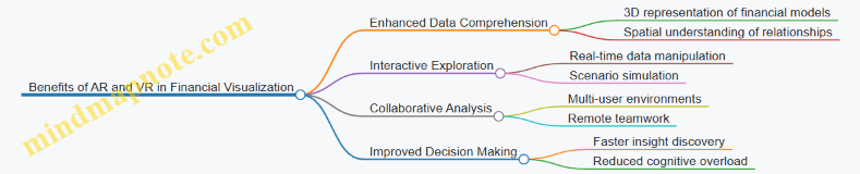
Practical Examples
Example 1: AR for Expense Analysis
Imagine an accountant using AR glasses to overlay expense data on physical documents or office spaces. They can see color-coded expense categories hovering over relevant files or areas, instantly identifying overspending.
Example 2: VR for Financial Forecasting
A financial analyst enters a VR environment where they can walk through a 3D timeline of company revenue, expenses, and profit projections. By interacting with floating charts and graphs, they adjust assumptions and immediately see the impact on forecasts.
Mind Map: Use Cases of AR and VR in Accounting
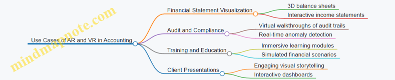
Best Practices for Implementing AR and VR
- Start Small: Pilot with specific use cases like expense tracking or forecasting.
- User Training: Ensure accountants and analysts are comfortable with the technology.
- Data Accuracy: Maintain high data quality to avoid misleading visualizations.
- Integration: Combine AR/VR tools with existing financial software for seamless workflows.
Example Scenario: VR Audit Review
A team of auditors uses VR headsets to collaboratively review a company’s financial records. They navigate through a virtual representation of the audit trail, highlighting suspicious transactions and discussing findings in real-time, regardless of their physical locations.
Summary
AR and VR technologies offer accountants and financial professionals powerful new ways to visualize and interact with financial data. By embracing these immersive tools, finance teams can enhance understanding, improve collaboration, and make more informed decisions.
12.3 Blockchain and Transparent Financial Visualizations
Blockchain technology is revolutionizing the way financial data is recorded, verified, and visualized. Its decentralized, immutable ledger system offers unprecedented transparency and security, which can be leveraged by accountants to create more trustworthy and insightful financial visualizations.
Understanding Blockchain in Finance
- Decentralization: No single point of control, reducing fraud risk.
- Immutability: Once recorded, data cannot be altered, ensuring data integrity.
- Transparency: Transactions are visible to authorized participants, fostering trust.
Why Blockchain Matters for Financial Visualization
- Enhanced Data Accuracy: Visualizations based on blockchain data reflect real-time, tamper-proof records.
- Auditability: Visual audit trails can be created, showing the origin and flow of transactions.
- Improved Compliance: Transparent data supports regulatory reporting and compliance.
Mind Map: Blockchain Impact on Financial Visualization
Visualizing Blockchain Data: Best Practices
-
Use Flow Diagrams and Sankey Charts to illustrate the movement of assets or funds across blockchain addresses.
- Example: Visualizing cryptocurrency transactions between wallets to detect unusual patterns.
-
Leverage Time-Series Charts to track transaction volumes and values over time.
- Example: Monitoring daily Bitcoin transaction counts and average fees.
-
Implement Network Graphs to represent relationships between entities on the blockchain.
- Example: Mapping connections between suppliers and customers in a supply chain blockchain.
-
Incorporate Interactive Dashboards that allow filtering by date, transaction type, or participant.
- Example: A dashboard showing real-time updates of company token transfers with drill-down capabilities.
Example 1: Visual Audit Trail of Expense Transactions on Blockchain
- Scenario: An organization records all expense approvals and payments on a private blockchain.
- Visualization: A timeline chart combined with a network graph showing approval flow from employee to manager to finance.
- Benefit: Clear, immutable audit trail that can be visually inspected for compliance and anomalies.
Example 2: Fraud Detection Using Blockchain Visualizations
- Scenario: Detecting suspicious transaction clusters in a decentralized finance (DeFi) platform.
- Visualization: Heatmaps highlighting transaction frequency and amounts, combined with network graphs showing interconnected suspicious accounts.
- Benefit: Quickly identifying potential fraud rings or money laundering activities.
Mind Map: Example Workflow for Blockchain-Based Financial Visualization
Challenges and Considerations
- Data Volume and Complexity: Blockchain generates vast amounts of data; efficient aggregation and filtering are essential.
- Privacy Concerns: Public blockchains are transparent, but sensitive financial data may require permissioned blockchains.
- Tool Integration: Not all visualization tools natively support blockchain data formats; custom connectors may be needed.
Summary
Blockchain technology enhances the transparency and reliability of financial data, enabling accountants to create visualizations that are not only insightful but also verifiable and trustworthy. By adopting best practices such as using network graphs, flow diagrams, and interactive dashboards, accountants can unlock new levels of clarity and control in financial reporting.
For accountants and data analysts, embracing blockchain-based visualization techniques is a forward-looking step toward more transparent, secure, and efficient financial management.
12.4 Predictive Analytics and Visualization Integration
Predictive analytics is transforming how accountants and financial professionals forecast future trends, identify risks, and make data-driven decisions. When combined with effective data visualization, predictive analytics becomes a powerful tool that not only reveals what might happen but also communicates insights clearly to stakeholders.
What is Predictive Analytics?
Predictive analytics uses historical data, statistical algorithms, and machine learning techniques to identify the likelihood of future outcomes. In finance and accounting, it helps forecast revenue, expenses, cash flows, and detect anomalies such as fraud.
Why Integrate Predictive Analytics with Visualization?
- Enhanced Understanding: Visualizations translate complex predictive models into intuitive charts and dashboards.
- Improved Communication: Stakeholders can grasp predictions quickly without needing deep technical knowledge.
- Actionable Insights: Visual cues highlight key trends, risks, and opportunities.
Mind Map: Components of Predictive Analytics and Visualization Integration
Example 1: Revenue Forecasting with Line Charts and Confidence Intervals
Imagine an accountant forecasting next quarter’s revenue based on the past 24 months of sales data. Using time series forecasting (e.g., ARIMA model), the predicted revenue is plotted alongside historical data.
- Visualization: A line chart displays historical revenue (solid line) and forecasted revenue (dashed line).
- Confidence Intervals: Shaded bands around the forecast line indicate the uncertainty range.
This allows stakeholders to visually assess expected revenue and the associated risk.
Example 2: Scenario Comparison Dashboard
Accountants often need to present multiple financial scenarios (e.g., best case, worst case, and most likely case).
- Visualization: A dashboard with side-by-side bar charts or area charts compares key metrics like net income, cash flow, and expenses across scenarios.
- Interactive Elements: Filters let users toggle between scenarios or drill down into specific accounts.
This integration helps decision-makers evaluate the impact of different assumptions visually.
Mind Map: Visualization Techniques for Predictive Analytics
Example 3: Fraud Detection Using Heatmaps
Predictive models can assign risk scores to transactions or accounts. Visualizing these scores on a heatmap helps accountants quickly identify high-risk areas.
- Visualization: A heatmap with color gradients from green (low risk) to red (high risk) displays accounts or transaction categories.
- Benefit: Enables rapid prioritization for audit or investigation.
Best Practices for Integrating Predictive Analytics and Visualization
- Validate Predictive Models: Ensure models are accurate and relevant before visualizing.
- Simplify Visuals: Use clear, straightforward charts to communicate predictions.
- Show Uncertainty: Always include confidence intervals or error margins.
- Enable Interactivity: Allow users to explore different scenarios or time frames.
- Contextualize Data: Provide narrative or annotations to explain predictions.
Summary
Integrating predictive analytics with visualization empowers accountants to not only forecast financial outcomes but also communicate these insights effectively. By leveraging appropriate visualization techniques like forecast line charts, confidence intervals, heatmaps, and scenario dashboards, financial professionals can drive better decision-making and strategic planning.
Further Reading & Tools
- Microsoft Power BI: Forecasting and AI visuals
- Tableau: Integrating R and Python predictive models
- Excel: Built-in Forecast Sheet feature
- Python libraries: Prophet, scikit-learn for predictive modeling
12.5 Preparing for the Future: Skills and Tools Accountants Should Develop
As the finance and accounting landscape rapidly evolves, accountants must proactively develop new skills and adopt advanced tools to stay relevant and add value through financial data visualization. This section explores the essential competencies and technologies that will empower accountants to excel in the future.
Key Skills for Future-Ready Accountants
Mind Map: Future Skills for Accountants
Example:
An accountant who understands Python can automate data extraction and cleaning, then use libraries like Matplotlib or Seaborn to create customized visualizations beyond standard BI tools. This skill reduces manual workload and enhances reporting accuracy.
Essential Tools to Master
Mind Map: Tools for Financial Data Visualization
Example:
Using Power BI, an accountant can build interactive dashboards that update in real-time, enabling management to monitor KPIs instantly. Coupling this with RPA tools can automate data refreshes, freeing up time for deeper analysis.
Practical Steps to Develop These Skills
-
Enroll in Online Courses: Platforms like Coursera, Udemy, and LinkedIn Learning offer courses on data visualization, Python for finance, and BI tools.
-
Hands-On Practice: Work on real or simulated financial datasets to build dashboards and visual reports.
-
Join Professional Communities: Engage with forums such as the Data Visualization Society or accounting tech groups to exchange knowledge.
-
Certifications: Pursue certifications like Microsoft Certified: Data Analyst Associate or Tableau Desktop Specialist.
-
Stay Updated: Follow industry blogs, webinars, and conferences focusing on financial technology and visualization trends.
Example Scenario: Upskilling Journey of an Accountant
Mind Map: Upskilling Journey
Example:
Sarah, an accountant, started with Excel-based reports. She learned Power BI to create dynamic dashboards and then picked up Python to automate data cleaning. Eventually, she integrated AI tools to spot unusual transactions, significantly improving audit accuracy.
Summary
Preparing for the future means embracing a blend of technical, analytical, and communication skills. Mastery of modern tools combined with a strong foundation in data visualization principles will enable accountants to transform raw financial data into compelling stories that drive strategic decisions.
Investing time in continuous learning and practical application today will position accountants as indispensable contributors in tomorrow’s data-driven finance environment.
13. Conclusion and Resources
13.1 Recap of Key Best Practices in Financial Visualization
Financial data visualization is a powerful tool for accountants to communicate complex information clearly and effectively. To ensure your visualizations are impactful and accurate, here’s a comprehensive recap of the key best practices covered throughout this blog, supported by illustrative mind maps and practical examples.
Choose the Right Visualization Type
Selecting the appropriate chart or graph based on the data and the message is crucial.
- Example: Use a waterfall chart to explain profit and loss variances rather than a simple bar chart.
Prioritize Clarity and Simplicity
Avoid clutter and unnecessary decorations. Focus on making the data easy to interpret.
- Example: Use clean labels and avoid 3D effects that distort perception.
Use Color Thoughtfully
Colors should enhance understanding, not confuse. Use consistent color schemes and consider colorblind-friendly palettes.
- Example: Use green for positive financial growth and red for losses.
Prepare and Clean Data Thoroughly
Accurate visualizations depend on clean, well-structured data.
- Example: Remove duplicates, handle missing values, and aggregate data appropriately before visualization.
Incorporate Interactivity When Possible
Interactive dashboards allow users to drill down and explore data dynamically.
- Example: Filters to view expenses by department or time period.
Tell a Story with Your Data
Combine visuals with narrative elements to guide stakeholders through insights.
- Example: Annotate charts to explain budget variances or highlight trends.
Maintain Ethical Standards and Accuracy
Ensure transparency and avoid misleading representations.
- Example: Always disclose data sources and avoid manipulating axes to exaggerate trends.
Customize Visuals for Your Audience
Tailor complexity and detail to the needs of executives, managers, or analysts.
- Example: Use high-level summary dashboards for executives and detailed drill-downs for analysts.
Summary Table of Best Practices with Examples
| Best Practice | Description | Example Visualization |
|---|---|---|
| Right Visualization Type | Match chart type to data and message | Waterfall chart for variance analysis |
| Clarity and Simplicity | Avoid clutter, use clear labels | Clean bar chart without 3D effects |
| Thoughtful Use of Color | Use consistent, meaningful colors | Green/red for profit/loss |
| Data Preparation | Clean and validate data before visualization | Removing duplicates in Excel data |
| Interactivity | Add filters and drill-downs for deeper insights | Expense dashboard with department filter |
| Storytelling | Combine visuals with narrative and annotations | Annotated budget variance chart |
| Ethics and Accuracy | Ensure transparency and avoid misleading visuals | Proper axis scaling in revenue charts |
| Audience Customization | Tailor visuals to stakeholder needs | Executive summary dashboard |
By consistently applying these best practices, accountants and financial data analysts can create visualizations that not only convey data accurately but also empower better decision-making and communication across their organizations.
13.2 Recommended Tools and Platforms for Accountants
In the realm of financial data visualization, selecting the right tools and platforms is crucial for accountants to efficiently analyze, interpret, and communicate financial insights. This section highlights some of the most effective and widely used tools tailored for accountants, along with practical examples and mind maps to help you understand their capabilities and best use cases.
Microsoft Excel
Excel remains the backbone for many accountants due to its flexibility and familiarity.
- Key Features: PivotTables, Power Query, Power Pivot, built-in charting tools, and add-ins like Power Map.
- Example: Creating a dynamic Profit & Loss dashboard using PivotTables and slicers.
Power BI
Power BI is a powerful business intelligence tool that integrates seamlessly with Excel and other Microsoft products.
- Key Features: Interactive dashboards, real-time data refresh, DAX formulas, and extensive visualization options.
- Example: Building an interactive dashboard to monitor monthly expenses with drill-down capabilities.
Tableau
Tableau is renowned for its intuitive drag-and-drop interface and advanced visualization capabilities.
- Key Features: Wide range of chart types, storytelling features, data blending, and mobile-friendly dashboards.
- Example: Visualizing cash flow trends across multiple departments with a storytelling dashboard.
Qlik Sense
Qlik Sense offers associative data modeling and self-service analytics, empowering accountants to explore data freely.
- Key Features: Associative engine, smart visualizations, AI-powered insights, and collaborative features.
- Example: Exploring audit trail data to detect anomalies using associative filtering.
Google Data Studio
A free, cloud-based tool that integrates well with Google Sheets and other Google services.
- Key Features: Easy sharing, real-time collaboration, customizable reports, and data connectors.
- Example: Creating a shared dashboard for tracking accounts receivable aging.
Zoho Analytics
Zoho Analytics offers an affordable and scalable BI platform suitable for small to medium accounting teams.
- Key Features: Drag-and-drop report builder, AI assistant, data blending, and scheduled reporting.
- Example: Automating monthly financial reports with scheduled email delivery.
Specialized Accounting Visualization Add-ons
Many accounting software platforms offer built-in or third-party visualization add-ons.
- Examples: QuickBooks Advanced Reporting, Xero Analytics, Sage Intelligence.
- Use Case: Generating customized financial reports directly from accounting software.
Summary Table of Tools
| Tool | Strengths | Ideal Use Case | Cost Model |
|---|---|---|---|
| Microsoft Excel | Flexibility, Familiarity | Ad-hoc analysis, dashboards | Included in Office |
| Power BI | Interactive dashboards, integration | Enterprise reporting, real-time | Freemium/Paid |
| Tableau | Advanced visuals, storytelling | Complex visualizations | Paid |
| Qlik Sense | Associative engine, AI insights | Data exploration, anomaly detection | Paid |
| Google Data Studio | Free, cloud-based, collaboration | Shared dashboards, lightweight BI | Free |
| Zoho Analytics | Affordable, AI assistant | SMB reporting, automation | Paid (affordable) |
| Accounting Add-ons | Direct integration with accounting data | Customized reports from software | Varies |
By leveraging these tools, accountants can transform raw financial data into compelling visual stories that enhance understanding and support better decision-making. Experimenting with a combination of these platforms based on your organization’s size, budget, and reporting needs will help you find the best fit.
13.3 Continuing Education and Certification Opportunities
As the field of financial data visualization evolves rapidly, continuous learning is essential for accountants and data analysts to stay current with the latest tools, techniques, and best practices. Pursuing continuing education and certifications not only enhances your skill set but also boosts your credibility and career prospects.
Key Areas for Continuing Education in Financial Data Visualization
Recommended Certifications and Courses
-
Microsoft Certified: Data Analyst Associate
- Focus: Power BI skills for data visualization and modeling.
- Example: Creating interactive dashboards for financial reports.
- Provider: Microsoft Learn
-
Tableau Desktop Specialist
- Focus: Fundamentals of Tableau for data visualization.
- Example: Visualizing income statements and cash flow trends.
- Provider: Tableau
-
Certified Analytics Professional (CAP)
- Focus: End-to-end analytics process including visualization.
- Example: Applying analytics to financial forecasting.
- Provider: INFORMS
-
Data Visualization with Python by IBM (Coursera)
- Focus: Using Python libraries (Matplotlib, Seaborn) for visualization.
- Example: Plotting financial time series data.
-
Excel Data Visualization Courses
- Focus: Advanced charting, pivot charts, and dashboard creation.
- Example: Automating financial KPI dashboards.
- Providers: LinkedIn Learning, Udemy
Example Mind Map: Certification Pathways for Accountants

Tips for Selecting the Right Program
- Align with Career Goals: Choose certifications that complement your current role or desired career path.
- Hands-On Learning: Prioritize courses with practical exercises and real-world financial datasets.
- Reputation and Recognition: Opt for certifications recognized in the finance and consulting industries.
- Flexibility: Consider online and self-paced options to balance work and learning.
Example: Applying Certification Knowledge
After completing the Microsoft Data Analyst Associate certification, an accountant was able to:
- Build a dynamic Power BI dashboard that visualized monthly revenue, expenses, and profit margins.
- Implement drill-down features to explore financial data by department and time period.
- Automate data refreshes, reducing manual reporting time by 50%.
Additional Resources
- Financial Modeling & Valuation Analyst (FMVA) Certification by CFI: Includes modules on Excel and visualization.
- Storytelling with Data Workshops: Focus on narrative techniques for financial presentations.
- Community Forums: Power BI Community, Tableau Community, Reddit r/dataisbeautiful
Continuing education and certifications empower accountants and data analysts to transform complex financial data into clear, actionable insights through effective visualization techniques. Investing time in these opportunities ensures you remain competitive and proficient in an increasingly data-driven finance landscape.
13.4 Community and Online Resources for Financial Visualization
In the rapidly evolving field of financial data visualization, staying connected with communities and leveraging online resources is essential for accountants and data analysts. These platforms provide opportunities for learning, sharing best practices, discovering new tools, and getting inspired by real-world examples.
Key Online Communities and Forums
- Tableau Community: A vibrant forum where users share dashboards, tips, and troubleshooting advice specifically for Tableau, one of the leading data visualization tools.
- Power BI Community: Microsoft’s official community for Power BI users, featuring discussions, tutorials, and custom visuals.
- Reddit r/DataViz: A broad data visualization community where financial visualization examples are frequently showcased and critiqued.
- Stack Overflow: For technical questions related to visualization coding, formulas, and tool integrations.
- LinkedIn Groups: Groups like “Financial Analytics & Visualization” and “Data Visualization Society” offer professional networking and resource sharing.
Educational Platforms and Courses
- Coursera & edX: Courses like “Data Visualization with Tableau” or “Financial Analytics” provide structured learning.
- Udemy: Affordable courses focusing on Excel visualization, Power BI, and financial dashboard creation.
- YouTube Channels: Channels such as “Chandoo” and “ExcelIsFun” offer step-by-step tutorials.
Blogs and Websites
- Storytelling with Data: A blog dedicated to best practices in data storytelling and visualization.
- Financial Modeling World Championships Blog: Offers insights into financial modeling and visualization techniques.
- Data Viz Project: A comprehensive gallery of chart types with examples and use cases.
Open-Source Tools and Resources
- D3.js Gallery: Examples of custom interactive visualizations, including financial charts.
- GitHub Repositories: Many repositories contain templates and scripts for financial dashboards.
Mind Maps for Navigating Financial Visualization Resources
Financial Visualization Resources Mind Map
Practical Example: Leveraging the Tableau Community
Imagine you want to create a waterfall chart to visualize quarterly profit variances. By posting your draft dashboard on the Tableau Community forum, you receive feedback on color choices, labeling clarity, and interactivity enhancements. You also discover shared templates and tutorials that help you refine your visualization, making it more insightful and user-friendly.
Summary
Engaging with online communities and utilizing available resources accelerates your growth as a financial data visualization expert. These platforms offer continuous learning, inspiration, and support, enabling you to create impactful visualizations that drive better financial decision-making.
13.5 Final Thoughts: Enhancing Financial Decision-Making through Visualization
Financial data visualization is not just about creating attractive charts or dashboards; it is a powerful tool that transforms raw numbers into actionable insights. For accountants and data analysts, mastering visualization techniques can significantly enhance the quality and speed of financial decision-making.
Why Visualization Matters in Financial Decision-Making
- Clarity and Speed: Visuals help stakeholders quickly grasp complex financial information without sifting through dense spreadsheets.
- Pattern Recognition: Trends, outliers, and correlations become immediately visible, enabling proactive decision-making.
- Communication: Visualizations bridge the gap between technical financial data and non-expert stakeholders, fostering better collaboration.
Mind Map: Benefits of Financial Data Visualization
Best Practices Recap for Enhancing Decision-Making
- Choose the Right Visualization: Use charts that best represent the data type and story (e.g., waterfall charts for variance analysis, heatmaps for expense patterns).
- Keep It Simple: Avoid clutter and focus on key metrics to prevent overwhelming the audience.
- Use Interactive Elements: Filters and drill-downs empower users to explore data at their own pace.
- Tell a Story: Combine visuals with clear narratives and annotations to guide interpretation.
- Ensure Data Quality: Clean, accurate data is the foundation of trustworthy visualizations.
Example: Visualizing Budget Variance to Drive Decisions
Imagine a company’s finance team needs to present budget variances to department heads. Instead of a static table, they use a waterfall chart:
- Waterfall Chart: Shows how each expense category contributed to the total variance.
- Color Coding: Red bars indicate overspending, green bars indicate savings.
- Annotations: Notes highlight unexpected variances and suggest corrective actions.
This visualization enables department heads to quickly identify problem areas and prioritize budget adjustments, accelerating the decision-making process.
Mind Map: Steps to Create Impactful Financial Visualizations
Final Example: Dashboard for CFO Decision Support
A CFO dashboard integrates multiple visualizations:
- Trend Lines: Show revenue and expense growth over time.
- KPI Gauges: Display current performance against targets.
- Heatmaps: Highlight departments with unusual spending.
- Interactive Filters: Allow drilling down by region or period.
This comprehensive yet intuitive dashboard empowers the CFO to make informed strategic decisions quickly, backed by clear visual evidence.
Closing Note
In an era where data volume and complexity are rapidly increasing, financial data visualization is an indispensable skill for accountants and analysts. By adopting best practices and leveraging the right tools, professionals can transform data into compelling stories that drive smarter, faster, and more confident financial decisions.